Transcripts
1. LAVENDER FIELDS INTRODUCTION: Hi there. My name's
Carrie McKenzie. I'm a professional
artist, author, undocked you to live in, in the beautiful
countryside of Yorkshire. Going to really love painting this beautiful landscape
of Lavender Fields. This class is suitable
for all levels. If you're a beginner, and
I've never painted before, I'll be guiding
you every step of the way throughout
the whole process. Will use the wet-in-wet technique to paint
a beautiful sky, will Bleed different
colors into each of the firm bottle foliage effect. Now show you how to
create a tree very quickly using plastic wrap. So that at the end of the class, you'll have your own
beautiful little painting to be very proud of. I've discovered lots of tips and techniques and shortcuts
over the years. So just as soon my in-person
face-to-face classes, I'll be sharing these
so that U2 can get the same benefits enjoy from painting that have helped me. A big believer in
learning by doing, rather than reading
lots of written theory. You'll be painting right
alongside me and my studio. As I demonstrate each
process step-by-step, and make your learning a happy, Smiley, and practical
experience. If you prefer, you can watch
the video the whole way through and how they got
the paint in afterwards. And of course, you can pause
and rewind it at anytime. I provided a reference
photograph and also the drawing
view to download. Now don't worry about
trace in the drawing because this course is about
painting, not drawing. You can see examples of
my work on my website. My style leans towards
impressionistic and contemporary rather
than photorealistic. I like to explore
loose approaches that ring out the color, light, and essence
of my subjects. I'm delighted to be
able to share with you, may experience tips and techniques I've learned along the way in my own Art journey. Importantly, the
most valuable asset is your own time,
patients and enthusiasm. There's no such thing as right, wrong or failure in Art. It's all about
learning and growth. Learning what worked well, practicing what you
need to improve on, and moving forward
with each step. Please don't worry
if your painting doesn't look exactly like mine. Lowry never worried
whether he's looked like golf or Picasso's. We all have our
own unique style, just like our fingerprints. And with that understanding, it's time to get on
with the painting
2. Materials, Composition, Drawing, Paint the Sky using Wet-on-Wet Technique: Hi there. Welcome to my Lavender
Fields online workshop. You're going to love painting
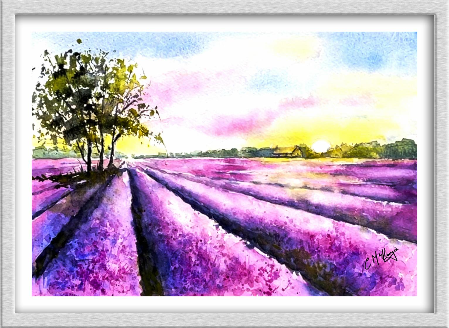
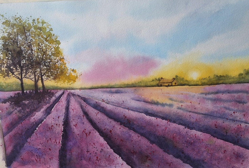
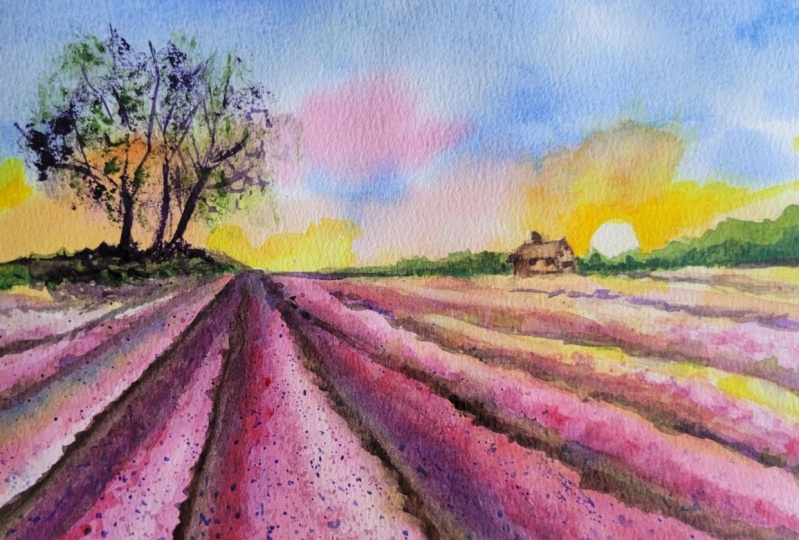
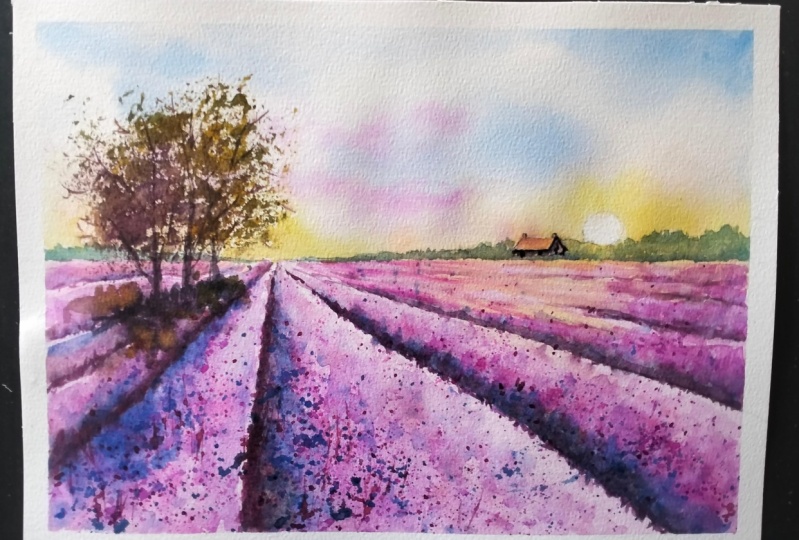
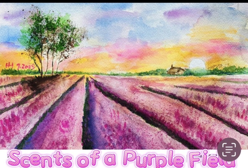
this stunning landscapes. See, we've got a golden sunset
in a beautifully lit sky. Distant houses, some
sunlight Trees, and a foreground of
beautiful lavender fields. Now, don't worry, because
I'm going to show you how to tackle all these
different elements. And you'll soon have your own beautiful lavender
Fields painting. Now these the colors I'm using, if you've got different ones, do feel free to use what
you've already got. Most of my parents are either transparent
or semi-transparent, which will allow the white
of the paper shine through. Now I have provided a reference photograph
that as you can see, I have made a number of
modifications to it. I have reduced the size
of the distant Trees. I've added a little
house among them, larger Trees that the right, which actually didn't
exist on the photograph. And I've lowered the
horizons so I can include a little bit more Sky. I've also shifted
the perspective of the Lavender furrows a
little bit more central. I've altered the
mood of the paint in a little bit by
changing the colors, particularly in the Sky. I think it's really
important that we do follow a photograph slavishly, that we can modify it, take artistic license when
planning our competition. Now you can see that I've
kept the dry and very simple, minimal details so that we get a nice, loose,
free-for-all painting. The first thing
to do, of course, is to transfer the drawing
to your watercolour paper. You can do that free hand if
you're a competent drawer. Or you can use some
graphite transfer paper or even rub the back of
the drawing with a pencil, turnover the sheet, place it
on the watercolour paper, and then go over the
drawing outlines with a ballpoint pen. I'm using a large brush to cover the Sky area with clean water. One of the main
considerations when painting a sky is
the time it takes. You really do need to paint
the sky very quickly. If you overwork the Sky, It's going to look muddy
and not very scale-like. So as soon as the
paint starts to dry, That's when you've got to stop and either go with what
you've already got. All leave it to dry, completely, re-wet it, and add
some more paint. Now, it's quite a
large area and we're painting wet in wet and it
is going to be very wet. It's unlikely that you're Sky
will be exactly like mine. If I was going to paint
the same Sky again, it wouldn't be the same. Still using my large brush. And first of all, dropping
in some cobalt blue. Now it's quite a watery
thin mix of color about the consistency of tea
or single cream at best. Because the paper
is already very wet and my pink consistency is very thin and watery and
getting lovely spread of color without
having to do a lot. And I'm also getting some lovely soft edges
around the shapes. I want to leave some gaps
in-between the blue areas for either some different colors or some white fluffy clouds. The second color
that I'm putting on is hansa yellow light. You could use any
light yellow such as our eolian or
transparent yellow. I'm just stroking it across the top of the distant
trees and bushes, which is where it will catch the light from the
sun that's coming up. Being careful to just
go around the sun, keep that area white. And just below the sun, those bushes and the
little house will be based in this golden
sunlight as well. Now, I'm imagining that
the sunrise will also extend over the tops of some
of the lavender bushes. While I've got my yellow
paint hand and just stroking it across the tops of some of those
lavender bushes. It's on dry paper so it won't blend like it
is doing in the Sky. And I'm going to get a dry
brush technique where it's sort of hits and Mrs. the
dimples in the paper, I've added a little touch of yellow up in the top
part of the Sky. And now I'm going over a few places of the
yellow color with my transparent orange to
emphasize the warmth of the sun. The Sky area of the
paper is still very wet. I've still got time to
carry on working on it. I'm adding a bit
more orange warmth behind this large
clump of trees here. They're going to be
much darker color, so it's okay to paint
the trunks and branches. I'm adding a little
bit more orange color over the right-hand side. Feel it starting to
dry a little bit pale. But when you do your own
painting, of course, you'll need to assess where
these little touches of color really need to go because your Sky won't look
exactly like mine. I've decided to put a little
bit more of the blue color, just draw over that
left hand side. And now I'm going to go in
with my Lavender purply color. You can see that the paper
is still wet because this pinky lavender color is still spreading in the wet wash. I think I'm going to just
add a little bit more of the blue color into a couple
of areas in this guy, just strengthen that Tone. And then I'm picking
up my paper and given it a really good Shake. This is one of the
reasons why I don't tape my paper down
like some artists do. Because I like to be
able to move it around. By shaking the paper
in this manner. We get all the colors merge
in and blending softly into the paper and avoid too many ugly brush
strokes in the sky. But I am going to add
a little bit more blue in that top
right-hand corner. Fortunately, my paper
is still really wet. Then you might want
to think about any areas that you want
to lift the paint off. Because while it's still done, you can use a paper
towel to just dab out any little areas where you want to return
some white clouds. If it is starting to dry
but it's still dump. Another thing you
could do is to just missed it over with
a water sprayer. And I have just missed it. It hasn't spread it. Then you can give your
paper another shake. And that'll just ease in and blend those extra bits of
color that you've put on. I've just got time to result in a little bit more blue coming in from that right hand side. And then I think I'm in danger of overwork in my painting. So I seriously need to put
everything down now and stop
3. Paint the distant Trees using Wet-on-Dry Technique and Bleed Colours Technique: I've mixed a green with some ultramarine blue and
some hansa yellow light. Now you do want this green to be more of a blue-green
than a yellow green. Because as things recede
into the distance, there do appear bluer and paler. It's quite a watery thin mix. So as you can see, the yellow under wash
that we put some in the previous layer is still going through
that green color. I'm missing all the trees
that are immediately underneath the sun and
also the Little House. I want them to stay more yellow. But I am going back and just gently softening
in the color into that underlying yellow
wash so that we don't have hard edges
that look on natural. I've come over to the other
side of the little house, making these trees a
little bit smaller so that we have some
variety in their heights. And also being mindful
to keep the bottom of the trees very flat
against the horizon line. Before I move over to the
trees at the far left, just going to dab
a little bit of the green color of the Trees
immediately under the sun. Then I'm going back
over now to finish painting the little row of
distant Trees on the left. Don't try to keep the tops of the Trees a bit
irregular in shape, so not one flat line
across the top. And I'm just mixing a
little bit of ultramarine blue into the green
mix and adding that just along the
bottom of the row of trees so that it beds the
Min to the horizon line. Because they underneath
the trees will be in shadow from the
overwhelming foliage. We also want a little bit
of shadow just coming along the horizon line underneath
the little house. And then to finish off, I'm just using some
paper towel to dab off a few areas on the tops of the trees where they
are catching the light. To paint the lavender bushes, I'm going to Bleed some colors
into each other so that I get a variegated,
mottled effect. Now, I will be building it up in several different layers. So don't worry that it just not what right, to begin with. I've mixed up some
permanent rose with some cobalt blue to get
a purply pinky color. And I've mixed a
stronger version of that same color and added a
little bits of blue to it. I'm still using a fairly
large brush because it's a fairly large
area that we painting. And I'm using these two colors intermittently to paint
over the lavender bushes. And I'm making my brush strokes go in the direction
of each through. Now you can see that the consistency of the
paint is quite watery. And even though it
is quite water, because I'm using a large brush and skimming over the paper. We're getting a little bit of dry brush technique
here and there. There are little bits of
white paper left behind. And being mindful not
to paint right over the top of the yellow
that I applied earlier. But I am dragging
a little bit of that lavender color in-between. I want to keep the area where the perspective lines
converge fairly light. And also the area where the sun rays are coming across where we've
painted the yellow. I want that little area also to stay a little
bit on the light side. If necessary, I will
use a paper towel to just dab off any paint
that strays onto that. Although I didn't pre wet the paper with clean
water beforehand, it is quite wet still
because I'm painting over the whole of this area
with quite watery paint. So using the stronger
mix of the two colors, I'm going back in the furrows and adding
this stronger color, particularly over the left side at each furrow where
it will be in shadow. What I'm trying to do here
is to create a 3D sorts of roundedness effect to the Lavender bushes
in each section. By putting the darker color on the left-hand side and keeping the lighter tones on
the right-hand side. We will keep that
thought of 3D effect. And of course, within each
of the little bushes, there will be dips and shadows. So we need a bit of darker tone here and there to reflect that
4. Add Layers to the Lavender Fields to build up Colour, Detail and Tone: I'm painting on the
second layer of color to build up the
shapes and definition. And I'll do this one
section at a time now. To begin with, I'm pretty
wetting this largest section. I'm using a soft brush so that I don't disturb the underlying
pigment too much. I am wetting the whole
of this section. Apart from the small area running along the
right-hand edge of it. I've already made
a stronger mix of the pink purply
color and evolves the mood and even darker
mix by adding some black, some ultramarine, and a
little bit of burnt umber. I don't want this dark and
mixed to spread too much, so I have made it a
little bit thicker about the consistency
of double cream. They've also got mixed some
ultramarine and some yellow. I'm applying this stronger
pinky purple color to the left side of the section and letting that blending with the Wet-on-Dry washed the I've just applied. As it travels in
that under wash, it will get lighter in tone as it goes
towards the center. I'm adding a little bit
stronger paint to wear. This section meets
the one on the left. So that's much more
definition between where the different
roles start and end. I'm now sort of dib
Dublin the paints on towards the center of
this particular section. Little gaps here and there, so that we get this mottled. There you go to defect
in the lavender bushes. And then using a damp soft brush to just lightly blend
that darker tone into the underlying
light tone will get a nice mixture of hard
but mostly soft edges. I'm using the paper towel to
just lightly dab off some of that paint on the
right-hand side of this section to keep
it nice and light. Now's the time to be
very brave and add in my really dark color just on
the edge at the far left. This is where we want to
give the impression of soil in-between the
rows of bushes. As I mentioned before, this darker pins is a much
thicker, stronger mix. So you can see it's not spreading as much as
the other colors. In fact, it's staying put in that thin triangular
section where the soil is. To make it look a
bit more Earth-like. I am dropping in a
few little touches of green here and there. It's a more yellow
green than the green that we applied
the distant Trees with. Then to increase the definition, I'm adding a little bit
more of that dark color and a little bit of ultramarine
to the left-hand side. And as before, rather than painting in straight hard lines, I'm using my brush in a
dip Dublin way so that we continue to get that barrier
gated, mottled effect. This section of the paper
is still quite wet. So I'm still able to Bleed
these different colors into each other and get some
nice harmonious blends. Asset starting to dry. I will then need to move
on to the next section. It's still a bit dump
and I don't want to accidentally market with
my arm on my brush. I am turning my paper
around so that I can more easily reach
the next section. I'm going to repeat exactly what I've done on the last
section for this one. But I'll still be keeping my eye on that last section and add in any little bits of
paint that I think might be needed as it's drying. Because I left the
right-hand edge of the last section
completely dry. I can now paint right
up to the edge of it without it bleeding from
one section to the other. Note that I am painting
with a slightly wobbly line here because I don't want you to look like the straight
edge and then matchstick, this is a bush that
we're painting. So it will have little
dips in it here in there. Because I'm going to be using the same process
to paint the rest of the sections in the same way. I will let the video play
on for a few minutes, but I will add some problems
along the way as reminders.
5. Increase Contrast, Lift off Paint Technique, Create Abstract Flower Shapes with Spattering Techni: Now that the paint is dried, I can see that there isn't enough contrast between
the lavender bushes. So I'm going to increase the dark tone of these soil
and earth between them. I'm using the same
purpley black color that I mixed earlier on and stroke in that over
the top of the soil area. And just, just before, I'm not painting
along straight line, I'm using a bit of a wiggly, wobbly line to emphasize the shapes and dips
in the bushes. For the smallest sections
like this one here, you don't need to put
as much paint down. Just a thinner line of
dark color will do. Because color gets lighter as it recedes into the distance. I won't be using
this very dark color for the distant rules, but using the more
medium purply pink color that we mixed
earlier on instead. Now at the moment, I've got hard edges on either side of this soil
area that I'm painting. But before the color dries, I will be softening
and blending it in the bushes on the
shadow side on the left. As I do, blend it in, that will automatically darken the tune of these shadow on the left side
of those bushes. So that these strips
of soil won't look quite as stark
as they do now. Then just before I
finish this section, I'll also be adding
a little bit of shadow to the smell house. Okay? There are often times
when we want to lighten the tone of some colors or
even remove it altogether. You could use a clean brush
and some clear water. I'm painting the shape you
want to lift out or lightened. Just let it be for
a minute or so and then dab away the water
with the paper towel. And you should see
the color lift out in the shape
that you pin today. Now you might need
to repeat that a few times depending on how much you want to lighten the tone or whether you're trying to
remove it completely. Another great little
tool you can use for doing this is called
magic sponge. Now it's often sold as
a household cleaner, is more abrasive
than a brush though. Use it with caution as it can
damage the paper surface. However, it is very
effective on removing color completely and getting right back to that white paper. Just dip a small
piece of sponge into some clean water and squeeze
it out so it's just damp. And then rub the unwanted pins gently until the
color is removed. And you can use a paper
towel to blot in-between Robbins to get that
last bit of paint off. It's important to keep the sponge clean
by rinsing it out. If it's still dirty, then just throw it away
and use a fresh piece. And that's what I'm
using now to recover some of the whites
are light areas on the right-hand side
of my lavender bushes where they are catching
the light from the sun. Sometimes think success
in a painting is as much about lifting off paint as
it is about putting it on. There is a bit of a
myth about watercolor that you can't correct any
mistakes that you make. But actually there are many
little tricks and tools like this you can use to correct any mistakes
that you've made. It can be so easy
to accidentally drop a dark blot in
a lovely light sky. And this is where
you're a little bit of magic sponge will become your best friend in
your materials toolkit. Now you can buy it
from art shops, where it's often
called magic eraser. But you can also buy it from
the cleaning sections in the supermarkets
where it's sold for cleaning things like
ovens or skirting boards. If you find you've
removed too much color, you can paint that,
cover it again. But it just tend to roughen
the paper up somewhat. So you won't get quite
a smoother finish. Having lifted some pants off, we're now going to go
back to putting paint on. But this time we're going to do it with the
sputtering technique. This is a very
effective way of adding some interesting
texture effects. It just needs to
load your brush with some color and then use a
risk flick inaction to false depends onto the paper or
my preferred method is to tap the brush with your forefinger because it
gives you more control. Before I actually do this
and protecting the sky with some paper towel because
these spotters can tend to fly all over the place. So I've just loaded
a medium-size brush. I think it's a size six or an eight with some of the
pink purple color. I'm positioning my brush
about 2 " above the paper. The nearer you are to the paper, the more control you have over
where the little spots go. I'm tapping the brush would
not fall finger to force those little droplets of paint
onto the lavender fields. The advantage of using the
sputtering technique as opposed to paint in the little marks with
the point of your brush. Is that well for
one, it's quicker. But most importantly, you get
a much more random effect. You can of course,
use the tip of your brush to spread
some of those spots is about or join them up where you think they need to be
in little clusters. Fill in any obvious gaps. I'm also spattering in a
bit of ultramarine blue. Again, to give you a bit of
variety and a bit of depth. I'm only really
adding the spatter. These three large sections at the front of the
lavender fields, you wouldn't be able
to see this level of detail in those
that are further away. I'm pretty happy with
what I've done so far. So I'm going to remove
the paper towel now and have a look at what
else needs to be done. I'm just softening in
a few of the spatters, particularly where they join the areas that I
haven't spattered. And then we get a bit more
of a gentle transition between the detailed areas
and the non detailed areas. I'm also using the
points of my brush to flick a few of those
little spotters upwards. I think the small house needs
a little bit more detail. So I'm using a very
fine pointed brush to just add those in. It is in the distance. So we don't really
need very much and just putting in the Windows and then adding a little bit of darker color to the
trees either side of it, so that the house just stands out a little bit more
than it was doing. Now I don't want the
painting to get to overwork and fussy with detail. So I'm going to move
on to the next part.
6. Create Tree Texture with Plastic Wrap, Final Details: I'm using my dark
purpley black mixture to paint the trunks of the
trees in the foreground. Now, you don't need to be
tool regular with these. A little bit hiddenness with
the strokes because we are going to be put in some
foliage over the top of them. Do bear in mind that
the trunks of trees are narrower at the top and widen as they get
towards the bottom. I'm using quite a large brush, holds a lot of pigment, but it just have a good
point at the end so I'm able to vary the size of my
brush strokes quite a lot. If you feel more comfortable than do use a smaller
brush if need be. And I didn't want
it to branches. And of course these needs to be thinner than the tree trunks. A few of them are
even hardly there, are be able to add
some more branches later on after I've
put the foliage in. For now, this is
enough to suggest the framework or the skeleton of where the trees
are positioned. I'm using the same dark color
to paint the little cops of Earth and soil that
the Trees are rooted in. This area just needs
to be quite dark because it will be in shadow from the
overhanging foliage. Once we've put it in. You can flick a few grasses
up with the points of your brush to keep this shadow area
interesting and varied. As the shadow moves further
away from the trees, it does, of course, get
lighter and softer. Just dumping your brush Enlightened the tones
that are furthest away. I'm going back into the
base of the tree area and dropping a
little bit more of that very dark color in. I'm also adding some dark tones
to a few of the branches. You don't need to go over
every little area just hearing their scrunched up a small piece of plastic. And I'm dipping
into my dark paint. Then dab in that dark paint on the left side of the branches
where it's more in shadow. And I'm twisting
the plastic wrap around so that I get
a variety of shapes. I've mixed a bit of yellow into the dark color to give
me quite a dark green. And I'm dabbing that onto
the center of the trees. Volatile around the top where
it's catching the light. There is some overlap between the darker color and
this green color. Because both colours
are still wet, there is some blending. And therefore I'm getting some
in-between tones as well. You need to leave little gaps in-between the jobs because we want some of the Sky to be
showing through the foliage. The foliage will of course, be denser in the middle
than it is the outer edges. If you haven't used
this technique before, you might find it useful to practice on a bit of spare paper just to get used to how much paint to load onto
your piece of plastic. How hard to dab on how to keep moving around so that you
get these random shapes. Whilst the paint is still wet. I'm dropping in a little bit
of that dark color here and there again to try and create a bit more
depth in the tree, particularly in
the middle of it. So we're building up the
clusters of foliage in the tree without having to
paint every single leaf. I'm turning my attention back to the shadows
underneath the trees. I'm going to extend
it a little bit further to match the
foliage that's above. And I'm also going to drop in a little bit of my
yellow color to resemble the leaves that have fallen on the ground
and also the grasses Then I can use a clean damp brush to just
drag some of that colour forward and blend it in over the top of
the lavender bushes. I'm now using a brush
with a very fine point. And I'm using it to painting
some more branches. I can go in-between
the clumps of foliage where the Sky
is showing through. You don't need loads of
these just to feel nor to give the trees a little
bit more structure. A few, a little
tricky bits here and there to give it a
little bit more shape. And while I've got this brush, I'm just flicking up a
few more little grasses from the earth below. The foliage paint is still wet. I'm using a paper towel to
just dab a little bit of that paint off where the light is catching it
on the right-hand side. I've noticed that some of the yellow paint I put on top of a few lavender bushes earlier on seems to have disappeared. So I'm just touching it back in with a little
bit more yellow. I'm also glazing
some yellow over the distant bushes
where they are catching the sunrise
analytical health. The term glazing
simply means adding another thin layer of
watercolour over the top, either to strengthen the
color or to change the hue. To give the painting a little bit more balanced with
the yellow color. I'm also glazing it. Just draw over those distant
Trees on the left-hand side. I'm going to show you now a few finishing touches that
I'm adding to my painting. But it's important that you
assess your own work and how your painting looks to see which of these you do or don't need. The first one is that
I don't feel I've got enough of the pinky purple, lavender color in the sky. So I've wet the
Sky area over with a soft brush very gently so as not to disturb the paint
that's already there. And I've put the water
further than what I intend to paint be so that
it's got ron to travel. And I'm now dropping
into that wet wash some more of the Lavender
color and just trickling. It's about letting it
blend into that wet under wash. Just to reiterate
because it is important. I've placed the paint into
the middle of the wet area, not right to the edges of it. That way the paint
has got some room to travel and blend without
leaving hard edges. I'm not adding too much
of this extra color. I want it just to make a
subtle difference and give a bit more balance in colour to the top
part of the painting. At it is below. Even if you don't
need to do this, your particular painting
on this occasion, I hope that seeing this technique will help
you if you do need to add color to future
skies and justice. When we first
paints at this guy, I've lifted the paper up, giving it a good
TO shake to help those colors blend
and soften into the wet wash. Another area that I'm going to add
a little bit more color around the sun. I just feel it needs
a little bit more on. Now the paper has dried
again since I did this guy. So just as before, I can wet all around
the area that I want to add some Pinto
and then just drop it in around the sun
and let it blend into the wet wash. Can even add a little bit
more pinky purple into that area because it's
all still nice and wet. As long as it's where you
can continue to add color. But just like I said before, when we were doing the
Sky first-time round, as soon as it starts to dry. That's when you got to stop. The last thing that I
want to do is to add a bit more spatter to
the three main sections. I haven't used paper towel to massless Sky area this time. But if you feel a
bit nervous about where your spots is going to go, then remember that
you can do that. Now I'm not going tonight
with the spatter. I just wanted to give a
little bit more prominence in the detail of
this foreground. Spatter in a bit
of blue as well as the pinky purple into
the shadow areas, again, giving them a
little bit more depth. And I'm using the points of
my brush to flick up a few of those spotters so
that they might look like the little
stems in the bushes. One of the big questions
that comes up in a Watercolor Painting is how do you know
when it's finished? I've never come across
already answer for that. But I do feel that
I am beginning to overwork it and fuss too much. So now is definitely
the time to stop. I would really love to see
your own finished painting, which you can upload to
the Your Project section. And if you could just take a moment to leave
me a short review, that also would be really great. I do hope you've
enjoyed this video and it's encouraged
you to have a look at some of my other classes. In the meantime, thank
you for joining me and I look forward to seeing you
next time. Happy painting
7. LAVENDER FIELDS FINAL THOUGHTS: Well done on
completing the class. And also the painting. If you've been painting
alongside of me. We've covered quite a
few different Technique. We've simplified the drawing
from the reference photo. We use the wet-in-wet technique for the first layer of color. We then use the
layering technique to add a second layer of color. After the first layer is dried. We use tonal values to
increase depth and contrast. We also looked at
how to Lift off Paint and recover lighter areas. We use the Spattering Technique. So I Details the foreground
and many, many more. I would really love to see
your own finished painting, which you can upload to
the Your Project section. If you could just take a moment to leave me a short review, that also would be really great. I do hope you've
enjoyed this video and it's encouraged
you to have a look at some of my other classes. In the meantime, thank
you for joining me and I look forward to seeing you
next time. Happy painting
 Carrie McKenzie, creating painted visions