Transcripts
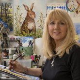
1. LIGHTHOUSE: INTRODUCTION: Hi there. My name is Carrie McKenzie and the
professional artist, author and our tutor living in the beautiful
countryside of Yorkshire. This class is suitable
for All levels. If you're a beginner, and
I've never painted before, I'll be guiding
you every step of the way throughout
the whole process, will be using tonal values
to create a 3D effect. Creating texture on
rocks and cliff, and creating some
lovely splashy waves and many, many more. So that at the end of the class, you'll have your own
beautiful little painting to be very proud of. I discovered lots of tips and techniques and shortcuts
over the years. So just as in my in-person
face-to-face classes, I'll be sharing these. U2 can get the same benefits enjoy from painting
that have helped me. A big believer in
learning by doing, rather than reading
lots of written theory. You'll be painting right
alongside me and my studio. As I demonstrate each
process step-by-step, and make your learning a happy, Smiley, and practical
experience. If you prefer, you can watch
the video the whole way through and how they got
the painting afterwards. And of course, you can pause
and rewind it at anytime. I provided the drawing for
you in the Resources section. Now don't worry about
trace in the drawing because this course is about
painting, not drawing. You can see examples of
my work on my website. My style leans towards
impressionistic in contemporary rather
than photorealistic. I like to explore
loose approaches that bring out the color, light, and essence
of my subjects. I'm delighted to be
able to share with you, may experience tips
and techniques that I've learned along the
way in my own Art journey. Importantly, the
most valuable asset is your own time,
patients and enthusiasm. There's no such thing as right or wrong or failure in Art. It's all about
learning and growth. Learning what worked well, practicing what you
need to improve on, and moving forward
with each step. Please don't worry
if your painting doesn't look exactly like mine. Lowry never worried
whether he's looked like Van Golf or Picasso's. We all have our
own unique style, just like our fingerprints. And with that understanding, it's time to get on
with the painting
2. LIGHTHOUSE: Materials, Composition, Drawing, Masking Sea-spray: Hello and a very warm welcome to the first part of my online
watercolour workshop. We're going to be
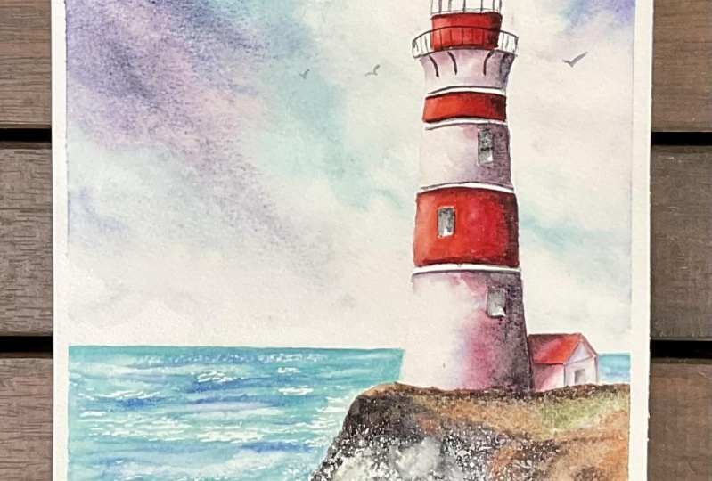
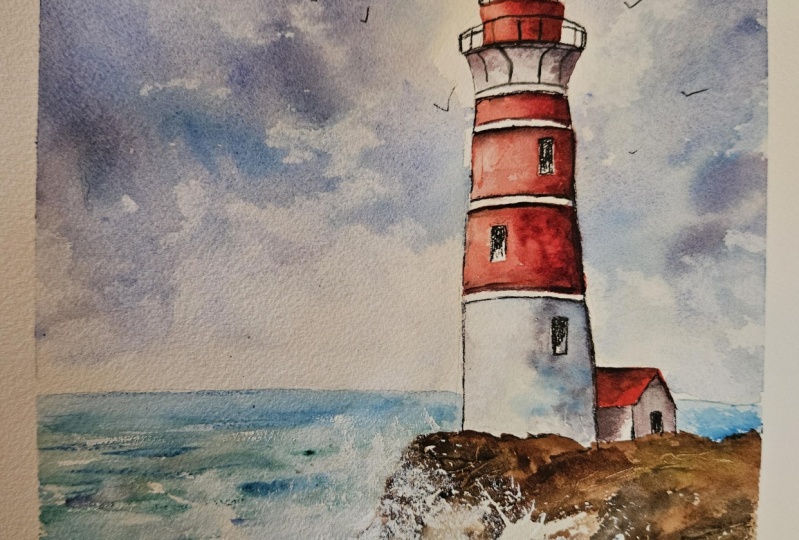
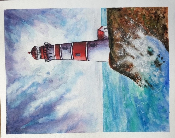
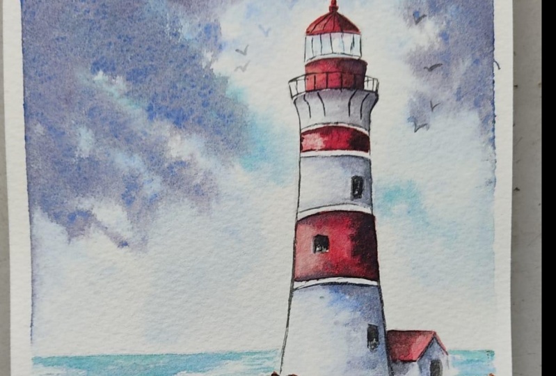
painting this lovely CCG. We've got a fairly dramatic sky. Especially splashy waves
are rocky cliff and it's done in red and white
lighthouse. Don't worry. I'll be showing you
from start to finish how to tackle all of
these different elements. So you'll have your own
beautiful lighthouse painting. You can either watch
the whole video through and have a go at
the painting afterwards, or you can paint right alongside me as I guide you through it. Now these the colors I'm using. But if you've got
different ones, do feel free to use what
you've already got. Most of my parents are either transparent
or semi-transparent, which will allow the white
of the paper shine through. Now for the composition, I've used the rule of
thirds because it's one of the most reliable guidelines
for composing a painting. Our lighthouse is placed in the right third of
the paper off-center, which is most
pleasing to the eye. It's not advisable to put the horizon line bang in
the middle of the image. So our horizon line is a
little bit below that. And although it's not obvious
at this drawing stage, we will be balanced in
the dark rocky cliff at the bottom-right with
some dark clouds in the sky at the top-left. Now you can see that I've
kept the drawing very simple, minimal details so that we get a nice loose free fall painting. The first thing
to do, of course, is to transfer the drawing
to your watercolour paper. You can do that free hand if
you're a competent drawer. Or you can use some
graphite transfer paper or even rub the back of
the drawing with a pencil, turnover the sheet, place it
on the watercolour paper, and then go over the
drawing outlines with a ballpoint pen. Once you've done new drawing, we're ready to use some masking fluid to preserve the
whites of the paper. I like PBL because it's blue
and you can see it easily. You can use a ruling
pen which has a little wheel to
adjust the size. I like these rubber
tipped applicators because you can wash it off
afterwards very easily. You can use an old brush, don't use a good one,
it will ruin it. This is an example of
just such a thing. I do use it over to mask
out random foliage shapes. And it can use a humble
paperclip for a very fine line. But this painting,
I'm going to show you a rather unusual way of the plane masking fluid with a piece of stainless
steel scouring. I want to preserve some white
paper where the form and spray of the sea waves are
crashing against the rock. It would be really
difficult to paint around all those tiny little
flecks of widespread. And the stainless
steel scouring does give this nice random
pattern effect. The beauty of it is
that you're getting some tiny little circles and
literally elongated shapes, very much like you're
doing nurture. If you don't have
some of this to hand, you could use an
old bristle brush or a piece of stick sponge. But I suggest you try it out on a piece of practice paper first. Make sure that you get this
really random pattern effect. Now once its own, we need to leave the masking fluid to dry. For about 10:15, 20 min. You can just touch it
gently with your fingers. If it's still sticky, it's not completely dry. Once it is dry, we can paint right
over the top of it. And then when that paint is dry, we can rub off the
masking fluid and it will leave these
little tiny shapes of white paper that will hopefully resemble the sprayer
and foam for our waves
3. LIGHTHOUSE: Use tonal values to create a 3D look, wet-on-dry, wet-on-wet, and blending and soften: I'm starting with the
wet-on-dry technique, wet paint on dry paper. I'm using cadmium red, alizarin crimson mixed
a very dark purple red with some Alizarin and ultramarine and a
touch of black. Starting with the cadmium red. And I'm using a small brush
with a very good point, get into these small shapes. This is a top of the Lighthouse. It's got some little
venules on the top as well. So it just needs to
be very careful with those very small shapes. Below. This is a
section of glass, so I will be missing the L and dealing with that
when we do the sky. I'm coming down now
to the next section. Now, there are some
railings in front of this is a little walkway right
up here at the top. But we don't need to worry about painting over the
railings because they are going to be in black later on so they will stand out. So you can paint right
over those railings. No problem. Now, the light
is coming from the left. So I do want to have
a little bits of a light highlight on the left-hand side of the
sections I've just painted. I'm just using a thirsty
brush to just lift off a little bit of that paint
on that left-hand side. And because the light is
coming from the left, the right-hand sides of
the shapes that were just painted will be in shadow. So I'm now adding
a little bit of alizarin crimson because it
is a bit of a darker red. It has no blue in it. It's leaning more towards the blue side in
the color wheel. And I'm kind of dip dabbing in with the
point of my brush. Give it a sort of a
motto shadow effect. I'm missing our
alternate sections because I want some
of them to be white. I'm doing exactly
the same process that I did before putting
on the cadmium red. And then I shall be lifting
a little highlight from that left-hand side where
the light is hitting it. Moving on now to the
last section of red. I'm just going to
be careful here. I've got little window, so need to just paint around that little
window carefully. The points of my brush. Again, just filling in that
shape with the cadmium red because it's a little bit bigger than the previous sections
that I've painted. Instead of using a thirsty brush to lift off the paint
for highlights, I'm actually sort of stopping
just where the window is, cleaning my brush in
some clean water and then just diluting that
down on the left-hand side, blending it in so
that I've already got a much lighter tone on that
left side than the right. When I'm painting any
area of the paint and I'm still keeping my eye on little sections that I might
have just painted before and adding a few more
touches of paint. If I think the
colour is seeps into the paper a little bit too much. I'm just adding a little
bit more of that cadmium red just to spice
it up a bit more. Now, it is still wet. So I can add my Alizarin
crimson in there. So that right-hand side
for the shadow again, just like I did before. I'm kind of smudging in with
the tip of my brush so that the two colors blend into each other and we don't
get any hard lines. We're aiming for a
gentle transition between the cadmium red
and the Alizarin crimson, and then of course
the dark red as well. So we want that soft
gradual transition of color going around the structure
of the Lighthouse. Because of course,
the lighthouse tower is a conical, rounded shape. Using these tones going from
light to medium to dark. That's going to convey the 3D structure,
that roundedness. The other little area
of red is the roof of our little house based at the
bottom of the Lighthouse. So I'm just touching
that cadmium red in and adding a bit of alizarin. Now instead of being on
the right-hand side, because the house is nestling
up against the lighthouse. The shared the shadow will
come from the Lighthouse and fall on the roof in
the left-hand part of it. Now because I am
working quickly, the paint is still wet. So I'm able to add some of the darker color that very
dark red that I mixed in earlier to the right-hand
side of the lighthouse tower. If you're not quite as
quick as as in this moment, then I suggest that you add this darker color
section dissection as you work in them through. It's important that you
continue to blend just a tease that dark color into the other two colors so that
we get again that nice, gentle transition
from light to dark. Now remember that
watercolour tends to dry about 20 to 30% lighter than when you
put the wet paint on. Those dark shadows
are not going to look quite as dark to do now, when the paint is
completely dried. The last part of painting these red sections is to add
a little bit so that very dark red above underload the borders that are going
around each section. I'm coming on to paint
the white sections now. Although they are white, they will still have some colour because they'll be reflection from the sky or the sea
against the white brick work. And they'll also be colour
in the shadow side on the right of Nixon,
quiet watery turquoise. And I'm using that to
paint the little ellipsis that's around the back of
the dome shape at the top. And also some reflections
on the glass windows. Because the ellipsis is
really the red color, but it's distance so
it won't be as strong. I'm just stroking
over a little bit of the alizarin because I want some very nice
soft blended color going into the white. I am first of all, wetting the white shapes with clean water that will help that transition
more naturally. I've got some watery
ultramarine blue, which can adding on first here. Now this section kind of
curves over on itself. There is some strokes underneath
that is holding it up. So this area will be
much more in shadow than the other two whites areas that we're gonna go on to paint. To come there that
dark under shadow. I am using that purpley red mix, the same one that we use what
we did the red sections and apply in that quiet a lot
to this under Section. I'm just as we did before, you need to dip double with the tip of
your brush to blend those colors together and get some nice, gentle transitions. I'll move on now to the
next section of whites. Again, wetting the
shape with clean water, going around a little window carefully and also across
the top of that border. Then I'm stroking in the watery ultramarine and that's just blending nicely
into the wet under wash, starting to drift already
towards the center. I just dumped a little bit of the shadow area
at the top there. It was just drifting
down a bit too much. Adenine, the dark shadow
on the right-hand side. And also just underneath and
above the border outlines. You want the paint color to spread across
towards the middle, but not right over to the left, that left side where the
light is hitting it, that's going to stay very white. The right-hand side is
going to be very dark. And the bit in the middle, that's gonna be the mid tone. As I said before, using the light,
mid and dark tones, That's what's going
to give us that 3D rounded effect of the tower. This bottom section, the window is really quite
well over on the right. So I'm also going to
put a little bit of shading color over the window as well as the right-hand
side of the tower. I'm going to be add in some of the same shadow colours
to the little lighthouse. Remembering to keep
the shadow more on the left-hand side of
the house where it meets and joins the
lighthouse because that's where it will be in shadow from the
lighthouse itself.
4. SEA and WAVES: use dry-brush technique and directional brush strokes to paint sea and waves to cr: Now I haven't used the dry
brush technique before. I do suggest you
have a read through this information and practice it before starting on
the actual painting. I'm starting off with the wet-on-dry technique with very watery, pale toned color. Then I'll be going into it wet-on-wet to give the
impression of water. I'm starting off with
the turquoise and just brushing it along the top
of that horizon line. Then I'm going in
with some viridian. Now I'm just touching that in along the bottom
of the turquoise, but I'm also missing
out little slivers of white paper leaving the white so that it will look like
waves in the far distance. I'm using horizontal
brushstrokes and just kinda skimming my
brush across the paper. I'm using Bockingford,
not Watercolor paper, which means it's
not exactly rough, but neither is it snowed. It's got little dimples
in the surface. And Asana, skinny my
brush across the surface. It's just hitting the tops of those little dimples but
missing the lower bits. So we're getting that
broken dry brush effect. And I'm creating some depth and exaggerating
the waves here in the by going over with the same colors
in one or two places. I'm going to add in a few little streaks of
ultramarine blue again. So just break up that color, give it a bit of variety, and highlight some of the
ways in the distance. As I'm working their
way towards the front, I'm using slightly larger, slightly bigger brush strokes. This is because things are
smaller in the distance, but obviously get bigger as
they become near towards you. I'm still skimming
across the paper and leaving more of that
dry brush effect. If I have pre wet this area
before applying paints, you wouldn't get the effect
from the dry brush strokes. It would just all
blend into one. Also, I wouldn't
be able to leave the little white gaps for where I want some
white waves to appear. That where I on the plane, the paint over the top of wet
paint that's already there. I am getting this nice, watery blended soft appearance. We're getting a mixture
of hard and soft edges. The thing is with
water, of course, is it doesn't actually
have a color at all. It's transparent. The colours arise through reflecting what is
beneath the water. And also what's the
color of the sky above? That's just a little point
to bear in mind when we do come on to
painting this guy, that we need to put some of these colors in the sky in order to harmonize the painting. Now, I'm starting to come
around to the area where this large wave is crushing
upon to the rocky cliff. I'm strengthening the
tune because again, it's getting near to
order our viewpoint. I'm starting to change the direction of the
brush strokes from horizontal to kind of sweeping upwards towards
that rocky cliff. I'm introducing a
little bit more of the ultramarine blue at this stage again to just darken this color where we've
got this crashing wave. The wave moves
upwards on the rock. It will actually lose colour. It will lose tune. The water will be
thinner in this area. So we need to dilute
it down a little bit. Also importantly, I'm
not going to be painting right up to the top of the masking fluid that
I've put on earlier. And that's because some
of that sprays some of that phone is actually
going over the rocks, are believing the very top area where the masking fluid is. Until the next step when we actually do paint the
rocks and the cliff. I think now is the time that
you probably need to just stand back and have a look
at your own painting, see what the result
actually is of all this. Blending and
softening and adding color might look a little
bit different to name. I'm just really now
going to be titillating, doing some final touches. Thinking about where do I need to add a bit
of extra color? Where do I need to
vary the color? Where do I need to maybe
lift a little bit of that color off the moment, I'm just adding little bits
of yellow because again, as a wave washes up onto
the shore or the rocks, it does get lighter
and sometimes it can be almost a green color. Some kind of dancing
my brush around here, adding little touches
where they're needed. I'm using paper towel to blots off if I've put
too much color on. Remember this area
is going to be very full me with
lots of sprays. So we do need quite a lot of very pale or even white
areas in this wave. And as always, it's knowing
when to stop, isn't it? When to stop fiddling and sit on your hand and just like
the whole thing dry
5. CLIFF AND ROCKS: bleed colours for variety and interest in rock formations; create texture in the: First of all, I'm
using burnt sienna to cover over the majority
of the rock area. I'm just filling in here and they're scenario is
gonna be a bit darker. Worry, apply more
pressure with the brush. I'm also lifting the
brush here and there and just leaving little
gaps of white. Burnt sienna is one of the
wonderful granulating colors. So it will give me a
variegated appearance anyway, due to the niche and the composition of
their pens itself. Granulation in Watercolor
Painting just refers to the unique textural
effect that occurs when certain pigments in
the paint settle into small green light particles
on the surface of the paper. This results in a
rich dashboard effect that gives a lot of depth
and interests to a painting. Now, some colours
granulate more than others depending on the
manufacturing process. What pigments the paint
is actually made up from. You can force more granulation by putting on a layer of quiet, watery paint and then putting some more thicker
pigment on top of it. This allows the
particles to float until the heavier particles clump and do their thing on the paper. Some artists don't like
granulation at all, and they will make sure to choose non granulating
paint colours. Personally, I love
the textural effects. I do think it adds such a lot more interests
to the painting. And you can, even by
granulating fluid, which you can add to any paint and make it even
more granulated. Now, I've got some strong
mix up then on the, which is another
granulating color. Putting this on top of
the wet burnt sienna, I'm kinda getting a double-whammy
now of granulation, which is ideal for
a rocky cliff. I'm bringing some
of the brown color down into the way through
the masking fluid. And also over some of the color that I
painted the wave with. I want you to look
as though the rocks are appearing through
little gaps in the wave. As I move towards the
front of the scene. And making the color
stronger, more definite. But still allowing some of the burnt sienna to show through in-between the burnt
umber strokes so that we get a variation
of color and tone. Because we are painting
roof craggy rocks. You don't need to be too precise in this part
of the painting. You can even be a little
bit messy and wailed. I've just started a
little touch of yellow to my viridian and I'm dropping in now whilst everything
is still very wet. Dropping in some touches
of green here and there. As if there was some greenery growing in amongst the rocks. You don't want too
much of this green. We don't want you to
look like a meadow. So just little touches here and there as if we've
got bits of grass or moss just sprouting out
amongst those rocks. To get even more
definition into the rocks. I've mixed up a very dark color. The burnt umber, mixed with
some ultramarine blue, which is another
granulating color. And also on Mars Black. Mars Black is one of the
few granulating blacks, which why I've chosen
it for this painting. So we're gonna get
a lot of texture, lots of granulation without really having to try very hard. It's going to be
darker as it comes down the cliff face than
it is on the top of it. So I'm concentrating a lot of the dark color in
that particular area. I'm using my brush strokes to determine whether
the cliff is coming down into
the sea or whether it's running horizontal
along the top. So dual, make note of which direction you
are using your brush. And now it may be
that you're cliff. Rocky cliff is looking
perfectly fine at this stage and you don't really
want to do anymore to it. But another little
technique that you can use is a piece of cut up credit card and use
the sharp pointy bits of it. There are two ways
that you can use this. One way is to scratch into the paint while
it is still wet. And the paint will run back into the groove and dark
and that groove. So you'll get like a dark
crevice in the rocks. The second way is to scratch into the paint
when it's almost dry and that will remove the paints so you'll get
some white crevasses. It's probably a bit hard to see because my hand is in the way, but I am scratching out these
light colored creditors. Well as using the pointer bit, you can also use the longer flat side and scrape out even
more of the paint. And you'll be a really amazed at the interesting textural effects you can get on the rocks, which will be very difficult
just with a brush. When you're happy with
all your scratchy bits and like everything else, less is more so it's best not to overdo it and make it
look tool contrived. Then you can go back in and
add some more dark color where you think
you've lifted it or it just needs a little
bit extra drama?
6. SKY: wet-on-wet technique to paint a sky, add drama by overlapping darker colours to create a vig: One of the main
considerations when painting a sky is
the time it takes. You really do need to
paint a sky very quickly. It's taken me about 9 min to paint this particular
sky for the Lighthouse. If you overwork, this
guy is going to look muddy and not very scale-like. So as soon as the
paint starts to dry, That's when you've got to stop and either go with what
you've already got. All leave it to dry, completely, re-wet it, and add
some more paint. Now, it's quite a
large area and we're painting wet in wet and it
is going to be very wet. So it's likely that you're sky
will be exactly like mine. If I was going to paint
the same sky again, it wouldn't be the same. I'm using a large brush to cover the sky area
with clean water. I'm going quite near the lighthouse that not
right up to the edge of it because I want
the area around the Lighthouse to
be mainly white. Sure that the
Lighthouse stands out. Nice and proud. I want to counterbalance the strong dark color of
the cliffs and rocks in the bottom right corner with some dark color
in the top-left. So I'm starting here
with my ultramarine blue and stroke in the
end in diagonal way. You can see how it's running
down into the wet wash that I just did earlier and blending and softening
in quite nicely. They can some of the blue paint over into the right-hand corner. So really creating a thoughts of the vignette effect
around the lighthouse. Now, don't be afraid
to pick your paper up and just give
it a little share, wiggle it around to
encourage the paint to keep moving into
that wet under wash. One of the reasons that
I don't take my paper down. Some artists do it so that I can actually control
the movement and direction of the
paint by lifting the paper and altering the
direction of the flow. While the paint is
still nice and wet. I'm now going to add in
some of my turquoise color. Pop that in over the
top of the ultramarine. In some places, not everywhere. I still want some of the
blue color to be evident. And the two colors are
now merging quite nicely. Again with a bit of
encouragement from the shake in the paper, moving it in the direction
that I want the paint to flow. You can see now that I'm taking some of the
turquoise color. So the other side
of the Lighthouse, you don't want a color
to stop abruptly. It's gotta go somewhere. So just to balance that and bringing a few little strokes or streaks of color either
side of the Lighthouse, but still retaining
that very light area around the lighthouse
in the main. Now, if you do find you've
got a bit too much cooler on. As I have here. You can just screw up a
bit of paper towel and very lightly dab it into
the pin, lifting it off. And then you put in back some of those nice fluffy
white clouds shapes. Because the paper is still wet. You should still get some soft edges after you
adapt it with the paper towel. But if not, if you start
to get some hard edges, you can simply get a
little water sprayer. I use one that's used the plants and just give it a little mist over and that'll just raise, soften some of those edges. The watery paint now
running down the paper. So I'm just rolling my paper
towel of its rag role in it. And you'll get some
nice broken shapes. It'll break that area look
quite nice and softly. Now I've got a little
pool of turquoise paint. So I'm just using a clean damp brush just
to soften that edge, lift off the surplus paint, and soften that in again. Because if you do leave little
pools of paint or water, that's when you get those
cauliflower or blooms, which can look attractive in
some parts of the painting, but I don't particularly
want them in the sky. Now, as I said earlier, I want to add a bit of drama in that top-left corner to counterbalance the dark
cliffs at the bottom right. So I'm using the purpley red
mixture that I used before. And I'm adding this on top
of the blue and turquoise and letting that again mingle and run downs the paper softly. Consistency of this
color is a little bit stronger than the blue
and the turquoise. So it doesn't need a little bit more
encouragement to run. So I'm holding up, tilting the paper diagonally, help it to move in those directions
towards the Lighthouse. And again, given it a Goodall shake to get
that paint moving. Now my paper is still very wet, otherwise I wouldn't be getting the soft blends of
different colors. If it was dry off, we're starting to dry. I would have to
stop at this point, leave it to dry
completely and then re-wet it before adding in
some more of this dark color. I've just got a couple more minutes before the paper
just start to dry. So I'm working fairly quickly now getting in a few more
streaks of the dark color. On this left-hand side. One important thing to remember is to have all these shapes, different sizes, different lens. What you don't want is
these streaks coming down looking like
match sticks in a row. All terribly even. Thinking about nature
being very random. So you want your
streaks of dark cloud also to be quite random
in size and tune. Moving over to the
right-hand side with sky. Now, I want to continue
that vignette effect. So I'm adding this dark color onto this side of the painting. Again, lighten those streaks, run this term in the
opposite direction. So again, they're pointing
towards the Lighthouse. This will all help to make the Lighthouse standout
as the focal point. Shakes of the paper
wanted to dabs. And I think I am
now definitely done because the paper
is starting to dry
7. FINAL DETAILS: lift colour create soft foam on waves, paint the railings and other details with b: I've looked off the masking
fluid with a clean finger. And as expected, it's less than quiet hard edges around the white of the paper that's
now been revealed. So I'm going to use some magic sponge to
soften those hard edges, enlightened the tongue of the color immediately
around them. If you haven't used
magic sponge before, you can buy it from the
cleaning departments of supermarkets are in
the pound shops. And it really used for cleaning ovens and
skirting boards. But it will become
your best friend in the Art Studio when you want to lighten or even remove color, right back to the white paper
to tear a little bit off, dip it into water, and then squeeze that
water out so it's done. And then you can rub it on the paint that you want
to lighten or get rid of. And like magic, it
miraculously disappears. Now you don't need
to keep rinsing your little bit of
sponge out in-between. Otherwise you'll be putting
dirty paint back on or pinch off under the piece of Clean sponge and start
rubbing with that. And in-between the
little Scrubbing, just use a bit of clean
paper towel to dab off any residual water and get
that tone lighter and lighter. Sometimes think watercolour
painting is as much about lifting paints off as
it is about putting it on. Because you can see now
I'm starting to get this lovely foam in misty sprayer like
effect around the wave. If you do find that you've
rubbed off too much color, you can of course, just wet that area and add a little
bit more color back in. But I think you need
to probably just step back from your
own painting and make a judgment call on
how much you need to lift and how much is
absolutely fine as it is. Moving on now to add a few final details using
some mass black paint. I'm also using a very
fine pointed brush. Now you could use a black
waterproof pen if you want to, if you don't have a steady hand. The only thing with
that, of course, is once the pen is on, it is impossible to remove, whereas even the black
pen can be altered and lightened according to
where you put in it. I'm working my way down from
the top of the Lighthouse. I didn't the divisions
between the paint of glass working my way down to the little railings. They walk where that goes
around the top there. Now we're painting wet-on-dry. So there's no rush. It can take your time to get these little details
right. Steadier hand. I don't think it matters too much whether your lines are
a bit wonky here and there. It all adds to the
character of the painting. I'm also painting the strokes. I think they call strokes
that are holding up the top part of the
Lighthouse in black. Little bit thicker
than the railings. And I'm emphasizing the borders between the red
and white sections with again a line
of black paint. And then I'm going to move
on to the little windows. Now in hindsight, I should
have really painted these with a flat brush instead
of a pointed brush. Because that would
have helped to paint these oblong shapes a lot
faster and more effectively. So if you do have a flat brush, by all means, use it for
the little window shapes. But you don't want to
flatten them out completely. You want some little
variations of tones, so black and gray and
even some little bits of white here and there to give the impression that there
is glass in these windows. Then finally, I'm
going to define the roof and the little door on the house at the
side of the Lighthouse. Again, using this
dark black color. And I'm also emphasizing the
shadow that is falling on the roof of the House and the sidewall from
the Lighthouse. I've watered down my back a little bit so that
I've got more of a strong gray color to paint some little birds flying around the top of the Lighthouse. You could even use a pencil for the birds if you didn't want
to actually paint them on. In fact, it can be
quite a good idea to draw them on
with pencil first. And then if you don't
like the word that you've arranged them all the way
that they are positioned. You can just rub them out. And once you're happy with
how you've got your drawings, then you can paint
over the top with some dark gray paint. The important thing here
is not to make them all the same size or flying
in the same direction. Wherever with painting
needs a little bit of variety and interest. So make them few different. Another final little detail
that you could add will be to spatter some very dark
brown and black paint onto the cliff. That's another way of adding some texture to a foreground. You can see I have
actually protected the area around the cliff
with some paper towel. Those spotters don't go
everywhere, they shouldn't. For the final detail, we're going to add a little
bits of white gouache or white acrylic paint around the waves on the rocks and perhaps a couple of
tiny waves in the sea. Now, to apply the white paint, I'm using a little piece of
stainless steel scouring, just like we use for
the masking fluid. I've dipped the piece
of scouring into the white paint and then
just dabbed it onto a bit of paper towel to remove any
excess paint before then dabbing it around the
waves and onto the rocks. I'm also using the
tip of a small brush. So add a few little
touches here in there, and a few small waves
in the distance. See. Personally, I tend to prefer white acrylic because it doesn't drill down
as much as gouache. So one application is
usually sufficient. I should point out
that I am using an old brush to apply
the acrylic paint with. Because once it's
dried onto your brush, it's virtually
impossible to get it off so you don't want to ruin your really good
watercolour brushes. And even with mild brush, I will wash it straight away
when I finished using it. I think I'm in danger of
Italy now overdoing it. So it's time to call it finished and go and
have a nice cup of tea. I would really love to see
your own finished painting, which you can upload to
the Your Project section. And if you could just take a moment to leave
me a short review, that also would be really great. I do hope you've
enjoyed this video and it's encouraged you to have a look at some of
my other classes. In the meantime, thank
you for joining me and I look forward to seeing you
next time. Happy painting
8. LIGHTHOUSE: FINAL THOUGHTS: Well done on
completing the class. And also the painting. If you've been painting
alongside of me, we've covered quite a
few different technique. We've simplified the drawing. We use the wet-in-wet technique. We applied some
masking fluid with a small piece of
stainless steel scouring. In order to preserve white paper with some
random white marks, we always tonal values
to create shadows. We create a texture in rock. And we also looked
at how to lift off paint on recover light areas. I would really love to see
your own finished painting, which you can upload to
the Your Project section. If you could just take a moment to leave me a short review, that also would be really great. I do hope you've
enjoyed this video and it's encouraged
you to have a look at some of my other classes. In the meantime, thank
you for joining me and I look forward to seeing you
next time. Happy painting
 Carrie McKenzie, creating painted visions