Transcripts
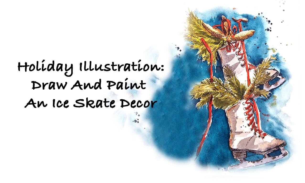
1. Introduction: Christmas is a favorite time
of the year for many people. During this time, we love
to decorate our houses and personal spaces
with things that we love and that we can relate
to and brings cheer. I am here with a cheerful
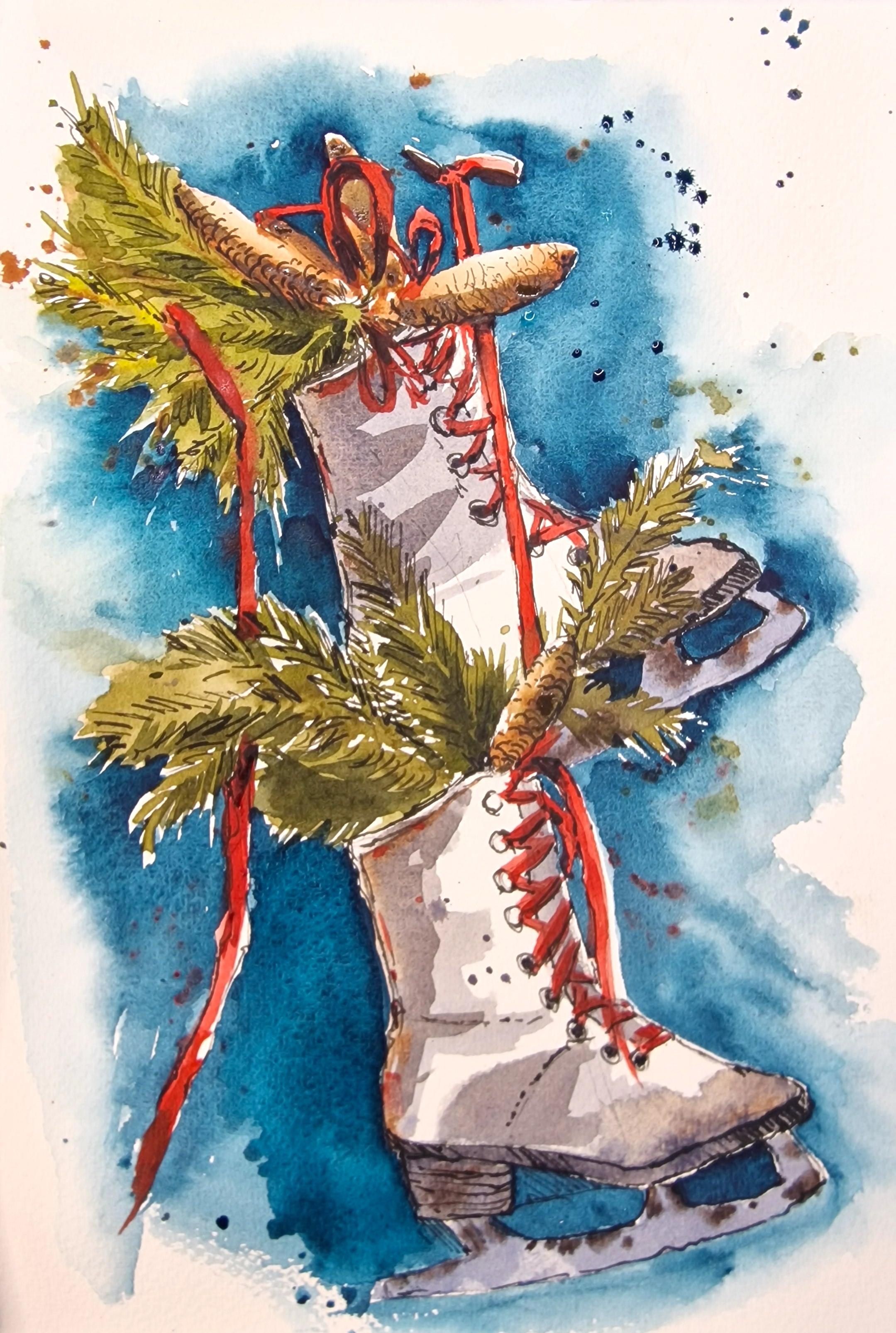
holiday illustration of a pair of winter skates
with decorations in it. I particularly like
this scene mainly because of how an old pair
of skates have been re, used to create the most charming decoration
in this class. I'm here to guide you step by step in the process of
drawing and painting, right from the basic
drawing techniques to the final product. Here are a few things that we will be exploring
in this course. First is observational drawing. Observational drawing
is the process of observing something
or even a photograph. Here in our class,
it's a photograph. We're going to observe a
photograph and learn how to draw by observing the basic shapes and textures in a photograph. I will show you how to build
this illustration right from simple shapes
to the details. We will also be learning some basic techniques
of watercolor wash, which is necessary
for this class. As well as that, I
will also explain a little bit about the
water to pigment ratio and how we can
control the water and the pigment while doing
watercolor wash on paper. We will discuss the use of pen over watercolor wash
to create value, to enhance your wash, and to create lots of
texture with your pen. To finish off, you can
also add an extra layer of water color to enhance your
wash and the pen lines, which is completely optional. We could also add a
background to it to make the whole thing Pop Illustration is a great gift to
someone special. It can also be made into
a card or gift tags, depending on the size
of your illustration. The reference picture was
taken from Unsplash.com It can be found in the projects and Resources
section of this class. You can also find
a line drawing in case you'd like to skip
the drawing part and go straight into watercolor wash. You can transfer this
line drawing onto your watercolor or
mixed media paper if you would like to start
painting straightaway. You can take this class at any level of your
artistic journey. If you are a beginner,
I have included all the basic details
that you need to know to create
this illustration. If you are in an intermediate
or advanced level in your artistic journey, this could be a
great inspiration for you to create
something similar and also to use the same technique for other
illustrations as well. The drawing and the
watercolor techniques that I have shared
here are really great to be applied to any drawing or painting
you may do in future. If you're interested,
stay on to find out more.
2. Suggested Materials: Here is a suggestion of all the materials that you
would need for this project. Starting off with
watercolor paper, I'm using 100% cotton
watercolor paper. You can also use any
other watercolor paper that you normally use. You can also use a
mixed media paper as we will be using a
little bit of ink as well. It would be great if it's a
mixed media paper as well. The ideal weight of
the paper is 300 GSM. You could also do 190 GSM. Anything lower than that could buckle your paper up when
you're doing washes. Next is a watercolor brush. I'm using a size ten
round pointed brush. It is ideal to use a
medium sized brush. It might be better that you
have a round pointed brush. You can also try with flat brushes if you're
comfortable with that. For pen, I'm using a dip pen with some waterproof
sketching ink. The sketching ink is
by Roher and Clinger. It is very versatile. It can be used in fountain
pen as well as dip pens, or even with twigs or feathers. Anything that you would
like to work with today. If you do not have a dip
pen or ink with you today, you can use a normal
ballpoint pen or a microtop pen,
or a doodling pen. The important thing is
that it is waterproof, so you have the freedom to
work over it with watercolors. With watercolors, I
am using water colors from tubes squeezed
out to a palette. You can also use a watercolor
pan with watercolor cakes. It is totally up to you and what you're
most comfortable with. Apart from this, you would also need a pencil and an eraser, and also some kitchen towels
and two jars of water. The reference picture
for this project can be found in the projects
and resources section.
3. Watercolour & Pen Practice: Let's practice some
watercolor techniques that is necessary
for this project. I will also suggest the pigments that I will
be using for the project, but you do not need to use
the exact same colors, especially for this
practice session. You do not need the
exact same colors. First, I'm going to
use some aqua green, which is one of the cal colors we'll be using in our project. I'm going to prepare a medium consistency wash. As you can see here
on my palette, the water color that I have just prepared is quite
flowy and watery. But at the same time, you can see there's
a good amount of pigment in there.
Let's try that. Onto the paper, you can
see a nice glaze of water. You can see that the paint
is slightly flowing around. This is the consistency
we would need for the first layer or
the first wash. Next, I'm going to use
some burnt sienna, which is a nice brown. I'm going to prepare the
pigment just like how I did aqua green by adding water
onto the watercolor cake. Just preparing it
on the palette. I'm going to prepare
a similar consistency as that of Aqua Green. Let's try that onto the paper. Now I can see it's a
similar consistency. It's got the same amount of pigment compared to aqua Green. I can also work over it
with some more pigment. Let's take some more
pigment and try to drop it into the wet area. I'm going to grab some pigments
straight from the pan. This time, I did
not wash my brush or introduce any more
water into this. I'm going straight into that pan where I
have burnt sienna. I'm going to introduce some
paint into the wet area. You can see how the
pigment just bled into it and has a soft
finish to it right now. This is a wonderful technique
to be used in our project. Today, I'm going to introduce some more pigment and I'm
going to try and touch the aqua green a little bit because aqua green is
also wet at this stage, the two colors are going to
bleed into each other and create a seamless wash.
Let's leave that to dry. Feel free to practice this
technique as much as you like. Playing around
with water colors. Just creating different washes
boosts your confidence. Before moving onto our project, now let's try sketching and painting a few elements
from our project. Today I'm starting
off with a pencil, doing a rough shape
for the pine cones. The pine cones are long and
almost like an ellipse. I've just done an
elliptical shape. I'm going to use burnt sienna just on one
side of that ellipse, and you can clearly see how I've left the other side of
the ellipse unpainted. Going to wash my brush clean, just drag out all the water
on the side of the jar. And let's run the wet
brush on the side of that wash. Just creating
a soft edge to that wash. This is a great way of creating dark and light or depth
in your illustrations. I'm just going to go into a
little bit of burn ciena. I can also add a little bit of darker brown like burnt umber. I'm going to work
over that wet area just giving some texture
using the tip of my brush. I've just dropped
in some pigment, mainly in the darker area. Just dropping in some
pigment for texture as well. We're going to leave that to dry and see how that works out. Meanwhile, we're going to try and sketch some pine leaves. I'm going to use
olive green for it. I'm also going to mix
a little bit of red. The reason why I do this is because green can
be quite bright. To create a more
realistic green, I prefer using a
small tinge of red. If you don't have olive green, a sap green also could work with a small tinge
of red with it. Let's try that onto the paper. I'm going to start
with a straight line. It doesn't have to be
perfectly straight, it's just a guideline
for the leaf. And I'm going to paint in
some pine needles here. You can see that I'm using. The tip of the brush to create that pine needles
and the texture. If you think the
lines that you drew are combining together like
how it's happened to mine, don't worry about it. As I said, this is going
to be the first wash. We would definitely
be going to go over it with some pen as well. Let's try another pine leaf with just a quick wash.
You can see here, there's minimum amount of lines. Instead of that, I've done a nice broad wash in
the shape of a leaf. We'll leave that to dry. Meanwhile, I'm going to
go back into Aqua Green. This time I don't
need a lot of water, but I need a lot of pigment. So I'm going to go into the pan and activate a lot more pigment, which means we have a lot of pigment and a little
bit of water. Let's try that onto the paper. You can see how dark and saturated that color
is at the moment. We're going to start
off with that. Now I'm going to
wash my brush clean. I'm going to use my
wet brush to start introducing some water on the
outside of that green wash. We did slowly begin to touch that green wash with your tip of your
brush and you can see how the pigment is
activated and how it's watered down into a
lighter wash. At this stage, you can also introduce some more pigment
into that wet area. You are going to get
a very smooth finish for this sort of wash. It's a great way, again, to do a quick wash for your line sketches or even
for our first layer of wash. It's a great way
to practice this. You can either start
with a light wash, like how we did
at the beginning, or you can also start with a more saturated wash and then introduce water to
lighten it out. You can try both ways and
stick to what you prefer. It's usually a personal choice. Let's move on to practicing
some ink sketches. The wash that we did before
with the pine cones and the leaves have to be completely dry before I do any sketches. If it's not dry, I would
suggest that you wait for it to dry completely or you can even use a hair dryer at this stage. Once the wash is completely dry, we can now begin to use
pen over this washes. I'm using my dip pen
with waterproof ink. I'm starting off with
the lower part of the pine cone where
there's more color. As you can see here, the color is in a gradation
from dark to light. I'm starting off with
the darker area. With the lighter area, I don't really want to
do a crisp outline. As you can see here,
I've just done a few suggestion of lines. I'm also going to add a little bit of texture
for the pine cones, Very short lines, curvy lines just to show the
texture of those pine cones. Also, again, I'm concentrating
more on the darker area, just creeping up over
to the lighter area. That way I give a
suggestion of the texture. Now let's move on to
sketching the pine leaf, starting off with the center, and then using quick short lines to add texture to the leaf. Again, I don't need to
add too many lines. I can add a little bit and
then be quite inconsistent. We just need to give a
suggestion of those pine leaves, the needle like leaves
just giving the texture. You can be quite loose with
your pen lines as well, quite free, and make sure that you enjoy the process
as you're doing it. As an optional next step, you can go back into
water colors and add a little bit more color onto
each of your illustration just to give it an extra
sense of depth and a little bit more value to the objects that
we have painted. So starting off with
the pine cones again, I added some burnt sienna. It was the same color
that we used for the first wash. You can see that the second wash is sitting on top of the
first wash and the line. But it gives an extra
sense of depth. It gives a little bit more
texture to the illustration. We'll leave that dry, and we'll do the same thing
to the pine leaves as well. I'm grabbing a little
bit more olive green, a touch of red, to just mute that green. It's not too bright
for that extra depth, I'm going to add a
little bit of deep blue. I'm using danthyine blue just
to mix that with the green, it makes it that
little bit darker. And I'm just going to add a few lines to
suggest darker areas. Just a few lines for
the pine needles. You don't have to cover all
the area with the lines. You can leave the lighter
areas if you like. It brings depth. We are finished
with our practice of the pine leaves
in the pine cones. We're going to do something similar for the project today. Another important technique
that we can practice now is to let the colors bleed into
each other without fear. Most of the time, when the
colors bleed into each other, we do get a little bit uneasy because it's
not in our control, which is a main character
of water colors. But I would say that it's a great idea to practice
this technique. To feel more confident, let's start putting
two colors together. I've used olive green first
just to depict pine leaves. Now I'm going to use
some burned CNA. Just deliberately get them
to bleed into each other. Keep it quite loose and you can see how the two colors are bleeding into each other. You might feel that there's
no control over it, but when it dries, it looks really beautiful. And it's great way
to practice and gain confidence and just watch the two colors bleed
into each other. You can even drop extra pigment into that area where it's
bleeding into each other.
4. Project - Line Drawing: Let's start with the project. The first step is to
draw a rough sketch. I'm using a watercolor paper. Here I'm using a reference. The reference picture can be found in the Projects
and Resources section, which is available
for you to download. The first thing to do is
to observe the drawing. I'm going to make very rough, simple shapes just to mark out where the skates
are going to go. From the reference picture, it is clear that the
skates on top is slightly at an angle compared to the
skates at the bottom. I'm just going to draw a
line to suggest the angle. The shape of the skates is completed using simple
geometric shapes. At this stage, I'm going to use a rectangular shape and somewhat like a triangular
shape, two different shapes. To finish off the
shape of the skates, I'm just going to mark out the shape of the
next skates as well. The only thing I need to
be remembering here at this stage is that the size of the skates
have to be similar. I'm going to measure
using my pencil, making sure that I have the
same size so that one is not larger and the other one is smaller measuring with a pencil. You can even use a ruler
or another pencil to measure if you don't want
to use the same pencil. Just looking at the shape of
that skates at the bottom, I can clearly see the slight
V shape for the heel. I'm just going to
capture that line. It slants down and
slants back up again. I'm going to finish off
the triangular shape. That's the front of the boot. Now for the heel, I'm just
going to add that shape there. Next, I'm going to add the
pine cones in the pine leaves. Again, simple geometric
shapes at this stage. Elliptical shapes for the pine
cones, again, very rough. Don't worry that
you're not getting a correct geometric shape
for the pine leaves. I'm going to add very uneven
shapes at this stage. Maybe for the longer ones, just the line is more than
enough at this stage, just drawing the direction of to where the pine
leaves are angling. And I think that's more
than enough at this stage. Now let's add the ribbons
so I can see a little loop, the bottom of that
skates there and a big loop of the ribbon
on the top right on top. Just make very rough
shapes at this stage. Or if you would like to
sketch the ribbon out, you can do that as well. You don't need to stick to the exact same position
for the ribbons. You can change it
according to your liking. Or if you don't want the ribbon strings to
be hanging down, like in the picture, you
don't have to do that either. Now I'm going to go in with a little bit more definitive
lines for the skates, adding a little
bit more details, finish the top of the boot. I'm going to add more finer
details like the ribbon, the lays of the boot, and the little holes
of the boot as well. You can even add the shape
of the boot at this stage, instead of having the
rough geometric shapes, you can go over it with a little bit more fluid lines just to make it look
more realistic. Now I'm going to add the
string that is hanging down, the ribbon that is
hanging down from the door or whatever
is in the background. Just marking that out. Again, observing my picture and just getting
the basic shapes. Now I'm going to finish off this skates using
more fluid lines, more flowing lines, that
looks more like skates. Now we're going to go over the geometric shape
that we have done. Now the geometric shape acts as a guidance
for our drawing. This way it's easier to get
more accurate drawings. Let's add some lines for the
lace of the boot as well. I'm just trying to copy the
lines I can see on the boot. You don't need to go
into too much details, just need to add an impression of the
lace that you can see. Here, Again, it's
just a pencil line, we're going to paint over it. You don't need to add too
much details at this stage. Now, let's move on
to the next skates. Starting off with the pine cone. Again, rough elliptical shape is more than enough
at this stage. I'm also going to mark out where the pine leaves are going to
go for the second skates. You can see the bottom corner
of the first skates is covered by the decoration
in the second skates. I'm just going to put
some lines there. I know that's where the pine
leaves are going to go. Now let's finish off
the top of that boot. You can see how that boot, or the shoe slightly curves
down towards the heel, giving it a nice shape. And now we can finish off the ribbons and the lace
of the shoe as well. I'm just going to
add more details like where the layers are going to go and the holes
of the shoe lasers as well. I'm giving that shoe a little bit more fluid
nature, more detailed lines. At this stage, you
can see that I am not going in a particular
order when I'm sketching. You don't need to follow the
same order as I'm doing. It is best to listen to the
instructions and observe the reference picture before you begin to try it on your own. That way you'd be able to understand how to get
this drawing right. It is also a great
way to learn how to observe a photograph or an object before
you start drawing. So these guidances are
just one way of doing it. When you begin to practice and get a hang of
your own style, you will have your
own way of drawing or getting an impression of
an object onto paper. Now I'm going to finish off
the lines of this shoe, the more detailed lines with
the curves and everything for the skates themselves. I'm going to mark where they
begin and where they end. And on this boot, I'm marking the front corner
and the back as well, which is attached to the heels. Then I'm going to just capture the shape with this, our initial drawing is finished. In the next video, we can start painting the first
layer of water colors.
5. Painting Skates (Layer 1 of Watercolour): Let's start painting the
sketch that we just did. The first thing
that we need to do is to prepare watercolor paint before we start painting a few minutes before
we start painting, it is a good idea to introduce some water into the colors
that you would like to use. If you leave it for
a couple of minutes, they will moisten
and soften out, which means it'll be
easier to create pigments. Now I'm going to create the colors that we
need for this sketch. I'm starting off with
preparing green. I have used olive green
with a little bit of red. You can either use a
Lazarin crimson red, or a permanent red. Some people like the
shade of crimson red, some people like permanent red. Either one should be fine to
mute down the bright green. I'm just going to try that
onto a scrap piece of paper. Next I'm going to try
some permanent red, which is the color
I'll be using for the color of the ribbon
and the shoe lace. I'm going to use burnt sienna, which is a lovely
rich brown color which is going to
be our pine cones. You can also mix it with a little bit of
cobalt blue to create darker brown or a gray shade for the darkest areas
of the pine cones. Or even for the shadow
color in any of the areas near the brown
color that we'll be using. Let's try to mix a little bit of cobalt blue with a tiny
bit of burnt N This time, depending on the amount
of brown you use, the color can vary between dark brown gray and bluish gray. I've created something that
is more on the blue side. This is like a
muted blue to gray. I can add a little bit more brown to create a little
bit more gray shade. Let's try adding a bit
more burnt sienna. You can see how the
color is changing. This is a great color
for shadows and to depict the shadows of the
white skates, especially. Now let's move on to painting this beautiful
Christmas decoration. I'm starting off with
the gray that we just prepared using cobalt blue and a little bit
of burnt sienna. And this is going
to be the gray, or the shadow color for
the shadows of the white. Now looking at the
reference picture, I'm slightly going to squint my eyes and see where
the darker areas are. And I'm just going to
paint them on to my paper. I've just placed the
colors you can see. Just simply placing that color, it can be blocks of
color at this stage. Don't worry about the
details right now. Over you can see a
darker area or a shadow. Just place that color
there on the white boot. Again, if you find
it difficult to find where the darker areas
or the shadow areas are, simply squint your eyes and the picture goes
a little bit blurry. That's when you actually see
a little bit of the shadows. We don't need the details, we just need that blurry
shadow details. Right now, right at the front of that boot, I can see a little
bit of brown color. It must be because
it's worn out. Just gone straight into the
pan of brown or burnt CNA. Just dropped that color into the wet area
that I just painted. You can also give
some little bit of details at this stage, like some brown or
red in the corners, just to show the
color on that boot. If you notice that I
did not go into washing my brush before taking
the brown from the pan. I just simply dipped in
straight away into that pan. The reason is because
I did not want to introduce any more water and
make this wash more watery. Again, I mixed some cobalt
blue and burnt sienna. Again, did not introduce
any water at that stage. Just finishing off the bottom of the sole of the
boot and the heel. They're all the same two colors, cobalt blue and burnt sienna. Just that the
amount or the ratio of pigment to water
is different. Right now, I'm working with very little water is
left on the palette. I'm just introducing
more pigment, making it slightly more darker compared to the
first wash we did. I'm just going to
add that darker gray into the details of
the boot as well, especially the little holes
where the laces would go. I'm also going to
add a little bit of gray onto the front
of the second boot, or the boot at the bottom. This is mainly because I can see a considerable
amount of shadow there, just underneath the bright
red lace of that boot. Now, just to keep
the whole thing a little bit more
flowy and loose, I'm going to introduce
some water on the outside of what
we have just painted. If you have wet paint, it is definitely going to flow into that wet area
I've just made. Which is exactly
why I'm doing that. I'd like the same color to simply flow outside
of the boot as well, just keeping the whole
thing loose and fluid. Now, I'm just going to introduce a little bit more shadow, especially on the left side. Again, just randomly, very roughly placing that dark color. Again, it's the same colors that we have been using so far, cobalt blue and burnt sienna. I also like to do a little bit
of spatters as I go along. And you can see the area outside the boot is nice and
spattery at this stage. Let's finish off
the skates as well. Again, it's the same color
that we have been using. I preferred a little bit more
blue to the skates itself. I decided to add a
little bit more blue compared to the previous
mixture that we made. You can definitely see that it's slightly more blue
gray than brown gray. Let's finish off
that skates now. If you can see in the
reference picture just to depict the rusty old skates, I'm going to introduce some brown dropping in
that brown into the wet, blue gray area of the skates, just letting it bleed
into that color. Doing its own thing, it's very effortless and
it's very therapeutic just to simply watch how the colors bleed
into each other, just creating a
beautiful effect.
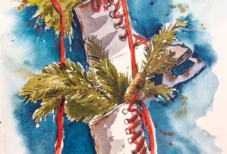
6. Painting Decor (Layer 1 of Watercolour): Next let's move on to
painting the pine cones. I'm using burnt N. We have
practiced this before. In our practice session, I'm painting just the bottom
of that elliptical shape, leaving a little bit of
unpainted area on top. I'm just going to mark out
the other pine cones as well. Also just introduce some water
dragging that paint along, lightening the top
parts as well. If you think you've
created a puddle there, you can lift out some pigment. Let's work on the
next pine cone. Again, the same process of
introducing burnt sienna and then introducing some water just to lighten the
highlighted area. Just let the colors bleed
into the wet area as well. If you think there's
too much water, then always use a kitchen
towel to just wipe your brush, dampen it, and then wipe out extra pigment
using the damp brush. Now introduce some more
brown to areas where there are pine cones hiding
behind the red ribbon. Really, you can see how
I am deliberately using that brown to let it bleed
into the other colors as well. You can also introduce
some more brown. If you think the first wash
was a little bit light, the wash is still wet. If you introduce
more pigment to it, it is still going to
be the first wash, just that some areas are
going to be slightly more darker compared to the
lighter wash you introduced. First, I'd like to keep the foliage or the pine
leaves as loose as possible. At this stage, I'm going
to wet my paper first. It is okay. If your brown bleeds into that vet area,
that's completely fine. Let's get used to the fact it
can bleed into each other. Now, let's introduce
some olive green which we had prepared earlier, just simply dropping into that
wet area we just created. Again, you can see
I'm just using the tip of my brush to do that. Also trying to do
some simple lines using the tip of my brush. Of course, because
that area is wet, it's not going to finish off looking like pine
needles at this stage, But if you do have
some drier areas, you can always try that there. To get some depth
into the foliage, I'm going to use some
lemon yellow fresh paint from the pan loaded
onto the brush. You can wipe out extra paint if you have
onto a dry tissue. Just using the tip
of that brush, you can create some lines. Especially the center
line of that pine leaf, maybe drop in a few pigment of lemon yellow
into that wet area. You can also use some fresh
burnt sienna, similar way, this time no water, just some fresh pigment
straight onto the brush. And just do a quick line for the center of
that pine leaf. Now let's move on
to the foliage. In the second skates, I'm going to use the
same sap green mixture to start doing the pine leaves. Like the first one, I haven't wetted the paper, but I've started to paint directly onto paper
using that color. Then I'm slowly
introducing some water, just loosening out and being very rough and loose
with the whole brush. There are two ways of doing it. One is to pre wet the paper and introduce
pigment into it. Another way of doing it is
to introduce the pigment, then add some water only in areas where you like
it to be loose, especially the second skates. I know that the pine
leaves are overlapping the first skates
and I don't want a huge puddle of green
on my first skates, which is why I decided to introduce color first and
then introduce some water. That way I have more control over how loose that wash can be. I'm trying to work around
a pine cone that is there, so I'm going to leave that
area unpainted and work around with green for the pine leaves around
that pine cone. Again, you can see that
the pine leaves are overlapping the
skate underneath, which is completely fine if your pigment on the
skates now dried. Which means you can work over it using an extra
layer of water color. It will nicely sit on top without activating the
watercolor layers underneath. That way, it's a great
way of overlapping watercolor layers creating
layers for your illustration. Now I'm going to finish off the last pine cone on
that decoration there. The green around it
has not really dried, so you can see how the green
is bleeding into the brown. But it doesn't matter
as we earlier, we are going to let them
bleed into each other. The only thing that I need
to be careful about is to leave a bit of unpainted
area for high lights, just like how you
have done here. You can also drop in
extra pigment of brown. If you want to
have extra pigment of brown into a wet area, the best way to do it
is to go straight into the pan of color and
not wash your brush. When you wash your brush, you would be
introducing more color, more water into your wash. Now let's paint the
ribbons in bright red. I'm using permanent red here. Begin with painting
the darker areas, using the bright red color. Again, leaving the lighter areas or the area for high
lights unpainted. You can always drag the
paint into that area, making it a lighter compared
to the other areas. You can see here that
I haven't really completed the ribbon shape. In the first ribbon, that is mainly because I
wanted a high light on top. In a minute, I'm going
to wash my brush and drag the paint
along into that area, just creating a lighter wash. So I'm just going
to add a ribbon that weaves through the foliage. And you can see when
I'm doing that, the green there has not
really completely dried, but I'm going to
do over it anyway. The reason being that I like the two colors to
bleed into each other, however little
bleeding that happens. It still looks nice when two colors have a connection
between each other. Let's finish off the
last of those ribbons. If you do like some
spatters of red as well, or if you want to add
in red to other areas, especially like how I'm
doing here on the skates, that was just a personal choice just to bring the
whole thing together. I wanted to add red. That's completely fine. And see where you
would prefer some red. It might just be some
spatters as well. See if you'd like to add more red somewhere within
the illustration. You can play around with colors the way you personally
want them to be. It doesn't have to look exactly like the reference picture. With this, we are done with the first layer of water color. It is almost done and we're
going to move into using ink.
7. Adding Ink Over Watercolour: Once the watercolor
wash is completely dry, we can now use some
waterproof ink over this wash to
create some depth, some texture, and some
dynamic lines in it. The ink that I'm using here is Rohorn, Clinger waterproof ink. It is great to use with fountain
pen as well as dip pen. I'm going to use a dip pen. If you do not have a dip pen, you can always use
a microtopopen. But just to make sure
that whatever ink you're using is waterproof. Let's start off with
the pine cones, the simplest shape in
this illustration, I'm inking the bottom
of that pine cone, or where we placed
water color first, where it's much more darker. I'm going to add a few dots and dashes just to bring in
the texture of pine cones. Let's move on to using ink on the ribbons and the other
areas of the illustration. We are using ink mainly
in the darker areas of this illustration where we
placed watercolor layers. That's where we're
going to add in. In. For example, if you
look at the ribbon here, I'm the area or the shadow of that ribbon with some ink just outlining that shadow area. I can even do some rendering or scribbling just to
show the shadow area. I'm going to try to keep the
lines very loose and fluid, just bringing in a dynamic
quality to our illustration. Let's try that with
the pine leaves, how we practiced
the pine leaves. In the practice
session, we're going to keep the lines quite
loose and fluid, just only giving it an
impression of the pine leaves. The lines themselves provide the darkest value
in our drawing. It just gives the
finishing touches. Then we can go in with a
little bit more water color to create more tonal
values using watercolor. Now let's work on this area where there's a cluster
of the ribbons, the pine cones and
the pine leaves. Where the edge of the boot is, it's definitely a lot more darker and there's a
huge amount of shadow. If you look at the
reference picture, I'm adding more lines
to depict that. It's just about finding the darker areas in
the reference picture. Just marking that in, just like how we did
with water colors. We always look for the
darker shadow areas and leave the others
a bit more lighter. When you're using
pen especially, we normally do not add lines
in the lighter areas at all. At least that's the
style I follow. But sometimes you might want to add some lines in lighter areas. You might think
that is necessary. By all means. If
you feel that way, if that is your style, please go ahead and
try that as well. The lines themselves provide the darkest value in a drawing, it just gives the
finishing touches. Then we can go in with a
little bit more water color to create more tonal
values using watercolor. Let's do the second skates in the same way that
we did the first one, so we're going to
use line to create value and texture in the
elements in that skates. While doing the shoe
lace especially, it's better to give a line only to the darker
or the shadow area. Here I have decided to place the lines on the
underside of the ribbon. Not on top is just a
way of showing depth. I feel it usually works
with just one line completed and leaving
the other end of the ribbon without
any lines on it. We can always go back on it
with a little bit more red. Once we finish using
the ink to finish off, I'm going to add a few lines
just to show the texture of the worn out skates and also the stitching on the
fabric of the skates, the sole of the skates as well. If you think you need
to add a darker area, you can do so by using short lines placed
close to each other, which is called rendering, which is what I
have done here on the sole of the
issue for the heel, just giving it some texture. Again, it's best to refer to your picture for
these little details. You can give the right amount of texture and also to give
the dark and light. It's always a good idea to refer to the reference picture. To finish off, I'm going to give a little shadow of
that skate underneath. With this, we are done
with using the pen. You could go a little bit heavier with the
pen if you like, especially with
the shadow areas. You can add more pen, make it really dark. That is one good style to go by. Another way of doing it
is to stop using the pen now and we can go back into
watercolors to finish off. It's really a personal choice or you could prefer to just stop where you are right now and
finish off the drawing. You can also decide to
stop at this stage because the illustration is
technically complete. But if you'd like to add
a little bit more color, then that is also
possible by using a little bit more water
colors or more heavier lines.
8. Adding Depth (Layer 2 of Watercolour): Once the ink is completely dry, you can choose to finish
your painting at that stage, or you can add an extra
layer of water color, only in the areas
you think you need a little bit more depth or
a little bit more shadow. Just to bring out the whole
illustration together, I would like to add
a little bit more contrasting colors just to make the whole thing
a little bit more. I am adding another
layer of olive green and a tiny bit of permanent red just to
make that green darker. This time, I am not
using a lot of water, I am using very little
water, but more pigment. My consistency of the
pigment is a little bit more thicker compared to
the first wash I did. I can also add some datherine blue for
a deeper green as well. I'm just going to add some
depth to those pine leaves. I'm not really painting the whole area of green
in a second are of green. But I'm only choosing the darkest areas where I like
to give some more shadow. That way the lighter
areas will begin to show more and that way I can add
more contrast to my sketch. I'm concentrating mainly
on the shadow areas. It is a good idea to refer to your reference picture at
this stage because you can clearly see where the
dark and the light are if you find it
difficult to see it. A little trick to do
that is to simply squint your ice and immediately you can see a nice difference of dark and light
in the picture. I'm just adding some
indathreine blue. Just for the deepest
tones of green. Especially where that cluster of ribbons and pine cones and pine leaves are just adding
a few brush strokes. It makes a huge
difference when you just add that very
few brush strokes. I'm going to do
the same thing for the second skates as well. There's a lot more shadow
areas in the second skates, especially where there's
a cluster of foliage. I'm going to leave some areas untouched because I'd like
those areas to stay a little bit more lighter so that way you can see more depth
in your illustration. With this, we have finished painting our Christmas
illustration.
9. Adding Finishing Touches and Background: This step in this illustration
is very optional. If you like a pop of color in the background,
you can do so. At this stage I am going to add a little bit of aqua
green for my background. I really love how the bright blue green color just brings out the whole thing, especially because
it goes really well with the
bright red ribbons. I'm going to work my way
around my illustration. I do not want to add any more
color onto my illustration. I'm going to be
very careful and go around my sketch using
only the tip of my brush. Being really careful,
especially with the foliage, I'd like to keep the texture of the pine needles,
the pine leaves. I'm going to use the
tip of my brush just to paint some blue green
in or aqua green in. Then I'm going to use some
water to just wash it down, creating a rather
fluid background. You can also wet the surface and then drop in some more
pigment if you like. We're going to try and
do it simultaneously. First we try dropping
in a thick pigint. Then we can add some
water to dilute it down. We can also introduce some fresh pigint straight
into that wet area, like how I'm doing now. And just let it bleed
and feather out. This way you get a nice
fluid, splashy background. So I'm going to go around
the sketch and finish off the background
in the same way now I've done the background. I'm just going to go
and check if I need to add any more colors
into this sketch. I do feel that the red ribbon
needs another splash of color because it looks a little bit faded when
the bright blue came in. Only in certain areas, especially the darker
areas or the shadow areas. I'm going to add a pop of red
just to bring that red out. Also, I'm going to
give a little bit of shadow just where the
ribbons are for this. I have used same red with a little bit of
the background color, which is aqua green. It gave me a nice
beautiful gray. And I'm just going
to use that to enhance my red ribbons as well. Finally, I'm just
going to add a pop of color for that
pine cone as well. For this, I have used burnt in the same color that
we have been using for pine cone and mixed
with Aca green again the background color just to give that
gray brown color. Our illustration of the
Christmas decoration in Skate is now complete with
the background as well.
10. Final Thoughts: I hope you enjoyed
creating this project. This project can be divided
into six different steps. Starting off with
the basic shapes for drawing and then building
on with details on it. The first layer of water color, or the watercolor wash, is the third step where you can let the colors bleed into
each other. Keep your wash. This really helps with gaining confidence with
the medium as well. Throughout this course, it is really important to
keep your watercolor washes quite loose and to deliberately let them
bleed into each other. You can choose where you want
to stop your illustration. Some people prefer just
to do the drawing. Some people might just want to go straight into
watercolor wash. There might be others
who just want to do a quick watercolor sketch, whatever stage that it may be. This illustration guarantees a beautiful effect
at each stage, no matter what stage you are at or what stage you
like to stop or start, it will be wonderful
to see your projects. Please make sure to share it in the Projects and
resources section. You can also use a
discussion section to communicate with me
and ask me questions. I can always help you out there. I hope to see some of
your work soon. Bye.
 Suzanne Abraham, Artist