Transcripts
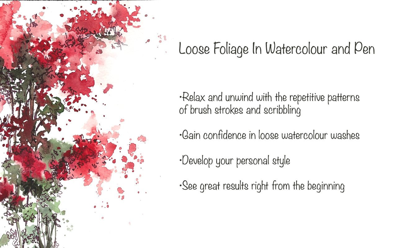
1. Introduction: Sketching is an emotion that
is inspired by the things around us or the things
that we experience, or the things that we
want to hold a memory of. Sketching makes a time or a place more special
and memorable. Sometimes I feel that it helps me get through
situations like waiting in an airport or sitting in a train,
or even cooking. I see them as carved out time for observing life
and things around me and always wonder how to translate that
into my sketchbook. Hello, I'm Suzanne. I'm an artist and
Albin Sketcher, and I worked predominantly
in watercolor and ink. In this class, we're
going to be sketching some simple fruits and
veggies from our kitchen. I personally spend a lot of time in the kitchen
prepping meals, putting away things,
washing up, et cetera. And as an artist, I cannot deny the fact that
I tend to observe things and always wonder how to sketch them more than cooking itself. Most of the time, I
have a sketchbook, some paper pens and
pencils in my kitchen. The subjects we have
chosen today are quite simple in form and shape, and they are easily available. You may use fruits and veggies that are
quite local to you. You don't need to stick
to what I have used. It is not necessary to create an exact likeness of what
we are sketching today. But instead, we are
only thinking of creating an impression
of what we see. And we can translate that
into our sketch books. The technique of
watercolor and pen is a great way of gaining
confidence with watercolors. And by using the simple
fruits and veggies, I hope to make the process even more simple for
absolute beginners. If you'd like to find out more, stay on for the next
video where I'll explain all about the
materials that we're using.
2. Suggested Materials: Here are all the materials that is required for this class. Starting off with watercolor
paper or mixed media paper. Watercolor paper can be
cold pressed or not paper. This one is 300 GSM. You don't need to have
such a heavy weight paper. However, the texture
of the paper is really great for sketching and for line and wash technique. You can also use a mixed media
sketchbook or a watercolor sketchbook if you'd like to
have them all in one book. The one that I'm using here is a 300 GSM watercolor
sketch book. You don't need to
have a heavy paper. You can go down to 190 GSM sketchbooks if
that works for you. I also particularly love
the rough texture or the slight texture of the
paper in this sketch book. Now for watercolor paint, I'm using a set of
watercolor pans. You can either use
watercolor pans or watercolor from tubes. For brush, I'm using
just one brush. Size ten, round pointed brush. You can also use size 12. You do not have a size ten. Along with this, you
would need a jar of water and some
kitchen tissues. Finally, for pen I'm using a fountain pen with
waterproof in Ca. You can also use a fine
liner or a microtip pen or a doodling pen as
long as they are waterproof as we'll be working
over it with water colors. These are all the materials that we need for today's class.
3. Explore Watercolour Techniques: Let's begin by exploring
the watercolor medium. We're going to wet our watercolor
cakes using some water. We're going to use more water to dilute the paint
onto a palette or a mixing area to make the paint a little bit
watery and diluted. It's a good idea to start using more water from your water jar. As you can see here, I am activating the paint from
the watercolor cakes. Then I'm going to go in and add a little bit more water from the jar to make
it more diluted. Now let's start testing it
onto our watercolor paper. The yellow is quite diluted
and light, it's quite watery. You can see a fair amount of water on the watercolor paper. You can't really see
any brush strokes, which means this is the
right consistency you need. Next, let's add a little bit
of red into that wet area. Keep the shapes rather simple. I'm creating rounded shapes
because we will be using more of these rounded shapes for the fruits and veggies
we'll be doing today. Now let's add some
ultramarine blue. And if you see that I haven't
really washed my brush completely between each
time I changed my color. This is mainly because
I didn't want to add any more water into
the mixed paint that I have once have placed enough colors and now I
can rinse my brush out. Now let's start
adding a little bit more yellow into that wet area. Because this area is quite wet, I have the freedom to
go into any amount of color and start introducing more color into this wet area. Every time I rinse
out the brush, I just need to make sure
that I'm wiping it off on the tissue so I don't introduce any extra
amount of water. You can also introduce
color straight from the pan as long as the
water color cakes are wet. You can also introduce some
color onto the wet surface. Again, practicing
the same techniques we did in the first shape. This time I'm
changing the shape. I'm also going to be
careful not to wash the brush while I introduce extra colors or more
colors into this wash. The watercolor cakes could get a little bit
messy at this stage, but if you introduce more water, the wash can be a
little bit more watery. At this stage, I'd
like to control the amount of water
there is on the paper. As you can see, I can
use this consistency to do a very rough sketch
using the watercolor brush. Keep exploring by introducing new colors into this wet area. It's always better mix on the paper rather than trying to mix a new color in the palette. As you can see here, I have introduced
red and blue onto that yellow shape just by placing that straight
onto the paper. Now let's try another color. You can use any color you like. This time I'm going to
see can water down. As you can see here, I've
introduced some fresh water from the jar into that
wet area with the paint. You can see how
you can dilute it and create a little
bit more softer edges. These techniques will help
you to keep your watercolor washes very loose
and nice and fresh. Let's practice these
techniques again until we feel
completely confident. Before moving onto our projects, let's start by
painting another shape onto a paper, watering it down. Using water from your jar, you can introduce another
color into the wet area. Just watch it bleed
into each other, just creating a
very soft outcome. I'm just going to try and see
if I can give some shadow to it just by using fresh
ultramarine blue here. Just some technique
that we will be using quite often in
our project today. I've used red and yellow and then I've just used some
fresh ultramarine blue. Just to play some shadows. I'm going to do
the same thing for the first shapes that I did. I have used a lot
of ultramarine blue for shadows in our project. It just bleeds and blends with the other colors to
create a perfect shadow. Let's try that again, and let's practice
these techniques until we are
completely confident. Finally, I find it
really relaxing and enjoyable to just spatter
some paint onto the paper. It also creates a
beautiful effect, especially if it falls
onto a wet area. I just simply love to explore the different angles at
which I can hold the brush. It gives you different types of spatters each time you hold the brush in
different angles. Feel free to explore spattering as well if you like,
to keep it loose.
4. Find Inspiration & Sketching With Pen: In this class, our subjects are pretty straightforward
and simple. We always have a range of fruits and veggies that can
be found in our kitchens. If you're a gardener,
you may like to sketch what you have
in your garden. Depending on the
type of fruits and veggies that you
prefer to sketch, you can find them in local farmers markets or supermarkets. You can use the fruits and
veggies that you can find in your local area and what
you prefer sketching. Also, I have provided
some reference pictures. If you'd like to work
from reference pictures, let's do some
observational sketches of some fruits and veggies. I'm starting off with a chili and I'm just going to observe
the shape of the chili. Understanding its
form and trying to translate those same
shapes onto my sketchbook. I'm using a pen
instead of a pencil, mainly because I'd like
to keep my sketches simple and not tend
to use an eraser. If it's a pencil, I might
concentrate more on the details of this shape and forget
about the main shape itself. It's always a good idea to use a pen if you are
starting to sketch, if you'd like to keep
it simple and at the same time enjoy your
process of sketching. I have used a fountain pen here. You can use any sort
of pen that you like. I'm just observing the chili, Just looking for the shape. Once I have the shape down
and then I can look for shadows and for the final
details after that, right now I've got the basic
shape of the chili and I've seen the beautiful shadow
that it casts onto the paper. If it's a small edge like this, you can always keep
it right next to the sketch on the paper. And it's easier that way
to translate the shape of that vegetable or any
object you're using in future. Finally, I can add some extra details like the
texture, the shiny quality. I can just mark out the light reflection I can
see on the vegetable itself. I can also look out for the dark and light areas and just simply
marking them out. It's all about observing
the vegetable, just translating exactly the
same things onto the paper. Don't worry too much about
getting an exact likeness. Drawing something and getting an exact likeness would
take years of practice. Besides, we're not aiming
for an exact likeness here, we're only trying to get an impression of the
shape of the vegetable. If you're interested in the
shadows and the reflection, you can attempt to
mark them as well. If not, you can just keep
it as a line drawing, just translating the basic
shape at this stage. Next, let's try a grape. I have made sure that it's
not a bunch of grapes, and it's just one single grape mainly because it
is easier to get the shape of the fruit when it's single
compared to in a group. You can look at it in different
ways and see if you can get to translate those
shapes onto the paper. Once you're confident with
using just one fruit, you may try to introduce
another fruit here. I've introduced another grape. I'm just going to
place them together. You can create a
composition of your own with a couple
of fruits as well, and see if you can get the shape of these two
fruits sitting together. It's going to be
slightly different when we were just
using one fruit. Right now it's two fruits. At this stage, I'm just
going to concentrate more on how them both together
look as a shape, always simplifying this shape. You can also look at how one is in front and
the other is behind. What areas of it is
not seen clearly, Or is there any
overlapping happening? For example, the front grape is overlapping the
grape at the back. You get an idea of how
I've sketched here. Feel free to experiment with. Turning the fruit around in different angles and
sketching them, if you like. Next, let's try a tomato. I'm getting the basic shape, which is an approximate
circle. An exact circle. Then I'm just going
to get the shape of the stem or what
is called sepals, which is the green bit that is right at the top
of the tomatoes. Because this is not
a botanical study, it's not necessary to
get an exact likeness. The best way to look at
it is just as a shape. Don't think of it as a tomato, but just think of it
as a simple shape. And you're just going to try and translate those shapes that
you see onto the paper. I hope that made sense. It is easier to just think
that it's not a tomato, it's just a shape you're
trying to get onto your paper. Once you've got the
shape of the fruit, now we can look out for the shadows, the
light reflections. I'm just going to look carefully for all these details right now. It's not entirely necessary
at this stage for you to capture the shadows
and the light reflections. But if you'd like a
little bit of challenge, it's a great way to look out for the shadows
and reflections. I'm going to use
very scribbly lines to depict the shadow areas, or the darker areas,
on the tomato. Our next fruit is a banana. Again, we're only looking
at a basic shape. Let's not think of
it as a banana, but just a shape in front of us. And we're going to try and translate that shape
onto the paper. It could be very different. When you start to draw it need not look exactly
like how I'm doing. You might want to use a little bit more thicker
lines if that's what you prefer or if you
like scribbly lines. Or if you want to mark out the basic shape in
simple geometric shapes. Once you've got the basic
shape of the banana, let's move into adding a
little bit of shadows. Just looking out for the dark
and lights in the shape. I'm going to mark that
out onto the banana. Finally, I can now add all
the little bits of textures and the dots and the different colors that
I can see on the banana, all these little brown dots. I'm going to mark it
in pen at the moment. Maybe later on if I'm going to do another sketch
with watercolors, I can always use water
colors to create this soft brown
marks on the banana. Next up is a beet root. I found this in my local
market and I instantly fell in love with the beautiful leaves and the texture
on the vegetable. I'm going to start off by getting an impression
of the leaves. It is quite broken and
cut off in certain areas, but it doesn't matter. I'm just looking out
for the main stem and the frilly leaves
of the beetroot. Just trying to
translate the shape. Again, not thinking
of it as a leaf, but just looking at it as simple shape and trying to
draw that onto the paper. Also, if you'd like,
you can also hold your vegetable I'm doing here. Instead of placing it
on a, or a surface. This gives you the freedom
to move it around, to look at it in
different angles as well. The angle at which I'm seeing, I can see the area where the stems come
out from the vegetable. I just absolutely love the
texture on this vegetable. Like we've done before, I'm going to add a
little bit of texture. I can see roots coming out of the little nodes
on the vegetable. I just absolutely
love how it looks. It just creates a
lot of texture. I just love the fact that I can use my pen to create
all this texture. Like any other fruit or vegetable that we have
been doing so far, we first get the basic shape of the fruit or the vegetable, then we move on to looking at the dark and lights
or the texture, whichever pleases you more. If you just want to capture the texture, that's also fine. The next fruit I have
chosen is the Humble Apple. The shape is really simple. I'm going to try
and translate that. Again, starting off with
a rap circle like shape, like how the apple is, I can see the top
and the bottom, which has a little
bit of dip in there. I can see the bottom
bits as well. I'm just going to add
all that texture, the ends of the apple, the little stem that
sticks out on top. I can also add some lines
for the different colors, the red and the yellow. I can see on the
body of the apple, just giving it a few lines just to show the
texture of that apple. If you prefer, you can
also turn it around in different angles and
try to sketch them. You will soon realize
that the more you observe it becomes
more enjoyable.
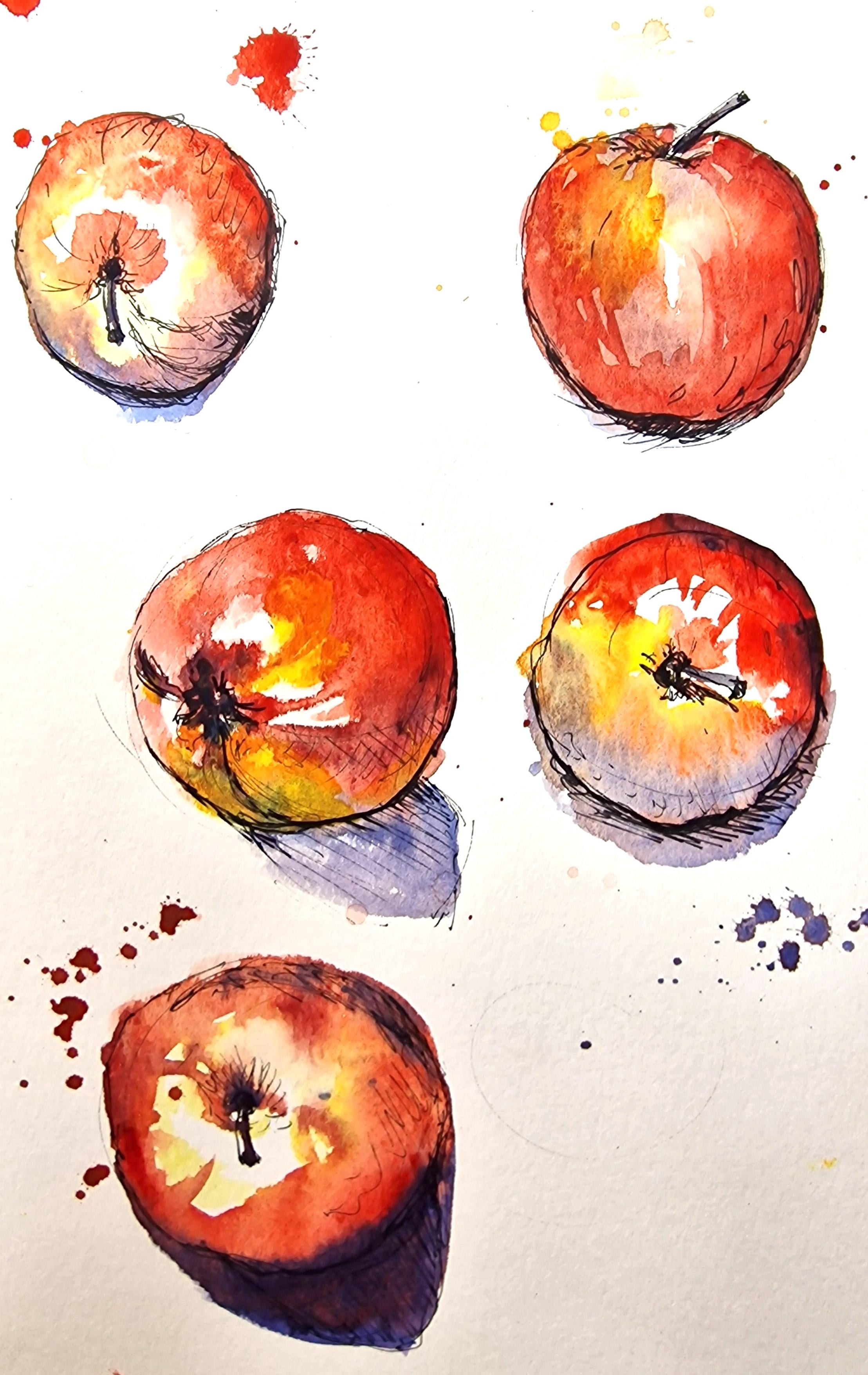
5. Project Using Fruit & Veg: Apple In Pen & Watercolour: Now let's start sketching
the apple in line and wash. Starting off with
pen and starting off with a basic shape of
the apple which is round. Then I'm going to look for all the details that make
it look like an apple. Just getting the impression of the shapes and the lines
that I see on the apple. Just doing the top of the apple, there's a little dip on the top. I've created these shot lines in an angle where I can see
it's the top of the apple. Now let's go over the shape
that we have created. Just making that line a
little bit more darker, creating the shape of the apple. First, we started with a
simple geometric circle, and then now I'm going
to add all the details. Just looking for the
imperfections on this shape and the little
dip of the apple on the top, as well as the bottom, making it a little
bit more squished up circle rather than
a perfect circle. Now we have the
shape of the apple. Now you can add in
a little bit of details like the shadow and some texture
that you can see. I'm looking for the shadow. I can see a little
bit at the bottom. Although I can see a larger
shadow around the apple, which is much lighter. I'm only going to concentrate on the main darker shadow
right below the apple. I'm using rendering line or
shot lines placed close to each other to create this dark shape right
below the apple. Take the process really slow. As you can see here, I
do pause quite often to observe what I've drawn and to keep observing
the object. It is a slow process. Now let's add some water
colors to this apple sketch. The colors that I'm using
here is cadmium free red. Or if you don't have
cadmium free red, you can use cadmium red or a
warmer red in your palette. I'm also using a little
bit of lemon yellow. I prepare both these
pigments in my palette, just ready for me to start using it as a wash
over the apple. Now let's start painting over the apple
using lemon yellow. You can see on the apple
the reference apple, how there's a bright yellow area to the left of the apple, and there's a nice amount of light reflection on the
center of the apple. I've just marked yellow around, leaving the center as white. Now I'm going to build in
using a little bit of red. I'm going very slowly keep
looking at the apple, observing it, looking out for which colors to
be placed, Where. I'm going to top it
in with a little bit more yellow
straight from the pan. Once I've got the colors placed, now I'm going to work on
where I'd like the highlight. Just lifting out some
color from the apple. Just making that high light
a little bit more obvious. I've placed the first
layer of water color. I do feel that the pigment
is a little bit washed out. At this stage, I would like a little bit more shadow and a deeper red bottom
of the apple. For shadow, I'm going to
use ultramarine blue. I'm going to dilute that on a separate area of the palette, not mixing it with red. I only briefly mix it with red. Not really mixing it
completely on the palette. I'm going to place it
directly onto the paper. Just watch how the blue and the red mix together
bleed into each other, creating a darker
purple shade on paper. I personally feel that it
is really great to try and mix your colors on the paper
rather than in your palette. Mainly because you can
create more fresher colors. This way I've placed
all the colors, I can see all the shadow
colors on the apple. I do feel there's a
lack of some red. I'm going to go in
and play some fresh red straight into that wet area. It is very important to go at your own pace
for these studies. If you think I am too fast, you can pause this video and
take it in your own speed. Finally, if you like to keep the whole thing a
bit loose and more fun, I like to do a little
bit of spatters. You can just spat
a paint around, see where it takes you. We're also going to
use a little bit of lifting out technique, which is lifting
out extra pigment or unwanted paint
from the sweat area. For this, you can use your
tissue and a damp brush and keep rubbing your damp brush over the area where you
want to lift out the.
6. Sketching Apples From Different Angles: Now, while this is drying, let's move the apple around, look at it in a different angle. You can create as many sketches as you like with this one fruit. Just try to capture the
shape in different angles. Just try to capture
the reflections and the shadows when it's
placed at different angles. I'm going to look at it
straight from the top. I can see the top of the
apple right in the center. Again, a rough circle
like shape to start with. It can be as scribbly and wobbly as you like embrace
your wobbly lines. I'm going to place the stem of the apple right
in the center. If you can see,
it's a little bit dark around the center area. Mainly because there's a, the shape of the apple
immediately outside that, there's a light reflected
or lighter area. As you can see, you may
want to mark that if you like to keep that as a
highlighted area as well. Also, you can mark the shadow again where you see the shadow. You can mark them, Darkening that area with the pen lines. Use your pen to the maximum. Use the different types of lines you can create
with the pen. Gain more confidence with
sketching and drawing. Observing a simple shape such as the apple here I'm marking out the shadow on
the bottom bit of the apple, just using the shock lines and marking out the light
reflections as well. Now let's continue the study of this apple in a different angle. I've turned it around to
the bottom facing me. I'm going to create the
shape that I see here. You need not use the same
angles as I am using. If you would like to prop up
your apple somewhere else, look at it from a
distance instead of looking down at it
like how I'm doing. Or if you want to hold
it up in your hand. That's also possible. Try out the different ways that you would like to
hold the apple. Try out the different angles and see what suits you better. Again, marking out
the shadows and the light reflections using my pen before I go on
using water colors. This way, when I start
using water colors, it leaves me a sense of
confidence to just go in and fill the area where I need to fill in
with water colors. I'm going to sketch
one last angle before I start
using watercolors. And I go by it using the same techniques as I did for the other three
angles of the apple. Now I'm going to start
using water colors. Starting off with
some lemon yellow. I'm going to place
lemon yellow in the areas I can see there's a little bit of
yellow on the apple. I'm also going to place in areas where there's
not a lot of yellow, but I know I can
still work over it with a little bit
of red as well, to create a mixture of the
two colors on the apple. Now I'm going to go in with
some fresh cadmium red. Just using my brush to gently move the color over the shape, You can see how wet it is by all the glistening of the
water colors on the paper. Right now, we're looking for a wetness and a looseness
in this style today. Just trying to gain
more confidence with using water colors
being really loose. Once I have all
the colors placed, I'm going to add in a little
bit of ultramarine blue. You can see how there's a darker area at the
bottom of the apple. And I've used some ultramarine blue straight from the pan. I did not wash my brush, which is why I had a
little bit of red on it, and then I just went straight
into ultramarine blue. Just creating this sort of. Mixture on the paper and a little bit of
spatters as well, just to keep the
whole thing loose. It's always important to see where I've left the high light. I can see a little bit of
high light on the top. I've not painted that area
to show the high light. Finally, I'm going
to place some fresh, ultramarine blue just
underneath that apple, just to show the
shadow that has been cast onto the white
paper underneath. Let's change the angle and start painting the other two
apples that we did. If you think your apple is
not sitting up properly, you can always prop
it up with something so you can get the
desired angle. Also, from the angle at which
I'm looking at the apple, I see more of red than yellow. So I started off using red. Again, I'm going to
start painting mainly looking for the highlighted
or the lighter areas. Not painting in the
lighter areas at all. Such as placing the color
in only the darker areas where I think there's a lot of color and there's no
light reflection. Once you are happy
with the color that you have placed and you
want to water it down, create a lighter wash. You
can use a little bit of water from your jar and just water
it down, making it lighter. You can see that
I've used a tiny bit of lemon yellow at the
bottom of that apple. There was no washing
of the brush involved. I went straight into lemon yellow and just placed
that there on the paper. The same thing I've done with
ultramarine blue as well. If you can see here, I have used a bit of
ultramarine blue. There was a bit of red
on the brush as well, which is why I was able
to create this sort of purple for the
shadows of this apple. I'm just going to place some
more for the shadows now. For some ultramarine blue. At this stage, you
can wash your brush and go into some fresh
ultramarine blue. Just getting the shadow color right at the bottom
of the apple and also the shadow that it casts onto the paper or the
doily sitting underneath. Now you can see, because
the whole thing is wet, you can also see how the red is slowly seeping into the
ultramarine blue shadow, creating a natural
mixture of colors. Now looking at the first apple, it looks very unhappy, quite washed out of the color. I'm going to go in with an
extra layer of water color, just using some fresh red to just bring back the
color of that apple there. And at the same time, being really careful
not to paint over the highlighted
or the white area. I can also use a little
bit of thin lines to create the texture
or the lines that I see on the apple itself also use some
lemon yellow as well, straight on top of that apple, because the layer
underneath is only 90% dry. It's not completely dry, but I'm just going to
go over it anyway. You can keep it quite
loose and enjoyable as well by using a little
bit of spatters as well. Now for painting the last apple, I'm starting off with some bright lemon yellow
on the left side, as I can see here in
my reference as well. And then I'm going to
go in with some red. You can see how when it's wet, the two colors bleed
into each other, creating a beautiful
bleed or beautiful effect without much effort from our side paint bleeds
into each other. I also would like to leave
the highlights as it is, making sure not to
paint in that area, being very careful to put a little bit more pigment in the center of the apple as well. The lesser brush
strokes that we use, it is more effective. That is just my personal view. I do feel that water color requires very less
brush strokes. Just placing the colors
where you think it's needed. The rest is done
automatically on paper. The pigments just bleed
into each other naturally. And it does create a beauty by not deliberately
painting over it. It's a good idea to
keep going back and forth to observe
the apples that you have painted and
see if they need any more fixing or any more
pigment to be placed there. It might not be the
watercolor pigments. You may want to leave it
to dry completely and you may want to add
some extra lines to it.
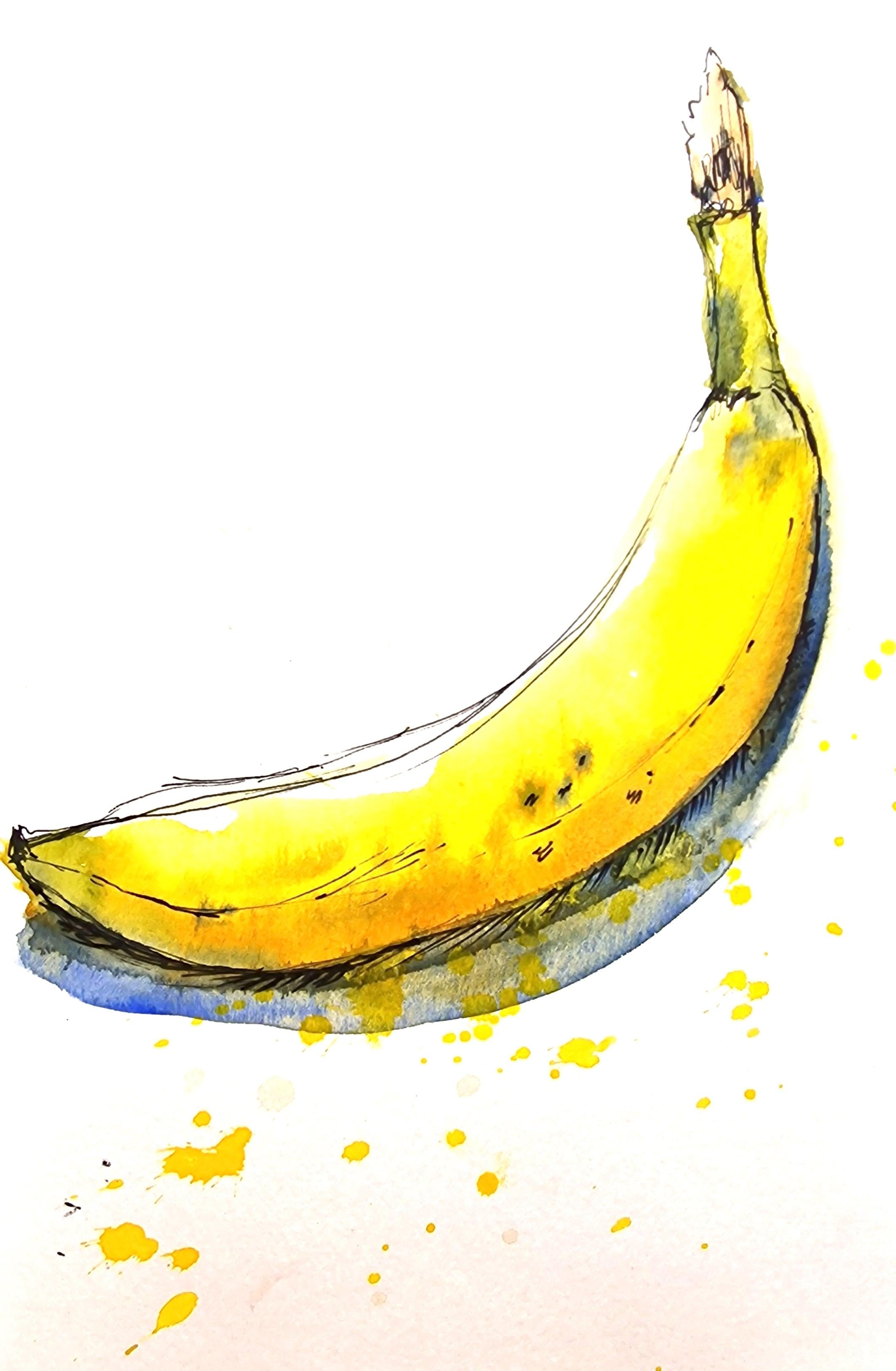
7. Sketching Bananas In Pen & Watercolour: Let's catch a banana. Now I have a banana
again from my kitchen. In my fruit bowl,
just got one of the most charming bananas I
could find in my fruit bowl. I'm going to start off
with using a pen to create a line drawing and also
to capture a little bit of texture as well
as I go along again, as we did the apple and
the initial pen studies, we are only going to get the
basic shape of the banana. We have already
practiced creating a banana shape in our first practice session
with using just the pen. And we're just going to
repeat that process again, creating a basic
shape of the banana. Don't worry if you feel
you're going wrong. As you can see here, I have made a few
wrong lines as well. In this drawing, the main idea is to
let yourself go wrong. And you can go over those
lines to create the right one. Sometimes these wrong
lines just act as a basic structure to create the right line and to create the right shape of what
you're looking at. That's how I personally see
it and it always brings me joy to see all the wrong lines in the wonky lines underneath. I do have a cluster of
different types of lines. When I sketch, it looks
almost like a scrible. I do personally feel that
this is a joy of sketching, just to create a lot
of scribbles and embrace your wrong lines, embrace the wonky lines, and just go about it enjoying the process as slowly
and steadily as you can. Once you've got the
line drawing down, you can either go on
and add all the details of the shadows at this stage
and the texture as well. Or you can leave it for
a little bit later. You could try approaching
this banana in a different way of having
a minimal amount of lines. And then maybe we can go into water colors at this stage
and see where it takes us. I would like to give you all different possibilities of how to go about a
drawing or a sketch. I would like you to decide
what works for you best. My course will just be an example of how
you can go about it. Now I'm going to prepare
some watercolor paint. I'm going to start with
some cadmium free yellow. Or if you don't have
cadmium free yellow, you can use cadmium
yellow as well. I am going to slight amount of Windsor yellow as well just
to get a brighter color. Or if you don't have
Windsor yellow, you can always use a
mixture of cadmium yellow and lemon yellow just to get
something in the middle. I'm also going to prepare
a little bit of green. And the green that
I'm using here is a rather muted one
called olive green. You can also use a
little bit of red to muted down if you think it's
your greens are too bright. Let's start with the basic bright yellow color
of the banana. Again, I'm painting
the area where there is more color and
less light reflection. From the angle at which
I'm looking at the banana, I can see a lot of light
reflecting on the left side. I'm just going to leave
that unpainted for now. Just going to use some
water from the jar to run it through the edge
of that painted area. You can see as soon as
I introduced water, the paint began to seep
into the wet area. Now I'm going to place
some fresh cadmium yellow. At this stage, you can see the stark difference of a brighter yellow and
a cadmium yellow. Which is why initially
I decided I would like a mixture of a bright
and warm yellow. You can see there's a
huge difference already. I'm going to use a little bit of orange and a little
bit of ultramarine, very tiny bit of
ultramarine blue. You can see it's almost going
into like a brown shade. I'm using that as my basis
for the shadow color. If you don't have orange, you can always mix
cadmium yellow with a bit of red and some
ultramarine blue, you get a orangish
brownish color. Going to use that brown mixture again if you think the
first mixture was. Two orange. What I've
done here is just gone into some ultramarine blue and placed it straight
onto the paper. And you can see how
the colors mixed very well on the paper
using the same color. I'm giving it a few
texture details as well. I can see a little bit
of green at the top. I'm just going to place
a little bit green, although I don't want to
give it too much green. Just dabbing in some color. Not really overly painting it a little bit of green
at the other edge as well. Again, if you can see how
my brush strokes are going, I'm not really
painting just using the tip of my brush
just to drop in color. Let it do its work on paper. Again, if you want
some deeper shadows, you can go straight into some ultramarine blue because the yellow is still quite wet. When I'm introducing
ultramarine blue, you can see how the
yellow is seeping into that wet area
I've just painted, which is completely fine. We would love to have the two colors bleed
into each other, just creating a natural effect. Again, with the ultramarine
blue on the tip of my brush. I'm just going to drop
in some color into that wet area just to give it
some extra texture as well. If you watch the
shadow area closely, you can see how the
yellow has now seeped in. I'm going to go over it
with some ultramarine blue. You can see I was able to
cover it very slightly, but I know the yellow is still going to seep
into this area, which again, as I said
before, is completely fine. I'm just going to make the
shadows a bit more wider as I can see in my reference now. Just to wash my
brush clean and grab some more fresh ultramarine blue just to finish off that shadow. Now observing the shadow on
the top area of the banana, I can see it's getting a little
bit too watery and muddy. I'm using a lifting
out technique here to lift out some
pigment from the top. As you can see here,
I'm washing my brush, wiping it on the tissue
to create a damp brush. Rubbing that damp brush around the area where
I want to lift out some pigment to create the soft effect on the top
right corner of the banana. And after a brief pause, I haven't let it completely dry, but maybe it has
dried a little bit, and now I'm going to
go in with a little bit fresh, ultramarine blue. All I'm doing here, I'm not adding different
layers at this stage. The whole wash is
still quite wet. I'm just introducing
some extra color. Just bringing out the colors. I can just place the
colors there and let it bleed into the area
you can see here. Now the ultramarine blue is sitting nicely in
that shadow area, creating a beautiful three
D effect for the banana. Now let's give some
depth to the banana. Right now, the green
edge of the banana. I'm going to darken it just by mixing ultramarine blue
with the green I was using. Just dropping in
some pigment there, let it blend and bleed
into each other. Once it dries, we can
always create more texture. Finally, I'm using a
little bit of burn cana, right at the top of
the banana where I've taken it out from
a bunch of bananas, you can see it's gone a little bit brown
at the top already. I'm just going to use
some burn ciena there. With this banana
sketch is finished, I would like to give the whole thing a bit
more, loser look. So I'm going to spatter
some bright yellow. Feel free to move your hands quite dynamically to create those
beautiful spatters. It will really bring out the whole sketch and just
create a beautiful lose effect.
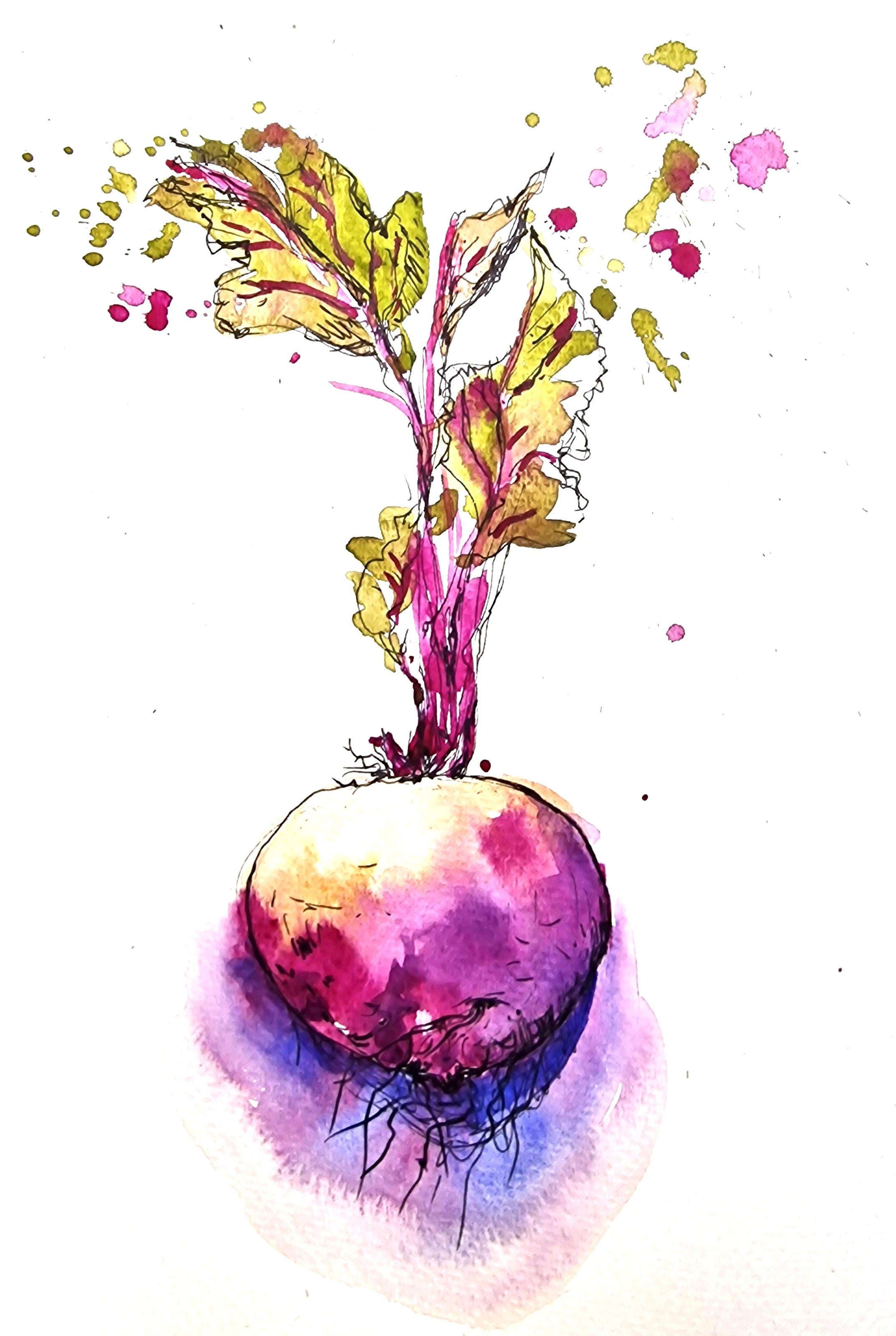
8. Sketching Beetroot In Pen & Watercolour: Now let's sketch a beet root. I found this vegetable in
my local farmer's market, and I absolutely love the
shape of this vegetable. I love the beautiful
leaves and the roots, and the nodes that come out
of the vegetable itself. I'm going to arrange
the leaves and the vegetable in an angle
that I would like to sketch. You don't need to arrange your vegetable in
the same angle. You can arrange it in any
angles that you like. We'll start off with a pen, like we have done with the
other sketches as well. Getting the basic rough shape of the vegetable using
very light scribbles. Now let's start adding
the little details like the root and the
node of the vegetable. You can also add
little tiny roots coming out of those nodes. That is all the texture
of the vegetable. I think I, I personally love all these texture
on this vegetable, which is why I think I started doing that first before
I did anything else, just completing the
shape of that vegetable. I'm going to start adding the stem and
the leaves as well. The stem and the leaves at this stage looks
really complicated. Let's simplify it a little bit. All we need to get
is an impression of the leaves and the stem. So I'm just going to
add some long lines, a little bit wobbly
lines as well, to create the texture of the
leaves that I can see here. I can also see the top of the beetroot is a little
bit more texture. It's got a lot more
grooves and nodes as well. As I go along, I'm going
to start by adding these fly loose looking
leaves as well. Again, the leaves do look
a little bit complicated, but let's simplify and just sketch the shape
that we see here. The best way to do it
is to slightly squint your ice and your image
becomes a little bit blurry. And you can just concentrate on the main shape of the leaf. You don't need to add a lot
of veins of the leaf as well, but if you do want to, you can add the main
veins which is bright, reddish, pink, or
mauve in color. Once you've got the basic shape, you can now begin to
add the shadows or the darker areas as you can see here in your
observation reference. I'm going to add that
shadow that I see here. I can also see a little bit of a shadow of the
roots as well. Any texture you think that
works for the vegetable. Let's start using
some water color now. The pigment that
I'm going to use here is permanent morph. I'm going to start by
placing fresh color straight from the pan
without diluting it. Let's wash our brush in the jar. I'm going to use a little bit of yellow occur for the top of the beet root because I can see a little bit of
brownish, yellowish color. I didn't want to
make it too brown. However, if you can see here, I am letting the
color mix with Marv. It's automatically
creating a brown. As again, we're just
going to try and mix the colors on the
paper rather than mixing it on the palette so
you get more fresher colors. And color transitions also
placed extra permanent mauve, and this time it was less
water, more pigment. So you can see it's
sitting on top of the first wash to
lift out some color. On the top left, just where I
can see a light reflection. Finally, let's go into doing
the stem of the beetroot. I'm using permanent mav. Again, for this you don't need to add too many
stems or details maybe. Stick to the main stems just to enhance the impression of the leaves and the stem. I'm going to add some spatters. Also a little bit of leaves. I'm going to use a bit of
olive green for the leaves. Again, it doesn't matter if it bleeds into or touches
them of the stem in, we're just going to
let it bleed into each other and create a
beautiful effect. Finally, I'm going to use some fresh ultramarine blue to create the shadow that
I can see at the bottom. Again, you can see that the mav bleeds into ultramarine
blue as well. I'm going to dilute that wash using some
water from my jar. You can see how the map just dynamically bleeds
into that shadow area. Now let's top it up with a
little bit of blue as well. I'd like to preserve the map that has
bled into this area. I could probably use that
as the little roots that come out of the nodes of
the beet root as well. The shadow area here
looks really dynamic. I'm going to stop
using the brush over it because I'd like to preserve this dynamic
bleed of colors. Don't forget to have
a little bit of fun with the
watercolor techniques. Here I am watering down the ultramarine blue
or the shadow area. You can see how the colors just dynamically bleed
into the wet area. I just absolutely love to
watch the colors bleed, is why I decided to enlarge
the shadow area as such. Now I'm going to let
it dry completely. If you do have the time to
let it dry completely and come back to it later,
that's absolutely perfect. Or if you feel you don't have enough time and you'd
like to get on with it, then it's a good idea to
use a hair dryer to dry it. Here, I'm using a hair
dryer just to dry it completely so I can work
over it with a second layer. Now that it is completely dry, I've decided to go into it
with a little bit of pen. I'd like to enhance a
few of those lines. I'm also going to add
more roots at this stage, so you can see the little nodes that I've created using the pen. And I'm going to add a
few more roots in there. I just love the texture that it creates when you
have more roots, especially in the
shadow area where the mauve bled into
blue earlier on, I'm using that area to create
more lines to show roots. Also to darken the bottom of that beet root just for
darker areas, shadows. There's also a bit of shadow
in between the stems. At the top of the vegetable, a few pen lines,
a few scribbles, creates a great impression of the stems and the
shadow that it casts. I'd also like to
add a little bit of contour to the leaves
that we painted. Just to show light reflection. I am making sure
that the contours are not touching the watercolor wash. As
you can see here, there's a little bit
of white space between the watercolor wash and the
contour I've just drawn. This gives the resemblance of light reflection that you
can see on the leaf here. I'd like to go back briefly into some water color because I feel I have missed out
a few leaves here. There's a lot of white space where I'm doing the sketch right now using the watercolor brush. At this stage, I can also add in some more details of the leaves, especially the
veins of the leaf, which is bright, mauve in color. I'm just going to add that in the watercolor wash
underneath has dried out, which allows me to work over it without the first
wash being disturbed. Now for some more shadows
for the beach shot, especially the bottom
of that beach. So I'm going to use
some ultramarine blue. Again, only as a thin layer of watercolor wash because the first layer is
completely dry. The ultramarine blue
is just going on top, creating a nice translucent
shadow for that surface. This layer that I
have placed now is leaving a hard edge,
as you can see here. I'm going to use some
water wash my brush, and use that watery
brush to soften the hard edges that harder
edges have gone now. Finally, I'm going to
top up the shadow with a little bit more
ultramarine blue again, because the first layer
has completely dried, the second layer sits
beautifully on top, creating the translucent effect.
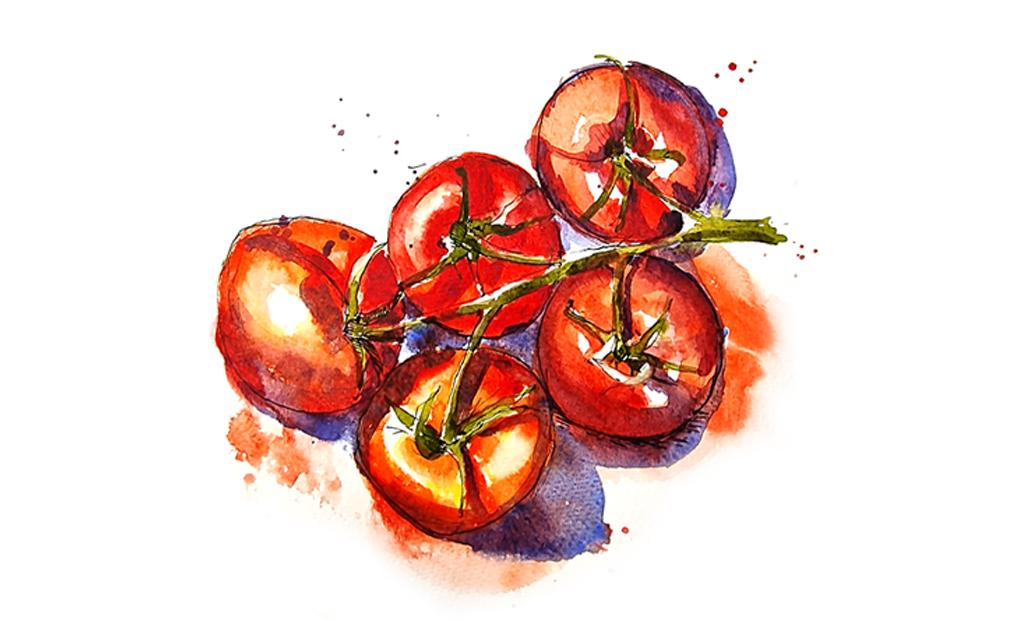
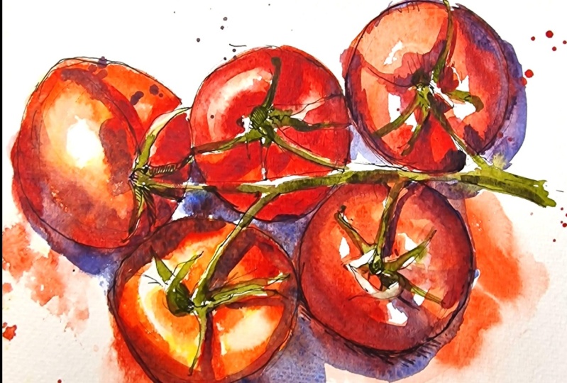
9. Project using Reference: Sketch Tomatoes On The Vine: In this video,
we're going to use a reference picture of
some tomatoes on the vine. The reference
picture can be found in the projects and
resources section. You may also use some real tomatoes on the vine if you'd
like to observe them, or if you don't prefer
doing tomatoes on the vine, you can just do an individual
tomato at this stage. The reason why I've
decided to use a reference picture
is to also give you an option of using reference pictures if you're comfortable doing it that way. Here I'm starting off with
simple geometric shapes. Proximate round, circle like
structures for the tomatoes, which is six in number here. Now I'm going to add the
vines of the tomato. Just looking at the basic
shape and the angle of these vines where
they are connected on the tomato and the
little sepals or the end bits of the tomato that connects the stem
to the tomato itself. The best way to go about
it is to squint your eyes, look for the main basic shapes, and maybe translate the shapes that you see or the angles of the lines that you see here. It doesn't have to be accurate. You can just get the
likeness or the resemblance of what we see in the reference picture
or on your tomato. It's all about creating
the impression or a resemblance of what we
are trying to draw here. The sepals of the tomato may look really
complicated at this stage. The best way to go about
it is to simply look at the direction of how they
are twisted and turned. You can simplify it. You can also take the
process really slow and observe how they are
and give it a try. But I would suggest not to
get too stuck on the details. We can just get an impression or a slight resemblance and that should be more than
enough for this sketch. In the end, it's all about enjoying how to observe
and it's a learning curve. As long as you're
enjoying the process, that is what counts
more than anything. I'm just going to go
around the tomatoes and get the shape of the tomato a little
bit more accurate. In the beginning,
I had just started off with a very simple circle, and now I'm going to use darker lines just to get the shape of
that squishy tomato. It's not really a
perfect circle, if you observe they're a little bit squished
here and there, and it's got lots of light
reflections and little dense. I'm also going to add some shadows where I can see the shadows on
the tomato as well as the light
reflection I could the highlighted the bright area
on the smooth, shiny tomato. I can also add a
few lines to show shadow where there is a
darker color as well. It's all about marking with your pen where you would
like to put a darker color. Again, let's continue drawing all the other tomatoes
in a similar fashion. Now that I've finished
the line drawing, I'm going to using water color. I'm going to start off by preparing the
colors that I need. I'm starting off with
preparing cadmium free red. Or if you don't have
cadmium free red, you can use cadmium red as well. I'm also going to
prepare a little bit of cadmium free yellow,
or cadmium yellow. If you look at the
reference picture, you can see that the
tomatoes are red in color. As well as that, you can
also see a little bit of orange in the
lighter areas as well. Instead of using orange, I'm going to use red and
yellow and get them to mix on paper to create a
more fresh natural outcome. I'm also going to
prepare a little bit of olive green for the stem
and the vine as well. If you look at the
consistency of the colors, you can see it's a
little bit watery. It's not too thick. At the same time,
it's not too watery. It's somewhere in the middle. Let's start placing
yellow onto the tomato, mainly in the lighter areas. And at the same time, making sure to leave a few
highlighted areas unpainted. Almost immediately,
I'm going to start using red over the yellow, so you can see how
they both mix on paper to create a lighter
red to orangish color. Let's continue painting
the first tomato and always be mindful of
leaving the highlights. If you feel you need more time
to complete your painting, you may pass the video and catch up with me
at your own pace. Another option is
for you to observe and watch the video and it, and try it in your own pace. It gives you a
better understanding of what you're painting. It also reminds you
to keep looking at the reference picture to
finish off this sketch. Now the first layer is
done and I'm going to use a damp brush to soften the edges of the
highlighted areas. As you can see here, it
is a good idea to have a kitchen towel with you
to wipe off extra paint. Once you're happy
with the highlights, now let's move on to doing the darker areas
of the tomatoes. I'm starting to
prepare more paint. This time I'm using cadmium
free red and a little bit of alizarine crimson red
to get a deep red mixture. You can also use elysarine
crimson red on its own without mixing it with cadmium red as we already have it on the paper. All you need to do
is top it up with a little bit of crimson red. You can see here
that I'm placing the crimson red only
in the areas where I feel is a little bit more darker because the
area is quite wet. You can see how the color has a soft finish to it when
you place it on the paper. Of course, I'll always love to spatter some paint
just to create a looseness in my sketch and also a reminder to
enjoy what I'm doing. Now let's move on to
the second tomato. In a similar fashion,
we're starting off with cadmium yellow or
cadmium free yellow. I'm placing the yellow
in the areas where I think needs a lighter or
a more orangish color. Again, mindful of leaving high
lights or unpainted areas. Now the next step
is to go on and add some cadmium free
red or cadmium red. You can see how you create a nice orange because the two
colors are mixing on paper, there's very less
effort for you to try and get the right
color on the palette. Instead, let them
freely mix on paper. I'm going to make sure not to paint over the
highlighted areas, leaving lots of white right
at the top where I can see lots of light reflection
in the reference picture. Once I have these colors down, the next step is for me to get the darker areas of the tomato. Next, I'm going to use a little bit of
Alizarin, Crimson Red. This time I have less water. I'm using the paint
straight from the pan. That way I'm able
to place the color on top of the first
wash and let them bleed into that wash without any effort Just placing the color wherever I think
there is a darker area, it doesn't matter if you
think the whole thing has gone outside the line
or it's too watery. It's a good idea to wait
for it to dry a little bit before you begin to work
again, if that's the case. Now, I'm quickly going
to wash my brush clean. I'm going to use my wet brush to run it along the
outside of this tomato. The reason why I'm
doing this is to make the whole water color wash a little bit
more loose and flowy. And you can see because
the tomato is still wet, the colors are bleeding outside
the tomato shape itself. It's just a fun way of
creating using watercolors. I personally love enjoying the flow of water
color on paper, which is why I have deliberately decided to run the
colors outside the box. Now we're going to finish off the other tomatoes as well in the same method using
cadmium pre yellow first. Then go in for cadmium free red and top it up with a little
bit of alizarine crimson red. Only in the areas
where you think you need a little bit of darker red, where you think there is shadow, you can also spatter
and also use your Brush to run the colors
outside the shape of the tomato to create
a more loose effect.
10. Tomatoes On The Vine: Finishing Touches: The water color on the tomatoes are only
just beginning to dry. However, I'm going to start
using the shadow color. At this stage, I'm going to prepare some ultramarine blue. It's not a very thick
wash. At the same time, it's not a very watery wash, it's a medium consistency wash. Let's use this mixture to
paint the shadow areas. Firstly, I'm going to place the color where I think there's quite a deep shadow or there's some shadow that is cast onto that wooden
plate underneath. Just looking out for the shadow
shapes and painting them. Don't worry about details
or accuracy at this stage, because we're only trying to get the main shadows at this stage. Let's finish painting
the ultramarine blue, especially in the areas in
between the tomatoes as well. It is ideal to leave the
vines white at this stage, we will be working on it with a little bit of green later on. Once this dries,
if you're able to, it's good to leave
that area white, but don't worry if you
have accidentally gone into the vine area and
painted it a little bit, which is completely fine. We can use the
lifting out technique again to lighten the
paint in that area, or you can even paint over it, whatever works for us at
that stage, we will do that. You can see that the
areas where I've placed the ultramarine
blue over red, it is not really mixing
very much into red. But it is sitting on top. This is because the color
underneath have begun to dry, although it's not
completely dry. And you can see
the effect mainly on the cast shadow areas
outside the tomatoes. You can see there's a little
bit of red underneath. I'm also going to
capture the shadows that the vines are
causing on the tomatoes. In some areas I would
also like to gently mix a lizarine crimson along
with the ultramarine blue, just to get like a deep,
maroonish, reddish shadow. And mainly to paint in the areas on the tomato where I'd like a little bit
more deeper red. You don't need to mix a
lot on the palette again. You can just have both
colors on the brush at the same time and paint
with that to create a nice, beautiful transition of
these colors on the paper. Here you can see on my palette, there is a little bit
of ultramarine blue. There's a slight bit of crimson red in the
mixture as well. However, I've not really mixed it completely to
create a new color. You can still see
those two colors separately on the palette. And I'm using the brush to
paint over these tomatoes, let them mix on the paper. Sometimes it's a
really good technique, especially if you
would like more red and a little bit of blue
in the shadow areas. For example, the lighter
areas of the tomatoes. If you prefer more red, but you still need
a bit of shadow, then you can vary the amount of red and blue in your
shadow color mixture. For example, the area of the tomato that
I'm going to paint. Now I would like a deep red rather than ultramarine
blue itself. So I'm going to use the deep red with a little bit
of ultramarine blue on my, to create this beautiful
shadow effect. Now let's prepare some
green to do the vines of the tomatoes because the layers underneath are still quite wet. I'm going to be really careful only to introduce a
little bit of green and really careful that it doesn't over into the
layers underneath. It can mix a little bit because that just
brings out the beauty of water color medium when you have colors bleeding
into each other. But at the same time, we would like to leave a
little bit of highlights or unpainted areas to show light reflection on
the stem as well. I'm just going to
be very careful to gently paint in
only a few areas. You could still leave a few
of them as white, unpainted. If you think it's too wet to be working on the sepals
of the tomato, then you may want to leave it for a little
bit longer to dry. Once it's completely dry, I can now go in and
use a little bit of olive green to finish painting
the areas I had left. I'm using olive green
to paint the sepals. The sepals are the
connecting area between tomatoes and the vine. I just wanted to leave
a lot of white space for the reflected or the
lighter areas of the sepals, as well as the vine, which is why it was ideal for the whole thing
to dry before I went in with any more
green at this stage. Because it's dry, I can now work over the red as well with
a little bit of green. It would just sit on top without blending into the
colors underneath. Finally, I would like to
mix the olive green with a tiny bit of crimson
red and a tiny bit of ultramarine just
to bring out a darker green for the
shadow color of the vines. It's not entirely necessary, but a few dabs of this
mixture here and there would bring out the whole thing and give it a more
of a three D look. With this, we are
finished with the sketch of some lovely
tomatoes on the vine.
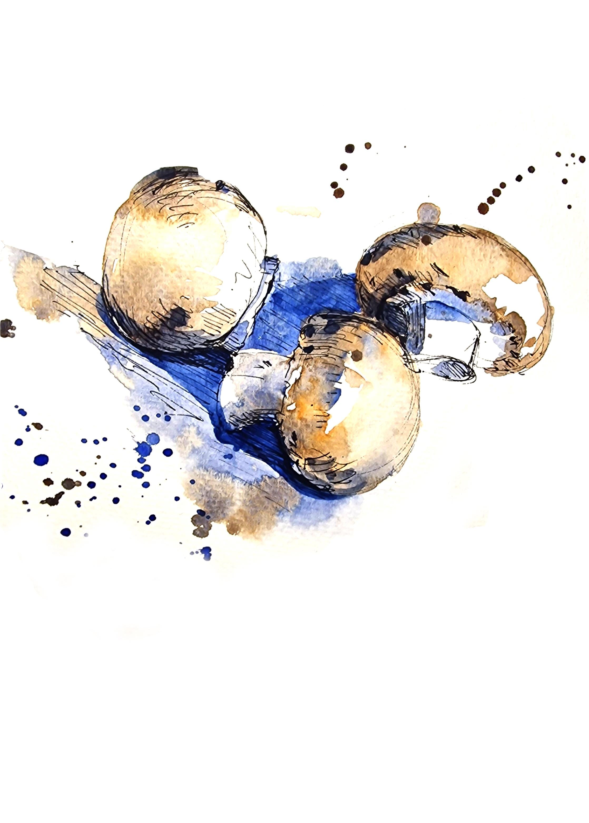
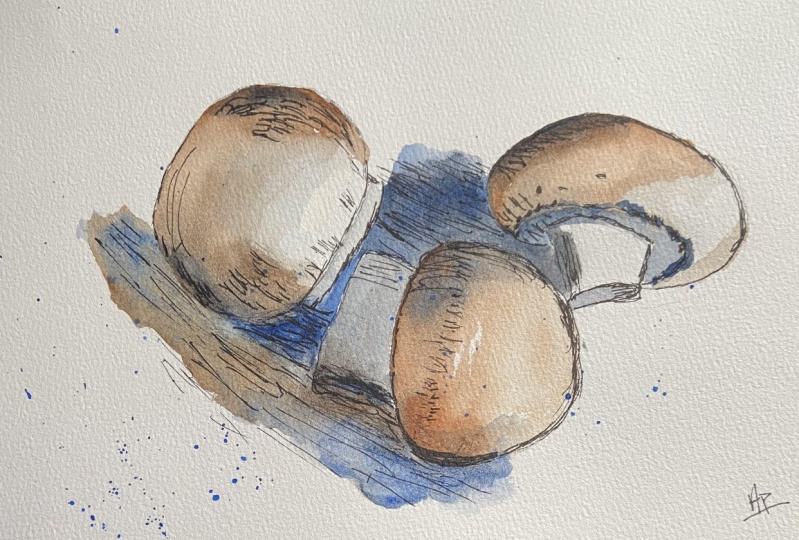
11. Sketching Mushrooms Using a Reference: Our next sketch is that
of some mushrooms. The reference
picture is provided in the Projects and
Resources section. You may also use real mushrooms as references if you prefer. I'm going to start off by
sketching using my pen, trying to capture the basic
shape of the mushrooms, the position at which they
are placed, et cetera. Mushrooms are a great
vegetable to sketch mainly because of
their simple shapes and the muted colors. You may also use a
white button mushroom, which has no color at all, which means you can work
mainly on the shadows. Here, I'm starting off
with the first mushroom, just getting the basic shape. When you are sketching
more than one item, it is a good idea to
look at how they are placed and the negative space, or the space in
between each mushroom. Once you've got the basic
shape of the vegetable, now we can start adding the texture and the
shadows as well. So there's a lot of texture on the mushroom
that I absolutely love. It is a great way to use my pen. I also like the shadows. Although it is quite
a muted color, I can still see a
lot of shadows. It's easier to look
at the shadows on this particular vegetable mainly because of the muted colors. There's no bright
colors to look at, which means I see
the shadows better. If you think you
feel a little bit confused with bright
vegetables and bright colors, then mushrooms might be a good vegetable to
start sketching from, mainly because you don't have
a lot of colors to look at. For shadows, I'm using sharp lines placed
together called hatching. And I'm using the
hatching technique in the cast shadow areas, the areas where the mushroom
casts a shadow on the floor, you can see that it is quite dark right underneath
the mushroom. I'm also just
quickly marking out the shadow area and I can use those lines
rendering lines again.
12. Painting The Mushroom Sketch: Once you're happy
with the sketch, let's start painting
these mushrooms. I'm using the pigment, burnt sienna, and a little
bit of ultramarine blue. I'm going to prepare
both the colors on the palette right now. I'm going to use burnt sienna. With a little touch
of ultramarine blue, the color changes slightly. I'm going to use that
on the mushroom. On the darker areas
of the mushroom. I'm starting off
with the area where I think the color is darker. Now, I'm going to
wash my brush and use the wet brush to drag the
paint into the lighter area. The most highlighted area
will be left unpainted. While this is still wet, I'm going to use some fresh
ultramarine blue from the pan and go into the areas where I think there's
a little bit of shadow. Let's use some burnt N and a little bit of ultramarine
blue on the tip of my brush, and let's start painting
the next mushroom, starting off with the darker
area or the shadow areas. Once I've painted
the darker areas, I'm now going to wash my brush. And using the wet brush, dragging the paint into
the brighter areas. Again, I'm going
to be very careful not to paint the
highlighted area. Leave that area with the white of the paper
showing through. Now let's paint the last
mushroom in a similar way. Next, let's paint the
stem of the mushroom. The stem of the mushroom,
as you can see here, has no color on it, so I'm going straight in for the shadow color
on this mushroom. The bottom area where
there is shadow, that's where I begin to paint. First I've put ultramarine blue. A little bit of burn sienna. Maybe just a touch of burned
sienna just to tone it down. And then once I
have that color on, I can use a wet brush to move the paint along
to the other side. We're going to do
the same thing for all the stems of the mushrooms, starting off with a solid color. And then wash your brush and drag the paint into
the lighter areas. Once we're done with that, we can now continue with
doing ultramarine blue for the shadows that is cast by
the mushrooms on the surface. We're almost done with the
illustration of mushrooms. I'm going to let it
completely dry at this stage. If needed, I can go back into fixing a few
things or adding a little bit more color
just to remind you that water colors normally dry
a little bit lighter. When this is completely dry, it may look a little bit lighter compared to the saturation of the colors that you
see here right now, once the sketch is
completely dry, I can now look in
for areas where I need to add a little
bit more deeper colors. So a few textures. I'm going to mix a little
bit of ultramarine blue and sienna on a little
bit of burnt sienna. At this stage, there's
more blue in the mixture. I'm gently going to place a few dots for the texture that I can
see on the mushrooms. Also, if you think
you've missed out on any of those deep shadows
on the mushroom, you can add that now.
13. Final Thoughts: I hope you have
enjoyed the process of observing and sketching
fruits and veggies. I would love to find out
the different fruits and veggies that you have
chosen to sketch. You may have noticed that this class has
multiple projects. You can choose the ones that
works for you personally. Regardless of how
many projects you did or how far you are
at in your projects, it would be lovely
to see your work. So please make sure to upload it in the projects and
resources section. It is a great encouragement
for fellow students. And finally, make
sure to follow me to get notified of
future classes. Happy painting, everyone.
 Suzanne Abraham, Artist