Transcripts
1. Introduction: Hello and welcome to a very relaxing costs on painting foliage in
watercolor and pen. It's a great way for
you to enjoy using watercolor in a more
relaxed way without feeling overwhelmed about the uncontrollable and
unforgiving nature of watercolor, which poses a problem
for many beginners. By using pen, you are able
to feel more confident about watercolor washes
and can come up with a very satisfying result
on your projects. Right from the beginning, you would have seen a lot of urban illustrations
in this style. Creating florals,
foliage, and trees are a great way for you
to warm up with this medium and gain
more confidence. The style that you develop can be applied to other themes, such as urban sketching,
landscapes and architecture. Creating illustrations
with florals and foliage is a very
enjoyable and very therapeutic due to
the simple shapes and patterns that you create
with a repetitive style. During this course,
I will introduce the basic techniques
of watercolor and pen and the process of combining the two we
will also practice to keep our watercolor
techniques quite loose and fresh this
course as projects that lets you explore your
unique brush strokes and lines that will eventually develop into your unique style. I hope you will enjoy this course and we'll
be able to develop your own dial using the repetitive practice
of techniques. I would love to see
some of your work. So please make sure to
upload your process and finished work in the Projects
and Resources section. Happy painting.
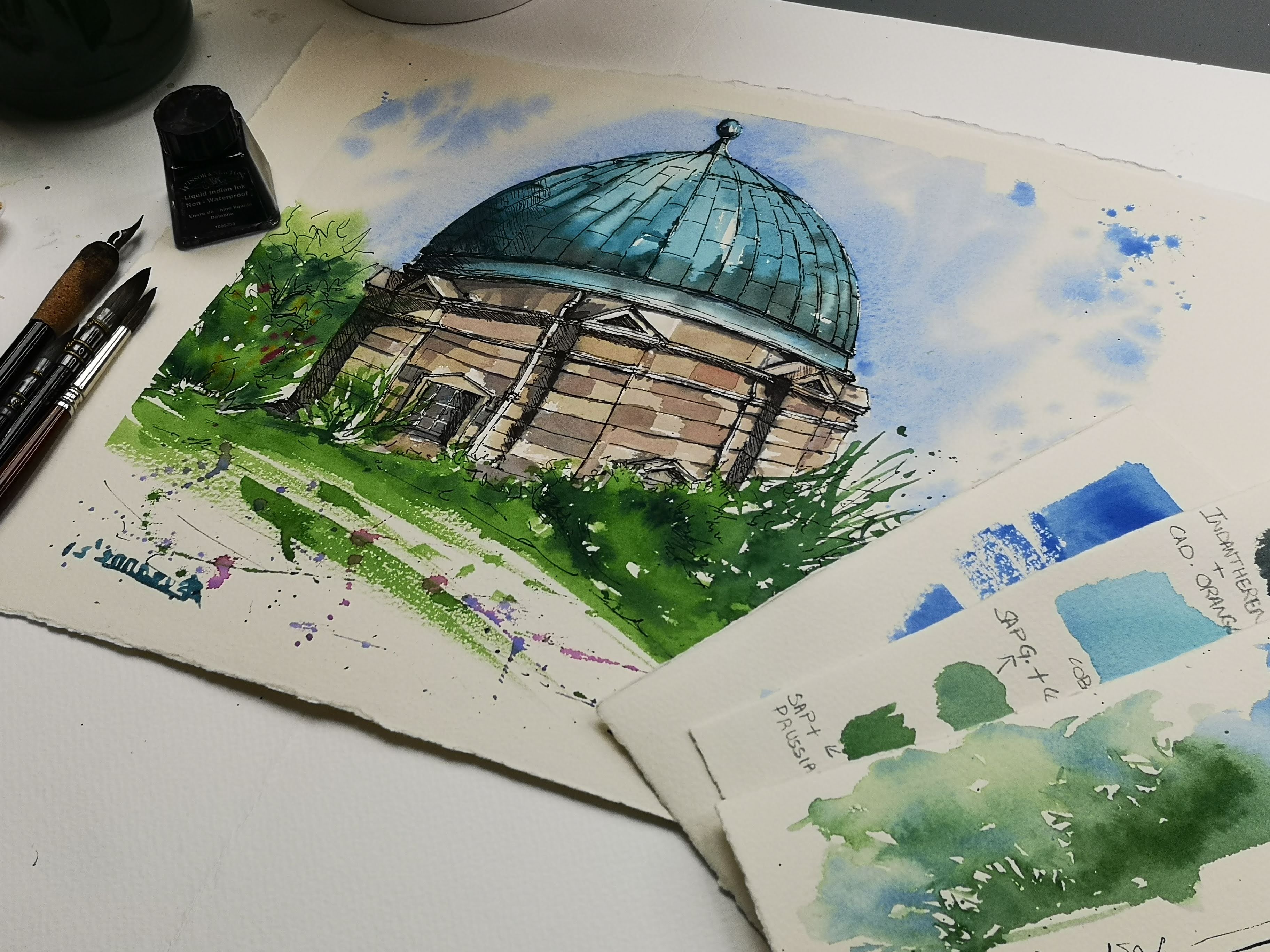
2. Suggested Materials: So let's start off
with watercolor paint. Here I have watercolor
paint in a palette. I usually use watercolor
paint from tubes. You can use watercolor paint
in tubes as well as pants. Watercolor pans come as a set. Usually. You can also buy
individual pans like this. If not, you can always use
watercolor from tombs. They tend to be a
little bit more moist and stays fresh for
a little bit longer. It is completely your choice, what you personally
prefer to use. Let's move on to
our next material. That is the brushes. I have a collection
of brushes here. You do not need all of these. You can use just
one brush today. And it could be any of these. I normally tend to use
a medium-sized brush, which is like a 12th or ten. You can even go down
to size at eight depending on what you
personally prefer, depending on the size
of your paper as well. Another option is for you to use calligraphic Chinese brush. They are similar to these
round brushes that I have. But I personally prefer these because of their
very pointed tip. And I am able to make
a lot of brushstrokes, different types of
brushstrokes with these, I also have an
angular brush here in case if you wanted to
try out angular brush, they're quite versatile when
it comes to brushstrokes. And it's a great idea to try out the different brushes that
you to have with you. If you do not have
the angular brush, you do not need to
go out and buy them. This is just an option if
you did want to try it. Now let's move on to
our next material that is the pen
in line and wash. We need pen. And I use fountain pen normally, especially because I like
going outside to sketch. I love using fountain pen. My next go-to option would be a dip pen combined
with some ink. And I usually make sure that
the inks are waterproof, both in the ink bottle as well as the ones in
the fountain pen. This is Indian ink
is waterproof. You do get a non
waterproof option as well. And this is sketch ink. This is really great
for fountain pens. If you wanted to use waterproof
ink in fountain pens. I would suggest not to use Indian ink in fountain
pens as they tend to be a bit more thicker and
can clog your fountain pens. So the best option would
be to use these sketches. There are other ones
in the market as well. If you are not keen on using
fountain pens or dip pens, another best option
would be for you to use a doodling pen or
a sketching pen. And this one is my
favorite castle, got different types
of nibs as well. This one is a small
nib which says S here. And they have a very fine tip. They are waterproof. And there are
different options and different other brands as
well that you can use. If not for that, you can always use a normal micro tip pen
that we use for writing. You just need to make sure
that they are waterproof. It just makes your
sketches a little bit more versatile to work with. The most important material
here is the paper. I usually use, watercolor paper. And this is by
Saunders Waterford. I use it to as free
loose sheets like this. Or you can also use
watercolor blocks like these. They are actually paid
bar but glued together. And once you've
finished painting, you can just take them
out of the block. This way it stays a little
bit more neater and you can save time from tearing
larger sheets of paper. There are other brands of watercolor paper as
well that you can use. It all depends on
how your personal style that will behave with the watercolor
paper that you use. It might take a
few trials before you come to a conclusion of what paper you
personally prefer. If not for watercolor paper, you can also use
mixed media paper. And other option that I wouldn't use is a mole skin sketchbook. I also have another
sketch book here. This is a normal sketchbook. Width, rather plain
sheets of paper, and it's not as heavy as the watercolor paper or
the more skin sketchbook. So this one might behave
a little bit different compared to the watercolor paper or the mole skins sketch books. But if you do have another
normal sketchbook, you can always try it out and see if it works for your style. We also need to have a palette. Here I have a palette with
a large area for mixing. Or if you're using
watercolor pans from a set, you normally will have a
mixing area on the pan. If not, you can also use a white plate for mixing,
as well as these, we also need two jars of water so that you
can mix your colors in and also wash the
brush is completely clean when you have
two jars of water. We also need some
tissues to wipe out extra paint and also
for the lifting technique. So these are all the
materials that we need for this course. You do not need to go buy
the exact same brands are the exact same paint
you can ship and change according to your interests and according to
your personal style, which we will discuss again as we go along in this course.
3. Introduction to Watercolour washes: Hi, In this video
we're going to discuss the basic techniques
in watercolors. If you're new to the medium. This is a great practice session for you to try out the median. I will go over all the
techniques that you need to know during this session, as well as a little
bit more about the watercolor medium in itself. So we'll first start off with the water and pigment ratios. So I have a jar of water here. I've got my watercolor paint. All the watercolor paint
here is nice and moist now because I added a little bit of water into each and every pan. So it's nice and moist
for me to start working. I'm going to start using
a medium-sized brush. I'm going to start by
using any color here. And I'm going to start by mixing the color
onto the palette. I've got a large, large area here where I
can mix my paints, going to grab some pigment. Here I'm using permanent rose. It's just a random color. You can use any
color that you like. If you don't have
permanent rose, you can use any color that
he personally prefer. I'm going to grab some
pigment onto the brush, bring it over to
the mixing area, and just put it down
on the palette. And you can see
there's not a lot of water at this stage here. You can see it's not moving
easily on the palette. So I'm going to go into
the jar of water here, bring in some water that is watery enough for
us to start experimenting. So let's start off. So this was a medium wash. Let's try that again. A quick brush movement, using the whole body of the
brush just across the paper, just move it across
the paper like that. And that is a medium
wash. You can see that the pigment is
quite saturated in here. And at the same time, you can still comfortably move the brush across the paper
without any friction. And that means there's enough water and enough
pigment in there. Let's try and add a little
bit more water to hear. Mix that here a little bit
away from what we have mixed. So that is a medium consistency that is going to be lighter, which means we have more
water and less pigment. Let's try that on here. You can see how it's
considerably more lighter than the three
shapes that we made before. From here we can
understand that the more water and less pigment
you have in the mixture, the washes are going
to be lighter. So here I added a little
bit more water and you can see it lightening out again. Let's add a little
bit more water. Let's try that here again. That's very light. And you can keep on adding more water to see
how light it goes. Now for a more
thicker consistency, we're going to wash our brush. We don't need any water
for this mixture. We don't want to
add any more water for this mixture here. That's the first mixture which
is a medium consistency. So I'm going to take
out all the water on my tissue going back into here. That again, Let's go back
to the medium consistency. Let's try and add a
little bit more pigment. So without dipping
your brush in the jar, we're going to add a
little bit more pigment from the pan into the mixture. Let's try doing that here right next to the
medium consistency. You can see how it's
gone a little bit darker compared to any of these. That is because we have more
pigment and less water here. Without going back
into the jar again, I'm going to add a little bit more of pigment onto the brush. You can move it to the
mixing area here and see that the pigment is
not moving as freely. It's more creamy, It's guessing
slightly more thicker. And that's how it's
going to look. It's very deep. It's got a lot of
pigment in there. It's a very saturated wash. Now the wash or the color cannot
get even more darker. That's just the
nature of the colors. So if you wanted to
make this darker, you would have to
add another color. But if you wanted a little
bit more thicker consistency, that is possible without having
any water on your brush. So I'm going to take out all
the water from my brush. I don't need any water right now because we're working
with the same color and ready to go back into
the pan of paint again, grab some paint and you can see how the brushes moving here. The pigment is quite
thick, creamy. Okay, Let's get that. So there's absolutely no water, just pure pigment here. I'm going to drag it along
and see how that works. So you can see here, even though there was pigment in there, because there wasn't any water, you try to drag it along. This is what happened. So this here with just a pigment and no water
is not great for a wash. So because we are concentrating more on line and wash
technique in this course, we will need a
little bit of water. Although this technique
here without any water and just pigment is called dry brush technique and it is great
for creating texture. It might be one of the
final touches that you can add on a new line and
wash illustrations. So let's start by building
a nice gradation. Now, I have enough
pigment on my brush, but I don't have any
water and you can see that it's rather rough. So I'm going to get a little
bit water from the jar. Just activate enough pigment. Put it onto the palette. You can see it's
nice and thick now. I can't really see the
bottom of the palette, which means it's nice and thick. It's full of pigment. I'm going to use that. And I'm going to start
a little swatch here. Just simply painting. That's nice and saturated, just like how we got here. Now I'm going to go back
into my jar little bit, scrape it on the
edge of the jar, bring that water in here. Let's try one more time. Dip. Bring some water
into this mixture. And let's paint another one
just below the pigment, just below the first
swatch that we did. And you can see that the pigment has loosened out or
the painters looted, loosened out a little bit more. You can feel it on your
brush as you go along. Let's continue to
add more water. You can see it's
visibly lightening. Now. Let's add more water. Bring it over here. Okay, let's, let's
just quickly wash our brush more water into the mixture and
then drag it along. You can see how
it's lightened out. I'm going to wash my brush now. Not going back into the
pigment yet because we have enough pigment here on the paper and just using plain water. And then touching the edge of that swatch and gently
dragging the paint along. And it's evidentially lightened. So now we have created
degradation from dark to light. So that's the highest
value of the pigment. That's the lowest
value of the pigment. That here we have a lot more
pigment and less water. As we came along, we added more water and
we have less pigment. And that's how we end up with this shade or this value
of the color here. So that's one way of adding
washes into your sketches. Now let's try a flat wash. We can still use this pigment, or if you want, you can
change your color as well. So I have a very
medium consistency. I'm going to use that to
make a little swatch here. A little box of color. Simply painting in. It's nice and wet at this stage. At this stage, if
you want to create a little bit more texture and a little bit more deeper areas. In this area, you can
add more pigment. One thing that we
need to remember is that when we add more pigment, we do not need any more water. So I'm not going
back into the jar. I'm actually taking out all
the water on the tissue, going back into
the pan of paint. I'm using that to gently drop in pigment onto the wet surface. We have the water
here on the paper. I'm reusing pure pigment, thick consistency of
paint to drop it in, into the wet area to create
texture as well as value. So we can do a light and dark just by dropping in pigment
into a wet surface. So we'll be using a
lot of this technique of dropping in pigment
into orbit surface. Let's try that with a wet paper. So this time we had some
paint on the paper. Now, now we're going to just simply wet the
surface of the paper. I don't need any more water, so I'm going to take
out extra water. Even you can use the tissue
to take out extra water. And then going back
into the pigment, if you think it's too dry, you can just add a
tiny bit of water. If not, just get some pigment
straight from the pan. You can try and paint
along like that. And you can see how the
water and the pigment behaves on paper and how the pigment feathers
out on a wet surface. And this is also a great
way of doing your washes. There are other ways
of starting a wash. I normally start with a
quick bold brush mark. Then I can dip my
brush straight into the water and then
get them to dilute. This sort of brushstrokes
and wash does create a little bit of unpainted areas in
between as well. And that in turn will create a lot of interest in your wash. These are a few wash techniques that we can use in this course.
4. Watercolour Mistakes and Solutions: I would also like to show you a little watercolor mistake
that we tend to do. And that is when we add
more water into a wash. So to show that, let me start by doing a
little swatch of color here. And let's say if
we wanted to make this a little bit more
darker in this corner, we would need extra
pigment but no more water. But we have this
accidental instinct of washing my brush
all the time. So that will mean that
our brush has more water. And now if we try to add
little bit of pigment here, it's not going to work is
just going to be more watery. When it dries, it's
going to leave a very washed light effect. Let me show you something
that I did earlier. This is what happens when you
try to add more water into an already wet wash. You
can see how the pigment is washed out and created this line which was
really unwanted. The best way to avoid that is to not add a
lot of water into the pigment or into a wash because you can
see a huge pattern here. I'm going to take
that pigment out. If that happens, the
best thing to do is immediately get a tissue out. Take out the water
on the tissue. Just drag your brush along
and take out excess water. And this is called lifting out, a technique which is really
helpful in case if we have huge puddles that wasn't really necessary in
our illustrations. So once you have taken
out on the water, you are left with a wet wash. And at this stage, without dipping your
brush in the water, you can go back into the paint, gets some thick pigment. You can try to add that
into the wet wash and that, and that way you're able to fix a little bit of your
watercolor mistakes as well. If you do want to add more
water to your washes, the best way to do is to add
it to the side off the wash. So let's say if I
added a wash here, the best way to add more water to this wash is to
add more water to the side and getting them to dilute and flow
into the wet area. So when you add more water
to the side of a wash, you're able to get
this pigment to flow from here to a wet area. Let's try touching the
edge of this wash here and see if this pigment will
flow into this wet area. This normally happen will work only when the wash is still wet. If it's dry, how much
water you add it, you won't get a nice transition. Let's try it here. If you add some water, you will need to rub
onto the paper a little bit more to activate
the pigment. But you'll be left with an
uneven shaped like that. These are a few
techniques that we will need for today's class. It's a great idea to try and
practice your washes and be confident with your
wash before you move on to the illustration itself.
5. Watercolour Brush Strokes: Now let's work on a few
watercolor brushstrokes. We won't need a lot of
watercolor brushstrokes here because we are going
to use a pen for line. But saying that sometimes it's a great way of
creating texture in your illustration and
that combined with line can give you a very
beautiful effect as well. So let's choose a paint. Any paint, any
color is fine too. I'm going to try and use a
little bit of blue this time. This is ultramarine blue. You do not need to
use the same color. You can use any color it, this is just a practice session. I'm going to create a
medium consistency, so enough pigment and enough
water making it quite flowy, but at the same time
has enough color in it. So the first brush
stroke is to use the whole body of the brush
to drag it along the paper, like how we practiced
in our washes. Now let's try using the tip
of the brush to create lines. And for creating lines, you need the brush to be nice
and pointed at the edge. So when you grew up, gather your paint
from the palate. The best way to do it is to
twist your brush slightly, drag it like that, and you get a nice pointed edge. And for making lines, the best way to do
is to stand up. If or if you're not
able to stand up. The next best thing
is to sit at a height away from your table
for more comfort. You can always have
the little finger resting on the paper. And then we can just drag
our brush along lightly. Creating these lines. If you press your brush
down a little bit more, the lines get thicker,
drag it along. You can maintain
the same thickness. If you put it all the way down, it becomes more thick. And this is really great for
creating leaf-like shapes. We can also do little dots. And this is called stippling. And you can even put the
whole body of the brush down, and that's called stamping. So just a few
brushstrokes for you to explore while doing
your illustrations. Now, stippling can
also be done lately, which means if
this is stippling, lazy stippling
would go like this. So just dragging that up off
your brush along the paper, but not lifting
it completely up. And this has got lazy stippling. It's a great way to create texture, especially
with foliage. And apart from this, I also like to have a little bit of fun with illustration. I'd like to splatter. For splattering, the best way to hold your brush
would be like this. And use your pointer
finger to simply tap. And if your brush is
completely loaded with paint, then the pigment or the paint will just splatter
onto the paper. That's one way of splattering. It's more controllable that way. Another way is to hold your
brush like this and use your other hand to tap it
like this or like this. Another way which is a
little bit more messy is to flick your brush and that way you get splatters
in a particular direction. So let's say if I wanted to
splatter in this direction, I would hold my brush like this. Here's my pointer
finger to flick it. And that way you get splatters that go in a certain direction. Let's try that again. You get beautiful splatters
that go in this direction. If you want the splatters
to come from here, you'd have to flip from here. The best way to do is
to turn your paper around and try and
flip it again. These are a few brush
strokes that we can use for a blind and
wash illustrations. The only downside about
splatter is that your table and your equipments can get a little bit messy with
the paint splatters. So that will mean that a
little bit more cleaning.
6. Using Lines For Adding Value, Contours And Texture: Now let's look at the use of a line in line
and wash technique. So we're going to use
any pen at this stage. You don't have to
use a fountain pen. You can use any pen that
you personally prefer. The use of line is
pretty straightforward. It's just like writing. And we're just going to keep our hand movement a
little bit more fluid. And that's the only thing that is probably different
from writing. When you write, you would
probably hold your pen right near the nib verus for drawing. Most of the time, it is well away from the nib. You get that free
movement of your hand. As I've explained before
in the materials as well, lines are usually used
in line and wash, mainly for contours, texture, and also for some initial
sketches as well. So when it comes to
initial sketches, it's kept very light. And it's mostly scribbling. You can see that the
lines are very light. If I show this up to you, you can see that the
lines are very light and you can even ship and change if there's
any mistakes that happened. It's more of very loose scribble like pen strokes at this
stage as well as this, we would also be using this for a little bit of
contour drawing as well. So if you do not want
to start like this, you can always start by you doing any sort of
sketches with this. And let's try a
little tree here. So starting off with the trunk, some branches, just going
to give some foliage. And mostly Klein outline or contour drawing
as you call it. Then from there you
can build on it with more lines as well
as some watercolor. So that's one way of doing it. Or you can start with
even lighter pen marks. Or if not, you can always use a pen store instead
of a pen as well. Let's practice the use of line. Some of the different types
of lines that we can use, starting with very bold lines
placed close to each other. And this is called
rendering or hatching. You can also do the same with two types of lines going
in opposite directions. So that's one direction. And then let's do that's
in another direction. And that is what we
call as crosshatching. That's another way of shading, are showing that light
and dark in value. And as I said before, we can use the lines
to do contours. Another thing that we
could do is stippling. So just simple dots. And you can actually render or shade by just using these dots, as well as that, you
can even use scribbled, depends on what your shading. Sometimes a scribble
would give it a little bit more
natural look and resonate more with the texture of whatever you're drawing. Sometimes these lines
are better and it depends on what you're doing
really with the lines. You can also do the
thick and thin lines to create value or
depth in your painting. So let's try placing
one very light line. Let's try placing a little bit more darker
line right next to it. There's immediately
a sense of depth. In these two lines. You can see that this is the darker side and
that's the lighter side. So the lines are
really great for you to show depth as well. And you can vary your lines
from very thick of them, very wide lines, too
much lighter lines. So that when you want a
thicker line or a hard line, press your nib
down and then lift it back up to a very light line. You can even bring it down to a few dots that we're creating a sense of
depth in this line. If you're using another pen, like a calligraphy
pen or a dip pen, the nib tends to bend a
little bit more as more flexible that way you're able to create a little bit
more thicker lines. So let's have a look
at how that works. I'm going to use some
sketching Ink for this. So let's start with
a very thin line and then we're
press the pen down, creating a thicker line
and then bringing it back up to almost a very thin line. So that's another way
of creating lines. You're free to practice this until you feel you are
confident with your lines. You don't need to use a
fountain pen or a dip, but you can always use a micro tip pen or any
other sketching pens. Even a brush pen
could work really well when it comes to
thick and thin lines. So if you do have them
to give it a try.
7. Quick tree sketch: Combining Watercolour and Pen: Now let's try to combine watercolor brushstrokes
or watercolor washes, as well as pen together. So let's start with pen. I'm going to do a
very simple tree. There are different
ways of using the pin as well as watercolor. One way, as I explained earlier, is to start with a
very light pen mark. So I'm trying to do like
a contour of a tree, just getting the
shape of the foliage. And then the tree trunk. And see how I'm holding
the pen as well away from the neighbor. So that's a very
basic initial sketch and then you can do
watercolors over it. So let's try another
way of doing it. Let's try a little bit more
harder lines this time. The lines that are a
bit more dark color. You can clearly see them
compared to the first version. I'm trying to do lots of scribbling to create
texture for foliage. We can even do a little
leaf-like shapes as well. Then with the tree
trunk and the branches. So I'm going to go really
hard with the pen lines. So when I want to go
with bombed pen lines, I would hold it normally
near to the nib. That way I get greater
control of what I'm doing. So depends on what you
are sketching really. And that will decide where
to hold the pen as well. That's the tree trunk. I'm trying to still
create depth, adding a darker side and
probably leaving this to almost like dotted lines
just to give me an idea. And then I can go ahead and do some rendering
here as well. Just to make this side a
little bit more in the shadow. And you can see, I'm using very rough lines. But at the same time, I know it's creating texture
and it's creating depth. And maybe a little bit
of depth here as well. Okay, So that tree
looks a little bit more complete to the
first wash in here. But these are two different
ways of doing line and wash. You can either start off with
watercolors or like a very, very initial light pen sketch, which has almost nothing. But everything will depend on how you put the
watercolors down. Another version where you can start with a nice good pen line. Get the shape of the tree, and then you can move on to
adding a quick wash over it. It's really great for you to
do these types of sketches, especially if you are working outside as urban
sketching or planar. And if you want us to
do a very quick sketch, this technique is really good. So let's try using
watercolor on this. So for this, I'm going to
get a medium-size brush. I'm going to use size
eight right now. It's not too small
and it's not too big because my sketches
tiny right now. I'm just going to keep to a smaller brush and we
need a jar of water. Let's start off with
applying some green. I've got some sap green here, which is quite moist because I have sprayed
it with some water. I like that green to
go a little bit dull. You do not have to do this. This is just because I
personally like a dull green better than the
bright sap green. If you do have another shade of green that you
personally prefer, you can always use that. And we're going to mix it
into a medium consistency. So you can see here there's enough pigment
there, enough water. But at the same time
it's not too creamy thick and it's not
too watery either. It's somewhere in the middle. So that's a medium wash. Going to start off with
this one here because I have the pen lines already doing a very quick wash only in
the darker areas for now. And then I'm going to dip
my brush into the jar, take out some pigment
and then I'm going to dilute, wash the brush, just touch the areas
where it's been painted with a wet brush and let the pigments just mix
and bleed into the wet area. That was a very quick
sketch of the foliage. And then four. For the tree trunk itself, I'm going to use
some burnt sienna and some deep ultramarine blue because I like a deep
shade for the tree trunk. Quick wash. And again, I'm going to wash
my brush clean, take out excess water
on the side of the jar, and then gently rub
it on this side here, making the edges a
bit more softer. And that way I also do get a
very 3D look for the tree. Now, once we've got
the first wash done, you can either
leave it like this, which is like a quick sketch, or you can build on it with a few more deeper
colors as well. So I'm just going
to build on it with a little bit more deeper Carlo. Starting with the tree trunk, I like a bit more deep, ultramarine blue and burnt sienna and a little
bit more deeper color. So far deeper color, less water, more pigment. And then I can just
simply drop it in. And I can use the
same ultramarine blue with a little bit of sap green or the green that
I have been using for the tree gets a deeper
color for shadows. And I can use that on the tree if I want
any deeper areas. Again, because there's wash
is still a little bit wet, it's a good idea to use more
pigment and less water. So make sure that you don't
dip your brush into the jar, but take out excess water. And let's try mixing
some deep green with some green and
ultramarine blue. I've got a very nice
deep green here. And I'm going to use that
here in the wet area. All right. So that's deep enough. I think I'm going to
stop pretty deep. Giving it a nice 3D look, and we're done with
our tree sketch. Now let's try this tree here, which is pretty much
nothing. Right now. Everything is done to the watercolor wash that we're going to place here right now. So starting off with the green, very watery to start with. And you can even mimic the same hand movement that
you did with the pen as well. So just placing some color, trying to leave some
white areas just for some interests to show some
lighter and darker as well. Okay, so that's the
first layer of green, very light at this stage. And now let's try and add a
little bit more color here. This time I don't
need any more water, so I'm going to scrape out all the water on the
side of the jar. And I'm going to go back
in with some more green. This time, more pigment
and less water. Just dropping that
in a few areas. Let's continue to do
that here as well. And just doing all
the little details at this stage on the
edge of the foliage. Okay. So let's move
on to the tree trunk. I did not really bother washing my brush because there wasn't
a lot of pigment in it. Anyways, I went
straight into brown, burnt sienna, and a little
bit of ultramarine blue. I've got kind of muddy
color, which is okay. We're only doing a quick sketch, so it doesn't really matter. I'm going to do this
side of this tree trunk. Wash my brush clean, make the edges a bit more softer by just touching the
edges of this wash. Let's add another branch here. So going back into
the mixture of brown, Let's add another branch. Strip the same here as well. Okay, so now it's very
light at this stage. We don't have any dark and
light like how we have here. So I'm just going to
quickly wash my brush. Take out all the water
on the side of the jar. So there's brushes just wet. Now, I'm going to mix some green this time with a little
bit of ultramarine blue. So it's nice and deep. And let's place that color here. If you think it's still
a bit too watery, you can squeeze out all the paint or take
it out on your tissue. Let's try again. So that way we are now to adding more water into this wash. You can even take some fresh
color without mixing on loaded onto your brush
and then just drop it into your wet area as well. That is also possible. And you can just paint with it. I can just mix on paper. You can hardly see the pen
lines that you did initially. They would just stay
as initial sketches. And this is just a wash.
Just darkening this as well, adding more texture
with the tip of my brush with little
dots and dashes. Okay, so I'm going to
leave that to dry for now. And then when it dries, I can decide if I want to add a little bit of pen as well. Now this tree is almost dry, so I'm going to strapped to add a little bit
of lines over it, just to give it a little
bit more details, just to contour the whole thing. So let's start with
the tree trunk. Little detail on the branches. And you can see, I'm only doing these little dots and
dashes to begin width. And as I go along, if I need bolder
lines, I would do so. So for now, just little dots
and dashes because we've done about 90% of the
sketch with watercolor, we're only using the pen that to enhance
your watercolors. Become might need
a little bit of bold lines here with
some dots and dashes. Again, I can add more
details as I go along. So adding some little
grass on the ground. And only starting off
with the areas where I think I need a little
bit more darker color. And also an impression
of outline or contour. So just adding some little
scribbles for the foliage. Let's walk our way up. Trying to add more
scribbles, dots, dashes, little scribbles, anything that would
work for you. You might even want to change the type of lines
that you're using. And you might want to use these lines rendering with
quick lines like that. If that is easier, that's more policing for you. That is also fine. I do a mixture of everything really and see
what works for me. Let's add more lines
here, more scribbles. Just making the scribbles a bit more bigger as I come here, giving it the impression
of leaves as well. And some are darker area here, slowly taking shape right now. You can also bring your
lines outside of the wash, giving it a little bit
more interest here. I don t think I
really need to do any sort of outline
in this area. Because if I do
any outline here, then I am going to block all the light that is
coming through this way. So I need to be
really careful and probably limit the type
of lines that I use here. So again, if you want
to do more lines, you can do that. And also I also tend to go back into watercolor
at this stage. So once we've done
the lines and I think if more lines would
only make it heavier, I would normally go back into a watercolor for another
layer of watercolor. So let's get up brush, get some more paint. The same ultramarine
blue and green. Just an extra layer
here and there, just to add some darker shadows. And I think that's okay for now. So I'm going to stop. That is two different ways of using line and watch
for your sketches. Either starting off
with a pen from set off pen lines and
rendering and everything, and then adding a
quick little wash, which is normally much easier. And probably the best way to
sketch when you're outside. But when you're in
the studio and you have the time to
go back and forth. You can always try
to start using the watercolors first or
very light pencil sketch before adding watercolors. And you can keep
going back and forth, depending on what is best
for your illustration.
8. Suggested Watercolour Pigments for Projects: I'd like to introduce to
you some of the colors or the pigments that we will be
using today in our projects. It's not necessary that you need to have all of these colors. They are just a few suggestions
and you're free to change your color selections
as you please. Some of the main colors
that we would be using would be permanent red, quinacridone red, and crimson red for the red
flowers that we're doing. So starting with
some permanent red, going to show you
how that red ace, a nice bright red. I will also be using a little
bit of alizarin crimson, which is more of a rose color. You can also get these two
colors to mix together. Another option for you to
use is quinacridone red. If you do not have
alizarin crimson. You can also mix
that a little bit with permanent red and see
how that works for you. Another color that
we will be using, especially for the terracotta
planter, is venetian red. For a deeper terracotta color. You can either use in Dan, three blue, all French, ultramarine or ultramarine
blue to get a deeper color, ultramarine blue is
a warm blue and it's really great to show shadows. So let's try with
ultramarine blue. And that is a sort of color
you can use for shadows and for deeper color on
your terracotta planters. Another option for you would
be in depth are in blue, which is a very deep blue. It's a bit like Prussian blue, but it's not, but slightly
more pure in color. And you can use this deep
blue to mix width rate, or venetian red or
permanent red to create nice shadow colors
are deeper colors as well. And you can also
mix the same width, a little bit of
permanent red as well. To get a very nice
shadow, purple. Avocados would be sap green. And I haven't used sap green
asset is because most of my floral colors are right and they tend to be a little bit bright when used with sap green. So I have always toned it
down with a little bit of permanent red and
ultramarine as well. So that is permanent red
with some sap green. And I'm going to
add a tiny bit of ultramarine blue,
very deep green. This green goes really well with red to create a very
nice foliage color. Finally, a tiny bit
of cadmium yellow for some brighter
colors in foliage. If you do not have
cadmium yellow, lemon yellow should work. But I do like the brightness
of cadmium yellow. Mixed with a lot of water gives me a very pale,
beautiful yellow. These are some of the main
colors that I would be using. It's just a suggestion
you can always use the colors that
you personally prefer. But if you're using
these colors, here are some of the suggestions
of how you can mix them.
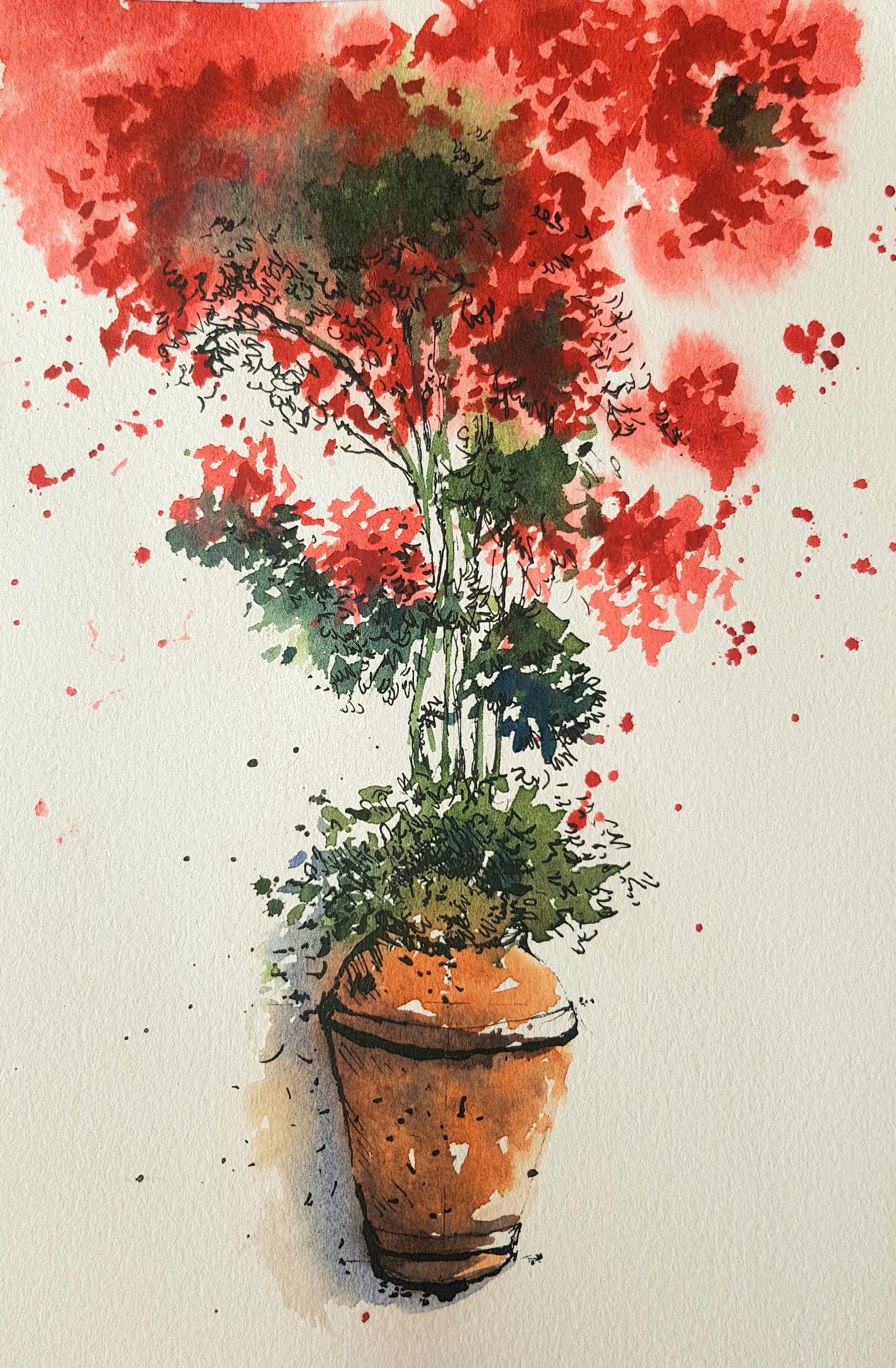
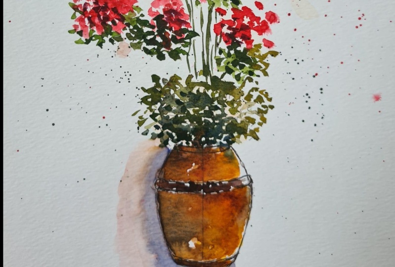
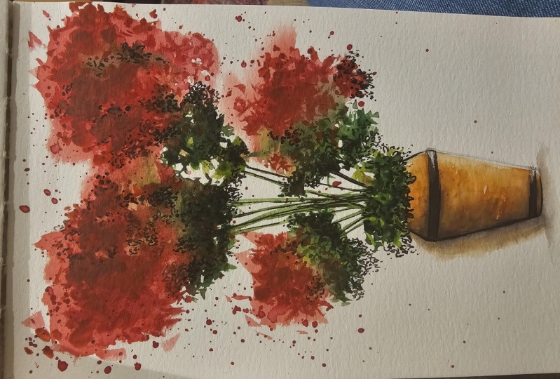
9. Project 1: Bougainvillea-Warm up sketches: Hello, we're going to look
at our first project, which is this broken belly, a planter in a very loose
watercolor and ink style. This illustration was inspired by the many urban sketches
that I love to do. And bougainvillea over a door is something that I
really love to paint because bougainvillea
flowers are really great for very loose watercolor style, and I love combining
that with ink as well. We're going to achieve
this very loose style. As well as I will talk to
you about how to illustrate these little planters in a
very quick and easy style. So let's start off by doing a
little rough work in one of our sketchbooks or in any rough piece of paper
that you may have. You don't need to have
watercolor paper because we're only going to try and sketch
these pots right now. So I have a spare
piece of paper, which is just the back
of some practicing. And I'm going to use that for my rough sketches
of the planters. So let's try and
get the shape of the planters right after
a little bit of practice, you can try it out on
your nice sheet of paper. We're looking at this
plant or you do not have to get the same shape
of the planter. So let's try different
shapes of the planters. We could have a very
simple planter, which is something
of this shape here. We're not too worried about
perspective or anything here. So we're going to start
with very rough lines. That's the top of the planter tapering down as it
comes to the bottom. Just checking that they're on the same level, these two lines. And at the same level, I'm going to do the bottom
of the planter as well. Now I can make these
little changes here like adding a wider neck. And I've caught a planter. So you can use this
plateau if you like, and then you can
have foliage in it. So let's try and sketch a
little bit of scribbles, leaf-like shapes, if you like. You can even try to darken
them now to see how they look. You can also overlap your foliage at the neck
of the planter as well. So quick scribbles,
keep your lines really loose just to get a hang of
how you go about with line. Let's try a plant or
something like this, which is a little
bit more bigger. So it's got a tape
head and neck. So let's start with here and I'm going to try and
do a central line. So my planter looks a
little bit more balanced. So let's put a
central line there. The two ends are going to be at equal distance
from the central line. This bit here widens a little
bit compared to the neck. So I'm going to do a
wider line just about they're very light pen
marks should be fine. Or pencil if that's more
comfortable for you. And then as it comes
down at the bottom, they taper down a
little bit more. So narrow at the top, wider towards the center. And then it tapers down again. So let's get the shape
of that planter. Very light pencil marks
again or pen marks again. And then you can
take it from there. So we've got the basic shape
in a very light pen mark. Now let's add some details. So that's a thicker neck
that I'm going to add first. The bottom cannot be flat. So I'm going to make
it a bit more curved. We can give this little frame or the bracket where
the planter is sitting. So I'm going to build
that around this line. It is going to be curved
because looking at the neck of the plantar and the bottom
there on curving downwards. So I'm going to make
the brackets also cover bit downwards like that. And I can give
another bracket here. So we've got the planter, and now let's add some foliage. Quick lines are fine. We're not thinking
about a lot of details. We're going to try and
keep it rather loose. So we've got the foliage stare. At this stage. You can go in and darken
your lines if you like. Or if we were to
use watercolors, we would use it on here. And then you can always
come back to H2, add more lines for
a finishing touch. So that's just two
different types of planters that I
wanted to show you. If you do have other
planters in mind, you're always welcome to change the illustration
according to your liking. This is just for us to enjoy the loose watercolor style land. You can chip and change even the color if you'd like
a little bit more brighter, rows are pink color or even any other color
for that matter, you can change it, see
how it works for you.
10. Initial sketches For Bougainvillea Planter: Okay, Let's start sketching. The planter is going
to be at the bottom. And we have this
very loose flowers just spreading across the paper. It doesn't have to
look like this. You can have different
branches if you like. So it's completely up to you how you'd like to
chip in change. So let's start off
with the planter. The plant is going to be
somewhere about here. It's going to end about here. Maybe it can be this big. So let's do a central
line. Very rough. If you do not like your
pen lines to show. After your watercolor is done, you can always choose to use
pencil if it's not really a problem for you to have initial sketches
in the background. Then you can always use pen
and see how it works for you. So let's do the top
neck of the planter. It's going to be
somewhere about there. I'm going to start off
with straight lines are built the curvy lines
on the straight lines. It's going to be
a little bit more wider as it comes
towards the center. Just making sure that
the points where I end is at the same distance
from the central line. And again, it's going to taper
down again at the bottom. So I'm going to have
another line here. Let's get the shape
of the planter. Now looking at this, these lines and the market, the planter can be
a bit more wider. If you don't like that, you can bring it down
to a smaller size. I might bring it down
to a smaller size. Just always checking
that it's in the same distance so it
doesn't look awkward. And then I'm going
to taper it down, maybe bring this down a
little bit more as well. Once you get one side done, it's always easy to
get the other side. He goes. So I've got the planters shape. Let's do the neck. It's going to be
a bit more curvy. The bracket in which the planter is sitting is going
to be curvy as well. You can add that now. There's another bracket here. And the bottom of the planter with the foliage. I'd like to leave
the foliage for now because I'd like to start
adding watercolors. If you do not like that and
you want to add some foliage, the best thing to do is make a very rough marking as to how much you
want it to spread. Maybe in little dots and dashes. Just like that. We're going to just make
it a little bit of a marking for your reference. Maybe I can let it
spread here as well. And I know it's going to spread all the way
up here as well. In the watercolor palette, I have made sure that all my
pigments are nice and damp. So it's easy for
me to work with. I usually do it a few minutes
before I start painting. Let's get a medium-sized
round brush. I'm going to use size 12
today. That is faced 12. Or if you'd like to use a Chinese calligraphic
brush, that's also fine. Either one of these
similar in size. It's about the size 12, round pointed or you can even
go down to ten if you like. That's a good size as well. So the first thing
we're going to do is prepare our paint. I've got two jars of water here. Going to start by
preparing the red color. The red here is a mixture of permanent red and quinacridone. If you do have something
like a Winsor red, that'll be a great
choice as well. Or if you do not want to write, you can always change it to
any color that you like. And I'm starting
by preparing it to medium consistency and I'm going to leave that
there for now. Wash my brush clean. Going to get some green. You can use any pre-made green that you
have in your palette, or you can make
something of your own. I do like mixing
greens of my own. The green and round is a good
contrast in combination. But looking at this
bright red and I need to tone down
the sap green, which is normally on
the brighter side, or the wiper inside. I'm going to get some sap green and add a
little bit of red, the same rate that
we're using here. Permanent red should do good. Tone it down slightly. It goes to a little
bit of brown. Sometimes you can add some Prussian blue
or in-depth rainbow, I would say in-depth ring blue is a little bit more
better than Prussian blue. Or any Deep Blue could work to have this very deep
green and your palette. Let's try that out on our
rough piece of paper. That as a sort of green
I'm working with. And then I can add a
little bit more red into that green to create more dull
green as well, like this. If you add more blue, it becomes a bit more deeper. That's a deep blue that I added. Let's try our red. So washing my brush clean, just taking up excess
water on your tissue because I don't want to add any more water to this mixture. Let's grab a little bit
and try our red here. That's the color we're going
to use for our washes. For the planter, you
can use finishing read. If you have or Indian red, something that
goes with pottery. I have vanishing right here, which is like a brick red color, which is what I'm going to use. And then to darken that, you can always use a little
bit of in-depth are in blue. If you don't have
in-depth green, blue, you can always try Prussian
blue or even indigo. And you can darken them as well. For shadows. You can also use a little
bit of ultramarine blue. It's a great
combination with the, with the brick red
color as well. So that's a little bit
of ultramarine blue. So don't worry if you don't
have in-depth marine blue, That's just a personal
choice for me. You can always try and
use a little bit of ultramarine blue and that
should work really well.
11. Bougainvillea: Watercolour wash: Let's get back to our
main illustration here. I've washed my brush
completely clean, Just making sure it's clean in the second jar of water as well. And I'm going to get
some fresh clean water. Let's start off by
wetting the paper, placing the water
or the wet brush. In areas where unlike
the colors to be, I'm going to leave
the central part without any water
just over here. Because that needs a little
bit more control with all the winds and the
little bits of foliage. So I'm going to move
to the top part, creating a wet surface
here as well. At the top. And I'm trying to create
a wet area at the top, making sure that
it's not too wet. I don t need puddles of water. Evenly placed. Wet area should be fine. So now we've got the wet area. We've made our paints ready. We're going to start
painting straight away. If your brush is too wet, Let's try and take
out a little bit of water on the edge of the jar. And let's dive into our red. I like to start with little
dots, dashes and splashes. You can try that as
well if you like. So starting off very
gently with a few dots, see how that works. See how the pigment feathers
out on the wet surface. Has tried doing
some here because the surface is quite wet and I don't want that
surface to dry out. So I'm going to try and
work a little bit quickly. And you can see
that I'm only using the tip of the brush right now because I like to
leave a little bit of white unpainted
areas here as well. Let's continue dropping
in the pigment. Here. It's going to be a
little bit more deeper. But let's start by placing
our first layer of paint. See how it beautifully
feathers out. And it's really beautiful
to watch as well. It's very therapeutic to just
watch the whole process. And you do not need
to rush your process. Take it in slowly and make sure that you
enjoy the process. This area is a little bit dry, but I'm still going in with
some little dots and dashes. If you remember how we do too lazy stippling in
our practice session, that's what I'm doing with
the tip of the brush, just gently moving, moving
it across the paper. We're coming into
the wet area now. And you can see that the
paint is feathering out a little bit compared
to the paint here, which is okay, we can have a mixture of different
textures here. Let's add a little bit of
paint here as well. You can. And this little planter here, if you like, or you can leave it if you think that's not
a good idea for you. I'll see how it goes and it
can always be added later on. Let's get some more paint. If you like splattering like me. You can splatter
paint right now. It is an uncontrollable way
of creating a painting. But at the same time it lets you enjoy the fluid nature
of watercolor as well. I'm going to move on to green. Washing your brush
clean and getting out all the excess
water from my brush. You can even wipe it across
your tissue if you like. And let's get some green. I'm going to try
and do the green, just like how we did red. Here. I can see that the paper
here is drying out. So you can see the paint is not feathering out as I
intended it to be. But because I've started to
paint already, It's okay. Never mind. If it does. If yours has begun to dry
the same way. Don't worry. You can always use ladies stippling to finish
off your foliage. Little dots and dashes, even splatters if you prefer. We're going to try and do a
little bit of foliage here in certain areas where I
can have some green. So just dropping in
the color for now, I'm not going to do
any details as of now. Lazy stippling on the
dry surfaces again. Let's try and add different
shades of green here as well. So I'm going to add a tiny
bit of ultramarine blue into my green just to make it darker and also to
show some shadows. You do not need to
wash your brush. For that, you can go straight
into ultramarine blue, get some blue and
mix it with the green that you already
have in your palette. Let's do some green
here as well. You can do stamping technique
with your brush as well, or just lazy stippling. You can splatter any
sort of brushstrokes that makes you feel free to
work with your painting. Let's add some foliage here. It's going to go on top of
the red, but it's okay. You can have them wet and wet and the red
will just move up. We move away, creating space for the new
pigment to sit there. So don't worry about mixing too much in
getting our muddy. Look, I think I might need to
add a little bit more green this time with less water there. Just to avoid that, I'm going to go back into
some fresh green purpose, some fresh green without
water this time. Let's add a little
bit of ultramarine blue as well to make it deeper. Or you can even use
in-depth are in blue. If you have that pigment, if not, you can go in
with ultramarine blue. I'm going to drop that
deeper pigment here. Again, just reminding
you again that we're not working
with water this time. Just enough dampness in our brush and we're just
going to mix the paint. Because our surface here is wet already and we do not
need more water here. I'm going to pull some lines
down for showing vines. Quick movement with
the tip of my brush. Just a few lines should be fine. Just going to add
some foliage here. Suggestion of branches
on this side as well. Okay, So now this surface here is beginning
to try a slightly, I'd like it to dry
a little bit more before I add my second
layer of paint. While I'm waiting, I'm
going to add some details. And also the color
of the planter here. Washing my brush clean, making sure it's double clean by washing it in the
second jar of water. That second jar of water can
be your freshwater as well. So I'm just going to
quickly show you my jars. One is quite muddy already. The other one is
the second jar of water where I normally W clean my brushes
and that you can use for fresh clean
water as well. Let's go into Venetian
red or Indian rail, or any terracotta
color that you have. If you do not have these colors, you can always use burnt
sienna with a little bit of red to create this
bright terracotta color. I'm starting by
using a medium wash. I haven't wet at the surface so I can start with a medium wash. So I've got enough pigment
and enough water in there. It's not as thick
as this one here. Starting off, I'd like
to show a little bit of light falling on the planter. So I'm starting
off with one side, just leaving a little
bit of unpainted area on the brackets as well. Pulling the paint down slightly. Right. Let's get
some more pigment. Drop it in here. I'm going to leave this
area unpainted right now. Washing my brush clean. Taking up extra
water on the edge of my jar and then I
can just simply run my damp brush near
to the wash that we just did to make the
edges a bit more softer. And also you can leave some unpainted areas as
well for light reflection. So that's the first layer of brown or terracotta
color that we did. I don't need any
more water here, so I'm going to take
out the water on the brush and go into some blue, either in-depth green blue
or ultramarine blue is fine. Let's use ultramarine blue. I'm going to mix it with
the terracotta color. The vanishing rate that I have, I get a deep brown. We have to make sure it's not as watery as this first layer here. And simply going to
drop in some paint. Mainly on the left side, where it's going to be darker. And little dots and dashes
to create texture as well. We're going to
leave that to dry. We're going to go back
into our Bogan video now. Now, again, washing
my brush clean, taking out extra water on the edge of the jar
and on your tissue. Let's go back into the
red mixture that we have. If your red mixture has run out. Let's try and create a little bit more using
permanent red and quinacridone. Red. If you do have a personal choice of color or a better
rate in your palate, then you're always
welcome to use that. Again, if you can see here, there's not a lot of water here. When I move my brush
into the mixture, you can see the mixture
doesn't move so freely. Let's add a bit more pigment. Again, no water,
just the pigment. Let's try that out here on the damp surface first before moving into the dry surfaces. So just placing the
second layer of red. And this time because
the paper is not as wet, they do not further out, they sit on top nicely. I'm going to use some
lazy stippling to create the texture of flowers. And being very gentle
with the brush, you can be very slow as
well, enjoying the process. If you do have this little
beautiful white areas of unpainted surfaces, then you can leave
that like that, creating a beautiful contrast
while you're working. Let's continue to do that
on this side as well. This side is a
little bit more wet, but I can still place
the second layer and it's staying there beautifully. And every time you do
a new brush stroke, It's a good idea to move
back and look at your work, see how it looks
from a distance. And that way you can judge your painting what is needed
for your painting again. Also, another way of looking at your painting
is to squint your eyes. All the details will go away and you can
just see the colors. And you can decide what more needs to be done
in your painting. So deep green with a little bit of ultramarine blue and a little bit of
permanent red as well, adding few splashes of
green here and there. So we're going to work in the same manner as
we did with the red. Just adding extra deeper
colors where it's necessary, or second layer where
it's necessary. I'd like to finish off the
frame of the planter as well. Or the bracket of the planter. I'm using same Venetian red and a little bit of
ultramarine blue. This time, I don't
have a lot of water, it's not so wet. Just quickly adding a little
bit of deeper color here. I can always come back to it with finishing touches
with watercolors. But just to place
some color there, it's still quite wet
and I like it to dry. Before I add any more details, add a little bit of shadow. Just here. So just wetting the surface. You can let your terracotta color mix into the
background as well, which is completely fine. It's taking up the excess
water from my brush. I'm going to get a little bit of ultramarine blue and paint outside the plant are just
giving it a sense of shadow. I'm also going to add a few brush strokes here
near to the foliage, giving a little bit of a sense
of shadow there as well. Little bit at the bottom. And I think we're done. Like to soften the
edges here as well. Before I finish, we're done
with the watercolor bit. Now. We're going to leave it to dry completely and we're going
to come back with some pen. And also for finishing touches, maybe a little bit of
watercolor as well, depending on how it goes.
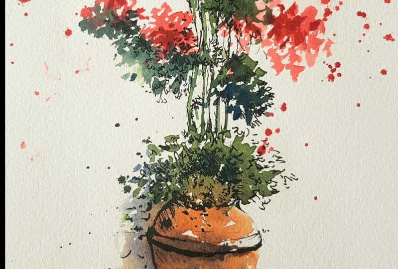
12. Bougainvillea: Enhancing Your Washes With Pen: Hello. Now this illustration
is completely dry. We can now start
working with our pen. While the illustration
is drying, it is a good time
for you to take a break from what
you're painting. And when you come back, it's a great way
for you to look at your painting and decide
what needs to be done. Sometimes if you don't take breaks in between your
creative practice, there can be
situations where you, your eyes get really tired and you wouldn't
probably able to, probably be able to produce the work that you
intended to produce. So after a good break and after this has completely dried, I'm back with the pen. I would suggest that the ink is waterproof as if you would like to work
over your pen lines, then it makes it easier as well. Now, the next step when
I begin to use a pen, I can either use my
fountain pen or I can use. Depends. So this is a
dip pen that I have. And I'm going to use the same waterproof ink
instead of an Indian ink. In the illustration that
I had done previously, I have used another colored ink. So it is also an
option for you to use a colored ink if you prefer. This is done in red
color ink today I'm going to use a black
one and see how it works. You can just use any
pen that you like. So I'm starting off by
dipping my pen in the ink. And let's start off
with the bottom here. Where I need a little
bit more lines and little bit
more details would be the place where there is lot of shadow or the darker areas. The areas where it's a little
bit more lighter would be worked later only
if it's necessary. So let's start with the area where I think needs
a little bit more details. And I'm again, just like
how we used the brush. I'm starting off
with little dots, dashes, very fine lines. And then once I'm really sure, I can start with deeper lines. So that's one side done. I'm going to add some
details of the foliage here. At this stage, you can add little leaf-like
shapes if you prefer, or little dots and dashes. Anything that you think would go well with your illustration. And each, and every line
would be very unique, depending on your hand
movement as well. That the lines are, the brushstrokes is
not something that you can mimic from another person. So don't worry if it doesn't
look exactly like mine, because each and every artwork
is unique and which is why it is really important to
embrace your unique style. And as I'm coming to this side, I'm trying to add some lines outside the painted
area as well, just creating an interest here and also creating that
lighter area as well. Let's continue with
little dots dashes. The impression of leaves. Over here where there's a
little bit more darker color. I can add more lines,
creating more texture. You can also add little
short lines like that, which is called hatching
metal creator of what? A large area of darker
area, if it's necessary. And now let's move on to drawing a few stems or lines here. And also add some
lines for foliage. You do not need to, don't feel compelled
to add lines in each and every area of
your painted surface. You can just restrict it to just one area and leave the
rest as watercolors as well. And it depends on how you want your illustration
to look at. Eventually. For me, I'm going to try and
do just the areas where I think the focus should go and everything else can be
really nice and loose, just like how it is right now. So starting off with
little scribbles. Just depicting the foliage, adding little dots and dashes. Taking the whole thing really
gently and very slowly. It's very important to stop
and have a look at your work. Actually, at each
and every step. Let me complete that wine there. You can also add
extra vines with your pen if that looks
good on your illustration. So there's no hard and
fast rule as to where to add your pen or where
to add your watercolor. You can keep on adding variable
you think is necessary. So I'm adding an extra vine
here just with the pen. And see how that works. Let me add a few more here. Maybe add some foliage
here as I go along. And it really depends on where
you want the focus to be. And that's where I normally give all the details and everything else is just a splash of color. So right now, I'm thinking
that the focus has to be somewhere here in this area. And that's why I'm
concentrating or placing all my
lines in that area. I would probably leave
these areas or cities. This area is quite dark enough, so I need to be a
little bit more careful about doing the lines. I'm trying to go
around it slightly, trying to create a
little bit of contour. At the same time leaving
some white areas as well. This area could do with
a little bit of details, maybe a little bit of
scribbles, dots and dashes. Let's continue doing a few
more of those lines over here. And also if you think
you need more control, you can always hold your
pen closer to the nib. Otherwise, it's a
great way to create very fluid lines holding the
pen away from the neighbor. Let's try and add a little bit
of details just over here. Okay, coming back to this area, just going to add some more
details on the planter. That's the bracket in which
the planter is sitting. So I'm going to
make a darker line. Just they're just showing a little bit of shadow
or a darker area there. Now I'm just going to add a
little bit of rendering here, as well as just to show
darker areas, some texture. You can even add little dots
and dashes depict or create the impression of
an uneven surface on the terracotta planter. That again, it's
all very unique, depends on how you
want it to look or your idea about to
terracotta planter as well. Then little texture
here as well. So we're nearly done
with this illustration. Don't need to add a
lot of lines here. If you think it's enough for your illustration, you can stop. If you are the best
way to do it is to stop for now and
then always come back to it after a few
minutes and see if you if you need to add
any more lines or any more of washes as well. So for me, I feel
that this is enough. I'm going to stop now. So that'll be our illustration of the broken belief
in a planter. I really hope you enjoyed it.
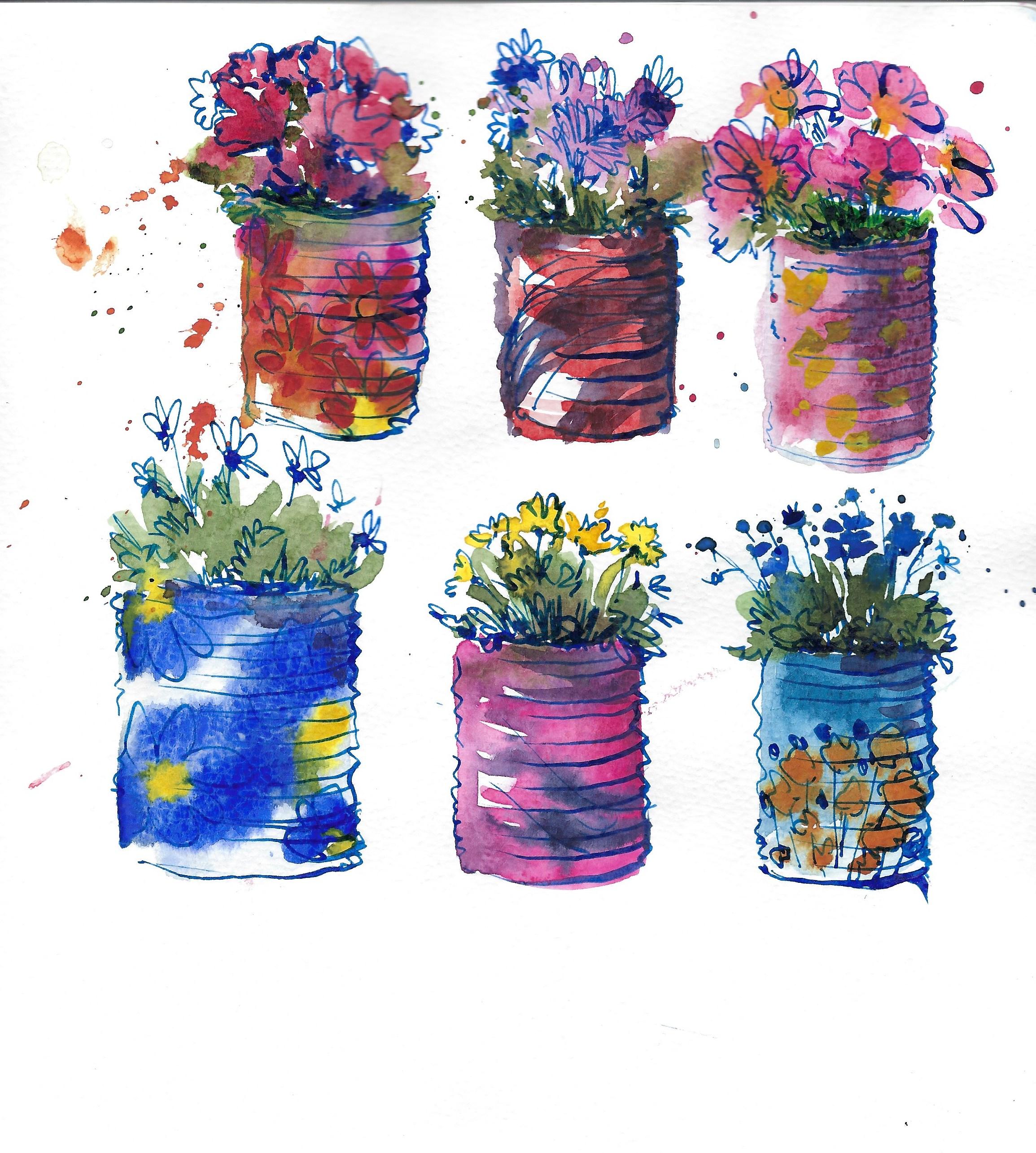
13. Project 2: Foliage In Can Planters/ Watercolour Sketch: Next illustration is quite
simple and a quick one. It's not as elaborate as the
one that we did earlier on. So we're going to do these
little cans of plants. And we're only going to try and do three of them. From here. You can pick anything
that you like from here, or you can even chip and change your ideas with the color
of the camera as well. So we're going to
start with just like how we did with the
first illustration, a quick line sketch. And I'm going to
try and do three. I'm not going to do all
the details right now is just to know where I'm
going to place the cans. That's going to be one can. And I can add or it can just be a nice rectangle for now and then you can add all
the details later on. Let's try doing the
next one about here, trying to keep it
in a similar size. This is the reason why I
started off with a pen first. That's another one here. And the last one is going
to be somewhere about here. Trying to keep the similar
size and similar spacing. If you think you didn't get
the spacing right here, I think it's a bit more wider. You can always move your
can to this side view, like when you do
your watercolors. I've got the three
cans placed evenly. Now let's start off with
some quick watercolors. So just keeping these
as the reference, you don't need to go
buy any of the any of the cans that are here is
just purely for reference. You can be as free as you like. In fact, it's not
necessarily that you need to have this reference
picture at all. You can just think about how the cans look and have a little
bit of foliage in there. So let's start off
with some watercolors. And I'm going to start off
with a medium-sized brush. Again, I'm using the
saint as same size, size number 12, I feel that it's a good size for me to
work with personally. I'm going to get two
jars of water here. Let's start off with
the shape of the can. Again, just feeling really free to use any color that you like. I'm going to start off with a very basic ultramarine blue, starting off with the width, an alkaline to begin with. And then I can add these
little lines just to show the lines on the
canvas texture on the can. And then I can add these
little quick scribbly, squiggly lines just to depict the shape or the
outline of the can. I wasn't very quick wash. I'm not too worried about
the neck of the can because there's going to
be foliage here anyway. The bottom, I'm just going
to curve the bottom edge. We've got the first column in a very light wash. Just to
begin your illustration width. Now, let's get some green. You don't really need to wash your brush at this stage because there's only very
light wash of blue in your brush and you're
going straight into green. And the transition
between blue and green is actually really
beautiful to see. So that way, you do not need to worry too much about
washing your brush. Again, this is going
to be rather than light wash just to
place the colors. And you can, you can build
on it later on as well. You can let your green blend or bleed into your blue as well. Creating that beautiful
color bleeds in watercolor. And using the tip of
your brush you can create the impression of leaves. So I've got green and now I'd
like to wash my brush now. And then it gets a
little bit of color. Let's say this
time it's going to be nice, bright rose color. For some flowers. Again, I can only give little squiggles of brushstrokes
to show the impression. Nothing more. The best way to do it is to keep
it rather simple. You don't have to worry too
much about how it looks. We're just enjoying the
brushstrokes at this stage. If you like, you can also do
a little bit of splatter. So that's the first wash. Now
let's wash our brush clean, take up extra water on
the neck of the jar. And let's go back to
some ultramarine blue. Now, darkening. This time we don't
have a lot of water, we have more pigment
on my brush and we're just darkening
certain areas. Okay, so now let's
move on to some green. I'm using sap green
with this time. I'd like a little bit
more deeper green. So I'm using a little bit of red to create that
deeper color of green. And also it tones it down
slightly, creating more off. More of a softer
green, not too bright. So it goes really well
with the rose color. Flowers as well. There has been a color bleed with the rows and the
green here already. So I'm going to try
and work around it because I like to
preserve these color bleeds. So making sure I'm
not overworking, I'm adding the second
layer of green. We don't need a
lot of pigment at this stage because
we're working on a very small illustration. Now. Let's add a few more
green foliage here. And just making sure that I'm leaving a lot of
whitespace is in-between, just getting a nice contrast between the leaves and
the flowers as well. Okay, Let's wash our brush clean and take up excess
water on the side of the jar. You can even wipe your brush across your
tissue for a bit. Going back into that rose color. This time you don't
need a lot of water, which is why I wiped
it off on the tissue. Getting a little bit of
pigment straight from the pan, just dropping in tiny bits. If we do this only if your first wash was
a little bit dull. And you think you wanted a
bit more pigment in there, especially here where
all the splatters have been mined look a
little bit too pale. And just adding more pigment, we don't need a lot of
water at this stage. I think I'm done with the
first Can leaving that to dry. I'm going to move
on to the next one. Let's start with
a very pale wash. You can use any sort of gray that you have
or a neutral color. I'm using Payne's gray, which is very neutral. And I'm using a
very, very light. So it's just to create like a little backdrop for this Can. The same way as we did here. It's quite a repetitive pattern. Then just doing these
little lines to create the impression of
the texture of can. I've got this very light gray
and little squiggly lines on this side to show the texture
or the shape of the cam. Let's move on to
doing some foliage. Let's start with green again. Or you can even stumped
with another flower color. I'm going to start with
some deep red this time, like more like a maroon color. So I have some Alizarin crimson. Crimson, red with a
little bit of deep blue. Like endeavoring blue or indigo, just a tiny bit should
be fine and you'll get those very deep maroon color. So still preserving
that redness, just a little bit of blue
to create the maroon color. And then you can create a little brushstrokes if
you'd like at this stage, that's completely up to you. I'm trying to create like
a little flower here. Let's try another
one's sideways, and maybe less. Another one here. You can let them bleed
into the canon as well, like how we did here. And then I'm going to dip my
brush slightly into the jar. They kept some pigment
from my brush and then do a very light wash, leaving a little bit
of white as well. So it's not like a huge puddle. While it's still wet. I'm going to wash my brush
clean and grab some green. Wash my brush clean. I need to take out the
extra water from my brush. Let's move into green. Sound a little bit of red to make that green
a bit more deeper. And also a little bit
of ultramarine blue. To get a very nice deep green. Let's Plays a few lines here. Just to show some green foliage. Few lines in between
those flowers, you can let them bleed
into each other. That's absolutely fine. You shouldn't be
worried about letting the colors bleed into
the canon as well. My brush clean. Like to
take the water again from my brush and just briefly going into some fresh yellow
if it's nice and damp, you can just get it from the pan and then just
place a little bit in the center of these
flowers just to show some yellow in the center. Now, moving on to the camp, like to add some
pattern onto the can. Or maybe let's just go
back into the yellow and then add like large yellow
petals like shapes. Washing that off. Let's get some blue
and the blue is fine. We're just trying to
create a pattern. Then create this large
petal shapes around it. Again, this is just my idea. You can create any sort
of pattern you like here. Okay, so that's looking good
enough for the final can. Start using some nice warm red, well that can peach color. So it into the right
and I'm going to add a little bit of yellow, very tiny bit of yellow to
just make it nice and peachy. Let's do that. For the can. Just like a base color, you can always come back
to it with another color. And then again, repeating the same steps as we did
for the other two cans, creating this
texture of the can. I'm just going to
wash my brush clean. Take up excess
water on my tissue. And let's get a little bit
of more of or any color. I'm just going to
do some dots in there trying to
do this cam here. Let's do like a big circle here. See how that works. And then you can just
randomly place some circles. And then when you're here, you can leave some white on painted areas just to
show light reflections. And the same with here as well. Okay, so let's move on
to the foliage now. Washing my brush clean and
moving into some green. Always make sure
that you don't have a lot of water on your brush. A little bit of
water is fine for you to activate the paint. I'm using a little bit
of ultramarine blue into my green and maybe a
little bit of red. Again. So the deep green again. This time, if you like, you can create the
shape of the leaf. If that works for you, Not necessarily you do. Okay, I've got some
leaves, wash it off. Maybe get some nice
color for the foliage. You can leave your phone, it should be white as well. Do like a little
outlined or pretend outline for the foliage
here are the flowers here. And then when we use our pen, we can add details of
flowers there as well. Just to show some white pants, I'm going to use a little
bit of deep purples. So if you have leftover
marooned from this flower, you can add a little
bit more deep blue to make it
nice, deep purple. And then do a little bit of
it in the center here and the rest you can do with
your pen when it dries me, making sure to leave a lot of white area because we are
creating white flowers. I'm done with the three
cans in watercolor. Just going to wait
for this to dry. And when it's completely dry, we can come back to it
with some quick lines.
14. Enhancing Your Sketch Using Pen: The watercolor is
completely dry. I'm going to start using my pen. I'm going to use my
fountain pen now. You can, if you're using
dip pen that is also fine, or any salt of waterproof
pen is completely fine. So let's start with just like how we did with
our previous project. We're going to start with the darker areas and
trying to create lines and texture with listened lines first and then you can work
your way up from there. So little dotted lines,
little squiggly lines. At this stage. We're going to do
a line here for the bottom of the
can. And might. Just trying to add large lines, squiggly lines to show
some darker area. And then maybe quick
lines for the flowers. Can be any flower, can be a flower from your
imagination as well. Don't worry too much
about how your flowers look can be very sketchy
if you prefer that. There's a lot of texture with just watercolor in this area. So I don't think I need to
add a lot with the pen. I'm going to go into areas
where it's quite flat, just like a wash. And then I can add some texture in there. Let's try adding some
texture of the can now. Just starting off with
a dark line and then just tapering it off as I come
towards the lighter area. Starting dark, lightening
your line as you come here. Just adding a little
bit of shadow here probably from the phone AJ. Just adding some
darker areas here, just for some contrast. A bit more contrasting
black lines or shapes in this side. Okay, we're done
with the first one. Now let's move on to the next. Can. Again, we're
going to repeat our process of creating this beautiful
texture for the can. Here where there's a
lot of color bleeds. You can add lines for foliage to depict
some foliage here. It's just creating the
impression of flowers. Let's go on and add
some more lines. Just creating contrast
with deep color, with deep pen lines as well. You can vary the
pressure on your lines. You can have very
light lines and then just build it up
with some darker lines. If you think it needs a
little bit more texture and a little bit more contrast
in your illustration. And let's just continue
doing the same thing as we did for the scan here. Okay, just adding some more darker color
here for contrast. Just to bring out the
flowers that are there. Few more contrasting
colors here. And I think we can, I can leave it like that now. That's looking all right. Now, just finishing off the can, maybe a few lines for
texture on the can. If you'd like, you
can darken the areas that you think needs to
be a bit more darker. If not, you can
leave it like that. Until we are done
with this scan. Let's move on to the next one. The next one we have
an extra job of remembering that it is
going to be white flowers, so you can add the impression of white just here right now. You don't have to because
you can make it up. Something else if you prefer. But that again, is
completely your choice. You can scribble a little
bit for some contrast, just add lines for your details. And we're going to finish it in a similar way as we have
done the other two cans. Just to impression of parentheses with a nice
purple in the middle. The best way to bring out
a white flower is to add contrast in colors or lines
around the white flower, leaving the white flower
without any paint or asset is, I am trying to do a lot of
scribbles around this flower, just bringing that flower out, making sure it looks white. Let's add some
contrast here as well. So that way I can
bring the flower out. Bring this flower out, because it's right now. It's hiding in-between
all the foliage. Add some more contrasting lines. Over here, is finishing it
off at the neck of the can. And let's finish off
the can itself. No. That looks good. I'm going to stop using the pen. Final touches. You can always go back into your watercolor if you
think that's better. I'm going to go back
into my watercolor to add some deep green
in a few areas, especially on this can
just getting some green. Make it deeper using little
bit of red and blue. Maybe adding a little bit here, just around the flower, making the flower stand out. And it's also a good way for
me to splatter paint now. Or even just leave
some dots and dashes, creating texture, creating more interests
in your illustration. You can do the same here
for this one as well. Just some darker color or purple color here
for the flowers. So the purple that I'm
using now is the same color that I used for the
center of these fancies. Just got a little
bit leftover from my palette to add some
deeper shadows here. And we are done. We're finished with our
three cans are quick. Watercolor and ink sketch. A great way to relax
because there's not a lot of things that we
need to remember here. And also it is a repetition, which means it is a great
way for you to relax and to work without
thinking too much just yet. And that is also a
great way of creating your own lines in your own unique style in
your illustration as well.
 Suzanne Abraham, Artist