Transcripts
1. Introduction: Hello and welcome to my course on urban sketching windows and doors. I'm Suzanne and I am a watercolor artist. I also love to paint in the traditional technique of line and wash, using watercolor as my initial sketches and line for enhancing my sketches later on. The reason why I do alone in wash technique is because I have a very busy showed you and it definitely fits my busy life as a mother. These illustrations usually take only about 20 minutes of my day. And that along with inking them or enhancing these illustrations will take another ten minutes. So these illustrations are great for anybody who would like to do quick sketches during the day. In this course, I'll be showing you how to paint some urban elements. Starting off with some potted plants and falling wages, as well as looking into some pretty windows and doors. Later on for our project, we will be using these illustrations that we did to create our own composition of a window and door, or mainly to create the facade of a building with some windows and doors. As the last time, 4H. This course aims to be very flexible, especially with the colors you use, and also with the techniques. You can start off with watercolor sketching and leave it at that stage if you don't like inking over it. Or you can even try inking fast and filling that in width watercolor washes. You can work any way that you prefer. And my code is only going to be a guideline for your illustration. I hope you will enjoy the class as well as the project. I'll see you in the next video with more details on materials.
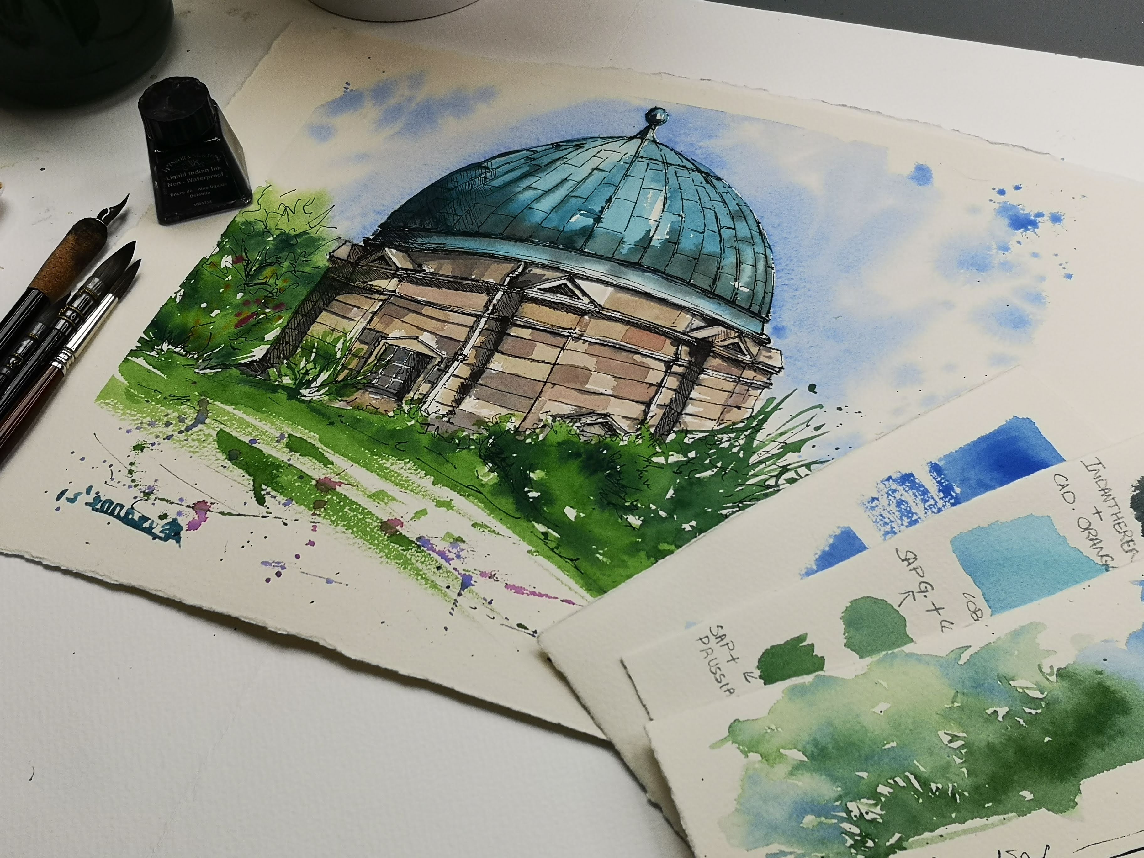
2. Suggested materials: Let's look at some of the materials we require for today's course. Let me start off with watercolor paints. I have a palette here with watercolor paints squeezed out from tubes. I normally use tubes and watercolor pans. It doesn't matter what you use, as long as they are watercolors and they're good quality, it should be fine. Also, there are no specific colors that we require today. You can use any Carlos. And I think if you have a collection of primary colors, you should be good to go. Now moving on, we're going to look at some of the brushes we need. You don't need a huge variety of brushes today. You can just do with one medium sized round pointed to brush. What I have here is size ten. I also have a smaller one of size six. It only if I need to do some details with it. But if you don't have it, don't worry. Moving on, because this is, this is a line and wash technique that we're going to talk about today. We definitely need a pen for our lines. I usually use calligraphic pimps mainly because I like the characteristic lines that it produces with these beautiful nibs. If you're using a calligraphic pen, I would suggest that you also have indenting. Indenting is slightly thicker than a normal calligraphic Inc.. And also you also get that in waterproof. The part here says it's non waterproof butt. I filled it in with waterproof Indian ink and it is perfect if you want to do some washes over the lines. Again. If you're not comfortable with calligraphic pens, you can always use a normal black ben or a gel pen. This one here is waterproof as well. It's not necessary. You need to have a waterproof. It just gives you a different effect when it's a non waterproof. Another material that you may require is a pencil and an eraser. It's not necessarily that you have them for today's caused mainly because we're going to try and do some watercolor washes directly onto the paper without any pen mark saying that for your final project, if you would like to do it in a large scale, it's always best to have pencils so you can mark out a few things. You would also need tissue, paper or kitchen towel to dab any extra paint. And two jars of water, one for fresh clean water and the other one for washing your brushes in. The next material, which is the most important of all the materials is watercolour paper. It's very important to use good-quality, a 100% cotton watercolor paper so that they can hold washes and they don't much like a normal paper. You can also try to use multimedia paper. And that usually works for a line and wash because we don't have a lot of layers on this one. I also use a mole skin sketchbook. For some reason. I loved her paper on more steam sketchbook and it can hold afield washes and it doesn't tear. It's very durable. And the good thing about this book is that the paint layers dry pretty quickly, which means you can place extra layers on top of it. If you are somebody who likes to just get shoes every day and you want to keep them together. A sketch book is a good option. So that's all the materials that we need for this course.
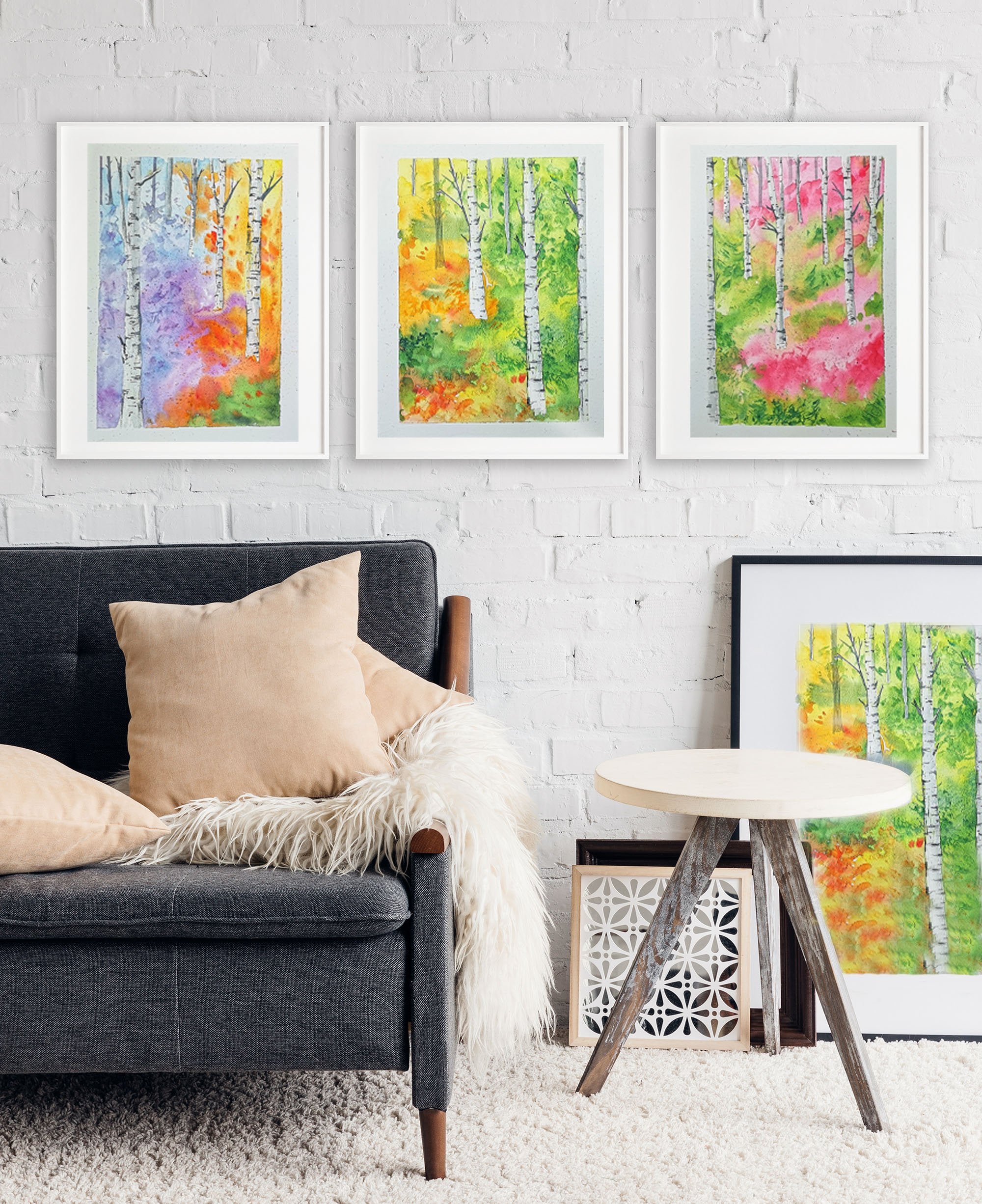
3. Watercolour foliage (part1): Let's start off this class with some water color illustrations. These are simple illustrations of foliage and some architectural elements that we would require for today's cause. So I have placed my paper, my board color pains, and two jars of water in a way that it's easier for my hand to access it easily because I'm a left hand. I have kept my palette on the left side. If you're a right-hand or it will definitely go on your right side. I normally keep the two jars of water right in front of me so I don't have to ligand over anything to get water and I'm not going to drip anything onto the paper. So once you have your brush ready, the brush that I'm using here is size ten. You could use a thighs 1012 or eight as long as it has a pointed tip. So let's start off with some illustrations. The first thing we're going to illustrate today is long truck full of foliage. So for that, I'm going to start off with the foliage first. Preparing some lemon yellow here. So as you can see, it's, it's not too watery, but at the same time it's not too thick. I'd like it to be nice and flowing at this stage because we're only intending to do watercolor wash and every other detail is enhanced by our pin. So I'm gonna start off with my first Bosch. And please note how I'm holding the brush. I'm holding it away from the tip of the brush. This is because FM holding it too close then my hand movement is restricted. So I'm holding it well away from the tip of the brush. And I'm doing lazy staple on the paper. The tip of my brush. Again, if you want to cover a larger area, you can use the whole body of the brush down so you get a wider coverage. And when you want the details, like the foliage details on the edges, you can use the tip of your brush. Now moving on, I'm going to prepare some sap green to go along with this yellow. We are going to prepare it in the same consistency as that of lemon yellow. And it doesn't matter if it mixes with the lemon yellow. So we're going to place the Sap Green over the lemon yellow on the paper. Because we're doing a retina wet wash here and the lemon yellow is still wet. You can see that as soon as I placed the sap green, it's sort of spread into that lemon yellow. You can still see tiny bits of lemon yellow underneath, but the whole area is kind of taken up by a Sap Green, which is fine again, because that's exactly what we needed. We wanted the Sap Green and the lemon yellow to mix well. And of course, I definitely love doing a lot of splatter on my paintings. I just loved the characteristic effect it has when we splatter paint on paintings. And it does get a bit messy. But again, that's part of the fun. Scattering pained is so much fun and it definitely makes you more happy. It makes you feel like a little child. And to just let go and team lead Twilio painting. I'm just going to add a tiny bit more depth to that foliage. So for that, I'm dropping in a bit more green. And this green is mixed with a tiny bit of Prussian blue to make it a little bit more darker. And you can see that it's definitely more darker than the sap green that we used before. And you can also notice that I'm placing that dark green only on one side. Mainly. That's because when we paint, we need to always make sure where we know where the light is falling from. So for me, it's falling from the left side and because of that, the darker side is the right side. So again, if you don't want any hard edges, you can always diluted down. You can use just plain water on your clean brush to pull on that pigment. And you can make the ends of BIT diluted a bit more knitr. That's just another effect. And it's completely optional. If you like carder edges, you can leave it that way. Or if you want lighter hazing edges, then you can try and water it down with a clean brush, like how I've just done. Now. I'm using vanishing red for the plant parked underneath. So just prepared that and I'm going to pinned under that foliage. So obviously we can't see the whole of the trough because the foliage is covering half of it. And so I'm just painting only the areas that you would see just under the foliage. And again, you can see that I'm actually going into areas where it is already wet with green. And it doesn't matter because I'd like the, the green and the Venetian red to mix together. Placing in some deeper brown, It's just underneath the foliage. The pigment that I'm using here is a mixture of the vanishing red that I used for the pot and a tiny bit of Prussian blue with it. And it gives me a darker, deeper brown. So you can see again, I've only pleased that deeper brown on the right side, leaving the left side a bit more on the lighter side. And you can see how that brown and green is sort of blending together. And please don't panic seeing this because when it dries, it's going to leave a very beautiful effect. And I assure you that you will love it. Moving on, let's try and do a pot plumbed just on its own now. So here I have started off with vanishing red. And you can see it's a very, very light Wash. It's gotten a lot of water in it. And that's fine. And now I'm going to place in a bit more pigment in it. So the way I'm doing it here is going directly onto the watercolor pan and getting some pigment and just placing it fresh onto that little part that I'm painting. Next, I'm going to go straight in with some Prussian blue. And just going to do a little bit of details on that part. Again, I'm placing the darker things on the right side just to depict that the light is falling from the left side. And you can see because we are doing it in wet and wet, you can see that the blue and the vanishing red just kind of mixing together. And now I'm just going to roughly illustrates some foliage as well. So the colors that I'm using here for the foliage is Sap Green. And if you want it to be a bit more darker green, you can always mix it with a tiny bit of brushing glued to give that darker, deeper Green. And I'm also going to use some read. Any sort of red is fine. Just to show some flowers. Again, if you like, that left side to be a little bit more lighter, you can always lift out with your brush. As I'm doing here, my brush is clean and it's damp. It's not full of water, it's just dam. And this way you can lift out extra paint. Let's try up just one more part with a different shape this day, more rounded. And again on this one, the light falling on it will be different. So again, the right side is darker and then left side is much lighter. And because it's rounded, it's definitely going to have a highlight. So I just lifted out that paint from the left side and you can see it's much lighter than the exact color of the part. Placing in some details like the base of the neck of the pot, just add in a few lines just to indicate that these are there. And it's not just any shape. But saying that you don't have to do a lot of details because we are going to use ink over it. And you can definitely add in a lot more details. But at this stage, it is more about placing in the dark and the lights just to show where the lightest falling and what area is in the shadow. Next, we're going to illustrate hanging part. So going with the same steps as we did for the falling edge, lemon yellow, Sap Green next. And if you need more depth in your green, you can always add Prussian blue. It's the same steps that we did for our first gland. So I'm going to try and do two hanging pots. And again, if you like any flowers in your hanging parts, you can use the same movement of the brush to do flowers, but with a different color. And you can choose any color of your choice. You don't have to go with mine. Again with the falling edge. If you don't need the green and the yellow in there, you can always change it and do another color because there are lots of other lovely colors for the foliage out there and everybody has different interests. So please go ahead and feel free to change the color of the falling edge if you like. Just painting in the pot as well. Again, using many vanishing red for that. I'm also going to draw in a few lines with the tip of my brush just to indicate that they are hanging pots. Next illustration is going to be our lab underbrush. And for this, I'm preparing some violet, lavender color for that mixing. Ultramarine blue and permanent rose to get the correct color. If you have a violet or elaborate in your palette, you can always use that. I'm also going to mix in some green. If you noticed the green of lavender Bush is, it's not as bright as a Sap Green. So for this, I have mixed it with little bit of Prussian blue as well. And as always, I have made it quite diluted, so not too thick. My movement off the brush here is slightly different to what we've been doing for the other 40 pages. So you can see here that I'm using the tip of the brush and making very quick straight, rigid lines and doing it in an upward motion. So I get the tip of that Bush nice and fine. Now while that green is still quite wet, I'm going to place him some dots for the lavender flowers. And you can see that the edge where it's touching the green, the lavender and the green is sort of mixing and blending together, which is okay, again, to finish it off, just going to finally add in some depth to the green as well. I'm going in with some more pigment but less water. The green that we were using here was a mixture of Sap Green. And you could also try using other greens if you have a perfect color for this.
4. Watercolour foliage (part 2): Hello again. In this video, we're going to continue painting a few more architectural elements and some more foliage that we could use in our paintings. So I'm starting off with the study of a brick wall with a little bit of foliage in it. So let's start off with painting some bricks. It's very easy. Just a rectangular shape. And the pigments that we are using here is venetian red and a tiny bit of Prussian blue, which you can see a, dropped it in the corner. So I'm going to start off with the next break. And here you can see I'm trying to make another rectangular shape. And this time I have more of Prussian blue mixed with the Venetian red here. Let's continue painting some more breaks here. And you can see I'm leaving a slight whitespace between each Rick. This is so that it doesn't mix together and which means it won't stay as rectangular shapes anymore. So I'm leaving that very slight whitespace in between each brick. It might touch each other in some areas, but more or less try and leave a small white space in between them. And you can see that I'm actually only using two colors here, that's vanishing red and Prussian blue. So I start off with vanishing red, and then I move on to Prussian blue, just dropping in the pigment in the corners just for some darker areas. If you observe a brick wall next time, you can see that it's not all red in color. If you really observe them, you can see that each brick is a different color and it's also got this different discoloration. It's got a light and a dark as well. So this is the reason why we're trying to bring in the same texture here. Now let's try and paint some roof tiles. Again that started off with vanishing red here. And you can see I'm just randomly placing the color on the paper in a very random slanting rectangular shape, or what we call a parallelogram. If you know a little bit of geometry, you might know what a parallelogram is. It's a slanting rectangular shape, and that's what I've painted here. Once I've done that first layer of vanishing red, and we're gonna go in with a bit more pigment and just placing some lines for the roof tiles. Next, I'm also going to place a few curved lines. Just to indicate roof tiles. And you can see here because I'm working wet in wet, all the lines have gone a bit fuzzy, which is fine. We only need a little bit of detail here, and the lines being fuzzy is not a problem at all. One thing to remember here is that when we're placing these lines, you can see here that it's sort of converging or closing in when it's going away from us. So those lines to straight lines that are placed, they are wider, nearer to me and the slightly more narrower when it's away from us. This is a way of showing that there's depth in the illustrations that we're doing. So if you were wondering how I got a very nice line, a darker line of vanishing red on that wet surface. I've actually gone into the pigment with very less water and a little bit more off the pigment, which means it's slightly thicker than the consistency of paint that we used in the first layer when we did the rectangular shape. And that's how I made the darker lines. Now I've mixed some Prussian blue with the vanishing red. And that has helped me to dock in a few areas on the roof tiles. And finally, I'm just going to place in some shadow areas on the roof tiles. So you can see I have painted a little bit more darker, vanishing rent or brown. That's the brown that's mixed with Prussian blue and vanishing red. I've just painted only on one side of the roof tiles leaving small areas to highlight, just depicting the light falling from right side. And with this, I think we're finished with our roof tiles. We will come back to all of these illustrations to use some ink and calligraphic pen. So let's paint another architectural element. Now that's stairs. I've started off with a very rough rectangle. And the pigment I'm using here is raw number. If you don't have this pigment, you can also start off with a neutral tint. I'm using a very diluted form off this pigment. It's only just to depict the shape of the stairs. And then later on we can build over it with more pigment. I've done the first rectangular shape. And now I'm going to do another rectangular shape. And you can just join the corners. When you draw the second rectangular shaped, makes sure that you are leaving a white space between the first shape and the second one. And we're just joining the corners that we, we get stairs, easier way to do stairs. So I've done the same process for the third stare as well. If you can see here, I have left white space between these three rectangles. And I've just joined the corners with lines. And this way I've made Three stairs. So now we've placed the stairs, now we can start building some layers on it. I've just used raw amber again to darken out the stairs. So this time I've added a bit more pigment. It's not as watery acid wasn't the first layer. So you can see definitely there's more pigment here. If you also notice that I've actually painted the stairs wet in wet. I've done the first layer which was very diluted, and then I've dropped in some more pigment while the first layer was still wet. And now we're going to start off with some foliage by the side of the stairs. Again, we're working wet in wet. And for the foliage we're using Sap Green. You can also mix it slightly with Prussian blue if you'd like a bit more bluish green. Or you could also use hookah is green if you like. Now if you see here actually painted wet and wet and you can see that the pigments are blending in together. They're mixing together. And this connection is very important in very loose watercolors that we're doing right now. If you don't want any huge puddles or uneven shapes, and then once it, once it dries, you might feel that you can't understand what you've painted, then the best way to avoid that is to leave a few whitespaces. So as you can see here, the stairs has got white areas. So you can actually differentiate between the three rectangle shapes, as well as those white areas serve as the top part of the stairs. Moving on, I'm going to place some violet to pigments between that green foliage just to show some flowers on this foliage. So if you have wireless pigment, you can use that. Or if you do not have that, the best way to get a very nice vibrant Violet is to mix permanent rose and ultramarine blue. And that gives a very nice blue violet color. I've placed it amongst the green that we painted and it's okay if it just blends in with the green. When you place it in, wet, in wet. When you place a new pigment, wet in wet, It's tens. The pigment that's already on the paper tends to move out. So the new pigment has space. And that's what's happened to our pigment here as well. So I'm just placing some more purple flowers on the other side of the stairs. Purple or violet is just my personal choice. If you're not a big fan of this pigments, you can always change the colors of the flowers. After all, these sessions are for us to enjoy. And you are most welcome to use any colors that you like. You do not need to stick to the exact colors that I'm using. It's always a personal choice. Again, another thing that I loved doing in water colors is to splatter paint. This is, again, my personal choice. Some people might like it a bit more clean, but I just loved this platters. And for me it's part of having fun with watercolors, and I just love to see them splatter on paper. I normally do it as placing the pigments. If you're not too sure, then you can always wait until the end. And if you think you want to add more, you can always add some spatters then. But if you just want to enjoy what you're doing, why not try flattering? Now? Our next illustration is going to be that offer bougainvillea. And we're going to start off with some red pigment, that is Alizarin crimson hue that I'm using here. As you can see, I've just started off with some very lazy stippling, just like how we did all the other colleges in this session. And please note that even here, I'm actually holding the brush away from the tip. So I get more movement, more free movement of my hand. And if you note the consistency of the pigment, it's not too watery and not too thick. It's somewhere in the middle. So you've got enough pigment that can show how viper in toward colors can be. So I'm just continuing to do some lazy stippling, creates some texture of the broken glia tree. And two at the top part of the tree. I'd like it to be a bit more lighter. So here you can see are gone and diluted the pigment towards the top part. And now to the bottom of that folder, yij, I've actually taken a bit more pigment, which means this time the pigment is long and the water is less. And you can see the difference immediately. Wartime painting now is a slightly more darker than the first layer I did. And it's definitely more darker than the lightest area at the top. Now, I like to do some mixing on the paper sometimes. So here I'm just doing a bit more darker areas. And I've just mixed my Alizarin crimson with some Prussian blue. You can either choose to mix on paper, which actually gives you a very dramatic effect once it dries. Or you can choose to mix it on your palate and place it on the paper. It's your choice. It all depends on how you want the interests ought to be. So I've kind of finished doing my broken philia foliage, just the flowers. Now let's move on to painting in some tree bark. So for that, I am using burnt umber. So I'm just preparing the Bund underpinned. And you can see that here. It's not too watery again, and it's not too thick, but it's somewhere in the middle. Which means when I place to pigment on the paper, it's still very vibrant and it doesn't flow or not. So just pulling down a few branches of the tree. If you notice broken billion trees, the tree barks quite uneven. It's got a lot of branches and it's more like an overgrown plumbed. And the stem bit is quite thick and it's got a lot of texture to it. It's got a lot of branches as well. So this is what I'm trying to depict here with just a few brush marks. That's all we need. As you know here we're doing line and wash technique, which means we don't really need to show a lot of details on any of our illustrations, which is the fun bit of theta because we don't need to break our heads over. Making it look very realistic and having a lot of details on it. So I'm keeping my details to the minimum. I'm just adding in a little bit more dark areas on that tree trunk. So far, the darker pigment just makes my bond to amber with a tiny bit of Prussian blue. If you notice, most of our darker colors have been mixed with Prussian blue. So it's just my personal choice, again, that other people might choose to use a more neutral teams. But for me, I just love the color Prussian blue. And I tend to use it quite a lot. So I'm just working on that trunk again. I just felt that there was a lot of pigment, lots of dark areas on there. So what I've just done here is to list out some pigment. So if you remember how we lift up pigment is to make our brush clean, make it quite damp, not dripping wet. And just place it on top of the area where you want to lift out paint and you'll be able to lift it up pretty well. Sir, just finishing off this foliage. I just have to do glottis. I just loved doing splatter. It just makes me feel so happy to reduce platters. If you have anything specific that makes you feel happy while you're doing your illustration, please go ahead and do that for me personally, it's flutters. For some other people, it might be huge washes. So please feel free to do your styled in these illustrations. For our next illustration, we're going to see how we can paint stones, mainly parts of stone buildings. You might have seen a lot of pictures of old run-down stone buildings. And I just loved the texture on those buildings. So we're just going to try and paint that in this technique that we're going to do today. So starting off with gray wash, and you can see that I'm going straight to wet the tip of my brush. And I'm going straight into painting. These rock shapes. The pigments that I've used here make this grey color is Prussian blue and burned amber. Again, these two pigments, like miracle combination for me, so different shades of grace and brands, which is really needed for today's illustrations. So here I have used more of Prussian blue and less of bond, but to get this gray shade. So if you vary the amount of Prussian Blue and burned on, but you can make a lot of different shades of Brown's as well as grays. So try, try out a few shades and see which one suits you best. Or you can just go and use neutral tint or Payne's gray for painting in the rocks. Again, I'm just doing some foliage at the bottom, just, just to show it's the bottom part of an old building. So after us placed some Folly, a cheer, and now I'm just going to water down the bottom area of that foliage. So you can see here that the color from that foliage is running down. How I did this is washed my brush clean and have just done the bottom area of that foliage. And you can see that the color from the foliage is running down into the new wet area. This is a great way of water down technique and you can get all these beautiful dramatic effects with this technique. Just adding in some burnt umber as well. And I'm just painting in some curved lines just to show the texture or for cobblestone flow, which you normally see around old buildings as well. So it's somewhat similar to how we did the roof tiles. The same curved shock lines. And I'm also painting in some curved shapes. At this moment it looks a bit too abstract and you may not realize what this is at this moment, but when we start putting ink over it, then it's all going to come together. So with this, I think we've finished with painting some of the architectural elements. In the next video, we're going to look into a little bit more detailed studies like doors and Windows. I hope you have enjoyed it so far. And painting and doors and windows are going to be equally beautiful and exciting. So I'll see you in the next video.
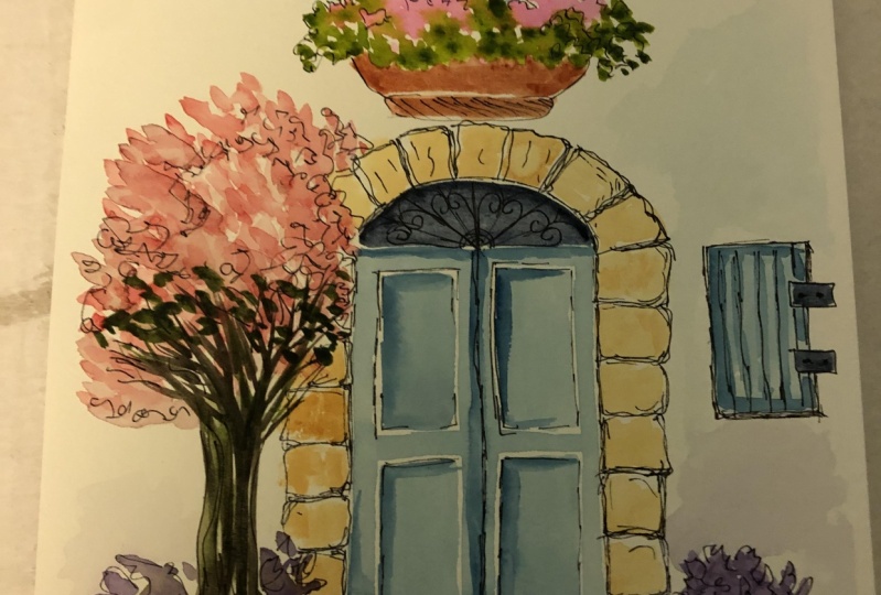
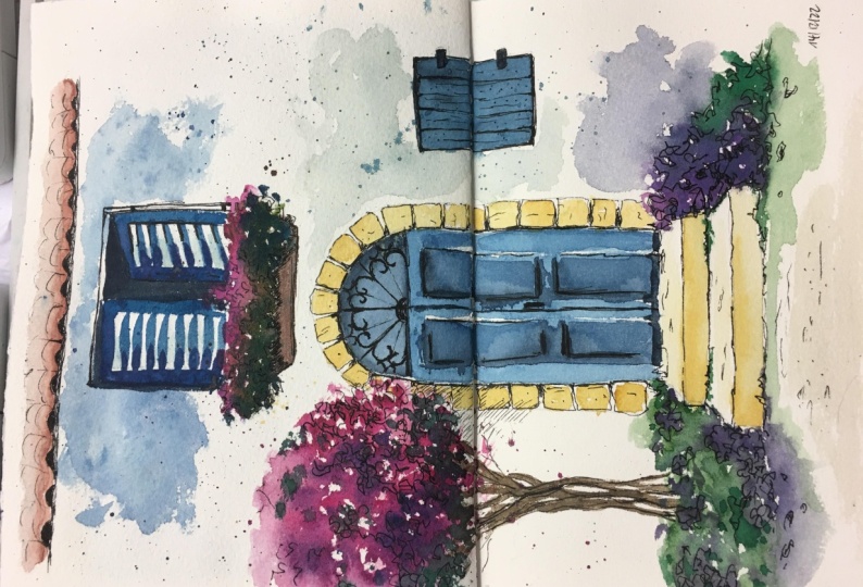
5. Watercolour windows: Hello again. We're going to look at how to paint windows in this video. So if you've never painted or drawn windows and doors, don't worry, because this is super simple, super easy. So I've just started off with a very basic simple shape that is a rectangle with the bottom open. The reason why I have left this bottom bit open is so that I can play some foliage. So this is the frame of our window, and we are going to play some foliage at the bottom of that window. Just to paint very pretty Windows scene. So the color that I have chosen for painting the window frame is very neutral tin, that's gray. And for the foliage of chosen Alizarin crimson hue. If you've seen my previous videos in this course, you would, you would know how to paint very simple folded shape. And I'm also going to place in some green for the foliage just at the bottom of the red. So we've got flowers and we've got lead. So if you notice here that the pink or the red of the flowers have actually blended into, mixed with the window frame, which again is fine. Next we're going to paint in the shutters of the window. And for this I am going to use ultramarine blue. You can choose any color you like. We're going to do a window shutter that is open outwards. So for that, we need to slanting lines going away from the frame of the window. So I've got a slanting line at the top and I've got the slanting line at the bottom and then the straight line which is parallel to the frame of the window. Just filling that in with the blue. And we're going to do the same on the other side. So have got a slanting line, line slanting towards the top. And we'll have another line slanting towards the bottom. And we have the straight line, the vertical line which is parallel to the frame of the window that be painted first. This way, we've actually created an illusion that these two windows shutters are open to what's us. So you can see here, while I was painting that shutter, it actually mixed with the green, which is okay. But I've also made sure that I've left a little bit of white spots. So it's not completely mixing in with the blue. The reason why I did this is because that green and the blue is still quite wet and it could really blend into each other. But I do want to keep a little bit of shape and that's where the white areas. So after mixed in a little bit more pigment, the same blue again, and just place it on Mac Windows shutter. Just a few lines just to define the edges. Moving on, we're going to paint in some breaks at the bottom of that window just to show part of the break wall. So, um, I have prepared vanishing red for this. And I'm just placing very random rough rectangular shapes at the bottom of the window. So you don't have to be overly concerned about the shape of the bricks. It may not look very rectangular shape and it may not be laid down in neat rows, which is okay. A little bit of messiness actually adds on the beauty of an illustration. After all, we're not trying to recreate them exactly as we find them on buildings. We are just giving an inclusion of bricks. And you can chip in change here in there. Just to add in that extra little bit of interest to your illustration. So if you remember from our previous videos in the same course, we have painted a little bit of bricks, and we've been using venetian red and a little bit of Prussian blue just to add in some darker areas on the bricks. So that's exactly what I'm doing right now. So I'm just adding in that darker areas, if possible, next time when you're out and about, do observe a brick building and see how the colors of brick Good to be. It's not completely finish and read all the time. It's not completely Brown all the time. It's also got these darker areas master for brick buildings, at least. Especially if they are very old, they definitely have a lot more texture than the new buildings happened outside and do a little bit of observation when you go outside next time. So I think we're nearly done with outbreaks. Just laying few more at the top of the window frame. Again, very rough, rectangular shape. I'm Andi actually calling the brush, not creating that exact rectangular shape. It doesn't matter if it's got uneven sides. I think we're quite done with this window Now. Before we finish off, I just wanted to do a little bit more in the inside of that window, which is rather plain now. So I'm just going to play some shadows in there. I'm going to leave for 1.5 of that area, quite wide, just to depict a curtain or some drapery. And also to finish off, I'd also like to add a tiny bit more details on that window frame, mainly at the top. Just to show the edges of that window frame where the top part end and the sides begin. So I've just done to slanting lines. Again, if you notice those tiny slanting lines or actually it's slanting towards the inside of the window. And this way you can show depth in your painting. I'm also going to do a little bit of shadow on MATLAB side. So I'm just going to paint a little bit more shadow on that window shatter. And this shadow that I'm painting right now is the shadow of the flowers. The reason why I am painting it on the left side window shutter is because and I'm thinking that the light is falling from the right side. And because of that, the left side is going to have a little bit more shadowy area than the right side. So for the shadows and actually mixing Alizarin crimson hue and Prussian blue to get very deep purplish gray shade. And I'm also going to do a little bit of shadow at the bottom of those foliage. And because the brick wall should be dry by now, even if it's not dry, it should be fine. It must be semi drive by. And now you can place the shadows going for them and let it blend with the brick wall. It should be fine. A few more shadows at the top calls that render frame, and a few lines on that cartoon. And we are done with this window. Our next window is going to be pretty symbol. And for this, choosing, the color cadmium yellow. And we're just going to do a closed shutter of the window just to show how we can paint a shuttered window. I'm also preparing a tiny bit of darker yellow by mixing in a little bit of orange and a little bit of cobalt blue with it, just to give me that brown shade. Or just to make it more easier, you can just choose to do a normal brown shade for darker areas. So starting off with the yellow window, this time, I'm going to do a window which has got a curved top. This is going to be rather straight forward because we are going to do a closed shuttered window. So I've done the frame of the window, the curved top. I'm just going to stick in the frames a little bit. Next, I'm going to paint short lines on both that white areas to depict shutters. I'm using the same yellow now. Just placing aim those lines and just finishing off at the bottom of that window. Where nearly done with this window. The only thing that's left to do here is to show a little bit of darker areas. For that, I am using the Brown that I prepared with cadmium yellow, a little bit of orange and cobalt blue. So I've got kind of a very light brown shade. Or alternatively, you can just use a brown shade to do the darker areas where painting wet in wet. And you can see that the pigments are kind of blending together. Just enhancing the frame of that shutters and, and the edges of those shutters as well. So let's shocked lines, just enhancing them, making sure we can see it. And we're nearly done with this window. Now the only thing that's left to do is when it dries, we're going to go over it with calligraphic pen and ink. Moving on to our next window, we're going to do another simple window. And this dime, the window is open and it's open to us. So if you remember the first window that we did, it is kind of similar, but with only one opening to that window. So very basic shape, a square shape. And again, I'm using a neutral tint, Payne's gray here. I'm just doing a little square inside just to show the inside of that window. And if I just joined the corners, I've already got a perspective going on here. Just to show depth. Fatty opening up this window again, I have chosen to use the teal color, which is like a blue-green color. You can choose any color that you like. So this window has only got one opening and it is open towards us. So the same principle that we used for the first window. So we've got the vertical line that is parallel to the window frame. And then we've got two lines that joins this white line and that window frame. And they are slanting and, and going away from each other as it comes towards us. Just painting that window frame in my favorite color. You can choose any color that you like for your window frame. With just darkening the insight of that window as well. With a little bit of shadow. I'm using the same blue here. It doesn't matter because that blue is already on towards the gray side. And I feel that should be perfect for any details of shadows. Next, I'm just going to darken the insight of that window as well and have used neutral tint for this. You can either use neutral tint or Payne's gray or any shades of grey that you like. Just randomly placing in darker areas and some shadows on the left side of that window frame. And you can see that I may have used a little bit more water on on that shadowy area of the window frame and that water has kind of blended in its gushed into the blew off that window shop window opening. I'm not going to worry too much about that at this moment. This for me is just a happy accident and I know I can do something about it when I am going to use my calligraphic pen and ink. Let's try adding something more to this illustration. So I'm just going to add a stone wall just at the bottom of that window. So if you remember again from our previous video where we did strong water illustration, you can do the same thing. So I'm just making an impression of a storm. Ron. We agree that I prepared with Prussian blue and burnt umber. So very random stone ships stuck together. Just like how we would see in an old building. You could do with anything really. It doesn't have to be a strong moral. It can be a brick wall or even a plastered wall. It's what you choose to have in your illustration. Now to finish this off, just going to paint some bushes at the bottom. So just starting off with green grass. And if you can see that made very quick movements with my brush creek upward movements to depict grass, I might just make this into a lab and Debreu. So painting in some lavender flowers with Violet again. So as I had mentioned in my previous videos, I do not have a violet color and my palate, so I normally mix it. So if you don't have a violet in your palate, you could get it mixed with ultramarine blue and permanent rows. Eight could also work with crimson red. But make sure that you mix and try it on another piece of paper. Just to make sure that you have the correct color. So you can see here that we are painting the lavender brush in wet, in wet technique. The foliage that is green is still wet. And I am just adding in the violet over it. And you can see that the violet is actually mixing slightly with the green, which is fine. Our next window's going to be pretty simple. It is a small arched window with some flowers growing at the bottom of it. You might be able to see these little arched windows in old buildings and castles. So starting off with a very small arch. Again, the base color, the first color that I've used here is gray and neutral tint. I normally start off my illustration to with a neutral tuned, especially when I'm not using a pencil line. And that way I can make any corrections or built over it. So working wet in wet, I'm just adding some purple flowers at the bottom of that code window. And you can see that it's kind of mixing in along with the gray render frame that we did before. While that purple flowers are still quite wet, i'm going to go in and add some green in between that as well. As we had been following this same pattern in our previous illustrations here. You may remember that we have always tried and work to wetter red, just so that we give the opportunity for the pigments to mixed and deliberately bleed into each other, which creates a very dramatic effect. Once it's dry. Again, to remind you about Hold off the brush, I'm actually holding it away from the tip of the brush. So I get more free movement. And it definitely makes a huge difference, especially when we're trying to do a very loose from each wash. So you can see here that my brush strokes a bit more dynamic compared to if I would be holding it near to that tip. Say, making very small light marks where the tip-off that brush. Now our next step is to fill in the inside of that window with a plain colour. And I've chosen gray again. And this time that gray is definitely a bit more darker than the frame that treat first started our window width. So you can see it's there. You can see that the window frame is lighter. And now to finish off, I'm just going to add a little bit of brick work around that arched window. And also enhance a little bit of those purple flowers. Because it I feel that it had faded out a bit more than I expected. So I'm just chopping it up with a bit more darker pigment of purple. And finally, my favorite bit is just flash some paint. For our last window. We're going to try out slightly more challenging perspective of that window opening. So I'm starting off with shuttered opening. Offer window. Very easy, just an open rectangle with lines inside it to depict shutters. And for the second opening, I'm going to make it open to the inside. So I'm going to make that drop out of the window angle downwards, giving it an illusion that it's been open to the inside of the room. So I'm not going to complete the bottom part of that window because I'd like to add some foliage there. So I'm just going to finish off the main window frame where the two windows shutters can be placed. So for that, I'm gonna go in with a gray color. Again. The reason why I'm using a very light gray wash again, is because if I want to make any changes, I can always build over it asks the wash as quite light. So I'm just just painting in that gap between the closed shutter and the open shutter, just revealing a tiny bit of the inside of that room probably. Now to finish off the bottom part of that window with some foliage and some flowers. I'm going in for red flowers, again. Adding in some green foliage, wet in wet. So I can let them both bleed into each other. And to finish it off, I'm just going to show a little bit of a trough in which these flowers are sitting. So I'm just going to draw it out with the same color that I'm going to use for the trough that is then you shouldn't read. So I've just drawn the two lines at the sides and a curved line at the bottom, just to show that I can see the bottom of that trough. So I'm just finishing that up with an elliptical shape at the bottom just to reveal the bottom of that trough. And if you notice there is a small white space at the beginning of that curved shape at the bottom of the trough. The reason why I left it like that is so that I know where the bottom of that truck starts and it just darkening the the inside of that window. Again, remember we are doing all of this wet and wet. So there is a chance that the Greek and bleed into those flowers. It is okay if it bleeds slightly, but if you don't like it, the flowers going to dark because of the gray, try and left out a little bit of the peak wound so it stops flowing into the flowers. So I'm just going to enhance those chateaus, just marking out some darker areas on those shutters with some brown, You can use vanishing red. It is a great color to show some darker areas on a yellow shutter. So we're done with our render illustrations. And in the next video, we can illustrate some dose.
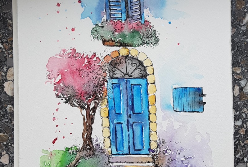
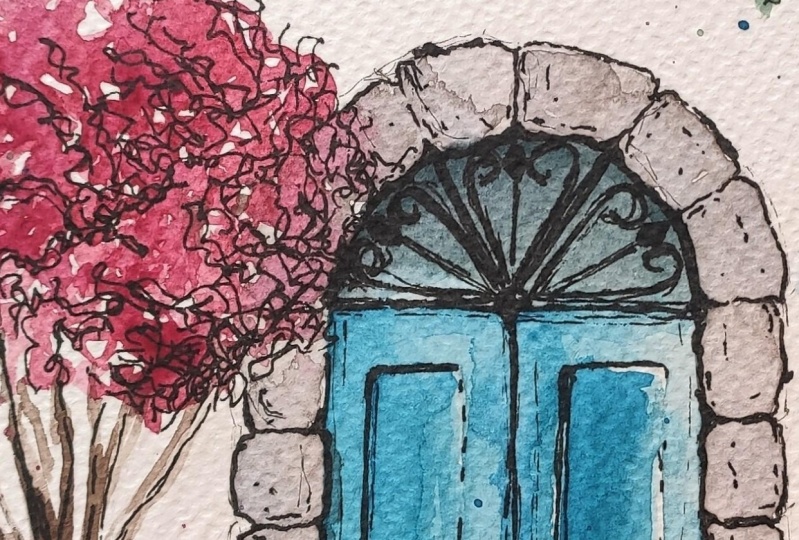
6. Watercolour doors: In this session, let's look at how to paint some doors. Starting off with watercolors, just like how we did it for all the other illustrations. And in another video, I'll be showing you how to use them. So we're starting our waste and Bank C and now a very light wash and roughly made long rectangle for the dough. You may notice that the bottom part of the rectangular or the door is very incomplete at this stage. I'm going to finish it off with a little bit more band, CNR this time. And trying to draw uneven wooden Klein's, just like you would see on a very old door. I'm trying to depict very old door. The reason why I have chosen to do an old door Institute of a brand new one or fully polished furnished one, is because old DOS have more character and I love to recreate the effect. Now the first layer is done. I'm going to start off with this second layer. And for this I'm using bond number. If you notice, you can see that my lines are not various trait, it could be a bit wonky, which again is fine. We're not looking for perfect straight line doors. And all these curved or wonky lines still gives a lot of character to your illustration. And that's what it will make it look more unique. I've just done another layer of bond, amoeba. And you can see that I've actually left little streaks of areas where I haven't painted on and that, and through that you can see that band Sienna underneath it. So now I'm just going over that layer with a bit more band umber, just enhancing those wooden planks, starting with the bottom and the numbering to follow these lines to the top. So you can see I'm not actually drawing lines. They more of dotted lines and they are uneven as well. The reason why I'm not drawing straight lines all the way to the top of the dough is. If I do that, it will look too heavy on this illustration. We'd like to keep it nice and light at this stage. And you could use broken lines to decrypt the wooden planks. Now I'm going to go in and paint a thick line at the top of the door just to indicate a wooden beam at the doorway. So you can see the ends of the login beam that have painted is slightly curved. That as just another Extra bit of character that I decided to bring in. You don't need to do that. If you don't like it, you can just stick to a straight line instead. Now I'm going in and painting the site of the door to just to indicate that there is a wall. And I'm, I'm starting off with yellow or just some rough shapes, creating some texture on that area. So once I got the base color, I'm now going to lay in some brick like shapes. And I'm using the same round brushes you can see just making some impressions, wet the brush. So I'm going to do the same on the other side, just roughly placing some rectangular shapes. I can't really say it's a rectangle. I'm actually only making an impression of that brush. And it looks like a rectangle or brick like shapes. And that's, that's all that's needed. We don't need to pin two in rectangular shapes in there. Let's start off with the next door. And I'm using Permanent red for this door here. You don't need to use the same color. You could go in for an other type of red or red, orange, or any other color that pleases you. So I'm starting off with another rod, long rectangular shape. And you can see I've done the outline first and I've used more, a little bit more water and done a diluted wash for that rectangular shape. That's the first side of the door. And now for the next side of the door, I'm doing the same thing. So just done another rectangular shape attached. So the first one, and you can see there's a slight difference between the, you can you can actually differentiate between the first and the second store. Just a slight different station saying i'm going with an arched top. And for this our views to Payne's gray. I've made a very rough arch. And again, it's not perfect. It's not doing architectural studies here. We're only having fun with some urban sketching and it's fine to have a little wonky lines. So just doing a little bit of details on inside that arch area. There. Again, you don't need to stick to these. You can just have a plain arch and some bars on it or anything that you like. So I think I'm quite done with arch illustration here. Very little details at this stage, always remembering that we are going to go in with ink later on. So I'm not doing a lot of details. Now the door is still quite wet, but I'm still going in with the next layer. And I'm using Payne's gray to show some details on that door. Mainly the center of a door where the two sides of the door closers and it's a little bit more darker. And other details like rectangular shapes on the door. Again, you can see I'm not using continuous lines, I'm using Broken lanes and and it is uneven and wonky, but it still looks like a door. And that's all we're worried about right now. The red of the door is slowly beginning to dry out, but it's not completely dry. But I'm still going in with another layer of red just to enhance a few areas, not everything, but just a few areas. And you can see I've actually washed out the Payne's gray accidentally. So I can go in with a little bit more pains Cree and enhance those center of that doorway. Again, this stage is completely optional. These little lines and find lines that I'm doing now. And it's not really necessary because we are going to do some ink over it once this dries. So if you want, you can put it off for a later stage when you are using a pen. So starting off with the next step, that is a few stairs at the bottom of that door. So if you remember from how we did stairs in one of our earlier videos, I'm just doing three rectangles, long rectangles, one slightly wider than the other. Moving on to our last and final door illustration, I've chosen to do Bright Kluge or this diamond. So starting out with rectangular shape, again with a curved job this time. So slowly making that Kurt talk, which is not very easy, but a very rough collapse job should be fine. Don't worry if it goes wonky Azure as using watercolors and you can just fix the shape by painting over it. Now I've got the shake ready. I'm going to go over it with a little bit more pigment. The same blue, but with more pigment and less water. I'm going to make a fuel lined stood Deputy Warden Clang on that door. So this is going to be a wooden door and I'm just drawing some wooden planks with the same. I haven't mixed anything more in. It is just a blue, but it's just got more pigment in it and less water. I'm just going to go over it. One more time with a little bit more pigment this time. Because I feel that the first one that I did not really make a mark on it as the pigment was very less in it. Say, while that hold illustration is still quite wet, I can still go back and make that correction right now before it dries out. So I get that very hazy look of these wooden planks and they're not very hard edges. So again here I'm just drawing another line, horizontal line to show another wooden plank. They store is more like very rustic garden. Now, while that door is still quite wet, I'd like to lift off a little bit of Spain and just to show some highlights, especially on the wooden planks that we painted. So I've made my brush dam. And now I'm just like lifting of some pinned gestures reveals some highlights. And you can notice that each time I pulled off and I'm actually going back into my tissue paper and wiping it off on the paper and making my brush cleaner again so it can lift out more pinned. And at what, at some point, you will need to rinse your brush clean again and make it down so you can lift out more pinned, more effectively. Next, I'm going to paint in a doorway in yellow occur. So I'm just going to go around that curved door with a thick line of yellow ocher, stopping right at the top. And I'm not going to paint on the other side of the door right now because I'd like to add in a little bit of foliage. And on that door before I finish off the doorway, so wild that yellow ochre is still quite wet. I'd like to add in a little bit more details of a stones or bricks on it. So I'm just going to do that right now with Bund right now. So you can see I'm doing literal strong shapes. Now, even while that door fray, Mr. wet, i'm going to go in with some foliage. The same technique that we've been using for foliage. We're going to use here as well. I have held my brush quite away from the tip of the brush and I'm just placing him some sap green. The blue Joe is semi dry, but the yellow ochre doorway is not dry at all. So you can see that the Sap Green is kind of bleeding into the yellow ochre and it's giving it fuzzy edges and that's fine. That's exactly what we need. And we'd like the connection between the different colors here. I'm just going in with some platters just to indicate that the foliage is spread around. And this is just another easy way. Often not painting each and every detail of foliage. You can always platter a little bit. And the effect is just beautiful and very dramatic. Now I'm just going to finish off the other side of the doorway. And I'm just going to place in some random brick shapes here. Or maybe it could also be stone shapes. I'm using yellow occurred the same yellow ochre they're used on the other side of the doorway. Just placing some random textures. And finally to finish off, I'm also going to do a little bit of grass at the bottom of that door just to finish off so it doesn't look like it's hanging in the air. Just placing in some very short tuples with the tip of my brush. And I think with this, we are finished with our illustration of this door. I'll see you in the next video where we will discuss more about using a calligraphic pen and some indenting for enhancing our illustrations.
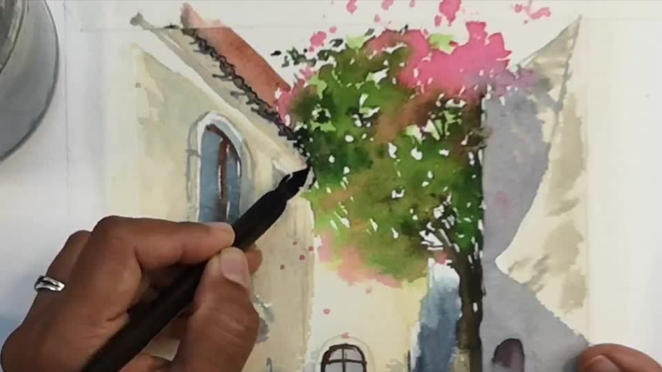
7. Introduction to using ink: Now that we're done with all our water color washes, or you're now going to explore the use of pen on these washes. So before we start off with any of the illustrations that we did before, we're just going to explore how to use the pen. We can use any type of pen. And if it's waterproof, the better. So here I have waterproof ink and Dip Pen. Calligraphic depend. I also have a gel pen here. This gel pen is also waterproof. You can use a normal ballpoint pen or a by rho pen, which again is waterproof. I usually comfortable using the Indian ink and calligraphic pen, mainly because I just loved the characteristic alone. It creates. Saying that if you don't have these nibs and pen, you can always use your ballpoint pen or your Charlton. So to begin with, I'm just going to show you what you could do with your gel pen. This is pretty much straight forward. You can draw lots of loans, different types of lines. And this is how we enhance our watercolor washes. So it's got a little bit of illustration in it and also a bit of shading. So mainly looking at the darker areas where you would like to enhance your illustrations, you're going to place the pen marks there. And these are some of the lines that you could use for enhancing your what to cut a washes. So the squiggly lines for your foliage and also a little bit of hatching. The short lines that I made here is called hatching. And there are lots of other things you can even Scribble with them or have little flicked lines, anything. This then here is waterproof. So I'm just showing you how it would work with watercolors over it. If I was to do a watercolor wash over my pen sketch, it will still be intact. It wouldn't spread. Moving on, let's look at how we can use our calligraphic dip them. And in doing. In this video, I will concentrate mainly on showing you how to use this pen for your illustration. I know many people use this for calligraphy and for writing. For me personally, writing doesn't come very easily. That's mainly because I'm a left-hand and using a catastrophic pen. It's not easy, especially if you're left handed. So I normally use it for illustration and drawing where I can use it the way I like. This span here is called a mapping pen. And if you see it's a, it's a very fine pointed tip. And it's also got a hold on that nib. And that's where you need to get you up think. So, so it flows easily to your paper. So I'm dipping it into my Indian ink bottle. And you can see I've covered it to that little hole. If you're new to this dipole spins and ink, it will take a few tries for you to get this right. So keep trying. If you're really interested in learning how to use this, it is pretty straight forward. But again, it takes a little bit more patience than using a normal Ben, especially because the ink may not flow that easily when you begin with. But then once you get a hang of it, it can be very easy. The main characteristic about this pen is that it can create very thin, as for less thick lines. And when you are illustrating, we definitely need these type of characteristic lines. So it's more effortless in doing a thick and a thin line or a light and a dark area in your illustration. If you notice here, I've made a thick line and then tapering it off to a thinner line. To get this effect, you'll need to press your nib straight down onto the paper, apply slight pressure and you will see the nib. The tip of the nib is widening and that's how it makes a thicker line. And when you want a taper it off or when you want a thinner line, you just gently release the pressure and bring it to that fine point. It works similar to a brush. And if you notice when we use watercolor brush, I always explain that if you want a larger area coverage, you press it straight down and if you are just one to have finer details, use the tip of the brush. And this is exactly what we do with the calligraphic pen as well. So here I'm just trying out a few different types of lines that you could do with this pen. So especially with the foliage, you can do these lazy stippling style. And also hatching. That's the short lines that can do wavy lines, streak lines, geometric loans. And anything that you do, it creates a dramatic characteristic effect. So if you see these geometric lines here, it's got sim lines as well as the guidelines. Especially when I use my pen in a downward motion, the lines become a bit more thicker. And if I'm using it in an upward motion, it becomes a bit more sooner. So you can try out different things with this spin. Try a few things that you would like to illustrate with this. Spencer, I'm Chia Graham just trying now to little random flower. You can illustrate anything that you like. Especially because this is practice session and we are just getting a hang of how to use this type of pen. Even if you don't have a calligraphic pen and you're using ballpoint pen or gel pen, you can always give it a try and try illustrating what those pins, so you get an idea of how to use this on your watercolor washes. So keep on exploring what this pen or any pen Machu have. Before we wrap up this session, I'd like to show you the different types of nymphs that I have and that I normally use for my illustrations. So the first one that we've been using so far is the mapping Ben. And it creates really thick lines as well as thin lines. I've also got other types of Nips. This one here is slightly different too. Mapping pen. And the good thing is that we can take the nip out from the nib holder or the pen. So I'm just showing this to you so you can have an idea of how the nibs Luke and how you can fix it back onto the pen. I've got a few other names here. I don't usually use all of these names, but I just wanted to show you in case if you're new to this medium and you'd like to know more about the names. So I have got different types of names and they all fit into that one pen holder. So I'm just going to try and show you how to fix it back onto the pen. So you just fix it straight back on it and it stays there. It doesn't come off, it doesn't come loose normally. So this particular nib here, it's very different to the mapping pen because the thicker lines that this one creates is slightly different to the lines that was created by the mapping Ben. So if you are somebody who would like a lot of thick lines in your illustration, then the mapping pen is for you. Or if you want a bit more, lesser thicker lines. And if you'd like to do a lot more illustrations, if you want a bit more uniform lines, then you can always use and other nib, give different nibs or try and see which one suits your illustration style best. With the indenting that I'm using. Or any type of ink or any color of ink that you like to use. It's normally non waterproof, but with ended Inc., We get a waterproof version as well. What I have here reserve waterproof ration, and if you put water color washes over it, It's not going to spread as long as it's completely dry and we're trying to put water Carlo washes over it. It will not spread. So that comes in handy if you want to do the illustrations first and then do a watercolor wash over it. So everybody has different styles. Some people like to do the watercolor wash first and then do the pen. And some other people like to do it the other way around. I hope I have given enough information about calligraphic pen and ink. Please feel free to contact me on the discussion session if you'd like to ask anymore questions about using the pen and ink.
8. Inking foliage: Now that we have explored the use of pin, let's go back into watercolor, wash it. So I've started off with the foliage that we first did. Starting off with the plant bought that very first. That's the long 12. So starting off with gently inking around the foliage, what little squiggles. So while I'm using little squiggles, I'm also using a few lines, short lines like hatching, to depict some darker areas within the foliage. And also going around the edges of the foliage to show a few bits and bobs sticking out as well. Just to bring it all together. Just to show some dark and light or some character in plant pot. So as you can see here, I'm using a pen and Indian ink. If you do not have this, you're always welcome to use any black pen and if it's waterproof, even better. Now, if you notice on this little illustration, you can see that the Brown of the port has bled into the green a bit too much then I expected it to go. But again, we can always fix that with our lines. This is one good thing about liner and wash. Watercolor being a very watery medium and especially the type of illustrations that we did here with wet and wet, if you remember, it was quite wet and the pigments were kind of bleeding into each other. And we were fine with it at that stage. And when we do things like this, there is a tendency for the pigments to bleed into each other, which is normal. But sometimes it could bleed in and surprise you. Sometimes it may bleed a little bit more than you expected it to bleed. And the good thing is it, these little surprises in watercolor makes It's very unique and special. And, and when you're using a line over it, you can just go over these little surprises and enhance it and make it look better. So I'm doing the same thing with the next planted port here. And you can see here again, the Carlos have just bled into each other. But it still has a form and it's still got their white spots here and there, which means this is a good illustration. I just love the colors that when they have bled into each other, H's creates a very dramatic effect for me personally. And the lines that go over it just makes it even more better. I just loved it dark and light. When, once we have finished doing the lines. So I'm doing the folly Acharya, like how we did the Farley agenda first plant bought. And I'm just trying to enhance the dark areas. We've already done a little bit of dark and light when breeded watercolor. And so now that acts as a guidance for us to know where we need to place our lines, especially the darker lines. And you can also leave a few areas without any pen lines over it if that's what you prefer. So moving on to the next part, I'm starting my pen lines from the darker areas on this plot because we've already determined the dark and light on the spot with watercolor. So we are just using pen lines to enhance these dark and light areas. So I've done the right side of the port with the pin and doing a little bit of shadow just under the port and around the neck where it goes a little bit inside and it's not standing that so much. And I think that's about it. For this part, we have just enhanced the lookup, the part of the way done with it. So the next one is the hanging plot. Just starting off with the squiggles, like how we did with all the other falling edges. With the first hanging part. I can hardly see the part because of the foliage. But whereas for the second one, I'm just working on that tiny little bit of hanging port that we can see just darkening the area. So the foliage overreach looks highlighted. And just going about it with dark and light areas as usual. There's nothing new about it. It's just going with the flow, enjoying the process. Our next illustration is the lavender Bush. Again, we're going to continue the process of enhancing these illustrations with Pan. So starting off with a darker areas. So here I'm starting off with the green bits of the plumbed, just enhancing those areas with a few lines and with the lavender flowers again, we are not going to go in and sketch out any lavender flowers here. We're not looking for much of detail for our illustrations today. This is a very simple illustration. Keeping it quiet to the minimum. So even with the lavender flowers, or we need to do is a few dots just to enhance the dots that we did with the water kinda pigment. We're going to do the same thing with pen. So we have the lines for the stock off the plumbed and a few dots to enhance. Third, lavender flowers. Moving on to our next illustration, that's the study of bricks. Again, we're going to do the same thing. We're going to enhance the areas where it's darker or where we would like it to be darker. So I'm also going to do a few dots here and there just a few areas where I'd like to show some texture of that bricks. And I think that's about it with the bricks. So this is just to show the dark and light areas, just to enhance fee areas that is really dark. Moving on to our next illustration, that is the roots, or you're going to do the same thing with it to. So I'm adding in lines to the areas that I think needs to be darker. And it's fairly easy if it's this stage because I've already marked out the dark and light areas with paint when I was painting in the beginning. So I'm just enhancing those areas, making it a bit more dark or maybe it needs a few more lines here being there. And that's what I'm doing at this stage. So let's continue doing that until we're finished with this. Ruth. To finish off this illustration, I'm just going to draw base for this roof as well. So I didn't want older roof tiles to be hanging in the air. So I'm just illustrating a little bit of a base for that, Ruth, just to show that it's actually sitting on a roof and not hanging in the air. So just rough rectangular shape just underneath those roofs and we're done with it. Next illustration or the architectural element is, stays with the little bit of foliage on both the sides. So let's start off with. And doing some lines on them just to enhance the shapes of the stairs and the foliage mainly. And at this stage you can also add in any details that you want to add. Especially here for me, the top part of that stair was important. I just added that in because it is going to be lighter. I don't need any color there. Which means just that a few lines has actually made it look a lot better now. And if you see the colors have really bled into each other and it's dried out so beautifully. And so there's not a lot of work for me to do with my pen here. I'm just enhancing or darkening out areas where I think needs to be a bit more darker. And I should be finished with this illustration quickly. So feel free to play around with your pen. See what you can do with your pen or where you want to enhance your lines. And, and that's all you need to do with it. You don't need to do a lot more other things. What the foliage, you can see that I've added a few pointer to flower like shapes, mainly on the right side at the bottom of the stairs, just to depict the type of flowers I wanted to illustrate. So again, when I'm doing the venom and harnessing the falling edge areas, if I wanted to add in a few flower shapes here in there, I can just go in and do that very rough shape of the flower is not necessary. You do that. It's only want a few details. It's your personal choice. And I thought it might look different from other 40 Jews. If we try and depict a few flowers and in this body. So to finish off this illustration, I'd also like to add in a flow to the bottom of the stairs. So like large stone shapes that stuck to the flow. Starting off with that now. So starting off with some geometric shapes at the bottom of the stairs, very rough, rectangular or square-like shapes. Or it could even be triangles. It could even be an uneven four sided shape like a quadrilateral. Anything that would look like storm that stuck on the floor doesn't have to be perfect. It just needs a very rough geometric shape as she can see what I'm doing here. And as you're coming towards you or away from that stairs, the shapes become slightly more larger and more pronounced because this is how we show perspective. This is how we can show what is away from us and Watson nearer to us. And with this, we're done with the illustration. And we'll move on to the next one. Moving on to Bogan billiard tree. As you can see here, when the pigments dried out, they have left a beautiful texture on that foliage. And I'd like to preserve at least some of them. So especially this white area here on, on the foliage. I'm trying to preserve that. I'm trying to go around it. So I don't work over a lot of textures. So mainly enhancing the darker areas of this college. As you can see, the top bit, which is much lighter, and as you come towards the bottom of the tree, that pigment has gone a bit darker. So I'm doing the same thing with the pen, so I'm only enhancing the darker areas. So going in with some squiggly lines just to show foliage and you can add in how many ever lines you are like. It all depends on your personal choice. So continue adding lines until you feel it's right for your illustration. Moving on to the tree trunk, a bit of this foliage. Again, we know that the right side was much darker, much lighter compared to the left side. So I'm enhancing the left side which is in the shadow. So this is one, this is the only concept we need to think about when we are enhancing our illustrations. So the lighter area, but need not have a lot of lines unless you have forgotten a few details and you need to add them. Otherwise, we always stick to the darker areas are the areas we think is going to be in shadow. So for enhanced the left side of this trunk and only a few lines on the right side. Just to add a few details, some grooves on the bark. And with this, we're done with our Berg and military as well. Moving on to our last element, which is the stones, we are going to do the same thing again, enhancing the grooves, the darkest areas in that structure. And you can use any sort of lines. You can use small shots, shocked lines for depicting shadow, or you can use squiggle or anything that you think is good for your illustration, is your personal choice of what sort of lines you'd like to use as long as you get the dark and light areas. Correct. And it's also quite important to preserve the white unpainted areas in this illustration. Especially to show that highlighted areas. Being very careful not to work over them. Leaving those white areas, acetate is just finishing off the bottom of those storms. Working on those grassy bits, again, I'm enhancing the darker areas. Just adding a few lines here and there just to depict some grass texture. We've already got the grass color there. So all we need is a few lines to just make sure that they look more like grass and not blobs of paint. And finally adding in some cobblestones texture. So if you notice in old buildings and old structures or old fruit parts, you've got cobblestones. And I'm just trying to depict the texture, just adding this short curvy lines. And with this, we are finished with illustrating our architectural elements, portrait columns and falling wages. And in the next video, we are going to work on our windows and doors that we did earlier on with watercolors, were going to do the same thing with the pen to enhance them.
9. Inking windows and doors: Hello and welcome back to my course on painting windows and doors. In this video, we'll be thinking over the windows and dose that we painted before. So I'm starting off with the first window and I'm using my depend indenting. You can use any black pen that you like. It need not be a dependent. And in doing so, I'm just starting to outline the window. One thing we did forget to Dane was the edge of the window. So here I've just added that extra little bit at the edge of the window. Now that I'm done with the window outlining, I'm going to go in and darken the insight of that window searches and enhancing all those lines that we painted before. And also perhaps darkening the insight of that window, especially the darkest area. And for this, I'm using shot straight lines, and we call this as hatching. So we are using a hatching technique to shade moving onto the foliage. It's the same way that we've been inking of foliage in our previous videos. There's nothing different to it. So just enhancing the curt and in that window, just with a few lines. So I'm going to go back into that foliage and add in a little bit more details. So you didn't see, I'm actually using small dots, teeny tiny circles in squiggles just to depict some flower shapes. And here we need to determine where the shadows falling. So for me it's falling at the bottom of that foliage and it's actually angling to the left side. So I'm just going to end harms that bottom area of the foliage. Moving on to enhancing those bricks as well. So we're kind of doing an alkaline only in the areas where it's pretty dark. And also enhancing them a little bit more with some hatching technique as well. So I'm going to go back into that window and then a little bit more shading. A darker area on the edge of the window. Nurture a lot though, because we would like that to be lighter than the surface of the window. Mainly because it's sticking out and there's more light falling on it. So adding some final touches, finishing touches. And we're done with our window. Moving on to a next window, that is the yellow shutters. And starting off, just like how we did the first one. So enhancing the lines and the edges. Notice here that we use in a bit more ink compared to what we used for falling. So I am actually outlining the shutters just to show, just to depict the edge of the shutters. And once you've had the alkaline done, then I can go into depicting the shatters with ink as well. And if you see the outlines are not just playing lines. I am bringing a lot of character to those lines. So I've got thin and thick lines in one goal. And I'm also using a lot of dotted lines. Mainly because when you try to use continuous lines, the illustrations good, look a bit monotonous with all those lines. So just to add some interests, it's always best to try and do some broken lines, dot steeples. Anything that could make it look different, that could make it stand out from a normal outlined window. So here you can see I'm working on the shutters and trying to use a thin as well as thick lines. So if I'm using a thin line for one shutter, one area, then I will be using slightly more thicker line for the next one. In such a way that I know there are some dark and light going on in there. If it, if you like a lot of details, you can even go in and do the edge of the shutter where it slightly start slanting and sticking out. So when you're doing the shutters on the next side of the window, you need to make sure that it's in line with the lines that we drew for the first side of the window. So these are just a few details that we need to be careful about when we're doing architectural sketches. Obviously there is lot of geometry going on in here, and we're going to try and keep it as simple as possible. But we still need to make sure that it doesn't look very awkward. So finishing off with that shatter, I can even go in and enhance the sides, the edges of the shutter. And she finish off just going back into a few lines, making it slightly more darker or thicker. So it actually adds a little bit more interest compared to just a plain, monotonous time. I can even go in for a window frame just to depict the sides go window, making it a bit more darker. So the good thing about using ink over your watercolor washes is that your watercolor washes can be very vague and suggestive. And when it comes to inking over them, you can add in any number of details that you like, and it will still look very, very good. So I've just added in darker area around those shutters. Just to show the frame work of the window. You could add editing your like if you think you wanted to have a little bit of brickwork at the bottom, you can still add that with your being. Moving on to our third window. We're going to do the similar type of thinking that we did for the last two windows. So I'm just going to do some outlines for the window, mainly enhancing the darker areas. But I have still done the lighter areas, but with ten aligns. And going into that window for some details, especially the inside of that window where it is a slightly wake and you can't really see a lot of detail. So I'm going to go in with my pen to do some details. And at this stage again, I can do any amount of details as I like. Some people like to leave it quite vague, which is fine. If you'd like more details, you'd like more doodling or sketching on your illustration. You are free to do that. So it doesn't matter what sort of details they could be anything. It could be the brick work or to even the tiniest texture on the window. So it could be anything that you prefer. Moving on to working on the stone wall. Again, I'm just going to enhance it just the way we've been doing. There's nothing more I could really explain on this except to complete doing this. So let's continue to do these illustrations until we're happy with. All the lines that we have given. So after the stone structure, we are going to go down to the lavender Bush. And if you remember from our previous video about falling wages, we had done lavender Bush illustration in there. And we're just going to apply the same rules to this one as well. Our next window is a tiny little window with some creepers at the bottom of that. So I'm just going to go in straight away and do the details on that. Darkening the inside of that window first. And then moving on to the other details. Feel free to try out the different types of Penn marks that you'd like to do in this, in these illustrations. Our last and final window illustration is this beautiful yellow window width. The width the shutters opening to the inside. And we've also got a trough of flowers and foliage just at the bottom of it. The way we are looking at this window is from the, from the ground. And this window is at a height, which is why we are seeing the bottom of that trough. If we were to look at it in level with eyes, then we would never see the bottom of that trough. So let's continue using pen over this illustration. We can use as many or as little lines as we like for this illustration. You can decide how much you want. So keep, keep looking at your illustration. Keep taking little breaks. Move back and look at your illustration to see if you need any more lines. Instead of doing it all at one, go, try and see it from a distance or after taking a break. And you would probably then realize how much more of lines you need. It's very easy for us to overwork ON illustrations like this. Because that action of putting ink watercolors is very therapeutic. So we can lose track of what we're doing and continue doing it. And at 1, we realized that we have done too much. So it's always better to take the short breaks and, and move back and look at your illustration to determine if you need any more inking on it. So now we're going to begin by illustrating our doors. We've got three dose to do. And we're going to start off with the first one going by the same rule that we're going to do a few outlines and probably do a few texture on the door as well. So starting off with the Brown though, we know that we intended this brown DO To be a wooden DO. So I am definitely going to give a few texture of wood on that DO. And now moving on to the door itself, I'm going to start off by doing the outline. And if you notice at the bottom, not going to add a straight line, I'm going to go with a bit of rough edges, mainly to show that this is a very old door. And I really love details on run-down old doors. So going in with the uneven shapes of the old wooden planks on this door. And as I come to the bottom, you can see I haven't added a straight line at the bottom or an outline. You can see that now I'm just filling it in with short lines just to show that the bottom is quite worn out. So going in with a bit more details, especially the wooden texture. So this is the time to give some texture on these planks. Feel rough lines, a bit of curves and some dots should definitely go a long way. Now that I've completed the wooden door and all the wood texture and the planks of the wooden door. I'm going to darken a little bit more at the bottom of that door just to suggest that there is a gap and that there is something beyond that door. And it's quite dark. And because of that, you can't really see anything else, but just that it's dark. And I'm going to complete it at the bottom with few steps. So starting off with step number one, just a double line, just to indicate indication that there is. Steps surface and then two vertical lines, and then the next horizontal line. So we've got a rough rectangle now, I'm also adding in a few details like little blades of grass sticking out. I'm just going back in and just redoing the stairs again. Just making sure that I have a nice surface there. Now I'm moving on to next door. We're going to begin by outlining the door, just like we do for everything. So again, when we are inclined, we just need to make sure that we're not doing a lot of lines. And you can use thick and thin lines. You can use broken lines, a few dots, and you can leave a few areas without lines. And that adds character to your illustration. So just starting off with doing a bit of lines only to the darker areas first. And then I'll see how it goes and how my illustration looks before they add in any more details. So I'm just going to start doing the arch shape off the top of that door. And definitely it is going to be darker as it goes inside. So I'm just going to make that arch of bit darker. And here I can use any sort of line here, either squiggles or straight lines, hatching anything that suits your interest. And you could leave the details inside that archway, acetone, or you can just enhance it with a little bit of spin. It's totally your choice. Now moving on to the doors, I'm going to give him a little bit more details here. So just darkening the area in the middle where the two sides of the door joins. And I'm also going to do a few details on the wooden plank of that door. So if you see very small rectangular shapes on that dough, I'm just going to enhance that a little bit. Finally, moving on to the set of steps at the bottom of this door. I'm just going to enhance the lines again. It needs more refined outlining here. Mainly because the color that I added for this steps was quite pale. And, and I think it definitely needs a bit more than just enhancing. It needs a bit more details. So I'm starting off with the, the shape of the steps, starting off with this surface, the flat surface first and then the the word to cause side of it. So if you notice how I'm doing the steps, I started off with a shorter step. And as they came down, they became longer. This is just a way of showing perspective in our drawings. Not that in reality that these steps are in different sizes. They could be of the same size. But the first step right at the bottom of that door is much shorter because it's away from us. And the last step is much broader because it's closer to us. So we apply the rule that things get smaller when it goes away from us. And things get bigger when it's nearer to us. And we see a lot more details when they are near to us. Say going in on that door again and adding a few dots just to enhance, Just to make it look very characteristic. I'm definitely a few dots, a few stippled with the tip of my pen creates a lot more character to that door. Last door is this bright blue wooden garden door. And it has got an archway, stone archway, which beginning to enhance now. And if you see on the left side, it's also got some sort of foliage, which I haven't really completed because I just like to just suggest that there is some sort of foliage there. And then leave it there. First to begin with them just doing DO stone archway. Once I'm happy with that, I'm going to go into the foliage and adding a few suggestions of leaves that is hanging over the door. Again, you can use squiggly lines. You can use tuples, dots, circles, or even precise leaf shapes if you think that's what you like. Any sort of lines to enhance your illustration? Moving on to the blue wooden door, I'm just going to enhance the two wooden planks that goes across the dough, mainly darkening the bottom of those two planks. Just to show that the, just to show the underside of that wooden plank and also going to enhance the vertical wooden planks on the door as well. And we could do the same things as we did with our first DO, especially with the bottom of that wooden dough, you can make it as an even match you lie. And to finish off, I'm going to illustrate a few geometry shaped tiles on the ground. And if you like, you can also add in a few brick shapes on the wall next to the wooden door. And with that, I illustration is complete.
10. Urban sketching: Project (part 1): Welcome to our class project where we will be painting and are been seen, which consists of windows and doors. And we will be taking a lot of inspiration from all the windows and doors and the foliage is that we've been painting so far. So I start off with wetting my palate using my spray bottle or you can even use the tip off your brush with some water loaded on it too, wet and activate all your paint pans or tubes. If you're taking paint straight away from the tombs for this purpose, you don't have to wet it again. But if you have watercolor pans or cakes, or if you have your pinned dried onto a planet, you can always activate it and reuse it by just spraying some water over it. While my paint being activated, I'm going to take my watercolor paper down onto the table using some masking tape. If you like, you can use a very light pencil mark to sketch out some very basic shapes of windows and doors. For this project. I will share my line illustration with you in the projects and resources section if you'd like to copy it or trace of ridge for your final project. So now my watercolor cakes, nice and moist, I can start preparing my pinned for the windows and doors on this project, I'm using mixture of ceratin blue and viridian green. It is my personal choice of color and you don't have to stick to these colors. You can always use any candidate you're like from the palette. Again, if you are not so much into mixing colors, you can always use a fresh scholar from your palate. So the reason why I'm using this color is simply because I just loved this color and it gives a very beautiful Mediterranean look to my illustrations. So I'm preparing quite a lot of this pigment cuz I know I will need a lot of it for my windows as well as my door. So when you prepare your pain and make sure that you prepare enough for all of your windows and doors so you don't have to go back and prepare again and again. So this is the color that we just mixed. It is still very, very blue. And its got a very, very slight tinge of green to it. So the second swatch is pure sarin in Berlin, and I'm just going to make sense and buried in green Along with that blue. So that's another way of doing it. You can either mix it on your palette or if you feel a little bit adventurous, you can try and mix it on the paper as well. And sometimes it creates very beautiful effect. So now that my paint so ready, I'm going to start off with illustrating my window. And if you see I'm starting off with the frame of the window, leaving the bottom edge without painting and the middle part and going to do some shutters. So those are going to be very thin lines with the tip of my brush. And you can vary the thickness of the shutters as you like. And which is really great, especially if you're trying to do it with medium-sized brush. The second window frame is actually opening to the inside. So I have actually angled the window to the inside. The top bit off it is slanting And it's going towards the inside of that building. I think we have done a window like this in our practice session where we were painting windows and doors earlier on. So we have kind of finished very rough illustration, office shuttered window. And now we can, in the second step, we can go in and darken areas where you think it needs to be a little bit more darker. This simplest way of doing this is to go in and drop in a little bit more of the same kinda debt you have been using. And other way is to mix in a slightly more darker tone for the pigment. So here I'm using blue. And if I add in a slight tinge of Alizarin crimson red, it's going to go into a deeper blue. And if I apply that onto my window, it's definitely going to be darker compared to what I have on the people right now. So I'm just dropping in only in a few areas. And you can see because the first layer is still quite wet, my deeper blue is kind of spreading, which is fine. I really like the effect when it's spreading. And it's very effortless way of depicting dark and light in watercolors. And I normally prefer doing this wet in wet. So we've just finished dropping in darker areas on the shutter. So I'm just going to depict a little bit off the walls on this side. And I'm using the same color as you can see. It's just a random brushstroke. And ofcourse. I need to do a little bit of sublattice most of the time. If you see I have actually covered the bottom bit of the illustration with a paper. So it doesn't spread onto the bottom area because we haven't finished painting that area yet. So lightening a few areas as I go along, I feel those brushstrokes on the side of the windows and little bit dark. So I'm just going to add in a little bit of water just to donate those areas. And you don't have to do the steps if you think your illustration doesn't need it. It always depends on what you think about your illustration. So I will definitely encourage you to actually look into your illustration and see what is best for your illustration. So going in with the bottom part of that window, I've got a nice trough of lovely pink, pink, and red flowers in there. So I'm just going to do a little bit of squiggly lines for my red flowers or pink flowers. Or you can use any other color that you like. And I'm going in wet and wet with the green as well. If you see, I'm actually using the tip of my brush to do a lazy stippling or squiggles. And for each person, these lines and these squiggles will be different because your hand movement will be completely different to mine. So it can never be compared. But the important thing is that you enjoy or what do you do. To finish the bottom part of that trough, I'm going to use venetian red. And if you look at the angle of the window, it is actually above eye level because these windows are going above door. So definitely we would be seeing a little bit of the bottom of that trough. So I'm just going to do an extra layer of vanishing red to depict the bottom of that trough. And you can see I have actually left a very slight thin white area unpainted just to differentiate it from the side of the trough. So going back and covering the bottom area of this illustration with a paper. So I can do a little bit more space lattice. Just to show this time it is in red color just to continue the flower like patterns on the trough. Next I'm going to fill in the darkest areas which depicts the inside of this building. So especially with that open window there. And I'm just going to paint in some dark Payne's gray in the negative space or the space where it actually depicts the inside of the building. And you can see that it is actually touching the plants at the bottom. And the pigment on the plans have actually spread into the window shutters as well. And we're okay with that because we'd like pigments to bleed into each other for the type of illustration we're doing. So I'm just going to go around the window shutters, too dark and just a few areas. Not a lot. We're using this darkest storm only in areas where we really needed. If not, it's always best to leave it. It's very easy for us to overwork with watercolors. So it's always important that retake short breaks and to look at our illustrations and decide if we need darker tones or not. And sometimes, and it happens very often to me that I have also worked on something and it's too late to turn back. So it's always best to take breaks and only add in darker pigments if it's necessary. Moving onto painting are blue dorm starting off with the planks of the door. So I'm using the same color as we used for our windows. So I've already got my blue which has been prepared. And I'm just gonna start painting, starting off with the framework and then the middle of it. So I finished the outline of my door and now I've got the central rectangular areas just settle in. And you can see that I'm actually leaving a slight white area just so that it can act as highlights from my door. Carefully placing my pigment in the rectangular areas and leaving slight white around it. It's very important to leave a little bit of white area, at least on one side of those rectangular shapes. So that it acts as highlight where the other side would definitely go a bit more darker. You will understand more of what I am talking about when you continue painting. So I've completed the full rectangle shapes on the door now. And you can see I've got enough white space around it. Now I'm going to depict some darker areas on the door. For that, I would need some deeper blue. And if you remember, we had mixed a little bit of Alizarin crimson red with our blue to get deeper, darker blue. And I'm using the same mixture to depict some darkest areas on the door. Mainly the center part, whether to draw blanks coming together and also a little bit of darker every knows on those rectangular shapes on the door. So it gives it a feeling that it is standing apart from the framework around it. And you can see I'm actually working wet in wet. And because of that, the pigments are kind of spreading everywhere. Which is ok at this stage because we are definitely going to go in and do some inking with append later on. Now to complete the semicircle shaped on drop-off that door, which is the artery. I'm using a little bit of Payne's gray because it's going to be much more darker than the blue data off the door. So just going in with the shape, just painting that in. And I'm also going to drop in a little bit more pigment on the top. Just to show a little bit of depth. Next, I'm going to start painting the stone work around the door which has the archway. So for that I am using yellow or Clara and I'm starting off with painting them, leaving a few highlighted areas, which is left white and unpainted. And when I come to the left side of the arch way, I'm going to leave a little bit more white area just to leave some space for the tree that's going to come on that side. So I'm not really going in and painting all of those breaks. I'm going to leave a few areas White. And just finishing off the whole archway. And now for our Bogan military, i'm going to start off with Alizarin crimson red. And we are going to use the same technique we always use for our foliage. And if you remember, we have already painted opaque in military and in our practice session before. So I'm going to, I'm going to do the same thing here. And please feel free to add ins, platters or steeples or any sort of texture that you think is good for your tree. This is a very flexible illustration and you're going to use your imagination and do what is best for your painting. One thing to notice when you dues platters is that if you have any areas that you do not want your sublattice too spread out to, then it's always best to cover that area. So for example, I don't really need a lot of splattered on my blue door, but at the same time, I don't mind a fuse platters, so I can just cover up that blue door area and have this lattice on the rest of the paper. And moving on to the tree trunk, better off are broken. But a tree, I'm going to use a mixture of burnt umber and Prussian blue for a very deep dark brown. If you have any color that you think is good for your Bergen fellow tree bark, then you can use that from your palate. And if you're not so much into mixing colors, you can always just use burnt umber. I just personally like the pigments are bit more darker. That's just my style. Some people might like it in a different color, so please feel free to do what you think is good for your illustration and for your interest. So if you remember how we did our bacon dilatory in our practice session, it's exactly the same thing that we're doing here. So I'm finishing off that tree bark and we're also going to add in a little bit of green. Any deep dark green should be fine. To depict a little bit of leads towards the bottom of that tree. If you think you don't like a lot of greenery in your book and military, then you can skip this step and just have your red tree moving onto the bottom part of that tree, just to depict a little bit more foliage over there and near to what's the stairs of the building. So I'm going to use it a little bit of green and then a little bit of violet or purple. If you have purple in your palate, you are free to use that. Or if you want any other color for your flowers, you can do that for me. I don't have a purple in my palate, so I mix it with permanent rules and ultramarine blue to get a very vibrant purple color. So if you can see here, I've actually painted around the steps that we drew. Now moving on to dropping in some purple color. And again, you'll notice that I'm only dropping in. I'm not really painting in large areas, but in areas where you need larger areas of coverage, then you can use the whole area off your brush. Moving on to the other side of the stairs as well to add in some purple flowers. And I'm also adding in a few marks on this tears with permanent Carlo, just a technique that the creeper have actually spread on to the stands as well. And you can do the same with the bottom of the door as well. It depends on where you'd like to follow. To be. Some people would prefer their door area to be much more cleaner. Or if you want to, a little bit more of the follett spreading around. Stairs as well as the bottom of that door, then you just need to add in a little bit more off to purple pigment. So at the same time, we also need to paint in the stairs. And if you notice, I'm leaving the top part of the stairs as white where there will be a lot of light falling and it's going to be lighter. And actually painting in the vertical side of the stair with some yellow ochre. Again. And you can leave areas unpainted wherever you think you need a little bit of highlight. Now finishing off the bottom of that stairs with a little bit more yellow ochre and a few drops of green, just to show that there is a ground after those stairs and that it's not looking awkward by it being left as white. At the same time, we don't need a lot of details there because our focus is on the door and the window. So just to drop him after you pick bins to show that there's something going on there, but nothing in detail. Moving onto the last window on this illustration, going to just quickly fill that in with some blue. I'm using the same blue as we used for our other window and the door. And just doing a very random rectangular shape. And perhaps add a few more darker areas to depict some deeper tones on that wooden plank. Adding in some details on that window. And you can also add in some splashes of colors so the wall around it doesn't look so blank. If you notice. I've also done a little bit off the roof above the window, which is a completely optional step. As you can see, I really did not have the space to do a roof, but I chose to indicate it just a little bit of the roof. And if you think you can't really fit it in or you don't really like the look of it, then you can skip this step. So I'm just quickly drawing with my brush. Very quick roof with vanishing red. And if you'd like to do this, it's the same way that we did roof earlier on in our practice session. So with vanishing red, I'm doing literal curves just to depict Ruth. And then you can add in some darker areas as well. And that's all I can do in this illustration right now because there is no more space for anything else. And with this, we finish too with the watercolor bit off our project. And I'll see you in the next video where we can do some inking over this illustration.
11. Urban sketching: Project (part 2): So let's start off with the inking bit of this project. So I'm starting off with the window which we did first. So I'm starting off with the main shape of the window. And if you notice that actually using broken lines, which means I'm not using a continuous line. Because I personally feel that will make the illustration goes a little bit more unrealistic. So I'm using broken lines and enhancing only where it's needed. So especially the darker areas. And the darker lines are the thicker lines going where it needs to be really dark or where it really needs to be enhanced. So I'm just doing this shutters, just like how we did in our practice session for our windows and doors. We are just enhancing width ink. Ben. If you are using normal ballpoint pen or a gel pen, you may not get lines as thick as these. But what you could do is go over a line to make it slightly more thicker. And according to your taste. Now I'm using hatching technique, which means them using very short lines closely placed together to depict the darker areas in the inside of that window. You can also use squiggles or little dots, which is called stippling or any sort of lines that you like. This is just my personal way of depicting it. When you depict too, you might want to use a little bit more squiggly lines. So it's really up to you. Give it a try and see what works best for you. And with the foliage just enhancing or outlining the area where it looks a bit vague with watercolors. So again, I'm using little squiggles for you for depicting foliage. And then moving on to the next window. I'm using thicker lines for darker areas and thinner lines for lighter areas. So the top part of the window, wherever there is still a gap between the window and the window frame, I'm using a darker line, a thicker line. And finishing off that second window, just like how we did the first one. Moving on to the foliage. Just using a few squiggly lines to depict or alkaline the areas so you know where the foliage starts and where the window ends. I can also go in and add a few squiggly lines and leaf-like shapes. If you like, if you're somebody who likes a little bit more details, you can always add in little leaf like sheets or fly like shapes on this college. At this stage, I'm also going in and adding a few more extra lines and darkening the areas which can really be darker and in the shadow. So my squiggles are much more thicker, my lines are much more thicker. And I've got a little bit of hatching. And now moving on to the trough, I'm just drawing out the bottom bit of that trough where what we can see and really enhancing only the areas that are in the shadow. So giving darker areas or more lines to the area stacked could be in the shadow. And we do the same with the foliage. And feel free to add in as many detailed as you like at this stage. And you can really work with your imagination and your creativity to see how much of details you need and water you would like to include with your pen. Moving on to the second half of the painting. And I'm going to begin by illustrating the burg and military. So using the same squiggly lines to depict the burg and military. Moving on to the back of the book and below tree, amusing line to end, the darkest areas and the briefs and all the texture on the tree trunk. And now moving onto that bar tree, trying to illustrate each of those terms separately and adding in a little bit of texture to all of them. Mainly to the stones on that artery where our focus would go immediately. I'm only doing a lot of details on that. And the rest you can leave it as cities. So there's not a lot of things that we could do on this dawns. It's usually a little flicks of your pen and little dots that could go a long way to depict texture on a stone. And forward the areas near to the bokeh in military. And that's hiding behind the book and military. I don't really need to do a lot of details. All I need to do is to depict the bogan military and the shadow of it falling on the, on the door. And we're done with that area. So moving on to the other parts of the archway, just going to finish all of those, adding in a little bit of details in the space above those doors. So if you remember, we had just filled this space in wet some Payne's gray. And now I'm going to go over it with some decorative details using my pen. And now I'm seeing the darkest areas that DO. Especially the bottom motto, where there is a gap between the Door and the stairs, it's definitely going to be darker. And also again, to finish off the creeks oldest stones on that archway. And now moving on to the steps. I'm going to start off by enhancing the steps as it is. So starting or her weights, the lines on the steps. And if you can see, I'm actually again using broken lines and little bit of uneven lines just to depict that there's some sort of foliage in between those stairs and also darkening the sides of those steps because of the foliage, it's definitely in the shadow and that's why it is a bit more darker compared to the central part of the stairs and depicting their little bit of foliage on those stairs. So using squiggly lines to depict foliage and completing off the last stare. At the same time, continuing with those lines onto the foliage. Moving on to enhancing that door. So starting off with enhancing the rectangular shapes. And if you remember, we had left a white area around those rectangular shapes. Just adipic tired lights. And now when I'm using the pen, I'm actually darkening the areas opposite to a two, which means the area that is not hydrated and that has a little bit more shadow in it. And now finally moving on to this small window by the side of the door, doing the same thing as we did for the door and the when and the first window. I'm just going to do an alkaline. Mainly the darker areas, trying my best to leave the lighter or the highlighted areas without any pen marks on it. I can also add in details like the latch of the window and also some texture of wood on the wooden plank off that window. And finally, going into inking the Ruth, if you had added the root's at all. So again, this was an optional step for you. And if you did not add the roof and you don't like to add it, you can skip this step. Because I added in a little bit of Ruth detail, I'm just going to go in and enhance it. And with this, we are finished with our class project of illustrating windows and doors. I hope you really enjoyed this, and I hope that you will give it a try. Please feel free to download or print out the illustration in my projects and resources section if you'd like to use it as a reference or even to trees over it. And I hope to see at least some of your projects in the discussion session, too. Happy painting, everyone.
12. Final thoughts: Hello again. I hope you enjoyed my class and the project, the illustrations that we did in this class need not be completed in one go. You can always take your time to finish off each illustration. And it can be asked that apathetic as you like. You can start off your day with a little illustration that probably takes only about five minutes of your day. Or you can even finish off your day with a little illustration. And whatever time you choose to fit this in, it is only going to take about ten or 20 minutes of your time. And the project would probably take a little bit more. But again, it will be really great if you can try and break this into a different session to fit your busy schedule. And that way you can take sharp breaks from your illustration and come back to it. You are definitely going to look at it in a different way. If you are somebody who did not like sketching, I will doing initial sketches for your project. You can always use the picture that I have provided in the projects and resources section to trace your initial sketches. Or if you do not like doing an initial sketch at all, you are free to try out directly painting with watercolors onto a white paper. Whatever method you choose, this is going to be your artwork and it's going to be definitely different from what I had been at here today. I hope you will enjoy this process and I hope to see at least some of the projects that you have done. Happy painting, everyone.
 Suzanne Abraham, Artist