Transcripts
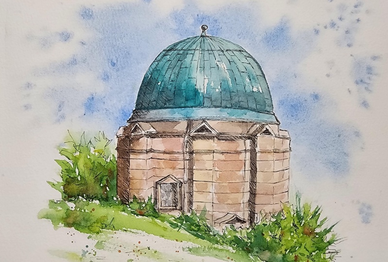
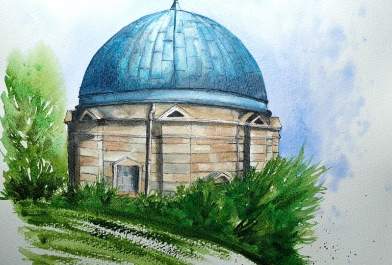
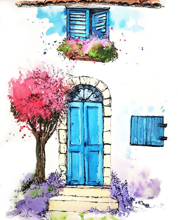
1. Introduction: Hello and welcome to a relaxed and final session of urban sketching in watercolor and ink. In this course, we're going to sketch and the city observatory or the city dome on cartoon view in Edinburgh. This was painted from a photograph that I took while I was visiting a few years back. Architecture has always fascinated me. And that combined with a history of that place, attracts me even more. And as an artist, I'm naturally drawn to sketching and painting such places that are not. If you are somebody like me who loves up in sketching, I hope you will really enjoy this course. In this course, I'd like to show you how to refer to a photograph to paint if you are not able to do it play now, I would also like to talk about perspective drawing. That's necessarily too such buildings like these. However, I know that most of you would probably enjoy painting this more than sketchy. So I am also going to provide a line drawing as well as the reference picture. If you'd like to just trace from it. Before we start off with the project itself, I will show you the type of pigments that we'll be using, as well as different brushstrokes and watercolor washes that you need to know. I will also talk about the pens that I use and how I use it to create or enhance your watercolor washes. As we start off with a project, I'm going to show you how to sketch if, if you'd like to learn how to, or you can even trace the picture onto your watercolor paper. I have provided two different videos. And you can choose which one you prefer to do. After we've finished sketching it with a pencil, we're going to go over it with ink. You are free to use any type of pen, ballpoint pen, micron pen, or dip pen. Anything should work. It would be great if it is waterproof. So when you go over it with watercolor wash, it does not spread. Next, we're going to go over it with a very quick and dynamic watercolor wash. We're going to try and finish the water column, just one layer. So we're not working over edge too much except for the shadows that would come as a second layer on, as a finishing touch. But I will definitely go through all the details in the coming videos. If you do not have a pen that is not waterproof, I would suggest that you do the watercolor wash burst on top of your pencil lines. And once that's completely dry, you can always start doing your ink over it. That way your ink does not spread with your watercolor washes. I hope you will enjoy creating this painting. I'll see you in the next video with the list of materials and happy painting everyone.
2. Suggested Materials: Hello, I'm going to introduce you to all the materials that were required for this course. So I'm starting off with watercolor paper. I'm using a 300 GSM cold pressed watercolor paper. Either options are any type of sketchbooks or mole skin sketch books that you like to use. And as long as the paper is good enough to take a lot of washes, that should be fine. So the paperweight can either be 300 GSM or it can even come down to a 190 GSM. And I have a masking tape that I am going to use to tape my paper down. The next material is watercolor paint. I use watercolor paint, crumb tubes as well as pants. So it doesn't really matter what sorts of paints that you're using. So I have a few plants here as well, which I normally use, and I just keep it in my palette. For the palette, I usually prefer something with a large area to mix my pain to him. So it doesn't have to be a pilot like this. It can even be a large white plate from your kitchen. Now, moving onto watercolor brushes, I have quite a few varieties of brushes here, but you definitely do not need all of these today. So I've got a flat brush size 12, round brush, round pointed brush, size eight or 10, as well as a slightly larger brush, which a size 12. Or it could even be a mop brush size two. So basically a flat brush and a round brush. Any size is fine. As long as you're comfortable with it. For ink work, you can use any black pin, microtube or ballpoint pen is also fine. I use dip pen and Indian ink, which is my personal choice. I have two jars of water, one for washing my brushes in and the other one for freshwater in case the other one guest muddy. And finally, I need a pencil and an eraser for my initial sketches. And I also have a Muslim clot here. You can also use kitchen tables or any tissue paper. This is mainly for dabbing extra paint out or lifting out pigments. So that's with all the materials that may require for this course. I'll see you in the next video with more details of this course.
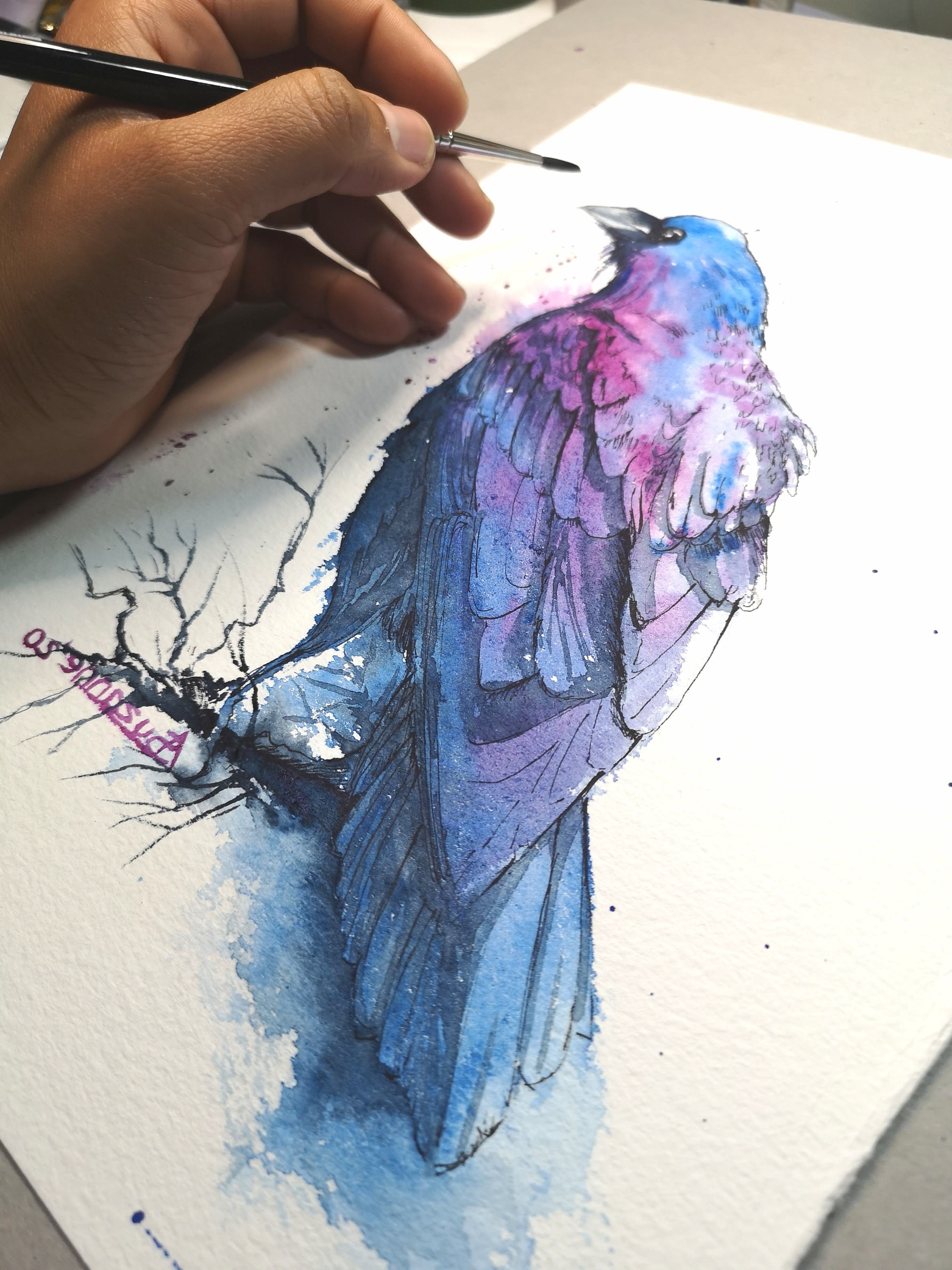
3. Introduction to watercolour washes and techniques: Let's look at some of the basic watercolor techniques that we require for this course. So first of all, I'm starting off with showing you how to mix pigments on your palette. So I've started off with making a very watery mixture. As you can see, I use a little bit from my pan, and I also add a little bit of water from the char, making it a very watery wash. As you can see, the consistency is very light and watery. Maybe the consistency of ink, I, I could say. So that's one type of consistency that we require, which is a very light wash. You couldn't make it a bit more lighter by adding more water to the mixture. Or you can make it a bit more thicker by adding more pigment to the mixture. So here I've added a bit more pigment to the mixture by adding some more from the pan. And the third one, I'm going to make a very thick mixture. So I'm going back into my watercolor pan and getting more and more pigment. I haven't dipped my brush in water, which means I don't have a lot of water on my brush. And you can see that pigment consistency is quite thick compared to the first mixture that we've made. So we've got the very nice light wash. And if I try that onto a watercolor paper, this is how it's going to look. You can see the amount of water in that mixture. And you can see that the wash is quite light. You can still see the white of the paper underneath that wash. So I'm just going to make a nice long swatch here just to look at how the pigment behaves on paper. You can also see that because my board is slightly at an angle, the watercolor mixture that I've just made is kind of flowing down and you can see that it's collecting at the edge of that swatch, making a huge blob of paint at the edge. So I'm going to try and use the mediums wash right next to it. And you can immediately see the difference that the pigment is not as flowy. First wash. And if I did a few strokes of that mixture onto the first wash. You can see that it sits well into that wash. Now let's try the very thick pigment or the very thick consistency of paint that we mixed. So here I don't need any water on my brush. In fact, I need a lot of pigment. So I'm using my tissue or cloth to wipe out extra water from my brush. And if I add that very thick pigment straight from the pan onto the swatch that we made, which is still wet. See how the pigment is kind of spreading very nicely and softly, creating very sought shapes on that, on that paper. If I did use the same mixture onto a dry paper, it's going to create a very rough marks, which is also good for creating textures. Let's also try doing a flat wash with the medium consistency that we have. So I'm starting off with a very flat wash with a brush, just, just painting the pigment onto the paper and see how much of coverage It keeps on the paper. We can also dilute it by adding more water from the jar and make it a lighter wash and see how many types of different washes we can make. Feel free to practice this session until you get really confident with using watercolors and mixing, mixing the pigment with water. So now I'm just creating swatches with the pigment that is left on my palette. So starting off with a medium consistency where I have a fair amount of water as well as pigment. And then later I am going to add drops of water into that mixture to make it lighter and lighter. And you can even experiment, just see how much lighter it can go. But adding more water into the mixture. Or you can even try adding more water onto the paper to see what happens. Now we're going to talk to you about another technique called a watered-down techniques. So for this, I'm going to mix a little bit more pigment on my palette. So a medium consistency to start with, not too thick, not too light, somewhere in the middle. So I've created a little swatch now, you can see there's a fair amount of pigment in there. Next, I'm going to wash my brush clean. And then I'm going to take out all the extra drops of water on the side of the jar. And if I move my brush along the edge of that swatch I just made, you can see I've actually diluted it, making it lighter. And I continue to do that until I have made it very, very light. And you can see the gradation from a dark to a very light in just one wash. And this method of starting off with a dark wash and bringing it to a lighter wash is called a watering down technique, which we'll be using quite a bit in our work in our class today. Another technique that I want to show you is lifting out technique. As you can see, I've just wash my brush clean and taken up the extra water on my tissue or you're on my, on my class. And if I rub the brush onto a wet surface on my paper, you can see how the pigment comes out very easily. If your swatches dry, you might have to work quite a bit to take up the pigment. But if your swatch is wet or damp, it's easier to lift out pigments. And this technique can be used in our project today for bringing back some light into painting. And finally, make sure that you experiment with the medium and try different things with the medium. Before you start painting our project.
4. Introduction to brush strokes and line work: Now let's start experimenting with our brushstrokes. And I'm going to show you what all different types of brush tricks that we can use it in painting today. So I'm starting off by mixing the watercolors that I need. So I've got blue as well as green. It's not necessary that you need to stick to think collars now, as we're Romney practicing our brush strokes. So you can choose any color that you prefer to paint these now. So I'm starting off with cobalt blue and I think it could be a mixture of sap green, which was already on my palette. And I'm not too worried about the pigments right now. So I'm starting off with just trying out the brush strokes. What I could do with putting down the whole body of the brush. And I'm also going to try and mix two pigments to get it together to see how that looks. Now, tried putting the whole body of the brush down. And now I'm going to try and use only the tip of the brush to make these squiggly lines. I can also place the body of the brush down a little bit once in a while to create those flat shapes. So a mixture of the tip of the brush as well as the whole body of the brush. To create this sort of foliage. You can also do little dots or what we call stippling. And you can even add more pigment into the layer that we just painted. So I'm just adding pigment straight from the pan. And you can see it was slightly thicker consistency and it sits well on that, on that wet area. You can also try mixing different pigments and see if other pigments do work on this wet area. Now I'm going to make a little bit more darker green. So I'm using sap green and a little bit of Prussian blue. You can also use any other deep blue color that you have in your palette. And you can see I haven't really used a lot of water in there. There is very little water and a lot of pavement. And you can see what happens when I drop it into the wet area. You can definitely see the darker areas now. And the brushstrokes that are making right now is definitely darker. Then the first layer of paint that I put down. And this is one of the ways that we can create texture of the foliage in our project today. So keep practicing using the brush, different types of brushstrokes. And you can even splat to paint if you like. You can use, you can use the flat end of the brush as well as the tip of the brush. Depends on what do you really prefer. So it's all about trying the different brushstrokes that you are able to make. As an individual, and it's all about sticking to your styles. So feel free to practice it and try the different things that you can do with the brush. And you can also see that I have used a little bit of blue in the background of the faddish that we just tried out. This sort of brings in the notion that there is depth in that bushes. There's something behind the bushes. And that blue Karla, which is a cool color, naturally, draws all the attention to the bush that is right in front of us. And mixing that to widths, the green Melos, the green down, bringing a lot of depth into the painting. So that was a little experiment with watercolors. We're going to do the same with ink. So you are free to use any sort of enqueue like you can use dip pen and Indian ink like I am using. Or if you're not comfortable with that, you can always use a ballpoint pen or a micro tip pen. My ink is waterproof, which means if I did work with ink first and then with watercolor, it wouldn't gets munched. So it might be good if you have waterproof ink. So we're going to try out different lines that we can make with our pen. So you can have thick lines, are thinner lines. You can even do a little bit of scribbles that is necessary for our foliage. And when it comes to showing depth with your pen, it's all about darkening a specific area with the same pen. So if you're using a calligraphic pen or a dip pen, you all you need to do is just push the nib down slightly to create thicker lines. If you're using a microchip pen, then you might need to work a little bit more too dark in that area. And with a lighter lines. You can also try doing broken lines like how I'm doing now. You can give it a little bit of texture to the lines by adding a few dots and scribbles. So it's all about experimenting what you can do with your pen, and what, what you prefer personally for your project. You can also do shading or darkening and area using snot, small short lines placed close to each other. Which was called hatching. Like how I'm doing now for this triangle. So darkening and everything can be done with small short lines placed close to each other. So I'm just drawing a structure here just to show what we could do with the pen. And you can see that I've used the hatching lines again to show the darker area just under that triangle, triangular shape. So this element is from our project that we're going to do today, where we've got a little triangular structure with a pillar below that. Feel free to play with the materials as much as you'd like until you are really confident. Twist brushstrokes as well as the pen strokes. And after that, we are going to move on to our project.
5. Project: Sketching(optional, check out next video for transferring a sketch): A good drawing is necessary for a successful painting. And if you'd like to learn how to draw in this project, I'm going to show you the very basic techniques that you need to learn how to draw. However, if you're not keen on drawing, I have also posted another video where I show you how to trace or transfer the image onto your watercolor paper. But for now, let's look at Tau to start drawing structure. So I've started off with the base, which is the little hill that we can see in the photograph, which is slightly slanted. So I've just made a very light pencil mark. I'm just trying to mark out the horizon line. The horizon line you can see in the photograph is where you can see the water body just in the background. And everything that we draw is going to be interrelation with this horizon line. So I'm just starting to mark off the end of the building. So just to where it has to start and where it has to stop. Once I have that in place, I'm just going to observe the picture one more time. If you have a ruler and if you place it on the structure just below the dorm, you can see that the curve of the dome is slightly curving up. And that means that it's a sitting above the horizon line. And as you come a little bit down, every other line on the structure of the building is going to curve slightly down in relation to the horizon, which means it is getting slightly below the horizon line. So we're going to start drawing that now. So we're going to start with the two sides of the building. So that I am going to draw two straight lines. Don't worry if you cannot get your lines traits, you can always use a ruler if you like to create your straight lines. So I'm just going to draw the next line, the next straight line, which is the other edge or the side of the structure. Once I have these two lines, I know where the structure is going to be placed. So I'm just going to make sure that my lines are not wonky. Say I'm using a ruler and I don't think that is a particularly wrong in art. If you prefer using a ruler for your drawing, feel free to do that. And now to begin with the dome, I'm going to start off with a straight line joining the two vertical lines. So I know how to curve the line off the dome. Again, I'm using the help of a ruler for that. This is just going to be an imaginary line. And we're going to place the end of the dome on this straight line. So as I explained before, because the dome is sitting above the horizon line, the line of the edge of the dome is going to curve ever so slightly upwards. I'm going to place that curved line on the straight line, just slightly curving it up. That straight line we drew with the ruler will help us to make that curved line a bit more stable. And we are going to place all the other structural elements of the building on this curve choline. So this is right at the base of the dome where you can see those little triangles and the pillars, pillars on the structure of the building. And I am just drawing the sides of that that you can see in the picture, which is sticking out ever so slightly. And just above that is the base of the dome. And after we've finished this little structure that I'm drawing now, which is a side profile of one of those triangular structures on the building. I'm going to start off with a base of the dome. Again. I'm using a ruler to make that straight line at the base of the dome. And that is going to be deadline on which we're going to place the dome sits just making that straight line. And now I'm going to start off with drawing the base of the dome. So that's the light blue structure that we see in the picture. Next, I'm going to draw the next line, which is where the exile actually DOM starts off. So right now I'm drawing the light blue band Accardo that you can see just at the base of the dome. So again, I'm drawing a straight line to make sure that the curves of those domes are correct. I'm also going to mark out the center of those lines. So I know that the dome is sitting right in the center. So just marking out the center of those lines as well. And placing the curve of that dome. And you can see as I'm moving upwards, the curves are becoming a bit more Kharia. They are curving a bit more upwards compared to what little lines on the horizon mine. Now I'm going to extend that line in the center. And that is going to where we're going to place the end of the dome, that top part of the domain for every know exactly how the drawn curtains. Now I'm starting off with the top off the dream. And if you see in the picture, it has a little round shape right at the top. And there is a structure that connects that little round shape or the spherical shape to the main part of the dome. So I'm just going to draw that in. It's more like a triangle. And now for the main part of the genome, which is a big curve, the reason why I have that line in the center is so I know that the left side and the right side of that big curves is equal. That way the DOM looks really stable and it doesn't angle to one side. So if Dan one side of the dome, and now I've got to draw the curved line on the other side as well. Once we've got the main structure of the building, now we can start adding smaller details, like the richest on the dome, for example. So I'm starting off with the ridges of the dome, darkening the areas where I think I need to have more emphasis on while I start painting. The next main structure on the building are those triangular shaped roof like shapes on the structures. So I'm going to start off with the one in the center. Pretty straightforward, a triangular shape with another little triangular shape inside it. And I just need to draw two straight lines, two vertical lines to show the pillar that supports these triangular structures. So all we need to do is just to mark those basic shapes. Drawing the next triangular structure, which is two, works the right side. And it is slightly at an angle as you can see in the picture. And obviously because it's slightly at an angle, you can see the side of the roof or the roof like shape as well. So I'm just going to make that as well. And now defining the edges of the building. And now I'm going to use a ruler again to mark out the straight lines of the pillar like structures on the building. It is perfectly fine to use a roller at this stage. Because what, we don't need a curvy, wonky line on the structure that could make it look or wrong and not in perspective. So to avoid that, I am using the help of a ruler to make sure that the lines are pretty much straight. It doesn't have to be really straight, but it won't benefit from being slightly straight and not too wonky or slanting. If it looks slanting, there is a high chance that the building would look very unstable and slanting to aside. And we want to avoid that in the sketch. Again on the structure of the building, you can see that there are bricks are laid all across the building. And because the structure in itself is a curved structure, the lines of the bricks seem to be slightly curving as well. So we're going to use to help with the ruler again. So we know where to place the curve two lines on the structure of the building. So just like how we drew the dome, we're going to place the lines of the building on straight lines. Before I do the details of the bricks on the structure, I'm going to finish off the next triangular structure as well on the building. So again, the triangular structure on the other side, which is the left side, slightly at an angle. So I can see the roof like shape on this side as well. And we've got a pillar like structure as well below that. So I'm just making sure that I have the lines right. Using a ruler. I'm going to mark this trait lines of the pillar like structure on the building. And just marking one curved line just to show where the, how the bricks are placed on the building. But we will come back into all those details very soon. Just marking out the foliage in front of their structure as well. Because most of the base of the structure is covered with foliage. There it is not necessary for us to draw everything on the building because we cannot see that in our reference picture. So I'm just going to place all the foliage. And once I have the foliage is in place, then I can add in all the other details on the structure of the building. The next main important thing on the building is that window that we can see on the structure. So starting off with a very basic shape, which is rectangular, as you can see. And it's got a slight ornamental decoration, architectural decoration. Just above that rectangular shape. Of just placing those lines down. We don't need to go into any more details because we can always use our pen to make it more characteristic. So with the pencil, you just need to stick to the basic shapes. There is also a doorway, just a behind the foliage. So you can't really see the door, but you can see the roof like structure on the on the building. So I'm just going to draw that out. So just like how we drew the triangular shapes, just been like a dome. Just going to place another larger triangle shape. And it's, I guess it's supposed to be a doorway and other detail, at least the other ridges on the surface of the dome. So I'm just going to look at my reference picture and just draw those lines just as it is. So I don't need to go into a lot of details by making it look like ridges at this point. I can always do that while I'm using watercolors or while I'm using pen. So right now it's just those basic lines. Just placing them so I know where to paint. Next. I'm going to add some details of the bricks on the structure of the building. So I'm starting off with the pillar like structures first, just making sure that the bricks are in line with each other. And because the structure of the building is curved in itself, all the lines on the, on the structure of the building is going to be slightly curved. They're not going to be straight lines. So you can see that the bricks on the pillar looks straight, but the other lines on the structure of the building are ever so slightly curved. So if you consider those lines starting from one edge of the building to the other edge, if you take it as just a single line, then you can see that the whole line slightly curves down to showing the details of that little pill and neck structures sticking out of the building. Obviously the lines will follow that structure as well. And just finishing off the lines on the last pillar like structure. If you think you cannot get it right and you're struggling with the lines, you can always trace it. Or you can, if, if you're in doubt, always try using the ruler. Place it on your reference photograph and see how those lines go in relation to a straight line. And that always helps you to make your drawing look better. So I think we are done with the pencil drawing of this project. I hope you really enjoyed drawing this. It was quite a challenge to get the shape of the dome, correct. But it's worth a try if you are really keen to learn how to draw these structures. However, if you still want to trace or transfer your picture on to the watercolor paper, there is always an option to transfer it from your photograph. And you can see that in the next video.
6. Project: Transfer the sketch on to your watercolour paper: In this video, I'm going to show you how you can transfer your drawing onto your watercolor paper. I'm going to start off with printout of the reference picture. There are many ways of transferring the drawing onto your watercolor paper. One of the ways you can do this is by transferring the line drawing using a tracing paper. So if you use a tracing paper, you place it over your reference picture. You can easily get the line drawing just by tracing onto the tracing paper using a very sharp pencil or a pen. If you do not have a tracing paper with you, what you can do is to shade the back of the paper where you have the printout on. So I'm going to use three B pencils for this. You can even use to be pencil or just any darker pencil is fine. So I'm going to just scribble at the back of that printout. Just making sure that the pencil lines or the graphite of the pencil is placed evenly while you're shading it. So I think a shaded all the areas that I'd like to capture onto my watercolor paper. You don't have to shade all the areas of the paper. Just the areas of which the elements you would like it to be on your watercolor paper. So once I've done that, I'm going to clip the printout onto my watercolor paper wherever I'd like my project to be. Using a very sharp pencil or a pen. I'm going to make an alkaline off all the things that I want on my watercolor paper. Once you finish drawing all the outlines and if you lift the paper, you can see that deadline drawing has been transferred onto your watercolor paper. This is because the graphite as the pencil behind the printout has been transferred onto the watercolor paper. And this is the simplest way of transferring your sketch onto your watercolor paper before you start painting.
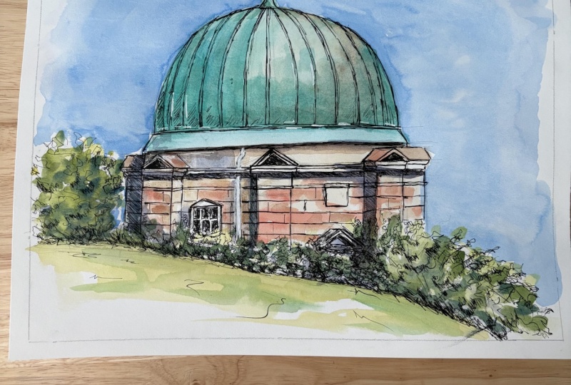
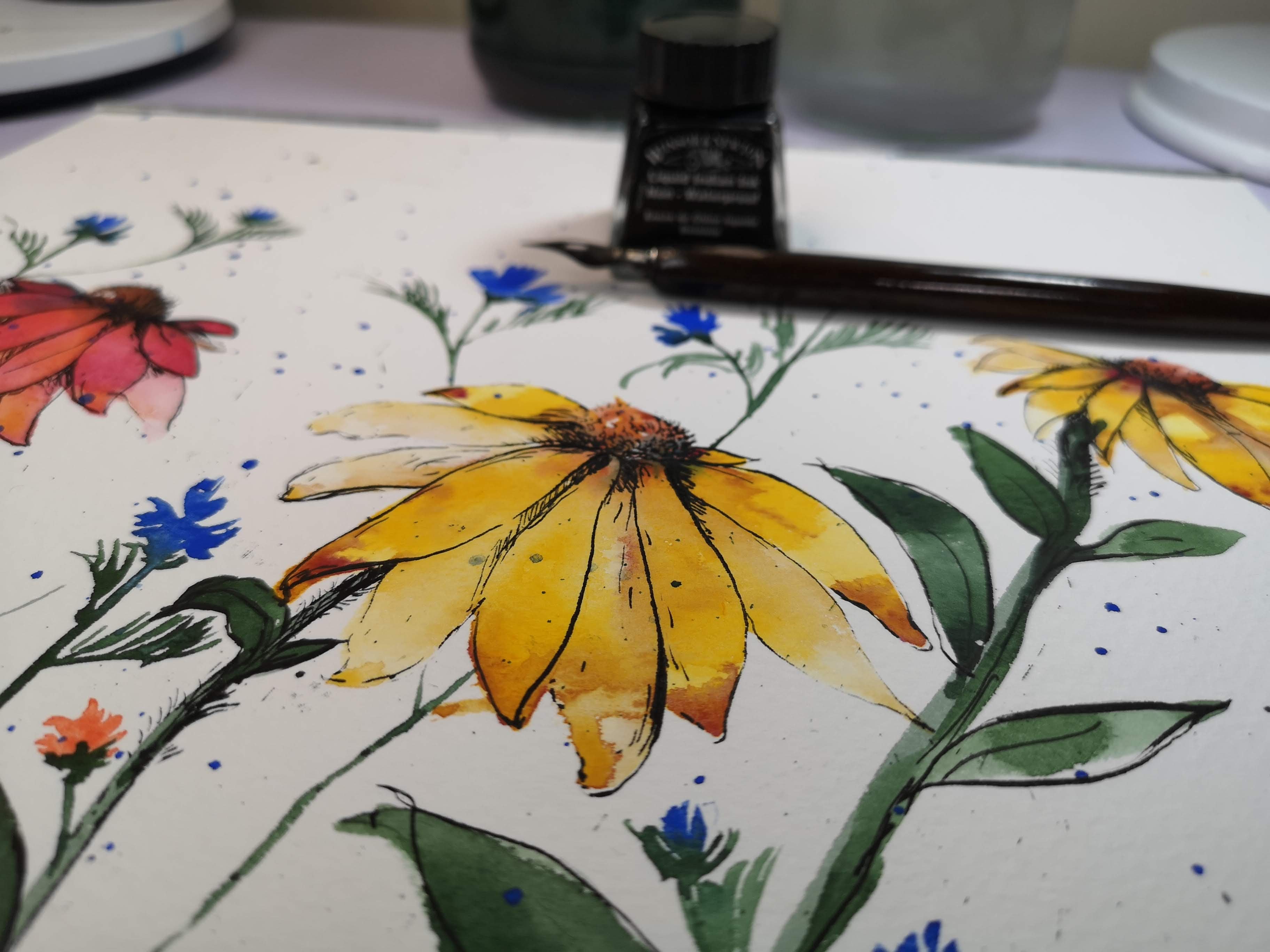
7. Project: inking your sketch: Once you have your line drawing in pencil, ready, next step is for us to use our ink and do some characteristic lines sketches on illustration. So I'm going to use a dip pen and some Indian ink for this purpose. This is just my personal choice. And if you do not prefer to use this, you can always stick to just your ballpoint pen or a microchip pen, or even a fountain pen if that works for you. But because we are starting off with the ink sketches before the watercolor washes, it is better to use their waterproof ink. So when you start your watercolor washes, it does not spread and smudge along with watercolor washes. But if you do not have a waterproof ink, you can always start the watercolor washes first and then complete your line sketches after the wash is dry. Either way is fine. Whatever works for you should be fine. So I'm going to start off with my sketch. Starting off right at the top of the dome. And I'm looking at my reference picture because I'd like to see where the shadows are. And I'm going to make my line darker where the shadows are going to be. So on that sphere at the top, I can see that the left bottom area is darker compared to the top part of that sphere. And so I'm going to make that line darker with my pen. I can also give a little bit of scribbles or shading using hatching, which are shocked lines placed close to each other. Or I can even do stippled dots placed really close to each other. Any of these techniques should work to make it look a bit more darker. Next, I'm going to work on the dome. And I'm going to start drawing the lines on the dome, all the ridges on the doom. So there is nothing particularly special that we need to do here. I am just going to go over the lines with my pen. We already have that in pencil, so it is going to make it easier for us to just follow the lines in pencil. If you're working on an area where there is a lot of light, then I'm going to use broken lines or dotted lines to make the light line look a bit more lighter. And if it is in there heavily shadow area, I can use a bit more darker lines for those riches. That way you train an impression or stuck and light on the dome. Hello. Now I'm going to continue doing the same for all the other lines on the structure of this building. Because we already have that in pencil, it is pretty much easier for us to just follow the lines. And all we need to look now is to make the lines darker where there is a lot of shadow, especially the left side of the building, which has a little bit more shadow compared to the right side of the building where there's a lot of light hitting that area. So while I'm sketching using a pen, I'm going to make the lines a bit more darker. And perhaps even put a shadow by using hatching or scribbling or stippling, whatever that makes that area darker. Again, the type of line Stat you're going to use here is completely your choice. It depends on what sort of lines you like. If you like scribbling to make an area darker or to show shadow that is completely fine. Or if you want to do little stippled, so little dots, that's also fine. Each and every line is different, just like how our handwriting has different styles could differ as well. So you do not have to copy just like what I'm doing. Feel free to try your own characteristic lines. To define these structures. Now that we're finished, the dorm part of the building, I'm going to start off with the foliage or the little hill that is right in front of us. Before I start off with the other bits of the building. This is only because we've got a significant amount of foliage and a Bush standing right in front of the building. And it is covering some of the main characteristics of the building. So I'm just going to mark out the foliage so I know how much of it is going to cover the building. See if you can notice the lines that I'm using for the foliage. It is very scribbly. More like the lazy stippling off the brush strokes we did in our practice session. I'm not taking my hand off the paper as much, but I'm just a lazy moving the pen. You can also darken a few areas where you'd think there is some dark areas on your foliage. So if you see in the reference picture, you can see that there is a little bit of dark area on that bush right in front of us. So I'm just going to darken that area with a little bit more squiggles, making my pen lines a bit more thicker if I need to. And also moving my pen really free. If you can notice how I'm holding the pen and actually holding it quite away from the nib of the pen. That way. I didn't, I do not have a lot of control over the lines that I'm doing. I'm just moving depend quite freely over the paper, not worried about what sort of shapes they are making. And you can see the result is very dramatic. And also if you'd like darker areas, again, you can see that I'm darkening a few areas, not just outlines. I am actually pressing the pen down to make a bit more dark areas. Or I can even add more squiggles where I think I need more darker areas. Now that I've completed the foliage, I can now go back to the rest of the building. So starting off with the finer details of the building, again, using darker lines for more shadowy areas and lighter lines or even broken lines or dotted lines when it comes to a very light area. So I do not want to lose to character off the light and shadow. When I'm using pen. So it's still like it to look very 3D. And because of that, making sure that I'm not overworking with the pin. So the best way to do this is to try and stop each and every time you have finished something on your painting. And I would suggest that you stand up and move back away from the painting to have a look a little bit further away from where you're sitting. That way you'll be able to see how much more details you need to include in your painting. So here you can see, I'm actually adding those little details on the structure of the building, which I did not do using pencil. And doing these lines, especially with the pen, mainly because it's easier to depict it using lines than to try and work with a watercolor brush. Because finer details with very thin watercolor brush and brush is still quite challenging compared to doing it with a pen. Besides width pen, we will be able to give it a lot more character compared to a watercolor brush. Usually we have to keep the details to a minimum when we're just working with watercolors. Whereas with pen we have the option to add a little bit more character. I'm also going to darken the inside of that window. Because you can see in the reference picture how dark it is in there. And you're going to use my pen to mark out the darker areas are the shadow areas as well. So darkening the window. And also I'm going to move on and darkening the areas. Which is in the shadow once I finish drawing everything else on the structure of the building. Now that I've finished inking all the main characteristics of the building, I'm now going to move on and do the shadow areas on the buildings. So if you look at our reference picture, you can see that the left side of the building is in complete shadow. So I'm just going to shade that area using small shocked lines, which is called hatching. And I'm also going to continue doing the same for the other shadow areas as well. So I'm going to look at my reference picture and see where the shadow areas are. And I can see it is mostly on the left side because the sun rays is from the right side. So I'm just darkening those areas. If you're unable to locate all the shadow areas on the building, don't worry because I have shared my ink wash of this illustration in the Projects and Resources section. And you are free to use that if you'd like to trees from it onto your watercolor paper before you start painting and watercolors. And finishing off some final details of the building. And we are nearly at the end of our inking session. And in the next session, I will show you how to use watercolors for this.
8. Project: Watercolour pigments: Before we start off with the watercolor wash, I'm going to talk to you about all the pigments that we need for today's project. So I'm going to start off with a cobalt blue as one of the main pigments that we'll be using today. So cobalt clue is used mainly for this guy, which is the background. And we're going to use a medium consistency of the pigment for this purpose. So I'm just going to make a little swatch of the pigment. So that was a medium consistency and I can always add in fresh pigment onto that wet surface. In any case, if I need to be a bit more darker. And are also acting also water it down, using more water, making it more diluted and very pale. Now for the dome of the structure, I'm going to mix a little bit of viridian green, cobalt blue. And you can get this very beautiful blue-green color. Alternatively, you can also use aqua green or turquoise green. Any sort of that blue-green shade that you get in really ready-made tubes and pans. Again, it's not very particular that you use the same color for the Dong. If you'd like to change the color to something else that is also fine. So I've used a medium consistency wash to create the swatch. And if I'd like, I can add more green pigment and also try it with a little bit more blue pigment. So feel free to experiment with the different shades you can get with these two colors mixed. So some of you might like the DOM to be a bit more green now. And you can use more green color. And if you'd like it to be a bit more blue, you can use a bit more cobalt blue instead. Or if you're not worried about that, you can always use ready-made pigment from YouTube or pan. And other mixture of color that we'll be using is a mixture of cobalt blue and sap green. So you can see that the cobalt blue is needed for a lot of washes in here. So I'm mixing cobalt blue and sap green on the paper. And I'm just watering down with a little bit more water, making it more diluted. And I might use these, this shade for the foliage, especially for the ones that I want to show in the background. You can also use that for the dome, if you prefer. Next for the structure of the building, which is a very light brown color. I'm going to use a mixture of raw umber and finish in red. It's just my personal choice of mixing colors. You might just want to use a plain color or a plane ready-made pigment from your, from your watercolor set. So in that case, you can also use yellow ocher or just raw umber on its own. If you want to make it a bit more brown, you can always use venetian red or even bonds sienna. And if you would like the color of the structure to be a bit more rows in color in some areas. You can also use crimson red for that. I will show you how to mix that in a minute. I thought the foliage is in the foreground or the bright green color in the foreground. I'm going to use sap green. And I can make sit in different consistency so far like and also mix a little bit of Prussian blue or any darker blue, like in dancer in blue. You can also makes a little bit of crimson red with your sap green to get a more dark green or red, brownish green if you prefer. So there are different ways of mixing different types of green just with sap green and a few other colors. Or you can even mix green from just the yellow and blue. And you can try different types of yellows and blues if you like. Finally, for the darkest areas, like the shadow areas, I am going to make in dancing blue. Or you can even use Prussian blue future not have in Dan three and blue along with some cadmium orange. Or you can even try crimson rate again, whatever works for you. I think even finish in red will work very well. That Prussian blue or in Dan through in blue to give you a very dark gray shadow cada, if you'd like. So that's all the pigments that we require for today's project. And we're going to start off with our watercolor wash in the next video.
9. Project: Watercolour wash: We're going to start working on watercolor wash. Now, we have our illustration ready and nicely inked. We have all the dark areas marked out. And all we need to do right now is to get the right pigment and start our watercolor wash. Again, the choice of pigments is completely yours. You can change the look of the painting by changing the colors. And you can use any colors that you think would work for your illustration. It doesn't have to be the same color as in the illustration. So I'm going to start off by mixing some fresh pigment. So starting off with cobalt blue, which is going to be our background or the sky. We're not going to do a lot of details for the sky. So I'm just going to make some pigment and I don't really need it to be very dark. So I'm adding a fair amount of water from the jar. And you can see the consistency is similar to that of ink. I'm going to use a flat brush for now. This is flat brush size number 12. And you can use a round, round brush if that is what you prefer. I just feel that the flat brush just gives me bought more precision when it comes to going around the structure. So first I'm going to wet the paper, making sure not to wet the building. Just wetting around the building. And I'm only going to add a thin layer of water onto the paper. It doesn't have to be a lot and I do not need any huge puddles. It is okay for you to go over the foliage. But I'm trying to stay away from the buildings. So I'm going around the building and the flat brush really helps me to be really precise with the lines. Now that I've wet the paper, I'm going to go back into the pigment of that I just mixed. So I'm going to load that on my brush and gently go around the building. And you can see because the paper is wet around that area, It's not leaving any hard edges. And I can move the pigment to any area that I like. And it will still be very soft when it touches the paper. Feel free to use bold brushstrokes if you like. Only when you need, when you come near the building, you need to be a little bit careful not to go over the building itself. And you can use bold brushstrokes and even use some splatters if you like that. So you can see that I'm keeping it quite loose. I'm not really painting the clouds or making it look just like the sky in the photograph. This is just going to be a very rough colors clash in the background of the building. So I'm just flattering paint now. And not a lot of splatters. And I have splattered the paint onto wet surface. So you can see that they are becoming very soft and when they begin to dry, they're going to be a bit more softer. And that is exactly what we need as the blue of the sky is not our main focal point in this illustration. And this is just a color's pledge to support the main subject in our painting, which is the building itself. Once I've done that, I'm going to wait for a few minutes. Meanwhile, I'm going to decide what kind of brushes I'm going to use now. And also probably makes a little bit of green for my foliage. But I am taking it very slow. So my painting has enough time to dry out on its own. But at the same time I do not want to be completely dry because I'm going to work on the foliage now. And it will be great if I can get the connection between the background colors and the foliage. So for the brushes, I'm going to use round brush, round pointed brush. You can either use a size number 12 or 10, which is a medium round brush. Or if you think your painting is a little bit more smaller compared to mine, you can go down a brush size and go to size number eight. So I'm going to start off with size number 10 for now. Or you can even use a mop brush size 2, which is similar to size 10. For the foliage in the foreground, I'm going to activate some sap green. So you can see that I've taken my larger brush to activate my sap green and mix it into a larger area so I can add enough water as I like. And I'm also going to prepare enough paint so I don't run out of paint halfway through civil making sure I have enough. Adding a bit more water, making it a little bit more diluted. Once I have a medium consistency of sap green, I'm going to move on and prepare some thicker consistency of sap green as well. So less water, more pigment. And to make the green darker, I'm also going to add a little bit of Prussian blue or green blue, anything that you prefer to make it that little bit darker. And that is going to go in the darker areas or the shadow areas in the foliage. So now here you can see the difference between the first pigment that are mixed and what are mixing right now. Because I have added a bit of indenter in blue in there, the green has gone really deep and rich. And you can also see that there is very little water in that mixture there compared to the first mixture that I made. So now I'm going to wash my brush clean. And we're going to start working on our foliage. So starting off with the first wash that we made of sap green, I'm going to loaded my brush and now I'm just going to freely move my brush over the foliage area. Again, you can see I'm using the tip of the brush as well as laying it down sometimes to cover larger areas. And I am keeping it quite loose. And you can also see where I'm holding the brush. It is well away from the tip of the brush. And as I go along, I'm also going to make sure leave enough white unpainted areas for highlights or to depict a lighter areas. And at the same time, I'd also like to add in the deeper pigment at the same time while the, while the paper is still quite wet. So you can see if taken another brush. So this is completely optional. If you, if you want, you can just wash the brush that you've been using and use it for the darker green color. The only reason I used in other brush is because I did not want to add more water to it accidentally. So if you do have a spare brush, it is always good to use the second brush. I've gone back to the bigger brush for larger areas of washes. And we're going to use the medium consistency of green that we first prepared to add some splatters as well as wide washes with a larger brush. And while you're working with the foliage, I tried to keep it quiet to lose. And I hope you will enjoy the process while you are painting loosely. So the best way to keep it loose is to hold the brush well away from the tip. And to just freely move your hand. Again, you can see that I am leaving a lot of white areas and these unpainted areas, well, it act as highlights. And definitely the brushstrokes are going to add a lot more character to the illustration than having a very flat wash on your paper. So I'm moving on to the largest bush in the foreground. Again, making sure to leave whites specs of unpainted areas, which again adds more interest to the painting. Try to enjoy the brush movements and also to keep it very, very loose. So you can see there I've swapped my brush here. And I've gone into the smaller brush to add in a bit more darker green into the wash. Again, I'm doing this as the paper is still wet and that way I can, I can be as free as I like. So I need to do very little work on painting here because the paper is a little bit wet and I can let the pigment do its work on the paper. The drier areas like how I'm working now. I'm using the tip of the brush to add some characteristic lines. And for wetter areas, if you'd like that area to be a bit more darker, all you need to do is just to drop in that pigment and let it spread on the watercolor paper. You can also do some splatters if you like. So because flatters, I think I need a bit more water on that mixture. And once I've added that, I can just go on and do some splatters and as many strategies that you like. If you want to make your darkest areas even bit more darker, you can go straight into the watercolor pan to get some dark blue or deep blue and drop it into that green. And that will mix with the deep green that is already there on the paper and create even more darker areas. So when you do the darker areas, we need to make sure that we're not overworking on each and every area of the foliage. That way we are going to block off all the light that is coming through that foliage. So just need to make sure that we're not working on a lot of areas where these deep colors. To add a little bit more interest into our painting, we can also add other colors onto our foliage. So I'm going to add some fresh paint straight from the tube. And this one is a very bright yellow. So I'm just going to drop it straight into that wet surface and let it spread on its own. I'm also going to add a little bit of bright rose color straight from the tube again. No water required. Just going to wash my brush clean and then get some fresh paint. I don't need to dilute it, but just good to get it and straight away drop it into the areas I'd like it to be. And it could be anywhere it could be anywhere on your foliage to add more interests. And I'm also going to dilute it a little bit to add some splatters. And with this, we are done with the larger washes on our illustration. Our next step is to add in all the details on the building itself. Before we do that, we'd like this painting to dry completely or there is a high chance that we get a washes much. So I'm going to wait to dry ice and get back to it. I'll see you in the next video.
10. Project: Paint the city dome: Now that the first wash is completely dry, I'm going to move on to painting the building itself. So I'm going to start off by mixing the color that's required for the dorm. So starting off with cobalt blue and a little bit of viridian green. And other option is for you to use ready-made color. And here I'm using aqua green. The pigment watercolor is similar to what I just mixed with cobalt blue and for eating green. And it doesn't matter, do you need to stick to the same color? You can change the color if you like. So once I've got to kinda in the right consistency, which is a medium consistency and not too thick, not too light. I'm going to start off with the dome. You can see that the sphere of the dome is not completely painted. I have left a white speck of paper shining through just to show reflection and the light falling on that shape. I'm going to paint the left side, the dome right now. Just placing the color on that, don't. And if you remember, the left side of the dome is a little bit more darker because the shadows falling on it compared to the right side. So I'm going to start off with placing some pigment. So that is the first wash. And I'm going to try and leave a little bit of unpainted area for reflection. And now I'm going to get a little bit more pigment straight from the pan and just drop it into a few areas where I think it needs to be darker. So especially the edge of the dome, the bottom end of the term. So let's just place the same color, but less water or more pigment. And you can see how nicely it blends in when it's painted wet and wet. I'm also going to add a few lines. So the lines are already there. With that we did with a pen. So I'm just going to enhance that with a little bit of watercolor and using the tip of my brush. And to leave a little bit of highlights, I'm going, I'm lifting off some color using a damp brush. So damp brush is when I've taken out all the excess water and just rubbing the brush over a wet surface and the pigment comes off. Next is for us to add in a little bit more darker pigment in the shadow areas of the dome. So I have mixed it tiny bit of finishing rate with the turquoise or the aqua green that I'm using right now. So that pigment has gone really deep and almost gray like. And that is the pigment I have used for the darkest areas on the dome, especially the bottom of the drawing. I can also use the same pigment and using the tip of my brush, I can add a little bit of dots and lines on the dome just to enhance the characteristic dome. So all those riches and lines on the surface of the dome can be enhanced using the same color, using the tip of my brush. So pretending my brush to be the pin here. You can see because we're working wet in wet, the color does not create any dark lines. It just feathers out and creates soft lines, which is what I'm really looking for. Because we already have the dark lines using the pen. And what we need is a fuzzy side or a soft side. And that we are going to try and achieve using watercolor. So moving onto the right side of the dome, keeping in mind that there is a lot more light reflection on that side of the dome. So I am leaving a few areas white without painting. So as you go around with your brush, just make sure that you're leaving a little bit of unpainted areas. Just finishing that doom off. Just leaving more white areas again. And I don't really need thick pigment in that area, so I've just washed that pigment off and just watered down that area. You can see immediately the effect of light reflection on that dome. And also adding a little bit of darker pigment. I think it's more like a staining on that, don't so it could be a color that is on the structure, but at the same time, it's not really dark, so it is the same mixture of turkey. That's all I got. Aqua green with a little bit of Venetian red that we've been using for the darkest areas on the left side of the dome. But this time a little bit more water on it to dilute it down. So we still get the pigment color, but it's not as thick and opaque as consistency on the left side of the dome. So again, I'm doing this same thing with the tip of the brush, adding in all characteristic lines with the brush. And because we're doing it too wet in wet, again, it's not going to stand out as much. Spend lines finishing off the bottom of that dome as well. And this time I've mixed a little bit of cobalt blue along with the aqua green. This is only because I just saw that color different, John, the reference picture. And I thought it would be interesting to add slightly different variation of the color of the dome. Again, it's just a personal choice. It's just something that I observed in the photograph. You to jot you do not need to change the color if you don't feel the need to serve again, the left side of that ring of the dome is going to be a darker because it's. Is in the darker area. I'm also adding in some aqua green, the same pigment as that of the dome. Just little specks of that pigment into the area just to show some color bleed. Just again, adding interest to the illustration as such. So we're finished with the dome now. Now we're moving on to the body of the structure. So I'm starting off by mixing the pigment that's necessary, that's raw amber. And I'm trying to prepare as much as paint as I need. Not too thick. The consistency is medium. I've got a fair amount of water and pigment and you can prepare as much pigment as you need right now. Just keep on adding pigment and drops of water until you get your desired consistency. Next, I'm going to prepare some Venetian red. Again, I don't need a lot of it. I just need a tiny amount of that mixed with raw amber to create the right color that I need. I'm also going to mix and prepare some crimson red. By the side of it. I haven't mixed the colors on the palette as yet. I'm just going to start using the color separately and mix them on the paper. So starting off with the darker areas on the structure of the building. So I'm starting off with raw under. And you can see after left little bit of white areas, again, just showing the reflection. I might dilute the raw umber and use it as a light wash in the areas where there's a lot of light falling on it. But for now I'm going to start off just with the shadow areas, which we have already marked using the pins. So our job is a lot easier right now. And I'm also watering down the pigment that I just added just to get a lighter wash in the other areas around it. Now for the darker areas where the shadows are falling, I'd like like to give a darker pigment there. So I'm going to use a mixture of Venetian red and a little bit a death rain blue. You can even use Prussian blue to get one of those deep brown, grayish color. And I'm just going to use that in the shadow areas again, which we have already mapped to using our pen. I'm also going to add the same pigment to the other areas of dome. As I'm painting, I'm going to make tiny bits of finishing ridge to the raw amber that we have, as well as a tiny bit of crimson red, just to show a rose color to the structure of the building. So you can also make your pigments on paper. It gives a very dramatic effect to your building, is that's what you like. And you can see I'm also leaving some white areas just to show light reflection. Again. Continuing with adding in the row under and finish in red, sometimes adding a little bit of crimson red as well. And also making sure that the pigment is not to stick. In most areas, it's almost very watery. And if you know where the shadow areas which we have already painted or which we have already sketched using our pen, you can start adding darker washes over it. So here I'm using a mixture of finishing grade and industrial goods. You can even use Prussian blue, just adding extra Scots, two lines just to add some character to the building. Moving on to painting the right side of the building, where there is a lot more lighter colors and light reflections compared to that left side of the building. So making sure to leave more white areas and to use a little bit more diluted pigment in this area. And now starting off with the shadow areas as well. So again, I'm using a mixture is vanishing dread and in dense ring glued to give me a very brownish, grayish color for my shadows. I'm going to use the same mixture for the window as well. The same in density in blue and Venetian red. And while I'm painting the window, I'm going to make sure to leave a few highlights to show the details on the windows. With this, we are nearly at the end of the illustration. We have completed all the watercolor washes that is necessary on the building, as well as the background. And what is left for us to do is all the shadows that's falling on the building.
11. Project: Finishing touches: In this video, we're going to complete the illustration by adding all the little details that will bring life into this illustration. So starting off with all the shadows and then we will move on to a few more details like the different types of bricks and the color variations of bricks on the building as well. I'm now going to work on the shadows that is falling on the building now. So starting off with the darkest area, which is the left side of the building. And using the same mixture of intense rain blue and Venetian red. You could also use Prussian blue or any dark blue that if you like, you can even use ultramarine blue. And that works really well as well. And that mixed with a little bit of Venetian red or permanent trade, brings a very vibrant gray, which is really great for shadows. I'm just darkening those areas which are really dark. And in the shadow. Already done the dark areas with PIN while we were inking. So I'm just going to work over it to just bring out all the highlights. Follow me along as I complete all the shadows that's falling on the building. And later on, we're going to also talk about the different types of brick work and the different types of brick color that we can use to paint the bricks on the building. Hi, we're now going to start working on some brick detail on the building. So I am using finishing read for this purpose. You can also use burnt sienna if you like. And also if you'd like to vary the color of the brick, you can add a little bit of presciently or indirectly in blue, along with that burnt sienna or venetian red. And you would get a grayish color if you would like it to be a bit more bright and more on the rows side, you can add a little bit of crimson red that which definitely make the brick work look a bit more vibrant. And I'm just adding a few details just randomly on the surface of the building. And some final finishing touches like the shadows that I missed out on, just darkening the areas. And once you've finished, don't forget to sign your painting because it is your creation and it definitely needs yes, thickness showed to make it unique. And with this, we are at the end of our illustration. I really hope you liked the illustration and you have enjoyed painting it with me. It has been such a pleasure working on this illustration and I hope you enjoyed it. Justice me. Happy painting everyone.
 Suzanne Abraham, Artist