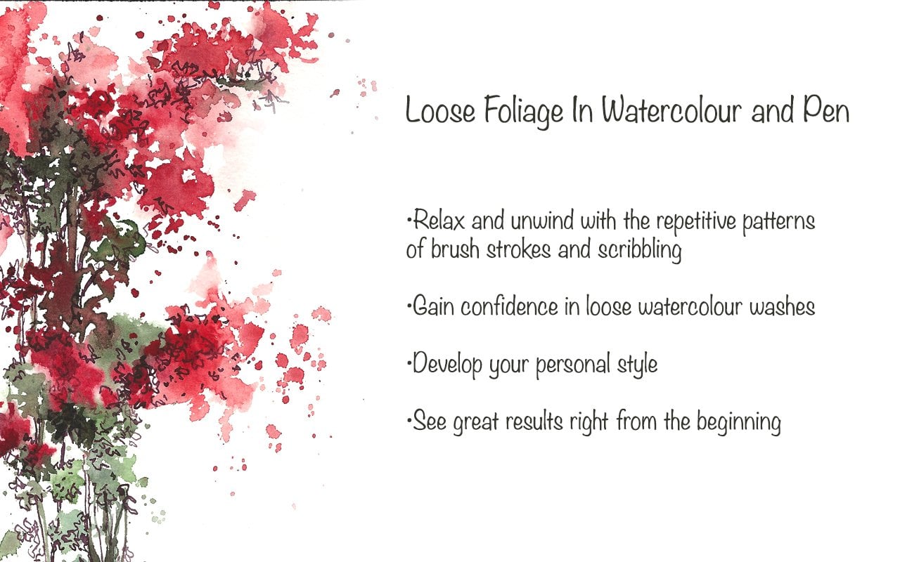
Transcripts
1. Introduction: Hello and welcome to your
mini tutorial on how to paint this cute little
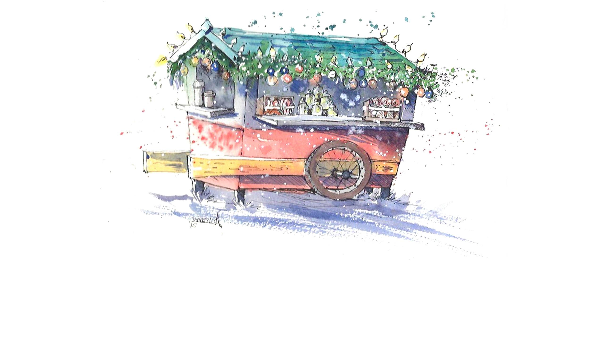
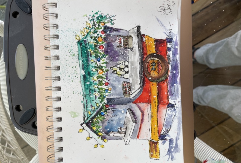
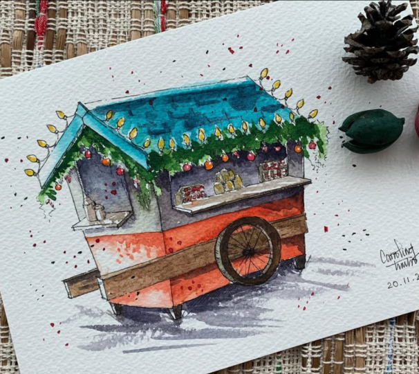
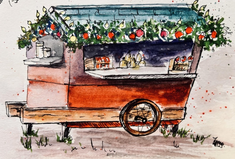
Christmas stall or Christmas cafe in line and wash. This illustration was
inspired by one of my visits to a Christmas market. I particularly love visiting Christmas markets mainly
because I can look at all the declarations and the different types of Christmas
stores that are there. And the atmosphere in the Christmas market
is very magical. In this course, I will provide
you with a line drawing as well as the photograph of
my finished illustration. You are free to use
my line drawing as an inspiration to create
something of your own. Or you can even use
a line drawing to transfer it onto a
watercolor paper. During this course, I will show you how to transfer your sketch onto watercolor paper if you're not too keen
on sketching it. And so that you
can enjoy painting it as well as doing
some make over it. I hope you will
enjoy this course as much as I did creating it. See you in the next video
where I will explain that a bit more about the materials
that we will be using.
2. Suggested Materials: Hello. In this video, I'm going to talk about
all the materials that we need for
this illustration. Starting off with
watercolor paper, I have medium-sized
watercolor paper here, which is slightly
smaller than A4. And this is going to be the size of our
illustration today. If you do not have
watercolor paper, you can also use a watercolor sketch book
or mixed media sketchbook, if you like, as we're doing line and wash technique today, it's not necessary that you have a heavyweight
watercolor paper. This is my palette
with all the pigments, you may use one of these
pallets with watercolor tubes, or you can even use
watercolor pans or cakes that come in a set. For brushes. I'm only going to use
just one brush today, and that is this round pointed brush and this is size eight. You can even go up
one size if you like. So that's either
size eight or 10. And you can either use
a round pointed brush like this or you can even
use a mop series brush. So I've got a mop brush
size 0 or size to you, and they are similar to the size eight or 10 that I have here. So any of these brush and just one brush is
all that you need. You can either use a
larger brush if you're comfortable with that or you
can just use a smaller one. Next material is ink. I will be using a dip
pen and Indian ink. But if you do not have
dependent or Indian ink, you can always use a fountain
pen or a microchip pen, ballpoint pen, any pen that
you personally prefer. And finally, for
initial sketches, I'm going to use a
pencil and an eraser, as well as two jars of
water that I have here. So I can wash my brush is clean as well as have fresh
water in the other jar. While I'm using watercolors
as well as these, you can also have a
tube of designers white goulash with you for some splatters towards the
end or some highlight. If you do not have goulash, you can always use a white
gel pen or any white paint. And even acrylic paints should
work well for highlights. Lastly, if you'd like to
trace the line drawing, you can have a printout of
the line drawing with you. Here I have my
original line drawing, which I did on a gateway
sheet or a tracing sheet. If you do like to do your own drawing just by
looking at water, have done, feel free to do that or if you would rather
prefer to trace them, I will be showing you how
to trace this line drawing onto the watercolor
paper in the next video.
3. Suggested Pigments: Hello, I'm going to show you all the pigments that we
require for this illustration. I'm going to make little
swatches of some of the examples of the
pigments that you could use for today's
illustration. This, again, is just
my personal choice of colors and you can
always change your colors, whatever colors
that you may use. It is a good idea to
have a little swatch of all the colors that
you prefer using. So you know how those
colors would look like. You can even make like
little doodles with your brush just to see
the color combination, how and how it may look like my choice pigments, aqua green. That is going to
be for the roof. The next pigment that
I like to use is permanent red and
lattice going to be the bottom bit of
the kiosk cafe. So I'm just making a quick swatch so I know
how the colors look like. This will also help
you to determine how much pigment you need and how much water
to use as well. The next pigment is
going to be Sap green. And this is what I will
be using for the foliage. That's sap green. And if you'd like to make sap green a little bit more deeper, I am going to use a
little bit of deep blue, which is in dancer in blue, that is what I'm using. But if you do not have
in-depth or in blue, you can also use Prussian blue. So that is slightly
more deeper blue. I'm going to wash my brush
clean now I'm going to move on to the next pigment
that I'm going to use. I would also need
a neutral tint. So for that, I'm going to
try and mix a gray color using in-depth green and blue and a little
bit of Indian rate. If you do not have Indian red, you can also use permanent red or a cadmium
red if you prefer. So that's the gray color that I just mixed using Indian red. And in that three in blue. And I can vary the amount of red and blue in this mixture
to get deeper brown. So if I need a deeper brown, I need a little bit more
brown or Indian red in it. And that mixed with a little bit of industry in blue would give me deep brown color, which is a great color
to depict wound. So that is like
really deep brown. I'm going to make it a little
bit more Indian red width, lesser in there, three in blue. To give a little bit
more deeper brown, a bit more richer brown. And I can add more Indian red to make it a bit more
lighter as well. If you are not keen
on mixing colors, you can always use a ready-made
color like burned on bulk or burnt sienna for
the rich brown color, as well as neutral tint for the shadow areas and the
deeper areas as well. I'll also be using a little
bit of cadmium yellow. And that is going to be for the light bulbs that goes
across the roof of the kiosk. If you do not have
cadmium yellow, you can also use Winsor yellow, which is another nice neutral
yellow, or even gamboge. Yellow is great
for this purpose. Along with all this, we're also going to
be using a little bit of white goulash
or some shadows. I can also use a little bit of ultramarine blue along with all the pigments that I'm using for an extra layer of pigment. Or I can even mix that with
permanent read a file like. So ultramarine blue is a great
pigment to make shadows. And the shadows would look
really vibrant as well. And that'll be all the pigments that we require
for today's class.
4. Transferring Line Drawing and Sketching: In this session, we are going to transfer
our line drawing onto the watercolor paper or any paper that
you're going to use. As mentioned in the materials, you can either use
watercolor paper or sketchbook or
mixed media paper. So this is a line drawing. This is the original off
the line drawing that I did and I have done it on a gateway
sheet or a tracing paper. You can find the line drawing as an attachment in this course. And now I'm going to
show you how to transfer this sketch onto your
watercolor paper, which is underneath here. So for this, you would need a printout of the line drawing if you are going to transfer it onto the
watercolor paper, or if you'd like to copy
it from the line-drawing, that is also possible. We're going to stick
to the main structure and we're going to leave
out all the little details. But once we've got the main structure onto
the paper and then we can carry on doing all
the little details that needs to be included. And that's the time when you can personalize it according
to your taste. So to begin transferring, the first step we need to do
is to get some graphite or charcoal the back of
the printout because I'm using a tracing sheet
either way I turn it around, it might look the same. But since you are going
to have a printed out printed out line drawing, you would be using
the back of the line drawing where there
is no print at all. I'm going to use a pencil. It can be any pencil, but if it is anything above two or a three B pencil in the graphite will be more compared to using a
normal HB pencil. What I have here is
an HB pencil and, and, and it's quite dark, so you don't need to have
an HB pencil is just, I prefer using this, but you can either
either use a 3D or a to B pencil or in any shading
pencil that you have. So I'm going to
shade the back of the paper only
where the image is. I'm trying to get as much as graphite
as possible on here. So when I begin to transfer the line
drawing onto my paper, I will get a neat line drawing. So I've got a nice layer of pencil shading or
the graphite at the back of the line drawing. Once I've done that, I'm going to get my
watercolor paper or sketchbook or anything
that you are working on. And I'm going to flip it back over to where the
original line drawing. And then I'm going to place
it over the April people. Once I'm ready, I'm going
to go over the line drawing using a
very sharp pencil. Or you can even use ballpoint
pen or migrated pen. Anything with very
fine nib should work. And I'm going to go over the main structure
only at the moment. So basically just
a whole structure. I'm going to leave
out little details like these bobbles and these
decorations and everything. So I think I've got
the main structure. So now I'm going to try and use the pencil or a pen to do
all the details that I can, I like to include in here. Now for sketching,
you can either use a pencil or you can use, or you can use ink to
begin your sketching with. I'm going to try and
use my pencil now. So what I can do the
watercolor first and then I can enhance my watercolors with
a little bit of ink. So now looking at the
reference picture, I can see that I've got
the main structure of the roof and now I'm going to
add a little bit of light. So I'm just only
going to suggest it's slightly not a lot
of details here. I can always add
details once I've finished doing my watercolors. So just slightly suggesting
some foliage as well, and also suggesting a few circle like shapes for the bubbles. Just a little addition
that you will not see in the line drawing. I'm going to try and add my collateral milk jug or something to suggest
that it's like a cafe. I can have like a little cup
that's sitting here as well. So that's the wheel. And now I think I'm done
with the line drawing. I'm going to try and avoid
all these lines that I did in the line
drawing on the roof. It was just a suggestion of
what a Ruth could look like, but I'm going to wait to see how my watercolor goes and then I will add them using
ink later on.
5. Painting with Watercolours: So we're going to move
on to watercolors. I'm going to start off by preparing some
pain for watercolors. And the brush that I'm using
is mob series size of 0. As mentioned in the materials, you can also use a size eight or a larger one if that's what you
personally prefer. But I'm going to use
the morph brush. They are similar sizes. You can use anything that
is comfortable for you. Starting off with preparing
some paint and I'm going to use aqua
green for the roof. So starting off with some
water and some pigment, mixing them together to get
a nice medium consistency. You can test it out on
a rough piece of paper. So that's the consistency
we're looking for. It's not too thick
and not too watery, but it has got a considerable
amount of water in there. And I'm going to use
that for the roof. And when I start
off with the roof, I'm not going to do like
a huge block of color. I'm going to leave a
few unpainted areas. So I have a lot of
light reflection. So I had a little
bit of pigment here. I'm going I'm going to
wash my brush clean. And then using my wet brush, I'm going to just gently spread the paint across to the rest of the areas
of the roof as well. Trying to leave out
a little bit of that area where the
light bulbs are. But don't worry too
much if you cannot leave a huge area and painted and the top of the roof, I'm going to leave
white areas as well, not completely covering
the whole area. And now for the
side of the roof, I'm going to try
and not do a lot, follow the site of the
race because this side of, this side is going to be
rather light compared to the right side because I'd like a little bit of shadows
on this side of the cafe. I'm going to wash my
brush completely clean. And then with that wet brush, I'm just going to run it across
here and that's about it. I'd like a little bit
of white area there. At this stage, you can also
use some pigment to splatter. And also if you'd like to
add some deeper pigment, you can do that as well. Now. Now as I'm coming down to this
area where the foliage is, I'd like the blue and the
green to make slightly so there's some connection between all the
colors on this paper. So I'm trying to keep
them wet and moist. And then almost immediately I'm going to move on
to some sap green. And then I'm going to
begin using sap green. And it doesn't matter if that touches along
with the roof. I'm deliberately
touching the roof. And I'm going to
make little marks with the tip of my brush. And just trying to create
the texture of foliage. If there is a bubble
that you'd like to add in between the foliage, you can leave the
space for that now. So continuing with my sap green. And you can see I'm, I'm not really worried
about the details now I think the most important thing is for me to get the
colors out there. And then once that dry, I can always add
pen lines over it. Now, along with the sap green, as we have seen
here with swatches, I'm going to add a little bit of blue to get deeper green. And then drop that
in between as well. Washing my brush briefly just to go back into some
fresh sap green, just finishing off the foliage. And again, you can have
splatters if you prefer. Without waiting. I'm going to go into
some neutral tint. So for the neutral tint, you can use a mixture of blue or Prussian blue
and a little bit of permanent red or vanishing
red or brown as well. Because I am going to use some permanent red for the
bottom lid of the cafe. I'm going to stick to the
same color, permanent red. And a little bit of
In than three in blue or ultramarine blue is also fine to create
a nice shadow color. And I'm going to use that just for the top bit of the cafe. Quickly going to
lift off some color here because I decided
that I'm going to leave this side of the cafe a little bit brighter
compared to this side. So very little pigment
is enough here. Maybe just a little
bit of shadow underneath those foliage
and some nuts, all I need. So I'm using a wet
brush just to drop in some pigment and get
all the pigments to run down in
this area as well. Now leaving that damn
going to move on to this side where I can use it a little bit more shadow color. So just at the top bit of the
cafe here, until this line. And then a little bit of
pigment here as well. You can add more pigment, more blue, or the same, same color a little bit more. Just to add a tiny
bit more just under the foliage where there
could be more shadow. And now immediately moving on to the bottom of the bottom, Mitch off the cafe which I decided just going
to be permanent red. Maybe a little bit
of cadmium yellow, placing it under there just to make it look colorful than that. So if you do not
like a lot of color, then you can always
choose not to do that. This is the long
wooden structure that is attached to the wheel. Some way to try and
make that yellow. You can use wood color
if you prefer that, if that's what you like. Going back into some more red. So I can finish off that
bottom of that structure. And I suppose
there's going to be a little bit of pigment
just here as well. Because even though it's
the wheel that I can still, I can still see through to the other side going to place
another layer of red here. Just a little bit more
pigment because I can see it's not very dark. So just placing a
little bit of that, not a lot, but only
in some areas. So making it a bit more darker. And also I can add some. In dance green, blue
or ultramarine blue. Any of these domains
bit more darker, so I can add some deeper color. Just for shadow. On this side, the narrow side of the cafe. I'm going to first wet the paper and maybe just add tiny bits of raid. I'd like the rest of
it to stay white. I can also add some
splatters if I like, just in the wet area. So now quickly moving
on to the wheel, which I'm going to choose a neutral tint for
that in downstream blue and a little bit of Indian rate for
that deep brown color. You can just use been
to or if you prefer. I'm just going to
fill that inside of the area of the wheel as well with a little bit of
red and some yellow as well. Because obviously I can see three the wheel and just finishing off
the center of that, we'll also going to add a little bit of shadow on the wheel so it doesn't
look really white. Now I'd like to add a
few Babu like shapes, as well as a little bit of
yellow for the light bulbs, say just slight yellow
for the light bulbs. But if you were not able to
leave those areas unpainted, not to worry, we
can always go back to it with some white paint. And now adding some bubbles. Try and vary the colors. I'm going to try and
do another color. Say let's say some blue
or purple if you prefer. Now for the inside of the cafe, I'm going to make it
pretty dark in them, three in blue and a little
bit of permanent range to create a nice deep shadow color. Trying to leave out the boxes of sweets that are in the front. Slightly going to wash
my brush clean and then pull out some color
to what the jaws. Because I like a little bit of gray color and for the genres. So they're not to
the stock, white. I can also add some colors. I like the jaws. So I can start off
with some yellow, slightly dropping in just like a little color splash and
fall the boxes itself. I'm going to use some brown. So you can use been to umber or you can mix your
own dark brown with a little bit of
Indian red and green blue. And just using that full the boxes and trying to leave out those suites
that are inside the boxes. So I'm not covering the whole area is
just the books color. And then I can add
some more pigment for the suites
that are on there. So a little bit of brown
for the gingerbread men. You can even choose
not to paint them. It's not necessary you, that you paint them. You can always go over
it with a little bit of dots of color because
they're so tiny, you can't really
paint them too much. So you can even do like little
splatters if you prefer. And for the candy canes, I can do these. Right lines, just to suggest some red lines
on the candy canes. And the lowliest as well. Just to let him
color splashes fine. Now for this site, the inside of the cafe, I'm going to wet
this area first. And then I'm going to use the same gray that
we used in them, three in blue and permanent red to create a deep
gray, purply gray. And then I'm gently
going to place the pigment in the area
where I'd like it to be a bit more darker and trying not to touch the things
that are sitting in front. I'm going to only cover the areas that suggests
the inside of the cafe. And you can make, make the
whole thing look a little bit more wet by just
splattering water. Or if you want, you can
splatter paint as well. Again, the little details like the little flask and the
monk that does here, you don't need to necessarily
do much about it. You can use a
neutral color or any gray to just add some details. And then you can
leave it at that. Lisa, just suggestions of different things
that you can see. You if you prefer. You can add color to it. If not, you can
leave it as it is. And for the platform on
which they are sitting, again, I'm going to use
the same gray color. So in that three in
blue and permanent red, I'm not going to try and
use different colors because then our focus will go from these colors to
all these different colors. So it's best to use
only a few colors. Keep your pilot limited. That's the edge of the little platform where
everything is sitting. Going to leave this side of
it, white and unpainted. So it reflects light. The same goes for this
little platform here. And then some light reflections. I'm going to use ultramarine, which is a shadow color. For the top bit of the platform.
6. Enhance your Watercolours using pen and ink: Now that we're done with the first layer
of border colors, I'm going to use ink
to do a few lines. So for ink, I'm using a
dip pen and Indian ink. Not necessary that you
use the same material. You can use any
pen that you like. It would be great if
it is waterproof. So in case if you
wanted to work over it with watercolors and it
wouldn't spread out. Let's begin inking
our illustration. When I start off with
inking the illustration, I'm going to try and stick to the areas where I think I
need a little bit of shadow. And I'm not going to outline each and
everything I'd like. The watercolor does
shine through as well. So because of that, I'm going to try and stick
to only the darker or the shadow areas where I think it needs a little
bit more enhancing. So starting off with the
light bulbs right at the top, so you can see what
I'm doing here. I've not not completed the
line on the light bulb. He left the rest of it. So it's sort of it's
completed by the ice. And you don't have to
stick to very neat lines. You can do a lot of scribbling. Be expressive with the
lines that you're using. A bit of detail. Starting off with some foliage. Again, you don't have to
stick to every bit of detail. Or if you like, you can
have extra lines to suggest foliage that necessarily doesn't need to have any color in it. So just like how we have
splatters with watercolor, you can also have expressive lines that
goes outside the box. So just enhancing
that barbel there. Again, not completing
the whole circle, just probably doing
only what is necessary. So there's another bobble. There's a nice color
bleed in this area. So I'm trying not to go too
heavy on the lines there. Maybe just a few dots
to suggest the lines. A little bit of shadow over
here and now continuing with a little bit of scribbly
lines for foliage. And then we're just
going to repeat the process of
enhancing that bibles. And now I'm going to complete the light bulbs at
the top as well. I know I haven't
been very successful placing the yellow
color in there, or to leave a little bit
of extra white in there. But no matter what, I'm still going to do the shapes of the light bulbs where
I can see the yellow. And I can always
come back to it with a little bit of quash to
highlight the whole area. And some shadow is falling
just beneath the foliage. And now I'm going to try and enhance all these little
things that you can see sitting inside the cafe. And then have a little
bit of shading just to show the shadows or
the darker areas. I'm going to do the
same for the jars. I know there was like a little Carlos flash that I
did here for the jars. Going to try and keep those light reflections
on the jars as it is. So very little lines again, just only enhancing
that a little bit. Hi. So when you give shadow or darker shade to the negative
areas in between the jaws, automatically the jars
get highlighted as well. So continuing with
the next set of jaws, again, we're going to
try and do the same. So just enhancing the
areas where I think I need a little bit more shadow or a little bit more
defining off the lines. But if not for that, I'm going to leave the
watercolor cities. So it's just those few lines. So now making the lines darker just under this table
that is sticking out because definitely there's going to
be a shadow in that area. So again, to make those
lines a bit more darker. So that's the wooden structure
that holds the wheel. And that I'd like it to
be like a wooden beam. So I'm going to do a little bit of darker lines just to show that a slight suggestion of that wooden beam going
behind the wheel and then coming out through
the other side. And you can see how the lines go lighter as I come
towards this side. Now as I come to the edge
of that wooden beam, you can choose not to
have any lines at all or just have these little
dark dots and dashes too, such as the outline
of that wooden beam. And then if you like to
have texture of the wood, I do these little shapes. Now to finish off the
bottom of the structure, it's going to be a
bit more darker, so suggesting a little
bit of shadow with some rendering or short lines. And I can always come back
to it with a little bit of water colors to finish it off by just adding a little
bit extra lines. Just under the just
under the cafe, just a little bit of
shadow under the cafe. You can tilt your paper if you like to get the blinds correct. It doesn't have to be
straight all the time. So feel free to,
to, to your paper, especially doing circles with a steady hand is really tricky. So you can always tilt your paper to get the right
to get the desired effect. And then you can
do a little bit of texture on the wheel as well. And also just continuing
to place a few lines just under that wouldn't be
just to suggest shadowed. And then I can go back
with watercolors in those areas to France and to add a little
bit more shadow, as well as that, I'm going to do a little bit of rendering just under
there as well. There's a lot of
light falling here, so there's very little
lines that I need here just to enhance whatever is here. So again, starting
off with the boggles, I don't want to ruin
the color bleeds. So I'm going to be very careful not to overwork
on these bubbles. Now with the roof line is going to be a bit more
darker because just to suggest that a little
shadow just under the roof and that little detail
on the top of the roof, the little wooden
piece on the top. The light bulbs. You can see how
light, the color, the lines are on the left
side of the structure. Just only to suggest the
objects that are in this side. I'd like to keep
everything quiet, light this little cup. Again, I'm not going to do
a lot of lines on them. Probably sticking
to the darker area. Just suggesting a shadow there. Shadow under the
table there as well. And just enhancing the corner. As well as a little
bit of shadow for the inside of the cafe as well. Just darkening the areas, only a few areas. So I'm nearly done
just to finish off the top of the roof. And you can add some details of the roof if that's
what you prefer. It's not necessary
that you do it. Just a suggestion of the roof. And I think with this
I'm done with the ink. When the ink dries. I'm going to go
back to this with a little bit more shadow just
to enhance the whole thing. And that'll be our
finishing touch. So see you in the next video for a little bit of
finishing touches.
7. Finishing Touches: So now for the
finishing touches, and we're going to
use the same brush that I have been using for painting with watercolors, the same mop, brush size 0. Or you can even use a round
pointed brush size eight or 10 depending on how
comfortable you are. So for the shadow color, I'm going to stick to the
color that I have used here just under the structure. So it was a mixture
of ultramarine blue and a tiny bit of permanent ridge to make
it a bit more deeper. So that's ultramarine blue. And I'm preparing a medium
consistency and preparing enough shadow color and
enough pigment so I don't run out of it because I'd like the pigment or the shadow
color to remain the same. So a little bit of
ultramarine blue and a tiny bit of permanent red. And I got that deep blue. If you do have a shadow
color in your palette, you are free to
use that as well. So just a few suggestions of shadow and I'm not
going to overwork. So starting off with the roof. So have a little bit of
detail on the roof and I like a little bit of shadow to suggest that they are layers of roof tiles or it could even be, would it, whatever it
is, the texture of, it can be enhanced using
a little bit of shadow. Again, I'm careful
not to overwork, so I'm not I'm defining
each and every area, just a few areas that I think needs a little
bit more enhancement. It doesn't look very so that
it doesn't look very plain. Another area where I like
a bit more shadow would be under the table and
is sticking out there. So just a thin layer of that shadow color over the
dry watercolor and the pen. And you can still see that the red shines through
and it doesn't get mixed width with the pigment
that we're using now. Just using a little bit of
water to wash my brush. Just make these edges
a bit more softer. I'm going to do the same color for just under the wooden beam. Haha. As well as a thin layer of shadow on the wooden
beam as well. Tiny bit of shadow under
the table on the left side. And I think we are nearly
done just to suggest a few brushstrokes justice
such as dark shadows. You can also make these
lines longer if you like. And I think we're done
with the watercolor bit. And finally, before I finish, I'm going to use a
little bit of goulash. So some white quash
with a wet brush. Just for some highlights. Especially here where the
jobs are just to show some light reflection
on those jars. And I'm only using the
tip of the brush just to suggest some
brighter, lighter areas. Going to do the same full. A few things like the sweets, just adding a few splatters. We are finished with
the illustration of this cute little
Christmas story. I hope you enjoyed it. Happy painting everyone.
 Suzanne Abraham, Artist