Transcripts
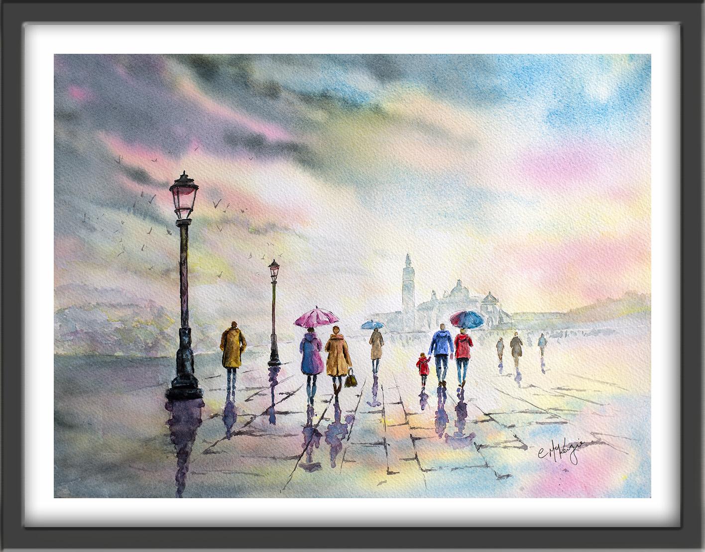
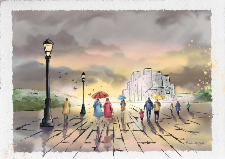
1. INTRODUCTION: This class, you'll explore
how to paint this glorious, colorful sky presiding over an atmospheric rainy
street scene in watercolor with a focus on figures, reflections,
and perspective. We'll start with some
loose wet-on-wet washers for the sky and distance. We'll suggest depth
with tonal values and create expressive
reflections on wet paving. And you'll learn how to position figures convincingly in spaces. The emphasis will
be on mood, light, and movement rather
than tight detail, allowing the painting to
remain fresh and spontaneous. It's suitable for all levels, including beginners because I'm going to be guiding you
every step of the way. And I'll be sharing all
the techniques, tips, and tricks that I use in
my own professional work. I've included a copy
of the drawing in the project resources section so that you can download
it and trace it, and then not worry
about the drawing because this is a
painting class. I am a professional artist, author, and tutor,
and over the years, I've sold a lot of
work across the world and helped hundreds of people to learn more about watercolor. You can see examples of
my work on my website. My style leans
towards impressionism and contemporary rather
than photorealistic. I like to explore loose approaches that
bring out the color, light, and essence
of my subjects. I've tried to
replicate this across all the many other videos
that I have on Skillshare. I'd love to see your
own finished painting, which you can upload through the project and resources tab. I'll give you some
personal feedback on it, and you'll be able to
see the artwork of other students and
get their support. At the end of the class, you'll have your own beautiful artwork to be very proud of. So let's swizzle our brushes and get on with the painting.
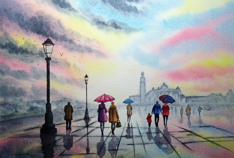
2. Materials & Drawing. Loose sky washes, distant buildings. Tonal Values.: I know you're going to love
creating this painting, and I'm sure it
will put a really big smile on your face, too. For this class, these are the colors and materials
that I'm using, but do feel free to use
any that you already have. For information on brushes
and paper, et cetera, do check out the basic
materials document that I've added to the
project resources section. Now you can see that I've
kept the drawing very simple, minimal details so
that we get a nice, loose free flow painting. And I've included a
copy of the drawing in the project resources section so that you can download
it and trace it, and then not worry
about the drawing because this is a
painting class. I'm not going to bombard
you with rules about perspective because entire books have been written
on the subject, but you can see from
this diagram where the eye level is and where the vanishing point
on the horizon is. All these factors
were important in determining the height
of the lamp posts, the height of the people, and where they should be placed, and the lines along
the pavement cracks. Let's make a start
by painting the sky. I'm going to use the wet-on-wet
technique in order to give the soft dreamy appearance that skies generally have. So I'm using a large brush and some clean water and going over the whole
of that sky area. But do note that I have already mixed up my sky
colors in my palette, my yellow, blue and pink
so that after I've wet it, I'm ready to go straight
in with the paint. This sky is taking up about two thirds of
the actual paper size. So it's important to
get plenty of water on, get it really nice and wet
because we don't want it to start drying on one side before it's finished
on the other. You could, of course,
do one half at a time, but then you're in
danger of getting hard lines in between
the two sections, which would look unnatural. It doesn't matter if you go over the lamp posts because they are going to be painted a dark
nearly black colour later on. Do try and paint around
the people, if you can, and it doesn't matter
if you go over the distant buildings
because we will want to paint those nice and softly
anyway in a later stage. So now that the sky
is nice and wet, I've started to add my lightest color of
paint, that's the yellow. I'm not covering the
whole of the sky with the yellow colour and putting it on in
patches here and there. And as you can see, it is softly blending into the
underlying wet wash. I've deliberately used it to
go over the glass shades on the lamp post because I
want it to look as though the sky is glowing through
those glass areas. It may look a little bit
heavy on the colorful side, but remember that
watercolor generally dries about 20 to 30% lighter than
when you first put it on. I'm switching over
now to use some pink, and I'm placing this in
between the yellow shapes. Doesn't matter if
they overlap here and there because pink
and yellow make orange, so we'll get some nice peachy
colors as well in our sky. I'm estimating around ten, 15 minutes maximum for completing this sky
because at that point, the paper will start to dry and it will start
to get hard edges. So bear in mind, if you
want a nice soft sky, you do need to work quickly, maybe even set a
timer for yourself. And don't try to replicate my sky exactly being
possible to do that. Watercolor is very unpredictable,
and to some extent, you've got to give
it its own free will and let it do what
it wants to do. And that is particularly
the case when you're using this wet-on-wet
technique because the paint will flow in different directions and in different ways each
time you do it. And now I'm using
the cerulean blue. Again, going into
the white areas, the gaps between the
pink and the yellow. Don't want to overlap
this blue too much in the other colors because we're in danger
of getting green, of course, which
is not desirable. I don't really like this
large yellow shape. I've got slap bang in the
middle of the painting, so I'm adding a little
bit more pinking, which we're now getting some
peachy tones to break it up. I'm deliberately leaving
some white paper in the lower middle of the sky because I want
that area to remain the lightest and drawing
the viewer's eye. Now I've got all my colours on, it's time to use the
shaking technique, which isn't really
a technique at all. It's just giving the paper
a really good old shake, getting those colors to merge
and mingle on the paper. And by shaking the color and letting it
blend in this way, you get a much more
natural and soft effect than if you tried to
do it with a brush. My blue colour is a little
bit too pale for my liking, so I can add a
little bit more in because the paper
is still very wet. As long as it's still wet, you can work on the sky. But as soon as it starts to dry, of course, that's when
you've got to stop. It's also looking a little bit pale on the right
hand bottom side, so I'm also going to add in a little bit more
pink on that area. And this is where
you need to look at what's happening with your painting and just make
adjustments that are needed. Yours may be perfectly
fine as it is. So don't follow what I'm doing slavishly if you
don't need to do. For the dark clouds, I've mixed up some indigo with a little touch of burnt umber. Now, if you don't have indigo, you could use some Paine's gray, but be mindful
which manufacturer, because Panes gray is bluer with some manufacturers
than it is with others. So you might need to add a
little bit of ultramarine or cobalt blue to your
pains gray mix. Alternatively, you could use some French ultramarine with a touch of burnt umber
and a touch of black, which would give you
another dark color. The important thing
here is to get a good contrast between
those background pink, yellow and blue colours and these dark clouds
that are coming in from the left
skimming across. And I really can't stress enough how important it is
to work quickly so that this dark color that
we're now putting on blends and softens into that
underlying wash of color, and we don't get
lots of hard edges. You can see that I'm sort of sweeping these dark clouds in from the left in sort of curving actions coming
around and down. I'm leaving spaces
in between so that I don't obliterate all that lovely color that
we've just put on, and I'm also being
mindful not to place the dark color over the
glass lamp post shades. Because the paper
is starting to dry, I'm giving it some really
strong invigorating shakes to get that dark
color running as well. And if you find that
some of the color is running too far
in one direction, just give it a good shake
in the other direction. And I always have a piece of paper towel handy in case I need to very quickly blot out some color from an area
that I don't want it in. But then you've
got to discipline yourself not to fiddle any longer because it's definitely
starting to dry now. I've added some water
to my dark cloud mix, so this is much paler for
the background buildings. Because they are in
the far distance, your eye would not be able to see much detail at all on them, so there's no need
to be fussy or spend a lot of time painting
over these buildings. I have switched to
a smaller brush. I think it's a number
four or number six, but it's got a good point on it, so I'm able to get into some of those tiny little
shapes on the rooftops. And I'm going to extend this color pale dark color right across to the right
hand side of the page. You can use the
tip of your brush to lift off some little bits
of paint here and there. Again, just to vary
the tone a little and keep even this distant
structure interesting. And for this area
at the far right, I'm just making it up really imagining that there'll
be some more houses, maybe some trees and bushes, making that shape
a little bit more interesting than
one long oblong. But keeping the bottom of it straight across
the horizon line, want that to stay nice and flat. I'm using a slightly
stronger color just along the horizon line, the bottom of the
buildings to add some structural marks and window marks all very
loose and random. I'm not waiting for
anything to dry first because I do want these darker
marks to blend and soften. I don't want them to be
very strong standing out. Using the same colors to paint the bushes on the left
hand side of the painting, going behind the lamp posts, and again, keeping these
strokes quite light, quite random, allowing some of those underlying colours
that we've already put on to shine through
here and there. Where are the gaps? Okay. Unlike the buildings which
are along one flat area, the bushes are receding
into the distance. So the further away
that they are, the lighter and more
indistinct they should be. So I'm using my paper
towel just to dab off some of the color that I've put on where they are furthest away. And then I'm adding a
little darker color at the base of the bushes, where they will be
more in shadow. And I'm using the side of my brush kind of
smudge some of that darker color up so that it
blends into the bushes above.
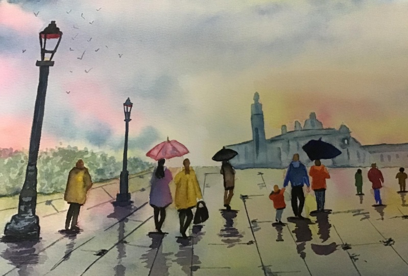
3. Paint the foreground, distant figures: wet-on-dry technique.: For the foreground,
we're going to use the same color and
a similar process that we use for the sky. So I've got ready mixed
again, my yellow, pink and blue, and my
dark indigo color. Okay. Switch back to my larger brush and using some clean water to pre
wet the foreground area. Going around some of
the figures so that I keep those nice and clean
for later colors of paint. If you do accidentally
wet some of the figures, you can just blot it off with some paper towel
as I am doing here. Then just as I did with the sky, I'm applying the yellow paint
in areas of the foreground. Letting this merge and blend
with that wet under wash, as I did with the sky before, Dancing in and between
some of the figures and leaving some areas
of the paper unpainted. The biggest difference here is to keep your strokes horizontal, so not curving around
as we did with the sky. Because if we did use curved
strokes on the foreground, it would make it appear
as if the pavement was curved a little bit maybe
like a skateboard track. Although I'm still using yellow, I am mindful that
in the distance that yellow will be paler
than it is in the foreground. And to keep the viewer's eye
going into the vocal point, which is the center
of the painting, I am particularly keeping that area very
light, almost white. Whereas the far right and
far left and front edges of the foreground are darker in. So we're sort of creating
a vignette effect. Then just as before, I can use my pink
color to go in between the yellow shapes where I've
left the paper unpainted. Again, some of it
is overlapping, so we're getting those nice
peachy orange colors as well. All the while being
mindful to keep my strokes horizontal for the reasons
that I've just outlined. Because we're painting
a mirror image of what's in the sky, you need to think about where your pink is
appearing in the sky above and then the position below where it also needs to be. Then you need to do exactly
the same thing with the blue color that you also
placed in the sky. Okay. Then once again, just
as we did with the sky, we can give the paper a good
old shake and encourage those colors to blend and mingle and soften
into each other. Once we've done that, without
losing too much time, we'll go in with the dark cloud color
that we used earlier for the sky and get those streaks in to
mirror what's above. Again, just to repeat what I've already said for emphasis, keeping those
strokes horizontal, not curved as we
did with the sky. Because this foreground
that we're painting now is a flagged pavement area. It will be darker
than the sky above. So don't be afraid of
putting some extra color in. We want it to be
slightly darker, stronger in tone than the sky above because of
what's underneath it. Again, this is really
where you need to have a look at your
own painting color. Assess what colors you've
got in the sky above, where they need to be positioned
in the foreground below, get those colors a little bit stronger than they
were in the sky and add your dark cloud color where they appear
also in the sky. But as I said, and keep saying, always using those
horizontal strokes so that the pavement doesn't suddenly start to curve as if
it was on a hill. Oh. I'm using a more watered down, paler version of my dark colors to paint the reflection of the bushes at the left and the buildings on the right
along the horizon line. So just scumbling in some of that pale gray blue
color underneath them. Now I'm going to
let my painting dry before I add some more
detail in the background. I've still got some of my
dark color in my palette, so I'm using that to paint some very abstract shapes in the distance below
the horizon line. And although they don't
look like it now, when we do come to paint tower
figures in the foreground, these distant abstract shapes will take on the appearance
of distant figures. I'm also going to use
this color to add a little bit more definition to the bushes on the left
hand side of the painting. Because they are nearer
to the viewer's eye, they will have a little bit
more shape and interest. Find that after my
painting had dried, a lot of the detail
that I thought was there had
actually disappeared. And also, of course, because I'm adding some darker
color to those bushes, I need to also strengthen the reflection of them
in the foreground below. Now, looking at my painting, I've got some rather
odd light shapes in the sky that I'm
not happy with. And I also feel that there
isn't enough color in the sky on the right hand side to balance what's on the left. So in order to add some color
without getting hard edges. First of all, I've pre wet the paper very much as I
did right at the beginning, and you need to wet the paper further than where you
intend to place the color, and that gives the color
somewhere to go somewhere to run without going right to the end of that wet paper
and getting the hard edge. So now I can add some of my pale yellow color
into those areas, and I'm also going to take
it down into the top of the bushes where it's
likely to be reflected. I'm doing exactly the same thing on the right hand
side of the paper, pre wetting it with clean water, so that it gives some wear for the paint to travel that
I'm now going to apply. I'm just strengthening the color there with some more yellow going over the top and let it
blend into the underlying. I think you can see now, particularly at this
right hand side, how just strengthening darkening
the tone of the colors here has given the composition
a little bit more balance. I'm going to leave it to try again before going
on to the next step.
4. Paint foreground figures and lamp posts using layers; layering colour; blending and softening techn: I'm going to paint the
larger figures and the umbrellas in the foreground with a range of
different colors. I'm going to introduce a few soft browns and
even academium red. But I will also be using some of the same
colors that I used in the foreground and
the sky in order to give some harmony to
the overall painting. Now, you don't have to use the same colors that I'm using. You can use some of
your own if you wish, but do bear in mind that you don't want too many
different colors. Otherwise, the painting
is going to look a little bit haphazard
and overdone. But an important point
to know is that in order to keep the center of interest in the
middle ground, I will be using brighter
and stronger color on the groups of figures
that are nearest to us. Now, this first
layer needs to be quite watery about
the consistency of t or single milk because we're going to be add more
detail in the second layer. So if you make
them too dark now, you won't be able to add
our nine detail later on. One mistake that some
people make when painting figures is to paint the
heads far too large. They are quite small in relation
to the rest of the body, so keep your heads the same size as I've already
outlined in the drawing. As you can see, I'm
painting wet on dry, but sometimes using
a damp brush to draw some of that color down and lighten the tone
here and there. And I'll just let you watch
the video play along now as I complete the first layer of all these figures
and umbrellas. M. Mm. Mm. O. Having finished the first
layer on all the figures, I'm now ready to
add some detail. And I'll only be adding detail to the figures that
are nearest to us. Those that are further away, you wouldn't really see
much detail on them, so those I'll be leaving alone. The consistency of the paint for this layer will be slightly
than the first layer. So adding a little
bit more paint to the mix to get
this stronger to. Okay. What I'm mindful about in this second layer is perhaps where the legs
are emerging from a coat, so there will be a little
bit more in shadow, and that is where I will apply the stronger color or where
an arm is moving forward, so it will be a little
bit darker if it's in front than the
back shape behind. Where there is a hood on a coat underneath that hood
will be slightly in shadow. Again, that area will need
some slightly stronger color. Where the umbrellas
are curving around, we'll need some
darker color there to indicate the roundedness of
those particular shapes. And for those figures
that are nearest to us, we'll be able to see some folds in the material and creases. So those are the main
principles that I'll have in mind when painting
the second layer of color over the
top of the first. I'm painting wet on dry again, but I will need to use the blending and
softening technique, which is a way of
softening hard edges. So particularly where we've got creases or folds
in the material, we'll want to add
some dark color but soften those edges so that
they don't look too harsh. Where you simply
use a damp brush to pull the paint away
from the hard edge, blending it softly
until the color disappears into the
underlying wash or white of the paper. It might sound like a
relatively simple technique, but it is actually quite a difficult one to
master thoroughly. So if you haven't
already done so, I do suggest that you
practice technique because it will make a massive difference
to all your paintings. Mm H. He. H. A. Oh. O. D. To paint the lamppost, I'm using the same principles that I apply to the figures. So an undercoat of paler color, and then I will be using a second layer later
on of darker color. I'm adding yellow and pink
to the middle part of the lamppost and cer
with a little bit of indigo to the bottom part of the lamppost
where it's in shade. I've mixed a strong blue black using my indigo and
a little bit of black to outline and define the shapes in the
top part of the lamppost. It's quite a small area, so you need a brush with a really good point on it
here for these small shapes. I'm also using
this dark color to define the metal that shapes
around the glass structure. Now, do take your time on
this little bit because there's a strong contrast
here between dark and light. So any mistakes are going
to show up more clearly. Having said that,
it's an old lamppost that's been here for
decades and decades, so don't worry if things go a little bit w or
ary here and there. I have just noticed that my lamppost does look as though it's
leaning a little bit. But that is because my paper is slightly tilted on the video. So when I put my final image up, you will see that it does
look completely vertical. Going back to the
top of my lamppost, I'm just filling in
with a damp brush in between those dark lines
that I made earlier, and that'll drag the paintings, so they look a pale
gray in between. Then for the middle
section of the lamp post, I'm just trickling down some
of that dark color that I mixed on either
side of the post. Letting some of
the blue pink and yellow to give a sort of rounded effect,
a three D effect. For the bottom of the lamppost, I'm doing similar to
what I did at the top, using my dark color
to define some of the shapes that are going to make up
this bottom section. And allowing the underlying
blue color that I put on earlier to show through where
it's catching the light. If I simply used just from start to finish to
paint this lamppost, it would look quite flat,
dead and uninteresting. Black is actually made up of
all colors of the rainbow. It's not a color in itself, so if you look at
any black image, you will see some other colors reflected or glowing
through in it. For the second lamppost, I'm using exactly
the same procedure, but obviously on a
much smaller scale. To enable me to
more easily paint the very fine lines of
this smaller lamppost, you can see that I've
switched to a rigger brush, and that's a very useful
brush because it's got a thin point that allows
you to get a ne and stroke. To finish off our lampposts, I'm just mindful of the inner
area of the glass dome, so we need to show how it's
curved round at the back. I've mixed a cadmium red with a to get a sort of a color
to paint the inside. So it does stand out and look different from the dark
black that's at the front. The rest of this top part
of the lamppost, of, is clear glass, so
we'll leave that unpainted and allow the
sky colors to show.
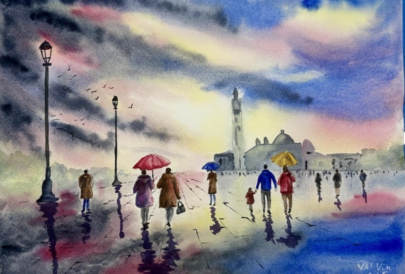
5. Paint wet reflections in the paving; paint the paving perspective lines and cracks; add some birds : To paint the reflections
in the wet paving, I've mixed a dark purple color. I've used some permanent rows, some cerlian and a little bit of ultramarine with a
little touch of black. The main thing to remember
with reflections is that they are nearer the source and lighten as they
move further away. The shape of the
reflection should pretty much match what
the shape is above, but it will be more of a broken intermittent shape
rather than a solid one. Whereas you needed a
rather steady hand for those small details on the
lampposts and the figures, this is where you need
more of a shaky hand. As you can see, I'm painting each reflection with
my purple color, starting at the
base of each shape above it and bringing
that color downwards. So, in effect, you are
really just painting a very loose impressionistic
reverse image of the shape above. But instead of painting
it as a solid shape, because this is in
water, it's wet, you've introduced some
broken lines to show that. As I said earlier,
reflections are darker nearer the source and lighter
as they move further away. So as the reflections
are drying, and if you notice you've
got one tone throughout, what you want to
do is go back in and add some more
color at the source at the base of the
reflection so that it is a bit darker there
than it is further away. If you need to lighten any of the reflections where
they are further away, you could either block them
with some paper towel, or you can use the softening
and blending technique that we looked at earlier. I should point out that
it's usually the case for reflections to reflect the
color of the shape above them. So if we take our
figures as an example, if we've painted a figure with a pink coat and blue trousers, we should really paint the reflection in pink
and blue as well. It's not quite as simple as that because whatever is
the local color of the surface that the water is on will also affect the
color of the reflection. Similarly, whatever is above
or below the surface will also have a deciding effect on the ultimate color
of the reflection. It's not really as
complicated as it sounds, but it is one of the reasons
why I decided to use artistic license and go for purple reflections
across the board. I also felt that
using purple for the reflections would
have more synergy with the dark clouds in our sky and therefore give the painting a
more harmonious appearance, whilst at the same time giving a much stronger contrast
in the foreground. As the great master
Picasso said, learn the rules like a pro so you can break
them like an artist. To paint the cracks
in the paving, I'm using my very thin
pointed rigger brush. Now, it can give you a
bit of a wobbler line, and that's a good thing because cracks are not dead
straight, are they? You know, they have
little breaks in them. Some of the areas of the
crack are wider than others. Some are missing altogether. So that's what we
want to achieve here, a nice natural appearance
in this paving area. It's also important to follow the perspective lines that were positioned in the
drawing earlier on. The color that I'm using
is a very dark gray. It's mixed with the indigo and a little bit of burnt umber, so not quite as dark
as the lampposts. And I'm also varying
the tone of these. So some of the cracks are a bit darker in places
than other places. Where the paving lines are disappearing into the distance, they definitely need
to be much lighter in tone than at the forefront. And you can see that I'm using very much of a
hit and miss approach. So missing gaps completely
here and there, trying to get this sort of
more natural rugged effect. And of course, I'm
working around and in between the figures
that are already placed. Now, you don't want to
overdo these lines. We don't want you to look
like a railway network. The viewer's eye will fill
in any that are missing. So what we're doing is just suggesting here that
this paving exists. Putting in some of the
horizontal lines that we need to convey the
appearance of flags. And as I mentioned earlier, it is important to keep these
lines perfectly horizontal. You don't want them
at a slight angle. Otherwise, this flagged
area will look curved, and that will look odd. If you're at all
unsure about this, you could always grab
a ruler and pencil in some lines using
the bottom edge of the paper as a guide for
the correct distance. Another thing to note
is that I'm placing the horizontal lines at
alternate distances in each row. Because if you joined all the
horizontal lines together, it would look more
like a chessboard, and that's not the
effect that we're after. And where the two lines meet
on the corner of each slap, I am making that little area a little bit darker and
a little bit thicker. And it does help to get
a few little dots and dashes here and there
in this line work. It'll look like a
few little stones or a bit of rubble
that have poked out. Now, we're not doing an
architectural study, so there's no need to labor
too much over this area. Keep it nice and random. A little bit haphazard
here and there. We don't want this foreground
to become too busy and cluttered and distract from the lovely figures
that we've painted, which are the main focus of our painting along with
this glorious sky. The last thing that
I'm going to do is to add a few little
birds in the distance. It can be quite a common mistake
for people to exaggerate the size of birds when they put them into a landscape setting, and before you know
it, you've got a flock of albatross
flying overhead. So it can be useful to
actually put these in in pencil before
committing paint paper. That way, if you have got the wrong size and you know
it doesn't look right, you can easily rub them out. And another point
to note is that they're not all flying
in exactly the same way, so you do need to vary the shape and direction
of each little bird. And you don't necessarily
need to draw the full wing on each one because some
of them will just look like a little.in
the far distance. I've attached a
reference photograph, which I hope will help
you to see how different these little birds are in terms of shape size and direction. And as always,
there comes a time when you really do just
have to stop fiddling, sit on your hands and
call it finished. I do hope you've
enjoyed this painting, and that you've learned some
tips and techniques along the way that you can incorporate
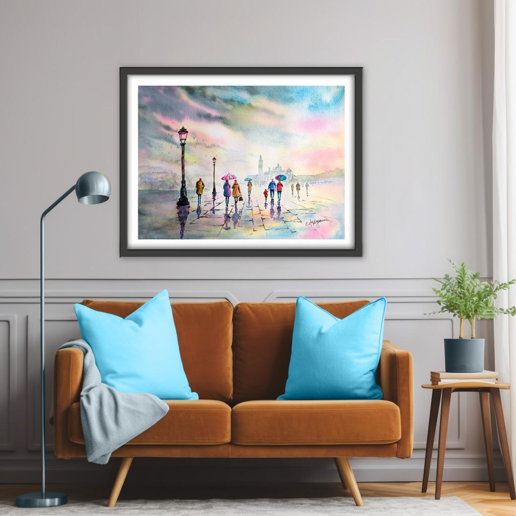
into your own paintings. And why not pop it into
a mount and a frame, and you'll be amazed how good
it looks when you do that. I really love to see your
own finished painting, which you can upload to
the your project section. And if you could just take a moment to leave
me a short review, that also would be really great. I do hope you've
enjoyed this video, and it's encouraged you to have a look at some of
my other classes. I've got lots of lovely
subjects loaded with more tips and techniques to help you with your own
exciting art journey. In the meantime, thank
you for joining me, and I look forward to seeing your next time. Happy painting.
6. FINAL THOUGHTS: Well done on completing the
class and also the painting, if you've been painting
alongside of me. We've covered quite a few
different techniques. We've simplified the drawing
from the reference photo. We use the wet-on-wet technique, putting wet paint on wet paper. We use the wet-on-dry technique, putting wet paint on dry paper. And we use tonal values
to depict whether subjects were in the distance
or in the foreground. We painted reflections
on the wet paving, using a little bit
of artistic license to determine the color of them. And we had a brief
introduction to perspective to determine the size
and shapes and positions of subjects
in the painting. Now, don't forget to upload your own painting through the
project and resources tab. After all your hard work,
I'd really love to see it, and I'll be sure to give
you some personal feedback. And if you've
enjoyed this video, do have a look at my other
classes on Skillshare, which are packed
with more tips and techniques to help you
on your own art journey. If you click the follow button, you'll be able to follow me, and then you'll be the first
to know when you upload a new video or any
exciting updates. And if you could
just take a moment to leave me a short review, that also would be really great. In the meantime, thank
you for joining me, and I look forward to seeing you next time Happy Painting.
 Carrie McKenzie, creating painted visions