Transcripts
1. Puffins: Introduction: Hi there. My name
is Carrie Mckenzie. I'm a professional
artist, author, and art tutor living in the beautiful countryside
of Yorkshire. I'm delighted to be able to
share with you my experience, tips, and techniques that I've learned along the way
in my own art journey. You can see examples of
my work on my website. My style leans towards
impressionistic and contemporary rather
than photorealistic. I like to explore
loose approaches that bring out the color, light, and essence
of my subjects. This class is suitable
for all levels. If you're a beginner and
have never painted before, I'll be guiding
you every step of the way throughout
the whole process. Or if you're
inexperienced artist, and looking for a
refresher course or even learning some new
approaches and techniques, I'll be demonstrating
how to build up the layers of color
so that they stay clean and fresh and avoid the dreaded mode so that
at the end of the class, you'll have your own
beautiful little painting to be very proud of. I've discovered lots of tips and techniques and shortcuts
over the years. Just as in my in-person
face-to-face classes, I'll be sharing these
so that you too can get the same benefits and joy from painting that have helped me. I'm a big believer in
learning by doing. Rather than reading
lots of written theory, you'll be painting right
alongside me in my studio as I demonstrate each
process step-by-step and make your learning a happy, smiley, and practical
experience. Or if you prefer, you can
watch the video the whole way through and have a go with
the painting afterwards, and of course, you can pause
and rewind it at anytime. I provided a reference
photograph and also the drawing
view to download. Now don't worry about
tracing the drawing because this course is
about painting not drawing. Importantly, the most valuable
asset is your own time, patients, and enthusiasm. There's no such thing as right, wrong, or failure in art. It's all about
learning and growth. Learning what worked well, practicing what you
need to improve on, and moving forward
with each step. But importantly, please
don't worry if you're painting doesn't look
exactly like mine. Larry never worried
whether he's looked like Van Gogh or Picasso's. We all have our
own unique style, just like our fingerprints. With that understanding, it's time to get on
with the painting.
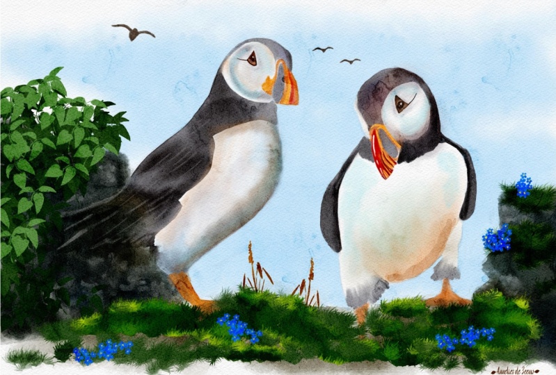
2. Composition, Drawing, Materials, Masking: Hi there and a very warm welcome to my online
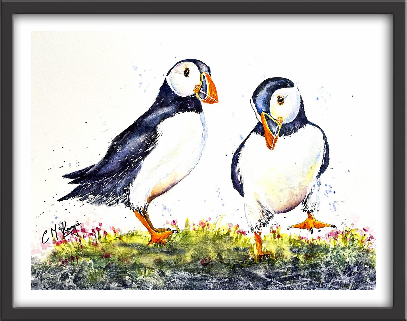
watercolor workshop. In this class, we're going to be painting these gorgeous
little puffins. Now you can watch
the whole video through and have a go at
the painting afterwards. Or you can paint right alongside me as I guide you
through it step-by-step. I provided the
reference photo and the drawing in the
resources section. You don't need to reproduce
the photograph slavishly. This is where we can use our artistic license to create our own
interpretation of it. I've actually used three
different photographs, one for each bird and
another for the C Thrift and I've combined these together to come up with the
final composition. These are the materials
that I'm using. But if you've got
different colors, then don't be afraid to use the ones that
you've already got. Most of my colors
are either fully or semi-transparent
because they allow the white of the
paper to glow through and this is what gives watercolor
its wonderful radiants. The first thing
to do, of course, is to transfer the drawing
to your watercolor paper. You can do that freehand if
you're a competent drawer, or you can use some
graphite transfer paper or even rub the back of
the drawing with a pencil. Turn over the sheet, place it on the
watercolor paper, and then go over the
drawing outlines with a ballpoint pen. Having completed the
drawing I'm applying some masking fluid to a few areas where I want to
reserve the white paper. I use pale blue masking
fluid because the blue color lets you easily see where you've put it and it rubs off well. I'm also using an
unwound paperclip because it gives me
a very fine point. You could use a masking
brush or the handle of an old brush or some
rubber-tipped color shapers. Or you could invest in a nutty little tool
called a ruling pen, which has pincers at the end and a little
wheel that allows you to adjust the pincers so that you can paint
with different sizes. You do need to wait for
the masking fluid to dry completely before
applying paint over it. When it is removed, it leaves nice crisp
defined white shapes. If the result is too
stuck you can always soften it with a damp brush
or even paint over it. You can see here how this very clever and cheap little tool,
this unwound paperclip, is allowing me to paint some very fine feathery strokes
with the masking fluid. In addition to reserving a few white feathers
with the masking fluid, I've also added a tiny dot
to the pupil of each eye. I'm now going to leave it for about 15 minutes until the masking fluid
is completely dry.
3. Create abstract rocks with plastic wrap. Paint eyes, beaks and legs wet-on-wet: I'm going to show you a
clever little technique for painting an
abstract foreground. As you saw from the reference
photograph earlier, sea thrift has the
amazing ability to grow out of very rocky places
in the landscape. You'll often see our little
puffy friends perched on these places either on their
own or in little groups. The foreground for this painting is going to include grasses, sea thrift flowers, and rocks. Quite a lot going on there. But I want to simplify
it so that it doesn't overshadow the main
stars of the show, which is our two little puffins. Using some plastic wrap
will give me more abstract, simplified shapes and also convey all the different hard
edges in the rocky area. I've mixed some green with
my blue and yellow paint. If you've got
already mixed green, of course, you could use that. I'm applying the
paint quite thickly. First of all, I've
applied the yellow. I'm going over with the green. Now I'm not being too
precious about this. I'm painting quite
fast and loose. Because when I put the
plastic wrap on later, it will obliterate quite
a lot of these marks. The important thing
is to get the paint on really quite dense and thick. Having got the lighter
colors on which is for the grass and
the sea thrift, I'm now adding some very
dark color that I've mixed with purple and
blue and a little black. I'm placing the dark color below the grasses because this
is where the rocks are. If you leave one or two
little white spaces in between, it doesn't matter. It's all going to merge together underneath the
plastic wrap shortly. We need to get
this on relatively quickly because we don't want this paint to dry
before we put the wrap on. It does need to be very wet when we apply the plastic wrap. So two will be brave and work quickly to get this
paint slapped down. The only thing I'm not
painting at this stage is the little pink flower
heads of the sea thrift. Because I don't want them to disappear into this abstraction. Although it's looking
quite dark at the moment, the other thing that
plastic wrap will do, it will lighten the
tones in lots of areas. Now for the exciting bit, I've got a piece of plastic wrapper cling
film as it's often known, and stretching it out
over the area that I've just painted and pinching it
together with my fingers. As you do this,
you can almost see abstract shapes
appearing underneath. It takes quite a while
to dry and take effect. I'll carry on with the rest of the painting while the plastic
wrap is still in place. We're going to be using
the wet-on-dry technique. Apply wet paint on
top of dry paper. Also, the wet-on-wet technique, where we will wet
the paper first. It may have paint on it
already or it may not. Then apply the wet paint on top of that and let it spread
into the wet wash. I'm using my light
yellow color to paint the iris of each eye. I can go over the masking fluid because it's quite dry now. That's not a problem. I'm also
painting the little beaks. It's this funny little
shape at the side of the beak that's in yellow. Then the ridges on the beak. These are quite a hard edge, leaving tiny little slivedge. You can hardly see
them just in between. There's also a little bit of orangey-yellow skin just above and below each of their eyes. This is just the first
layer of course. These areas are going to
appear much more orange. But having the yellow
under wash gives it a little bit more depth
and interest of color. Watercolor rarely looks
right in its early stages. It's work to layer on layer until you get
to the final result. I'm using quite a small
brush here, a number 2. It's got a really
good point so I can get into all these
tiny little shapes. I spent quite a lot of money
over the years on brushes, particularly, expensive
sable brushes. But I found lately that
my style is better suited to a synthetic brush. They have a little
bit more spring in them and I find that
the points last longer. I quite often use major
brushes or Escoda. These brands do tend to
keep their lovely points. I've got a few black
velvet brushes and an assortment of Chinese
brushes as well. The latter of which have good bellies for
holding the paint, as well as wonderful points
to paint fine detail with. As you can see,
I've now moved down to painting the little puffins, the legs, and claws. Moved a little bit
of the wrap down so I can get to those areas. Then I'm going back now to
the eye and beak carriers. The yellow paint I put on earlier will be pretty
much dry but not quite. As I'm putting this orange
paint on top of the yellow, we will get some nice
natural blending as the two colors
mingle and merge. But I've still got some of
the yellow showing through. By using two different
colors I'm able to convey the quiet hard ridges in
the shapes of the beak. Although it looks
like one large shape, there is in fact a lower
and an upper beak. I will be separating those out later when the paint is dry
with some darker color. That little blob of
orange flesh at the left of the beak is actually the hinge that helps
them to open and close. Do keep checking back with the reference photograph if you want to have a
look at the detail. But as I said earlier, we're not trying to do a completely
photo-realistic painting. This is our impression
of it so we don't have to be
exactly the same. I'm using the same technique
to add the orange color now to the legs and claws
of our little puffins. Again, leaving some little
areas of yellow showing through letting that color blend and mingle in other areas. We're essentially
trying to convey a 3D rounded form on a
flat piece of paper. This is why we need to use
different tones of color from light to medium to dark to convey those
rounded shapes. Notice here how the foot of this little leg actually disappears into the
grass so obviously, we're not going to be
painting that foot. The right foot,
however, is raised up, so we can see very little
of the leg at that side. I'm just going back
into my painting and adding a little bit more
orange at places I've missed, particularly around the eyes. Now, you might not need to do
this with your painting so have a look at what you've got and only do it if
that's necessary. I also don't feel that I've got enough definition on
the legs and claws. I'm adding a little bit of Alizarin crimson to my orange just to strengthen the color and give it a little bit
more tone in between the two areas and on
the sides of the legs. Again, as I was saying, we've got to create this
rounded effect, a 3D form. We need some darker tones
to be able to do that. Much of the underlying
orange and yellow paint is still wet. I am still getting
some natural blending and softening in some areas. But a few little
areas have dried. To enable that softening, I'm using a clean, damp brush and just
stroking down the side of that darker color
so that it blends and softens into the
underlying wash. I don't want the dark
color that I've just put on to look like match
sticks sticking out. Looking at where I need to
actually lighten the tone, I'm using a clean brush to wet over the shirt
with some clean water, leave it a second, and then lift the pen itself
with a thirsty brush. That's a clean, damp brush.
4. Paint first layer - head, back, face and breast of each Puffin: I'm using the wet-on-wet
technique again, and I'm just adding some
clean water now to the top of the head and the back until feathers of
each little Puffin. Now I work in them
both together, but if you are not
a quick worker, then no problem in working
the one at a time. I've already mixed
up some cobalt blue. About the consistency
of t needs to be quiet, wet and watery, and emerging this to the wet paper and allowing that color to
spread and mingle into the underlying wash. Just going carefully around the
outer edge of his face. Just trickling in really, trickling the painting with
the point of my brush. I'm not really pressing
too hard and allowing the wet paper to soak up the color from the
tip of my brush. Bringing it down now
over the tail feathers, keeping it all nice and soft. I'm using my brush in the direction that the feathers
are growing naturally. That is really important to keep that correct direction so that we get the impression
of those feathers. Just come in under
his little chin, and again using
tiny strokes here, because of course the
feathers will be a bit smaller in this particular area. I'm just adding a
little bit of blue to his beak where it will
be black later on. What is useful is to
put little bits of extra color, different color, especially if you're going
to put black on top, because the black
can look rather dull if you'd just to
play it on its own. That again is why I'm adding this cobalt blue
color first of all, to the first layer. Don't worry if you miss out a few little patches of
white here and there, that will add to
the roundness of the form and give it
a bit more interest. Even though this is
just the first layer, I'm still varying the tune, I've just lifted a little
bit there of the wing. You want to still
be aware of having some darker tones
and lighter tones. Again, this will help to convey the roundness of the
little bird's body. I'm just lifting a little
bit off the top of his head again where it
might be catching the light. I've already mixed
a purple color using the cobalt blue with
some permanent rules, and while this cobalt
blue is still wet, I'm now adding in this
purple color here and there. I'm not going to go over
every single bit of the blue, I'm really just again trickling that purple color in
and letting it blend. We will at a later stage be put in another darker layer on, but this first layer here
is very useful in providing some underlying
color that will go through and give the overall results a little
bit more interest. Just as I did with
the cobalt blue, you can see that I'm
just using the point of my brush to let that paint flow into the
underlying color. Using the side of my
brush to blend it in and lift it off where that's
needed to alter the tune. I'm also going to add a little
bit of the purple color to that area of his beak that is going to be very black later on. I'm particularly adding
the purple around the back of his head where it will be aware from the light, and so we will need it
to be stronger in tone. Now we're going to use
exactly the same process, but a little puffing
on the right. If you are working
the bolt together, just check that where you applied the water
earlier it is still wet. If not, add a little bit more
water on before you start. As you've already seen me
paint this process already, I'm just going to speed
the video up a little bit. Now because this little
Puffin is facing forward, there isn't really anything
of his back to paint. But when you paint in
his neck area where the blue black meets the
pale of breast color, just be mindful to add some
little tiny flicks where the dark blue black feathers overlap the natural
lights of breast. Up in my eye on how the
paints on the puffing on the left is drying and adding any more little touches
that might be needed there. Just as before and applying the purple color but
lifting itself and blending it where
needed to try and convey that rounded form. We can now pull off
the plastic wrap. The pen should have dried. You should see lots of interesting abstract
shapes there in the paint. It's impossible to predict how this technique will
actually turn out. Don't worry, if yours doesn't
look exactly like mine. Now I want the effects on the faces to be very,
very soft indeed. I'm pre wetting these
areas and using very, very watery weak paint. Although the faces appear to
be quite white, of course, there are always
shadows and reflected light that affect the
tool and the color. I'm using exactly
the same colors that we've used already. I'm using some very, very, very watery yellow. I'm going to add
a little touch of cobalt blue into that yellow. The important thing here is
you can see how much lighter the tones are on the face than what we've just painted
on the head and the back. Have a good look also how
I've left a little sliver of white paper around the
edge of the face area. That's to try and convey a domed globe
effect of the head. I'm adding a little touch of purple at the
bottom of the face. Again, this is
going to be more in shadow with the light
coming from the top. If I've gone a bit too dark, I can always use
that lifting out technique with a thirsty brush. Don't be afraid to take your time with
these little faces. Although the small areas, they will actually
become the main focus, especially once we've put
the black in for the eye and we get the strongest
contrast in this area. The only hard edge
that you really want in this area is where the pen meets that sliver
of white dry paper. The rest of it, keep using
your blending technique and you're lifting off technique
to create that domed defect. We're going to use exactly the same technique that we've used for the faces for
their little breast. Now, the thing to remember
here is that the lower part of each breast is
going to be more in shadow than the upper part. This is why you'll need to apply the majority of the color. I'm using exactly the same
colors as I used for the face. Cobalt blue, little
bits of purple, some yellow, and some
transparent orange. We're also likely to be
getting some reflected color from the strong orange and yellows in the leg and feet. I will be putting that reflected color on the lower breast areas. Just as I did with the faces, I'll be trying to keep
everything nice and soft using blending and softening
wherever is needed. Also maybe lifting off any
paint that's too dark, because this area does
need to be light, we need that contrast between the dark back wing area and
this light colored breast. It's important to keep those brushstrokes going in the direction of the feathers
as they naturally grew. For example, we wouldn't want any horizontal strokes here. The area that I'm
painting now is where we got that reflected
light from the legs. I'm going in with some yellow first and then some
orange over the top, just like we did with
the beaks and the legs. But obviously I'm not
making this paint here a strong in
tone as the legs, it needs to be much lighter. Again, using my brush, damp, thirsty brush to lift off
the paint where it's too dark and keep those
edges blended and soft. As usual, I've always got
a piece of paper towel in my left hand ready to dab off anything that doesn't look right and keep that area
soft and clean. I'm moving on to paint the breast of the
second little Puffin. Again using those same
colors, and again, trying to convey the roundedness
of his little shape. It's probably more obvious in prominent in the
forward facing image that we need to keep those tones darker at the bottom than they
are at the top, and also at the sides, again, to create that 3D effect. There is often a misconception
that shadows are gray. But in fact, if you look
really closely at shadows, they hold a myriad
of different colors. Apparently the main hue
of shadows is blue, but they can also
reflect the color of any objects or
sauces around them. The breast of this little
Puffin is almost egg-shaped. To convey that we need some shadow areas that are darker and some shadow
areas that are lighter. The lighter ones are
going to be more or less in the middle of the egg shape, and the darker ones are going to be around the outer edges. Do make sure that
your color is more intense or lighter in those areas that
I've just mentioned. As well as the shadow being stronger the further it is
away from the light source, we'll also get some shadow in-between the little feathers. Adding a few shadows on the feathers just
around the legs, below the breast area.
5. Paint second layer of dark blue/black colour on Puffins. Paint eye and talons with black: I'm using a very small
pointy brush and some pure black paint to paint the pupils of
the little eyes. Now I've got that little dot of masking fluid on
for the highlights, so I can paint right over
that without worrying. I removed that lead so when the paint is dry and
that'll just give the eyes that little bit of sparkle and bring them to life. If you don't have a steady hand, you could use a black
waterproof pen instead. Now, they've also got
this little dark mark at the side of their eye. So I'm just pulling that out
again with my black paint. Wouldn't really be a good
idea to do that with the black waterproof pen because we need to
soften that in, otherwise it's
just going to look like a black stick
that's been stuck on. So I'm using the blending and softening technique
to just soften that dark line in to the
underlying wash of paint below. As you can see, I've
turned my watercolor paper upside down so that I can
reach those areas more easily. This is one of the
reasons why I don't actually tape my paper
down like some artists do. That's the eyes
pretty much finished. I'm ready now to move on to
paint the second layer of color on the heads and
backs and tail feathers. I've mixed a strong blue-black
color using ultramarine blue and permanent rose and
a little bit of Mars Black, and the beauty of
watercolor is that once a layer of color has
completely dried, you can paint over with
additional layers of color, and this will create dimension, texture, and color variation. It's really important to
let each layer dry before over-painting with
the next layer so that the colors
don't get muddy. But because watercolor
is transparent, you will still get some of that underlying wash showing through the second
or third layer. Layering is sometimes
referred to as glazing, so when you glaze or layer, the natural transparency of watercolors affects the
color or appearance of a painting as each new layer alters the color of
the layer underneath, for example, if you painted
a layer of yellow paint, let it dry and then painted or glazed over with a
layer of blue paint, you would actually end
up with a green color. In fact, glazing with color
or adding another layer of color adds lots of richness
and depth to a painting. You could apply glazers
or extra layers of color at any point
in the painting, or you can leave it right to the end and apply a final glaze, which would maybe
increase color harmony, or affect the mood
of the painting. Because I'm painting
onto a dry surface now, I am, of course, getting these more severe
and hard lines. Once again, I'm using the blending and
softening techniques. I do use this [inaudible]
throughout my paintings to soften those hard
lines and blend them in to that
underlying color. I want a bit of a
highlight on the top of his head where it's
catching the light from above. I'm mindful to keep their
intersection lighter. I'm still mindful
to keep my brush strokes going in the
direction of the feathers, and I'm also leaving little
gaps between the strokes, so I've got some variation
in tone between light, medium, and dark in this area. I'm going to use a
clean damp brush again to blend some
of those lines in, leaving some hard edges
and some soft edges. I'm going to work my way around each little Puffin using
this dark blue-black color, varying the tone, so that we've got
some light tones, some dark tones,
some medium tones. Every shape needs some variety in it to keep the
viewer's interest. I'll be using the same
dark color to paint the darker feathers where they join these
little orange legs, and also for that small area in the beak that
we painted blue. That also needs to be over-painted with this
dark blue black color. Then to finish this section, I will paint the little
talons on their feet.
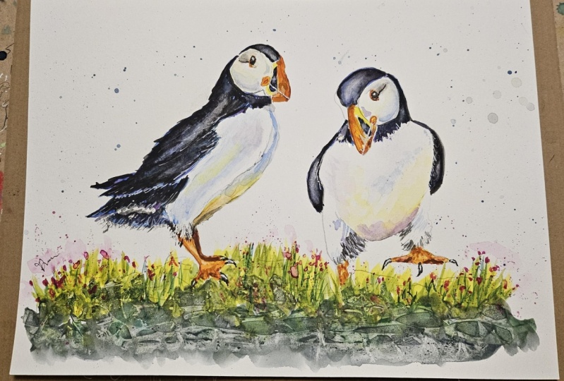
6. Tidy foreground. Paint sea thrift flower. Add spatter around the puffins. Final details: I'm having a look at
my foreground area and checking where do I
need to touch anything up, where do I need to add
a little bit more paint or even lift a bit off. Now, I've added some
yellow and green color around the feet area of the little bird on the left because I did have some
white paper still there. I'm using the same
color to flick up a few more grass shapes. Now your painting might look a little bit
different to mine so you need to assess what else you need to do
with your foreground. It might be
perfectly, yes it is. In which case don't
fiddle or you might need to add a bit of
depth to the rock area. It very much depends on what
result you got when you remove that plastic wrap from the foreground
that you painted. I'm fairly satisfied now with
my foreground so I'm using some permanent rose
to add some dots and dashes for the
sea thrift flowers. I've mixed it up quite strong
so I can also dab into the grass areas and add a few little flower heads
in and amongst the grasses. Now the distance from which
we are viewing the flowers, they are very tiny, so we don't need to be trying to put a lot
of detail in here. Maybe vary the tone
here and there. There will be some flowers
that are a bit lighter, some that are a bit darker. Again, use your paper
towel or your brush to lift off a bit of
paint here and there. Do vary the size and shapes of these little
dots and dashes. What you do, you want
them all to look completely uniform that
wouldn't look natural. I'm just adding a few
little darker green stems to embed them
into that grassy area. We're really just painting an impression of these
little sea thrift flowers. We don't want them to take over the whole painting and
become the focal point. For the background I'm using a very simple technique
called spattering. You just load your
brush with some paint, hold it horizontally about
two inches above the paper, and then shake it with a wrist flick inaction to force the paint onto the paper, or you can tap the brush with
the forefinger to do that. If you use a large brush, you'll get big spotlight marks. If you use a small brush, you'll get little small
random size dots. I'm using a
medium-size brush and cobalt blue to add some
spatters around the birds. Now, if you're worried about getting these marks on
the birds themselves, you could always mask them
with some paper towel, especially if you're not
used to this technique. The closer you hold your
brush to the paper, the more control you have over where the little spots land. Especially if you use the
finger tapping technique as I'm doing here instead of
the risk flicking action. For this particular painting, I'm keeping this battery in
quite subtle, quite low key. Again, I don't want this to
overshadow my little puffins. Now that the painting is dry, I've removed all the masking fluid with a dry, clean finger. I've also assessed
what else needs to be done to say that the
painting is complete. This is where you'll
need to have a look at your own painting and assess what final touches you
will need to add or remove in order to say that
the painting is complete. I'm adding a touch
more black paint to the eyes to make them
darker and more intense. Whilst also not overpainting, the little white
highlight in the pupil. I'm painting a very thin, fine black line where the
upper and lower beak join. Some of the orange
color on the legs and feet has dried a lot lighter. The thing is with watercolor, it does tend to dry about 30% lighter than
when you put it on. It's not always easy to judge
the tone so just adding a few little touches of orange just to bring
those back again. I also think I need a little bit more definition
on the left-hand puffin, just where the lower breast
meets the top of the leg. Now I want this to
be nice and soft and blending so first of all, I'm just gently brushing
over with some clean water. Then I'm dropping
in just touching in a little bit of
my blue black color. Because it's going onto wet paper that dark
color will soften and diffuse and lighten a little bit so it won't be as dark as
the women tail feathers. But it will give a little
bit more definition to the front of
this little bird, especially as the
predominantly white breast is against white paper. That's why it's
not standing out. I'm also adding just
a little sliver of this dark paint to differentiate between
his two little legs. I'm going to do a similar thing
on this little puffing on the right and wetting the lower
part of his breast first, again to get that soft
diffusion of paint. But this time I'm putting
on a little bit of purple color before
I put on the dark. Again, that is just
strengthening that shape, so it just stands out a little bit better
than it did before. Now as I said, you might
not need to do this. Look at your own painting
it might be that you've already gone dark enough and you don't want to overdo it. These are just suggestions of little final touches that
can make all the difference. It can often be useful
to put your paints into one side for a
couple of days and then look at it with
a fresh pair of eyes to see what final
details might be needed. Although I did mask out some of the little white feathers
in and amongst the dark, I don't feel that there's quite enough showing
so I'm using a white gel pen to add a few molecule little white
feathers here and there, along the tail feathers
and along the wing area. Now if you're a
purist and you don't want to use a bit of mixed media in with
your watercolor, you could use a sharp scalpel to scratch a few
white feathers out, or you could use a brush with a very fine small tip to paint in a few strokes
with some white gouache. A word of caution
here of course, is not to overdo it, not to make it look over-fiddly. Finally, the pink paint
that I put on for the little sea thrift flowers
has also dried lighter. As the last step, I'm just
spattering a little bit more permanent rose over
those flower heads, just to give them a little
bit more definition color. Then it's time for me
to take my own advice. Stop overworking it, sit on my hands or go
and have a cup of tea. I hope you've enjoyed painting our lovely little
puffins and I look forward to painting with
you again very soon. I would really love
to see how you've got on with your own
finished painting. Please upload it to
the project gallery where it will also inspire
your other classmates. In the meantime, happy painting.
7. Puffins: Final Thoughts: Well done on
completing the class, and also the painting if you've been painting alongside of me. We've covered quite a few
different techniques. We've simplified the drawing
from the reference photo. We used some plastic wrap to create an
abstract foreground. We used both wet and wet
and wet and dry techniques for the first layer of paint. We then used the layering
technique to add a second layer of color and create the
illusion of feathers. We looked at how to blend
and soften hard edges, particularly when
adding final details. We also looked at
how to lift off paint and recover light areas. Finally, we had a lovely splishy sploshy time adding some spattering
to the background. I would really love
to see how you got on with your own
finished painting, so please upload it to
the project gallery, where it will also inspire
your other classmates. In the mean time, thank you for joining me
and I look forward to seeing you next time.
Happy painting.
 Carrie McKenzie, creating painted visions