Transcripts
1. Elephant Watercolour: Introduction: Hi there. My name
is Carrie McKenzie. I'm a professional artist, author and our tutor living in the beautiful
countryside of Yorkshire. This class is suitable
for all levels. If you're a beginner and
have never painted before, I'll be guiding
you every step of the way throughout
the whole process. Or if you're
inexperienced artist, I'm looking for a
refresher course or even learning some new
approaches and techniques. I'll be demonstrating how to
build up layers of color so that they stay clean and fresh and avoid
the dreaded mood. So that at the end of the class, you'll have your own
beautiful little painting to be very proud of. I discovered lots of tips and techniques and shortcuts
over the years. So just as in my in-person
face-to-face classes, I'll be sharing these
so that U2 can get the same benefits enjoy from painting that have helped me. A big believer in
learning by doing, rather than reading
lots of written theory. You'll be painting right
alongside me and my studio. As I demonstrate each process step-by-step and make
your learning a happy, Smiley, and practical
experience. I provided a reference
photograph and also the drawing for
you to download. Now don't worry about
trace in the drawing because this course is about
painting, not drawing. You can see examples of
my work on my website. My style leans towards
impressionistic and contemporary rather
than photorealistic. I like to explore
loose approaches that bring out the color, light, and essence
of my subjects. I'm delighted to be
able to share with you, may experience tips
and techniques that I've learned along the
way in my own Art journey. Importantly, the
most valuable asset is your own time,
patients and enthusiasm. There's no such thing as right or wrong or failure in Art. It's all about
learning and growth. Learning what worked well, practicing what you
need to improve on, and moving forward
with each step. Please don't worry
if your painting doesn't look exactly like mine. Lowry never worried
whether he's looked like Van Golf or Picasso's. We all have our
own unique style, just like our fingerprints. With that understanding, it's time to get on
with the painting
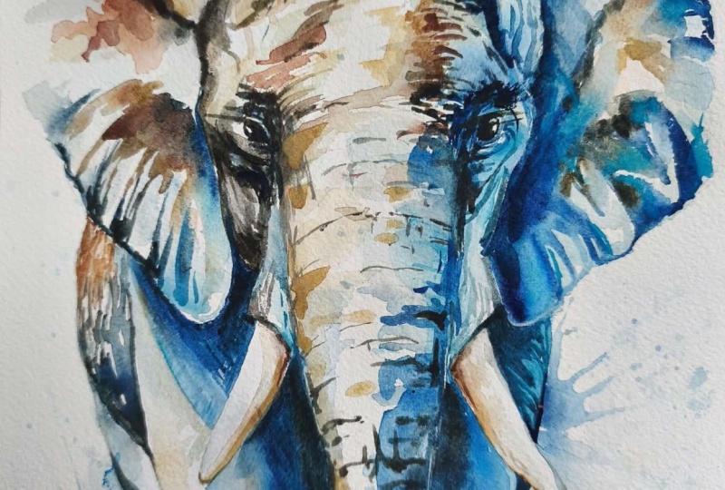
2. Materials, composition, drawing, preserve white paper with clear wax.: Hello, and thank you for
joining me in my studio today. Well, I'm going to
paint this beautiful, majestic Elephant. You can either watch
the whole video through and have a go at
the painting afterwards. Or you can paint
right alongside me as a guide you through
it step-by-step. First of all, let's
have a look at the materials needed
on the composition. We don't need to think about the composition
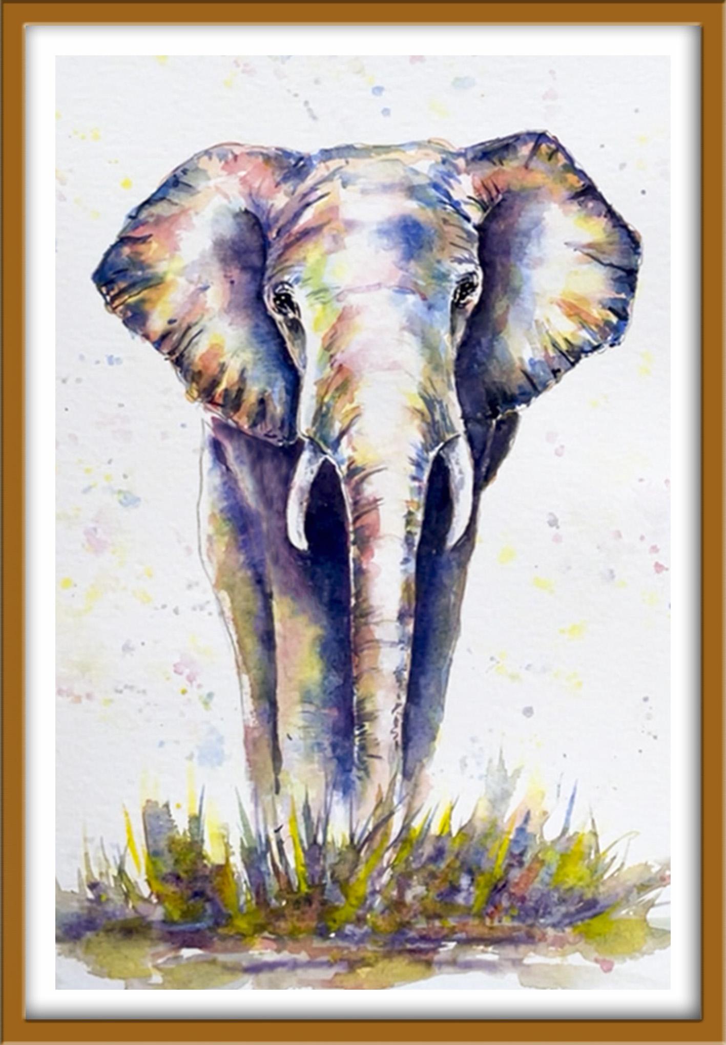
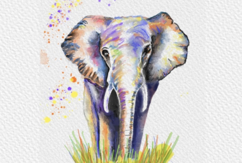
because it's a full-on image to show the grand jury and then majestic
stance of the Elephant. You can also see how I've simplified the drawing from
the reference photograph. You really don't need to
add in lots of details. But I have put in
some pencil lines to show the roundness of the trunk and also the radial lines spanning out in the ears. The elephant's feet
and the lower part of his trunk are going to disappear behind some
foreground grasses, which is why I haven't
drawn them in. Here in the materials
the time using that do feel free to replace
with your own if you wish. All my colors are transparent, which means that the white of the paper will be able
to shine through them. I'm using French ultramarine
by Winsor and Newton. But you could use a cobalt
blue or fallow blue. I've got permanent rose
also by Winsor Newton. Any other pink or
even a red will do Hansa Yellow by Daniel Smith. You could use oriole in
or gamboge and have also got CPR or you could use burnt umber to mix a
really good dark color. I've also got a little
clear wax crayon. You could use a chunk
of clear candle wax. I'm using the wax
crayon to retain the white paper for
the elephant tusks. I'm not pressing so hard
that it will completely cover the white paper
because I do want a little bit of color
on there. Later on. I'm using the wax
crayon also to add a little highlights on the
left side of the trunk, just above the tusk, just to show whether
light is catching it. And I'm stroking
some little touches down on the left-hand
side of the legs, on that side, and also
on his head above. A disadvantage of
using wax, of course, is that you can't easily
see where you've put it on and it's almost impossible
to remove afterwards. So do use it with caution. Don't go too heavy. You want to achieve
the effect of highlights, not search lights
3. Use the Wet-on-Wet technique to paint the first layer of colour.: Our next step is to paint the light tones of
the Elephant with very weak nixes of pink and yellow about the
consistency of T. I'm using a large
brush and lots of clean water to mix a pool
of the yellow color. Do wash your brush out
and make sure it's clean. Wipe it on some paper
towel to get rid of all the paint before
mixing the next color. I'm now Nixon Nepal of
the permanent rose. With again clean water
and a clean brush. We need to look at the
reference photograph to see where the light, medium and dark tones or the whites of the paper
will actually be our very lightest tone. If you find it difficult
to judge tonal values, you could always copy
the reference for to unblock in black and white are important into some software and change
it into black and white. Because it is sometimes
easier to make that judgment in black and
white rather than in color. I'm now using a clean brush with clean water to paint over the
medium and dark tone areas. Starting with the ears, I am leaving little bits
of white paper in-between, not covering the
whole of the ear. If you do think
you've missed some, then you can always dab
some of the water off with a damp brush or
some paper towel. The idea of not
covering the whole ear with water is so that we can lead areas of white paper where the light tones
and highlights are. The reason that I'm painting
with clear water in the first place is so that
when I do at the paint, I'll get some nice blends of
colour and less hard edges. You probably can't
tell from the video, but I am using very
gentle soft touches, really just letting
the paint trickle off my brush and into the
water almost by osmosis. We're getting these
nice soft blends into the wet wash underneath. I'm glancing back at the reference photo just
to check again where those white highlights are not going into those areas
with my yellow color. I'm also not covering all of the wet wash
that I've put on. I'm leaving some
little areas for the pink so that when I do put the pink color now we'll get some very specific
areas of pink. And some areas where
I've got an orange color through the pink and the
yellow blending together. As you can see, I'm being mindful of
the mid and dark tones, being particularly in the inner and outer
areas of each ear. So that is where I'm laying down the first colour of this
first wash of color. I'm also using the very
tip of my brush to paint the dark creases in between the folds of
the elephant's ear. I'm now giving my
brush are really good clean before I drop in some of my pink color and
let it mingle and blend with the yellow
paint underneath. Again as before, and being mindful of leaving
the white areas, the highlights, not all
the painting with those. And I am getting
some nice blends of orange with these
combine two colors. I'm also being mindful
not to completely obliterate the yellow
paint altogether. I do want to return some of that pale yellow for the light. It's a mid tones. The pink tones of
veering more towards the mid tones because pink is
a darker hue within yellow. One thing to be aware of is to keep this first wash very light, not to overwork it by pressing
too hard with the brush. We want to keep it nice
and fresh and glowing. Letting some of that white paper underneath hello through. Whilst the paper is
still damp to wet, will continue to get
these nice blends of colour allowing the want
to run into the other. If the paper just
start to get dry, you will begin to
get some hard edges. That won't be a problem
around the outer edge of the ear where you've
got a lot of creases, but it might be more problematic towards
the inner of the ear. If it does happen, you can either softening
those hard edges with a damp brush or you could
leave it to dry completely Then go over with a wet brush again and carry on from there. Although I've moved over onto the right ear and still keeping an eye on
the paints and how it's blending and traveling on the left side and going over because my
paper is still damp, I'm able to add any
little touches that are still needed to
define those years. In my case, I do think have maybe gone a little bit over
some of the white areas. So I'm using what's called a thirsty brush as well to lift out some paint from some areas and get back
to that white paper. What I mean by a thirsty brush is you rinse your brush out in some clean water thoroughly and then dry it on
some paper towels. So it's really just done. And then press it into the
area that where you want to lift the pen towel to dry
on some paper towel again. Repeat the process so don't keep dabbing it on with
the pen still on. Otherwise, you're
just going to replace what you've taken off. Now repeating the last step for the head and
the body, again, being mindful to return light
tones wherever they appear, particularly down the center
of the head and the trunk, and on the left-hand
side of the whole body. So just as we did before, I'm using a clean brush
and clean water to paint over the areas that are
dark and mid tones, leaving the white
paper again as it did before for the white
and light tones. Now you've just seen me Dobbins and paper
towel on the ears. I'm always keeping an eye
on what's I've just painted as well as carrying on with
the rest of the image. Because whilst after the
paper is still damp or wet, the paint will
continue to travel. So what you thought you'd left
us a light area and they, you know, in a few
minutes appear actually to be quiet colored. So just keep an eye on it. Go back in like I did, and lift off some
of that paint again with a thirsty brush,
awesome paper towel. As you can see, I'm
working the whole of the rest of the
image in one go. That if you are a slower worker, there's absolutely
no reason why you can't work this in sections. So you could do the head and the trunk first
and let that dry. Could do the legs first
and let that dry. So ticket in the
order that suits you and you don't have to
do it all in Mongo. If you feel that's
too much of a push. Again, just to set did before. I'm dropping in some of my yellow paint into the areas that I've just
painted with water. Lifting that paints blend and mingle into the
underlying wash. As I'm working around the body, I am mindful of the
direction and the form of the animal where it's more rounded on his head
or on his trunk. I am using my brush to
follow that same direction. For example, here on the trunk, the lines are not straight, flat, they are
rounded, the curved. So be careful to use your brush in that
same curve stroke. And that'll helps
to show the phone. When I first started
painting in Watercolors, it took me awhile to understand that it doesn't
look right from the get-go. You have to build up
the image in layers and build up the
tones in layers. So if it doesn't look
right at the moment, it looks more like a banana
than a, an, an elephant. Don't worry about that because
we are going to take care of that with some future
layers of colour. We can start changing that
now a little bit with the application of
the pink color. Again, letting it blend and mingle into the
yellow wash beneath. Using the tip of my
brush just to make some of those curved lines, grooves in the Animals trunk. Some of the parents is
going on to white paper, some of it is going
over the yellow. So I'm getting a nice
mixture of pink, yellow and orange tones. If you are like me working
on the whole image, don't worry if some
of the color from the trunk bleeds onto
the color in the legs. That's fine because we will be delineating those will be making the trunk stand out from the legs in a future
layer of paint. I'm continuing to check against the reference photo where
the very dark tones are, and making sure that I cover
those areas with the pink I'm taking a little
bit more care when I'm painting around the tusks. Because although I've
covered them with wax, they won't be
completely covered. There will be little
dips in the paper where the wax hasn't caught on. I want to be able to go back and paint those
until later stage. At some point here, you should be able to
see the white highlight where we'd put the wax down the left-hand side
of the legs on the left still are on
the side of caution. And whilst your painting in
the dark and the mid tones, remember to leave
that little highlight going down the left side. And just take a minute or
two to stand back and assess your own work to make
sure that you've got an even spread of colour
in this first wash. In my case, I feel I've got a little bit more color in the lower parts of
the elephant's body. So I'm adding a
little bit more pink, particularly in the
ears to balance the tones across
the whole image.
4. Add a second layer of colour for the mid-to-dark tones. Recover some of the white paper.: In the next layer,
we're going to paint the mid-to-dark tones in blue in a consistency
similar to single cream. We'd probably going to be
using the blending and softening technique a bit
more than we've used before. So if it's a technique that you haven't been used
to doing before, it's worth spending
a little time learning how to soften
hard edges this way. So have a read of this
information sheet and even spend a few minutes practicing the technique on
some spare paper. Before applying it to
the full painting. I've mixed my ultramarine blue to the consistency
of single cream. But first of all,
I'm going to clean my brush and some clean water. And just as I did before, I'm going to paint
the clean water onto the dark and
medium tones areas. Again, starting with the ears. But I'm not going to
wet as much as I had done previously with the
pink and the yellow, particularly around the
outer edge of the ears. I do want the blue to blend into the underlying wash around
the inner ear area. But for the creases going around the outer
edges of the ears, I want a mixture of hard
edges where the creases are, some blended paint
where the folds are. Now you can see
straight away that the blue paint that
I'm applying here is thicker than the first wash that we put on because
it's not spreading, it's not traveling quite as
much into that down water. I'm also using that brush and little bits of extra paint
ties that colour outwards. On the one hand and taking note of where the dark and mid tones and where all the creases in the ear are in the
reference photograph. But on the other hand, I'm not going to be a slave to the reference photograph and copy every detail
exactly the same. Because although you're always in charge of your painting, to some extent, it's
a good thing to let the watercolor
do its own thing. It can be a little
unpredictable. And what I'm really
looking at now is where the underlying wash has settled into shapes that form the creases in
the folds of the ear. And I'm going more with
what I've got now on my painting than what I've got on the
reference photograph. So don't be afraid to
look at your own work and don't slavishly
follow the photograph. Paint these details in where
they are best suited to the way that the parents has settled on your
particular painting. But do keep checking
where the main shapes, the key structures are that define the elephant's
appearance. One of the reasons that I
enjoy painting Elephant is because they've got
so much character in every part of the body. They are very gentle and y's Animals exemplify and
nobility, power and strength. The elephant's are traditionally considered a symbol
of good look, strength, inspiration,
wisdom and protection. Aristotle described the
Elephant as the animal that spatters all others
in width and mind. And he was right
because in fact, the Elephant is one of the
most intelligent animals on Earth capable of deep
thoughts and emotions. In fact, humans
and elephants have the largest and most complex
brain of any land animal. Many cultures believed
that elephant's represent the power
of the human spirit. That we all have power
and we can use it for good MSc in our lives in
the world, a better place. We all need to be aware of this power and
take charge of it. Like the gentle giant, we can be peaceful warriors, powerful without being
confrontational. By recognizing that power
comes from within us, we can begin the journey of creating what we
want our live to be. The elephant is also
set to symbolize stability because of its deep
connection with the land. And of course, they are
extremely protective and loyal. And elephant will
personally endanger themselves to protect
their cars on the hood. Which is perhaps a bit of a
reminder to us to actively work to keep her friendships and family relationships strong. That's a little
bit of information about the Elephant that's
thought you might find interesting that I'm
going to let you just carry on watching
how I build up the shape, the depth, and the form The animal using these
mid and dark tones Just before I finish
this section, I'm going to stumble a
little bit blue paint over the tusks where
they're in shadow and give them some
shape and form. The clear wax that we applied earlier will repel
most of the paint. But there are little dips in the paper surface where
the paint will collect. You'll remember that the
tusks are made of ivory. So in the name, they do need to be a lot lighter
than the skin. If you haven't used it before. I want to introduce
you to magic sponge. It's an erisa that works miraculously to remove
unwanted paint. Or you can use it to light
in an area that is too dark. Even strip the color back to completely white paper
depending on which color that you've used because some colors stay the
paper more than others. You just dumping the sponge with some clean water and then rub the unwanted paint gently until the
colour is removed. Use a paper towel
to block in-between Robin to get that
last bit of pins off. And do keep rinsing your Spanish during used
to keep it clean. Otherwise, you'll the Pen icon that you've
just lifted off. I tell little bits of
sponge off the foam block. For small areas. You can also use stencils or plastic mask to control the area that you
want to be raised. It's really useful if you get accidental splashes of unwanted
paints on your painting. Or if you just want to
lighten the tone of an area that's got
a bit too dark. This little piece of magic sponge will become
your best friend. You can get it from Art. Shops. Are retailers, are
in the cleaning section of local supermarkets because it is actually sold as
a general cleaner. Looking at my painting, I have felt that I
had lost some of the highlights in the ears and down the center
of the trunk. So I'm using little
bits of sponge to lights and those areas bring back the
white of the paper. It might be that you don't need to do this on your painting, but it is a very useful
little technique if you do. In a way, it's a little
bit like sculpting, taken away the bits that don't work and leaving
the bits that do. Another method of lifting
paint is to use a brush. Now you can either
stroke the area on that. You want to lighten
some clean water, leave it a couple of minutes to let that water
start working into the paint so that
you can then lift to easily buy button with
a piece of paper towel. You can use a stiff
bristle brush, which is what I'm doing now. Scrub into the paint. Again, dabbing in-between with your paper towel to lift the
paint and remembering to keep washing your brush out
in some clean water so that you don't reapply the paint
that you've just lifted off. The brush method
is very useful way of lightened in the
tone of certain areas. But it is more difficult to
get back to the whites of the paper or a very,
very light tone. So I am going to go back
to using my little bits of magic sponge just to lift a final few highlights
from the trunk area. Another method that you
could use, of course, would be to all the paint with some white
gouache or acrylic. But these are opaque paints which gives a slightly
chalky finish. And you still can't get back to a light that says
whites as the paper. Here's the before enough to, and I'm much happier
now with the result. Could have left nor
white paper earlier on. But I did want to show you
this really useful technique
5. Use the Wet-on-Dry technique to paint the darkest tones. Apply the blending technique to: We're now going to paint
the darkest tones. And to do that, I've
mixed some blue, pink and a touch of my sepia, dark brown to get a
dark blue purple color. Up to now we've been using
the Wet-on-Wet technique, where we've put wet
paint on wet paper. This time we're using the
Wet-on-Dry technique. So we're putting wet
paint on dry paper, so not wetting the
paper beforehand. Just going straight in
onto the dry paper. I'm applying the paint
in smaller areas now. I've switched to a smaller
brush, number six brush. But I will also be used in a second brush in number eight, with which I'm going to blend the paint into some of
the underlying wash, particularly the inner ear area. Where I'm painting
around the edge of the ear where we've
got how it decreases. I won't be blending all of those areas are believing
some hard edges there. So again, a mixture of hard and soft edges using
the blending technique. But I do find that
it's easier to use two brushes when
I'm doing a lot of this because it saves
having to rinse the brush out that I'm applying the paint
with constantly. You'll see that I've
also turned my paper around so that I can get
to this area more easily. And that's one of the reasons
that I don't tend to tip my paper down that do
like to move it around. Sometimes even pick it up
and give it a good shape to get the paint moving
in certain places. Just as before, I'm checking
the reference photo known again for the name shapes
and the important details, but I am still again going by what I've got on my painting. And not afraid to switch some
of those creases around. Don't have to
laboriously put them in exactly the same place as
they are in the photo. There are some wonderful
hyper-realistic artist who paint exactly what they see. Very true to life. My personal style is
more impressionistic. And I think as we all go
along on our journey, our own particular
style does evolve. Sometimes it changes
and we switch about, but you will
eventually settle on the type of style that
you like yourself. It would be absolutely
wonderful to have the opportunity to go on
safari and paint these. And there's in animals
on the spot in life. But that's not always possible. So sometimes we do have to use photographs in order to paint
the subjects were love. And I believe that
as long as you're not a slave to the photograph, use your artistic
license, your artistic, I leave out bits that you do on adding some things,
switch things around. That makes it your painting
and mix it unique. You do have to be
careful, of course, when using photographs
taken by other people. You don't infringe
their copyright. There are a couple of
solutions available. You can either get
permission from somebody who's taken a great
photograph or you can take your
own photographs so you could visit a zoo that has some elephant's if you wanted to paint elephant's. There are also a number of
websites on the Internet that provide artists and other people with free, copyright-free
photographs. Getting back to the painting, you can see that I've turned
my paper around again, so that's a can reach the
other ear more easily. I'm just continuing to do
exactly what I've done before. I've got some dark
paint in the inner ear, which I'm going to blend away. I've got some hard edge
lines going around the outside of the ear where the creases
in the folds are. Going to work my
way around all of the elephant's head and body using exactly
the same process. Applying the very dark paint in areas where I want
to darken the tune, blending it away
in some areas with a soft brush and leaving
hard-edged areas in others
6. Add watercolour glazes to intensify the colours in places. Paint the foreground grasses.: I want to show you a
technique called glazing. Glazing is simply adding
multiple layers of thin, transparent washes of paint
on top of each other, allowing the layers
below to shine through. So you need to identify
which of your colors are transparent and
which are opaque. And just use the transparent
ones. For a glaze. Glazing is used to add
richness, visual interest, or depth of colour, and your layer of
glaze may cover all are just a portion
of the subject. The important thing is that each layer of
paint and must be completely dry before
applying the next one. Otherwise, you will get
the pigments coming together and creating
the dreaded mood effect. When you Claire's
in, try to use soft, gentle strokes so that you don't disturb the underlying layers of paint with too much pressure. You can apply a glares at any point in the
painting process, or as a final adjustment to increase color harmony or mode. You can just run a clean damp brush along the edge of the glazes
to softening it. And watercolour glazes
can be soft and subtle, all strong and dramatic depending on the effect
you want to create. Have to admit that I am
a bit of a color junkie. I do like a lot of colour. So I want to add in a little bit more color to
this particular painting. And what better way to do it
than to use a simple glaze. I've gone back to my thin
washes of pink and yellow. And I am just stroking or glazing these in
over the parts of the elephant's body where I think that the color has
become a little bit weak. This is where you need to
assess your own painting. It might be that it's quite
colourful already and you don't need to apply
any more glazes at all. It could be that you don't
need to apply the glazes of colour in exactly the
same places that I have. You'll have different parts of your elephant that
require a bit more color. I'm not glazing over the
entire body of the Elephant. I'm just choosing
little areas here in the and glazing over with a bit of yellow or a bit of pink, uneven lighting those
tool mingle to give an orange where needed. I'm using a damp brush to blend some of the
glazed areas into the underlying wash.
And some areas I'm leaving with a hard edge. Again, it's for you to have
a look at your painting and decide where and how you need to apply some
glazes of colour. But I would suggest that you
try and avoid glazing over the very dark areas if there is a danger that that
dark paint can lift. And then you'd get a
more moody appearance. I've painted some grass shapes just with clear
water first of all. And then I'm dropping in some of the yellow wash paint
that we made earlier on. And that's because I
want to more blended effect in the grass foreground. I don't want it to
overshadow the Elephant, which is our main
focus on mindful not to have too many hard
edges in this foreground. Because hard edges
tend to draw the viewer's in my painting, wet-on-wet, we will lose a
lot of those hard edges. Another much more
subtle blended effect in this foreground. Whilst the yellow
paint is still wet, I'm adding in some pink color, very much as we did
in that first wash of color at the beginning
of the painting. Letting the two colors
mix and mingle. So we're getting some nice
orange tones in as well. I'm also using the same blue
that we've used earlier. By using the same three colors. We get a harmonic going
on within the painting. It ties it all together. We'll get some nice greens with the blue and the yellow are
reminiscent of foreground. And a few purples from
the blue over the pink. I'm building this
foreground up in quite an abstract
way and pushing my brush in different directions so you don't want you
grasses to stunned upwards A line like soldiers, some will be going
into the life, some flopping over to the right. So use some very fluid
brushstrokes here. Then I'm dropping in some
of that purple color that we mixed earlier to get some
depth in the foreground. You can also add some
horizontal strokes in the foreground to depict the earth which the grasses
are growing out of. Again, these joint
needs to be precise. Just a few wiggly lines to
indicate that the soil below. You can just keep
adding little flicks of colour here and there to sue until you've achieved a sort of balance in the colours
that you're happy with. Painting the grass shapes, rights over where the elephant's lower legs
and feet would be. I'm continuing to give
the impression that he stood in this foreground
of tangled grasses. As always, the trick is
not to overwork it too much because you've got the
three primary colors of red, blue, and yellow, which
if we mix them too much, we'll just turn into mode. And you might want to
just blend the bottom of the foreground into
the white paper below. Regarding the background,
I'm not going to do a great deal with it and spattering some of the
yellow paint using quite a small brush
so that I get small spatters because
the bigger the brush, the bigger this butters
and vice versa. Again, I don't want
the background to overshadow the Elephant, which is the main focus. I'm adding in some pink
spatter over the top, letting that blend on the
paper here and there. If some of the spatter
does go on the Elephant, you can just dab it off
with some paper towel. Alternatively, if you wanted, you could tear up some little strips of paper
towel and put them over the top of the Elephant to
mask it from any future pins. To continue with
the theme of using the three colors to create harmony of now added
some blue spatter. I'm going to add a tiny bit of the very dark color that
we used to create depth, again, to tie in all the
colors that we've used. That before. The spatter dries. I'm dabbing it with a paper towel not to
remove it completely, but to reduce the tone. Again, it doesn't
overshadow the Elephant. It looks center, and therefore
more in the background. I'm going to go back
to the foreground now because whilst I've been
adding the spatter, it has even doubt in tune. I've got very
little depth there. So I'm adding a
little bit more of the dark color in to
give it some depth. And just flicking
some loose grasses out of that dark tone, adding a few more horizontals
for the Earth shapes. Then just to finish off
a little bit more of the yellow and pink
spatter over the top. These are very weak so
they will sink into the paint and blending
as the dry in. I think now is the time to stop fiddling and overworking
it and say it's done. When it's completely
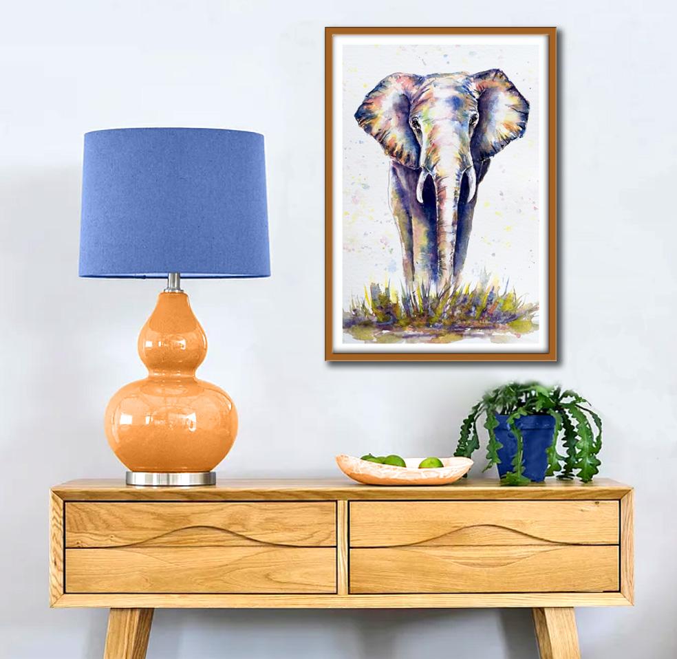
dry, crop it, sign it, and pop it
into a nice prune. I would really love to see
your own finished painting, which you can upload to
the Your Project section. If you could just take a moment to leave me a short review, that also would be really great. I do hope you've
enjoyed this video and it's encouraged
you to have a look at some of my other classes. In the meantime, thank
you for joining me and I look forward to seeing you
next time. Happy painting
7. Elephant Watercolour: Final thoughts: Well done on
completing the class. And also the painting. If you've been painting
alongside of me. We've covered quite a
few different technique. We've simplified the drawing
from the reference photo. We use the wet-in-wet technique for the first layer of colour. We then use the
layering technique to add a second layer of colour. After the first layer has dried. We looked at how to blend
in soft and hard edges, particularly when
adding final details. We also looked at
how to lift off paint on recover lighter areas. I would really love to see
your own finished painting, which you can upload to
the Your Project section. If you could just take a moment to leave me a short review, that also would be really great. I do hope you've
enjoyed this video and it's encouraged you to have a look at my other classes. In the meantime. Thank
you for joining me and I look forward to seeing you
next time. Happy painting
 Carrie McKenzie, creating painted visions