Transcripts
1. Introduction: Hello friends,
welcome to my class. Today I would like to
share with you one of my favorite
watercolor techniques. It's really fun and easy. Beginner's friendly, and
the result looks amazing. It is a watercolor
painting technique where the objects look like
a stained glass art. So if you are looking for
a new and final way to paint the regular things
like flowers or fruits. This may be just
the class for you. We're going to start with
a quick pencil sketch. Then we'll decide which colors
to use for our project. And finally, we will create some lovely vibrant
artworks like these. No need to worry. I will
be here with you all the time and I will guide you through the process
step-by-step. Hope I get to interested
see you in the class.
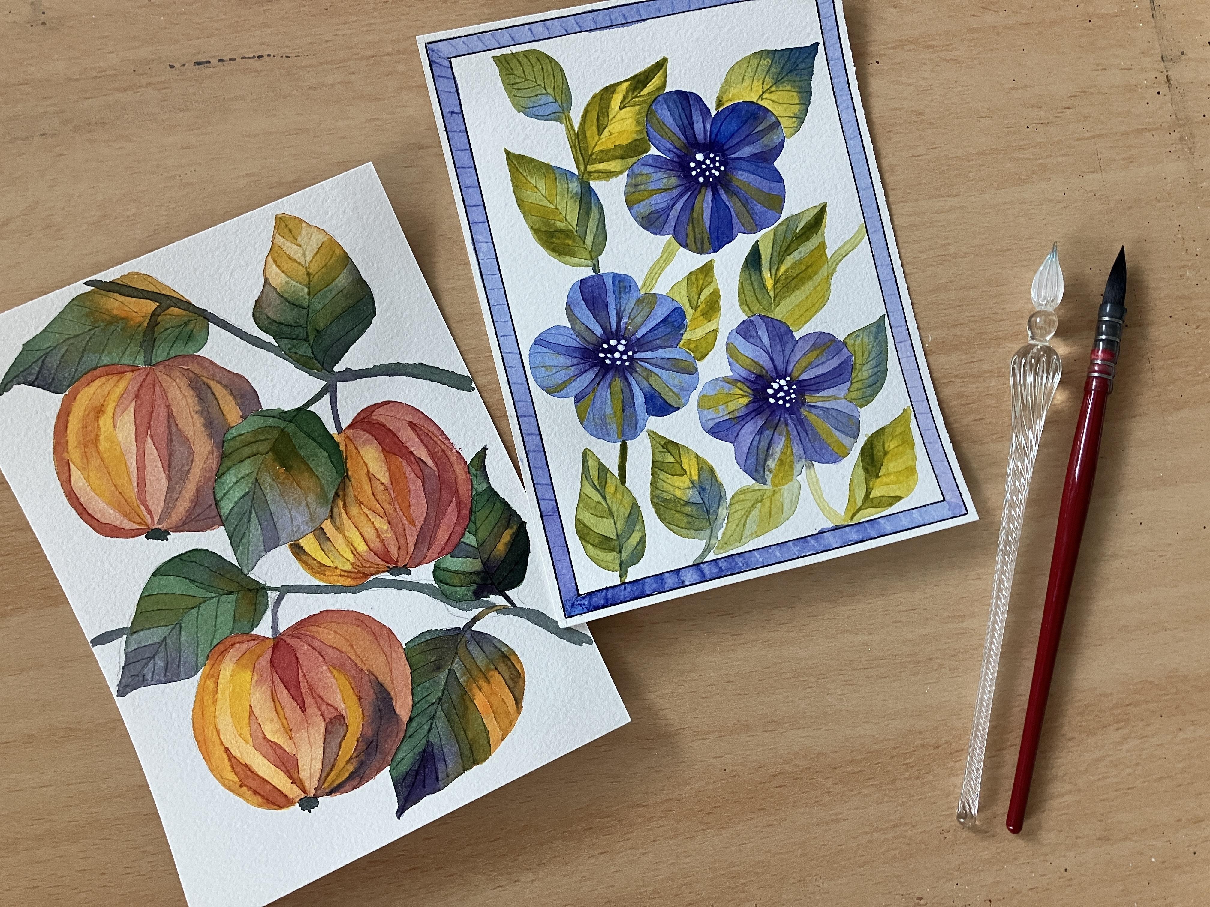
2. Materials: Let's have a look at the art supplies we
need for today's class. First, let me talk about
the watercolor paper. This is one of my favorites. It's 100% cotton paper
by French brand Canson. It is not too expensive and
the quality is very good. I got one sheet into
smaller pieces. This one is 13 by 18 cm. My Alt and Bill, old White
Nights watercolor set, it looks very messy. That's because I love it
and I use it all the time. We will only use
few colors today, so don't worry if your
set is not this big. Now my brushes, I have
several of them here, but I would recommend
one that is maybe size ten or 12
for bigger areas. This one is a mop
brush with a nice tip, so I can use it for larger washes and also
for smaller details. But just in case I would need to switch to something finer. I have some smaller
brushes here as well. This nice little thing is very important for
today's class. It is a glass pen. It looks wonderful. It has very sharp tip
and it will help us to divide the objects into these
small mosaic like parts. I ordered it online
for a few Euros. But if you don't have
something like this, use anything that is
pointing in half, even a wooden skewer
would work just fine. If you want to, you can
add a colorful frame to your artwork or for more of
a stained glass window look. To do so, you would need
a ruler and a pencil to please catch it and a
fine marker to outline it. But it is completely optional. I will do it for one of the projects and skip
it for the other one. To add some highlights
and details. I will use white ink. This is a Winsor Newton
calligraphy ink, and I just love it because
it has wonderful opacity. But a white gel pen or
white gouache paint, or even white acrylic
paint would work as well. Last but not least, a jar of clean water
and a piece of paper towel to clean
and dry our brushes. And we are all set. Let's draw.
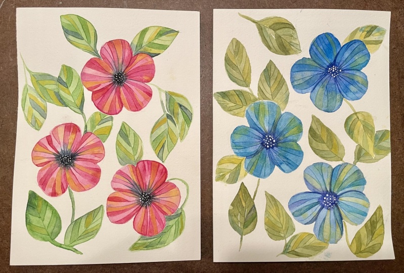
3. Blue Flowers - Sketching and Color Palette: I always say that less is more, especially when it
comes to choosing your color palette
for your artwork. Using too many colors may
result into our busy painting, and it can be difficult to
reach the feeling of harmony, especially if you
are a beginner. This being said for
our rule flowers, I'm going to choose
only a few colors. The main one obviously is blue. This is ultramarine blue color, very nice and light blue. For deeper blue tones, I have here Prussian
blue as well. This one is a bit warmer. I love using this violet color. Not only in this case when it
goes nicely with the blue, but in many paintings, especially for shadows, because
it is very rich and deep. And to add a bit of a pub, I choose cadmium yellow medium. Without the painting may feel a little too calm and
maybe boring to some. So much for the flowers. But we're also going to
have some leaves and stems. So let's choose colors
for them as well. My LED color will
be olive green. It is a warm and pleasant green, but it's not the only
reason I chose it. You can get a very
similar color mixing ultramarine blue and cadmium
yellow medium together. These colors will look
very natural together. I am using ultramarine
blue also for the leaves. Repeating the colors
on different objects will help them to
connect and cooperate. That's why I also chose the same yellow as I
did for the flowers. Maybe worried that having practically the
same color palette for both flowers and leaves will make
them blend together. But it's not going to happen. For the flowers.
The reading colors will be blue and violet, with a bit of highlight
coming from the yellow. For the leaves,
the leading colors will be green and yellow, with just a hint of blue for
additional depth and shadow. The color palette is decided. Now, I'm going to
grab my old ruler and draw some straight
lines for my frame. Mark 2 mm from the
edge of the paper on both sides and
connect them together. Then I repeat it three times for all the sides of the paper. That is the outer
edge of the frame. For the inner edge, I measure 5 mm from
the outer line. So the frame is 5 mm wide. It does not have to
be super precise. Or you can skip this altogether if you don't want any
frame around your flowers. Now when the frame is done, I'm going to do a quick sketch
of my flowers and leaves. I want three big flowers
surrounded by leaves. So first I drove three big
circles for the flowers. I'm not going to draw every
single petal of the flowers, but you are welcome to do so. If you want my flowers, we will have five petals beach. So you can pre drove five smaller circles inside
the big one like this. Now I'm going to draw
several pointy leaves. It is a very simple shape. You can change the shape into more rounded one or make the
leaves longer or thinner. It's up to you. I chose pointed leaves to contrast with the
round petals of the flowers. Now I'm happy with the sketch, and if I feel like more
leaves are needed later, I will just add them as I go. So now we can add some colors.
4. Blue Flowers - Mosaic Effect: To create the mosaic effect, I will use my glass dip pen. You can use regular dip pen or a wooden skewer
if you don't have this one or anything else that has a tip sharp
and pointy and F to create a thin scratch
or group on the paper. The idea is that as you scratch the wet paper using
the tip of the pen, the surface of the paper gets damaged and the pigment
would run into the scratch, making it darker than
the rest of the paper. This way you can create
the piece of the mosaic. It is important that you draw the lines while the wash
is still wet enough. The interesting part is
that the lines stay visible even if you apply a lot of
darker color over them. So let's try it. I have my mop brush and ultramarine blue with a bit
of Prussian blue. And I just color the whole
area of the first flower. At this point, I want
the color to be light, then we will go darker when
adding second layer of paint. It's important to understand
that with watercolor, you can always add a darker
wash on top of a light one. But it does not
work the other way around because the
paints are transparent. That's why you should always
start with lighter color. Now I ended up just a few
drops of a yellow color into the wet blue wash. You can see that it's turned
green immediately. And now while the blue
wash is still wet, I add a rich violet color into
the center of the flower. And you can see how the pigment starts spreading into
the blue petals. This is what I love
about watercolor. Now with nice sharp dip pen, I draw lines going from the center towards the
edge of the petals, spreading the violet color and creating this thing scratches. Then we'll divide my petals
into smaller pieces. Or you can say that these
lines are the natural veins. You can see in the petals. You can split the
lines here and there. You go all the way
around the flowers until you reach the
spot where you started. It already looks
quite impressive, but it's just the beginning. We need to let this one dry. So let's continue with
the second flower. I started with the blue again, but as I go, I add
a bit of violet. Just a very light mix, not as dark as I used for
the center of the flower. And again, add a
little bit of yellow. And let's drop in some dark rich violet in
the middle of the flower. I'm drawing the veins going from the center to the
edges of the petals. You can try to go the
opposite direction as well. But this way the violet
color spreads better. And finally, the third flower, you can see that I have very light mix of
blue and violet. And yellow is thicker this time, so it does not turn green, but it stays yellow and vibrant. This particular yellow can be quite opaque when in
high concentration. That's why I chose it for
this kind of project. Because we will be applying
it over the blue wash later. And I want it to be able to stay visible and to not to
blend in completely. Nice, the flowers
look very good. So let them dry
now before we add one more layer of paint and
let's focus on the leaves. I change my water so
did I don't pull with my green and yellow colors
that I'm going to use now. So using my mop brush
and olive green, I'm coloring the
first leaf and stem. I take advantage of
the wash being wet. I switch between
colors and create lovely smooth color gradients. I'm adding a few drops of blue, but the dominant
color is still green. With my glass pen, I draw the central vein of the leaf and then
the side veins. It can happen that as
you paint the leaves, you touched some part
of the petals that is still wet and there
will be some bleeding. It is something that happens and I'm not too
worried about it. You can let the
colors run into one another and then
when the washes dry, you can come back and recreate the line between
them. So it's okay. Switching between the
colors is quite random. You don't need to overthink it. The only thing to
remember is not to use too dark colors
for the first layer. Use F water to make your colors blend nicely and seamlessly. And if there is a
live right next to the flower is opposite color. So in this case, I'm not going to use any
blue for this part of the leaf because I want the flower to stand
out against the leaf. So the part of the leaf that is right next to the
petal or below it, as we can say, will be yellow to contrast with the
petals of the flowers. I think it looks a bit
empty in this middle area, so I'm going to add
one more leaf here. And the first layer of our blue flowers and
green leaves is done. Now it's time to take a
break until the washes dry. My flowers are dry now and that means that I can continue adding more layers of color to actually create
this mosaic effect. You can see that the
lines are visible. And if some of them are not, you can revive them, applying more color over them. As you can see in this
drawing in my sketchbook, the parts of the petals have
slightly different colors. They are still the same colors
used for the first layer, but indifferent and
higher concentrations. Let's try it. I'm going to
start with the cadmium yellow. I have my small brush size is zero and very rich yellow paint. It has creamy consistency when adding just a bit of water. And I paint some of the
little areas of the petals. I chose this era's
randomly just few of them. I want the dominant
colors still be blue. Into the wet yellow wash.
You can always add a bit of a different color to make it
more interesting as you go. And as you go with your brush over the scratches
made by the pen, you can notice how they pop up as they suck in the wet paint. Just experiment. Try painting to
neighboring areas at once to see how the line
changes as you paint over it. Switch the colors as you go. Make sure you always leave
out some of the areas. You want this light parts untouched to provide
you the contrast and variety of color tones that resemble the
stained glass window. I'm adding more of dark violet to the
center of the flower, and it immediately spreads into the wet areas of the petals. I want the center
to be dark enough so that when I add
white details later, they would stand out properly. I repeat the same process
in the second flower. Again, do not forget to
leave out some of the parts. So the deer flower has the
highlights and contrast unit. And some more dark
violet for the center. The flowers look great. Let's add some more color
to the leaves as well. The idea is the same
as for the flowers. So I paint some of the leaf areas with
darker tones of green, yellow, or blue, and also
leave some areas out. I make sure green is
still the main color and use blue and yellow in smaller amounts to
provide contrast. Once all your leaves and finished and the
flowers are dry, you can add finishing touch to them using your white medium. I have white ink. But if you don't have white ink, white gel pen or brush
will do just fine. I'm not going to
use the dip pen, but rather my size
zero brush for this. And I'm doing small dots in the dark center of the flowers. I made sure the violet color I used for the center
is really reached. So you can see the
white box up perfectly. Nice. I'm so happy with how these blue flowers turned out. If you don't want to add the
blue frame to the artwork, then your work is
done and you can take a break or continue
to the following part of the class where we use the same technique to paint
some lovely to see apples. But if you want to
give the frame, try, then follow me. I have my ruler again and
a Faber Castile black pen. And then outlining the
drawing I prepared before. When the frame is outlined, I paint the inside of it with ultramarine
blue and violet. Switching between them randomly. I use a watery mix of paints so that they create a nice
seamless gradient. While the wash is still wet. I draw a tiny line is
creating small mosaic pieces. If you want to, you can repeat the process we did
for the flours, led the friend dry and
then add one more layer of blue and violet to
some of these tiny areas. I'm not going to do that
so that the frame is not taking the attention away
from what is inside it. This is our eyes work can
be easily turned into a greeting card or a small
gift to your loved ones. If you like this technique, feel free to try it on
other projects as well. Like leaves,
mushrooms are fruits.
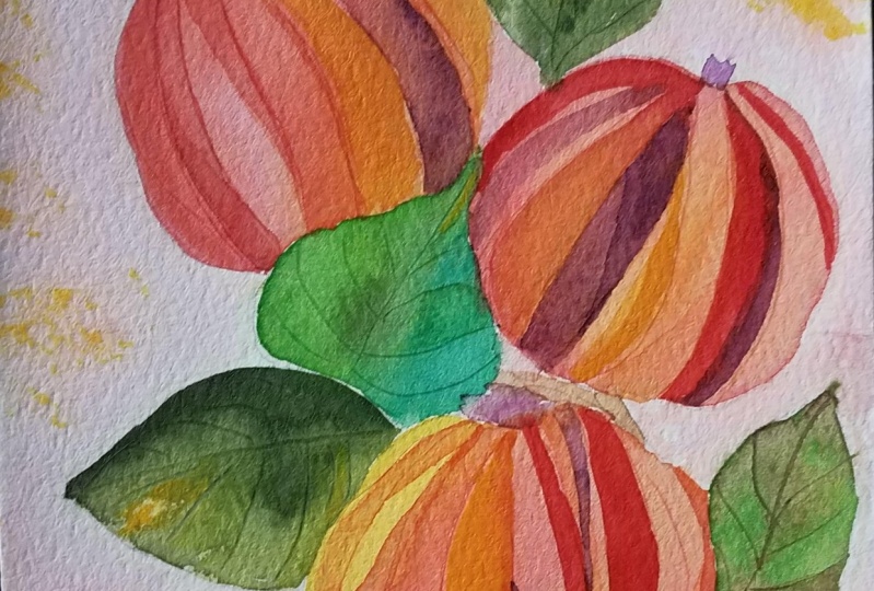
5. Red Apples - Sketching and Color Palette: If you like this technique
and want to practice it more, let's try to paint some first to see apples hanging
from the branch. First thing to do is to
decide which colors to use. I want the leading colors of my apples to be red and orange. For lighter tones, I
choose cadmium yellow, the same I use also
in the first project. For shadows and darker tones on the apples, I choose violet. It is maybe a bit unusual. One would not think of violet to be suitable color for apples. But you'll see that adding
a bit of darker color like this will make the objects
look more three-dimensional. Four leaves. I'm going to repeat some of the colors I
chose for the apples, like violet and orange. But the main color
will be dark green. Now let's redraw our apples and leaves just really quickly. I want to have three apples. You can of course have more or maybe draw just one of them. I roughly sketch to tweak. They are hanging from
and some leaves. I want to have the paper for. So I drove the apples
and leaves quite big. Once you are happy
with the sketch, you can proceed with
the watercolor part.
6. Red Apples - Mosaic Effect: We're going to repeat the same process as in
the previous project, where we were painting some lovely blue
flowers and the leaves. This time I'm starting
with the apples. And I apply yellow, orange, and red color. I make sure the
paints are watery enough to spread and
blend on the paper. Also, more water makes
it easier and more effective to use the dip pen to draw the lines on the APL. When the paper is wet enough, it gets scratched more easily. Draw uneven long shapes. Why they're in the
center of the apple to emphasize the
round shape of it. Do the same with the
rest of the apples. Make sure this layer of
colors is not too dark, so that you can use it as a highlight later when
applying another one. Before we continue
with the apples, they need to dry completely. So let's use this time to
play a bit with the leaves. I'm starting here by the APL. I painted first because
that one is already dry. I colored the live with dark
green, violet, and orange. The green covers the
biggest area of the leaf. Continue with the
rest of the leaves, and don't forget to draw the veins right after
the paint is applied. If the leaf dried, it would be impossible to
create visible lines like this. Now it's time to work
more on our apples. They are dry already
and ready to receive more color and texture. I started with the upper one and apply generous amount
of yellow color, and then switch to red. See that I leave
some areas out to create wider variety
of color tones. I also add a bit of violet, especially here, where there couldn't be a
shadow cast by the leaf. I add a bit of violet again, but I'm quite careful with it. I don't want the
apples to be too dark. It's just a hint of shade
that I'm going for. You don't need to use only
one color for one small area. Feel free to combine them and let them mixed
together on the paper. If you think the lines you drew with a dip
pen are too faint, threatened go over
them with fresh paint. It usually helps them to pop. Applying the colors
is pretty intuitive. You don't need to follow
100% of what I'm doing. Just stick to the
leading colors of the objects you
are working on and leave out few of the small areas when adding
a second layer of paint. Very well, the apples
look fabulous. The only thing that remains is to add more color to
the leaves as well. I follow the same
process as before, and color several of the smaller areas of the leaves with second
layer of paint. This time a bit
darker and richer. While their flagella,
these apples look great, they shine among
the green leaves. And they look like a
piece of jewelry to me.
7. Thanks for Watching!: Guys, the class came to its end. I hope you liked it and
learned something new. I had a lot of fun filming this. I am very pleased, especially
how the apples turned out. Please, if you
have any questions or comments, let me know. There is a discussion
section below the video, so you can use it. Also. I'm always so
glad when someone uploads their projects
and share their thoughts. So please, if you
paint it along, let us see your artworks. It's always amazing to see them. I wish you all the best
in your creative journey. And if you feel
like it's checkout, also my other classes. See you soon. Bye.
 Jana Raninis, watercolorist