Transcripts
1. Introduction: Hello everyone and welcome. My name is Yana and today I have a new radical
class for you. This time you really
don't need to worry about your radical or
said being too small. Because what we are going to do today and what
we're going to talk about is monochrome or a
monochromatic style of painting. Which means that you only use one color for the whole artwork. But I believe you will not get bored using just one color. As you will explore a
ton of color values, you can get experimenting with
the paint to water ratio. Painting with only one color
is wonderful exercise. I speak from my own
experience when I say that sometimes we think we need
the biggest watercolor set. Otherwise we are not able
to create the best art. But the truth is that
the white choice can sometimes be
quite overwhelming and it can be helpful
to stop trying to use many different
colors in one artwork, but rather take the time to
explore them one by one. And monochromatic painting is a very good and
fun way to do it. To practice this, we will paint three different
paintings together. A foggy forests, a
bunch of flowers, and a city in morning haze, which reminds me of
an old photograph. I hope I got to interested, if so, meet me in the class.
2. Materials: Let's see what do we need today? First of all, obviously
some watercolor paints. I have here, my
white knight set, which I'm using all the time. It looks like it,
it's pretty messy. It's a huge says, but I'm only going to three colors today. Different color for
every painting. For the foggy forests, I will use emerald
green for the flowers. I chose indigo and for the city. Let's take sepia. You can choose different
colors, of course. Or you can even paint
all three painting using the same color is
absolutely up to you. Regarding the paper. I have two kinds of paper here. First, this is Aqua
fine watercolor paper by Dale around it is a cheap watercolor paper
which I'm going to use for the testing of the colors
and color value chart. For the actual paintings,
the class projects, I have my Canson Heritage,
100% cotton paper. I recommend the
cotton paper guys. I know it's expensive, but sometimes working with cheap art supplies can be so frustrating and
actually hold you back. So I really recommend you to get at least one pad of higher-quality paper
and see the difference. It really matters. Of course, my brushes, I have
several brushes here. I have the mop brushes
that are perfect for applying a lot
of water or paint. They also have a
nice tip when wet. I have regular round brushes, size six or eight. And liner brushes as well for
the tiny details and lines. And for the cityscape. Some people prefer a flat
brushes like this one. It can make drawing the walls
and sharp angles easier. So you can give it
a try if you want. But I usually go
with round brushes. I have my jar of water, some paper towel
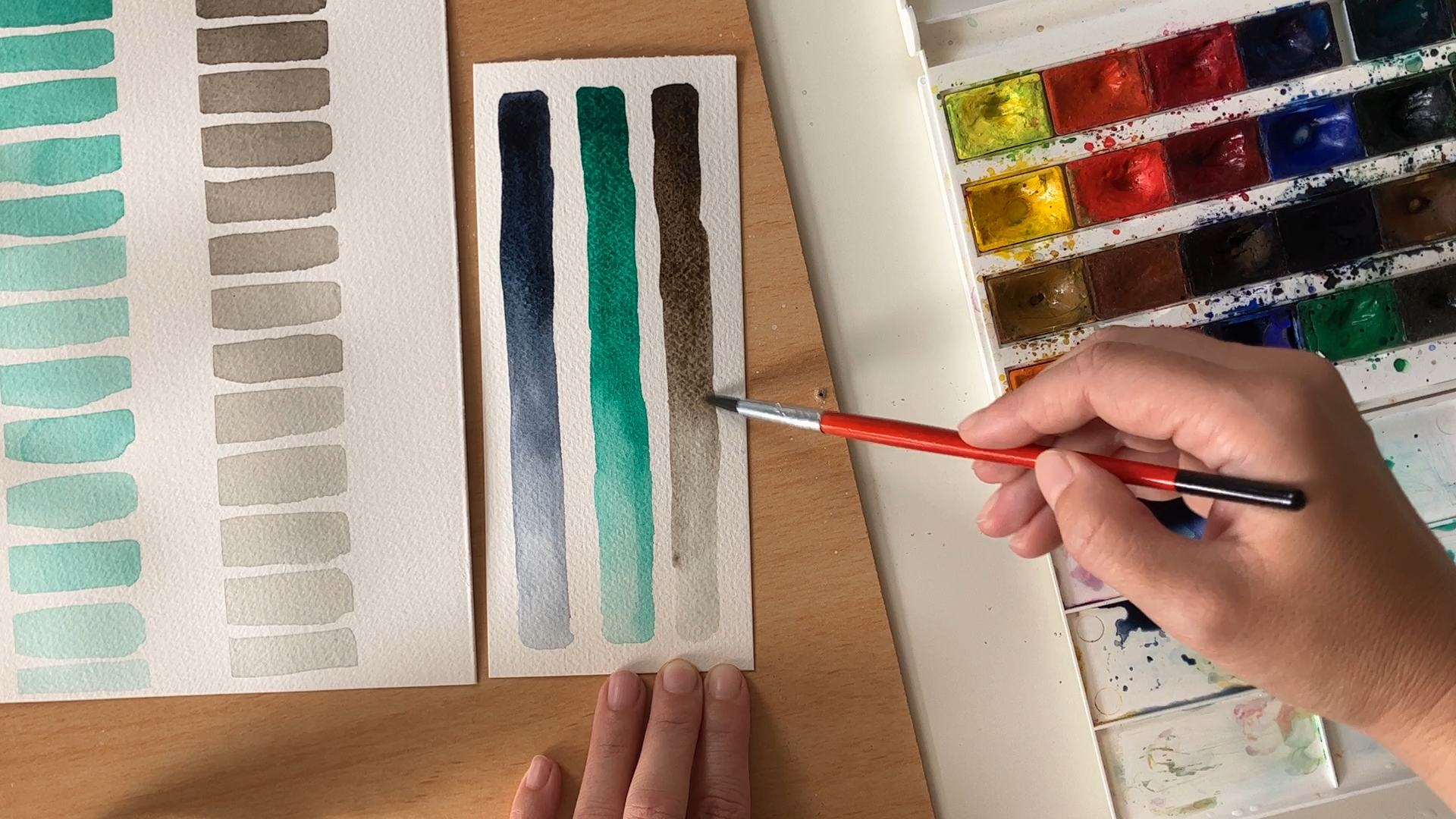
to clean my brush. Now for the color value
chart or a value study, I want to create several columns where I will record
the color tones. For this, I will use
this masking tape. This is two centimeters wide. The same masking
tape I will use too fast and the paper
to this hardwired, once working on the
class projects, I like to do it this way as
it helps to hold the paper in place and prevent the curling
of the paper when it's wet. I think we have everything. Let's see how much fun you can have painting with
only one color.
3. Color Value Charts: Monochromatic painting is
painting with only one color. But within this one color, you can have countless
different tones and values does provide you the contrast
and variety you need. The best way to imagine it is to look at a black
and white picture, find an old photograph, or just use your
computer or phone. And this iterate any color
photo to gray tones only. You can see that the
black and white photo, which is actually
monochromatic photo, is not something like this, but it has all these
gray values in it, right, is also a part
of the spectrum. You can imagine it as a very, very light gray painting with only one color is wonderful exercise,
especially for beginners. I remember that when I was
starting my art journey, I thought I needed
the biggest color. Said there was an I needed
to use many colors in the single artwork to bring the contrast
and life into it. But that's not
true. Working with limited color palette or with only one color can give
you a new perspective on how to work with lights
and darks in the painting. And the result looks much
more professional and harmonious than if you just throw 15 different
colors on the paper, especially if you are not sure how they would
work together. Just to be clear, I'm
not discouraging you to experiment with different color
combinations, not at all. What I'm trying to say is that sometimes we buy these huge sets of different colors and then we're overwhelmed by
the choice we have. And we think that we need
to use all of them at once. But it's beneficial just
to take a step back. And rather than trying to make all these colors
work together, focused on just one of them sometimes and see
its full potential. So I'm creating a
color value chart for my three colors of choice. And I start from
the darkest value and move gradually
to the lightest. You can go also the other way
around from light to dark. But I think it's
easier this way. I have watercolors in pants. So for the first color value, I use small amount of water just enough to wake
up the dry paint. And then into the first column, I paint the dark
small rectangle, the darkest indigo value. You can see that it
appears almost black. It's very dark. Now
for the next values, I need to add more
and more water. So I pick up the
concentrated rich indigo and using my brush, I move it to the mixing palette, making sure I have enough
of the pigment there. And from now on, for every
new rectangle of color, I will dilute the
paint more and more. I always leave out
a tiny dry stripe between the rectangles so that they don't blend
into each other. I'm moving to the next well, on my mixing palette
because in the first one, I have too much of the pigment and I want to go lighter now. I pick a bit of the paint
from the first well and diluted farther into
much lighter values. Of course it can happen as
you mix the water and paint. The two rectangles seem the same or the following one
which will be lighter, I press a bit darker, but we are not a
computer and it can happen that the washes
are not precise. The meaning of this
exercise is to learn how much the color or the
value can differ. Water in my jar is
pretty dirty now. So before I paint the
lightest rectangles, I'm going to change it. Very well. The chart
looks fabulous. We can really see now
how one color can provide us deep
and dark tones on one side and gentle and translucent washes
on the other side. All we need to do is to control
the water to paint ratio. Now I want to do the
same with emerald green. This color is not the
darkest indigo, but still, when taking the pigments
thread out of the pen, the wash is pretty dark. Now I'm moving to the
mixing palette again. And one-by-one, I draw
rectangles of color, can go lighter and lighter. I jumped to a clean mixing well, again, for more diluted color. You can see that since I brought the paint out of the
pen in the first step, I'm not going back to the pen. I only work with what I
have in my mixing palette. And with water. Let's change the water again for the
most transparent washes. Very nice with
this lovely green, I plan to paint a
foggy pine forest, and I think it's going
to look wonderful. Now let's play a bit
with sepia color. This is one of my
favorite darks. You can see that
just like indigo, it appears almost black when at its richest
concentration. I'm adding water now and soon the nice brown
tones appear. As I dilute the
paint more and more. The color appears to be
more grand and brown. It's very interesting color. In the class project chapter, I'm going to paint a nostalgic
cityscape with this color, reminding of an old
photograph or postcard. I'm looking forward to it. I have one more quick
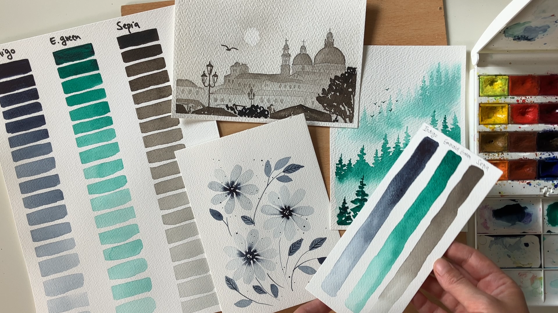
exercise for you. Let's make similar color chart, but with only one
wash for one color. It's very easy. I have a piece of scrap paper
here, perfect for this. And I started with indigo again, applying the richest
concentration in the upper left corner. And then I pull the
pigment downwards using more diluted paint. And for the lightest part, I wash my brush and I
use the water only. Does the watery part of the wash meets with
the darker tone. There will be a natural
gradient effect. Pleasant, more pigment
to the upper part. And it looks very good. Do the same with the emerald
green and WhatsApp. Yeah. Very good. Even though I'm not a
watercolor beginner anymore, I still enjoy
exercises like this, because sometimes
it's easy to forget about the potential
of single color. So if you want to
spend more time on playing with
your chosen colors, I encourage you to do that. And once you are
ready to join me for the three class projects,
three monochromatic paintings. We are going to paint
simple indigo flowers, emerald foggy forests,
and said PSAT silhouette.
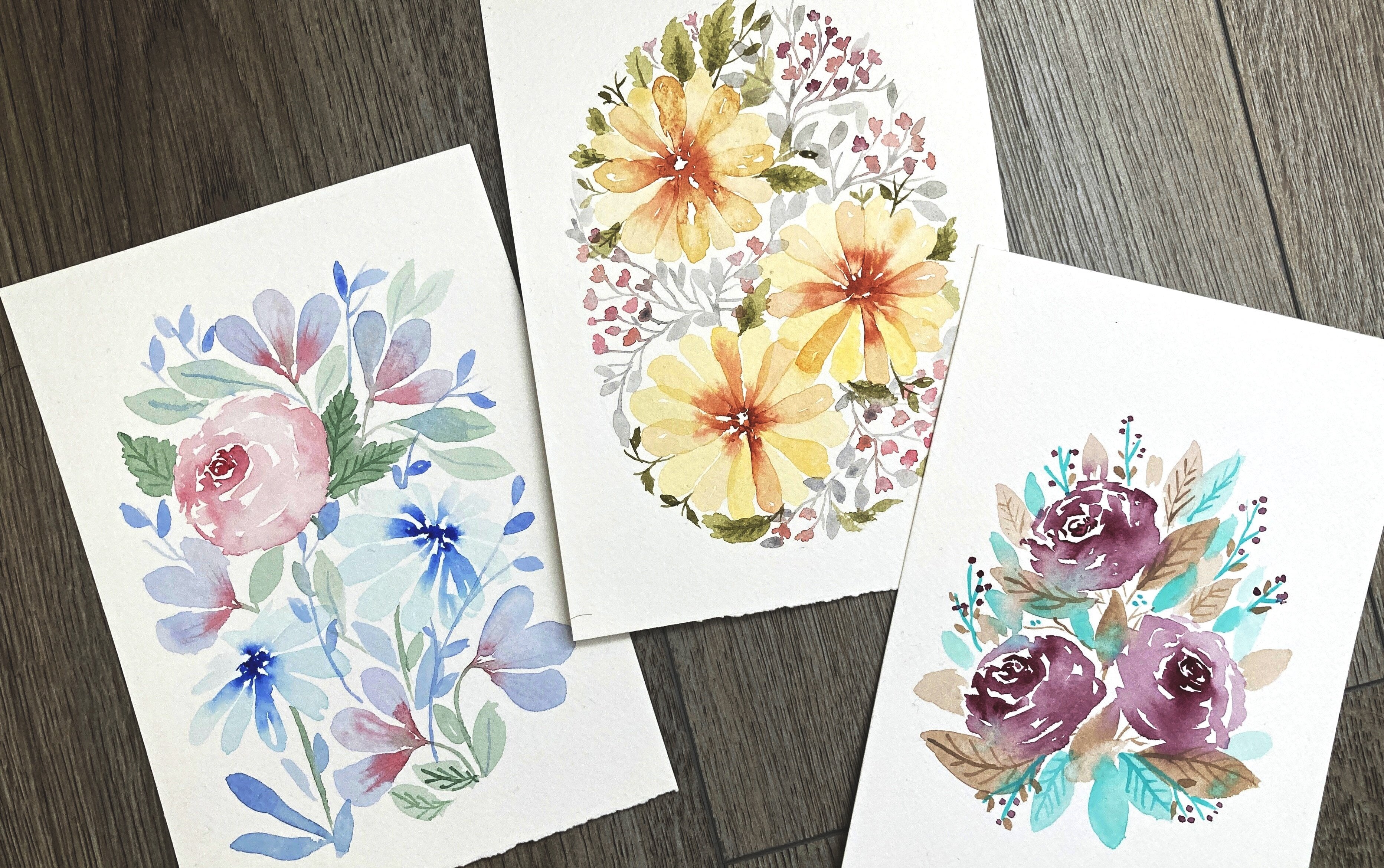
4. Indigo Flowers - Class Project #1: First monochromatic
painting that we're going to do today
is the easiest one. We will use indigo color to paint some gentle
flowers and leaves. You will see how one color can provide enough
interest and contrast, even in something
like a floral motif, which is something that
we expect to be colorful. I want to paint three flowers. I'm starting with
painting the center of it using a very concentrated
indigo color. Using tiny brush, I drove several small dots,
creating a circle. It can be a bit uneven. And now all you need is a
bigger brush and clean water. I picked some clean
water and paint petals. I make the petal connects to
the center of the flower. And the still wet, dark pigment will run into
the transplant petal, provide some light
color to the petals and create nice gradient effect. I am still using only the water
for the petals as I draw. And I drag a bit of
the pigment from the center to the
petals themselves. And to increase the
contrast and gradient. Now I'm adding more paint into the center and let it run freely into the
rest of the flower. Note that I left some tiny
spots in the center wide. It is a good way to add some
contrast and highlight. And I'm going to do the same
also in the next flower. So again, I apply a really rich indigo mix
in a shape of circle and few spots in the
middle of the circle remained white and give
that nice highlight. Now I clean my brush
and using just water. I paint some gentle
light petals. When I'm done with them, I add a few drops of dark
indigo into the center. Now let's create the third
flower the same way. If you think the water in your jar is already
too polluted, just change it and continue. Note that I always
tried to paint the petals close to each
other, but not touching. I want the tiny white
stripe between them, which will become even more visible once I add the
additional pigment. Very nice. Now I'm going to use my liner brush and add
a few little stamps. The color I'm using
is not too dark, but it's still quite
contrasting and visible. This term here is a bit
lighter, but it's okay. Now I'm painting the leaves using middle values of indigo. Those are the colors in
the middle of the chart. So I'm using more water and
drawing some simple leaves. Again, they don't need to
be all of the same value. Some of them can
be pretty faint. Sun can be a little bit darker, but overall, I don't want
them to be too dark. That's because I want
to add some texture to them and I want
it to be visible. So as the leaves are dry, I take my liner brush again
and using dark indigo mix, I drove several A-sharp lines representing the
veins of the leaves. I'm not going to draw them on every single leaf.
Just shocking. And now as a finishing touch, I'm going to splatter some
color over the painting. And I'm going to use darker
mix again because I want the drops to contrast nicely with the light petals
of the flowers. Make sure your paint
is liquid enough so that you can beat it
out of the brush easily. Hi, I'm very happy with
this little artwork. It looks peaceful and elegant. It has enough contrast and
have different color values. You can see that for the
center of the flowers, we use the darkest values. On the other hand, the petals
are faint and dreaming. And the leaves provide nice middle values that connect
the whole piece together. Of course, different color would give the painting
different vibe. This one is calm
and the wintery, but if you paint
it red or orange, it can feel more
energetic and lively.
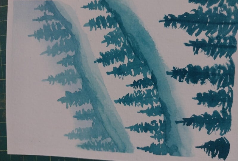
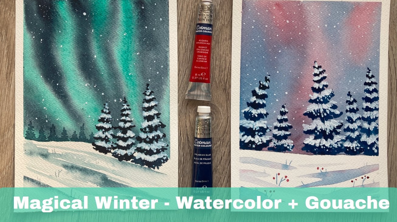
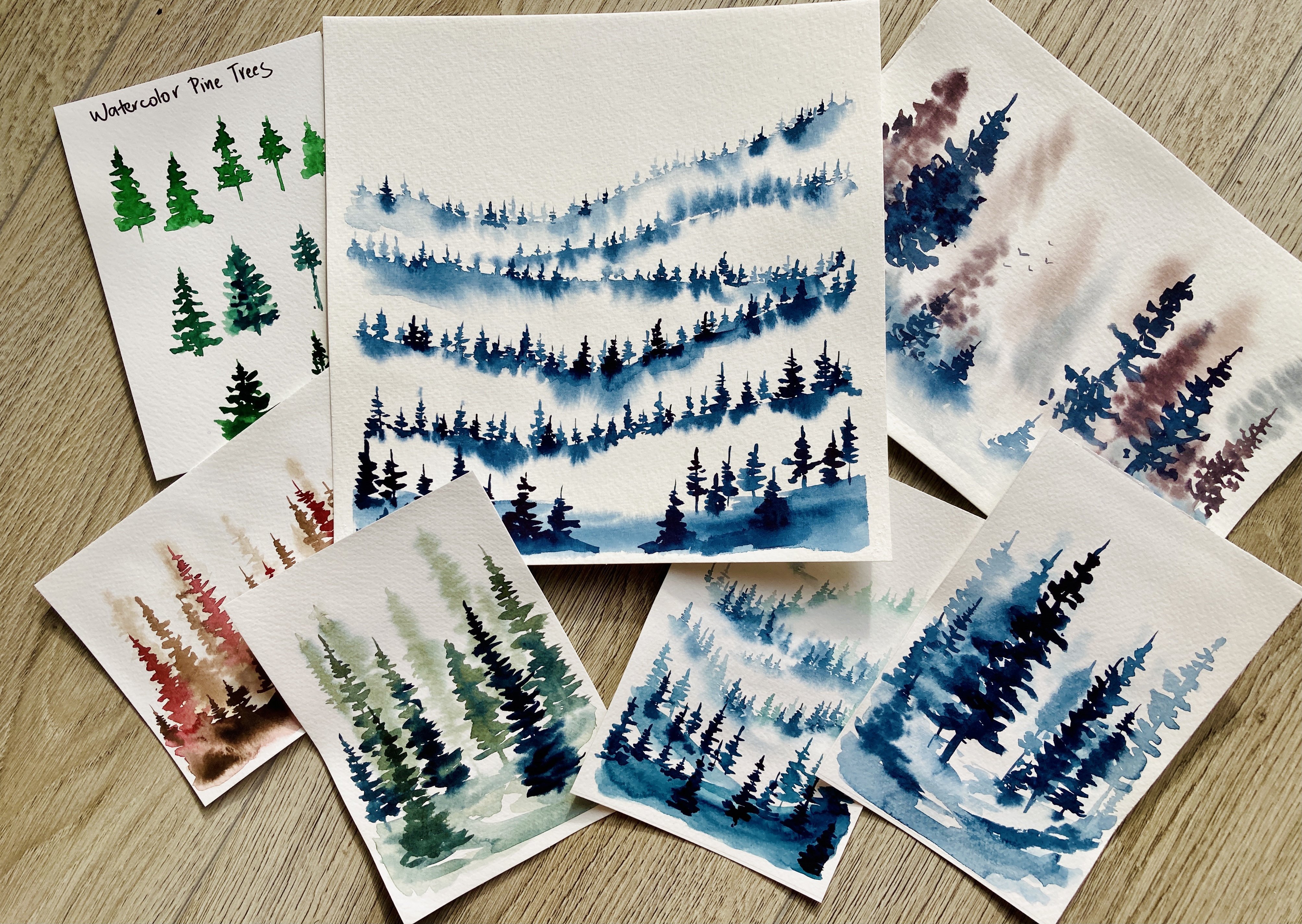
5. Emerald Green Trees - Class Project #2: Second painting is
a foggy forest. I love this subject. I append it very often. I even have a whole
class on foggy forests. You can check it out. But this one is going
to be emerald green. I have a piece of
watercolor paper. This is Canson
Heritage Cold Press. And I'm going to create a forest that is
fading in the fog. That means that I'm going to use the lightest values for the trees that are
in the distance, and you'll go darker and
darker as I move forward. I use the masking tape to secure the paper to a piece
of hard board. And using my mop brush, I apply a layer of clean water on the upper
part of the paper. Now I paint a faint light hill that runs into the
area of the white sky. And I smooth and the lower edge using clean water as well. Let's throw up some pigment here and they're still very light. Just so that the
scene has more depth. And now you have to let it dry. You can use a hairdryer if you want to speed up the
drying process app. Now following the line of
the hill I painted before, I am drawing simple
pine trees are for 3s, just easy conifers. One vertical line for the trunk and several horizontal
lines for the branches. The color values are
still pretty light. Remember that these
trees are hidden in the fog and you don't
see them clearly. Some of the theories can
be a little bit darker. Maybe the focus, not
the dance there. And I'm always using the
water to smooth and add the wash below the trees
to make it fade gradually. So the first, the most distant
range of trees is done. You can see that we use the lightest values
of the emerald green. But even here, not all of the trees are the same in
terms of color values, and it gives the painting
a realistic feel. Now let the painting
dry again before you continue with the
second range of trees. My paper is already dry so
I can paint another hail. This one is closer to me
and has a bit darker color. Again, I use the water to create the gradient effect in the
lower part of the hail. The future trees. Using emerald green that is
a bit darker and richer, I paint another row of trees. These trees are not only darker, but also appear a bit bigger because they
are closer to me. You can add more
pigment here and there, maybe belonged to
Teresa, create a shade. My order is to green now, so I'm going to change
it and then use it to get rid of this sharp
green edges down here. After the paper dries again, I'm going to use the most
concentrated emerald green for the cause of stress. They also appear
tallest and biggest. See that? I don't make
them all the same. One is taller than the other. The branches are bit uneven and I don't
paint the trees flat. I leave out some tiny
whitespaces for the highlight. And the paint does not have the same value for all the
trees and all the branches. Now removing the masking tape, I'm revealing this nice,
elegant white frame. And now as a finishing touch, let's add a flock of birds
flying above the trees. Just simple V shapes. Draw as many of
them as you like, using dark mix of emerald
green and a liner brush.
6. Sepia Old Town Silhouette - Class Project #3: The last project in this class is a
statistical word painting. I'm going to paint it
in sepia color because I like the nostalgic feel
of an old photograph. I found a photo online. It was a website
called pixabay.com, where you can find many
free pictures and videos. And this picture will serve
me as an inspiration. It already is monochromatic, so it's easier for us
to imagine the values. I'm starting with
taping my paper down to a piece of cardboard and
then sketching the city, all the dorms and
roofs, the three lamps. I have not 100% following the composition of
the original picture, like the sun or the street lamp, I move a little bit so that it looks better in my painting. Also, I will not draw all these tiny details
in the bottom. Those people and stuff. I want to simplify
this in a bit. Okay, Now I'm satisfied with the sketch and I want
to add some color. I have a sepia mix
that is really light. There is a lot of water. I use it to paint the whole
paper except the sun. The sun stays white, swipe paint around it. I'm not too happy
with its shape. So I'm using a piece of paper towel to adjust
it a little bit, and then I continue with
painting the rest of the sheet. Now the paper needs
to dry before we add some more
layers of color. I can continue now. My paper is dry and my sepia
color is a bit darker. If you're not sure
about the value, you can try it on a
piece of scrap paper. I want the color to be darker on the roofs of the buildings
and lighter in the bottom, just like in the photo. Because the roofs and
domes are peeking out from the haze and the lower parts of the buildings
are hidden in it. So for the roofs and domes, I use darker sepia and for
the lower part, just water. See those tiny details
in the towers and domes, those highlights and windows where this guy is
showing through. Make sure to preserve them. Don't paint the
whole tower and then realized there should
have been some window. These tiny details give your artwork the
crisp and elegance. And in watercolor, you need to think in advance because adding highlight after dark paint was applied is close to impossible. If you don't want to use any opaque media
like ink or gouache. Every layer needs to dry
before adding the next one. So I helped it with a hairdryer and I'm ready to continue. Now. You can see that
in the reference, the roofs are darker than
the walls of the buildings. So I'm going to do the
same in my painting. I have sepia, again
just a bit darker. We are in the middle values now. And I'm painting the rules
and few details like windows. At this point, I'm pretty much imagining what is
happening in the scene. I don't even try to draw every single window exactly
where it is in the reference. As I move downwards, the car gets lighter again, because that's where the
highest concentration. Now I have my tiny brush and
I'm drawing the street lamp. I have very rich sappy
at the lab is close to me and the haze does
not make it fade away. Let's add one more lone pair. And now we can add
the final layer of sepia color and December
very dark and rich. I draw the tree. On the right side. Again. I leave out some
tiny spaces for highlights. And then few of the roofs and
details in the foreground. The whole painting
is very loose. I don't want to worry
about details to match. Few more windows. And last thing to do is
to add this flying bird, maybe a C go flying about
the street or square. That's it. Only one color and so many possibilities
and choices.
7. Final Thoughts: Thank you guys for being
here with me today. I really had fun painting this simple
monochromatic pieces. The purpose of this class was to show you that you
don't need to have dozens of different colors in your set to work with
at the same time. You can make wonderful art with limited color palette or
even with just one color. I encourage you to practice this monochromatic
painting style. Then maybe add one or
two different colors. And you'll realize
that your ad would appear more harmonious
and accomplished. Let me know how you
liked this class and don't forget to
upload your projects. Thank you. See you
next time. Bye.
 Jana Raninis, watercolorist