Transcripts
1. Introduction: Hello my wonderful friends. My name is Anna and I have
another create your classroom. This one is going to be more of a mixed media class because on top of the watercolor,
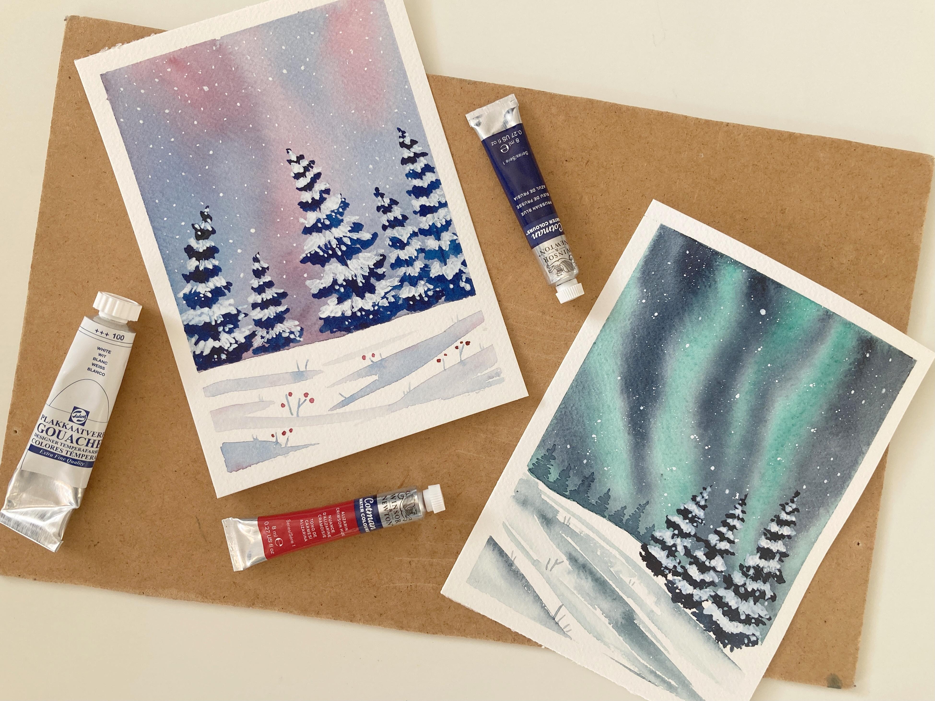
I usually teach, we will be using a white gouache
to create something like this little illustration
like painting of a snowy, frosty winter night and some
tall 43 is covered in snow. And one more painting of a frozen forests with some lovely northern
lights glowing about. I love painting northern lights together with a snowy
landscape because the colors of the sky contrasts nicely with the
monochromatic country. I was inspired to create this class when painting
this illustration, this was a prompt cabin in the woods in the Instagram
element challenge 2021. And I liked it so much that
I decided to paint it again. And obviously great, our
social class as well. This class is
beginner's friendly. We will go step-by-step on
how to paint a sky like this. How to draw the trees. But if you want to
take a step back, I have hold two
classes just on trees. You can find the links in the
description below the video or just browse my classes and
you will find them easily. So if we're interested,
we can get started.
2. Materials: Okay, let's see what we
need for today's class. First thing I'm going to talk
about is watercolor paper. What I have here
is a high-quality 100 percent cotton paper called Canson
heritage or heritage, which is a cold press paper. You can see the lovely
texture of the surface of it. I love this kind of paper
because it is able to absorb a lot of liquid and
still don't call too much. And also it dries
more slowly and grants me more time
to work wet on wet. It does not have to be canceled. And there are other brands
making cotton paper. You can try Claire Fontane, arches, or Saunders Waterford. These brands are
available here in Europe. This kind of paper is not cheap, but I promise you it will help you to get
the best results. Next, I have here
my watercolors. I will be using tube colors for one painting and pan
colors for the other. Just to show you that you
can do it either way. So I have here the Winsor Newton Cotman
watercolors in tubes. I don't use them that much. I don't really know why
because the extra like them. So for the painting number one, I will be using only two colors, Alizarin crimson
and Prussian blue. I always encourage
my students to work with limited color
palette because it forces you to
explore color mixing and it makes the result
painting more harmonious. And for the painting
of northern lights, I have my White Nights
watercolors in pants, and I will be using
indigo and emerald green. So for each painting, we will be using
only two colors. And the third will be white. In traditional watercolor. If you want to have some
white in your painting, you need to leave that space
out when applying colors. So the white is actually the
natural color of the paper. We will do that today. But on top of that, we will be adding some awards
details and highlights. Also using our white
gouache paint. Gouache is basically
an opaque watercolor. You can water it
down to be almost as translucent as
normal watercolor. But right out of the tube, it is pretty opaque. And we will use it to paint our snow on the trees and stars. Of course I have
here some brushes. I have three of them
through different sizes. The biggest one
has nice fat belly and can hold a lot
of water and paint. I really use that for
the sky and ground. The middle one will be
used for the 3s and the smallest thinnest one
is perfect for details. Little tweaks, stars, et cetera. I have here my mixing palette, and I have jar of water and paper towel to
clean my brushes. And I also like to
fester and my paper to a piece of cardboard
with a masking tape. Especially when
I'm using a lot of water in my painting to prevent it from buckling and to create nice white frame for my artwork. And that's all you need.
3. Drawing the Fir Trees: As I mentioned, I have
separate classes on trees, just in case 2 of drawing
them as much as I do. And you will be interested. But today, we are going
to paint for trees only, and that can easily be
wrapped up right now. You can skip this
chapter if you already know how to draw a
pine tree or a 43, but you are also invited
to see my process. So here I go. When drawing upon or for R3, I always start with the trunk. It is my helping line. The axis of the three, sometimes I draw, my
tree is straight. Sometimes they're a little
tilted to the side, bend a little like
in this painting, which makes them
look old and covered with lots and lots
of heavy snow. And it gives the painting
a different dynamic. Then you can sketch the
branches and it really is just few lines because the
details will come in color. So that's it for the sketch. Sometimes it is helpful
to take some time and think about the color
values of the painting. So what I do is that I just take my pencil and a piece
of paper and sketch the object just
using the pencil and emphasize the dark spots
and the light spots. Digital study, we will
give me an idea of how I want to work with the highlights and
darks in the painting. It is enormously important, especially in
traditional watercolor, when you don't use any opaque highlighting
media like quash, we are using gouache today, so it's easier for us, but I still find
it quite useful to see where the light and
dark colors will be. I'd like to show you how I
painted these threes here. I have a piece of paper here. I already applied
some dark color to the background and
it's already dry. I take a rich indigo
color and draw the trunk. And following my
little study here, I paint the dark
part of the tree. Just the needles leaving out the areas where
my snow would be. C, that I'm not very
worried about the details. The painting is quite loose and I let it dry
and when it's ready, I take my white gouache and
mix it with a little bit of water and the snow just in
those places left out before. Of course you can do
it also this way. You paint the whole tree
with a dark color and then you add the highlights on
top of this dark color. But I like the first way
better because it seems more fun to assemble
the painting like this. And also, as this style of
painting is quite loose, you will have some little
areas of the sky color shining through the wash.
And that provides more texture and dimension to the tree. So it's up to you. You can try both ways and choose which one
works better for you.
4. Watercolor Sky: For the radical or sky, we are going to use two
different techniques. We will try wet on wet
technique and the wet on dry technique worth always will be used for the
northern lights. Because as the paper
is loaded with water, the pigment can flow and
create these lovely stripes of green areas which
look really realistic. Wet on dry it will be used for this painting when our
sky is purple and blue. And you can see this
texture created as the pigments are applied
on the paper gradually, both of these are interesting. And before we start, I would like to again
emphasize that the result of this exercise very much depends on the quality
of your paper. I have here a piece of
Canson Heritage paper fixed to a cardboard
with some masking tape. The upper part is going
to be painted a wet on wet and the lower
part wet on dry. This is just an
exercise for you to see how the pigment
behaves on the paper. So for wet, on wet, I'm first applying enough of
clean water on the paper. I wanted to be really wet
before I go in with the paints. Now I take my indigo color, that is a very rich dark blue. And I'm applying the
paint on the wet paper. Stripes. I don't want to
vertical or horizontal lines, I'm going for more likely
diagonal orientation because in my final painting, it will give my landscape
that feeling of depth that the Northern Lights disappear
somewhere in the distance. You can see that the pigment is spreading beautifully
on the wet paper. Now I'm using emerald green and I'm feeling the
whitespace is with it. You do not need to
worry if there is a tiny white spots left out between the Indigo
and emerald green. Because now you lift your
paper and you start moving it, tilt in from one side to
another, but not too much. Because you don't want these colors mixed
together all the way. You're just wanted to
create this feeling of a flow and movement on your sky. You can also add more color
if you think some areas are too light and the
color flow, again, there can be some liquid the
gathering on the bottom, you can get rid of it using
a piece of paper towel. Okay. I think I'm good. It looks good now. So
now we just let it dry. And while it dries, we try the second part of this exercise and that is
the sky painted wet on dry. Now, I want to use my water
to water down the paint. I don't want the
washes to be too dark. I know it is supposed to be
an evening sky or night sky, but having the sky
too dark would make our dark trees not visible
enough against the sky. What I'm doing right
now is that I'm mixing these two colors together
into a lovely purple color. But as I go, I switch between the purple, crimson and blue. Remember that you need
to use a lot of water, otherwise your paint
will dry quickly on the paper and you will end up with hard edges so
that you don't want. And now as it is already dry, you can see the texture. It looks like an
nebula of some kind. For the actual painting, I would go even lighter colors. And the northern
lights turned out just perfectly very nice. Everybody knows what to do. So let's move to our projects.
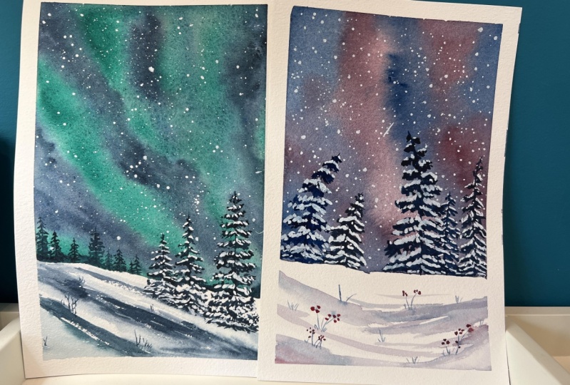
5. Class Project 1 - Northern Lights: I am going to start with the
one we did northern lights. First thing to do is
to fix your paper to a piece of
cardboard or how the board and anything that is firm enough and you can
easily lifted. We are going to use a
lot of water and we are going to move the
paper left and right. So it's good to
have it fast into something. As you can see. Here is the reference painting. And the foreground
is actually white. It is covered in snow. So I don't want to paint
on this area just yet. I'm going to use a pencil to sketch over the
snowy area begins. And then I'm applying clean
water using my big brush. Only in the sky. Era, the foreground
does not get wet. And then just like before, I'm using indigo
color and painting the stripes of dark night sky. I love how the pigment is
moving on the wet paper. I could watch it all day. Now it's time for
some emerald green. And a bit of tilting. I can see there's some
excessive water down here, so I'm going to pick it up
using a bit of paper towel. Now in dereference painting, we can see that the ground is
not just clean white spot. There are some light-blue lines. Those are suggesting
that there is actually something like a hill. And we are standing in
the lower part of it. Also, when you look at
the foreground trees, the next one is always standing
a little bit higher than the previous one as
we're going up the hill. A simple trick like this will give your painting
a perspective, a feeling of actual space. So while we wait
for our sky to dry, we can work on our
foreground with a loud mix of indigo and
a bit of emerald green. I draw these diagonal
lines really loose. I smoothen the edges with
clean water and make sure I leave enough of
the white blank space. Because the small
wide places are what gives the crispiness to
your watercolor landscape. I helped the situation with
a hairdryer so my sky is already dry and we can
move to the stars. And that is when our white
gouache comes handy. I push out a little bit
into my mixing palette, use just few drops of water and then load my
medium brush with it. And now I'm going to be the
color out of it literally. And the drops of white color
will be the perfect stars. I usually use another brush to beat against the
brush with the color. And what remains in the brush. I then use to add
some more stars, stars that are bigger and brighter. Just here and there. Another thing that
adds some depth to your landscape are
some background trees. These trees here
are into distance and the day or maybe covered
in some kind of haze. So they are painted in lighter colors than
those in the foreground. Painting background for
trees is really easy. It is just a vertical line for the trunk and then several horizontal
lines for the branches. Very, very easy and
very effective. I am using a live mix of
indigo for these trees. Here I'm also adding
few classes or tweaks peeking out from below
the snow, just few lines. But I think it gives us
one more nice detail. And now we can move to
the foreground trees. I want to have three of them, and I want them to go uphill. So I draw the drunks first and now I'm adding
some branches. I am leaving out the space
where it is null will be. But you can definitely paint
the whole tree dark and add white gouache on
top of this dark color. You can see that my style
of painting is quite loose. I'm not worried about
details too much. And that's the way I like it. And before we add some snow, we need to let these three
is dry because I don't want the white gouache to get
mixed with the dark indigo. You can use again, a hairdryer to speed up the
drying process just as added. And I am now ready
for some snow. I have my mixing palette here, my white gouache,
and my medium brush. I'm going to paint a layer of snow on top of every
branch of the trees. This looks a little
bit too cartoony and illustration like bus to me. It is something that
really goes together with the whole snowy
magical winter scene. And the last thing to do is to remove the masking
tape and see how elegant our painting looks
with this nice white frame.
6. Class Project 2 - Purple Sky: The class project number two is going to have different colors, but similar type is going to be a frosty winter,
evening or night. We'd have proper sky
and snow covered. Three. Similarly to the
previous landscape, I'm going to leave
the foreground blank. For now, focus on the sky only. So I'm drawing the line where
my sky and the ground meat. And using my Prussian blue
and Alizarin crimson hue, I am painting the
sky wet on dry. Make sure you don't go too dark. Now, we'll turn down
your paints and now for, and if you accidentally use
darker color than desired, watering down on the paper. Use enough water, too. Hard, edges, and
switch between colors, mix them together
just to have fun. And when your sky is dry, you may see some interesting
texture as the colors meet on the paper and the
run into one another. Now it's time for us to spend some time with the foreground. And similar to what we did
in the previous project, I'm using my big brush
and a light mix of the sky color to
create some shadows and texture on the
ground covered in snow. And just few more strokes. Don't forget to leave
some whitespace. I'm going to add a sum of
tweaks, just few of them, and then using the same
red color as before, I paint some small dots. These are some raspberries and
they create nice contrast. In the snowy landscape. We can now focus on the trees. You can see in the
reference painting that these trees
are not straight. They are bent a little
because the snow, they are covered
with a very heavy, just like before, I draw some trunks and then
I added the branches. I use the Prussian blue, really rich mix of it, almost strike out of the tube. Now again, we have to wait
for our twists and dry. But we can use this time
to paint some stars. This time, I'm not going to splatter the paint over the sky. I'm using my tiny brush and just draw up small
dots that is bigger, another one is smaller. If you have a white gel pen, you can use it as well for
this part of the project. And while we were
busy with the sky, the trees got dry. So we can move to the final
step, adding some snow. So I added some fresh grass to my palette and using
my medium brush, I'm painting this now on top
of every branch and also add some white dots and spots on the dark branches
for additional texture. I don't know how about you, but I really enjoy
this part is just like the whole painting came alive when you add
this white color. The last stream, this
one is tall and narrow, and some additional
details and it's done. Let's remove the masking tape. Now. It looks very good. I think it looks even better
than the reference painting to see how much you can do using
only two colors and white. And just love it.
7. Final Thoughts: New friends. These were the two projects
I had for you today. I hope you had fun painting
these little illustrations. I certainly did. A small painting like
this can easily be used as a winter holiday
aqueous and cut. Let me see how it went for you. Upload your artworks,
share your feedback, and until next time,
take care. Bye.
 Jana Raninis, watercolorist