Transcripts
1. Introduction: Hello friends,
welcome to my class. My name is Yana and
I love bringing you new ideas and tips how to
improve your watercolor art. Today's topic is a
center landscape. This is my first
class on landscapes. Although I paint
them all the time, I love painting them. So I'm really excited. We are going to paint three
different landscapes, all inspired by my
favorite places. We are going to span techniques
to paint summer sky. And we are going to explore how a really minimalistic
color palette can be more than enough to
create a lovely painting. I hope that the techniques we are going to try it together. It will be also useful to you in your other artworks you are going to be working
on in the future. So let's talk about the art supplies and then let's paint.
2. Materials: Let's talk about
the materials we are going to use
in today's class. First, this is my watercolor
set, White Nights. I use it all the time.
It's affordable. Watercolor said with pretty regular color
selection. Nothing special. We are going to use very
limited number of colors today, so no worries if you don't
have a set that is this big. Regarding watercolor
paper, this is arches, 100% cotton paper. It's 185 GSM. This one is not that
expensive as 300 GSM kind. And that's pretty
cool job still. These are my brushes. I love this mop brushes
with nice big bellies, which can help out of liquid
and helped me make my wash is smooth and seamless.
This is size two. Next I have my medium brush. This one does not even have a size written on it.
It was already cheap. I would say it's something
like a size six or eight. Now my liner brushes for
the details and fine lines. We are going to use a
lot of water today. So I recommend you to tape your paper to a
piece of cardboard. Cardboard or even your desk. It'll prevent the paper
from curling and you will get nice white frame after
the tape is removed. This is just a
regular masking tape. Now I have here two
jars of clean water to charge so that I don't need to change the water
all the time. And also some paper towels
to clean my brushes. And for some nice
trick, I will show you. We're not going to do a
lot of sketching today, but for that little bit of it, here is my pencil. And it seems we have
everything we need. So let's begin.
3. Summer Color Palette: Before we start, I would
like to talk a little bit about the color palette we
are going to use today. Because it's semi
landscape we are painting. I want the colors to feel warm. Also. I like using few
colors in one painting, which helped me to
achieve the harmony and prevents the scene
from looking too busy. I'm going to show
you which colors I will combine together and why. And in case of some
special color tones like the olive green, I will show you how to make similar tone in case you
don't have it in your set. Basically, my favorite
color combination for realistic summer
landscape is this one. Ultramarine blue for the sky and raw sienna for the ground. In my opinion, these two colors
are absolutely the best. You can use them
right out of the pan or have fun mixing
them together. Raw sienna and
ultramarine create one of my favorite Grace I use
for the sky and shadows. Mixing moral sienna
into the blend, you'll get some lovely
earthy greenish grays and light brown tones. Just this tube paints are
enough to provide you enough colors and tones
for harmonious painting. I love combining
these two colors with some nice warm green. And my usual to go
green, olive green. This color is not usually in
standard watercolor sets. I bought it separately
and I use it quite a lot. But even if you don't
have this color, you can mix very similar one using colors that you
most certainly have. And those are ultramarine
blue and some warm yellow, like in this case, it is cadmium yellow medium. For the olive green color, you need to have slightly more
of the yellow in the mix. But the best way to see
is to try for yourself. So take your time to make it the green color that you
would like the most. Besides the olive green, ultramarine blue,
and raw sienna, we are going to use
also burnt amber, which is a nice warm brown. Mixing. Burnt umber and ultramarine will give
us a lovely dark gray. For the three trunks
and branches. Guys sick all the time. You need mixing these colors. Having fun, exploring
new color tones. Once you are ready,
we can start with the first of the 37 landscapes.
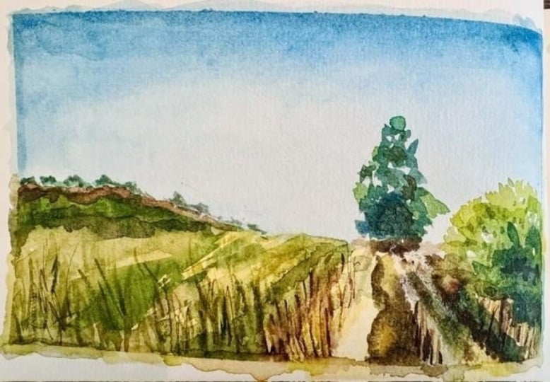
4. Painting #1: Wheat Fields: First one of the three paintings today is going to
be the easiest. We're going to paint a
lovely golden wheat fields under a blue sky with
some fluffy white clouds. This painting is
inspired by the fields today are just ten minutes
walk from my apartment. You can see that I already
have this kind of landscape in my sketchbook to for dispensing, we're only going
to use two colors, ultramarine blue and raw sienna. I started with taping my
paper to a hard part. The paper I use is 21 by 15 centimeters and
it's only 185 GSM. So it will buckle more
than 300 GSM kind. That's why it's good to
fix it to something firm. No big sketching here this time, I just wanted to
suggest the horizon. And it is the lower
third of the paper. Dividing the picture
to the third is one of the basic
composition rules. Next, I want to
work on this guy. First using my mop brush. I'm applying clean water
to the whole sky area. I'm leaving out the lower
third where the field will be. Now, I use rich mix of
ultramarine blue and I apply the color on the
upper part of the sky. And in the lower part, I'll leave some blank space. That is the foundation
for my white cloud. Now, I'll show you a trick
that I absolutely love. Take a piece of clean dry
paper towel to take off a little bit and then folded
allele using your fingers. Now full of the
shape of the cloud, you suggested tapping and lifting the wet pigment
from the paper. Every now and then,
turn the piece of paper towel in your fingers to fight a clean spot or
gesture of some new piece. This way you create nice, realistic defined
edges for your clouds. I'm adding also few
smaller clouds, about the biggest one. Again, just lifting
the pigment app using the paper towel. Maybe you ask, why would
it apply the water first? Well, based on my experience, applying clean water
before the pigment, makes it easier to
leave the color app. Because the paper
socks in the clean water first and then
the colors taste on the surface longer. Therefore, it's
easier to lift it up. Now I'm just playing with
the shadows on the clouds. You see these clouds are fluffy and have a very
irregular shapes. We can depict it using very light mix of
ultramarine blue and just randomly apply this color
to the body of the Cloud, making it look more realistic. If you feel you went too dark, use the paper towel again to
remove the excess pigment. The clouds look wonderful. Now we have time to move to the lower part of the painting. Again with my mop brush, I apply water and
mix of raw sienna. Now it's looking very flat, so let's add a
little more color. I am making horizontal
brushstrokes using rich mix of raw sienna and also a bit of raw sienna and
ultramarine next, which will give me the idea
of shadows on the field. Now the field is
still quite wet, but we can work on the first layer of the
wheat growing here. I have my liner brush and what
I do is that I simply draw vertical lines first using plain raw sienna and also
the mixed with ultramarine. Next, the paper is still wet. Majority of the lines
will disappear. So now just take a break and let the painting dry before
adding some more details. I used my experts trying groom, aka my south-facing balcony and my paper is now ready to work
on some smaller details. Again, with my liner brush, I draw some more vertical lines. This time you can see that
they stay visible and defined. I use raw sienna and the
bluish gray mix as well. The lines have different
height and thickness. We are almost finished
just for a bit of crisp. I'm going to add few tiny
details to the wheat or not to every single
vertical line we have here, but only to some of them. And I'm going to draw
the width spikes. It's going to be very easy. I just randomly select the line and then using the fine brush and draw a few tiny lines on both sides of the
stem. Let's do it. I don't want to overwork it. I think it's enough.
And the last thing to do is to add a
flock of flying birds. I have my liner
brush and they're all CNR plus Ultramarine mixed. And I'm drawing
simple leaf shapes. And that's it. The first of today's paintings
is finished. I hope you like this very
simple some landscape. And we'll tell your results.
5. Painting #2: Pathway Through Meadows and Fields: Second landscape is inspired by the countryside
around the village where my boyfriend's
parents live. We spent quite a lot
of time there and I love walking this piece
fulfilled and metals. I chose this photo as a reference picture
for today's class. So after I fixed my
paper to the board, I'm going to do a
very quick sketch. I don't want any details. I just want to mark where the main objects are and
how the pathway goes. Now I'm again going to
start with the sky. First. I apply a layer of clean water to the
area of the sky. Next, using my mop brush
and ultramarine blue, I paint the sky. I was the blue color to be
darker in the upper part of the sky and going lighter and lighter as we go
closer to the horizon. So what I do is that I apply the color on the upper
part of the paper. And then I'm lifting the hard
board with the paper using the gravitation to
move the pigment gradually to the bottom
part of the sky. You can also help
it a bit and add more clean water to the
lower part of the sky. That would make the blue gradient wash even
more seamless. Now I need this guy to
dry before we continue. So let's take the advantage of the really hot days we have now. This is my tiny balcony and
I sometimes use it to speed up the drying process as the sun shines
really strong here. To just few minutes
for the paper to dry so we can now
continue with the ground. I know it can be
overwhelming to paint a landscape based on
the photo because you see all these tiny
details of the bushes and the grass and leaves that we are not going
to worry about it now, first thing to do is to
apply a base layer of color that would help our painting to look
more harmonious. I apply the color following
the leading lines, like the pathway and the roles
in which the crops grow. To introduce a bit of a three-dimensional
look to the painting. The first layer is light. I use raw sienna
and olive green. Here where we have the pathway. You can see that the
ground is a bit lighter, so I'm lifting up the pigment
using a clean damp brush. The brush would suck in the liquid from the
paper together with the pigment and give you a
lighter color as a result. Now, while the first
layer is still wet, let's add more color. Wet on wet. I still don't
care about any details. I look at the photo and try to identify the darks
and lights there. Then I roughly apply
the color accordingly. So for example, I see
that there is a strip of darker green color
mixing the horizon line. Or on the right side
there is a big bush. There are some red grasses
growing next to the big three. So you can see that I'm not
drawing them one-by-one. I just suggest the shape of
the whole bunch of them. Now, of course, the tree. I'm still using the mop brush so the color is applied roughly, know tiny branches or leaves. The green color I'm
using for the three and Bush is a mix of ultramarine
blue and olive green. Adding more blue
into the mix will give me darker and colder tone. Now that as I paint
the shape of the tree, I'm leaving out a tiny bit of
the sky through the leaves. It's a nice way to add texture and highlights the
trees and bushes. You can add also few drops of pure ultramarine to the tree, especially to the
left and bottom part. That will give you
a nice trading. Also the bush. You can see
that the sun is shining from the right side and the bush is casting quite a big shadow. So I'm adding more ultramarine
to the left bottom of the bush and also to the pathway where the shadow
is cast by the grass. This photo was taken
after 06:00 PM. So the shadows are pretty long. As the watercolor
dries quite light. I'm again applying some
darker green color to the left part
of the landscape. Okay, I think we have the
colors and values than alright. Now let's add a bit of
a detail and texture. But no worries, it's
going to be very easy. Basically, what we see here is a field of wheat and some grass. So I'll take a thinner
brush and I'm drawing simple vertical lines
to the field era. And also by the pathway. I'm switching between olive
green and neural sienna. The paper is still a bit damp, so this initial layer of texture will not
remain much defined. We're going to add
one more layer later, but first let the painting dry. Mine is already is 36 degrees
today is killing hot. So I can work on some details. First, you can see that there is a row of trees in the distance. I'm using my medium brush and ultra marine foods,
olive green mix. And I'm painting these trees is just an uneven line
of green color. But it's clear to everyone
the dose or the trees. Now this nice push we
have in the foreground, there is a shade on the left part and also
on the actual bush. So I have mixed
ultramarine and raw sienna and I'm painting some
spots on the postdoc, also the lower left part. And it is casting a shadow
over the pathway as well. So here I'm drawing that
shadow lying on the ground and few more darker
spots on the bush. Now, I want to work
on the pathway. You can see that
the shadow is on the left side of the
stripe of yellow grass. And it's pretty pronounced. It gives us the line that is leaving the eye
towards the tree. It holds the composition
of the painting. So it's quite important. I have my small
brush so that I have a good amount of control over what's happening
on the paper. And then mixed myself
a fresh rich mix of raw sienna and
ultramarine for the shadow. I'm holding onto the
direction of the pathway, having the expressive
yellow grasses right next to the shadow. And now I just add few more simple quick grasses
using pure, raw sienna. I am satisfied with the pathway. So let's add few
more grasses and weeds to the left
part of the painting. I am changing the colors. I use olive green than raw
sienna and also the gray mix. Nothing else is needed. The painting has enough texture that does not seem too busy. The colors are nice
and harmonious. There is enough contrast
between the light and shadow. Let me know if you
have any questions to the process and of course,
share your paintings.
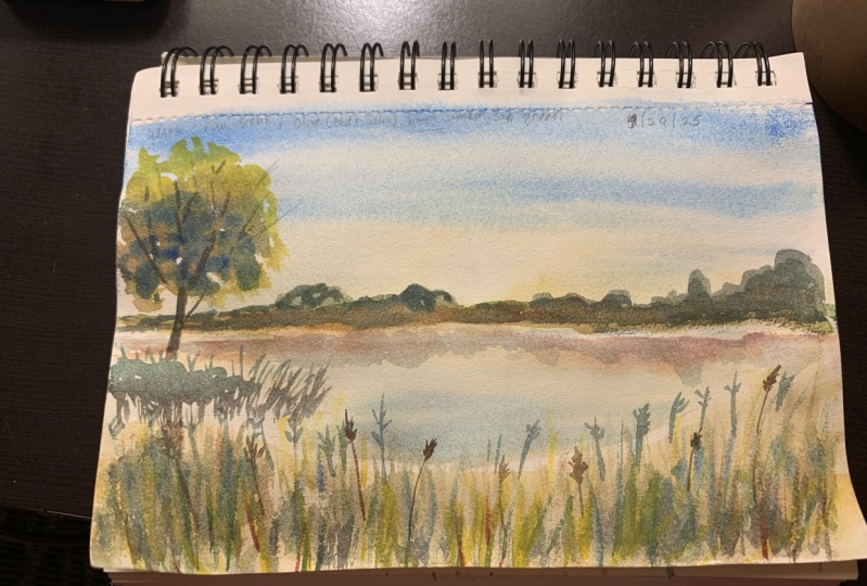
6. Painting #3: Evening at the Lake: The last painting is going to be summer evening on the lake. I painted this picture last
year based on a photo I took when we were out swimming in
a nice little lake nearby. It was such a nice
peaceful evening. I follow this photo
when painting, but I decided to leave out this big dry three
in the middle. So I would like to paint the scenario once
again with you. Again, I taped my
paper to a hard board. There will be quite
a lot of water used and this paper is quite
backlink when wet. Good. Let's make a quick sketch. The same as before. No details, just a rough sketch of where the
main objects are. The three is the
horizon, the lake, the sky will be
wet in wet again. So let's apply clean
water to the area of sky, and then let's paint some
nice warm summer evening. The sky appears to be yellow. There is also a blue part, but around the sun,
it seems yellow. So I'm using a light mix of raw sienna and applied
on the wet paper. Also suggesting the SAM, which is basically wide circle. Because the paper is wet, the shape of the Sun would be disappearing or losing
its definition. But I have the good
old paper towels to help me control
the curve spreading. And now I'm painting the rest of the sky light blue,
ultramarine again. The two colors should create nice seamless gradient wash
if your paper is wet enough. And now I'm just correcting
the sun and the sky is done. We can now work on the lake. I'm using the same light
raw sienna as for the sky. Maybe a bit lighter, even some
light ultramarine as well. Just like when painting the sky. Note that I leave
out a thin stripe of dry paper between
the leg and the sky. It's very important to make sure the light
is really light. And now I'm creating
the first layer of light color on
the foreground. While the lake is still wet. Let's Spend the
reflection of the trees. On the other side. I have my medium brush
and sepia color, and I'm just dropping the
color right under the stripe. The pigment spreads immediately and creates a lovely
reflection in the water. Now I add a bit of
ultramarine and then R-CNN. In the meantime,
the foreground is already dry and I can start building up the layers of
the leg, grasses and plants. So I have a worn a mix of
raw sienna and olive green. And I'm applying this color in short, vertical brushstrokes. The foreground is composed of
countless vertical objects. And instead of drawing
every single graph, I will build up the richness of the greenery using several
layers of simple brushstrokes. Same goes for the tree. Instead of painting
each tiny leaf and applying the
colors in rough, uneven dots and gloves, leaving out some
of the sky to see through and suggesting some
shadow down on the left side. Now, I'm bringing
some shadows and darker tones also
to the foreground, creating a contrast
and texture we need. Now we can leave the
foreground to dry a little bit and we
can focus on threes, casting the reflection
in the water. The reason why I paint the
reflection first is that I have less control over
what's happening on wet paper. So I let the reflection
turned out somehow. And then I adjust
the real trees, which I paint on dry
paper accordingly. I started with a
stripe of a warm, raw sienna, that is the grass
and the sun is shining on. Then I mixed myself a cooler green tones using olive
green and ultramarine. And I'm following the reflection and painting the
trees based on that. Here I tried to finish the
big three on the left side, but as you can see, the leaves are still not dry. So I'm going to focus on the biggest three on the other side. I just add few thin lines to represent the
branches and trunk. Now we're ready to add some of the plants that
grow by the lake. I have my liner brush and a mix of burnt umber
and olive green. This is how the
lake grass looks. It's really simple. The simple grass covers
the shore of the lake, so I'm drawing it in different
mixes of olive green, burnt umber, and raw sienna. Under the tree on the
left side there is a bunch of grasses
casting a shadow below. Then let's add this
shadow using ultramarine. Now a few more leg grasses in the foreground don't be afraid
to use different colors. Now the three seems
to be dry already. I have my thin brush which
throws really fine lines. And I drove several branches and twigs picking out from
between the leaves. I used a mix of ultramarine
and burnt amber. And that's it. Let's see how the painting looks when
the tape is removed. I must say, I really
like it and it really has this relaxing
evening, right?
7. Special Class Project: Guys, I hope you
had fun painting this simple similar
landscapes with me. And I would like to encourage
you to maybe use some of these techniques
we spoke about today. And as a special project, paint your own salmon landscape. Maybe an adult you
like working with your dog or a field behind
your parent's house, or some lovely place you
visited while on vacation, or just choose one
of the paintings I showed you and
painted yourself. Just don't forget to
take a picture of your project and upload here
into the project section. I'm always very happy to
see how it went for you.
8. Final Thoughts: Friends, thank you for
being here with me today. I had a lovely
time painting this sunny, warm summer pieces. Maybe you painted
all of them with me, maybe just one That's okay. Just please upload
your paintings for me and your
classmates to see. I'm always over the
moment someone uploads. So if you have any
questions or comments, I will gladly answer. Just use the discussion section. I have more stuff here, so feel free to check it
out if you feel like it. See you next time. Bye.
 Jana Raninis, watercolorist