Transcripts
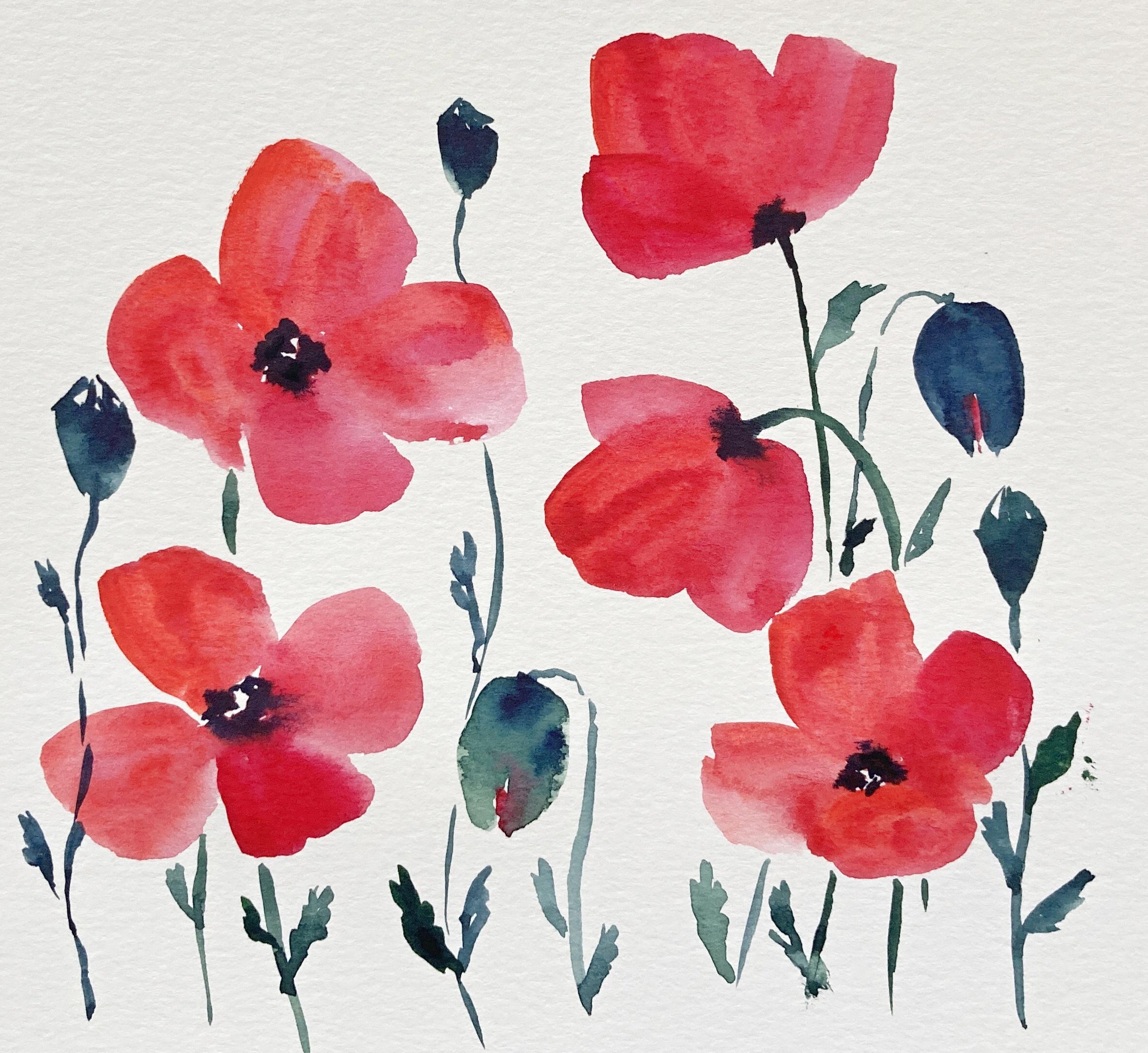
1. Introduction: Hello friends is Yana and I have another watercolor for beginners class for you. Today we are painting my favorite summer flowers, the vibrant red Wild Poppies. I love them. I go out every year with my camera and I take pictures or damages, never gets old. And I also love painting them, especially in watercolor, because their flowers are so gentle and fragile that I think that the watercolor is really the best medium to capture that. I've been poppies in many different styles and ways. But today, I would like to share with you my process to paint them really loose and easy. Just few brushstrokes, few colors, and that's the way they look the best, I think in case you have never drawn this lovely flowers. We're going to talk about the shape of petals and leaves. And I'm going to show you step-by-step how to actually paint them in watercolor and not to overdo it. And as a class project, we are going to paint simple, loose watercolor artwork like this, very nice and modern. So if you are ready with some of the materials.
2. Materials: For today's class, we didn't just regular watercolor supplies. I have my water color set here. This one is White Nights by St. Petersburg. You don't really need a set big like this one is just three or four colors we are using today. So NSAID you have at hand would work, I'm sure. But it's good to have at least two different resonant. Then I have watercolor paper here. This one is Canson XL watercolor paper. It's not a 100 percent cotton and it's quite affordable, at least here where I live, which is Europe. But any watercolor paper you have would do. And I have a brush here. And for today's class, I'm okay with only one. And this is the brush I'm using. This is number 12. I don't need any other because this one has nice tip for the details. And also nights belly will help me to bend the petals of the poppies. You can also try smaller brush like number 10. That should be also okay. And of course, jar of water and paper towel. Before we jump into the painting part, we are going to talk a bit about the shape of the puppies. So I'm going to do a little bit of sketching, which you can do along or you can just watch, enjoyed me later for the painting. But if you want to sketch as well, maybe it's the first time drawing the puppies for you. So it can help. In that case, you need a pencil and a piece of paper.
3. Shapes of Poppies: Propositionally have four or six petals. Those growing here in Europe have four. And that is also how either Big them, the petals are overlapping and have quarter circle shape, like a big deform slice of pizza. They come together at the center of the flower, which is usually dark. Puppies are very easy to draw. The petals are so fragile and they can twist and changed as they are exposed to wind or rain. But once you paint red flower with the dark center, everyone knows is a poppy flower. That's what I loved them. They are perfect for loose style because the external look quite loose themselves. Now, I'm drawing several puppies from different angles. You can draw along if you want. This one is from the side. When drawing puppy from the side, I usually draw three petals. As the last one is hidden. I usually start with the middle biggest ones and then draw two more on the sides. These are smaller because we don't see them hall here as the petals meet the stem, the flower is usually dark. Another way is the direct view. Like you are looking directly into the center of the flower. You can see it's stamens and f-orbitals. I usually draw them a bit overlapping. In the center of the flower, there is a future puppy has, which is usually light. And around it we have the dark black stamen, which is the large center of the flower. The flowers are very fine and fragile. They bend easily so we can also draw them that way. I'm basically doing the same as I did in the first case. So I'll draw the poppy from the side but upside down, then the stem, we'll event as well. Now let's try to draw the poppy flower allele little bit on angle. So you can see a bit of the center, the stamen and the dark part. But you do not look directly in the middle of the flower. To make the flower look on angle, I draw the petal closest to me smaller than the rest. The buzzer, pretty easy. They look like an egg. So on the bottom there are wider than on the top. You can draw them closed or opening. Like you can already see a bit of the flower peeking out. Usually the stems with the buds are banned and the buds phase downwards. You can try both ways. The puppy heads are, again pretty simple. They are like a little cap with a lid. So I draw triangle shape on a stem. And at the top of the triangle there is composed of several center lines pointing up. And the leaves are small, thin and long and jacket. It's not a lot of them growing from the stems. So I draw just one or two on every step.
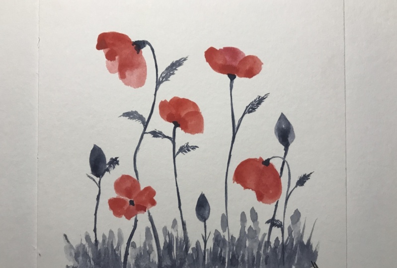
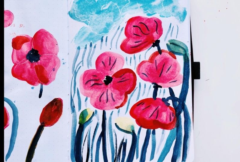
4. Color Palette: Most of the Wild Poppies are red. The red arise from light orange, too, dark carmine red. But in our case, we are going to combine two different kinds of red. I am painting some swatches now to see how my chosen colors look side-by-side. Feel free to paint your own swatches through at different colors and see how they match. I chose carmine red and degenerate for the flowers. I like using two different rights for the puppies as they look more natural that way. For the center of the flowers, which is dark and contrasts nicely with the red of the petals. I usually use indigo blue. It appears almost blacks when in high concentration. But you can absolutely go with the regular black or sepia. That would also look very good. You can try to apply a bit of your chosen dark color into the red swatch to see how they react together is still wet so I can see how the colors bleed into one another. The stems and leaves are, of course green in reality. But what I like to do is to use a little bit of blue in the green mix or combine green and gray. Here I try combination of dark green and indigo, Dahlgren and sepia, and dark green and Payne's gray. The puppy hits algorithm and they are young. But as they dry up, they turn brown. So you can play around, paint, one of them, green and blue and brown. You can even use blue or violet as I did here in this painting. It really depends on what you like. I'm going to use dark green and indigo in this class.
5. Painting Poppy Flowers: When painting loose flowers, the most important thing is really not to overthink and over-complicate things. It does not have to be perfect. What we want to do is to make our painting look fresh, effortless and airy. We do not want to get anxious about color bleeding and realistic petal size. That's why it's good to have a bigger brush so that you can paint the flower in just a few strokes. I'm painting a flower from the side now. So what I do is actually just using my brush. My red color is red carmine or carmine red. And just two or three strokes. And the biggest battle is done. Then I convex to the color palette, take more color and paint another petal, again just to strokes and similar with the last one. The third settle. It is important to use enough paint and water. We want to paint it wet so that when we add the dark color to the bottom of the flower, it runs nicely into the red. Let's do it again. I'm painting the petals using my big brush and nf paint. Again, very easy. I didn't worry that one petal seems bigger than the others. I tried to engage the belly of the brush, not just the tip, pressed against the paper and pull towards the center of the flower. If needed, you can refine the shape of the petal with the tip of the brush. But the majority of work should be done by the belly of the brush. So that the petals look nice and smooth. And while it's still wet, I go in with indigo color, which is dark blue, appearing almost black. And I just step once or twice where I want the dark spots to be and let the colors bleed naturally, creating a lovely texture. This is the moment I love the most about painting poppies. Now let's try to paint the poppy flower like we'll look right into it. And I paid four petals. Some are overlapping, some are not very loose and casual way of painting. I switch between colors. I use more of carmine for one petal. Then I add the mortician red for another. And no to the day, leave some negative space in the center. Just a tiny blank spots. But they are quite important because they will give us nice highlights. While our petals are still wet. I go in there with indigo and make few dots in the middle and let the paint dry run. And again, avoid these blank white spots. As a result, we have lovely poppy flower with nice texture stamen area. For the next flower, I would like to show you a simple but very useful trick, how to combine two colors and actually paint with both of them at the same time. I am mixing here pure carmine red color. What I want is to have my brush loaded with this carmen color. And once my brush is full of the carmine red, I'm going to pick a bit of Titian read, just read the tip of my brush. So the belly of the brush is full of carmine red. And on the tape we have degenerate. And once I paint, I press the brush against the paper to create a petal. And I have Edition Red coming out from my tip and carmine coming from the belly of the brush. And they combined naturally together on the paper. Try district also with different colors, may be yellow and red to see better how it works. Another flower on angle this time, I'm painting the same way using enough water and paint. And I'm painting nice big petals, leaving some blank spots in the middle. Don't forget about it. And the last petal is going to be smaller. As I look at this edge. And again, I use indigo to create the stamen. And I keep some of the negative space because I want some texture and the highlight. And the last one will be banned. So I bends the petals facing downwards. And I also paint some bending stamp.
6. Painiting Poppy Buds, Heads, Leaves: For the bats, I mix myself dark green and indigo, getting nice, bluish-green. And using this color, I'm painting simple shape of the down facing that and some bending stem. I want to also try about that is already opening. So you can see a bit of red as the flower is getting out. So I'm leaving a gap when painting the bad shape. And I will add some red to get lighter. But now I want to paint one more bad, this time facing upwards. And this one is again going to show some petals already. So into the gaps I left out, I'm going to add just a little bit of red color. The bus are still wet so the red color will around but it's okay. It was painting and we wanted to live its own life to a certain extent. For the poppy head, I'm using indigo with a bit of green and I'm painting the lower, bigger part of the head. So just that kept shape on a stem. And on the top I paint a few short lines forming a point. Delete. This is really easy. You can try different sizes and colors. But again, as you bend the top of the poppy head, leave some negative blank space to give your poppy heads highlights and texture. As for the leaves, they are even easier to paint and draw. All you need to do is using the tip of your brush, paint a single line coming out of the stem, and then to make the leaf a bit, the jacket penned several other lines next to each other coming from the first one. This is very simple and effective way to paint a nice natural-looking leaves. I paint one or two of them on every stem. To wrap it up, I'm painting a poppy flower on the stem. The stem is not straight. It is. That makes it look more dynamic. I add few leaves as well. Now I paint. Again, the stem is wavy and I leave some negative space for the red petals peeking out. And the last one is a little bit darker. But again, very simple. Guys, if you need more time to practice, absolutely take your time. Practice the brush strokes. Get used to paint with the belly of the brush, with the tip of the brush. And once you're ready, we can jump into the class project.
7. Class Project: As a class project, we are going to paint simple floral watercolor artwork which can be framed and displayed or made integrating guard if you make it smaller. I'm using the same colors as in the practicing part. Carmen and Titian, red for the petals and dark green and indigo for the stems, butts, heads and leaves. I have here a piece of watercolor paper, 20 by 20 centimeter. And I'm going to paint several poppy flowers, maybe five of them, and few bats and poppy heads, all in loose style. First, I'm painting the flowers. I use different angles, different facing flowers. I don't forget to leave out that important blank space in the center of the flowers. And I'm applying indigo color for that nice contrasting dark part of the flower. Okay. My flowers are done. I'm painting some stamps. Very loose, very simple. And fear green leaves as well. Now I look at the picture and decide where to put the bats. There is some empty space in the central area of the paper. So I'm going to put one back there and another one on the right side. I am again painting also the loose wavy stems with fewer leaves. And let's not forget the poppy heads using darker indigo mix. I paint three of them, just where I feel they would look nice. Don't worry too much about the composition at this point. This class project is to teach you how to combine the flowers has an bads of Bobby's. How to switch between using the belly of the brush and how to append simple but nice and fresh look and flowers using just one brush and few brush strokes. My name is Dan. If you want to, you can add more leaves, more poppy has and bads make it fuller. But I'm satisfied with how it looks now, if you wanted to spare her some red color over the painting for additional texture, that would also look nice, but I'm not going to do it today because I'm just happy with the way it looks right now. As you can see, I managed to create this little smudge here. Well, it happens to everyone guys. Let me know how it went for you. Upload your project. Share that with me and your classmates and if you have any questions, use the discussion or project section, I will be happy to answer.
8. Final Thoughts: And that's it for today, guys. Thank you for watching. If you like the class, please leave your feedback and also leave your feedback if you see some areas for improvement, I will be grateful for your comments and suggestions if you want. So please upload your projects in the project section. I would love to see what you guys created. And if you're interested, you can check out also my other classes here on Skillshare. Thanks again for being here with me today, guys. It was pleasure as always. And until next time. Take care and stay safe and keep creating.
 Jana Raninis, watercolorist