Transcripts
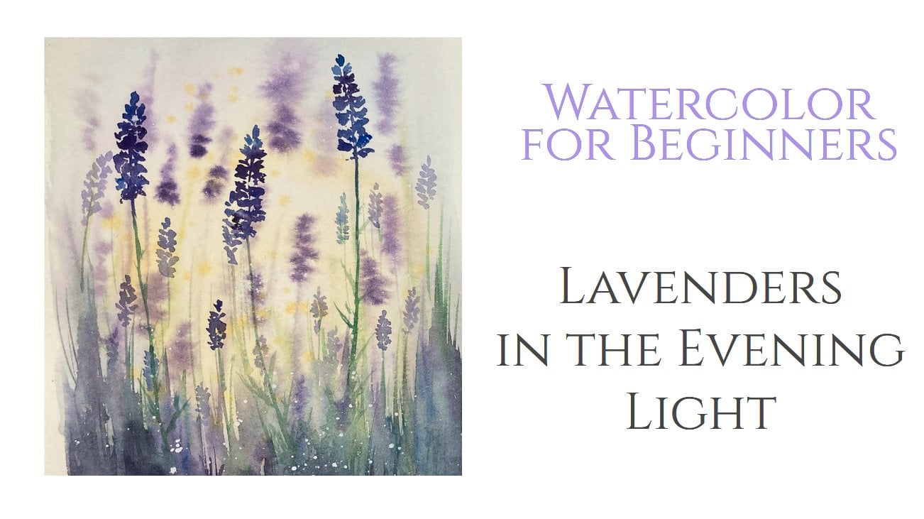
1. Welcome!: Hello friends and welcome. My name is Yana and I would
like to invite you to a watercolor class where we are going to be painting
some lovely, elegant the birch trees. I really love painting
birch trees because of their distinctive
black and white bark. And the leaves are
fresh green in the spring and summer
and the golden yellow. And ultimately, to create
a painting like this, we are going to talk about
some special techniques. First of all, we're going to use negative painting
technique for the bark, for the tree trunk. And another one is using masking fluid to create
highlights in watercolor. I believe these skills will come handy not only in this class, but also in other artworks we will be working
on in the future. If you are interested
in watercolor, you can also check
out my other classes. I have many classes on trees and on negative
painting technique. So you can give it a try. But now let's paint some
nice birch trees together.
2. Materials: This is what we need
for today's class. First, let me talk
about watercolor paper. You may know that
the best paper for watercolor is a
100% cotton paper. Some of the most expensive
and famous brands are Arches, Fabriano or Saunders Waterford. This kind of paper is also quite expensive as I mentioned, and I understand that
for the practice, not everyone is willing to spend $50 for a twelv
sheet, pad of paper. Nice alternative would
be something like this. I just recently discovered the Arches paper
that is 100% cotton, but the weight is lower. Usually I use 300 GSM, which means grams
per square meter, but this one is
thinner, only 180 GSM. I tested this paper and found
that it works really well. It is less expensive than
the 300 dress and kind of, but still does a
pretty good job. If you don't use like a really huge amounts of
water in your painting, you would not even
spot the difference. I truly recommend. Next, of course, some
watercolor paints. I have my good, I'll set
of White Nights paints, which I'm going to use today. Just a heads up. We will be using only four or five colors. So no worries, you don't need to have a big selection
like this one. Of course, some brushes. I have here, several brushes, some are bigger, some smaller. Basically, what you need
is irregular brush, maybe size eight or ten
or a mop brush size two. Then some thinner liner
brushes for the details, thin twigs and so on. I mentioned in the
introduction that we will be using a
masking fluids today. This is the brand I have. It is a French
brand, PBO or PEBO. I'm not sure how
to pronounce it. And to apply the fluid, I had to sacrifice one
of my cheap brushes. You can see that
the masking fluid created a sticky
film on the brush. I don t think I would ever
be able to get rid of it. So I recommend you use a really old otherwise
useless brush or maybe a wooden skewer
to apply the fluid. Or if you have your own
tips regarding this, let me know in the
discussion section. For the sketch, I have my
mechanical pencil and a rubber. This is my piece of cardboard. I use it to stretch
the paper on it, fix the paper to the board using the masking tape and this way prevent the
paper from curling. Another benefit is that
you will get these nice, neat wide edges
for your artwork. Last but not least, some paper towels and
a jar of clean water.
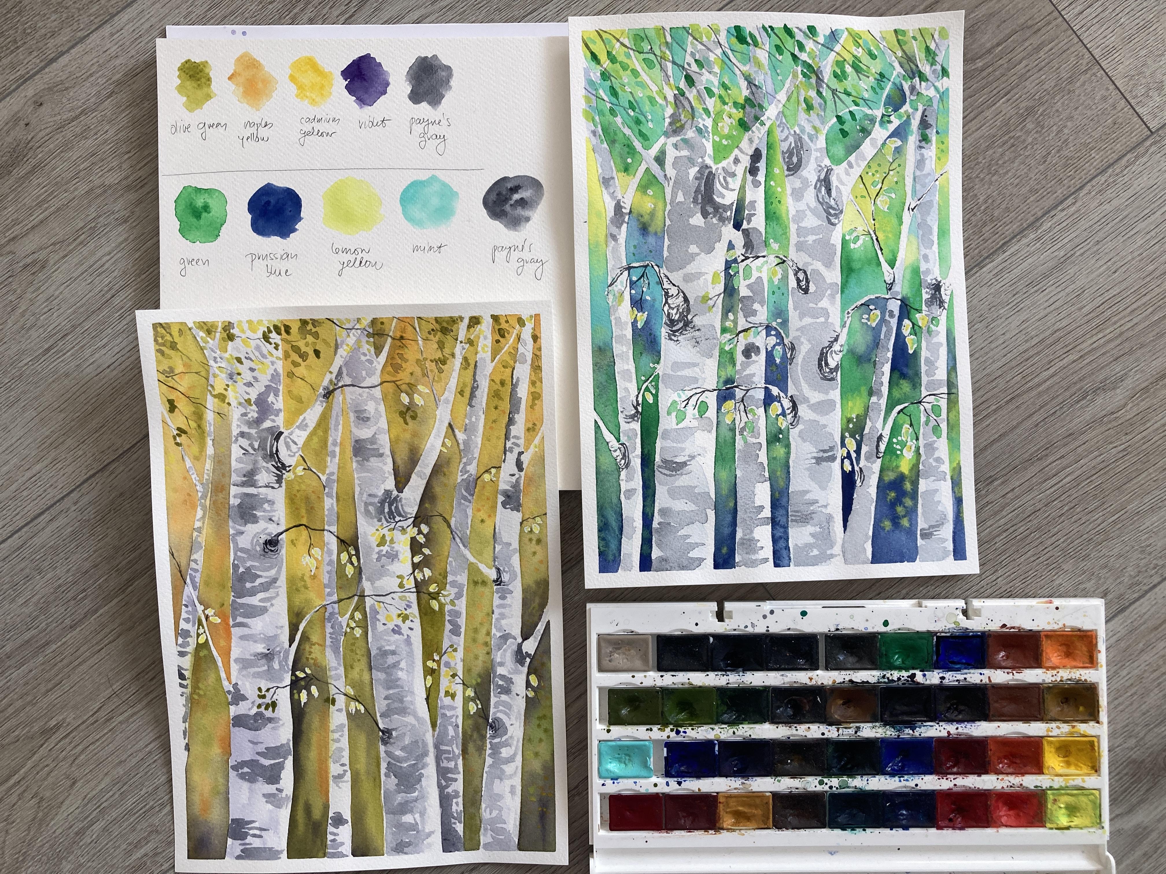
3. Choose Your Color Palette: Let's talk about the colors
for today's project. In the reference painting, I went for more often, autumn, nice color combination. You can see that the
dominant color is yellow. In fact, I have two different
yellow colors here. Naples yellow, which is something between
yellow and orange, and cadmium yellow, which is
a nice rich, warm yellow. And I combine these
tones with olive green. So again, a very warm color for the shadows and
additional contrast. I used violet. I love using this color
for nature paintings because it gives me the depth that I need for the artwork. Not to be looking flat
and for the texture on the tree trunks and
also for the tiny tweaks. I chose my favorite dark, which is Payne's gray. You can definitely go
with regular black. Maybe mix it with
a bit of violet or blue so that it's
more interesting. I rarely use black, but if it's what you like, you can absolutely go for it. This is to show you one color palettes
that I used before. But I would not like
to repeat myself. And for today's painting, I'm going to choose a
different color combination. This time. I want the painting
to have different vibe, something cooler, like an early Tuesday morning in the forest and the spring. So I'm going to choose cooler tones for the spring feeling I need some fresh green. This is a yellowish green
from my White Nights palette. I don't use it that
much because normally I prefer colors to that a
little bit more muted. But today it's going
to be perfect. Next for the darker parts of the background and
for the shades. Let's try some nice blue. I have here Prussian blue, which is one of my favorites. And to emphasize
the cold feeling and the pale morning light, I'm going to use
lemon yellow and meant both these colors
are nice and cool. For the details
and bark texture. I'm again choosing Payne's gray. Now this is my
palette for today. You are free to use your
own color combination. Maybe you want to go to
orange and red tones. You can even go crazy
with some pink, violet or neon colors. Everything is allowed. And if you choose some
unexpected color combination, make sure you share your
projects with the rest of us.
4. Class Project Part 1: Sketch the Trees: Before we start painting, let me fix my paper to the
cardboard with a masking tape. I do this all the
time because this way the manipulation with
the paper is easier. The paper does not backhoe, and in the end, I have a nice elegant White framing after removing the tape. So I make sure I stick
the tape to the paper straight and more or less the same on every side of the paper. Now it's time for
a quick sketch. This painting is not
going to be too detailed, so we do not need to draw
every tiny leaf or something. This drawing is going to help me see where to apply
the background color. As I mentioned, we're going to explore negative painting
technique today, meaning that we will
create the shape of the trees literally by painting the background
around them. This paper I have
here is size A4. That means 21 by 29 centimeters. So it's quite big. If you have smaller paper, you can draw as threes. I'm going to have like five or six of them
different sizes. Some of the trees are wider, some are pretty thin. And I'm also suggesting
the branches. First, the bigger ones. And then also these small, thin ones that will hold
some of the leaves. And I'm also
sketching the leaves, just a very simple oval shape. This painting is very intuitive
and not too detailed, which will give your artwork the feeling
of effortlessness. I'm always coming back to the reference painting to
show you the next steps. So now we need to make sure the leaves withdrew are
going to stay white. When painting, you can avoid the era of leaves to make it so. But it's easier to use
the masking fluid, especially when
you need to avoid many small areas
next to each other, like in our case. So I have my masking fluid here. I'm going to shake it and then using my poor old sticky brush, I'm applying the masking
fluid on the leaves. You can cover all the leaves
with the masking fluid, or you can leave out those
that are in front of the tree trunks because they are going to stay white anyway. That's the way I'm doing it. I'm covering just dose where there is a
background behind them. And for additional highlight, I make few drops here and there. And that's it for the preparation
phase of our project. Now before you start painting, make sure the masking
fluid is completely dry. Otherwise you could
ruin your brushes. So my trick is to put
it on the balcony where the sun dries it quickly or
I just wait a bit longer.
5. Class Project Part 2: Paint the Background: The masking fluid is dry now. It is still a bit sticky,
but that's normal. So we can now proceed
with the background. What I did in the
reference painting was that I used
the darker colors, violet and olive green, mostly in the lower
part of the painting, and the lighter colors, yellow tones, mostly
in the upper part. I did this to suggest
that there is less light coming from
the bottom of the scene. I'm going to do the same again. So the blue and green for the
bottom and the yellow and meant For the top of the
background, but not exclusively. I'm going to use a bit of
blue also for the upper part, and few yellow highlights
in the bottom as well. Does the majority of
colors should be dark in the lower part and light in
the upper part of the paper. For the texture of
the three trunks, I will use the
Payne's gray color. Okay, let's do it. Here's my mop brush size two, and I'm starting in
bottom-left corner. I'm painting the background, making sure I avoided the area of the
trunks and branches. I started with blue and
green and try to make the color transition
smooth by using NFA water thanks to
the 100% cotton paper, I do not need to rush
because the washes stay with long enough for me to create
this nice gradient effect. And coming back down there, dropping few bits of
the mint color to the dark blue wash.
For the texture. You can really play around with the colors in the background. I know I told you to use more dark colors and
the bottom part, but it is very much up to you
how you like your colors. No need to overthink it. You can see that you can freely paint over the masking
fluid and still, once we remove it, we will have some
nice highlights. Okay, I think I need
a smaller brush for these areas
between the branches. And now I'm moving
downwards again, switching between colors,
avoiding the branches. Sometimes I come
back to the wash. I just painted with a drop of different color to make it more colorful fluid and I don't want the
background to look flat. What I like about painting like this is that you can
paint it doesn't times using different
color combinations and still it will give you a different vibe,
different fields. The reference photo I showed you reminds me of an early autumn. This one is cooler like
a fresh spring morning. Is just so versatile and fun. Don't forget to
change the water in the jar if it seems too dirty, otherwise, it could pollute your colors and make
them look muddy. Very nice. The
background is done. We can move to the
three stem cells.
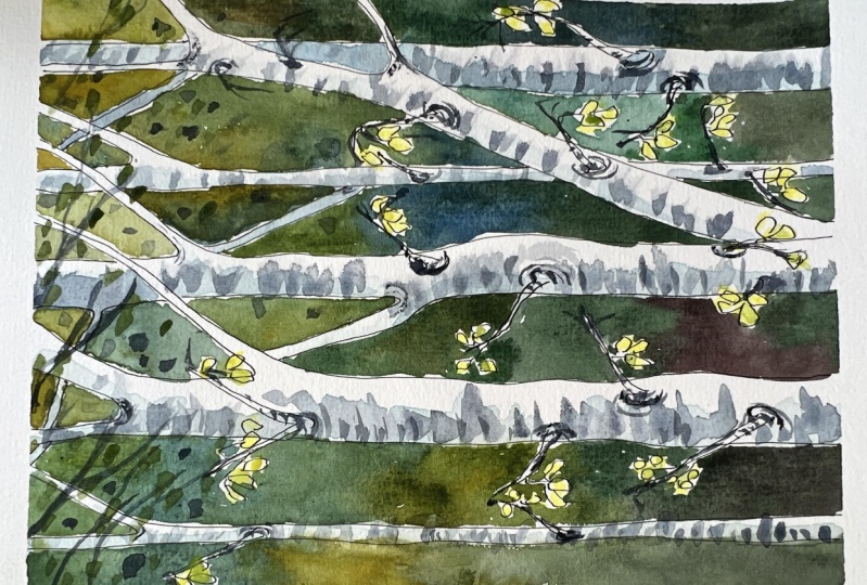
6. Class Project Part 3: Add the Details: We have already
created arteries by defining their shapes when
painting the background, that is the negative
painting technique, using the negative space, space around the object to
define the object itself. But right now, our trees are just blank areas and
they look very flat. So to make them look
more three-dimensional, we need to add some shading. In the reference painting. I used a light mix of violet
to create this shading. In today's painting,
I'm going to use the same blue as
for the background, but really watered down. So it is light and does not make arteries merge
into the background. I'm applying this
light blue color on the left side of the tracks. That will give us
the feeling that the light is coming
from the right side. Now we need to pay special
attention to these spots over the trunks and branches
are crossing each other. We need to create
the illusion that the one branch is in
front of the other. So the branch that is
behind appears darker. Again, I'm using very light
mix of the blue color. Be careful do not
go too dark here. And I'm painting the trunks and branches that
are in the bag. Making the branches to
that in the front pop up. Soften the edges of the darker spots using
just a clean water. Now let's your three is
dry and while we wait, let's see how we will create the dark texture
on the whitebark. First thing to say is
sure there are dark, almost black spots on
a birch tree trunk. But we do not want to go the dark because we
don't want to lose this feeling of why threes stepping out from
the dark background. That's why I'm using just a
light mix of Payne's gray, really light to
create these areas. I'm also using the
mop brush because I want these areas to
be just a suggestion. I don't want to make
the trunks too busy. They would distract
the viewer from the fine details
of tiny twigs and leaves that we are
going to create lighter with my big mop brush. I'm just drawing simple, short horizontal
lines on each shrunk. And in the places where there's a branch growing
out of the trunk, I said just a round shape. As the dark bark embraces the place where the trunk
and the branches connect. It is really just this. At this point, no
details are needed. The tiny details, dogs and
highlights that would bring our artwork to life are coming after the layer of
light gray dries. My threes are already
dry so I can continue. I have my liner brush that would allow me to draw a fine lines. I'm using, again,
the Payne's gray, but much darker this time. And what I'm doing is that
I'm working on the branches, emphasizing how do we
are joined to the trunk, extending them, adding more tiny tweaks on which the leaves
will be hanging. Now I want to add more twigs and leaves hanging
down from above, giving me the
feeling of standing under a green roof of trees. And I would also like them to
move in the same direction. That would create
the illusion of a wind moving them the same way. So all my tricks are
pointing to the right. And now the time comes
to remove the masking fluid because we wants to reveal the white
spots underneath. Different people use different
tricks how to do it? But what I do is
that I take a bit of plastic sticky tape and I read my index finger in
it just like this. And now I just rub the
masking fluid of the paper, the plastic surface of the tape, and the gummy surface of
the fluid creates traction. The dual helped me remove
the masking fluid. Any plastic would work. I tried clink foil
and it was okay. One time I even remove the masking tape with a
candy wrapped in a foil. But it's best to use
transparent plastic tape or foil to avoid any color
marks from the foil. Nice, the tiny spots
are visible popping up. So we don't want
to cover them with some dark color and
lose the highlight. That's why I'm using yellow
color and I'm not even painting the whole shape
of the leaf just a bit, leaving out some of the white. For the leaves that are in
front of the white trunks, you can use darker colors like green to make them visible. You can add few dots
here and there. Those can be the leaves in
the distance or out-of-focus. And now let's add some leaves to the branches peeking
out from above. And let's make them
pointing right, just like the
branches to emphasize the idea of wind
playing with them. You can see that the leaves are just simple shapes created by just a one shot
the brush stroke. You can add as many
leaves as you want. Switch between colors. And once you are satisfied, you can remove the masking tape. Good job.
7. Thank You For Joining!: Friends, I hope you
liked this class. I certainly had a lot of fun. The first time I was
shooting this tutorial, I managed to run out
of the storage space in my phone and ILOs
significant portion of it. So it has to do it over. But it was so much fun
that I didn't even mind. What I like about a
class is like This. Is it, that it's not
only about teaching one particular skill or one
particular thing to paint, but rather about exploring
new color combinations. Practicing the brush control, and trying new techniques that may be handy in the future. If you like the class or
if you have any comments, please let me know. Use the project section
to upload your projects. It is always such a pleasure
to see your paintings. And also feel free to check
out my other classes. See you there. Bye.
 Jana Raninis, watercolorist