Transcripts
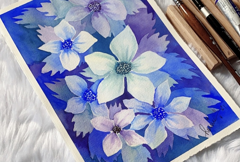
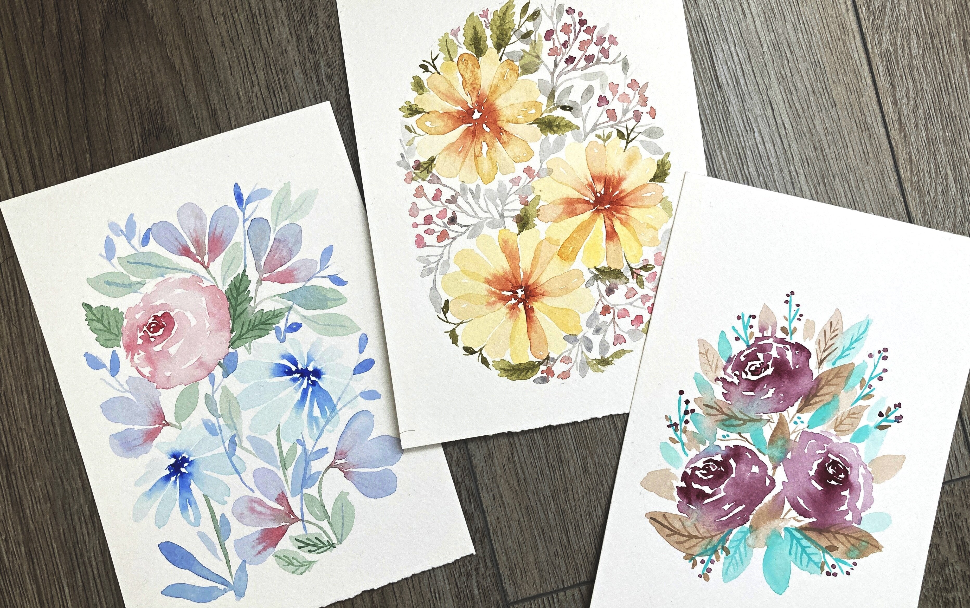
1. Introduction: Hello friends. Yana is back with another watercolor class. Spring is finally here, at least here in the northern hemisphere. And whether it's getting warmer and we already see some flowers blooming in the gardens. And in time like this, I'm usually very much inspired to paint florals. I believe there is no better medium to spend dreamy florals than watercolor for its chancellor and translucent finish. And I couldn't really decide which technique to use for this class. But after all, I decided to go for negative painting technique. This technique is very important, especially in watercolor. We will talk about it later. So if you never heard about negative painting technique or you have never tried it, this God is just for you. As a class project, we are going to paint something like this. Nice, dreamy, modern watercolor florals. You can turn this into a greeting card if you make it smaller, or you can frame it and give it to someone as a gift. Or you can just keep it in your sketch book, as I did guys, this is one of my favorite techniques to paint florals in watercolor. So I really cannot wait to share my process with you. So let's get to it.
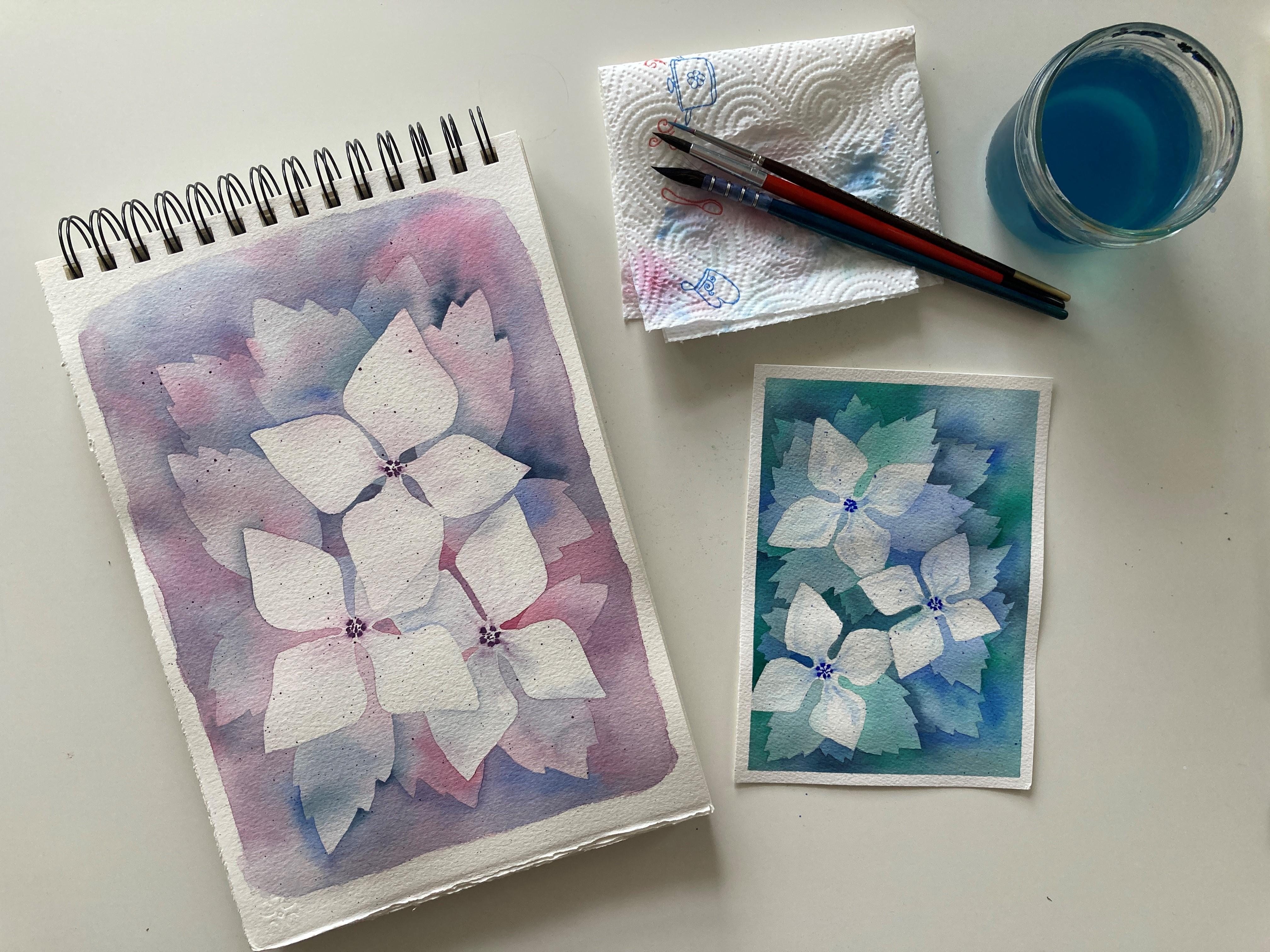
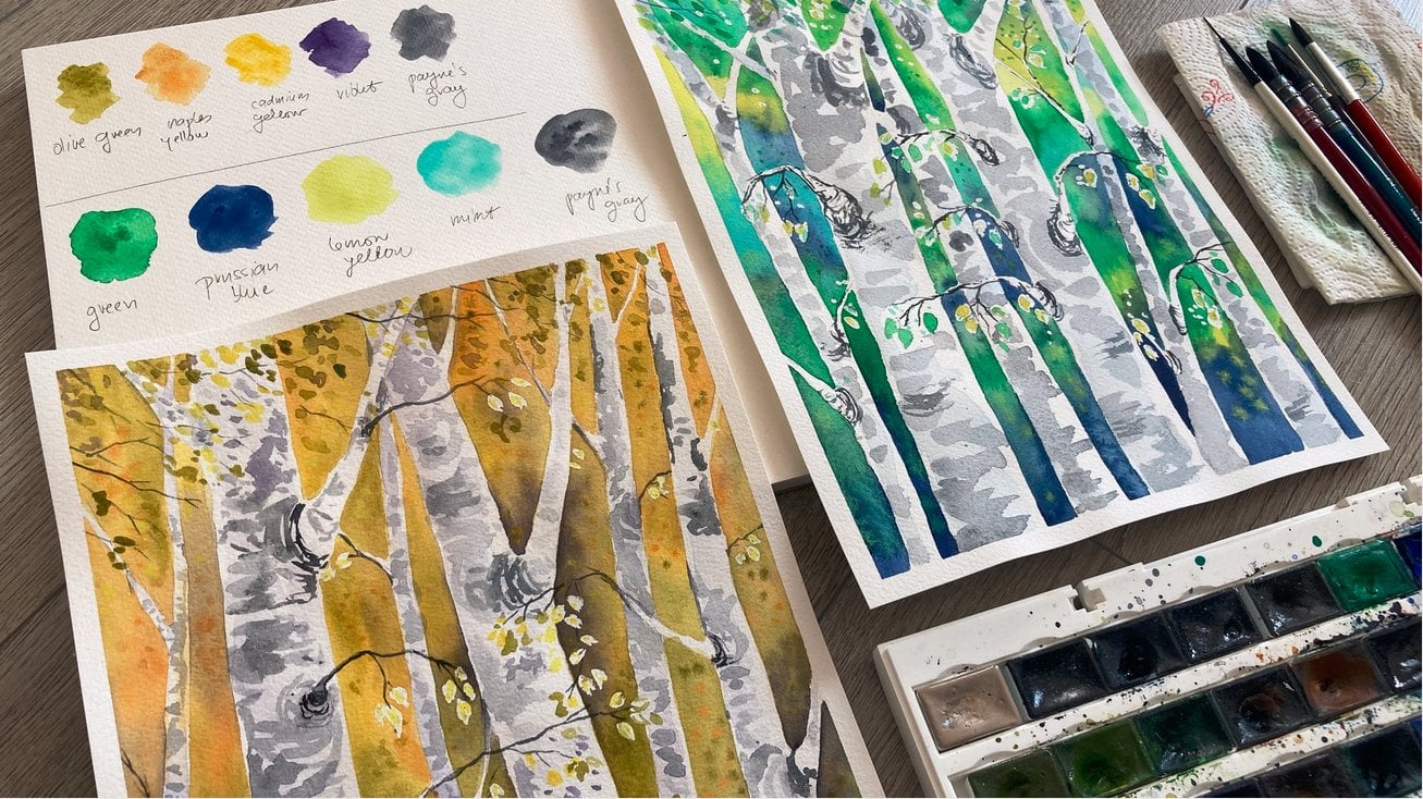
2. Materials: As for the materials, here is what do you need for this class? I have my watercolor set. This is a wide night said I always use. I have watercolor paper. This one is Arches cold press watercolor paper. And here I would like to talk a little bit more. Usually I tell you that for sketching and experimenting, you do not need expensive paper. But the truth is, sometimes you just won't get the same result working on cheap paper as you would if you had good quality paper instead. This one is one of those cases. I'm using arches, 100 percent cotton paper, coastal paper is the best for watercolor for its ability to dry evenly and stay down longer. So you have more time to work with the pigments still wet and alive on the paper. For this technique, we need nice smooth washes and we also need the paper which holds the pigment so that we don't accidentally pick up the underneath layer when applying another one on top of the first one. So one good advice for you. If you struggled with watercolor and you do everything right according to the tutorials, et cetera. And your results are still not satisfactory to i bit of paper, a 100 percent cotton paper, and you will see the difference. I promise I've been there. So I have arches here for this class. I cut it into smaller pieces. But I also have Claire Fontane, a 100 percent cotton paper, Saunders Waterford, and one of the more affordable Paul Rubens watercolor paper, also a 100 percent cotton. If you don't have this kind of paper right now, that's okay. You can work with anything you have. But just in case you see some weird backgrounds, awkward watermarks as the pigment drys or you notice your color transitions are not smooth and seamless. Maybe your papers fault. Okay, back to the materials I have here, of course, some brushes. I have one bigger and one smaller jar of clean water and paper towel to clean my brushes or correct some accidents. I like to faster than my paper to a hard board with a masking tape. So I have this here as well. And for the sketching part of the class, I have just a regular sketching paths and a pencil. And that's it.
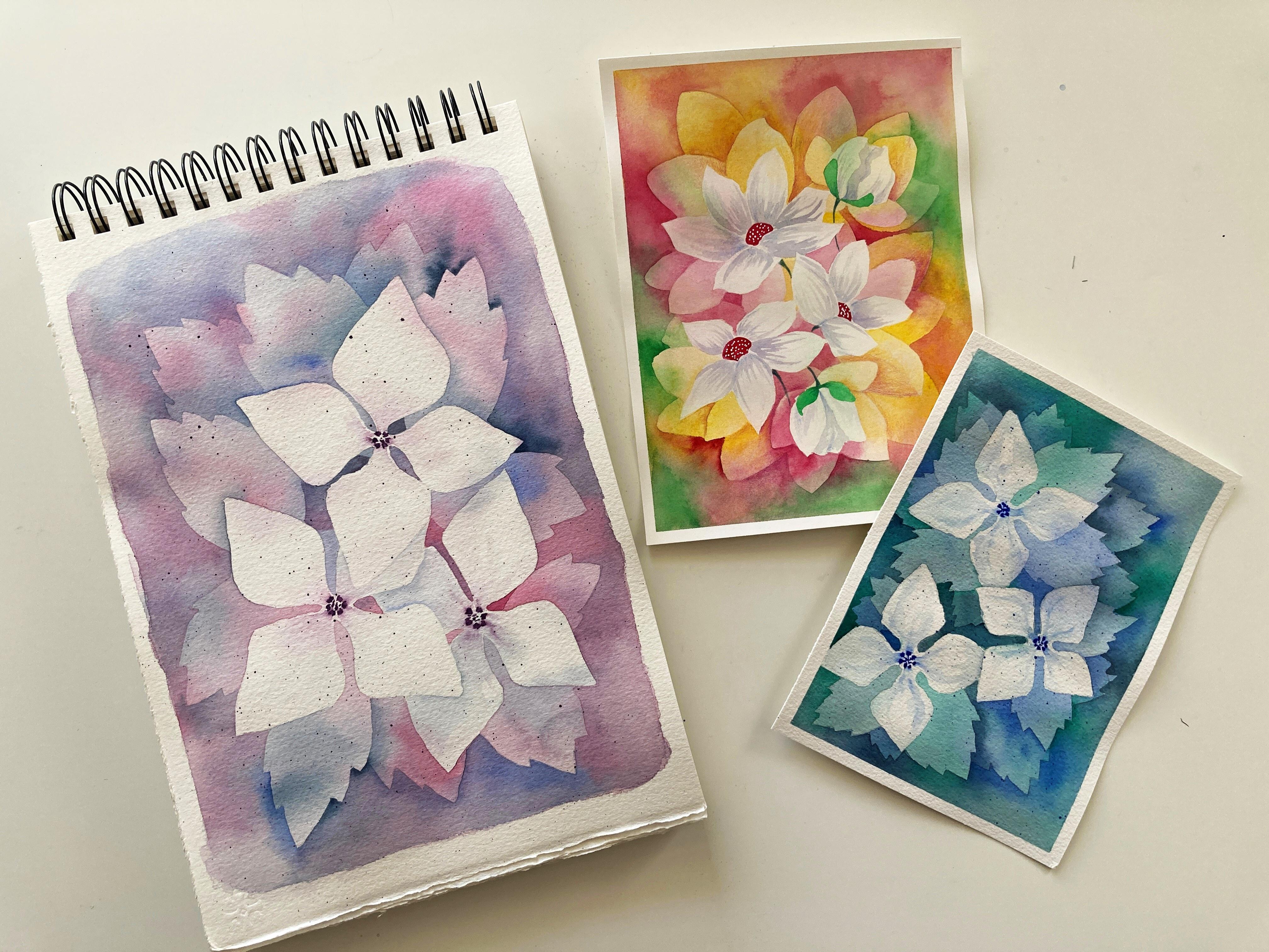
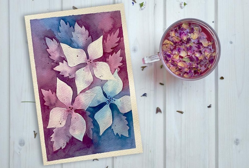
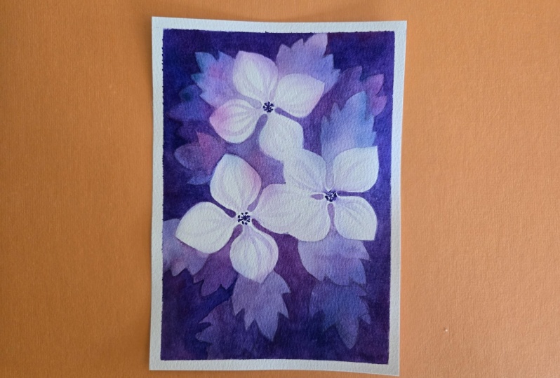
3. Choose Your Color Palette: The title of this class says dreamy watercolor florals. So we will choose color palettes that is not too harsh, not too busy, and not too disturbing to get this harmonious look of our painting. This painting I have here feels very harmonious and calming to me because of this blue and purple tones going lovely together. If you're not sure which colors to choose to make your painting harmonious, color wheel is a great thing to help you with that. Here I have some basic color wheel. You can see here which colors are primary, that's yellow, red, and blue. And colors we get mixing these primary colors together, like orange color that we get when we're mixing yellow and red together. It also shows you harmonious or analogous in this case, and complimentary or contrast colors. In my case here I chose shades of blue and purple. So I'm in the analogous area and my painting feels very harmonious. If you want to add more life or contrast, you can choose two colors that are similar or analogous, and one more that is complimentary to them. That would be the split complimentary chart here. And you can see that this painting here is a little bit more, let's say energetic. We have tons of red, green and yellow. Red and green are complimentary colors, so they are contrasting and yellow is pretty harmonious with green. So you can also try it this way. There is very much to tell about the color theory, but I'm not going to go any farther today. You can check the color wheel and choose colors for your painting. Or you can just use your favorite colors. That's also okay. If you're not sure, you can paint some swatches on a spare paper to see how the colors look side by side. I'm also doing it right now. The first three are of colors is something very similar to what we saw in this example. So tones of blue and some red. This is something that always work. So if you're not sure what color combination to choose, go for this one. But today I would like to try something new. I don't want to repeat myself. So how about some emerald green, indigo and sandal? Maybe ultra marine or Prussian blue. Emerald green is a bluish green, indigo is dark blue, and ultramarine is vivid, light blue. So these three should go nicely together. I think I'm going for this one. But just to show you something else, still a, Let's move to some reddish and the yellowish tones. So I'm going to combine orange color. This is cadmium red light actually Naples yellow and finishing in red. This is again, some very nice harmonious combination, but I'm looking for some cool tones today. Take your time, guys, play around with these colors. Use the color wheel for inspiration. And once you are ready, we can talk about the shapes of our florals.
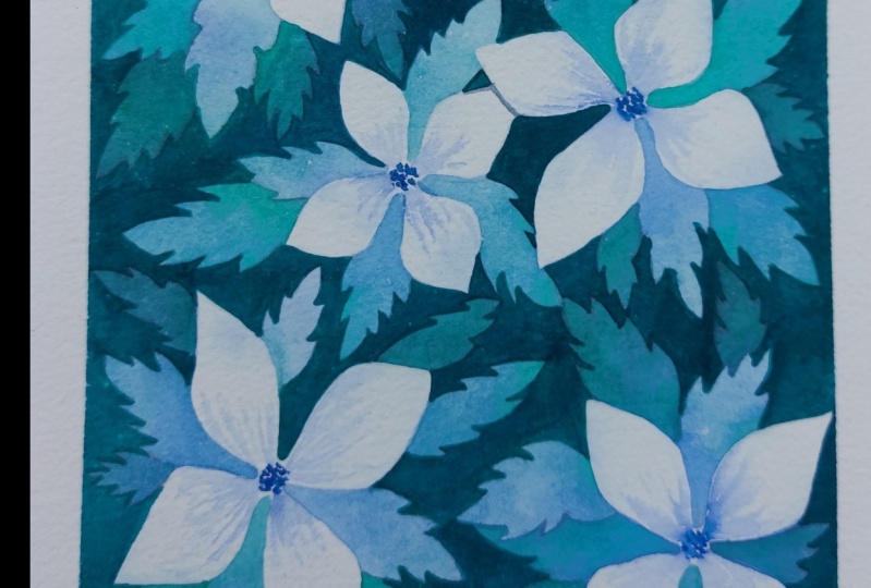
4. Floral Shapes: Negative painting technique we are going to explore today takes a little bit more effort and control as we are going to see in the next chapter. And that's why I want to choose simple shapes when painting this way today I want to paint some flowers and leaves, and I want them to be similar to what we see in the example I'm showing you now. You can see that my flowers here have for diamond shaped petals, very simple shapes. So let's give something like that. It always helps to sketch some leading lines, something like a skeleton that will guide you. I have four petals, so I want for central lines, but basically it's just two intersecting lines, like across. And I want to sketch the inside of the flower as well. Now, I want to draw my petals, and I don't want them to be too strict. I want them look a bit natural, the corners and tips around it. And I also want to have some gap between them. And I want this gap to be a little bit wider, closer to the center of the flower and then getting thinner as the vessels almost touch each other. This is the easiest flower. You can absolutely dry flower with more petals, like five or six. In that case, you would again draw some leading lines and the center, and then sketch the diamond shaped petals, just like we did in the first case. But if you are a beginner, I recommend you to go for the four petaled flower. After you finish the flower outline, do not forget to erase the inner helping lines. As for the leaves, you can see that in this example here, the edge of the leaf is not smooth, but we have these little points here. You can sketch a simple leaf and add points afterwards. Or you can try drawing the point to leave right away. It's quite simple shape, so I'm sure all of you can do it. This pointy leaves are easy to draw and paint in watercolor. And they also go nicely together with our gentle smooth flower petals. There is a nice contrast between the petals and leaves. And it's easy to tell right away. Okay, this is Aleve and this is a battle. In the final painting.
5. Negative Painting Technique: As I mentioned in the introduction, negative painting technique is something that you need to know if you wanted to master watercolour medium. But first, what is a negative and positive space? Let's draw ourselves a simple little apple here. In this drawing, the apple shape, the apple itself is what we call a positive space. What is around the apple is called negative space. So maybe you suspect now that negative painting technique has something to do with this negative space that is around our objects. So let's say I want to paint a little heart. What we usually do is that we outlined the object and then fill it with color. So we use the positive space to portray our object. If you want to use negative painting technique, you would need to fill the surrounding of the object with color. So what remains blank is actually our heart. And we have the red color around the heart defining our shape. Maybe you think using positive space is so much more straightforward and easy. So why would anyone bother to use negative painting technique? This technique is so important in watercolor because if you want to paint a wide hard on a red background, there is no other way to do it, then use the negative space. Watercolor is transparent medium and there is no way to put highlights or lighter tones on top of diagnoses. So you, let's say wants to paint white clouds on blue sky. You need to paint blue around the clouds to make it possible. The only white we have in watercolor is actually the white of the paper. It does not have to be only pure white you use to paint your objects. You can build up the painting using darker and darker tones. In this illustration here, the bandy was painted live in his very wide. And for the leaves and grasses, I painted the background light green and yellow, and then use the darker tones to bend the negative space around them. Also the white dots on the back and the highlights on the rose hips that I just left that little arrows out when I was painting around them. One important thing to mention, your paper has to be driving your start applying your layers. Otherwise, you won't get these nice sharp edges. I love this technique guys. Yes, it takes more time, but it also gives you quite a good amount of control because you work wet on dry most of the time. And it looks very good. So as thrives together.
6. Class Project: For the class project, we are going to paint lovely, gentle watercolor florals using negative painting technique. I have here my watercolor paper. This one is 15 by 20 centimeters, and I'm going to use this masking tape to fix it to the artboard. This will prevent the paper from curling as it gets wet. And it will also give me nice white edges after removing the tape. Now I'm going to sketch my flowers. I want to have three flowers and some leaves peeking from behind these flowers, but we are going to draw the leaves later. It's good to have an odd number of the main objects like 1, 3, or five. It is just for some reason more pleasing to the eye. That's why I wants to have three flowers in my painting. But of course you can choose less or more depending on the size of your paper and your preferences. So I'm drawing these crosses here, three crosses for three flowers. And I'm going to draw these petals just like I did in the exercise chapter. Sorry about the white balance issue. You can see that my paper suddenly looks yellow. I did not notice when I was recording. Okay. Take your time. Correct your lines. If you are not satisfied with the shape of the petals, and once you are satisfied, please erase the helping lines inside the flowers. I forgot to do it. And I applied first layer of color over them and then it was really hard, almost impossible to get rid of them. So don't forget. See, I just went over the lines slightly to make the drawing less visible, but I did not erase the crosses my bed. Okay. Now that you have your flowers ready and you're helping lines erased, take your big brush, clean water, and a wet your paper to roughly loaded with water. This is going to be the first layer of the paint and the color of our flowers. Once you have the paper wet, mix yourself, a nice light mix of your chosen colors. I have emerald green, ultramarine blue, and indigo. And using your big brush, apply these light colors on your paper randomly. I deliberately avoid the area where my petals are because I want them to stand out and stay light, as light as possible. But as we work wet on wet, the colors are running on the paper and there are some spots on the flowers where I have some pigment, but that's okay. And when it dries, it's going to be much lighter and more subtle. So don't worry if your colors ran into our petals here and there. Now my first layer is ready and before we continue, the paper must dry completely. So take a short break, make yourself a nice snag or a cup of tea. And if you are impatient, you can help the drying process using your old good hairdryer. My paper is dry now and here is where the found begins. I can see the battles I drew. And what I'm going to do is I'm going to use the same colors as I did for the first layer. Just make them a little bit darker and paint around the petals. Here I'm using ultramarine blue. See how my drawing leads me. I am painting the background for my flowers actually. And the note, the day you don't fold the blue pigment all the way to the edges of the paper. Once I have my petal defined visibly, I use just clean water and I smaller than the BU era until it's transparent. I don't want any hard edges in my background. I want my colors to sewage smoothly and I want to preserve the SAS brand look. Therefore, once I have my shape formed, I use lighter mix or just a water to create this gradient. Look from blue to transparent. I switch between colors. I make them blend naturally on the paper because I use quite a lot of water. One good advice, as you paint the background, you apply the color and the new normally have two directions to work. So I'd say here I'll go downwards from where I first started with that ultramarine blue. As we want smooth color blends in our background. Make sure you smooth and the other side of background blurry or not working on it. Don't let it dry into a hard sharp edge. Just use clean water and spread the pigment until transparent. You will come back to that part later. Here I come back to the right part of the paper. And you can see there's a big area in the corner. I don't want any dark pigment there yet, so I just apply water and do some color only to define the petals. This big men who around nicely into divid area in the corner and create beautiful natural color gradient. The key really is to use enough water here, cotton paper can hold the water longer and gives you more time to work. Because you can create these nice cool transition and gradients on a veneer of paper is wet enough. You can see that I switched my brushes. I need my smaller brush because I have smaller areas to paint. Once you're done with this layer, all our flowers are nicely formed and visible. To lead your paper dry again before we continue. Now our paper is dry again and I can draw some leaves. Remember that we want to have some nice, interesting pointy leaves to contrast with our simple puzzles. You can see that I did the same in this painting. I will use my pencil to draw some leaves peeking out from behind the flowers. It's up to you very wants to have your leaves, but leave some space between them. We will fill these gaps with another layer of leaves later. Similar to what we did before, I make myself my chosen colors and a bit richer concentration. And I'm going to paint around the leaves and around the petals, make sure you don't go too dark. Now, there will be one more layer. I am again using a lot of water and switching between colors. I'm using clean water to spread the pigment smoothly towards the edges of the paper. Although my painting to be too dark, you can see how the leaf stand out a venue band around them darker than the flowers, but still apply the colors around them. Nicely visible light. The second eggnog give you the depth. That is hard to achieve. Other way, a lot of color. Okay. Hi. Hi. And when you are done with this layer, let the painting dragon and we're going to add some more leaves next. Our painting is dry. You can see that I did not manage to completely get rid of those unfortunate helping lines. I tried to erase them but it's hard after apply color or even a water over them. But never mind, or at least you can learn from my mistakes. I am again drawing some leaves. I put them between those I already have our anywhere I feel they will look good. And you already know what to do. Makes our self your colors. Again, I love it darker and paint around your leaves. Say this is why it's important to have the paper that Bill the already dried pigment enough to glaze over and underneath the pigment out. Okay. Okay, we have this lighter completed and I think it's enough for me. If you still have some space that needs filling up, feel free to add more layers of leaves, but I'm now going to play a bit with my flowers again. You can see in the example painting here that the flowers have tiny dots in the center. I'm going to do the same in our project. Choose one of your colors. I choose ultramarine blue and mix a darker tone of it. And with a small brush paint, few dots in the center of each flower. Let it dry a bit and those are still a bit wet. Go in with a wet brush and pull the pigment towards the petals. This way you'll give your flowers, I love it. Hey, look. If you're already or you need a little bit more color than simply mix yourself a nice light shade of your color and deals that and did it as well. And now if we have some overlap and vessels like I do here, you want to play with the shading. I have a loud mix of indigo color and I will apply this on the lower petal about it stand out and visualizer. Then again, using clean water, I spread the color so that it fades nicely. How are you doing, guys? I'm sure your paintings are already beautiful, but I'm going to add one more finishing touch. You can see it also here, these tiny dots sprinkled over the painting. If you don't want to, you don't have to do this. But I like it because it gives me more texture. So if you want to try this, what do you need to do is you simply take your brush loaded with quite a watery but still rich color mix. And I'm again using ultramarine blue. And once my brush is holding enough paint, using my second brush, I'm tapping against the brush loaded with paint, and I spit her to paint over the painting. Mistakes are deliberate practice though. So if you're not sure, please try first on some scrap paper. You need to learn how hard to tap to get drops unit. But once you know how to do it, it's really fun. And it's done, guys. You can see how lovely painting you can accomplish using just three colors. Now my favorite part, removing the masking tape. Careful some masking tapes can tear the paper. And look how lovely this is. I'm very satisfied with the result. And how about you guys? Please share your paintings in the project section, I can't wait to see your projects and your color choices.
7. Final Thoughts: Guys, as always, thank you for being here with me. It's always a pleasure. I hope you had fun and realize a bit. Because after all, that is why we all love art. If you want to feel free to share your projects in the project section for me and your classmates to see and get inspired. And also, please leave your feedback and you can also check out my other classes here on Skillshare. And that is all for today. Take care, stay safe.
 Jana Raninis, watercolorist