Transcripts
1. Intro: Hi everyone. My name is Aaron on up in mining town
with her color. If we are approaching Christmas, which is a very busy
period of the year. And so we haven't gotten maybe so much time
for painting bad. At the same time. It's something that
we can take as an occasion for practicing
a little bit of watercolor, especially if you
want to paint e.g. a. Christmas dots for
our relatives, Brian, so our beloved ones. And to me, it's a very, very good opportunity
if I want to paint and to practice a little bit
off the colors of winter. And this is why I am just
wanted to share with you these glass in which
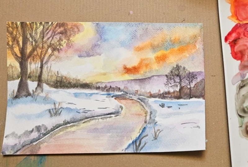
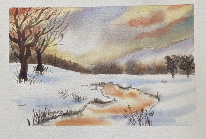
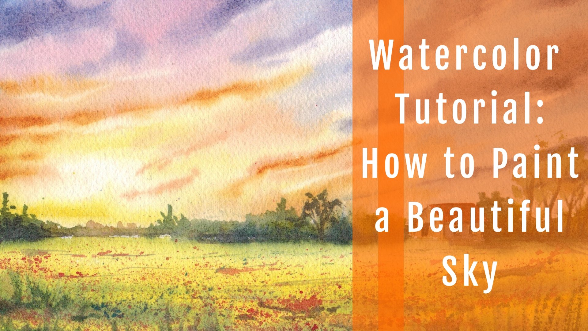
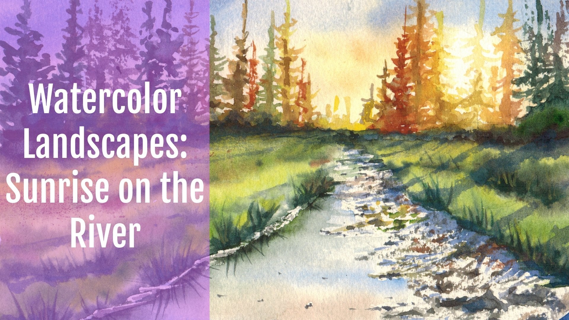
we are going to think that these Christmas card, it's a very simple landscape. We have a lot of
elements anyway, like the saucer two, we have a trees, we have the reflection of water, and of course we have snow. And also very quick. So you can generalize this
painting in less than 45 min. So if you're ready and you're looking for something
nice to buy into, even be spheroid of the year, which is a very cold, at least here in Italy. Grab your rashes, your favorite, and of course your colors. And let's do this.
2. The project part 1 : Okay, So we're ready to
start with a drawing, which is very simple. We will keep it
really, really simple. We will start from
more or less from the middle of our paper. And we will trace the distant hills and the
horizon line more or less, as I told you before, in cutting the paper into and maybe the lower parties that are less than
a half, we are not. Now I'm tracing the
river bank of the river. And you see it's sort of like an S more or less the
river banks are not straight, so try to create a very
not a perfect line. Now, we are adding the trees. We have trees on the left and on the right
side of the river. The shape is really,
really simple. Keep it really loose, jaw Stata, few branches as a guidance. Just to remind you where
you will have branches. Now, I'm adding a little
bit off distant trees, bushes or something like
but something like it, yeah, the distant woods. Then we have also distance here, which is very helpful to create
a little bit of contrast. So here is the base
of the reverse. We can add a little
bit of graphs, so we'd coming out
from the snow. And we have also a little bit of distant bushes also
on the right side. And let's add a little bit of trees also here in this way. And as you see, I'm dressing
just a very simple lines to remind me where I
want to place my trees. And as always, I'm using up to B pencil because I want you to see very well what I'm drawing, but feel free to use
something lighter or to rub, but you are drawing a little bit before
starting to pay because otherwise the pencil
will be a little bit too evident under
your paintings. So we're done with the week. The drill way you can i
elements if you want. And now we're ready
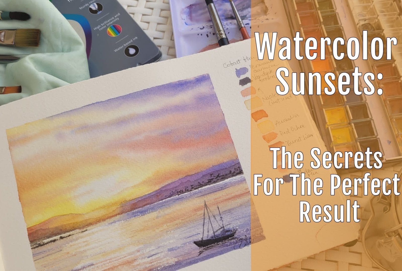
to mix the colors, which are very, very,
very few callers. We are going to use a
very limited palette in this way to get a
very nice result. So mainly I will be
using cobalt blue, sorry, cold blue, which
is a very bright one. It's Pb 28 pigment. And I would often
very well my brush because I'm going to
take my go-to yellow, which is Arial in arginine, is very bright and
full of light. And now you can use all
superior Laurent e.g. like the one that
I'm using here. If you want an orange ready. Otherwise you can
use real smarter. We choose a color and mix that
with the orderly together. Very nice. Orange as well. And we are almost done
because we wouldn't get also some grace or chocolatey brown mixing cobalt blue
and pyrrole orange. Or you can stick to a more
classic combination, e.g. that I will show
you in a minute. This combination is my tried and true one
which is burnt sienna. And this is my burnt sienna. I love where sienna and
cobalt blue together. So you get all the possible
shapes from brown to gray to dark brown according to their proportion of the two
pigments that you're using. And it's something really, really nice because
the colors also granulocytes and Chip
rate is in separate also on the paper. And this creates a
very nice effect. So here we are. We've got all of the colors
that I'm going to use. I'll sorry. We will be using a bit of purple made with cobalt blue
and rose matter. As you see, it's a
very vibrant purple. Now I'm mixing a
little bit more color because the one that I prepared, Is it a bit to lead to
eat won't be enough. Okay. So if you
haven't got arguing, then you can stop that. We're very lucky I know that you have in your
palate. It doesn't matter. It can be cognitive yellow. There. Very nice one. And now I will mix also
originated with a little bit of rose madder to create
a very vibrant orange. You can get a very
nice orange mixing also are eolian or your
Gallo with burnt sienna. Eat some more of Boston orange. Very nice and subtle shade, which is very nice. And you can use that
for your rating. So now we're going
to wait in this area that I'm indicating just right now with the tip of my brush. So we have the sun
with the widest white, so we will leave this area wide. We are not going to
pay that why we wet all the surrounding areas. If you want, you can leave
this area dry so that you are sure that the
colors Go on one cover, that part of the paper. I will be painting
all the surface because they want to have very nice and soft and
diffusion of the color, which is something
that I really, really like because in
this way I'm sure that I will have no harsh
lines in the sky, which is something
that I don't like. But if you want to be safe, leave this area dry. I am spreading water until the heels level that the horizon level more
or less because I, um, don't want to have the the corner going below the
the distance heals better. So it's a sort of
insurance that I take. Now LK, I'm using round brushes, squirrel butter,
any synthetic brush we will be, will be okay. As always, we will start
with the lighter tones. In this case, we're
starting with yellow. And I will add then
my orange juice. I'm using the oranges
that I prepared. You can use whatever
orangey like you can add also rose matter as it is if you want to let the color
mix on your paper. And we are tracing very simple shapes for
the, for the clouds. Use the tip of your
brush to paint small clouds towards the horizon to increase the
error perspective. And now I'm using a smaller
brush and also clean one because I'm
introducing cobalt blue. So as you see, cobalt blue is very
close to yellow. We don't want blue and yellow to mix because we will end with something
written in our sky. So I'm adding purple. If you have areas of yellow sky and you want
to be safe and sure. When you are painting on purple or orange nose to the cobalt blue or
the blue pigments, e.g. identity can be
French ultramarine. In this way, if the blue mixes with orange
juice or peripheral, you will get a very nice brown. The shaver we just shade. So sorry, which is
something that it happens to be in nature. So you will be also sure
that you won't have any gray and green
pigment in your style. Maybe something
gray which is fine, something wrong which is
fine but not great at all. And as you can see, cool blue is granulating. You can increase now. You can encourage the movement
of the clouds as you like. You can work as long
as the paper is wet. If it starts to dry, you need to stop. And this is why
it's important to work out the bounds to when you are painting wet on
wet like in this way, sorry, I'm really
become sick girl. And so when you're
painting wet on wet, you'd need to take into
consideration two things. One is that you need to prepare enough color
because if you start to make some
more colors in the winter time and your
paper is going to dry. And I'll also the
fact that the ear, if you mix pigments
and you think that they are a little bit
too strong on your palate, you need to think
of the fact that once that they will be dry, they will dry painters. So it will be shade, a shape wishes, sorry, a shade which is 25, 30% lighter than the
one that you are looking at just right now in your palette with fresh color. So you will have a very nice and dramatic
contrast in the sky, which will give a little bit of contrast and ran our
typical of a sunset. And don't be afraid
to use bold colors. Because they will be paler. So you are probably
working in a safe range. Even if you don't think to. Maybe just right now
because the paper is wet and the colors are
still really, really bright. So now I'm abiding and a little bit of
time because I want the sky to dry a
little bit because we need to put in the
flower bushes. And I don't want the color to run nightmare in the
middle of the sky. So because I want to avoid this, you can do also
two other things. One is to incline the board, which is really useful. And the other one is to make
a dance wash to apply in the in the area where we are going to
pay the distant bushes. So I'm mixing cobalt
blue and burnt sienna, and I will get this gray. You can add a little
bit more burnt sienna to have it more of a brown. Or you cannot also a touch of
rosemary if you like that, or of orange, of pyrrole orange, which is an optional color. Now we are putting the
color is, so as you see, the paper has started to dry, so the color is diffusing, but not too much. Before attempting these fly in a very small area
of your painting. And if you see that
the color flows too quickly and it reaches
half of your sky, stop and wait maybe for a minute or maybe some
a little bit more. And because we don't want
the color to flow to the, made it off the sky because the fire whooshes needs to stay. It's the right height behind and they are not
part of the clouds. So you can, as you see, the co, cobalt blue is
granulating on paper, which is something
really precious because it would give a little
bit of texture. Now, I'm adding it with this purple color that I painted before and adding the
distant hills and I will soften the lower part with a little bit of clean
water so that we give the ADL. So Butoh bit of mist of
distant mist and now wetting, increasing the contrast
in the upper part. And then softening. And I will add also the self and also the base
of these distant bushes. And now adding the distant
bushes also on the right side. So as you see, they
are spreading from the base towards the upper
part of the distant hill. As you see, you
can add a darker, darker shade of gray, but you can also add the
pure pigment of color. As I'm doing here. You can add cold
knew as a change. You can add burnt
sienna as it is. And in this way, the color. You will learn a little
bit more of an interest in your distant trees
and bushes at wishes, something that really exist
in nature because they had, they haven't got just one color. They are made of
different colors as well. You can also increase the tone because there's just told you before we
are working wet on wet. So if you need that, you need to increase the
contrast. You can do that. You can trace some shapes that, as I'm doing here, to create maybe the
illusion of 3D trees. And even if they spreading
them very uncontrolled and unpredictable way that's perfectly fine because we are, they are very far. We're not going to see
them in a precise way and softening upper part of
this distant bushes, which is something that we
want to do if you want to increase this fuzzy lines. And you can add
layers and layers. Visa, as I told you before, we are creating, we are
adding layers of colors. We are creating a sense of
depth and a three-dimension. We are work the far background. Now we are creating
the middle name. I will just throw be more
colors on the distant hills. So because sine want
them to be a little bit darker so that I get a
very nice bright color. It will make my lights in
the sky pop up even more. And I think that now we
are done with the spot. And we can move to the
lower part of our painting.
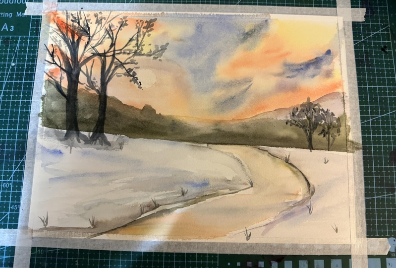
3. The project part 2 : Okay, so now we have to find the second half foot while the sky and the
background are drawing. So let's position
everything and let me see. Okay, now we are going to makes it a little
bit more colors because I've run out of them, so I need to prepare it
a bit more of REO man. And I will add also
a little bit off. I refresh a little
bit of orange. Because as we're going to
paint a reflection in there, either we have the same
exact colors of the sky, so we need to prepare
those colors that we used in the upper
part of our sky, also for the lower part. So if you have ran out
of colors is Aidid, you want to, to make. So the same exact close
we are going to bind. There you have your bank also add a little bit of reflection. We need also very dark
brown for the riverbed. And these dark
brown is mixed with cobalt blue and burnt sienna. And you will get a very
dark chocolate brown, Something like a
very dark brown, which is the darkest value
in I1, our painting. And we'll use the
same dark color also, also for painting the trees. So you need to have
mixed a lot of this. And we have also the coal
blue and let me see. Oh, I need to I have the orange
color that is in the sky. And if you have mixed Oreo lane and you can get all these
brown mixing cobalt blue, and orange as I told you before, even if I'm stick to cobalt
blue and burnt sienna. Now, let me see. You can have also
something lighter. I as I told you before, the orange was made out. Okay. I'm preparing a little
bit of burnt sienna. Maybe I want to use that. Some areas has the cheese. So now let me check
if it is dry. Is always the palm of your
hand and not the sorry, don't choose the palm
of your hand but just the back of your
hand if you want to touch it to check if
something is dry. And it must be dry because otherwise we cannot
pay into the trees because otherwise the color
will spread all over the sky, which is something
that we don't want to. But if you work on a very small surface
is I'm doing here, it will dry weekly. Okay, so now we've my koala, we'll mix it a bit more of
cobalt blue and cleaning also my brushes because I don't
want them to be really ni. Now we clean water. We are going to bind the stellar leave a
very teeny, tiny, dry white line to
separate the far Bush's from the lower part. So for from snow. And I want to create a
very nice, nice soft ADLs. Now, this is why I'm
watching all the areas. And we will use cobalt blue and a little bit of violet
and burr hole because he eats the sound set to say
if it was early morning, I would've used broadly. Yes, called lewis. He is because I wanted to
give that CRISPR sphere. So if e.g. you could use Naples yellow for the
sky of a bright morning. Just Naples yellow and cool
blue and maybe cerulean blue. And you will have a very different, totally
different atmosphere. And for the snow would
have used stuff coal blue, maybe a little bit off
also ultramarine blue or thoroughly and lead together
with the cobalt blue. And you will get the
idea, I'll call Y. In this case, we
are painting snow but in a very warm wise. So take your dark brown, brown that we mixed and
we're painting the Earth, which is underneath the
snow and which are, which is fundamental
for our river bank, says you see as itches all wet, just using the tip
of your brush, you create very soft edges. Soft, soft, soft edges. And they are really nice because
it gives you the idea of the snow covering this area. And also add a little bit of
dark at the very foreground. Because in this way you
will get the idea of depth. I'm mixing a bit of a cold blue with the purple
color in the very background. So you see we have these slides, these fine white lines that
catches the maximum light. We put a little bit of
cobalt blue also the base of the trees because these trees
is planted into the Earth. So it's not lying anywhere. Now we are ready to bind
the river or reflection. We will wait also a little
bit for the branches and the trees because
as I told you before, I want to be sure that the sky is dry because I
don't want to spoil what we painted before, so okay. So let me check. If I need something
to refresh something. I will refresh a little
bit of my purple, which is made with the rose
madder, and cobalt blue. If you haven't got rho smaller, you can use Salazar and
crimson, purple, magenta. Any purple color, but you
have in your in your palate. I'm preparing a little
bit more of orange. This orange, something
that I really love. A lot of contrast. And so now leave. I'm also use a clean brush and wet all the
area of the river, leaving a very fine line between the surface of
water and river beds. And which is fundamental. If you lose this line, you can also use it a little bit of white goulash
or the very end. Buddy she succeeding, leaving this dicey to be the
best option ever. And okay, so now we're going to mirror the colors that we have
in the sky in our readers. So try to match if
she had yellow. Yellow. Yellow is a color that we have more or less underneath the sky. Then we will go in with orange. Orange is something
that we love. It gives the, really the ward
off these nice landscape. We have also a little bit
of violet and purple. And I will add this
in the middle. And also in the case of water, bear in mind that we are
painting wet on wet. So once he tells us fully dry, the corner will be painter. So in January I'll not only in this
tutorial when you're painting, was her reflection. Go bold in my advisees to be to use a concentrated,
saturated color. Otherwise you wouldn't
get a dove resolved. And the very poor contrast, which is something
really something unpleasant to see when
it comes to water. And because you can have a very pale shade if it's
something far from you. But if you are observing water from the very foreground as
we are doing Josh right now, you need to go a bit
bolder with a color, okay, So i think we are almost ready
for putting in our trees. So as you see, we moved from one area to the other
of our painting. And in this way, we really optimized all the
phases of our painting. And we paint one thing while
the other is drying so that you can really complete
this painting all in one go. And now I'm adding the dark wall because we need to put in the
reflection of the riverbank, which is the last thing
that we're going to do. Before painting the trees. And if you think that it's trying to pay in
some areas you can reinforce and now use your
round brush if you want. There are some other
lessons on my Skillshare. Here, on Skillshare
where I teach you how to paint water reflection properly. In this case, as we have very few reflection
and very simple one, I'm using a round brush and doing something very,
very easy, super-easy. So even if you are a beginner, you will have no problems in doing repeating the
movement that I'm doing, dragging the reflection
towards the bottom of water. And to have a very nice result, even if it's your first
water color ever sell. Why it's something really, really super simple than
ever anyone can do. Even if you have a
very little experience with watercolor. And the result is
really pleasant. So I'm dragging some lines because they want to suggest
the movement of water. And as you see, it's coming everything together. So we are more or less just, we're very close to the
end and you see that we are framing top and bottom. And they are, we are close
to different phenomena. But the, we have
all the elements. So the atmosphere
is almost always the last thing that
we have to do is to introduce the darkest value, which is the ones
given by the trees, which are almost
black or very dark. You see my brown is
really, really dark. It's the darkest value. If you don't like this color combination,
I'm auditing also, as I told you before, I'm using cool blue
burnt sienna and I'm adding a little
bit of rosemary. If you don't like this color
combination and you want to use black, you can do that. I will never use black in my landscape view because
I think that it's too, too dark and it will diminish the
light of my paintings. You can use a little bit of Payne's gray if you
want to get rid of rows mater or Ben Sienna to
get up very dark border. If you stick to these very
simple color palette, you will get a very nice result. So tree branches are
very simple to paint. Use a very good point. Oh sorry. Brush with a very good point. And try to start
beak close to the, to the tree trunk and
then you and smaller, we have a very small
dimension, a small diameter. As long as you are
moving far away from the main tree trunk and try to alternate to be position of the branches so that they are stocked and they are not
wanting front of the other. Otherwise, we looked at
a little bit contrived. If you use a paper
which is cold press, which is something that
I really encourage you to do on you. We can get an advantage
or you can get advantage of the
texture of the beach. She's in this way, lines of the branches will
not be perfectly straight, but I'll be done July eating
and modulated, sorry. And this is really something
that I really liked. Another thing that this is
something that I'm doing. I'm increasing the dimension of off the base of the
trunk and I went to big. So let's correct
that immediately we're a little bit of
clean water and we have the right proportion
of these branch. Okay, so let's move on. Let's add a little bit off. Trees also, the back. And you can use also
paler concentration of color because these trees
are distant from us. And so you will get
a very, if you want, you can use a byte concentration of colors just to create
the sense of distance. And now I'm adding a
little bit of branches. As you see here. And you need to use
that very fine line. I'm fine. I'm sorry, I find it. Yes. You need to trace fine lines. So now I'm softening
the basis of the trees. And now I'm using my my Russia in horizontal way and
I'm dragging it on the surface of the paper along
with catching the texture. It's a little bit
of dry brush work. And I am doing sam suggesting the all
defined branches that Ovid of leaves that you
have probably have on the, the, you can see on
the trees in winter. And now I'm adding a little
bit off the tree trunks and some some pine branches, as you see here. Okay, it makes it a
little bit more of colors because I
run out of that. But it's just something really, really simple average do. It's a very nice simple
technique that you can use to create the idea of trees in the far, far behind. And now we can beat off, you can use the
same technique also here to create the
illusion of fur, some dry leaves that
are on these branches. And to increase the
contrast to ask bar, you see we have the light
of the sun come from the, coming from the back. So we, we see these
trees as dark objects. And now always using a little
bit of dry brush technique. And you can see
also it's dry and why we are adding a bit of
contrast with other elements. So we are creating a little bit more definition
in our middle play. The very slapped nine is the
one of the far background, the sky, the distance he is. And we have our middle plan. She's made off the bushes, the flower bushes
in the back ground. And also, as he told you before, you can use a very light
wash of this dark brown to add the shapes of the
some trees and bushes. We are almost done, I think in this way
you created it. You don't need to
talk a little bit of grasses here in the
very foreground. And to add a little
bit of interest, you can add as many elements you want just to create a
little bit of movement. But one of the things that
is important to say is that maybe once you're starting to create some small details
like this one, e.g. grasses or out tweaks
coming out from the snow. Or if you alright, putting in some brown, also tones or pieces of bar, I have no elements coming out
from the ground like e.g. now I'm painting small
leaps on these weeds. Don't be carried away
and you don't feel everything and tried to
leave the white space. And also when you are putting in the color of the blue
for the, for the snow, leave some white
because the blue is just to suggest though
the shadow of the snow. Ok, so I'm using,
I'm adding these. You see a little bit of details here and there because I want to increase the dimension of this, of this nice sound set. But we are, we are done. Yes, I think we are really done. Or just feeling a little bit, I'm just making it smaller because this white line was that every too evident. I'm adding a little bit of
contrast here at the very, at the very far end. And I'm adding also some weeds and grasses that
the basis of these trees. Because we are just to
increase as you saw you, as I told you before dusk, due to increase
everything they offer the sake of composition
we are done now, let it dry and see you
later for some final tall.
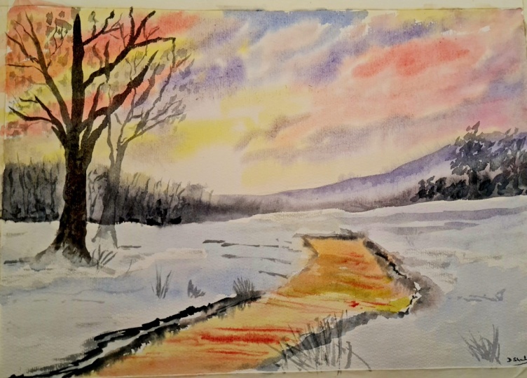
4. Final thoughts: We are at the end. This is our final project and hopefully you are
painting along with me. So one of the things that I would like to share
with you is the fact that you can change up a
little bit the landscape, the subject of landscape, I get very beautiful
results even using a very limited palette of colors as we did in
this in this class. And you can see some of the
example behind my right side. So it's very nice to give
corners or fight and limited by just so
we have a lot of Armani apnea as a
final disaster. Can you can apply that to
many different landscapes, but at the same time he, she changed a little
bit the corners, e.g. use the more cobalt blue, your sky and there'll be
less yellow or orange. You can get a totally different
atmosphere with a bright, CRISPR winter morning and you get a very beautiful result, keeping all the same
landscape elements. Otherwise, as I told you before, you can use the same color
palette and apply that to different subjects and get a very beautiful
sunset atmosphere, summary and atmosphere. And even if the elements of
the landscape are different. So I really encourage
you to share your project with
me and if you have questions or doubt
about this class, so please share that in the discussion section
of this tutorial. And I would really love to have to hear from
you and if you want, you can share your project
also via Instagram. And you can follow
me on Instagram, but also on Facebook. And if you want,
you can face a pay a visit also my YouTube channel. So I hope to see you in
my next Skillshare class. And in the meantime,
happy painting everyone.
 Eleonora Serra, Italian watercolorist