Transcripts
1. Intro: Hello everyone. And any sudden, a lot of money today and
what's your calories? So in this class we're going to talk about how to paint the sky. The scalp is the most
important thing in a painting because it sets the moods of the whole painting. And if you have a very good sky, there are good chances that all the Finished water color
will be a great success. But if this guy comes out in a very horrible or
not satisfying way, you'd better to
throw everything in the bean and start
all over again. So these glass, we will band
together and these project. And I will teach you not only which colors are very suitable for painting
pole kind of sky, not only that, but
also rainy sky. Your older kind
of apples spheres that you want to capture
when you're painting a sky. I will show you all my
tips and tricks that I use for lifting the clouds, for painting very soft
shades of pink now to swell. And so if you want
to learn all of my secrets about painting a
sky and you have your rashes. He would call us the paper, and let's do this.
2. Materials: Okay, so let's have a look at the materials that we
are going to use today. I have my sketch
it off or harsh, but April 300 g
per square meters. Sorry, cold press, not
hot press because I want to take advantage of
the texture of the paper. I have train than plead
my Maschine type. Use paper that you like. You don't care about the brands. The most important thing
is that 100% cotton and it's not half and
half when other mixture, of course, I will have my
facile with my pushy rather because they need maybe to erase and there'll
be my sketch. You will need your
palette columns from white tubes because it's easier to show you
the difference in density between the first wash and the washes that
we're going to use, e.g. for the flout or for the bushes. But since free to use
also the boss, e.g. but you have a boss will
be absolutely fine as long as we can understand well, the thickness of the paper. I will be using
my round brushes. I will have brushy soft,
different dimension. We use also, if not brush, wet the upper part
of the sky and to show you also a
particular technique because in this way you can create very soft shades of the
a sub shaping the sky, lift away a little bit of cones, but also to create
a shape of clouds. And we'll have also
abrupt shift or any nutrition square
brushes for some areas. And of course, they are
all synthetic brushes. That I wasn't very good point. Maybe I will have
even something small. And for the details, I will tell you along
the way anyway, have a range of four round brushes that you can use according to the
size of your own painting. And of course, you will need your dark water
vapor challenging. To use all of your sponge or
cloth or wherever you like. I think we are ready to go. And for the list of the colors, you will find that in the
description of these glasses. So let's get started.
3. Colors for the sky: So now I want to tell you about the comments that I usually use when it comes to
painting the sky. And I want to share you a
very simple thing, very easy. You don't need too many fancy
colors to paint the sky. You just need a few. And if you use them correctly, you will get all
the possible shapes that you have that in the sky. So you will be able to tackle all the possible atmospheres. So men thing is, one of the colors
that I use really a lot is Naples yellow. You can use it by itself. You have to bear in mind that it contains a little bit of white, so I will be totally
transparent. But as I was telling you before, you can use it by
yourself or by itself, or you can mix it with a
little bit of scarlet, red. E.g. I. Will mix exactly on paper
so that I will show you, sorry, this style it is that
it'll eat too powerful. Okay? So you get all the different
shade if you can have also in Samson, e.g. For INA, beautiful
early morning, early Don't you see how
very nice purple shade. You can also use raw sienna
and style it if you want. If you don't like the
idea of Naples yellow. But the other thing that
I want to show you is that if I make some
Naples yellow, we type of mice here. So you mix them. When they merge, she's see, you won't get any kind of green. You get us what does gray color? So if this happens, new sty, you're personally on the
safe side because you won't have a green areas. So you can start using
also one of my favorite go-to color for the sky is REO Man horror,
transparent yellow. You can have a transparent
yellow or on it. When this are the two, they are very similar, but our funding is very transparent aniline
and life is color. And you can make sorry, Lynn would stall out. You can make sorrow.
And also we'd read all care or burnt sienna. The main color will
be Naples yellow. You can have a scan, it surely undo a yellow. According to your preference. It can be Naples yellow
or it can be formally. Then you cannot do on your lane, as I was telling
you, a color, e.g. like cow, this is
a red ocher that I really loved and I'm
going to make that width. So you see you get this
orange shade which is Ray, Very nice, especially
for the sunset. And I will mix that
also in my palette. So you can get also
this kind of oranges, which are really right
because ARMA thing is a pigment with a lot of springs. The nice. If you mix that vermillion, you get or we'd start a thread, you get a more powerful color
and more powerful orange. But you can add all the shite, vary the proportion between
orange and red or scarlet. And then I'm taking
a little bit of my sorry, I really am. As you see, we get something
if they've touched, we get something to work the grounds that we
all care but me say. So. Yellow colors that we use. Sti be called blue. Old movies, my go-to color. If you want something stronger
in color, you can use, you can make whole
blue, ultramarine blue. You will get a little bit
of granulation in the sky, but this is perfectly fine. And we are going to use
these two colors for, let's say, for the
upper part of the sky, because we want to give the
idea of aerial perspective. And so this is a very, very, very good combination,
but you can use, you can make it also cold
blue or ultramarine blue with certainly on loop
to get this shape, which is something
like this, this shape, sorry, which is something
in-between the two. And it is really,
really powerful. Any goals. Very well with the oranges. E.g. you can imagine
this as a sunset. And so as we have a little
bit of yellow inside, you can get something Gly, if it happens up a
little bit more red. And you are say, okay. And we have a thing
that you can use. The other color combination
that I really like is we've loser in
Queens them all purple, magenta or calm
and quinacridone, red, really a red
color that night. And if you mix them online, you can get kind of read up some lovely,
always put salsa. But if you want strong clouds, you will mix the blue
that we used before. We are adding a cobalt blue or ultramarine blue
with burnt sienna. And according to
how much you get, you can have a very dark
color and long can this guy's going to be more blue? You will have bluish gray, which is excellent for layouts. You can make salts, so you cannot have a
little bit of magenta. This next made with cobalt
blue and burnt sienna. And you will get something on, more on the violet shade, you can mix up. We'll blue and purple
magenta exactly as they are to get a very air exactly
as exactly the blue color. And you will get all the
possible shapes and buyer. Show you in a minute, e.g. here, you can see that we have the beautiful
colors of salsa, just mixing very few colors. So these are all
the option that you can really use to paint all the colors that
you've seen the sky. We want to really have
a very strict Follett. You will need a yellow color, Arminius my go-to, but you can use also
transparent yellow. I will certainly have
burnt sienna or red ocher, something containing a
pigment which is PR, one-on-one, e.g. is fine. I will have something
like this one. We choose my purple magenta. You can use Alizarin,
crimson, quinacridone, red, whatever color you like you
on this side of the spectrum. Cobalt blue, cerulean blue. You can have also an
ultramarine blue if you want. And Naples yellow, which
is my extra bonus color. And one of the thing, the last thing that we have
to bear in mind when it comes to painting a sky is
the color density, which is very important
because you have from the first washing
usually work by hand. So you wet all of your
paper? You worked? No playground. I'm trying to show
you wet your paper. Maybe he walked first watch. We'd have very diluted
color wash off. In this case. Then we are going to
apply the clouds. So we don't want the
color to round like mad. But if we want the color to
stay in one of our area, we need to create
a dance mixture. So the mixture of the car off the clouds that you are going
to mix should be an EOB, thicker than the wash that you had as the first wash or
the underneath layer. So you see, I'm just
putting in you can use the tip of the brush shapes. You can use it sideways, e.g. like this area. Now I'm doing and bearing
in mind the other. The last thing is
that the clouds are bigger towards
the upper part of the sky and are smaller as they are over the horizon line. And if you bear in mind the
variation of dimension, you will have a very beautiful
sense of perspective. You will have very
beautiful stylized. You can use also
different brushes. That's according to
your way of painting. There are artists who
use calligraphy brushes, screen early mutation brushes where the lower cloth and then I usually have a very good brush that retains a lot of
water, unlike e.g. any mutations grid brush Upworthy underneath that
layer, the first layer, the first wash. And then I will use something
more stiffer my town or a martini mutation or something synthetic Mecca
Mongoose or any way a brush that has a
good water retention. Retention but which
is not too soft because I want the color
to stay Dustin one point. And also because I
want to move and drag the color in the direction
that I really like them. I think that everything
now we are going to go out and start to grind
our atmospheric sky.
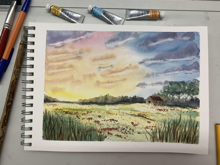
4. The drawing: Now, for the drawing, I want to keep it as
simple as possible. I am going to trace
the horizon line. More or less sweat at won
Florida's why surface. I want because I want to keep the main focus samples thigh warm just to flip a
psych of composition, I will put in a very
small house, right? Yeah, maybe. There will be also
born to small windows. We will have some
malicious yeah. Sound good. Trees. We'll tackle worksheet. Yeah, Convey more
Nassim, nice. Shin. I want to keep an eye out. A couple of an L shape
composition on I want to my lighter area here and here we will have another fun because I want to put
in a lot of color. So we'll have a Greenfield
with a modal flowers that are, we are going to spotter
at the end of this. That's where the drawing
very simple one. Our main focus will be the sky. And now we are mixing the
colors and starting to paint.
5. The painting 1: So now before starting
to, they took, we are going to prepare the colors that
we're going to use. I will be using the
colors that I mentioned in the previous section about
the tips and techniques. I'm using tubes. So because in this
way I can control by the density of the
different washes. But if you have bonds
that is perfectly fine. Now, first of all, I want a yellow, I will be using ARIO lean. But if you don't like
or eolian or you haven't gotten your ballot,
It's not a problem. You use a transparent yellow
or yellow that you have. Clean your brush between mixing the colors so you won't have
any kind of muddy colors. My brush is now wet. I will be using now
purple, magenta. You can use rose madder
and answering crimson, purple or quinacridone
red color, the hue light I will be
mixing that are running. So we get this beautiful, bright orange, red, orange. Now I clean my palette. I want a little bit of
purple, magenta by itself, very diluted so that I have
fun little bit of pinky tone. Now, cobalt blue. Cobalt blue is by Goto. Blue for the sky is even if the ground and
lights a little bit, then I will be mixing my cobalt blue with the
ultramarine blue to have the darkest shade
that I want to mix in the upper part of the sky
for area perspective. And also in this case, my mixture is dance, it's not very watery. Then clean the brush and we
will move on to cobalt blue. Because I want to create
the violet color, cobalt blue and purple magenta. So my mixture, I'm trying to create mixture or
at least denser than the previous mixture
that I mixed before, because I want to use this column for the clouds
and I want to stay, eat in place where I put, I don't want it to spread it too quickly all over the
all over the painting. This is one of them may
concept as you remember, if you've seen that
mixed race thick, you see it's not really water. You can avocados. So if you think that you need to create a more dense
of a mixture, and then you can tie
it to a spare piece of paper just in order to
check that the density S1, because we don't want to movie too foreign
to spread too far away all over the sky because even if you have just
water underneath it, remember that the colors
were the clouds must be thicker than the washer
that you have beneath it. And yes, I think that we weren't going to
create a darker mixture. I am using now, ultramarine blue with a little
bit off my purple magenta. I have a darker shade of violet. And I'm auditing also teeny
tiny touch of burnt sienna. This is why I want to create one of my other
color that I use a lot. It's a kind of dark
aubergine color, which is very useful
when it comes, e.g. for not only clouds
but also shadows. And you can get a
very nice color adding Always burnt sienna, ultramarine blue or cobalt
blue if you like that. And you can vary the
tone of this color. You can get something more, more of a brown color instead
of all a purpley brown. Something that is
really, really nice. It's something in-between
the purple color and the darker version color
that we mixed together. It's a different version
of an aubergine color, but it's really, really useful. It's a sort of up, it looks like a bit
like a couple of more than what I
prefer to mix that by myself so that I can decide the exact amount of darkness or light that I
want in my paint. And I think these
are very useful mix that you can use
not only for the skies, but also in other elements
of your landscapes, especially when you
need some dark tones. And I think we are done. Maybe we will use
also a little bit of Naples yellow later on. I'm not very sure about that, so I will have my palette
here at my, my right side. In any way, I will
tell you along the way which colors
I will be using. So now let's take my painting
and we are good to go. So we now need my flat brush and clean water and start
to wet your paper. I am using water sparingly and doing a lot of these
horizontal movement. I want to, with very, very well my paper, but I don't want to create puddles and I
don't want to have too much water on
my paper saved must be a nice, workable surface. Wet, not down, but not in, not too dry but not too wet. So you see that I'm moving and reaching the horizon
line and trying to massage my papers so that they really have a uniform
surface to work with. Here we have the area of y to, so I will be using the corners but leaving the whitespace. So playing rashes have
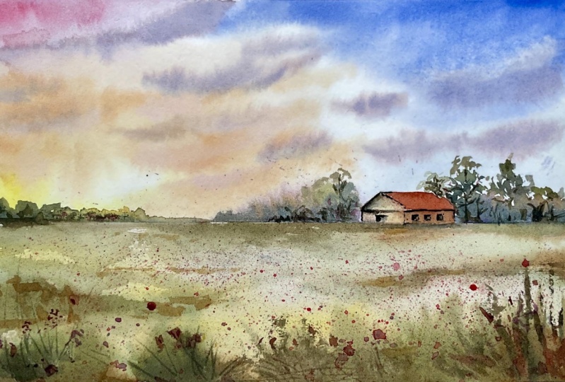
your knocking candy. And now you see I'm
going in with my Arial in exactly just right
from the start. Using the very bright color and don't touch the white area, lead to color flow freely. Move and drag the color
towards the right side. Now, I'm using my cobalt blue, very diluted in this case. You see that yellow and blue
are very, very close now. And I'm leaving a little bit of white between the
two colors are still they want touch and get the gray color
that we don't want. Now I'm using the mixture of cobalt blue and front
and ultramarine blue. And I'm starting from
the upper corner because the darker shade should be in the top of your paintings
so that you create a beetle. Era of perspective. You keep dip. So towards the horizon the
colors are always lighter. And now let's add my Bupa
color, purple, magenta. This is really, really
strong as a color. What color? But I am going to dilute and don't be
afraid of the fight of the colors would be
really brilliant at first when you put
them on paper, it will dry, lighter, so don't be afraid of that. It's something that
I really like nasa. And now I'm adding a little
bit of Naples yellow, Josh right here because I want
a little bit more of that. Being key orange. So you see when you mix it
with yellow or purple magenta, you get very nice, very nice shade of colors. Purple color, pinky
colors, oranges sudden, they are very warm
colors for the sky. They get along very
well with the blue, with the purples in there all. We have a very nice palette of colors put all together
in a very nice way. I'm trying to use
this match colors as possible in this guide
because I want to show you all the possibilities that you have while
you're painting now, I'm putting in my purple color. Let's go with the orange. Oranges. Since I was forgetting
about the orange. I'm using the tip of my brush. The paper is still really wet and I'm dragging the clouds in. The more. It's an horizontal way, it's not exactly horizontal. It's a little bit of Blake's, but usually in an oblique way. Anyway, as you see, I'm lifting, cleaning my brush, and I am encouraging my clouds to spread in one direction instead
of the other. And I can do this because
my paper is still wet. So you using now the
tip of my brush, I am painting very
small clouds so that I get a nice contrast because I have the
white paper underneath. And also because I
want to increase the contrast as mixed a little bit more of my
purple magenta with orange, and I got a more
saturated color. So now I'm reinforcing
my clouds. Alton, a little bit of orange
also behind the house. Softening. Lifting and
encouraging movements. Now, I'm using my brush
sideways and I'm putting in the very dark clouds
with a dark mixture that we mix together before. So you see, now I'm adding really depth because like a dark clouds are in the
upper parts of the sky. I'm joining the area of white
that I have left before. And I'm doing this always jacking the
dampness of the paper. The paper is still
damp so I can really worked my paper because I have a safe I'm in a safe
place so it's not too dry and it's still workable. Check the darkness of
your paper always. Now in this area, so clear, so light. We're going to add the
dark clouds so that we get more of the area of
perspective, more of depth. And we'll get these
dramatic effect that we're looking for when we're
painting in atmospheric sky, like in this way,
maybe the storm has already has just gone away. Now, I'm using the purple color, the dark blue color
that we got mixing. Ultramarine blue and
purple, magenta. I'm reinforcing these docks at the very top of my painting. Trying to follow more or less a continuous way because
these clouds are moving more or less in
the same direction. So now I am softening my clouds. Adding a bit more of a purple color to
accentuate this area. And let them mix all together
so that we get beautiful, nice shapes, adding a little
bit of cobalt blue here. Now I'm taking my flat brush. It's a plea and
twisting my risks. Do you see the movement
that I'm doing? I'm lifting the lower part of the clouds because
the sun is underneath. The light is coming
from the bottom. And in this way, I am really adding
a pop of light. You need to leave
the area underneath the clouds white because the sun is in the lower
part of the painting. So here we don't
do this too much. I mean, you can don't be
carried away by this movement. And we are doing this
at the right time. The paper is starting to dry. So it's not too wet. It's not too too soon
and it's not too late. If you wait for the
paper to be too dry, you won't be able
to do this any way. You can use this also
for lifting the color and create white clouds
without doing anything else. So now we are going to put it in a little bit of purple
color as of color, as a background color
in my very background. The vapor must be
a little bit wet. So let's try in a
small area like e.g. here you see, okay, February is still wet and
the color will spread. Creating this soft, feathery at shape as you see
just right here. So we must be very careful. So use very teeny tiny bit of colors here
along the horizon. And I think I will
incline my board. I will take I'm using my
masking tape and I put it under my lock because in
this way I have it tilted. And the result is that the
the color that you are just painting want runoff in the middle of the sky as
quickly as it did before, but it will stay towards the, towards the horizon line. Okay, So now as we need
to let it dry a bit.
6. The painting 2: Because it's a little bit too
early to put in the greens. So we aren't going to
make the greens as well. We're going to mix
very dense mixture using failure green. And I'm adding also
a little bit of ultramarine blue
and burnt sienna. You need to create a very dark, saturated green, almost like the green software for trees
just to give you an idea. But in e.g. if you haven't got burnt sienna or you want
something darker, you see as it is dark. You can use also Van
**** brown, e.g. in this way you will
get a very darker green using just fatal green
and Van **** brown. Maybe ob das, a teeny tiny bit of ultramarine blue and
you'll get the job done. So now you see that the color is not spreading
as fast as it did before. So we are good to go and
we're going to put in our distant trees and bushes to create this very nice contrast
with the red sky and the, yes, the horizon line. So it is very defined. Can clear. And now we need a
little bit off. I'm mixing. I'm
doing Oreo link to my dark green mixture so that I get a very
nice light green. And I'm adding debt for the
sake of variety also around the house and in the
other bushes. Like so. This way we have a little bit of variation in the
vegetation or otherwise, you will have the same colors. I'd also a little bit of
burnt sienna you create, you can create beautiful greens, just mixing Arlene, cobalt blue and burnt sienna
or raw sienna. Or you cannot little
bit of oral into them the previous mix that
we prepared before. And you have a very nice in Greece with just the
very few colors. Now I'm adding a little bit of orange or yellow because it's the area under the sun which is reflecting the maximum light. So it's lighter. And if you see that the tips of your bushes are to resize. If you want more of
a feathery effect, clean your brush, and with
a brush, you can moles. And maybe now I'm adding the shapes of fern trees for our little
bit of more variation. But you can soften the upper part of the
distant bushes with just by leading a rush and
yes, softening the edges. Now I'm doing an abbot
of negative painting. The house that is
of a light colors. So I want it to be really, really defined and adding the greenery behind it will
help and will increase because the shape of the
house is standing out thanks to these dark washes
that we have behind it. And now it's time to
move to the lower third, which is our foreground. I want to lay my arm in almost everywhere because
it will be my base. Even if you touch
the horizon line, it's not a problem. It will give a very
nice feathery effect like the font that like if you have really grass
bushes of grass creating, you see that you are
seeing the top of the bushes which are feathery and suffused in
the very far distance. You can use different
concentration of RNA. Now I'm using my brush, which is any mutation
or squirrel. It's a little bit smaller. And I mentioned that the
one that I show you in the materials section,
bury the consistency. You can use Arial in
exactly as it is or very, you know, very concentrated way. And if you use a more
concentrated mixture of REO, lean towards the foreground is perfectly fine
because it's closer to the observer so the colors
are coarser, stronger. Okay, here we are. Now, take your green, the dark green, and Putin
as long as it is wet. A little bit of greenery in the very foreground
to increase the depth and try to drag
mainly these strokes. Like if you were
mimicking the glass. You don't need to
be very precise. Go freely and follow
your gear on fantasy. And now mixing burnt
sienna just a bit. And you'll see that I look at these bushes just by
mixing more or less all of the colors that we used in the sky so that we have
a very tight bond it, but also watts in the sky. It's also in the
foreground, in the ground. I'm adding my dark greens now. But you'll see that in a minute. We will put in also the cobalt
blue and the purple color. Because in this way
we get a sort of uniform and rounded structure of the colors in our painting because we are using
a limited palette, we're creating a lot of shapes just by using the same colors we are using mainly
RNA and burnt sienna. Cobalt blue or ultramarine blue, which is always a blue family. And you see we're all
singing dust week now this 6567 colors
in my palette, or usually when I
have 1012 colors, I think I have plenty for
painting almost anything from the highest mountains to
the seasons, the ocean. Okay, Let's increase a
little bit the color here. Okay, I'm checking if my
sky is dry ETS and now I can put in using
my little bit of dry brush technique and I'm
using my brush sideways. So you see, I am putting
in the colors of the leaves of the trees using a little bit of green
that I had a medium tall. Now I am mixing, I'm using a very teeny tiny
brush with a good point. And I'm mixing ultramarine
blue and burnt sienna. Because we need to put in the branches and the
trunk of this tree. It's just a very,
very simple stroke. Very, very simple. And now let me see
what we can do because it is a small surface so it's drying more
or less weekly. That please check
before going on. If you're not sure you need to be aware of the fact that
if you have steel the dry, if he's not right, dark, you can go on working
on the Cloud or e.g. adding the leaves of the trees. Otherwise you will get trees even in the
middle of the sky, which is not something
that we want. Now. Why Hs so wetting or sorry, when each is drying
also in the lower part. We are going to mix
a little bit of gray color for the house. And then we will be
using cobalt blue and a little bit
of burnt sienna. And in a very light wash, you will get a great color. I will show you, you see it's
a very, very light gray. And as I told you
before, as it is, all these colors are obtained using a very
limited quantity. The final result is going to be even brighter and
more beautiful. Now I'm adding a little bit of the orange that was
left from the clouds. Because I really like
the fact that we have these underneath gray color and the orange between increase
the final result of this, whether it how's
it recalls maybe the color of the timber
or at the breaks. I don't know exactly
the material, but I really like
it for the house. And now I'm abiding, get rid of time, but I'm preparing the
columns for a roof, which is a mixture
of our purple, magenta and burnt sienna, maybe a little bit more
burnt CNI, mahogany color. I really like this
kind of brown, red brown color for
the ties of the roofs. Be careful if it's not
fully dry weight for that. And because you don't want
the color to be to spread, even in the lower part
that we just painted. I'm leaving a teeny tiny line. Okay, If a little bit of color
runs out from the borders, It's not a big problem. Try to absorb it
with your brush. And now I think I will add also a little bit
of blue or purple. Purple and orange is a color combination
that I really like, especially when painting,
bending so old houses, I think that the fact that the colors are
spreading on paper, they are giving very nice
effect, very unpredictable. So it's more realistic. So you see that? It is, yes, it's almost dry. We're at a good point. We got this very soft
feathery edge at the point in which the fields and the
bushes and the trees meet. Now, we're starting to have fun. We are going to
spattering colors because we want to
create the ADL flowers. That's prepare the mixture. What should I use? I think I will use ARIO
lane and purple magenta. And okay. Here is my purple
magenta used to say Mar, even the remaining of the color of the oranges that
you mix before. Purple, magenta
and orange layer. And then you will
get this bright red. It's almost like the
color of the puppies. So we may think that we
have puppies in this field, but I want all still a
little bit of violet. So I'm mixing cobalt blue
with my purple magenta. I really like the colors of the flowers in spring
when we have all of these beautiful flowers coming out and they are
red, violet, blue. A wonderful color palette. To get inspiration said, I went to protect the sky. And let me see if I
can use something like my vapor tissue
that I had before. Okay. So you have to apply
your paper tissue like like so so you cover your sky because when you are going to spot her your page, you don't want to
finish that on the sky. The only problem is that
my sky is not totally dry, it's a little bit damp and
my tablecloth are dumped to, so I just put in a little bit of spare paper because the
most important thing is that you protect the upper part that you just painted because
we don't want to ruin that. So my tissues are enough fun
because they are too wet. And I want really to protect
and I don't want any kind of drops of color is
red colors in my sky. So I'm using, in this
case, flat brush. But if you can use
also whether Russia ruined one of the most
rewarding it is the better. And now I'm spattering my
red color. Here we go. Follow your fantasy or imagination and
there is still rule. The only rule is to
have fun with this. You can lower your hands so
the closer you are towards the bat and the big area you have the dimension
of the flowers. Otherwise, if you say
a little bit higher, you will have small droplets. And this will increase
a little bit of aerial perspective as well. So you see I'm doing
it very randomly. There is no right or wrong
dust stuff fun with that. Splatter the paint
where you think it does to create the yes, the ADF groups of
flowers here and there. And now I'm adding the
purple one as you see. So create a little
bit of movement. And the purple, yellow, and green are very nice spot that I really love to
use in my paintings. Even if it's not a
subject like this one, if it's not a countryside. And now I think I will add also a bit
of blue, cobalt blue. I really like the factor
that we have blue in it. Yes. So this is the final result. You see that I left a
very good amount of space and not covered
by my spattering. That's because if you stay a little bit
behind now you can add some random droplets
here and there to complete and to feel the areas where you
think that they are a little bit too empty. But without exaggerating
said don't be carried away. Don't splatter all of your
paintings on the field. But just Putin, the flowers
here and there, according to The place that you think
you really need it. And you can add also some
purple or violet color. Use it also for chasing
some grasses in the very foreground to add
depth to your painting. But be very careful. You don't need to end up
with everything covered up by this spattering
of the painting. You can add also some grasses
with the dark greens. And if you don't meet, if you come to that all in one, go wait for one to be fully
dry and then go back. According to the
room temperature you are working the
dimension of your paper, you may need to stop, please do so and then
you pause and come back and complete your
painting in more than one go. Depends on a lot of factor. You can also use the purple colors and doing
here and lifting that to create the movement of
grass, of distant grass. And as you see, it's something that
she'd been gradually. Now I'm using coal blue. And I think, okay, I want a very dark brown, cobalt blue, sorry, ultramarine
blue and burnt sienna. I never use black in my my water color unless it is I didn't know
the eye of an animal, e.g. if something man-made
with this color, as I was studying you before, check if the house
is perfectly dry. I'm adding a little
bit of details. The house we're going to put
in also the small window. One window and then the other. Now we're going to put
in also the door issue. Unlike me and you
don't like black, you can use these
very dark color, which is made from ultramarine
blue and burnt sienna, and you get the darkest
value in your palette. Know why I'm adding the ADS e.g. for timber basis of timber. I'm reinforcing the color of the chunks of these trees,
adding some branches. You see just a very
few things that we do. To create contrast. We can add maybe a
small tree here. Use of rush sudden ways
to add the leaves. Just for the sake
of composition, for balancing even out, maybe. Now I'm adding a middle tone. Sorry, I'm middle
layer should say a little bit darker to
increase the contrast. And to make my point of light to result in
**** out even more. And now I'm adding
with the purple color, I'm adding shadow on the house and a little
bit on the roof. And I'm adding also the shadow from the house
and the trees in the fields. And there'll be here
because I think that I need to increase the contrast. You have to check what
happened on your paper and decide if you need some
areas of dark or not. But don't be carried away, leave it airy and
breezy so that you catch the beautiful atmosphere
of this dramatic sky. They'd be a sunset or sunrise. I've now been a really, something like it's a beautiful, glorious morning or
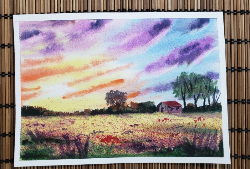
at Laura's evening. At the end of a beautiful day. We're done. See you for some final thoughts.
7. Final thoughts: So we think together a
beauty itself that sky. This is our final result
and now really love to see your own project to so please feel free to post to eat nuts, the project section that we have under this blast results. And feel free to ask to all the questions that we
have about this topic, which is very, very important. And I would love
to answer to all of your questions
about painting a sky. As I told you at the very
beginning of this lesson, this time is probably one of the most important
aspect when it comes to painting a landscape. And the main thing is to practice and to practice
a lot again and again. And don't be discouraged if at the very
beginning you may have some difficulty
controlling water or controlling your washes all when you're painting wet on wet, this is very normal. It's a process that we
have to go through. But I'm sure that if you bear
in mind off of the concepts and the tips and
techniques as I tried to get to you in this
case, share class. The next time you are
going to paint a sky, you will have a very
that clear idea of what colors you need to
paint all the sky possible. And also the technique
that you have to apply to have a very good
on satisfying result. So if you want to learn a
little bit more about me, you can follow me on my social media profile,
instagram, Facebook, or you can pay a visit
to my YouTube channel and see you soon also
in my next stage here, class, time, happy
painting, everyone.
 Eleonora Serra, Italian watercolorist