Transcripts
1. Intro: Hello. My name is Laura and I'm anytime
with her color is, but I'm also a
full-time working moms, so I really know how difficult
it can lead to squeezing even the smallest
painting session in one of the very busy
days that we have. But what if you have
just 30 minutes? Is it possible to get out something good even from
that short amount of time? Sure it is. So follow me in this class because I will change
your point of view. You'll understand
that when you have very few minutes for painting, the most important thing
is not the details that we have to change
our point of view. And we have to focus
on some aspects like for example,
tonal value, lights. And thinks that we'd be very useful when we talk
or more complex, a project type, for example,
very large paintings. In this class I
will teach you also some tips that I use
when I want to have everything ready so
that I can get start to paint the exactly mean that
I save space and time. So are you ready for this? Let's join me.
2. 1 Tips for optimizing time: So when it comes to
a very few minutes, we have to concentrate
all the things that we want to do in just a very
small amount of time. So we have to be
a bit strategic. So first of all, I
suggest you to prepare in advance these little
sheets of paper. These are A5 size. And if you have them ready, you can just take your masking tape and start
to paint or just right. And the minute you say that, the other thing that
you have to evaluate is the fact that the subject
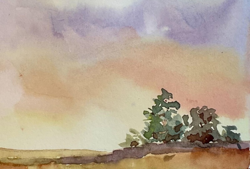
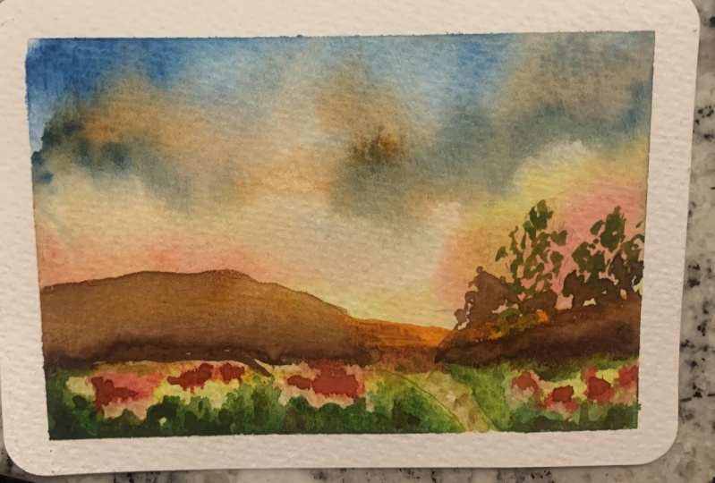
can not be too busy. It can be a very
simple landscape like for example, in this case, we have some distant trees and the trees in the foreground. We have, for example, a distant hills in
the background as some fruit trees
in the foreground, we have another similar scene here we have some
flowers, for example. We have also something
very quiet with a very strong and
beautiful light in the foreground and some
medicine at the very front. So you see these are all
very good exercises, for example, for
practicing sky colors, for practicing the
colors that you are more useful
for you for though of the style that you have and for the subject that
you're going to faint. And they are very good for evaluating tone,
light, and values. So if you have very few
minutes to paint today, the best thing that you
can do is try to make these simple exercises which are concentrated on a
very simple landscape, but they will offer you the opportunity to investigate
are some important things, like, for example,
practicing sky painting, which is something
very difficult. But it can be really
very rewarding. And you will
understand also better the importance of tone and
the importance of light, and the importance of going
very softer, for example, in the background
and being maybe stronger in at the very front of the painting so that you can get more emphasized and
stronger result. And the last thing that you
have to consider is this. All these paintings
are very loose. So the fact that
you don't have to concentrate too much on details is something very important
because you will understand immediately which are the key elements of
your landscapes. And it will be very useful even in future
because it will help you to simplify even the
more complicated scene and just focusing
on what you really need to make your painting
pop and be bright, full and full of light and
with a very good result. So after this short explanation, we are good to go.
Let's move on.
3. 2 Materials to have always ready: So when we have very few minutes to dedicate
to our painting session, we must be very strategic
and plant things in advance. So you may prepare
your small piece of paper already taped on your table or on the surface
that you're going to paint. And the paper is always 300
grams per square meter. How 100% cotton, and
it is cold pressed, so they just tell us a
little bit of texture. You should have a handy also your paper towel or paper or tablecloth or
whatever you use. Your jar with clean water, you may use one or two your mechanical pencil
with the material. You will have to get ready
in handy also your brushes, different sizes and different
types of, for example, I have round but also flop
brushes, for example, that are here very close to me so that I can grab whatever
you need very easily. When it comes to color. This is my part I just wanted to show you because this way, you and see how we I
have Mike organized, I have organized my colors, and I have Naples yellow. I have lemon yellow, orally, transparent gold
ocher, which is not necessarily have
an Indian yellow. I have cadmium orange or
chrome, orange, scarlet, red. And then I have all
the red and violet, and then all the blues
and all the greens. And then I have
the earthy tones. And my last one is
my Payne's gray is, I don't use black very often. I mean, I have oxide Blackboard. I use their spirit again
just for few details. For example, if MP find
painting agent now, human structures, for example, buildings or details or
frightened or bullets. Or if I'm painting in sex, which is usually
in my landscape, black is something
that I never Ghazi. Anyway, you should
have your yellows. You can have also your red. I have also permanent com, which is my favorite. I have ultramarine blue, cerulean blue, blue, cobalt
blue, indenture in blue. And then I have also
a lot of greens. The one that you
probably need to have ready R sub greens and green, I have also golden ingredient, which I don't use very often, but I like it for tomatoes. Then I have a yellow ocher, raw sienna, burnt
sienna, red ocher. And I have also this one
wishes Mars Bordeaux, which is always the same
pigment as red ocher, but it's less bright, it's more towards the burgundy. I have burnt amber,
Van **** brown, and Payne's gray, as
I was telling anyway, the very few callers such you
need to have is a yellow, for example, lemon
yellow and orange line, or a cadmium yellow light. Then permanent carmine,
ultramarine blue on blue and cobalt
blue, then green, sap green if you want, then I would have my raw sienna and burnt sienna and red
ochre at the ready. And burnt umber and
Van **** brown. These are all the
colors that you need to have in your palette if you want to be very quick, one painting. And if you really want, you can add also mineral violet, which is a color that
sometimes comes in very handy when it comes for, for example, green mixing or some particular other colors
or like permanent timing, rose matter, Alizarin,
crimson, whatever you like. It's something that we can use if you want to
bend, for example, I'll meddle with some flowers. So I think that with all these kinds of colors in your
palette always ready, you can pay it almost anything, any kind of land sick on landscaping of subjective
that you can encounter with. And for example, on
vacation, sightseeing, or at the beach or the
mountains in the countryside. In your hometown. That said if you have a place in your house where you can
have all of this stuff, always ready and good to go. You will be able really to
paint in a very few minutes. Very simple landscape. And the other thing
that I wanted to remind you is
that if you don't have all the time altogether mean you can just separate into blocks of 15 minutes and still getting a very good result. So I know tau for downtime
and let's get going.
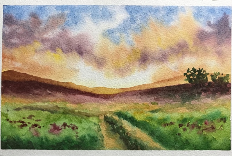
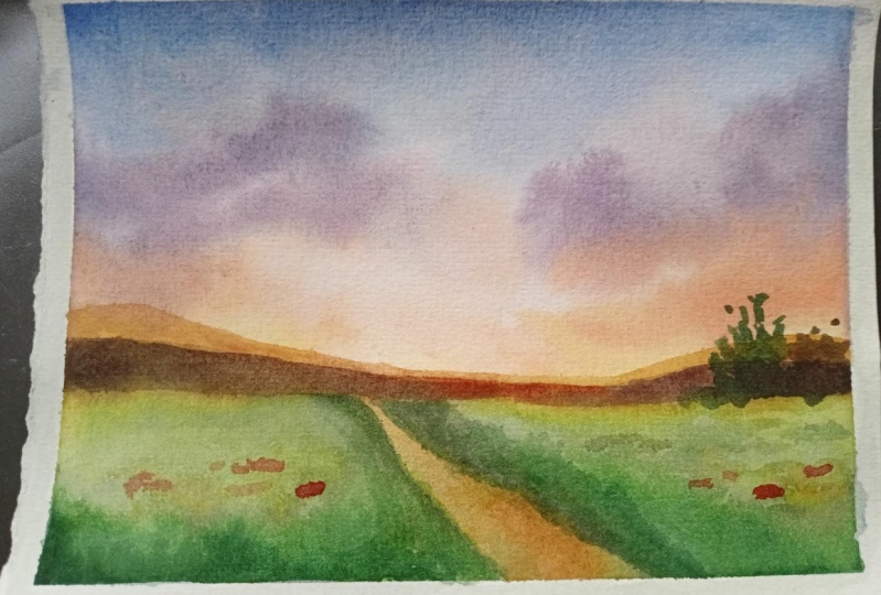
4. 3 Final project: drawing : So as for the drawing, we are going to use it to draw something
very, very simple. So let's say that
we want to vary. Not very neat and
define horizon line with some distant hills. Then we have something darker here with a suggestion of a
few trees or bushes here. And then we may have
sort of a street, let's say with some grasses
here and also here. And we will have some maybe
flowers in this area. And we are done.
5. 4 Final project: Before starting as
for the colors, I had some spare class in my, in my palette, but these are the colors
that I'm going to use. So I have raw sienna, burnt sienna, cerulean
blue, ultramarine blue. I have permanent carmine, red ocher or your lane, or a yellow that you
like, and phthalo green. So these are all the things that I need for this painting. And I just want to prepare the colors because as
I always tell you, we have to be very strategic
planning advanced, and then we will be ready to go. So I want a very pale yellow and then I want a very
light warm orange, so I will paint it. So you see this
is very powerful, but once on paper as
the paper is wet, which will be diluted. So don't be afraid of the
fact that it can be a bit concentrated
here as you see it, but it will be lighter. Then I'm going to mix
ultramarine blue with my cerulean blue because I want a very bright color in the sky. And the last color that I'm going to use because
I want a bit of contrast with the clouds
is very dark brown, purple, dark, dark brown. So I'm going to use my burnt sienna or even
a bit of red ocher. So I have almost you see, it's like not a violet put in. Come in for Rho smarter
or what you like. And also a bit of
ultramarine blue. And we have this violet color. And then we will
allow the beam of red ocher so that we get more of the brown site. Okay. So I think we are good to go. Now. I'm going to wet my thanks ground and the sky. And I will be very careful
because I don't want to paint underneath that the mean and I don't want to
go below this line. So if I have some yellow
in this area is fine, but I don't want yellow
in the upper part, so I'm going to use, let's use this brush
holds so for the sky, and let's start with
our ultramarine. Okay. Sorry, I'm really on blue mix or the upper bar. Then. Wash. Very well your brush. Let's put in the yellow part, very distant because we
don't want to have this guy. Then we will drop bit of
orange at the very site. As a told you, once it goes on the wet surface, it will become lighter. You cannot have beautiful
yellow while you are mixing your orange on paper so that the colors will mix
together and they will form some very nice delicate clouds. And then let's go with
some orange clouds. I'm using my paper, sorry, my brush on the site. Leave some space. So you see that if the orange
goes in with the blue, we have our gray color, which is something that
can happen in the sky. And let's put in some countries, this color which is darker, but it creates a
very nice contrast. And then some small clouds
with our orange just here. It's too wet. Yeah. Okay. So the sky is really full of light
and it's fine. We can either be yellow
if we want to light and sound the area because we think that
they are too dark. See what's happening
in your paper. You can leave two also a bit
of color here and there. Just to give the impression of the sank underneath the clouds. Warm, orange color here. But I'll work that too much
because we are We said that we have just a very few minutes, so let's use our bear, a very dark brown with my ultramarine blue
and burnt sienna. And as I ran out
of burnt sienna, I'm going to add a beat here. So have your colors are ready. Then you can use them. Okay? So now we can not work in this area
because it's still wet. Otherwise we will end
up with the color of distant hills going
out through the, um, to the sky. So we're going to mix ultramarine blue and burnt sienna to get these
very dark brown, which is something that we want to make it
good contrast here. And also here, be careful. Why going towards the middle, which is the area where the
light of the sun is coming. We are going to use a very, we're going to use burnt
sienna as it is in, then start to put
in our yellow here. It doesn't matter if they touch because the color will spread. With form. You see these very soft three
edges that we create the impression of tomatoes,
flowers or whatever. Now it's time to mix some green. And I want a very light green. So I'm going to use my style
green with my raw sienna. A lot of raw sienna and
just a hint of green. You can use also
phthalo blue with, let's add a bit of yellow. Okay, Now it's right here. Now, let's put in our, sorry, our sap green
or very light green. Here. Don't be afraid of building things in
corners in stages because we have to work from light to dark and we have to wait
for the right moment. So as you see, as the vapor was still wet, we had a bit of
color running up, but we're still safe because the distant hills
are protecting us. So this is not an error if
it had been on the sky. I mean, it could have
been some distant bushes, so no big deal, but in any
case it's better to stay away. So now I'm mixing my darker
value for the green, which is dollar green, ultramarine blue,
and burnt sienna. You really need to add
a lot of burnt sienna. You can also add red
or creation like that. But I want to
increase the area of perspective so the dark, these are the very front. And a bit of dark
also here to give the idea of perspective. Because we have running
down this area. So let's put in the sum. Color here and if we
have a bit of yes, maybe the whooshes not so plea. So let's use a bit of orange, the left orange that we had. Because we want to put in
the lines of the path. If you had raw sienna
in your palette yet, that would be great. So let's start, for example, to drag rid of color
here and there. Lot some more contrast, so some more dark. And it's also time to put in some splashes of how
we use red ocher mixed with a bit of
permanent come in here and they're very, very sparingly because
you see the color is still very wet. And now I'm using red ocher
with the tip of my brush. Another thing that you can
have is to use a brush we, which allows you to get different brush
strokes or with one. So this one is Scribble imitation
with a very good point. So I can have strong strokes, for example, for the sky, but also the very precise point. So now I mix some
more dark green, which is not dark enough, so some more ultramarine blue. And now we have it because I want a bit of
grass in the middle of this. And let's add a bit of yellow, which is almost green. So it will give the
idea of these Fluffy. Okay, now I think I really need a smaller brush and
how we use this one, but okay, we need to make a lighter brown
would be this one. So ultramarine blue with burnt
sienna or with red ocher. Like carry milk,
chocolate brown. And we can go back over. It should be lighter though. So that's lifted. And then move on with
our orange color. Then we have our yellow color. This is the point
of maximum light. Okay? Then we will move in
with our orange again. She's our red ocher. And we will trace the contour of the other hill on
the other side. Maybe put it in a
bit of dark brown. So if we need to reinforce our
dark brown dark part here, Let's make mixed
with war so that we increase the contrast spine. We need. You see, we created a very
nice result. Here. We can put a bit
of dark also here. And here. Then, now I'm just using my fantasy to create a bit of movement
and putting colors where I feel that they need some just do increase the depth of these beautiful small
legal fainting. Okay, why we are waiting
for that to dry. We can add some details
with our strongest value, which is that dark brown that we mixed with burnt sienna
and ultramarine blue. Here, for example. Creating more or less
the illusion of stones, we can add a bit more
of a light green. And then just as a focal point, check with the
back of your hand. If it is, try, more or less, less, try. Let's do. Let's be very tentative. Okay? We can put in the shape of a decision tree that will
create a good contrast. It will serve us as
our focal point. We can add some more here. If it spreads a bit, That's okay because
it will have to give the idea of also
aerial perspective. Something that's going
on in the far distance. And maybe some more
contrast here. You can use also the dark value, the dark brown that we created. So some more ultramarine blue with red ocher or burnt sienna, whatever you have
in your palate. Because we are at the very end. Okay. A bit more contrast here. Then we are really done. So we've created this very
nice small landscaping less than 30 minutes
with a very few colors. And we exercised a
little bit too today. So, you know, practice
makes maybe not perfect, but it really assures asked to. It will assure us to
become very confident with the colors and at least we made a little
bit of improvements. So let's see you for
some final thoughts. Once it is fully dry.
6. Final thoughts: We are at the very end. Then let's share with
you some final thoughts. Is it possible to find something
good in just 30 minutes? Off course it is. So everything boils
down to the fact that when we have such a
short amount of time, we need to concentrate on the main aspects
of our painting. So we have to understand which are the key elements
of the landscape. We need to concentrate on light, dark, tone, and value. And we need to be
a bit more I lose, which is something better. It's very important
because in some cases the best painting done in
a very few minutes to, because we have a way to express ourselves
with new boundaries. No attention to
particular techniques like masking fluid or something more complicated
like maybe many washes. So we need to be very
strategic about this. Choose the right elements
of the landscape and we have to express our self
in a very free way. And I'm sure that if you
manage to squeeze in some short painting session
in your daily routine, you will greatly benefit from this short but concentrated
and focused exercises. I would really love to
see all of your projects. And if you like this
kind of content to see if you like short
painting sessions, please let me know in the
comments and the project or you can contact me
through my yeah. If you'd like to know what
I find to outside from Skillshare or you can follow
me on Instagram or YouTube. You will find the
link in my profile. And I hope you
enjoyed this class. I really would really love to see all of your
projects, as I said before, and I hope to see you in my next key share class and in the meantime, happy
painting everyone.
 Eleonora Serra, Italian watercolorist