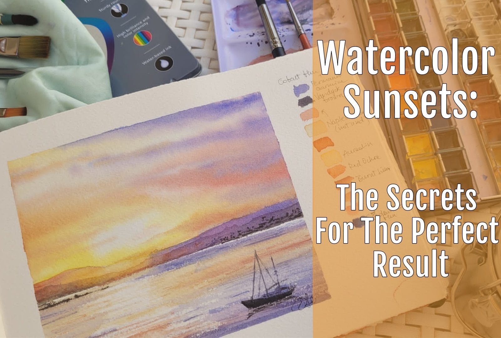
Transcripts
1. Intro : Hi everyone, My name is and I'm an eternal water color is if you follow me on Instagram
or Facebook, you know, but I love
painting water. I love to pay in
Dreamweaver waves, the sea crashing waves. Or what's your reflection
sparking water. This is why I decided to
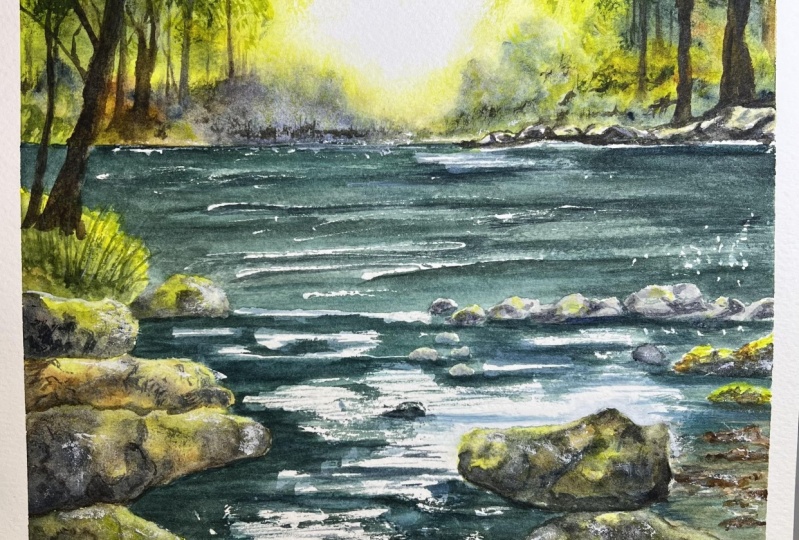
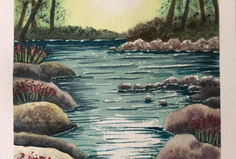
share a little bit of my experience with you and I define it to feel in this class. So this is the final product that we are going
to bind together. It's something like BZ, but with a lot of tips and techniques and
I'm sure you will greatly benefit from these lessons
because you will get a lot of information that you can use
for your further paintings. And we will learn not only
how to paint reflections, and in particular how to
paint sparking water, but we're going to paint also lot of different
shades of green. Green can be a
little bit difficult to manage when you're painting, but after this tutorial, I'm sure you will
be able to pay them to mix all the possible
shades are being ever. And you will learn also
how to paint rocks, how to Playing
tomato sauce trees. Because in this
project we haven't got the sky as you usually have
in a normal landscapes. So it's a little
bit unconventional, but it's packed with
a lot of information. And I hope you will enjoy
painting, definitely me. So if you're ready to go, grab your brushes, so he wrote
color, so you play brush. And let's dive into this.
2. The drawing: So let's start as usual with the drilling and let's
say that I as usual, I am sparing one-third
of my paper to the, further the upper body than two-thirds for the lower bond. So our focus is going to
be the light on or even. Now I'm measuring my paper, which is as usual,
100% cotton paper. This is a block wash paper
then the E Cheese, 27 cm long, so more or less I
will stay around, but let's say ten
centimeter and a half foot, that will be my upper third. And I'm now, I'm drawing the
horizon line more or less. And then the drawing is
really, really simple. We have a pot of light
in the very center. Now we are drawing on some distant hills or the river banks with
some distant trees. And we're going to sketch
everything really, really quickly and in a very
simple way just because we want to trace everything
but not everything. And just to give more or less an idea of the very
far back ground in any way we will going
to mask it also this way because we want to
that to the light. An amusing also a
very dark pencil, even my busyness tube B pencil. But then you have
to rub that away. Because it's the marks
are to evidence, but feel free to use something
lighter to your drawing. And now I think that more
or less around here, this splice, we have some, some rocks that we chart. A main point of interests because there will be a
lot of life in this area. So I'm tracing these rocks. Follow me there. You have just to position
them more in us correctly and then don't be stressed by
the drawing in itself. And we need to give an indication
of the right position, but don't add too many details. Gesture right now because
the drawing in a watercolor, how should we relate light? Okay, I'm sorry, I
don't like this rock. And B, so one to leave
some more spaces, so I want the water to me. My main focus, I
will add some rocks. Also. Hear another
group of rocks. And now I'm savage
introduced by first Bush. And then from here I will make, i will start to draw some trees. They are starting
from here as you see. I'm just getting them really, really quickly with
fluff very freely. Some tree trunks
and some bushes. But in a very simple
and schematic way, I'm not adding too many details
and they will be duster. Will we painted, but
not with a lot of details because the
main focus will be the area of light in the
sky and in the water. Anyway, if the mean
drawing trees is something that
frightens you feel sweet to make it a little
bit of SOC practices. So we are going to buy into
a little bit off trees here, but this area, we will have the light coming and
shining through the forest. And so are we are adding trees just to give
a sense of depth. And because we want to create a sort of error
perspective in the center, we will have the light
of the sun with the race filtering through the
masses of trees and leaves. And this will give us a very, a lot of rightness
just in the center. In this area, we will
create a gradient pinned if you want, you can. I also have a look at the lesson that you can find
here on skill share about watercolor sunset because there is a specific section
on technique to follow to create
the effect that we will have also in
this painting anyway. Now, let's go on with our rocks. I position my main rocks
in the very foreground. These rocks are
bigger because they are closer to the observer. And they are probably one of the most important focal
point after the light. Both through the forest, through the trees in the
foreground and the water. The reflection of water, the light that you
will see in water. Okay, Now let me say more or less here we have
the other groups. The other group of rocks. And okay, we will study you before you can modify
the shape of the rocks. You don't have to follow
exactly what I'm doing because rocks or something very, very common in nature, but thing is no one, Well, that is a alike the other. So don't worry if your
drawing is not close to mine. It's just an indication, then you can draw and
paint your own walks. Okay, So now let me see. Are we okay? Now i'm I'm just thinking
about the shadows. Would be the shadows has the lightest scouting
from the very front, there will be this
area and shadow. But we will paint the shadows when we are at the very end. And now I have to add, No, I don't like this
rough place here. I'm going to draw that again. And I want to preserve a little
bit more space for water. And I just want to add
a lot of these rock. Let's draw that up with
data with more interests, little bit more angles. And maybe it will have a lot of Fisher and
crevices to the end. Okay? But I want also to
leave some light. So okay, we have these
two main groups of rocks. We will have lights in the background of this
river through the rocks here. And we will have also
light in the sky. We have live here and also
at the very beginning, okay, now we're going to
apply the masking fluid.
3. Masking fluid: So now we're going to
apply our masking fluid. And as usual, I will be
using a very cheap old, whether Russia is something
that she sacrificed because it will end all ruined. As you see, mine is really, really cheap and the point
is a little bit ruined. I'll show you using the
masking fluid for many times. I'm robbing the bristles
on a bar of soap. In this way, I will
protect my bristles and it will make them my
brush enough longer. And once he chose so really it is full so I
can use by masking fluid. I'm using a gray
masking fluid because I can identify that
more easily on paper, but if you want, you can use also a white one. We are going to cover
all of our rocks in this area because we want
them to be almost white. We will just paint the
shadows of these rocks because they are almost
completely even in light. And now I'm taking advantage of the surface of the paper which
has a little bit of tooth. And I'm dragging my brush on the paper because I want
to leave some white also in water and then
also I'm going to apply in my masking fluid on
the rocks in the second row. And I want to cover them because when we
are going to paint water, we want to feel free to move our brush and apply
the brush stroke. So well I will in a freeway so that we're sure
that we're not going to disturb any rocks. I will mask also here because I think that
there I'd like to leave a little bit of white and I'm applying also the masking fluid to the contour of the rocks. Maybe once we have finished
with painting the water, we will need to draw once again, the contour of the rocks. But because when you
remove the masking fluid, you probably have a whale so little bit of your
drawing underneath, but that's not a problem. We are going to protect
all of the rocks because we really want
to protect the areas. In particular the upper part, because the upper part is the
one that catches the light. And I really want to
them to be covered. And we will be
very careful later on when we are going
to paint these rocks because the light is
coming from the center. And the, so it's enlight
the upper part of the, of the rocks and snow coming, the light is not coming
from left or from writers. It is usually as it usually is. So even when painting, we will be careful we, because we don't want
to disturb what? We will paint a one rock. So we'll let it dry and then
move to the other and so on. And we are almost at the end. We are painting This rock. Sorry, we're covering. I
will add in a little bit of masking fluid also here
because in this part, we will have a
little bit of light hitting this area of the rocks. And Sarah want to
reserve years of wide. Now, we're going to apply a
little bit of masking fluid here because we have
very wide area of light. And as always studying
you before I'm dragging my brush on the surface and catching the
tooth of the paper. And it will give
really the idea. Sparkling sparkle for water. That is why we cannot use hot pressed paper
because it is too smooth and it won't help us with this kind of effect that
we're going to create. Another thing that
we're going to do is to apply a little bit of masking fluid off to the
far distant water. And now we are going to create an area of masking fluid. Also here in the center. We are not using that
much of a masking fluid. You really need just
a few concentration of masking fluid on your brush. We just want to leave
some areas white, some areas with they call it. And it's like I'm
uncovering were left the contour of this area. You will see that
it will be almost white in this part because
it is really full of light. And then when we remove
the masking fluid, we will add a little bit of brush strokes to
with the singular of water to increase their Jackson to the
movement of water. But it will be
almost, almost wide. We are really covering and protecting the
boundaries of this area. Okay, So now I'm using
a Dr. as you see, it has a very fine
point in the EU. I can use this one, but if you haven't
gone to a Dr. you can use all to the back of a brush. The most important
thing is that the brush that you are using has a
very small dimension, okay? You can use the back
of the brush and you dip it to the
masking fluid and you used to print dots on your paper in this
way that I'm using. So I am. You can use ofs e.g. on old pen or you can also spray a little
bit of masking, e.g. with an old toothbrush. I'm adding very, very few
dots here and there because saying this way
they will give me the idea of a small area. So for sparkling lights. And it is a method
that you can use. You can use the knee, but you can use any kind of tool that she's feel that it's practical and
it's helpful for you. This is something
that I really liked because once it has fully dried, you remove the
masking fluid easily. You don't need to protect the resource or
or anything else. Okay. I think that we are done
with the masking fluid and I think that we can
stop here and let it dry. And let's move on to
the next section.
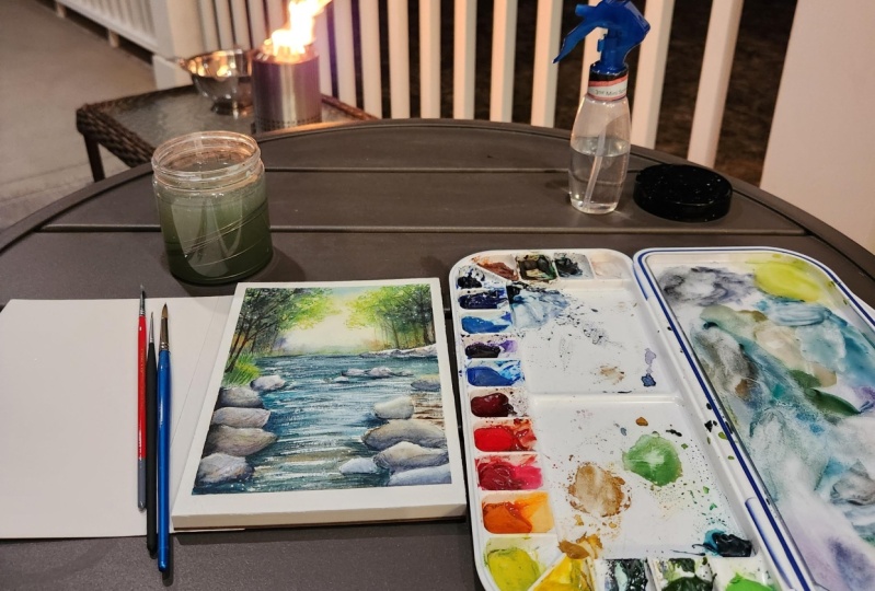
4. Mixing the colours: So now we're going to prepare the colors for our painting. Okay, So now today
I'm using my tubes, but you can use also half bonds. The race-neutral me see what's down to
personal preference. In this case. This would have color. We have very different
shades of green, but we will stop with something like with a
really bright yellow. In this case, it's
a lemon yellow. Which is very good
because it contrasts very well with the greens that
we are going to make sense. And also because lemon
yellow is very easy, it's not transparent,
it's an opec. Corals build big color. So if we want to add
some leaves, e.g. and that catches the
light in some way. Some leaves that kitchen
delight in some area. The fact that the lemon yellow is an opaque color
is very useful and we cannot also a little bit of white gouache to
the lemon yellow. And we will get a very
opaque color that we will use on the darkest parts, the artist, the darkest areas so that we can enlighten the air. And so we lost the light, e.g. or if we think that we
need to add a little bit of light in some part
of our painting. So lemon yellow is something that you really want to
have in your palette. Then I'm using another
which is orienting. Eat. So very similar in tone
to our lemon yellow, but it's a transparent
and it's really nice colored because he doesn't take away the light on our paper, especially mixed with the all
the other green ingredients and I use that to make soul. So my agrees. If we haven't got a lot
of greens in our pilot, we can make some orderly
and we'd cobalt blue USA. And as you see, or
you can use also Cadbury yellow or another yellow that you have in your palette. If we want, we got out a medium. Green in this case, it's very, very bright. And he's, so you see, it's a sort of middle tone. We're being doing a
gradient of greens. And that's really the
most important thing because we want to progress
from the road the brightest, the lightest, to
the darkest one. And as we haven't got
a clean or horizon, the horizon line is almost totally covered by
the green area. We want to create
this sense of depth using the gradient tool screens. And we want to create also another kind of green
wishes, darker. And I'm using, in this
case style of green. Green and I'm adding a little
bit of ultramarine blue. Um, I cannot add a little bit of burnt sienna light in this case. Or I cannot also read
all of care e.g. or other reddish color e.g. if you use moss, Bordeaux, Burgundy corner and anyway, and dragon's blood,
all the corners, e.g. that they are containing
PER one-to-one. And we get this green, which is a darkest green
now on a more muted colors, which is very close to the
color that we have in nature. So we don't want very sparkling bright gradients in this a corner because we are painting a foreign state and we could use all feel Van ****
brown or ultramarine blue, or even burnt amber if you want to create
a very dark gray. Now I'm using sap green. If you haven't got some green, you can mix that with an
orderly Nora, cadmium, yellow or green or blue, and a bit of raw sienna. As I'm doing jumps right now. I'm adding my raw sienna. I'll also to my stock green, but the result will be the same. And in this case you will
get up a very green, yellowish green, which
is very colored too, which is very close to
the color as you see in the fencing in
spring and anyway, but we can also take
it a little bit of fallow green and burnt sienna. And we have more
brilliant green. If we compare that to
the one that we mixed, telling me to go
with the sap green. But we can also take our sap green and then
I will mix that here. And we will add a bit of red
ocher, burnt sienna hand. Okay, I love song,
warm, sap green. And we have in this case, a green which is very
close to nature as well, but it's more of
a reddish green. Any Sakalava HE, e.g. can observe in the grasses. And it's really useful to create a little bit of contrast. As you can see what we
can get all of this green mixing yellow with blue
and ultramarine blue. And then you can not only
know a bit of raw sienna, burnt sienna, red off period, and increasing or diminishing the proportion of
these main color, you can get all the
different greens that I am mixing today. And greens are some, sometimes are difficult to, to, to manipulate because they have they are
difficult to create. You can use also find a green and you can get
another beautiful green adding a little
bit of violet, e.g. in this case I'm adding mirror lying it a
little cobalt violet. And we get a very nice
bright green color. And something also
darker and cooler, different from the one that we got before applauding, right? All Programs sienna and
ultramarine, blue to green. And d equals to
this one is really, really useful for
the conscious there, for the air as the shadow. And then we have
also green in water. So we have 0 or we start
always from fallow green. And we're going to create a very dark green
adding copying orange, which is a P or 20. And in this case is see if you have any other oranges to your palettes and they
couldn't be fine. I'm adding here and
it'll be enough. Faint blue as well. And we get this dark green, which is even the ETC. Now it's a different
shade of green, which is different from the
one that we prepared before. So let me create a really mixed all the
possible combination, all the possible
shades of green. Now, we can get something
even darker, finer green. And here is a little
bit of Van **** brown, sorry, Berlin by a letter R. This is not bounded brown. And you can use
also find agreeing with a period and a rule. More tumor, Van ****
brown or any other kind of dark purple color. And the last one is the one that I sent before
with funding round, which wasn't this side of my
palette and failing grade. And so you see we have a different shade
of green as well. So we have all the
dark greens on one side of our planet and all the right ingredients
on the audit. You cannot also
ultramarine blue, indigo to get a darker color. Really depends on the
corner that you're using. I mean, if you have a half pans or tubes that we loved,
maybe slightly different. And oh, another thing is that a really is a staining color. So please watch very well, you're at in your brushes. So the ICU, you will get everything green even
on your, on your brush. And then now we are
starting to paint. Then we will paint to
that for the bright area. And let's move on and
paid to the first bar.
5. Background: Okay, so now we are going
to bind the background. We have the area of light in the center in this born
less than these positions. So we will move from the upper part and
then we will tackle the lower part or paintings and bear in mind that
we have to leave an area of light and the sender and I will
show you how to do that. But if you need more hi
information on this concept, please follow the lesson that we have of
Skillshare about Sal sets mucus and the technique is explaining a thorough way. So let's start to
wet all the area. I'm using. A brush tool which is an enemy
tension of squeezed down and eat retains a lot of
water on using as you see, that my four fingers
on one side, it's almost I mean, it's not exactly
vertical and I'm leaving a dry area exactly in the
center of the painting. I don't want any kind of
color or water to go there. I'm trying to leave dry. These areas you can see
finding climbing the board. You see that you have the
dry area and the wet area. Please don't wait to match your paintings because
we don't want to create any puddles and we
want to have a very clean, uniformly wet painting. We must have something wet to the num more or less in the same way
on all the edges. Now, I'm using a smaller
brush, round brush. And we can imagine that we have a little bit
of sky in the suburban. I'm mixing a little
bit off cool Bu, but just a teeny tiny amount. In this case, even if I
have greens later on, to create a different
shade of green as well. It's a nice introduction, even if we are in the
middle of the forest, maybe we can have a chance of seeing any little bit of sky. And what I was saying that
I'm using a smaller brush and it's always going to
be additional squirrel or any way something that
retains a lot of water. And it will give a really nice contrast
with the green if those small part of
that we can see. So I will start with
the lighter value, which is our yellow pen. I will try to put that around the area that I left
in July, it before, and I want it to
be very bright and clean and using you
see my brush none, all the stories onto away
and I'm spreading the color. And you see, even
if it makes us with the green and the blue, sorry, it will turn into green, but that's not a problem. Okay? I will put in a
little bit of the 0, not only with lemon yellow and this moment there is
no right or wrong. We are dust stuff. Creating the background with not really splashes of color, soften where you
think you need that. And I will work for our use
even on smaller brush now. And I will start to soften
and to put in some small dots just to create the
shapes of the leaves that are heated by the sun. And I'm using now a very, very light green, sorry, the lightened screen
and that I had before and I don't want to cover the area and then
I left white lie. But I'm creating a
sort of IDL leaves. They will be hit by the sun. Now I'm wetting again the lower part because
it was almost dry. Lodging always my mixture
of lemon yellow or orange or yellow or yellow
that you have in your body. It doesn't matter if you haven't exactly the same
color that I'm using. The most important thing is
that you meet something that gave the has the same grade
and so bright greens, brighter pianos, median,
we send dark me. Why they choose. Drying, be careful that we
haven't got any harsh lines. But I think that we are
we have a lot of we have a good time and we have enough time to pay
to wishing wet. And we are creating the
gradient and we are putting in the different corners that
we can see in this forest. And we also need to be aware of the fact that we cannot cover
with the darker colors, the lighter wash that
we put in before. So even when you're
spreading this mixture, be careful and try not to cover. We did the column, we've agreed that you're
using all the breeds that you painted before, but you have to
create a sense of movement and of variety. You have to alternate dark areas to lighter areas and try to
create a sense of depth. We have darker areas
and light areas, and we need to build
this foliage in. I mean, it in a very
easy and free way is to see that I'm doing, but at the same time we cannot we can't pay
without having in mind, bearing in mind the final
result in, you see it. I'm using more or less all of the greens that I
mixed it before. But I'm still leaving a little
bit of white areas, e.g. here in this cluster, the rocks because we have the tree trunks
in front of them. So I'm creating a
good contrast and I'm using now and it'll
be enough mineral violet, cobalt violet is
cobalt violet with ultramarine or cool blue to
get this nice booklet color. And I'm softening the
color as well as the sea. Yellow and violet and green is an amazing combination
of columns. Okay, I'm implying my water, I'm using my masking tape
so that I'm sure that my violet mixture want flow
up until the area of sun. Now I'm putting in
also the dark green as well because I want
to contrast with the white with the light that
will be heating the rocks. And so even when
you are painting, tried to do planning advanced the area of lights and darks. Sudan, you get a very
nice result would be n very harmonic
voice results. Or if you have lighter as a new water
to me even brighter, use something dark
in the background so that they really Papa stand out. We can also use some
pure color, e.g. a. Shaft to Sammy adding lemon
yellow in this case because the pure color in coming out from the
tubes is very dense. One spread all over it. It will stay more or less. The end. You see, it will give a nice
contrast even in this case. So here we have a very
fuzzy feather edge, which is really nice
because it recreates the sphere of the bushes. So in this case, it's an unwanted cauliflower, but it's really useful. They are using, we can use them in favor or they're
not working against us. See the color as we're
working wet on wet is becoming lighter and lighter. That is why we need to add
a little bit of dark color. So when the watercolor dries, you see that the color fades, fades out, it becomes slider. And as long as each is wet, we can add a bit of start, a little bit of contrast without losing our yellow here yeah, that we painted before. We, now I'm waiting this plot because here
we have another bush. Repeating the same process. I'm adding first my lower, my lighter value,
which is yellow. And then that'll be
enough for medium. This is a major element in
green and it will be darker. So I, I sort of
gradient also here. And now I'm going to
use a pure color, e.g. a, burnt sienna or red or per wishes another
good color to use. Hello. Contrast with greens
because it's reddish and you know that green and red
are complimentary colors, so they are really working
very well on your palette. And you can use something
more brownish, reddish. You cannot break
down barriers I'm using as I'm doing here. We will spend a little
bit of this color. We will let it mix
that all papers. Are we getting a very nice
color that are otherwise we wouldn't have obtain if
mixing on our pilots, feel free to let the color mix
on your paper because, um, you will get very nice color combination
and color shades. You know what a color is magic. Because magic works on the paper when the
corners make me meets the water and a little
bit of blue in it. I'm really adding contrast and you cannot also granulating
color if you like, e.g. my purple, blue, and
ultramarine that I use in the mix is pretty
lighting on light IPL, which is something that
I really like when I'm painting Woodson
forest because the granulation effect
obsolete little bit of texture to the, to the forest Sama
Jing once again, ultramarine blue and green. And now I'm adding my fellow
green with ultramarine. I'm sorry, we have a couple
of violet that I mix before. And I'm using all the
degrees that I'm mixed. It's more or less than random. It seems to be a
random positioning, but I tried to explain before it's something that we do
to create the gradient. Now I'm lifting bit of color because I want to
create the impression of the ray of light entering
through the leaves. And it's something
that you have to do with a very clean brush. Wash that and down. Not thoroughly wet. Really. Drawing better bit with my knocking in my left hand. If you're not if you don't like these kind of
effect and do that, uh, your anatomy, you can leave
that as you saw before. So it's something that she
can decide to do or not. We will pay it anyway, leaves in front of this area. So why use a soft brush and be aware of the
fact that if you do this when the paper
has started to, why you won't have this
soft effect is so tiny, it's really crucial
in this case. And so you should see that
the paper is still wet. You can do that, otherwise, you need to and you
cannot do this. You do that. Now I'm softening this area. And we have done everything we can do in this upper part and now
we can move on to water.
6. Water first wash: Okay, so now we're
going to find water and first things first we
need to make so our callers. So we are going to create a different
shade of green for water, because water has
a different green from the rest of the vegetation. And I'm going to
use my final green. We're going to use a
lot of green in this, in this project, fellow green. And we are, We are using
also cadmium orange. I'm using a phenol ring
which is P G7 or PGA, according to the brands and
my cabin oranges appeal 20, but you can use also e.g. chromium orange, which
is P0 63 or I think, I think it's six, it should be. Or you can use also
green and orange. Anyway, you can use also e.g. your green with
yet another orange or that you have
in your palette. The most important
thing is that you have something of the
same tonal value of the mixture that I have. Here. It doesn't matter if it
doesn't really match exactly 100% the
color you're saying. Okay, So my block
is on an incline. I have my masking
tape underneath it. And now I will choose
my soft brush. And a rejection of square
root out is synthetic. I'm wetting with clean water and I will try not to disturb the areas that
I've already painted. So it doesn't matter really
for the horizon line. But you see I'm staying away from the bush that
there is on the left. There is a very fine dry line of paper that I'm not going to wait because I don't want
the color of the water to go over my gosh. So now you see that these
two washes really watery. It's very diluted, very
very light, very Bay. And as it is way too wet, it's probably going to dry
even lighter than what it is. So as I think that each is
a little bit too light, I'm adding a little
bit of sino blue. Let's mix it up. Dark
is the final green, blue and orange, cadmium orange. And now let's put
in subtle case. So here we go. This is the right color
that I wanted it. We are putting in a little
bit of our darker green and now I'm working wet on dry and managing the very pale
wash that you see that I'm just putting on the paper
just right now because it is why is that very paid? Because we have been doing the depth of water
in different stages. So we are starting as we
usually do with watercolor. We're starting very, very light. And we will add color and
tone as long as we move on. So now you see I
had a little bit of orange in my palette and now I have a
little bit of orange. Austin, what are we choose? Not a problem because
in this area there are some rocks underneath
the water is shallow so I can
see those rocks. And in fact, I will be
adding a little bit of red ocher or burnt
sienna in a minute. Because I want to create the ADF these rocks
under the water. You see B also changing
the brushes from the very soft one to a synthetic one which is a
little bit more, less elastic. And anyways see corners I'm mixing on the paper and now
I'm adding my dark green, which creates a very good
contrast with the rock, with the red ocher
or burnt sienna that we painted in that and
they are creating, it will show yes,
so think they are complimentary color
and they are doing, they are adding a little bit
of interest to our painting, which is really, really green. We have green in all
its possible shades. And I think we are
about done with this. And I think we have very, very few things to do. No, we are just putting
a little bit of dark color here as
it is still wet. So I think yes, I'm fine if I'm
working on that again. And if it's already dry, don't do this on your paper because otherwise you
will be doing that. Okay, Now we can stop, let it dry and we will go back in with a second wash later on.
7. Trees: Okay, so now we're
going to play the trees and we're going to concentrate on the upper
part of our water color. And I'm moving
from left to right because this way I won't
smudge my painting. Move from right to left if
you're left-handed so that you're not going to ruin everything you've
painted before. So as I was, the trees are all darker than the things that we
have in the background. So we're going to
use different colors for the tree trunks. And I'm going to prepare a
mix of a very dark brown. I'm using ultramarine
blue in this case, in my burnt sienna, so I get a very dark brown. You can use also Van
**** brown if you want to, or burnt umber. And in this case you will get
different shades of brown. I want to also
different colors, e.g. okay, let's take something
towards the violet. I'm taking a volume
that could be a cobalt violet or
a mirror of violet. Ultramarine violet depends. And I'm using also cobalt
blue and a little bit off. Red, crimson or rows
mater or purple, magenta or calming
whatever you want, okay? Yeah, because I want to use this coloring in the background in to give it a little bit of a DAG off the
very distant trees. And to add that to
my, to my painting. Because that's something
that's really ******* be confused with the trees as well. I need also to my medium
value for browser. I'm mixing cold blue
with burnt sienna and I'm getting these larger shapes. And you can use also cobalt, blue, and red ocher, e.g. we are good to keep the idea
of these trees in the world, but they won't be too detailed. And I want also to
bind a lot of trees, but just a few to give the idea. So let's start from
the very far left. And I'm painting my tree trunks. We got a lot of brushes. I have a very good brush
will be the booty. Good point is very
useful and you can, you can trace the
brushes is sorry, the branches of the trees
with a very defined stroke. So don't hesitate. Feel free to try to get
confident with this move. And at one year you are
painting the base that you have to soften it a little bit because we want
them to be planted into our bushes and not
detached from the ground. So as I was doing before, you can just wet to
the base of the tree. We're a little bit of water and then dab it with a tissue. Whereas the tablecloth
or whatever you have. And now we're adding another treaty with another
color and lighter one. And there is no
really precise rule. The most important thing is
that for the sake of variety, you change the tone of your
browser that you're using. And remember also when
you're painting trees, the tree trunks are bigger
at the base and they get smaller and narrower if you
move upwards towards the sky. Now the thing,
Okay, now I'm using my blue shade, you see, and just to add a very few
trees in the very distance. Now I'm printing a little bit of color on my paper because I want to keep AIG of a
tree trunks which is partially hidden by the foliage. And this is another
technique that you can use to pay trees or
to give the idea of masses of trees and rewards with a lot of
a lot of vegetation. And then we have
also a branch here. And now I'm tracing. Remember to trace your branches dimension which is not
bigger than the trial, where they are departing. And as the branches goes opera, they are, the dimension
is narrower and narrower. So it's something
that you stopped baked and you end up
very, very small. And this is something
that you can realize. I mean, with a little bit
of practice and pressing the brush that the
base of the branch off of the trunk and then moving on you or the tip of the brush and tracing a very fine line. You can position the
trees wherever you want. And you can also pay
a smart trust you as much trees as you
want because it's your own painting and
I want you to read it. Think of while you're
painting and okay. So you're very free to do this. Decide how many and how
busy or how crowded you're you're forests can be. So another thing that I
know that's a good thing that I want to underline is that when you
are painting the trees, you don't want to have a very wet brush like any
mutation of square root, because otherwise you will
get them not of color. And maybe you can get on
it will be ten gold and, or you can have
some difficulties. So when you are painting trees, I usually go for synthetic
brushes which has wish, I'm sorry, a very good boy. But they're not they haven't got a very big capacity of
retaining a lot of color. Another thing that you can bear in mind when
you're painting trees, maybe there are
some types of fiber which are more suitable
than other fruit simple. I will never use hot
pressed water for trees because I like the fact that the cold press paper has
a little bit of tooth. So it will give me
what interests no, totally in the lines that I'm
tracing for the branches, but also because it increases the effects of granulation
of some pigments like e.g. cobalt blue or ultramarine blue, which are granulating pigment. And that's so that will give a little bit more
texture to my trees, even if in this case, granulation is not so important. But if you're painting
forests and woods, this is something that
you may bear in mind. Okay? So another thing is that if
you have painted green areas, you can tour in the board to to bind to your your brush or yes or
your trees in a better way. So as I was saying, if you
have painted green areas, you have to trace also
some round just because the leaves that have faded are supported by
something underneath. Be free to turn your board or your block
of papers I'm doing just to feel more comfortable
and to trace your brushes, your branches in the most
comfortable way if we remember to add them because those branches
or the CEJ tanks, because otherwise
you will have leaves just operating the sky but with nothing underneath
it to support them. And you can add more color. You can add different
tones of color while it is still wet so that I can
create very interesting fact. And if you think that the color that you laid down is a
little bit too strong, you can dump that
tissues, sorry. Or you can also use e.g. you can lighten up with clean water and then you can drop them with with a tissue. Because lifting color is
something that a tree, It's very interesting effects. Or you can add
different shades, e.g. we'd lighter colors,
lighter browns, e.g. a. Simple raw sienna would be nice, not in this case
because it's very dark, but it could be something
really nice to do. Okay, Now, we can remove the masking fluid here and
stopped, talk cool. The first part of our rocks. And let's stop here and see you when you have removed all of your
muskets, believed.
8. Distant rocks: Okay, so now I'm going to paint the distance rocks
that we have to bear in mind that the light
is coming from this point. And so we have the
upper part of the rock, so which is completely
hidden by the light, so it will be almost white. And what we need to
do is just to paint the contour of this
rocks are not going to paint them in a very
defined or precise way. We want to give the ADR. So I wouldn't mix the color and I'll want to sort of gray. Will you be using cobalt blue with a little bit
of burnt sienna? I will get this kind of gray. I will show you
all come closer to my webcam so that
you can see better. So this is cobalt blue
and burnt sienna. Again, you can have very
different shades of gray. It maybe you have something
more towards the brown, brownish color or even though
towards the bluish color. Hey, according also
to the quantity of new or L3 burnt sienna
that you're using. It depends also
on the brand e.g. burn center can be made by PB, R7 or B are one-to-one. See you can get a
different color. You can use also
Payne's gray, e.g. in a very diluted
down concentration. Or you can use other grace that you have
in your, in your palate. And the most important
thing is that you get the tonal value as I was
attending also before. And it doesn't
matter if you have exactly the sushi haven't
got exactly the same color. You remember that for
the sake of variety, It's also fine to get some nice different
shades of colors of D, also different shades of gray. You can have something more towards the brown
or towards the red. Because the nature
we have variety and we can add a little bit
off the other browns that we mix before for the trees
because the rocks are reflecting the lives and also the things that
there are around. So even at the trunk
of the trees as well, we are going to use a very fine brush or with
a very good point here. And these rocks are distant, so we are very good. Dark tone, ultramarine
blue and burnt sienna will be fine for this. Because I want to catch the
the shade off the rocks. And so I'm going to put in the shades as
First thing first. And to define than
long did separate the shades from the
rocks of the water. Now I'm using the C my
brushes sideways and I'm going to off the rocks. And I'm not doing anything else than just the
suggested in VHDL, so rocks that we see. Okay, So let's move on. Adding some darker shade. The most important thing here, it needs to get the right tonal value while we are creating the shadow of this, we are leaving that. The most important thing do you have to leave the white bar, the white paper because it
reflects the maximum light. And I'm using now the peripheral wired color
that we mixed together with cold blue and Alizarin crimson or peripheral magenta or
whatever you use before. Then I guess you can use a
purple color as I always say. And now we are almost
done eating this area. I'm softening a little bit
off with the tree trunk. And now we will
leave that to dry.
9. Foliage: So now we're going to find the foliage leaves that we
have on these branches. And then we will
tackle the Lord. But now first thing first, you need a very old whether brushed with the
brush, that chicken. Okay. I'm checking if it's
all already dried. Okay. As I was saying,
your brush that you can that's cheap weather, that you don't care that too much because otherwise
it will end all ruined. Now we're going to use a
little bit of lemon yellow. Now. Using a dry brush work, I drag my brush in an horizontal way and I'm
scratching on the paper. I'm really trying to catch in the tooth of
the paper as well. And I just want to cover a little bit also
the area of the light that IN left in the center
because I want to give the impression of the leaves. Now I'm adding a little
bit of sap green. You can really use the colors that you
had in your palate. And okay, we are adding leaves. With this effect. You see ashes is probably the best paper for
this because it has a very nice texture,
asha, cold pressed. And I know that we are going to cover what we re painted button. That is why, why I'm
using lemon yellow, which is an opaque color. I'm rounding green,
darker green. I'm now I'm adding to my fellow green a
little bit of violet. And so you see I create
these darker value. And in this way, we are going to create a three-dimensional idea
of trees and foliage. Add the leaves where you think
you need this should go. But be aware of the
fact that you have to leave the areas of light. So you'd want to end with
everything COVID Apple with the darker color that we
are mixing just right now because we want to give the impression of
different masses. So foliage. Feel free
also not all fit for you. You need to use also a more dense color mix that
the one that she used before, because in this way the
corner won't flow everywhere. As usual in watercolor, we start from light
and progress to dock. This is why I'm using the
dark color just right now, but you don't have to cover up every every space in
stay and it'll be back. Stop before covering everything. Maybe tomorrow morning
we're fresh eyes. You will be able maybe to Ogden some darker
areas but for now, stopped before because
otherwise you've count. Go back as you see how I'm
using this technique also for increasing the bushes
in the far distance. And I'm mixing the
green set in this way. And now I'm adding more yellow because I think this area needs to be
bright and a little bit. And move also in these ways you see I'm
moving from left to right. If you are left to hand, it will move from right
to left so that you don't smudge all the things
that you painted before. And even using the dry brush, we're don't cover
everything, leave the trees. The ranges that you've
painted before, our org lists some of them
still visible because you don't want to cover everything. So if you haven't
gotten lemon yellow, cadmium yellow will be fine. Otherwise, you can make
it a little bit off. So white gouache with
your lemon yellow, you will get even a more
opaque color that we'd cover the branches that
we have underneath. As I was saying before, we are creating an impression of depth because we haven't
got the sky really. We need to give a little
bit of perspective. This is why I am using, I am layering different colors. And anyway, don't be afraid of trying this technique
because it's really simple. And try to give an idea, an impression of trees, but you can move your hands freely on your paper
because in nature we haven't got very precise
trees or Rogers. They are all put in a perfect way and
buying Mother Nature, but we're better off for it. Some cool, something
man-made here, it's white, so please try to
protect this area. Now imagine that a
little bit of red ocher, burnt sienna because
I want to change the color and I'll
want it to be darker. And okay, so here I'm adding a little
bit more contrast because I think that my, they've my painting
good benefit from that. I'm using as a C always
my dry brush technique, using my brush sideways. And I create the impression
of this new foliage. Leaps in the very far. And now we'd love
to my other brush. I'm creating, I'm dragging
some grass or wheat or whatever just to
create different aspects. And to give you the yes, the ADR or RAS. Anyway, this your watercolors. So if you don't want to
do something that I'm doing because you think that your painting doesn't need it. Feel free to manage and to control chap what's
happening on your paper. And C3 2-OPT at some
details or not. If you think that
they are useful or not for your ankle position
and for your final result. Now we'll put in also little
bit of grandson up psi. I really like the red, a component in the
very far distance. It will help to break
all these muscles green. And also on the rocks, eight will give a little
bit of a nicer shadow. Okay, now we can move to
water in the lower part.
10. Water far portion, second wash: Okay, so now we are going to
mix some dark green again, final green, then
the final blue, together with cadmium orange. This was my previous
combination of colors, but ISTE haven't
got this red color, so you can use cobalt blue with, I'm sorry, all-terrain
new we fail agree. And cadmium orange,
It's very dark, very, very dark mix of green. See, you get, you should
get something like this. And you should also have
something thick, not too watery. Consistency of this
washer is pretty dense. And check your density. And when you think you're
done with mixing these color, we are going to use. So for the first part, it's
a combination also dry, wet on dry and another
bit of wet-in-wet. So now I'm using my wet
brush on dry surface. And then I always ask, sorry, I'm also softening. I have my knocking my
kitchen roll ready. And as you see, I'm softening the lower-class of the
lines and I dos trace it because I want to recreate the impression of
sparkling water, but not completely
white sparkle. I just wanted to give an
idea of shining water. But recreating also the
idea of movement and the ADL flakes and also
of deep water which are darker than the wasps that we can have in the
very foreground that are, of course shallow
because we are close to the to the observer. And so you see I'm
working wet on wet and wet on dry and I'm
softening the snow work bot. And this way we created the
idea of movement of water. So here, be careful, tried to live a very fine line. That's a break the rocks
from the surface of water. And I'm adding a little bit of dark also in these rocks
just to give them work. Three day mission. And so we don't want
any harsh lines. So here e.g. I. Am softening. We don't have a bit
of clean water, and I just want that to be completely soften
now we'll leave that to dry and we will remove
the masking fluid from the rocks that we have
on our left side? Yes. Because this way note I
will stop here because it's a little bit too wet
steam and this in-stock good. Okay. See you later.
11. The rocks : Okay. So I have removed the masking fluid from
some of the rocks. This is a good moment
if you want to trace some of the lesser
tubercle, the last two, we have to remember that we need to leave some
whitespace from warm rocks and the other because the upper part of the rock
is heated by the light, does so it will be totally
white if possible. We need to prepare the
color of the rock. So once again, because we have to we need to have them ready. Um, because we will be
working mostly wet on wet. So we will need also a little bit of yellow
and a little bit of green. Because I was telling you
before there might be some literacy or
Moses or our rocks, or because they reflect the economies of the things
that are around them. So now I'm taking my
pencil and just want to define a little
bit to draw again a little bit of the
lines that I lost. If you want, you can do that. Okay, so how do we
start painting? We need, first of all, brush wishes of the
appropriate size for the rocks at your
painting not to bake. And now we can wet the area as we did for the central
layer of this painting. We are going to leave some, we're going to do live
saw a very fine line of very fine space,
so totally dry. And now we are putting our water just in the
lower part of the rocks, which is the part
which is in shadow. And then we start always
from light to dark. We are going to put
in some yellow, which is a little bit dirty because it's more of
a greenish yellow. Anyway, I live that way. I'm going to create a
little bit of brown with my cool blue
and burnt sienna, but feel free to mix the
color that you really like. And as you see, I'm putting in the
car in the bottom, but I don't want the color to spread all over the
surface, often rocks. And then I'm taking and
also my darkest value, which is ultramarine
blue and burnt sienna. Because I wanted to be really conscious
and to give me the, the idea of shadow
on dishwasher. Because I want it
to be really die. Silly tweet contrast in
a very nice way with the upper parts of the rocks that we have
underneath this one. Because as we said before, the other part of the rocks
will be full of light. But this is a very good brush that I use for painting rocks. It suddenly mutational squirrel
than I really like also from lifting because it
is very soft, softer. So I have a very good results. Why we need lands are not
too harsh and when it comes to mixing the color
on lifting them in a very, to get a very soft
results. This is y. So here we are leaving
dry the rocks in between because we don't want the
color to spread all over where the one that we just painted and the technique
is always the same. You dry with your clean water
all the surface leaving a very fine line or July and then you start to put it in the color of the
light one degree, she's always lemon yellow
from the very bottom. And you tried to stay
away from the upper part so that the colors flow
colorfully in a very natural way. Now I'm running a
little bit of green, but they do not touch
or at least they do not reach the upper class. Now, I'm putting a bit of burnt sienna as
a cheesy please. Red ocher, burnt
umber, raw lumber. A brand that you like. For the sake of variety, feel free to use
different browsers, different cues also
gray if you like, you can use darker greens. You can use via nurture as well, which is a color that is
really nice for the rocks. So violet or purple, this is called blue
and promote Commie. Hey, you can use smarter
as I was saying before. And I think that this is
really nice, very nice shade. And now again, cobalt
blue and burnt sienna. This time I got a
very dark brown, not as, not as dark as the one with ultramarine
blue, but really die. And now I'm encouraging
the mixing of the colors Dustin paper and
I'm trying to blend in them. We're using these Rush. She's very soft as always study before and it
retains a lot of color, so it really allows me
to bind a good amount of time without needing off stopping and taking
some water color. And as long as it is called
fully wet hoodie and also some areas of dark in
like I did just before. So you get the bar to meet
the the darker areas. So if it is dry, you can move on to these rocks and you can
remove the masking fluid. As I told you before, we need to stop because we were disturbing the areas that we
had already painted black. I'm I'm you know, that the rocks that I
just page in our drawing, so I want to stay there
with no smudging it. Also, I'm pleading these splines which are in the upper part, and I'm going to play them
in the same way that I can use a smaller brush
because these rocks are far. And for these rocks I
think or we go back to my dry brush
technique with gray. Just to give a bit of gray. The shadow area. Match your brush now and
create just the contour. The, the, the, the, you have to give
the idea of rocks. You, you don't need
to be really precise. Add some dark colors
on doing here to give it more of a
three-dimension aspect. And then C-suite
to blend or less, or dark blue tissue if you
think that you went too dark. And also here, in this case, we have the shadow
on the other side. It's not on the right
side of the rocks, but it's on the left. And I'm using my
gray color are made with cobalt blue and a
bit of burnt sienna. I didn't get a little
bit of purple, but really feel free to use the color combination and the color mix
that you prefer. Feel free to invent, to improvise also be done. Tried to create very
nice color of rocks on your paper according also
to your own personal taste. You can put in also some green to create the ADL Ross here
and there I feel like that. Feel free to experiment with the stirrups or something
that I really like to bite. It's like meditation. To me. They are nice, nice subject with a lot of
possibilities. There. There is no wrong a stroke on a rock and something went wrong. You can always do something
to make it right. Now. We are going to Emily and taking away the
masking fluid also here. Okay, I will write this
rocks day as you see, I'm creating the shy
off the rock with no pencil drawing really
guidance underneath. But if you think that
eats new accessory, feel free to do that. I mean, he stopped
before painting. You retrace once again the shape of the rocks and
then you start to pay them. I really like to
buy into following the impression or the
movement of that bill went. But if you need something, you don't want to improvise. This is strongly advised to
stop within the drawing, the drawing line
and then go back. So I'm increasing also the dark tones at the
base of the shocks. Because they are a little
bit too light to me. But maybe you don't
need to do this because on your paper
it's already right. Anyway, we can always check in when it's fully
dry and if we need some some other d chance
or some strong dark areas. So I'm repeating the process for all the rocks that you see, that you will see. And so the process
is always the same and you need to start
with a base of piano, and then you start to put in the color that
you really like, e.g. in this case, I'm
using burnt sienna. Like to have
something reddish to contrast in this place
of the painting. And then I'm mixing again ultramarine blue
and burnt sienna. I just want to very, very dark
tone this time, this time. And see when the corners
will be totally dry. See what a wonderful
walks you get this wide is the cauliflower,
some paper. And it says on paper and you get really something that
you wouldn't have. Also say You see I've
taken some greens and putting some green,
some soft cheese. You can use also hookers, green or whatever you
have in your palate. So as the process you see there is a little
bit of repetition. I will see you on the other side of
that and I will leave. You saw music so that you
can go on painting rocks. And feel free to use the color that I'm using
just through the guidance, but I tried to create
your own personal locks. Good. Good. Okay, so now we are almost done. We are at the very end, this part of the rocks. And, um, Okay, One thing
that I have left, e.g. if you see that sums in some
areas they are too light, you can always start a
little bit of color. And you can also add
some details doing some dry brush work as you
saw me doing along the way. Before doing any
brush dry brush work. Aware of the fact that
no stalls must be dry, otherwise it's not dry, Russia, but it's a little
bit of wet and wet. And I think that now we can move on to the remaining rocks.
12. Water final wash : Okay, so now I have removed completely
all of the masking, see that I still
had on my paper. And I have done this operational very carefully because I didn't want
to touch the Moxa. Anyway, we need to
add the reflection inside the ears
that we left white. And we want to create that
beautiful sparkling effect and the impression of water
moving and meet Chuck, then be sure that you
have masking fluid, wouldn't be sure to have enough color around
mixing again, a little bit of my
dark orange that is fan of green, yellow, blue, and cadmium orange
was I told you before. And I want it to be really dark because in
this case I'm going to move me to paint my darkest value
because they want a high contrast that
the dark is the value. The higher, the darker, sorry, the darker the value, the higher the
conscious standard, the greater the
sparkling effect. It must be really
dense so that when you drag your color on
the paper you use it, you have a little bit of white left by the tooth
of the paper that will increase the shining
effect if you use a very moving my brush
with a very good point. This is the number two and it allows me to draw even
very fine details. And if you want a line which
is a little bit stronger, you just have to press
a little bit more. And you use also
soft brush, e.g. this one is not too much synthetic and it works really well because it's
not too elastic. Okay, So if chalky, if you think that
this number is, the number that you're
using is either going to be q because we are tracing very fine lines. Switch you use also e.g. a. Numbers theory depends on
the brand that you're using. So you see that I'm adding
the shadow water and then with a very fine brush and wishes a little bit softer, I'm going to wet the area underneath the shadow
and I am softening that suit and we have a harsh and soft line the same
time in the same position. And it creates the
idea between how to create the ADL fan off away. So let's put a little
bit of shadow also. Wonder these barcodes everywhere but just to indicate
the movement. And for two, because
we see the sparkle, but there is water moving
underneath and we have also announce page rocks here. And as always, check how we
will match your painting. You just want to
indicate the shadows, but you don't want to cover all the white areas that
we decided to leave white. So don't be carried
away with this this, this part of the painting. You need to be careful and
watch what you're doing. If you think that you are putting too many lines,
please stop yourself. Take a break, maybe super cup of tea or coffee,
whatever you like, or maybe stopped
painting and go back to that the next day so that she looked at
it with fresh eyes. And you can judge, you can jump in a
more relaxed way. In a fresher way. If you need well, other nice or not. And if you need to add some
dark areas are worn off. Because once you've
covered your room, areas of white, you cannot go back to
white with water color. So now I'm adding a
little bit of reflection of dark and flexion
close to your rocks. And the ending, this
reflection, one-by-one. Just a little bit hold. So here B, I mean, try to use just one stroke. Joe, do small steps. Now I'm softening again. I'm using a bigger
brush here. Now. I believe inflection
on the Alice side, following the shadows to Zach's and create all to some movement in these
big area of y two. But we left the very beginning of this process right? Now only and try to
use dance mixture. And I'm using to see
my wrist is close to the lower border of my block. And I moved using a
guidance because I want to draw very straight line because water comes
to a level leads. We can really trace the lines were we are
moving up and down. So we need to be to go straight. And this can be a little
bit of a trick to use. Now, you see that there are
some rocks underneath e.g. in this area we have some
brownish inflection. If you want, you can
increase this corner going back with a little
bit of burnt sienna. And I'm softening
the lines again. Then go where we'd solid dark color. Okay. You didn't need to leave
too many white spaces, but it's just a matter of policy you need to evaluate to if you need some more or there
is no need to add anything. And now we are at creating a little bit of
smooth mental see this white, make white area
because even if it's all enlightened by the sun, we still have a little
bit of shadow diffuse, so we have repugnancy in water. And we want to create this, this nice effect with a
high contrast values. So go dark, gold
bowl we're color on. Don't be afraid of the fact
that it may be really, really dark because
as I told you before, it really helps with the
conscious and the tonal value. And it will make the
white shy even more. And use these thick
mixture so that when you drag your brush
on cold press paper, you really take advantage of the texture of the
paper so that you get a very nice result because the lines are
not straight and heat, but they will be
broken by the texture. And this is something
that you have to use, a true red bondage. The, the, the paper,
the materials. So as you choose, she'd always be planned and
there'll be an advance just so that you can
take advantage of the main characteristics
of a color, of a pigment or vapor. You need to know very well also the instruments
you're using, e.g. if your brushes, how much
water brush carry tide, and so on. Okay. So now we are adding
the final details. Okay, Also here. Yeah, I'll dig in a little
bit of reflections and now let's see maybe a
little bit of dark here. And also here of
the very far end. Follow will tell. Okay. So also at the base of the
rocks is a good, nice work. You need to put in some way. Still strong dark areas
that they can ballpark. Really softening the lines
where I think they need to. We are about done DNA art, where you need to lead
of DJs but not too much. I see you see how
they did the dance. Mixture conscious trading well with the white of the paper
that we love to sell, I think that we are
really close to the final touches and
we are almost done. And I will stop here and
then we'll come back for the very final touches to finish and king in tie
everything together. Let it dry and then
we will go back.
13. Final touches: So now we're going to use a little bit of white goulash
should be consistent. I lost that line, the white line between the rocks and the
surface of the paper. Maybe you need to do the, doing this because you
maybe even take that line. And anyway, I'm adding a bit of white gouache in these
areas because they want to keep it really fine. Now I want also to
add some leaves, e.g. here, I put a little
bit of white gouache on my one corollary of
my masking tape. I don't put that in my
palette because otherwise on that all of my colors
will become opaque white. And I'm adding a bit
of lemon yellow, mixing that old
voice in this area. So what I'm trying to do is to get a yellow gratia or
and I'm using that to apply a little bit of fleets a light to my painting in there, I can recreate this
sensation of the leaps, lightened, heat by the sunlight. And e.g. just, just few dots
you can use all from the dry brush
technique in this case. And if e.g. you were
painting a Knowlton tree, you could add burnt sienna to your white gouache and get
some orange trees and leaves. And now I'm adding also
a little bit hafnium, the mixture of the dark green
made from cadmium orange, yellow, green, and blue. Because I want to add a
little bit of contrast. Here we have, you know, we are creating a little bit of three-dimension
in this leaps in, in the streets and three
will be masters of foliage. But you can really check what's happening and maybe you
won't need this. Hello. Okay? So I think that we can
prepare now the color, the color for the shadow that we have to cost over our rocks. And if you need to clean
your bonnet, please do so. You see my Israeli. Anyway, you have a little
space and I want to mix it a little bit
of cobalt blue and also a little bit of alizarin crimson rose mater per month and calming
whatever you like. And to get this
nice purple color, the same color that
you used before, and more or less the same. I like the shadow to be
more bluish than red. And now we are going
to add our media, our shadow, and you
see that they really, these rocks will pop up
and everything will come out and it will be even rider. Okay, so we have the shadows of the branches all over the rocks. Tried to to paint I
suggest, you know. Yes, a suggestion. All the branches, the shadow of the branches,
very simple strokes. Don't be worried about the
fact that they might be no precise or two similar to, I mean, you can
really scratching so freely and as long as you
trace the sun lies them. Recall the, the shape of branches and all the
elements that are missing will be recreated
by the eye of the observer. So you know that
you are creating an impression or favorite thing. It's not. Again, not a picture. Moves for creation of file. A painting. I think I will add a
bit of shadow also. Bushes between the trees. Foliage may be a little bit, just because I really like
this color combination. And now I'm removing I
forgot to remove this area. In this area, the masking. Okay. This area is the area of light. And I'm going just to add a
little bit of details just to keep the idea of the rocks. I'm adding just a little
bit of seizures over here. Okay. If you want something
I'm not going to do, but if you want, you can paint some
lines, reverses. Thanks that you see normally
on rocks and not too many. But just to make those
rocks are more credible, more similar to the ones
that you would see. A landscape like the one
that we are painting. But not too much
because I don't want to overdo that Tor work that okay. I think we are done and we
can call that finished. I'll see you for
some final thoughts.
14. Final thoughts: So we are at the end of
this very long lesson. I hope you really enjoy thinking that
for me and I hope you had a chance of learning all the things that I tried
to show you all the way. The method that I use
for painting rocks, for preserving the areas of why choosing the masking fluid. What I like to use this
with the shades of green and the conscious that
are creating using e.g. pianos and fewer purple color. And hopefully, you probably also learn how to paint very
different shades of green. Started with a very few colors and hopefully the interface, the result that you
got together with me. One of the thing
that I would really love is to hear from you all your intestine opinions if you have any
troubles, any questions, so please feel free to ask me if you need a little bit of help for
throughout the process. And so in the discussion
section of this tutorial, I would really love to
see also your progress, your work in progress. So e.g. if you take features of you are off the stages
of your paintings. And because this is
really important to me. So if you tell me if there are any questions or I need
point in this class, but are not as clear as I
thought they should be. Feel free to ask in that it
will be a pleasure for me to give you a piece of advice and share my
knowledge with you. If you want, you can
follow me also my social, Instagram, facebook, or to pay a visit to
my YouTube channels. You will find all the links
and my Skillshare profile. And as always, I hope to see you in my next
Skillshare class. And in the meantime,
happy painting, Bye.
 Eleonora Serra, Italian watercolorist