Transcripts
1. Intro: Hello everyone. My name is that alone
are not many tiny. What's her color is? The I think he escapes
underwater in breath. Take your flat more often but not my students tell
me that they are intimidated by escapes because there are a lot of
things going on. Haben die get half the distance. He is. York's water,
logins votes. Too many things going on
in one at the same time. So if this is your case, follow me in this
class because I decided this class is I want
to share with you my method. And I'm showing you that if you separate all
the elements of a very complex landscape like Craig's applause escape and
you divide it in very simple. You need like e.g. the sky at the
distinctive Xerox, you will come at the very end of the process sitting
very smooth way. We view stress and in
a very relaxed way, you will see that all the
elements will join and come together in a very
spontaneous final result. So, if you want to know
more about my method, then grab your brushes, your paper if callers, and let's do this.
2. Materials: So let's talk about the
materials that we're going to use for these
watercolor sheet of paper, I'm using sound just water
for its small-dimension eats 24 cm by a t. My paper is 300% cotton
paper and sorry, hits 100% cotton paper or
300 g per square meters. And feel free to use
whatever brand you, what you want, you can use our shifts under water
for that immediately. I'm a nanny but Hong Fabriano, the paper that you have
at all if you like, as long as the
requirements are met. So first important
thing is 100% cotton and some work on a
small surface so that you can control
in a better way, in an easier way the water flow. You will need also pencil. You will be in the potty
rubber and the ruler. Because if you want to trace a very straight
horizon line, you will need a ruler. Then you will need also your
tablecloth or kitchen roll, the jar of water you will
need also the masking tape. And what about the brushes? I'll be using these for rashes and they
are all synthetic. They retain water, seal a
different way and use brushes. Good dimension according to the size of the
paper you're using. I will be using this one which is number two of the
very fine point. And the other one, let me see what number eight
days eats a number to it. As you see, there
are different brands that they have
different dimension. And then I have also these
other two also they are all synthetic and that behave
in a very different way. So this one, it's a
squirly mutation. It's a very software agents, a lot of water as well
as the other three. But let me tell you
that this one with the orange handle is different because it's a
little bit stiffer. It's changed a little
bit less water, but it's very good
for fine details. And these are the
brushes that we'll be using some street to choose them all the
one that you have. Now, let's talk about the color. So first of all, I have to tell you that we're going to use
white gouache for the final touches or
white or white gel pen. So if you have
something like this, I will show you how to
use them at the very end. And now we'll see
about the colors. This is my palette,
my standard palette. I use tubes so that I used, I put a bit of the tube color
inside these tin palette. But you can use also
half-past this. So feel free to use whatever
color you have at home. It can be students
grade or artist grade, and also will give you an indication of the
course that I'm using. But if you like
some other color so you want to change
something, e.g. the earthly thing
you don't like them. You can change the colors in the way that you want
and you are encouraged to experiment and to have your role personalized palette
with your own personality. And I will give you also
a general indication, but please feel free to use the colors that are
more similar to the one that I mentioned or
the one that you like best. So I'll be using
French, ultramarine, then cerulean blue masterly and Louisa Arabic different
from the traditional one because it is Pb
15 column three, so it's more close
to failure blue, and not your traditional
serial layer, but use whatever
cerulean you have, It's not really important
then it will be using cobalt. And this is a corollary
they liked with a green. So we'll be using our
fellow green and sap green. But if you don't have
spake this upgrade, you can solve that with a
little bit of fallow green. And you add a bit of piano and a tide of red ocher or burned, Sorry, I read raw sienna or burnt sienna to
calm them down. And I will be easier for sure, row and burnt sienna, red ocher, which is a color
that I really like, but it's not something
fundamentally, you can even leave it out. And also yellow ocher is a color that you may like if
she wanted to use that. And another color that I will be using eats up scarlet red. Just a teeny tiny
beef because it will, we'll be using that dust for the side and you see
it's a small quantity. And another color that
we're going to use, it's pheromone calming
permanent communities of color that really like
to create shadow, to create the clouds. You can stop that. We'd Alizarin, crimson calming, rural smarter of color, purple color that you
have in your palate and that eats more or
less similar to this one. We are ready. Let's move on.
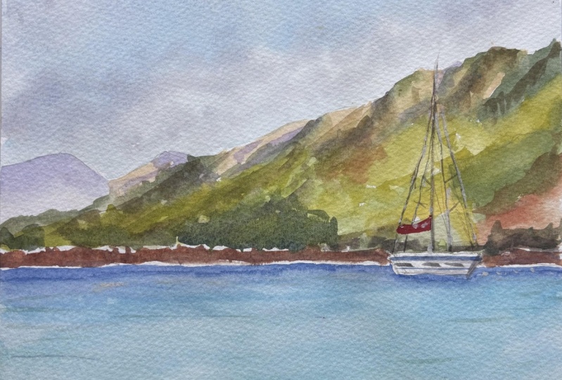
3. The drawing: Okay, So let's start
drawing the drawing. In this painting, we will have two-thirds dedicated to add
a foregrounds to the sky. They're distant teeth, and
the lower third will be dedicated to other
rocks as soda, nothing happened is
going to happen, particularly in the scalp, have just some plots
in distance here, so nothing too busy. And my paper is more
or less a 20 cm. So we're going to take
my rulers because I want to trace the horizon line and
I want it to be straight. So the two-thirds
would be more or less, let's say 15 cm. And so here we have
the 15 cm mark. And I will take also 15th century meters
on the other side. Then I will trace
my horizon line. You can do the Saltzer
freehand if you feel confident and you are very good at tracing
straight lines. So okay, maybe it's too low. So I think having me
move on over centimeter, okay, so let's trace the
horizon line is centimeter up. So it's 14 cm from the
top of my sheet of paper. Okay. So I will wrap everything away. I'm using a to-be pencil
because I want you to see the drawing
very, very clearly, but you're free to use also
a lighter pencil because otherwise you will need to rabbit and to lighten that
before starting to paint. And okay, so now
that we're done, we'd have robbing and
cleaning the paper. We can move on with
some distant he is. And there's nothing
too complicated. We have just to trace
them because we want to, or they are in the background. You don't need to trace
very precise shape. You can use also your fantasy or copy something
that you like, e.g. from a picture
taken by yourself. And let's put in
some rocks also in the very front of
the distance he is because we are trying to create, after you playing composition, we have the distance. Here's the medium hills and
the wants and the very flat. Let's go back to
the median plane. Nothing to precises
and said before because we are going to
paint these two wet in wet. So we will have a very
fuzzy, loose shapes. And now I'm also starting
to put in the shade, the area that should be darker so the light is
coming from the left. And we need to bear in mind that the shadow will
be on the right side. So when I'm painting, maybe I lose trace
of what I'm doing. So I like to put in some
simple pencil strokes just to remind me where the
darker areas should be. And I think that this is enough. So let's move on to the boat. The boat will be our main
focal point because it has the right sales and it will be more or less
in this position. It's going on, it'll be upper the arrivals in line at a little bit above
the horizon line. It's a very simple shape. So let's say the, okay, this is probably
the right point. And it's not too big. It's not in the
center because it's always for the sake
of composition. We don't want thing
very, very center. They will look a bit contrived. Let's put in also some
other details like e.g. the small windows that we have, just to keep it a
little bit more realistic and
they're the master. And let's go over the
distant hills in this way. And let's trace all show the ropes and some
other elements. And I'm not a sailor, so I'm not really precise
with these words anyway, the ropes, you know
that the older thinks that we have in a sheep. Let's put in also some
other details like this. And then let's draw the, say, the red one, which is fastened. And bear in mind that we are going to finish out our
painting itself. White goulash. We are not using any masking
fluid at all because I want to keep it really clean
and fresh as possible. And anyway, we would
come back and you'd see in the last part that we're going to
use the jump and, or the white gouache to really enlightened our small boats and, and to keep it as
wide as possible. Don't be worried about
too many details. Gesture it now. Okay, So let's move
on now to the rocks. Okay, Let's clean this area and let's start
drawing the rocks. They're adding a little bit of interests in the foreground, which is something
that I really, really like when I was with the seaside and I took
this picture this summer, I was really captured by the beauty of these
groups of rocks they did, they seem to be lacking, as well as multi-family of rocks that were
altogether old route. And they also costumes beautiful reflection into the shallow
water really close to the, to the, to the
shore, to the beach. And this is our last
groups of rocks don't, don't, don't draw too many
of them, don't exaggerate. We are also putting
in the shadow. As I said before, the
light is coming from left. So we need to remind
ourselves that do the right side of the
rocks easing shut up. And that's a very, very light pencil strokes
just as a reminder, as a guidance to follow later. And I think that we are done. So now we are. Let me tell you how
we are going to move. We will start to
fade from the sky. Then we will paint the
distant tails than the C and the rocks and at
the very end, the boat. So let's move on.
4. The sky: So now we are going to paint
the colors for the sky. We need to prepare
them in advance because we will be
painting wet on wet and we don't want to
run out of quality adjusted the middle
of our sky painting. So I will prepare a little
bit of cerulean blue. Cerulean blue is a particular because
it's called Hello IOS, Sierra Leon and eats
at Pb 15 column, the pigment you can
use, so whatever. So really am do you have and
I'm adding also a little bit of cobalt blue because I really liked the
combination of the two. Ec haven't got these
kind of cerulean blue, you can add a title
of a flail of blue to your cerulean blue and mix
that with a cool blue. Or you can use coal blue
by itself, which is fine. Use it very diluted
at the towards the horizon sooner you get a nice gradient for
aerial perspective. And now I want also to paint a little
bit of a gray color. So I'm cleaning my
brush because I want the hues to be clean. And so for these gray color, because the word clouds,
headed with Ray. And I want to create
these scoring, which is made by cool blue. And you can use also, you can add a bit
of burnt sienna. You will see that in a minute. And I will show you
that you get a very nice gray with a
strong blue base. So it's something
that it's really nice to use in the sky. Also because it's made with
the colors that we're going to use also for the
rest of the landscape. So we get a very limited
color palette of colors made by a few pigments. The wishes, something that meets really nice in our morning
and the end. So you see it? I'm adding burnt sienna to this cool blue and we have
really a blue gray color. Now, I want a third color, which is more of a violet. I'm always using my cobalt blue. Cobalt blue is probably didn't
lost my most used color because there is no sky
without cobalt blue for me. And then I will add a
little bit of red ocher. My red ocher is a PO, sorry, P R11 colors. You can use whatever
pigments you have will be the
same composition. And you will get, I will show you an amine. That's how you would get
a very nice purply color. It's easy, it's becoming
now it's more brown. And if you add more
of cobalt blue, you see that you get this
very nice gray purple color, which is very nice to
use word for clouds, but you can also use coal blue to get
the very same color. You can use cool blue with a
little bit of burnt sienna. And now let's see, we had an all those the gray that
we prepared before, but more on the blue side. And then you can add a little
bit of a purple color. I will be using
permanent carmine, but you can use Alizarin,
crimson, quinacridone, magenta, any roles matter, any
purple color that you live to get this nice
purple blue shade, which is also nice
for shadows, e.g. it's not something that you
can use Jocasta in the sky. It's a very useful color. So now that the colors already have indeed your kitchen roll or your t-shirt
type of cloth. You take I take my
masking tape because I want incline the board
and in this way I can work, there'll be more at ease. Okay. So I just want that
to be nicely put. Okay. We're not sorry. I just want it to be a little bit inclined in a different way. Okay, Now we're good to go. We need to wear to the sky area. We are going to wet all the sky, but we're not going to wear to the hearsay because we don't
want the color of the hair to spread up in the sky
so that you end up with the color of the hair
cells in the middle of the sky and slowing up. So we are staying just
with the sky portion. We are leaving. The heel is totally dry. We'll do things in small actionable steps
that you would work with the maximum coal for it and
you didn't have to worry about the heels which
are below the sky area. I will start with a clean brush and clean
water off course. And I'm using my
brushes sideways and you see I'm not wetting
in a very uniform way. I'm just putting
water here and there, but I'm leaving some white
space because I want to have a mixture or
a combination of soft and hard lines as well. The sky wishes effect
that I really like in because we have a combination of the two and it's something related really asked
you see that in a minute when we
put in the color. So I'm waiting just
around my hairs and now I'm taking my blue color, that mixture of cerulean
blue and cobalt blue. And I'm starting
with the upper plot. I'm always keeping my
brush in this way. So you see the color spreads
very easily where we wet. But as you see scattering
the columns in this way, we'd also large and small. I can nurse. Fortunately, I didn't do
any damage in my studio. Okay. Now, you see I'm
putting in the ally to very diluted gradient and light very diluted wash
of this blue color. And I'm softening with clean
water so that we get a very nice to start to flex
position between the dark, sorry, the, the harsh
lines in the soft lines. Now I'm putting
in my gray color, the one that we prepare before. And you see if you How case. So if you have some harsh
lines, like in this case, you just use it a little
bit of clean water with a tip of the brush
and you soften them. And so that you keep a
balance between harsh, hard lines and soft
lines and soft edges. And now with the purple color, I'm adding a few clouds towards the horizon
with a tip of my brush. And these are very small market because the clouds are various far and they
are very small. So we are suggesting the perspective of the
clouds towards the horizon. Too sweet to encourage the movement of these
clouds in the way that you think it's better
for your own painting. And okay. So I think we will
soften a little bit. Yeah. Because you say, I
want to keep the very, very good contrast between
the upper part of this class, which is not feathery, but a more defined and the
lower part I'm preparing also a little bit more
of my vision color, which is made from
permanent Kami, cobalt blue and burnt sienna. Because I want to
add that bit also in the upper parts of the sky to increase the area
of perspective. Any some other
areas where I think that I need to go a
little bit darker. But you see that on paper
the colors are separating. So we have just
right over the mast. You can see that we have the brown part separating
from the peripheral part. And this is something
really, really nice. It's the magic that
happens on paper and it's not possible to recreate such a situation twice in the same identical way. And this is something
that is really beautiful. Okay, So we've put in a
little bit of dark areas, soften where you need to soften. You can use always a clean
brush with clean water. And then if you want, you can also use a tissue
or your kitchen roll to dop the areas where
you don't want the color. You can use also the tissue
to lift away the colors, also to create the clouds. It's not totally for cleaning, let's say the areas like this one where I don't
want the color to go.
5. Distant hills: Okay, now let's
move on Pair going to paint the distant
hills and the rocks. And we have to be very careful because we don't want
to paint the boat, so we're not going to use any
masking fluid in this area. We are going to paint. We're going to leave
the whitespace of the boat because we
were and also the side, we want to be the brightest
point of the red cell. So be careful and we are going to use
some contrasting color behind the boat so that they can trust very well
with the white of the boat. And the boat will
pop up even more so as usual before
anything else. So we have to prepare the color so I'll move my board away and I'm taking my palette and we
prepare the color together. So I'm going to
use smaller brush and feel free to use
something that is suitable for the dimension
of your paintings. So we are going to use some purple for
the distance hears. And so it's part of
my mind is permanent. Tommy, you can use
purple, magenta, Alizarin, crimson, rose matter. Any purple color that you
have in your palette is why we are allergic.
Cobalt blue. Cobalt blue as much as I need because I want to
get a very purple color. And these purple bluish color is very useful for
painting distant, hence not only seascape, but in landscapes in general. And that's why it's a
color that I really use a lot in all my paintings. Now, we will need a
bit of raw sienna. Here we go. Clean your brush, raw sienna. You can warm it up a
little bit with a touch of oriented or a warm it transparent
yellow that you have. You can use also Academy
yellow or lemon yellow. Maybe cabinet yellow
is more suitable. But also red ocher. Yellow ocher, sorry, is a very good color
for this painting. Bank yellow ocher
is a little bit more opaque than raw
sienna and running. So raw sienna and orderly
narrow transparent colors, red, a yellow ocher naught. Now, we are going to use
a bit of burnt sienna. Burnt sienna as it
is using pounds, but you can use also tubes, as I said before. Burnt sienna is a
very nice color, but I will use also
bit of red ocher, which is a pigment
containing PR, one-on-one and
mixed with a green, red or something that
are really, really like. Now we're going to
prepare the greens and I will mix them on the
other side of my palette. So to keep callers clean, we are going to some sap green. You will probably have some wins already
done in your palette. But if you want, you can change the tones, but just by adding
a little bit of violin or lemon yellow, and you will get a really
bright, dark green. And you will have to bear in mind that the color are going to
spread on the paper. So when it comes to the green, the mixture must be
a little bit thick, not just water is the other one. Now we're going to
prepare a dark green. We'd say look green. And to give a good contrast, I will add something dark
and light, ultramarine blue. And we will be adding
also Beatles red ocher, as I was telling you before, we have this medium dark green. You can use also
burnt sienna and ultramarine blue if you want. Or anyway, you can, we need also something stronger, maybe something in-between
these two greens. You can use also
golden ingredients, you have it if you don't want to mix yellow with
sap green anyway, I'm taking a bit of formalin. And you can also use Arlene and cobalt blue to
get a nice green. Anyway, in this case, I'm using raw sienna
to calm it down. And you can use all. So you can make
salsa sap green with burnt sienna to have something like a sort
of medium green. So now that we have our
three shades of green, we need also very dark
brown and each is paid off ultramarine blue and
burnt sienna together, this one will be the darkest
value in our palette. It's not black, it's almost
black, It's very dark. It's a very dark brown. And even if you have
fundic rallying, you're falling,
you can use that, but please add a little
bit of ultramarine blue because it will tie
everything together. We will get us something
very ammonia is using more or less the
same colors to mix all the colors that we
have in our paintings. So we are going to paint
almost wet and dry. Have your handy
your kitchen roll, and older things that you think you think
you're going to need. Let's position the board and
write it in the right spot. And let's begin with
our purple color. Very diluted, very clear because little very
soft tooling mix. And now we're going to soften
this with some clean water. And because this distance here and Sarah very far from us, so they are very diffused. The color is not as clear as
if they were closer to us. And let's move on. You can add some whitespaces. Why we are going to feel all the areas which
are in, in shade, shadow, sorry, so that we remember that we
have a darker side. And you don't need
to be very precise. We are just giving the idea. So the couture off the rocks. And so that is the main thing, I mean DST to say when it's dark and where
you see the light. Now I'm using, are these
yellow very diluted. So you see that
they mixed together these purple color and the yellows and the formula
a little bit of brown, which is a very nice shade. And I really liked the fact
that there is light tone, which is not the
white of the paper, but it's given by these yellow mixture that we
prefer we prepared before. So I'm trying to use this smile color because
I want to suggest, as I told you before, the
contour of the mountains. So nothing too precise, but anyway, not, not
very soft as well. We're dropping now some darker brown and we'll start,
sorry, dark gray. We will start with a
dark gray here, e.g. and so it fit, spread freely. It, it's not something unwanted, something that we really like. And if it's too dry for three to soften the edges and doing with clean water and the
tip of your brush. And because it will
give the idea of feathery contour typical
of the woods or trees. While here we still wet, we can put in our
greens, dark greens. Be careful to put in that dark color in the dark
areas with the shadow. And tried to create
the shapes of the mountains really freely
in a very loose style. Don't be too precise
because they are so far that you can't really
distinguish all the details. Now, let's put in
some medium green, sap green, e.g. also here. So that should create even a nice contrast
between the alternation of darks and lighter color, e.g. here we are putting
a bit of dark. We have a bit of light green. And then some of the dogs, and we are going to vary their sequence so that we have something really
natural looking, very interesting to see. So we are approaching
the back of the boat. And as I told you before, I want something not too
dark for the upper part because we want to
see the details of the boat in the front and now. But we want also something
that contrasts with that. So we're putting
also a little bit of green as you see
later on in a minute. Here we go with the greens
and also be tougher red. So you see also that the
colors are mixing together. So here we have dark
greens, here and here, we're going to use
very bright colors because it's a bright sunny day, bright vegetation in
the middle of summer. Okay. We can use our burnt
sienna or raw sienna. The greens that you
prepared before and let the color mix even on your paper and just go on in stages, we did the very background. Then we're going to
build this meeting play. And now let's take
the very dark green, the red, all Carol, burnt, sienna, phthalo
green and ultramarine blue. And let's increase the shade, the dark shadow or the
dark side of this. The side that even
shed off this. The painting. Okay, here we are going to put in some green
because the site will be ready to serve just won
a very nice contrast between the green and the red. I'd tried to preserve the area of white of
the sale if you can, even if it's really
small, small area. But in this way we will have a very nice contrast
with the yellows, reds of the, say, the
green vegetation. So sorry, you can
dab the color out. In this area. This is also why I'm
not working wet in wet on wet on dry because it's easier to stay white where
you need to stay white. Okay. If the policy is spreading, just dab it out to the
tissue as I'm doing now. Okay, maybe this red ocher
is a little bit too strong. Too much. Anyway, it's going
to dry in a paler shade. And I'm adding
also dark green so that it will come it down a bit. The rocks and the vegetation where of these beautiful red. So I'm, sometimes we're afraid of strong colors
but we shouldn't. Okay. Soften the areas where you see the heart-lung
wanted harsh lines. So the wise, if it's still wet, you can put in dark colors
or accents of Fred's e.g. to create the contrast
to browse if you prefer, so that you remember
to soften things out. And then we will mix also a little bit of
this purple color. I'm violet because
we will add a bit of burnt sienna to get these dark chocolatey
color, gray color. Just to add a little bit
to nouns, the contrast. So you see how many
colors I'm creating, just using very few pigments. Okay, now we are leaving some white spaces
because there is the light of the sun
polluting the rocks. We will use sap green again, maybe red ocher, burnt
sienna a little bit. Let's add some washes also
here at the very front. So it's all about varying, some about variety, every kind of variation under the sun. Let's put eight or so some harsh line here
because we want to suggest that the rocks behind the trees but do not
exaggerate just a little bit. It should be a good balance
between hard strokes. The movement of the trees. Tried not to be very
precise and so on. You need just to
give the idea of what's happening in
these distant hills. Now, let's go with
our dark green again. Here. And here. It's tried to find a good
balance between dark greens, medium green, light greens. So then, just to create
the impression of a three-dimensional complex of rocks and Watson vegetation. So if you need, you
can clean your brush, you can dampen it
in your tissue and then you can soften or lift away the color while you
think you need that. Because that also, as I said, it's still a matter of
balance between harsh lines and the feathery lines
and soft whooshes. And we have a very good movement down and just rate
now very contrast. We did also light areas
and dark areas for the very front of this rocks I'm taking I don't care
about birds San as fine. We'll try to be the rocks
leaving whitespaces. Series of simple strokes just gave the ADL something going on. Leave the boat white, as I told you before, you can add a little
bit dark brown made with ultramarine
blue and burnt sienna. Just to increase the
depth of this rocks. But leaves them really clean. Soda, you can appreciate the light of the
sun they are now. They will provide a
very good contrast with the water of the seals. So okay, Well now we
will put in some violet, some purple color for the
shadows because we need to provide more elastic
unit for uniformity. And okay, we are about done. So you can go on putting
in some details. You can lift away where you think you need to catch some light because
it she lost them. You can just do this lifting lifting where
the color with a clean brush, dab it with a tissue and to create maybe softer
lines where you need to. But if you see that it's on your paper
is right, don't do this. Please check what's going on on your paper instead of
following me without checking really what she painted because
maybe your paper is is really good and
you don't need any thing like just like this. We are done and we'll
leave that to dry and we will go on later on.
6. The sea: So now we're ready for the c. And as you can see, I cleaned my palette from the green colors because
they don't use them anymore. And now I'm going to
prepare the colors. See what colors are we going
to use my serially and blue. You can use whatever
cerulean blue you having your volatile anyway, the communist that you use
before, you used before. And I'm going to add all certainly don't be tough
for ultramarine blue, which is something
that I really like. So now I take my cerulean
blue, which is unhealthy. And certainly in Bahrain, a sauce bowls cupboard. You can use whatever
grants you want as long as the pigment is Pb 15. And now I will add a touch
of failure of rain because I really like the
combination of the two of these lights value of
blue and yellow, green. You can use them
both if you don't have any cerulean blue. This mix of the two
allows us to get these very beautiful
turquoise color. There is also something
already, e.g. cobalt turquoise or some
corners like this one. It according to the brand
new test set just with me, but I don't like colors that I have cobalt inside them because cobalt is a couple of duties or color that
tends to be analyte, which is something
that I don't want. One, I'm painting water. Even 0s in this case, you could use that. We picked neil problems. So be sure that you have
enough of the shoe. I'm adding in a bit more
salient green because I really like this turquoise color. And now I'm going to
create a gradient, so it will start
from the upper part. Then you are going to leave
a teeny tiny white line, very fine line because
we don't want the water to touch the distant rocks. Now I'm taking my
ultramarine blue, as we can see dots right here. And I'm starting to paint, leaving the small whitespace, as I was telling you. She's seconds ago,
really working around the boat because it hasn't got any masking fluid in there. And I don't want that to be
touched by other corner, so I must be very careful now
I'm adding a bit of paint. And now I'm going to soften the dashed line that
I use as a border. And now we are working
with rooms dry, but in a minute we'll be living with night and starting
to paint wet on wet. Now I'm watching my cerulean blue and I'm mixing
the two colors. So now we are
working wet on wet, I'm adding gain a bit of ultramarine blue because
I want a gradient. We want dark color. Underneath the road, the
distance rocks because it will give a
beautiful gradient. Now. It's time to go from wet
and dry to wet on wet. I'm adding clean water and
I'm waiting all the area. We tried to be careful because I want to leave the rocks totally dry so we didn't have any
masking fluid on them. So be careful now, I'm wanting my turquoise color. Okay, So be careful, work around the rocks and
trying not to touch them. And now we're going backwards
to meet what we met before. Now I'm using a
very diluted wash. Now I'm adding a
little bit more color. Try to control the density, tried to add color it, not to use the more dense
wash than the previous one. Don't talk more time because otherwise you will
get cauliflower. And now I'm trying
also to create some new line sardine
blues and greens. Try to create some soft
movement in the sea. Yeah, and just to recreate the very small waves
in these towns, see, you didn't need to be
very precise at this stage. We are trying to create the base for the underneath layer. And now when we will go over it, when it's totally dry. So for some more details now, same for our purposes, we are going to wet the very strong we are watching
all around in Watts. Be careful. I'll send this area chart
too wet in a uniform way. Here the water is
really shallow, so we're going to put it
on a bit of raw sienna, which is the color of the sand. And it's the color that we
see in the very front here. The very bottom of
our painting in which it will give the AND
hours sand underneath that. And then we will go back with our mixture of some
very light mixture, in this case of fallow, green and my cerulean blue. But you can use also
failure blue to failure green with
a small amount of failure will be
just right, fine. And now we're going to put in the color of the sea
in shallow water, maybe a little bit darker
just around the rocks. And any way in this area or we do over
with their selections. So the current must be really, really light and we need to prepare the background
for their selection. We don't want any cauliflower
or something like that. So try to use a washer
which has a uniform. De Lucia, a few bills
where they walked sophistry to clean
with your tissue. And East there are some
areas that you missed. Of course you need
to call it that. Anyway. We need to stay really light. So don't worry to be too
aggressive or too bold with a corner has you probably need to wait
for that to dry. And then we will
add the reflection, but we need to keep it really light because we want to
see the transparent areas. So we are done with
this gradient. We have a dark area at the very far end and they're
very far edge of the sea. And then we are coming
towards the bathtub with a very nice gradient and
we are finished with that. And then we added all
suite of raw sienna, yellow color that
indicates shallow-water. And now we have to leave that
to dry before moving on.
7. Rocks and reflections: Okay, So now we're
ready to paint the rocks and the
reflection into water. And that will be all in one go. And then we will
focus on the boat. And what color are
we going to use? We're going back to the raw
sienna and burnt sienna, the colors that we
had in the distance here since so that I have
on this part of my palette. So let's mix some fresh colors. So this is raw sienna. That is the base for
everything where it will come to painting rocks. Then we'll use
also burnt sienna. And here we have our pure burnt
sienna will have a really dark brown that when we go up that mixing ultramarine
blue with burnt sienna. So let's make a little more. Because we need it. We want, I'll send
intermediate brown. We can use this, okay, this purple color, you can
mix that using cobalt blue. And we add in a little
bit off my tummy. You can use whatever
purple color you have. This loop, we will be using these for the reflection
and the shadows as well. So I think we are pretty
fine with this color. This one is another brownish
color than probably was a mixed from red ocher and
a bit of cobalt blue. Suits free to use
whatever Brown you like, you can use also sort of
milk chocolate color, which is fade from cobalt
blue and burnt sienna. And you can really make
so all the pigment, the blues and the
rest that you have and see what kind of browse you, you get out of them. So what we're going to do now is to paint where
almost wet on dry. We're taking advantage
of the texture of the paper which is
a cold press the, so it's not completely flat
as a hot pressed the water. And we are going to live also some white areas
because the air as heat by the light of the
sun are almost white. We're going to put in very, very light strokes
of raw sienna. And we are leaving
whitespaces and then we will immediately go in
with some dark browns. This case the
darkest value, wet. So it's a mixture of wet
on dry and wet on wet. But let's try to
create the shape of the rocks and the shadow old. So in this way, building the rocks
little by little. So very the tint
that you are using. The most important thing
is that you remember to put in the shadow will be
for above the darkest area. So as long as you put
everything in the right order, you are perfectly fine. And everything, you will
see that everything will slow Naturally towards the end. And you need, you can encourage the movement of the pigment in one area of steel or the other. You can lift some
color out if you think that the color went
too high on the rocks. In this case, don't worry
to be very precise. You have a combination
of harsh lines, soft lines, It's perfectly fine. The most important thing is
to try to recreate the shape and to have the lights at the right point and the
shadows in the right point. So also for the sake of variety, I encourage you to
mix different browns. We just spent a percentage
of ultramarine blue, burnt sienna, red ocher, dragon's blood or
whatever other life read. I don't know what color
you have in your palette. And you need to clean your brush though,
easier before issue. When you start to paint with
the light color like e.g. we will see, and this is
what I'm doing right now. Then you can go in with
a darker color like e.g. the value that I'm using. But then you need
to rinse thoroughly your your rush because
you don't want to have a dark color
on your brush when you are trying to paint the
right and the lightest value. So be aware of this. And even if your
water is sturdy, clean that because you will
have muddy color in which Okay, So the process
is almost the same and we're going now to
wet all the area of the rock. And we will paint
this one wet on wet. So we will add it to all
the color on wet paper. This is another technique using that you can use to
paint the rocks. Be careful because we don't
want raw sienna everywhere. In fact, you see I'm lifting the very top of the rocks because I
want them to be white. Use the tip of the brush
to put in that dark color. Let's try to recreate these three-dimensions
of the rocks. Now. I just want something
darker here. I want to increase the
depth and the contrast. And bear in mind that they are really close
to the observers. So maybe a little
bit more details is something that we need
to put in in this case, because they are
in the foreground. So for our last slot rock, let's use the same
techniques. So wet. Then Sienna. And then maybe a bit of red just to create a
little bit of variety. And then the darkest
value again. So once they have dried, thoroughly, see that
the values are lighter. But this is fine because
we will go back to these rocks once they are
dry because this has, let's say like a first wash. Then we will put in all the
details in a second moment. Raw sienna is a very
good color because it gives you the ADL slight
but not pure white. And now we're going to prepare the columns
for the reflection of the rocks which are not
as dark as the rocks, e.g. if we were painting a
river or another subject, I would prepare the same mixture of color that I
prepared for the, for the rocks because the
reflection and match or more almost perfectly the colors in this case we
need a muddy green. We Okay, now I'm lifting because I
think that there are some areas that I should
have left for white. And if you want, you can do this live. This lifting process just to announce the 3D shape
of your eye of rocks. Or if you think that you need to shake them in a better way, a more defined way. Just to give a little
bit more structure. And if it's a good paper, you will just lift what you need and you want
to ruin all that. You do, everything
you painted before. Okay, let's add a little
bit of violet just to give them a little bit more
of an interesting look. And now we're going to try the
reflection, as I told you, it's a mixture of color and
a mixture of some green. So I have raw sienna. That comes the query
down, then sap green, maybe a bit of fallow
green as well, because a y and then all, maybe this is too bright. Let's add a bit of burnt sienna because there
are k that the palate, so this is not matching
the palette at all. So let's add a bit off. Okay. I think this is fine. It's the sap green very
close to the Earth, the tools that we used
in the background for the our heels and so on
asphalt, voice sickled. It's like the corner
that you will see in some lying in the grass. E.g. you can use this
mixture and autonomy for the module reflection that we're going to paint
just right now. It's an interesting
shades of green that you can use also e.g. in nother kind of
landscape and it's perfect for the grass
summer I think. I'm okay. Let's try with this one first. And we also in this case, we don't need to be
really, really precise. The most important thing
is to have a good brush with a good point and we
start to create some ripples, some movement of water just by. Painting some strokes as I'm
showing you just right now, just to give the impression
of reflection which are not Steel as in vivo, e.g. because the water, even if
you shave it is shallow. It's not as t, But we have for small waves. And so your reflection, I love moving because see the reflection just on
the top of the waves. And this is why we see them. Not to Precisely. Anyway, try to recreate this
movement of the weights. And any way the water is
reading really shallow. So you are very close to
the beach, the seashore. We are trying really to give the ADR halt
movement of the sea. But it's not
something too strong. Most important thing here is to have a brush with
a very good point. And you will get really good at tracing this
kind of random strokes. A good thing to do is to observe
the movement of the sea. Maybe if you want, you can try before on a
piece of paper and try to get confident with
this movement before trying that on the
final painting. Now I'm using a bit of
the dark brown that I presented before with the ultramarine blue
and burnt sienna. Because in the area
that is very close to the US, to the rocks, I want to add a little bit more the goals the car off the
rocks because broadly, we're going to see
just a little bit off that when it's really
close to the rockstar. So here I will. I'm not using that much of this color as I told you before because it's not Stillwater
but it's moving. So you see just a hint of the real reflection
of the color of the rocks really close to them. And then you see the color of the rock mixing with
the one of the sky. And then ripples have these kind of magic green
that we prepare before. So let's see. I'm preparing some more colors. In this case, as I told you, there is just the
movement of the waves, which might be tricky, but we are not matching
exactly the reflection. So don't be worried about the fact that you're
at and the ripples or are the lines that the
strokes that we are putting our noticed really precise the should
match the position of the rocks but not
as in a mirror. We can use also beetle serially, I'm blue in this green because the water is reflecting
all the colors of the sky. And say hello, green
or salable is you have just to get a more
of a bluish color. And then I'll drag also
some green lines here with fellow green and blue are fatal green and cobalt blue
or ultramarine blue. Just to give Day Dia off the slope went off the seal
still in the far distance, but very gently, not too many. Otherwise you will end up with your project to all
covered with lines. And we don't want
that to happen. How k Let's go really gentle
year and around the boat. So we are done and we
need for that to dry. Once it's dry, we will move on.
8. Boat and rocks: Okay, so now we're going
to paint the boat. The most impressive
thing that we need is a little bit of scarlet, red or whatever read
you like or orange. And we need to pay the, say. I'm using scarlet, red. And I tried to be very, very careful, use a small brush and with a very big point. And then we will
put in the shadow. But just for now, we're going to paint
all around, but say, we need our darkest
brown, the darkest value, which is made by ultramarine
blue with burnt sienna. And let's do a
little bit of this. Use always a very good brush
with a very good point. We will paint the mast. Go little by little if you
don't have a very ferment. And now I'm going
to blank the ropes. The night is going
from the left. So now I'm painting the ropes than we give them a little bit of
light with a gel pen. And now we are painting decides that are in
shadow or any way all the elements which
are dark and that are contrasting against
the background. We have to paint this
area, gesture it now. Okay, So let's take some
ultramarine blue. Yeah. And then we have this
decoration on the boat. Nice ascribe here. And then we have also
the ultramarine blue. We want to buy this other
line under here, okay? And then we have to
put in the windows. So mixing some new, fresh color. This is my brown color, ultramarine and burnt sienna, and that's putting
the windows in there. Let me see now why we are
waiting for that to dry. We will go back just a
little bit to our rock. And using the dry
brush technique, still using my brush
in an a result away and holding with
pythonlearn warm site in the fingers and the outlet. I'm really trying to
catch the surface, the tooth of the paper. And I'm dragging my
color all with them. And I'm really picking
really this surface vapor. This is why using cold press paper is important for someone
who wants to paint landscapes because you can take advantage of the
texture of the paper to get all these
details so soon rock that would give a
good contrast with a soft wash that we did before. Now, we have to put in
the shadow of the boat. So this is the side
where she is in shadow and all this area. We just had a teeny
tiny bit of color, a little bit of water, sorry. And then we need to go
back to the EOB of color. But be careful we don't want to erase all the things
that we did before. And please if it's not fully dry weight because
otherwise it will disturb the windows
and you will end up with a blob into
something that we want. And now we are going to take a little bit of Galatia
to underline the robust, the ropes and some
are the elements of the boat to make it really
pop out from our painting. And I will show you how to use both a gel pen or
the white goulash. Let's move on.
9. Final touches: So we are at the very end and we're going
to put in some highlights. You can use two
different things. So the white gel pen, It's really easy to use. Buddies who have already some
confidence with water color and you really like you can use the white gouache
with the brush. And you can be, you can use that
even for the mass, for the Rilke's where
these fine details, and if it's just
a merry off hobby to me, we are going e.g. to use the Gen Fen for the very fine spots
also on the rocks, on the distant hills. But you can use also the
brush and the white goulash or for these kind of
highlight whenever you, wherever you think
that you need them. So let's start with a gel pen. We'll put in some highlights and fine details on the
ropes off the boat. I'm not trying to
cover the dark lines that I painted before
because I want to keep them. And you'd need to be very, very careful in this case. So maybe the gel pen is more suitable for this kind of work. But ACR precise, go on and
use your brush as well. Use a brush with a
very good point. You must be fished
out also for men. So let's put some
highlights on the window. So for our boat. And now I will show you all some how to use the
white goulash later on. But you can use the gel pen also for these kind of
very fine details. Just start some spots
here and there. Because they recreate e.g. part of the rocks
coming out from the bushes which
are hit by the sun. And you need something, you can do that now for
the lines on the seat. And then the repulsive, I will use the white
gouache because I think it's better
than the white gel pen. I'm using that just
straight from the tubes. And with a very good
brush with a good point. Now, you need to
go horizontally. You can drag your
wrist along the board. And so you have
your wrist against the board and you
move along side. So you drag your wrist in this, with this rule branches. So you are sure that you
are going horizontally as long as your paper
is horizontally placed. So here we lost a little bit
of white at the line that separates the C and the rocks and in the
rocks themselves. Now, let's go. Let's try to put in the
white off the ripples so you see it's very dense. If your galoshes
maybe more diluted, you will have less difficulties than the one that
I'm having here. But I like this kind
of white gouache because it's an OT to liquid. Otherwise it will
be not as white, but it will dry up
a bit more opaque. So you can put these white
lines wherever you see. You think you need them between the rocks to renounce
your painting. But do not exaggerate because otherwise you will end up
with everything God in watts. So now we're done and let's share some final
thoughts together.
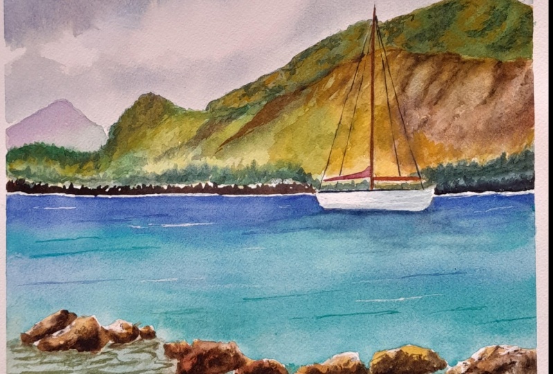
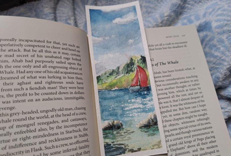
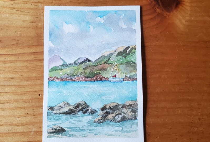
10. Final thoughts: We've come at the very end, and this is our final result. I hope you enjoy
painting this with me, and I hope that first of all, you grab the method
that I shared with you. So we started from the very
background, frivolous dying, and then we moved towards the foreground when we
talk all the rocks and the water and the C and then at the very end of the boat with
some finance to update it. I hope that this will help
you when you are going outside and painting all of the landscape because
this method is suitable, not only for this
case, first of all, for all the landscape that
you want to buy into. So I would really love to
see your results us to share with me in the discussion or in
your project section. Your projects, your
final results or landscapes they keep painted
following this method. And if you want to follow
me also on my social, and you can follow me on
Instagram, Facebook or YouTube. You can find the links
in life to fly it. And I hope to see you in my next Skillshare
classes soon in the meantime, happy
painting everyone.
 Eleonora Serra, Italian watercolorist