Transcripts
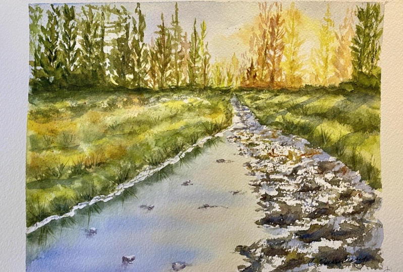
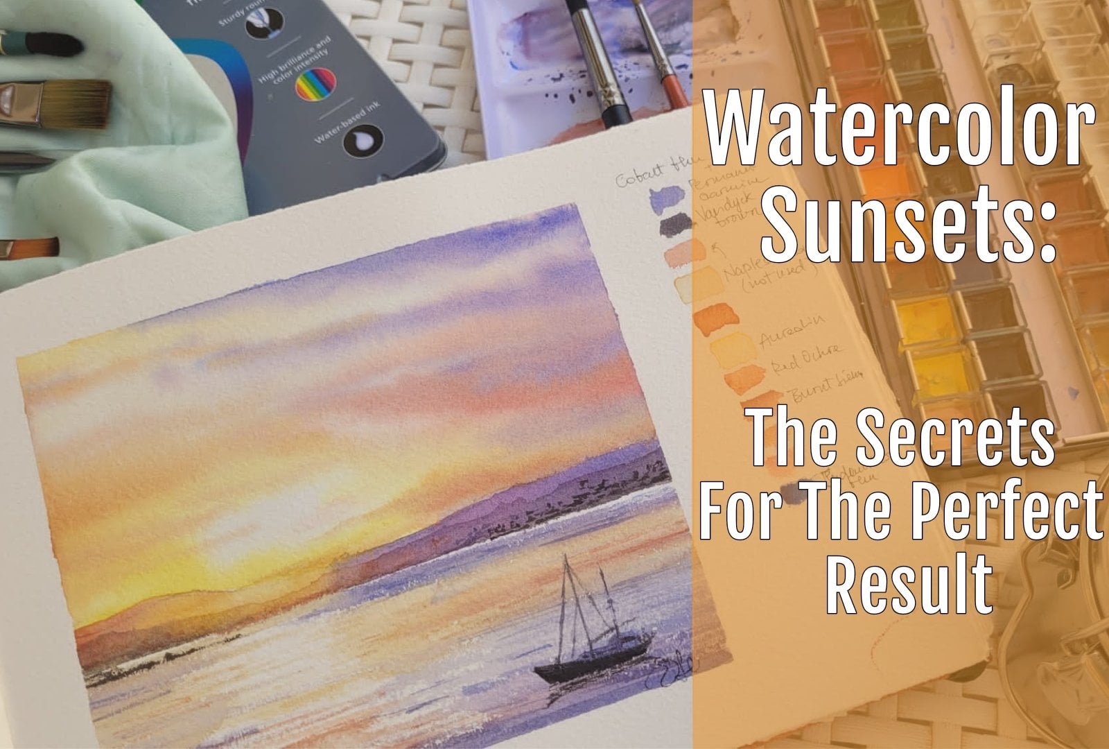
1. Intro: Hello, My name is Elena and Italian or
whatever color is the. So here in Italy, autumn has officially started and we are enjoying
lifetime for him too. And we are approaching
the beauty of the season as we are waiting for a yellow leaves, the leaves, so all the trees and
we're waiting to enjoy very beautiful walks
into the woods, but we are enjoying
this asteroid belt, beautiful morning sour eyes. And this is why I decided
to stay this water color. And I thought that it would
be very useful as a class. And I'll tell you
why in a minute. So you see it's packed
with a lot of elements. We have the light of the rising sun filtering
through the woods. We have the gradient
from yellows and reds, and we're moving gradually
towards the darkest green. We have the masses of trees, but we have also the
masses of grass. And last but not least, we have the sun reflecting
into the river. And we have also these
beautiful rocks are asked. So I thought that this would
have been a very nice glass with a lot of
technique to enjoy Dr. brushwork or flexion
masking fluid. Also very useful
to introduce you some of the autumn
colors that you can use with a lot of ease
whilst that maybe you can go outside and paint
and paint and blend air. Or if you want to recreate a very specific
palette for this season, which is particularly full of different shades and the light is not as strong as in summer, but it has a very
beautiful turn that convey a particular atmosphere
to all of our painting. So if you want to learn all of these things with me
grabbing brushes, you're gonna see favor. And let's do this.
2. Materials: So let's talk about the
materials that you're going to use for this tutorial, we're going to use a
four-story material depends on the rubber
and the ruler. Yeah, wishes optional
because I want to drill the horizon line in
a very straight way, but it's not something vital
as I said, it's optional. Paper. Paper must be hundred
percent cotton paper. It must be cold press because
we need a bit of texture and we need the
surface of the paper. This paper because we're
going to do a bit of dry brush work for the
stones and the rocks. And it is very important to have not a hard-pressed kind
of paper because it's too smooth and a so-called
breast or not 300 g/m². So 100% cotton is fine. Every brands are suitable. Mine is what are
some just Waterford, but I also use dosha. I use e.g. also counseling or whatever brand
you like really, as long as the
requirements are met, you can use whatever
brand you want. So you need to also
your kitchen roll, your jar of water
and you can use also the spray if you want
to activate your colors and the system for the coldest. Now, I will be using this time, I will be using my thoughts
instead of using my twos, but you can use tubes as well. It's all up to you. And I will list the colors
that I'm going to use. So Naples, yellow, I will be
using also a gambled you, but you can use also
our e-learning as well, or a cadmium yellow and a warm yellow that you like and then you
have your palate. I will be using also
my geranium lake, which is similar to Alizarin,
crimson, purple, magenta, or whatever purple color that you have in your
palette is fine. We'll be using ultramarine blue. Cobalt blue. I will be using
also finer green, and I will be using
also burnt sienna. You can use also a type
of red ocher, e.g. or another P R11 color. I will be also using sap
green and I will be adding it also Van **** brown
and a couple more e.g. could be buried and buying
it or coupled Martin, and these are all the colors have more or less I'm using for this tutorial, for the brushes. Okay. I hope you
can see clearly, I will be using
my round brushes. I have a number two, I have a number four. These two are synthetic. Imitation of sable is fine, but even harder and stiffer, and they are quite steep. Live in this one, it's
an imitation of spirit. It's a very soft retreatants, a lot of water and it's bigger and I will be using
also a flat brush. And this is a twelv size, but it depends on the brand. So the most important thing
is that you have a small, a medium, and a large
round and a flat brush, which is not very big. And ask for the dimension. It depends on the sheet of
paper you're working way does so this is more or less an A4
size that I'm going to use. So try to stay in this
range of dimension. And of course you will need
also your masking tape, but to frame your paper
and the masking fluid. Because we are
going to apply that to the rocks and in
some other areas, e.g. if they are either bank
where the line meets the river and we want to preserve
the areas that we want to keep sub solute
really bright and white. And that said, we
are ready to start. So let's move on.
3. The drawing: So as always, we will
start with a drawing and we will try to be strategic
about our composition. So we will try to divide
our tooth in three-thirds, one-third dedicated to
the sky and the distance. Trees and the lower
two-thirds dedicated to the rocks and the river
or the groups that we have. So in this way we will have a very
harmonious composition. So now we are in gray. I'm going to take my ruler
because I want to be precise about the horizon
line should be straight. So my favorite is 21 cm. So let's say that
one-third will be 7 cm. So where it is here, I will put a mark here. And also on the other side, if you are, you are free to trace this horizon line
by freehand if you want. The ruler is not
necessary, it is. So let's see, maybe it's too high and I think
I will go out. We're less so centimeter down. Okay, so let's say
that in this way, your horizon line should be placed yesterday a
little bit lower. Okay? This should be fine. So the area here is the
white area for the sun. And we have a focal point with
maximum light in this era. So we're not going
to paint here. And then I'll try to, I'm starting to put in
the trees, the trees. And I'm just giving
you an indication because we will paint them in a very loose
and free styles. So I'm just putting in your choice that will serve
me as a guide dose later on, but you don't need to
be really precise. Some of them are coming down. We have also these point, which is the, the last point
that we see our river. We have one side coming with disinclination in this area and then we
have a small bend. And more or less the
rocks are curling down. The, more or less at the
middle of the lower part. So let's do a little band and come down to these
areas, old rocks, and then we will start to
trace the bank of the river, so more or less from here. Let's follow this inclination. Okay, this will be the bank of the river or the
creek and then we have some bushes that will provide us very nice
reflection in yen. Then following this inclination, we see that the forest of the trees are coming
down in this way. One that's not straight but it has a little
bit of incline. So let's put in some more trees. And here I start putting in
some strokes in this area. But as here I have the sun. I'm not tracing the unjust tracing the basis
of these trees, but I won't paint anything
because I want to preserve the maximum light
possible as I'm not using masking
fluid in this area. So this is enough. And be aware of the
fact that here you have to leave white. And then let's put in if you want some more details
here in the fields, even if we pay them
in a very loose die. And then we have the bank
which has this inclination. And now we're starting to
suggest the idea of rocks. We have some areas of white. We preserve them with masking fluid because we want to give the maximum reflection
in this area, which is our focal point. Here we have some suggestion
of fields of grass. And we have just, as I said before,
very few marks, very few indication of the things that we're
going to draw here. And then we will start to
concentrate on the rocks. So the rocks are painted very freely in
a very loose style. We don't need to be very
precise than light. Let's say that the
light is coming from right to the left. So this is very important
because we want the shade, shadow, sorry, are going to
be on the left side is silk. We can put in some darker
marks just to remember that the left side of the rocks will be
the one in shadow. And we will try to pay
to draw these rocks in a very simple way just to have an indication
because we will pay them in a very loose type. And another thing
that we have to bear in mind is perfect perspective. So rocks are bigger
in the foreground. But as we move toward
the the background, the rock that are
smaller in size. And this is something
that we have to consider. So then we have a very
realistic approach to our painting. Even if we are going
to buy it in a, not every detail stata, every pebbles or at all. But it's just an education, something that we need to get coffee within our mind before
starting to paint a stove. Let's put in some
small vessel strokes, few traces as I said before. And now, let's see
what we can add. Okay, maybe I'm just defining a bit more these areas because
I want them to be clear. I don't want to lose
the traces of this. And I'm adding all these
little pebbles, rocks, dry, dry area that we are going to protect leisure wrong with
the masking fluid because we are going to put
in details what these rocks to be very sun. The sun is heating them
so we want them to be very light and white. And I think that this is
everything for the drawing. Now I'm taking the
masking fluid. And the next step
would be just masking out the areas of maximum
wide heavier mosquitoes. Do it, you're ready. Let's move on with the
following steps and I'll show you how we are
going to realize everything.
4. Masking fluid: So now we're going to apply the masking fluid in some areas. And if we want to protect
this area with a sign, I'm not applying
anything because this is the area
of maximum light. And even if my masking
fluid is gray, sometimes masking fluid can
leave some traces or halo. And I don't want that to
happen in this painting, so I'm going to leave
that completely white, but I will mask e.g. the fine line at the river banks and dust because they
want to protect them. And I want I will
muscle out also some of the pebbles of the rocks
that are coming to water. But I will not be too
precise because I want to preserve them
because I will paint them in the details later on. But you don't need to be very, very precise while masking. So how we are going to
take a very old brush? Mine is very old. The Bristol are ruined needs, whether it doesn't
matter, I mean, the cheaper brushes, the
better and you don't need to ruin any
expensive rashes. Then I will take a piece
of soap, a bar of soap, and I will rub my brush on it. And then I will use my protected rush and I will dip that into
my masking fluid. So remember to
re-install your brush and just right after
these processes. So I'm going to
take a little bit of masking fluid and I'm going to put in some water,
so some stripes. Because in this area, as we said, we want
maximum light. And if the slides
are two objects, don't worry, we are going to, I'm painting over them. As for the white line that separates the
riverbank from the river itself from
the shallow water. I don't want a very
precise slide, but just an indication, something you'd
also to reassure us that so that I'm sure
that everything is going smoothly till the
end and then I'll put in some white masking fluid on the rocks that I
want to stay white. But I will not mask
everything out because we need to
remember that there is a sign of shadow on these rocks. The side is the one on the left, as we said in the drawing. So I don't need to
mask out everything. He says some of
these shocks will be darker than the water itself, so there's no need
to protect them. Then I will put in some few dots here and there
just to suggest the ADSR, very small rocks are coming
out from the surface of the shallow water and
we'll add a little bit of interest in our composition. So now that we are done
with the masking fluid, we will leave the masking fluid dry and we will start to bind the upper part of our painting because it's not touching
the area must out. So let's move on.
5. Technique focus: dry brush work: So one of the most
important technique that we're going to
use in this painting is dry brush work and thrive brushwork is very
simple but very useful. First of all, the paper, it must be cold press paper
with a bit of texture, be a big, tough tool. And that is the most
important requirements. You will understand why in a minute and aspirate
the colors on the brush that you need a very teeny tiny
amount of colors. So I'm going to wet my brush. I'm picking a bit
of cobalt blue just to show you how it works. And we're mixing
that and you load your brush with a
very small amount, the paper is dry. We are not going
to wet our paper. So the paper must be called breaths with
a bit of tooth and dry. And then I take the
brush in this way horizontally and I will
keep my thumb in this way, my four fingers in the other, and then I drag my brush on the paper so
that I'm catching teeth of the paper while the valleys of the
paper stay white. This is why we need
cold press paper. And this process is
really simple to do, but it's very
useful because e.g. if we mix another color, I'm taking rid of green or gray. And we go over, we see, you see we get
the best of both worlds. So we have a bit
of wet in wet too, because the color is
mixing in the areas which were wet by the
previous quarter end. So we get this really
nice structure. You see the white
of the rocks with the hard lines and the shade. Also the darker areas
which are in shades. And it's really, really simple. This technique,
the old thing you need to bear in
mind is to add the two to load the brush with
very tiny amount of color. The paper should be dry and you need to remember that you
have to keep it horizontally. And in this way, you, you need to get
confident with this. You catch a bit of color, just a teeny tiny amount and then you drunk
that on the paper, which must be with a
bit of tooth and you get these very nice
combination of, as I said, white and color. And this is a very
interesting technique because you'd get this
area which has four F e.g. this effect is very useful Also when you're painting
the leaves of a tree. Because you get, you can
imagine these are e.g. the leaves coming
out from branches. But in the case of rough,
they're very useful. Still try two or three times
and then I'm sure that you will need to go and start to play through
the final project.
6. Technique focus: reflections: The other thing that you need
to learn before starting the sweater color is
the technique that we're going to use to
paint the reflection. Reflection being in Stillwater
because it's not rough. So I'm taking a bit of
color blue, cobalt blue, and I have my flat brush here that we would use
that in a moment. So let's mix the color. Mixing the color is the
most important thing. You need to mix the
color in that path. Then let's say that these
sees the river bank. I will draw the line that said that this is the real bank. And let's say that we have some bushes or
trees a growing on the river bank and
we have to mirror them with their
reflection in the light. So as I said before, prepare your colors must be, they must be very concentrated, not spare, not thin washes. Then with clean water, we are going to
wet the paper and we're going to leave a
very teeny-tiny line which is completely dry that separates the bushes
from the reflection. Then we are adding the color and we are
dragging it more or less mirroring the
shapes that we have. Be careful and leave this
teeny tiny white line. And when you're done, you take your flat brush
and then be careful so you need these stuff
brush and you wet it into clean water in then
you are going to dry that a bit with a tissue
because he tests to be damp and not fully wet. And then you're going to drag vertically some
lines in this way. So be quick and you need to do the
movement with the wrist. It's very vertical. You, you keep the brush
vertically perpendicular on your paper and then you move towards the bottom
of the paper itself. And in this way, once they are fully dry, you will see that you have
the reflection of elements in Stillwater because
there are no waves. And HCV, something
steel, it's not. We have no movements. So most important thing is
that you use a flat brush. And as I showed you before, and these brush must be dumb, not fully wet and dry. That is the most important
requirements that you need to meet if you want
to be successful. So have your tablecloth AND, and drag it vertically, the caller must be concentrated
and must match the wants that you have in the upper
part of the painting. And you need to get confidence
with this movement. And once, one other thing that you have to bear in mind is that while you are dragging, you can smudge and transfer the color from one
point to the other. So if you have very
different colors left, e.g. green and red,
yellows seem suite to clean your brushes between
one color and the other. And then you go on dragging the color so that you will not end up with something very muddy at the end of
your reflection. And now that we have set all these things,
we can move on.
7. The Sky: So let's start to mix
the colors for the sky. So this time I using my fans, but it's perfectly fine
even if you have tubes. He doesn't matter whatever brand students
grade, artist grade. Tried to find something in
your palette that matches my father's and then you're
good to go in and eats it. It comes down really to personal
preference in this case, which kind of colors
you are going to use. I will start with my Naples yellow because it's a
color that I really like when it comes to
the sky because it helps to take away the whiteness of the paper
in some areas and it gives really nice pinky color. And I'm adding a bit
of burnt sienna. My burnt sienna is really red. So you'll see some more of
a pinky color in this case. I really liked that for the sky. And so let's add a bit
more Naples, yellow. And then of course, I will pick some
cobalt blue because I cannot pay the sky
without adding cobalt blue. So let's rinse the brush
just to have it clean. Here's my cool blue and
I'm mixing also this one. Cobalt blue is
something that it's a constant in all
of my paintings for the sky because it's a very natural color
and full of vibrancy. We will need also
something darker. So I'm going to use
always my cool blue, but I'm adding also
something of a purple color. My color here is magenta lake. You can use Alizarin, crimson, rose batter,
quinacridone magenta. You can use also quinacridone
red if you like that. Mike color is really powerful. So you see I just added
a ton of color and it became really
purple to purple. So I'm adding some more
coal blue because I want it more on the blue shade and not to the purple shape. But these color is
something that I really need to bear in
mind every time I make that same mistake because
I use too much of it. And of course we need also
some yellows in this guy. And I will be using this color, which is gambled shoe
that I really love. Another color that
I really like. He's Arial in oil in
because it's transparent and it's very warm
up for the sky. I usually go for a very
transparent yellow or not very not with a high coverage. And I will do want also a
beetle for k. Let's add a bit of more of the burnt sienna because I want it
more pinky here. And yes, I will say we are going to have a
little bit of orange as well. So always gambles you and my burnt sienna
that as I told you, it's on the red side and I
have a very bright orange. So don't worry if the colors are too vibrant on your palette because the sky is something that goes on
when it's wet in wet. So you know that the watercolor wash
that he just fully dry, loses its vibrancy and it's
more or less a 25% lighter. So when we will be
finished with this guy, the colors will often
be as bright as you see those in the palette. That is why I want them to be very concentrated
so that we have a very good result on
the final product. So now we're going
to wet our sky. Sorry. And we have, okay, Let's bring our round
brush with a very good point. And you're probably asking
why we are going to pay the sky if we have for
trees in front of it. Okay? This is a very good question. So we are going to paint the sky before because it gives a more, let's say, more realistic
feel to our composition. So we could pay too small streaks of sky
between one tree and the other, but it will not be
something very realistic. So let's start with
the, in my opinion, means better to start with
the sky in the background. Then once it is fully dry, we can move on with the
fruit trees in this way, we will have the more smooth
and realistic composition and final result. So in this way, you still see the process. It's a little bit longer, but it's more easy to follow and will give
a better final results. So, I'm sorry, I need
to wrap this away. I forgot to re-up that away. And okay, now we can
really start with the sky. We can apply clean water
with a round brush, a very good brush. Mine isn't a
mutational squirrel, and I will start
to wet the paper, but be careful that this area
I wanted to stay Watson, I'm not watching that. And because I want it
to gather the best, the best light, all the
light, the maximum light. So if you want, you can follow another lesson that I
have here on Skillshare, which is a lesson
about sounds that I do explain this kind of
technique in depth. And it can be very useful
if you want to paint a sky with a lot
of light in them. Let's wet everything
really well. Be careful that there
are no puddles. This area is dry
and it's not wet. Then we will start
with a yellow. I'm putting the yellow. You see far away from
the white dry area. I'll add some orange
beetles here. In this way. Collar is moving
towards the white area, but it's not going
exactly two with that. I am putting the blue color
in the upper part of the sky. And I will add also the peripheral because
this, in this way, we would have the darkest part of the sky in the
upper part of the go off the paper so it will
increase the Iraq this back. Now, I decided to move on with the pinky color
and the orange. And now I am encouraging the blending
of the different shades, but try to keep it very, very loose and you can encourage the fusion of the
color with your brush. You can leave some space and some color away if you
think you need that. And let's put in
also some more blue. Stay away from the yellow because you don't want to
have green in your sky. And you will see that we will put a bit of orange
in the upper part. Wear blue and orange
are touching just here. I'm putting orange just
so that if they mix, I have a gray and not something awkward
layers green in the sky. I'm adding all sorted
albedo, so purple. Just to increase, there's
always fear of perspective. So feel free to put
in all the colors, the pinky color, but
that we got with Naples, yellow and burnt sienna. Also. If you see that there
are some areas to white, and then of course, lift if you need to. Okay, a bit more of
orange also in this area. And now we're going to soften these lines because
watercolor is transparent and we don't want to see the harsh line of the sky, the color of the sky in the following a washes
that we're going to apply. So let's soften
with clean water. And I think this is enough. And we will let the
sky dry completely. And then we can move
on to the next step. Okay, so let's move on.
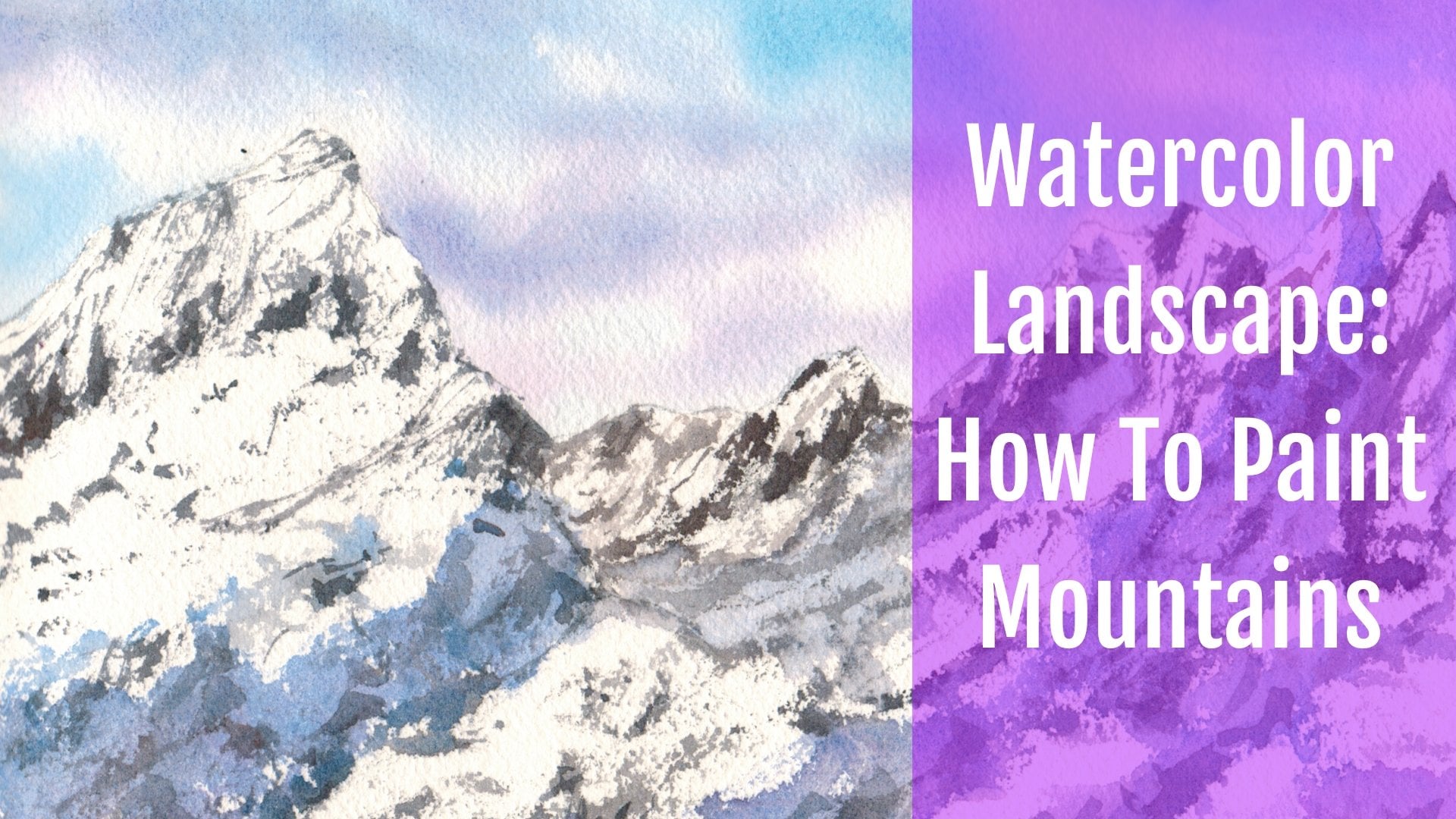
8. The Forest: Okay, So now you're
ready to tackle the forest and we
need to prepare the colors always
before starting to paint has dried very bad. It's nice and it's
not too strong color. So now we need to prepare the colors for the gradient
because we will be having a very likely to area new disposition and this
will be our focal point. So these parts of the painting, we need to be very light
and then we move and we have a gradient to
progressively darker colors. And they are a mixture of dictionary with Carlos and now we're going
to prepare them. So I still have a beaches, the colors of the
sky in my palette. This time, I'm using the smaller ballot and
I think I will clear, and I want you to take
away this Naples yellow. We have more interesting greens, and we have some
space for our color. So let's refresh our gamboge, which is something that
aren't going to use. And then gamboge hue and
a bit of burnt sienna because we need a nice
orange and it will bring, you can take your dust
that from the pan. It's really powerful,
just like mine, but be careful, that's really just a very teeny tiny beat. Anyway, some free to mix now the green with the colors that
you have in your palate. Remember that you need
to be the gradient, so we're going to use
fill of green and green. So what you need to
bear in mind is that you really need to go dark and you need to go
bold and also thick. You want them to thick wash. So make, make your own
greens really dark. And you're washed should be like a cream so that
he doesn't do sous. So now I'm adding a
bit of burnt sienna. You can also have a color which is called Dragon's
blood or eats up P R11. So it's a sort of
read off career. You can add it to your final green to have
a dark green do if she wants something
even darker, like in this case, under the bleed at this
violet color that I've had, I'm mixing standard green and we'll add
always to beat off. This time burnt umber or
burnt sienna as you want. And you can add also a
beat of frantic brand. But even in this case, I'm thinking I'm
going to use a bit of coupled mortal or Perlin violet, which is really dark
right at that next week, greens gave this
very nice dark tone. Them, it will be very, very useful and you'd
see why in a minute. A twinning, identical bit of interests to our composition. I'm probably needle so
some lighter greens. And so this subquery I taught, I think can add a bit
of burnt sienna here. And because I want that
should be not too bright. This a bit muddy. So let's take a bit of sap
green to have it at the ready. And this case, as
I told you before, the washer, so not very watery. And now we're
almost ready to go. Okay, you can also add
blues to reinstitute dark, and then you can use
ultramarine thing Diigo, the Indian, turn
blue, or even cobalt. Cobalt blue, it depends really on your personal
preference or choice. Okay. We're starting Sean
left and we're moving right. This is because if I start
on the right and move towards the last and
the left arm will be smudging all of my painting. If you are left-handed, feel free to start
on the other side. And this is very
important because otherwise you will just merge all the threads
that you painted. And this is something
that we don't want. We will start to paint trees. And the most important thing is to observe that they
are moving from really dark to light in the area
that we will have the sun. Feel free to move things. Have your brushes, Andy. You you should have also
know your number four brush. I'm using my number four but
also my number to Russia because the sun trees will
be in the fight distance. I need to to something useful
to bake them in small. And Dave mentioned,
and I want to use it also for
fine branches too, because I want to suggest
maybe the leaves, but we're not doing
anything precise. So just to give an
impression of branches of the fruit trees only to create
these sequence of shapes, as Simon's done, will be neighbor and closer
to the observer, or some of them will be
in the far distance. And we will do also little
bit of dry brush work. Anyway, follow me
along and if you need, you can always pause it
and go back and see twice and see also the
technique section for more information about
the dry brush technique. So I will be using these very
dark brown, green brown. And you see I'm starting to Putin the shape of these
fruit trees in there. So tough foods see random
signs on the paper. And I'm not I'm just
recreating the, the shape, but I'm not
really very, very precise. I want this for a treat to
be really, really tall. So I go up on to
the upper border. And maybe if you think that
it's something to live, cheapen always go
strong, very odd. Blue, e.g. and ultramarine
blue or Van **** brown. And then remember at the base, let's try to have
a darker color. Now. We're moving, right? And we will add a little
bit more of burnt sienna. So while you are
mixing these colors, fishy to add
different tones, e.g. earthy tones are
not seeing that she vary the color is
because in this way, you have a more
natural finished look, finishing and finishing
it because say in nature, you haven't got the same
color for all lotteries. You need to vary them just to, also to create something that is not really boring to see. Okay, so you see, it's really easy to
paint this for trees. Now, we're going to put in some sap green in the background so that we have the
impression that these trees are
against something. You see. These could be e.g.
at least in humans. I want it to be light. And because I want to convey if the light and all
should be presented, wanting to contrast
with the dark fir trees email that they are
in frontispiece. He is now soften the borders. Tried to have various
soft diffused in shapes and we don't
want any harsh lines. This is why I am trying to softening with clean water and you can also
dof with a tissue, but it's just to keep
everything really nice. Okay, So as it is wet, now I'm picking my violet, violet that I did it now I am using this technique dying
or more or less printing. Like if I'm printing
my brush on the paper. And just to create
the suggestion of the tree chunks
in the background. And we put in at the same
time also the branches, the leaves, so there are touchy and I'm using the
dry brush technique. I'm using my brush and picking up the
texture of the paper. And now I'm adding the color even in
these areas as we had, these really light green, we get this beautiful
brown color. Now I've been also to put
in some more elements. I'll be adding some
failure green. It doesn't meet him
in your corner, does need to match mine exactly issues free to experiment and to use a degree such as having your boss just see what
colors you can guess. Because he nature of
Greetings and welcome. So let's go on with
this technique. And in this way, we have also very soft focus in view of these fruit trees. And wishing something that gives the impression of applied. And see hating nice, gentle something that
there is out there but you can't really tell what's, how many or what it is
how many trees are not. Also here. I'm adding my cup with Martin because I
really like this violent, but you could use whatever
a purple color you, what libraries you don't
have my purple color, but with the blues Experiments, feel free to experiment and explore on the colors that
you're having your body. Maybe use different
brands just to see what kind of shade if
you can get because greens can be and it'll
be some tricky to get it the first time because you
don't want just one green, Do you want a variety of greens? And so you need to
experiment to try and to approach this
painting with a very open-minded to the many greens that you can mix
in your file it. So now we are moving
towards the area of lightest colors
need to be lighted and we need to
introduce a bit of, I think I would
use parent damper, but you can use
all so-called blue mixed with the burnt sienna. And we need to have
some trees here. And we have a nice area where
we can see the sky also. So I'm using my smaller
brush because I want to change the shape of the trees and the dimension
of the branches. And now I start to put in my burnt sienna and I'm using it pure obeyed,
certainly too strong. We need to count it down with a beautiful red tamper. Okay? And a beta of sap green
just to get a darker color. So mixing the colors
in this way you get beautiful, beautiful hues. Maybe the columns are
going to separate and paper and half beautiful
effects of k. Now we're going to use the old
ways, these orange color. And I'm using to me stir off downward shoe
and burnt sienna. Maybe. You could also be
different ombre, oil or mixture off burnt sienna anchor will do as
a changing before. And now I'm sad a bit
more of the sap green. Because oranges, green slab, they are very nice to see 1plus to the earlier
because they are, I can Florida
complimentary colors. And we have a beautiful
orange with this light green. This time. Let's begin, Let's just call it. Let's put in a beautiful
orange in the subtree. We need to darken this
to be a little bit of burnt umber and a
piece of green as well. Now some yellow cell, we have smaller trees. As we are approaching
to the light area. Use your brush. You see, it's like painting visuals. See ledgers or some
random shapes. Don't be too symmetric. You can symmetry is
something that I exist in nature or when you are intervening
at masses of trees, it's really difficult to
something symmetrical. It will look contracts, so be as free as possible when you're leading
with your hand and try to bind the
impression of these forest. Okay, So in this way, which you remember that when we need to go very light because we are approaching
the other side. So let's introduce a bit
more off the yellow color. And now we will start
to on the orange, we are going to mirror
or the gradient. Maybe it'd be tough. You're in Tampa. Hello, so here you need to
walk to what's happening on your paper if it's enjoined
to bail out some color. And the fact that we are going to use many
different hues, they'd mix on the paper they
suit of three-dimension. Try to accentuate the dark
at the base of trees. Now I'm mixing a bit more
burnt sienna and gambit you because I have very bright orange color
as I'm approaching. The area of the Sun
will increase. Also. Phi of this through trees. Might notice of my bird Santa
is we're on the red side. But you'd probably
handled fruit stand out, which is PB RX-7. So maybe to read more
on the brown side, but you can also add a
bit of scarlet red, e.g. to get this kind of color. And now I'm getting
clean my brush and I'm moving towards
this area which is here if maximum light and
they have to be careful. The column shows from
one to the other they can create one in
this very nice fact. So you will see
that in a minute. Now. Sorry, there's a small spot
that okay, it doesn't matter. Now be careful,
we're using yellow. And I want you to
leave a white space. Let's put in a bit of
while at the base, at the bottom of these trees. Okay, now, leave your whitespace and let's collect
it all in yellow. Color is green at the top
because there is BWM needs, but it's fine because
it's a neutral color. Now I need to clean the brush
and tried to suggest should be allowed these branches
e-mail very subtle, delicate way and we
don't want the color. We just hold the brush
to be almost clean. Okay, now let's go back to
the orange color at the base. Here. That's a bit of green
sin as the cheese. And now we are going to
add the greens once again. So preen, swept up trunks. We can put in also
some violet again. You can use also
all-terrain violence, e.g. or a cobalt violet
color like these. To opt to Greece you will
get very interesting, beautiful shades of color
that can be really useful. Como via two is a good option to four breaths when you mix fader
green with cobalt violet, you have really
interesting results. Okay, now we're going to leave some areas white because we want the light to to shines through the branches
and we don't want to cover up me and where to leave some space to see the sky
that you painted before. Don't cover all of your sky area with a
little video for trees. Because we want to see
the sky because we tried to leave it white before and now we have
to leave it wide. Wide painting the trees. Maybe if you see that there are some costs that are too strong, I put simple this
one in this case. I mean, I really like these red trees because it draws the attention on
our focal point. But if his seat Strong, some are color, you can always watching the
big toe or debate. She creates a gradient, a good grade and to colors, maybe something dishing
that the one that I did, I'm adding a bit of
this brown color, which is really
light bird dander, a bit more orange here. But I want to keep this area
flight to really light. Anyway. You receive
old thing that she needs some more
branches in some areas so you can all to increase the darkness of the base of
the tree. So you can do that. Yeah, I think I'll really
reinforce the base of the trees views and
want something you need dark to give
the coil cellist. So before moving to the bathroom off to the bottom of the painting will be to
make some very strongly. I will be using a silo green. I will show you my palette. So salad green. And then I use Always
top would not do. And now ultramarine blue. Or you can use any name Chengdu. In D girl. You can use also on Digg brown, Let's say that you mix all together all the dark
tones that you have in your file and see what kind of spring you get as long
as it stays green. Tried to get the darkest value that you can eat your palate. Okay? Now we're almost
ready to be black. Because black, it's something
that I never used an ad doesn't match with the
painting that we are. I'm doing, buddy, you know, it's something really strong. We want a bold color
to give a goodness conscious with the grass
looking boy B in the front. So now I'm wetting the base of the fruit trees
and also on the side. The very base. Not too much because
we don't want any we don't want the color to spread to
tie with fruit trees. Okay, I'm a bit of a soft green. Leaves, some areas
single because we still have the
sun shining through. So in this case
we have something like whales here and
start to arc the dark, dark polo of if we begin
with the dark value, because I want as a
strategy before we need something really strong fit to provide a very nice contrast with the grass that
we will pay later on. Simply your dark
mixture wet in wet. And we are going to create
a sort of medium lines. So it's not really in
the far background. And it's smart really, sorry. I draw. Okay, So I was almost
thinking it's not really far. Any small tree kills jobs
into the foreground. And if you want, you can put in some of
your riotous color. The most important thing
is that your result is a stronger in value as it is mine. Binding. It is a color that
compliments reading well, in both with greens and yellows, so I have it, you can use it. And try to soften at the base these lines because we don't want any
harsh line even if we're going to have grass and we will probably will
be wetting again once. Once again, the oldest Syria. Let's try to keep it
as soft as possible. So here we have some
more darks wet. Maybe it's not happening
on your painting, so check out what's
going on your paper and then two free to
make adjustments. You can also add a
bit of new cheese. So it will make smoothing
Galileo's and gave him very different greens in two different brain trauma and the ones that she
makes him the pilot. Okay. So now you see we have roots, soft cool tours
which are forming. You can list the color, you can move the color, encourage this now following
one way or another. Now the most important
thing is that underneath this area
you will have grass, which is soft and fuzzy. So she wants, she can
leave some color just to have a very nice contour, which is not our first line. Okay, So now you need
to leave that to dry. And if you won, and you see that there
are some areas not clean, use clean water with your
tissue Dhabi so that you get a more clean wash and you won't have
any harsh lines in the following layer. Okay, so let's stop and
wait for that to dry. And then we will go
back with a grass.
9. The grass: Okay, Now we're going to paint the grass area as the
forest is completely dry. We move in this case
until the river bank. And we're going to use more or less the same colors
that we used for the forest. Let's see if I need to
just sell fresh color. Of course, what I'm going to use my yellow gamboge you
that I used before. You can use whatever
yellow you like. And I will be using also. Let's see, maybe a little
bit of yellow again. Okay, so first the
green sap, green. And I will mix that with my burnt sienna or to create
some different greens. And then I will be
adding also a little bit of dark green and also
some orange color. So I'll be it off
burnt sienna as it is, and a bit of gamboge hue to have these very light orange color that recalls the
colors of the autumn. So, no, we're good to go. And we will be painting
from left to right. And if you are left-handed, feel free to move in
the other way because otherwise you will smash all the things that
you are going to bind. So I will be waiting with clean water all these
area and we will be wetting or less in a very similar way
with no puddles at all until the lines
of the river bank. We will put in all the
colors starting from the very light once,
starting from yellow, because it's the base and it will give the light,
first of all, okay, albedo, dark color here because this is something
that I want to increase. Okay. I will be also softening
that lines in a minute. Here. It's wet. While it's wet. I can soften that
up a bit and I use a tissue to debate nor
harsh line in this way. So let's go to our yellows. Okay, MBOs, gambled shoe, or you can use Arial lane or
whatever yellow you like, as I told you before
I start always with a lighter value in my
painting here out there, a little bit of cauliflower
or blooms forming, but they are working
at our favor because they are creating
the software free. So there are edges,
soft, soft bushes, and let's put all our
yellow color underneath in all these area
because it will be the light shining through the
grass and I don't want it to be covered by
any other dark color. So let's put in the greens. Now. This is sap green mixed
with a bit of burnt sienna, but you can make salsa
so sap green with e.g. raw sienna, or use
some orange e.g. to give a little
bit of variation. You can use it as it
is from the plan to create a darker value
and you are moving. I'm moving in a very
randomly way just to create the idea of
movement inside this grass and feel
free to create variation because in
nature there is nothing so that is released. This data, do you know
there is a Berry. Bushes are moving randomly
and the colors are different. So we have greens,
we have browns, we have orange juice. And in this case, e.g. I'm using all the brows
and the reads and I let them mix freely
all my paintings that I get a very natural
effect because there are colors that are mixing
buddy not uniform way. And I'm also using again, applying a second
time my ENS because I want to add a little
bit more contrast or edited more light because it's just see that
it's drawing more light in a lighter way that
the one that I want and I want it to be very warm. And so I don't like the
white or the very bad area. Now, let's start up even more
contrast to the slide area, adding the darker values, I'm using my dark greens. Dark greens that you can make. Using, as I told you before, a combination of fallow green, you can add burnt sienna or ISM doing just right now
bleed parent and my rule and or coupled
Martin or Van **** brown because they will
give you a very dark value and I will be using OLS
and you cannot also beat off ultramarine blue or in GIGO or she wants
something even darker. And even when you're
using dark greens vary the tones of the dark
greens such are using. So in this way, you will create. A lot of variation and it will give us a
little bit of interests, a little bit more interesting
painting and use OLS, the dark green to underlying
the areas of light as e.g. in the fields. And
also to create maximum contrast it close to
the river bank as I'm doing. And also even under the forest just so that we have
something that really lead to the observer to the focal point, which is the lightest
area with the sun. And you can really improve eyes. And you don't need to be too precise because you are
painting in a loose style. We are creating the impression and be aware of the
fact that the painting, that the paper
should not be too, too wet because it
fits to, to wet. The colors will spread. And you will end with
everything up from, say, the color will move from the very bottom to
the upper part, which is something
that we don't want. So now I'm, I'm adding
even more dark areas. And you see what do we have
the perspective leading to? The focal point. Now, we are done with this area. And I'm just lifting a
little bit of color. And now we are almost ready
to tackle the second half, increase the movement,
lift some color, do all of the knee, the financing and
shame touches in it. Now, for the other part, we are going to paint until this area because underneath
we have the rocks, so we are not going to touch the rocks and we
want them to stay dry. So I'm applying clean water just as you see in
until this line. And then we are going to
apply as we did before. Okay, So sorry. I picked up my gambit you
and I'm adding a little bit of yellow here because
as I told you before, it's a drawing to light
and I don't like that. And adding also a beat off, the dark greens
should because you see why they are drawing. They are drying too light
to probably just walk out. And also I'm driving
some grasses. That will be the some weeds that you will see
in the reflection. So as they are drying to pain
from street to art color. Now, we put in the yellows as we did before because it's the color
that we need as a base, then we will add a bit
of green, sap green, in this case, a bit
more gambit shoe. And then we are going to
apply even the darker values. So let's finish with a mixture
of yellow and sap green. And now also here I want
everything covered with so that I'm sure that
eat lunch and try to light smudging here, but as I told you before, I don't want any I don't
want any harsh lines. So as the rocks are
coming or become RO starting from this
point to stay light. And then I'm adding a
bit of dark green here. So you see, I'm creating
also another play here. It's violet, It's a Van ****
brown that you can use. I'm mixing some more dark green using my couple of mortal. And I added a little
bit more dark green and I'm creating a
third, a third plane. So I liked the
fact that there is a little bit of light area, and so it looks like
a little bit of mist in the very background. Here. I'm adding contrast
using my dark greens. We don't want any harsh lines and rocks are not
something perfect. So been moving randomly
my brush trying to create the same shape that
you would see in nature. So increasing the dark values so that we have a
very good contrast. I'm picking up some dark
bushes here and there. And you see we have
this light again, then we have some darks, and then we have the
red fruit trees. So we are really creating
a sort of misty effect, which is something really nice. Here. I'm applying a little
bit more dark greens because it's really too light. And now I'll be suggesting old show the weight that will be reflected in the river
later on in a minute. And you see you can go in with a color as long as
it is still fresh. Okay. So as I apply colors
just right now, you'll see me driving
the grass in this way. Use a very fine brush
with a very fine point. And just paint that freely
around randomly vary freely very loosely as the Euro
imagination suggests to you. A little bit also here. Okay? I think that we are about
done through this area. Let me see if there is something
that we can do more to increase the contrast
before finishing, okay, I'm adding a bit of violet because I want to be dark. Because as I was
telling you before, you can increase the values and add colors as long as it is wet so that you won't have
any cauliflower or bloom. So anyway, in this case, blooms are welcome
because they will give a little bit of interests and
a little bit of movement. And we are creating something very random as it is
exactly in nature. So we don't have any, I'm harsh lines or
contrived lines that can suggest something which is a
little bit off pretty now, instead of being so
soft and natural and we choose in a denominator
with the rest or Beijing. So let's increase a
little bit more here. And here on this final touches. So I think we are done. And once it is fully dried, we will go back with the rocks. So let's move on.
10. The river: Okay, so now that
the grasses fly, you are going to talk
called the reader. We are going to bind there
even before that, the rocks. Because in this way, when we're going to talk,
the rocks are good to go. So we have the reflection of the grass and there's
walks up para, staying here covered by
the masking fluid is so we need to pay to prepare
the colors that we need. And we'll start with cobalt blue as we have to
mirror what is happening, what is going on in the sky. I have taken other brushes, smaller brush because
it's different one because this one
goes to softer case. So cobalt blue, which is
the main color of the sky, I will add a teeny tiny bit
of permanent calming or magenta like Arizona and
crimson because they want that. The lower part that should be
a little bit darker so that it gives a little bit
depth to my painting. So this area, this is
the one that I want to know that they should match and there should
be a little bit dark. And then I am going off course to prepare
my Naples yellow. And they have to
mirror the oranges. So on Naples yellow and let's
add also some burnt sienna. The same way that
we did for the sky. Because the way we
are going to mirror and I'm taking my gamboge hue. And I will add also here a teeny tiny bit of burnt sienna because they
want that orange color. And we will need also a bit of greens because we have the
graphs reflecting. And this is very important
because we have to mirror the same exact
colors. Sap green. I will add also a bit
of burnt sienna maybe. But now I'm preparing
also the dark greens. So you can use to say you have to use the same
combination of color. Mine was fatal green with Van **** brown that I'm
adding just right now. And ultramarine blue as well. But you can use also say
look blue and a blue color, the East significantly in dark. And it's helpful to get
a very dark mixture, but you can use also
the violet, e.g. burden and maroon
or coupled Martin, the one that you used before. So now we are almost ready. Let's clean a sorry, Let's wet the area
with clean water. We have our masking fluid on and we will remove that
dusted the very end. So where did in a
very uniform way, no puddles, no dry area. Feel free to look
sideways at your paper so if you see that
the shiny shine, so in everyday,
everywhere, you're fine. So let's start with cobalt blue. Pure cobalt blue as it is. I'm taking that just
read from the pan. And that's the main color and we will add a
little bit old. So here, remember that you are trying to mirror or
the color of the sky. So it's very easy to
go along in this way. And now I'm adding
my pinky color. You want wholesale,
it'll be here. And orange, just a tot. The colors are mixing
freely on paper. Now, let's go. Let's do an undertone
and under wash, sorry, with cobalt blue and
especially at the very bottom. Okay. And then we will go in
with a darker wash that we prepared with a little bit of permanent Kami Nora
nudging today, crows mater, the
color that you used, the purple color
that you used to get these nice violet
peripheral, call it. That keeps a little bit off
dock at the very bottom, which is very helpful
for perspective. Anyway, remember that thinks
that are really close to, you may look a little
bit darker than the ones that you have in the background. Now. Let me see. I think we can go back
with some pink color. So you see that the
story is always the same when it dries, maybe today need to pay. So if you think that
you are too too light, fields street to off things until the paper is wet
and it's pepper is what you can do almost
anything you need to prepare a good wash
and a good layer. Now for the greens, now we have sap green from the Rossby kind and dark greens. You should match exactly
what's going on in the upper part of the grass and think that
everything is beard. So if you have dark color
at the very bottom, you should start with
a dark color and then you cannot the
lighter one underneath. Now I'm darkening my greens because as I'm
working wet in wet, I think I need something stronger sun even adding a
bit of purple to my rings. Okay, Here we go. Now I have a good
dark green and I'm sure that need one side away
once the test fully dry. And okay. Now we are going to dark knee. Sorry, I dropped the reflection. I'm Adi. Okay. I think that now
it's more or less. Okay. Now I'm dragging
vertically the reflection. Wet your brush. If you need soften
the reflections, wash your brush or
because you don't want to drag the colors from
one layer to the other. And then if you are not
very close students, you can talk to me technique. You take your square
brush and drag it vertically so that you
get the reflection. So this is something really, I mean, they are not
very accentuated, but they are something
that we need to create some nice reflections
because we want them to be as close to real as possible. I am washing my
brush, I'm dumping. It must be done not
thoroughly wet. And then you drag vertically the color and go please check
the technique section to have more information
about this technique and get coffee that with that before activating the final project. And in this way, you can have a very
nice, smooth result. And now we need to wait for
that to be totally dry. You can lift some color if
you think it's necessary. You can do whatever you want, but be careful of the fact
that the paper must be wet. Because he peaks dry, you cannot lift or
odd any colors, otherwise you will
have blooms hour, you will ruin the
underneath that wash. Okay, now I'm lifting
a little bit of color, but I think that
we are yet to go. So the only thing that
we need now is to let it dry and then go
back to the final stages.
11. The Rocks: So now you're ready for the rocks are so we can
remove all the masking fluid that we use to to protect the rocks area that we have, our areas of white,
sparkling white. So be careful while
you're removing from the painting must
be completely dry. Otherwise you're
going to smudge it. Okay? So now we have almost all the colors that
we need in our palette. Let's have a look. Okay, we will need
some burnt sienna beat and also a bit of sap green. We already have the
dark green, our palate, and the darkest value that would be ultramarine blue
that we used before, mixed with the burnt sienna. And this is a bit like
too powerful and vibrant. This is, I'm adding a little bit ultramarine do
to calm me down. So you'd say it's almost black, what I want to brown. So you cannot beat off
the Van **** brown also, if you prefer to
your all-terrain do to get a very dark color. Now that we have everything, you need to bear in mind that the light is coming
in this direction. So from right. So the shadow, we
are on the left. Okay, let's do a bit of shadow
color that would be cobalt blue and the purple color
that you have in your palate, purple or magenta
or quinacridone red or alizarin
crimson rose madder. Mine is stronger, so this
is something that we need because we need to pay and also the sides in shadow
off the rocks. And so we need everything ready
before starting to paint. Now, we are just painting
the idea of rocks. We are not painting
every lesion rocks, every little pebbles or so. Here and there you can
leave some white spaces because these rocks are
cheating by the sun. And this is almost wet on dry, but it's almost a wet on dry, but it's almost drying and dry because the color we are using now are just a hint. So let's add also be tough
peripheral mixture here. Maybe a bit of the dark value, the dark towards the bottom, the very far end. And then we will start
to recreate the ADR off of rocks using okay, let's put in all so
bit of orange just so it's burnt sienna
with gamboge year. Okay. And now let's put
in also some white, some lighter areas just
to vary the colors of the rocks because they are reflecting the light of the sun. And we will paint only inside that is in shadow so that we get they D off the
shape of the rocks. We can use ultrasound
greens because we have some legion Iraq or Moussa. Let's, you'd use a
bit of burnt sienna. And now we can use the dark color that
we prepared before. And use your brush
horizontally as I'm doing and catch
the texture of the paper you see I'm dragging my brush horizontally
and you can find more details in the
technique section about these techniques
so that you can really catch the
surface of the paper. That is why we need cold press paper because it has a little bit of tooth
enough texture. We can put in also some other colors and we have a beautiful mix
this around them. Mixes forming just on paper. And we'll have all
the teens that you can have a nature because
nature is so you see, you have colors that are
forming on your paper. And this is really something
that gives a lot of interests to our fainting
and a lot of variation. So be aware when you're doing these dry brush technique to
stay on the very surface. Because in this way
the colors will go adjusting to the peaks and valleys of the paper
will stay white. Says we are approaching
to the foreground, the rocks are bigger and we put in also
some shadow color. And we are going to determine V a little
bit more at our rocks because they are closer
to us and we can see them in a better way. And we want to increase this, their structure so we create, can create a new
bit of gray with a cobalt blue and a
bit of burnt sienna. I lock this color really. And I think that needs for
effect for shadows, for rock, so for stone step,
chocolatey brown, gray. And it calls really, it recalls to me of the
colors of the rocks. I'm creating the
illusion of fraud. So you see, I'm really
trying to improvise. There is note something
really defined. Who we are, not just, I mean, we are giving
indication of rocks in some areas will be a
little more precise, but we are just giving
a hint to the viewer. And you really need to move your brush around a
way there is data to try to thank the rocks
as you would see that them catching
the surface of paper. And so that the
final result is very natural and very unspoiled. Something that really looks like something natural
and not contrived. So as you see that now
that the colors are drying while some leaves
them mix on the paper, they aren't giving
you beautiful hues. Let's experiment and joy, Also mixing different hues. And go on in this process of
creating random shapes on your paper so that you have
a very unique resolved and you will not have to 2 st, which are exactly the same. There will no, there will be no stones which are identical. Okay, so now I'm putting in all the colors that I
have in my palette. Maybe any, it'll be more
of burnt sienna here, and also in this area. Okay, so let's put in
and now the dark side. So if you run out
of color throughout this process and make some fresh color as
quickly as you can. And you cannot make
your fight go forever, so don't add water and you
need to some fresh color. This color must be
stronger in value. It cannot be watery. We can add also some pinky color because the styles are
reflecting also have a sky. And now I'm mixing some fresh colored
because I ran out of ten. So it's important to, if you want to have
bright colors, you need to have fresh colors. And in this way you would get a very nice contrast
to the fourth, which are very dark and
the wasp which are light. So even from the dark areas, me sure to have fresh colors, the colors of the rocks. And now I'm adding a
bit of couple motto to my ultramarine and
burnt sienna mixture. I'm Maddie give a higher
rate of sale green. And now I will increase the shades and the shapes
of the rocks as well. Because I want the stone
seeing the very foreground to be very dark and to come out, to pop out from my painting. Okay, So it's really
beautiful to see all the things forming
before your eyes. So you can delve a bit
too if you want to create even more texture and interesting and
watch your painting. And you can add also
some lines with a dark mixture to underline
some areas and small pebbles, the small rocks which are
in contact with water. And so we are adding e.g. here with these stones. So we will indicate
just that the shadow area with the dark color, with the dark side, we are
indicating the dark side of these rocks and then putting Olsen the water a little
bit of reflection. Just to give the
ADL shallow water. Not too many. Otherwise you will end up with a river covered with stones, but just a few here
and they're scattered around in a very random
way to get the idea, I'll start something
natural, not man-made. When you get to this point. I think we are good to go. We can stop. Maybe
you can stop here, have a cup of coffee
and then come back with fresh eyes and evaluate if she needs something more or if it's enough
where he or she needs e.g. to go dark areas, some areas or the other. But I encourage you to take some poses from one step to the other of these projects
so that you can really understand why do you
need some more darks? And now I am ready to
trying to break the dot, the white lines because it's
a little bit too obvious. But I think that we are okay. We are now about I don't need
to put in any dark area, so let's stop here
and let it dry. And then we will move on.
12. Final touches: We are almost done. We're at the very end. We now need to take a few, we have to find very
few things that are left to just to bring
our painting back to life. So first of all, we
have to add a bit of reflection into the water. We have the grass. And now I'm mixing
my dark green. I'm mixing the green. The dark green
we've failed green, ultramarine blue
and Van **** brown. You cannot. Violet color as coupled martin, parent and reward or
whatever you like, even a mineral violet
or cobol violent. And now let's do this. So Ahmad engage the grasses. But because I want to
announce these, again, the fact that they are darker and now I try to
follow the same inclination. So use one. He's going right. I have to go to the opposite
way but try exactly to mirror the grass so that there is in the upper
part of the river bank, the same thing goes
in into the liver. We do the same thing
also in this area. Let's add a little bit
also grass and contrast. And another thing that
we can do east to spotter a little bit of
Scholar just to give the ADL so small flowers, e.g. or different weeds. I'm using burnt sienna. Just a teeny tiny bit. I mean, don't don't
do this too much because it can be carried
away by this process. End up with all the
border color colored by burnt sienna
spotters all around. It's just something
to add interests to our painting and to create
a little bit of movement, but not too much. Okay? Now I'm painting. I'm preparing a mix of
yellow with you can, you can mix yellow
and white goulash or use an opaque yellow. Because I want to
add a little flight to these dark greens. I want something to contrast. We'd stopped necessary
something really, um, that you can also
leave out or dust adds a few white touches with white gouache just
to enlighten this area. And I think that these
would be enough. And yes, the last thing, but that's probably the most
important thing that we need to do is to
prepare a shadow color. I will use my cobalt blue
with a little bit off. Rose madder or add or
animal-like or magenta, quinacridone, red
alizarin, crimson, the purple color that
you used before. I see I'm adding just a teeny tiny beak
because as I told you before, mine is really, really powerful. So another thing is to try to make enough of these
because shadow, more or less the same tone, maybe too dark here at the very strong and lighter
towards the backgrounds, but it should be more or less
in the same tone of color. Now, I'm mixing a
bit more because I fear if you run out of data and adding a shadow here, e.g. even if we don't see an object, it can be the shadow caused
by something outside. E.g. I'll treat
something that we don't see that it's not in
our visual field, but that steep part of the
landscape and its presence. It's due to the fact
that we see the shadows. We go on with the
shadows, the grass. And the story is
almost the same. The same one that we
suffer reflectance. So we need to mirror
Watson in the upper part. And so if there is Ras
is going here and there, we have to give the same
movement and we are adding a little bit of
shadows also for the rocks, dust to renounce the depth
and the state I mentioned off the rocks that we painted and now we're ready for the
shadows cast by the trees, which are the main ones. So don't fear to cast a shadow. So I know that something that
beginners might be maybe hiring you are concerned
about chartists because they fear to ring what
they just painted. But shadows are the
things that keep flights to give light
to your painting, even at the base of the trees. And even either Grouse, I love the shadows
because they have to announce the depth and then
we'll give them light. Didn't help you to make
your painting pop off. The end, really shine. So you see that I'm adding a little bit of shadows
also in the grass. And now because I don't want
to have any harsh line, I think my brush and softening
these harsh lines so that I keep those softer brushes. And something is, everything
is really, really soft. Okay, So remember also
that the shadows are as smaller towards the horizon while they are bigger
and stronger in tone, but just a little bit, why not at the very foreground? So she need areas to do
that just right now. And yes, that's how I
will submit a bit here. But now, let's stop
because I don't want to cover up everything
with his blue color. Now we are done. So we can call that a day. Now we wait for that to be
totally dry and then we will check out what we got and
share some final thoughts.
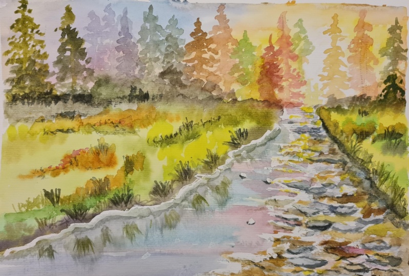
13. Final thoughts : We are at the end
of our journey, this glass, and this
is our final result. I hope that you
enjoyed painting this with me and I hope that you had the chance to grabbing the main aspects that
we learned together, asked him why is this
specific focused all dry brush work that we
used to paint the rocks. The other one is this technique. Focus on how to paint
a simple reflection. So I hope that you really
enjoy painting the rasa reflecting into the water and how the sky influx into
the water as well. Anyway, in this class we sell. So how to create a very
balanced composition because we have Hard elements
and I preached up all the styles which
are contrasting with the softness of the grass. We have mice, colors
of the sky contrasting with the green and read off the corners
of the fruit trees. And we have also the
yams and the greens again in the grassy area. So it's packed with a lot of elements that I'm
sure that will be very useful for exempts for
your own personal paintings. And that said, I would really
love to see your projects. So feel free to post into
the sound we discussed the session of a
section of this class because it's important for me to have your own
feedback and to understand if there are any difficulties or you
see how some doubts e.g. that maybe are putting you
in a sort of difficulty. So we really appreciate to
be of any use for you and to help you to succeed in
your old final paintings. And if you want to know a
little bit more about me, you can follow me on my social. You will find the links to my social media and my
Skillshare teacher profile. And I hope also to see you
in my next Skillshare class. And in the meantime,
happy painting everyone.
 Eleonora Serra, Italian watercolorist