Transcripts
1. Intro: Hi everyone. My name is and I'm anytime watercolor
is that if you follow me on Instagram
or Facebook, Kenya, but I love to
paint landscapes. And one of the thing
that I love to bake, especially in winter
here in Italy, it's winter and it's
pretty, it's pretty cold. But anyway, it's the right
season for painting. One of my favorite subjects, which is Mountains, marked
as our symbol to pay. And they can give us a lot
of satisfaction because they are an easy subject and I
find it also very relaxing. So this is why I wanted to
share this class with you. This is the project
that we are going to lines together and it's
really quick to do. You will learn how to paint
snow-capped mountains. So which are the
technical things that have to bear in mind that you'd be have
a very good result. And it's super easy, super quick to do. You need just a bunch of color, wash your brushes, your
focus, and that's good.
2. Materials: So let's have a quick look at the materials that I'm going
to use for this tutorial. I'm using my sketchbook and
my paper is Arch 300 g, not which means cold pressed. Then I will be using as usual my white gel pen or with some white gouache
sharing necessary, but you can have it handy just in case you need
some final touches. I hope not. And when it comes
to the communists, we won't be using tutorial. I'm using cobalt blue. Whatever code you have is fine. Or town of zirconium knew that have a wide range of cereal, ma'am, Lu use
whatever brands you want and you having your ballot. If not, you can use cobalt
blue, very diluted. I will be using a teeny
tiny bit of red ocher. You can use light red or whatever pigment you
have in your palette, which is PR one-to-one. And I will be using also went little bit
all your full my stop. You choose this
color you can eat so sort of quantizer
and creams and, but you can use also call me. You can use quinacridone, red, whatever color you like. We choose a sort
of purple color. And brushes. I have two ranges of rashes, namely the one that bigger brushes for the
clouds in the sky. I like to use something
which is synthetic butter. Imitation of square, or
even Martin is fine, but I'll use mutation
of Martin. Why anyway? Synthetic brushes with a very good point
for the mountains. And I encourage you to have a wide range of
different points. I have a very small one for the finer details and some bigger ones
for the wider plot. And most important thing is that they have
a very good point, at least really sharp. And also the surface
of the paper is not, which means cold process so
that you can abandon, get, get a bandage off the
tooth of the paper. Because for painting mountains, this is one of the most
important requirements. You'll want to look for it
in the paper you're using. You will need also
you're adopting water, some paper tissue, and
most of all your focus. And then we can jump right into our tutorial with these
beautiful mountains waiting for us to
be painting, okay.
3. Tips and drawing: I was saying that you must be
aware of the fact that when you paint the mountains, you want to preserve the area
of white at the very top. And one of the things that
we can use to increase these whiteness
of the mountains. Even if we're not
painting with white, we're not needing it that
really particularly white, um, is to create a good
contrast that with the sky that we have behind the rocks. And so in this way,
you will create, you will give a sense of depth and you will
improve all sedate. The brightness of the tops
of the mountains as well. So it's really funny
to sort this out. Let's say I want a
gentle shape here, something a little bit. Thus, it's a really relaxing for me to
painting mountains. They are so full of
energy, so quadrant. And they give me a sense of relaxation of open
Spanish from the freedom. And so we want to create a
contrast behind these rocks. This is why we are going to wet all the area of the
sky and leaving dry. We're at the tops
of the mountains. If you want, you can use some lighter pencil that
the one that I use because you know that I use a to B pencil because I
want you to see very well what I am drawing. But if you think that
the person lives and to have it and you can wrap
that away a little bit, especially at the top
so that you won't have any pencil marks visible
once you start to paint. Because you know that things
will be sealed forever. You are, you counting the marks off to the water
color has dried. So in these caves where
they are a little bit. And so I think we
will approach getting very boring night
wash of color in the lower path and then
we will create the car in the upper part is this time
to increase Eric perspective, but we will also put in some dark details to contrast with the white areas
of the Southern Nigeria. And you're off this
guide, vice versa, you could decide to
paint a very dark sky, which is not what we're going to do today, but in this case, you can, with everything darker so that the brightness
of the tops of the mountains will
pop up even more. So now that we are drawing, for the drawing, we will
start to thank them. And let's go to the
mixing of the columns and the tutorial pool work.
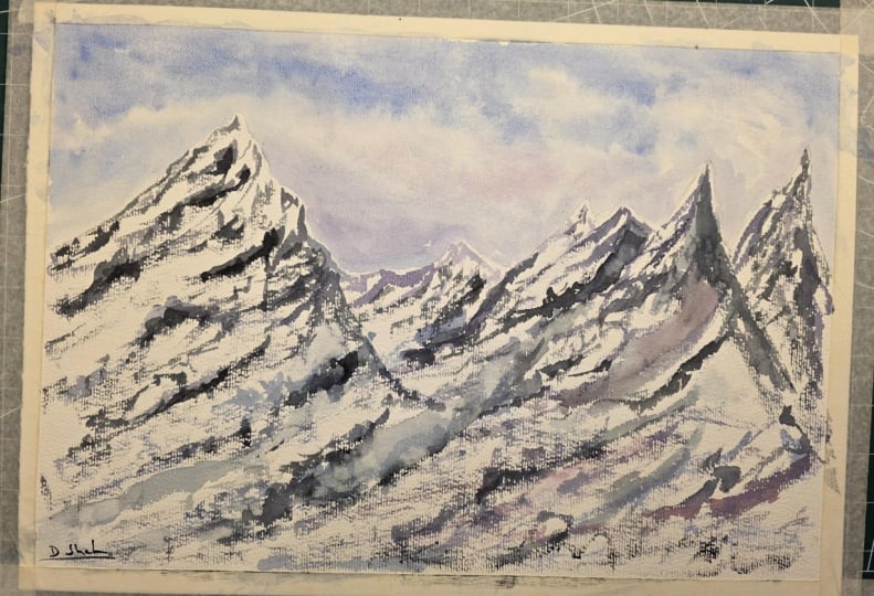
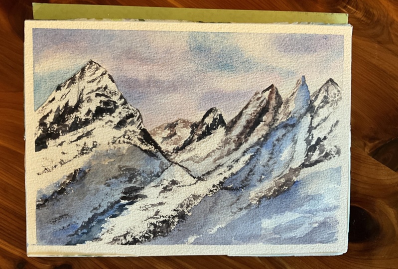
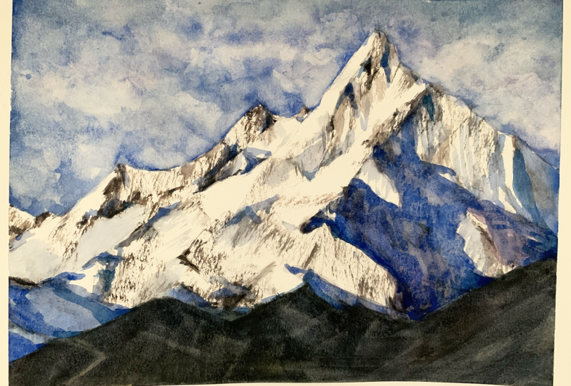
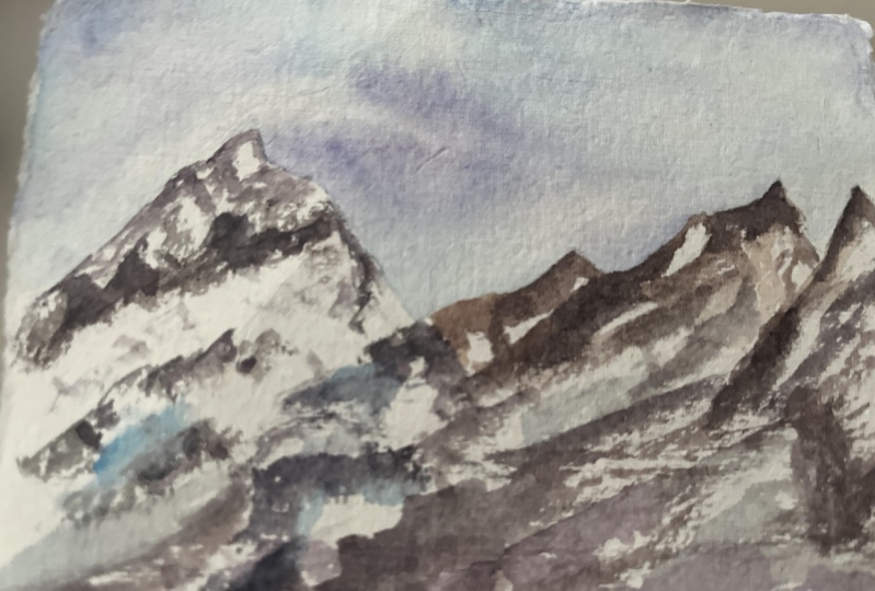
4. The mountains: Hello, That's going
with the colors. Have my pallets, you
can use fines or tubes. That choice. It's exactly the same. There is no preference for one or the other medium if you want one or the other
type of water columns. So I'm using cobalt
blue mixing also. I have this hello, new cheese. Sorry, this one is done. Okay. So this is my Sara Lee. I'm blue that I really
like because it's really bright, I would say. But you can use also some
other cerulean blue. I have certainly embryo from
all the brands possible. And I can't remember exactly
which ran out of those, but a half White
Nights means you're new to know how ram brands. I think that probably my favorite is Winsor and
Newton after this one, which is Byron assessable step, but you can use, I mean, I'm showing you these cerulean blue
that you can use. Then we will mix
the purple color, colon and a little bit
of purple magenta, but you can use quinacridone,
red, alizarin, crimson. Get this kind of you can make it a
little bit more darker or a little
bit more violent. According to your own preference
to make some more space. I think a woman, I am using non so
purple magenta as it is because I want a
sort of key background. So now my color
Justin film to me. I start to paint the background
so wet all the area. But be aware of the
fact that she needed to just work around the
top of Euro mountains. You don't want to wet
the mountains at all, if you prefer, you can
leave a very wide, teeny, tiny whitespace
cell that you safe. Insurance because the other
thing that you can do, if you want to stay 100% sure that you're not painting
with the colors of the sky. You're on. Your own. Mountain tops is to mask them out with
some masking fluid, which is something
that I don't want to do today because I want to leave the white of
the paper exactly as it is. So that's putting some clouds, stronger color
always at the top of our painting so that we get benefits from
Harris perspective. That's pretty and also
a bit of our VM blue. And you see Sudan buoys,
very subtle color. But I really like
together with blue. And a little bit off
certainly on new wall. So here we'll start to create the contour
of the mountains, just diluting our cerulean blue that we had on our on our brush. And then let's add a
little bit of pink. Yeah. Let it makes exactly
as it is on paper. You give just some
small streaks. More. People. Maybe it'll be dark and that sounds a
little bit more coal. Okay. I like it. You can mix the two. You can have some
darkened clouds. The top and some more
purple and violet. You could use also some
already made follows, some already made violet that you have in your body if
you don't want to mix them. But whatever you didn't like
about the fact that I'm using goaling way
to balance that I have a more uniform results, result of the end
of this tutorial. And also because I want to use the cobalt
blue also for the, for the mixes that I will
be using for painting Iraq. And I think it will
give us a lot of positive aspects because
you will have a very old, so cohesive that
finally resolved. And because when
cold blue separates, like it's doing either because it granulate is the
color that ground on it. So it will give us more
precious one and results, even for the structure
of the RAF can selves. I think that we are
done with the scan will leave that to
dry if you want, you can lift some color
where you cannot, some white spots if you want, you can work as long as your
sky as your paper is wet. Otherwise we've stopped to say if it starts to
dry, you need to stop. And now we're going to mix
the colors per the rocks. And basically we're going to mix cobalt blue Integral Care. Cost of all shapes. Now I'm using a smaller brush and we have I call
them red ocher, but you can use any
pigment she loves, e.g. like red cell, we have a
very dark mixture here. Then we want something maybe
more towards the ground, which is here, and something
a little bit lighter, so it will be red ocher. Sorry, this is too much, too much for bills. And let's have more because
we want something in between to have a
very light mixture. If I want, I cannot
even a little bit more. Let's say a red ocher. As I want these brown color. Now that we have
the darkest value, we choose our mixture
of Google Play. You can add more cool blue
and you get something more towards the dark. It's not black, but
it's a very dark gray. Then we have something
Nika, dark bow. We choose make with this
red ocher and Hello Moon. And also here you can hold
new as long as you like. It mustn't be as
dark as this one. And then we have our
final lighter value, which is always some mixture of red ocher and cobalt blue, but in different proportions. So I think this is all you need. So I will start from the
left side moving towards the right because
I don't want to smudge the work that I'm
doing while I'm painting. But if you are left-handed, you can move from the
right side and going towards the left as you feel more comfortable,
white paintings. So I have my color right
and stamped with me. And another thing that I want to make clear is
that just right now, the most important thing
is to use the brush. Working both with the
TPP and also sideways. So I will be using for my gosh, dry brush work, my brush and
I will hold it in this way. So my thumb is on this way and the other fingers are
on the opposite side. And let's start with
the darkest values. So you can remember that
I traced my dark areas, the areas the darkest area, or at least the areas of shadow. And now you see I'm catching
the surface of the paper. I'm trying to create
the movement. Off the rocks coming
out from the snow. It's something that you have
to build one step at a time, so don't be in a hurry. You need to control
what's going on, on your paper and you have
to check them out very carefully because in a minute you can be covering
all of your surface. The rocks. And so you will have no more, no more whitespace is left. And so you will have
no war, poverty. You will have no more white. And it's impossible
to go back to white because you can wash
away what you already painted. So don't be worried by the fact that you probably
are not dark enough as you want because we will
have time to put in and to adjust the values
and the darker stones. One. Once we are at the
end of this tutorial. And now you can pick the surface of the
paper also in this way. Then as you see, you can move in
different directions and you have a reference photo. You can look at the restaurants may be
something that your picture that you took while you were on vacation or friends of yours. I sent you a picture. And in this way, moving randomly ways, see
there is no right or wrong. This is why I told you
it's very relaxing. You can take advantage and you can put in some
dark thoughts. If we have light, sky. Otherwise is in this case, we have a good contrast
between the white of the snow and the sky with the colors the sky
that we have behind. And we're going to leave
this then if you want, you can dilute the corner and always using a little
bit of dry brush work, which is not exactly dry, but just a little bit. And we can insert
also some variation. We pure coal because we have to put in also
shadow at the very end. But it called blue
in itself is a color that I really like when it
comes to painting snow. Because it creates a very
good contrast and it gives the idea of the whitest white. So something built the cool of the winter and they
love to do this. Let's make so also the
color just on paper, that is this why they're working their own magic and they
are working for us. So now here we have the
more distant mountains. So I'm using the lightest value that I created, the
lightest brown. And I'm diluting that
with water, adding water. And always using my
dry brush technique. Tried to catch the surface. Very, very tiny movement. So in this case, we are creating variation
than picking up my middle value because
they want dark area. I also hear you saying try bash. Okay. So my mountains are coming out and literally painting very, very few marks and lines. And now let's go back with our lightest
value, very diluted. Because I want a little bit off. Light. Also hear, pay. If there are some
colleagues of the sky can transform even your
errors or what do you think there are
errors, e.g. Justin. You can use them
to your advantage and create a new shape
of the mountains. The mountains are extraordinary because that S for the trees. As it happens for the trees, there is no right or wrong. So it doesn't
matter if you have. A shape which is
not exactly as you get older because even with the water column
is unpredictable. So you never know what's going
to happen on your paper. But with the mountains, you are always seen as such
place because you can take advantage of the
fact that you are every mark can be turned
into something else. And just so you
cannot make mistakes. This is something really easy and something that
I really, really like. So you can put in very
soft, teeny, tiny marks. You can work on tonal value, putting in something docket
to give more of a 3D. So we can put in a little bit more with the darker color. Let's put it all to a base. And as you see the importance
of using cold press paper, this is fundamental
because in this way, you will have a very
good services to work. And you take advantage of
the surface of the paper and you don't need
to do anything else. You can vary also the
colors that I'm using. You could use e.g. just pure coal blue for the sky. Let's put in an area of shadow. Too much color on my brush. And you can use also
Payne's gray if you want. You can use final blew. A model called lot of variation
of combination of colors. There is no right or wrong. I mean, I'm just suggesting the one that I usually
use because I loved them, but I've painted also
mountains using, as I told you before, Payne's gray off to fail of
gloom got very good results. It depends also on the mode that you want to give to your role. Painting. So if it's more of a nice day or a
cloudy, stormy day. So let's add a
little bit of light. I'm using the
lightest value here. So as we have contrast
between the sky behind them, top of the mountains, I do need to go too
dark or I mean, I don't need to define the
tip of my mountains to match. And, you know, mixing
the two colors, coal blue and red ocher, you can get really in
this shapes of color. More brow or read more. Mixing also the two techniques, wet on wet, wet on dry, dry and why you really
get the best stuff, all the words of water color. So you see this is a very, very quick and simple exercise and something
that really can help you. So now let's put it out
a little bit of violet, the purple color that
we mixed before. Let's add that here at the very bottom so that
we create a sort of, sorry, my products, some green. I thought I had completely washed away and instead
it's coming back. Okay, so let's make
some weight off. Purple color fresh one here, cobalt blue and purple, magenta. And these aren't
framed zone calming. Quinacridone, red,
whatever color you like. Lidar according to your
own preference and also looking at what you
had in your sky. So in this way, we are getting a
very nice result. Now to enhance the shades. You can put in also a
little bit off dark color. So I'll say dries
really quickly. You can have a look and say, okay, I want this area darken. So you can create the
contour of the rocks. And you can increase the slope or the
details that you want. You want some more
strong details. Just start darker value. But as I told you before, don't go over and over every set at a certain point
you need to stop. Otherwise you will end with
all covered with dots. Which is not what we want. We want because we want to
leave the white of the paper. This is why I didn't want to use any masking through the
white of the paper. To me is the most important
thing when it comes to painting the
mountains because even a few work with a very good masking
fluid when you remove it, you won't have the
same whiteness. And if you are a little bit, if you are careful
when you use very attentively the colors and try to preserve the white areas. You will greatly
benefit from this because the result will be more on spoilt. We, the freshness
of its own wishes, something that you cannot get back when using the Maschine. So I think that the
main structure of our painting is done. And now we are ready for
putting in some shadow colors because the shadows help us to delineate the shapes of the mountains in or even
more beautiful way. I'm using mainly, okay, cool. We the very teeny test. Okay. These color okay. I like this color, so it's
purple but not too much. I want something more
towards the moon. Does the spectrum. And I'm using a very
soft brush home that retains a lot of water. You can make sweater color
is for the shadow color is also cobalt blue, pure coal blue as it is. But okay, so warrant
side shadow. In the shadow color you want, you can put in also the purple
color at the very base. I know that many of my students that are afraid of putting shadows
because I say no, they will call me up
everything that I've painted, which is true in some cases. But if you use some
colors like cold blue and one that we used before. So I did all your
Alizarin crimson or whatever call Coca-Cola. You get there very transparent. And they really help you
to increase the depth. A few painting and give you nice and
rider contrast. Okay, So we are done. Here. We have Walworth
glorious sunrise on the monitors in done
in a few minutes. And let's go to our
final thoughts.
5. Final thoughts: Okay. So we are at the
end of her act now, so I hope you're
enjoying this lesson. This is our final
and these slabs, we learned how to cough. One tells each other technique
the color Saturday night. It's something really
easy, very relaxing. You can add as many details. But one of the main thing then have to bear in
mind is that you want to cover up all of the white spaces within the small dots are recalling the rocks
otherwise you will lose all the
Why did we tried to preserve without
using any masking fluid to see the project
that you can paint the fall. And in this class, or even
projects that you can post in the discussion
section of this class. Reference photo probably took way wearing a funny day or on vacation or near
where you need it, you'll be really a pleasure
to help you in kind of difficulties
that you may have following this
fiance's these knee. All the questions
are really very welcoming to be at night
for me to answer to you. If you watch, you can follow me on Instagram and Facebook. You can find the link to my social media profile in my
profile here on Skillshare. If you want, you can play with
it to my YouTube channel. Still hope to see your
project here on Skillshare. And I hope to see you
my Skillshare classes. In the meantime, happy
painting everyone.
 Eleonora Serra, Italian watercolorist