Transcripts
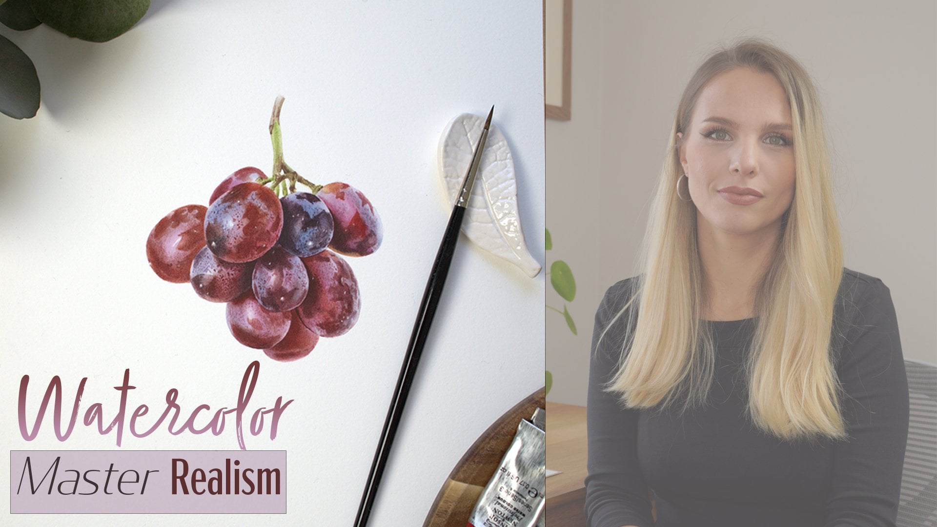
1. Introduction: Hi, my name is
[inaudible], and I'm a botanical watercolor
artist based in England. I have a huge passion
for watercolors and painting botanicals
is my favorite subject. [MUSIC] I'm known for highly realistic and detailed
watercolor painting style. I'm mostly self-taught,
but I have tested my skills in a society of botanical artist distance
learning diploma course, and I have graduated
with distinction and the highest marks
achieved on the course. That greatly encouraged me to share my knowledge and the
skills with everyone else. In this course I will
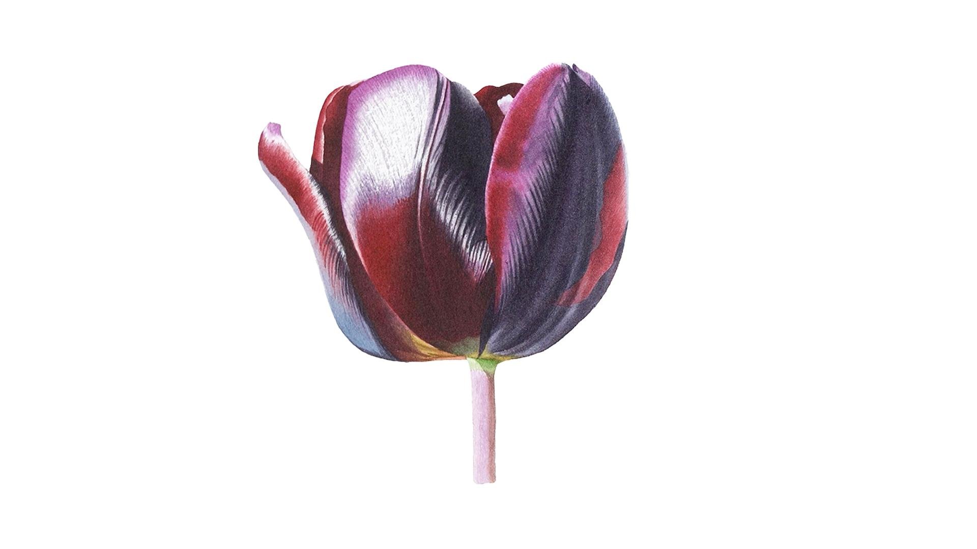
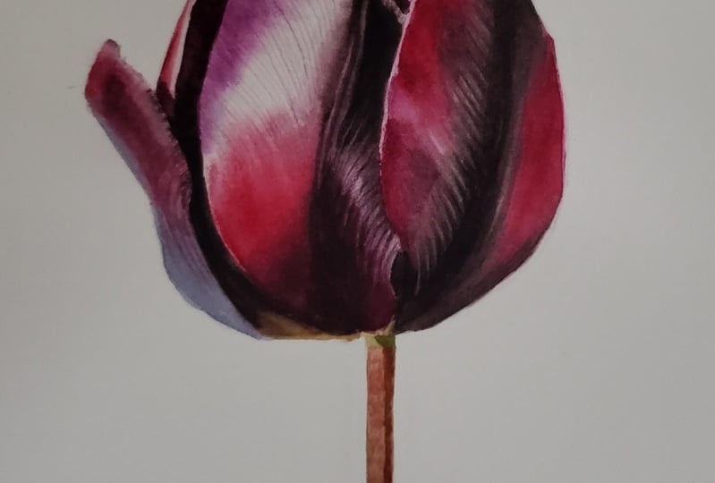
show you how I painted this realistic watercolor tulip. In each stage of this painting, we will practice techniques
such as wet on wet, wet on dry, and dry brush. By the end of this class, you will have an understanding
how to approach painting something as detailed and
complex as this to is. Also how to mix your colors, how to layer them without them getting
muddy on the paper, and how to achieve
those really dark tones that can be challenging. Also how water control is
very important on your brush, on the paper in your mixes, and how different amount of water can give you
different effects. I will also share the techniques I used to create texture on the painting or on
the opposite how to create really smooth layers. I will also provide you with reference photo, line drawing, and full material
list where you can download before painting
from your project section. Roll your sleeves up and
let's get started. [MUSIC]
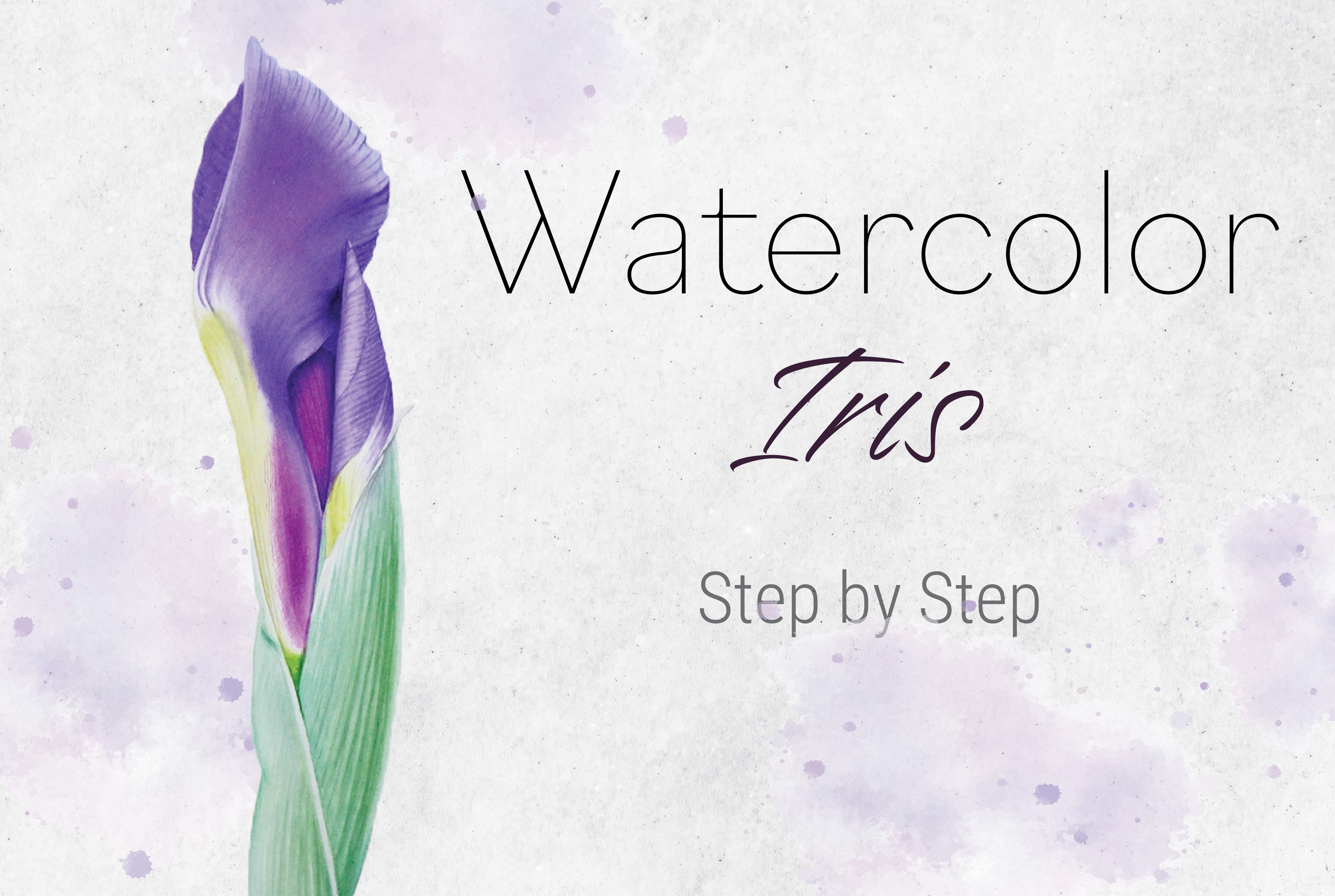
2. Before We Start: Very quickly before we start. If you would like to
know more about how to transfer your drawing
onto watercolor paper, how to stretch your watercolor
paper onto a board, or what kind of brushes, paints, and palettes to use
in greater detail, I would like you to check
my first Skillshare course, Watercolor Iris Bud, and
choose the class accordingly. In order not to bore you
all with the basics for all my future paintings that I'm going to upload
here on Skillshare, I have also created a
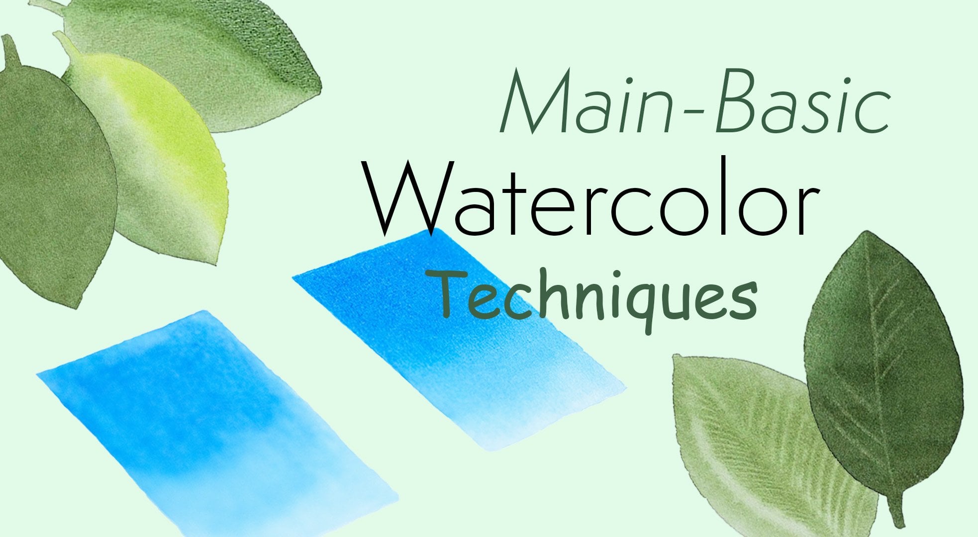
mini-course that is specifically dedicated to the main
basic techniques I use for each painting. Those would be wet-on-wet, wet-on-dry, and then most importantly is the
dry brush technique. I use a dry brush in
every single painting and it's very important and
essential to the way it paints. If you are familiar with watercolor basics, at least check that dry brush technique. I can't wait to dive
into the painting and I'll see you
in the next video.
3. Materials: Hi, again. Let's
go quickly through the materials you're going
to need for this project. To start with, you will
need watercolor paper. I recommend to be
100 percent cotton, so it can handle the
layers and water. If it is 300 USM or lighter, I would recommend
stretching it onto a board to prevent
from buckling. For that, you will
need gum tape and a sponge [inaudible] paper with. If you would like to
know how to do it, I have a class on my
first Skillshare course, watercolor iris bud
where I show you how to stretch your watercolor
paper onto a board. Next, to transfer
your drawing onto watercolor paper
from your sketch or the line drawing
I provided you, you will need tracing
paper if you would like to know how to transfer your
drawing onto watercolor paper. I have a class on my
first Skillshare course as well, watercolor iris bud. Choose the class accordingly. For that, you will also need
a pencil and an eraser. You will also need a container
to clean your brushes. I used two, one to
clean my brushes and the other one for
clean water glazes. You also need a towel
where you can wipe your brush and a palette. I recommend ceramic palette
because the colors flow much nicer on the surface and you can see the correct
color of your mixes. For this project,
you're going to be using four main pigments. Those would be Alizarin crimson, quinacridone gold, Philo blue,
and quinacridone magenta. You will also need a brush. I use round brushes
with a good point. I will be using
number 6, 4, and 0. Also, use a little
bit of blue tack to remove the excess
graphite off my drawings. That's it. Those are materials and let's go straight to
the painting. [MUSIC]
4. Mixing Colours : Hello again. I'm really happy you
decided to join me on this tulip painting
project journey. I would like to start by mixing the colors
for the flower head. I have my picture on
my tablet and I take a piece of paper where
I can test the mixes. You can see there are a lot
of very dark, bright colors. In all of my paintings, I tried to use a
limited palette, meaning that I tried
to mix the colors with the same pigments if I can. I have Alizarin
Crimson on my palette. But as you can see here, those two colors are both
called Alizarin Crimson, but they're from
different suppliers. One is Winsor and Newton, and the other one
is by Sennelier, and they are quite different. The one on the palette
is by Sennelier, but I would like to use the
one from Winsor and Newton because it has a little
bit more pink tone to it. I'm going to be taking that
color from my other palette. I will be using that
red for my main red as my base red color
for all of my mixes. For the first mix, I take a very generous amount
of my Alizarin Crimson. I'm just going to
use it just on its own on those very
dark red parts. Make it very rich, gloopy mix. That's our first color mix. As all of those colors on
this flower are very dark and we're going to need
quite a few layers to achieve that darkness, we will start with wet on
wet as our base layers. With this technique,
colors dry out much lighter than
they first appear. Therefore, we need to start
a little bit stronger. For the second mix, again, lots of Alizarin Crimson
as a base color. We want to make it
really dark red. I'll be adding a little
bit of fallow blue. You can see how that instantly
darkens our red color. I'm going to be
using that color for those really dark red places like the bottom of
the middle petal. I'm adding a little bit more
blue to make it even darker. Now I would like to
mix this black color from those darkest
parts of the flower. Again, I will be
using my main red. It appears black because I
just didn't clean the brush because I'm using
the same colors. Again, Alizarin Crimson and
fallow blue to start with. To make it a true black, I'm adding a third
primary, yellow. I'm using quinacridone gold
as my yellow for this mix. Three primary colors, red, blue, and yellow will give us black even really great saturation. As you can see, I am trying
to use the same colors and you can create
different varieties of red and black with the same colors. You don't necessarily
need to look for premixed colors to
match a painting. By mixing just a few pigments, there are endless possibilities
of the color mixes that you can create. I decided to add a little bit
more red into my black mix. My red, meaning
Alizarin Crimson. Now I need to clean my
brush thoroughly because I'm going to be mixing a
little bit lighter color, this violet bloom right here. I will be starting
with fallow blue, the same blue as it is
in all of my mixes. I need to water it down
a little bit more. I'm adding a little bit
of Alizarin Crimson, this time very carefully trying
not to make it too dark. It looks about right
for the blue part. But at the very
top of that petal, it goes a little
bit more purple. I would like just to
add a little bit more red right next to it. We won't need it much anyway, so it's okay if they
mix with each other. The last mix for the
tulip flower head would be this
magenta right here. I'm going to be using
quinacridone magenta, with a little bit of
fallow blue and interest to make it a little
bit bluer, purple. Those will be all the main
mixes for the flower head. If you will need any
additional little mixes or some yellow on its
own or something, we're going to do that as we go and we're going to mix
some colors for the stem as well later when we
start painting the stem. Let's get started.
5. Layer I-Wet On Wet : Let's start painting. Right before we start, I would like to remove
some excess graphite. The reason for that is because whenever you
paint with watercolors, you want your graphite to be
as light as possible because some watercolor
pigments might make it permanent and you don't want it to be visible
through your layers. Of course, in this case, it's a very dark flower, so we would most likely cover all the pencil marks and
they would not be visible, but it's a good habit to have to always remove the
excess graphite. I'm going to be using
number 6 brush. I have to, but you can see they're a little
bit different in size, so I'm going to choose
the bigger one. At this first stage, we're going to be painting
wet into wet technique, where we wet the
paper first with clean water and then we put
pigment onto that glaze. At this stage, we're going to be laying down our foundation, where we're going to
establish main colors, main light and
shadow, some texture. With good foundation, it will be much easier to
build upon layers after layers in the later stages
when we want to bring that tonal value to
the right point. Now, you see me glazing my
first petal with clean water. You want to cover the entire
surface very evenly to have no petals and
no dry patches. Keep tilting your
head to see the light reflecting of that surface of the paper to make sure that you covered all the
surface very evenly. If you can see a little bit of still texture of the paper, that is the right amount
of wetness of that place. I'm going to start
with first color, quinacridone magenta. I'm just putting it right at the edge of that first petal. I apply no pressure, just letting the color
fall off my brush, just painting with the
very tip of my brush, making sure I have a very clean, nice line, bringing a
little bit more color. I'm just noticing how
my color is spreading. If the color would spread
way too much and too far, that means the
glaze on the paper is a little bit too wet
and has too much water, and it might be they have
too much water on my brush. When you pick up your pigment, you can slightly dab it on your towel just to take that
excess amount of water. Then I clean my brush,
take the water out, and I sweep through to keep my color in control where
I don't want it spreading. Picking up my second color, I will start with red, with a lighter color, and then I will be putting
the dark one on top of it. I'm painting that red all over that shadowed area at
the bottom of the petal, even where the dark
color will go. That red is going to be as a good basis to try achieve
that darkness of that shadow. Make sure you keep a
little bit light at the very base of that petal because as you see in
the reference photo, there's a little bit
of different color, a little bit more green. We're going to keep that
bottom of the petal clean for now and then we're
going to paint in later on with the
different colors. I can see in the reference, there is a little
bit of magenta, the very edges of
that bottom petals. I'm putting a little bit of
magenta because I can see my glaze is still wet and I
can still keep working on it. If you see that your petal has started to dry and the
color is not spreading anymore and you're getting very sharp lines of
your brush strokes, that means your glaze
has started to dry and it's best thing
to do is to let it dry completely and then rewet it again and
start applying color again. You need to keep
an eye and see if your glaze on your
petal is still wet. I can see that mine is
still wet and I can still work on it because I put quite a good amount of water and let it soak into
the paper beforehand. I'm placing now my
third color, black one. Usually, start from a middle of the area do you want to cover just to see how
the color spread. Because if you start
from the edges and if color spreads too quickly, if the glaze is too wide, then you cover the areas that
you're not intending to. Start from the middle
and then keep moving into the areas where you
want that color to be. I can see that it has
a very nice spread. It's not spreading too much, so it stays in
control this glaze. Cleaning my brush,
take all the water out on my towel and I sweep around to contain my color from
spreading any further. You can repeat that as
many times as you need to. Now, while our
glaze is still wet, we can still work
on it and I will be putting this shadow, dark red color at the base, at the bottom of the
petal where I see the darkest part
of that area are. Again, I apply
absolutely no pressure. I'm being very gentle with my brush strokes and
letting the color just to fall off my brush from
the very tip of my brush. You can see I'm just using those very light
flicker movements with my brush because I don't
want to disturb any glaze, any color that is already there. I just want to add some more. Cleaning my brush, again, taking all the water out. It's very important
because you do not want to add water droplets into
the settling glaze because that would quickly
spread into the glaze and will leave you with like
cloud shape water bloom. We want very even glaze. I'm taking the water
out and then picking just be all my red mixed
pigment and adding a little bit more red into the red areas where
it has dried lighter. When you are painting
wet into wet, the color will always try much lighter than it looks
while it's wet. It might go lighter as
much as 50 percent. We will need quite a few layers
to achieve the darkness. Usually, I start with
very pale mixes, but for this particular flower, when it's really dark
and it's really black, I'm starting quite strong. When my glaze has
started to dry, it's a good time now to lift off some
highlights, some veins. The reason we do that
at the end is because the only time when you
can lift off with clean, damp brush, those really
sharp highlights, is when your glaze
has started to dry, but it is still a
little bit wet. If it was too wet,
you would not be lifting off those sharp lines. It would be quite
big, soft highlights. In order to get
those really sharp, it needs to be at the very end right before it
completely dries. You have to clean your brush
and take all the water. I cannot stress this enough, all the water out of your brush. You do not want to
bring any water into your settling glazers that it immediately will spread and
leave you with watermarks. Take all the water out on
your towel and then keep sweeping to collect that color of the highlighted areas
that you want to lift off. Then you clean your brush
every few strokes because otherwise it will be
dragging the color with you into the
white of the paper, and we don't want
that in some cases. In some cases, where we do, we can make a few strokes if you want to drag some of the
color into the highlight. Now, we need to leave that
petal to dry completely before we can give a second
layer of wet into wet. Now, we need to move
on to the next petal, but you want to work on the
one that is not touching the one that you just
painted because otherwise, the water and the color
will be running into that wet area because the
color goes where water is. For this petal, we're
going to be putting our underlayer with this
grayish blue color first and we're going to
leave it to dry completely before
we put the red one because there's
quite a sharp edge of that red color on this petal. In order those two
colors not to mix, we need to do them separately. I gave a little glaze with water and now painting in the areas where I can see that
purply gray color to be. It's mainly on the
left-hand side and all the way to the
bottom of the petal, and the other edge of that
petal has a highlight. Later on, on the second glaze, we will be putting in the
middle, the red color. Making sure they have a
very clean, nice edge. I'm cleaning my brush,
taking all the water out. It's going to sweep along
the edge to have that color, a very soft edge, and that's it. We're going to
leave that petal to dry and we're going
to move on to the next one because my
middle petal is dry already, so I can paint the
one next to it. This petal is a little
bit more tricky because the way the shadow
falls on the pedal, there's this red shape on
the side of the petal, so we wouldn't be able to
achieve those two colors, the dark black and the
red on one first glaze. What we would like to do, I will paint in that red shape on that
side first, let it dry, and then we're going to come
back on a second layer wet into wet and put in the
rest of the colors. Let's get started.
I'm picking up some red and I'm starting to paint that shape and
straight on the paper without wetting it first
because it's a small shape, so wearing it is
not necessarily. It's pretty simple shape. Putting a little bit color
and then I clean my brush, take all the water out, and I soften that outer
edge to keep the color soft and lighter for reflective light as
the petal curves, and then picking up a
little bit more color and continuing to paint in
the rest of this shape. Because we were
painting wet on dry, it will dry pretty quickly. Just wait a few
minutes, let it dry, and then we're going to do
wet on wet on this petal.
6. Layer I (Part II)-Wet On Wet: [MUSIC] My petal is dry, now I'm putting a nice
glaze with clean water. Again, trying to cover the
entire surface evenly, making sure there are no
puddles and now drying patches so the entire
petal should glisten evenly and you should be able to see some texture on
the paper that's how you know there's not too
much water on your paper. Picking up my first color, I will start with magenta
because there's a look at the petal this magenta looks as an under-layer color and
the red and black sits on it. That's how it looks, so
that's how I will start. I'm starting with magenta in the areas where I
see magenta to be. It's pretty much first half of the petal on the
left-hand side. Going up to the place where
the black color would start. Notice I'm leaving
a little bit of light along the pencil line
at the edge of the petal. Because when you look
at the reference photo, it has a highlighted edge. Now picking up my black and
we'll cover the middle part of the petal in a
gentle linear streaks just as you would see, the petal has its
natural curves so you want to try and move your brush in the
direction of that form, especially on those areas
that are very predominant. Keep an eye on the
highlights for example, at the very base of the petal, there's a little bit
of light so I don't want to cover the entire
base of the petals. I'm leaving a little
bit of light. This area is really,
really dark, so you can't really see much
information in that shadow. I will try to create some highlights just to give
some life to the petal, I don't just want to have a one black blob in the
middle of the petal. If you look closely, you can see a little bit of highlights in that dark shadow. Now I'm trying to
carefully paint around the red shape and
try not to cover it. You need to be aware of
because the color will spread because of wetting entire petal. But as you can see, the color doesn't
spread too much, I'm still in control. Now I'm going to clean my brush, take off all the water out, and I will sweep through the places to lift
some highlights. Going from white of the
paper into the color, because if you go the
other way around, it will be dragging the
color into the highlights. You want to start from the
highlight upwards into that paint and cleaning
your brush every stroke. Now I need to lift some
highlights within that shadow, black area and making sure it doesn't go onto that red
part that we painted in. Now, while the glaze
is very wet still, I can add a little
bit more color around and in-between those
highlights that I lifted off. Immediately, that's petal now he's getting a little
bit more life when there is more contrast from light
darts and highlights. Contrast always
gives the realism. Very dark shadows. Obviously, when appropriate
and highlights kept. Now while the glaze is wet
and before it completely dry, we can still put some
red color now so it goes at the edges of that petal. There is a little bit
of gap in-between, I'm leaving that
painting around it. I wanted to mention that every paper will
react a little bit differently the way the color spreads on wet,
on wet technique. The best thing to do test your paper before you
start the painting to see how much water you need on your glaze in order
to have a widespread. If the color spreads way too fast and way
too far and too wide, that means there's a
little bit too much water on your paper. Let's soak in into the paper a little bit before you
start putting the color. You have to get to know
your paper because every pair reacts a little bit differently than
painting wet on wet. The last thing we do before
the glaze starts to dry, we will lift off some
highlights or waning. Now when the glazes
are about to dry out, as I mentioned in a previous petal when you are painting in, its time to lift some
sharp highlights. The point is to have
your petal nearly drying out but still
a little bit damp for us to lift some highlights. You need to have a
clean damp brush, wipe it every few or one stroke and making sure you take all the water
out on your towel. In order to lift
some highlights, your brush has to be drier
than the glaze on the paper, and the glazes predator
much drying out. You need to have almost
no water in your brush. Otherwise, that droplet is
going to spread on your glaze. Making sure you wipe your brush a few times
on the towel and you keep lifting off
depending on how bright we want our
veining to be. I'm repeating the process
now second time over the same way is to just
get them a little bit more brighter and lighter. [MUSIC] Moving to this petal right here, now we're going to put some red color on as
I mentioned earlier. A little glaze of clean water, trying to cover the
petal nicely and evenly and not to go out
of the line, pencil line. Remember, color goes
where the water is, so we try not to go
out of the edges. Now loading my brush
with red color, I'm watering it down
a little bit because my mix has started to
dry on the palate. Gently now placing in
the middle of the area that the red would
go just to leave some room for the spread. With a very gentle dab, just letting that color to
fall off my tip of the brush. Then I go towards, and there's some veining and some a
little bit more texture. That's what I'm trying to
imitate with my brush. There's some black color
at the very end of that. I'm picking up a little
bit of black after I clean my brush and just putting a little bit of
black where I can see. Just here and there little
dabs of black color. Again, now cleaning
off my brush taking all the water out and I sweep through to collect
that red color to prevent it from
spreading any further. Because it has quite
a sharp edge and that is why we painted
that blue color first. Because if you were to
put those two colors on one glaze and when we lift off and try to get
this hard edge, we would be lifting off
our blue or purple color. That's why we put the underlayer first and
then we came back with the red color on a second layer once the
first one has dried. Now the glaze is still wet, I'm adding a little
bit more color, just trying to build
up a little bit more of that darkness. You can see as the glazes and the water dries on the petal the spread is less and
less, smaller and smaller. Now I clean my brush,
took the water out and I'm just softening
the edge where it's at great too hard edge because
of glaze drying already. The last thing we do, we
lift off some waning again. Cleaning my brush after
every one or two strokes and just lifting a few
highlights veins here and there, mainly at the base
of that petal. Gentle flicker will create
a little bit of texture. Before we move on, I would like to remove some
of the hard edge that I have created on a first
petal right here. That is because the glaze was a little bit
too wet and I had a little bit too much water
on my brush as well and therefore the color spread
into the edges very quickly, creating this very hard edge. Now I'm scrubbing
gently with my brush, to the very edge
of that outline, and then dabbing with
my kitchen towel to collect what I lifted off. I'm using with the
shower eradicator brush, which is flat synthetic brush, very small but you
can use any brush, even the one that you
are painting with. Just gently put a little bit
of water on that hard edge, let that water sit
for a few seconds, and then dab your
towel to collect it. Or you can just keep
scrubbing that edge and blending it in into the
area without lifting off. Which way you want to do it, either way is fine, because we're still
going to have to put some more color in
this area anyway. The point is just to remove
that very hard edge. Let's paint in little
side petal behind there. You can see just a
little part putting mainly color on
the left-hand side where the darkest part, this visible and then
cleaning my brush, taking all the water out and running my brush along the edge, creating a lighter, softer
edge on the other side. Then I paint a
really small area. I don't wet it it before, it's just not necessary. You can go straight in with the color and I clean
my brush and took the water out and wiped again just to have a little
bit lighter edge. That's it. Our first layers are done and I will see you in the second video where we continue our painting.
See you then. [MUSIC]
7. Layer II-Wet On Wet : Welcome back. Now we're ready to put the
second layers, wet on wet. Now when you're putting water glaze onto already
existing layers, meaning there's already
color on the paper, you want to put water
in a single strokes because you don't
want to be fiddling and scrubbing video brush because if you were to do that, you will start to
lift off the color that is already on the paper. Before you put any second
layer of wet on wet, first, you have to make sure your
glazes are completely dry and you put your water glaze with little movements
as possible. Now waking up my colors, I'm loading my brush
with first red color. Now on the second layer, we're going to be
doing pretty much the same thing we already did. The first step, first
layer was the most difficult because you
have to know what to do, but right now you already have the basis so you just
do the same thing where we going to do just
a second layer to dry and build our colors. We're going to need
quite a few layers to get this darkness
of this flower and we're going to do it
mainly with wet on dry, but we want to get as close
as possible with wet on wet. Now on the second layer, we're just going to
do the same thing we did the first time around. There's not much new
information will be. We're going to build
upon what we already put on those petals. Except we're going to be
painting in those couple of gaps that are in
between the petals that we haven't done
in the first layer. I put my red color. Now I'm putting a little
bit of magenta in the same places as we
did the first time. Now going to my black and painting that black area as
we did the first time around. You can see how I move my brush in the
direction of that form. What we want is to keep our highlights that
we already did. I'm trying to paint in and
around those highlights, try to preserve them. I still have on my
brush left a little bit of black very faintly. I'm adding a little
bit where I can see on the reference photo there is a little bit black on
the very edge here. I clean my brush, taking all the water out, and then sweep
through to collect some black color that is
spreading a little bit too far and clean up where I don't
want the color to be. In the middle right here, there's a part that is
very white and clean, so you want to keep that. Picked up a little
bit more color and painting in
that little midrib. Now here in the
middle so putting a little bit more detail. Very gently, no pressure with
the very tip of my brush. You want very fine lines. Because I see that my glaze
has started to dry already and I'm not able to put my
dark red color anymore, so I'm going to have to do
another layer to do that. I'm going to leave it to dry because when your glaze
has started to dry, you don't want to do
anything to it anymore because it's a
little bit too late. I'm not going to
put my dark red, so I'm just going
to leave it to dry. I'm just going to
now clean my brush, take water out and I'm going
to lift off my highlights and I will put up dark red on
another layer, wet on wet. Now we can move on
onto other petals. I'm just going to
leave it to dry. Just very quickly, I'm going
to paint in that very tip of the petal with a
little bit of magenta. Because my middle petal
has dried very quickly, I can paint right next to it. I'm wetting this petal
right here with water, again with as little scrubbing and brush movement as possible, just in a single stroke, try to cover the entire
surface, entire area evenly. Just try not to fiddle
with it too much. You don't want to lift
your glazes, your color. If you can see it shining a little bit too much
and it's too wet, just let that water to soak
into the paper a little bit. Because if it's too wet
the color will spread a little bit too
quickly and too far and it will be hard
to control it. Some styling with my red color, with a little gentle dab, just putting it in a darkest
areas of that red area. You always start your colors on wet on wet with little
dabs here and there just to first check and see how much your color spreads so that you would know
if you can continue painting or you need to
wait a few more seconds for the water glaze to soak into
the paper a little bit. But in our case it
spread very nicely, it's not spreading too much, so it gives us some control. Again, try your paper before
you start any painting. Now I'm picking up a little
bit of very dark red and just dubbing slightly
in those very dark areas with my dark red mix this time. Now I clean my brush and now we can continue
adding the colors. I'm going to go to
the black color now. Just added a little
bit more blue into it, just a little dab. In the same manner as
we did the first time, in a direction of a form with
a straight streaks painting and very gently and painting
in between the highlights that we have lifted
off the first time. Now we want those highlights to have a very soft transition. I'm going to clean my brush, take all the water
out on my towel and we run our brush in a highlighted areas
of that shadow. You can see how
immediately it softens and has a nice transition. I clean my brush
after every wipe because you can only do that
with a clean damp brush. Always stab your
brush on the towel because your brush
has to be drier than the glaze in order
to collect the color. I'm adding a little bit of
color at the edge here. We need to leave that
outline over the lighter for reflective light
but it's not too much. I see that the color has started to run into the highlights. I'm going to clean them up again and wipe few more times just to prevent that color
from spreading too much into the areas I don't want to. When you're lifting off those
bigger highlights softer, you can press your
brush down a little bit and collect it with
a belly of the brush because you use
just the very tip of the brush when you want to collect for the
very sharp veins. I would like to add a little bit more color on this petal, the black veining but the color will spread
a little bit too far while the glaze is wet. I'm just painting in
that little gap in between while the glaze
is a bit drying more. Now I'm adding a
little bit more color and when water
glazes on the pedal is drying and it's
a little bit drier, the color will spread less. That's how you control
your water on your brush because the different water will give you different results when you put a
color on wet glaze. If you want your color
to spread very softly and to give you a very
soft veins for example, right now if I
were to do it with a completely dry
brush on a dry paper, it would be very sharp. But now while the paper
is a little bit damp, it gives very soft veins. On the other hand, if the
water glaze was too wet, then those veins just
quickly disappear and just spread into the sides and you won't be able
to create veining. You really need to just
practice and with experience, you would learn to
know intuitively when you can paint and
what results to expect. Now I was lifting
off some highlights as we always do at the very end, just swiping through where I
don't want the color to be. While I see that my
glaze is is still damp and I can still
work a little bit, I'm just adding a little
bit more black color because we will need
quite a few layers and glazes to achieve
that real darkness. I'm just using the opportunity
to add some more color. Now we can leave that
petal to dry completely. Now I'm going to show
you how I create this texture on the middle
petal, on the highlight. You need to water down
your black mix completely, you water it down to have
this very pale mid-tone gray. Take your brush and you
just spread the bristles. You need a bigger
brush for that. For example, number 6 I'm using, you pick up that
mid-tone and spread your bristles like
so and dab it on the towel to take
the excess water because you need a dry
paint on your brush. Just test first on a separate
piece of paper to see if you can make those
crayon like marks. Then in the direction of
a form slightly curving, you see I am with a very
last tips of each bristle, I'm just painting
in that texture. Basically I'm just painting the very texture of the paper. It's very important that the paint is pretty
much dry on your brush. When you pick up the pigment, you spread your bristles
and you dab on the towel to take all the water out and test on a separate
piece of paper always because if you cannot
make that mark, you will end up with not what you expected
on your painting. Just keep adding that
texture where I see, and there's a little
bit more here at the very edges of
that red glaze. I'm just flickering with
the very tips of my brush. You need to have a really
pale color for this. I'm pretty much going
all over my highlights because I can see in
my reference photo the texture on all
those highlights. All we have left now for
our first layers to be done is to paint in
the remaining areas that are left out empty. One is right here. It will be a very dark area. We will give a couple of
glazes with wet and dry and then the dry brush is going to bring it to the
right darkness. I'm not wetting it before because it's a small area and it doesn't have
any detail in it. We can just go in
and start painting. I started with my light
red at the top and then continuing with
my very dark red. I'm just going to paint in
all the way to the base. Now when we approaching
the base of that petal, there's a little bit more
detail and information. So it's a little bit
might be trickier. Now I'm going about right here
and then I clean my brush, take all the water
out and I soften it and spread that color into the
rest of the remaining area. Because if you look at
the reference photo, there's some gray and
then some yellow in it. We're going to give a little
glaze of yellow later on, but right now just leaving
it a lighter area there. We're going to do
the same right here. Little petal peeking
from behind. I'm just going to paint
in again but on dry. We have finished with our foundation layers using
wet on wet technique. In the next video we will start building the tonal
value using wet on dry and I will
meet you there. Bye.
8. Building Tonal Value-Wet On Dry : Hello again. Stage 2 where we start painting with
wet on dry technique, and the purpose of this stage
is to build a tonal value. Basically it's not about putting
much of new information, but build upon the
layers that are already present just to
bring the tonal value, the color saturation
to the desired point. We're going to need to water all our mixes down because
when you paint wet on wet, the color dries much lighter. But when you paint wet on dry, the color doesn't dry, that much lighter from what you see already when you paint, so you need to use very watery transparent
watercolor mixes. Other reason why you do those multiple layers
of very transparent, loose watercolor
mixes is because all new layers and multiple
layers create the depth, the luminosity of the painting. You just cannot do that
with a very strong color, so you need those layers
to get the factor of your paintings and the depth, and then the dimension of it. Before I start, I'm just gently removing some of the color that I don't like here and there, maybe a hard edge, or weighing it with my
blue shallow eradicator. I'm going to start as we did at the beginning with my magenta
and the middle petal. I'm testing on a piece of paper now all my mixes because
I want to make sure I don't start too strong because I want to now keep glazing with a very nice transparent
watercolor mixes, and bring that depth of color
slowly and gradually. The way we paint at
this stage now is we glaze a little area and
then we clean our brush, take the water out, and
soften the edges of that glaze or blending in
into the rest of the area. Now while I'm still on the
magenta, I'm adding it. Right here, you can
see some magenta shining through the very
gentle brushstrokes. You see, I am now painting quite pale and building up
the colors slowly. The reason why I paint
this way is because, well, now you want to stay in
more control and you want to be a little bit more detailed than when
you paint wet on wet. Because when you
paint wet on wet, you need to look at
the petal as a whole. Now we'll look in the smaller sections and we put the focus on the smaller
areas at a time so we can stay in control
and maybe capture more detail and be a
little bit more accurate. Building slowly those colors with transparent
watercolor mixes will prevent you from making any mistakes or coming too
strong with any color. Slowly but surely, we will get to that desired tonal value. Now you see painting in with my dark red in the
most shadowed area, and at the very base, they're
wavy reflective light, so I'm capturing that
shape of what I can see. Normally if there's
hard edge visible, I would clean my brush and
soften around that glaze. But at this point,
I don't really see any hard edges,
and it's blending in quite nicely with
the rest of the red, so I'm just going to
continue painting. I would like to paint
that base right here, reflective light, and
it's hard to understand, but it looks dark, greenish gray color so I'm
just adding a little bit of the same colors as we
did for all our mixes. Quinacridone, gold, and fellow blue next to my
black mix and mixing it all together until I
get the greenish black. I'm just going to
paint in that base of the petal where probably in the reference
photo it shines. The color bounces off the grass, and so it gives us very
dark greenish color. Now we can continue
with our glazing. Now I'm going to go into
the black color and I'm going to just very
gentle brushstrokes. I'm going to build
up that darkness. This area is really dark and
it's really, really black. I'm really going to glaze over until I get that
darkness because the contrast of light and the
shadow gives this realism. You can see in the
reference photo how the highlight is very, very light and the shadow
is really, really dark. That what happens when the sun is directly
shining onto the object. I want to capture that because
it gives us the realism. I really want to get
those darks really dark. When you paint something
really, really dark, although glazing is really getting you into the dark place, but where you're really going to bring it to the depth of it
is when you dry brushing. Usually you can
really get really, really dark without
that dry brush. We will be dry brushing
on the next video. Now you can see I am putting a little bit more
information on the veining. When you paint dry, now it really those veins
popping out and everything. You can see how even though we made our mixes much paler, but the color comes off stronger when you
paint wet on dry. Now, darkening all the
veining and the midrib, and make sure you test your mix on the piece of paper just
to make sure you're not coming off too strong
and not making too dark lines here or veins
if it's not necessary. Although we want to get
as close as possible at this stage with wet on dry to the tonal
value that we need, but still as I mentioned, the dry brush is what
going to get us really, really where we need to. I'm just going to
now keep glazing over and building up that color, constantly referring to
the reference photo to see if I'm getting there. But when you glaze
over and over again, you need to make sure that your glazes underneath
are dry. [MUSIC]
9. Building Tonal Value Part II-Wet On Dry : We've finished glazing
on the first petal and now we can move
on to the next one. I'm starting with the red, which needs to be
brought up quite a bit. I'm using something now
in-between glazing and dry brush. It's not completely dry brush
but not totally glazing. It's a little bit dry paint
than you would be glazing, but a little bit wetter
than when you dry a brush and just with gentle
brushstrokes, I keep building up that
color in the direction of the form of that
petal so that I can create that linear texture, very hard edge on
the left hand side. You can see now at this stage
we're narrowing our focus. Instead of looking at
the petal as a whole now we're putting more
details in a smaller scale. It needs a little of
black on the side here. Lateral because it's
a very small area, so it's better to do it. We're on dry rather
than wet on wet. Just bringing it into the
highlight that texture because you see a
reference photo in that highlight is not
completely white. It has quite a bit of texture. Just repeating the
process a few times until I get the right
depth and darkness. Now we're going to glaze
over the rest of that petal. I'm just bringing
slightly more blue into that light purple mix just to make it a
little bit more bluer, and just gently
going to glaze over just to bring it up a
little bit, the saturation. Always keep your mixes very watery and transparent
at this stage. You want to build
those layers slowly and gradually and better. Repeat the process and
layer over again a few times rather than coming
with some strong color. The difference is great. Even if you can try
to, for example, paint a little square
with very strong color or build it in few
transparent watercolor layers and see how differently
they will look, there's just this depth
and dimension when you lay a pigment
over and over again. I think I'm going to
leave that petal for now and just keep moving on. Just darkening red here, and now that part in-between the petals have to be
really, really dark. I'm going to have to glaze
over a couple of times. But next video when we
start to dry brush, we're really going to bring it to that really
dark, black color. But it doesn't have
any much information. Now, I'm just going to glaze over a couple of times
all the way to the base where there is already a
little bit more information and we cannot capture it
when you start dry brushing. Time for our next
most difficult petal. This one is very dark, has lots of blacks in there, so we will need
quite a few layers. But now I will start the same way we did at
the very beginning. I will give a layer of
magenta first because now in comparison to all
the other darker colors, I can see it's way too light, and we do need to brighten
that magenta a bit more. I'm giving a layer of
magenta in the same place where we did the first time, just where we can see
the magenta to be. Then that will work as a
wet into wet, I would say. In that now damp area, I will bring some red color. As you can see, I am not making
any faster big movement, just very gently tapping, seeing at the same time how
the color is spreading. Being very gentle
because I don't want to this color to go in a place
that I don't want to. I'm being very careful
and taking my time, so just little dabs
here and there where I need that
red to be brighter. Doing the same here
on the other side. You can see now
that the glaze has dried and it's
leaving harder edges. Now I can clean my brush,
take the water out, and I can soften around where it seems a
little too harsh. Just blending in that red color. Now we can move on to the
dark and black color. Watering down my black mix. Again, just trying to use my brush strokes in the
direction of a form. I'm really trying to
be quite careful, just checking what's happening. I'm just making a
few brushstrokes and see how that looks, and whether I need to water
my mix down a little bit or even pick up some
stronger colors too. Now, I'm starting from the
edge where those veins are, and just painting
in-between the veins. But you can see I'm not making the entire vein really
dark and black, I'm just from a
halfway of that vein. I'm not bringing any black into that lighter magenta part
by joining all the veins. Now again, in the same style as we were applying
this black color when we did wet on wet, again, long gentle movements, painting in-between
the highlights. I paint in the shadow part
and then clean my brush, take the water out
and soften the edges if they come too
harsh, for example, like so, then painting the
other part of that shadow. Again, softening on either sides because we want to have
a very smooth transition and graduation from a shadow
going to the highlight. You're going to
clean your brush, you take the water
out on your towel. You don't want to bring
any water in here. We want to soften with clean, just damp brush,
not completely wet because that will
disturb the glazes and just continuing that
all over the petal. If I need to, I will
repeat the process again to just talk
and everything. I'm going to leave that
red little area there when we do the dry brush. What I would like to do now, to move on to the dry brush
on the next tutorial. I would like to paint in the little yellow base
they've left out. I'm just mixing up a little
bit off quinacridone gold. Just very little water down and just glaze over the
base of the petal here. You can see at the
reference photo there's some gold and
some yellow in there. Just giving you a nice glaze
before we start dry brush. That's it. That will be it for the
glazing and tonal value part. Now, we're going to move on to the dry brush
in the next video. I'll see you then.
10. Dry Brushing-Finishing Stages: [MUSIC] We're done with
wet on dry to our value. I think we're pretty close
to where we need to be. We're going to start
our dry brush process. I'm picking up my
smallest brush. I like to dry brush
with my Number 0, Winsor and Newton brush. Again, I'm going to start
from the middle petal. Now we start focusing
a little bit more. Now I'm placing my focus onto the tiniest areas of
that petal because now is the last step
of the painting, and so few things we do here. We first of all dry
brush to enhance the shadows where we might
use crosshatch technique, and then we smooth the entire surface where, if you've seen the dry
brush technique video, we dry brushed the
entire area of a tiny little brush strokes filling in the lighter gaps in a glaze so to create a smooth appearance and smooth glazes to make it
all very perfect. I'm starting with my red. Now, I'm not just
smoothing it out right now because you see
I'm making bigger strokes, so I want to build some color, I want to brighten that red
and then I'm going to need to darken the dark red at the base there, so
I'm going to cross hatch. Right now I'm doing two
things at the same time. Basically, I'm
trying to build up a little bit more color with dry brush and then right after, I'm going to start filling in those little lighter patches and then glaze to
smooth everything out. I will show you later after
we've done this petal, the difference before and
after the dry brush does. You will see why I'm always doing this step because when you look
at our painting, it's ready right now already, and it has all the colors and light and shadows and mid
tones and everything is there, but the dry brush really
brings it to the next level. Now with my darkest red, building up that
darkness a little more, and you can see how dry brush
immediately darkens it. When you dry brush,
you need to use even paler mixes
than you did with wet on dry, because when you dry brush and the color
is darker on the page, so when you pick up
the color, again, to have your brush
on the towel to take the excess amount of water
because you want to dry brush. We don't want to
be glazing over, so we want to take that
moisture and water out and be left just with a damp
pigment on our brush. If you don't have this instinct that how much water you have, so always dab it on the towel
before you start painting. In that case, you will know that you took that
extra moisture out. Now you see I started
smoothing it out, so I'm filling in
the gaps and I'm making those lines
now clean and nice. This is the step also
where we making sure all our edges and lines are really nice
and sharp and clean. This is the stage of the painting where
we just finish it off and we make
everything perfect. It's about smoothing it out, building the darkest tones
up and putting all the waning and all the detail and texture that still is missing. Now we're done with our red area here and I'm
moving up into the black, so before I start dry brushing, I'm lifting off some paint
off the page just to brighten those highlights a little
bit more in certain areas, just here and there, like I'm
going back to the dry brush. Before I move up, I'm just going to
finish that edge here next to that highlight. I need to bring a
little bit more color to the highlight and even that edge out
a little bit and so tiny little brush
strokes because next to that highlight
you can see how textured the surface is. It's not a clean highlight. It's very linear and
lots of tiny lines, so I will try to mimic that with my tiny brush strokes
to get that texture because the tulip has this very textured and
very linear petals. Some of you who already have
seen my videos and know me, you know how much I love this dry brush part,
it's really my favorite. Sometimes this part can take the longest from the entire painting because it's really up to you
how tedious you want to go. Because as we started, I looked at the petal as a whole when we did wet
on wet and wet on dry then like those
patches at a time, red, black, and right
now I'm looking at a tiny detail on each petal and this tiny
area that I'm dry brushing. I'm really putting my focus into the smallest areas right now and I'm trying to
capture almost everything, so it's not really
necessary to go that detailed,
it's up to you how much of that detail and dry
brush you want to do because the painting is
already looking really nice even before we dry brush. It's up to you, I always
say that you don't have to go that detail, you can just dry brush the
entire area just to smooth things out but how much you want to go into it,
it's really up to you. The longer it will dry brush probably the better the
painting will look. Of course, you can overdo it, you can always overdo
the painting so you need to be cautious. If you don't know if you're
painting is finished, the good thing to do is to
make a little break and come back to the painting
a few minutes later, have a cup of tea and
then you can judge with fresh eyes and see
whether you need to still keep going or
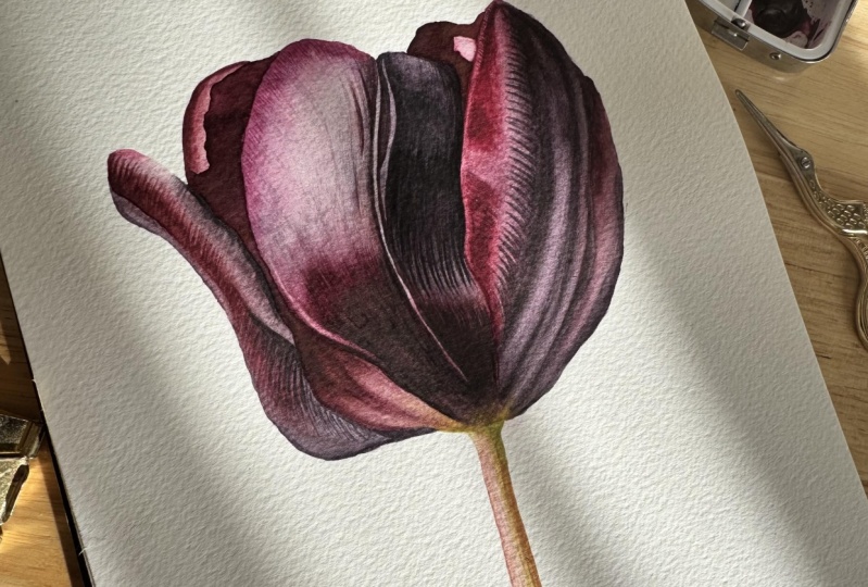
maybe it's time to stop. Here we've finished
that bottom half and so here how it
looked before we started to dry brush and this
is how it looks now. Now you can see the
saturation, the darkness, the depth of color, and the smoothness
of it and this is the reason why I
love dry brush so much because you really can make every painting
look very realistic and have a really
bright deep color so it's all about those layers. Now I'm just going to move on to that black area and do
exactly the same thing. I'm just going to dry brush
with tiny little strokes. This part is actually really well already brought
up, is pretty dark, so it's not going to
require too much of work, but important thing is here, not to lose those
veins that with it. When we reach that part
next to the highlight, we intensify a little
bit of veins but try not to dry brush
over the white parts. You see I'm dry brushing
now to just bring that darkness and here I am
painting in those veins. I would always recommend mixing your own blacks and all
those shades of black because premixed black
tend to look quite flat and so if you just use
your three primary colors, blue, red, and yellow, and you can create any black, but then you can also
adjust the tone of it. You can add a little
bit more blue, it's going to look
a bit more bluish, if you're going to add a
little bit of the same red, it's going to look
a little bit more purple so you will get
those different shades of black and they won't look flat because that's what I found the premixed
blacks look like. Always mix your black colors, it's not difficult at all, you're just using quite
saturated primary colors and you can mix it
up very easily, you see how we did here
with this painting. [MUSIC] We almost finished
with this petal, we just going to
have to dry brush a little bit with magenta color. There's a little bit
more texture at the top. I want to now
darken the magenta, so that's what I'm
going to do with those a little bit bigger
brush strokes because it's a textured surface
and I'm going to add a little bit more veins
after that to this area too. Here you can see me now adding
a little bit of veining. You can see how quite
pale I keep my mixes, because if now I was to
come with too strong mix, it will look a little
bit unnatural and too screaming at
you, those colors. Always go paler and then you can darken anytime rather
than too strong. We are finished with this petal. We can compare to
the other ones, we can see how deep
and dark it is. Here, how that our
petal look before we started dry brush and how
it looks right now after. You can see the depth and
smoothness of all those colors. Now, we can move on and do exactly the same thing to
all of the remaining petals. Again, we're going to go to now left and start from
left to right, and I'm going to this
smallest petal right here, and then we'll move to that gap in-between those
petals, and so on. Again now, when we
did the wet on dry, I'm moving my brush in the
direction of that form, curving my lines to create
this curve of the petal. I'm bringing up some color and now building up that
red to get really dark. As you can see,
it's pretty dark. This entire flower
is really dark. All the colors have to
be really saturated, so I am creating some texture and building
the color at the same time. Here are some veining now. To get really nice veins when you apply a little
bit more pressure at the beginning and then lift off gently the brush off
the paper so you can have a very narrowing
veining at the end. Now we need to really
darken this black area, and again, tiny little
lines to create that texture around
the highlight. It's very textured surface, so lots of tiny brush strokes to mimic that texture there, and a few more veins
with black color too. All we need to do now to
bring some color at the base, a little bit of this blue color, and we will be done
with this petal. The very base of it has a
hard outline and dark base. You see me now
bringing a little bit of black color at the
base of that petal. I'm bringing a little
bit more of fallow blue into my mix to make
it a bit more bluish, and just going to dry brush
over this area just to darken this whole area because it's way too light compared
to the reference, so you see now I'm
crosshatching just to build up the
colors a little bit. Keep it very pale because
if you use too dark color, you won't be building
the smooth layer, you will be making very visibly obvious lines
and we don't want that, we want to build a color. We don't want to make it
look that it's linear. Now, we can move to
this now petal behind. This petal as it curves, you can see a little bit
of front of the petal and then the remaining sort of
the inside of the petal, and so as the light
falls on that petal, one edge is very dark, where I am now bringing
some color and the other edge is lighter
where I left some light. It's very important to
leave that tiny band of light on the other edge
because you see now it gives the contrast
between the inside of the petal and outer
part of the petal, really separates it and brings that very top of
the petal forward. It looks realistic and so
it's important not to lose those tiny highlights because those details are
very important. To navigate dry brush that
inside part of the petal, to bring a really dark, it doesn't have anything
going on in there. There isn't any detail, so just this smooth layer of
really dark saturated red, and then at the
base of that petal, we'll have a little
bit more work to do. You see me now dry brushing to the part where now
there's something going on. We need to try to mimic now those detection the shadow
that falls at the very base. Now, make sure you use very
pale mixes because we want just a very pale mix of
our black or the dark red, just to have almost a
gray mix on because it has a transition
from very dark into all of the sudden
very light yellow there. I'm just trying to
mimic that shadow, is a little bit hard to
understand what's going on there, but we don't need to be
100 percent precise. Just get something
similar to what we see. Since I'm in the area, I'm going to just give few more strokes right next
door on this petal here. Just darken a little few
things as now in comparison to the very dark area that
we just dry brushed, I can see here and there I
needed to darken a little bit. We do the same thing
on that little petal that's just peeking behind. Just the simple that dry brush, there's no detail in it. [MUSIC]
11. Dry Brushing Part II- Finishing Stages: Now we can move on
to that big petal, and probably that's
the petal that I took the most time to dry
brush because of that really, really dark area
there, black color. Again, I'm going to start from
top and go to the bottom. I'm going to start with red, and now being intentional with some veining because I can see some lines can be visible. There are few patches that
needs to be darkened too. We're keeping our
brushstrokes very small, very watery mixes. You can see this dry brush the entire area with
tiny little brushstroke, but you can't really
see the brushstrokes. The glazes look very smooth
and it's like airbrush look. That is what I'm going for. Unless behind the area
where we want those lines to be visible where some
veining and texture going on, then we'd be
intentional with it. Otherwise, you need to
have mix on your brush, so pale that you can't really see the line when you're making. But when you're layering
over and over again, you build up to this
very smooth surface. You can see how velvety all the surface on
that flower looks. You need to really
practice it then. The best and easiest way to
practice dry brush is to just have a couple of squares the same way that I
made a tutorial about. Just give dry brushing until you finally find
you have a feel, get a feel of how much
water and what strength of the color has to be depending on what area
you're going to dry brush. Of course, if the area is very, very dark, you might need
to go a bit stronger. But generally speaking,
when you dry brush, you need to keep all
mixes very watery and much lighter than you think you would need for that area. Now next to dark
and very dark red, I can see that
this magenta patch there needs to be really dark, and because it's
just way too pale, it lost its color a little bit. Now I'm using a little
bit stronger and a little bit more
watery mix just to make it easier to go over
the entire magenta area. So now moving to
the dark, to black, and that's where we're going to spend most of our
time on this petal. You can see how little detail it's visible on that petal
there, the darkest area. I am improvising a little bit. I'm trying to really examine this picture
and this petal, and I see that there's
some highlights within that shadow that we
try to depict already. I'm going to just emphasize it because I don't want just to have a really one
big patch of black there and it would look
really flat and unrealistic. We will be dry brushing again
around those highlights. Starting from this edge, now I'm intensifying
all this raining. Also what I like about dry
brush is when you dry brush in the areas next to different
colors and different tones, you can make a really
nice transitions. With very pale mix, you dry brushing between
the area where two colors meet to have something in-between those tones so that the transition
looks a bit more smooth rather than you get just line of magenta
and then line of black. You want to transition
it gradually. With dry brush, I usually able to achieve
that transition. You can see now I dry brush the veining, and
then something a little in-between the veining, a little bit into the
lighter area so that it joins nicely the darkest patch. The goal is now to make all those blacks really
dark and really black, but also make a really smooth, and nice
transitions when it goes from darker to lighter like those little
hills on this petal. We're just going to do
that little section at a time as like one
streak at a time, just as we did when we
were painting wet on wet and wet on dry just
like that streak at a time. We want to darken the
darkest part of that shadow, and then with a
very, very pale mix, just dry brush in-between
those two shadows to make the transitions very
smooth and so we don't have those long lines, but they flow from one into
each other very nicely. Let's dry brush the entire area now just to make it very
smooth and gradual. Use very pale mixes and then make sure you don't have too much water
on your brush, just dab on your towel when you pick up a little bit of color, and just dry brush
the entire area to just join everything together. Just put your focus on to seeing those tiny little lighter
patches into your glaze. That's the part
that you're going to filling in to make it smooth. Or if you want to
darken the area, just use your
crosshatch technique. [MUSIC] As I paint now,
I notice that there are some black patches of darkness
on that magenta area. I'm just going to
with a very pale mix of my black color really, really water it
down and just going to dry brush lightly just to give some of that column that I can see on
the reference photo, some patches of darkness. All we have left is this red
patch on our flower head, and I'm going to do it with red and mix it with a little
bit of darker red just to have something
in-between because it's not exactly bright red there, and
not exactly very dark red. We'll just mix in those
two colors in between. I'm going to have to
dry brush it a few times over to get this darkness. But I'm going to stay
in control within those small brushstrokes
and it's going to build it up slowly, and trying
to keep reflective light at the very edge and a little bit lighter here at
the bottom of that shape. We can see it has
a highlight there. Once they are done, then I'm going to go
over one more time, and then we'll see if I need
to maybe give another layer. [MUSIC] You see, as I'm
building up the color, I'm also filling in
those little patches of lighter gaps so that displays is smooth and it looks even. That is the smoothing technique that you fill in
those lighter gaps. Yes, I need one more
layer of that red. I like to paint with quite strong contrast in my paintings in a
very light lights and I always go really dark
because that contrast is what gives the realism
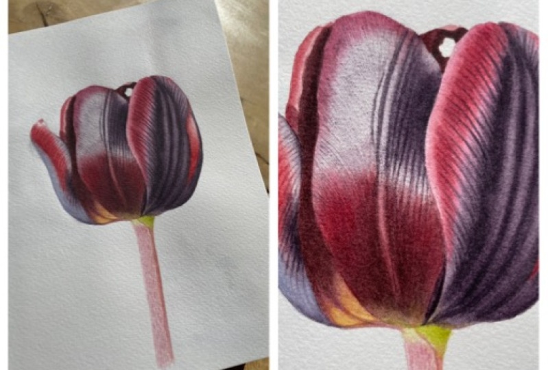
and wow factor. We don't want it to be too dark the whole painting and too pale, so the contrast is important. Here how it looked
before this dry brush, and that's how it
looks after dry brush. As I said, in my opinion, dry brush can do magic, so it's very important
that you practice it. All we have left to
do is now to paint in that little stem and then
it will be all finished. I'll see you in a very
quick last video.
12. Stem: All we have to do is to
paint in that little stem, so I clean my palette, make a little space
because I'm not going to need any of the other colors. I'm going to use the
same colors that I already used for
the flower head. I'm going to mix up some green, so quinacridone gold
if it's fellow blue. Just make sure you start
with yellow and then very little dabs of blue because it can go
strong very quickly, so we need very fresh
green that you can see at the very top of that stem
that falls into the shadow. Very fresh. When you make
green with Phthalo blue, the greens always will look
very fresh and mixing up some of that pink with magenta and tiny
bit of yellow blue. On the side, it's a little bit orangey color
that falls into the shadow, so again, magenta
and a little bit of quinacridone gold to
make it a bit more orangey. As I paint, if it looks wrong, I might adjust the color
but let's see how it goes. I'm picking up my
number 4 brush, Rosemary and Co,
and I'm not going to paint it before because
it's very small area. Usually, when I paint
something small as this I don't wear it before, so I'm just going
to paint in with that base pink color
and I'm leaving the top light because you see there's going to be
very pale green there. I'm quickly painting in with
my pink just as a base, and then on a second
layer we will start painting in with a
little bit of more texture. While it's damp, I'm
painting in the shadow. I'm picking up my green and paint in the shadow, a quite sharp shadow that
falls on the right-hand side. While we leave it to dry,
we're going to fix a little in this petal because
I see it looks a little bit disjointed from the stem, so I'm just going to pick up
a little bit of that orangey and I can see that this
petal a little needs to be slightly extended
as you can see in the reference photo to
connect it with the stem. It looked a little disconnected and somehow it got
lost a little bit. So my stem is completely
dry and I can remove now my pencil line because I don't want it to be visible because the stem is quite light, so we want to remove our pencil
lines as soon as we can. So after the first
layer, I'm removing it because we won't
need it anymore. So now with the same pink mix, I'm going to now paint
in a stippling way so that I can create
some of the texture. You can see it's not even glaze, it has little gaps so I'm just painting in a
way to create that texture. You see now, I'm
mixing my orange with a little bit
more pink because it appears to be
a little bit too orangey for me as it dried out, so I'm just bringing a
little bit more pink into the mix and just
simply painting it in. Just with the very tip of my
brush with the last hairs, again, I'm trying to create
the texture that I can see not to have it just with
a strong edge shadow, but rather textured one. Also, now leave it to dry. Once it's dry, we will
get another layer off of that thing just to get
our texture intensified. That's it. We're finished with this tulip, and congratulations
if you gave it a go. I'm really happy because this is a big project to do and the one that requires
quite a bit of patience, and so if you did it, I can't wait to see your
result and happy painting. I'll see you in the
future tutorials. Bye.
 Egle Kolev, Watercolour Artist & Teacher