Transcripts
1. Introduction: You feel like
watercolors and it's endless possibilities that
the watercolor provides. Then you came to
the right place. Hi, my name is Angela cola. Number of times a watercolor
artist and illustrator. I love to paint realistic, vibrant botanicals
with watercolors. And I'm here to show you
the appendix and be very realistic and very detailed that they have to
be complicated. I like to say very
limited palette for all of my projects. So in every project with me, you will learn how to mix your own colors with just
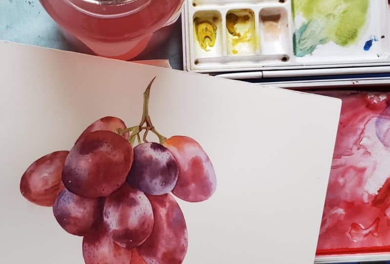
a few constant pigments. For this class today I chose to paint these delicious grace. They have so many different
colors and shades, and hues and detail. And a lot of people might
find them intimidating. But I wanted to show you
that it doesn't have to be. I split the process of painting this grapes into individually, very simple and achievable steps so that even a
beginner can do it. But when those layers and those steps are layered
and they come together, they create this
beautiful painting. I will also provide you
with the reference photo, line drawing and
full material list down below and
resources section. The only rule I have in my classes is that you
enjoy the process. Try think a little
bit less about the end result and try to find the therapeutic
and relaxing nature that watercolor provides. And if you do it as I guarantee, you will always have
a wonderful time. So let's get started.
2. Before We Start: Before we start, I would like
to mention a few things. If you are an absolute
beginner and you are not familiar with basic
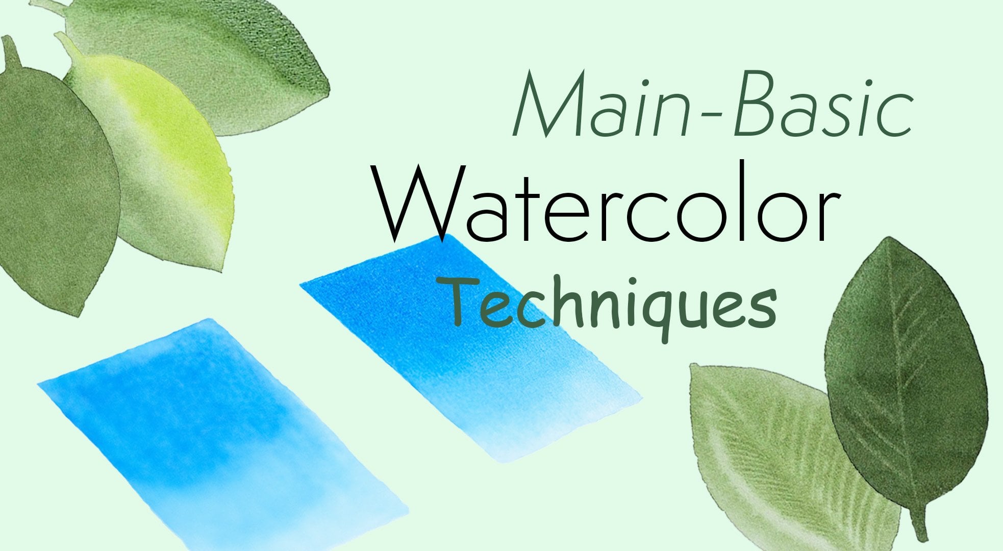
watercolor techniques. I would like you to check out my class specifically
dedicated to those main botanical
watercolor techniques called Master main basic
botanical watercolor techniques. And I explained it
in great detail, how the technique works, how to do it correctly and have to practice it
with simple shapes. And if you do that, you
will feel much more comfortable painting a subject. Also, if you would like
to know how to stretch your watercolor paper
onto the board, e.g. if you're using 300 GSM or
lighter watercolor paper, I do that to prevent paper from buckling and
settling and evenly. Or if you would like to know how to transfer your drawing onto the watercolor paper
from either your sketch or from the line drawing that I'm going to provide you with. Or if you would
like to know more about the materials that
are used in greater detail, like what type of paint and brushes and palate
to use than I would like you to check my very
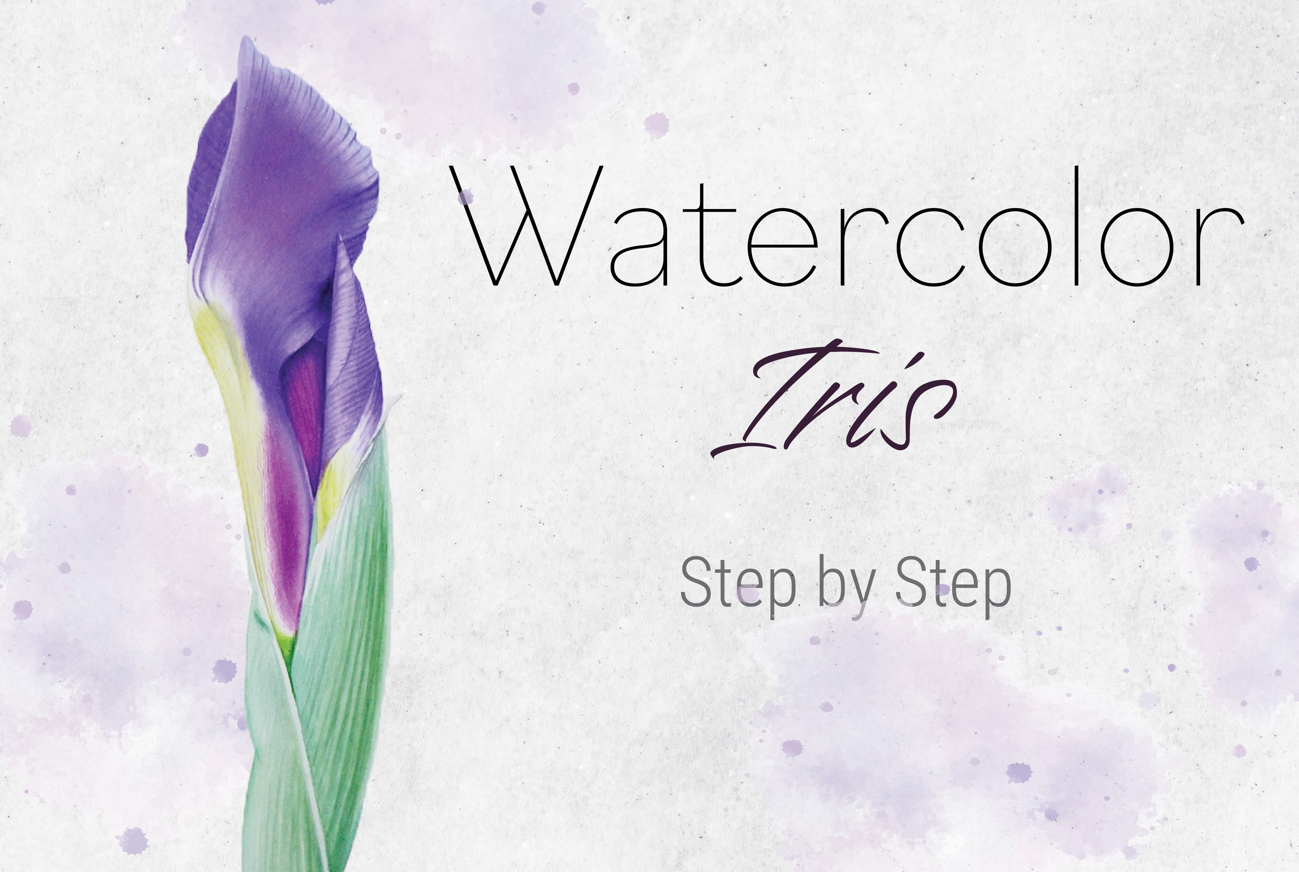
first Skillshare class called botanical
watercolor painting. Learn to paint iris, but step-by-step and choose
a lesson accordingly. You don't have to
watch an entire class, just the topic you
are interested in. So then without further
ado, let's get started.
3. Materials: Hi again. So let's
go quickly through the materials you're going
to need for this project. So to start with, you will
need watercolor paper. I recommend to be 100% cotton so it can handle the
layers and water. If it is 300 GSM or liar, I would recommend
stretching it onto a board to prevent
from buckling. For that, you will need
gum tape and a sponge, the cumulative paper with, if you would like to
know how to do it. I have a class on my
first Skillshare course, watercolor iris bot, where I show you how to stretch your watercolor
paper onto your board. Next, the transfer
your drawing onto watercolor paper
from your sketch or the line drawing
I provided you, you will need tracing
paper if you would like to know how to transfer your
drawing onto watercolor paper. I have a class on my first
Skillshare course as well, watercolor, iris, but choose
the class accordingly. For that, you will also need
a pencil and an eraser. You will also need a container
to clean your brushes. I used to want to
clean my brushes and the other one for
clean water glazes. You also need a towel
where it can wipe your brush and a palette. I recommend ceramic palette
because the colors flow much nicer on the surface and you can see the correct
color of your mixes. The colors used for
this project is lemon yellow, permanent rose. Scenario, read,
perylene, maroon, phthalo blue, and neutral tint. I will also be using
round brushes number 3.1, and also use a little
bit of blue tack to remove the excess
graphite off my drawings. So that's it. Those
are materials and let's go straight
to the painting.
4. Mixing Colours: So I'm very happy to
have you here and we can start working on
painting this beautiful grapes. So first step,
mixing the colors. And we're going to be
starting by mixing the colors for our
underlayer, the bloom color. So that's the color
that's underneath all this red, dark red patchwork. So now, when we start
looking at those grapes, you can see how
many colors there. And not as many cars, but different shades
of a single colors. Just to look at the
main red color. So it is more orangey red, then it's more purply red
here is very dark purple. Now if we try to look beyond those dark colors and Marx
looking at the bloom. So the most obvious blue
Here's a bit more pink, a little bit more purple. So it's quite a few
shades of colors. So we're going to try to capture those colors to make
it look realistic. So now for the first tab, so at this, for this painting, we are going to be
probably using more wet into wet techniques because when you paint circular
shapes and those colors, different shades of colors, they flow into each
other very seamlessly. So it's easiest and best to
do it with wet into wet. When it's when, when the different colors flow
into each other on one shape. So you will do it if you want it to look natural and not to have any hard edges or watermarks. So you're going to have more wet into wet techniques
for this project. Right? So for the first step, I would like to paint in
that bloom because it is a lighter color so that
our colors would go on top of it because
it's much darker. And so even if it's different
colors on that bloom, if really showed
through very much on those markets because
those markings I've really, really
dark anyways, so we can paint full grape all grave
with that blue color. And then we're going to put
those dark colors on top. Now, try to look beyond those marks and try to see what colors you
can see on that blue. So even on this grape now, you can see there's
blue around the edges. It's like grayish blue, slightly more pink
towards the middle. Right here is very
dark, blue-gray. Here's Very, think a little bit of blue around the
edges here as well. Pink halfway through then. Bluish gray, hair, bluish
gray and pink and so on. So now we try to see those colors and try to
ignore those markings. We're not going to
be painting them in the first couple layers. Right? So let's mix up dance. I'm not going to
mix all the colors, so we're going to start by mixing the colors for the blue. And once we think we
are done with the bone, we're going to mix up some
more colors for those marks. So let's start them. Thick piece of paper. Right? So I will be using for this
project a little bit off. Neutral tint, my gray mix, just, just to touch for the balloon colors to grade them
down a little bit. So first color we can mix
up this slide bluish color. So I will be using
failure blue for that. And I will turn
it down by adding a little bit of
neutral tint gray mix. Actually can add
even maybe too much. So this scholar would be
great for this dark color. And maybe some places
a little bit of blue but diluted up
bit more, right? So for the second color, I'm not going to even clean
my brushes right here. And the same one, blue and gray. But this time I will add a
little bit of permanent rose. Make it a bit more purpley. Maybe a bit more pink and blue. Too much gray. Maybe. Try not to overdo
with gray because it's gonna be just
too muddy them. Let's see what we have. So the first mix, those bluish colors couldn't
be maybe more blue, I think. Stronger and slightly
touch of permanent rose. Be okay. So we would need
to really water it down here for the lighter areas. Criminal throws. All right. That's better. Right. Our purple gray, little
more permanent rose. I'm getting too
strong colors a bit. Rose, Permanent Rose, Sorry. For the foreplay places. So now we need something
more pink curve. Start with permanent rose. The touch of yellow, blue. Touch provides strong
water it down. Let's see. So this is
for those pink areas. It looks about right? Right. So I want to add a bit
more to the purple mix. This is gonna be okay. I know it is a little bit hard to see those colors because they all just very quickly jumping
into one another. So it looks a bit
bluish up with pink, but it doesn't really have to be exactly as you see it, right? So we just need to get something similar and tried to
apply similar colors. Anyway, because each grape is different than if
different shades. So those colors can mix and match as long as we
can get something similar, it doesn't have to
be exactly the same. But I think we got something, what we need so we can
start painting them. Alright, so I'm gonna use
my number three brush. This is a Newton CR7, have real at banded this brush. So I thought I will give it a chance to
prove itself again. Alright, so I think
maybe we need to go to lines a bit lighter. A little group of low-tech, one painting with watercolors. Watercolors make
pencil mark permanent. So that's what you want to keep your pencil marks as
light as possible. Specialty painting,
something very light and they
might show through. So using a little bit of blue
tack on kneadable eraser, gently tap over the drawing to take the excess graphite off, leave it just enough for you to be able to see your drawing, but not more than that. And in the next video we will start to paint. See you then.
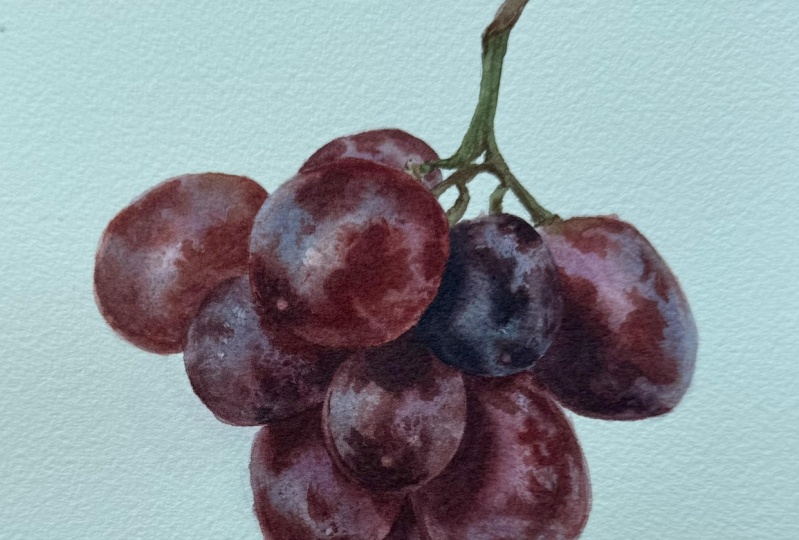
5. First Layer- Bloom Colour (Underlayer): I'm so excited we can start painting those beautiful grapes. And in this part we will start painting in depth, bloom color, the underlayer color of dogs, grapes with those beautiful
pinks, purples, and blues. Alright, so I'm picking
up some clean water. Then we're going to start with probably just scrape Maybe
this one from the side. So when we apply
water this time, I don't want to have too
much water on the paper, so we're going to apply water in a middle quickly push
it up to the pencil line. They take the water
out of the brush and collect all the excess and then we'll go start
painting right away. So I don't want too much
water because it is small area and I don't want the paint to
spread very quickly. I want it to be in control and how they very subtle spread. So if you put lots of water than the pivot to
soak into the paper, the water talking to the paper. Then the people would be water for longer and the
colors will spread more. And in that case, it doesn't really go for us for this painting because
sometimes you need lots of time to do your glaze
and maybe there's a lot of lifting
of that needs to be a lot of colors
and it's a big area, then you will put lots of water, let it soak into the
paper a little bit, collect all the excess,
and then start painting. But in this case I want
to just a little bit damp surface or the color spreads
nicely but not too much. So I don't want lots of
water on the paper symptoms. So you're going to just apply water quickly in the middle. Not enough pencil line. We want to make sure we
cover all grape very nicely and try not
to come out of line. So dab the brush on the
towel to take the water out. And I gently just
run my brush over the paper over the area we covered the water to
collect all the excess. And I just have a very, very gentle water glaze, very subtle and
it's not very wet. It's just a little
bit of time so that the color spreads nicely yet
doesn't spread too much. So if you're not sure,
how much more do we have, we can pick up a little
bit color and just make a couple of dabs just
to see how it spreads. Spreading very quickly
into the edges. That means there's
too much water on your paper or on your brush. Right? So I started with pink color around the area
where I think I can see it. Then I picked up some blue go
around the edges and I keep shorter a little bit
of the pencil line around the outer
edge of the grape. To have this a, when you paint
something circular, we have this reflective
light around the edges. I clean my brush, take the
water out on my towel and run my brush around that edge
grading the slider effect. In order to collect the color, you might need to do it a few times and cleaning
your brush regularly. So we do want to
make sure we have a very nice clean lines where the groups are
touching, right? So now I clean my brush
off the water out and I collect a little bit of
color in the middle. And they leave the highlight
bigger than what it appears. And then I pick up a
little bit more color and just put a little bit
more in the dark areas. And then again, I
see the color starts seeping into the edges
and I clean my brush, take the water out and
collected, collected again. Right, so that's all we're
going to do for this step one and try to move away from
the area, so just paint it. So I go on the other end. Because you always want to keep the distance from the
areas we just painted. Always try to make
sure they don't touch. Otherwise, they're going
to flow into each other and completely disturb
your glazes again. So I placed a little bit
of water in the middle, push corrupt and a pencil line, clean my brush and then collect the excess water and started
painting right away. So when painting this
bloom or foundation layer, if you will, it doesn't really matter which color
you're going to pick. You do need to examine
your reference closely and see where
the blue tones, where the pink tones, where the purple
tones and just try to match as closely as possible. There are a reference photo, but it does not have
to be exactly like mine are exactly like
the reference photo because each grape
is very individual. If you pick up a little bit of a different
color in a certain area, there won't be the end
of the world because those grapes are very colorful and as long as you use
all the same pigments are no extra ones is going to be good no matter where
you're going to place them. So just try to examine
your reference photo. Try to see where your
pinks and blues are, but don't get lost into following
every step that I make. So I placed my colors again
and I clean my brush, take all the water out. I keep collecting the pigment in the lighter areas or
where the highlight is, and keep cleaning your
brush regularly, right? So now the first
group is already dry. We can paint next to it. So I'm going to tackle this
biggest grape at a center, putting nice water glaze. So good way to know whether you don't have too much water on your paper is once you apply
the water on your paper, tilted head to see the light
reflecting off that glaze. And you should have a gentle shin rather
than glossy shine. And you should still
be able to see a watercolor paper texture
through that glaze. That means you don't
have too much water. So I started with the BlueMix, picking up pink one
on the other side, it looks much more
pinker. Over here. You can see I leave
the highlight around the edges
and in the middle, there's very, very little
highlight in the middle, but it's better always to live
bigger than what you need. You can always narrow it
down in a layer of glaze is, but if you leave too little
right now and the wet on wet, it might just quickly close
up because the paint is going to be moving
towards that anyways. So we can make a little dab, dabbing motion with your brush
because it's a little bit more textured in
patchy those grapes, so it's not very
like even glazes. And again, with a
clean, damp brush, I collect the paint around us. Nice reflective
light on the grape. I clean my brush
after each stroke always if you want to lift
up the paint, otherwise. You can note that if you will try to run your brush
a little bit longer, depend won't be
lifting off anymore. You will be just
dragging the paint with your brush so we need
to clean it regularly. And then just keep
repeating the process as many times as you
think you need to. All right, so now
I'm just thinking Which one I can paint right now. So let's just go with that one because it's not
touching anything. All the other groups sort of close to the one
we just painted. So dr. to keep my distance, again, nice water glaze. Pushing up to the
pencil line and collecting all the excess water. Just tilting my head to see if I don't have any dry patches. So this one is quite
pink one and has a little bit of blue
Bloom around the edges. So putting a little
bit of blue around, still keeping a little bit
short of the pencil line. I'm not going all the
way to the pencil line, so picking up my pink and pretty much covering
the rest of the grape. And so you can see that my
pain doesn't spread very much. It just gives this
very smooth spread, gentle one, but it's
not spreading very far. So that's why I wanted not
to have too much water on my brush because the area
is very small. Those grapes. So if I have too much water, it will cover all grape and we won't be able to
get those highlights and reflective light before
it dries out because this, this glaze will dry out much quicker because we don't
have much water on it. So you need to work fairly fast. And as soon as you place
your primary colors, you need to collect
the highlights. Otherwise it's going
to dry out and you won't be able to lift
off the paint anymore. So hooked up with a
color, your brush, and then collect around
the grave that highlights, the reflective light highlights. And then if you need
to add more color, then you can add more color. Then again, if the color started
spreading too far again, you can collect just, you need to do it quite, quite soon, otherwise it
just drying very fast. So by now I think you
already noticed the pattern. We wet the paper, we placed the colors
that we can see. We clean the brush,
we collect the color, then we can add a little bit
more and then we collect some color from highlights and around the edges once more. And so we need to do that for
all the rest of the grapes. Going to add a bit of
pink to my pink mix. It just looks a bit
bluish here somewhere. And a little bit more pink
into my purple mix too. Just to make them look a
little bit more fresh. This grape is a
little bit darker, so we're going to have to put a little bit more
stronger color. So I'm going to start with my pink mix and loading my
brush a little bit heavier. Still not going all the
way to the pencil line. Keep that edge clean. And even on the reference photo, you can't really see too much of that reflective light around. But once we put
all the glaze is, it will soften for us as well, but it just looks a
little bit more natural. And that you paint circular forms if you leave
this reflective light, even though in the reference
photo it's not that obvious. It's quite subtle,
but it's there. If you examine closely, right, so this is
the last grape. And so now you can leave all the glazes to dry
completely because after this, we can remove all
that pencil line of the grapes live on a stem because we're still
going to have to paint it. But just where you think
you're not going to need it anymore because all those pinks might make pencil
lines permanent. So I would like to get rid
of them at the beginning. So first step is done, and I'll see you
in the next video.
6. Second Layer- Bloom colour (Underlayer): We have our first
layer of bloom color. Now as we look at
the reference photo, I can see that this blue color
is still really too light. So what I would like to
do in this step is do exact same thing we did in
step one. In the first layer. Just to apply a second layer of this bloom color so
that we give depth, they mentioned to our grapes. And you can only create
that with layers. So better with more
transparent, lighter layers, but more layers than try to
go very strong at first. With less layer. Layers are very important in realistic and
three-dimensional painting. So we're still going to be
using wet on wet technique. We will do pretty much
the same what we did. We just need to give
some more color, somewhat tabs to that
bloom under layer color. And of course, until we put our darkest tones with dark red, those patches in the next step, we won't know how dark our
bloom color has to go. Because only in comparison
to the darker stones, we can judge our lighter taught. So dark is very
important for that. But for now, I still see that the blue color
is still too light, so we can go ahead and give
a second layer of that. So start with by loading your brush with clean water
and applying on paper. So the only difference
on this step from the first step one is just
that on a few grapes, I will apply color in this dabbing motion
that I'm doing right now, just to give a little bit more patchy texture
for the grip. I'm not gonna do that
for all of them because others seem pretty smooth, but just on a few where it
seems a little bit uneven. So other than that, you're gonna do the exact
same thing as we did on a first step. Just give a little bit
more depth for the grapes. Are we doing the second layer
just to darken everything? And because the more layers
you put them more depth, the object will have. So yeah, let's get it
done and we will start putting this dark
patchy pattern. After this. We have done the second
layer and you can see how much more vibrant
our bloom is right now. So now we need to live all
the layers to dry completely. And in the next
step we will start. I'm mixing up some
colors for now. Those are very dark
and red patches. So the fun part we're
going to start, I'll see you in the next video.
7. Red Patches-Third Layer: In this lesson, I'm going
to start painting down all this beautiful red
and dark red patches so that this bunch of little circles would start
turning into actual crepes. So let's get started. So first what I would like
to start with is by making some space for some new additional red
colors on my palette. Right? So first, I would like to mix maybe
this red, orangey color. So I will be using
scenario read. Read a bit of
Ireland. Let's see. Maybe we can add a bit
of perylene maroon. That's better. Second one, just Berlin maroon photos, darker parts, darker red. Then we need this
purply red maroon. I want to add a bit scenario to scenario. Alright. So you see e.g. here, it's perfect
for this grape. For this one, you
need the first one. So when we paint this grape, we can just add a
little bit more blue somewhere in the
corner of this glaze. Just slightly adjust for
each grade because on each grave stone is
slightly different than so. You don't have to bother, you can just use one
color and if it looks a bit different from
the reference photo, it's not a big deal, but if you want to really get
perfect for each grade, we can slightly adjust the tone someone
at the entire mix, but somewhere in the corner, just add a little bit of blue
or a little bit more red, just so that you can pick up that tiny piece that you just mix that up
and then paint that. Decorate. Alright, so these
are the colors. We can start painting. Maybe we just want
to adjust my ugly. Now you see now we're
going to dry and it looks a little bit too brown. Add even more red
into this dark mix. Be better. Right? Let's start. Again. We're going to be
painting wet into wet, still using the same brush. And again, we don't want to have too much water onto
the paper because we want to have the control and
we don't want them mixed to spread too much because we don't want the
paint spread all over. We want to have those patches
of color. Same way we can. I walked onto the paper and
then mop it up quickly, the excess so that we have
only a slightly damp surface. So for this part,
for this stage, it's even more important
that the paper isn't too wet because
those patches, if it's too wet, we'll kinda lose the pattern
that we want to grade. So it needs to be
very uncontrolled, yet it needs to, needs to have a
very subtle edges, meaning that you do need
to paint on a wet on wet, so that it spreads very nicely, yet they stay in shape. So before you start
painting everywhere, just dab couple of times just
to see how much it spreads. If it's too much, just wait
a few seconds for the paper, for the water to
soak into the paper, it will get a little bit drier. I'm also this point using pretty sticky and
goopy color mixes because for the same reason
we don't put too much water on our paper before we
start to paint so that those patches would
stay quiet and control and don't spread
all over the grave, but only in little patches. So you can see I'm painting
with a tip of my brush in little dabs so that I can make those little patches and closely monitor how the color spreads. So you do need to
closely monitor your reference photo and don't be bothered about
tiny little dots and speckles here you
can see on a grape, we only want to paint in those big blobs and
patches of red color, but also don't get lost
into too much reference. Because if those patches slides in a different
place, that is alright. Because when you paint
something busy and colorful, it's not about where exactly
you put those patches, but the concept of them, so they can be in completely
different places. You can use the reference for just purely as the reference, but you can paint
wherever you want them. Don't be too worried if
they don't seem exactly in a place where I put those
patches or the reference. They will still look
good and ignore all the little scratches and little dots and
speckles on a grip. We're going to do them
in the next step, so only the big
patches of red bloom. I also cleaned my brush to
the water out and slightly softened one edge of this patch that goes towards the pencil
line to make the grip look a little bit more circular and preserve this
reflective light. So I see that my glaze is
still a little bit damp. I can pick up a
little bit darker, stronger color and still
apply a little bit in certain places
because you see those patches and not
very even colors. So while the glaze is damp, we can just add a little
bit more variation of those patches, not as smallest detail
just here and there. The very end there, there's better very
dark little patch. So I'm just gonna quickly mix up the same color that
we had for the bloom. Just a little bit darker. Philo blue with neutral tint to have this very dark color. And right here at the tip of it, There's properly dark patch. So just applying
some color there in a little dab and motions. So now clean my brush, take the water out, and just sweep through the highlighted
area in the center. Again, does highlight as much lighter than it's
supposed to be. But it's okay once we
do all the patches, who reminded to read glaze, the bloom, we will make that highlight as big
as it's supposed to be. But right now I'm just
leaving more than I need to just to be safe. So as the glaze tries, the marks will make their sharper and the color
doesn't spread too much. So I'm going to have to stop, but I'm just adding
Karen there and just making my patches look closer
to give reference photo. And if you need to soften around the edge,
just clean your brush, take the water out and
just sweep around slightly making the edge towards
the pencil line. Slightly softer. Last little detail,
still picking up a little bit of my dark, dark red and is placing
few dabs in the center. As my color doesn't spread as much as I can make
slightly darker patch. And so now you can see
those dark patches. The bloom looks so light and will probably
need to darken it. Now we can leave that grip to dry and move on to the next one. Again, applying in
ice water glaze that doesn't have
too much water. Here I applied all over the
grip and then collected all the excess and starting
to paint right away. Picking up quite right. You can see the paint
on my palette is dry. Ash doesn't have a lot of water. So everything's a little
bit more concentrated to make sure that those colors don't just spread
all over the grape. I needed very, very
gentle spread the color. So I'm starting with
my lighter red first. And again, you see I'm
painting with my tip of my brush with little dabs, making sure the color
doesn't spread too much. If it does, make
your color stickier or a little bit less water
on your paper first. Picking up some
darker colors as I go into the shadow area. And so you can see I'm working in those very small motions, just little dab at a time. You do need to work fairly quickly because the
glaze is drying. But I'm not trying to
make any big strokes. So just little dab and I'm moving along with quickly but in little tabs so that in
case I do a mistake, I had only one little dabs
always using big brushstrokes, just little dabs at a time
so that we see how that color spreads everywhere and so we know where to
make this pattern. Even you can see mine
is not identical, the same those patterns, but we just want to get similar as close
to their reference. And if it started
spreading somewhere, you don't need it and just clean your brush to get the word out and wipe it away that color. So my glaze is almost dry. You can see the colors
not sprinting anymore. So I'm going to just add
a little bit of blue into my dark red mixture
here in the corner now, nuts all over the mix just in the corner
to have this really, really dark color,
purply red color for the shadow area in here, I'm going to apply in this dark, dark corner here, again
with small little dabs. No sudden movements. And make sure I have
a very clean line around overlapping grape. Because when you paint grapes, it looks like it's a very
simple subject dose. Paint circled, but it's
actually quite difficult because you need to make sure
your lines are very tidy. Because whenever you just go
over the other grape and all of the sudden death
grave just doesn't look natural and
realistic anymore. So we need to make sure you don't come out of
the pencil line and they stay nicely circled. So as you can see, now the colors no longer spread. That means the glaze
is already pretty dry, so I'm adding the tiniest
little mark here at the edge. Cleaning my brush,
taking water out and softening that side
towards the pencil line to make it a little bit
transitioning into the lighter as the grip curves and
make disappearing edge. Right. So I can now leave that to dry and move
on to the next one. So now that we've painted
a couple of grapes, I think now you will be able to understand why the step is
and what we need to do. And so I'm gonna leave you to continue and finish
all the grapes. So what we do is apply
clean water glaze first, making sure we don't
have too much water. Once you apply the entire
grape, clean your brush, take the water out, and just
collect all the excess. And then closely monitor your reference photo
and apply lighter red, darker red patches where
you think they are. And if they're a little bit in a different place, Don't panic. They will still look nice
and still looks like rape because nobody will
see the reference photo, but you, nobody will know where exactly those
patches have to be. So enjoy the process and just make sure you don't
have too much water on either your brush or your paper or the mixes so
that you can stay in control. Sure. Right, So this is
our last grape. I hope you enjoyed
this step and it was clear and understandable. And in the next lesson we
will start painting down those really fine details and little scratches and little
dots on those grapes so that we further enhance
our crepe painting. So I will see you
in the next step.
8. Fine Detail-Fourth Layer: We are so close to
the finishing line, and right now it's
time to paint in all this fine
detail, little dots, little scratches and markings, everything that we
couldn't do when we were painting those big red patches. So all the main
layers are done and we have the bones
sort of speak and, but it's not very detailed. So I'm gonna take
my smaller brush, which will be
probably number one. And we no longer going to paint with wet on wet technique
now we're going to paint with dry paint or a wet paint on dry paper
or dry paint on dry paper, depending on the area, but primarily it's going to be quite lucky dry
brush I would say. And so we're now going to try to capture all those little
dots, little scratches. And in some areas
you can see some of the patches have sharp edges, so we're going to paint
over those as well, making the forum a little bit. What we see in the reference, there is a little darker
areas and those patches so we can paint
those students are basically all the fine, fine detail, all the finest
detail we're gonna do now. So now that we have
our darker tones, we can clearly see that the blue needs to be darkened compared to
the reference photo. And as I mentioned, that you can only judge a lighter tones once you
have your dark tones. So once we're done
with all the detail, we will do a binding layer
where we will glaze over with our bloom color
underneath color that the colors that we started with to sort of tie
everything together, diffuse a little bit of all
our markings that we make. And that's a good
think to do at the end because all the markings and fine detail that
we're gonna do, my look a little bit
disconnected because they're going to be a little bit
too sharp and too strong. So when we'll do the binding
layer at the very end, we will tie it all
together and it just will look like it belongs. Right? So we can go and start painting rights fault for the smallest and
this fine detail, we're going to be using
the same colors that we used for the red patchwork. So again, I don't have too
much water on my my colors. I don't remove wet
and remix them. I just pick up a
little bit of water on my brush, diluted mix, and loosen up the paint on my palette and then
load my brush and I dab on a kitchen towel to take the excess water and
they start painting. So this is will be like a dry brush so we don't
want any droplets, so you don't need to how
much water in your brush, just if your pigment, but it has to be diluted
because when you paint, dry paint or wet
paint on dry paper, the color doesn't
dry much lighter, it stays pretty much the
same as what you see. And it's quite different than
you paint with wet on wet, that you'll probably notice
the colors dry, much lighter. So this step again, it's not very complicated. It's quite easy one. And because we don't have
wet glaze on our paper, we can take all our time, just as much time
as you need because no colors are
flowing everywhere, you don't need to
manage anything. So now we'll really focus on the smallest of the
parts of each grape. You know, when you paint
with wet on what you focused on hong grape. Because you need to monitor all corners when
you paint with wet on wet. Now, we paint little
section at a time. Color stays exactly
where we need it to be. And so we can just take our time and it's
quite relaxing now. And we can really focus on each grape and each corner and put as much
detail as we want to. So I personally like to go into really fine detail
and I examined every centimeter of a grape and I tried to match
it on my painting. You don't have to do that. You can just capture the essence of a grape and you don't have
to go into great detail, detail as I do, but it's up to you. But the step is
generally quite easy. So if you're not sure a little bit about the step
than maybe paint with slightly more diluted paint in case you might go too strong so you can always darken
anything you need. But if you're a little unsure, maybe just start painting with slightly lighter paint and you can just darken the
color as you go, as you feel a little
bit more comfortable. So you see now I'm focusing on every little corner at a time and just paint
little patch of the time. Really closely monitor
my reference photo. And they paint in little patch. And maybe one edge of that
little patch might be softer. They then clean my brush, take the water out and I just further away
that corner with clean damp brush to create a transition
or disappearing edge. And then I move on to
the next little area. And so I am going into great detail here and
I pick up the colors. According to that,
everyday paint, e.g. I. Painted with my red. Now I'm moving to the
corner that's very, that the tip of the
grape, it's very dark. So I'm picking up
my dark red mix that had some blue in it. So we just keep
building that grape. So I started by painting in darker part on the red patches that we painted in
the previous step. And slowly I will
start moving into the light areas where it
doesn't have any marks that, and I will start here
making little lines. You see little scratches and literal little dots and I'm
like speckles on each grape. And I'm trying to make them
very fine and very small, just as I see in the
reference photo, a little bit erratic,
not perfectly rounded. Somewhere can be a dot
somewhere can be a little line. And you can see that I'm
using very dry paint. If I had very wet paint or
too much water on my brush, then I wouldn't be able
to make very fine lines, are fine dots that water would
sort of drop off my brush and could create much
thicker watery marks. So if you want to
make very fine, very sharp details
and paid just with the last sort of
hair on your brush, then you need to have
pretty dry paint. That's why I didn't really
wet my paint on the palette. I love to dry and I just picked up a little bit of
water on my brush just so I can loosen up that paint each time
we need to pick it up. And if I think I have too much, I just dab it on my
towel to take the excess so that I would have just the
pigment without much water. So the previous step that we did where we painted
those big red patches, it's like a groundwork
for all this detail. Now with this dry brush, I sort of grade
shape a little bit more what it looks on
the reference photo. And I miss shaping a little bit those
patches that we did just to match my reference. And again, it's just
because I really like to go into like very fine detail. You don't have to do it. But now it does dry brush. You can create
pretty much anything if you just take your time. So this step is, I would say quite easy. It's just that it's
time-consuming. If you're someone like me that it gets lost in the
details sometimes. But yeah, so take your time. Don't rush and just examine your reference and paint
what you see, I guess. And just I would like to mention that you
can probably notice that those marks that are
making their slightly too dark compared to
the rest of the grape. And that is because
we still haven't put this binding layer that I mentioned we will at the very end in the next lesson. So don't worry if those marks coming off
a little bit too harsh. They will get softened with our final layer and
they will get diffused. So if they are two lights, they might get lost
underneath that layer. So they do need to be a
little bit stronger than what it looks right for
the stage that we are. And so I think now it's
clear what the step is. Using quite dry paint. Painting in all the detail. Little brushstrokes at a time. If you want a softer edge
somewhere, clean your brush, take the water out
and soften away, further away your marks. And just try to capture as much, as much detail as you can see. And let's just go and finish that step on all of the grapes. So we finished this step and we are very close
to the finishing line. And I hope you enjoyed this
step and you understood everything and you
happy with the result. And in the next lesson, we will put down our
binding layer to bring all of this
fine detail together.
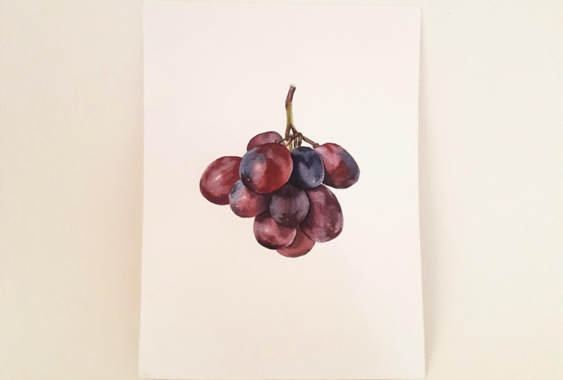
9. Binding Layer : Hello and welcome back to the next step of painting
this beautiful grapes. So now we're in our last
layer for the grapes. And then all I have
to do is the stamp. So now looking at our grapes, we can see that after
those markings, the bloom color is a little
bit too light and we're missing a little bit more
pinks and blues on our grapes. And also those marks and the fine detail that
were put in looks a little bit too sharp and they
a little bit to a parent. So, but I did want to make the fine detail before
the last layer so that now you can glaze over with very transparent watercolors
over the entire grapes. Just making this bloom color underneath a little
bit more saturated, but also it will soften and diffuse the fine detail
that were put in. And this last layer will
bind it all together. And those details and
marks and dots and scratches going to
look a little bit more natural and software. And it just the last
layer just going to bind all our work into this
realistic looking grape. So what we need to do is now mix a little bit more bloom color. So I'm using the
same dark blue color that we had in a corner. We're going to use it for
this very dark grape, and we need a couple
additional colors. So I see I need blue, but very, very pale blue, but with
a little bit pink in it. So I'm using my fellow blue, adding a little bit of permanent rose and making
it very watery and pale. Just keep adding
those two colors. And let's see what we have
on my piece of paper. That looks about
right, so another mix, we need something
much more pink. I'm adding primarily
permanent rose and adding a touch
of yellow, blue, just the pink should be
dominant in this case, and this will be for those
slightly more purple parts. I'm keeping my mixes very
pale and transparent. This is how the dark
blue gonna look. And I'm all using
in all the mixes, I'm using the same pigments are fellow blue, permanent rose. It's, it's a different
quantity of each. It creates different
shades of mixes. So if we need to adjust lively when we start
already painting, we can by adding same pigment. So I'm picking up
my brush number three that I was painting area. And now keeping my mixes
very pale and transparent, I will focus at the little section of a
grape nut, entire grape, but just a one side
of it and glaze over the darkest part of
that part that I chose. Then clean my brush, take the water out and I soften around into the lighter areas, and then I pick
up another color. So now you see I picked up
a little bit of blue color. Glazed left side of
this grapes soften into the lighter parts that
cost over the pencil line, the edge and towards
the highlight. Because when you soften the edge of your glaze
with clean damp brush, you sort of feather
with away and making it that
transition lighter. Here I'm picking up
slightly different color, slightly more pink and
glaze the other side. And so you paint this
little sections of each grape at a time with very pale and
transparent watercolors. And you can repeat that step
as many times as you want, and you can read glaze
many times if you want to. But most important
thing is to let those glazes dry before
you come back to them. So you do want those layers. You don't want to
rush this process and you don't want to come with strong colors because
to create luminosity, depth, and dimension
to your paintings, you need those layers. So better paint
with more layers, with very thin
transparent colors, but more layers than a single
layer of very strong color, it will make a huge difference. And also when we paint with
very transparent watercolors, even though we make a mistake, it wouldn't be very obvious
and apparent because the painting very, very lightly. So that just helps you to avoid mistakes and
going too strong. And it's just easier
for you to judge them where we need to glaze
again, where it's enough. So little sections at a time, each layer at a time. And you see I keep returning to decrypt the I already
glazed because it has already dried
and I can come back to the same grape and repeat the process as many
times as they need to, but I need to let
those layers dry. And so now you see how on, on those few grapes
that we've painted, those marks look
softer, more natural. They seem like they belong
and they're not really. Just screaming too much and
then that disconnected. So yeah, so what do we need
to do now is take our time. We don't need to rush, enjoy the process and
we need to finish this step on all of our grapes. So try to look at your
reference photo and you do have time now because we don't have
wet glaze waiting for us. That's trying and we need
to rush and paint quickly. Now we really can take our time. And so we need to examine our reference photo
closely and see what color do you see of that bloom because those
colors are very subtle. Some are blue, purple, pink, but they are very subtle. So you need to try and identify what shade
you actually see. You can really make
a mistake here. They are very colorful. So even if you place a different
shades and certain area, it will still look good and there's still will look natural. But you do need to try and make that decision for yourself
so that you can progress. Just I want you to not to rush NOR and take your time with this step because this is a last step for
the actual grapes. And you can take all your time. And if it's hard for you to understand whether
it's dark enough, good thing is to
make a little break. It doesn't have to be
a long break and go on that tea break, five, 10 min. And then you come back,
you will see with completely fresh eyes and it will be harder for you to
judge whether you need to darken a little bit more. If you need to glaze
a bit more or not, or just simply stand away from your desk and look at it from
a little bit further away. And this will be easier to see because sometimes when we
scrunched over the desk, it's hard to see. If you're not going too dark
with something because it's very easy with watercolors
to go too dark. So that's why you
need to paint very lightly so that we don't
overpower with our colors, especially the bloom color. It still has to
stay pretty light. So let's go over and finish the stuff on
all of the grapes. Here if you have finished with all our glazing and
now you can see how this last layer pulled
everything together. It looks very realistic, are fine detail is diffused
software and looks just like the
reference photo and also the game, a
little bit of color. So now, before we
finished with the grapes, what I want to do is take a
clean brush, smaller brush, or a brush that has
a good point and remove some of the paint of those few little white
dots they can sue on few Graves is just the
tiniest detail gifts. Something special
to the painting. So I usually like to, to capture those
smallest details. So clean, damp brush, put a little bit of water on the paper and with
gentle rubbing, try to scrub a little
bit of paint of the paper and then dab with kitchen towel to absorb
which are lifted up. So I did that on all of the grapes that I can
see requires that. But I can see that
it doesn't lift off as wide as they need to be. Because in few grapes I can see those little white dots in the reference photo that
I can really lift off. So what I'm gonna do now is I'm going to take a tool which is, I think it's called compas. That's the tool that you
use to draw your circles. It's cool and I'm going to
use the needle part of it. And it will gently rub the surface of the
paper to scrub off some paint and you can
see how immediately have really bright white dots. So I like to capture this
kind of a last detail. That's not an, a technique
that I highly recommend because it essentially
is damaging the paper. But if you need for
something this tiny, I don't see a problem with that. You can use a needle or you
can also use white paint. It's just that a lot of botanical painters
don't really like using white paint or
specialty if you want your painting to be
accepted to some calories, some don't allow white
paint, opaque white paint. So therefore, the white paper
isn't very widely used, but it's an option if that's
what you would like to do. But you can see now I rub
few parts and it just gives that really bright
white little detail on all those grapes
that require that. It's just something that brings something new to the painting
and I like that, right? So I hope you enjoyed
the process of painting those beautiful
grapes and all is left now to paint in the
stem and we will be finished. So I'll see you in
the next video.
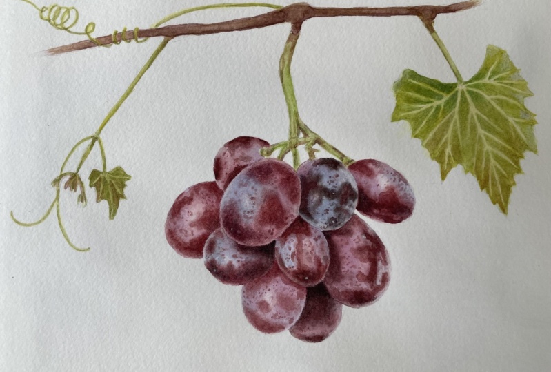
10. Stem: Right, so congratulations
for making it so far. And now we're going to make some space on our
palette to mix up some colors for our green stem. Usually, when I paint something, I tried to use the
same pigments for all of them mix is
required for the painting. So I'm using if I'm using
one type of yellow, I've tried to use it for all of the other mixes that
requires for that painting. But sometimes they do need to extend the options
and I need to add other yellows because one
is cooler, one is warmer. But generally speaking, I
tried to limit my palette. So right now I'm using Ireland yellow and add a touch
of phthalo blue, fallow blue is my
favorite blue perhaps. Because I tried quiet and
many different options of mixing your greens and I'm like mixes of migraines
with fellow the most because they usually
very smooth mixes. The color doesn't
granulate and it was very fresh, nice, green. And if you need to make it
a little bit more Oliver, you can add of your reds are a little
bit of quinacridone gold. And it just, my favorite recipe, if you will, for Greens, is it pale blue, right? And now we need to mix
a little bit of brown, again using the
same pigments were used throughout the painting. So that would be filled
blue, Ireland yellow. And I'm adding Sennelier
red to make it look brown. And we can start, That's all we're going
to need for the stem. So I need to apologize because my reference photo isn't
very clear unfortunately, but we're still able to
see what we need to paint. So generally, I would start something when you
paint something that's a little bit messy. Suddenly unnecessarily
complicated, but it's not very clear. So you start by blocking
one color than the other. So I'm going to start painting
from the top, going down. So I will be blocking
green color first, but because at the very top there's a
little bit of brown, so I'm going to start with
brown just at the very top. I'm not wetting the
paper before because it's very small areas. So don't require wet on wet. What I'm gonna do,
I'll pick up at first slightly more diluted
color, painted the area. And then while
that glaze is wet, I can lift off a little bit of highlight with
a clean damp brush and add a little bit stronger
color in a shadowed area. I'm done with this
brown part now. I'm picking up my
green and we're going to start applying that green all over the stem and just blocking
all those colors. Because brown color is darker, it can go on top of the green, so we don't necessarily need
to keep the area white. So we're just going around and painting each little stem with this first color and you see me softening the edge where
I want it to be lighter. And if you are a
little bit worried, then paint with even paler color and then you can just keep building those layers until you like the color saturation. But generally speaking,
always try to paint likely, especially if you don't
paint with wet on wet because the glazes
won't dry much lighter, it's going to stay pretty
much what you can see now. That stem doesn't really
have much light and shadow. So I thought maybe once we've finished with this foundation
layer, if you will, we might add a little
bit more shadow on one side to create the
stem a little bit more circular and just exaggerate it a little bit more than what we can see in
the reference photo. Now, let's finish blocking all the green parts on our stem. And then we're going to pick up, how about Brown and began to
paint the brown parts of it. Right at the first layer
with green is finished. Now we can pick up a
little bit of brown. I'm starting with quite watery and pale brown
just to start with. And once we block the
main brown parts, we can pick up a little bit
stronger brown and create. A stronger contrast for that stem and painting of
really, really dark parts. So you can see the
stem is a little bit not very well focused
on reference photo. So just try to mimic something similar shapes that
you can see in that stem. I paint a little area, then I clean my brush and soften away the edge that is softer, that sort of disappears
in the stem so that you don't create those
very rigid, hard lines. So whenever you paint something, you soften the other
edge with a clean, damp brush where you want
it to appear softer. So now that we did our first layer with
green and brown colors, we are halfway there. What do we need to do now is to create slightly
stronger contrast. So if you need to apply a
little bit more shadow part. So now what I'm doing, picking up some green and I am building that tonal value
for the green stem. And you can see that I am
exaggerating the shadow a little bit more than the
reference photo suggest, just to give a little
bit more realism to the stem and look, make it look a little
bit more circular. So I added a little
bit of shadow in the middle and softened on either side so that it's lighter and it makes it look
a little bit more circle. And I'm adding a little
bit darker tones of green on a little
parts of the stem. And we're going to be doing the same thing with brown too. So when you paint something, doesn't matter what it is. Contrast is very important for the object to
appear realistic. So that means you need to have pretty light lights and some
really, really dark parts. So there needs to be
balanced of both, not everything, just
too light or too dark. So the contrast is
very important. So what I'm gonna do now, I'm going to use the same
pigments that are used for Brown is Ireland, yellow, yellow, blue, and red, but make the brown a little
bit stronger and a little bit more saturated and darker so that we can paint
in those really, really dark parts and give that contrast to our stem so that it looks a little
bit more realistic. So those very dark parts
are very important. And you can see how now the
paint is nearly black part. And it immediately lifts up the stem and it looks a
little bit more realistic. So I paint the tiny
little section, then clean my brush, took the water out
and softened one side of it where it
needs to be softer. And I will repeat
that process on all of little parts where I can see some really,
really dark pigments. If you want to paint or even almost you can call it drawing. Those really, really fine
details and really dark parts. You need to pick up
slightly a dryer paint. So when you pick up
your son concentrated saturated color dab on your
towel to take the water out. And with the tip of your brush, we can paint in those
really fine lines. So the paintings to
be dry on your brush. If we have more
water in your brush, deadlines will come
out pale and thick. So dry paint and more saturated. And you can draw
really fine detail. Just adding a touch
of red into my brown. It's the same pigment that
was used in a brown just for little party that it looks
a little bit more reddish. So here we reach the end
for those delicious, delicious grapes that the paint that I really hope you enjoy it. You definitely can.
I give it a try. And I really, really can't
wait to see your painting. So please, please do share your paintings with me either on Instagram are here and I can't wait to see what
you're going to create. You don't have to
use my reference. You can maybe use your
grapes. It doesn't matter. The process would be the same. So I hope you enjoyed it. Have a nice day, and I'll see you in the
future projects. Bye bye.
 Egle Kolev, Watercolour Artist & Teacher