Transcripts
1. Introduction: Hi, my name is Daniel call, M and M botanical watercolor artist based in England. Ever since I was a child, I was always drawn to visual arts and crafts, but I couldn't really find my feet or calling in any of them, none until my late 20s growing up in a small town without smartphones and computers weren't in everybody's home. We didn't have this possibility of finding art and videos and lessons and courses just on a comfort of your home. So when years later I have discovered that I felt an immediate connection. I knew then that is the genre and medium for me. I found watercolors fascinating with the character of its own. I mature passion. I was progressing fast and felt courageous. So I applied to societal botanical artist distance learning course. And two years later I graduated with distinction and an award for excellence and highest marks achieved on the course 15. Soon afterwards asked to illustrate catalog cover for the company that sells bulbs and flowers. So when I remember when I first started and looked at the work of other artists and thought I could never paint as good as them. I thought it's all about the talent. You either have it or you don't. And I couldn't be more wrong. It still allows room. And I look at the paintings I have at the very beginning and see the progress I have made. So it's all about the practice that gets you where you want to be and the courage is not to give off any think you are failing. It's all about enjoying the process without being consumed by a thought about final result. So that brings me here where I have decided to share my passion, knowledge, and thoughts. Video. So come and join me.
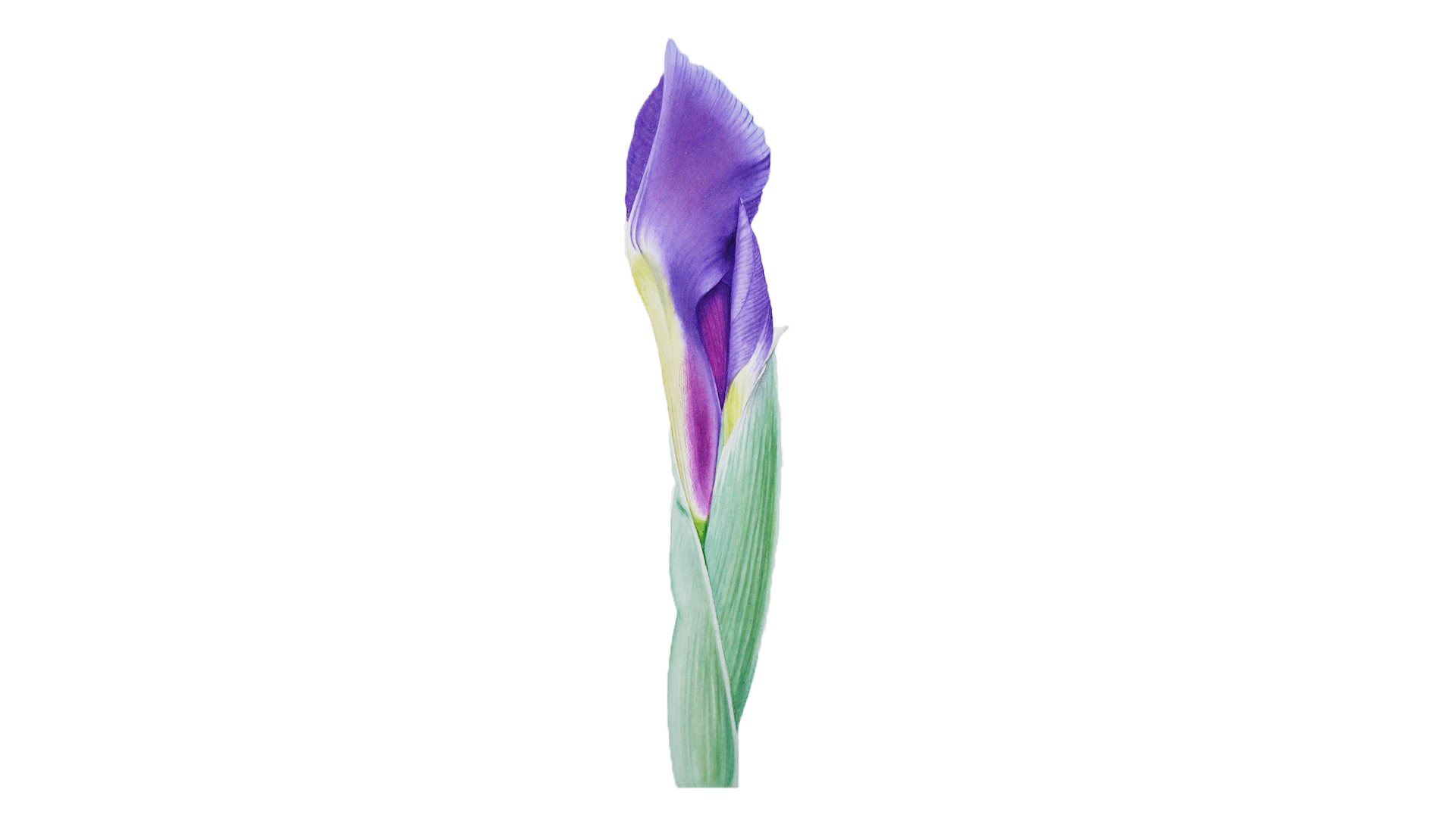
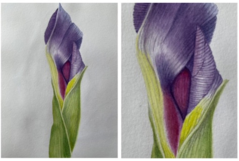
2. The Project: Hi, In this class I will show you step-by-step over the entire processor took to paint this beautiful, realistic, high-risk. But I mostly been using reference photos as a mummy of toy. Usually don't manage to finish the painting while the real specimen is telling good condition. So I take lots of photographs of flowers and plants to never run out of inspiration. I will show you how I lay my workspace and all the tools are used. We will learn how to stretch your watercolor paper and how to transfer your drawing onto it, will learn main techniques used for this painting. And most importantly, I will show you from start to finish, step-by-step how I painted this iris. But I will provide you with a reference photo and a line drawing that you can trace onto your watercolor paper. You can find them in the projects and resources tab down below. So if you're interested, then stick around and let go straight to it.
3. Materials: Hi, So let's talk about materials. When it comes to art supplies, every artist has their own personal preference. So it is best for May 1 then be for someone else. So you really have to try different things and final torques for you, but they're only be a few general things to know when you choose. So let's talk paper. When it comes to paper, it really is a personal preference. I tried many different brands could call the papers all the other artists recommend. And here I keep coming back to the paper that I don't see many artists using editors, Bockingford watercolor paper. So first of all, everyone would recommend 100 percent cotton paper. So dy, so it really surprised me there. I keep going back to this paper that it is not made out of cotton and it is the only paper that works really well for me that isn't cotton. And other good thing about this paper that is affordable compared to cotton paper. So it can be a great paper for your practice work. But if you want a 100 percent cotton paper, then arches or Melinda ROI, for example, are great choices. I always choose hot pressed for its smooth texture. Next board. Now, if I use 300 GSM or 140 pound watercolor paper, I always stretch it on my drawing board. I have a few different sizes and got it from an art store, but you can also get a plywood board from your local hardware store, and they will probably cut it to your preferred size for you. If using heavier paper, then 300 GSM stretching paper might not be necessary. So let's talk paint now when it comes to pain, I would recommend artist grade paints. Artist grade paint mixes and flows better, retaining their value and vibrancy while student grade paint might fail and turn muddy mixes. Artist grade paints, more expensive. So I would recommend getting just a few primary colors to start with. And then you would add your collection. Rather than getting a full pallet of student grade paint and potentially getting frustrated, you would be surprised how many variations of color you can achieve using only primary colors, which are yellow, red, and blue. And I'm talking about all the greens and grays, Periplus, and even black. If you can get each primary cool and warm tones, then you will be more than seven. I mostly use Winsor and Newton, but I have few scenarios and Schwinger paint, I tried to use mostly transparent watercolors to achieve luminosity in my paintings. You can choose tubes or pans. It doesn't really matter. As you see, I use tubes and I store them in my pants and they will last me for many years. It already has. So for this painting, I used for colors, lemony yellow, phthalo blue, quinacridone, magenta, and Winsor violet. So brushes again, personal preference, again, tried quite a few different brands. I guess I would recommend watercolor brush that have a good point and soft bristles, I am using Winsor and Newton Series 7 and bullish old brushes. They are natural fibers, but now more and more brands are coming with their synthetic good-quality brushes. I will be using number 4, 20 brushes. I only use white ceramic palettes because the pencil is very nicely on their surface while on the plastic ones mixes gather in small pillows and therefore it's harder to see the true color. And also ceramic one's doesn't stain and scholar as the plastic does. And if you don't have one just while dinner plate, it will work just fine. And so a few more things that we needed to transfer my drawing or use transfer paper by Daly, brownie, fine liner marker, couple of pencils, not softer than AHP eraser and a little bit of masking tape to prevent paper for a moment around it also use a little bit of blue tag, which is great. Removing excess graphite of your drawing once it's transferred onto watercolor paper and then stretching paper onto your board, we will need gum, paper tape is punch or a big brush and some water. Then of course we will need a water container and and all that towel where we wipe our brush off and that is it. That is all we will need. Let's get started. See you in the next video.
4. Stretching Watercolour Paper: Hi. In this video we'll show you how I stretch my watercolor paper on my board so it doesn't buckle when you paint. So what you need is your drawing board, paper, gum, tape, scissors, bowl of water, or spray bottle, and sponge or brush. So first of all, we have to make sure which is the good or which is the bad side of the paper. So I have my paper good set up so I turn it around so that I could wet the back of my paper, the bad side of the paper. So I decided to use punch and just soak it in water and squeeze a little bit of water in the middle of my paper. And then move it around gently to cover the entire surface of paper with water. Then take the excess water out of my sponge and just collect all the excess water off the paper, all the puddles just to have an even glaze. Then I turned it around, place it on my board. So now I have good side up. So it caught my gum tape in four strips for each side of the paper. I take my sponge and a run it through a couple of times to activate the glue on the gum tape. And so I place it on a board catching just a little bit of paper. Just make sure to leave enough space around the edges of your paper because you will be able to take the tape off, you will have to cut it out. And I repeat this for all four sides. And there is a narrow just have to leave it to completely to dry. It will start to buckle, but as it dries, it will stretch and it will be tagged as a drum and ready to paint on. And when you do, it will not buckle anymore. See you in the next video.
5. Workplace Arrangement : Hi there. This is just a quick video to show you how my work this looks like when I'm ready to paint on my left-hand side, ie how you limit brushes, my pencil and eraser. And in the middle I have my painting board. On the right, the hammer water, depth towel and my palette. And usually at the top right next to my water until I have my paint collection or I squeeze some fresh pin onto the palette. That depends on a painting. And that is it, Let's call my table looks like for painting. So let's get started in this water. The next video.
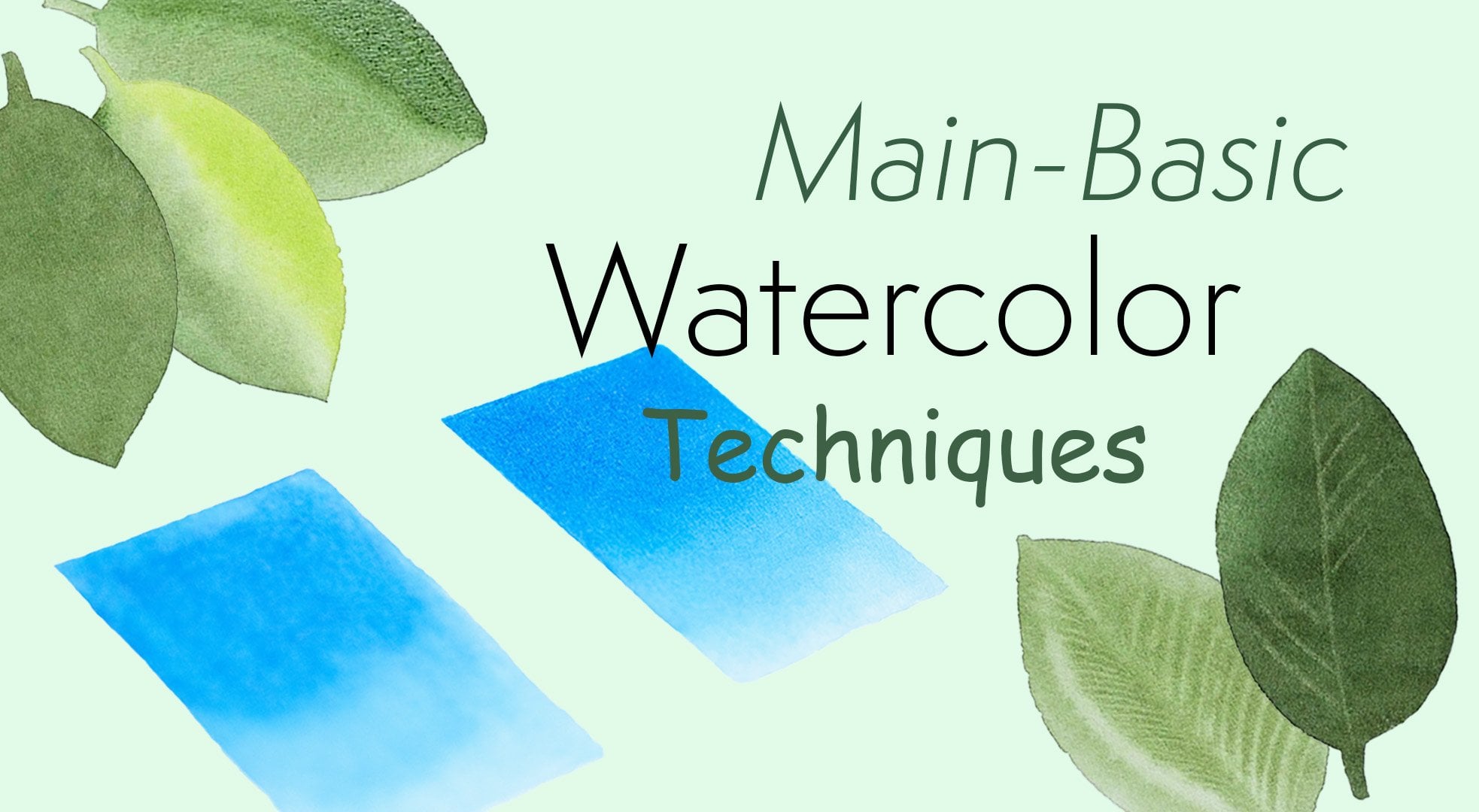
6. Watercolour Techniques : Hi and welcome to the next video called waterfall techniques. When it comes to this, you might think, I don't really need this and you might want to jump straight into the painting, the project, but those basic techniques are very important. So please don't skip it, practice it, play with it before you go straight into the your project, you will feel much more confident. So what's in red is what pain into what order. This is the first technique that I will show you. So I put a nice reservoir of clean water into the middle of my shape, which then are used to push up to the edges of my shape. Once we have done that, it's good to just get over it once more with clean damp brush to collect excess puddles or revamped areas that have started to dry. What we want is an even glistening. Once our glaze is done and we let the water to soak into the paper a little bit. Then we go and load our brush with color. Then go straight onto the paper and let it just fall of the brush very gently. What we're looking for is this nice cloud-like spreading. That's what good quality paint will do. Then you just drag your color into the edges of the shape. If your colors and spreading nicely, then most likely your water glaze have started to dry. If spreading too much, then you either have too much water on your brush or paper. So it really is about balance between water and paint. If you want to tidy up any edges, just make sure you don't have too much water and paint on your brush. And so that is a basic wet-in-wet technique. And let's go to the next shape. This time, we will be putting two colors using wet-in-wet technique. So now we'll go through the same process. We putting some clean water into the middle of our shape, pushing it into the edges, collecting all the access puddles and making sure our shape has a nice glistening, even glaze. And then we load our brush with our first color and just dropping it in right where we want it to be. We clean our brush and pick up another color. And just doing the same, just dropping it in and in a place where we want it to be and is basically letting the water do all the job and letting it sort of flow into each other. To encourage that again, clean your brush, making sure you don't have too much water on your brush. And you can gently Flickr, true to let the colors meet each other and, and blend into each other nicely. So this time, I will use opportunity to show you that you can collect some highlights using rhythmic techniques. So while the glaze is still wet, you clean your brush day the excess water out on your towel, making sure you have clean, damp brush and just swipe through the web glaze to reveal some highlight. Now if you want to lift off some sharper lands like wanes for the leaves, then there's a very short specific window when you can do this, it would not work on that wet glaze. It has to be damp right before it dries. And I will use first shape we painted in to demonstrate that as it is a little bit still damp. So I clean my brush and take all the excess water out and just run through to see if any color is being lifted off. And every few strokes I clean my brush, date excess water out and swipe through again. Now I used the pain that is quite staining so it will not lift off as well. And that's just because I decided to use the same colors that will be used for painting our iris. But you can still see it lifts up quite nicely. But if you use any non staining color, it will lift off even better. And so the next technique I wanted to show you is wet on dry. And that is technique I use very often specially layering colors after I've done my first initial washes using wet-in-wet. And that is called wet on dry. So just loading my brush with a lot of a little bit more watery pigment and just going straight onto dry paper and trying to work fairly quickly before the paint dry so I can keep moving it down to cover the shape nicely. With clean, damp brush. I can collect any puddle. And so now to show you how I would use this technique to layer color, I pick up some color and I will go to my first shape worry, lifted off some veins. Just we'll pretend for a second the data is a leaf and I want to layer and darken some areas. So I lay some paint down and then clean my brush day the excess water out and soften the edge to make a sort of smoother transition, transition. So here will show you this technique on a new shapes or where you can see better. Just laying a little bit of paint, cleaning my brush and running along the edge to soften it. And that is the technique I will use to build up my colors and all the shadows and create a form in a painting. And last but definitely not least, I will show you my favorite technique and that is try brushing or smoothing. So just to demonstrate it, I will paint in those two squares shapes same way, and we'll try to make them look as identical as possible. So that then later when I show you the technique, you can see the difference between a dry brush and not. So now I have two shapes that are painted in the same way. Ever lived their left arm out and I will dry brush the one on the right-hand side. So now you can see all those lighter, uneven patches of color and watermarks and Kalam marks. So basically those are the ones that we will be filling in that our dry brush technique with tiny little brush strokes. So pick up a little bit of color. It has to be fairly try. So when you try it out on the paper, you should make a pencil or crayon like marks. So basically I will be filling in those lighter patches of uneven color, the tiny little brush strokes filling in each gap and therefore making the whole surface Seems smoother. So the more time you will spend doing this, the smoother it will look. So for me, this is their favorite parts of painting. I absolutely love doing this and I could spend majority of my time just doing that. But it comes to personal preference and the look you're after. But at the end of this video, you will be able to see the clear difference between airbrushed and not generally, I'm trying to work within the direction of form. It's always better for the object. You painting to look more natural. But cross hatching also looks good specially when trying to make those smooth transitions from darker to lighter as you can see in some places I'm doing. And so now we are almost finished and you can see how to shape that looked exactly the same now, clearly not. And so what I like about this technique demos that no matter what mistakes and imperfections you have done while painting, you can fix almost anything using this dry brush technique. So if you made a mistake or you had some water Marxian and even graduations and you almost want to start the painting over, just use this technique. And so every painting of your skin look flawless. See you in the next video.
7. Tracing - Transferring the Drawing onto Watercolour Paper: Hi. In this video, I will show you how we will trace my drawing onto the watercolor paper. And the reason I draw on a drawing paper and not on the watercolor paper is because you do not want to use any eraser on your watercolor paper because it will damage it. A menu layer watercolors on it will become visible. So a tape, my transfer paper and I place it on top of my drawings. I take a little bit of piece of masking tape and security tracing paper onto my drawing paper so it prevents from moving around. I will use my black fine liner and I start to trace all my drawing onto the tracing paper. I also make a little note of letter R to indicate which is the right side of the paper. So take me tracing paper off and turned around and using my HB pencil, I cover the drawing outline with graphite. And that is the reason why I indicate the right side of the paper because I cannot tell you how many times I covered the whole drawing with graphite on the wrong side of the tracing paper. Now I position my drawing onto the watercolor paper right-side-up and secured a little piece of masking tape to prevent it from moving around. Then they take a slightly harder pencil and start drawing. So make a few lines and check how it transfers on watercolor paper because you want to use minimal amount of pressure because watercolor paper is very fragile. Therefore, if you've pressed too hard, it can make a dent in the paper and that will become permanent. So you want to use the least amount of pressure for you to still see the drawing as light as possible. And that is the net is how I transfer my drawing onto the watercolor paper. And I will see you in the next video.
8. Dry Brush Detail: Okay, so let's start. I will be using my number two brush and four colors, lemony yellow, phthalo blue, Winsor, violet, and Kodak man magenta. So the first thing I do before I start to paint that, take a small piece of blue tack and roll it gently over my drawing to remote access graphite. Don't worry, it will not leave any marks, new article or a paper. Whereas the gray way to soften your drawing as you want it to be as light as possible. Before you start laying a paint over. Particularly small piece of paper where I can test my water column exists and I start preparing my colors. I will start with Anza while at our line work and I'm just adding some clean water onto my color and watering it down to get as pale, milky consistency. I will start from the top of the smallest part holding my brush right on its tip toe and pressing down very gently to create slightly thicker lines. Working my way down, I follow the guidelines of my pencil drawing. But at this stage, I'm not too worried about them being very perfect as they will still be a lot of painting done on top of them. And so all the imperfections will be covered in any of the layers of paint. As I work after every few lines painted, they will run my brush along the outline of their bad to collect all those tiny little paddles that are left at the end of each line. Moving on to the next petal on preparing new column mix of phthalo blue and Winsor violet. What I'm looking for is less than blue or purple color shade. They can see if you look at the picture at the ends of the main petal. Pim testing limits on my piece of paper and see that it looks too blue, so I'm adding more violet and water to thin it out. Starting to work on a main petal, I'm defining the lines or veins just at the edge of the petal. And now go all the way down to C up as there will be a lot of glazing and try brushing. So I will leave this to the later stages. I'm picking up some Winsor violet and repeating the process to this tiny little petals peeking from behind the main one. I would like to note that it is not necessary to put all these Winton lines at the very beginning. If the paint them in at the very end on top of our glazes, they will be sharper, more distinct. But if you want them to look softer, a little bit more washed out, then we might want to paint them in first and then layer our glazes on top of them. Next, let's mix up a little bit of neutral gray color for the veins central our yellow parts of iris, but you can mix any shade of gray using your three primary colors, yellow, blue, and red. In my case, I'm using lemon yellow, phthalo blue, and conducted on magenta. And just by adjusting the amount of each color added, you can create a limitless variations of gray. When painting yellow, there are few things to know. First, keep your pencil marks as light as possible because yellow column make them permanent. Therefore, you won't be able to erase them afterwards. And second, put most of your shadows and veins before putting your yellow color washes on using neutral gray colors. And the reason for that is painting shadows on top of your yellow wash might make them look muddy and unnatural. So I think I'm happy with my gray mix. I pick up a little bit of color and start with the smallest distinct shadow in our yellow area to gently stroke laneway color. Quickly clean my brush, take the excess water on my towel and soften the edge. Then pick up a little bit more color and continue with my lines. I can see few veins on the smallest, but T2. Using the Winsor violet, I'm going to indicate midrib and few lines in the middle of the main petal. Just a sort of work as a guideline of the detail. And also it will help us to kind of know what we have in the layer first washes using wet-in-wet. I'm using my gentle brushstrokes, clean my brush and soften the edge. Few lines in the middle. There we have a congratulations. Your first step. Painting this beautiful. I'll see you in the next video.
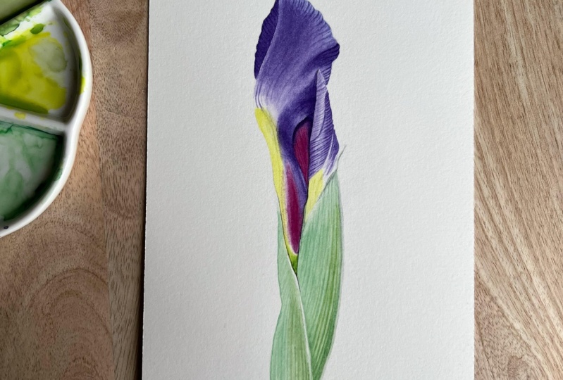
9. Base Layers: So welcome to the second stage of our iris. But painting in the state will be painting in first layers. And in this video, we'll go from this to this. Let's get started. I would like to start by laying down the yellow color first. As you don't want to be putting yellow colors on top of the other existing colors and the risks changing the US. So Australian, I am mixing up some lemon yellow with a touch of blue to make it look slightly greenish as that is what I see in my reference photo. Bring a lot of clean water to make a paler. And I will not work my paper for this first, I will go just straight in with a color. Starting at the top where the color is the Turkers to strokes and I clean my brush, take the excess water on my towel and soften the edge because the area around it could be kept wide so I don't want to end up with hard edges. I load my brush with more color and continue moving down the pedal into the pace. Don't worry if the calcium's too strong at first because the yellow tends to fade and dry lighter. Whereas we are using wet on dry method, we shouldn't lose too much brightness. And again, clean my brush, take the excess water on the towel and soften the edge while the glaze is still wet. With clean, damp brush, I will mop up some to reveal the highlight. And then I load my brush with paint again and dropping it in around the highlight to intensify the shadow area. And then once again, clean my brush, take the excess water out on my towel and soften the edge to keep that white area clean and nice. And right now I'm just picking up some pure lemon yellow and we'll pin in the small area on the tiniest part. So I'm going in straight in with a color paper, dumping it in, and then clean my brush and quickly soften the edge around. So sometimes they can't help myself wanting to painting the darkest areas as soon as they can. To sum, we're satisfaction wanting to see contrast. So this time no exception. So I will pick up some Winsor violet, very dark and thick pain and we'll pin in this little corner in the middle of their pad. Just again, not wetting the paper before just going straight in with a color. Then quickly cleaning my brush, dabbing the access water on my towel and softening that edge, repeating the same on the other side of the corner. Going straight in with a color, cleaning my brush, taking the access water on my towel and softening the edge. And trust me, you will become a master of cleaning your brush on the towel. Data, even thinking about it. And while the paper is still wet and the cholesterol settling, I will use the opportunity to pick up a little bit more color and dropping it right into intensify the shadows even more. Next, we will be moving on to the smallest. But again, because the area is very small, you don't need to get our paper before will be we'll just gonna go straight in with a color. Some loading my brush with Winsor violet own. And I will start to paint from the shadow side of the above on the right-hand side. So cloning with few strokes and I clean my brush. Data access wore out on the towel. And then sort of drag the color into the middle of the area to leather color spread and soften the edge. While the painted area is still a little bit wet with clean, damp brush with gentle brushstrokes. I sort of Flickr through the glaze to reveal some lines. For this technique to work, It's important to note that your paper has to be tamped, not about almost dry, and your brush has to be trialed and the paper so that it can sort of soak up the color, revealing the highlight. So I am repeating the process for the rest of the above. I will pick up some color, dropping it in few strokes, then cleaning my brush, taking all the excess water out on my towel, softening the edge or spreading the color in the middle. As you can see right now, I picked up a little bit of watery mix of Windsor violet and when over the entire but to directly as the lightest area or with armed white. So moving on, I am picking up my number 4 brush. We were still working with number 22 now and dropping in some clean water into my blue purple mix to wake the colors up. Stearate really well and load my brush. And starting from the top-left will go all the way down the outer edge of the main petal, where if you look at our reference photo, you can see this blue, blue at the ends of the petal. As you can see every few strokes I will clean my brush, dab it on my towel to take the excess water out. And I will soften the edge, smooth it out into the petal, reload my brush and continue applying the color. So I'm trying to bring my brush all the way to the pencil line, slightly encouraging those little curves. But at this stage I'm not trying to be too precise or to tidy as there will be more layers. And also later on I will show you the technique I use to smooth all the imperfections and how I make all my paintings to have this airbrush look. So after this, I will start using wet-in-wet technique. If you're not feeling confident with this technique yet, best thing to do is to pain in sections. So I clean my brush and load it with clean water. And we'll start from the bottom of the petal, since the top part is still drying from our blue layer. So I put a nice reservoir of clean water into the middle of my shape, which then are used to push up to the pencil line. And I will go about halfway up to the pedal. Once I've done that, I'm just going over the entire area with my brush, collecting any access water and the puddles. And I just keep tilting my head to see light reflecting on a water glaze in order to see if I haven't gone over the pencil line and if I haven't missed any areas, so I'm just letting the water so CAN into the paper because they're more water people will have in it. The more time I will have to control my colors and before it dries too quickly. So what I want now is an even Matt glistening, not shiny surface. That's how I know that glazes ready because if you come in with your colors way too early before the water soaked in a paper properly. Pigment with spread way too fast and it will be much harder to control it. And second of all, it would run into the edges of the wetted area and you wouldn't have had watermarks. So think my glazes ready now and I load my brush with Winsor violet pigment and just let a pigment fall off my brush right into the darkest shadow area. Then quickly clean my brush and wipe around it to stop the color spreading. Then pick up another color, our quinacridone magenta, and again, just dropping into the darkest area, sort of walking around the highlight. And I'm using this very gentle brushstrokes. Just moving my color all the water that pencil line and reloading my brush would connect on magenta and letting the color fall of my brush right into the shadow area to intensify it. Then I clean my brush, taking all the excess water out on my towel, and sweep through, collecting their color to reveal the highlight. And with every stroke I clean my brush and take the excess water out to keep my brush clean and nice. Now basically I'm just letting the water and colors do its magic. Trying not to disturb the settling glaze too much. I'm deciding a little bit of more color into the shadow area. So I clean my brush, take the excess water out again and sweep through the left edge to stop the color spreading too far. And now we can let the area dry properly and move on to the next. So now I just want to fill in that little area on our small but no need to wet the paper before because it's really small area. I just pick up a little bit of the Winsor violet and painting it in. Next we're, all the glaciers are settling on a petals. We can move on to the stem. You always want to walk away from the areas you just painted because you don't want to disturb a settling glaze. For the stem. We're going to use wet-on-wet technique. And right now I just would like to make some pale blue-green color for our first layer. So I'm starting with lemon yellow, adding a little bit of phthalo blue and a touch of magenta to turn it down to make it more neutral. This testing it out on a piece of paper and I think it looks good. So I clean my brush loaded with clean water. Drop it straight in the middle of the shape and a sub pulling up to the pencil line. I want a nice even glaze. So while the water is soaking into the paper and making sure all the shape is covered properly. Just tidying up the edges and letting the water to soak in with a damp brush, just mopping up any puddles they can see. So I load my brush with color and using gentle vertical sweeps, just letting the color fall of my brush. And I am always trying to work in a direction of form of the object. Because as we continue layering colors, it will help us to create this natural three-dimensional effect. Bringing the paint all the way to the pencil line on the left side of the stem. But I want to make sure I keep clean this white streak on the right of the stem, just with clean damp brush sweeping through a couple of times. And while the glaze is still damp, but not to at the moment, just before completely drying is when I can reveal some waning with clean damp brush. Know that every stroke I clean my brush and dab it on a towel to take the excess water out and for it to work, It's important to know that the brush has to be drier than the paint on a paper so that the brush can lift the color of the paper revealing this highlight. So now we need to leave this area to dry so we can work next to it. So what we're gonna do, we're gonna move on to our main petal. So I load my brush with clean water, droplet strain in the middle of the shape. And as previously, I'm just moving it up to the pencil line. And again, just making sure I have an even glaze collecting all the petals. And just keep putting my head to see if I covered all the nooks and crannies. In the meantime, letting the water to soak into the paper. Okay, So I think that Watergate is almost ready just few more seconds. In the meantime, I'll put some violet mix just to wake up. So a load my brush with Winsor violet debit a little bit on the towel just to take the x's out. And going straight in the middle of the petal. Too gentle sweeps, letting the color just fall of the brush. And then picking up a little bit more saturated violet and putting it in the shadow areas. And again, I'm trying to work in a direction of form of the petal, gently encouraging its natural pattern. As you can see, I'm trying to work around the highlight areas even though the highlights on have to be dislike. I can always go back and with watercolors it's much harder to go lighter. So working around them. And since working in wet-on-wet technique, watercolors tend to dry much lighter than where it seems at the beginning. So I'm just going to drop a little bit more color in the middle of the petal, then clean my brush, dab it on a towel and run along the edge to let the colors bleed in nicely. They include members debit on a towel again to take the excess water out and run along the edge just to stop the color spreading. Then I pick up a little bit more color and drag it a little further down. Then clean my brush again and sweep through the highlight again to stop the bleeding. I know it sounds quite repetitive, but when you're working with wet-on-wet technique, we have to work fairly quickly. You glaze the paper, apply the color, clean your brush, stroke the color spreading, add more color, and that's the way you control the pigment on wet paper. But if you're not feeling confident just yet, you don't have to do a lot in one go. You can Glaser people, would water apply color in a small area and in small sections that are dry completely and regulates the paper and reapply the color in another small area and repeat the process until you're happy with the result. The most important thing to know is to let the glazes dry completely before starting over. So I see that my glazes starting to dry. I'm adding a little bit more color and the darkest shadow. And I can see that the color is not spreading as much anymore. So now I clean my brush, dab it on a towel to take the excess water out. And I will sweep through the areas where I don't want color to be. Cleaning my brush every few strokes and damning and a towel to make sure there's no water on my brush. Because you do not want to put any water on the settling glaze because the water would quickly spread and we'll leave this cauliflower shape. Watermarks, clean, damp brush, reviewing a little bit of texture on my glaze, tidying up the edges. And we have finished with this. So we need to leave it to dry completely now and we will move on to the next onto the stem. So we need to get the area first. So again, lots of clean water in the middle of the shape. And start moving it up to the pencil line. So while adding water to soak into the paper, I'm making sure I cover all the corners and I don't have any puddles, so just sweeping through the entire area. And now it will allow the water to soak into the paper before I apply the colors. So I think the water glaze is ready and I load my brush with our pale neutral green mix. And again with gentle vertical sweeps following the natural pattern of the stem, I apply the color. No pressure. This letting the car full of my brush. I reload my brush with more color and making sure I'm not going over the pencil line leaving the light band. I clean my brush, dab it on the towel out in a sweep true along the edge to keep clean this reflecting light. I keep cleaning my brush on the towel. So that clean, damp brush I'm contribute a little bit of texture at the top of the stem, gentle sweeps and cleaning my brush strokes. Also few wanes down the body of the stem with clean damp brush. And if nothing happens, that means they are glazes to dry already or it might be too wet. There's a very small window when you're able to leave those nice wins out when Douglas is just about to dry, but it's still damp enough and has this matching. And so we have finished with this area now we just need to leave it to dry completely. And while that is drying, we will paint in the remaining little shapes. I will start with this pedal peeking from behind the body of the iris. Don't need to wet the paper first because it's very small area. So just loading my brush with lots of Windsor violet and just going straight in painting that area in, I clean my brush, dab it on a towel to take the excess water out and wilder glazes still damp. I liftoff few wanes. Every few strokes, cleaning my impression, taking the excess water out. And once we've finished with that, we're going to paint in this middle area. Also, no need to wet the paper first, just loading the brush with double magenta and painting the area. And so while the area is still down from our glaze, I will do the opportunity to darken the shadows. So just picking up a little bit of violet and putting it into the shadow area. Because as the shadows, I really even need quite a few layers to achieve this darkness. And of course, let's not forget this tiny little gap in the middle that is left hand painted. And so congratulations to finishing the most difficult part of this iris. But we have done our first base layer using wet-in-wet technique. And in the next video we will start our layering process using wet on dry to achieve the right tonal value. So see you in the next video.
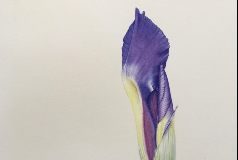
10. Layering The Petals: Welcome to the next stage of this iris. But painting in this video, we will focus on achieving the right tonal value and depth of color. And in this stage, our painting, we'll go from this to this. So before we start to paint, It's a great time to remove all the pencil marks because we already painted all of the shapes and very gently try to use as little pressure as possible because we do not want to damage the paper. So this video will be quite self-explanatory. At this step, we're basically try to achieve the right tonal value. And to do that we will lay a color in small sections using wet-on-dry technique. So starting with the main petal and picking up quite watery mix of Windsor violet and going straight on the paper, no need to read it before bidding only a small section. And before the glaze tries, I clean my brush, dab it on the towel to take the excess water out and soften the edge, lighting the color to blend in nicely, then quickly reload my brush with color and continue with my glazing and working fairly quickly, I clean my brush again, debit linen towel to take the excess water out and softening the edges before the glazes. Dry. Painting in this way, glazes read quite quickly. So while you're painting in the other little section away from the one you painted in last. The one before is already dry. So basically, always try to keep some distance between two areas painted one after another to allow the drying process, I use the same colors that are already painted on the first base layer. And the goal here is to build a vowel and dimension. And so this is the processor will keep repeating until I am happy with the depth of color and tonal value. And while I'll always try to soften all the edges and blend the color using clean, damp brush. I'm not too worried at this stage about watermarks and color overlaps because in the next step video, I will show you the technique I use to smooth all the imperfections and give the surface this airbrushed look. So this stage, unlike the one before, is quite stress-free and all about having fun and working in small steps, small areas, and just watching how your object is taking shape. So painting in this way, religious husband toward mistakes. Using 10 washes in small areas and just walking in little steps really. So don't forget to experiment and have fun and see how each little brushstroke I respect to, I. Hi. Okay. Okay. Hello. Okay. All right. Hi. Hi. Hello. Hi. Hello. So we've reached a stage. We achieved Death Valley down after it. Next up is my favorite technique I use to make this surface or the petal.
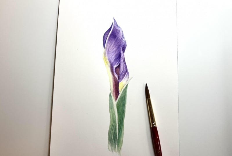
11. Dray Brushing-Smoothing: So welcome to my most favorite part of the painting process, dry brushing or smoothing, as I like to call it. In this stage, we will give the flower petals the smooth sort of airbrushed look. And by the end of this video, our iris will go from this to this. So a similar demonstration video, I tried to cover up all these little gaps or overlaps and make smooth transitions from one color to the other. And for this technique, I will be using my number one brush Series 7 by Winsor and Newton. I have my piece of paper where I can test my colors, especially for this technique because I need to make sure I don't have too much water on my brush. As you already know, you have to sort of draw with your brush and set of paints or glaze. And so we're set and ready to start. I said, Tell me your stuff and write something for me. Then he now wants to smoke. And then they're wordy grow. Spending power via kill be found. By now. You've got questions. I get auto stops looking further. The answer is C by two. Searching for a target and a master's degree. And talk and not on down. This time that it takes a row. And he kill me five. And now you've got passed down from the sky. And then you invite flow. Stops there, confer the answer to your friend. I need a five. Now, you've got this guy.
12. Stem Layering Part- I: So welcome to the next video. In this step we will focus on the stem, since our first base layer is quite light and the stem has fairly simple shapes, we will put secondly using same wet-in-wet technique as we did for the first base layer, but this time we will use two colors, same pale bluish green as you mix previously, and we will make some fresh, darker green mix to go on the shadow areas. By the end of this video, our stem will look like this. So that's good side. So right away, let's mix up our fresh green mix. So straight into the lemon yellow, I'm adding a touch of blue. Very little will go a long way, so don't overdo it. So keep adjusting amount of blue and yellow until I get a tap of green that I would like. And I will add just a touch of magenta that will give our mix a more natural look. For a tip, if you add a little bit of red or pink into your green mixes, it will make the green look more nature like. So I'm trying to make quite thick mix of green as we are going to be painting wet-on-wet. So the color will fade a little bit. So just testing it out on my piece of paper. And I think I just need to add a little bit more magenta. So it is basically keep adjusting the amount of each color until I get the right green. So I think we're nearly there. The social glue and should be. Alright. That's my racket and bread. So just put a little bit of water into the, our blue mix that we made earlier, just a freshener up. And so right away, I will put lots of clean water onto our stem shape. We will do one side at a time. So start with the left-hand side. So as you saw, I am starting with putting lots of water in the middle of the shape and then pushing it into the edges up to the pencil line to cover the entire shape. So once I blazed the area with clean damp brush, I will run through just to collect any extra puddles of water. And then load my brush with our entire green mix. And I will start laying it in the shadow areas. So on the right-hand side, in the direction of a form. Always try to work in a direction of a form. Because of the colors layer and overlap, it will create this natural two-dimensional look if you will always work within the erection of objects natural pattern. So as you see I'm laying there color in gentle vertical sweeps, leaving some gaps of light to give me start to that linear texture that the stamp has. So I picked up our blue-green color to put it on the left-hand side where the lighter side is. And as I paint, I realized that I need darker shade of the blue-green mix. So I'm taking a little bit of our fresh green into my Bluemix and adding a little bit more blue to make it more bluish. And just adding on the right-hand side where the darkest shadow isn't on that shape because they see there is sort of this dark blue, grayish color in a corner. Some tidying up the edges. And as the glacier is drying, every brush stroke is sharper. So I'm adding a little bit of texture. And some of the glazes at the point where it's about to dry, It's perfect time to lift off some highlights. I clean my brush, take the excess water out on my towel and gently Flickr through the glaze to reveal some lines. And every few strokes I will clean my brush because to lift off their colony, to keep our brush clean. I see that at the very top, the glaze is already to try to do so, but it's not a problem as we can do that on the next stage. So while the glazier still a little bit Tam, I will add a little bit more color on the shadow area. And so again, while the glaze is still a little bit wet, I will reveal a highlight, two with a clean damp brush. And just remember to always wipe your brush on the towel to keep it clean. The decide. So now we can leave it to completely dry and move on to the next. And so we repeat the exact same process for the other side of the stem. Hello. Hi. The first time.
13. Stem Layering Part - II: So in this video, we will focus on the tonal value. We will deepen shadows and give the stamp more three-dimensional look. In this step, we will use wet on dry technique as we did for building up color and tonal value on the pedals. And at the end of this video, our iris, then we'll go from looking like this to death. So without further ado, I pick up some of my bright green and as we did for the petals, start bubbling up shadows and overall color. Working in small sections, vertical brushstrokes to continue create this texture of this very linear stem. And you use very pale mixes of color. I know it might seem slow and tiresome process to some. But painting in this way, building up color with 10 washes, is what creates luminosity and paintings. It also takes stress away as opposed to working in wet-in-wet. And you can never go too dark because we are taking our time building up layers. It's easier to notice details and capture them when painting this way. Most importantly, the process has to be enjoyable. I am sharing with you the way of painting. It has brought me joy. And a way of meditation brings great results may be left in that festers to a cost effective. So once again, enjoy the process. Refer to the reference photo. Constantly. Put up your layers stroke by stroke. Hi. Okay. Hello. Okay. Hello. Introduction to make. Okay. Thank you. Hello. Okay. Set.
14. Finishing Detail: Hi, So this is a step where we make our last adjustments and touches. So jumping right in. Now I will show you how to create this texture on the base of the petal. So picking up some fairly dry paint and dry because so that you could flatten your brush and separate Brussels like so. And then there was too much water and a brush, you wouldn't be able to separate the hair like this. And it's always a good idea to try it out on another piece of paper before you paint onto your painting just to make sure you can make them mark that we After looking for is this crayon like Mark. And so just trying to use as Chantel brushstrokes as possible so that you would touch the paper just with the very tip of the hat. So I'm going down to my number two brush so that I would have even better point. And we will be putting a little bit of detail waning. And it's inside petal. And again, for a detail like this is important to keep an eye on the balance of water you have in your paint. Because in this case I want a very fine line. So I tried to have dry paint on my brush and I tested out on a PowerPoint if it was too wet and aligned comes out too thick, I would dab on the towel to remove the excess water out of my brush. And as in this step, we do all our last touches and details. Tidy up some edges and corners as I go. So they'll take the piece of paper towel and we'll try to lift off a little string of light at the very edge of them, base of the petal. To do that, we need a clean, damp brush. Images rubs slightly where we want the highlight to be too basically what the color that's sitting on a paper and debited kitchen towel and dab should lift off a little bit of color. And now this particular color is staining, so it will not live as well, but as you can see, it still comes off quite alright. So this video is about putting the detail waning in tidying up some edges, shadows, nooks and crannies and doing sort of a bit of a housekeeping. So I will put us to some lovely music and I will meet you at the end where I put magenta is all over the pedal to adjust the hue. Okay. Okay. Hi. Hi. Hello. Okay. Okay. So here we are, nearly at the very end. So I pick up my bigger brush, number 6 and we will be glazing over the petal to create this pink loan debt, you can see in the reference photo, so clean my palette so I have space for some fresh mixed and now use only magenta. So just watering it down. So I just water it down to some milky consistency and load my brush fully deserts on the paper and ready to go. And I'll glaze gently over the area where I can see pink color shining through. And then I'm cleaning my brush, taking the excess water out on a dab towel and softening the edges around, letting the glaze to blend in nicely into the rest of the petal. Now living this to dry, I will glaze over the smallest, but using violet as when you look at the reference photo, the highlights aren't as light. I can also see some magenta on the petal data is coming from behind our blood. So after I will glaze, have tried, I can now again see some imperfections. So I will use the same driver smoothing technique to correct some of them. And here we have arrived at the finish line of this painting. I hope you have enjoyed this lesson and maybe learn something too. I see you in the next video.
15. Removing Painting of the Board : Hi and welcome to our last video. I just wanted to show you in this quick video, however, the finished painting out of the board, susan, a craft knife cutting along the edge of the paper underneath the gum tape is you can't peel it off. Once you're done. You will also have to cut the remaining tape around your watercolor paper or leave it on and hide it underneath the frame if you choose to frame your work. So I also wanted to say big thank you to everyone who watched it. I hope you enjoy it and found something useful. I can't wait to see everybody's work, so please post your projects down below. Be creative experiment, and I hope to see you in future videos.
 Egle Kolev, Watercolour Artist & Teacher