Transcripts
1. Intro: Hi, my name is Anna and
I'm a watercolor artist, graphic designer,
and web designer. I specialize in teaching
watercolor techniques and I love helping others explore their creativity
through painting. In this class, I will guide
you step by step through the process of painting a
vibrant watercolor token. This class is designed
for both beginners and those who already have
some watercolor experience. If you're just
starting, don't worry, I will break
everything down into simple steps so you can
follow along with ease. If you've painted before, this is a great opportunity to refine your layering techniques, experiment with textures, and bring more depth to your
watercolor paintings. We'll begin with first
watercolor layers, working from light to dark, gradually adding details and
vibrancy to our painting. Along the way, I will share useful tips
on color blending, brush control, and how to create beautiful textures that
make your artwork pop. By the end of this class, you will have your own colorful token painting and
you will feel more confident in using
watercolor techniques that you can apply
to future projects. I truly believe that anyone can learn to paint with practice
and the right guidance. My goal with this
class is to make the process fun,
approachable and rewarding. I can wait to see
what you create, grab your watercolor supplies
and let's get started.
2. Materials: Hi. In this quick video, I will discuss the materials which we will use
during this course. First, paper. I will use watercolor
paper from paper concept. Their paper is of
a good quality, and I will use paper
with 25% of cotton. But if you had 100%
of cotton paper, you can use it I will
use A four size. The second important
thing is paints and I will use my color palette. It's not all these colors
are from white knight. I have some shades which come from Roman Schmall
Aquarius paints. I have my favorite
colors in here. You can use whatever colors and whatever brand you
have in your house. You don't have to use
the same colors as me. You can pick similar
tones which you have. If you have granulation colors, especially green and blue, green and blue hues, you can use it
during this course because I will use granulating, two granulating shades
turquoise and green. Here I have granulating palette from white knight and
my favorite color from this palette is aquamarine
mist and you can use it in the background and Tiga
mist as a green shade. So if you have some
granulating shades, you can also use it. Of course, we will use mixing
palette to mix our colors. I have here white quash, white quash we will also use
to add details at the end to our work and brushes. I have a selection of
my brushes in here, so we will use some very thick and
small number brushes and bigger brushes to
paint bigger areas. So as usual, you also will
need water and towel. This is mostly it. Let's get painting.
3. Background: Okay. So our first thing which we will paint will
be background layer. And to do that, we
will use wet on wet technique and
simply three colors. So as you can see, I have my sketch transferred
to watercolor paper and right now we will mix some
colors for our background. We will mix colors in 50 50. I call it 50%. We have 50% of water
and 50% of color. The first color
will be Turquoise. I will use I will use
granulating colors for this. If you have some
granulating colors, you can also use it. But if you don't have it, if you don't have any
granulating colors, it's also fine to
use regular ones. Perhaps you can use some salt to make some textures
on the background. This is my first color. It's turquoise. The second color, I will
make some more this turquoise because I usually
run out of it very quickly, so I need to have
it quite a lot. The second color will
be medium green and I usually take autumn
green from Aquarius, Roman Schmal it's also granulating one and
it's very beautiful. I like it. I just love this color, so it's one of my favorite. I will mix it in the second. We don't need much
the green colors. The most we need is
blue, wish tone. The green is the second. I also have a second
green color and it's like golden green it calls its name is quinacrado
gold green. Very hard for me to say. We start with water. I will pick a bigger
brush because it runs. It can take more water. On it and we will paint step by step because my paper
is not 100% cotton. That's why I will
paint it step by step. As you can see, I have
placed here some leaves. That's why the colors which will go in here in the background
will also be green. I will which my brush, this one holds a lot of water, and I will pick some turquoise and I will place my turquoise. Did you see how it flows? It flows beautifully. And here where this is dry, I will place some water
and make it flow. We can even paint the
whole the hole or space, which is left in here and put
some blue in here similar. So I will add some
water to my paper, make it flow more. I will take my autumn green We don't paint the branch, so we left the branch
white for a moment. Let's clean my brush, add some water, make
this green flow. Pick lighter yellow
and lighter yellow. I will add in here. I will add some water
in here because I don't want this area to dry. That's why I will
add some water. But still, we need to
finish that thing. Make it flow more. Okay. In here, I will add some blue. So stroke wise. Once again, Clean my brush, add some water, and in here, I will add some green. I picked the lighter one, and I will add some
autumn green to it. And also, remember
to paint this area, this small area, and I will
paint it with turquoise. Don't leave it white. Okay. And around that
branch, I will use green. So first, water. Add some green. It doesn't matter
which one you pick. One of these two greens. Okay. Look how this
granulates this blue. It's really it creates
very beautiful effect. And once again, I place some
water around that leaf. And in that area, I will place more
green than blue. One, it can be very subtle. I don't have to be a lot of
the screen, very dark green. It can be very delicate. The last thing well turquoise, so ugly water to make it flow. Take some turquoise. And the same here. Okay, and water to make it flow. While this is still wet, I can pick my turquoise
once again and pop it somewhere to create
this interesting effect. And right now, we need
to leave it to dry completely before we move
on to the next stage.
4. Branch: Okay. My background is dry now. Look how beautiful textures
this blue color has made up. Right now, we will
paint the branch. To do that, we need
two brown colors, one medium value and one dark. The first color will be red char this is my first color and I will
mix it in the 50 50 ratio. This is my red ara color. I call it medium brown, but it's a brown with a tint of red and the second
color is dark brown. That brown or I have brown from Roman smell and it calls October 2023 and it's
more reddish brown. Then it's more with
purple inside, and this one is
more with red tone. I will choose this
one because it suits better with my red char I will mix it this is our first
layer for the branch, so we shouldn't be worry much
about how it will turn out. Let's start from left to right because I'm afraid that I will go with my hand
and smudge the color. That's why I will switch
at the beginning for the smaller brush and
place water in here. And first, I will pick my lighter tone and add it
at the top of the branch. And here, right here right now, I'm cleaning my brush, make it dry on paper tab and I will switch
to the darker tone. And I will add this darker value at the
bottom of the branch. In that way, these two
mix with each other. If you see that the top
brown is too light, simply take it once again
and add it to the branch. Okay, this area will leave to dry and we move
on to the next part. I will put some water
take the light brown, put it in here and make it flow. Flow to the branch. Take the darker one. You can even add more dark
tone in here under the leg because we have some shadow in that area and live that way. And let's move on to the
last part of the branch. My light value. Let it flow. Let it flow once again and
pick darker tone. Okay. I see that I have too
much water in here, so I will dry my brush and
pick this water on my brush and I will dry it on a
paper tab and I will take the darker color and put it in here because we have
some shadow in this area. And once again, I will
take my lighter tone. And at the top of the branch. This area is already almost
dry and as you can see, it's not as dark as it
seems at the beginning. So we can leave it that
way, leave it to dry.
5. Beak: At this stage, we will
move on to the beak and the first layer on the beak and the first
layer around the eye. So to do that, we need to mix some colors. So the first color color
will be cadmium orange. So this is my cadmium orange and I'm mixing it to be quite thick. I'm mixing it with 50% water. I call it 50, 50%, it's like 50% of water
and 50% of paint. So it's not very watery, it's not very translucent
and it's quite thick. This is our first color. The three colors will
mix in the same ratio. The second color will be rose. It's a light shade of red. I call it candy red. This is our second color, and the third color
will be naples yellow. See these colors look
great together in trio, so we will start with them. I will pick smaller brush. This area is quite small, I need smaller brush, and we will start from the
lightest color of this tree. I will start from apples
yellow and I will lay the first layer
from that color. After that, I clean my brush, make it dry on a paper towel, and take the cadmium
orange color and add it to the left side
and around the eye. Because this area
is a bit darker. Let it flow and we will
add some red to it. But at this very
moment is too dry. We need to wait a minute to
make it less watery and then we will add more red or
we can do the trick. The trick is that I will take this rose color straight from
the pan because it's not that watery on my brush
and I will add it to the edge oh the left
edge and around the eye. It will flow, but
not that much as it would if the paint will
have more water in itself. Let's move on to the beak. We start once again from
the lightest color, and we will start from
the top part of the beak. I will place my cadmium
koples yellow color, add some water to it to make
it flow more because I want this the transformation between colors to be more slightly. So I will add more water. Let's pick our cadmium
orange right now and add it from the end of the beak
to the half of the beak. We don't place it to the
beginning and at the bottom. We want the top part to be the lightest and we also will
remove some color from it. This part is a bit darker. You if you paint here
just like I did, don't matter, don't bother. Don't be worried
because we will paint it later with the darker
color so it doesn't matter. Right now, I'm
cleaning my brush, make it dry on a paper towel, and I will lift some color from the
top of the beak. I will switch to a
little bigger brush because I will take four. I had two and I switch to four. And I will lift some color from that part of
the beak to make it lighter. I will switch once again
to the number two, pick my rose color
and once again, add it to the bottom of the beak we can add it even more
because as you know, the watercolor paints get
lighter when they dry, so I know that this
will be lighter. I want this down part to be even darker than This is right now, so I will pick my rose
color straight from the pan and I will add perhaps we need to wait a little bit to make it less watery and right now we move on
to the lower part, but be careful because
the top part is very wet so we don't want it to to flow to the
bottom of the pig, we can leave some part white, but it's not necessary. If you don't do it, don't worry because still
this is the first layer. We will place another
layer on top of that. I paint with the lightest
colors on apple, yellow, then switch to the
cadmium orange, add a bit of cadmium
orange to it. Just like before, clean
my brush, make it dry, and pick some rose color. I want it to be more thick, so I add paint to my mixture, and I will because
when it's thick, it don't flow as much. And here I will add this red color to the
lower part of the beak. As you can see, the top part it has less water because
it dried a little, so I'll add more red to the edge of the to the edge
of the top part of the beak. We need to leave it to dry. See you in the
next step where we will paint the rest of the body, the rest of the head, so we will move on to
this part and this part.
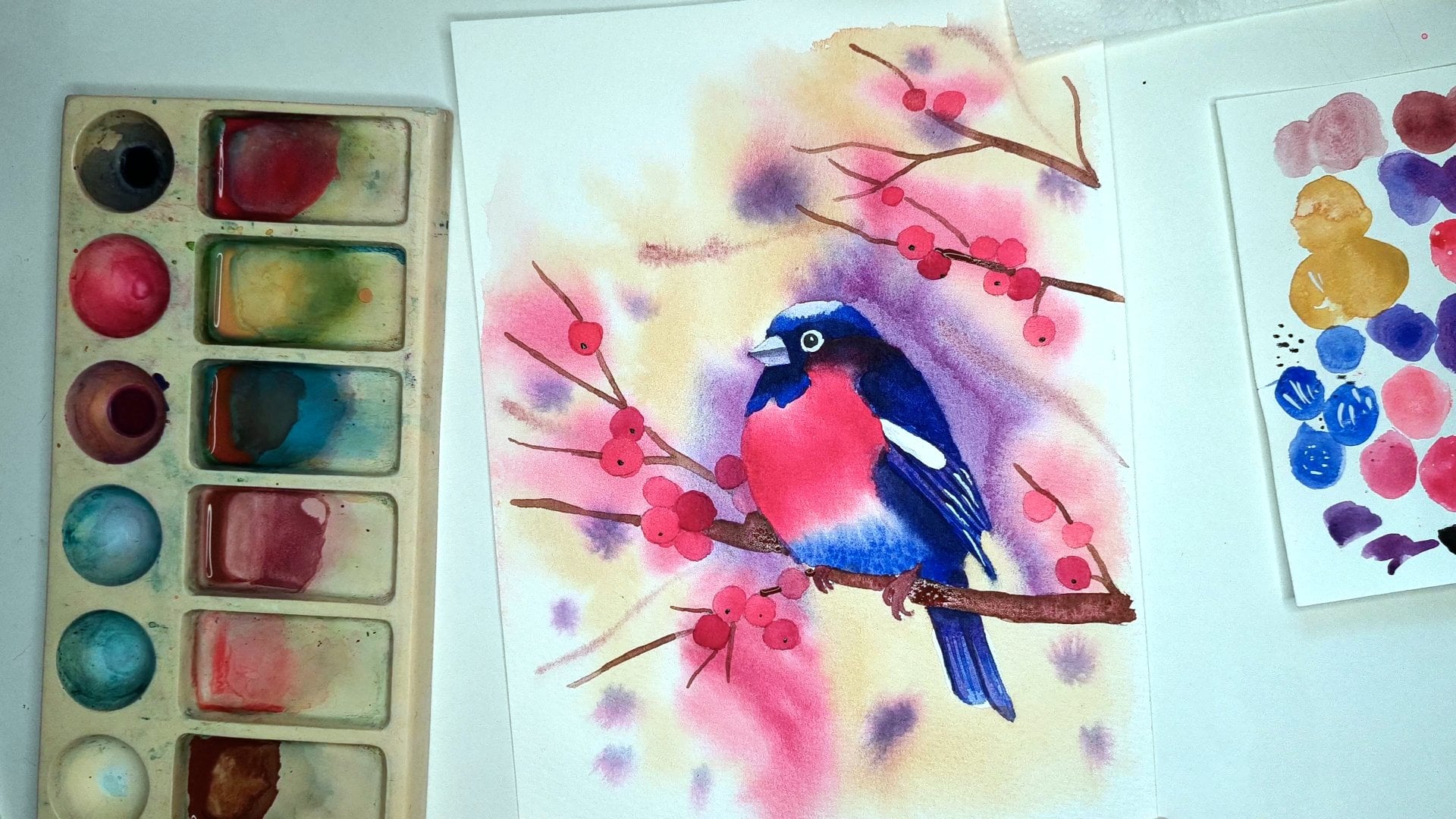
6. Head: At this stage, we will
paint mostly we will paint the rest of the
head of our bird. The bird is not dry yet. The first element is safe to paint is this area
below the eye. So we need some
colors for this area. First one is cadmium yellow, cadmium orange, and
we have that color. I will only add more water
to it because I needed to be more translucent and
more transparent. This is first color,
even more water. The second color is gray and I have this
pigeon gray color. I call it pigeon gray because
it looks like pigeons gray, but it's misty morning. Color is very beautiful
and it's granulating one. I will create beautiful
effect on our work. This color also needs to
be mixed with a lot of water and it should be very
light, very translucent. If you don't have this color, you can still use paints gray mixed with a lot of water to create a very
light shade of gray. This my beak and the area
around the eye is almost dry and let's clean up. Let's change the
water because we need some we will paint wet on wet, so we need clean
water for the stage. The first thing, I will pick my number for brush
and it's round brush. So it's easier for me to paint. I will simply place water area which we will
paint at the moment. So I will cover the whole
area with the water. I will pick my gray color first and I will add it here around under the
eye and under the beak. And make it flow. I will do the same
with my camium orange. I will pick my orange and
add it here and let it flow. I want this color to
be very light and it will be very
light when it's dry still I want to create this
orange effect in that area. I need to wait a
second and place my second a touch
of gray in here. I'll switch to the smaller brush because with the smaller brush, I will take less paint
with water and paint from my mixing palette
because I don't want this darker color to flow as much as it
did the slighter one. While I'm talking, I'm also waiting for this area to dry a little if it's not as water as it was
at the beginning, I'll add some more gray
in here because I want this area near the eye and
near the big to be darker, not the darkest because
it's not very dark, but I want to have this transition between
the darkest gray to the lightest
and to the orange, and I will do it that way. So we will leave it to dry. I wanted to say that we will
mix the pains gray color, but we don't have to mix it because we need to
have very thick color. The trick is that I usually have my palette
sprayed with water, so my color is quite
thick in here. So I only mix it with the water with the drop of the water which
was sprayed in here, and I have very thick
pains gray color. So I will take it from there. And perhaps I will switch to the smaller brush because
this one is too big. I know that this is also
t, and this is two, but I feel that this
tree is smaller than the number three from Neptune. Once again, I will pick my
paints gray straight from the straight from the pen. And I will paint this area. I have my cat's
hair on the brush. I will paint and we can
paint and this area, the top and the bottom
as a one for a moment. We'll paint our eye. So this white spot we will leave the iris of the bird and around that. Okay, this looks even nicer
when it has painted eye. So let's move on to the head and still with
the paints gray on our brush. But there is one trick. When you paint the
right side of the bird, try to imitate with
the simple strokes, try to imitate the
feathers on the head. So let's paint it this
way here and the rest you can paint almost as a whole. Sometimes I just pick
water and add it in here and don't worry if you leave
some white areas in here, it even looks nicer if you
leave some white because it looks like the light is
reflecting on the feathers. But remember that these
areas shouldn't be very big. They should they should
be rather small. And we will paint it till this end with the
very light strokes, simulate the feathers here. Perhaps we will add some water. Okay. It looks quite nice. I see that my gray
flow to this black. So I know I see that
it's almost dry now, so I can change that, make some corrections, and
we will leave it to dry. And in the next stage, we will move on to
the body of the
7. Body part 1: Okay, so right now, we will paint the
feathers of our toucan. So to do that, we need
to mix four colors. One is a turquoise color. I will use the same color which I did to paint the background. And we mix it in 50, 50% ratio, not very much with
water and not very thick. This is our first color. The second is once again, our green, this
was a gold green. This was autumn green. Once again is this autumn color. I call it mixed value green. I will need to add some
pigment to my mixture. This is our second color. Like I said before,
I like this color because it's granulating one. I will create beautiful
effects on our work. The third color will
be cobalt cobalt blue. This is my cobalt color. I need to I need to have
more of this color, so I will add water
and more paint. Cobalt blue is our third color, and the last one is cobalt
blue mixed with faint gray. Then we will create this very beautiful
dark shade of blue. This color looks like denim
color, dark denim color. So I love it. It's one of my
favorite mixtures, but I need to make it. More Okay, so we have
our colors ready. Let's change our water
because we will paint wet and wet the first layer
and our water is dark, so we need to change it. Let's start from
layering the water. The rest of the head almost is already dry so it won't flow and Let's put some
water in here. Remember, this is
our first layer, so we don't have to
worry about the shape of the wings and the feathers. This is the first layer and
it can be very Organic. When I have everything wet now, I will start from the
turquoise, the first color. It's just like my base color. I will put it in here. When I see that it doesn't flow, so I think it's not
wet enough in here. I will add more water. To make the flow easier. Now, let's pick some
green and place it at this area. You can even add it somewhere
like spots dots in here. Next, I will clean my brush, make it dry on paper towel and I will pick my cobalt color, and as you can see, the down part of the swings is darker and the left
part is darker. We will add some required color. But remember, this is
not the darkest one. I will add my color in here on wings, make them flow. Oh Okay. And right now, we will pick the
darkest color and perhaps I will switch to
smaller brush because it will be easier for me to add this dark color in
the areas where I want. So I will pick my darkest color and I will
add it on the left side of the wings and also at
the bottom of the wings. And in here. Well, it looks quite dark. It's my first toucan. The second one was very light, and the first one
turned out quite dark. That's why I added some details
with the crayons later, and we will see how our
toucan will look when it dries because it looks very dark right now because the
watercolor is still wet. When it dries, it gets lighter. We will decide if
it gets too dark, then we will try
to make it lighter with details made with
crayon and guash. But it depends. It depends how it
looks when it's dry. So at that stage, we can still add some green details like in here and we will
leave it to dry. At the next stage,
we will move on to this area and detail
and to do that, we need the wing to
be dry because we don't want this
color to downward, see you in the next step.
8. Body part 2: We will move on right now
to the rest of the bird, and I forgot to add some
details on the head. Perhaps let's start
with the head. And to do that, we will need only pain scray. I will spray my
water into the pan, take a very small brush. Mix it because we
need a thick paint. Let's try on a scrap
paper how thick it is. Because I want to
add some details on the head and they will be just simulation
of the feathers, we need to add just
these tiny marks. Let's add these details in here. On this dark area. It will be visible. I know that background
is very dark, but still it will be visible
just as the delicate marks, and it's enough for us. And we can simulate
feathers like this. We can go to the
slighter background. We also need paints gray. I will mix it on my palette. But I will take a bigger
brush to do that. I need this paint to
be in 50 50 ratio, 50% of water and 50% of paint. See on a scrap paper
how this looks. Perhaps more paint to this. The second color will be
rose just like on a beak. I simply add water to it and add some paint, Rose. Once again in 50 50 ratio, we have rose color. If you don't have rose color, you can choose whatever red
you have on your palette. The third color will be
once again our gray. I call it pigeon
gray, and I love it. It's misty morning from
Roman Schmal from Aquarius. We have these three colors, and we're ready to paint. But before painting,
let's change our water. Okay, let's start
with the water. I simply add some
water in the area. This area is not big, so I will switch
to smaller brush. I'll take two from Princeton. And at the beginning, I will use as a first color, I will use this grayish one. And simply let it
flow on this area. I I needed to be very
light at the bottom. So if I see that
it's dark out there, I try to pick the paint
with my clean brush. And while this is still wet, I'll take pens gray and
I will add it up here. I want to achieve the effect
that the darkest tones are at the top and under the wing because we
have some shadow in there. But the rest is gray. And I clean my
brush, once again, pick my grayish color
and paint the fit. I will call it fit
because I don't know how this calls, even in polish. And we leave it to dry. And let's move on to
the rest of detail now. And once again, let's
start with the water. The darkest shade
should be below the wing because we
have shadow in there. So once again, we start
with the grayish color. I just add it and let it flow. Switch to my smaller brush. This time, I will
pick my rose color, and I will add it to the
tail because we have some red tones in here. My main inspiration
for this Work was work generated in mid journey and on
my mid journey file, the toucan had a lot of
reddish tones in detail. That's why I don't
know if it really has, if real toucan has
these reddish tones, but I like the effect which
mid journey achieved. I try to paint the same way. That's why we had
this reddish tone. Right now I'm switching to once again to pens gray and
like I said before, we have some shadow here. And some darkish tones
also on the tail. But I'm painting only
with the tip of my brush right now to create this effect. Okay, let's leave it to dry. My feet is almost dry. This part is still wet. I wanted to add some details
just like I did here, but this part is still wet, so we can't do it right now
because everything will flow. We need to wait til it dries, but the feet is
already dry and we can add some details
onto our feet. I will pick my gray once again. Perhaps I will add more paint to my mixture to
make it more thick. M so just like you see, I have thick paint and look how this color
is granulating. It's very beautiful.
I just love it. It's one of my
favorite. That's why. If you paint with me,
you will see it often, just like autumn green shade. You have to try it really. But I will pick my gray and I paint some
details on my feet. Line the fingers. I will call it fingers
because I don't know how this single elements
on birds fit cold. And I will make some marks in here just to indicate the
skin, the skin fracture. With the same color, we add this factor in texture in here and also we will simulate some lighter feathers on
itself in this lighter area. We need to switch to pens gray now and we need our pins gray to be fixed so I will pick
it straight from the pan. Let's test on a
piece of paper if I can paint a single
thin line, so I can. I see that the density
of the paint is enough, and I will add some details in here simulating our feathers, just like we did on the head. Add some details. Details are very
important in our work. Okay. Let's stop there. This is our first layer. We have the whole
body of the toucan. In the next video, we
will do the details. The details on the beak
will start from the beak. Once again, we will
move to the body and we will finish our
work with more details. See you in the next video.
9. Beak details: Let's paint the second layer on a beak and around the eye. To do that, we once again
need to mix our two colors. Orange and rose or it could
be even darker red than rose, it could be like zarine crimson. A. If you have Azarin, you can use it this time. Let's mix our colors and we need these
colors to be thick. And I will use colors
which I used before. So rose once again rose, but I will add a bit of isarin to this mixture
to make it darker. And I will use cadmium orange. Okay. We have our colors. I will pick a smaller brush. I will start from the beak
because I'm right handed. And if I start, start from this area, at first, I I can smudge it. I will start from the beak. I will use only the red colors. Let's start from our Alizarin and place it on the
beak like that. We want the end of the beak to make the end of
the beak darker. I will put my colors this way. And let's clean up our brush. And with the wet brush, let's smudge it smudge the
edges. Make them lighter. We need this layer
to dry a little, so we will move on to the
bottom part of our beak. And once again, we do the same add this darker value
at the top of the beak. With the wet brush, smudge it
a little, smudge the edges. They shouldn't be as
visible as it were. And we do similar process
in here around the eye. I will add red in here
and around the eye. In here, and we will smudg it. The places where
you can do this, but because not everywhere, you can blend the edges. Something like that, and our top of the beak
is almost dry now, so we will add more details. We will add these
lines on the beak. With the tip of my brush, I will make these
lines and I will make them in different sizes. One is higher, one
is very little oh so varied sizes. And perhaps I will add some
more value in here because I want the end of the
beak to be very red. Desdh the darkest reddish color. I will add it once
again and I will do similar thing below in
the bottom of my beak. I will add once again Aline. And once again blended. Okay.
10. Leaves: Let's add some details
to the branch right now. We will use the same
colors like before. So my light brown was red ochre and dark brown was October
2023 from Aquarius. I will add just water to
my palette to this color, and let's check these colors
on scrap paper. I think I need more
paint in my mixture so I will add more paint. I want my colors to be thicker, the less transparent, I have
my cuts hair everywhere. I need them to be more solid. The second one, the
lighter brown, it was red. This is my second color. Okay. And with the
smaller brush, I will start with
the lighter color, and let's add some
details to our branch. Remember, they shouldn't
be very straight line. They should be jaggy, shard, curved jaggy lines. Oh. Okay. I will clean my brush and switch
to the darker color. And with the darker, I
will outline the bottom. But with the not solid line, I just like I just
paint dotted line. And also, within the branch, I will leave marks. Once again, just
these jaggy lines. Okay. And let's paint our
leaves at that stage. So once again, I will mix these two colors which I
have used in background. So it was autumn green. And the second one was
quadricon gold green. So I will mix these
two on my palette, and I will make them
in 50 50 ratio. O. If you don't have
these two colors, you can mix one medium green. Autumn green is my favorite one. This is autumn green. I have similar color from other firm and it's
called fern color. So fern is very similar
to autumn green, but autumn green is
granulating one, and the second one is
quadriconGreen, gold. Okay. So we have
our colors done. Like if I have something
which I want to paint loose, I usually take my mop from Roman Schmall because it holds a lot of water
and a lot of paint. So let's start from
this medium green. And with the very loose strokes, you can paint leaf here. Just like you see, you can leave some unpainted areas in here because the background
is green in this place, so we can do that to
make more interest. I have only one leaf
sketched in here, but there is a place
to make a second one. I will take my other green, so this green gold, and I will paint
with the green gold, and I don't mind if these two
colors bleed to each other. And at my first work, I have also painted
leaves in here and I want to do
it the same way. So I have left some
green space in here. I will start from
the lighter color and Don't worry if the shape of the leaf is not exactly what you want because we will add some details later, and it won't be as much visible. Perhaps I will switch to my medium cream and I want
them to bleed this time, so I'll paint it this way. Okay, let's leave it to Dra.
11. Last watercolor layer: This time, we will
paint some details. We will paint details on leaves
and on a bird on a bird, but without the
guash for a moment. So first paint we need to
prepare is our middle green. So in my case, it was autumn green. So it was here on my palette. I just add some water to it. If you want, you can add
more shadow in here, so I'll place a little bit
of that color in here, clean my brush and
with the wet brush, blend it with the rest. Remember, you can
play with your work. You can do whatever you want
because it is your work. You can try new things. For example, like that, and we can do similar
stuff in here because I don't like this white area and I will make that
leaf darker in here. Okay, so we leave
green at the moment, and we will move on to
our bird once again. And we need our two
dark colors from here. So one was cobalt blue, and the second one was cobalt blue mixed with paints gray. So we need these
two colors back. I think I have them here. So I just add some water. So this is my fallow blue. I love that color. And
this is my fallow blue. This was my cobalt blue, sorry, and this is my cobalt blue
mixed with pink gray. I just need to add more water
because it is too dark. So it looks like this. And this color I need more. That's why I will add water, and I will add color from the palette once
again because I see right now that it's
not enough for me because I think it will end while painting
and I don't want that. It don't have to be
very dark so you can mix it in 50 50 ratio. Let's go back to our work. Just like before, I will
take a smaller brush. We'll pick my lighter
tone from these two, so it is cobbled blue first and I will add details just
like we did with the green. We will paint some details. Outline the wing,
the right wing. We will start
outlining our wings. Let's pick the darker hue, so the cupboard mixed
with paints gray and do similar stuff
at the beginning, some marks, but
with this darker, we don't go to the inside of the bird to the
inside of our wing. We only create that
spots where is dark and we outline our wings. Once again, We create the shape of our wings. It looks better now. Don't you agree with
these old details, it looks much better. Perhaps I will add some
dark details in here. Okay. And with this dark tone, we once again, add some
details to the tail. So we will define its shape You can vary the line. Sometimes it can
be very thin and sometimes it can be thicker. It adds very interesting
detail to your work. I will add more suggestions
of the feathers in here. We'll add more details in here. Well, I will paint
this bird slightly different than the first
one and it doesn't matter. It's just like I said,
treat your work as a test and experimentation sometimes and see
what you like better. Well, I do it in a different way and this
one in different way, while I will have two
works of the same bird, I will see which effect, which effects, which
techniques I like better. Sometimes you can treat
it as an experiment. Okay, we need to leave it to
dry and in the next video, we will move on to guash.
12. Gwash: The last thing, the
white quash details with the white quash. I have my washing here, so I'll simply add water to it, or I have dirty brush. I need to clean it more. I'll simply add the water to
it and move my brush so that it dilutes the paint and
make it tick on my brush. On a scrap paper, you can test if you can paint
a fin line with your brush. I see that I can't I will mix some more to have
more hick paint. If you don't have
the white wash, you can simply use gel pen or something like
that or Posca pen, white posca is also fine. I will check once again. And with our white on a brush, we will create some
light on our work. If you painted this area, I have left it white. But if you painted this area, you can paint it with white gash and make
it visible again. For example, I will add
some it's too thick, so I will leave it. But if you don't have this line, just paint it. The same. If you painted your eye, I don't have the second light. Wow, a simple detail and
it looks much better. If you painted this
white dots on iris, you can paint them
right now around here, we will add some white areas. We will add some white feathers, simulation of white feathers
in feathers in here. With a simple short strokes, it could be lines,
it could be dots. We will make the
simulation of feathers. The same on the head, we will add the
simulation of the light shining on some
feathers on the head. And perhaps in here, it could be simple dots if
it's hard for you to make this very short and thin line, it could be just dots. I also creates interest. We make similar lines
like we did before, but with white this time, this way the bird
will pop, pop more. Let's add some. Here, we have very dark area, and I want to make
it a bit lighter. That's why I add some thin lines in here simulating that
I have feathers, different feathers in here. We will add some
white marks in here. And on our on our tail. And we can add some
details also on a tail. This time, I see that my
leaves here are too dark, so I want to add some details here to distinguish
one leaf from another. Remember that this is your work. You can do whatever you want. You can stop at this stage. You don't have to add this
white quash on leaves, if you don't like it, if
you don't like the effect. But for me, this
area went too dark. That's why I will add some. Well, this looks a bit strange. That's why I will add just a
few lines in here and there. Okay. So we are done now. So the last thing
which we need to do is to sign our work and
remove the masking tape. Wow, it looks. It's beautiful. I
like the effect. After removing the masking tape, I created a very beautiful work which you can frame
or gift someone. It's different from this
one, just like you see, but each work is different and it's okay that
it's different, and it's okay that you paint for the second or third time
with different paints, different colors, or
different techniques. So I hope you like it and see
you in the wrap up video.
13. Final: Congratulations on
finishing the class. I hope you enjoyed painting
this vibrant token with me and that you feel more
confident using watercolors. We covered a lot in this class, starting with the sketch
the layering colors, adding details, and
experimenting with textures. I really hope these
techniques will help you in the future
watercolor projects. Now, I'd love to see
what you've created. If you share your paintings
in the project section, I will make sure to take
a look and I always enjoy seeing how each student adds their own unique touch
to the painting. Don't be afraid to experiment
with colors and techniques. Every piece is
special and there is no right or wrong way to
express your creativity. If you enjoy this class, I'd really appreciate it if
you could leave a review. Your feedback is
incredibly valuable. It helps me improve and create even better classes
for you in the future. Plus, it helps other students decide if this class
is right for them. If you're interested in learning more
watercolor techniques, be sure to follow me
here on skill share, so you will be notified
when I release new classes. I also share tips
behind the scenes, insights and additional
tutorials on my social media. If you'd like to stay connected, you can find me on Instagram. Thank you so much for
joining me in this class. I hope this is
just the beginning of your watercolor journey and I can't wait to see what else
you create. Happy painting.
 Anna Krupa, web developer & graphic designer, mix media artist