Transcripts
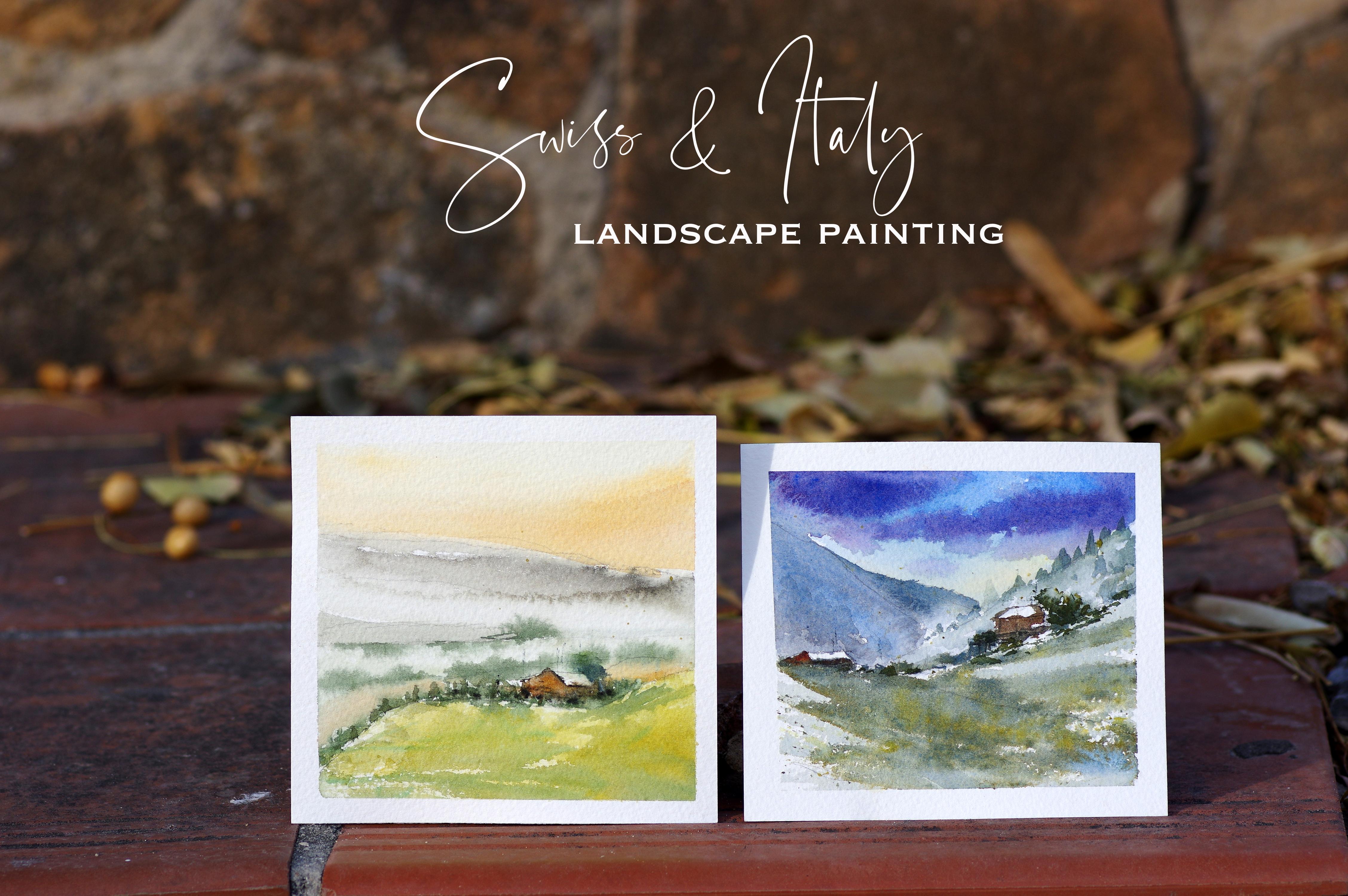
1. Class Introduction: Bug and Donna. And I'm taking you to
Switzerland and Italy. We are going to
have fun painting these two landscapes
in loose style. And Mr. Way, if you haven't
heard about me yet, I'm a Filipino, French
artist illustrator in Spain, and all painting
landscapes and cityscape, collaborated with galleries
and interior designers, sold over 200 paintings
around the globe. My dream is to inspire
others that it's possible to paint as a self taught
artist like myself. And that no dream is too big. If you have faith
and work harder. In this class, you
will learn to simplify your subject and composition
in the most effective way. You will also learn
water control and perfect timing in order to
loosen up your paintings. All of that in step by
step and real time. This class is designed for
all levels to achieve unique, wonderful art on your own.
What are you waiting for? Join me and instruct
this together, and I'm super excited
to see you, Niva.
2. Materials : Color one. And so I'm
going to tell you now all the materials that we are going to need
for this class. I am using the Cotman
water color paints into for this class. Although these are optional, a lot of optional colors
that you can choose from, I am going to use these
primary colors and then mix them to have all the
necessary colors that I want. In my painting, I have the
Chinese white and the bona, the cam yellow,
blue, the sap green. Of course, this one is a
local product from Vietnam. It's the lemon lemon Bu
you have the ivory black and of course the yellow or
Cuba blue for my purple. Because I'll be using
purples in this painting. I'll be using the mix of crimson anise blue to have
my purple for Vandyck Brown. I'll be using the ivory black and the Bor Siena
and all of the rest. I really encourage you
to mix your colors and try your own experiments and you'll just
enjoy the process. Recommend that you
buy into because they are gentleer
on your brushes. Of course, these are the brushes that we
are going to use. Of course, you can have your own brushes with
different shapes. But just remember that
the bigger your paper is, the bigger your brushes person. I'm using this secret
brush number two. You see it has pointed to for more details
detailed painting. This one with flat edge. This is secret number 12. Of course, my favorite one, the brush number two. It's a brush, this is number
two, but it's secrets. And I'm going to use this
as well of the small one. This is secret is
brush number zero. You are going to need
the following as well. You have your small
jar to put the water. Of course you have
your tissue paper and I am using the small pox because these
are only small painting, you don't really
need the big one. This one is a wooden one
and I just can't close. This is very practical to
move around for the paper. I'll be using 100% cotton
in grant that is rough. I'm just going to cut it so our materials
are really simple. I think what matters the
most is the tailing practice and constant trial and experiments in order to
become a better painter. I think that's it. And please don't forget
to download the PDF of all the materials and tips that you're going to need before starting
the classes. I can't wait to see
you and let's paint.
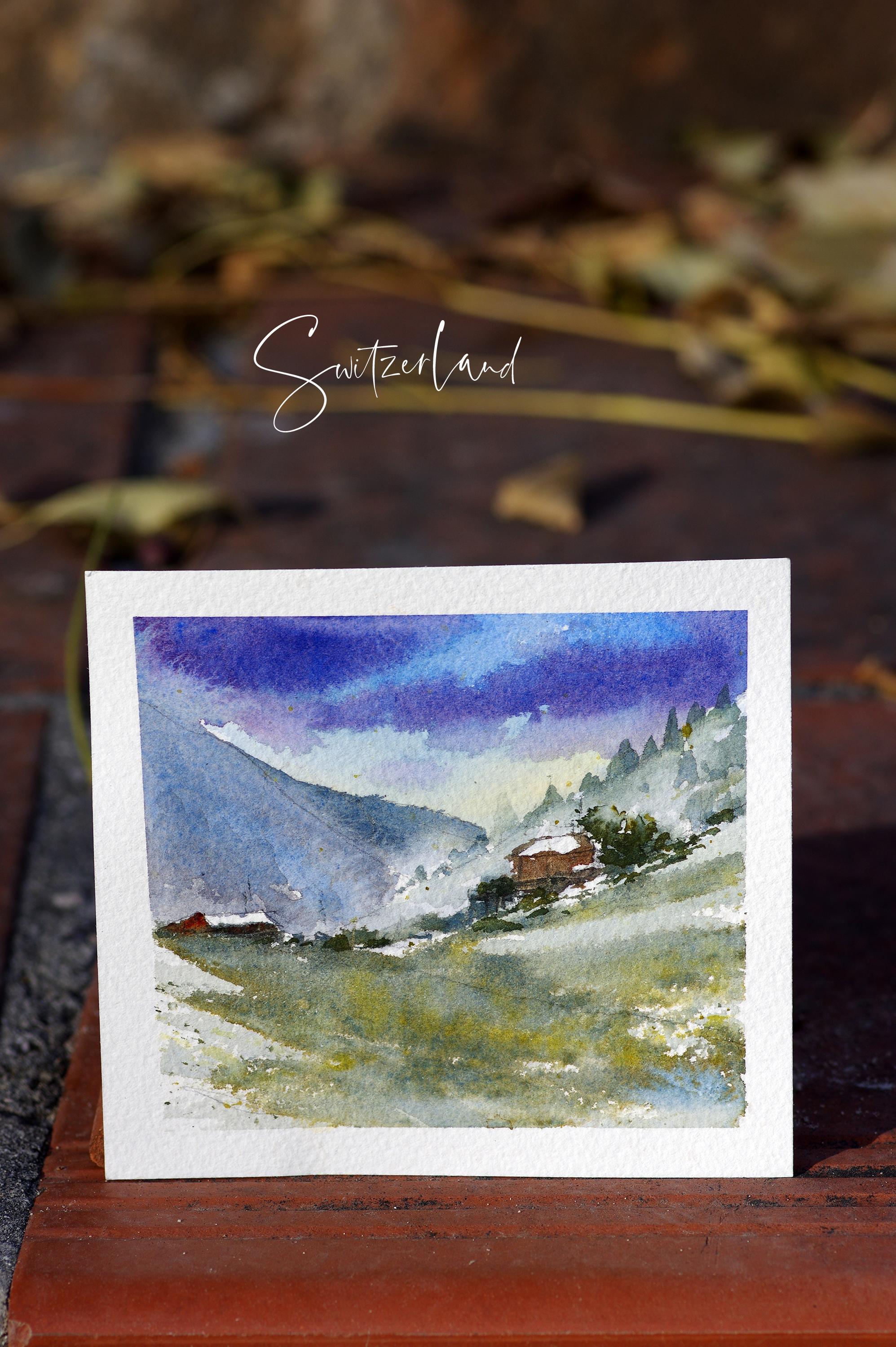
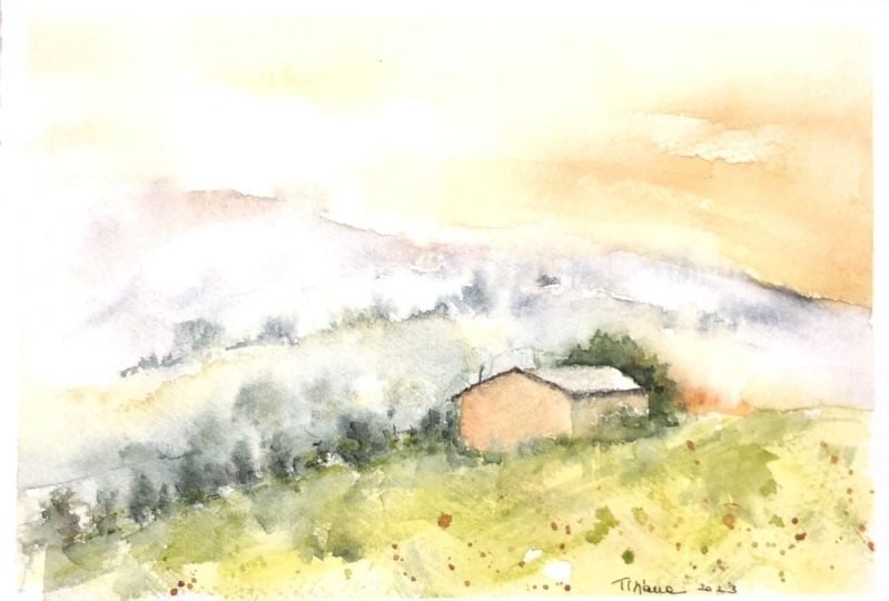
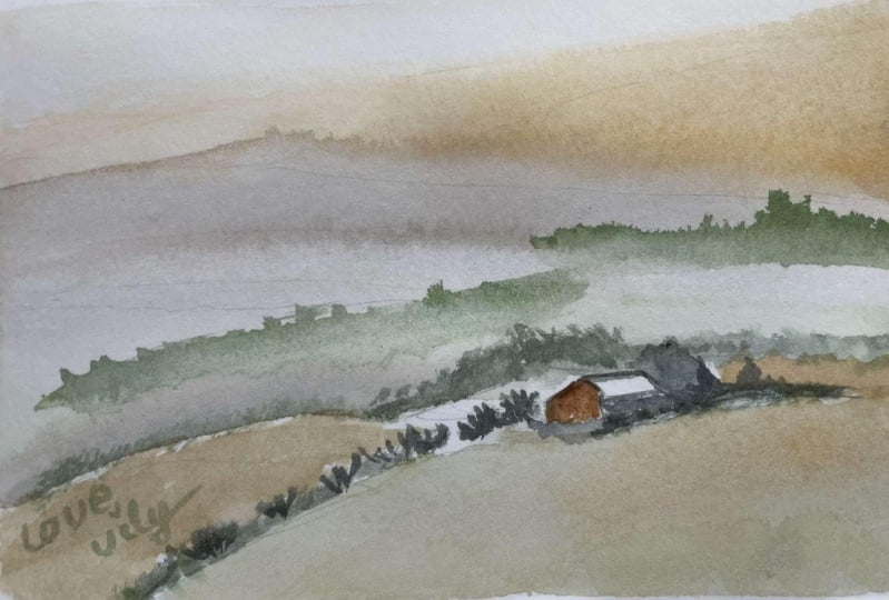
3. Switzerland : Everyone, thanks for joining me. And we're traveling to this
amazing place in Switzerland and we are going to paint this beautiful countryside
of Osnenseea Switzerland. And we're starting the sketch. I am using a pointed tip
of our regular pencil. I'm just changing a little
bit our composition. And you could also do the same, as long as it looks familiar or similar to the reference photos, so we can paint together. I'm making lines of the landscape using the
pointed tip of my pencil. I am trying not to
press it that much, we won't see it on
the painting results. I'm sketching the beautiful
chalet in discovery sites. They have a lot in
Switzerland and they're so beautiful when you are driving or you are
taking the train. When you are doing
sketches like this, I think it's better
not to sketch everything from the
reference photo, those lines and shapes
that you are not going to cover with
paint on your process. We're almost there and let's get started with
the painting process. I am using a flush
brush number 12. It's sharp, it's I really like it because
it's easier to handle, especially for the edges,
the sky like this. I am using paint cobalt blue, and I'm just dragging
the color to the sky. I've added yellow or to give it a little
bit of warm color, I'm not going to
paint white clouds, but rather purple clouds. Because I like purple, you can change any color
tent that you like. I think the color is
not very important, but it's the tonal
value of your painting. We are painting on
loose paper and wet, we are painting on wet paper. And I'm just dragging the water color paint
onto the wet paper to give it a different tonal value so that it doesn't look
so steep and boring. I've changed my brush
into brush number two. So that's a small
one and pointed one. I encourage you to buy brushes
that are pointed here. I switch to the flat
brush and I was just going to exchange it with the smallest
brush I have as well. This is not really important as long as the tip is pointed. I've added sub green
on the color mixtures that we already have to give it a little bit of green
onto the landscape. I am avoiding the chalet because we're going
to paint them later. It's also important to clean
the edges from time to time, not to paper here. I've added blues
onto the paper here. Now I've really changed
the watercolor brush. I'm using a pointed one to paint the trees, the pine trees. I have to clean this. I have you noticed it
while I'm painting? Yes. We're working on semi wet paper so that the
pine trees will be loose, far away distance trees, they are usually loose in tunes and they are lighter
to suggest distance. I'm dropping the greens. Those are sub greens with blues and a little
bit of purple. I'm adding more and more paint onto the paper to suggest trees. I'm just really dragging
the color onto the paper. If you feel that you need to splash it with a
little bit of water, please go ahead but try to
cover your clouds and the sky. Now I'm the water
color paint lots of water onto the dry
paper for our foreground. I've switched the brush and
I'm using the flat one here. This chalet is not
the focal point, but it's still important. I'm going to give
it a little bit of contrast by adding a
little bit of blues. I'm just drugging the
water color upward, it will mix onto the mountains. A switch again. I'm just actually alternating these two brushes in
this painting process. I'm really mixing it
well onto the palates. I'm also alternating the
whose blues and greens. Now we're almost done with the trees and I'm just
trapping a little bit of contrast here,
plus the foreground. Just a little bit
avoiding the sky here. The foreground is
a little bit wet. Now, I'm adding more green to make this sap
green a little bit darker. I've added some blues. I've added some yellow
or onto the greens to give it a little
bit of warm variation. I'm just varying the colors. I splash yellow Orc onto
the foreground as well. Now I'm working on the chalet
and this is Van **** Brown. To have my Van **** Brown, I've added the ivory black and the Borsana to have
my Van **** Brown. But if you have it at
hand, it's perfect. Okay, I'm just adding
more contrast. I'm trying to make this chalet pop up more because this
is our focal point. I'm working on the trees, I'm adding more bushes, giving it a little bit of
contrast and darker value to indicate that there are bushes and plants
on our foreground. And I am working on it while
the paper is still wet. Now I'm going to
work on the shell a little bit more and
make it pop up more. I'm adding more darker
value of ivory, black. I'm adding some fences and I try to make it as
thin as possible. You have to wait that it's
a little bit dry before adding this lines of fences. Using the tiniest
brush that I have, I'm adding post as well
to give it a little bit of natural looking chalet. Because they have post, they have wires,
they have lines. We're almost done
on this process. I'm super excited to finish this with you and I really
encourage you to post this so I could see your beautiful painting at
the end of this lesson. Here is almost dry. I'm just crouching
using this like material and I'm just making
some lines. There you go. We'll finish, and
I hope you like painting this with me and I'll see you in
the next painting. Well done, and congratulations for finishing this up with me.
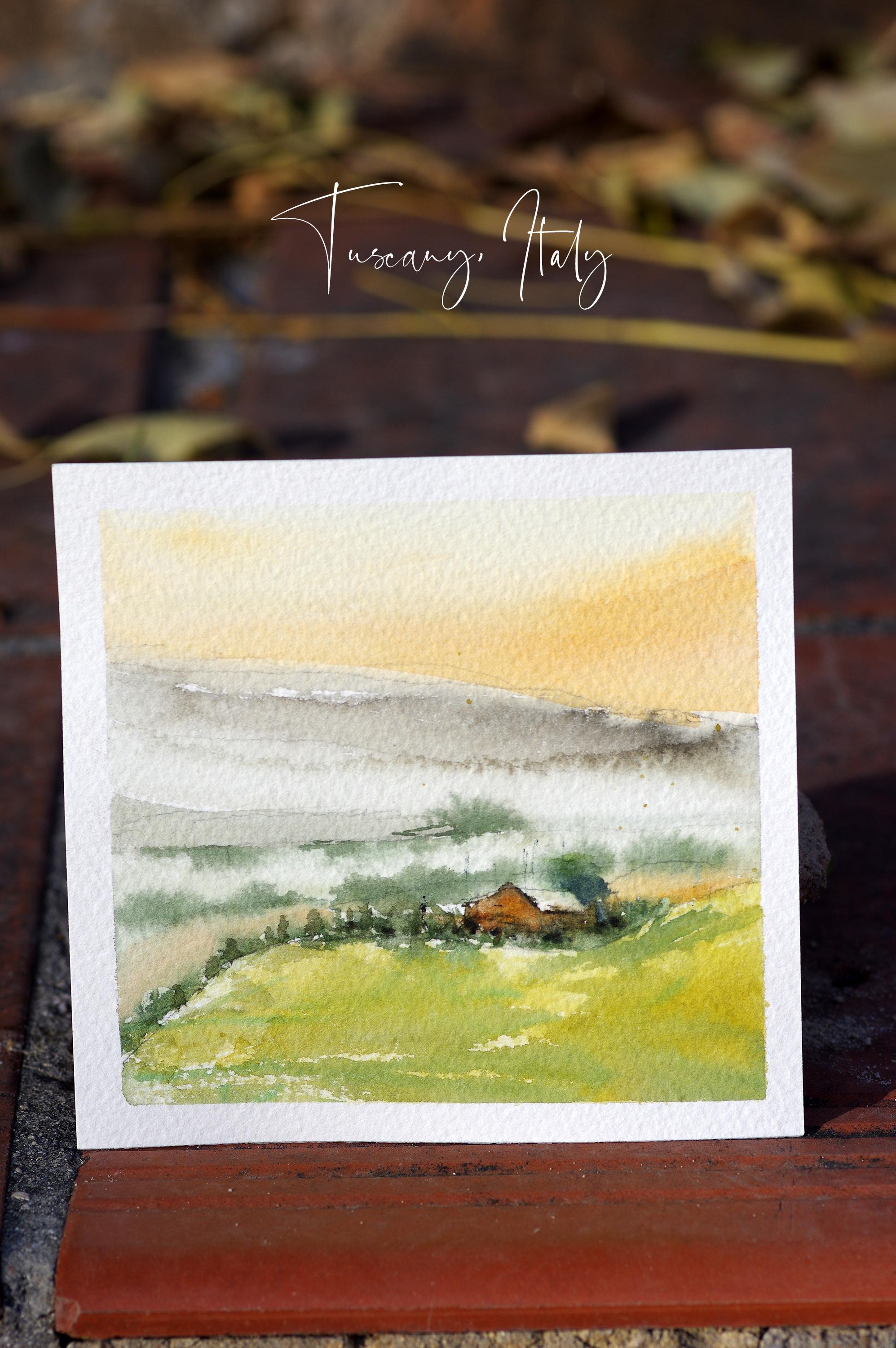
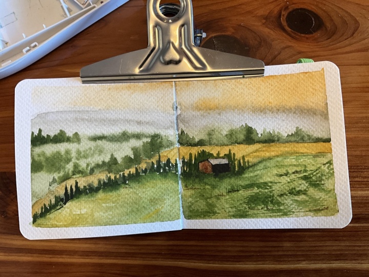
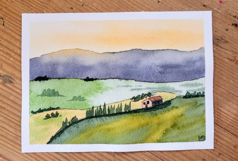
4. Italy: Welcome. Thank you so
much for joining me in this class and we're going
to paint Italy, Tuscany. It's a very beautiful
place. I love it. Now I'm using a normal pencil, I'm sketching the
carbs of our painting. Please have your reference photo with you at hand so
it's easier to follow. I am sketching the focal point, which is the house I'm trying not to sketch
is too much so that if one damage a paper
also if you're sketching, I'm trying to sketch visible those that you're
going to cover with paint. Just like these trees,
I'm making lines. The mountains, this
is our background. The lines is as
light as possible. One tip I can give you when
you are learning to sketch that you shouldn't start
using with rulers, because it will look very tight and you don't want that to happen
on your painting. Try to make sketches like lines and shapes as as possible. Here I am pressing the
tape to make sure that the watercolor paint won't leak when I paint while it's done. And I'm super excited to sketch this beautiful scanny
landscape with you here. I'm using the cadmium orange
mixed with some yellows, like cadmium yellows
and yellow Orc. Of course, I advise
you to try this and mix your different
color or Tina, you wish. Here I mix Van **** Brown for the mountains with
with the black, with the ivory black. I've added a little bit of Chinese white to make it grays. Here I'm painting on dry paper, but I'm dragging the colors to make it look as
loose as possible. I noticed the position
of my brush here. I'm using a flat
brush that we have. The more you paint, the more you will realize that water color is
not as difficult. Okay, here I'm
adding some green. These are sub greens
with lots of water. I'm still painting with the
same brush, flood brush, and I'm just really and helping the water color to be
as loose as possible. Here, I've cleaned the
brush with water so I can do a little bit of lifting. I'm cleaning my paper
edges from time to time. Here I am cleaning
and washing my brush to lip some color so that it
will look misty and whiter. Experiment with this and try not to be scared
in this process. I think it's really fun when you can see that there's
this misty effect. Also when you take a photo, sometimes even in the process, it's really nice to see
how it is going to life. Okay, so now the
paper is still wet. So while it's still wet, I'm adding the trees based
on our reference photo. I'm using the tip of my paint brush and I'm going to do some lifting if I feel
that it's too much. Because I don't want
straight lines, I'm trying to break those lines. I'm just adding a
thick amount of sub green mixed with
black ivory or ivory. Black here, it's loose so
you can see that it's moving and the shape is turning into like small trees because
the paper is still wet. Here is the part that
is not very wet, so you can see it's a
bit of dry brushing. In your paper is wet, that means that your
watercolor pigment will move on its own. Maybe the shape is a bit
bigger so not to put too much tint or pigment on it or else
it will become huge. Timing is very important when you are doing loose
painting like this. In this side, the paper dry, you can see that I have
more control on my shapes. This a mixture of yellow or, and cadmium orange, and I'm just dropping it
anywhere on the paper. And I'm just going to mix
it using my brush here. I'm going to add more
hoods and colors in the sky and the paper is still a little bit dump
and it's not very wet. As you can see, I'm not
cleaning my palette, I'm just adding more
yellows and greens. Here is the foreground
and the paper is dry. I'm using quick brush stroke so that you will have
some whites on the paper. Here, I've changed my brush. I have a very small
brush with pointed tip. Now that's brush number two. I think it's much better to use the smallest brush that you
have with a pointed tip. These brushes that I'm using, I'm going to put the links
where you can buy them. But I say no. I put it in in an online
shop, in Alex Press. And these are art secret shop and their brass are really nice. Okay, as you can see I'm
working on the foreground. I'm adding some browns. This is Van ****
Brown with water. To have your Andy Brown ruder, you can your Porciana ivory black and you will
have the Vandyke Brown. I encourage you to really
practice different mixes. Now I'm adding shadows. And this is a darker shade
of ivory black that we will have more details
and our focal point will be more visible
on the painting. It's very important
the composition, as I've said that
mentioned this before in my other painting lesson, that focus on your focal point rather than painting
everything on your painting so
that the eyes will slowly move towards
your focal point and it will look more
natural and dramatic. Twitty painting is not
easy at the beginning, but once you get the head of it, I think it's much
better and easier here, I'm doing a little
bit of lifting, I'm trying to break the
line of these trees. I'm just dragging the colors
down to have some shadows. I think straight
lines like this, especially if they're
not in the focal point, they are not as beautiful. If we look at the painting, try to break the lines to give
it a little bit of spunk. Okay, I hope you are having
fun in this process. If you feel that
your painting result doesn't exactly look like
what you wanted, don't worry. You can always watch this video again and do it all over again. I'm a suba artist
and I've learned a lot from making mistakes
and constant practice. And that's how we
learned, isn't it? I'm adding darker tonal value at the back of the house to give it more contrast because I
really wanted to pop up. Now, when I added the dark
green mix with ivory black, it seems like the
house popped up. And this is what I
want it to look like. Your sharp edges and your soft edges is also important on your
painting as well as, of course, your composition. Hi, and I hope you're
enjoying painting with me. Okay, we're almost
finished in this painting. I'm so excited to see your
own version of this painting and make it your
own. Keep learning. Now I'm adding a little bit
of shadow on our house. I'm just drugging it.
My watercolor brush is wet and it's clean. It's amazing when you are making paintings because it seems like you're
building houses. And it's really important
to feel as confident as you are when you're painting
as believe in yourself. I have the zero brush that the
smallest brush I can have, paper is dry, lines
and wires and post make this painting and city escape a little
bit more realistic. If you make your post, you start on the top
and going down and make your lines as small and
as thin as possible. Here I'm making some fence using the smallest
brush that I have, making it more realistic. As I've said, this is more
like quick dry brushing. I can't wait to see your own
painting and please post it, Scale share, or in social media. You can tag me so I
can see and comment. And of course the other people can see your beautiful
painting as well. I'm so happy to have
finished this painting of landscape with you
and I hope to see you on my other tutorials. Thank you and I'll see you. Well done for this job
and just getting better. Okay, so there you go, your loose watercolor
landscape painting of Tuscani Italy. I'll see you in
my next tutorial.
 Dawna Mae, Watercolor Artist & Illustrator