Transcripts
1. Class Introduction: The Gladys moments in human life is a departure into
unknown lands. Hi, I'm Donna, Filipino
French watercolor is, has art I inspired by their most fascinating
landscapes and cityscapes I traveled and
the places I dreamed of. In this class, let me take you to a dolphin Taiwan
ancient village. This class is designed
for intermediate to advanced students
who wants to loosen up their paintings and
challenge themselves. Cityscapes could be
intimidating, I know, but my goal is to take that fear away so that you can enjoy
painting and be afraid. Through step-by-step
guide, you will realize that it is not that
difficult as it seems. You will learn
principles, techniques, and composition to gain self confidence and trust
your natural artists in sync, which I truly
believe within you. If you are apt for magical, challenging, but truly
rewarding watercolors. I believe this class is for you. I'm really excited and I look forward to seeing
you in this class.
2. Materials: Hello and welcome everyone to the material part of this class. All the materials will be made available for you to download, so please download
it in the reference. We'll be using the
paper for this one is 100% cotton artist, great, vegan friendly from
each nurse sketchbook. They are really nice and very easy to use and
wonderful to use. My favorite is Arches
watercolor paper as well. They're really nice. I have all the tips
that you need in the reference of this
watercolor paintings. So please see, of course, a bucket of water. Winsor watercolor paints. We'll be using tiniest white, cobalt, blue, yellow,
cadmium yellow. This is optional. Van **** brown, born
sienna, and sap green. Of course, you also
have the neutral tent. For the brushes. We have brush number 40. From time-to-time, the
big brush for washing. Of course, my palette. This is made of
ceramics and I like it because it's heavy and
it's doesn't fly anywhere. They should paper, of course. And of course your
very important for me. It's my spray is my water spray. I think that's it. So we are off to paint
the two open painting. I'll see you.
3. Sketching: Hello everyone and welcome to
our sketching. Let's begin. And for this project
we will be using the watercolor sketch,
sketch book pad. It's 280 GSM and it's
wrapped surface in A4 size. So we will be painting these lovely cityscapes
with Langton's in Taiwan. It's my favorite
thing in painting is very traditional
and oriental. As you can see, it
looks complicated, but actually it isn't and it's just a matter of practice
and I think determination. So let's begin. I started with making
lines for our paper. So it's going to help me
see where's the limit. Now, when you are
sketching escapes our landscapes is important to understand your where
is your background, your foregrounds, and
your middle ground. Here I started, whereas the guy in the
foreground with a line. Now I am sketching the building. As you can see, as I've said in a
material parts where I using pencil with Sarah, 0.5 thickness, notice deposition of my
pencil while I'm sketching. If you feel that you need to do a rough sketch on another
piece of paper before your final paper will go ahead because I think it can help
you build your confidence. When you finally worked
on your watercolor paper. As you can see, it's
really slanting. Rpr pencil is slanting position so I can achieve
a straight line. But if you want to
use some ruler, if you are a beginner and if you feel like you need the help
of a ruler, then go ahead. There's no rule. It's just a matter of practice. I feel like you
just have to enjoy the process of sketching and
practice as much as you can. See. It looks complicated. Cityscape looks complicated, but we will try our best
to simplify it. Just notice the
position of my hand. While I'm making lines. I'm doing my best not
to over sketch it. It means that the
sketch stomates so that we didn't damage
the watercolor paper. Yes, slanting pencil like this to make to make
straight lines. One tip I can give you is that do not try to sketch
everything that you see. It means that planning is very important at right at the
beginning of your painting. You will avoid making unnecessary lines because if you are going to
sketch everything, and finally, you will
cover it with watercolor, paper, watercolor paints that I think it's a waste of time. It's going to scratch your
watercolor paper for nothing. So planning is very important. I think for every painting. Go ahead and enjoy and
I think isn't gonna be really amazing when you see the final result
of your painting. If you feel that the painting
sketching is quite fast, then take your time. Rnc, your favorite coffee, and just relax and take no post the video
and come back later. The focal point of this
cityscape is in the middle, of course, where
there's the like, the mountains see at the back. So when you are, when you are finally
painting you, you will realize that focal point is very
important in every painting. We are sketching Taiwan. I think it's a lovely place. I haven't been there, but it's my favorite
subject every time I paint. I just loved Chinese lanterns. I just loved lanterns. And I think that i1 is a very nice country and we would love to
visit it one day, be able to paint it in place. Okay. So here I'm just on this side, on our right side. This isn't our focal points. So I'm just imagining sketching
roughly the buildings. This sketch that I'm doing will be made available
for you to download. So you will have time
to look at it and study it before
sketching if you want. Now, this will be
our foreground. So I'm sketching and Umbrella. Umbrella is a bit
tricky to draw my, even for me, I've been
doing it for many, many years and
it's still tricky. It will take time, so you just have
to practice this. Maybe on another piece of paper. Don't worry too much if you feel like it's not so
perfect bundle worry, it's just enjoy the process. And I think if you are
passionate with what you do, you will see the difference in every end of your painting. Ecm, narrowly
scratching too much. I'm not really
sketching too much, I'm just making some few lines. Although having said that
is also very important to realize that when you
finally covered them, if your sketches with
watercolor paints, you want to be able to see
those lines if it's too light. So just make sure that you see, you can see them when
you are finally painting because there's nothing worse if you don't see where
you are going to. So it's just, it's just a
matter of practice and you will really understand how
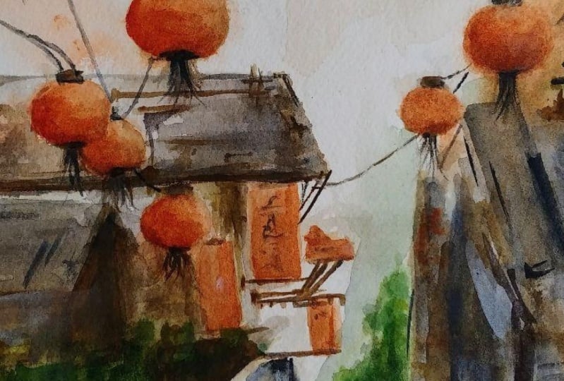
it works the more you paint. Now these are the lanterns lab. This lanterns is, it's just a lovely and it has
this positive vibes. It's really fun to do it. Now you have to apply
from our videos how to draw some lanterns
in debt for a thesis. If you feel like you need to do more and more, you just have, you know, grab a scratch of
paper and draw lanterns. And as you can see, it's not really perfect circle. It doesn't have to
be in perfect shape. Just have to be a bit round. So as you can see, it's my pair, my pencil is still
slanting to make lanterns. There's two way to do it. You do it slowly. You really make a round circle. But that would take a
little bit of practice. Just keep practicing
and I think you'll be, you'll be doing it
perfectly fine. You see, I know that
cityscapes probably is one of the most difficult subject
when you are painting, especially with
watercolor, watercolors. But as a painter, most of my paintings
are cityscapes. And I really loved the collision between
men in men and gods. It's just, it's just really
wonderful to see it. And I found it really fulfilling and
challenging at the same time. As I've said, lanterns is one of my favorite subject to paint. Because it really feels happy
and bubbly and positive. As you can see, I'm trying to define our lanterns as much as possible so that I can see them during
our painting process. Just another tip is
that I think you're painting doesn't start on the painting process means
you're painting doesn't start. When you throw watercolors
on your paper. Your painting starts
your masterpiece. By the moment you plan your painting and that's
on your sketching. Sketching. I would say I like, I think probably all painters
would definitely say that your sketchy is probably one of the most
important part of your, your painting to
succeed or to fail. So that's your composition. So your composition is very
important and I think, I would say probably
the most important one. In painting. Composition is the way
you arrange shore, the shapes and the
lines of your painting. Virtual foreground, middle ground, whereas
your background. And it takes time, it takes time to
master these skills. But it's not impossible. It's definitely
something you can learn. The more you practice painting. For me, it really helped to sketch outside as
much as possible. And when I'm in nature, I just, I just imagine how would
it be when I sketch them? My, my style and sketching is more an
impressionist style, so I'm not really into realist. You can see that it's more
loose and it's more free. Now, adding more lanterns. As you can see, that, as you can see are the shapes of our lanterns are quite big. So which means
that the painting, this scene is that
we are very near to the lanterns and the
buildings on the background, the houses, they are quite far. You really have to imagine
how it looks like in the, in the real photo
or the scenery, how it will look like. So this requires a
little bit of practice. As you can see, this one is another way of making lanterns. I just, as I said, you can make like round circles in repeated
motion or you can do it slowly. Just like what I did
on our first lanterns. I really hope you are enjoying this sketch as
much as I'm doing. What I notice is that the more I sketch and the more I
practice every day, the more I built
myself confidence. I would really like to remind you that if you feel that
it's too hard for you, I would say never give up
and just keep on doing it. And one day you will realize
that it isn't so difficult. I think everything that we do, and I think you will
agree everything starts in almost impossible. And then finally we
can, we can do it. Now. We're done with our sketching, and now I've sketch almost everything
that I want to paint. Thank you so much
and I'll see you. The most exciting
part, the painting.
4. Technique, Palette, and Practice: Welcome everyone to
this thick Nick palette and practice abdomen
Taiwan cityscapes. And all of the
reference materials will be made available
for you to download gay. So you are going to
learn about wet on wet, wet on dry lifting and dry brush. In my palette, I
have burnt sienna, yellow or Van **** brown. I've already knew our sap green, cobalt blue, Chinese white, and neutral tent and the
optional cadmium yellow. All of these materials and
my palate, as I've said, are available to download in PDF file for you before
we start our painting. So feel free to download everything before
we start painting so that you have an idea
what we're going to use and what we're
going to do exactly. That makes your painting
more easier and stress-free. Now, we are going to do the
sketching of the lanterns. So as you can see, I'm using a normal pencil five. And I'm doing oval shape
in small and big sizes, so they are in different sizes and I'm just repeating the same. Ben sells stroke all over again. I'm not really sketching hard so it won't
damage our paper. Go ahead, grab your pencil and paper to practice how
to sketch the lanterns. So I just wanted to say that, welcome to this painting and I'm super excited to be
painting with you. And I really hope
that you will enjoy this class as much as
I do. I'm filming it. Okay, So we're going to paint the lanterns using burnt sienna. This is wet on dry. Loads of pigment and
less water on the paper. This is wet on wet. I've wet the paper before
and then I applied burnt sienna onto the paper. So I'm doing the same process
on the other lanterns. What is very important when
you are painting is you have to plan ahead and recognize where is the
light coming from. Because if you know
where your light coming, where your light is coming from, you know where to put
your shadow and we know where to put the
darker tonal values. As you already noticed, as you've already
noticed paintings. I mean, the paints would
usually fade in time, so you have to adjust and add more pigments
if you want to. So now I'm adding more shadow. So that's for darker tonal
values to suggest shadows and lights using Van ****
brown and for sienna. Now it's Van ****
brown and ivory and wire up or that
tap over London. I am using, of course the brush, a number, number to a mop brush. I'm using brush Cyril, the tiniest brush I could find, and I'm dragging the
watercolor paints to make deadline turn tail
position of my paper upside down for the
watercolor to flow. I've added darker to the
values for the details. And that is I've already
know r and Van **** brown. And I'm repeating adding
more Born sienna, less pigment to have the
shadow of the plantains. I'm actually adding more and more contrast
on the lanterns. And here I've dragged the water
that the board is a yada, would lead outside the paper
to give that lowest effect. I've added more
darker tonal values. So that's born sienna and Van
**** brown with less water. Here. I'm just
blending the color. As you can see, the light is on the left side of the lantern. Here I'm applying the
tiny yeast cable lines, wires using brush number 0. So go ahead and practice this
all over again and enjoy. I think it's really fun to paint lanterns because there are very expressive and attractive. So I'll see you in the painting
and sketching process. I'm super excited. So welcome to this class.
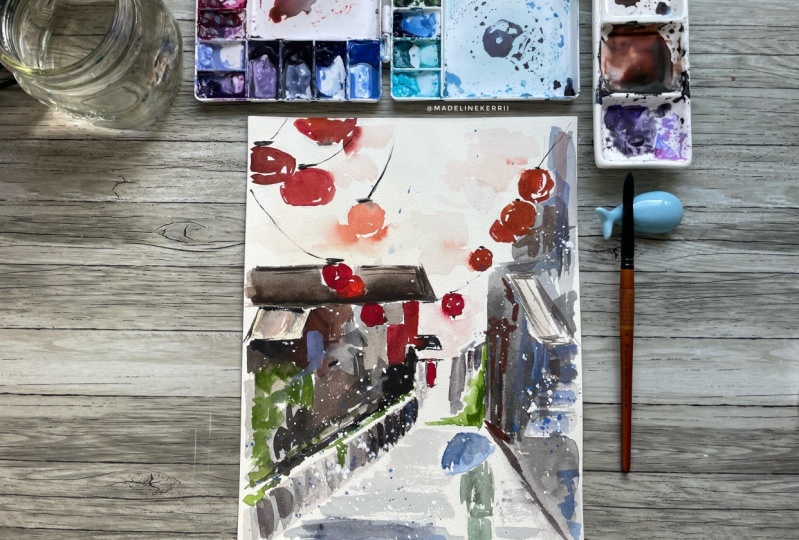
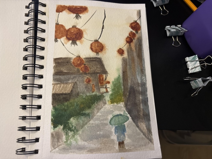
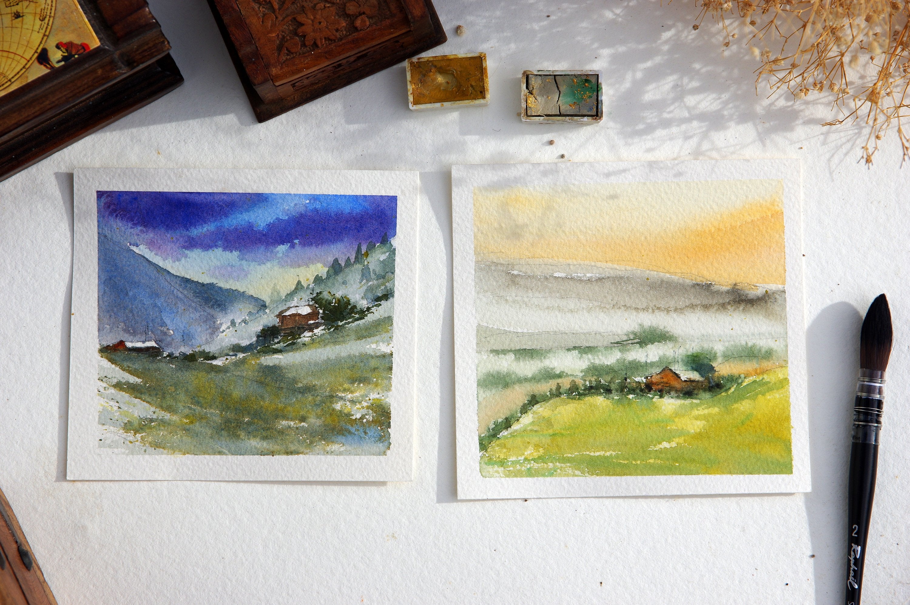
5. Middle Ground Wash (left half): Hello and welcome everyone
to this painting glass. Let's begin painting do
fin Taiwan cityscape. I'll be using each
nurse sketch book, A4 cold press, 230 GSM. Thank you so much. It's NOR it's a
wonderful as sketchbook. Let's begin. Here is the sketch. I'd like to create it. Sara of flickers and Sean, Sean way for this painting inspiration
of Xenophon, Taiwan. It's wonderful painting and with very interesting
composition. We have the small medium
and the big subject, which is very important
for every painting. I'm going to talk
through it about the composition during
the painting process. You will see its importance. Course. You have the foreground, the background in
the middle ground and focal point
of this painting. All our tips and materials will be made available
for you on video files. Don't worry about it. So let's begin. I started with yellow
4k and Chinese whites. Chinese whites. And wet my paper evenly
and spread the paint, the paint all over. And use my flat brush to
spread the paint evenly. I'm doing this to have that atmospheric and warm
effect on the painting. And I haven't taped the paper because I have a magic stone to
the whole of it. Of course, if you
want to tape it, you you can tape that. Of course, you can tape
your paper. Let us begin. We'll be starting over
with the biggest subject, which is the house
of this painting. And then we're gonna through to the foreground and then of
course, the background. We don't have really background on this one because
it's all white. So using my brush, my brush number four, mixing lots and loads of pigment of Chinese
white, neutral. Then there'll be Van **** brown. This I'm working moist paper. It means it's not very wet. So be careful on this part. More pigments and
just enough water. Here the paper is
a little bit wet, but not too much. So I'm trying to leave
the white of the paper. Not very easy if our
paper is voiced. So I'm using the
tip to achieve it, the tip of my brush
to achieve it. So that's why it's
very crucial to have pointed tip brushes for
almost painting that I do. I really appreciate
having pointed tip brushes because it's
easier to work around. Here. I'm still using the same watercolor
paints and I've added a little bit
of cobalt blue. So just relax and
enjoy this process and you can do it
all over again. You can practice it all over
again. If you have two. What didn't port, what is important is you
are enjoying it. Here. I'm trying to retain
the shapes of Ireland trends. Using the tip of my brush. Notice deposition on my brush. I'm trying to leave the whites a paper
as much as possible. And it's that easy as I've said, if the paper is moist, we can use the tips. I've added this blush, cobalt blue and Chinese white, mixing the watercolor paints on the paper and just let
it flow on its own. Using the tip to
retain the whites. Because our paper
is not that dry on this part and it's
not for rough paper. So if your paper is
rough, more or less, you will be able to
achieve whites easier. This part is for the plants, so it will be green. You can use quick brushstroke, dry paper to achieve the white. But here we're using the tip. I'm just following
the sketching and the painting using
lots and lots pigment. And of course, with a
mix of Chinese white. Here I'm doing some
quick brushstroke to achieve the whites, to have the white of the paper. And looking forward for you
to join me on the next part. And this painting, It's getting
really, really exciting. So I'll see you.
6. Middle Ground (right half) & Foreground Wash: Welcome everyone to
the second part. This painting, often
Taiwan cityscape. And this you can see I've splash my paper to
wet it a little bit. Before continuing. I'm using the same
combination are Baines, Chinese White, Van **** brown. Oops. I'm going to
clean up this side. The edge of the paper that
I accidentally painted. So you can do that with
water and tissue paper. As you can see, I'm still using the same paints. Ivory white, Van **** brown, neutral tint, a
little bit of blue. I'm actually painting and mixing them on the paper and
also in the palette. And I'm just really
alternating and mixing those colors on this wash. Now, I'm using the tip of my
watercolor brush on the paper. And this, is, this
still, the buildings? Notice the position of my brush
while I'm painting wrote. This one is, there's a lot of water on it and the
paper and the brush. We are painting the shadow. It's still the same color, alternating the same
alert Chinese white, neutral tint, Van ****
brown, cobalt blue. And are still doing
the second wash. I'm just testing if
the paper is wet enough because I want it to
be loose and not too tight. I'm paying attention on the
edges of the paper this time. I haven't taped it. It's still prettier. If I'm going to leave
the edges whites here. Just alternating cobalt blue and the same watercolor paints. And just notice
brush, brushstroke. So this style is
impressionist style. So that's why we didn't
really sketch it. So I'm just really looking at that painting right
now and which you also have in your PDF files as reference while
you are painting. I encourage you to
maybe print our model. You that you can see actually
what you are painting. Of course I'm showing it
here from time to time, but it's better for you
to have it at hand. These lovely inspiration
painting from fashioned way. Now I'm actually getting
a little bit darker. This is more Chinese
white and neutral tent. We're going to talk
about the water control. And water control is
really important, but this can be achieved with lots of practice
of daily practice. The more water you
put on your paper, the more it will be loose and more difficult for you to
handle the watercolor paints. Dry brushing is actually
easier because you can hunter, you can handle the edges
of your watercolor paint, but then you are what? Your paints will look
a little bit tight, so it really depends
on what you want. Now I'm showing you our reference
and we are paying still doing the the shadows road. And we're getting
into our focal point. As you can see. Getting more and more
specific with the details. So I just adding
some details here. While this part is still
a little bit moist so that watercolor paints will
have this loose effect. I'm still mixing the same color and the roof is still wet. If you are painting inside and I don't think you need to wet the splash water
most of the time, but I'm actually doing
it because as I've said, I'm painting outside or is trying a little bit
quickly than it should. But when you are splashing
water on your paper, be very, very careful. That means you have a bit far. You have to cover some parts with your hands to help avoid it from from wedding too much. So go ahead. I've just flush of water because I want this part to be loose. I mean, I want every
part to be loose. I'm splashing water,
splashing a little bit far. I want this part to be loose, so I splash water in it. And I've covered the area
that I don't want to be wet. So be careful when you
are splashing water, especially if your
paper is still wet and you have a lot of
pigment because the pigments, the watercolor pigments could spread anywhere on your paper. And it might be why
it's not impossible, but it might be a little bit
difficult to clean them up. But I also show you
that it's possible to do clean up the
mess that you made, you seeing water
and tissue paper. If you can't do
this occasionally, but not all the time
because it might ruin your paper and your
painting in general. I'm, I'm adding a bit more
of darker tonal values. To do that, I've makes neutral
tint and Van **** brown. And a little bit, I've already know r or ivory black. To do this. You have to look at your reference painting that
I made available for you. You have more idea or
what you are doing. I'm just looking at some parts that it's still
a bit moist and dark, darkening it a little bit. They'll have more contrast. So I don't want to go
back to it later on. Okay, so are getting really
closer to our focal points. And the most exciting part, which are the lantern. So you are doing very well, so keep it up and just really enjoy the process and you
will see the difference. So now I'm just helping
these watercolor to spread and have this
loose effect using my brush, water in your tissue paper. I'll see you on the third
part of this painting.
7. Middle Ground & Foreground Second Wash: Welcome everyone to the
third part of this. Too often cityscape painting, as you can see, I wet the paper and
moist of paper. Start walking on the buildings. On the right side. I'm still
using the same colors. These are Dennis White, Van **** brown, cobalt
blue, neutral tint. I'm actually just juggling the
four colors altogether and adding more darker tonal values. As you already know, this kind of painting
is impressionist style, so we don't actually
give much details on it. And it's just we are leaving
the rest to the imagination. Using your reference, of course, reference photo
of this painting, you can look at the details
and you can follow it. This is what I'm
doing right now. I'm looking at it. Sam, just like giving a details on the buildings where the
lines are, the windows. So yes, it's really free flowing painting and
impressionist style is more on the light
and the shadow. Here, working on the
foreground of our painting. And I'm adding the same color. It's the road. And we're adding some shadows. Still juggling and
mixing the paints. This shadows of our
paint, our cityscape. I'm showing you the painting as the reference or what
we are going to do. So we'll be working
on the lanterns soon and now we're adding more
details on the buildings. I suggest that you
really just relax and don't be stress when you
are working as it escapes. Because it's like in
every painting is going to show you our stress
on your benzene. Suggest relax and enjoy. And you can always tell
yourself that yes, each sum I made some things that I don't
want to under painting, but I can always do
it all over again. That's how it is when
you are learning right? Now. I'm adding darker tonal values. With skinny Gibbs. More impression of
details will in fact, we are not really doing something like a
detailed painting. Now, I'm going to
splash more water. But if you're doing this, I suggest that you do it
bro far away and of course, not to overdo it as it
can ruin your painting, especially if we have
pigment on your paper. Actually, I started to
give you another bit. On my background. I started
painting like two years ago. Two years and a half ago. After that, I never stopped. I would usually paint daily or sketched daily in order
to improve my skills. I think that's the only secret I could give you in
order to improve your techniques is by doing it daily and
practicing daily. And of course, learning
from others and being inspired from others. Masterpiece. Now I'm still working on
moist paper and this part, I'll try to add more
details on the roof. Splashing more water and I'm adding more
darker tonal values. So tonal values is really important because
it's gonna give you the Drama effect that
you want on your painting. And the depth is that like
completely black and white, but you have gray and
other colors as well. So this is to evaluate is
gonna give you that the dip really well done painting
product in the end. So here, looking at your
reference painting photo, I'm adding more darker tonal
values on our buildings. I encourage you to really
practice daily and don't be intimidated by cityscapes or landscape painting because
if you break it down, epi, break it down
into small parts, then you will realize that it's not really that complicated. It's just a matter
of daily practice. And I would say dedication, inspiration and your graph. I'm adding details
on this building, these CS like doors or
windows on our cityscape. I'm still working on moist watercolor paper so
that it won't look tight. I'm adding more highlights and adding more tonal
values, darker tonal values. So as you notice, we are, we, we started from light and to low values and
then we get darker and darker as we move along to paint our lanterns
and our focal point. There is also one
thing that I would like to add that right at the beginning up your
painting be your masterpiece. You have to really imagine where the light is coming from. I learned the hard way
that you actually say more time or effort
or even materials. If you plan your painting
right at the beginning, you're painting doesn't start on new thrombin papers on
your watercolor paper. But if actually starts
the moment you sketch, when you sketch, you
already have this visual. You already visualize how
it will look like and it's candidate really
make the difference. We're painting lanterns right here and it's the
most exciting parts. So that's born sienna. And the video is
skipped a little bit, but that's really
not significant. So I'm adding sienna
on our lanterns. The lantern, they're wet, but it's that very weird, but they're like moist, so that it will
allow the pigment to move and to blow
freely on the paper. Because we don't want a
lantern to be really tight. We are going to gradually
add washes and more colors. Gradually. To retain that shape. I'm adding. Actually using the
tip of my mop brush. This is where I really
appreciate my brush, as you can see. So far, we've used
only one brush. I love brushes, but I really
feel like we don't have to have so much brushes in
order to make a masterpiece. I firmly believe that the
only needs a few materials, but those materials
are the good ones. And mop brushes, they can
hold a lot of pigment, a lot of water. And the most important
tip I could give you is to have a pointed brush. Let's continue.
8. Lanterns & Background First Wash: Welcome back to painting
cityscape part four. We're still working
with our lanterns. As you can see, the
more and more pigment and less water, burnt sienna. We are working on moist paper. I've sprayed water prior
to this, but be very, very careful when you're
spraying water not to overdo it because it could spread all your paints
all over the paper. Of course, it might damage
your, your painting. Notice the position of my brush, how I'm holding it. I'm actually using
this the tip of my brush in order to follow the sketches
of the lender earns. I also just want to add that cityscapes could be intimidating when you look at them,
they look complicated. But now that we're doing it step-by-step and
broken with broken the presses in the
smaller parts that you should probably notice that it's not as
complicated as it is. I always encourage
my students to really have the
guts and challenge themselves to practice more challenging
and difficult subjects. Because I think it would
really help you improve your technique and know
how watercolor works. Watercolor works. Actually, you will
be less scared. And then when you go back
to making simple subject, you will find it really easy, at least for my parts and how I've learned
watercolor painting, because I am a subtotal, I'm always challenge myself with subjects that is
more telling Jane. And of course I always
had this painting that, oh no, it's horrible. But then it's okay. I think this is how you learn. You make mistakes and
you learn from it. I'm pretty sure you
will agree with this. Yes, I always love
painting cityscapes. Most of the artists
that I look up to our cityscapes and
landscape painters such as Shinto way and Joseph
big of Australia. And so roller up Spain. They are really wonderful, wonderful impressionist artist
and allele laptop style. You can look and Google their names and you will
see how wonderful they are. Artworks are. As you can notice that when I paint the lanterns, I I try not to paint with
the same amount of paint. That means one is lighter
in there together and one is a bit darker. It means one has more
darker tonal values so that it can have more contrast and your painting
will not look done. Here I've added a little bit of Chinese white and
it neutral tense. On the foreground. I'm just spreading it. The foreground. I'm just waiting
for the lanterns. See, I'm just waiting
how the water, the watercolor will flow. And then I've added more Born
sienna with less pigment. So basically we're
just going from dark, from light rather
from light to dark. We're adding more. Contrast and tonal values. You see here. To learn pointers. Dangled. So one is darker and
another one is lighter. I just wanted to share that. You're probably asking why. I've decided to have this lantern cityscape painting
of all the landscapes. It's because it's one of my
favorite subject to paint. Dolphin is a place, a really dream to go and paint. There. I found it really
relaxing and just beautiful to see all these
lanterns in the city. It's so traditional
and it gives you this really calm and
at the same time, positive vibes and
happy feeling. So I love Red Lantern stages. They say it's for, it's lucky. I've
had more than that. I think it's really a, I feel happy and joyful
every time I paint them. This is what's
amazing if you are landscape painter
because you can go to the places you dream of traveling while staying at home. Yes, I think it's pretty
amazing to be an artist, especially in tough times
that we cannot travel. There's painting is one
of the thing that we can do and travel. Now, I've added sap
green for this painting, for the greens, for the
trees, for the leaves. And now I'm working
on the focal points. You put paint next to light
or white part of the paper. It will give you more light. The darker your, your pigments, it will give you more contrast. That's why I think it's very important to understand and to practice how tonal values works because it could
really improve your, your watercolor
painting and product. I really encourage you to, to observe other
painters and maybe take some workshops or you
see what's the videos. And of course, practice daily
and never stop learning. It says just there, the way of, if you paint more, if you do it more, you will understand how
watercolor works easily. I've added yellow or
along with sap green. And I'm just actually
alternating it here. I'm just adding more
pigment on the paper. And I'm still trying
to avoid the whites, this part of the painting. So yes, we're almost,
almost getting there. I really hope that you are enjoying this painting process. I will be very, very happy to see your
final results as well. So let's continue painting together and the next
part of this painting, and I'll see you on
as See you soon.
9. Figure and Details: Hello, Welcome everyone
to Taiwan cityscape. Now I'm still using the same
brush and as you can see, I've done the first wash, sap green on the
umbrella and the coat. The person. Here, I'd like to encourage
you to use any color, watercolor paints that you like. And as long as it has
the same tonal values, it doesn't really matter. So go ahead, have fun and
do your own experiment. Here. I'm working
on the background. This is the only
breakfast we have, That's the faraway mountain. And I've added a
little bit neutral, dense mix with Chinese whites. I've done it really,
really faint. So it will show that the mountain is far away
from the cityscape. Actually dragging
the colors that we already have for the
shadow on the roads. Now I'm going back to the trees and the
plants mix cobalt blue, sap green, and Van **** brown. And I'm still trying
to leave some whites. The paper, although it's
not very easy because we are not walking and
walking on rough paper. I had to use the tip of my
brush to leave the whites. I also would like
to add that for me from experience and
from my observations. I think the composition is the most important part for our painting to be
a successful one. Then you also have
the tonal values, the light and the
dark, your painting. And of course, the edges of
your painting and the light. All my painting painting
that I've finished, I've always searched
for the lights. And it isn't easy
to find the lights when you're painting
because we have a tendency to
always color every, everything that we see. Here. I've added more pigment of
sap green on the codes, the person and yellow arc. I didn't color everything
and the paper is still wet. I've added more darker pigment below or to indicate shadow. Uninvited, more darker detail. You saying Van **** breath. You may observe and
follow the precision of my brush and I'm still
using the tip of my brush. Motifs, as you can notice, while I was doing the
shadows for the road, I didn't touch the person. It just so it has still some whites and
those will indicate the light of the painting where the sun or the
light is coming, is coming, is coming
from or shining through. Because if you are going to call everything in the clothes, it will look very stiff. And it will, it will
cover the light, which is very important for impressionist style of painting. I'm still working on wet paper. Now I'm going to show you, of course this is the reference maintain
photo and we're going to start to go darker and
darker on our painting. Here we're going Docker. Hub said on our
lanterns as well. They are not very wet, they are a little bit moist. And I've used the mix. Of burnt sienna and Van **** brown to get this
shadow on the lantern. And I'm just alternating on
painting the lantern light, dark, light and dark
to have more contrast. And the lantern SET, you can see also blending the burnt
sienna and the Van **** brown on the building and helping
and dragging it. It will look like it's bleeding. And do you know it will have this Drama effect
on the painting? Now, I'm just really checking all the object that needs
to be in burnt sienna. Using your reference photo, you can look at it again and see what we are
working on right now. So here I'm just really
dropping colors. Burnt sienna and Van ****
brown on the part of the building that I
wanted to be more darker. The Van **** brown. To add more details. As you can see, as I
already mentioned, this is impressionist style. We are actually suggesting and leaving the rest of the
imagination with the details. It's not very detailed. It's really loose and it's rare. It's suggesting the details. We allow our audience
to start and to continue their imagination
on the subjects. Here I'm just adding Van
**** brown anywhere. It gets kind of hiding. Okay. So now it's okay. The fence, I've added
darker pigment. Born CNN. Van **** brown. A little bit of this, a little bit of neutral
tent and ivory. I'm just dropping
the parts that I want to have more contrast. Go ahead and look
at your reference painting photo to give you
more ideas what we are doing. Here. I'm adding more
and more details. And I've mixed born Van
**** brown and sap green. This part of the fence, this part of the paper
has dried a little bit, so we're doing a
little bit dry brush. And on the lower part, the foreground is a bit too wet, so it's still wet-on-wet. Probably if you are just
starting the watercolor, you will find it difficult to know where to drop your colors. If the paper is wet, the paper is dry. This one takes a little
bit of experience, experiment and probably more
experience on watercolors. That as I've said, don't be intimidated by that. I'm a self-taught and everything that I'm
doing right now, if I've learned most of it from, from actual painting
and daily practice. Now what I'm doing is just
dropping more details using darker tonal values of darker pigment of Van
**** brown everywhere. I'm just taking where I
went to drop the colors because I don't want to keep washing my brush and then picking up the color and
then washing it all over again because it is just a waste of its waste of your paint. Now that the planters
just a little bit moist, am still trying to improve it, adding more Born CNL in
it with more pigment. As you have noticed, we are working on darker, darker and darker
pigment to have more contrast and darker
values on our painting. Also notice how I'm holding
the watercolor brush. It's getting really,
really quick. And now I've picked
up some things. So I think lead off with
tissue paper and brush. So I'll see you on
the next part of this painting is getting
really exciting. See you.
10. Values and More Details: Welcome back again to our TO fin Taiwan
cityscape painting. And we are still
working under lanterns. I'm still using the same brush, brush number for
working on Born sienna. Spreading the watercolor
paints on the paper to have these loose and bleeding
effect on our lanterns. As you can see,
I'm just grabbing colors on our Latin
bond, sienna. And I'm using my tissue
paper to clean up my brush, dry the water, and then I'm
doing it all over again. So I am actually spreading, doing some lifting using my
tissue paper and my brush. This but you had distressed your instinct and do a
little bit of experiment. And of course, you can
always look at our reference painting photo of the cityscape. On this spot. I want it to blend with our Building Board sienna to bleed and blend
on our painting, on our building writers. So I'm just dragging
the colors and adding more pigment on our brush. This spot as well. I checking all the parts are that bathing that needs to
be in warrant sienna color. I'm adding all these
spots that I will use the same watercolor
paints so I don't have to go through it all over again at the end of the process. One of the tips I can give you is you really have to
plan ahead, as I've said. Are you going to
drop the colors? If you're working on
one watercolor paints, you have to think, am
I going to use it now? Is there some spots that
I want to color it now? Because we don't want to
waste your watercolor paint and watch it again and then
use it all over again. Getting more and
more darker with our tonal values to
allow and show contrast. And I'm also using the tip, of course, I'm using the tip, my watercolor brush to retain
the shape of our lanterns. Our paper is still moist. I am working on moist paper. Yes, I'm dropping all the buds are the painting
with burnt sienna. As you can notice as well, that are brushstroke is
getting a bit shorter. It's because we are adding
more and more details. Now, I've mixed
darker color paints. This is now the Van ****
brown and bonds sienna. I'm just adding more details. Looking through the painting, a reference photo that we have. So as I've said, this is impressionist style, so it is more like
suggesting the origins, the subjects, and the
painting in general. We are not doing a
detailed painting. It is more on suggesting
the shapes and the light. I'm still working
with a Langton's. I'd say that this is the most important
subject on this painting. Also notice how I'm
holding watercolor brush. I'm just using the tip. Also. Their reference with
a reference photo and all the PDF files. You will also find resources on where to find
if you'd like to paint landscapes or cityscapes, you will find that. I have some tips on where
to find the photos. I encourage you that if you want to paint
more cityscapes, landscape, I think you can start with a photo
at work, at home. But from time to time, I really think that
painting outdoor will make your painting improve
your understanding on how the light works. Now I'm working with a light
pigment, Van **** brown. The paper is moist, spraying one more time. And as you can see, it kind of made lanterns
bleed a little bit more. So we just have to be very
careful when we spread. I mean, when we, when we
put water on our paper. Now, as I said, we're all gonna be working with our lanterns and all the wires. Yes. Decided to use. Finally, I've decided
to use another brush, a size, this is the smallest
brush I can find 0. To add more details. The brush is dry. We are actually doing
a little bit of dry brush using the
paint, the big brown. And I've renew our drawing lines and a wire. That will definitely add
more contrast and of course, detail on our painting. Working with cityscapes can be really intimidating
and challenging. But I encourage you to
never give up and just to keep on painting
as much as possible. Because it's really rewarding to be able to do cityscapes. Because in cityscapes you
have different shapes. You have figures, you have cars. You can almost paint every subject in a lot
of subject in cityscape. So it's going to open
the door for you to try painting the subjects that you haven't painted while you
are painting landscapes. Although it looks a bit more complicated than other subjects, I think it's also very
rewarding in the end. I know that from my experience, I visited lots, lots of
places, Let's cities. And I always wonder if I'd be
able to paint them one day. And now I'm pretty
excited that I'm starting to do so. Yes. Instead of buying postcards, veneers, you can actually
try and paint your cities. The cities that's
really memorable for you are something that you, some places that you will
never forget and, and try it. What I am actually doing
right now is I'm adding more darker tonal values right before I add more cables and lines because I don't want to do the other way around
as much as possible. I'm just adding dark. I've already who are on top of our lanterns that
will hold the wires. Using my big brush. I'm going to do some lifting on top of our lanterns that
it will not look so tight. Because although the land dance, probably the one that is more
visible on this painting, they are actually not the focal points
after this painting. There are focal point is right in the middle of our
painting reaches that the faraway part
of the foreground. More colors. I mean, pigment, burnt sienna
and Van **** brown. And I've also added a little
bit of ivory in war because we are getting a little bit more darker to add
more contrast. So as you can see, I've added black colors. I've already moire
almost everywhere. So this is to add
more unity under painting so that we don't only look at the middle
of the painting, which is the foreground, but we also are eyes would also traveled through some parts of the painting, of course. Because if we only put darker
colors on our focal point, definitely notice all the
rest of the painting. So I am trying to unite all the parts of the painting with the
highlights on the focal point. So actually, in some
of my paintings, you can unite all the colors and other subjects and
everything that's going on on your painting
through washing it. But we won't do it
in this painting because we want to
retain the white colors. Okay, so we're getting, getting really close to
the end of this painting. So I'll see you in the next part of this
painting process. Well done.
11. Dry Brushing, Dept & Light: Okay, so let's
continue our painting. I'm still using the same
brush, brush number four. We are using the tip of my
brush to add more details. This is paint IVR in
war and Van **** brown. Follow the brushstrokes
and we are actually working on dry paper. Here. This fence is
a little bit dry. And I'm just adding
more details, suggesting more details actually because we're not working on
a very detailed painting. To have more tonal values and suggesting more
shapes and lines. We are actually trying
to unify the painting. I suggest that you have your watercolor painting
or reference at your hand. So you won't get
lost in a process. Here, I am using the
paint straight from the watercolor to have
more thicker pigment. Here, we are adding more
flowers and leaves. They are all over the cityscape because this is autumn scene. So I encourage you as
well to play with colors, use any watercolor
paints that you like, have fun and enjoy this
process we are done with the most complicated parts of now you can enjoy
and display around. Of course, I, I think
you should remember to always close your
watercolor paint tube if you don't want to it, you don't want them to dry. As you can see, I spray from this
dance to our boy, avoid the painting from ruining. I really hope that
you are enjoying this process and you
know, just relaxing. Sim, painting has hailed
me in so many ways and I really hope it
does the same for you. So here I am still getting
straight from a tube. This is burnt sienna,
adding more flowers. Anywhere on the painting. There are flying all
over the cities. And I didn't brush it off. Shake their Amin,
shake our brush because I want to be able
to control the shapes. Okay, so we're
adding more drama. Actually, we are
unifying the steward. We are unifying the
painting as a whole. So if you, if you have noticed reward steps by steps well as
much as I can step-by-step. And now we are more working under painting as a
whole to unify it, which is very important for a painting in order
to be successful. I am lifting using
brush and tissue paper. I feel like this pot, it has a lot white. We try to cover them up
and blend to the painting. We are smoothing the rough
edges except our focal point. Here we are dragging, adjust the color
with my mop brush. This is how I really
appreciate using my brush because it always has water in it because it can hold more
water than the normal brush. We're adding shadow, light, Van **** brown pigment, which was from the
painting itself because we are just blending and
dragging it for the shadows. This is the focal point. I'm trying to get darker and
I'm just adding more drop of Van **** brown and
it's spreading onto the wet they apart the paper. Okay, So now our adding more details on the
part above focal point. Here, I'm just
taking which part? I should drop darker
tonal values. So that's why it's very, very important to
always plan ahead. Whereas suggesting
more shape lights. All right, So almost
getting there, I hope you are having fun and
just enjoying and relaxing. Grab your coffee. You want to take a pause
and you can always go back. Here we are dragging the color
again from the Langton's. Just blending it. I am as well lifting some colors and blending it on
the white paper. Lantern is bleeding. Here. I am just dragging the paint and mixing
it on the paper. I feel that this part
it has too much white. Yeah. Please refer to your
reference photo to guide you. Of course I'm guiding you, but it's always important
to having a hand. As I've said. Please be reminded that
we are using small paper, but this model that I'm holding our inspiration
to this painting, it's on rough paper so it
doesn't have the same effect. Your paintings
sometimes will also depend on the kind of
paper that you are using. We're still using the same brush and we will be walking
more on the lanterns. These Lenten is the biggest
Lenton that we have. Annual, I'll be working on
it, dragging born sienna. I have almost dry brush. Notice how I hold the brush. We will be adding more
darker tonal values, such as shadows and light. Okay, So D.C.'s Van ****
brown and burnt sienna roofs, that's too much of a
water, but to hurry, we can always clean it
up and dry it up with our tissue paper and dry brush k. So our goal on the spot lantern is to have
thin line as possible. The lines get bigger at the
edge of its, of its land. Here I'm really
using dark pigment of Van **** brown and I Voronoi. I have to be honest with you. I had to do paintings
of lenders almost like, I don't know, I
can't count anymore. In order to master it. I suppose ends. I feel like I am working on this lantern more than I did on the whole
painting itself. That's part of the
learning process. And we keep learning. Sometimes I will stay in one painting part longer than the data parts
which are bigger. Yes, it's so planning is really important right
before the sketch. Then save your time
and of course, effort. Yes, we survived Atlanta and
so we continue painting. I'll see you.
12. Final Details on the Lanterns: Alright, so well done. So r here, almost the last part of the painting up
too often cityscape. And we're still working
on the lanterns. I'm using the tip of my brush to make the
tail of the land ten. We are now getting
much darker with our tonal values to
suggest a shadow. Using ivory, Anwar and Van
**** brown and Dearborn Amber. So yes, I really hope that you are enjoying this painting. And if you feel like
you have to go back to the practice video for the
London's while go ahead. And you can always come
back to this painting. As I mentioned before, we are trying to make the
lines as thin as possible. And as much as I, I challenged myself to use only a brush in every
painting that I have. Sometimes we have to change. Be free, feel free to change
the size of your paintbrush. If you feel like it. Some parts are the stair, they are a little bit wet. So as you can see, the water I mean, the watercolor paint
is moving in its own. And sometimes I'm also
helping it to the line, the lines that I would
like it to have. Please notice how I'm
holding the paint. The paint brush is almost
like I'm using pencil. The closer your hands, your fingers rather to
the tip of your brush, the more control you can make. Joe Fan, as I've mentioned at the beginning of this
painting process, is one of my favorite
cityscape to paint. I'm really inspired with chateau ways painting
for this one. And of course, Josep
job, big answer roller. They are my inspirations. Becoming watercolor
is impressionist. Really, really
loved her style and their mastery of watercolor. And I suggest that if you really want to continue
working on watercolors, she can go unresearched. Famous watercolors. And I'm pretty sure
you will be inspired. Suggests we keep
doing the same thing. Tip of the brush using. I've written a Van ****
brown and burnt sienna. If you're going to
look at all my works, most of my paintings, they have this Asian feel. Although I'm also
painting European scene, but most of them, they do have lanterns. I love Born sienna, this orange, reddish color. I just found it really amazing when you use
it on your paper. I am usually using
a rough paper every time I paint Langton's, but this one, I
made an exception. And it's so far it's
doing pretty well. What we are doing right
now is actually going back to the mountains and
adding more and more washes. Adding more layers to achieve the thickness and the color
that we, that we desire. And finally, finally,
I've decided to change my brush just to be
sure I make the finest. And let's see this line I could, I could do still
using the same color. You have ivory in
Van **** brown. We are doing the best part, probably the most challenging
part of this bending, that's the line because it's at a you make
it or break it. Yes. We're adding
darker pigment. On the tails and under
lanterns, ungenerous. Just observe and
follow how I'm doing the brushstrokes
and deposition of my fingers on the paper. I also would like to add that all the materials and refresh There are made available
for you in this class. So go ahead and download them and have fun and look at
them before painting. And also along with
what I'm painting this, I've mentioned a lot of tips and you can also find
them on your affiliate. So go ahead. You can print
them and take a look. I'm really looking forward
for your painting posted, please, so that I can see the final results
of your painting. I'm super excited to see it. And if you need more advice or anything,
you want to tell me. Go ahead and you can
add a some message on the discussion and I'll be
very happy to help you out. Now I'm lifting a little bit of black on the
lengthened tails. Guess I feel like it's a bit tight so I'm lifting
it using tissue, paper, water in my brush. And I am back on the
map brush number four. To inspire you a bit, our other bit more, I'm a self-taught artist and learned painting
all by myself. But of course, I've learned
from watching videos of my favorite artist in YouTube and reading books
of serving at us. And so far it's really amazing this journey and you can definitely teach
yourself how to paint. Okay, so I'm showing you the reference painting photo
and now her goes the line. This one, I have to
use my other hand to help me because
it's going to move. So I want to make
the thinnest line almost invisible on the paper. Because she don't want these
lines very, very evident. And it's going to take the
your eye from the focal point, which is the faraway mountain and in-between the buildings. I'm just dragging now helping my fingers make the lines
using my other hand. Because if you can notice I
have left handed as well. From big lines to the
smallest line possible. If you feel like you need to look at your reference photo, go ahead and post
the painting video and go back and do
it all over again. Because this part I think
is very crucial for you to make the TNS
line as possible. And I'm using Van **** brown and I were in wire
for these slides. The paper is of
course, already dry.
13. Final Layers and Splatters to Finish: Well done and
congratulations everyone. You made it to the last part
of this painting process. Well done, well done. And of course we're
still not finished. We still have some
details to do so. Keep it up. Let the magic begin. I am just blending and lifting burnt sienna
onto the paper. I'm just adding more details on the parts that
I want to paint. I'm just actually
unifying their painting. Notice my brushstrokes. We're still using loads
of pigment, burnt sienna. You can still of course, refer to your reference
painting for row. As you can see, landscape painting is probably
faster than cityscapes. But personally, I
found cityscape really challenging just because you can find everything
instead escapes. You have the people, you have gas, you have
buildings, have natures. The collision between man and nature is just
beautiful to paint. So I hope this painting
exercise will give you more eagerness to
paint more cityscape. I think it's really challenging and you
have to treat more all the things that you'll need for this
watercolor painting. Cityscape, you have
them in your reference, so go ahead and print them
and read them and study them. Of course, you have
all the tips as well. I would say that just keep on painting and the
only way to improve, I think you would
definitely agree. I am mixing pigments, yellow org for our flowers. And of course you can do your own experiments using
your favorite colors. So go ahead and be free. Now I'm adding cobalt
blue and mixing it with Chinese white for
our splash on a paper. Feel free to cover that
upper part if you need to. Although I'm splashing it
on a paper everywhere, I still try to avoid this spot that I want I
don't want it to fall. Yes. You still have to be a little bit extra careful
on this and this part, although it's the
most magical one. This is what I like
about watercolors. It's really, is really
an amazing medium. And this part, with a splashes will give more life to the watercolor
painting that we have. It will give more
looseness and movement, and that's what I really
liked doing this. Of course, you can always skip this process
epidemic one too. I'm also helping it out. The spread. We're are using less pigment. I mean, let's turn pigment blue and white,
lighter to darker. Have the variation,
the splashes. Sometimes I will get
this directly from the watercolor tube. Well done. I know I took too
much, but well then, and thank you very
much for being with me in this painting. And if you need anything, feel free to message me and write some
comments and discussion. And of course, I
would really love to see your, your own painting. And I would be able to comment on your painting
if you post them. Go ahead. I think the only way to
improve as well is admin. Another way to
improve as well is to share your paintings so that others can see it and can
give their own opinion. And this is how you learn. Because I think people sometimes see differently from
what we are seeing. And critics,
objective critics and appreciation is really important if you are learning something. And I had to learn this
In the hard way because, because I was always
scared to show my, my final result before, but now it is much more easier
to share it to everyone. Okay, So we're almost, almost done and feel free to follow me as
well on social media, on Instagram where I
post my new paintings. More previous there
I'm sharing as well. Yes, go ahead and feel
free to connect with me and I will be very, very happy to hear from you. Don't forget to sign your
wonderful masterpiece. And I can't wait to see you
in my next class and to see your own fainting
of cityscape. Taiwan. Here you are. Well done, everyone,
and thank you. Thank you so much and see
you very, very soon. Bye.
 Dawna Mae, Watercolor Artist & Illustrator