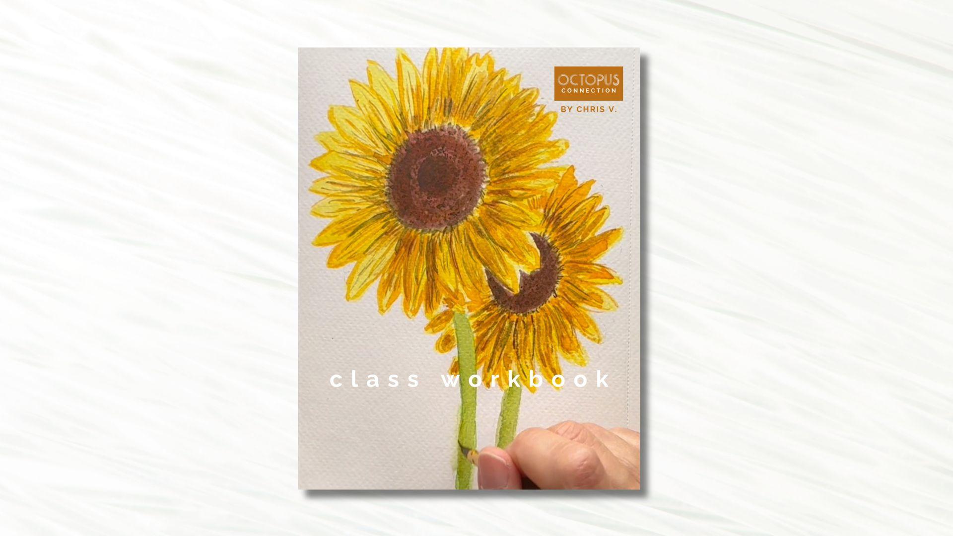
Transcripts
1. Intro: My favorite paintings
are usually done in a quick and loose style. I love spontaneity, and the loose style is
just so beautiful and captures and imperfect
but more natural beauty in that light. If you're not that experienced, it may seem like painting a detailed and elaborate
composition should be daunting. They find that nothing is
further from the truth. When you have an easy
step by step process. Hi, I'm Chris, a former retail
management professional, turned full-time
freelance artist and designer living
in the desert. I love Art and
Design and I've been teaching creative classes here
on Skillshare since 2016. I have courses on my
own website and I run a Watercolor membership
to take students deeper. My specialty is to
mystifying process into simple terms and helping students gain competence
in their own work, which I've done for a few
thousand Now, in this class, I aim to show you how easy a complicated
subject matter can be when you slow and break it
down to more simple terms. This time I'll be showing
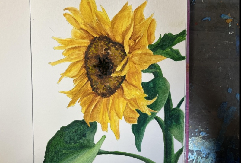
you how to paint sunflowers, their phone to paint
all year round. And even though it seems like a very simple subject
matter at first, there's a fair bit amount
of detail involved. I'll start by
walking you through a rough sketch and we'll begin painting layer by layer
as we add the right colors, shadow and light, special
effects, textures and details. Along the way, I'll show you a watercolor supplies I'm using, how I use them and
share loads of painting tips with you
throughout this entire class. Learning how to slow
down and go deep with a more elaborate watercolor
project like this one. Build your skills. Show you how to take
a step back and slow down and will give you so much confidence in tackling other more difficult
subject matters later on. This class is for
beginner to intermediate watercolor students
who are looking for a challenge that isn't
too overwhelming. I can't wait to
show you that you can take on projects that
might seem hard at first. Then show you how
to break them down into more manageable steps. Are you ready for
it? Let's do this.
2. Your Project: Your project in this class will be to paint sunflowers
along with me. While you're learning all
the tips and techniques, I'm sharing with you. One of my favorite things to see is what other
artists are creating. So I cannot wait to see your project if you'd like to share it with
me and the class. I never grew so quickly is when I started
sharing my work. And so I know you'll benefit
from completing this step. It can seem scary at first, but the more you share,
the easier it gets. I promised artists connect so deeply when Bonnie
over each other's Art. So this will also help you
build connections and gain confidence as well as learning new techniques
from others. I would love for you to upload your project
into the class. Here's how. First you go to the Projects and Resources
tab under the class videos. Then click the green
Create Project button. From there you'll want to upload your cover image
for your project. Choose a file. Then click Submit. From here. If you want to
replace your image, just click the button below. Find an image. And below you can make it larger or smaller
with the slider. Or you can drag it
side-to-side to position it. When you're happy,
just click Submit. Now your project needs a title. It can be funny, descriptive
or whatever you like. Hello is your personal
project field. Click Image to add image files. Then position your
cursor underneath the image to add descriptions. I'm adding a series of images to show my entire
process for this project. You can do it anyway,
you like the law. You can also add
a video or links. When you're done, just click
the green Publish button. Once it's published,
you can go below the videos and see your project
on the right-hand side. When you click on
it, you can see the, all your images are uploaded. On the right is where
people can comment. And like your project. I comment on every project. So I can't wait to see
you in this space.
3. Tools and Materials: I just wanted to talk
a minute about what I'm gonna be using
for this class. Again, very basic. If you've taken my
classes before, you'll know I like
to keep it super simple because I
can just dive right into the process
and really enjoy myself with the Art itself. So first of all, I'm gonna be using an HB
pencil for sketching. It keeps it light so I
don't have to worry about my lines getting really
dark and erasable. And then I've got a gum eraser. It's actually a polymer eraser, but it doesn't leave black
marks on my paper that can damage the paper and
ruin the way my Art looks. So gum erasers are
another option. Here's a just a paint
brush from my garage. I can kind of brush off
the eraser dust quickly, easily and not have
to worry about getting oils from my
hands on my paper. As for paper, I'm using 140 pound cold press,
watercolor paper. This paper is good quality. It's not super expensive. And it has a tear sheet. If I really wanted to take this out and frame it or hang it, I can do that. But it still has that sketch
book convenience where I can flip through and
see all my Art easily. But you can choose
whatever size you like. This project is gonna
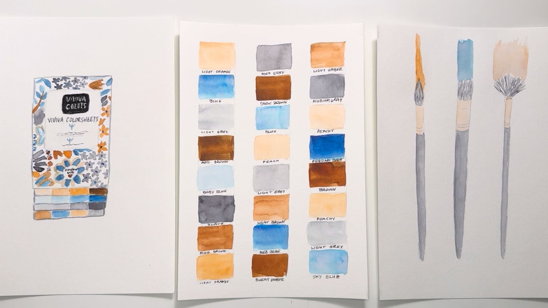
be your project. So go ahead and choose, choose what you'd like to use. For brushes. I've got a large round well, this is actually a
medium round brush. It's a size seven. And this one is a size three. If you don't have a
small round brush, you can definitely substitute
with a basic detail brush. But we're going to be
painting small items. So I know I'm going to
need something to get into some bit of detail. For paints, I'm using my
Viviva Colors, colorsheets, they're super convenient, but then the
convenience, I mean, aside from going out and
painting when I'm out and about, I love to use this
in my studio because the colors are so vibrant
and it's just easy to use. It's easy to hold on my hand. It has its own flip
out color palettes that I can clean and
use for next time or continue to use these colors. And it has 16 colors that last as long as
irregular half pan. I've been using this
for a year and I'm still not even close to
using all this paint up. But if when I do like this, this one's getting
close and then starting to separate
a little bit. I can buy a replacement for
any color I run out of. So it's just super
convenient and easy to use and I use it
for a lot of projects. I'll be using three
different Viviva Colors, colorsheets sets to have more color choices
for this painting. The original, the fall
and the spring sets. Viviva Colors, paints
are handmade and are actually 100%
bio-degradable and vegan, which is why I love
using them so much. I've included a link
to more info on these paints in the Project
section of this class, if you'd like to delve
in deeper to these. But you can use any
watercolor paints that you have to paint this project. I've got two jars
of water because I get really intense
with my color a lot. And if one Jar gets saturated,
I have a second one. Or if I one Jar starts getting
really dirty, I can rough, clean my brush in one and
then final clean it in another to make sure
it's really free of color before I
move on to the next. And then of course,
paper towels or Rags, if you prefer, I use a
combination of both. And so I'm trying to be a little kinder to the environment as much as possible, but sometimes they need to see my color on a white
piece of paper towel. And if I don't want
to paint it all up, I want to use it for
sopping up or whatnot. I have this little tiny
sketchpad is sketch paper. It's other Strathmore
sketch sheet. This one is
three-and-a-half by 5 ", has those pretty tiny, but I can just do some
tests painting on here to test my colors against
a white background. So I use this quite a lot. It's a nice handy tool. And that is all we're
going to be using. Plus, you can find a full list
of tools and materials in the Projects and
Resources section of the class under
the class videos, and also in your workbook on that same page in
the Downloads section. Alright, let's get
started with our project
4. The Sketch: Now I'm going to
show you how I do a quick sketch just to place everything just
right on my paper. I'm starting off with a loose Center and some
petal shapes around it. At the top-left of the page. I want my Sunflowers taking
up most of the page. So I kind of like board, this is placed even though it's really close to
the edge of the paper, you could definitely
make your flowers smaller on the paper
if you prefer though. I'm keeping my eraser
close by as I'm sketching because I'm changing a lot of things in the process. Now I'm starting with
the second flower, which is a bit smaller
because it's a bit further in distance and it's a bit
behind the first flower. I've decided that the
center was way too small for the proportion
in that photograph. So I'm going to erase this
and make my center larger, much happier with that. And this stem is way too chunky. So I'm just going to erase it
and make it a bit thinner. Now as I'm looking at
this and I'm realizing that the second flower
is way too high on the page and it's just
leaving a whole lot of empty white space on the paper at the bottom
that I don't like. So I'm going to erase it and
I'm going to reposition it. I'm drawing a general
circular shape just to get a feel for
where it's going to land to be sure I'm not going to get past the
edge of the paper. You can see I'm doing
quite a bit of erasing, which is totally fine. It's just a matter of getting this place on the paper
exactly where I want them. And that's looking
much, much nicer. As an artist, you
have the freedom to change your painting
anyway, you'd like. So it represents how you
want to express yourself. Now I'm really happy with
this and I am ready to paint. I'll see you in the next video. To start that
5. Painting Part 1: Now that the Sketch is all
finished and ready to go, it's time to paint. Let's do this. So now that I have my
sketch done and I feel like the composition is
working better. I'm gonna go ahead
and start painting. The first thing I want
to do is I want to do all the yellow petals around
first because I kinda, that's really what
I want to focus on. The middles are sort
of more neutral. I want to make sure
that I wanted to get the first layer of color down these petals because
we're going to be layering. And I'm just going to
use happy yellow from my Viviva Colors spring set, some on the palette and working from my my reference image,
I'm going to be yellowing. I'm going to be
layering these colors. So this is, if you look
at the reference image, you're going to see a
combination of yellows and yellow oranges and then deeper ogres as these petals
go into shadow. This is what you call
an underpainting, where I'm going to be
putting this light yellow down and then
layering on top, leaving some of that light
yellow showing as highlights. So an underpainting prepares for you to layer on top of it, but not the whole
thing you're gonna be, we're gonna be seeing some of this original color underneath. And on the side of the color will be
layering over and you'll see what I mean as we go. I just want to lighten
some of these pencil marks because they're starting
to show through. I'm not a super fast
budget about that, but I don't want it to look so messy with pencil that
that it bothers me. So I'm just going
to take and just lighten some of it
just like that. I'm not going to
worry about this round because it's gonna be a very dark color and
you want even see the pencil at that point. And I'm just going to keep
going with my happy yellow. I loved the name of dark
color. Happy yellow. I mean, what a great name
for such a happy color. I'm going to, now there'll
be petals in-between. So I'm going to start filling
that in right now because I want those to also have
this underpainting color. You can see if you look
at the reference image, you'll see the
sunflower has layers of petals and they're pretty full. I'm going to make sure I
pack them in really nicely. Not going to worry about my
hands too much, just yet. Being meaning the ends of my
petals all the way around. And I'm just going to
speed this up for you. So you can watch as I go. You noticing I am
using the tip of my brush now to actually form the ends of the petals which have a
little slight point to them. They kind of taper
and just going back over and making sure I
have that on this side too. It's a little hard
for me to move my hand in that direction. And I don't want to turn
the painting right now. I don't often turn my
paintings because I feel like I can't I don't know. I just feel like I can't see the big picture
of it as ongoing, so I don't do it often. Now some of these I
don't want to paint these all exactly spaced. So some of these are, have a space here. Some of these are real
bunched up together. And that makes the
flower field so much more natural
because in nature, the beauty of nature, which we don't really, I don't think notice enough
is the imperfection. It's fascinating how
imperfect things in nature are and yet how
drawn we are to them. And then when we go to our Art, we tried to make it perfect. It's, it's kind of counter-intuitive and
I don't think a lot of us realize that as
we're going forward. So that's something I really
want to point out right now, is let it be a little
imperfect and enjoy that. Because you're mirroring
nature when you're doing that. And again, I want to lighten
some of these pencil marks. I'm just gonna go ahead and try not to paint over this green because the yellow will make such a difference in the
color of this green. If, when I paint over it, it's kinda look
different right there, that flower and I
don't want it to. That's a great start. I'm just going to
let that dry now
6. Painting Part 2: Now because I'm out
here in the desert, my paint is drying really fast. It's already dry over here
and I'm gonna go ahead and find a darker color
and start layering. So this happy yellow
is my highlight color. I want a Colors dot
is a lot less, right? I'm going to have to change to my original Viviva
color paints sets. So this one has a nice
yellow ocher right here. That yellow ocher is basically
yellow with brown in it. And so this is gonna be a nice color to help
me with that yellow, orange color as well. So I'm going to start
with it right in the center because you'll notice most of the time unless it's in by this light source here, the center is shaded more
and I'm going to use my, I'm gonna go to my detail. Round brushes is a number. Three. I know sizes
aren't standardized, but just for reference, it's about a half an inch, maybe a third of
an inch bristle. Let me just first
see the difference of this chrome yellow. Yeah, I don't think
it's too much. Oh, it is darker. This chrome yellow
is slightly darker. Maybe I will start
with that just to not get too crazy
with a dark just yet. I want to go slowly on
this and build it up. I'm just going to draw lines, just thin lines going up so that you can see that happy
yellow in the back. This is the darker, this is the shaded
side of the flower. So I'm going to be
layering quite a bit. Just leaving a
little bit of the, oops, that's the wrong color. Just a little bit of the
happy yellow showing. And then we can darken this. The very darkest ones
with the yellow ocher. I'm just keeping my eye
on my reference image. And since these petals are starting to show up quite
a bit of light and leaving a little more and more happy
yellow showing through. I don't want this
paint to water it because otherwise it
will just turn out to be blobs like this instead of nice clean lines like
you see in these petals. Now I'm going to
have very few lines. As these petals here
are in full light. This one is shaded underneath, so I'm gonna give
it more shadow. I'm not loving this
floppiness over here, so I'm gonna just thin it
out and let it dry and just either leave it or add some more light lines
like these have. This is also way too much blob. Just got to use to doing
those kinds of strokes. And I did not lighten them
enough going into these petals and in full light,
You just smile. Dab that the tiniest bit. That's good. And at the same time
we're going to add a little more shadow over here. I'm gonna go ahead and
start on these petals while that's drying. Now, there's gonna be quite
a bit more shadow over here since this flower
is behind this one. And then the reference image, It's a lot more smushed against. But since I've
moved the position, I don't think that
works as well. So I'm gonna go ahead and treat it the same as these petals. My brush gets dry so
quickly that I have to add water and then
re-add my paint. Otherwise, my brushes stops
in its tracks, so dry. I'm just darkening it around the center because there's
quite a bit of a dark area, especially on this flower. Kind of my artistic
decision not to get too crazy with the detail and go
for some more simplicity. We're going to have quite a
bit of detail enough already. Adding my lines back on
some of these petals that I thought were to dark initially
7. Painting Part 3: Now I'm going to let
this dry already. I'm gonna go ahead and come
back in with my yellow ocher, staying away from
the more wet areas. This is all dry. Now, let's start over here. There's not too much
to do on this side, just some fairly their lines. I want to make sure this
is good in dark so that it doesn't move my
brush out at my way. Good and dark so
that it doesn't, it makes the right effect. I don't have to go back in
and repainted bunch of stuff. A lot of paint on my brush. And just add a line here, a line there for
emphasis, for shadow. This is gonna be
my darkest color. So I want it to make its impact on these wrinkles
in this, in these petals. So you can see how with the lightest color we
painted all the way through. Then the second darker color, we kinda went in almost halfway. And now we're going to maybe
go in and be like a quarter if that just acts
and everything. This is what brings the three-dimensional
nest to your paintings, is this layering of color
and how you add it. I've used this yellow
ocher so much. I'm going to have to get
a replacement because I'm running out of color
here and I need to, I want this to be really,
really saturated. I want this dark color to
really define these petals. Also because right now this yellow and orange is sort
of blending altogether. Brushes just getting so dry, it's not picking
up the paint well. Plus, I've used
this color an awful lot and it's dwindling. I need to get a replacement
color sheet for this, which you can do, by the way, super convenient and
easy to change them. That's looking a lot better. I still want to add
some really dark areas like I have here. You're in there just to give
it just for emphasis and really show off the
shadow and light. Go ahead and just add a layer of very light
brown over some of these. Or yellow ocher
rather over some of these petals on this side
against the light source. So almost all the happy yellow will be disappearing over here. And that will really emphasize where the light source
is coming from. Again, this isn't have to
be perfectly accurate. We're just playing with
color and shadow and light and seeing what
we can do with it. I'm just going to let
this dry and I'm going to start the other flower. Here's just a lot more
shadow down here. So I'm going to dark and these petals quite a bit
because they're kinda behind and they're not getting
as much light as this one.
8. Shadows: I'm gonna go back
through and add more of this chrome yellow to some of these petals are
just aren't getting, they're not catching the
light like the other ones. You just need to be
a whole lot darker. That is looking
pretty darn good. I've chosen two. Now that this is dry, I'm going to make a gutsy
move to add some black. And this is literally
a charcoal gray. And just certain spots with
the tip of this detail brush. Just to add a little
emphasis between petals and just here in there without getting my
elbow in this other flower. Don't want to do that.
Just here and there. Just to add a little bit of extra reinforcement to separate these petals and just bring a little definition
into the picture. If this was an image on your
phone that you are editing, it would be like hitting
the clarity, setting. Springing into focus
a little bit more. Especially on this side, where there's a lot more shadow. Very lightly going
out to the edges. Just to show those
deep wrinkles. Then as possible I'm keeping
just the very tip of this brush dragging here and they're just here and
there is all you need. And I'm not going to
get too crazy with the, I'm gonna just leave those alone and go on to this second flower. I can do a lot more because I have a lot more
shadow here already. So I'm going to have to deepen my lines a little bit
so they even show That's looking really nice. Now that this one is dry, I'm gonna go ahead
and do the Center
9. The Center: Now with this one, I want to use this, maybe this tree bark brown. Be perfect because it's
got some red in it, but I don't mind it. Now, this dark is going up into the full hour with these little lines that kinda
go up against the yellow. So I'm gonna go ahead
and fill this in. And as you can see from
this reference image, It's not a solid black, It's got a little
brown in there. I think this will be a
nice color to have as the underpainting
once again that word. And then go on top of
this with a darker brown. Again, going just a
little bit up into these petals are not
perfectly shaped. I just doesn't look natural. Pretty good. Start there and then go into
my second flower, which I have to
be really careful since I have these petals, I don't wanna, I don't want to disturb
these beautiful petals that are supposed to
look like they're in front of this smaller flower. So very carefully going
in-between the petals here. You can see this color is very
fresh on this color sheet. I have really rarely used it and you can see how
saturated it is. Again, the lines
going to the petals, just with the tip of the brush. I've noticed that there's
no yellow right here, which is a mistake. So I'm gonna go ahead and go back to my chrome
yellow and just put a dash of yellow here
are gold, if you will. Okay, next I need to
find a darker brown. And I think I'm
going to go ahead and try this burnt umber. And then start around here, dot and all the way to the edge. But low. Mood my brush up again. My hand, like it came
from the flower, but it's not even in this room. That's so funny. I don't think this is
as dark as I want, but it got us another step. See how I use all of these two combine so many
different colors. This tree bark brown, I
think it's the same as what? Well, no, it's not as red. Actually, this is pretty nice. Kind of liked that one. I'm
gonna go ahead and use this. It's pretty dry and I'm
just gonna go ahead and make these little tiny dots. Even though the center of
this photo is so dark, you can't see the dots. I'm going to add these
anyway because I think it's just going
to make this flower looks so much prettier to
have that detail throughout, because that's what it would
look like in real life. Sometimes you have to use your imagination when you
want things to look a little differently and you're
not always going to have that knowledge or that
specific specificity. But I was just looking
at this flower. And I really like, I just love this
texture of the center. We don't think about the sunflower texture generally in the center unless you know, Sunflowers better than I
do. I don't really think. I just think of it as a very
dark brown or black center. I don't think about all these
little tiny textured dots that exists there and it
makes it so beautiful. And I really wanted to capture
that with this Painting. Just make these dots come a
lot closer in the center and then spread out just a little
more on the lighter tones. You can see that
texture clearly. That's fine. I'm cool.
I'll stop there. I mean, I can go on forever, but I think at some point you gotta
make that decision that enough is enough. It doesn't have to be a photographic exact
representation. In fact, I prefer it when
it's not to exact because I love the looseness of what the paint does
to a subject matter. And with this darker color, I'm just going to
bring it out into the petal just a little bit more
10. The Stems: Now I'm ready to do the stems. I'm gonna go back to my spring set where I started
and I'm going to you, I really liked this
foliage green. Now the stem of the sunflower is a yellow green
with a little olive. Maybe. I'm going to start
off with this color, same kind of an olive
green but a light. And this is not all of it all. Maybe I'm going to use
the olive green instead. I'm just going to
take this on through. As an entrepreneur Painting. Do the same here. So
they look the same. That's not a bad
green and of itself, but the stocks of a
sunflower are all lovey. I think it goes better
with the colors in nature knows best. Yeah, that's good. Okay. So that's really dark. I don't want to
saturate it that much. While it's wet. It's
going to nicely absorbed this color and they'll
just blend together, which will soften this olive. There's quite a bit of
brown in this olive, so that will make it just
a little more toned down. I got this one just a little
thicker than I wanted to. So I'm just going to dab that. Fantastic. I am happy with that. That was a FUN project. I hope you enjoyed it too. Can't wait to see
your sunflowers.
11. The Recap: We have done a lot of work. Let's recap the process
and sum it all up. First, get the simple tools and materials together to
create your project. Start with a light
sketch to place your flowers on your watercolor paper where you would like them. Or sketch along with me. Add your first layer of paint with the lightest
shade of yellow. Next, paint the darker parts of the flower with a slightly
darker shade of yellow, leaving parts of
the light yellow showing for highlights. Paint. Another layer of thinner
lines with a brownish, yellow or yellow ocher. Now use a dark brown
or black to make some very thin lines
that separate the petals and add the deepest shadows
and the flowers keep this layer pretty
thin so you don't overpower the
yellows and browns. Paint the center with a
layer of medium brown, adding a darker brown to the
very middle and outside. Using the tip of your brush, dab some even darker brown
dots to create some texture. And finally, paint
the stems with your favorite green or with
olive green as I have done. Make sure at every
stage you let each of these layers dry before
going to the next step. If you need a refresher
on the steps, you can find them on the Projects and Resources
page description and in the class Workbook, along with a Tools
and Materials list. You can download the
workbook on the Projects and Resources tab under
the class videos, just scroll down under the project description and you'll see the Downloads Area. As always, please
reach out to me with any questions you might have about the class in
the Discussions tab. And I'll be happy to help
12. Summing It Up: I am so happy that you joined me in this class and
learn how to slow down and take on a
more detailed project while reducing the overwhelmed. I also really enjoyed sharing with you how
I can get lost in a painting so that it becomes a state of meditation
and relaxation. And I really hope that you were able to slow down and
relax a little bit to painting can be so important for physical
and mental health. So practicing the Art of watercolors can enrich
your life in many ways. Now it's time for you to get out your Art Supplies and do a
sketch and start painting your very own sunflowers using the tips and techniques I've shared with you in each lesson. The skills you learn in
this class will not be unique to just painting
some flowers though. These lessons were
designed to help you overcome intimidation of more
detailed subject matters. And your new knowledge
and experience will help you break down your
own projects in the future. If you need any help or
have questions or comments, you can reach out to me in the Discussions page
under the class videos. Who knows? Maybe another student has that exact same question or thought and you'll just
be helping them out. I also really encourage
you to share your project. Nothing has helped
me grow my skills more than sharing my
work with others. Getting feedback can be intimidating and
sometimes even scary. Once you do it a few times, it gets much easier and you'll have valuable info to
improve your work with. There's a very big chats
based on student projects. I've seen over the years that your work is way better
than you think it is. So please give it a try
and upload your project into the Project Gallery as I've shown you in lesson
two of this class. Once you start gaining some more clarity about how
to improve your skills, but also feel so
much more motivated about painting if you
enjoyed this class, I would so appreciate
your review. You could do that by
clicking on the reviews tab under the class videos and
following the prompts. Reviews helped me
improve my lessons, which translates to better class is for you in the future. Because I loved to
improve so I can provide you with even better
content than I did before. Well, that's it for today. Thanks again for
being here and I cannot wait to see
what you create. Bye for now
 Chris V, Artist, Designer, Maker