Transcripts
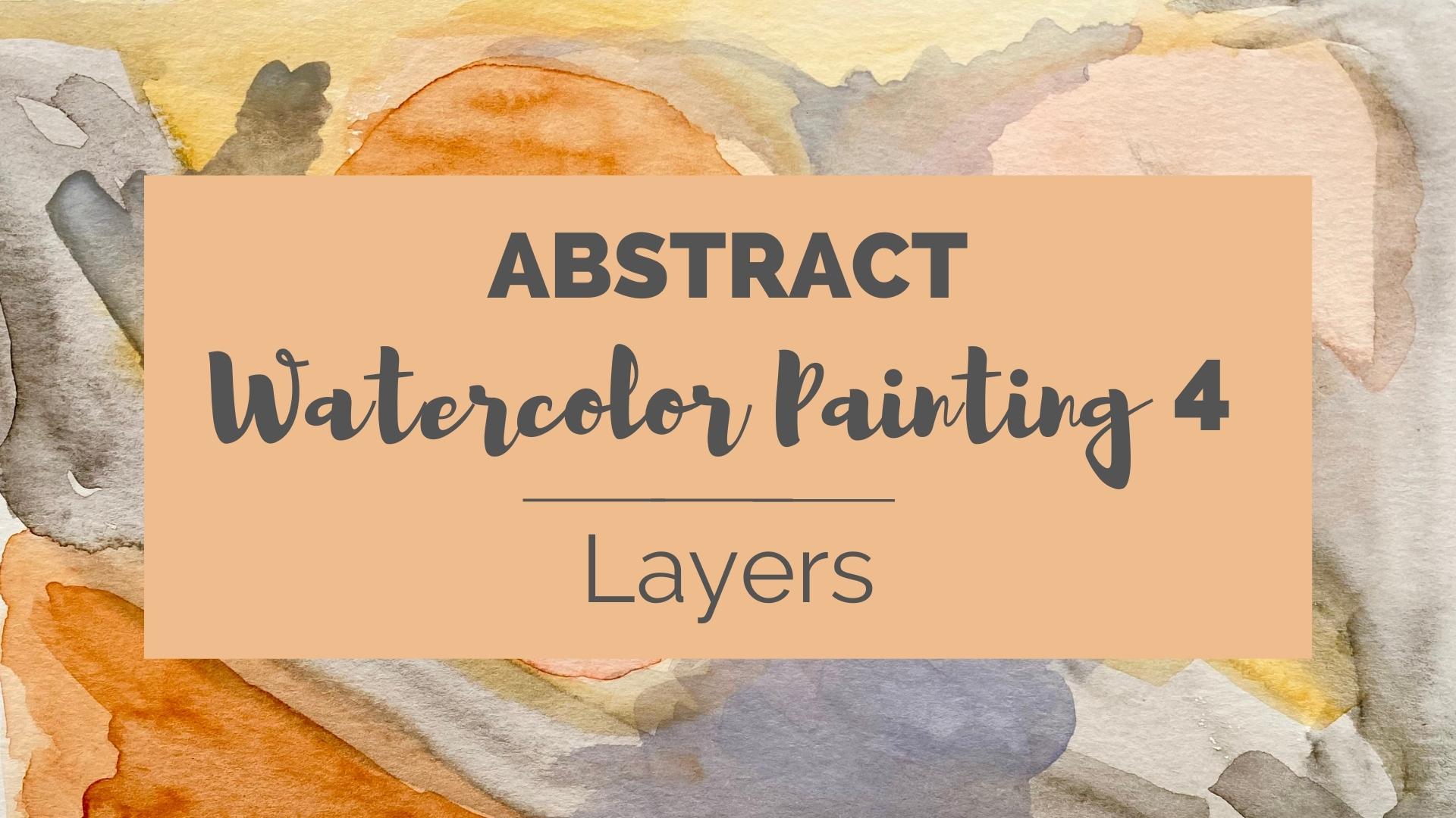
1. Intro to Abstract Watercolor Painting 4- Layers: Welcome into the studio once again for a whole new adventure in abstract watercolor painting. This time, we'll be focusing on layers. I'm super excited about this process and I can't wait to share with you, not only how fun it is, but how easy it is to accomplish this simple effect. I'll be sharing with you the very simple tools that I'll be using in this class, how I get inspired, how I set up my workspace for easy access to everything, and then how I dive into conquer that blank page syndrome. I'll be showing you this process in three easy layers. Plus, I'll be sharing some bonus tips with you along the way. This class is for beginners to intermediate artists looking to grow their skills. And this project can be used for greeting cards, art prints, social posts. The sky is the limit. So join me for Abstract Watercolor Painting- Layers. Remember, you got this! I'll see you in the next video.
2. My Project: Learning by doing is so effective. That's why I encourage you to create a project, whether you share it or not. In this class, your project will be simple. Follow along with me on each video while I show you how I gather basic materials, how I get inspired with colors and images and set up my workspace. Then we'll dive in. You're not required to share your project, but I hope that you do. I grew so much more in my skill level when I started sharing and getting feedback from my fellow artists. You might even be better than you think you are. It's a bit scary at first, but when you get comfortable with it, it's much easier to call yourself an artist. You can upload your work by going to the projects and resources tab under the class videos and clicking the green Create Project button. You can make your project public or private by clicking the box at the top. From there you can upload a cover image by clicking the Upload Image button. Then select an image from your browser. Below that is a slider that can make your image larger or smaller. Just slide it back and forth until you're happy with the way your image looks, and click Submit. Then you need a title for your project. It can be something descriptive or clever. Below, in the larger field, you can start writing about your project. You can write about your experiences, your process, how you enjoyed the class, et cetera. At the very bottom you'll see buttons to add additional images. You can add as many as you like. A video button to add a link to a video, for example, on YouTube or Vimeo. Just paste your link into the field just above the button. The other button will allow you to post a link to another webpage like your social media accounts, for example. When you're all finished, don't forget to click the green Publish button, which will complete your upload. And that's it. Congrats. Now you've shared your work with the class and can begin to get feedback. I've made lots of Skillshare friends and connections this way. So there are lots of benefits to sharing. Sharing your work can help you grow more quickly. Seeing things through other people's eyes gives you a whole new perspective. I honestly cannot wait to see what you share. And I love to pop in and see what you've posted and comment. Next, I'll talk to you about the very simple set of tools that I use for this project. You'll be amazed how easy it is. I'll see you there.
3. Tools and Materials: So I want to go over with you the basic tools and materials we'll be using. And as you know, for my other classes, I do like to keep it basic, so it's accessible to everyone. I have a watercolor paint set. Mine is a Winsor and Newton Cotman set, which is a student grade. But the quality is really nice. It comes with two pallets. So if you don't have a pallet, you'll need to get that. And I have some resources for you for supplies in the project area. And then of course, the cup for water, whether it's recycled or reusable. And then I like to use a number five or number 6 brush, which is a medium size. And it works for just about everything. But I do have small detail brushes and larger ones as well. I just mostly use these and this is what I'll be using in this class throughout. So there's that. And then as far as paper, I love this Canson, a 140 pound watercolor sketchbook. It keeps everything in one place. And a 140 pounds is really nice and thick, so it absorbs lots of water. But any watercolor paper you have will be suitable. There are some that are under a 130 pounds and little thinner and that's perfectly fine too. Aside from that, the very most important thing that you'll need to collect before starting to paint are paper towels. You know, not only sopping up spills if they happen, but if I happen to oversaturate my paint area, I can just take a paper towel very quickly and just dab that saturated area to lighten it right in the middle of a project. So I really count on paper towels. I keep extras right beside me just in case. Please keep in mind that you don't have to have these supplies. Basic watercolor set paint, and paper is perfect. So get your supplies together and I will see you in the next video to get inspired.
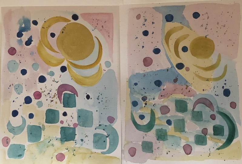
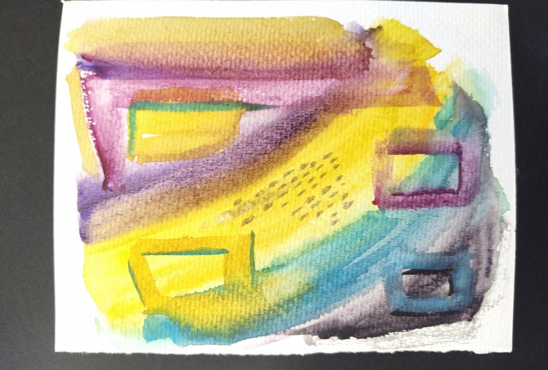
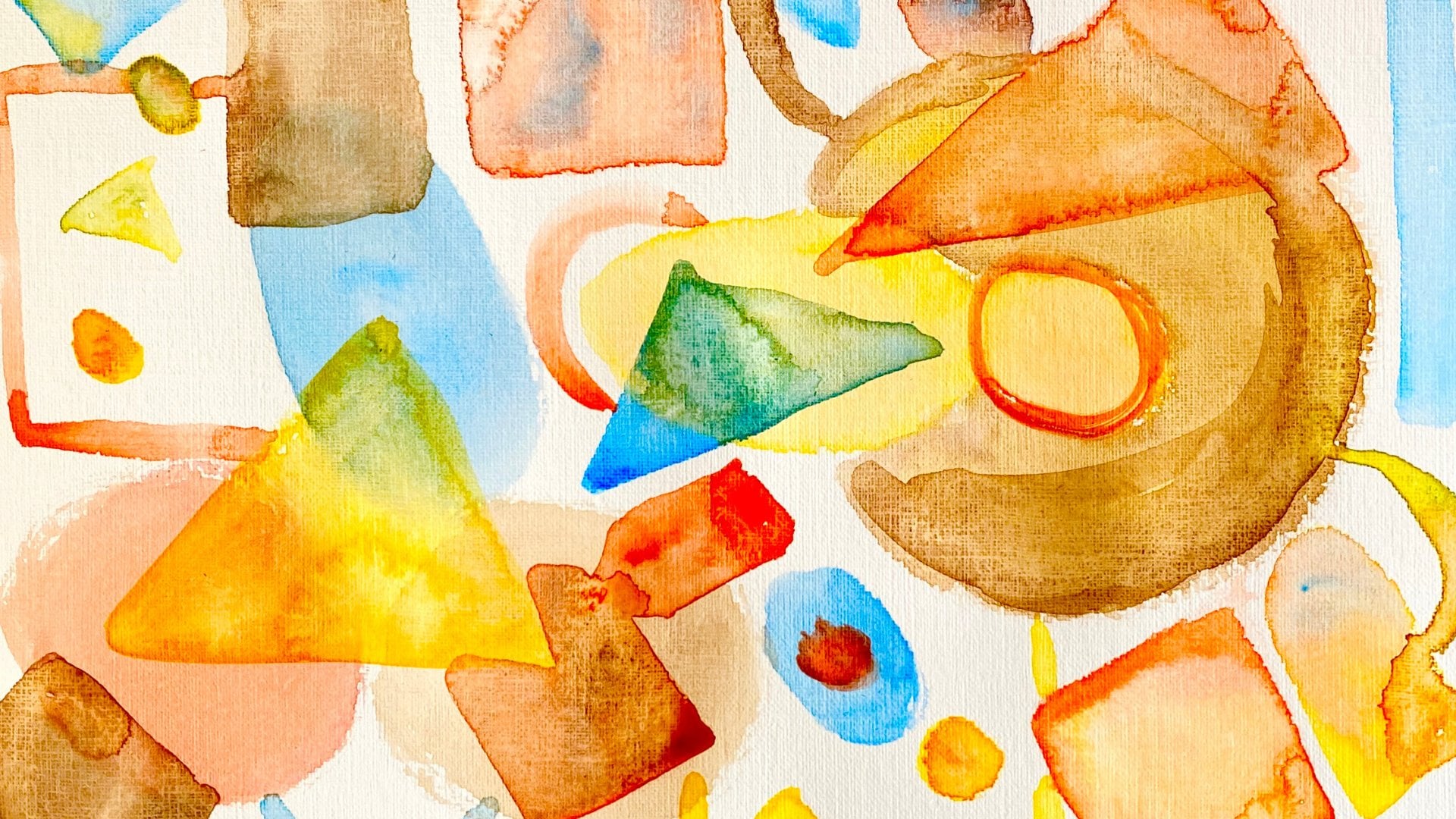
4. Inspiration: So I really want to talk to you about how to get inspired for this project. I automatically turn to Pinterest. It's chock full of images, and I have created a board called Art and a folder called Abstract Art. I'll be sharing a link with you on the Projects & Resources page. It's really full of great pieces that you can look at to get inspired for this project. I want you to stay with the more simple pieces and ones that focus on layered colors. You'll see there's just quite a lot of stuff to look at. I'd like you to scroll through here and notice different pieces that are layered. This is a little bit more shapes oriented. We're going to keep going. This one, This one's interesting. You can see how they've painted layer over layer and they've created very interesting strokes and just used a few colors. This one is interesting too, but that's a little too plain. This one's perfect for my abstract watercolor painting backgrounds class. So we're going to move on. I want something with a little bit more going on. This time. Let's see what we've got here. I've got quite a few so you can keep scrolling for a while. Even before you find something you like. This one is interesting. This one is a perfect watercolor example, and it's even monochromatic, but you can see all the detail and texture they've blended into this project. And really this is made by letting each layer dry before you go to the next one. The other thing I'd like you to pay attention to is the color palette. I'm choosing about a five to six color palette for this project. And what that's going to do is give your piece a little bit more focal point by not getting too crazy with the colors. So you can see this one's about a five color palette. A good color palette generally mix, mixes a couple of warm colors, a couple of cool colors, and a couple where one or two neutrals. That's a rule of thumb, but you can always break the rules a little bit too. This one has a lot of colors in it, but you can easily pull your favorite five or six colors from something like that. So I can't wait to see what color palette and what inspiration pieces you end up with. You're welcome to post them in the project gallery as part of your process. A bonus tip I have for you while you're doing this exploration is to pay attention to what you like about each of these pieces and also each of these colors. Learn, it will teach you something about yourself and your signature style. I'm going with this piece that I painted awhile back and this color palette. I can't wait to see what you chose and I'll see you in the next video to get started.
5. Bonus Video 1- Setting Up Your Workspace: I just wanted to show you quickly how I set up my workspace. It's super simple. I keep my brushes off to the side so I can grab a different brush easily. I keep extra paper towels, handy, and I keep one in my hand for quick messes. On the right I have my water cup up above so I can switch easily and my paints on the right since I'm right-handed. But if you're left-handed, you can move them to the other side. Of course, my paper is in the center. And I keep paper towels or rags underneath so I'm not freaked out about ruining my table surface. I'd love to see how you set up your workspace if it's different and how it works for you. And I'd love to see that in the comments or in the Facebook group. See you in the next video.
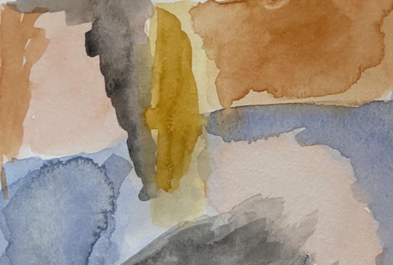
6. Layer 1: So as I mentioned, I am using this painting here for my inspiration. It has lots of nice layering and I'm using my six color palette in that one. That's one that I did recently. So I'm diving and you see I'm wetting my brush. I'm going to load some paint onto my brush. And this is a burnt sienna, so it's an orangey red. Make sure there is plenty of paint on there, but not too dark. I want it kind of watery honestly. And I'm going to make a mark on my paper. I'm making it light. So if I don't like it, I can kind of fix it. But there's no real, big commitment here. You're going to enlarge that a little bit. And I'm going to be making my strokes really random and very rough. Honestly, I love rough brushstrokes because they create so much character in the painting. Next I'm going to load an orange and I'm going to make it very watery, so it comes out a peach color. Instead of a triangle and making a circle. These shapes will probably end up changing as I go or I'm layering on top of them, but I'm just throwing stuff onto the page. This helps me get started every time I just put something on the page and then I get an idea for the next thing and then the next thing. So fear of blank page is really just a step-by-step process to conquer. And to add more color onto this. And I'm going to add a lot of color on these shapes yet our layers, yet this is actually our first layer. But I want to see the difference in these colors. Next, I am working with some gray, so I'm watering down my black quite a bit because I don't want this very dark really. I'm laying out my painting and I'm working in kind of a square C, you'll see as I'm creating my paint strokes and my, my random shapes on here, I am filling in a square shape. And you'll notice that I'm trying to keep similar colors at the top, and the bottom. Maybe not in the same exact symmetrical places or the same shapes. But this will create balance in the painting. When not all the strong colors are here at the top, or all the light colors at the bottom, et cetera, It needs to have a flow so the eye keeps moving around. And if you have even elements throughout the painting, that will keep the eye moving around and make it more interesting to look at. On that note, I'm going to add a little bit more of this burnt sienna here in the center, so it's not all at the top left. Eventually, I'm going to probably end up putting some at the bottom too. Just to even out that tone. I'm literally just the throwing random strokes on here in these crazy unthought out shapes. I'm just relaxing and having a good time right now. There's no pressure to have this look any certain way. And that's one of my favorite things about abstract painting. I hope it becomes yours too. You can just really relax and enjoy the process. And maybe I'll leave it at that for now. And I'll see you in the next video to start layer two.
7. Layer 2: So let's start the second layer of our painting. This is putting down the basic format for our painting. Now I see what's left is pretty minimal. And I wanted to start adding a little bit more color to some of these strokes. Adding some more definition. I'm going to share another tip with you. And it's adding lights and darks and tones in between as well. It just creates a really good contrast and can make the difference between a mediocre painting and a good painting. So it's an important one. This is a nice medium tone. So I want to add a little bit more color. We'll be adding more later on too, once this dries. I'm going to add a little bit more black to my palette so I can intensify that. Here's some yellow ocher, and so it's a new color I'm introducing that we haven't used yet. We've only used three of my six colors. And in keeping with that rectangle shape around the outside of the painting, you can see I've added that yellow ocher in a line on the side. I'm incorporating it into the orange and the black on that little circle in the center. So I've added some yellow ocher at the top. Now I'm adding some towards the bottom. I haven't kept it even. I've kept some of my strokes darker than others to add that character, creating more of that rectangle shape over here. Now there our painting is all filled in. I will see you in layer 3 video. Next step.
8. Layer 3: So now that the, the rectangle of my paintings all laid out, it's time to add some interesting strokes. So I'm going to get really adventurous with this block now and get it really dark. In places, not everywhere. Who? I like that. I didn't plan on doing this crazy brushstroke, but it is a great contrast on that very light peach. And that's my next bonus tip for you. Add really interesting elements to your painting to keep the eyes on it longer. It makes it more engaging in social networking. Or even if you're selling your paintings, it makes them more beautiful and interesting. People will want to throw them on the wall. So that circle and a centres a bit light and I want to add some, it's kind of like this regular shape and the rest are kind of rough. So I want to add a little bit more, something rough around it. Possibly in the center. We'll see I'm going to, this is my sixth color in the palette. This kind of gray blue. And right around that circle, I'm going to add a crazy stroke just to break that regular shape up. I don't want anything too obvious in this one. I'm actually looking at that gray blue edges put down and noticing it's blending in with the gray. So I'm going to regroup on where to put that next or how to go about that. I may have to intensify that color. In the meantime, I'm starting to add some darker strokes to my Sienna areas. Lots of lights and darks in those strokes. Really catch the eye. And moving up to the top, making sure there's plenty of character up here as well. So it doesn't I just doesn't hit the center of the page. So I'll be roving around the page, moving from one section to the other, making sure one's not stronger than the other. Making sure they all have some unique strokes within them. That's what layer three is all about. And literally popped a little bit of regular brown onto that burnt sienna just to give it a little bit more character. You can really get experimental with this. Or you can stay within your pure colors. It's totally up to you. You, I loved to play in feed if you've taken my classes before, you know, I love to break the rules. It's called artistic license. It's okay to do it. Next, I am going to add a bit more detail, I think to this light peach, it's just a bit late for me. Just even a little hint of color will help a lot. Just enough that it's not close to the burnt sienna color, but enough that it's going to be a little more vibrant. That helps immediately. Without disturbing that beautiful black stroke. And you can see I'm overlapping my colors a lot too. That's totally fine to do. Actually creates more definition between them. Just putting a little bit more color on this center area. And a luxury intensifying the burnt sienna has brought out all the other colors and make them pop even more. So next, we'll be going to standing back and taking a look at our painting. I'll see you there.
9. Step Back: So now it's time to take a big step back and really look at this painting. I know we've been taking tiny steps and assessing and adding in so forth. But now it's time to really take a look at the composition, see what it might be missing. I've decided I can't live without that gray blue color that I was talking about. So I'm going to add more intense color to it. And I've really added more weight and more blue to it to make it pop against the gray. It's gotta hold its own. So there has to be more blue in this color. So it stands out more. It's going to be the only cool color in this whole painting. So it's really a piece of the puzzle. This is where layering is really fun because now it's the final touch. It's really that final detail. It's going to polish the whole thing off. Now, I really want to add some more of this gray blue on this other side of the painting. So it's not just in that one spot. So I'm going to add a ton more white. Pull some of that blue into here. Looks like I need more blue. just dabbing my brush into that paint, letting it absorb into the bristles. Getting more blue and white in here. That's better. We want this to really show. Because I'm not mixing a huge batch, the color is going to be slightly different at every part of it, but I don't mind that. Actually because the color is similar. it's going to seem like the same, but it's going to be interesting or unique or different enough that it'll pull the eye and say, what's going on over here? The eye will notice, even if someone's not an art connoisseur, (ooh I like that stroke), I didn't know I was going to do that. Even if a person isn't an art connoisseur, they still notice intrinsic color differences and texture differences. It's just human nature. So from here, just letting that dry just a little bit. And I think I'd like a little bit more blue and white on this top area. It looks a little too gray. That's better. Much better. Now, last stroke, really put it over for me, really added a lot to the top of the painting. I think I'll put a little bit here. And that will literally pull this blue gray color in a circular motion on the paper. You can kind of see that it's like a triangle shape where each of them are located. So that color ended up being my focal color. Again, it's the only cool color. So it's not so strong that it takes over, but it's different enough that it just adds a little something to the painting. I love it. It leads me into my next bonus tip. Creating a balanced composition means that the eye will move evenly around the painting. You can see we've got terracottas and oranges throughout. The yellow ocher is at the top, bottom, and middle. The gray and the black are kind of a nice background. And this blue gray is differentiating itself from the gray. And kind of taking your eye in a triangle. This stroke at bottom really helps create movement. And that circle in the middle pulls the eye into the circle once it's traveled all the way around. That concludes this painting, and I'll see you in the next video to continue.
10. Overview- Project #2: Let's take a moment to overview the process from start to finish. You'll be gathering your tools and materials and getting them all ready to go. Then you're going to get inspired with colors and images. Bonus tip one, don't forget to take a moment to stop and notice one thing you like about each image that inspires you. Then we're going to set up our workspace and dive into layer one. We'll lay out the first few colors and start to see what the shape of our painting is going to be. Be sure to keep your colors light and watered down so they don't take over the painting. Then we dive into layer two to continue adding the rest of your color palette into the painting, keeping your colors light at this stage. Bonus tip to make sure to add lots of lights and darks in your painting for good contrast. So we'll start to add some darker and more textured strokes. In this layer. Layer three, add even more intensified color throughout the painting, keeping it even from one color to the other, which leads into bonus tip 3. Creating a balanced composition means the eye will move around the painting evenly. Now it's time to step back and take a look at our work, see if there's anything you want to add or dilute. I want to add more black brush strokes to make this thing pop. Bonus tip number 4. Add unique elements to your work to make it more engaging. We're finished. I can't wait to see what you've created. Bonus tip 5. Make more than one of these in the same color palette to start building a collection. You can add to your portfolio, or hanging them in your space. I hope you enjoyed the process and I'll see you in the next video.
11. Next Steps: Thanks for joining me in the studio again today. I hope you got inspired. I so enjoyed sharing this time with you and sharing my process with you for abstract watercolor painting using layers. I cannot wait to see what you've created. Remember that your painting will not look exactly like mine and it shouldn't. My hope is that you relax and enjoy the process, not worrying about how your painting will look. You just might surprise yourself. You're not required to share your project in the project gallery, but I really hope you do. I grew exponentially after I started sharing my work and getting feedback. You can learn how to share your projects step-by-step in the my project video under the introduction. Also, I'd be honored if you would leave me a review so I can continue improving my classes. And if you would hit the Follow button, you'll get updates when I launch my next one. Until then, I have 20 other art classes here on Skillshare, including three more abstract classes I created just for you. Well, thanks again, and I'll see you next time.
12. Bonus Video 2- Project #3: Music Music
 Chris V, Artist, Designer, Maker