Transcripts
1. Intro: Hello, beautiful people. This is Bianca, an aspiring watercolorist from the Philippines. In this course, we will paint a stylized portrait using watercolors and learn how to mix skin tones with only 3 colors. Classes are presented in real time so you won't feel lost. I will guide you step-by-step from doing a color swatch, sketching the portrait, painting the first layer, adding shadows, and finishing it with details. I look forward to painting with you and I'm so excited to see your own version of this painting. So grab your materials and start this colorful project.
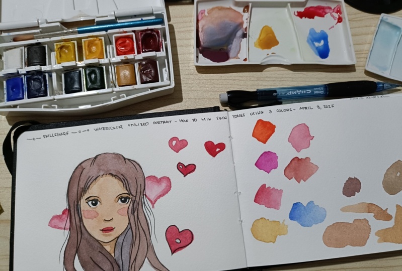
2. Materials: For this class, you will need a watercolor paper. I am using Baohong, 300 GSM and 100% cotton. I also have a smaller one to test my colors. A mini palette. Of course, your water jar, where you will rinse your brushes, pencils. I am gonna use a 7B pencil for my final sketch. You will also need the brushes, one big brush. I'm using Mont Marte mop brush size 10, and a smaller one for details. I have here a generic Chinese brush for that. And we will be needing three colours. One blue, I'm using Cobalt Blue by Holbein, Scarlet Lake for my red and yellow ochre for my yellow. But whatever colors you have, please pick your primary colors. I'm going to use this dried up paint on my palette later.
3. Colors: Before we start the painting, I recommend that you also do this with me, a color swatch to get to know the colors that we will be using. So here again, I will be using Scarlet Lake for my red, Yellow Ochre for my yellow, and Cobalt Blue. For my blue. You don't need to have the exact colors as I have. But it would be really helpful to do your swatches first and test out how the combinations of the colours you picked look like, now for the first layer, I'm just going to mix my Scarlet Lake and Yellow Ochre. You will need to pick up more pigment if you think those are pale. And just grab a tiny bit from the Cobalt Blue to desaturate the color. And this is the color that we are after for the first layer, the basic skin tone layer. Now for the shadows, same, Scarlett Lake, less Yellow Ochre, but this time a bit more Cobalt Blue to produce this brown color, a dark brown color. And once again, test it out on your scratch paper to familiarize yourself with how this combination will turn out as I am doing here. So now we have the first layer and the darker color for the shadows. Now for the hair, it will be actually the same combination as the shadow, but more of the Scarlet Lake and more of the Cobalt Blue. So more of your red and more of your blue and pick up more pigment than you did before and you should get a really dark neutral color like this one. So I hope you have tested onto your colors and you've tested the combinations. And I'll see you in the next video where we will sketch our portrait.
4. Sketch: Now let's do our sketch for our portrait. And I am following the basic Loomis method in drawing portraits. And keep in mind that we are not painting a realistic portrait, but rather a stylized one. So don't feel stressed out about this stage and just try to follow along and get the proportions right. Okay? So I will start with a circle and then I will draw a cross to find the center of the face. Now take the half of that circle and extend it downwards, and that's where the chin is. And this is smaller circle is where I will place the nose. Usually, I start with my nose, so I can easily place the other features of the face. Now I have here and the lip. To make our character look cute, we will place the lip closer to the nose than it is to the chin, where the horizontal line is from our cross, that is where we will draw our brows. So just do this shape and draw the eyes. Now, all you need to do in drawing these eyes is make them look the same and they are aligned. As long as your person or your character is looking like a human being, that is very fine with me. You're doing a good job, okay. Now I'm drawing a smaller circle for my chin and I'm going to connect everything and start shaping up her face. Now where the top of the circle is, that is where the hair line will be, and I will just follow that later. The bottom of the nose is usually aligned with the bottom of the ear. Draw those, and then draw her ear. So since this is a stylized portrait, I'm gonna give her some waves and curls. And you were free to change her hair however you like. If you're going to give this to someone, a friend, a family, or a relative. Feel free to customize your own character. So I'm just going to give her a wave. And since we're just drawing a portrait and not the whole body, I will end up with the neck. I'll give her curls here and there just to make the painting look more interesting. So here is where her neck will be. To give her more or a bit of a character. I'll just surround her with hearts. since it's almost Valentine's day. Now that I have my basic sketch, I'm going to grab my 7B pencil. Or you can use any pencil that makes a darker mark and just trace along the main features of the face. Don't worry about the grids and the guidelines. We won't need them. We will be erasing them later. Now the brand that I'm using here is Staedtler. If you are unsure if your pencil is compatible with water. If it can withstand water, if it won't be erased, then I suggest that you scribble first on an extra sheet of paper. And after that, brush your pencil marks and see if it will bleed with the water or it won't. Now, since I've been using this brand for so long now, I'm confident that it won't run out or bleed and then erase the unnecessary lines that you will need later. Like the cross that we use as our guide. And it's time to color in our sketch. So see you in the next video.
5. First layer: Now that we have our sketch ready, we will be doing the first layer. Remember the proportions. Scarlet lake plus yellow ochre, and just a tiny bit of the blue that you are using. So if you did your swatch earlier, you will be more familiar and the amount of colors that you need to use to come up with the first layer of the skin tone color. It should be a not too bright, and not too dark flesh tone color. So this proportion, one is to one with , Scarlet Lake and yellow ochre. And just half of that with the cobalt blue. And since we are doing our class project now, if you are unsure of how the color combination will turn out, always test it out on an extra sheet of paper. Now I find this too pale, so I will add more pigment to it. Again, red plus yellow and a tiny bit of blue. Once you're satisfied with that, you can now go ahead and color in the face of the character up to the neck. You may choose to avoid the eye area. But since this is just a fun stylized portrait, I won't worry about that. And just paint over all over her face at once. And you may choose to do the same. Again, I'm using here my mop brush, which is a bigger brush, a size 10 brush, so that it's easier to cover a big shape like this. Now, since I cannot work on her hair yet, I'm going to work on the hearts around her. And this is a limited palette, so I will be using the same red that I used earlier, which is Scarlet Lake. I will be avoiding a highlight on these hearts just to give it a more interesting look and I will do the same with the rest of the hearts. But as I go and work on the bigger heart that is on her background. I will go for a lighter wash which has more water to it and use the wet on wet technique. So if you're unfamiliar with wet on wet technique, the paper is already wet. And after I wet the whole heart area, I'll grab more paint and drop darker colors on it. And I'll do that on the other heart as well. Again, if unsure, and if this is your first time painting something like this, Always practice first on an extra sheet of paper. Just to familiarize yourself with the colors, with your brush, with the amount of water or pigment that you'll need and even with the techniques that we are using. So here is the wet on wet technique. The paper is still wet and I dropped a darker scarlet pigment onto it and let it blend by itself. So the heart has a sort of darker outline and it has now a more dramatic click on it compared to the other two hearts. Now I'll see you in the next video where we will be painting the shadows on the face.
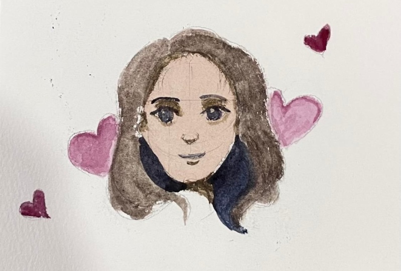
6. Shadows: Now let's work on the shadows on her face. But before you do this, please make sure that the first layer has dried up already. We will be using the same color mixture that we did for the first layer. But this time, let's just add more blue to it. And it should look like this. Once again, if unsure, always test it out on a separate piece of paper. I'm adding more blue as I find that pale. Now before we start painting on the shadows of the face, I want you to observe this one on the left, one without shadow. While the one on the right is the one with shadows. And we will be painting the shadows in her hair line, around her eyes, in her ears, below her nose, below the lower lip, and on her neck. So please take note of these areas. Now we can begin painting in the shadows of the face. I am going to switch to a smaller brush. Now, it is easier to paint smaller details with a smaller brush. And I will begin with her ear. So just the inner part of the ear. Next I'll work on the neck. Be careful in this one for the shadow of the neck will define her chin as I am doing here. I am being careful. Next, I'll work on the lower lip. There is shadow in there. Then I'm going to work on the areas around her eyes. So that arc also suggests the nose bridge. And I'm going to do the same. Being careful since the shadows will also suggest the shape of the nose, as you can see it is starting to make sense now. Now I will also add some shadows under her eyes and under her nose as well. I know it looks kind of weird right now, but later as we add darker colours, it will start to make sense. Adding in some shadow on her hair line. And then let us color in her hair in the next video.
7. Hair: Next for the color of the hair, we will use this combination. So if you can remember, there is more red and blue than yellow. So again, here's my scarlet lake. Yellow ochre but less of that. And cobalt blue. I'm after a brownish violet color for the base color of our hair. Mix that. And then as always, test it out first on a different sheet of paper if you're unsure. But if you want to do spontaneous painting, then feel free to just use the color combination that you come up with. That looks pale for me. So I added in more scarlet lake and checking if that matches my swatch. Sort of. But I will need to add more yellow to make it now, more yellow to make it brownish in color. Now, I am using my larger brush here, my size 10 mop brush, to color in the hair. But if you're not used to using a big brush on smaller areas like this, I suggest that these switch to a smaller and more manageable brush for you. And see as soon as I painted in her hair, the shadows on her face are looking paler right now. That's how values work. I'm leaving out the hair on the back of her head because I want that to be even darker to make it look like they are sitting at the back of the head. I will make the same mixture that they already have and my palette and just make it darker and on the bluer side. And just color that in. So as you can see, it is now darker than the hair near the front of her head. Since I am using this mop brush with a pointy tip, it is very easy for me to color in shapes like this. Now, can you see the difference before and after we color in her hair? The shadow on her face is looking pale now. Now since I have this dark mixture already, I'm just going to make sure that it is already dry. The face is already try. And then I'm going to use the same color for the darkest areas in her face, which are the eyes, the brows, the lip line, the nose. And some loose strands of hair. Once again, to do this, I will be switching to a smaller brush, since it's easier. I will be leaving a tiny bit of highlight to give her eyes more life. But if you want, you can just use pure white paint later. If you do have pure white paint. Now, she is starting to look like a person. And once again, that is our goal. We're not after a realistic look, but rather as stylized portrait. So as long as you're painting is looking like a person right now, then you are doing an awesome job. Make sure that you're a person who's not looking like a mountain or a flower. And that's totally fine. I'll also draw in some dark shapes in her ears and kind of outline her face for it to stand out more. On the next video, we will be adding more details on her face and we're almost done. Good job.
8. Final Details: Now it's time for some the details and this is my favorite part. First thing that I will work on is paint, prominent strands on her hair. And I am using the same color that we used earlier for the hair at the back of her head. Earlier, which is colored in the hair as a single shape. But this time we will be adding more details and make it look more like hair. Thus, we're adding prominent strands to give her more of a character. Try and add some loose strands around her hair. This will give us an impression that the wind is blowing through her hair and thus making our painting more dramatic and more interesting. There's more movement here as well. I will use the same color and paint in some strands also on the darker side of her hair. Next, let's give her some lipstick. And we will be using this scarlet lake, the same color that we used for the hearts. I will start with the lower lip and gradually add the upper lip. Now I am being careful here in painting her upper lip since I don't have any guidelines. But if you want and if you need to, then feel free to use your pencil first and draw in the shape of the upper lip before painting it. Or if you just want to be spontaneous and have fun then do it just like me directly painting the shape of the upper lip. Next, I will just darken the upper half of her eye because that's how it's supposed to look and add some lashes to give her a more girly look. And she is starting to look prettier now. Don't you think so? Next, I'll be adding some outline on the hearts. And I will do it for the other hearts as well. Just to emphasize that the shapes that are surrounding her. Next, the upper lip should be darker than the lower lip. Hence, I will be adding another layer of Scarlet Lake, the same color to the upper lip. Next, I'll use the same color and add some blush on her cheeks. And this time, there is more water compared to the mixture that I used on her lips. And just add an oval shape under her eyes. And that will give her a cute blush. And using the same color, I also add in some eye shadows. So I've told you this is the most fun part. I'll see you in the next video. And let's add in one more final detail.
9. Highlights: Now this last step is optional, but if you want to give more life to your portrait painting that I suggest you use your pure white pigment and color and the white of the eyes. We could have just left out the white of the eye so that we only be using three colors, one red, one yellow, and one blue. But for beginners, if you find it hard to leave out the white of the paper. This technique might help you with that. See, how she is now looking more alive when we added the pure white pigment. And I did the same on her lips. Just to give it a bit of a shine. I hope you enjoyed this class with me. I'm looking forward to see your paintings and your own version of this stylized portrait.
 Bianca Luztre, Watercolor, Productivity, Color Mixing