Transcripts
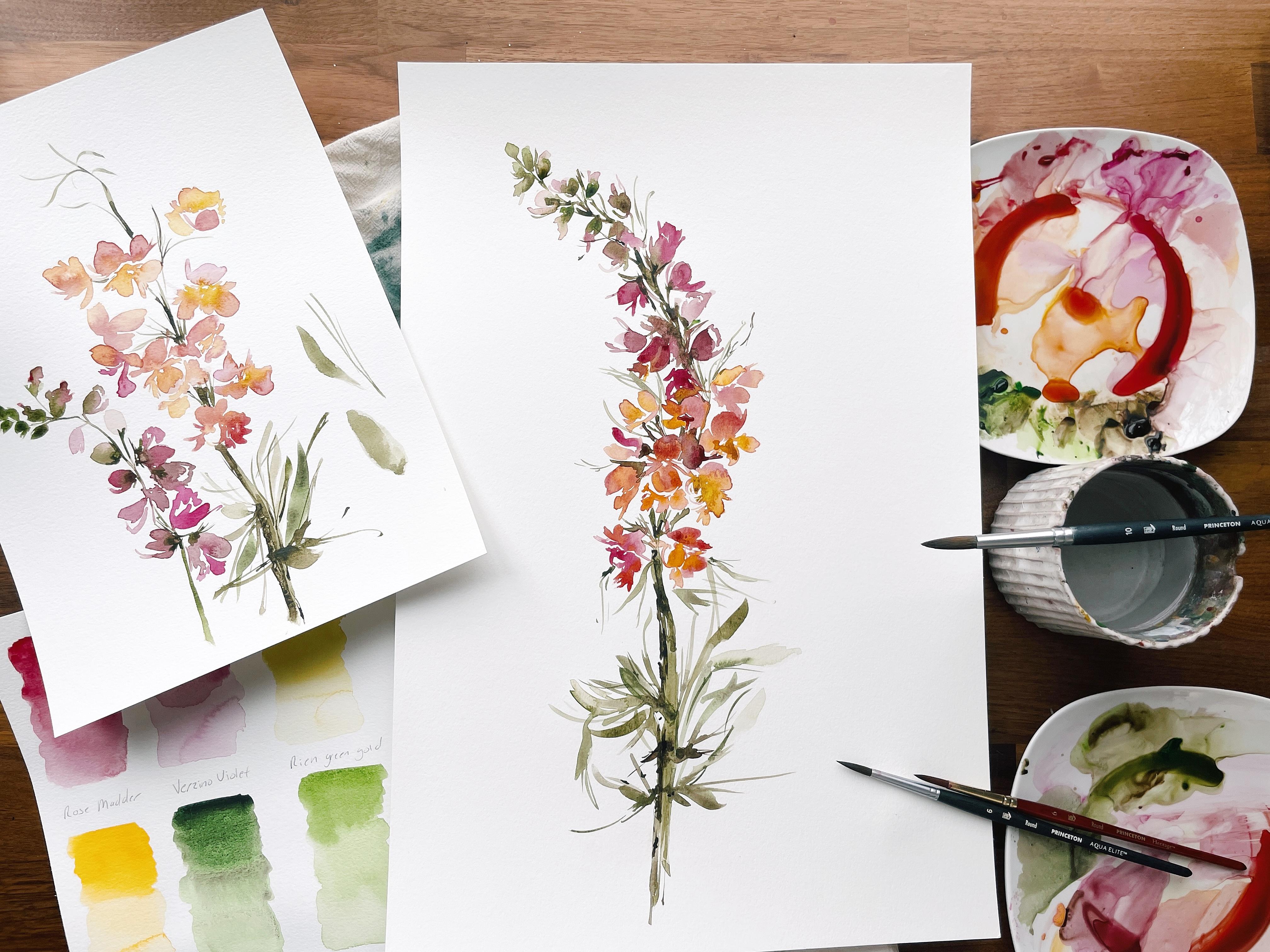
1. Introduction & Supplies: A warm and big hello and
welcome back to you. And happy 2022 to those
of you who are joining me real-time in January as we have just
started the New Year. I am so excited about
our class today. It's gonna be a good one just in time for us to start
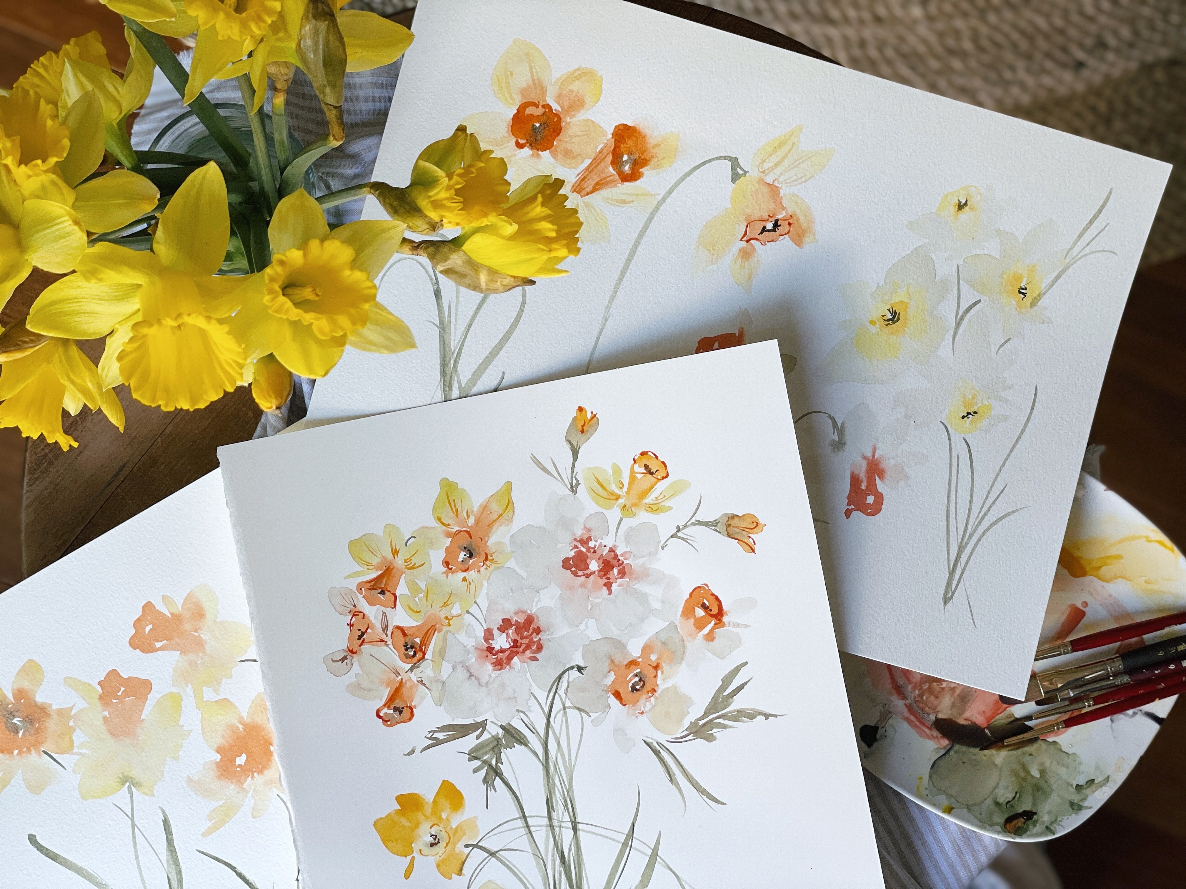
preparing for spring. We are going to be creating what have been called
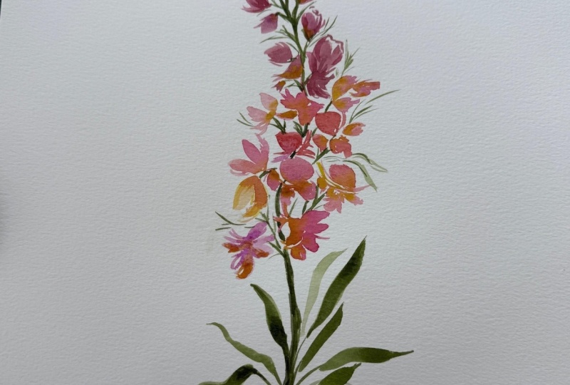
sorbet Snapdragon. Don't you just love that name? It just conjures up so many
beautiful images and colors. And we're really going to have fun with this palette today. It's gonna be a busy palette, which we will talk about. And I'll cover this because I feel like there's
always new people joining us and I never want
people to feel like they just poke their head into a class and didn't
miss the first 15 minutes. So I'll say that this is a beaconing slash
intermediate class because of the amount of colors that we'll be using
and creating blends. So it's going to be
a little complex just because we'll be having multiple brushes and blend
is going at the same time. But the actual subject matter, we're going to keep quite
simple and gestural. If you have taken some
of my previous classes, you'll know all about
gestural and what that means and how
to implement it. If you do not, and this
is unfamiliar to you. I do invite you to
head back to one of my earlier classes and just work through some of the
material before you had n. Alright, so let's
cover our supplies. If you have an iPad
or some other device on which you can look up a few pictures for inspiration
that would be great. I am using this site
called flower mock. See, where this sorbet orange
snap dragons are featured. We are also going to be using Canson 140 pound
cold press paper. I talked about
this all the time. It is inexpensive and it's
a fabulous beginning, even intermediate
paper, one because it's inexpensive and you're not going to be afraid
to mess it up. And two, because it
has a really medium, fine, excuse me, a
medium tooth to it. So meaning it's got
a little bit of texture but not too much. It will also pick
up some of that just a beautiful texture
behind the painting. Next, we're going to be using a variety of Princeton brushes. I'd like you to have anywhere between four
to five brushes. I'll be excuse me, four to six, I'll be using five if
I need another one, I'll pick it up, I have
it off to the side. We're gonna be using
multiple blends, as I already mentioned. And so we're going to have different colors
loaded on each brush. It might get a little
bit confusing. But here is the rub. We are going to be using such complimentary colors that it's really not going to be a huge deal if you
end up picking up a pinkish color
instead of a gold color, they all work so
beautifully together and we're not going to
panic or stress about it, but we will try and keep our
blend somewhat separated so that we can create these
beautiful merges and bleeds. So that's with our
brushes asked for size. I love a size six to
eight, even attend round. Use what you have and don't
forget about that either. The other thing we're
gonna be using our paints, of course, and we have
a variety of brands. We're gonna be using a few
of Winsor and Newton Cotman, the sap green and the sepia. And then we'll be using a few. Daniel Smith, we
have green apatite, genuine new gamboge, and
rose matter permanent. And then we will also be using
a few of my married blue. This is green, gold and Zeno. Zeno violet, clearly
Italian, clearly not myelin. Which beautiful colors though, if you do not have the same
brand of colors again, please do not fret. Find something similar
to what we'll be using. And the effect is going
to be just as beautiful. Just make sure you are
using artist grade paints. If you're using the
really cheapo ones, we're not going to
have the same results. So keep that in mind. Winsor and Newton
Cotman is fantastic, great beginner and
intermediate Brand. Alright, obviously we're
going to need a palette. And actually for this class, I would like you to have two pallets or one
extra large one. I am going to have
a palette with all of our main colors on it. Then I'm going to
have a clean palette for additional mixing. So we'll do a
little mixing here, but we're definitely going to
need to utilize more space and have the extra room to just merge and
blend our colors. Alright, that's it
for our supplies. Paper towel to blog off
on and a cup of water. The only time I'm gonna ask
you to rinse it is when we switched from using
these beautiful pinks, corals and golds to green. Just because you don't want, you don't want your green and turning pink, it's not pretty. All right, so let's head
into the next step.
2. Discussing the Palette: Okay, So let's talk
palette briefly. I've done some of the work
for us that way we could skip this step and just
kind of launch you right into creating the bleed, the blends that we're gonna
be using for this class. However, I do want to
just go over this. If you would like to pause the video and do
this separately, just so you have this, you absolutely can,
but I will keep this hopefully
within screen view. As I'm working, I'll
be working on a nine by 11 piece of paper or
excuse me, nine by 12. And hopefully I'll be able to keep some of the
colors in the frame. But if you wanted
to take a moment and swatch out these
colors just so you understand the base of the foundation from
where we are working. It won't hurt. But these
are not the colors we're gonna be using to
create our blends will have a separate
page for that, and that's what I'll
walk you through next, but I didn't want to just
go over them briefly. So we have rose
matter permanent, and we have ZnO violet, we have green gold,
rich green gold. We have new gamboge, green apatite,
genuine sap green. And sap, yeah. That's
the foundation with which we'll be working. Obviously, we're going to
mix all of these colors up and create something very unique and cheerful and festive and all of those
good things, all right.
3. Creating Blends: Okay, As I mentioned before, we are gonna have two
pallets will have our working palette here
with all of the base colors. And we'll do a little
mixing here where we can. And then we'll also have this additional palette
where we will pull colors together and
make new creations. So let's go ahead
and start swatching out what these
colors are going to look like so that you
can understand them. We'll start with the
rose matter permanent. Let's make a nice little pile. I'm using a number
eight round brush. This is a six. My mistake. The Aqua Elite, just a tad bit bigger than the six heritage. Just for reference, I
loved the heritage. It's super pointy, great
for that fine tip. This has a little bit more
of a beefy build to it, but still quite precise. And it really depends on
the state of your brushes. I worked mine pretty hard. Alright, so we're
going to mix a pile of two broth consistency
right about there. If you have not taken a
class in which I talk about consistencies and water ratios that is absolutely
crucial for this class. So please review that material
before moving forward. All right, and then
we're gonna pick up a little bit of the
rich green gold. And we're gonna make kind
of an orangey coral. A little bit more water. Add a little bit more
pink back into it. I do like orange and
we're going to need it. I'm not typically an orange
fan unless I'm doing some berries or personal ones, but we're going to
need it for these. So I'm warming to it. Alright. Then once you have it
thoroughly mixed, go ahead. Move over to your paper and
do a little test swatch. Bring it down about
halfway, rinse your brush, and then fill in the
rest with water so you can see the gradient. You can see from the highest
value to the lowest value, meaning more water, excuse me, less water or more water. And then you can even
go over again just to see how dark it could be. As I showed you in
that first picture, where we swapped out the colors. It's good to move it through its color capabilities so that
you understand like okay, so I can get a really
pretty personal and orange and then I can also get a very faint peach
out of that color. So in essence, each color blend is going
to double as two colors. So you'll have, I mean, you could have a medium color, but there's really not
enough definitive difference between here and here. Somewhat. We can use this at this highest and
lowest value to create, like I said, this peach and then then this really pretty
kind of burnt orange. So keep that in mind. You can have a third
palette and start working with a lot
of different values. So if you wanted
to have this color and then break it
down even further, you would start a new
pile adding water. Now you have this color, one color to color. But just to keep things
somewhat simplified, I'm not gonna be going that far. That would be an
advanced class and something that
perhaps if there's enough interest I can cover. But for now I'm trying to meet most of my community
where they're at. And that's with beginning
slash intermediate classes. That's our first color blend. Let's go ahead and dip
into the Arsenault high lit and then mix in a little bit of
the new gamboge. We kinda have a more
intense version, so I'm going to add a little
bit more pink back into it. Now we have more of a fuchsia. It's going to be a matter
of your preference. And I want to really
encourage you to not feel married to my blends. If you want more pink
and yours, great. If you want more yellow
and yours, great. My only request is that they are different enough so that you can tell they
are separate colors. Sky is the limit there. Brushing off the excess paint, dipping into the water
to finish the color, kind of dip in one
more time because it's still looking a little bit dark. Then we'll finish that color. Let's go ahead and
make notes here. I know what these
blends are usually, but let's make sure we
haven't written down. So we have rose matter
plus green gold. Then we have violet
plus new gamboge. I'm going to sop up a little
bit of the color here just to give us a little more
room on our palette. Then I'm rinsing off
between just FYI, but my water is it's
kind of looking like our first
little swatch here. I don't mind if you
want really freshwater, you can rinse rinse out the cup every two
or three colors. I don't really find
that it affects the the value of the painting, but it's something
to keep in mind. Just keep an eye on your
water as it's changing. Let's do a little
bit of green gold, a little bit of new
gamboge together. I'm going to bring
out my practice page. So I think kind of
mirror what I have here. Just checking to make sure that Let's go ahead and pick up this new gamboge and rich green gold rinsing off
and finishing it with water. We have green gold
plus new gamboge. I'm gonna move over to
the other palette now, in the certain situations, I'm going to use
the color as it is. So this is a little bit
of the rose matter. Just so we have it up against. I've already done this
on the other palette, but I wanted you to see it too. Just so you can kinda
see how these colors are playing with each other. So this is the rose matter. Just as is. You can see, there's
not a huge difference between this color
and this color. This one has a little
bit more orange in it. You can see I still
had a little bit of my new gamboge
and green gold. And so I'm picking up a little
bit of the orange here. This is what I'm talking
about when I'm saying, it really doesn't matter when
working with these colors. If there's leftover
on your brush, will use different
brushes just so that we're using
the correct color. Initially. However, if when we
are in the middle of painting and we're just with the spirit, I
like to call it. You don't have to
worry about, Oh gosh, this is running into that or I still had some of
that on my brush. It's all going to look
really beautiful together and just enjoy this process. Then for ZnO billet
will do the same. I'm going to play with the
color value here and add a little bit more water and bring it down. This is mainly what we're
gonna be working with. I may pick up a little bit of new gamboge as it
is at occasionally, if I'm wanting to add a
little pop of fresh color. But for the most part
I'll use the blend. But I want you to also just feel free to use all of these colors. Think of them as a family and they all just work and
look so lovely together. So that's gonna be
our working palette. Like I said, make sure you have enough room because you're
gonna be moving back and forth between
picking up this color on your brush and then
moving over to this palette. And you're going to want
to have something that's close and comfortable and
just get comfortable. That's the most important thing. Alright, let's move on.
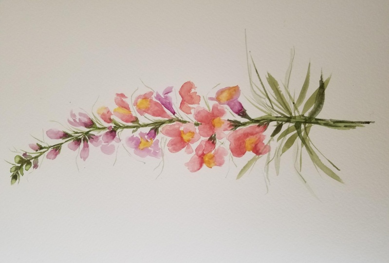
4. Studying Shape and Making the Petals: Some are fully popped and showing all of their
curves and arches. Others are kind of medium, wrinkly, more of a
fluffy bowl shape. And then some are in Kernel, not yet popped or
just slightly popped with a little bit of the
kernel still attached. So using that, that comparison really
frees me up to be like, Okay, popcorn, I can do
popcorn at rather than, oh, I'm gonna paint
a Snapdragon. So it's really important that in my classes we talked
about this and we not just sweep all
of that anxiety and overwhelmed that creating art can stir up creating
is beautiful, beautiful process and
a beautiful thing that we are so privileged
to be able to do. However, if we cannot
get our minds straight, we lose the joy when we're
creating and just sort of mar the experience and taint what it should be and what it
should bring to our lives. So I know I'm rambling
a little bit, but it is crucial. It's important that you come here and you
feel comfortable. Yes, we want to learn something. Yes, I want to improve your
skills and help you be a stronger more it stronger
technician and be able to. Things that you couldn't do before you came to this class. But with that, just as
important is I want you to move through the lessons on any lesson
with a sense of peace. So let's move into
creating Popcorn. Go ahead and pick up one of your brushes can be number
six or eight or ten, whatever it is
that you're using. I'm going to brush
off a little bit of extra for Xeno violet that I somehow gathered on the shaft. And really doesn't matter
what color we use first. But let's just go ahead
and pick up some of that. Rose matter. And green gold. It's already mixed
here for us again, I'm not really worrying too much about it being the
precise color. As long as I have something I have something
definitive here, That's really all
that matters to me. So I'm going to pick that up
kind of an orangey coral. Then I'm going to use
another brush, number six. And I'm going to load
that with our gold color, new gamboge, rich green gold. I'll have these two colors
working together immediately, working wet into wet. And then I will pick
up a third color. Put these here as well. So you can kind of see. I don't want to cover that. Here we go. I appear at the top making sure my brush brush is fresh. I almost said breast there you guys not even going
to try and hide it. Brush and fresh
came out as breast. I'm definitely not
going to edit that out. So enjoy. Let's head into
this popcorn shape. I'm gonna take my brush and I'm just moving it gesturally. Creating what I see is like this first sort of lift
up of the popcorn kernel. And then I'm gonna come
down here and just create some lines from where I want there to be
some orientation, some, some negative space in a whitespaces is very
important in watercolor. We don't always need to use it, especially when we're
working gestural. However, it really
does give a sense of ease and shape as you can see
in this petal right here. It really helps to just kind
of give that whole petal as a whole sense of just
balance and variety. Come down here, just using
a little bit more water. Add a little bit more.
Here's the thing I'm going to take a few liberties because although this forward doesn't have a whole lot
of little fine edges, it doesn't some areas, it's more just kind of a clump. I'm gonna take some
liberties here and going to implement what I call flare, which is just these little
kind of gestural marks along the side using
the toe of the brush. And that just gives it a
little bit more shape. Picking up the gold now and
heading into the middle here, you'll see that the
media is quite wet and that color runs
perfectly into here. And now we have something
that is a pretty good blend. Definitely need
some time to rest. While that's happening. I'm going to pick up a
third brush and head into my ZnO violet just as is
at broth consistency. So go ahead and do
that on your palette. I'll show you what
mine looks like. This is broth. And I'm just going to touch
here along the edges and fill in some of the already wet area. Not too much because I want
to have the initial color. We laid down, that
green gold mixture and then also that Virgina
violet at the tip. So there's our first
petal, petal flower. It's hard to think. I think of the Snapdragon
as being the flower, but there are also little
flowers along the way. So whether they're
interchangeable, if I call it petal or
flower, you'll know, I mean, I mean this I'm going to
create a different shape. A few of them over here
just to keep them separate, but to keep in mind
that we're gonna be putting these
eventually on a stock. It's going to be important
to learn how to tuck in flowers behind
flowers so that they're not all just
like stuck on the page without any sort of
interaction with one another. That's the most important
thing when creating painting a flower that has a lot of
busy little parts going on. They need to be able to
interact with each other. And there needs to be
a sense of distance. And even if you can't
or don't want to create that with
a lot of detail. You can do that
with positioning of the flowers and the
shape of the flowers. All right, This time let's
start with my little trick to, to keep denote what I have on
my brushes to just take it and run it across the palate real quick that
way I'm not like, oh, was this the one that
had for Xeno violet? It's just a really quick
swoop and I'm like, okay, yeah, that's
the one I wanted. All right, let's go ahead and create one that's
facing downward. Remember Popcorn? Popcorn can be any shape, but this is what we'll attempt. Just kind of dragging
the brush coming up on the toe and through
the belly as I work, going back and forth, really moving that
brush around so that I don't get the same shape
over and over again. This is something that
takes time and practice, but you'll get it adding a
little bit of that flare. And I don't want the flowers
looking too similar. So I'm going to keep
this one a little bit smaller and actually
do a connection here. Then let's pick up
the rose matter and the green gold and pop that right
there in the middle. We can even create a
little line in the middle here and pull it into
the rest of the petal. And I go back here so you can kind of see these
are separate colors. I wanted to get a close-up
of the popcorn, so to speak. But let's go back to our
inspiration picture as well. So there you have our
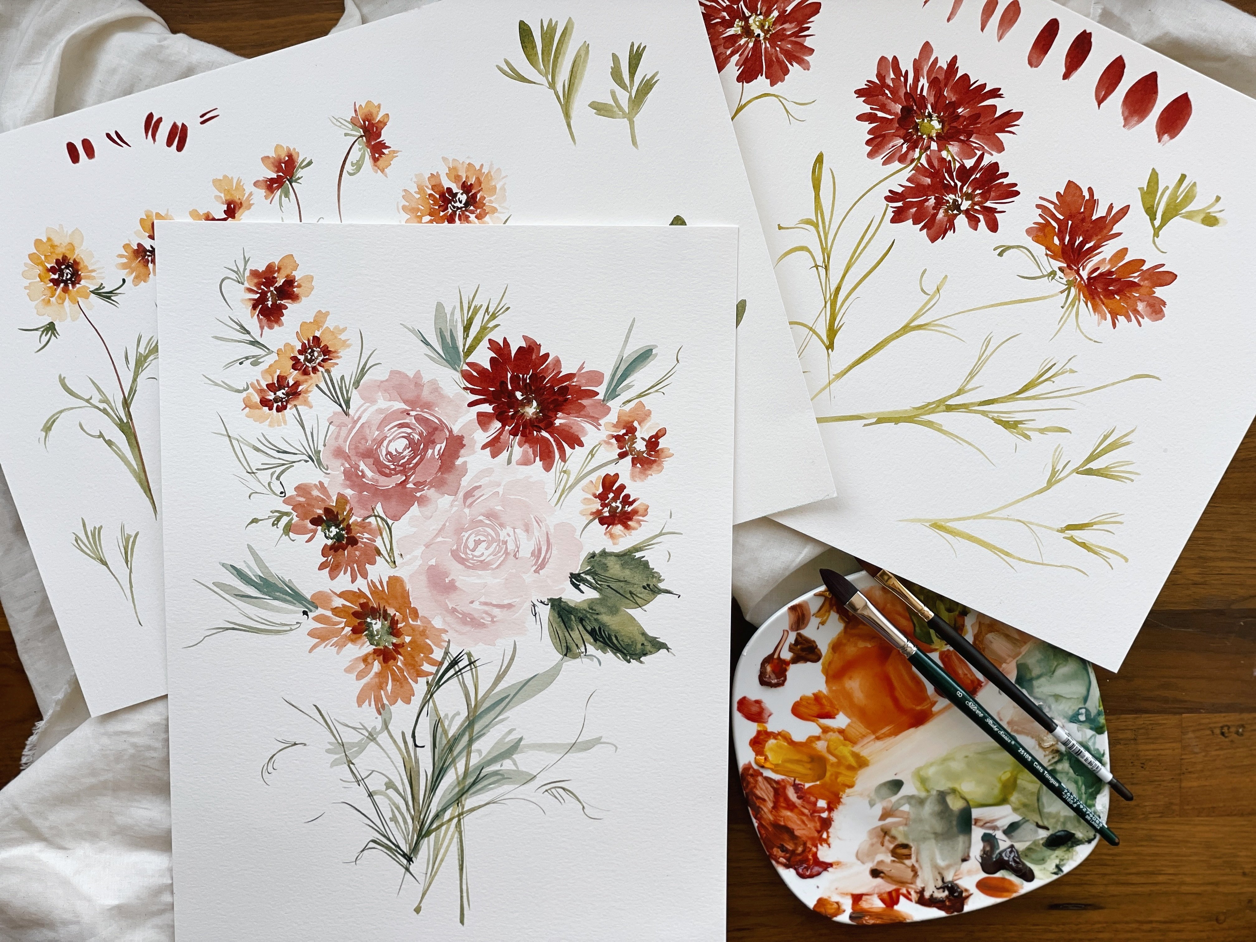
sorbet, snap dragons. You can see there's pink, yellow, and then orange. If we're not giving the colors, assigning them names all
within the same given flower. Go ahead and pick
up another brush, and let's pop in a little rich
green gold just as it is. Let it touch the top petal
and also these bottom petals. Then that obviously
needs to rest. And so now what you can decide, it's your decision is whether or not it needs to
be a little bit darker. And what you can do is wait for the media to dry and
then add in more color. I prefer when working with this style to not
go dark too soon. I feel like that's
something we could probably do later on and add a little bit of
darker flair to the flower. But these colors are
so beautiful and so complex because they're all
three colors in each flower. I don't really feel like we
need to go one step further. That's just my
personal preference. But obviously as you work
and just feel like I said, the spirit moving
as you're creating, It's completely up to you. Alright, let's go ahead and pick up a little bit of the rose matter
all on its own. We'll go ahead and create
a closed popcorn kernel. Little line here coming
up on the brush to create something that's kind of thick over here,
the little line. And then will come on top of
it and create the petals. Pick up the green, gold and new gamboge and blend
those two together. Some can be very
simple like this one. You know, that that really is something that
you want to attempt because if you have every single flower
with all of this flare, nothing's gonna stand out. I know there's this tendency to make each flower
super-strong and count, but you have to think of
this painting as a whole and not an individual piece when you're working with
something like an orchid. Or a rose, It's one
flower and you're creating each little bit
within this one flower, but with a flower
like this where it's more clustering again, you have to think
about the interaction between your elements. That's a nice
variety here we have some different colors and I feel like they're all kind
of working well together. If you wanted, you could come
on the side and just add a little bit of pedal showing
just to close it off. Then could do the
same on this side, just kinda showing you
different options here. But obviously nothing
needs to be permanent. Let's go ahead and do one more. Pick up. The rose matter and the green
golden new gamboge mixture. Let's do similar to what
we did in this one. I'm going to create one
kind of moving giant petal. Just using the toe of
my brush to kind of swoop to the side
with a simple stroke. Come up over here
with a little tail, then move down through here. Creating little
lines, kinda like the ease of details
you would see in a popcorn if you were
to really take it and study it here. And then this is quite large. When we're working, we probably
won't paint quite so big. So you have to keep
that in mind as well. A one large flower like
this wouldn't be a problem. It would be super lovely, but you just wouldn't
want all the flowers to be that large or
you're going to lose a sense of how they are
thick at the bottom and then gradually get smaller as they work their
way to the top. Just kinda dragging
the brush here. And now I'm going to dip
into the green, gold, and new gamboge and do
some blending here. But these colors run
into each other. Just kind of making
connections here. Here we have the top petal, then here we have the one
that's kind of folding out in the middle and then we have these
bottom petals here. This would be probably one
of the more complex petals. Can add a little bit
more flair to it. Making a little connections here using the toe of your brush, just dragging things,
keeping it gestural. Then let's go ahead and do a simple sideways
using the green gold. Picking up a little
bit of the router ZnO violet all on its own. Pumping it in there. I'm going to help kind
of work it through. Again, like I said, I advise leaving some flowers, just really simple like that. This one looks
like it's folding, folding in an upward. And for the most part we're gonna be facing
our flowers going outwards because that's how snap dragons tend to lay on the page. But this could,
pedal could easily work over here coming
out from this one. Let's go ahead now that we've done these separately
kind of fill in the gaps here with
different positionings, different sizes using
all of the same colors that we've already
previously discussed. Let's do that in the next video just to take a
little break here. She got your hands and stretch.
5. Conneting the Flowers: Okay, I'm gonna come in
a little tighter here. You won't be able to see exactly which color I'm picking up, but I will talk about
it as I'm using it so that you can follow along exactly with me or
you can just use the creations that you
have on your palette. But I wanted to just kind of
come in a little bit close those who are working
on a smaller device. You can just see how we are stitching all
of this together. Alright, let's go ahead
and pick up a little bit. The rose matter. I'm going to create a flower
right here coming sideways. I'm making that
first little mark just to kind of give
it some framework. I'm going to come down here
and then fill in here, kind of dragging my
brush a little bit. So you have this sort
of emerging when we put a stock in here and
a stem and here it's going to move
even better together. But if you want, you
can always run it up against the edge that it really
looks like it's touching. That looks great too. It's really your preference. Sometimes distance
is nice like on this side to create a
little sense of peace, a little bit of separation. And then other times I like to kind of run it right into it. You can even take your brush, kind of roll over
the paint and then now you can't really tell where one petal ends and one begins. So that's a tip and
technique that you can use throughout the painting. When you are
connecting everything together with this paper, it stays wet for so long
that it's very forgiving. If things were even dry, you can still use your brush to do little things like that. All right, let's pick up our
rows matter and new gamboge. And I'm just going
to pop in here with just a little bit of
color in the middle. Just dragging the toe of the
brush through the middle, not really making
too many connections here so that there's a
little bit of white. Just more of like a center. Now, this doesn't really look
like a Snapdragon petal. But in conjunction with the ones that do where we've taken a little bit more care. It's going to fit in
magnificently, I promise. I'm gonna keep this one simple and just leave it right there. When I'm trying to think about where I want
to put flowers, I have to think about, okay, what's where are we
ending and where are we? Which direction are we
aiming it with a Snapdragon. They intend to either bend
either right or left, and then they come down and
have a really big stalk with lots of really
beautiful green foliage here at the bottom. So keeping that in mind as I'm working so that
when we get there, that feels just a little bit more like we prepared for that. We don't want anything
that's coming out super far. In fact, when we're working on the final project together, we'll keep in mind, we want
to keep things narrow here. I mean, there's definitely
some big blooming here, but we have to keep in mind the size of paper
that we're using. I'll be using 11 by 15 paper at that point so we can
get a little bit more of the whole shape and cents and scope of this magnificent flower rather than trying
to fit it here. But I liked the size because
it fits in the frame. I can come in close and show
you guys all the details. Picking up a little
bit of orange. And I'm gonna come fill in. Here. Again. I'm going to create
little shape here. Touching on this side
and on this side. Really getting a sense
of balance here. And then picking up
the Xeno violet. Use utilizing it in a little
bit of a higher value. So this is not quite broth, it's more along the
SERP consistency. You can do that by just
poking into the color with the toe of your brush and not dragging it out
and adding water. Doing that on a few of the
flowers really helps to keep the eye attracted.
Quite wet there. So I'm gonna stop poking it and just leave it right there. Come down again using
the same color. But this time I am
going to pull it out on the palette so that
it's back to broth. Excuse me. I'm going to
flip up this petal here, kind of doing a little V-shape so that we have something
that's kind of lifting up. Then I'm gonna come down and
fill out the bottom portion. A little bit of flair here. Keep things small. While that's resting. Let's pick up a little bit. Of the rose matter and
green or excuse me, yeah, rich green, gold. And head into the middle here. Pulling it out a little
bit for this petal. Then I'm going to also add
the rich green gold, as is. Just kind of letting those
colors do their thing. You can see over here having
a little bit more structure. Something a little sleeker
really does lend itself to being beside a flower that looks like this
where things are. I'm not necessarily
less structure, but just more clumpy and big. So having that variety
is really key to creating and maintaining
the composition. Let's go ahead and do one more. This will be about how many
flowers we would do when creating that middle portion
of the Snapdragon here. And then we would start to get a little bit smaller
working into opened bud and then barely opened bud and
then no open bud. So we'll pause here. Let's do two more. I'm going to use new gamboge. Do a nice flower
here in the middle. Again with the V coming
out to the side. Just creating a little bit
of shape and structure here where I imagine like a
little fluffy center to be. Then picking up
the rows manner as is touching along here. I'm going to blend
that yellow and pink together so it turns
more of coral, but then I'll leave it more
of a pink on this side. Adding a little bit more flair. Then let's move up here. Picking up a little bit
of the new gamboge. Creating that V, create
the bottom portion. We imagine this one
kind of poking out to the side here so we won't
do too much work here. Picking up a little bit
of the rose matter. Give it a tiny bit of
flair for structure. There you have it. That's
pretty much going to be the body of our Snapdragon. And then we're going
to start working into creating petals that are closed. And then just gradually getting smaller and smaller
as we work our way up. Take a break, stretch
out those fingers, and let's come back
for some more.
6. Studying Shape and Creating the Buds: I wanted to show you this image one more time before we head into creating the buds. As you can see, we were
really orange and gold when we're working
down in this area. But as we head up, we get into some darker
sort of fuchsia, magenta colors and
then similar like dusty rose and then
a very faint pink. So we'll be mirroring that as much as possible to kind of get the sense of the whole sorbet
in the mixing together. So I did want to
just point that out. You can choose to use all the same colors
we've been using. But I think the overall effect is going to look really pretty if we follow along
here with the image. All right, I'm going to tuck
this off to the side now. Go ahead and start
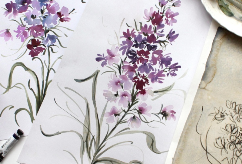
creating some buds. Go ahead and pick up your brush. Let's get into the violet. Once you to have that on
your palette at both. Cough syrup consistency
and brought consistency. That way we can kind
of pull from both. Taking the time to mix that, adding a little more
water until there is some definitive difference
between those two colors. I'm gonna have my reference
picture off to the side here, but I'll keep my
painting here so you can look at how it
looks on the page. We're also going to use another brush to dip
into our step yet. Let's go ahead and do that. Try to avoid that
little ring of light needed because it's very
cloudy and overcast today. But try not to give you a ring. Then let's add a little bit of the Virgina violet to that. We picked up a little
bit of the rose matter, which is totally fine. Again, happy accidents. I don't want you to be
stressed. There's still enough definitive color
between all of these. This is clearly a dusty rose, whereas this is more fuchsia, magenta family, little
bit more sepia into it, Till I have something
that's pretty rich. There we have our
three working colors. We're gonna do the same thing only we're gonna
keep in mind that now we are creating petals that are getting
a little bit smaller, a little more
clustered together. Let's go ahead and start with the Virginia violet and the sepia with a
little bit of rows matter in there starting here. And now we're gonna take
the toe of the brush, just drag a line and
really gestural line here. Just to kind of indicate, okay, that's the front of the flower that's coming up
behind the flower. There could be more
pedal action here, but I'm gonna leave it open
because it just feels right. It feels like it has
a sense of balance, complexity, and it's just
the right shape and size. I'm going to leave that as is. Now. I'm gonna come over to the casino violet in
its highest value. An atom, another flower
right here next to it. This one, I will add a little
bit of back pedal work. These flowers, unlike the ones
that we were doing before, don't consist so much of blends. There's a little bit of
mixed color in there, but more within the petal, the individual flowers
and not so much within the same singular petal, if that makes sense. Give it a little
bit of flair there. Now I'm going to use
a third brush to use the Virgina violet
in the lowest value. And I'm also going to pick
up a little bit of step yet, just to kind of get
it a little dust ear. So here's my Marzano
Violet pulling it out here and adding a little
bit of the sepia to it. Really, really
pretty faint pink. I'm actually going to darken that a little bit
because this is the color that I want
when we move our way up. So I'm gonna just
kinda let that sit there and a sop up a little
bit of the color here. And start again because
it's all running together. Because I'm moving the
palette back and forth. Normally the palate would stay still and everything
would be separate, but I want you to
see everything. I'm gonna leave that there. I'm gonna take a
little bit more of the violet from
my other palette, put it back over here. And pick up the sepia, mix it back in, and then draw that out a
little bit further. Broth consistency. You have to remember the stock
is coming at an arch here, so we have to visualize
and keep in mind, okay, There's a stem
running through here. Let's create petals that are
going to complement that. We have one that's facing
out and a little bit down. We have three definitive colors here which are working
really nicely together. Pick up a different
brush and head back into the darker version of the
sepia and the Xeno violet. Little bit more backward here. So basically just dragging the brush for an
initial stroke and then doing a little
bit of back pedal work using the toe of the brush. Let that run into that one here. Just kind of keep it simple. I come down here
and do the same. But I'm gonna make
this one a little bit more open since it would essentially be
attached to the top of here. So we're imagining
this to be the top of the flower and this to be
going right on top of here. Nice big petal here, a little tiny petal here. And then let's
come around there. Then we're going to
create a little bit of pedal work using
the Virgina violet. Then as we work our way up, we're gradually going to
get smaller and smaller. So let's go ahead and do that. I'm going to reduce, excuse me, the sepia and Brazil
No Violet to even paler. Taking it one step further until I have something
that's more like this one. This is what I call
lightest consistency. For those of you who
don't know, I have a watercolor book coming out in May and we go over a lot
of these techniques, mostly all of them. And you'll, you'll learn about different techniques
and consistency. And so the three that I use
are lightest consistency brought consistency and
cough syrup consistency. We're getting a little
bit smaller here. So we're gonna do big petal here and then some TO work here. Do the same thing
on the other side and kind of let
that run together. As you see in your
reference picture. We mostly have flowers
that are coming out. Be around the ring. There we go. Cup colors that are, excuse me, petals that are
coming out to the side. So they're kind of springing
out from the stop. There's a few in the
middle and you can kind of play around with different
shape and position. But for the most part we want these to be angled
out to the side. I'm going to go
back to that color that I had mixed before, that really, really pale pink. I'm just going to
create a gestural, almost like a pinwheel petal, like one of a pinwheel pedal. You're doing the whole pinwheel. We would do a few more
imagining that negative space. So this is just one
pinwheel petal. Same thing on top. Then we would have
our buds up here. So we're going to take
a little break here. And actually I'm gonna
do one more just to kind of give this middle
portion a little bit more. We're going to have a
stock coming through here, and I want that stock to show, but I also want it a little
bit more connection here. So I'm going to
grab the sepia for Xeno violet and just
create one more loose, loose TO work here
off to the side, dragging the brush down
and then a little bit of a bigger petal coming
back up through here. More TO work just to
kind of connect things. And now we have something
that has a really good flow. Negative space, negative space, negative space, big
negative space. And then here we'll
have a areas for the stock and stem to show
through which we want. So leaving intentional
areas for that stem. Again, stretch out your hands. We're gonna come back, mix
up some greens and I'm gonna show you how to merge the greens into the pinks without losing the individual colors and also
how to time it correctly.
7. Mixing Greens and Forming Small Buds/Stems: You'll remember from the
initial swatch sheet that we have the green apatite genuine and we also
have the sap green, which we will be
mixing with sepia. Clear off a little
room on your palette. You can rinse your
cup if you like. Then grab the fresh brush
and dip into your sap green. Then you're gonna make
a little pile here. Pulling from the working palette where I had all the colors. I'm going to add the sap
green first because it's more of a gentle color and the
SFIA kind of dominate. So I'm gonna make
sure I get that sap, the color I want it. Then I'll plug into the sepia to create that beautiful,
rich, mossy green. If you loved these color blends. And you have not
already discovered the line of color guides
that I have available. You're definitely
in for a treat. So head over to the website and have a look under
artists resources. And you will see a
ton of color guides where I thoroughly explore
each range of colors. Yellows and golds, whites
and grays and browns, pinks, oranges and corals, greens and blues,
purples and reds. They're broken up
into families so that they can be
easily understood. Okay. Let's go ahead and just make sure that's thoroughly mixed. I have a little bit of sap green that's just kind
of sticking on there. And this is still quite wet. So what I'm gonna
do is I'm going to add a little bit
to it right now. This paper, like I said,
it takes forever to dry depending on if you're
using a lot of water. It's one of those things
where water is knowing the right amount to
lay down to achieve whatever result that you're
trying to get is crucial. So we'll walk through that. But while everything
is still wet, I'm just going to plug a little
stem right through here. Not minding if
things are blending, going to kind of
curve it here because that's how it is in the picture. Things we're sort of
curving to the left. And then I'm gonna come down
here and thicken it up. So we have this which is going to plug
into the top of this. I wanted to keep them
separate because we'll be doing this in
our final project. But you can kind of see how this is going to lead into this. And then the stock gets
quite thick through ear and we have lots of
beautiful greenery which we will cover. As you can see when I dipped
the green into this pink, it's sort of, it's
sort of took over. Now, this is where
I really, really, I encourage you to
figure out what look and style best suits you. We talk a lot on Instagram
about finding your voice, finding your signature style. And this is something
that really can cause a lot of
anxiety and overwhelmed, especially for artists
who are attempting to turn this into a
livelihood, a business. And that's probably one of the questions I get
asked most often is, how did you find a style that immediately as
recognizable as your own? And then the answer is
practice and exploration. I figured out what I liked by following along with other
teachers to use as a guide. Then figured out how
to make that more me. I would take a
picture or a lesson. And then I would make little changes along the way that just felt inherently and
instinctively my own. It's something that
can't be rushed. And I think that's
probably one of the harder aspects for
new artists to grasp, is that we're not talking
even just a year. We're talking multiple
years because you are going to continue
to grow and evolve. Your skill is going
to get better. What you created when you
are just learning to paint. What you paint a year
later is going to be exponentially
stronger and better. Then gradually you hit a plateau as your skills sort of even out. And then you might
have another leap after you go through
utter despair, not being able to
grow in your craft. And you just have to
keep in mind that it's a constant evolution and growth. And eventually the things
you paint will start to take on a style of their own, the colors you use, either personality
of your flowers. It starts to move its way to the forefront,
to the surface. Just want that to hit home with you in
two, Take your time. Those of you who are
hoping to turn this into something to support
yourself or your family. It takes time, it cannot
be done overnight. The only way it can
be done overnight is by copying other artists. And I see it done a lot. And it's something
that I initially started off doing 56 years ago and quickly learned that was not the route and very dangerous, not only because it
hindered my growth, but because if you are very
present in social media, people are going to pick up on that and you're going to lose your credibility and your
integrity as an artist. And there's nothing
more important than people trusting
you and your art. Talk that aside.
Keep it in mind. Trust the process. Keep it slow and keep it study. As I've been talking,
can you believe that this is still wet? All that time. This petal, I had used
significantly less water until the color just kind of
looped into the bottom here. I'd like you to have
a mixture of both. I'd like to you to keep certain petals separate
from the stem. And then I'd like
certain petals to, flowers to run into
the green here, which ones you choose
completely up to you. But I'd like you to
execute a variety of that. I'm going to plug in here
and that's pretty dry. I'm just going to
kind of brush the toe of the brush up along
the edges here, just drag it back and forth
to create that sort of STEMI, clasp that is around
the base of these buds. Do the same thing over here, curving this using
the toe of my brush. Again, just kind of creating that little STEMI area at the bottom of the petal. Not everything has
to be defined. Not everything has
to look identical. You som can have none, some can have some of this, of this little green area. The idea is to just keep it loose and not get too detailed. You can have some stems
pulling out from the flower, then some that are really close and kind of on the stem and you don't
really see a whole lot. It all works. Let's do a couple of
moving parts together. We're going to pick up
our number six brush, dip into really any pink. But let's use a broth version. So I'm gonna use the
Virginia violet and sepia at its lightest. I'm gonna come up here and
just create a few more. They're getting
much smaller now. I'll open that one up
just a little bit. This one is fully closed. Let's go ahead and plug
in a little green now things are very wet still. I'm going to take the
total of my brush and run the stem so that I'm
creating an angle here. Then I'm going to take
the toe of my brush and come here at the
very edge and just gently nudge the paint so that it doesn't completely dominate. That's what you have
to look forward. That's what takes practice as
an artist is figuring out, okay, how wet is my media? How gentle and slowly do I
need to work my way into it? Because if you just sort
of lay the brush in there, it's going to clobber
and dominate, which is super beautiful. But you don't want
that to be the look of the entire flower giving flowers variety or is what
makes them so special. I'm gonna plug in a little
bit more green here. Then I'm gonna come up
and do the same year. And I'm not going to extend
that green into the petal. You see there's a variety
here of what's going on. Now let's work our way
into the smallest buds, solely green with
just a little bit of pink popping through. The green first. Just a little blob. Nothing to structured. We take the pink,
we're just going to rub it along the edge here. I'm gonna make this one
a little bit bigger. Just so we can, we're
keeping the shapes. I'm going to pull that
out a little bit. Give it a little
pedal backwards. I want these ones at the
very top to be the smallest. It's okay if there's a
little bit of difference between moving your way
from largest to smallest, but overall it should gradually get thinner
and more narrow. I'm going to look at my reference
picture just to kind of get a refresh of how
everything is sitting. Once we're here at this point, things start to come back
towards the middle versus not completely sideways
off of the stem. So we have buds that are
sitting right on the middle. We can create some stem here. We can add a little bit
of pink if we want to. We didn't really do
a whole lot of that. We can do a little
bit more here. Then as we work our way to
the top, curving it again. Gentle coming up on the toe, keeping things really loose. Smallest, but really nothing
more than a few strokes. These are created really by
just doing two simple stroke. So coming down using not
quite the toe of your brush, sort of mid belly and then keeping things a
little bit pointy up here. Or you can at the very
end, rounded out. I'm gonna do one more over here. Just to kind of show a
little bit of shape. I'll do the green first. Just creating that bottom
part like we did over here. And then I'm going
to take the rows matter lightest consistency
and plug it in here. I'm just going to drag it through and just get something
that's really loose. And I'll make this one
a little bit bigger. So you can see again, this is bigger and
this is smaller. Do the same thing here. If these are feeling
too light to you, you can always head back
in and darken it up. In our picture we have a, a, a gradient where
things are a lot darker right here in the middle and then they get fainter. So we can always do
that after the fact. Still is gonna look lovely, especially with this paper because it stays
wet for so long. We can even go over that
green with that color again, the idea is just to make sure that there's
some separation. I'm going to plug in a
little more flair here. Using the toe of my
brush to create a shape. Then will thicken
up the stem here. But I just wanted to get
the basic form and shape down so you guys can
see how everything is laying on the stem. You can do a little
bit more work in here. You just want to be
careful about not getting too blobby that you can't tell the difference
between anything. I'm looking at my
picture one more time and I'm going to add one final little green guy right up here at the
top to close it out. That looks pretty solid to me. Do a little bit more
flair here if we wanted just to kinda
give it a little shape. Using the toe of the brush. Adding a little bit
more green into here. Now just kind of standing back, looking at my work and touching things to see do they need more? Do they need less? And add a little
bit of green here? Dip into that sap green
again and the sepia. And I'm gonna add a little bit of green into this
flower right down here. A little bit more sepia. Just a really light version. There's not a whole lot of flair that comes out from here, but I don't think that's
going to stop me. I'm going to create
a little bit just using the toe of the brush. And then I'm gonna hit in here this butt and just add a
little bit more definitive. And we'll do that too is we, we do a little more contrast, but I just wanted to
get the framework down, like I said, and
that initial layer. So that is the top
of our Snapdragon. We're going to head
into finishing the middle and bottom
portion and adding leaves. And then we'll move into details contrast before we
head into our final project.
8. Adding the Stems: I'm going to refresh my pile of sap green and
Sophia just because it was getting a
little low and I don't like running out of
paint mid project, so make sure you have enough. Want to have it at about
broth consistency. Now we're gonna plug
in the stem here and give it a little
bit of shape direction. Now, we have to remember that this is going
to be the top of it. So we're kind of
working this way. If this paper were a lot bigger, you would obviously
move up into this area and then arching
toward the left, which we'll do in
our final project. I'm going to start here
at the top and just kind of leave where would be? Things would start to be
getting a little bit thicker. So here's connecting to here. And then we'll work our way down using the toe of the
brush to fill in here. Taking my brush
and I am pressing lightly and at a 90 degree
angle for a more sharper, thinner stem and then using the belly for some areas
that are gonna be thicker. And then we'll come down here. Things are thickest and give it a nice loose
gestural stem. Nothing to defined. We're going to add a lot
of leaves to this area and we'll go over leaves and how to cluster those together. Then we'll start making
a few connections here you can see this one's
a little bit too far out. But we're gonna start there
anyway and just pretend that we meant to do that by
adding some smaller stems. And we're not really
going to connect it because it doesn't really in an area where
it would connect. It's just sort of floating there because we were figuring out just the popcorn kernel
shape itself and not necessarily thinking
of attaching it to a stem. Then we'll create
some smaller stems. Here. This one again is facing inward rather than
out, but that's okay. We're just going to
create some stems using the toe of the brush, keeping things really
loose and gestural. You see I'm not taking my brush and dragging
a super slowly. I'm just flicking it around, chunking up the stem here, and just making the connections. Snapdragon stems are
really just thick and they look beautiful
on the Snapdragon flower, but it's not so great on
paper unless you're doing a botanical and there's a lot of different shading and light. So I like to make up for
that aspect when using gestural by really
playing with flair. And then obviously we
would come up here and there would be a
lot more happening, but we're gonna start
curving things this way. And then we're gonna have flowers coming
off the stem here, which we will do in our final
class or final project. But just you get an idea of how this is all
working together. That's pretty much
it for the stem. What I'd like you to do now
is mix up a little bit of the sepia with the sap green
in cough syrup consistency. We've been using
broth up until now. If you need more
sepia, take a moment to get it on your palette. Want it to be more on the
brown side than the green, but not so brown that
you can't see any green. So nice little marriage
between the two. We're going to add
a little bit of detail through the stem here. Just by using the toe of the
brush and running it along the side to create a
little bit of shading. Not dark enough. I can add a little bit
more sepia in there. Like I said, I like to start
light and then work my way. Too dark. Can add a little bit towards the middle just to get
some darker areas. But there's a lot of really
beautiful color variety happening here because sap, green and step, yeah, there's so much color
between those two. There you have it
it's a really it's one of those things that I say. It's simple but not easy
because what happens, especially for newer
artists as you look at something like a stem
and you think, Oh my gosh, I just want to capture
every little bit of that to make it
really come to life. And inherently what ends up happening is you overdo
it, you overwork it. And so when it comes to stems, I really just kind of give myself the right
shape and direction. Then give it a rest, put my brush down, stand back, let it let it dry
if I wanted to, and then be able to
come back and say, okay, you know what, I want a little bit more definitive
dark area over here. So let's darken that up. Give it a little bit of
shape along the side. There. Now I feel good and I'll
set the brush down again. Come back and say, Okay, Still not where I want it, but avoid the urge to just keep touching it for
the sake of touching it, can keep touching
it all you want if you are achieving the result that you're
trying to achieve. But if you just think
just doesn't look good, That's when I advise you
to take a step back, give yourself a moment, see it through some fresh eyes, maybe even go get
a glass of water. I'm telling you even just
five minutes away from a painting that you
feel is total garbage. When you come back, you're
like you don't want it. That really isn't so bad. As we work were so
close and we're getting so caught up in all
of the details that we miss. A lot of the magic that's
happening on the page. We're not even aware
of it because it's something that's sort of just
within us and beyond us. So keep that in mind
as you're working. And don't be afraid to put the
brush down and add slowly. So that's it for the stem. We're going to come
back in just a moment and I will show you leaves.
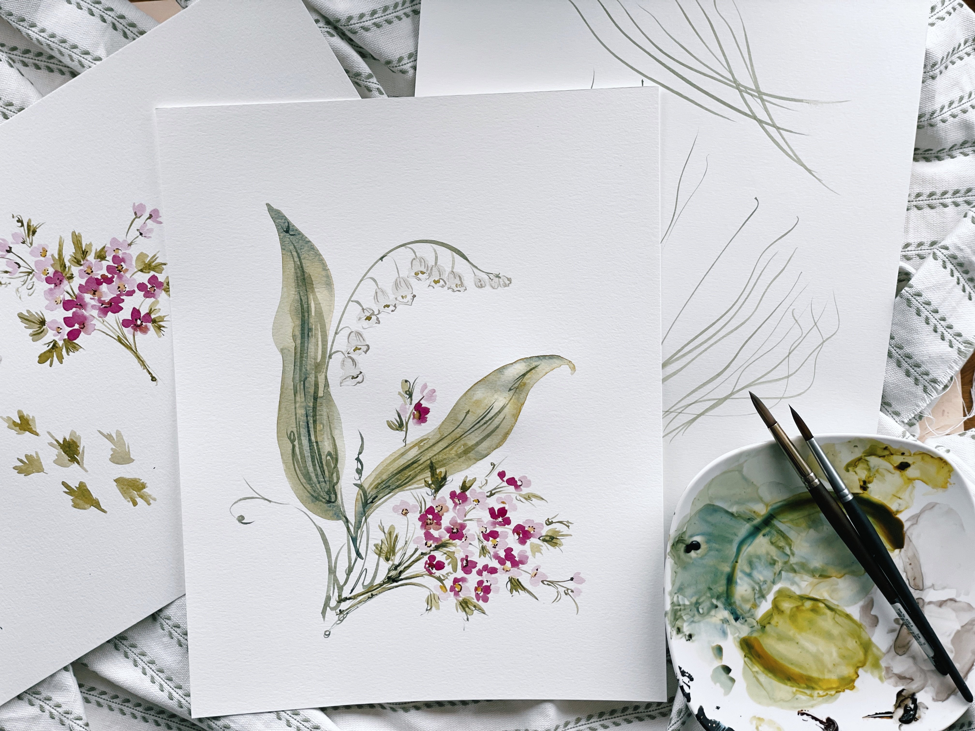
9. Adding Leaves: One of the most magical colors in my toolbox is green
apatite, genuine. As you can see, there is the most beautiful sediment
rising to the surface. And like anything else
that's happening here. What happens is the pigment separate and they kind of
make a texture of their own which is so
beautiful and can really be used to just sort
of jazz up a painting. I use it with caution and
I tend to calm it down with a little bit of sepia
just so it's not so intense, lime green, but honestly, if you know how to
use it correctly, it works great all on its own. We're gonna be using that
color along with the sap green and sepia and just kind of be merging the two together, letting them run
and then creating a little bit more detail on the leaves once things are dry. As far as leaves, I have gone over leaves extensively in previous
classes like simple, simple stroke leaves and compound stroke leaves,
gestural leaves. And it's something
that I'd covered. And so I'm going
to cover it here, but I'm going to do it in a way that's not
quite as thorough just because it's material that we've already we've
already reviewed. So I'll break it down
a little bit for you, but I would love
for you to lean on, rely on in the leaf
lessons that you've learned in previous
classes and also just feel free to kind
of make it your own. So looking at the
reference picture, you can see that it
gets really busy. Try and get that ring on. It gets really busy along the
bottom of the flower here. Lots of leaves, bushy effect. And if you're not using all of those little
individual colors and shadow, it can kind of get lost. So we're gonna, we're
gonna be inspired by that, but we're not going to feel super attached to that either. Let's come down
here at the bottom and we're gonna make
our first stroke. I'm going to mix
the green apatite genuine with the SFIA,
breath consistency. And then all my
other brush have sap green and sepia to
working brushes. We're gonna make one big leaf to just sort of anchor the stem. I always like when
I'm working with a painting to have
an anchor flower, anchor stamp,
something that says, okay, this is where
I'm starting. Everything else can
extend from there. So to do that, I looked at my reference
picture and I see, Okay, there's a big leaf that's just kind of
curving up here. That's, that's the that's
where my eye goes. That's where I'm directed. So I'm going to mirror that. We're going to take the
silver brush not full TO mid belly and just drag
it down to this doc here. Really loose, not doing
anything super special, just dragging it down. All I want is for you
to have a slight curve. We're gonna do the same
thing on the other side. But we're gonna give
it a little bit of movement and we're
gonna point it down. So we're going to come start at the toe and then we're going to pull it up and attach it. Okay, so now we have
kind of an idea of where things are going, which direction they're angling. We're doing is just start adding leaves in different
sizes and colors. So now I'm going to dip into
the sap green and sepia. What's going to happen
here is this dries is you're gonna get a lot of really beautiful texture that is just gonna be so
lovely all on its own. It's not going to need a
whole lot of touching up. This is where we get a
little bit more gestural. We'll do some bigger leaves, taking our brush,
dragging it along, and bringing it
down to connect it. But we're also going to do a
lot of little or leaves two, coming up on the toe for a line. I'm actually going
to come out here on the stem and create a leaf that's shooting
out from the stem. Again, this is all very loose. I'm just sort of
moving and working with the paint as
I see the leaves. Really just trying
to get a shape, not trying to perfect
each leaf that I see. These leaves are
achieved by strokes, simple strokes, starting at
the top and bringing it down. Gestural, more of a
line stroke coming up on the toe. Gestural. If you wanted to even
thicker than that, come down full belly. Basically just doing
a variety of these, moving the stems in
different directions. So you have this one that's up, this one that's down, this one that's coming
out to the side. Nice variety. Now we're a little hindered here because we have
this flower here. So we're just imagining things kind of moving into
this realm over here. Then. Darkest value, the suburbia
and the sap green. I'm going to come on top
of what I've already done. Just add a few darker pieces, darken things up a little bit. Moving things out to
give things sides, giving things shape
and structure. It's a very busy bottom here. I'm trying to make sure that
there's enough variety, but also preserving the shape in which these leaves cluster. So have a look at that
reference picture. Be mindful of shape and
positioning and size. Those are your three
strongest components. Size, positioning and shape. We're pretty good here. That's enough leaves
I feel like it fills in the area
of really nicely. And we would obviously have a little bit more
room here between the bottom and then
the Snapdragon, and then finishing
up at the top. So we'll be working
in our class project with a bigger piece of paper so that we can accommodate that. But if you want to do
things on a smaller scale, you're more than welcome to. It still works is just you
need to paint smaller, which can be tricky to do. Okay? Alright, so we're
going to pause here, stretch out those hands, and then we'll come back
for our final lesson.
10. Class Project Part 1: Okay, we are ready for
our class project. We are going to be utilizing all of the tips and techniques
that we learned throughout the lesson and applying them to
one giant piece. So rather than having
everything kind of broken up here with the middle
and the top and leaves. We're going to put
it all together for a beautiful Snapdragon. As I mentioned earlier, I'm gonna be using the 11 by 15 paper just because
I feel like it accommodates the
Snapdragon will get a really pretty
arch through here. We're gonna be leaning
towards the left like we were in our lessons as
we were working. And we'll break it
up into the same, same steps that we did, starting with the middle
and the bottom of the flower and then
finishing with the top. And then we'll add in
the leaves and details. After everything is finished. Gonna be playing a little bit of classical music just to have something to kind of fill in the background noise I'll
be talking as I'm painting, but not quite as much as
I was during our lessons. Just so you can kind
of get into the mood and the spirit of
putting a hole, putting moving pieces
into a hole that way you can enjoy it and
just sort of get lost. And they experience
right along with me. Alright, so I've gone
ahead and I've mixed up several colors just like
we did in the Initially, I've freshening them up, having the permanent
rose matter and the green gold and then new gamboge and green
gold and here in the center. And then for Xeno violet with the green gold
slash new gamboge, kind of a mix of both. And then also for Xena
violet here just on his own and rose matter
permanent on his own, will be using all five of those colors interchangeably and creating a variety of a popcorn flowers using
all of these colors. All right, so let's
go ahead and begin. Alexa. Resume music. I'm going to start here
with the rose matter. Green gold. If you'd like, you can put your practice sheet off to the side to sort of inspire and guide you as well. Starting with that
initial petal facing up, then coming down a
little bit of flair, leaving a little bit of
negative space here. Then I'm gonna use
my other brush to pop in a little bit of the
new gamboge and green gold. Pick up a third brush now and add a little rose
matter at the top. Making sure things
are very plenty wet but not so wet
that it just pools. Smart ticket down on eye level to check how
wet your paper is. This time I'm going to
start with the fuzziness, violet. The new gamboge. A little bit more of a violet though, a little bit more pink. But again, we want
to remember that these flowers down here are more sorbet inspired. And then we'll gradually work our way up to something pink. Asked for where to start. I kind of just plopped a flower right there
in the middle. I'd say it's just a slightly bit higher than the
middle of the page. And just for scale, this is roughly the
size of a piece of popcorn, slightly bigger. Then if you need to, what you can do is take
a pencil and sort of sketch out a framework of
where the stem needs to be. And then you can erase that with a dust free eraser at the end. If you feel comfortable
and confident to just move the flowers around, keeping in mind
that there's gonna be a stem running through it, then you can do that to whatever
it's gonna make you feel most comfortable and
give you the most piece. Sometimes having that
pencil framework really does just sort of alleviate the anxiety
of straying off course. And if you are on the
newer side of painting, it might be something that
might be a good idea. I'm going to use the
side of my brush creating little tail here. And then like a
sideways simple stroke. And then coming up
on the side here. A little bit of flair, then a little bit of back
pedal work as well. Remember these ones want,
you want these to be bigger so that as we're moving
up, you can get smaller. So they need to be big enough so that you have room
to get smaller. It's gonna pick up new
gamboge now on its own. I'm going to do a coming
facing outward, the top petal. We'll do that little
sideways Mark. And then we'll imagine that
it's kinda coming down here. I'm going to pick
up the rose matter, enrich green gold now, giving it a little bit of
flair here in the middle. Really utilizing
that popcorn shape. Gonna pop in a little
bit of violet. Doing a little bit of work here. I'm going to blend that
in with this petal here so that they're combined. So that it looks
like this is sort of falling behind this petal. Like I said, you want to have some petals and flowers that are separated for some really
beautiful negative space and area for that stem. And then you also want to have areas where the
flowers are touching. This is most natural to what
you would find in nature. Violet again, I'm gonna
do a flip up again. Coming up on the side here. This was achieved
by moving my brush downward and then
dragging it across the page up and down
until I have a shape that resembles a petal,
sort of lifting up. Then I'm gonna do some
negative space work in here like we did on this petal, this flower right there. And a little bit
off to the side. Coming up on the
toe of the brush. I'm gonna pop in green, gold and new gamboge. Just sort of filling it
in sort of like that pop corny where you see the wrinkles and the areas where the skin is sort of
folding into each other. Nothing too detailed, just enough to give it some
structure and shape. I'm going to leave
that one as is. It looks really nice up against these two that are a bit darker. Next I'm going to
pick up rose matter. Rich green gold, a little bit
heavier on the rose matter. Letting that blend into the other petal flower
that we did here. I'm going to create the middle and create some
outside petal work. Wash off some of the paint here. We have more of a
broad consistency. Plug-in, a little bit of green, gold and new gamboge.
11. Class Project Part 2: Take a moment to
step back and see how full the stem area is, where to continue adding. Remember, we're curbing
our stem to the left here. And we want things to be probably come out no
further than about here. Just adding a little bit
of pink to that petal. It come in at
lightest consistency here, something somewhat soft. And do an outward petal. Then do some back
pedal work here. Then I'll pop in
just a little bit. Orange. Just a little bit more color here to the center. Things are wedged a little
bit of green, gold. Just to kind of get
some variety of color. They're looking a
little bit orange. So I just want to make
sure we're utilizing all of the different
colors here. Remember, Thanks, stay wet
for quite a while so you can head in and do a
little bit more work. Making sure that I'm
coming out and down. Create kind of a
closed petal here. Blending into this one. Pick up a little bit
of diverse, you know, violet, nice dark petal there. And then a little bit of the
rose matter in new gamboge. Little bit of the rose
matter to the tip here. Just keeping it a
little bit of shape. I'm gonna come in here
with a little bit of yellow and just sort of create more of a bleed
between these two colors. That's the rich green gold
into the rose matter. One more off to the side here. Pick up, never seen
a violet as it is. Not a TO work here. Just really gestural. Just keeping the shape
of popcorn in my mind, not being too exact or precise. Coming in with violet
again, to darken things up. A little bit. New gamboge. Honest to take a pause and just look at my
reference picture again so that I can just
sort of get an idea. I'm gonna leave
this as is for now. I'm tempted to kind of add some really thin
flowers over here, but I don't want it
to get so bulky. I wanted to keep things narrow and then I can always
fill in later. We don't want to lose
the shape and extend things out so much that we
don't know it's a Snapdragon. I'm going to pause there and just leave that as is and begin working with the
smaller flowers, not quite buds, but just smaller than what
we've been working with using the variety of
pinks that we covered. So the rose matter and the sepia and then the
Xeno violet and the sepia, and then also those
colors just as is. Let's make sure your palate
is prepared for that. I mostly have that
already on my palette, so I'm going to just
add a few areas. That's for Xeno violet,
all on its own. Then I'll add a little
bit of sepia to it. Now remember that the paper
that we're working with, like I said, it stays
wet for quite a while. So if we don't have to really worry about
mixing up the greens yet, they'll say something,
these will stay quite wet and we can add a little
bit of the merging greens. And soon I have received a violent and sepia
loaded on one of my brushes. And then I will have the rose matter and SAP yet
loaded on the other brush. My dramatic song. Don't know if he quite suits
the mood of the painting, but I do love it. Alright. I'm gonna look at my reference
picture one more time. Just to be mindful of how
everything is laying. I encourage you to do the same. You want to make sure you
leave room for the stem. Accommodate that
clustering look. Back pedal work. And then we'll do
the same over here. A little bit more
differentiation. So the more gestural here.
12. Class Project Part 3: And then Martino
violet, all on its own. I still have my brush with
rose matter in suburbia loaded up so I can pop
that in whenever as well. Plug-in one really big
pink flower right here. A little bit of back
pedal work here as well. Making it a little bit
different, giving variety, just sort of extending the brush strokes a little bit
further in some areas, coming up on the toe and other areas darken this just a little bit. Then this one as well,
just because we're gonna get pretty faint up here. So I want to make sure that
we have room to do that. Okay? Loading up the rows matter are using the brush with
the rose matter on it. Getting it to the
right consistency. You want something between
breath and cough syrup? I'm going to pop in just a
little bit of green gold. Excuse me. Just to kind of give it a little bit
of a playful color here. Being mindful of the stem and where things
are going to lay. Some are pointing up like we did in our practice and
some are pointing down. Some are coming out to the side. Make sure these
are dark enough so that we can get a
little bit lighter. If things are showing up
to light, like I said, you can always go back in and just add a
little bit of color. Once we plugged the stem into, we can always come back. So that's something to
keep in mind is you don't have to fill in
every little area. You can do this part
and then decide, oh, that's still needs
a little bit more. We're getting to the area now where we're going
to want our greens. So let's go ahead and mix up. Or if you're still
using the same palette, go ahead and freshen
up your green areas. That was step sap green. Then the green apatite,
genuine and sepia. We're going to start merging
and blending here soon. Gonna get a little
bit fainter and a little bit smaller here. Mixing the Rozanna
violet and the sepia. So it's very faint
like the color we were using in our lesson. Still want these to be somewhat bigger so that we
have room to get smaller. I'm going to run the stem
through the top portion now using the sap
green and sap, yeah. Just so I understand
now where things are aiming and angling and I'm
going to attach it to this. Right here first, rather
than doing a middle stem, because this is going
to give it a more of a natural flowing appearance. I'm gonna merge the
green into here, give it a little bit
of loose green area connected to our stem. And do the same thing here, connecting, do some chunkier stem and then do some lighter, thinner stemming as well. Letting the colors run
in gently nudging them. Still a little bit wet, so it's still a little bit pink, so we'll give it
a minute to rest. Doing a little bit
of tow work here. Along the edges. Now the Snapdragon is a lot fuller than what
it's looking here, but we need some separation
to show that it's getting thinner and more narrow. So we're not going to fill in everything the way that it
would be in the picture. Let's go ahead and stem off from here and do a green first. Like I said, it's kind of
like no distinct shape. You're just going to run
your brush up and down doing some TO work
and some belly work. Then you'll add
the pink into it. By doing it that way you get a little bit more of
a different effect. Here. You can see that
it's a little bit lighter. Here, it's a little bit darker. Actually going to pop a little
bit of color into here. Just to kind of bring a
little bit more flair. Just giving it more of a shape. I'm working these a little
bit because I want them to be bigger so that I have
room to get smaller. Now I'm going to connect
the stem right about here, rather than doing it
directly through the middle. Again, this helps to create
a flow within the piece. Not attaching one stem to run
through the entire metal, but moving your stem
from branch to branch. I'm going to do a couple here just to kind
of prepare and get ready. Some are gonna be right on the stem and some are
gonna be coming off doing a little bit of tow work right
around the bottom. I have these sort
of run together. And now we'll add the pink. So I'm gonna do for Xeno
violet first just on its own. A little bit more
over here as well. Then I'm gonna do
the lighter color, the rose matter and sepia. I'm going to cross
over the stem here. I'm just going to rub the brush until it
rubs out the stem. And I'm gonna plug in a little
bit more of the violet. We have something that's not
so moving in this direction, but something that's
flowing together. Darken up this with
the violet as well. Then I'm going to
do a little bit more work up at the top. Standing back now, I'm really
starting to lean towards the left and I want
to make sure that I don't start to arch
all the way over. So I'm gonna bring it
back up through here. It's important that every once in a while you
just sort of stand back from your work and
realize what's happening. Good to get lost in it, but it needs to come out of it every once in
a while as well. More connections
here just to kinda, kinda lobby the
stem a little bit. I don't like stems that
are too courteous, that are too nice. And I want something
that's just a little bit more unreserved. Little more here. Now let's come up here and
finish with our smallest.
13. Class Project Part 4: Alexa, next song. We don't need that one twice. C, one more final
one right there. Run that through. We're going to need to thicken
up this stem a little bit. It's looking a bit too dainty
for what snap dragons are. Let's go ahead and
give that a minute and we'll do the rest of the
stem while we're waiting. Let's mix together that
sap green and sap. Not too heavy on the sepia because we want to have room to play with contrast later on. So more on the
side of sap green. Let's start plugging it in
where we would imagine. We're going to bring that
standing nice and long. I have a little bit
of paint down here that I will have
to touch up later. As to in the moment. Nice chunky Snapdragon you saw, it's really just practicing
moving gesturally in a vertical position of that something that
you feel like you need to practice on a
different piece of paper first, please do that. Get, get the feel of what it what it feels like to
just move up and down, not being so rigid and stiff, You've got to keep
your wrist loose, keep your fingertips
on the brush loose, and just move up and down
in a very flowy manner. We're going to add some flair,
even though there's not so much in the
actual Snapdragon, we're just gonna do
it anyway because it needs a little bit,
it needs to perk up. So let's get messy
here with our brush. Make some connections
here between the petals. This will also help to
define individual flowers. Not all of them, but some. I went a little too far
into my petal here. So I'm going to
take my brush and just run that out of there. This is my own liberties. This is my style, my voice coming out gestural
work along the stem. Or I feel like it
best accommodates and suits the painting. Please take your
own liberties here. This is just a
sample, an example. It's not meant for
you to exactly copy, but just to give
you a framework and idea of how to move along, need a little bit
more sap green. So I'm going to mix up here. Sap green, the one that I'm using with any way
from Winsor and Newton is very gentle and
so it requires quite a bit. Some don't. It just depends on what
you're working with. Still a little bit wet here, but I'm just going to darken
up some of the areas. Give it a little bit
more detail to this. Let's chunky up this
stem a little bit. I don't mind if it gets
a little Dane tier as we work towards the top, but I don't want it
so that we lose. The essence of the Snapdragon. Really feel free to kind of
get messy and sloppy here. Pulling it all together. Rub out the color
a little bit more, but I don't mind if
emerges too much. Coming down through the stem, darkening things
up a little bit. Then going ahead in width, the leaves now going to start with the
sap green and sepia. Again starting with
that anchor leaf. Nice big leap off to the side. Going to connect this stem here. Then we're going to
do the same thing. A little bit more
movement down here. Washing off a little
bit of the color that we have something lighter. Then I'm gonna pick
up the green apatite genuine and the sepia. Mix that together as well. That will bring out some
really beautiful sediment. Again, I'm just moving the
brush and an up and down, minding the shape and the
positioning of the leaves not getting anything too intense, just kind of figuring out
where the shape guides me. There's a lot of
leaves that are coming out towards the bottom. So I'm, I'm accommodating that. I want some leaves actually on the stem because there's a
lot of that happening too. I'm going back and forth
between green apatite genuine with sepia
and soft green. Adding a little bit of
leaves from up here. Although there's not a whole
lot of that in the photo, I think it just kind
of lends itself to the feel of the Snapdragon. Adding a little bit more
contrast to the side here. The sap green and
could do a couple of light petals in the background. That we have something a
little bit more delicate. Touching to the stem here. I'm gonna go over it one last time with the green apatite, genuine and step, yeah. Just for some darker
gestural strokes. Really just sort of
waving my brush around. Figuring out where does
it feel most natural. This is where I would step
back and just kinda see what I have as a whole and figure
out does it need more? Is it done? Sometimes you don't know until you give a few minutes to rest. I'm going to pull you out
just a little bit so you can see the whole thing
minus the boo-boo. That way you can kind of get
a sense of the whole piece. Moving from the top all the
way down to the bottom. Really beautiful. Just cover that there. That will come out very easily
with a little bit of TLC. All right, there we have it, that is our Snapdragon. I hope you enjoyed this class. It was a fun one to teach. I can't wait to
see your projects. Please make sure
to upload them to the forum and then also tag me on Instagram with love to see and combine and
see what you're up to. Thank you so much for
joining me today. Have a wonderful week.
 Cara Rosalie Olsen, Floral Designer + Watercolor Instructor