Transcripts
1. Introduction: Welcome back to Class
Creative Friend, and continuing with the
Birth Flower series. Today we are going to
learn how to paint loose daffodils to celebrate
the March birthday. We'll begin our time
together by observing both live flowers I
have brought into the studio as well as
a few images online. Together, we'll discuss the
shapes and structure of the flowers and
any other details that feel special to us. This time will be used
to stir inspiration and help you collect
information about the flowers. As always, I will emphasize capturing the flowers
through a loose lens, keeping our objective simple
rather than narrow focused. Main strokes and minor details
should be thoughtful and intentional without
feeling the need to pin down every mark. We'll be using a somewhat
minimal palette today, featuring yellow, gold,
orange, coral, and green. However, each color combination will open up new possibilities. Lastly, we'll have
our class project where using the knowledge
gained from our time and study and application will assemble
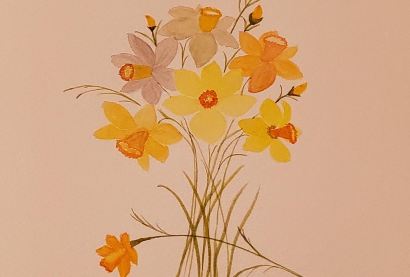
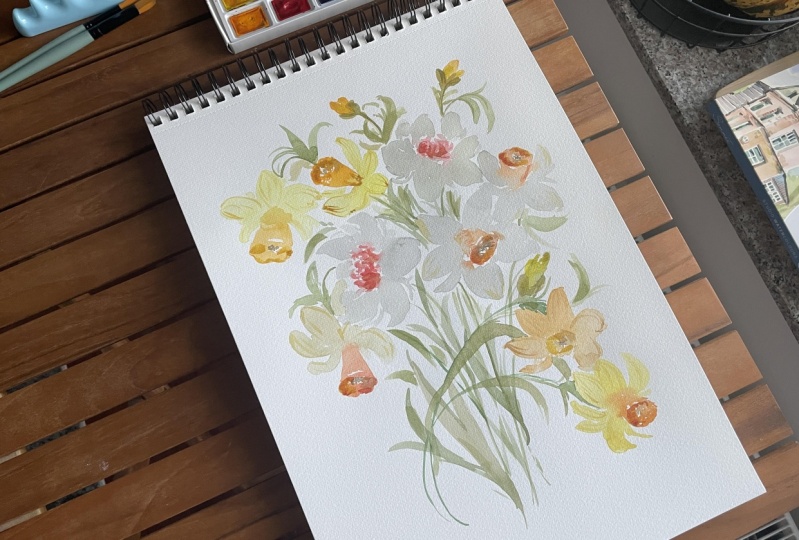
a beautiful bouquet of daffodils featuring
all three varieties explored in previous lessons. I'll take you through the
composition flower by flower, explaining the why
behind the choices I make and setting you up
for ultimate success. Although some introductory
material will be provided, basic concepts such as how to mix water and
paint to achieve proper water ratios and beginning florals suggested
advanced beginners. Those with six months
plus experience and intermediate students will find the material suitable
for their skill sets. With that in mind, let's begin.
2. Class Supplies: Jumping right into it,
let's go ahead and discuss the supplies that we will
need to complete this class. If you happen to be in a spot where you're
close to a Trader Joe's or a flower
farm and are able to pick up some daffodils. That would be a fun addition to bring into your
creative space. They are in season, it shouldn't be too
difficult to find. However, it's not
mandatory at all. They just bring a
little extra layer of joy into the process. If you don't have live flowers, then you can grab your ipad or what other
device that you might have. That way we can look at a few
reference images together or you can simply just use
the ones that I'm using. Then in addition to that, we're going to be
using as always, our can send 140 pound
cold press paper. Where you're going
to need a palette. I would like you to have two just because we're going to have a pretty busy palette of colors working with a lot
of yellows and orange. And then I'd like a palette for your white blends as well. As far as brushes goes, we're going to use a
variety of these as well. I'm going to be using the Princeton Umbria
Filbert in size six. I'm going to be using six
Princeton velvet touch. Those are the Filberts in
the velvet touch series six. Just a little note, if you've
taken my classes before, then you already
know that I love for you to have duplicates because we tend to do
pre loading of brushes. Meaning that we
mix up the color, reload our brush
with that color, and then we set it
off to the side. That way we can jump right in
and continue with the flow. And not have to stop the
process while our media is wet and have to do the
whole thing again and then have to possibly
rewet the media. It just makes for just
an easier process and transition
from step to step. Okay, duplicates of these. Then also, I would
love for you to have anywhere 2-4 is great. This is a three in
the Heritage series. This is around a couple. Duplicates of these
would be great, then if you want to
have a duplicate of the six Heritage series,
then that's great too. If not, I believe I only used one of these.
I didn't need two. But with the rest of
them, I found that duplicates were really handy. You're going to
need yellow nails. Just kidding. But I won't lie. And I won't say that
I didn't coordinate my nails to go with this
class, because why not? Right. We're in full
spring mode here. Let's just go for it. Okay. Additionally, let's
talk about our paints. You're going to be
using a variety of Mary Blue along
with Daniel Smith. For the Mary Blue series, we're going to have piral
orange and naples yellow. And then, excuse me,
our Daniel Smith, we're going to be using
undersea green, burt, Umber, Hansa, yellow, deep jeans black. And then this magic color that I have just
fallen hard for, probably going to
mispronounce it here, a roll in which is
a cobalt yellow, that will be your palette. Then if you're able to pop in a little bit of
permanent white, any white gash, we're going to be mixing up a coral color. Like a really soft,
pinky orange. I'd love for you to be
able to pop this in, but Chinese white
would work fine. And that about covers it
for our class project. I would love for you to
have a hot press paper, just because I want to be able to give you a whole bunch
of different media options. We're going to be
painting daffodils, but we're going to be
painting daffodils in different shapes,
structures, and colors. I want to give you the
full gamut to be able to do that and to keep
building upon each lesson, each step, and not just doing the same thing on
the same paper. If you're able to
use a different paper for our class project, I think that would just be fun. It's an extra challenge because
you have to get to know the paper as you're
moving along with it. But use a paper that you've
used before that you like. If you've never used
a hot press paper, my personal favorite is
arches 140 pound hot press. That's what I will be using. But there are a lot of really great hot press
papers out there too. I'm not saying that you
have to use that one. Just some different paper
would be fantastic that way we're just able to explore and give ourselves just a
range of results here. All right? Other than that, just bring your fun and your curiosity and we're
ready to get started.
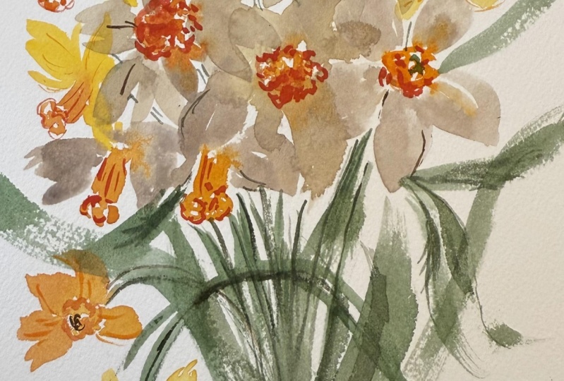
3. Observing The Daffodils: Now, before we
officially pick up our brush and begin playing
with paint on paper, let's just take a
few moments here to observe these flowers,
note the details. And you can even grab a piece of paper and a pencil and write these things down. The more you plug in
what you observe, the better and the smoother
the process is going to be. When you go to paint on paper, all of these little
steps really truly do add up to success. If you want to do that,
I've already done it. You can go ahead and get yourself a piece
of scratch paper. And we're just going to talk, we're just going to discuss what it is that we see when
we look at these flowers and things that feel
special and unique and prominent and what we want to include
in our painting. I picked these up from
Trader Joe's last week. They were all just
very tightly closed, and I knew that
they were going to open just in time for our class, and they did not disappoint these lovely little daffodils. They cost I think like
$1.99 If you're able to, like I said, please go
pick up some daffodils. They just bring
so much happiness into the creative process. Although we are not going to tackle this color
palette just because it, I wouldn't say
boring, it's pretty. I do love this light,
Naples yellow. And then we have
what we'll be using, the Hanz yellow, Deep, more like the arolean. For this center here,
U. I want to be able to tackle some of the more interesting
color combinations. We're going to jump in first, in the next video with the
yellow and the orange. And then we're going
to build upon that. If we have time, I may just show you quickly this
color combination as well. We're really going to explore the petal structure and shape, and we're going to do
that in the next video. I don't want to
jump too far ahead, but I just want to prepare
you for what's to come. Just know that we're
going to be exploring a range of daffodils. Because if you look closely
as we're launching into this, you can see that the daffodil
is a six petaled flower. These petals have a bit more of a slender and triangular
shape to them. Whereas some of the
daffodils, similar to these, some of the daffodils
really have a bulky petal. They can be trickier
to capture on paper, because if you do not
paint big enough, you don't have enough
room to build upon this generous center here and really just capture
the look of it. I prefer these daffodils
that are a little bit more petite because they don't
feel so wonky and so large. I feel like they can
be a focal flower, but also serve as a filler flower in cases where they are just on
the more petite end. I love that these are a
little bit more slender. You can see some
really beautiful, just lines through
these petals almost as though they were
like tissue paper. In fact, I have a tissue paper this beautiful, creamy yellow, and if you just gently
squeeze it together, it looks almost
exactly like that. Then we have this
beautiful bold center here that is like a bowl. I want you to envision that
as we go into the next video, where we're going to be
sketching with our paint brush. I want you to envision
we have a bowl here when we're looking front on
just a ruffle bowl here. And I'll talk more about that as we move into the next video. Then we have a little bit
of detailing in the center, which we will pull out and add to our flower just to give it that extra
layer of interest. Then we have the petals
curling up here. If we wanted to just paint it full open, we could imagine, okay, here it is, Completely open faced here. Or we can allow it to
do what it's doing here tucked up and give it more
of an interesting shape. We're going to just play around with the shapes of
the flowers here. That way we can come up and then come down the way a daffodil
might come down like this, Maybe it's coming up and it's pointing over to the right here, maybe to the left, maybe just
slightly down to the side. And really just explore a range of different possibilities. We have a heavy little
trunk here which I found doesn't quite work as well on paper as it
does in real life. Then also it has the brown
paper that it's not paper, papery texture that closes and just encapsulates the bloom until the daffodils come out. If you want, you can
remove this paper, it comes off very easily. You can just set it
off to the side. I am not going to be
including it in the painting. I want a little bit of
that green to be revealed. Then we also have our long stem here that fades from like a
dark green to a light green. What we're going to
do in the next video, when we sketch, is to
think of, like I said, this bowl shape and then also this
trumpet shape and how these petals shoot up from
the side and come back. The most fun part about this class that
personally I feel, is that we're going to go
through super loose structure, slightly structured and then just structured because
here's the thing, loose watercolor is a spectrum. On the spectrum, you have to
the left, almost abstract. It's just slight gestures intimating at something
happening here, something happening here,
and then possibly a stem. And then as you work your way towards the middle
of the spectrum, you get something that's
more slightly structured. You're taking a moment
to allow the center to dry before you go ahead and add these other petals in here. That way things are
a little bit more solidified and things are separated with super loose, especially working wet into wet, everything's just flowing,
running together. It's super intuitive,
super relaxed. I won't say that
it's easy because it can be extremely
challenging for people such as myself who want to paint all of the details
that I see in nature. I won't say it's easy, but it is more of a relaxed, sit back on the brush, Vaguely notice what's
happening on your screen or in real life and then applying
that gently to the page. As you move, like I said,
towards the middle of the spectrum and we just add
a little bit more structure. It gives way to something
that's a little bit more defined and something that possibly might make more sense. That's where my sweet spot is, in the middle of that super
loose and that structured. I like the slightly structured. And then what we can do post creation is go ahead and add in those details that really
bring a lot of interest and thoughtfulness to the painting
working with dry on dry. Okay, we've taken a
moment to just look and see what we're working with here as far as these
slender petals, when we move into
the other daffodils, I'll show you the ones that
are a little bit more bulky. There's not so much space
in between the petals here. This really has such a
sweet little star shape to it, a lovely daffodil. This will be the one that I'm looking to recreate as we move forward with the different
color combinations and structure possibilities. Let's move into the next video, where we're going to be
beginning some application.
4. Sketching The Daffodils: One of the tricks that
I have learned along the way to better help me not be so focused on every little
detail that is found in nature is to search for reference images of
artificial flowers. I know it sounds so silly. Like why would you study an
artificial flower when you can learn and study
from the real thing? Which I think there's so many amazing benefits that come from actually
putting your hands and your eyes on real flowers as you mean to explore
them and study them, fall in love with them, and allow them to inspire
your creative process. However, as I mentioned before, the perfectionist in
me will sometimes get mightily attached to all of
the details that I find. I'm unable to detach my
brain from what I see if I am using something that is already artificial and not real, for
whatever reason. And this may not work for you, but I'm putting it out
there in case it does. Some people have said
this is a game changer. I did this with my loose orchids class and so many people said, oh my goodness, that
was so eye opening. I'm sharing it again, looking at something that is
artificial will just somehow immediately
relax my brain and allow me not
to be so focused, determined to pluck out every little detail
that I'm saying. Does that make sense you're going to see because we're
going to do it together here. I'm hoping that if it's not eye opening or game
changing it at least is something that you can use
every once in a while as you move along and tackle
different flowers. Okay, I have got this
reference image, this is from Etsy's
artificial flower. And we're going to use this to just do some loose
sketching before we really begin to tackle the different color
combinations and wet into wet and structure. This is just going
to open us up, get us more familiar
with the flower, and allow us to just lean in. Go ahead and plug in some
pyal orange on your palette. Mine, I was exploring
all day yesterday. Mine is definitely dry. If you are just putting
it on your palette, you won't need to
agitate it as much. I'm just going to use one color. I want to simplify this process. I don't want to
overcomplicate it, and so I'm just going
to use one color. Even though there
is a yellow and an orange and even
some green in here. I'm just going to use
the one to just give me a single color to focus on. That way is really about the
shape and the structure. Okay, let's look at
what we have here. We have two pretty much
open face daffodils. We have this one that's
facing a little slightly up, but mostly just
completely open face. Then we have this
one that's more pointing up into the right and a little bit on its
side Here we're going to tackle these petals
that are coming out, intimating that something's
happening behind this petal. You'll see as we move
into super loose, slightly structured and
structured structure, I think you're going to hear that word a lot in this class. You'll see the differences
and the nuances, and what works on paper and what necessarily doesn't
work as well. Okay, let's go ahead and
tackle this first daffodil, the one on the left,
as I mentioned before, and I'm just doing this like on the back of some practice. I was painting daffodils
all day yesterday. I'm just going to do
it on the back side. I don't want to
overcomplicate it. I find like, the
more steps you take, like cutting your paper,
using your good paper, the more and more nervous you get about not messing it up
instead of just going for it. Use a scratch piece of paper. Whatever it takes to
just open your mind and free yourself from all
of those pressures. Okay, we're going
to do bowl shape. It's just a ruffle bowl. So let's go ahead and
do that together. Just using the brush to
quickly shape a bowl. It's not perfect,
it's not identical. And then we have something
that's happening in here. Then we're going to take the brush and we're
just going to sketch. I'm going to start with
this petal right here. I'm just going to
trace what I see. I'm going to do the same thing, moving all the way along, and it's not exact. I'm trying to give it a little
bit of body and structure but also just trying
to paint what I see too. Then this one has a petal
that's coming up into the side. We can put that in
there if we want to. I'll rough that up
a little bit there. It's not exact. In fact, this petal ended up being just a little bit too long,
but that's okay. The idea isn't to get
it exactly as you see, it's just to begin to start noticing the structure
and the shape, the length and the width of things and getting
that sweet spot. We're going to go
ahead and do that again this time we're
going to paint this one, we're going to do a little
ruffle here coming up, minding that little dip there, I'm painting pretty big here. I don't think I'll
end up going this big when we are painting, just because I want
to keep these on the petite side, however, this is best for you to
really see it and I'm just not concerning myself
with size quite yet. All right, then we have
this tube structure here, and then we have this
first puddle kind of coming up and around. And we have this one right about hitting
right about here. This one coming out a little bit too hot. There were like
right about there. Then this one folded over, but I'm not going to really
include that detail yet, Just leave it like that. The petals aren't quite as
pointy as I'm making them. That's more of a liberty
that I'm taking. If you like the more
thick bulky tip, then you can employ that. I just found that I didn't
really love the effect. I just thought it looked
a little bit clobbered. I'm going to, like I said,
make some modifications here. Then we have this
one that's coming up and peeking around. All right, and
then we have stem, which is basically just shooting straight through this one. We see a little bit
of that bulbous shape here and pulling it
down and through. Okay, we have these
two basic shapes here. What we're noting here, again, this is a shape that we're going to be
using again and again. I'd like you to take a few
moments to practice it, is that bowl shape. You might see a little
bit of the tubing here, so we can plug in a
little bit of that. We can try this one again and just imagine that we're just
tweaking it a little bit. That's the idea is if you've
taken my previous classes, we always talk a lot about
pen wheel structure. This is basically just
pen wheel structure using a six petaled flower. I typically teach
pen wheels with five flowers and four and three. But in this case, the
daffodil is usually six. We're adding that
extra petal in there. Sometimes it feels a
little bit overworked just because the daffodil does
have a wonky feel to it all. Then we see that this one's
like I said, coming up, down. And then we'll plug
in this one here. Okay, this is the same concept, we're just now turning it, imagining that we've just tweaked it slightly to the left. We're seeing a little
bit of that tubing and then factoring in those petals. I don't tend to
put a whole lot of detail striping
in at this point, but if you want to, just to
just start getting the feel of how some of those
details lay out, you can. Plus it just feels good to
make those gestural marks. It helps to, in your brain, give the flower a
directional identity. I talk a lot about
that in my classes. With gestural, sometimes it is super important
to just feel that we understand the angles that we're intending our
flowers to be at. Okay, And again, you
plug in a little bit of detail here just enough to
give me a good understanding. And then I'm going
to say that, okay, this is right around where the flower is going to connect. So this is where our stem
would come out here. All right, let's do that again. I'm going to use a live flower
this time just to give us a little bit more practice and give us some
different possibilities. Let's pull out, okay? And I am going to take that off because I just don't want it. All right. How do we
want to position? We could position it this way. We could position it this way. Don't see much of that
inner working there. We could even imagine
it like this. Why don't we do that? That's new. We might have to
just fold it a little bit, so I might have to hold it as I'm working here,
but that's okay. All right, it's just
for a general idea. Let's go ahead and I'm just
going to imagine, okay, this is the center here. Okay? So I have a center. And then I see a
petal coming up here, another one here, and then
quite a large one here. This one's wrapping around. And then I have this pretty
generous petal here. Then we, let's see, kind of coming up and here. And wrapping around. Okay. All right, so that gives
us an idea of what the daffodil might look like you were it to be
coming up and down. I really love this process. This part where we're just noting the different
possibilities of structure and shape. This is such an important
part of composition and being able to bring flowers into the bouquet in
the most aesthetic, natural organic way
and give it interest. If I were to paint
five daffodils and paint one like this, and then paint one
that looked like this, but it was just a little bit in this direction and then another
one that was like this, but in this direction
there'd be some interest. However, it would be pretty minimal versus where we
to plug in one like this. Then let's imagine that
we move this one over, it's coming up, and then around. And then imagine that we
have a couple buds up here. This is what we're essentially going to do in our
class project. We're going to take
what we've learned and apply it to make a bouquet, which is just a whole
different ball game rather than just
one single flower. Hopefully, this gives you a pretty good understanding
of this process of sketching. I don't tend to do the buds
very often just because I use the same structure for buds
pretty much across the board. But this is bud shape, I usually just do like two little lima beans
and then add some, something happening
up at the top here. There's not a whole
lot of sketching that goes into the process. But you can if you want to, just plug in a couple of details there if you
wanted to use that. I'm not even sure exactly
what its official name is, but if you wanted to note
that and include that in, then you obviously
could do that too. I felt like in this case,
it just weighted down. All right, that's just
taking a moment to sketch. I know that was like
almost 15 moments. But again, if you take
the time to do this step, it will benefit
you as we move in. Because your brain
is already locked in a couple different possibilities
of structure and shape. It will better know
what to do when we go to do this for real, okay? All right, so if you want to do that for a few more minutes, grab a few more reference images and take maybe another five or ten to do that before we head in to create our
first color combination. And affinel, by all means, please take some
time to do that. If not, follow me along, and let's move into
the next slide.
5. Yellow and Orange Daffodil: Super Loose: For this lesson, you
are going to need pyal orange and the Rolen, or the cobalt yellow. We are going to take on just that very common
orange and yellow daffodil in the super loose structure. In order to have the most
success with super loose, we're going to do it all
in one fluid moment. That means we're
going to need to have our brushes ready and prepared. A 140 pound cold press
cans and paper will absorb the paint and the
water pretty quickly. If you're using a paper
that has a bit less green, you have a bit more time. But I've noticed in my
explorations that the quicker and just the more
facile the movements are, the more success I have
in achieving something that feels very loose
but not sloppy. Have you seen the
difference In possibly, maybe my style or
maybe even someone that has even more of
a gestural style where you feel a connection
to what they've painted in a way because it's
loose but it's not sloppy. You can tell it's intentional. There's thought, and there's care going into the creation. That happens right
here in the process, setting yourself up for success. I want to take a moment to just make sure I put
that in plain terms. It's not so simple as just slapping some paint
down on the paper, but really being thoughtful
about each step. I'm going to have you
take number number six, the velvet touch Filbert. Go ahead and put that
into our piral orange. Really make sure that you have a nice generous cough
syrup consistency pile. Make sure there's no
blobs on your brush. So make sure it's an
even coat of paint here. And then go ahead and set
that off to the side. And then I'm going
to have you take your number six filer. Jump into, I haven't put it
on my palette yet or I did, but it's just mostly. Let's pop a little bit of
that onto the palette. And then take your brush and bring out that beautiful yellow. Okay, And then one step further, we're changing the ratio to broth consistency and
decreasing the value. That's how we
decrease the values, we add water for my
beginner friends, I know many of you are more
on the intermediate end. But I'd like to make sure
that I am creating a class that accommodates as many
beginners as possible. Take a minute to just watch this before you apply with me. I know a lot of you
tend to actually listen or watch
my classes before actually going through them and actually working
the material. And I think that's
so fantastic to just give you just a leg up to come when you feel
like ready and prepared. I also want you to pull out a little bit of
your undersea green to pop your number
three or two or four, whatever size brush
you're using. And we're going to set
that off to the side. Then let's go ahead and use
our number six as well. Plug in the piral orange here. You may need to get
a little bit more paint on your brush. These colors have already mixed, which create a really
beautiful palette of yellows and oranges here. But this is why I would like
you to have two palettes, because this is going
to happen and it's okay when we're doing
the yellows and oranges. But when we go to do the whites, we definitely want to
keep them separate. A lot of you use palettes
that have separate wells. Those are great to typically
this works for me. I'm just going to create a
little bit of dry separation here and then remix. Okay, so we're going to
imagine, as I said before, that this is an open
faced daffodil, so we're looking
straight upon it. So we're going to begin
with that bowl shape, then we're going to fill it in, leaving a little bit of
white space in the middle. Picking up our number
three brush loaded with the undersea green plug in
a little bit of color here. Then we're using our number six in the Umbria to immediately launch in for
super loose structure. You can see all of my
movements are very quick. I'm not taking any
time to separate, I'm just intuitively
moving around the daffodil as I've worked
it in my sketching process. It's wet into wet. Constant movement, flowing. This is probably one of my most favorite ways
to approach any flower. You'll see as we
go into slightly structured and even
more structured, that things just get
a little bit more, I want to say
overwork structured, just more defined
and more detailed. This is probably my
most favorite because we end up getting
that metal color that you saw happening
between the yellow and the orange on my palette. You get it happening on paper, which is why it's
important to try and keep those colors
separate so that we can achieve that on paper rather than achieving
it on the palette. I love this. To me, this is a done daffodil. I really wouldn't
add anything to it. This is just super loose. I wouldn't say it's abstract, but there's no definition
here for that center. The center could be
just an open center, or if it's being implied
that this is a daffodil, then then you know that there's a daffodil trumpet happening
here in the middle. What we can do,
and I'll show you that as we move along here, is add in intentional details that highlight the
areas of emphasis. We can do that post creation, like I said, and give it a little bit more structure. Let's go ahead and
do that again. But let's do it on its side just leaving a little
bit of white space. Picking up my number six, leaving a bit of
white space in there. And immediately, let's head in, imagining this
daffodils on its side, plugging in those petals, letting it all flow together. You can see the movement
is really quick, and I'm going to break
it down for you here. However, it must be noted
that with this style, it's hard to break it down
because it is so intuitive. I'm not thinking about it. I'm using that time
during sketching to just allow my hands to do what my brain
has already learned. Adding a little bit
more structure there. Again, you see that there's clearly some structure
happening here to show that there's length and
then the leaving of the white space
crucial to show that, okay, there's some
separation here. This isn't just one
continuous stroke. This is one movement here
and one movement here. That white space
really is so crucial, especially with super
loose structure. Now we could make it even
more loose where this wasn't so defined and we're
just adding it. Playing with the possibilities of petals expanding and flowing. It doesn't have to
be, so 123456 petal, this would be more
of that super loose, just continuous flowing petal that doesn't have a
lot of separation. Let's do that again,
and I'm going to do this one flowing petal here. Let's go ahead and do this. Bowl, ruffle, bowl, Addie. Keeping that little
bit of white space, taking your number six, a V shape here, leaving
a bit of space there. And then let's just work one giant petal,
all the way around. You see that my first
super loose attempt actually wasn't all that loose. I could probably do it again and get something that's
more along those ends. Let's go ahead and do that
nice bowl shape here, a little cloud,
and filling it in, leaving a little bit
of white space in the middle and
immediately heading in. Now we have something that's a little bit more loose than that. We can really see the
definition in the petals here. This is going to be more for
our slightly structured, although I am going
to make it even more slightly
structured than this. Again, I love this. I think it's so beautiful. I would say put a stamp on it. It's a style. Whether or
not is it your style? That's what my classes are
intended to figure out. I never want to say to you, this is how you
paint a daffodil. Do you want to even think about painting it a different way? Because there are so many ways
to approach it and there's so much room for
your own creativity to bloom and flourish. Here, I'm going to show
you three different ways. I want you to figure out which, which one speaks
to you the most. How do you feel most expressed? How do you feel the most joy? Which flower and which way? This gives me the most joy. And also the next stage
where we move into a slightly more structured with some thoughtful,
intentional details. But I love this, these two
colors work famously together. It's beautiful. We
know that they're daffodils because we've taken
some steps to make sure. We've added some
trumpeting here. Really? That doesn't happen
in any other flower. We know it's a
narcissis, a daffodil. All right, so I'm going to quickly add
in some stems here. If we wanted to use
like super loose stems, they're just going to be
very flicky gestural. We're not trying to capture like the exact movement of
every single stem. So let's go ahead and do that. I'm going to use my number. I had you do a duplicate
of the number three. So that's what I'm
going to do here. And I'm just going to plug in a few stems here where
I would imagine, okay, happening there.
That's happening there. This one possibly
right around here, and this one right around there. Then if we wanted to, actually I'm going to bump
up and use my number six. The number three is
great for stems. However, it's a little bit
minimal for the leave, they're just really super loose. You can see with
the daffodil leaf, if you were to go
and look at it, it's like it has this. It's very sword,
like this is what it looks like. I
don't love that. I think it's okay, but
it's just not my favorite. Sometimes I'll do one like that because I do want
people to know this. Sometimes I'll have
people comment on my videos or my work and say, it's really lovely
but it doesn't look like a fill in the blank. And I'm like, you
know, you're right, I took some liberties here. I just didn't love the leaves. I changed it up a bit pressured and don't feel as though you have to stick to a
certain look or style. This is your art, it should
reflect how you feel. Then I might like plug in something like that
and then maybe loose it up a little bit by doing like some
jagged lines here. Really just playing with what
I see versus what I like. Okay, this is really just
loosening your wrist, allowing a lot of play. You're just taking the brush and letting it glide
around the paper and just giving it some
play and movement. Okay, we can, like I said, post creation head in. Then what we can do that
was broth consistency. We can use a cough consistency to really add a little
bit more of depth to it. Taking that, layering it on
top of those initial strokes, then we have something that's
a little bit more defined. But again that, although I still would label
it as super loose, it gets a little bit
more structured as we add in those bold lines. Again, this is up to you to be able to decide
what do you like, what parts of this do you want to implement in your process? Okay, so that's super loose. We're going to
move into slightly structured in the next lesson.
6. Yellow and Orange: Slightly Structured: The most significant difference here is going to be timing. Watercolor is all about timing. It is the foundation
upon which we build that's proper
water ratios and timing. Those are the two
main components that create this whole
watercolor process, depending on how long we wait. And this is where it gets
complicated because depending on what media you're working
with, meaning the paper, and how much grid it has, this changes each time The possibilities expand
and they get bigger. If you're using this paper consistently, you
can begin to learn, okay, This is how long it typically takes for
something to dry. You can plan for that, but each time you switch
to a new media, you have to readjust
and recalibrate. So for this structure, the most significant thing
is going to be the timing. We're going to allow that
initial paint, that orange, to dry a bit before we head in with our six brush
and pull out the petals. Go ahead with our bowl shape. Nice ruffle, leaving
a little bit of the white space,
begin to fill it in. Now we're just going
to wait a few beats. And this is the part that
gets really tricky to film because when you do those
process time lapses, people don't see that,
they're trying to learn from you, however they can't. Did you wait 8 seconds? Did you wait 15? Did
you wait a minute? It really all changes and depends on what it is
you're trying to achieve. I've given that a moment. As I did with our
initial flower, I'm going to begin
plugging in those petals, making distinct differences
between each petal. I'm also going to
leave a little bit of white space so that the color
doesn't completely flood. And then I'll attach
it a little bit later. But this is my trick for not getting this middle portion to flood into these
petals and take over. You can see I'm really taking my time here as I build 123456. As I move along, you
can see that there's no flooding now because
it is beginning to dry. I'm going to make a little bit of flooding happening here. Bleed. Let's do more of a
gestural stroke here. Not so similar to
all the other ones. Again, this is not how
you would see a daffodil. Their petals are
all pretty similar. Some might be a
little bit wider, some have a little bit more of a slender point to them and
then slum get really bulky. I like the ones that
are a little bit more slender, as I've mentioned. Okay, here we have this, which you can see there's quite
a bit of difference here. Instead of having just
this continuous petal, plugging in that white
space intentionally, we have a dedicated space
for each petal loose, then we wait a little
bit longer to pop in that green that is
not as it is here, flooding into the petal as well. That would be the
difference between super loose and slightly structured. Then what we can do, and
I'm going to do that again, doing a different shape, you can really begin
to understand it. We can plug in those lines that we did when
we were sketching. We can plug those in for some just intentional
thoughtful moments, leaving a bit of white space there using my six velvet touch, blotting off slightly, pulling a little bit more
water into the brush, something a little
bit more pale, keeping a bit of
white space there. Just like I did the first. And then again, we're just
going to give it a beat. I'm going to while I'm waiting, because it's so hard for the watercolor artist
to just sit back. It feels like you should
be doing something, especially if you are not botanical and you aren't
waiting for layers to dry. It can be hard to just sit and breathe and
give it a minute. Let's consciously just breathe. Now things are just
a bit more dry. Let's go ahead and
plug in those petals. Okay, so we have 123456. This is pretty simple
and straightforward. We bring in a bit
more of structure. As you can see from
the difference here, things are not so
continuous and flowing, but still, it feels loose, feels very natural,
and not at all forced. Then we can add a little bit of the green center
here if we want to, just to bring in
a bit more color. Here is where you can opt to add a bit more
structure if you like. You could take your
number three brush and I'm going to dip it
into the pyal orange. You could add one more layer of orange in the cough
syrup consistency. Could take it around the edges here and go over that ruffling. Then what you could do
from here is you could blend it in some areas, you could blend it in
the whole thing and then add in a bit more green to once more flow into that orange. But just know that with
each step along the way, you're adding more structure. The more strokes,
the more structure. It's something that I
invite you to play with. We'll do it here too, where
I've made some separation, adding in a bit more orange here while the
media is still wet. I'm going to show
you what this looks like when the media is dry. And you can see the difference, just blending it along there. Now we have something that
looks quite a bit different. With each little layer, we add a bit more
of that structure, a little bit more of that
understanding in the flower. Then plugging in
those petals, petals, stems, and imagining
it's coming. Maybe right about
there. I'm just going to use my number
three while I'm here. Even though I probably
would use my number six usually just to plug in
a few of those leaves when we go to create a bouquet, I am going to suggest that we bring that bouquet
back to center. Unless you're really trying
to line up your flowers here, and that's something
intentional, I don't suggest it. It tends to not look
as though there's any composition
being implemented, and it just looks
a little chaotic. When I create flowers together, I try and bring them
back to center, or at least have the
majority in the center. And then I might take
a flower like we did in our snowdrops class
and really pull it out and make that focal flower
if I were to a leaf here, and then maybe make
it into a stem, and then I could have
another daffodil coming down right here. Why don't we do that, just to give you an idea
of what I mean. I'm going to have my
bowl here on its side, taking my number six hoops coming out of the frame
a bit, apologize. And then heading in
with the roll in. Giving it a minute
though or not a minute. Ten to 15 seconds, just enough for it to kind
of land there on the page. Now we'll begin to plug in, being careful not to immediately touch up against that orange, but leave a little gap there. You see how it's our simple
compound stroke beginners. If you're finding that this
material is feeling advanced, I'd invite you to
go back to one of those beginning courses where we talk about compound strokes. It's just the one and the two. Plug in a little line here. It doesn't have to be
exactly a full petal then. Maybe right there now. You see what I mean? I want to bring things back to center, but I can always take a flower. I wouldn't do it on both
sides because again, it just starts you want
angles and dimension. But you don't want it
to be so spread out that there isn't a place
for your eye to land. And I know there's a little
bit of the stem in there. You can paint that out, or you can just
leave it up to you. You can do this first, then plug in the stem. I won't say that
there's one right way or one wrong way though. People sometimes do like
to do the flower first so that they aren't the right word, like committed to lining up their flower exactly
where that stem is. If you don't have
a great, great, solid command of your
brush and placement, I would say do the flower first, and then you can add in
the stem because you can see mines leading right
up to where it would be. But there's times, even when I've done this, a dozen times, that I don't line it up right, and you can definitely see that the stem would not
line up there. Again, super loose structures, slightly structured, and we have a little bit of
room and liberty to play. We can add the
green if you like. You don't have to, but you can
see up here as things dry, they just begin to look
a little bit more harsh. There's really no
avoiding that unless you are diluting the
color initially, rather than this
broth that we used, this color right here, we
would dilute it even more. We would decrease
the color value to something that was like a 90% water and 10% paint ratio. Then we can layer on with a broth consistency and it
wouldn't look quite as dark. That's something you
can experiment with. Water to color ratios, make all the difference
and then the timing. All right, that's that. I'm not going to add any more
details because we're still falling under the category
of slightly structured. In this next video, we will move on to what I call structured without so
much as being botanical.
7. Yellow and Orange: Structured: Approaching this flower with
more structure in mind. We want to utilize all of the tips and tricks that we learned in the previous video, but we're going to
build upon those. We're going to do all
the same steps and I'm going to do them
fluidly and quickly, Mindful of giving the
paint a moment to dry here on the paper before
moving onto each step. Then we're going to
add in more details. We're going to just get more structured and you're
going to see how adding the details
does two things. It gives more understanding
and identity to the flower, but it also tends to make it appear a bit
more worked there bowl shape giving that just a moment, I'm going to mix
up my, a roll in. Actually I'm going to
do another one over here off to the side so that
it has a chance to dry too. We're just using the Filbert
to do some sketching here, blotting off a little
bit of the paint, create a bit of separation here. I can see that the paint super heavy right here on the right. So I'm going to start
here at the top. And being mindful of how
close I come to that orange, I'm going to rinse
off a little bit, get that orange off my brush, and then dip back into my broth. That way I'm really
getting the yellow here. Okay, So we have 123456, but we can definitely see
that there is structure here. Okay? And now I'm going to do the same thing over on this one. Imagining that there's a
petal popping up right here, one on its side, one coming down and then
disappearing behind this one. All right, I'm going
to give that a minute. I'm going to do a few more
allowing these to dry, although I am going to plug in that green before doing that. All right, this time
I'm going to use one of my flowers
as a reference. And I'm just going
to kind of imagine, all right, again, this is where our
sketching comes in handy. Picking up the number six, blotting off a bit, and I'm going to give
it just a beat to dry. This one's kind of
hitting right about here. We have this one
right about here. Picking up a little
bit more water, a little bit more paint. We have this one, it's
coming along here. Overlapping here, I'm
running out of paint. So give me a moment. This is the benefit
of working with a little bit more
structured as we have the time title here, okay? And then we imagine that the stems coming down around here. We'll plug that in later. Okay, put that up to the sign. Here's where we would, again, just like we did last time, picking up a little bit
of the pyal orange. Using our number six,
we are going to. Now here's an idea. You can always just leave
those strokes as is. You do not have to fill them in. They can be really
gestural and light. I'm going to do these ones
a little bit thicker and then I'll do the other
ones a little bit lighter. You can note the difference. But let's say we wanted
something that was a bit more even and separated. We could take the
brush and just add in a little bit
more color, right? That would be an easy step. Then what we can do here, we know that there's
separation happening here. We could really emphasize that separation by taking the
brush and just running it along where these two parts
of the center separate. So now we can clearly see, okay, this is this part of the flower and there's clearly separation
happening there. But if you do that, then I
do suggest adding details in other parts of the flower
because that can just look a little bit odd, a little bit consistent. If you're adding details here, you likely want to add
details elsewhere. You can take number six, brush here, we can
add some lines. I'm going to just fill in that little area where it
should be blotting off. You don't want them super dark. You can always go darker,
but you cannot go lighter. So make sure you don't
have a ton of paint. There you go. You add
in a few little lines. Now on this flower, we could do the same thing
or we can take our brush. This time I'm really
going to lean in to the paint here using
the tip to really plug into this sticky globe so that it's more than
cough syrup consistency. Really using it almost like 100% tiny bit water coming up directly over
the brush, just like this. Some sweeping gestural lines so that it looks something a
little more like that. Here. We really am pulling out
what's happening here. The depth here we have, it's dark in here because we're looking into this tube here. There's not so much of that. It's just saying, hey, these two parts of the flower
are a little bit different. We could also doing
the same thing using our number
three brush plug into that sticky bit of
under Sea green. I do the same thing. You see how it's not
running all over the place. They're thoughtful,
intentional details. Then lastly, I'm thinking
these petals are dry. Ish. Add a little bit of the
piral orange to your Olian. To get a nice little
mixture of the two colors, we're going to add some
lines into the petals. These can be as thick or
as delicate as you like. Still a little bit too wet here. But that's okay, because
it's a look too. You can add those
lines when it's a little bit wet and
then you'll get more of just a flow then that I think is
going to be too wet. Yeah, too wet still. Let's go ahead and
plug in our stems and then we have this
one coming up there. So we're just imagining
that this is where it's attaching because we had
it right like this, right? I'm not going to do such
a lengthy stem here. I just find that it
doesn't work as well on paper as it does in real life. So I'm just going to kind
of bring that around here. Then I'm going to
do the same thing, adding some detail lines to these to make them
a bit more structured. If I had to pick, and again, this is about, this is
about what you love. I would say that this is more the flower I would lean
towards versus this one. It begins to just look a
little too dark for my taste. But again, it's up to you. I want you to figure
out what you like. Experiment with all of it,
especially you beginners. This is your time to really
figure out what you love. Nothing has to be branded. Nothing has to feel
like it's off brand, Meaning that it wouldn't
go with your feed. If you have a feed on
Instagram where everything feels like it needs to coordinate
with the last picture, there's a lot of pressure on artists to maintain
a cohesive feed, which does not bring
a whole lot of exploration or curiosity
into the process. It can be really challenging. As beginners, this is really your moment to
figure out what do I like? How much more do I want to
continue exploring this? These are petals are a
little bit more dry, which is producing a bit more of structured
results which I like. Again, I'm super loose with it. You can see I'm just pulling the brush through the petals. I'm not taking
pains to like make each line super similar
to the last one. It's all just very
loose and natural. Okay, I like these a little bit more when I plug in a little bit more of the
structural details. Because again, like I
said, when you just do one detail, it
just feels off. It doesn't feel like
it's hitting right, and there's just
something missing. But the more details you add in without going so far as
overworking it, again, this is the step
that I would say is right before it
starts to get really structured and we lean into botanical where we're really
allowing each petal to dry, then we're adding
shadows to the petals. Then we're adding each little stamen that's
in the center. Rather than just like
there's a moment, there's something
happening here. Gesture is all about moments. You're picking and plucking out what you love most
about the flower. What you want to
accentuate and emphasize. Okay, experiment with this. Use those three
different approaches. The super loose, slightly
structured and structured. Put it all on a couple pieces of paper and figure
out what you love, because you're going
to gravitate to one style over the other
is my guess, or a couple. Then in these next lessons, we're going to build on what
we've learned here using different color
combinations and tackling some more intricate and
beautiful daffodils. I'm looking forward to
that. Take the time you need to explore
and practice, and then head on into
the next lesson with me.
8. Yellow and White Daffodil: Super Loose: This daffodil is very similar to the yellow and orange one
that we have been exploring. It's diminutive. Its petals are on
the slender side, more so than some of
the bigger bulkier daffodils that we'll take a
look at in future lessons. This one's going to
be, like I said, just very similar to what
we've already been exploring. But we're going to bring in
a different palette now. Using a bit of al
the Hansa yellow, deep, and then creating
a white mixture to create just this
beautiful, delicate daffodil. This will be my reference image that I'm going to draw from, so I'm going to pull
this off to the side. Just keep it here, just as far as having something to look at. But really, I'm just going
to be moving intuitively, especially as we move through just the different
structures using the super loose and then the lightly structured
and then the structured, if you haven't already, It's definitely a good time to rinse out your water cup
because it's probably going to be pretty orange
and yellow by now, and we want a nice, clean, fresh cup of water
as we mix whites. Then also, as I
mentioned before, I would love for you
to have a separate palette for your white mixture. Just so that we are taking
extra precautions not to have it corrupted by the oranges and the greens
that are also on the palette. So go ahead and do
that then we're going to load our brush and plug into the chains black nice
broth consistency. Then rinse your brush off
and dip into the roll in. And we're going to mix those
two colors together to get something very nice
and complimentary. We're going to pull that
out one step further, adding water,
decreasing the value, so that it's something
a little bit lighter. White washes can be made
using a series of browns, blacks, yellows and greens. I have a whole color guide if it's something
that interests you. I've talked about
it multiple times, so I won't go into
detail in this class, but essentially it's
a sheet full of my hand mixed white mixture. It's something that might
be of interest to you. Now I'm going to make sure that my number six is
nice and rinsed off. And I'm going to dip in because that's the
brush we're going to be using and load that up. Then I'm going to go ahead and set that off to the
side for a moment. Then I'm going to pop in a
little bit of the honza yellow deep and just keep that
there for a moment. I'm going to use my six round and mix the roll in right over here away from my white mixture. So it's something in between
broth and cough syrup. I would say it's a 60%
paint, 40% water ratio. All right. We're going to begin
the same way we did with our daffodils,
creating the bowl. If you notice, I'm
not going to go through this whole
process again with you, of observing and taking notes just because we've
already done that. But you'll see that the edges of the trumpets are a lot smoother, they're not nearly as roughly, that's something that we can employ and utilize when
we're painting this flower. Or you can continue to
do the roughly center. It's completely up to you all. I have both of my
brushes ready to go. We're going to begin
with super loose, that's that one continuous petal moving around the center. So something just slightly
more smooth around the sides and then immediately heading in
with my number six brush. Just intuitively moving
the brush around, that would be the
basic daffodil. We can see that there's
definitely some petals happening, but there's not anything
that's truly identifiable. We can even make that a little
bit bigger if we want to, a little bit here. Give it a side
view as if we were looking at the
daffodil in this way. We can imagine that this
part coming down here. So let's go ahead
and do that again. Remember it's just that
continuous stroke. Let's go ahead and do
one on this side now. You know what? Let's
go ahead and add just a bit of that tubing. I'll make a little line there. That's our center. We'll pop in a little
green in just a moment and begin rinsing off my brush real quick
to make sure that I'm not picking up too
much of that yellow. Now, we can plug in a little
bit of that Honda yellow. This dried up a
little bit on me, so I'm just going to re wet it. And there we have what I
would call super loose. Let's go ahead and
do one more that, let's imagine this one's
kind of coming down here. So we got a little trumpet here, Make our line, and then do
our little sweet little bowl, a little bit of separation here, and begin plugging
in those petals. Just intimating that something's happening right around here. There's a petal coming up and popping in a
little bit of that. Hansa, I don't love how that one turned out because it happened post creation. I love when it all happens
in one fluid moment, that one was marred bit. But what you could do is
continue to add color to it. Sometimes I take this as
an opportunity to just re wet and have fun with it. So let's go ahead and do that. And then add a little bit
of wet and to wet here, and just adding a bit
more of that, A roll in sketching out that
shape, filling it in, adding a bit of a
smaller shaped daffodil. We're really going
to play with that when we do our class
project together. Right now, I'm
doing them all the same size just to give you an idea of color
combinations and timing, because that's the
most important thing, especially as I said, with the super loose,
you want to have it to have your brushes loaded, and then be able to
just simultaneously or continuously plug in
each step along the way. We're just gesturing like, okay, there's something happening here in the center of this flower, but we're not really
taking the time to really pull that detail out. Then again, with
the trumpets part, we're indicating, okay, there's definitely
something happening here in the elongating
of that flower. But we're not taking the steps to move into something
more structured like this. If you wanted to,
just for the sake of curiosity, curiosity,
and exploring, what you could do is take your number three brush dip into the undersea green and add just a few
little detail marks. As we see here over in
our reference image. There's some really pretty
little green happening in there along with the yellow. We can just take a moment
to plug in some details. That's really fun is to mix these approaches because this is still
very super loose, But a little bit of
detail isn't going to be so odd that it feels like there's a disconnect or discord between these approaches of using super loose and a
little more structured. That green with the
yellow is super pretty. That's mostly it. I love mixing greens and
yellows together. We can explore a little
bit more with that. We'll do that a little bit more with the slightly structured, but that gives you
a basic look at just using this color palette
in a super loose way. All right, let's go ahead and
move on to the next lesson.
9. Yellow and White Daffodil: Structure: This daffodil is very similar to the yellow and orange one
that we have been exploring. It's diminutive. Its petals are on
the slender side, more so than some of
the bigger bulkier daffodils that we'll take a
look at in future lessons. This one's going to
be, like I said, just very similar to what
we've already been exploring. But we're going to bring in
a different palette now. Using a bit of al
the Hansa yellow, deep, and then creating
a white mixture to create just this
beautiful, delicate daffodil. This will be my reference image that I'm going to draw from, so I'm going to pull
this off to the side. Just keep it here, just as far as having something to look at. But really, I'm just going
to be moving intuitively, especially as we move through just the different
structures using the super loose and then the lightly structured
and then the structured, if you haven't already, It's definitely a good time to rinse out your water cup
because it's probably going to be pretty orange
and yellow by now, and we want a nice, clean, fresh cup of water
as we mix whites. Then also, as I
mentioned before, I would love for you
to have a separate palette for your white mixture. Just so that we are taking
extra precautions not to have it corrupted by the oranges and the greens
that are also on the palette. So go ahead and do
that then we're going to load our brush and plug into the chains black nice
broth consistency. Then rinse your brush off
and dip into the roll in. And we're going to mix those
two colors together to get something very nice
and complimentary. We're going to pull that
out one step further, adding water,
decreasing the value, so that it's something
a little bit lighter. White washes can be made
using a series of browns, blacks, yellows and greens. I have a whole color guide if it's something
that interests you. I've talked about
it multiple times, so I won't go into
detail in this class, but essentially it's
a sheet full of my hand mixed white mixture. It's something that might
be of interest to you. Now I'm going to make sure that my number six is
nice and rinsed off. And I'm going to dip in because that's the
brush we're going to be using and load that up. Then I'm going to go ahead and set that off to the
side for a moment. Then I'm going to pop in a
little bit of the honza yellow deep and just keep that
there for a moment. I'm going to use my six round and mix the roll in right over here away from my white mixture. So it's something in between
broth and cough syrup. I would say it's a 60%
paint, 40% water ratio. All right. We're going to begin
the same way we did with our daffodils,
creating the bowl. If you notice, I'm
not going to go through this whole
process again with you, of observing and taking notes just because we've
already done that. But you'll see that the edges of the trumpets are a lot smoother, they're not nearly as roughly, that's something that we can employ and utilize when
we're painting this flower. Or you can continue to
do the roughly center. It's completely up to you. All right. I have both of
my brushes ready to go. We're going to begin
with super loose, that's that one continuous petal moving around
the center here. We're going to give the flower
just a bit more structure. So that means we're pausing
and we're waiting a moment, allowing things to
dry just a bit. Before we blend the
two colors together, we can pop in the honza. Have a bit more time then. Remember, we're going
to leave room for just a little gap here so that
the color isn't flooding. Okay, just taking a brief
look at my reference image, I'm going to be linking these for you so that you
have them as well, and you can bring them up
on your ipad if you like. Again, like I said, this is
more of a diminutive flower. So the petals are a
bit more pointy on the ends and not
so thick and wide. Making sure that my brush is
using that white mixture. I don't want the colors
to mix on the palette. I want to make sure they're
mixing on the page. Okay, so once more, we have that definitive
123456 petal, that open faced daffodil, and adding just a
bit more structure so that our petals
are a bit more crisp and identifiably separate. Okay, I'm going to
do the same thing. Give that some time to dry
before I add in more details. The lin is just about
done on my palette, so I'm going to add a little
bit more here quickly. Okay, using my
number four brush, or excuse me, this
is a number six and I'm just going to
give that a minute. Still pretty wet. Let me go ahead and add the Hansa Yellow. Deep In a moment, we're going to play here with a different color possibility. I'm going to show you what
the white looks like with the Hansa in the middle
versus the rollin. All right, so let's
go ahead and start plugging in our petals. We want to, we could allow a little bit more
bleeding action to happen here between the petals,
but not necessary. Again, you're just
checking to make sure the media is still wet. If it's dry, then it becomes
a lot more structured. And then let's go ahead
and use our three brush to dip into our undersea green
to create a few stems. Now let's go ahead and use a
different color combination. I'm going to use the
Hanza instead of the rollin so that you can
see what that looks like. All right, let's use one
of our live flowers. There's a reference, I really like this one right here that I'm pulling
out. It's so beautiful. I'm going to try to put
that in right about there. Okay, this time, loading
my brush with the Hanza. It's such a fun color, really buttery,
buttered popcorn. This time I want to show you something
a little different. I'm going to start
with the petals and then plug in the middle. All right? So we got right
about here, a little dark. I'm going to blot
off a tiny bit. I'm just pretending that
these petals are in fact white and yellow. Okay, We have just like
the basic structure here. And then I'm going
to be careful not to completely allow those
colors to merge quite yet. I'm going to start right about here. Held that in. And then allow it to
touch right about there and then leave a little
bit of white space and then I can finish off the flower and we have something that's
pretty similar. I'm omitting this little guy, I like that this petal was
coming up and covering it a little bit more
of a super loose. But you can definitely
still see that there is structural
things happening here, rather than just one
continuous petal. Can even add in
another petal over here taking some liberties. Then if we wanted to, we can add a bit of
the undersea green. Although we don't really
see a whole lot of that, even using this
as our reference. We wouldn't see a whole lot of it if it was turned on its side. So let's go ahead
and do that again using an open faced daffodil. Having given that just a
little bit of time to try, I love how the edge of the bristles picks up a
little bit of the paint. So you can see that happening along the edge of the petals. That's one of my favorite
things that happens. You just gradually picks up a little bit of
the paint and then it brings it into the
edges of the petals, which is just so pretty. All right? You can see that's
a really super fun color combination as well, in addition to using the role
and it's a bit stronger. Now if we wanted to make it a
little bit more structured, we can go back over to our first couple daffodils and
plug in some more details. So we can imagine
that this is right where the trumpet would be folding over and then
do the same thing. Here we have the
choice whether or not to completely
fill it in or to simply add in a few marks
and leave it like that. Taking a bit of
the undersea green to indicate something's
happening there in the middle. We can also do it with the Hansa yellow deep because
as we see here, there's some really
pretty things happening in the center. Adding in a bit more
of the undersea green. And then we can do it over here on these daffodils as well. I'm going to plug
in a couple stems first and a few leaves. I'm not really overthinking
it too much now. We've given it
enough time to dry, We can do the same thing
here if we want to. Creating a little bit
of shadowing here, then the same thing over here, we can color it in, or we can simply just outline using that
gestural technique. You have a couple
different options. We don't have anything
that's over structured, it's just very light structure. Using color to define, making sure that
there are separate separations in our petals, and then applying those
intentional thoughtful details at the end post creation. Sometimes using them while
the media is still wet, but trying to give it
enough time to dry so that the paint really
has an opportunity to soak in and
create a new layer. Okay, that's our new
color possibility. We're going to explore different daffodil in
the next video using some really pretty fun structure
and a new color as well.
10. Daffodil Extravaganza: If you are not already
familiar with Floret Farms, A Year in Flowers, I
highly suggest this book. So many of you will
already be familiar, being flower lovers like myself, with Aaron's book, but she tackles flowers in
different seasons. You can see that I have a lot of little tabs here because so many of the
images speak to me. And she does such a great
job explaining why she pairs certain flowers together
and how she arranges them. It's really more about floral arrangement rather
than painting, but it's a great book
for inspiration. She happens to have a section that's completely
devoted to daffodils. I fell madly in love
with this flower, Studied it so much
a couple years ago, and then studied
again this year using a different medium colored
pencil and white guash. But I absolutely love the
images that she shares. The varieties of daffodils
are just so beautiful. It feels like they're limitless. And in fact, when
I was exploring, researching this class, I felt like I couldn't
narrow it down. Like I wanted to paint
each one with you. But to take the time and really draw them out, it takes time. And I could be here with you
for 3 hours if you let me, But that makes for a
really long class. Maybe in the future we'll do something like a series where we're getting even more
deeper into the flower study. But for now, I'm trying to
give you a taste, a platter, a sampling of sorts, so that you can just get smitten with this flower
if you aren't already. And then continue to do
more exploring on your own. Anyway, this is an
incredible resource. Love this book. And she
has another one too, and I definitely recommend them. The last daffodil that I
have picked out for us to explore is the
daffodil extravaganza. If that doesn't
sound like a party, then I don't know what does. This flower is just so full of intricate details just from the gorgeous petals to the
ruffling in the center, to the mixed petals inside, along with the
ruffling trumpet area. There's just so much
happening and I wanted to tackle at least one intricate
flower and see if we could do it in a way that feels loose a bit of structure to it and just feels like
a whole lot of fun. We're going to mix up a
new palette of colors here and employ these
beautiful coral, adding it a bit
of white guash to soften it a bit and
have a lot of fun. But post flower, I highly
recommend you can continue on. There's so many different
daffodils to explore and I think you're going to love
something about each one. I really love this daffodil. Precocious over here in
the corner is so fun with this big giant coral
trumpet. Same here. And then these ones
have some really beautiful actually we basically just did
these ones just using the yellow
instead of the coral. This has the coral
just along the rim. There's just so many
different ways and approaches and I hope that
you will take the time to really enjoy this
for our coral color. We're going to be using a
bit of the in the Rose lake. The pyal orange and the Windsor and Newton designers squash and permanent white. I'm realizing now
that I neglected to mention the Rose Lake when I was talking
about the supplies. It's in the class
overview and supply list. But I believe I forgot to mention that one,
just so you know. Let's go ahead and build that
color from the ground up. Plug in a bit of
the rose lake here and a bit of the piral orange. And then I've already put
the white quash over here. And then using your
other palette, pick up a little bit of the Jans gray and mix that with the until it looks
something like that. Add a bit more water. I'm going to put that
off to the side. And now we're going to build
our coral starting with the Rose Lake pit lunch. You want to have enough of it, keep building and modifying
as you move along. Then we're going to
bring in the gosh, that's going to lighten
it up considerably. I'm going to put in
a little bit more orange because it's starting
to look pink to me. Now we have a color
that's getting closer to what we're aiming for. It takes a while, but
it's worth the effort. Still more pink than coral. So I'm going to pop in just
a bit more. There we go. Now we're getting there. If you like the pink, you
can always use the pink. You can keep it more on the
pink end, is what I'm saying. You don't have to add
quite as much orange. Okay, now we have
our center color, and then we also have
our petal color. I'm going to set those
off to the side. Now this flower is a mixture of really all of the flowers that
we've been studying. Its petals are a bit
more on the wide side. They come at a point, come out, and then come back. So they have a real
wide feel to them. They're not so slender
and pointy at the middle, they have a rounded tip. I'm going to make some
artists liberties along the way just for
the esthetic sake. But again, you can look at
the reference images and follow along if you want to
sketch these in advance, taking into consideration
the ruffles and the petals, and pull all of that into
a sketch just to get a feel for how it's going
to lay down on paper. Then that might be
a benefit to you, but I'm going to go
for it here and just begin incorporating all of these little details that I see. We're going to be using
a bunch of brushes. Going to be using my
number four, number six, round number six in the Umbria and the number three brush
for some of those details, we're not going to be popping
in any yellow or green. This is strictly
going to be white and coral, using my number six, the filbert, I'm going to
dip that into my paint here and begin building
the center of the flower. It has all of these really
fun ruffles that I'm just going to pull out as details. Making gestural strokes, adding a bit of structure
here in the middle, and just giving the flower a
bit of directional identity. Now I'm going to go in
with my white mixture. My brush is pre
loaded and it has these beautiful white petals intermixed with the peach here. And let those colors
flow and blend together. And then begin to take on
the rest of the petals a little bit of
wetting to wet there. And then I'm going
to take one of my three brushes and dip
that into my white mixture, and create some
little gestural lines here just to bring a bit
of delicacy into it. I'm going to leave
some white space even though there's
not a whole lot of it. Just to give a bit of, like I said,
directional identity. And that definitely looks
like an extravaganza to me. I'm going to pull out a little
bit of a wider petal here, looking a bit like a pony. I want to make sure that I'm
staying true to the flower, including all those
pretty ruffles. Okay, we're going
to do that again, and I'm going to
pick a different direction to come in this time. Let's go ahead and
start with our round. This time I'm going
to use my round brush to begin the middle. Just gesturally adding in a few petals and then immediately
plugging in the white. Rinsing off my brush so that
I'm not picking up that, that pink. And then continue. And then a nice big petal here, another one right here, and another really
generous petal here. And then there's a few more white petals
right along here. I'm not going to aim to try
and capture all of them, but I'm going to use my brush, angling it back and forth until I have just
the general concept, if you're not looking
at this exact image. These are the two that
I'm looking at here, twisting them around, making a few artistic liberties
along the way. Let's do one more time. This time we're going
to come up and down. I'm really going to use
my imagination here. Take a moment to envision this flower as though
it's coming down, beginning with that center. A few intentional
gestural petals. Oops, Be mindful of your hand
smudging into the details. Then your white mixture. Careful if you're pulling up that coral to rinse off
your brush in between, I want those white petals
intermixed with the coral. That's what makes this flower so fun is that
there's a lot of that happening where it
looks as though they're almost stitched
and sewn together. Again, rinsing off
my brush so that I can get some clean
white petals in here. Gradually adding
a bit more detail until I have something that
feels like I've given it a directional identity,
it's facing this way. Then we can go in with our
number three brush and create some stems imagining that this is landing
somewhere around here. I wonder if you have a favorite
yet? I'm super curious. I cannot wait until you upload
your projects and give me some feedback because it is
so much fun as this one is, how beautiful and
ethereal it is. It's definitely one
of my favorites, but I love the other
ones. We explored too. And now you know why I spent a collective
six months studying this flower because there's
just so many different ways to approach it and
to have fun with it. Just for fun, I'm going to do a full tube coral
with the white. You can see what
that looks like. Then we're going to wrap up. Okay, I'm going to keep
building on this piece of paper just so as to save a bit
of paper along the way. I think I've used
like 17 pages by now. You can also use
the backs of paper. Okay, so I'm going
to do the same thing as we explored in the beginning, but using this more
tube structure. Really leaning into
the water ratio here, playing with those ruffles, and now moving into
that super loose. I love this as is. Like I said before,
I would call this, just put a stamp on
it and it's done. The success of this
beautiful color is really going to come with the work that you put
into building it. I included that one mixing
step in this video because I really want you
to see the time it takes to get that mixture
exactly as it should be. Not too watery, not too thick. Adding a little bit of pink, adding a little bit more of orange,
bringing in the white. It takes time, but
you're setting yourself up for success
and that's what you want. You want to make each step of the actual painting process as easy and as straightforward
as possible. And you do that by preparing beforehand so that
when it comes time to paint, all you have to focus on is the actual painting and not
fixing your water mixtures. All right, let's go ahead and do the same thing over here, blotting off my brush to get a nice light color down here, letting them touch briefly.
And now heading in, finishing it off with
our number three brush. Giving a little
bit of structure. We're going to
cover this when we do our class project together, but just to give it a
bit of play and fun. Now here's the
thing. You can wait, post creation and add in your stems or something
super fun that you can do is touch the green stem to the edge of that white petal. That's a really
beautiful effect. I'm going to do that and draw it out here so that you can see it. But this color
combination is a ten. It's so beautiful. I've loved using it when I
explore daffodils. This year I released a few originals in
this color palette. And they were so loved. And it's been just a joy to recreate it using watercolor and white paper rather than the linen paper
that I used for that study. It's just, again, it's a complete win and I think
you're going to love using it. All right. To show
you that step, I'm going to go ahead
and create one more. Just a bit of paint on my brush, mostly water, brushing it up against the edges
and then heading in. Now what you can do, have that brush loaded and plug it in right here
on the edge of the petal. For beautiful wet into wet. Super beautiful. I hope you have loved all of these different
color possibilities we've looked at so much, we've looked at super
loose and a bit of structure and then
heavily structured. I didn't do the
mower structured, I didn't keep going with it because I showed you
how to do it with this initial flower and I wanted to be
respectful of your time. But it's something that you
can now that these are dry, you can go in and
add those lines, add those little
gestural markings to the perimeter and to the center
and see how you like it. I definitely invite you to explore more with these corals. We're going to use them
in our class project. We don't have to say
goodbye to them quite yet. And we're going to put all
of these beautiful daffodils together in a gorgeous
bouquet. I'm so excited. So practice as you need to, and then get your
hot press paper clean off your palettes if you need to rinse your brushes. And meet me in the next video.
11. Class Project Part I: Okay. My friends, I am here
with my hot press paper. A few things to keep in mind, as with most watercolor papers, there are two sites. There's one that has
a bit more texture to it and then one
that is smoother. I'm going to be using
the smoother side also, because we are going
to be intending to put these daffodils into a
composition, into a bouquet. There are things, like I
said, to keep in mind, we are going to want to
employ basic structure. That means giving flowers
a directional identity. Using color combinations to bring interest and intrigue
into the painting. Then the size of the
flowers themselves. We're going to want to
use a couple big flowers and then use ones that are
a bit more diminutive. Because this is a
daffodil bouquet, we can really play with all
of the different varieties of daffodil and make something
that feels super interesting, and unique, and full of life. We're going to do all of
that right now. Go ahead. If you haven't already clean off your pallets or have
your mixtures ready, we're going to do it basically
daffodil by daffodil. We're going to start
with one variety and we're going to lay
down some anchor flowers. And then we're
going to sprinklin with those smaller diminutive. We're going to make sure that we're bringing it all back to center Here we want to have
a center, focused bouquet. Or if you don't want
to focus bouquet, at least figuring
out what side of the paper you want your
stems to originate from. I tend to just do the center because that's where the
most room to play is. I am going to continue using the same colors and focusing on the same flower that
we were studying in our last skill
building exercise. That's that really
beautiful dreamy coral. Just re wetting it, making sure I have enough of it. You might need to add a little
bit more to the mixture. Plug in a bit more white
for further exploration. You can add even more white and get something
even softer and creamier. But I'm going for a little bit more of a vivid color here, then also wanting to make sure that your white
mixture is refreshed. That's your bit of genes, black, and a bit of a rule in making sure you have
enough of that as well. The first flower I'm
going to be laying down is the Daffadyl
extravaganza. I'm going to do it in
exactly the same way that I did during our
practice sessions, beginning with the
center of the flower, adding in those gestural ruffles and incorporating the
white petals alongside them to give this flower a little bit of
directional identity. I'm going to be angling
it up into the left. You're going to
see that the paint reacts just a little bit
different using this paper. If you're using the same paper, I am and it's your first time, I think you're going to love it. It's one of my favorite papers. Hot press adds such a
different feel to it, blotting off a little bit. Here be cause I
don't want to pick up too much of the paint. Nice generous petal again, a nice generous petal here. Adding had a bit
more of the choral. Now, to the center here, I want to make this flower
one of the larger flowers, and so I need to
take care of that. My petals are big
enough so that when I implement the smaller flowers, they do appear diminutive. Next to this daffodil came in to do the same
thing right over here. Adding in a few gestural marks, this ruffling in the center, giving that just a
moment to settle. Hot press paper is a little bit different from
the cold press. You'll find although the
Canton isn't overly toothy, there's not going to be such
a stark difference that you find yourself
unable to maneuver. It's just going to have a
bit more of a smoother feel. Things are going to stay
wet for a bit longer. I picked up a little
bit of paint there, so I'm gonna blot off my brush. Adding in a few of those
ruffles into the center here. I want those two flowers to serve as nice anchor
flowers for the entire piece. For me to build around a few little details
in the center here. But we'll mostly wait
until things are dry. Expand the petals a little
bit more just to make sure that they are in fact going to be the largest
of the flowers. I'm starting to get a little bit of the afternoon sun in here. I took a moment to put
a shade up so that we don't see any of
that on the paper, and it doesn't disrupt
what we're doing here. The next step is
we're going to add in those beautiful orange
and yellow daffodils. Go ahead and make sure you
have your palette ready. I have my pyal orange
and then I also have my, We're going to be using
our number six brush, the Umbria filbert,
also our sixth round. Then our six filbert in the velvet touch for
these daffodils. We're going to really want
to play with their structure and their shape rather than
just doing basic open face. We're going to do
one of those here. But then we're going to
bring these daffodils down so that they're coming up and around and really give this bouquet some fun structure. Let's go ahead and start
with the first one, a nice open faced daffodil. We're going to begin
with that roughly bowl, and then using the role in, I'm going to begin to
plug in our petals. We want to make sure
these are a little bit smaller than the
daffodils we just made talking in petals behind
the daffodil extravaganza. And then we can tuck in a bit of that undersea green
towards the middle here. Now we're going to have some fun playing with those daffodils, using structure to
build our composition. So we're going to imagine
that these daffodils are coming up and down here. I go to turn my
paper just slightly. Continuing to build
on this flower, letting the petals
run into each other. I'm going to add in just a
little touch of green here. And I'm going to
continue plugging in these flowers on
the left side here. I want them to look
as though they really are clustered and nestled
up against each other. If you leave too much space
in between your bouquet, it starts to look
like there's gaps. It's something you
want to keep in mind. Once you've laid down
those anchor flowers, you're basically
building around it. You want those flowers
to be nice and nestled. There can be little
moments of white space. In fact, I do recommend
them however, you just want to be
sure that you're also making sure that the flowers are laying and cutting next to each other the way that
they would in a bouquet. Now, I'm going to use
my white mixture with the orange to create something
a little bit different. Still working on the
left side of the paper. And we're going to come nice
and straight down here. Now, plicking in
the white mixture, it's just going to be slightly different enough so that it adds interest to what we already have and doesn't
look too similar. Adding a bit of green, we're going to do the same thing on the right side, right here, making sure not to pick up too much of that
orange on my brush. And one more over here, tucking it in nicely
behind those flowers. And I'm going to come back
over here and just lift a little bit of the color
out of this daffodil. I like the gray in it,
but just a little bit, I'm going to continue over
here on the right side. Nice little ruffle bowl. We're going to put a few over here on the right hand side. And I'm going to use the
roll in for the petals. And I'm going to make
these a little bit more diminutive than these ones
over here just to give it a little bit more of interest really
playing with the shape here and plugging in the Honda.
12. Class Project Part II: I'll plant a little
bud right over here. I'm going to turn
my paper around to get the best angle possible. I'm mindful of my wrist, I'm going to plug in
a few stems here. Even though I'm
not finished with the painting and I still
have more flowers to go, I want to start
giving a sense of cohesiveness that it belongs together, each
individual flower. I'm going to take my
number three brush, using the consistency
in the undersea green. I'm just going to begin bundling these stems towards
the center here. I'm going to have a lot of
fun here with these stems. There's going to be so many
of them because you can see that there's so
many daffodils up here. Don't feel like you
have to line up each individual stem
with the flower. The idea is just to
create a variety of stems that somewhat lead back to the flowers
you've created. I'm going to put in a little
bit of stemming around here so that we can see where
things might be connecting. And all of a sudden the bouquet starts to make a
little bit more sense. You want to make some stems that are thick and some
that are thin. You don't want each stem
to look exactly the same. Adding a few details here
at the base of the bud. Now we're really going to have some fun playing
with the structure. I'm going to create a few
stems going this direction, or we're going to plug in
a few daffodils here at the bottom to give the bouquet. Just a sense of that
it's clustered here, but that there's something fun happening down here as well like some loose daffodils that have fallen
from the bouquet. Really being playful here
with the petals again, you can wash away the
stem if you like. Just a few strokes on
top of it should do it for further variety. Now, I'm going to
switch the color pellet here and I'm going to
use in the center. And then the Hansa Yellow
deep for the petals, I'm going to plug
in a little bit of the undersea green in the middle and attach a stem. Now it's time to begin
adding some leaves. I'm going to rinse off
my number six brush and grab my palette with
the undersea green. I'm going to layer some
strokes on top of the initial stems to create some depth and then also add
in some leaves. These are just
gestural markings over the stems to create a
little bit more full body. Now we're going to
create some leaves just using those
nice flicky motions. Alternating those
sword like shapes. I really want something
that feels very wild, care free, nothing
too structured. I'm going to turn my paper here, get a little bit of an angle so that I can create
some leaves coming down. Even a little bit of leafing
happening right around here. We don't have a whole lot of the underside of the
daffodil showing. We can plug in a little
bit more green in certain pockets right here to emphasize the angle
of this daffodil and draw it out that undersea
green At consistency. Again, we're just layering
here on top of our leaves. I'll cover up this stem
a little bit of paint. Then I'll also add in
some gestural details that will eliminate that. I like where things
are at structurally. I like how the bouquet
is feeling as far as balanced and feeling like there's a lot of interest in it. Not feeling like it's
too heavy on one side, but just I like where we're at with the bouquet. I've added just a
couple more leaves over here on the
right hand side. I feel as though the bouquet
feels very balanced, but also extremely playful, as this could be happening like in an
actual field somewhere. Or as these daffodils could be caught in like a
vase or a glass, and a few have fallen free. Just for fun, I'm going to add a little bit of a
shape here to create a few more leaves,
nothing too structured. I'm going to do the same
thing on this sign, just using the toe of the brush to create some really
pretty leaves. The last step is going
to be to add a few of the gestural details within
the flowers themselves. So I'm going to start
here, over here on the left hand side, by adding a bit of orange around the perimeter and a little bit through
the trumpet as well. Right? If you feel like your lines are
a little too dark, you can always take your,
your six fiber and blend in. Again, we're trying to create something that feels
slightly structured, some significance to
the petals and to the centers, but not overworked. Now I'm going to
pick up a little bit of the honza, yellow, deep and do the same
thing number here. I'm just adding a little bit of detail in the center here. I'm also going to run
a few lines through the petals. Mindful
of your wrist, you can always wait until
things are completely dry. If you would rather
get those solid lines. My petals are still a bit damp. I'm getting some of
the just combining. I popped into my orange
over here, which is fine. I'm just going to blend
that in a little bit, make that more of a
yellowish orange here. Typically, I will wait
till things are dry, But since we're doing
this as a seamless class, I'm not going to pause and let everything completely dry before moving on to the next thing. But I'm trying to be careful, doesn't always pan out. There we go, we covered up the stem a little bit over here. And now I'm going to mix up a little bit of the undersea
grain with the coral. I know it sounds like
a funky mixture, but it makes a
really pretty brown. And I'm going to run this
through these petals over here and then mix a little bit
more of that undersea green with the pyal orange. And finish off the
details in here. It's a really pretty brown. Wouldn't really think to use oranges and pinks and a
green to create a brown, but it ends up being very similar to like a Van
**** brown, to be honest. Now, last but not least, I'm going to dip into my coral mixture and add a few gestural markings
to these daffodils. Stravaganza just re pulling out some of those uffly
petals in the center. So there you have it, my
friends, our daffodil bouquet. I love it. I'm so
pleased with it. It's bright and full, and playful and has such
a great symmetry to it. While not being overly worked. I hope you have something you're equally proud of on your desk. I also hope you enjoyed using the hot press
paper, but if not, you can head back using the
Canson 140 pound cold press. That way you're a little bit more familiar with the paper. Some people can find this a little bit tricky to navigate. But again, it was only meant to be like an extra challenge, an extra layer of interest, so that we weren't simply doing the same thing, the same way. Thank you so much for joining me and I can't wait to see
your class projects. Please be sure to upload them here and to tag me on Instagram. If you decide to
give this project a, go wishing you if
you are, in fact, in the same season as I am, a happy spring and if
not just wishing you a wonderful week ahead,
take care of my friends.
 Cara Rosalie Olsen, Floral Designer + Watercolor Instructor