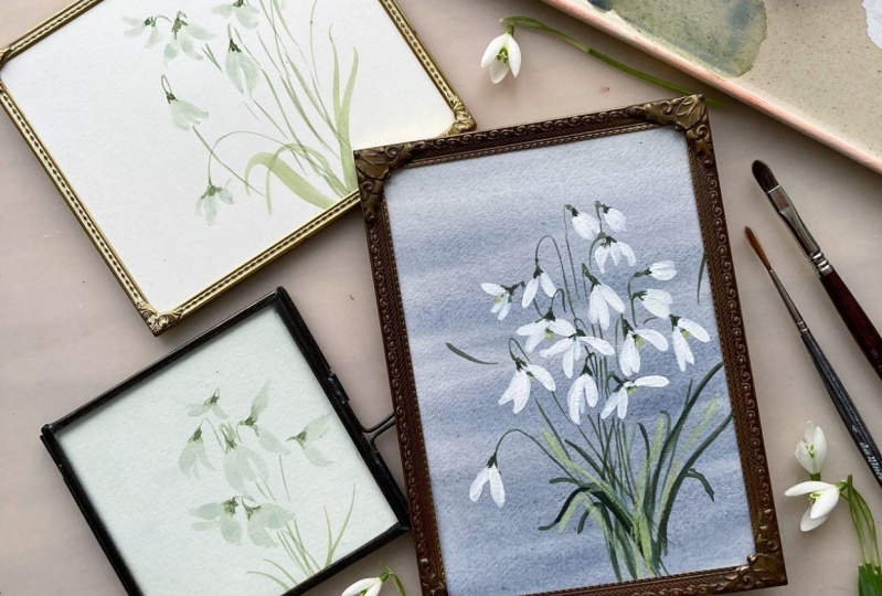
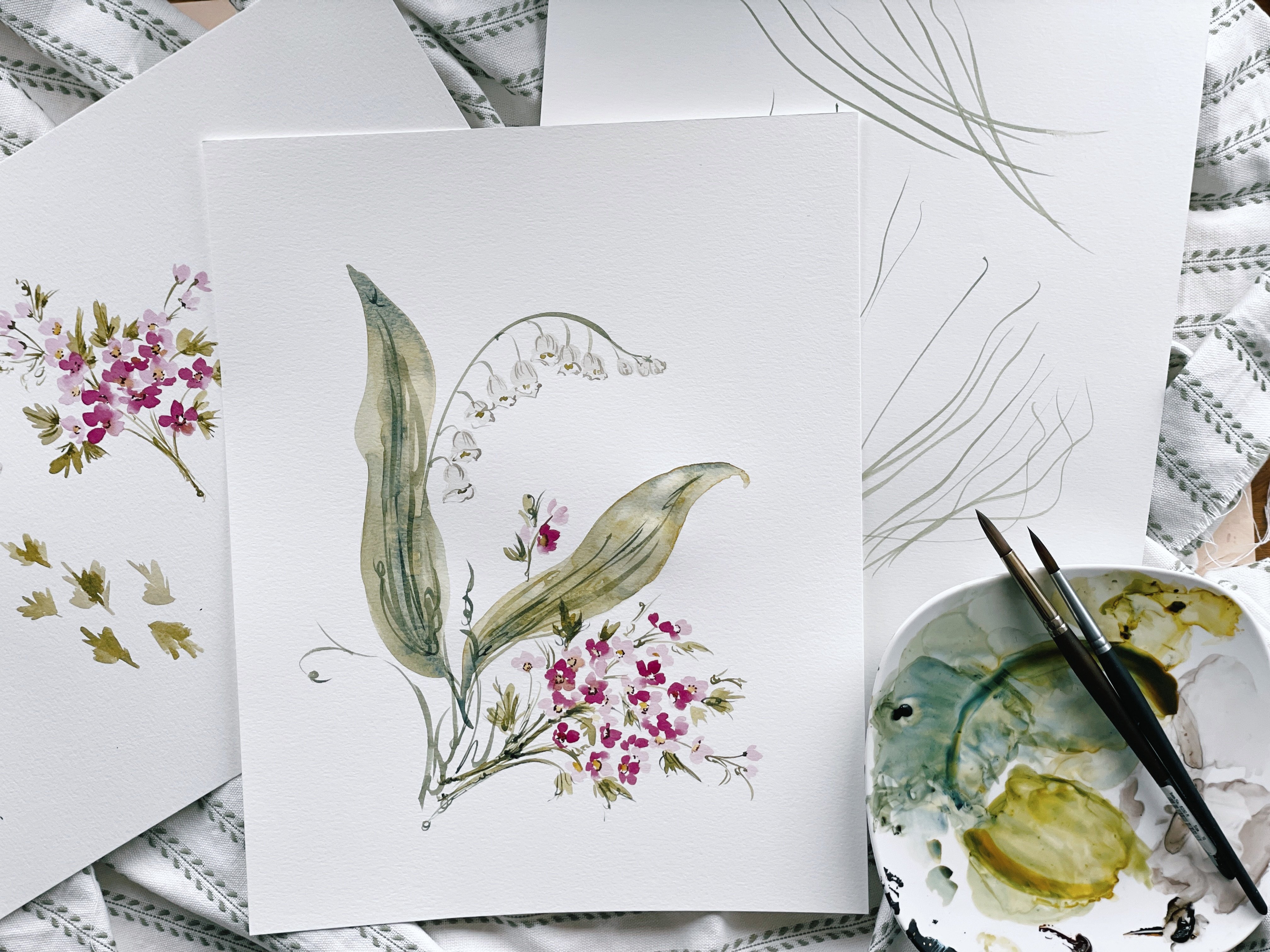
Transcripts
1. Welcome To Class!: Hello creative
friend, you are back. I'm so glad you're here. Thank you for joining me
for another class today. If you joined me last
month in January, you'll know that we created beautiful carnations together to celebrate the January birthday. We wanted to kick off those birth flower series and we are back at it today with the
other January birth flower, which is the snowdrop. Such a beautiful flower. I am so excited, I had been wanting and
hoping to be able to get this class ready and
up for you in January. However, it is February 1, so I'm giving myself
a little grace. It needed a few extra days just to put those
finishing touches on it. But it is a great class. The very first thing we're
going to do together is we're going to take a few moments
to notice and marvel. We're going to look at some
real pictures of snowdrops. We're going to immediately
take out our pencil and put it to paper and we're
going to draw what we see. Now I know a lot of
the time people are so excited just to get to the watercolor portion of the class, however, I'm going to strongly recommend that you take a few
moments to do this with me. It's really going to
strengthen your skill. Also, when we move forward
into the next lessons, you're going to be able
to intuitively paint because you have spent that time on the page with a pencil. Your results are
going to be ten fold. I encourage you, please
take a few moments. I know you want to rush ahead
and get to the fun part, but this is definitely an
essential part of the process. With that foundation
underneath our belt, we will break out
our water colors and we will create some
beautiful snowdrops together. We're going to learn all about snowdrop posture and structure. We're going to simplify
this flower as we do in the majority of our classes and just keep it very
straightforward. I'm going to show you gestural approach as I do
in other classes. It's really going to benefit
you and help you not to load this flower down with too many details because it can, and you'll see as we pull
the practice pages out together that it can quickly become overwhelmed
with too many details. We're really just going to
learn all about the beauty, the daintiness, and the
elegance of this flower. Then once we have
completed those lessons, we are going to move in to the class project which
is so exciting you guys, because it's been widely
requested for months. A big part of my process, I use these beautiful
washed colored backgrounds. That's exactly what we
are going to do today. We're going to put these
gorgeous snowdrops on a washed background. We're going to use
some white quash. We are going to make
a gorgeous painting, let me show you here
together that is ready to gift display whatever
you want to do with it. But it is so beautiful. This class is going to be
suitable for beginners. However, as noted in
the class description, I will need you to have
some experience education, understanding water
ratios and then also just being familiar
with brush terminology. Um, and white mixes in general. If white watercolor is
completely new to you, I'm going to suggest that you go visit my white watercolor
class because it really lays the foundation for the lovely mix that we're
going to be using today. I'll spend a little bit
of time breaking down the mixtures and we'll talk about the ratio of
paint to water. But I would say it's
like a beginner plus class and then leading
into intermediate level. Other than that, let's grab your supplies and
let's get started.
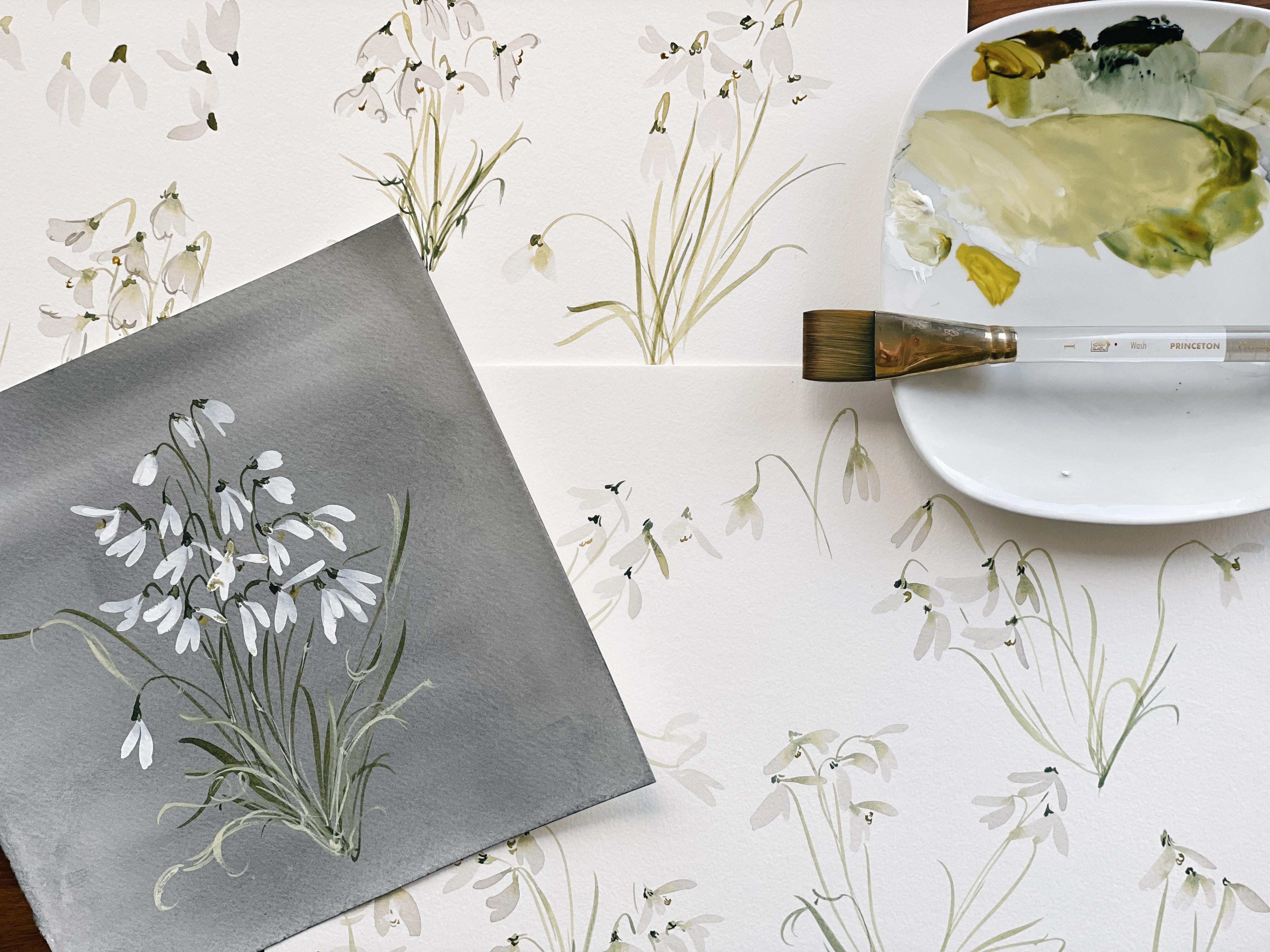
2. Your Supply List: Let's take a few moments
now to discuss the supplies that we'll need to complete our study and our class project. Beginning with our Canson
140 pound cold press paper. This is typically what
we use in our workshops. It is a wonderful
beginner paper, extremely budget friendly. I recommended if you are not using it and you are
one of those people that feels pressure using their beautiful
watercolor paper. But any paper similar in
quality is going to be great. I'm also going to be using
a piece of loose leaf, 140 pound, cold
press legion paper. I'd like you to cut
it into a square. Whatever paper it
is that you use doesn't have to be legion. But if you could cut
that into a square, we're going to be using it
for our A class project. You can set that off to
the side for now though. Then also in addition
to our paper, we are going to
need some brushes. Obviously, we're going to keep it really simple
with this class, we're only going to be
using two brushes today. Both are from the velvet touch
series. Princeton brushes. We are going to use a
filbert six and a round six. Then let's cover our paints. We are going to be
using a combination of gas and Daniel Smith and
then one my Mary Blue. I will list all of this
in the class supplies, but just to cover real quickly for you here in
case you're watching this. To plan a supply list, it's going to be our
Daniel Smith, Burnt Umber. Daniel Smith, Rich green gold. Daniel Smith, undersea green. And then we're going to
pop in some guash here. This is a moss green. If you don't have a guash, it is not imperative.
I want to repeat that. If you can just mix up
some olive green and in fact this rich green gold and the undersea
green make an olive green, which we are going to use
to complete our snow drops. This is just an extra ancillary
color just to have on the palette to possibly add in just a little bit more
range to our palette, since we are keeping it simple. Using just whites and greens for this project also would like
you to have some black. I'm going to be using my
Mary Blue carbon black. But you can use a lamp black. You can use a Pains gray. You can use Janes. Janes black, I believe it is. Any black will do then. We're also going to be needing our Windsor and Newton quash. This is the non negotiable. I definitely need you to
have some white guash for this project because we're going to be using it to complete
our class project. Okay, also we're going to be doing a little bit of sketching. I'd love for you
to have an eraser. This is a really good one.
This is a Faber Castell. It's not a needable, but it just works really
well to not lift off the color and leave behind
any pencil strokes. I'll list that in the
supply list as well. Then any pencil, I'm going to use just a
regular normal two. But I have drawing pencils to. If you have drawing
pencils that you love, you can go ahead and
include those two. You'll need a palette,
obviously, a cup of water. This is just my practice sheet. We'll be using this as we, as we sketch, but we'll
also be using my ipad. So if you have an ipad and you
want to bring it alongside just to have a few reference
images as we sketch. And then as we begin to
practice our snowdrops, taking the theory that we
learned and applying it, then you can do that as well. But really you can just
follow along and watch me as I point out the
shapes in the structure. All right, that covers it. Other than that, maybe
grab yourself a cup of coffee or some tea.
Let's get started.
3. Sketching Snowdrops: One note before we begin. While sketching, I
would not say is imperative to this class or
the success of this class. I will say that it will benefit you greatly.
I'm talking to you. Those of you who do
not love to sketch, feel like I cannot
draw to save my life. Pictionary is the worst. Let me assure you
that. We're just going to approach this
gently and simply. It's really just to build in some muscle memory so that when we go to use our
brushes on paper, the movements feel just
fluid and natural. We're going to just take
this really nice and easy. Anytime that I sketch a
flower before I paint it, I can tell you
that it's twice as good as it is if I
were to just paint it, or it takes me an hour or so to really get the lay of
the land and feel it. Anyway, that's my $0.02 I would love for you to
join me for this portion of the class as we just flesh out a few of these
lovely, lovely snowdrops. Let's go ahead and
pick up our pencil. I'm just going to
note what I see here. Just shape structure movement
now with the snowdrop, because all of the
petals really do this downward direction and there's not a whole lot of
positioning going around. We're really going to need
to be somewhat gestural and dynamic when we head
in to add the leaves. But as I'll show you
in my practice pages, I found that with
this flower anyhow, less is more the more leaves. I tried to keep in mind of how full
things look down here. It just began to
look overwhelmed. It didn't look natural, it just looked crowded. Just keep in mind, I
do encourage you to experiment and see
how it goes for you, because my technique is going to look a little bit different than the way that
you approach it. But I'm going to
show you what I did, talk you through,
choices I made, and allow you to basically make that decision for yourself,
for what you like. But what I found that looked
most aesthetic and most appealing was just
keeping things simple. But what I do is take
some liberties here. You'll notice when I paint, I'm going to do
these snowdrops with a little bit more movement
than maybe they are as shown just to give this
painting eventually. Anyway, when we get
into the class project, a little bit more dynamics then as you might want to go through and grab a few
images of snowdrop, some of them are really
closed like those shown here. We're definitely going to do
some of those then you can note just the little details
inside the centers of them. Then some do, Those are mostly just roots
at this propeller, just like completely
coming out like this with almost like wings. Or if you see like a
lady bug lift off, they have this really funky little wing action
that comes out to the side. We're going to do a bunch of different shapes so that we can just bring this
flower to life. All right, I'm just going
to draw what I see here. I'm going to start with the
little cap at the base. I'm not going to pull
out every single detail. It's just to gain an understanding and awareness
of what's happening. I'm just going to indicate that something's
happening in there. Then what I really love is a stem with some great
flow and movement. I'm going to pull that back. It doesn't even need to connect, because what I'll end up doing is just adding a little bit of movement later on. These will be leaves.
I'm not really even going to worry
too much about that. I do see up here that it has this cute little
tail that comes up. So I'm just going
to plug that in there and leave it like that. Okay, I'm just
repeating the process, looking at this snowdrop
as I move along. Bring it down a little bit. Now what I'm drawing
is not going to necessarily translate
to painting so well, but it's giving me an idea
of okay, where is the stem? How is it moving?
This one really came, and in fact, I didn't
get it quite right. I should have probably
come up a little bit more to really give it that lovely arch
there. There we go. We have a much nicer shape
there where it comes up high and then comes down and we give it
some really nice lines. Then with the snowdrops,
we're going to be bundling, bunching
them together. They all sprout from
this general area. But if we were to
be doing a pattern, so say you really loved the look of the snowdrop and wanted to do something
graphic with it. We could do a cluster here. And then imagine that there was another cluster coming
up and over this way. And add some
snowdrops over here. I'll show you just a
couple different ways to apply this theory. With this one we see
another stem coming up. And moving towards
the middle here. I'm just going to begin to plug in some snowdrops with
different positions. This one's coming this
way, which I really like. It's going to give us some
play and some movement. We see a stem come back
this way, coming through. Then I'm going to do a nice little propellers snowdrop here, just to show you what I mean, coming nice up for the arch. Bring it down a little bit
and pulling it through. Again, this is just a sketch. It's not meant to
completely line up, but just to give a general idea of the shape and movement. Now I don't, typically
when I'm sketching, go in and add like the
thickness of the stem, just because that's not going
to apply to water color. Now when I create professional sketches
for my clients or birth flower commissions, then I do add quite
a bit more detail. This is just a paint sketch, It's not the same as a
professional sketch. But if you wanted to just add
a little bit more detail, you could come back in
alongside the stem and just note some of the thicknesses
here within the stem. But I don't recommend it or say it's necessary for
what we're achieving here. Now I'm going to do a snowdrop, that essentially isn't what
you might find in nature, but it's just going
to bring a little bit of life to the painting. I'm going to start with
the stem and come way out, and then pull it back through
here. Add that little cap. This one's coming out
quite a bit more than what you might find in a normal
bunch where they all just come up straight and
then they umbrella down. Now say we were to want
to make some pattern, we could come over here, if this is how we would
want to line them up, say we were planning to put
this on fabric or gift wrap. Then imagine this is where
one cluster would go, and then this is how I'd want to line up the next cluster. And then, let's see, do a nice closed, oops, come pre a nice closed snowdrop. We could even do a
couple of those, really, utilizing the
shape and movement. That's what I mean when I say you don't have to draw
exactly what you see. There's room for you to
add liberties there. You could imagine that this cluster is doing
something like this. And then this one is doing this. We see the leaves down
here, They're pretty thin. But like I said, and I'm going to show you here
in just a moment. I found that when I tried to accommodate this in just a
gestural loose way to me, it began to feel more overwhelmed than aesthetic,
I'm going to show you. But before then, if
I were to try and tackle some of this fullness, the volume that I see down here at the base
of the snow drops, Then I would basically
just take my pencil and begin to plug in some
leaves with pencil. It does look quite
a bit more lovely. It just doesn't have
the same effect. But you can see that
the more I add, the more overwhelmed
this area starts to get. I have to be very intentional about what it is that I add. And they do spring out
and then curve backwards. If I were to do the
same thing over here, again, I'm just doing
some loose shapes. If you do not know
how to draw a leaf, you can be as simple or
as detailed as you like. I tend to move quickly. Sketching could
be a whole class. It's not one that I teach, but I'm sure there's several
here on skill share. But if you were to just go through the fluid
motions of it, it starts with something thin, then you come out
and then you tip, and then you go thin,
and then you come back. That would be like a
very detailed leaf. But what I'm doing is
just taking my pencil and just doing a
general shape of it. It's just a swoop, noting that it starts thin, gets a little thick somewhere,
and then tapers off. You can run that through
your mind with some drills. And then you're obviously trying to add some movement to it. If you were to do a leaf
that's like straight up, it doesn't quite have the
movement in the flow. You're wanting to angle
as you move along. Having in some thickness
there and some movement. Okay, that's just the general
shape of these snowdrops. We have a lot of
different kinds. I'm just going to note
them here off to the side, so that we have
things organized. And then I will show you my
practice pages so we can take a look and discuss not
necessarily what went wrong, but just what happened. Okay, our closed snowdrop
would look like this. We start with a little cap here. It has a little bit of
a jelly bean shape. If you were to just sever
it at the tip of one side, then you can even do both sides first just
to get that feel of it. Then you're just again, like a big jelly
bean and then you're going to come up and just
split down the middle. What you can do here is you
can split it completely down the middle or to give it a
little bit more interest, you can do heavy on one side and then light
on the other side. You see how that looks
just a little bit more dynamic versus just doing
something like this. Even if I were to like 0.1 side, it just doesn't have
the same beauty as this one where
it's just coming out a little bit more and
has a wider cut there. Okay. That's closed. And then we can do full, actually we'll just say open. Okay. So we're coming out
a little bit more here. We can add a little
bit of center there. We'll go through centers in just a moment for me on my end. It's just a little
tiny squiggle. It's not something
that I'm taking a whole lot of
time to flesh out. Okay, I'm going to erase that
because it's starting to look a little bit funky
and too big for that cap. We need to give it a little
bit more of a neck here to the cap. There we go. Okay, And then we have a
little middle happening here. And then this little
squiggle right here just to indicate
the middle here. We have fully closed, and then we have one that's I would call open
or partially open. And then we have the
helicopter snow drop or the bug wings, whatever you want to call it. But I basically see like
propellers coming out. Sometimes I draw over my
lines like if I don't like it but I can still
see what I'm aiming for, then I'll just draw
over the lines here, giving it a little bit
of shape and body here. I would say even more. It can be fully like this. It really is dependent on what it is you see and
how you want to tackle it. You can do closed,
partially open, open, and then really aim for
that wide angle snow drop. Just having a sense of how
they can appear in nature and being able to use
these together within the same cluster is
going to bring so much dynamic to the painting. You can see we have one
that's really wide here, one that's mostly closed and then open a little open
a little bit more wider. It just really does benefit the overall painting to be able to note the
different shapes. Okay, that's just a way to keep it simple
for that middle. I'm really just taking, and I'm going to do the same
thing with my brush. Just taking my pencil
and just doing like a little squiggle. It's not even
anything that I could compare a shape or a letter to. If anything, it could be
maybe a sideways three. If it were to be
facing up or an E. Just little squiggles there. You can practice that with your pencil and then
practice it with your brush. But it's just a quick
little gestural note indicating that something's
happening there. Okay. And then with the stems, you really want to know how they come up in this beautiful arch, and then you pull them down. If you wanted to give your stems a little bit more movement, then you could come
out to the side here and just pull
it off to the side. Because essentially
what we're going to do is we're just
going to add in some leaves here that'll
bring in the body. But when you see, when we go to our class project, we're going to be bundling
it all together here. Just practice if you
like for a few moments, just a few different angles. Let's do one coming
through. There we go. We're imagining
that's coming up and down this bud is on top of. We have one that's
coming up and hooking, one that's more of
a drastic angle. One that really does have like
that candy cane type feel. And then one that disappears
here behind the petals. And then we can do this one
just another direction, bring it through here. Okay? That should give you a good
sense of just the shape, and the movement, and the
flow, and how to approach it. We're obviously going
to do all of this with a paint brush as well. And then because this little
video is getting a bit long, I'm going to stop it here
and then I'll show you my progress pages as we begin to lay paint down on
the paper in the next slide.
4. Practice Painting/White Mix: Okay, let me take you back in
time a little bit and show you where we started from so you can see what I
mean when I say that. As I began to add volume
and bulk to the snowdrops, things just began to look
crowded and overwhelmed. It's not necessarily
a bad thing if this is the goal that you
have for your snowdrops. But as I just continued
to experiment, I just, like I said,
found that less is more. I feel like taking you
through the choices I made might save you a
little bit of time. And that's always my
goal with these classes, is to educate you on
the choices I made. Not just how to achieve this, but what happened
when I did this. And I feel like students
find that to be of value. Let me just talk you through
that for just a moment. Here. You can see
that I started off with stems and everything
looked lovely and delicate. And then as I began to try tackle and plug in
some of those leaves, painting them exactly
as I saw them, it just didn't look good. I'm an intuitive painter. This is not my area where
I paint what I see. I used to study botanicals and I feel like I got
as far as I could get, but it didn't sing for me. And I just moved away and began gravitating towards
loose florals in general. Then I began to add a
little bit of texture, so I would have a
bit of paint on my brush without a
lot of moisture. And I began to plug in some
dry strokes as you see here. Layering dry strokes
on top of the initial, just normal strokes here. I also plugged in some darker detail lines along the stem, which we may end up doing. When I walk you through
the details portion, things worked fine here with the little detail in the middle, that little spot of green gold. But all in all, it just did not work for me. You can see here that
I played with allowing the snowdrops to fully dry before adding the stems to them. And then I began to
explore wet and wet, allowing that bit of green to flood and pool into the snow drops. Then same here. I began to experiment with like a little vignette creating a grassy area and then coming out with more
gestural strokes here. Which I feel like that would work if there were more of them. But just as one, it started to look
a little bit funky. What would work in using this style is what
we're going to do for our class project where we're
going to put a background down and then we're
going to layer the snowdrops on top of it. Something like this
would essentially work if we were to have
a different approach. I also began to add some structural lines
into the snowdrops, which we're also going to
do in the detailed section. This may be something
that you love or it may just feel
like overkill to you. Again, I'm all about giving you options and
different approaches and then allowing you to make the decision
that's best for you. But again, down here, this less is more thing. I really love the
light strokes and then just a few little
structural lines here, plugging those in. At the end when things were dry, I really loved the look
of the wet into wet, even allowing the
stems at times to run into the petals and
create that flood there. I really loved the general shape of these two clusters together, separating, having a little
bit of separation here. Some breathing room, so to speak. So we're going
to play with that. But this really
was just all about exploring what could happen, how I could approach it, and then deciding what I liked best. I also flipped the paper
over and did the snowdrops on the smoother side of the paper and did
not like it at all. You may end up liking it and it's something you
can experiment with. But I did not love that the
snowdrops fell flat for me. They didn't really
pull the structure, Excuse me, the
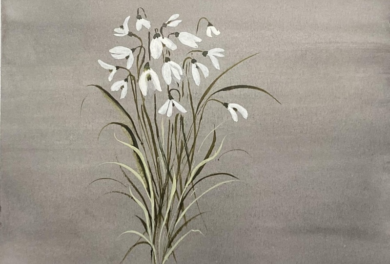
texture wasn't there. And I feel like for a flower, as simple as the snowdrop, there needs to be some sort of foundational texture to really give them their moment to shine. Okay, that's basically
what happened, and then how we arrived here with this page
of lovely snow drops. I really played with positioning
here, with structure, with flow, bending the snowdrops in a way that you would
not find them in. Nature really played
with the wet into wet, allowing the green to flood in and to take over the
white in some cases. And then also being
more subtle with it, it's really those little nuances that makes such a
big difference. I cannot emphasize that enough
as a professional artist. Little tiny choices
that you make. Where I went from a
full cap up here, like really taking
my time to paint out the cap until I
changed it to more of just a gestural
indication that there was some attachment there that these really began
to sing for me. You'll see in some cases, I did add a bit more of a cap as we did
when we were sketching, but when it came
time to paint them, I found that almost like the squiggle I use
for the center here in the middle
of the snowdrops, it really began to benefit just the overall aesthetic
of the piece. Then like I showed you before, I'm just using an upside down three to do a nice
little squiggle in here. Then I added a few
leaves post application, no wet into wet here. But just added a few leaves, thought they were okay,
liked them a little bit. We'll do that more in
our class project, but just for the
sake of loose art, I really loved them as is. You're going to see
that this is a pretty simple and just
straightforward class. There's not a whole lot
of bells and whistles when we're not tackling
a pony or a poppy, where there's just lots
of layers and things. It's a very straightforward
flower and I felt that to benefit
it the most, we really needed to
keep things simple, which can be a challenge for me. I love details and I love
adding interest to paintings. And it took me four
pages before I was like, okay, no, you really
need to pull back. Just let the flower and the fun little shapes of
it speak for themselves. Where I really just
wanted to add layers and add depth and
add more colors. It just didn't work.
That's my experience. You might find that there's
a different experience. But anyway, there we are. Let's go ahead, break out
a fresh piece of paper. Grab your Filbert brush. We're just going to
tackle the structure of the snow drop. We're going to practice the
heads just as they are. Then we'll add in some
stems when they're dry. And then we'll do some
wet into wet as well. Okay, let's pull our
palette over here. I'm going to mix up a bit of the burnt umber and
the carbon black. You're going to pull that into your palette, add some water. Then we want
something that's just like an earthy, grayish color. Then you're going to
pull that color out one more time to
lighten it a bit. You can pull in a little bit
more color if you need it. Adding a bit more
brown, touch bit, a touch of a bit more, adding water till I have a really nice light
consistency here. This would be a 70%
water, 30% paint ratio.
5. Learning Snowdrop Structure: I'm going to take you through a little bit of my process here, which might be a little
more unconventional. I do talk about
arranging the page so that it's most comfortable
for you as you paint. I'm big on that. It
doesn't really work. When I'm filming time
lapses and reels, I need to keep the
paper nice and still so people can
see what's happening. But when you're just private
in your studio or at home, you really should
feel free to just move your pad paper
all around just to get that best angle that makes you feel
most comfortable. I found that snowdrops are
not a flower that I feel comfortable painting with
the paper like this. I found that I needed
to turn things upside down before I really felt
comfortable with the movements. But I'm going to show
you what I'm doing with the Filbert brush.
Just straight on. If I were to be taking my
brush and I'm just going to turn it on its side so that it's not the full belly
but it's on the side. We have one side
of the snowdrop, then we have the other
side of the snowdrop. Very simple dual stroke. Now that's just a very
straightforward snowdrop, if we were to break
it down the middle. Let's go ahead and do
that one more time. We're just adding a
little bit of a line here just for an elegant sweep coming out and then
finishing it off here. If I were to do
things upside down, I'm not going to move the paper, but I'm going to approach this flower as though
I'm painting it, wanting it to come this way. Then I would start
at the other end, the very end of the petal, and come back this way and do the same thing
on the other side. I feel like I begin to feel a little bit more
confident with the stroke now. You might not see a whole
lot of difference there, but it feels different to me. I'm going to encourage you, just as you're painting along, to move the page however
it feels best to you. I'm going to do a
couple like this couple with a three petal. Now, I'm not going
to try and get all of the petals that
are in the snowdrop. In fact, some are hidden
behind on the other side, and you would only see a
little bit of it peaking up. We're just aiming at a
general shape and structure. Let's do a nice wide one here. Then we'll take the brush. Then we would imagine that
there's a little cap here. We could add another little petal just to really show that
things are nice and wide. And then we're
imagining that we're bringing this stem up and then hooking it down this way I'm visualizing, that's
how I'm working. Now if you don't like that, if you don't like
working upside down, if it's just too much for
your brain and too confusing, we can definitely do things
just the standard way. If I were to continue
in this vein, then I would come
out and come out, if you wanted to do a snowdrop that was really just a bud, then you would just
take one stroke, then just finish it off here. We can definitely add some of these in when we do
our final project. They look lovely mixed
into the full blooms here. Okay, I'm doing like a
full belly stroke for that wide one and then coming along the side of the brush, full belly and then a
side stroke for that bud. Then let's do one
that's coming nice and some of those snow drops
look just very linear. I try and add, it's just innate for me to add a
lot of flow and movement. But the snow drop really just
wants to stay very linear. Very straight up and down. I'm trying to respect the integrity of that flower while also adding
my own liberties. Okay, that's it. Like I said, this is a very simple and
straightforward flower. There's not a whole lot
of fuss and muss here. It's just a matter of figuring out what you like,
what looks good. Also, finding your
proper color value is something that I
cover in great length. In other classes, I
try not to repeat too much material for those who have been following
me since day one, So that we're not tackling or revisiting the same principles
we've already learned. If value to color is something that is
a little confusing, especially in white
water colors. I have a whole class
on white water colors. You may want to
take a peek at that before coming in and feeling
confident with the whites. I did like a very quick
demonstration on my palette, but I really break it
down and go through every little facet of finding the right color value
when working with white and a whole lot of
different mixtures as well. If you're not already familiar with my color guide series, it is a huge asset. My enchanted series, which
covers white blends of water color is probably one of my most well loved
of all the resources. So have a look there too. Okay, That's basically that. In a nutshell, you
can decide whether or not you like the
upside down method. We're going to be popping
in some stems here in just a moment to get an idea of how it all looks together. But first, let's imagine that
we're doing a cluster way. When we do go go to
plug in the stems, we have a little bit more
of a shape to work with. Okay, looking at, I have
my reference sheet here. You can have an ipad brought up, anything that you
feel inspired by. I'm just going to note and
take from the snowdrops. I see that some really do like overlap each other and they
come on top of each other. I'm going to note
that as I move along that I'm going to come
up here in the middle, look for those white
spaces in between. Again, I don't love
this angle of painting. I would, if I were painting
the way I wanted to paint, turn it upside down,
just like this. And you may find this is like eye opening and
revelational for you, especially with these strokes. And then begin to plug in some nice little ones here. And then maybe one more
off to the side here. Nice little propeller
shape there. Okay, I have a nice
little cluster here. I'm going to be imagining that. I'm going to be bringing
the stems back here to center and then
adding some leaves. I'm going to let that dry for just a moment and do one
more cluster over here. And then we're going to do some wet into wet
in the next video. But just for practice sake, let's go ahead and do
that one more time. Really playing with
movement here. Okay, I want you to shape these petals as though they're coming from
different angles. Imagine and visualize. Okay, here's the
little cap coming up and then that candy cane
hook coming through. It may even get lost
behind this petal. And then bringing it through, you can do something different. You can say it's coming up here and it maybe it's
swooping down this way. That's why it's so nice to have a little bit of a reference
image in front of you because you
can look at all of the different ways
to approach it. We go do a cute little bud
right on top of there. I'm going to have some
overlapping each other. And then let's have
one more right there. I think I like the idea of
one more over here too, just to kind of give it a
little bit more movement. And then let's have one
really kind of coming down here that, okay. All right, so while
this is drawing, we're going to mi up our greens. Let's go ahead and do that. Grab your number
six round brush. Let's bring out your
undersea green, we're going to do a
Roth consistency. Really mix in those greens, then grab a little bit of
your green gold as well. Not too much green gold in this mixture because
you're going to use, and see like I added
too much there. You're going to use
that green gold for the center and
you want there to be some differentation
between the color. There we go. That's a beautiful,
beautiful, olive green. This is my favorite
olive green mixture. I use it all the
time. All right. What I was saying before about adding a cap
to my snowdrops, I was really taking my time. I'll do it on the
practice one here. And adding a cap here, say I was doing it like that, like it's too structural or
too botanical like that, but it really is
like I'm taking time to flesh out a little tip here. And it doesn't look bad.
And I wouldn't say that you would be steered wrong if
you were to do it that way. But what I really
liked, and this is just my own
personal preference, was taking the brush and just brushing it up against
the snow drop. I don't know for me that
just saying a lot more, it looked more delicate. The snow drop is such
a delicate bloom that it just worked for me. Anyway, you can try this
approach and this will dry a little bit lighter and you can also blot off some
of that color, decrease the value in that
mixture you're using, and come in a little lighter. There you go. That's
the same theory, but now we're doing it lighter. I like that much better
when I went into dark here. It just didn't, like I
said, seeing for me. So even though we mixed
our palette to what I would call like a broth
consistency here, it's like a 50, 50 paint to water ratio, Decreasing the value
even more to like a 70, 30, you'll get that really
beautiful light mixture. All right, I'm just adding a few little stems
now this is on dry, we're going to do wet
in the next slide, just up and down. Just gestural lines. Just something as
simple as like this. You can practice that
off to the side. It's going to be
a pressure thing. If you're not good
with pressure yet and you tend to really just come
down hard on your brushes, you may want to practice
this off to the side where you're just gently
stroking the page. Line, line, line, very light. Same thing with our
little squiggle that we're going to add in, a sweet little
squiggle upside down. Three again, those things
that take 2 seconds, but really do need to
be mastered before you have a tremendous amount of success with whatever
it is you're painting. They're worth investing
that time in. Okay, I do the same
thing over here, just so we have a couple
different clusters to work with. You can even do a mixture of the cap theory and
then just the lines. Okay, for stems, let's go ahead and use that
light mixture. Now the best thing that
you can do here is visualize where you
want these stems to go. If I'm wanting them to
come in the middle, that means I need
to lead them back. If I were to have these stems over here and this
ones over here, what we're going
to get is more of a triangular feel here. And we don't want that. We want something that's bunched here towards the middle
because that's how the snow drops are shaped. Let's go ahead and do that.
We're going to come up and hook around and pull
your stem through again. This is something
that looks easy, but we'll take some practice. Imagine where you
want that stem coming from and then pull it through. Now it's okay if some of
your stems are coming wider and they're not all coming exactly to the same point. I encourage that.
But what I don't want is things coming
out too triangular. Okay. Don't feel like
everything has to be lined up to exactly like every single stem meets exactly where it
should at the cap. Again, we're just trying to
tackle the general structure. Okay, that would
be like a little, we're going to do the
same thing over here, but then we're going to
add some wet into wet and leaves in the next segment. All right, just
practicing again. Let's do one where
it's getting lost behind that stroke was a little bit thick
but that's okay. Again, it's going to
be a pressure thing. I'm not really going to
do too much for that. I'm just going to
allow that stem to speak for this one as well. Even though this stem
was leading to here, this one could be coming
down from here too. And the same thing here, this
one could be right here. It really isn't something that needs to be perfect ingestal. And we have this one. And then let's, just for fun,
I'm going to draw a stem. Then let's go ahead and
use that filber brush. And I'm going to not
touch it because I don't want to show
you wet and to wet yet until we've
covered this in depth. To give our up and down
motion of that snow drop. To give it a little
bit of playfulness, we can add structure
in a shape like that. Now I'm going to
get a little wet and wet there, prematurely. As you can see how
beautiful that looks, it really does just
start to benefit. There's so much
more interest now. You have all of these
up in this direction. And then this one lonely
little snowdrop that comes out that just
says hi peekaboo. And it really just
lends so much interest to the whole overall
cluster and painting. Okay, let's move on
to the next segment, where we're going to do more of this beautiful wet and to wet.
6. Wet into Wet Technique: Taking a brief
moment to remind you to update your piles
on the palette. If you used all of
your white mixture, go ahead and mix
yourself another batch. Same thing with your greens, because we're going to be
loading brushes this time. Brushes is a technique that I use when I'm
using wet and to wet so that I don't have
to hurry to mix the color. Once I've laid down
the wet media, I can lay down the
stroke and then I can head in right away with a brush that's already
preloaded with paint. I'm just going to roll that
brush through this mixture, get it nice and wet
and ready for me. Then I'm going to begin
with my Filbert brush here, pulling that through my mixture. Then I'll set my palette off to the side and
then we will begin, I'm just going to be
doing a couple at a time, a couple snow drops, noting that there's still wet. That's something that
you'll need to look for on your end because your
stroke is not going to be exactly the same moisture
level as my stroke. Depending on how much water
you have on your brush, you might need to actually
wait longer before you plug in the next step, which is the stem cap. And plugging that all together
in that same fluid moment. I caution you, and
I just encourage you to note what's
happening on your paper, not what's happening
on my paper, because that's there's
just going to be either small or large differences between
what's going on. All right? Okay. So that's a good
amount to start with. The four, I can see how wet
they are. Not overly wet. Now, I'm going to take
my brush and I'm just going to plug in a little bit of paint and allow it to flood into the beginnings
of that snow drop. If you're more comfortable doing like one at a time,
you can do that too. It doesn't have to
be four at a time. I'm going to lighten my wash here just a little bit off to the side. Still a little dark. One more time, lighten that up and then I always go back
to the first one that I created because that's
going to be the one that's probably
trying the soonest. I love the way the wet into
wet looks what will happen if things are too wet is the green will completely
take over the white. Which isn't a terrible
thing like you saw that happen
here in this petal. As long as it's not happening in every single petal,
I say go for it. You can really add in and play with how much
green you allow, but you just don't
want it to look exactly the same each time. All right, and then heading
back in for the stems. You can choose to let that
stem run into the petal here, or you can make a break and not have any
connection there whatsoever. It's completely up to
you. I'm going to have this one peeking in behind here. All right? So a nice,
sweet little bundle there. I'm going to do
that one more time. You can see as this is drying, it's getting quite
a bit lighter. I say it was still a little, initially darker than what
I began with up here, but becoming a bit
lighter as it dries. Okay. Remembering
that you're trying to angle these petals in
different directions, not have them all just
come up and down. But we can start with one like that and then be thinking about
the different directions. We have one that's going
to be coming out this way. Now I can't move too slow or things are going to
really dry on me quickly. Brushing. So here's an example of really allowing
that green to soak in and just kind of let
it dominate that petal, okay? And then adding the stems. Excuse me, adding the caps. And now we can add
the stems. Okay? Visualizing where I want
these stems to come from. So I want this one
to disappear here. Bringing it through,
bringing it down. This one I want hooking
like a little candy cane, bringing that through, having your stems come up at
different lengths. Also another fantastic way to bring some interest
into the painting. All right, now we have a
couple little clusters here and we can begin
adding some leaves to them. Let's go back up here to this
one where things are dry. Go ahead and refresh your
paint if you need to. I need to take just
a moment to do that. Now, I have a nice mixture. I'll show you what I'm
working with over here. Okay, getting it nice
and dark to begin with. And then I'm going to add
water and lighten it here. Okay? This is where things can
potentially get overworked. Just take your time here. Just figure out where you think that leaves might
benefit, this overall cluster. Now, in a real snowdrop
painting or a photograph of it, you're going to see
lots of bulk and volume coming up here where they're
growing out of the ground. But it just didn't work for me. As I've already
mentioned several times, I'm going to do some
really light strokes here. These are the same leaves that I use when we're doing
our floral bouquets. Is just one nice
long stroke here. Then what I might do is to
give this a little interest. I might come up
and hook it over, just to show that things are going in a
different direction. In real life, the
snow drop leaves are quite a bit
thicker than that, but I just found it didn't work. Okay. This is where
I would stop. I feel like if I go
any further than this, things are going to start
to get really bulky. What I might do, just
to add a little bit of interest here and
just to bring things up to a different level is add one final leaf just
to break up the level here. Because then essentially what's going to happen
is when we add in those little details going
through each little cluster, we're going to see that each new detail as a layer of interest. Same thing here
with our little one here. Let's go
ahead and do that. Just some really sweet little
leaves here at the base. Not overwhelming it. Let's head down here and do the same thing, coming out to the side. Try not to think
too deeply on it, but just gesturally into it where I feel like
the leaves might look best then adding some
more gestural lines, You can even if you wanted to tinker with doing
strokes that are more along this line and then ran
out of the camera there. Let's try that one more time. A little bit more like this. And then doing some that are
nice and thin, like this. Again, that's going to
be a pressure thing. You're going to come more on the belly when you do that stroke. Then really coming up on
the tip of the brush. For those light strokes, having the leaves run into each other too
is really pretty. The leaves don't
come up too much further than right about here. But again, feel free
to take liberties. If you wanted to add a leaf
that pops up right here, filling in that space, you
could totally do that. Just own, that does not have to be exactly
as it's seem there. You have just a sense of the whole different process of the wet on dry and then
moving into wet into wet. You can decide what you like, what you gravitate towards. We're going to head in and
add little details along each stop here that will finish off the snow
drop. It's very simple. We're going to add, like
I said, a few key details that will help bring it to life. Then we're really going to have some super duper fun with our class project with a
whole different concept.
7. Class Project: Part 1: All right, my friends,
welcome to the class project. I am so excited because I'm about to teach you
a concept that has been asked for many times and it's never been taught
here by me on skill share. And I think it's
just going to be so much fun for
you to learn this. This essentially is another
class on top of what we just learned because
they look so different. The approaches before we begin, I want you to make sure that you have a lot of
room on your palete, because we're going to be
mixing up a color right here. Additionally, I need
you to have rinsed out your cup so that it doesn't have any green or yellow in it, and then rinse your brushes as well, just for good measure. Then, I also neglected
to mention in the supply list that you are
going to need a flat brush. Any flat brush will do, it does not have
to be this brand. This is a Princeton one wash. This is the heritage series. But any brush that is flat and just good for
covering a lot of space. If you are trying to do that
with your little six filer, it's going to take you
forever and you're not going to have very good results. You want to be able to
lay down an even coat of color on the paper.
That is step one. Most essential to this
process is being able to get down an even coat of this wash that
we're going to mix up. We're going to go
into great detail here that I set you
up for success. If you do not have a brush like this, definitely pause here. Order a brush because
it is very versatile. You'll be able to use it for a whole lot of
different purposes. But for those of
you who are ready, let's go ahead and dive in a. You're going to take
your carbon black, go ahead and dip the brush
into some water and then just begin pulling it into
the middle here. We're going to mix
up quite a bit because we have a lot
of space to cover. It's going to end up
looking more like a gray background than it
will a black background. But we're going to layer it pretty well so that it's dark. That's going to provide
the background for our snowdrops to really pop and just look
super beautiful. We're going to be
using the white guash to create our snowdrops. Just a whole different feel
and looks, like I said, two classes and one, I think you're really
going to enjoy it. It's just a whole lot
of fun when you add a different element to the
process and to the project, all really taking my time here, I don't want to
run out of paint, I really am making
sure that I have plenty adding water
in as needed. It's a little piece of paper, it's only a nine by nine, but you'll be surprised
by how much you need and how much of
this gets soaked up. Take your time. I wanted to show you exactly the amount
of time that it takes, rather than just
come in already, have my palette mix and say, go all right, Make sure there's
no chunks on your brush. Really look at it. Turn
it back and forth, add more water until you have a nice size mixture that you believe is going
to cover the entire page. All right, then. It's really
not super complicated, but it does need to be
done in a specific way. Let's move this
over to the side. We're going to start
here at the top. And we're going to
take our brush, and we're basically going
to run it back and forth, adding a little bit of water
and paint as we move along. Now another way to do
it would be to wet the whole page and
then add the water in. But we're not going
to do that today. We're going to do it
this way. All right. Before I begin, some people like to tape down their paper. I find when I'm working with a canvas that's this small
and if I'm covering, the whole page is actually
going to be fine. It's not going to warp
and buckle too much. I can end up putting it in a book or putting it
under something heavy and it will flatten it right
out with a big piece of paper where there's potential for like a big ripple
in the middle here. You would want to
tape the border. We may do that in a future class where we're leaving
a little bit of a white perimeter around. But here for our purposes, we are going to paint
the entire thing. All right, let's go ahead
and get started there. Adding a little bit of water. Bring this over here so you can see how often I'm dipping in. Like I said, it's going
to end up looking more gray than anything. I do like to work
from top to bottom, a nice even coat. If you see some dry areas, go ahead and just
plug in the paint. You can see how black it was. But I am quickly using almost
everything on my palette. All right, coming all the
way to the bottom here. I've used up almost
all my paint, but I'm going to go ahead
and just use the rest of it. That looks good. There's
a little puddle there. So I'm just going to
smooth even that out. Those stripes will disappear
because the canvas is wet. Okay, Lifting up my
finger as things settle. And we're going to get a nice even coat here and
the canvas will be ready. So I'm going to pause
here, allow this to dry. And then we're going to
come back in and add our snowdrops to the
canvas. All right.
8. Class Project: Part 2: Okay, a few things to note before we begin step
two of this painting. I want you to go ahead
and rinse off or wipe clean the palette where
you were mixing the black. You don't want any
of that to get into your white mixture or your
greens and your yellows. Also, you will need to rinse out your water cups so that it's not heavily dominated by
that black paint. Then thirdly, you're
going to want to make sure that your painting
is in fact dry. It may look dry, but if
you really look at it, pick it up, you're going to note that there's
still areas that are damp now. If it's still wet a little
bit on the back, that's okay. We're not going to be
painting on that side, but you do want to run
your fingers along, make sure that it
is in fact dry. What you can do, sometimes I take a small hair dryer and I just lightly on low and
don't use the hot setting. I use the cool or the warm and just from a distance
can dry it that way. Sometimes if I do that, when it forces the
process along, it will cause
warping or buckling. I do say if you can wait, it really doesn't
take that long. Maybe five or 10 minutes. Just let that dry on its own, and the effect is going to
be all the better for it. Anyhow, my painting
is in fact dry. It's still cool to the touch, and I know that it will
continue to dry further. But it's dry enough now to begin step two of the process,
okay? All right. So go ahead and
you're going to pick up your filbert brush. We're going to mix up
our white mixture for our snowdrops pulling
into our white guash, which we have used before
in previous classes. If guash is completely
new to you, then you may want to go and take a look at my
Guash elements class. That way you actually
know what it is and how it works and what makes it different
from water color. But essentially it is that in between medium of
acrylics and water color, it is water activated,
water based. So you can rewet it. Unlike acrylics, it's really
a fantastic little medium. Now the trick with
gas is you can use it at its full opacity, meaning that you can block out the color that is
shining through. We have a color
here, but let's just say this was a pitch
black background. We could take a large amount of the gas and apply
it to the paper. You would not be able to see
the color coming through. However, if you were to use
it at half its opacity, you could do apply the same principles and you
would see that color popping through the quash the same way you would if you were to lay down water color on
top of a dry media. Hopefully, that makes sense. We're not going to use
it at full opacity, but we will use it
at nearly full. All right, I'm going to mix
up a nice little pile here. But I want the snowdrop
to be nice and dainty. We don't need to use
our mixture for white, because we're actually
going to use a white now that we are painting
on a colored background. That's another benefit of
using a colored background, is we are able to actually
use white in this case. Whereas if we were to try and paint with white
guash on white paper, not much would
happen. All right. Just making sure I have
the right ratio here. This would be a little more than a cough syrup consistency if
we were using water color. Just to give you an idea what's going to happen and
you'll see as we paint along, the guash is going
to look like it's quite a bit darker than it is. We're going to lay
down a stroke, a few of them using
the same principles, everything all the
same technique. We're just using a background. This time the guash is going to do something
a little bit different how you're going to see
that as the guash dries, it will in fact get
lighter and it may be best to go back over that stroke
with a new layer of guash. All right. As I mentioned, when we were painting the
snowdrops on the white paper, I am most comfortable
painting them upside down. That's what I'm going to do. It's not something
that you have to do. You don't have to follow
along exactly in that way. But I will give you some
guidance and some tips. Although the paper
doesn't really have a directional identity yet, I am going to flip it around so that this
deccling that I have on my paper is going to
remain on the left hand side. So I'm just going to
flip it like this. Now I'm going to look at
my paper as though it were broken up into three sections. Like this would be
the first section, this would be the second,
then this would be the third. While painting the snowdrops, I'm going to keep in mind that I want them to fall right here, not too close to the
top of the page, but not too low either. That I don't have any room for the stem right here
where I would imagine that the second and the third little section and
area would be overlapping. I'm going to start
here in the middle. And then I will begin
to cluster them around in different
positions and directions. Keeping in mind that
some will be buds, some will be partially open, and some will have that really funky little lady
bug wing shape. There you see there's
my first stroke and it will light up, excuse me, light
as it dries, okay? The same strokes
that we used when we were practicing
on our white paper. We're just now applying
it with G again. If you're unfamiliar with this medium and it just
feels tricky to you, go back, take a look at my gas. I'll have you up to
speed in no time. All right, so let's
just continue here. Taking my time, just imagining where I want all
of these sitting. Again, I'm focusing on the
middle and the top area, not going too far
down or else I'm not going to have a lot
of room for my stems. Do a nice little bud here, maybe one right over
here next to it. Adding a bit more of
the guash to my brush. You can see already
the beginnings of this petal is starting
to lighten a bit. We'll see if we need
to go back over. It really all depends on
how much paint you have. Once I get a lay of the land, then I might turn my paper back over just to see
what's happening. Just looking here,
seeing what I have. My snowdrops are
up nice and high. It's going to give
me lots of room. I don't want to encroach this bottom portion of the paper. I want that to serve as breathing room all
along the sides here. Being mindful that I want some of my snow drops to be really open so that I can head in
with that little squiggle. I'm going to do that right here, flipping it around,
see what I have. I really taking my time and
then imagining my cluster, my stems coming right here. I'm also going to pull out a little snow drop
like we did in our cluster to
kind of just serve as a little peekaboo over here. Oops, come off the
page, bit the camera. There we go. Now we have a nice little peekaboo snow drop coming
off to the side. We may want to add
more of those, but this is a good
starting point. I'm going to put my brush down and I'm going
to go ahead and mix up the same mixture
we used before. We're going to use
that undersea green mixed with the rich green gold.
9. Class Project: Part 3: Pre in here. Go ahead and add a
little bit more of the rich green gold because we are working on
a darker paper. It's heavier on the rich green
gold than it was before. I would say it's more
like 70% rich green gold, 30% Daniel Smith,
undersea green. Add a bit more of the
undersea green back in and I'm going
to pull it out one more time so I can see what it's going to
look like. There we go. We have a nice blend. Now
we're more at 50, 50. And we're going to begin
attaching our stems. Same thing we did before
adding that little cap. It's still a little wet
there. That's all right. If you find that the
gash is still very wet, then you're going to
see the color run in to the petals here. It's something we can definitely
correct when we're done, or you can leave it as it is for a little bit of wet and wet. It works with gash as well. Okay, now I'm going to begin attaching the stems
as I did before. Pulling it all the
way through and down. Don't worry too much
if things don't match up or if there's
breaks in your lines, we're going to be adding
those leaves at the end, are going to make it
all come together. Just have fun breathe,
enjoy the process. We can always add in
a few more snowdrops if the painting is going
to be benefited by it. Remember again having your stems come up at different areas. See you have a little
bit of the green coming into the snowdrop
here, which is lovely. Something you can
intentionally do, or it's something that you
can decide not to include. Okay, so we have a very sweet little dainty snowdrop
cluster happening right here. Let's just take a moment
look to see if we feel like the painting would be benefited
by adding a few more. I think so. I'm going to go ahead
and get back into my gas and create a few
more of those snowdrops. Not coming too far
over here because I don't want to encroach
on that little peekaboo. But just a few.
There's one there. Just taking a moment
look at what I have now, I'm feeling
like the painting is just a little bit more full. I'm going to add a few buds here at the top again. Really just taking my
time, not feeling rushed, looking to see where things
are lining up again, I like this being breathing
space for the painting. I want to make sure that there's enough room here
at the bottom to add leaves without feeling
like I'm crowding this area. I'm loving the little touches of green into the white here. Again, I'm just taking
a moment to enjoy it, which sometimes if you're
anything like me type a recovering people please are wanting to do everything
perfect the very first time. That could be a
struggle for you. I just encourage you, enjoy it. Even if it's not working out, it's going to work
out eventually. Everything is an experiment. All right? I'm going to add, I think I'm going
to add one more. Not decided yet, because what
I don't want to do is add one so far over here that my
painting becomes unbalanced. That's important. I want to keep things
key in the center here. But I love this little
peekaboo snowdrop. I'm trying to remain mindful of the shape
that I have going. Maybe what I'll do, maybe
I'll add one over here. We'll see. Let's
just play it by ear. I'm going to go ahead
and add in the stems. I can do this painting six different times and it's going to come out a
little bit differently. I never like to just say this is exactly
what I'm going to do or until I've seen
what's happening. Okay, I'm going to get a
little bit of the wet and wet here and then begin adding the stems in. Remember what I
said, not everything has to line up perfectly. These stems are acting as though they might be
down in this area. But I'm going to plug in one
more, right around here. Then I see what I have. I
like where this is headed. The next step is going to be
to go ahead and add leaves. I'm going to mix up my mixture and begin plugging those in. Just like we did in
our practice pages. Right here, down at the bottom, just those simple strokes
coming out and overlapping. You can, if you like,
bring up a stem through the top here to show
that it's coming up. Not necessarily what would happen in real life
with the snowdrop. But that doesn't
matter. I'm going to do the same thing
on the other side, just coming up a
little bit higher, adding a nice little
line in there, giving the painting
some balance, some interest, filling up that space until I have something really
nicely balanced. Then what we're going to do
is we're going to mix in. We're going to give that
a moment to settle. If there's any areas that you want to see a little bit darker, I'm going to show
you what you can do is now taking your Gh, add a little bit more to the brush so that
it's more opaque. You can layer on top of your snowdrops if you want
it to be a little darker. For example, if you wanted these darker now I really
like them light, I think they look really
beautiful like that. But you can essentially just
layer over what you have. You can do all of them like that, you can
do some of them. It's really
completely up to you. Okay, now I'm going to take my mixture and I'm
going to dip it into my gas and make this really pretty
pastel, Easter Green. Okay, really rotating my brush and we're going to layer on
top instead of going darker. We're going to go lighter now
because we're working with a dark Bra ground before we went dark to really make
those details shine. But now we're going to go
light and we're going to do the same thing that we
did with our studies. And there you have it,
some nice layered lines. You can always darken those up. I don't know why I
say darken them up. You're not taking
them up or down. You can always darken them. Then what we'll do is
add that final touch. We're not going to add
the structural lines to this because it
does not need it. It's not on white paper. They really do pop as they are, but we will add in
that little squiggle. So go ahead and rinse
off your brush, pick up that rich green
gold, get it pretty dark. We're going to go
ahead and plug that in anywhere where you see a spot where it looks like it might
be open enough to add it in. Then what we'll do, once we have plugged in those
little squiggles, we're going to add a
little bit of gash to it using the same
rich green gold. Adding a touch of
gash to it can go over those areas where you put that squiggle
down or just fresh areas and you'll have a
little layered effect there. All of these steps are optional. You can omit any of
them if you don't like the look of it. It's
completely up to you. I've given you all of the
tools and then the fun part is you deciding which ones
you would like to add. Anyway, this would be
completely beautiful as is. You can frame it. You could go on to add more
to it if you like. I'm just going to
keep things very simple today and just
keep it like this. I love it. You could matt
it, it would be beautiful. You could scan it, do
something with it as well, turn it into a pattern
or a greeting card. But I'm just excited to see you come away with and how you end
up using the material. Again, you'll notice things
are going to keep drying. What you can do is let things
dry and then head in again. If you wanted to darken up those lighter green
areas that we just did, you can do that whole
process over again. You'd wait till it dries and then you'll
do another layer. Squash is all about
layering and it's all about playing with
the different opacities. All right, that
was a lot of fun. I hope you feel like you learned a whole lot in this whole new concept with the background. I can't wait to see
what you create. Please tag me on
Instagram when and if you share if you have a chance to leave a
review for this class, I would appreciate it. Thank you so much for joining me today and I look forward
to seeing you again.
 Cara Rosalie Olsen, Floral Designer + Watercolor Instructor