Transcripts
1. Introduction: Happy May to you,
creative friend, in continuing with the
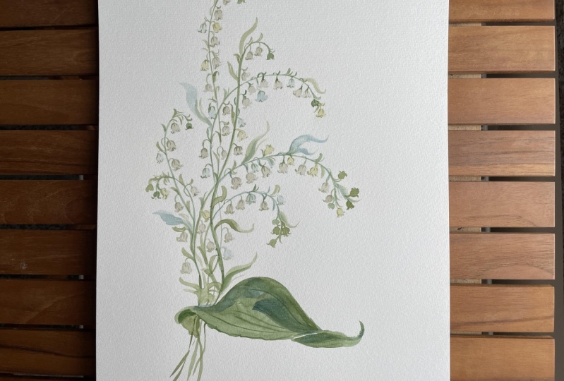
Birth flower series. Today we are going to learn
how to paint Lose Lily of the Valley and Hawthorn to
celebrate the May birthday. As with all my classes, my hope is to offer you a comprehensive study
of our subject matter, providing the instruction and education necessary to achieving success and leaving you with a sense of anticipation
to keep exploring. I'll be providing
numerous options on how to approach the
lily of the valley and inviting you to find the style that best suits
your autistic voice. We'll begin our time together
with early practice, observing a few
reference images online. Together, we'll
discuss the shapes and structure of the flowers and point out any details that may feel significant and special. This time will be used
to stir inspiration and help you collect
information about the flowers. As always, I emphasize capturing the flowers
through a loose lens. Main strokes and key details
should bethoughtful and intentional without
feeling the need to pin down every mark. After assembling
our white mixture, we will take a few moments to sketch with our paint brush as an exercise to help us capture the general shape
and structure of the flower. This time spent purely
in exploration, and in preparation
for the lesson will be extremely beneficial later on when we go for it and begin painting the
lily of the valley. We'll be using a limited palette today consisting of brown, black, gold, and green with a pinch of pink for
our hawthorn flowers. I'll show you how to
decrease the color value of our mixtures to create different versions
in the same color. Using this method
to invite light, depth and dimension
into your work. Because I do break down the material and actionable
bite size steps, I consider this to be
a beginning class with the note that basic concepts
such as how to mix water and paint to achieve
proper water ratios and using wet into wet
techniques should be understood. Although we will
spend a good deal of time exploring
Lily of the valley, when we move into
the Hawthorn study, I will be calling
upon skill sets covered in previous classes, such as the pen wheel structure. With that in mind, let's begin.
2. Supplies: Let's take a few
moments now to discuss the supplies that we will
need to complete this class. We are going to be using a
variety of brushes today. As always, I would
love for you to have duplicates just
because that makes for a smoother transition
from paint to paper. But if you only have
one, that's fine, we can rinse off and do the whole process without
having to load our brushes. But if you've taken a
class with me before, you know that my little secret to success is to
pre load brushes. Duplicates if you have them. The first is going
to be a Princeton. They're all going
to be Princeton, Princeton velvet
touch a size six Then we're going to
have this really sweet little mini detailer. That's a Princeton mini
detailer, and it's a size two. Then we also have the velvet
touch in a size four. Then we have the
heritage series. This is around three. Then for our larger brushes, We're going to have we may
or may not use this one. I used it while I
was exploring and I haven't quite decided yet
if we're going to use it. But if you have it,
bring it into the mix. This is a Aqua elite size eight. Then we will be using this is size ten Princeton
Umbria, that's a round. That's it for our brushes. For our paints, we're
going to be using a mixture of Mimery
blue and Daniel Smith. Actually the only one for the
Mimary blue is going to be the VsinoVlet then the rest
are going to be Daniel Smith. We're going to use a rich
green gold and indigo, burnt umber Under Sea
green, and James Black. We'll be using Canson paper, 140 pound cold press. So I'd like for you to have either this specific paper
or one that's comparable. You'll also need a paper
towel, a cup of water, and then if you have
an iPad that you want to bring up some
reference images, that would be great. But I will as always pin the images that we are looking
at to my Pinterest board, which is labeled skill shares. You can always find the images that I'm referring
to on that board. All right. That brings us to the conclusion
of our supplies. Let's go ahead and jump
into the next video.
3. Observing The Flowers: Before we begin painting
the lily of the valley, let's take a few moments to observe some photos
I found online. These can serve as
your reference images, or they can just be something
that you look at with me. This is part of my process
where before I paint, I like to, like I said, just spend a few moments
looking at the flower. And figuring out what
I find fascinating, what special, what
intricate details I want to include
in the painting. It helps to just serve me not only for success
in the painting, but just ensures a
more joyful process along the way. We're
going to do that now. Then our next step
will be to sketch. We do this or we've done
this in previous classes, and I've heard that it continues to benefit those who
take the classes and just allows you to become
a little more comfortable and familiar with the flower before we head in
with the paint. Most of you will be familiar
with Lily of the Valley. It's a very popular flower. It's one that I've
explored in great detail. I spent better
part of a year um, just figuring out all the ways to bring it to life
and interpret it. I think it is one of those
flowers that is very highly interpretable,
if that is a word. And I want you in this class to feel as though you've
been given the tools to approach it confidently
and the way and bring it about the way that you feel it best
represents your style. So the first thing I notice when I look at the flower is the
sweet little bell shape. Um, Finding common
objects helps me to just solidifies what the subject
matter is in my mind. So I see these
sweet little bells with the little
curves on the end. And that's something
I definitely want to bring into the painting. I want to try and capture
that shape to the best of my ability in gestural form so that will be something
that we tackle together. I love the way that the ends
of the petals just curl up, and they're very
dainty and diminutive. Um, I also like in
some of these photos, you can see the inside of
the lily of the valley. We're going to really play with that structure and
highlight it and be able to include some
sweet little details on the inside of the flower. Um, I also notice in this image where the
bells are hanging over. And so this stem has quite
a bit of posture to it. It's not, you know, straight up and down.
In some images, it is. It depends on the flower
and how it's growing. But I really like in
this particular image, how the stem is sort of
shooting off to the side. It gives it um, direction and it gives it a
sense of movement, which is something
I personally love to experiment with
in my paintings and try and avoid is stagnation
within petals and leaves. So we're going to really play
with that and focus on how the bills seem to
sort just dangle over and it almost feels as
if you were to pick it up, they would just jingle at you. They're so sweet, and I know so many of you have a
fondness for them, and it's a very
nostalgic flower. So many of you have
grown up with them. Um, I unfortunately here
in Southern California, I'm not familiar with
this flower in person. I've never even seen it,
so I'm hoping I do have the opportunity one
day to actually put my eyes on this
flower in real life. If you happen to have
access to it, by all means, bring it into the studio and let it serve as inspiration to you. Again, just another
image showing the inside of the flower here. There's some really sweet
little pink details that we can add. Mostly, we'll be
using our green gold to highlight the inside
of the flower though. Okay. So that's that one. I feel like that really helps to illuminate what it is that we're going to do
with the flower. But just looking through
some of these other fronds, just taking a moment here. This more highlights just the way that they sort of
droop over and dangle. And then there's also these
sweet little buds at the top. So we don't want to
leave out the buds. Those are so special
and they help to bring a sense of
size comparison, which is really important when you're clustering
flowers together, is to have petals that
are different size. So in a cosmo, you want some petals to be large and some to be small
so that it gives a sense of how the
flowers position. With the lily of the valley because they are all
roughly the same size. We'll use these buds to
our advantage to indicate, just a scope of sizes here. Then we have our
beautiful leaves which somewhat dwarf the
flower, if I'm being honest. But we're going to try
and as much as possible, um, include these
beautiful leaves to the best of
nature's inspiration. But we'll probably play a little bit and take
some liberties with just the sizing of it so that our lily of the
valley stem and bells, they won't lose focus. But when I'm looking
at these leaves, I notice that they
have some really beautiful curvy body to it, so I want to make sure that when we bring that into the mix, I am taking my brush
and really sweeping it along the edges here is I'm creating the outside
of the leaf, and then also a nice little a point to
the top of the leaf. That's something that
I'll want to bring in. Again, if you have a note pad or if you're making
notes off to the side. These are things that
you might want to jot down and just just bring
into the process with you. There are some leaves
too that overlap, which we can play with. Again, ingestial form, not
being too precise here with capturing the color
shift so much, but more just the general shape. Then also, there's
some riboning veins through these leaves
that I really like. Those are the main things that I feel are the most
fascinating, interesting, and special that I want to bring into our lessons today,
but by all means, if you have something that
you've found that special, please bring that in and you'll find a
moment to add that. Okay. That's going to bring us to the conclusion
of just observing. But if you need a
few more moments, you can take those now
and then head into the next video as we begin
to sketch the bells.
4. Sketching The Bells: Okay, go ahead and pick up your mini detailer
size two and then also grab the Jines black
and burnt umber and put a little bit of
that onto your palette, we're going to make
a white mixture. We've done this in
previous classes. It's a very simple way
of making a white. It's usually done using a
variety of either blacks, browns yellows or greens. This is my particular favorite. But if you want a much more in depth class and instruction about how to create
white water colors. There is a white anome class, and then I also have a
color guide on my website, which you can access using the link in the class syllabus
and it walks you through, I think, something like 25
different ways to make white. So it's a great resource. For this one, we're going to mix together the burnt umber
and the Janes black, and then it's going
to look like this. I'm going to add a
little bit more just so that we have enough of
it as we are sketching. And I like to make my white on the more
of the black side. I tend to add a bit more of the Janes black Then
I do the burnt umber. But I like the
mixture of the two. The burnt umber is a little
too warm for my taste and the black becomes very
oppressive if you use too much, but I find when you mix
the two of them together, it's the perfect mixture. Then we're going to draw
it out one step further. That's more of a
broth consistency, and then we're going to
dilute it even further. That's going to be about
60% water and 40% paint, and then we're going to use more like 70% water
and 30% paint here. You want a nice light mixture. And make sure you
mix that thoroughly. We're just going to
go ahead and explore. I'm going to give
you lots of options. I think that's one of the things that I always try and
emphasize in my classes is not a one way approach to painting a flower
and it gives you the most freedom to explore which method resonates
most with you. Okay. So I'm going to put
that off to the side. And one of the things, as I've mentioned before, that really helps me when I'm painting a flowers to
think of common objects. And we've already brought
in the word bell. But one of the other
things that I thought of, and this might be a little bit more obscure for some of you. But my daughter has these little tiny toy characters that she loves to play with
and one of them looks exactly like the
lily of the valley. It's a baby octopus. And it's just so te tiny and it It looks like the ghosts
in the Pac Man game too, if any of you are old enough to know and understand
that reference. It looks like the little
ghost chasing Pac Man. Bringing those
images to mind and conjuring those shapes
really does help us as we try to move that information from
brain to hand to paper. Just be thinking
about those things, little tiny baby octopuses, and then those
little ghosts. Okay. Let's go ahead and
just start right here. We're going to make two curves
to create the bell shape. And then we're going to
take our brush and we're going to come up
on the toe of it and begin creating the petals. It's a very general rough sketch of the lily of the valley, but that's what I
want initially is for us to just get the
general shape of it. Don't worry too much about
light and shadow and depth or even angling
the bells at this point. Let's just try and get our heads around
capturing the shapes. Let's go ahead and
try that again. Making minor changes. Maybe shortening the bell, making it really petite up here, and then really tiny petite and then maybe taking
a little bit of extra paint and curving up those petals the
way that we see it here in our reference image. I'm going to just do
that a couple times. Playing with the shape here. We have some that come really wide out and then come down. This is probably my
least favorite one where the petals really shoot far down just because I feel like you lose
the diminutive shape. My happy place is definitely In the middle where we
have a nice little round, almost like parentheses up here, and then some really small. Just capturing the
general shape. That one is definitely
the winner for me. You'll want to experiment
here with 60 seconds, guys. It doesn't have to
be super expansive. But just taking a few
moments to figure out, I really like that shape. Sometimes people will
elongate the bell part. I feel like that tends to look a little bit more like
snowdrop territory. But again, this is your painting and you can decide what it is that you want to bring out what you see is going to be
different from what I see. Just taking a few minutes to
use the toe of your brush, moving it around,
coming full belly, and then using just the toe. You can really figure out quickly how different
shapes can be made. Okay. So that's just the first
step in just sketching it, becoming familiar with
the general shape. If you need a little bit more
time, go ahead and do that. I'm not going to spend
too long just because it is a very simple and
straightforward flower. The next step is
going to be what I talked about when
we were looking through our reference images, and that is bringing out the under belly of the
lily of the valley. The way I do that, and again, you know my style is gestural, so I'm not looking to
capture things botanically. However, I am going
to walk you through one slightly botanical way
to capture the flower. So we start the same way, get a little bit more
water on my brush. And I'm going to
make the same shape, and I'm going to use the toe of my brush to do the
same thing coming up. Then what I'm going to do is
I'm going to use the edge of the brush to connect to
the bottom of the petal. And just make a sweet
little shape here. Now you can fully see, this is the top of the flower
and this is the inside. This is definitely
my favorite way to approach and even rate, I did a lot of illustrating sketching the lily of
the valley last year. What it does is it
provides room for us to have some little special
details in the center here. Later on, when we
paint this for real, we'll use some green gold to
touch upon the center here. Now, if we wanted to bring
that out even further, what we can do do
the same thing. Getting a little dark here, but that's okay.
We're just sketching. Then actually that
ones a little bit too we'll do it ahead anyway. But what I'm trying
to emphasize here. I'm going to do it
one more time is that if you just come
up really shallow, then you can really play
with the shape here, which is super fun
because then you can put some special
details in here, and then you have
the little stem attached and we'll put
all that together. I don't want to
load you down with too many steps as we're
just exploring the shape. A few of those, and then what I want to begin doing because
the lily of the valley don't always sit so obediently
on the paper like this, but we're going to be having a stem and having
them dangle over. Let's go ahead and paint
a few at an angle. Okay. So let's pretend
that you know, we don't have to pretend
we can actually do it. So I'm going to grab I believe this is
a number eight round, and I'm just going to paint
myself a very rough stem. Okay. And then I'm going to go ahead and
just paint a few. I'm not even really paying too close attention to
where these are positioned. It's all just very generic, but I want to have
something to build from. So we're going to try and employ some movement here
when we're painting, and you saw in that
initial image, we have something like this
where the bells are dangling. So let's go ahead and
attach a few of this shape. Okay. And what you can do is even turn your
paper if that helps you. So we begin shifting things. So instead of sitting
directly like parentheses, we are shifting it just a
bit so that it's sideways. Let's show the inside of
this one quite a bit. Then this one we can have just a tiny little bit
of the underside. Yes. Okay. So we have a lot
of variety here, even though it all
looks very similar, we have some that show
more of the inside, some that are longer in shape, and that's how they sit on
the lily of the valley. I'm looking at the photo right
here if you want to have it up in a different window. They look similar, but each one, depending on how
it's dangling over, has a different unique
body in shape to it. Again, if we were to
bring a couple more. We're just turning
it to the side just a little bit. Okay. So that gives us just kind
of a general feel of the way that the bell is going to
sit and situate on the stem. And the next video,
I'm going to walk you through a bunch of different
ways to approach it, how to paint it, adding
those special details, and then we're
going to put it all together and begin
to add the stem for real in the correct color and the leaves and just bring this
beautiful flower to life. Okay.
5. Painting The Bells: Okay. Before we begin painting just a gentle reminder
to refresh your mixes, they will start to pool and
the pigments will pull apart. Constantly be awakening
your piles and then adding a bit from this pile to your light consistency here. I don't want to
completely ignore or just gloss over the fact that perfecting a white
mixture is tricky. It's a challenge and it's a
part of the art in itself, creating just the right blend of colors and adding enough
water so that it's light, but that it shows up and it's
definitely not too dark. So If anyone's
struggling with that, it's definitely a challenge
and it's something that needs to be addressed
and worked through. If you find yourself at the
beginning side of watercolor, don't panic, don't
get too overwhelmed. Just add a little bit more water if things are
coming out too dark or a little bit more of your paint to add to
your beginning mixture. This is definitely more of
an intermediate concept. Anytime we work
with white colors, it just bumps up the
skill set needed. I have my pile here and we're going to
begin the same way. With our sweet
little bell shape. And then this time, we're going to color it in. Then we'll do the bottom. This does look more like a
gray, but as you'll see, it starts to lighten up and it becomes a lot lighter
two to three times. This is my favorite
way to do a white, but you can also add a little
bit of a green gold or a Naples yellow to just
change up the color palette. Like I said, this is
my preferred white, and then it's even a bit. I would probably do
it one more time. Then it's going to
dry even lighter. The idea is that you can see
what I'm doing too, though. It's not so light that you're having a hard time seeing it. There you go. That's
just the general shape. We're just essentially
taking what we learned here and then
painting it here. This is not my
favorite way to do it. But it's just one of the ways that we can
use this flower, add it onto here to give
some variety to it. If we had flowers that looked just like this and
they all looked like that, it would feel very boring and just lack
interest to the eye. But if we add each of these components that
I'm going to show you, then it brings it all together. And makes for something that's
a lot more interesting. Let's go ahead and
do that again. Then I'm going to come
up really shallow here, and then I'm going to
do the same thing, creating a little middle, and then coloring that in. Now, I have a clear
defining top and bottom. I can take my brush
if I want to and add a little bit more
curve to things. But just now when
you layer white, it gets darker and
darker each time. We'll add some details gesturally to highlight
this sweet little shape. But for now, let's go ahead
and just leave it there. This time, I really want you to work on a light consistency. I'm using just a touch
of the mixture here. We're going to let
that dry for a moment. And I'm going to show
you how you can make a definitive top and
bottom in a different way. So pain and nice. Chunky shape here should look
right about there. And we're going to let that
dry for just a few moments, and I'll show you how
we're going to cut into the shape to create
a shadow underneath. Let's go ahead and
keep practicing. Let's turn the
shape a little bit, twisting it on its side. Then we can do a bit. Really play with
the opening here. One of my favorite things to do is to just simplify it
in some of the shapes, not do everyone so
structured and then just do a nice big y
here for the bottom. Okay. Okay. I'm going to add another one up
here so that we can do this a couple times too. So you can see this one. It's still the
darkest of the male, but it's lightning
significantly. I'm going to go ahead
and do a couple more because I want
to show you guys a few different things you
can do and add to the flower. Okay. Okay. Okay. Let's turn one this way. If you need to turn
your paper, you can. Let's do another
in this direction. So let's say that the stem
was coming up and this way, then we would have some ds here, and we would need to twist these flowers so that they situated on the branch
the right way or the stem. All right. A couple more. If you wanted to really, really simplify this flower, let me show you how
I would do that. I would just do one stroke, two stroke, three stroke. And then one more stroke. That's if you really
like things very, Okay. I feel like you lose some of the shape when you
do it like that. That's just my own
personal opinion. But if you really
like that sort of sketchy look, then
those are fun. More just like a gum drop. The lily of the valley are
a bit more plump than that. I'm going to show
you how we can cut. I think it's just about
dry the center here. We're going to use
our darker mixture. Pick up a little bit of this. Add a little bit of water to it. You don't want it so dark
that it's black inside, but you definitely want
it dark enough that it distinguishes from the top. Then we're going to break
into the middle here. I can see where I am imagining
that there is separation. And now I'm going to
create that bottom. Blot off a bit. I don't need it
quite that dark now. This is a bit botanical to me, only because it's using color to really signify the shape
and the structure here. You might love
that. I definitely think it has its benefits. Doing it again here, seeing where there might
be a seam here. And then And then you can add the little
curves if you want. We can do that up here as well, just to show you what
it would look like. If it were just a
tiny little bit. Again, variety is
going to be key here. You may like one of
these looks the most, but by employing a
few different meaning there's just a little bit here, and then there's quite
a bit more here, and then this one curves
up a little bit by putting these three together on
the same front stem, it's really going to make the painting sing
versus if you were to do the same exact flower eight times on the stem,
if that makes sense. Okay. Okay. I'm going to
do that one more time. I'm just imagining where there might be a
split here and then bringing my brush into the center going up
and down motions. Okay. And then what
we can do pick up your three brush and
I'm going to use a bit of the dark mixture again. We can run a few
sweet gestural lines through the top part. Just using the toe of my brush to create a few
little lines here. You want them to look
as though they're sprouting from the
top, the base here. You don't want to do them
straight up and down, you want them to
have a curve, again, like that parentheses and look as though they're
sprouting from the top. It takes a light
touch. You're really just grazing the paper. You can see by how
adding them it's just one more interesting facet. Which you can also do
is take your brush. If you have something that's more open in
the middle here, you can take the
edge of the brush and create some sweet little details along the edges here. Okay. Essentially, you're
sketching again, but you're just using
a bit more paint and you're emphasizing
shadow as well. This is my favorite method. So, these two would
be my favorite. I don't so much like
the dark on the side, because it also prevents me from adding a sweet little
detail on the side. But again, play with this, feel it out, see what you like. I really like the gestural
details on the outside. You can do them up top two, and you can add the
lines as well. Okay. You can be as loose and free
handed with it as you want, or you can be meticulous
and, you know, intentional. Okay. Okay. So they have it. There are several
different ways that you can again approach
this and hopefully, I've given you quite
a bit of thought. I'm going to add a little bit of the rich green gold
to our palette now, and then I'm going to
take our mini detailer. I'm going to pick
up a little bit hereting off. I just
have a little bit. I don't want too much
paint on my brush. Nice broth mixture. Then what I can do is add it to the inside. Just like that. Just a sweet little squiggle, I don't get too stiff
or stagnant with it, I just try and indicate that something sweet is happening
on the inside here. In some of the
pictures I showed you, there's pink in the middle. That really goes far
up into the flower. It's higher up. But again, you can take liberties here. If you want to really create
a flower that is wide open. So let's just say if we had this one, I'm going
to draw it with this. Let's say we had
something like that where the inside is really wide open. You can now plug in a little
bit of the yellow here right about to the edge of the petal and then put more
of a pink up here. So we can do that and I can show you what it
would look like. Because this flower is
so sweet and diminutive, I feel like adding
too many details to it can just take away
from the elegance. But my job here is to just show you options. I'll
go ahead and do that. If you wanted to
add a little bit of pink here, you could. You could even touch the
edge of the petal here. If you want to get super
abstract and super loose, and then you can
add a little bit of the yellow down here. Again, I'm going to pick up my other mini detailer,
I have two here. That's why I like to have
duplicates so that I can have one color on one. I have the rich green gold on one and then I'm going to have our gray mixture
on the other. Let's just see what that would
look like if we were to do wet into wet. Okay. Giving that just a second
to just sit and situate. We did a lot of that
with the sweet peas last month if you
took that class. Then we would gently lean
into the color here. Let's do that a couple
more times just in case you really like
this and how it looks to make it a so we have a bit more
of a difference here. And again, heading in with
a little bit of yellow, brushing it up against
the edge of the petal. Making a nice, wide curve here. There we go. It's a nice subtle way
of doing wet and to wet. It doesn't pull too far
or make a huge impact, the way that the
pink is going to. If you really love
that wet and to wet, super splashy abstract,
nothing's really definitive, then that's definitely
the way to go. My happy place is a medium.
It's in the middle. It's using gestural and
abstract to create something that's intuitive, but
also comprehensible. Makes sense. That's a lot
of options for you guys. There's so many different
ways you can approach it. One note, I wouldn't say combine all of these
on the same frond. I know I keep saying
variety is key and it is, but you want to find variety within the given form
that you choose. If you're doing this, you want to do some
that are closed, a little bit more
closed than this one, more along these lines. If you're doing this, you want
to make sure you have some that don't necessarily
have the white showing. Variety. We're going to jump into the next video
and continue the fun.
6. Painting The Leaves: Okay. Now I'm going to show you a few different ways to approach the lily of
the valley leaves. I'd like you to have two brushes and roughly the same size. So I'm going to
have my number ten round and my number eight round. They have a bit of
a different shape. You can see that the aqualt
has more of a point to it, and this one's
definitely more chunky. Having a little bit of variety
within brushes is nice, but if you just have two of
the same bruh, totally fine. So I went ahead and I put a little bit of the undersea
green on my palette, I'm going to go ahead
and mix that now. Then I'm going to do the same
thing with my other brush. I'm going to take some
of the undersea green, bring it over here
into a different pile. Try and keep it separate enough from this one so
that they don't mix. Then I'm going to pick
up a little bit of my rich green cold as
well to change the hue. I get a little bit more
olive and we're going to use color within these leaves. All right. So I'd
like you to have a broth consistency for both. I'm going to remove
this paint from my palette so that I have
a little bit more room to play here with color value. Over here, I'd like it to be
a little bit more watery, not quite so thick on the paint. Okay. Your piles should look
something roughly like that. You have one that's more of
a broth mixture of 50 50, and then you have one that's
more light consistency where it's a 70% water, 30% paint, and then
this one as well. With those leaves that
we were looking at, they had a lot of body to them. So curves, so I'm going
to play with that. I'm going to take my
number ten brush. I'm going to start
here at the tip, and I'm just going to draw
a nice curvy shape and then I'm going to come
back and bring it down. Okay. And then I'm immediately going to take the rich green gold mixture and just splash that in there. Maybe even down the middle, maybe here at the top as well. Until the end, that's
about all I would do. We can go much further
with the leaves, and I'm going to show you again options because I
feel like that is the best way to really
unleash she creativity. I'm going to do that again. I'm going to do it on this side. Imagining that maybe our lily of the valley is
coming up like this. Dipping into the light mixture, now let's create
one on this side. A little thin here, so
I'm going to fix that. And timing this is key. You need to lay down a
nice even coat of paint initially so that it's wet and ready to accept the next color. You can at any point,
add the darker mixture. Let's go ahead and do that now. I'm going to put that
on my ten brush. I'm going to come
here at the bottom and add the darker
mixture as well. If you need to practice a
little bit with leaf shape, by all means, take a
few moments to do that. I'm really just doing
one, two, coming in. Let me show you over here. O. Then I come back
and do the same. Immediately, making
sure that I'm applying the water to
avoid those hard edges. I'm going to elongate this
just a little bit here. It's a little bit too
far out for my taste. Then jumping right in. Okay. You can while
things are wet, use your brush to
add some lines. They won't be definitive at this point over
here is quite dry, but that'll add some special
detail to the leaves, so you can take your brush and just run it down the middle. You'll have to gauge if the media is dry or
wet and what you want. This was more dry.
This is more wet, so they're going to flood
into the existing paint. And just keep adding another layer of the
paint to the leaves. I can come up here. My
favorite is having moments where it's very dark and
then also very light, which requires a little
bit more tactic and using a little bit of water on your brush to push back the
paint to create some bleeds. Adding a little bit
of a darker tip here. That's the undersea
green just as is in the broth mixture and then rinsing off my brush and
pushing back a little bit. You can do the same
thing over here, adding a little bit of
water and pushing back, but the bleed won't be quite as dramatic if you wait so long. The harder you push
into the paper, the more of a
reaction you'll get. But you do have to
make sure you're nudging the water along or
it will just sit there. Okay. I'm going to do a few more leaves. Just refreshing my
mixtures over here. Let's do one as it were
kind of sprouting out. So coming from the side here. Coloring that in. Nice and wet. Then I can take the
undersea green dark. So in that broth mixture, more leaning towards
cough syrup. And just run that
through the middle. Then we're imagining that
the stems coming out here. I'm going to put a bit more
undersea green on my palette. I'm running out if you need
to do the same. Go ahead. I'm going to use my other
brush to create a bleed here. I just giving that a moment,
seeing what's happening. This look is what's
going to pair best with the lily of the valley
and the style that I like. I'm going to show you
a few other ways too. You can always drag your
brush along the side of the leaf as well if
you're wanting to create a lighter side to things. I'm going to take most
of the paint off of my brush now and really do
a nice light leaf here. Nice water here. I said, laying down that even
coat is essential. And then using a bit
of the darker undersea green to create a point. And come straight
through the leaf. I said, you can run
some lines through if you would like while
things are nice and wet. And adding another
color as well? And then you can rinse
the paint off of your brush and push
back with some water. You can watch as
things are drying and add more layers of paint
while the media is still wet. That's my recommendation. Adding paint when
things are dry, it becomes a bit more tricky. And you run the risk of
overworking something. Things are a lot more
when the paint wet. Okay. Yeah. Okay. Pushing back a little bit with the water. You can be heavy with
the water and the paint will just pool and
move around or you can wait until the
leaf is a bit more dry and then plug
in with the water. But again, waiting too long, the effect can be a
lot more minimal. You'll want to just
experiment with that and see result you like. I'm going to move this over Now, let's pretend that
we have a stem. Let's say that's our
lily of the valley stem. If we wanted to do a leaf
that had a curve to it, how would we do that
in a gestural way? So what I would do
create the base, and then I would curve the tip. And then come back
to center here. And connect that to the bottom. Then what we can do
here. Once this is dry, we will darken the edge
of this just like we did with the lily of the valley to create just a bit of
a darker shadow here. In the meantime, we
can add a little bit of the rich green gold. We can use the tip
toe of our brush to just add in some
dots that will. We don't have to do sweeps, we can just add dots. Then let's go ahead and
add another leaf up here. And adding a bit of paint a bit more of
the undersea green. Let's create that point. And sweep through. And then we can while things are wet, we can add this sweet stems or we can wait till things are dry. We're going to
do more of this. In the next video, this is just to kind of
get you warmed up. I don't think this is
quite dry yet. Possibly. That's a problem with
real time painting. I'm going to take a bit more of the undersea green
on my brush here. And I'm going to create
a little definition between what's happening
here and here. Use my mini detailer
to finish it off. So this gives the illusion
that the really curving over. Another way is to sketch it out. Where you imagine that
curve is going to be? And create a bit of
space using the white. Then this is where
I would imagine it curving over and using a bit more paint to create
difference in color value. This would be a leaf that was just coming straight
off to the side here. I'm going to grab
my other paper real quick so we can do a few more. Again, if we're
wanting to sketch out that shape initially, we can use our brush
to create the curve. And then waiting a moment. And imagining where
that curve might be. This is a bit more of
a challenging way. I don't recommend it for beginner beginners because it requires a little
bit more thought. I like to just the
straightforward using a lot of
body and movement. But again, this is me just
giving you lots of options. That would be where your
stem would be coming out. Then you'd have a
nice curvy leaf here running that
through the middle. It's something to
play with for sure. Okay. Okay. I'm going to pause the video here
because it's getting a little bit long and then we will regroup in the next slide.
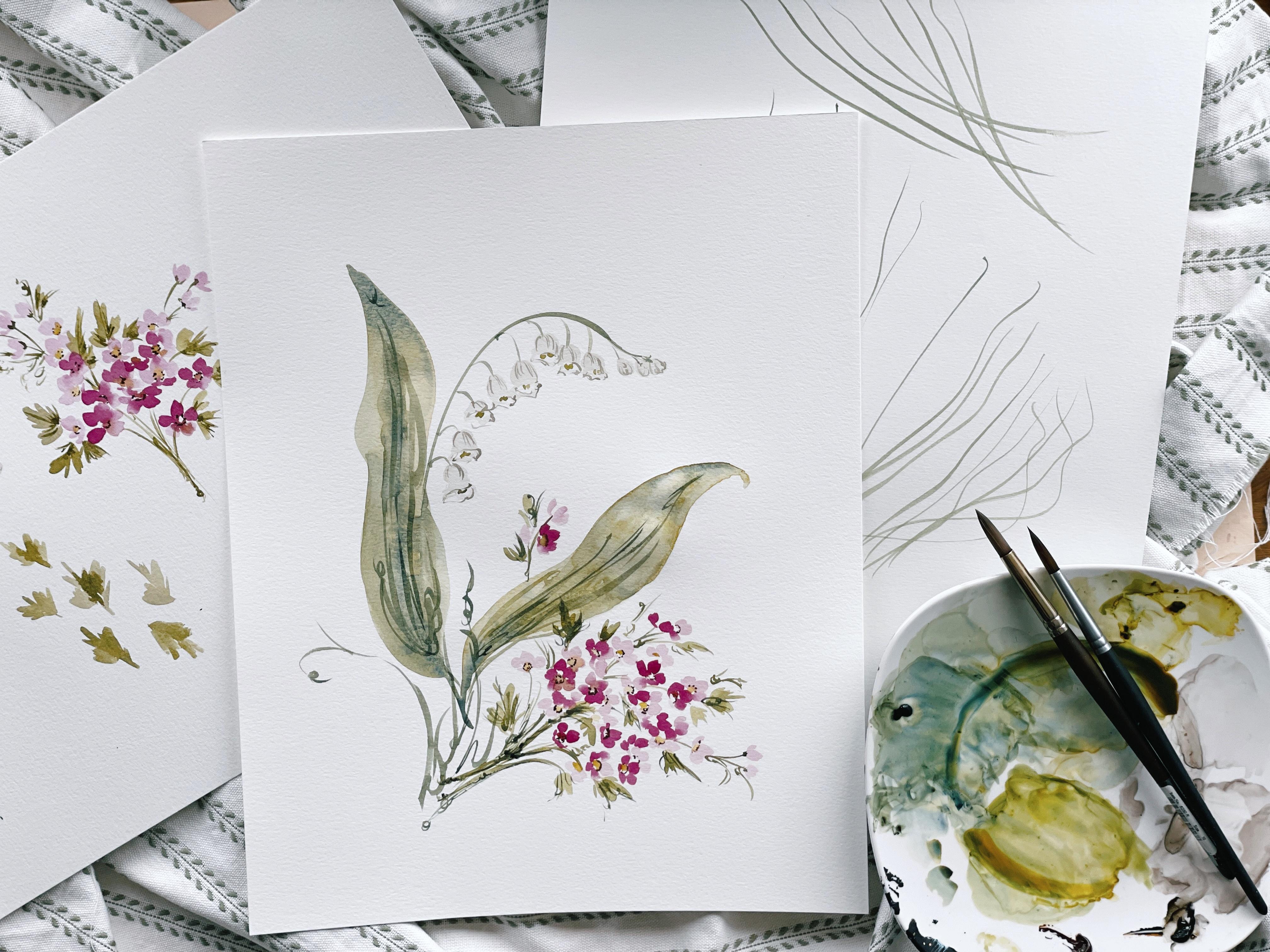
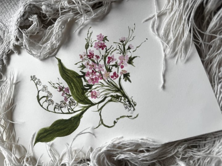
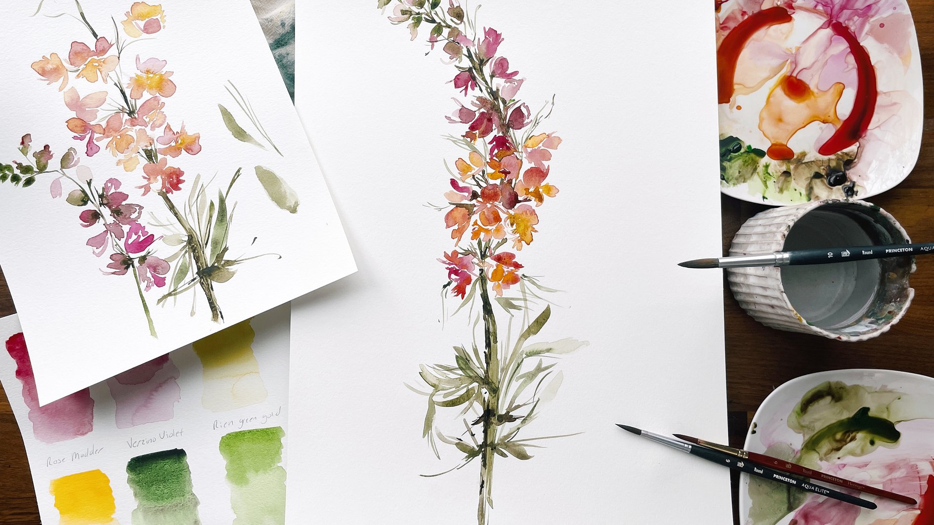
7. Painting The Hawthorn: And now we are moving into our second May birth
flower, which is Hawthorn. This is one of my favorites because it reminds me
so much of wax flower, which is by enlarge, one of my most favorite
flowers to paint. I use it in so
many compositions. It's such a lovely
filler flower. And Hawthorn is very similar
in that way that it is just the most lovely flower
to add to a mixed bouquet. If you're not familiar
with it, yet, you're going to be a fan by the time that we're
done exploring it. So, um, because this is not a flower that's
a focal flower, we're not going to
take the normal time that we usually do to do all of the processes
starting with observing and then sketching
and then all of that. We're just going to jump
right in after taking a few moments to just
look at the flower, see the different colors, and the petal structure, and just talk about
it for a few moments, and then we're going to get
right into painting it. If you feel like you need a little bit of practice
time, of course, that is something
that you can do on your own prior to beginning. Um, You can just pause
the lesson and then jump right back in once you
feel ready to approach it. Hawthorne comes in a few
different varieties. I've selected the white
and the pink for us, and we're going to play with
some different water ratios and mixtures and just blend
the two of these together. There is a lot of
pinks within the pink, which if we're observing, that's one thing that that I've picked out that
feels fascinating and interesting and
something I want to incorporate in the capturing of this flower is that
some petals are very rich and dark pink
such as this down here, slightly in shadow, and then where the light is
touching the flower, it's a lot more soft like
ballet slipper pink. We're going to play
with that using both color and water ratio, mixing up cough sy consistency
and broth consistency, and then also using
our white mixture that we used for the
lily of the valley. Hawthorn clusters together. So we're going to really
lean into playing with angle and the positioning of the
flower so that they aren't all face up in just open
face staring at us, but that we do really lean into the structure here coming
on the side of the flower and tucking some
behind the cluster and giving the illusion
of depth and dimension. Then we'll also be adding
the sweet little leaves. We're going to do that using
a brush we haven't used yet. Then putting it together in
a bit of a stem cluster. So typically, these
grow like in bushes, but just for the sake
of our painting, we're going to be mixing them
together with the lily of the valley for a birth
flower painting. So we're going to take a few
liberties in that regard. Other than that, the
other special thing that I note here is that there's a sweet little
yellow center to the flowers, and then also these
beautiful stamen, which come in both pink and white and brown
or I should say, come in pink, white, and brown. Mostly, I've seen it
as in pink and brown. It's going to be a lot of fun. This again, like I said,
is one of those flowers. That's just a great
deal of fun to paint. Okay. I'm going to set this
off to the side for now. Actually, you know what?
I wanted to show you two more So this is this shows
the leaves a little bit more. I like the leaves
and the other one. I think we'll probably
use this shape more so than the leaves in
the next slide. I like how they're
angled in position, and I think that
they'll accompany the lily of the valley well. But there is another option here too that has more
of a ridge in like a rose petal leaf and really definitive
veins in the leaves. And I like those white ones, the way that they sort
of cluster here on the branch and then also
another reference image. So again, I'll be
pinning these to my skill share
pinterest board so that you will have
these to refer back to. This is an example of the
yellow in the middle and then the brown specs in the center as well
acting as the stamen. Okay. I'll leave that out but
off to the side, and Okay. You're going to go ahead
and put a little bit of the zeno violet on your palette. You're also going to
grab your number four filbert brush and begin mixing into the pile. Mix a nice thick cough sir pink. Okay. And then we're going to
draw that out decreasing the color value so that we're
at a broth consistency. You should have two
versions of this color. Then also, using a
number six fiber. I'm going to mix up a little bit more of
the white mixture. That's the s and
the burnt umber. Add a bit more black to that. Then of course, decreasing
the value a great deal. Until we have something
that looks more like that. Again, we're going to be
clustering those together. I'm also going to add in a
pop of the green goal just so it looks a little bit different than our
other white mixture. Okay. A bit more yellow. But I don't want it so yellow
that it's going to detract from the yellow center. Going to keep
experimenting here until I find something I like I to
touch more of the black. Sometimes it just takes a bit. A bit more black. There we go. And then drawing that out. Here we go. Bit warmer with a hint of the yellow
in it as well. Okay, so now we
have two brushes. What we're going to
do is we're going to play with the color value. We're going to start
with the pink hawthorn. And I'm going to have
my mini detailer loaded up with the
co consistency. And my four brush with
the broth consistency. We're going to play with
these two color values as we create the flower. So this flower you
may have noticed, especially if you have
read my book and taken a few of my other classes is
very much a pinwheel flower, meaning that it has five
petals and they are evenly spaced and they give
the appearance of a pinwheel. If you were to look at it. So if you were to look on it head on, it would have one, two,
three, four, five. And we rotate these petals and we make them a bit
smaller and a bit bigger to give the illusion that
the flower is either on its side or turned over or
tucked behind another flower. These are just the
tricks that we use to make it appear this way. You'll see as we do
some open face flowers where just completely head on, and then we begin to cluster some smaller flowers
behind these open face. Let's go ahead and just focus
on color value right now. Let's go ahead and do two petals in that cough sy consistency. Just like that a
little two stroke. Then let's use the broth consistency
to finish the flower. Letting those two
colors blend together. While things are
wet, you can use your other mini detailer to pop in a little bit of
the rich green gold. If you want to,
you don't have to. You can use just
the pink center. To fill that in. I do recommend leaving a little
bit of white space. That white space acts not
only as a light source, but it gives the impression
that there's separation. Let's go ahead and
do that again. This time, let's tuck the
petal right behind this one. We'll have three
petals shooting up. The first one in
cough consistency, and then the second one and
the third one in broth. So we're giving
the illusion that this flower is tucked
behind the other. Then we can also pop in a little bit of
the rich green gold, which is blending with
the pink as well. Let's continue moving along. Let's do one in all broth consistency to
see what that looks like. For these petals, just a small little
marking will suffice. If you notice, it gives
the illusion as though the flower is just grazing up against the other one
tucked over slightly. By not creating flowers that look exactly the same
with the same color value, we're going to create a of flowers that really beautiful
and natural together. Popping in a bit of
that rich green gold. Now, let's nestle of
flower next to this one. Let's imagine that it's leaning on its side in this direction. So we have touching up against that wet media and then let's finish it
with a broth petal. We also make it
slightly smaller, we're playing with
size here too. All of these are key
components to composition. By playing with the size. We also give the
impression that there's layers happening and there's
depth and there's dimension. You can leave some
of these centers white if you want to or you
can continue filling them in. It's entirely up to you. Let's continue building here. I'm going to show you a few more so that we have
at least one cluster before we move on because we are going to be repeating
this process in our final class project. Mm. Again, clustering this petal, this flower on its side here. Then I'm going to do
another broth flower. You can add more colors
for even more variation. So if you wanted to
add a little bit of the rich green gold
to the pink mixture, that would bring a
peach into the mix. Obviously, things get more complicated as you
add more colors, but really beautiful results. Okay, I'm going to
add a one right here, touching that wet media. And then I'm just going to
leap right into another one. Some of them will have four petals and some
will have five. That's one of the other
components to play with is varying how many petals
you put on the flower. I'm going to do another five. I'm going to add a few more
here so that we can continue to build up our Okay. Okay. Okay. I'm going to add one right here. It looks as though
it's hiding in there. I'm going to make
it nice and dark. So it gives the illusion of it being further into the whereas the other ones
are on the outside. And then what I'm going to
do is I'm going to create a few buds coming up. So that's just like
a sweet three pedal. We'll imagine that we're
attaching a stem here. And we can do another
one over here. We can do just a two.
Variation again is key. And I'm going to do the same
thing on the other side. Okay. Okay. And plugging in one more petal here
for one more flower. And just because I don't
like an even amount of flowers on both sides, let's go ahead and
create one more there. Okay, so we have a nice here. Things are trying quickly just because the flowers
are quite small. I'm going to pause the video here and then we will resume in the next one and add in those brown speckles
to the center. Okay.
8. Adding Details To The Hawthorn: So again, just noting
what we've done here. We've created a
really nice variety of flowers using petal shape, having a few petals
sometimes be bigger, a few be smaller, and then also playing
with color value. All of these things lend
to a really fascinating, interesting cluster of flowers. You can continue
with the cluster, even shooting it out in
a different direction. We're going to do that. I just wanted you to understand just the basic petal structure here so that moving
into the class project, you're feeling more comfortable, more familiar, and confident
with the material. Let's go ahead and I'm going to use my number three brush, and I've dipped into
my burnt umber, and we're going to
create just a few little speckles in the center here. Let's go ahead and start
at the upper left. The way that the stamen sit in the center,
it's very circular. I'm going to employ
that, but I'm also going to take a few
liberties as well, not adding the same
amount to each flower. These are the little details
that make a difference. If you were to do the stainen in the exact same spot
on every flower, again, that's going to detract from the interest
of the painting. By making those key
intentional choices and doing things just
a bit differently, it brings in much more
interest to the flower. You can even do more of a circular motion and not so definitive as
far as the speckles, or you can keep it
as it is in nature. You can do wet into wet, but just take note that the petals will become
quite brown if you do, depending on how
wet the media is. Okay. We're also going to be doing this
with white flowers. But we're going to save
that because it is just the same petal structure just using a different color. Go ahead and off your
number three brush, and we're going to dip into the undersea green
and the rich green gold. And this time, I'd
like the mixture to be more on the green gold side. So putting in 60
to 70% green gold and 30% undersea green just
so that there's a little bit of variation between the
two different greens that we're using
since we will be clustering or combining
these flowers together in the same painting. Okay. Let's go ahead and add a few stems here
attaching them to the cluster. To create a base. I just do a couple gestural
strokes here. Just a few little squiggles to indicate that
these are connected, and then bring them back to
where they naturally lay. We do the same thing
on the other side. Okay. And then you can do a few gestural markings up
here if you like. Just to bring a bit more
interest into the painting. Then I want to make sure your number four Filbert brush is nsed off because we're going to be creating some leaves. Just creating some
sweet squiggles. Okay. I'll bring that stem into here. I'm not going to do a
stem here because I'm going to end up dragging
my palm through it, so we'll do that at
the end. All right. To start with this
leave, dip into your green gold mixture
at cough consistency, and we're going to plug
in some leaves where they might benefit the. I'm just taking the belly of the brush and
creating some marks. You can do it off
to the side too. If you feel like you want
to practice a little bit, I like to do one, two, three, and then come to the other
side, one, two, three, and then maybe come
up to the center here and attach the leaf. That gives you a nice shape. Varieties key, on one
side than the other. We can add some of the higher color value
to the center here. Sometimes drawing the line first he can do it like that as well. Apologize. You have a
nice leaf that way, and then let's do
one facing down. You see this green mixture is going to complement
our green mixture over here. And one more time. We can do the line first
if that's helpful. One, two, one, two, three, and a stem or
you can do the leaves. I like to do both because it
achieves different results, and so not every leaf is
going to look the same. And then you can take the cough sy consistency and add a nice little
bleed into there. I can do that here too. We'll leave it as
it and then we'll run some veins
through these leaves. Trying to take care to not create the same
leaves on each side. So smaller and some larger and even some
overlapping is nice. Some tucked behind
the flowers. Okay. And just looking at
what I have here, what might need to be amended, I'm going to add a
little leaf up here. Maybe one coming out here. Just aiming for variety here. And now we can take our number three brush
and finish the cluster. Adding in just a
few little lines to indicate that these
things are connecting. Nice little bush here. And then I'm running out
of my green mixture. I'm going to do
it one more time. That's the undersea green
and the rich green gold. That way I can create
some veins as well, and it's really going to
bring to life. Start here. I'll say it again,
variety is key. Don't do the same
veins in each leaf. In fact, you can
leave some as is. Nature is so generous with the
way that it gives variety. I try and bring that
into my paintings. Taking care to leave some areas unveined then areas where I'm expanding the veins
to go beyond the leaf. You can darken the stem here, add a little bit more thickness, and finish off with There you go. I hope you feel confident
and ready for this. If not, you can practice
off to the side, both leaves and the hawthorn, and then you jump back in to the final class project at
the end. All right, guys. Okay.
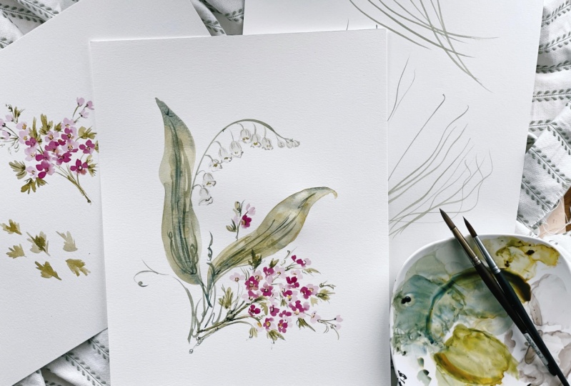
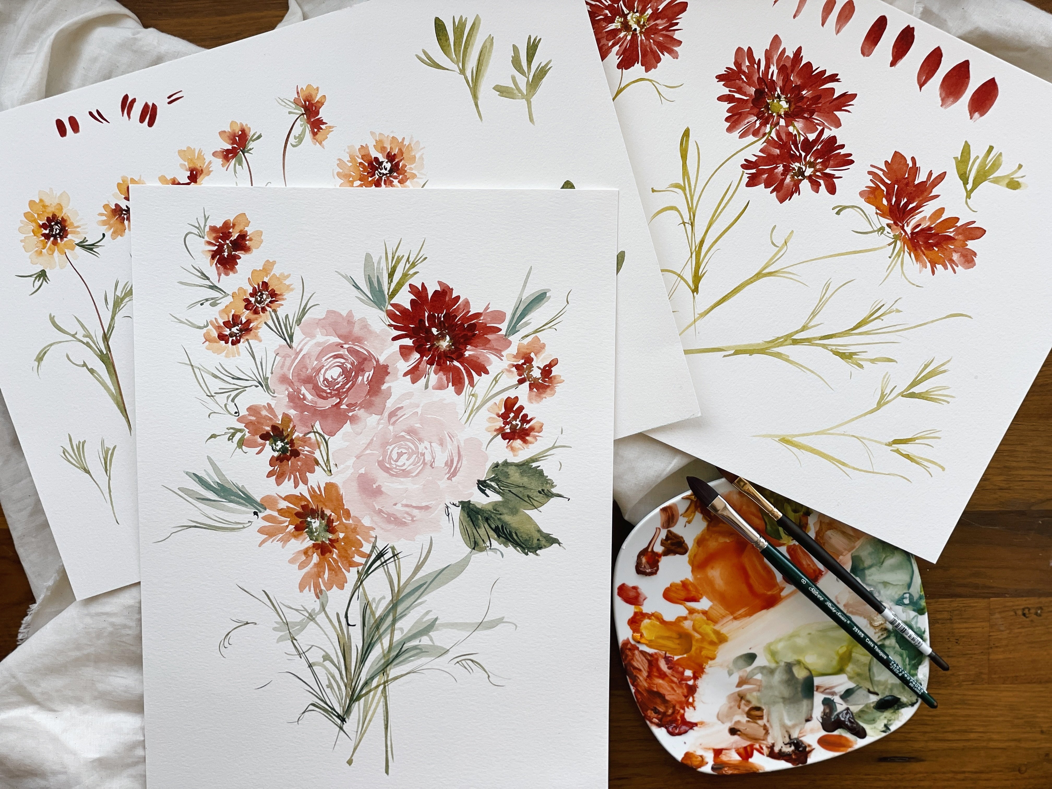
9. Class Project 1: Welcome to the class
project, my friend. I am so glad you're here. By now, you have
gained the skill and the confidence to
assemble a painting. But if for whatever reason, you are not feeling ready, please feel free to re
review any of the material, work through the lessons
as much as you need to, and then come ready
because we are going to have a wonderful painting
session together. I'm going to talk with you for just a few moments
about our plan and then we're going
to jump right in. The first thing we're
going to do is we're going to create a
stem for the lily of the valley serving as an anchor point
for our painting, and we're going to do the bells first and then we're going to
attach the leaves. Now, if you've decided
that you would rather paint your lily of the
valley over the leaves, you can definitely apply
this concept and approach. Just be sure that you've
made that decision ahead of time and make the
necessary modifications. If like me, you're going
to maneuver around the bells and use this approach where we are weaving the leaves around the stem and then leaving room for the bells. You'll be following
along with me and you won't need to be making
any of the modifications. Once we've done that, then we will begin to
assemble the hawthorn, which is going to
come clustering down here towards the
bottom of the page. We'll work wet into wet and then also take pauses
to allow things to fully dry before we use gestural technique to add
details and markings. The last thing,
before you begin, go ahead and refresh your
palettes, mine were pretty dry. What I've done is I've gathered cough syrup in our
versinoviolet and also broth. Then I've refreshed my palette
with the whites as well. That's the mixture of the genes black and
the burnt umber. Then on a separate palette, which you might consider
doing is my greens mixture. That's my undersea
green with a touch of the green gold in a cough
syrup and a broth consistency. Then this is green
gold with a touch of undersea green.
Just reversed here. Then we'll for our
hawthorn leaves, we're going to use the green
gold and the burnt umber. That way we have three
different options of green here to work with. I always say I'm a broken
record, variety is key. With that, we are
going to begin. Now, I'm going to switch to my number ten round
brush to create two leaves using the
broth consistency in the undersea green mixture. Remember to use
sweeping strokes. This should feel like
one seamless motion. And two. Go ahead and layer
over your stem if you like. And then make
adjustments to the leaf. If you feel like it's too
slender or the curves are too deep at a point to
the top of your leaf. Then we're going to do the
same thing on the other side. This time, we're
going to make sure we navigate around our stem, and we're going to create a
leaf going in this direction. Now, while things are still wet, you can use your brush and the undersing green at
cough syp consistency. To splash in a bit more color, I'm going to add a bit here at the tip and then run a vein
through the center as well. And I'm going to use my other brush to
load the green gold in cough sy consistency
and do the same thing. Running up against the edges here and just tightening up some of the details
here at the bottom. One more time, I'm going to use cough sp consistency to create a nice dark point and run some veins through
while things are still wet. And also begin creating
a few of the stems. If you like, you can rinse off one of your brushes
and load it with clean water to create some
bleeds within the leaves. You don't have to do
it. It's not necessary, but it does add a little
bit more interest and fascination to the painting. I'm happy with those leaves. Just going to make a small attachment down
here at the bottom. Okay. Now using my eight round brush, I'm going to attach a
few smaller stems to serve as connecting to the bells of the
lily of the valley. Be careful of your palm
running through, and in fact, you may want to take a
hair dryer or you can even just wait till things
are dry before adding them. You want to space them
somewhat evenly apart, but not so evenly that
things feel too stagnant or similar because variety is key with the way things
are laying on the paper. Okay. We will also extend the stem here to create a
few smaller buds. Also going to run the stem back through the leaf here, just to reconnect,
you don't have to. It can be disappearing
behind the leaves. That's completely
fine. Then also, I'm going to add a bit more of broth consistency to the
southern side of the leaf here. Now, be sure that your brush is completely clear of the pink. If you were using
the same brush. If you have a separate brush
for the white mixture, then this one should
hopefully still have the same white mixed and
loaded on there. Be sure that you have the
proper water to paint ratio. You want light consistency, which is 30% paint
and 70% water. Okay. You'll also need to make the decision about
what style you enjoyed when we
were experimenting. For example, if you
really like the way that we cut in here and
created shadows, then you'll need to make the
necessary modifications. If you preferred the way that we did it down
here where we left some white space and then we use gestural marking to
serve as structure, then you will be following
along exactly with me. I'm going to start at the
bottom and work my way up. Okay. Making minor changes here allowing for a bit more white to show in some of the bells and making others a
little bit longer. Reloading my brush as needed and also blotting off the excess
paint onto the palette. I'm also playing
with perspective, curving some of the lily of the valley flowers in and
some are curving out. And then we will use the same
brush to create a few buds. We'll wait till those are dry
before we attach the stem. The leaves are still
just a bit wet, so I'm going to give
them another minute. While I'm doing that, I'm
going to go ahead and use my mini detail to add in the center of the
lily of the valley. I'm again trying to use
variety within my markings. Now I'm going to use my
number three round brush to dip into the broth mixture. I need to make it a little bit more brothy because it's a. The lines don't need
to be so dark through the lily of the valley because
we painted it quite light. Just enough to provide a bit
of definition and structure. You may want to test this off to the side to
make sure that it's the right color and then
make the necessary changes. Still a little bit dark. So I'm going to decrease
the value a bit. And then begin making the marks. Okay. I'm going to bring you in here at
a different angle. So just so you can
see, most people are working on a
desktop computer, but sometimes you need to
work from your phone or iPad, and I want to be sure
that everybody can see. Again, it's just to capture the essence of the
lily of the valley. We're not trying to grab
every single detail. Now, we can use our breaths
to attach the stem. And now bringing
you back full view, we'll use our Aqua elite size eight brush to add some
veins to the leaves. Okay. Adding a bit of the green gold mixture. I can see that leaf is still a little bit wet,
but that's okay. If you feel like the
lines are too dark, you can always use your other brush to do a
little bit of blending. Okay. Okay. There's really no rule here as far as how many veins to
add or not to add. It's entirely up to you. I'm going to put a few
markings in there. Just my signature style
to add a little bit of a curly Q essence to my leaves. You can also add some structure along the sides if you want to. I'm pretty happy with the
way things are looking now. I'm going to take a pause here, allow the leaves to fully
dry and also refresh my palette to begin painting the hawthorn down towards
the bottom of the page. I'll see you in the next video.
10. Class Project 2: My leaves are actually
still drying. I added a bit of a
curve here on this leaf just to give it a bit more
of a playful structure. But where I'm going
to be working is dry. I'm going to go ahead and begin putting down the hawthorn. I'm going to load my
mini detailer brush with the coughs consistency and then my other mini
detailer brush with the broth consistency. We're going to do this
in the exact same way that we did when we
were practicing, assembling a cluster that has a light source and also
depth and dimension, playing with the three
petal to two petal rule, where we do three
dark petals and two light petals and then
also switching that and then doing some that are all
dark with just a little bit of a splash of water and then
some that are all light. Variety is key. I'm going to turn my paper
just slightly so that I can get the correct angle as I'm
moving in this direction. And begin with a nice
open faced flower. I'm going to touch the edge of the petal here and
create a nice bleed. And connect the flowers. I'm also going to while
this is drying just a bit, load my six filbert brush. Actually, I'm going to use
my four filbert brush, tiny bit smaller with the green gold mixture
to pop into the center. You can choose to
wait till things are a bit dry so that it doesn't run into the color or use the color while it's wet. Remember to leave
a little bit of white space to serve
as your light source. Let's continue building here. I'm going to do an
all broth flower now. And touch up just
against the edge here and do the same thing as they continue to build this. Adding in the green
gold to the center. Now I'm going to begin to
play with the perspective of the flowers tucking
some underneath to give the illusion
that there are curves in the flowers and that they're bending in a
certain direction. I'm also going to
leave a little bit of room for stems here. Okay. Okay. Painting the flowers in different
directions also helps. Adding just a touch of the
cough syp consistency here. And I'm going to
continue shaping this. As I want it to move
in this direction. And how did that to be hello. Okay. Okay. With these flowers, it's not so much a worry
of running up against the edges as we have encountered those challenges
when working through other lessons because these are directly in the
middle of the page, and they're so stalwart
and not loose and flowy, the way some of our
other lessons are. There's not really a
huge worry about that. However, you do want to
be mindful of running too close to this edge
because then it will look as though your painting
is not balanced. Just be mindful as you're
shaping your cluster to work in this bottom middle
portion of the page and leave some room
for leaves and stems. Okay. I'm going to turn and twist my paper
again just to get the best angle possible
and begin shaping in this direction
as I want some of my petals and flowers
to be pointing down. Also, creating some of
three petal flowers instead of using the typical
four or five can also add a little bit
of interest in variety. I want a nice dense
to work with. So I'm going to
continue adding petals here until I feel like I've
reached the right point. Taking the opportunity to pop in a little bit of
the green gold. Can me make paper background, just to see where I'm at
with shaping this cluster. Sometimes what I
like to do is create a nice dense mixture of
flowers and then add the stems and then add more
flowers on top that can be sometimes a trick to making sure you maintain
the composition. M. Sometimes I like to use the previous flower
to bleed into the next one, rather than using
my other brush, then I can just naturally take the pigment from
the previous flower and add it into the next one. Okay. I'm going to begin
adding a few buds here. I want my hawthorn to be angled down and towards the
bottom right corner. I'm also going to add a few
buds over here as well, just to give the sense
of balance and flow. I'm just taking a moment
now to look at what I have to imagine
running the stems how I'm going to connect everything
and seeing if there's anything else I want to do at this point before
making my next step. Yes. I like when
things are shaped now. I'm going to take a pause,
not with the video, but just with
adding the flowers. I'm going to begin to
add the stems now and also leaves and then see
where I need to fill in. I'm going to use the
broth consistency that way I can layer over with cough syp later for a bit more definition
and structure. I'm going to turn my
paper just to get the best angle here and I'm going to begin by
creating a stem. And then creating
a few more here. M. Now I'm going to use my
number four Filbert brush to create a few leaves using
the same strokes that we did before when our
practice Hawthorn leaves. I'm actually going
to turn my paper a bit upside down here. And just begin plugging in the leaves where
they feel natural. I'm wanting to move
things in this direction, so I'm going to take care to
add the leaves so that they are facing in the most
natural direction to go with the flow of
my stem and also adding in stems as needed to make the connections
throughout the cluster. I'm going to pop in a
few more blooms here because this is becoming
an unnecessary gap. Just to help assemble
the bouquet or the cluster and create depth
and dimension and density. Just adding a bit of color here, working wet into wet. Now I'm going to use
of ser consistency to go over the lily of the
valley here to connect them. That way, it doesn't
look like these two blooms are so separate. Creating a little bit of
a cap at the bottom here. And connecting it
back to the stem. Now I'm going to look
for some places to add some gestural lines
to begin to add a little bit more interest and also to help correct
the flow of the painting. Sometimes I like to fill in with these little marks where there's not quite enough
room for leaves, but there's definitely
room for something. With this gestural
approach, remember, we're just trying to
capture the essence. You can go ahead and be playful with your leaves
and with your stem. I'm going to add a touch of the undersea green just for a bit of a darker color
within these stems. I love to layer my greens. I'm also creating shadows in the leaves here so
that it looks as though there's a
darker portion of the bouquet and then
where things are lighter. That's where I would
imagine that the sunlight's touching the leaves. Yes. I'm going to turn my
paper back around just to check the flow of the piece. To better connect this
flower with this one, I'm going to create
another branch to come up behind the lily
of the valley leaf. I'm going to do that now using the consistency and the
green gold mixture. This helps to give a bit of depth and just cohesion to the piece as though
they're not so separated. I'm going to keep using my mini detailer brush to
add the petals. And also fill in this negative space here with a few more
gestural markings. Using a bit more
of that undersea green and cough
sir consistency to layer once more on top and
darken the base of the stem. Okay. Okay. Okay. Also adding in a
few shadows where the leaves are coming
behind the petals and darkening this leaf
so that it clearly looks as though
it's over the lily of the valley leaf. I
like where that's at. I'm going to head
back into my lily of the valley leaves using my aqua te brush and add a few veins with
very fine lines, the ones that we practiced,
grazing the paper. Another thing that really
helps is to stand up. A lot of us sit while
we're painting, and sometimes I find
that when I'm close and I need to be to be able to
see where I'm putting things. I always stand up before I decide that I'm
done with something. I pull back, so let's
go ahead and do that and take a look together. Obviously, I will have placed my flowers in slightly
different places that you have. But you can get a
general feel for how things are laying out how
things are connected. Okay. I'm going to add a few
leaves right here. Then I also like the idea of
filling in some of the space was just some gestural
markings, curly es. This is something like I said, I part of my signature style. It helps to fill in the space and give a sense of
balance and flow. I'm going to use my Ace number
eight brush to do that. This helps to make
it feel like there's a really true connection happening between
these two flowers. A little playful mark here and there really
goes a long way. Okay. I really like
where this is at now. I'm going to take my number
three brush and dip into the burnt umber to add this dam into the
middle of the hawthorn. Oops, I did forget
to add a bit of the yellow gold to the center of this petal.
I'm going to do that. And begin down here. B. Really taking care to add a little bit of a minor
difference to each flower. It would be very
easy to just plug in the same markings
over and over again. But I think it's taking time that we make the painting
go from just being mediocre to something
really extraordinary. I'm going to add a
few gestural lines to these leaves up here. I really like the way that we decided to
connect everything. That might not be
a stylistic choice that you want or wanted to make. I always invite you to make your own necessary
modifications. If you're not loving the way things are being
situated and placed, a lot of people like
to watch the video beforehand and just see
how it's going to lay out. Please, by all means, feel free to rework
the pace rework the painting and go
at your own pace as far as where you want things
to be situated and lay down. But I'm very pleased with how
this all came together and I'm feeling good and don't think that anything else needs
to be added to it. I'm going to call it done. Um, I also want to just
say thank you again for continuing to follow along the birth flower series with me. I'm having so much
fun each month exploring these flowers and learning new things
along the way. The lily of the valley and watercolor was
something new for me, and so it really did bring a
fresh burst of inspiration into the studio to play with some concepts that I
hadn't yet tackled yet. Thank you again for joining me. I cannot wait to see you
next month before you go. If you've already
finished your piece, if you would upload your class project and
leave a review, I would be so grateful. Happy creating to
you, my friend.
 Cara Rosalie Olsen, Floral Designer + Watercolor Instructor