Transcripts
1. Intro and Supplies: Hello creative friends and
welcome back to class today. I'm so glad you are here. It was a goal of mine,
a personal goal, to create one more Autumn inspired class before
the close of October. It may be October where you are. If you are taking this
shortly after I've filmed it, it may be Autumn. But if you are located
in Australia or anywhere else that is on the
other side of the world, it may in fact be
spring or even winter. I just wanted to say
that you can save this class when you are
in the Autumn season, or if you want to take it now, then I would love
for you to be here. Because it is autumn
where I am at. And it's really starting to feel as though we are
embedded into this season, which is my favorite. Many of you know, I wanted
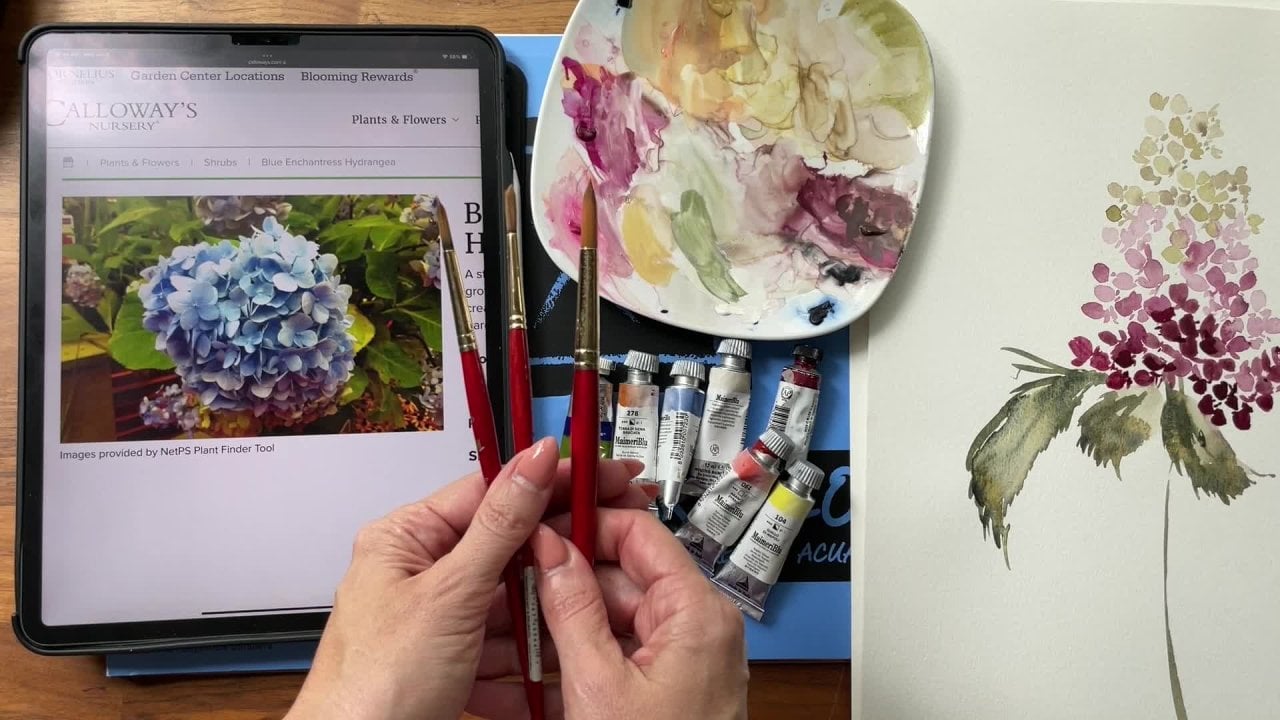
to create one more class. You can see that I have this
very full palette here. I have the pleasure of working
on a bouquet commission, a wedding bouquet
commission yesterday. And it included just the most
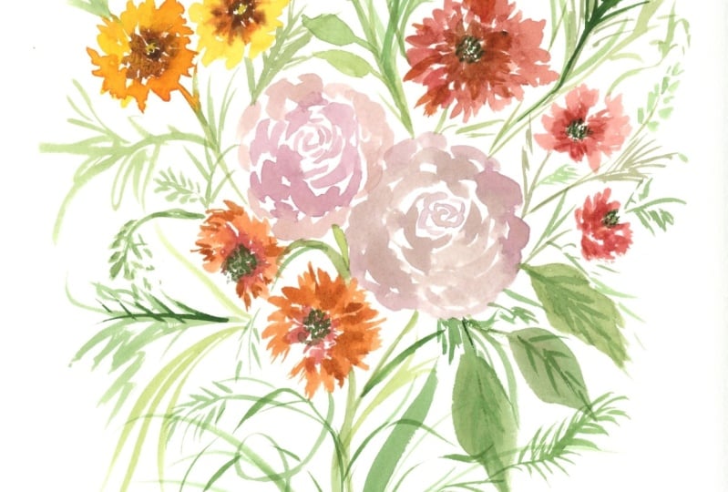
lovely palette of colors. As you can see here, we have a quinacrodone,
burnt scarlet, and we have a moms a yellow, and we have a pyal orange, and we have a green gold
and some beautiful greens. I've gathered these colors over here, and I
thought to myself, while I was painting,
this would be the most amazing fall bouquet. We aren't going to create her bouquet just because
that is one of a kind, but we are going to allow ourselves to be inspired
by those flowers. I also take note, I'm going to be attaching inspiration photos
to my penrist. I will provide a link in
the class details so that you have that you
can have a look at the photos prior to
painting just to get a feel for the flowers
that we'll be painting. And the colors will be
using slightly different. If you don't have
these exact colors, that's more than, okay, I just want you to have a similar color palette
which includes auburns, gold, yellows, browns, mustard, and some greens thrown in there. So I'll go through the colors specifically in
just a moment here. But I didn't want to
assure you that so long as you have an atomy palette, the class is, it's going
to go perfect for you. It's not going to
matter whether or not you have my exact same colors. Okay. Anyhow, all
that out of the way, let's just cover our supplies. Nothing particularly new here for those who are
frequent returners, but we'll go start with brushes. The one brush that is
new and I just wanted to bring it into our
class materials. Because for those who take
my classes regularly, I like to introduce
some new component, whether it be a brush
or a paper or a color. Just so that I know
you're leaving with a bit of education you didn't have prior to taking the class. This is a size
eight silver brush and it's the ruby satin. I got this on Amazon. I am in the process of
creating a store front. It's taking me a while though. I'll just link this brush
in case you're interested. It was inexpensive and I love it because
it's a cat's tongue, which is a rarer brush to find. I do have a lot of filberts, but cat's tongue tend to
be few and far between. This is a good one,
it has a nice point. It creates some fine lines, but also you can see has a
really big body here too. That will be our new
brush that we'll use to create some of our
bigger flowers. Then I have my trusty Filberts. I love my Filberts. I have the Umbria series and I
also have the velvet touch. Those are both favorites, a
size 4.6 which if so funny, if you look the four which is
clearly than the six here, it's just funny how
they number them. Just be sure to look if you
are going to buy brushes. The size four in the
Umbria is in fact bigger than the size six
in the velvet touch. A couple of Filberts
would be great. And then I also love my rounds. I use the Princeton Aquoli
and I also love the heritage. I have a size 68.3 here, just a nice variety color wise. We're going to be
using a blend of my Mary blue, Daniel Smith. I'm also going to throw in a Windsor and Newton
Cotman, then also aqua. Let's cover Daniel Smith first. Since there's quite
a few of those, we're going to be
using the Hanza yellow deep the rich
green gold Quinacridone, burnt scarlet, burnt umber. Then from the meri
we're going to be using this sepia
and burnt sienna. Then we also have from the
Cotman a yellow ochre. Then I'm also going to
use a touch of guash because I love this
ashy green here. It's so great for Eucalyptus. I use it for a lot of my eucalyptus painting
and just to blend with my tried and true always favorite Daniel Smith
Undersea green, which I forgot to put that in there right nearby because
I use it for everything. This will all be listed
in the class details, but just to cover it, this is
the ash green from the gas. Then the other color I
don't have right here, it's on my palette is pyrole
orange. That's right there. That the tube got annihilated when my
daughter stepped on it. That's why I'm not showing it. But that's another color
that we'll be using to blend and make our
beautiful autumn palette. You will need a
palette of some sort. I'm using my ceramic
salad plate, which I love, a cup of water. Then we will also be
using canson paper. This is the biggest
block, but a big block. The 11 by 15 A block. Me A pad. A block. It's a really
good size paper wise. Anything 140 pound cold
press is fantastic. Again, you don't have to feel like you have to have
the exact same supplies. Something similar
will work great. Anyway, that's a quick
rundown of our supplies. Let's go ahead and jump
into our first flower.
2. Mums: Okay. Before we officially
begin on our first flower, which is going to be a mum, I did want to talk real
quickly about the paper here, just in case you are
new to watercolor or just new to my classes. I wanted to mention that watercolor paper
typically has two sides. So you're going to
have a side that has a bit more grain or tooth, is what it's called when talking about paper
in the industry. Then it has a side that's more along the lines of
hot press paper. It's going to be smoother,
not so much grain. I'm going to be using
the side that is more textured just so that it picks up the paint and you'll see it solidify in
the grooves of the paper. I didn't want to create
a separate slide for this because it
is just very brief. But I didn't want to talk about the setting up of a palette. If you have never
watched a video about how to set
up your palette, thought it might be beneficial
to quickly go over that. I've laid out a few colors here. These are the colors that
we will be using initially. This is the pyal orange,
this is yellow ochre. This yellow, deep,
and quinacrodone, burnt scarlet and burnt umber. I lay them out in
a specific way, not necessarily this
way every time, but depending on how
I plan to use them. On the left side here, I have
my oranges and my yellows. The reason I do that
is so that when things happen on the palette
and they blend together, Since I don't have separate
wells here, as you can see, I don't have a palette
that's separating each individual color, or a blend of colors. They're complimentary
to each other. In fact, these are all
very complementary colors. Anyway, there wouldn't
be a huge issue. But let's just say
this blue over here sank its way
into the yellow. Well, now I have a green
instead of a yellow. Versus if the quinacrodons
burnt scarlet, you know, flooded
into my yellow. Now I have something
that's like an orange. I do that so that when things
just blend on the palette, it's easier for me to work with what I have.
This works for me. A lot of people like to
separate their colors, but this is a great way
for me to make sure that the colors I'm using
are the ones that I, in fact, want to
put on my paper. Okay, that's that.
Let's go ahead and I want you to take
your Filbert brush. I'm going to be using the
Cicis in the velvet touch. Let's pull out a little bit of the Hansa Yellow Deep
done that here already. We're going to mix that here
at cough syrup consistency. Again, just to refresh cough syrup consistency
is a 70% paint, a 30% water ratio. Then when we dilute that further by pulling it out into a separate pile and
add more water, we create a broth
consistency which is more along the lines
of a 50 50 ratio. Can be more like 40, 60, 60 water, 40
pain. It all depends. There's a spectrum
of consistencies, but that's typically how I describe it and how I
understand these consistencies. We have our Hanz yellow
deep and then we're also going to pull in a little
bit of the pyal orange. I'm just going to
blend that along here. And blend it into
my broth as well. Typically, I'll just create one pile here and
then I'll bring out the mixture separately just to alleviate
the amount of steps. But I wanted to show you, just so you had at
least one example of the consistency
difference. All right. We have a nice orange here. Now I'm going to pull in a
little bit of the yellow ocher just to make it
a little more earthy. Okay, then I'm also going to pull out my other brush here. Give me just a moment. Working off to the side here, I have one more size six. I like to have
duplicates of brushes. If you've taken my classes, you know that I like to
preload my brushes just so that everything is
ready to go with this. Because we're not
working wet into wet. It's not essential that you
have a brush ready to go, fully loaded, and ready to
just dive into the wet media. It's more of just
like an extra perk to have off to the side. And just saves me a step. Once I've started the
painting process, I take that brush. If you're still using
just the one brush, it's not a big deal. You can just rinse and
then do this step. But because I have two, I'm going to take my
inacrodoneburnt scarlet. And I'm just going to mix
a little bit down here. Such a pretty color, one of
my absolute favorites to use, especially for autumn
inspired pieces. Okay, so we have a nice
cough syrup consistency, making sure to clear out all of those little blobs that
sometimes get separated. Okay. You'll see in the pentrast inspiration
folder that the moms, they have this gradient
of color where they start with a center that
we're going to be using, brown, they move into
this orangey color, and then they move into
like a yellow color. So we're going to just play with that color palette and
just have fun with it. Again, you have so
much freedom here. And I hope that you'll revisit
color combinations and take a stab at lots of different options
because there's so many different ways
to approach this flower. Okay, let's go ahead
and going to take our size six of the
heritage round. Going to plug into my burnt
umber here and pull it off to the side to serve as the
middle of the flower. We're just going to do
a very gestural center. Those of you who are
familiar with that word, because you've either taken
my classes or someone else, or it's part of
your own process. Gestural simply means to capture the essence of what
it is that we are examining, observing, and trying to create. It means that we're
not too strictly tied to painting it
exactly as seen that there's room for interpretation and even turning it
into something that is more along the lines of abstract for the
middle of this flower, we're just going to paint
like a dotted center. I'm going to put some
little swoops in there. Just taking my brush
and just flicking it around to create
a middle that has some white space in it
because we don't want it completely solid brown or else we're really going to lose the sense of it being a
center and more of a, along the lines of a blow, something to this effect. Then we're going to take your six brush and dip into
the nacrodone, burnt scarlet. And we're going
to begin to apply little filbert strokes along the perimeter of this center. Just in case you
are not familiar with the stroke of
a filbert brush. Let me just show you
what it's capable of. If we were to do like
a downward stroke, it would look like that, Almost like a little thumb print. If we were to do a
sideways stroke, we can come up on
the toe of the brush here for a nice thin stroke. And then the other way we
can come down and pull up, then we can go straight across. There's lots of
different ways that you can change either
the positioning, the pressure or well,
yeah, that's basically it. Just the positioning and
the pressure of the brush to create different
petal shapes. All right, let's go ahead and we're going to create
a little filbert, that first stroke
that I showed you. It's okay if you
touch that center, then come up on the toe
of the brush to create some different
shapes of strokes. You don't want them
all to look like that, you want some variation
within the petal. You can even go back and add just a little
bit of variation. We should have
something that looks along the lines of
this as our flower. That's our first layer if
you've ever looked at a mum. It's so intricate,
Intricate enough to thoroughly be
able to overwork. We're going to avoid doing
that and just try and capture some of the detail of that flower later
on in the next. Segment, we're going
to do A daisy. Are B daisy, which
is essentially just a larger mum, sometimes, it depends on the
species of flower, but we're going to do
that on a bigger scale. But I did just want to
warm up here with our mom. They're smaller,
they're more petite, they're an awesome
filler flower. Those who are looking to find
a flower to just pop into bouquet that has larger focal
flowers such as a daisy, pony, rose, magnolia, any
of those large flowers. This is such a great
one to accompany, it has such a great shape
and so much beautiful color. Okay, that's our first
little layer here. Now let's dip into that
mixture that we first created. That's the broth consistency. The pyal orange,
the yellow ochre, and the hansi yellow, deep. And we're going to plug
in bigger strokes here. What we're going to do,
this is my little tip. Because what ends up
happening is people just naturally do the same stroke on top of the petals that
they've just created. This is my tip. Look for
the white space in between your petals that is naturally where that
next petal should be. This is going to give
it a great shape. It's going to also give it an organic feel so that the
flower doesn't feel stiff. Then again, remember that you don't want to do the same stroke over and over and over again. Move your fingers back and forth, changing
the positioning. And your wrist come on top of the brush and then off to
the side of the brush. When I teach one on one, these are the tips
and details that I tend to include because
they are often overlooked, are what come down to bringing that wow
factor into your flowers. You can use beautiful colors and you can use beautiful
inspiration photos. But if you don't understand the capabilities of your brush, you're really going
to be limited in what you're able to do, and your flowers will
come out looking, um, very stagnant and just not having that wow factor
like I was describing. Let's go ahead and head in. I see a nice big
white space here, so I'm going to plug in here. Now if your media is still wet, then your strokes here are going to blend together,
which is fine. I just want there to be enough differentiation so that you can see that it is
a new layer of petal. I'm just plugging in, taking a break, making
sure that I'm getting that nice circular mum shape. We are doing like a straight on. We'll do some different
positions here in a moment, but let's just start with that. You can see I'm constantly
doing one of these things. Moving my wrist around, that's something to
practice off to the side. Prior to either the class
or just in general. You want to make sure that everything isn't
lining up perfectly. You want to make
sure that there's some white space in
between some areas and then also areas where everything is touching because that's what happens in nature. You see it overlaps in a large area and
then maybe there's just a giant white space here where the petals just
haven't clustered again. That's another one of
those tips that I throw in when I'm educating one on one. When you intentionally
do something like this, leave a nice chunk of space, it gives that flower
the sense of, oh wow, it looks like what
you would find in nature. Because those petals,
they overlap and get real crowded in some areas and then
they're sparse in others. Let's go ahead and
do that again. We're going to do a
little bit bigger then we're also going to blot off a little bit here to get a little more of a
super broth consistency like 80% water and 20% paint. You can see we
have some blending happening, which is great. Hopefully everything's
working together as I'm pulling you
along with me. But if not, you can try
this again and again. We have a lot of room here. Just for the sake of time, I'm going to move into different positions of this flower, because I want to cover that. Because pulling all of these flowers that
we're learning bit by bit into a bouquet, and every flower is not
going to look like that. We're going to have
some off to the side. I'm going to do that in
the next slide here. But if you want to practice
that prior to moving on, you can. That's essentially it. One little just option that you could take on is
doing three layers. You could do that brown, which I suppose
counts as a layer, but you have the brown center, the inacrodone burnt scarlet. And then you could have
more of an orange layer here and then move into that Hansa yellow
deep. That's really light. Again, like I said, a mom is one of those flowers
that you can really overwork if you're not careful because it's not on its own. Again, another one
of those tips. You're going to be
putting it together in a bouquet that has
a lot going on. You, you may want to omit extra details
just for the sake of rest within your painting. Anyway, something
to keep in mind? Just wanted to add those
little tip bits so that you can make those decisions
as you're moving along.
3. Mums Continued: All right, moving
right along here, we are going to be
doing the same concept, but we're going to put
this flower on its side. Let's dip into that burnt umber. Make sure you mix
those little goobers. I call them very professional.
Thank you very much. Let's go ahead and
practice this flower, what it might look
like on the side. There's a lot of different ways to approach this sideways. Mom and I'm going to go
through a few of them. Let's go through the first one, which let's say it has a little bit of the
middle showing. Let's go ahead with just
some gestural marks here. Let's just say, okay, there's something happening
along those lines. Then we would move
into the quinacdone. Burnt scarlet can blend here. We have that first
sideways look. We could put something here, which I'm going to do that this time to create a bottom row. Then we can leave it at that and then head into that next layer. Same theory applies here, moving a little quicker, bleeds are happening, which
again, it's all about timing. The thing you want to
keep in mind here is that the sides are going
to be the widest. What's going to happen down here is going to be the most shallow. You're going to not have the depth that you
would typically have. That's how you're going
to get that side was appearance then you can take it one step
further if you like, add that third layer. But again, you're
wanting to leave some open space here and not
extend the depth too far. Okay, this is our
first sideways mum. What you would do here is you would take your
brush now and create a nice thin stem and connect it wherever
you're connecting is. Okay. That's the first way. That's mum with a side showing. If you wanted to not
have the side showing, you would just go straight
into the Quinacrodone. Burn scarlet. Again, I don't think I
said this initially, Hopefully it was obvious. But when you are, or positioning a
flower on its side, you need to be working with
the angle of that position. You can see here, I'm
coming head on here, now I'm working
towards the left. Same theory applies. If you're extending a flower
on the right hand side, you're angling your
flower to the right. I'm going to go left again. Here. Now we have a mum
that is on its side. No center is showing. The tricky thing about
these flowers you might discover is that it can be
hard to keep them petite. We want to keep them petite because they are
a filler flower. They're going to end up
looking too much like the daisy if you're not careful, because those strokes
are going to be a lot wider and fuller. We like to have petite flowers. I chose these two specifically because they go
so well together, but it is something
to keep in mind. Okay, then we head in with, we have a nice little orange
happening here because we're working really
quickly. Wet and wet. If you would rather have
that differentation, then you need to
wait a little bit, or you need to make sure you're leaving
some space in between. But both ways are pretty. Um, my style of teaching differs from
some other teachers, which is that I never want you to feel like you're creating
the exact same thing as me. I want you to put your
own personality and just what you've learned along
the way into your process. Your art shouldn't
look like mine. I'm giving you the education
and the foundation for rush posture and
color possibilities. But in a sense, be the gestural version of you. They should take on
nuances that are yours. This is very clearly like my
style of painting, flowers. And I want you to feel like
you can bring your style and your choices into
how you create. All right, there we go. We can also not extend this
mum to keep it petite, or we can make it fuller
by adding more petals. And then what we
can do here, again, is bring down the
shallow petals. Now we have a Mm that's on its side, but
there's no center. You can see the difference here. The last way to do that
is the same thing. We just wouldn't add this layer. I'll do that really quickly. Again, the quicker you work, the more bleeds
you're going to get. We have a really petite
little mum here, and you can see they
gradually got a little bit smaller as
we took away details. Each time you had a layer, you need to respect that
layer and give it its moment. They get smaller here. As
you take away components. This is something that I want you to instill in your bouquet. If you do not apply variation to your flowers and each
flower looks like this, it's going to have a very
overall stiff feeling. But if you take on the
possibilities of the flowers, you're really going to
find that the value, the bouquet has so much
more value and interest, which is always what
we're aiming for when putting together
a composition. Okay, those are
the different ways that you could
approach that, mum, just for the sake of showing
you the other direction, you can do the same thing. Really bending my wrist here, normally I would move my paper, but pull it that way. Now I really have a flower
that's on its side. You can see all the
same concepts apply. Then I'll just use a brown here because I
have it on my brush. Take you, pull in a stem. We'll go ahead and do that
with the rest of them as well, rather than creating
a new slide. I'm just going to pull
all of this together. Skillshare likes
me to break things up into tiny little
bites which I totally understand but sometimes it breaks the flow of painting. I'm just going to t this
one on because it is such a short little bit stem
placement. It's important. You don't want to have a
stem for this flower that's like floating off to the
side and looks disconnected. You want to, okay,
looking at my flower, where would the
stem possibly be? You also don't want
a lollipop stem. Lollipop stems are, when you create a stem
that's perfectly straight and you have this
little pinwheel shape and it just looks
like a lollipop, You want to have some
movement within your stem. Try and find a curve, even if it is just a front
on flower like this, Try and find a way
to make it just feel a little bit more alive and have a little bit
more movement to it. I'm going to plug in right here off to the side where I
see this white space. Just put it a little
bit of shape to it. Same thing here, off
to the side here, Just using a little bit of
movement to bring it in. Obviously, you change
the direction of the stem depending on
which way it's going. That is our mum simplified. You can see there's just lots of different
ways to do it and tons of different
color capabilities. Just for the sake
of a loves Autumn. Let's do one that
has a layer feel. I'll do that here. All right. We have that center,
that's just real tal, just a series of lines and dots. Then we'll plug in
here. This is why I like having two
brushes because I can just move quickly and
they're prepared for me moving through. Then I'm
going to rinse that brush, dip into my piral
orange over here. But I don't want it so orange that it's like screaming orange. I'm going to tone it down with a little
bit of burnt umber. That's a burnt orange. Maybe that's where they got
the name burnt orange from. Pull that off to the side and now I have something that's
broth consistency because I don't want it too dark and I'm going to look
for those areas of white and plug in here too dark, blotting off there we go. And I'm just going to start plugging in here. Okay. I like the areas where
there's a little bit of intentional white space. I like the areas where
it's bleeding in, the areas where it's not all of those variations really help
to bring value and interest. Okay, then let's do
that third layer. You're going to see the mum
just is gradually going to get much bigger,
some chrysanthemums. It depends on, like I said, the species of the flower. These are little, tiny, dainty ones and
I'm using them as a filler flower for
the bouquet that we will eventually be
pulling together. Okay. Now we'll really go
into broth consistency here, blotting off again till I get something that's much lighter. Always keeping mind of, okay, the shape and
the positioning. How am I going to make it
feel natural, not overworked. Then I end up with
something that's like this. You can see we lose a
little bit of the shape, We can round it out, but it just is going to get
bigger if we were to have something that was
on the rounder side. Sometimes you can even do
this with your pencil just to give yourself a guide and
then you can erase it later. We can fill in that area and get something
that's more round. Then you take your
brush, there you go. There's a really fun stem. No lollipops, there have
something that's just loose, but a little bit more detail. Hopefully that gives you
a fair understanding of the mum and how to approach. It's such a beautiful flower and I look forward to seeing how you use it in your projects. All right, let's
move on to daisies.
4. Daisy: All right, so you see
I've made a little bit of room on my palette
off to the side here, which is because I'm
going to bring in a little bit of the
rich green gold. So go ahead and dab a little bit of that onto your palette. Then we're going to mix that together and begin
working on the daisy. I'll be using both a size six in the velvet touch and then a size four in the Umbria here
to create the daisy. Same theory applies for the mom. You can take a
look at the daisy. I invite and encourage
you to do that, because again, that will bring
in more of what you see. Gestural is such,
again, a spectral. A spectral, it's not a ghost, it's a spectrum of observation. Gestural to you is going to feel different
than gestural to me. Please feel free
to have a look at the subject matter and make
those decisions for yourself. I'm going to do something
really light and loose, and gestural for the
center of our daisy here. I'm also going to use the number six brush for the same thing that
we did with the mom, just that loose center. Let's pull into our
green gold here. I forgot. This really
is more along the gold. I have a, my Mary Green gold
that is not quite as gold. It has a little bit
more green in it. I'm actually going to
pull in a little bit of my favorite tried and true, very well loved
Daniel Smith here. If I can even plug it, which is so fun. Do you have as much
joy as I do pulling out the plugs on
your water colors? I am one of those tactile people that find way too much
joy in picking at things. Anyway, I'm going to pull in a little bit of that,
Daniel Smith, and then we'll mix that
green together. All right? Pulling that green
into my green gold, a nice cough syrup consistency, then I'll bring it out one more time to get that
broth consistency. I just like to see the
differences in colors. You can see there is quite
a bit of difference. Sometimes that nuance makes all the difference
in the world. I'm going to start
with that broth, then I'm going to layer cough syrup consistency on top of it just to bring it to
life here. Okay. Again, using that
number six brush. Let's go ahead and
pull into that shape. Now, with the mum, that center was
smaller than a dime. You had something that was on the petite side because it's a filler flower
with the daisy, It's a much larger flower. They can actually be really big. It depends on what
size flower you want. We're going to talk more about that because it's so important. And I want to just
emphasize that having shapes of flowers, having different positionings of flowers and sizes of flowers, those are all the
components of composition, including color, that we have to keep in mind
when creating a bouquet. You don't want to have
all your focal flowers be the same size, even if they are in nature. Um, nature, them, Lorem, it's always going
to look beautiful because God created it. But when we try and tackle
those same concepts on paper, we can get, but
we cannot achieve the excellence of what
is actually in nature. Just keep in mind that the bigger your center then,
the bigger your petals. So you may want to tinker with a couple different
ways to do that. All right, heading in here. I'd like to start with
a nice wide center leaving some white space and then filling in a
little bit of that. Then I'm going to take
the brush and I'm just going to come
around it to create some of those daisy is feels because it has all of these minuscule little
petals around the center. And again, it becomes so
overworked if we're not careful, but we want to bring out
some of those nuances. It's like a sun, basically. A sun that's not filled in. This is about the size of, I would say a nickel, not quite quarter size. All we have that first
little layer here. Then we're going to move into our Cronacrodone, burnt scarlet, and we're going to use that at a little more than
broth consistency, but a little less than cough
syrup, if that makes sense. Something right in the middle, I'd say more of like a 60%
paint and a 40% water. I'll show you why
for this daisy. I'm not going to do
two different colors because we're already going
to have that within our mum. If we were just making a bouquet of daisies, then
absolutely, please, I would love to see so many different variations and colors because you
have one flower. The idea then is
to find a way to make each flower have its moment while complementing
the one beside it. But when we are pulling
different flowers together, we have to be careful
and think about each of those components to
be sure that we are serving the overall painting and not just the flower itself. All right, so these strokes
are going to be a little bit bigger because the daisy
is a little bigger. So you can lean into the
pressure here a little more and begin feel free to overlap some of the areas
that we just painted. In fact, I encourage you to, it'll have a more
natural feel to it and to leave intentional white
space between petals. Then we're going to
do the same thing, looking for that white space. And this time we're going
to do a combo stroke. I just did that very quickly. We have one side of the stroke and two sides of the stroke. You can just do
one giant stroke, but I don't like
the way that looks. If you see the difference
here when I'm pulling down, it just makes this awkward. Even if I really
try and like, okay, make it as beautiful as I can, it just isn't the same as if I do one stroke and
then two strokes. One stroke and then two stroke, you're just going to get
a better result that way. Tinker and practice. Okay, so we have a daisy, that's the intention was to
put it basically front on, but again, you end up
with that lollipop look. So I do take certain
precautions, I suppose, in making sure that it's not going to
look so stagnant. So I'm really, again, manipulating the brush and making sure that I'm
coming at it from different angles and feeling like doing a copy
and paste stroke. Okay, there we have that. The one step further again, I'm going to do the
inacronone, burnt scarlet. Now here's what you can do. You can play with the
ratio of water to paint. We had more of a cough syrup
in this initial layer, and then we had more of a broth. And now I'm going to go back to more of the cough
syrup so that we have a difference of stroke here. Your stroke should
get a little wider. So you're adding,
tacking on petals. Still using that
two stroke method. Now make sure you're taking a moment to monitor the flour. You don't want to
lose the shape. You don't want
something that looks so obviously, copy and paste. You can look at the
flower and I say, oh, that's a little bit
too much white space here. I'm going to just fill that
in a little bit there. These are looking a
little too round to me. I'm going to add just a little
bit of variation there. Just making those little
minor moves really helps benefit the
flower overall. Having some petals that are
larger, some that are thin. Again, all of that really plays a huge role in just
the flower overall. Just taking my brush and pulling those petals
in different positions. Then since we just have
it here, here's my brush, taking that green gold, pulling a stem down, imaging in it, on its side here. We'll play with all
of this fun stuff. I just made a mistake, I turned
it into something there. But we'll play with all of
the little dainty aspects of this flower later on. But you can see here we have
something that's head on, but it's also a
little to its side. Those are going to
make a huge difference just in the flower overall. Hopefully, that feels like a solid understanding
of the daisy. We're going to do it in
a couple different ways just so you can get a
sense of how it works. But I'll stop here
just so we have a nice ten minute clip and then you can head
in to the next.
5. Daisy Continued: All right, so let's go
ahead and do that again. But this side this time
putting our daisy on the side. We'll start with some of
the center showing as with how we did with the
mum just creating that nice center here. But the difference is as
we don't come full round, the idea is that we're creating more of a jelly bean shape. Something that's more
wide than it is round. What I just realized
here is that I never pulled in the size four Umbria, which was why our petals didn't
get too much bigger here. We compensated for that by
using the two stroke petal, but I'm going to
do the same thing, but using this size brush, it will accomplish what we
did here in one stroke. There's a lot of times when
I'm painting when I just get lazy and I decide not to use the bigger brush for
the bigger petals. Just that's my style of painting is constantly
to just adjust. Because when I feel like an artist gets too attached
to it has to be this way. I have to have this
brush for this petal. Then they're not as flexible
and maybe not even as compassionate to themselves
when they're painting. And they expect perfection. They expect the same result
over and over and over again. And that just never
happens in art. You're always going to have a
slightly different version. Even if you were to paint
the same flower with the same colors in the
same five minute window, it's going to look different, even if you tried to do
stroke for stroke anyway. That's the understanding and maybe my excuse for
not using that brush. Let's go ahead and we'll
do that this time using the sideways flower going to
dip into that Rinacrodone, burnt scarlet for
that first layer. But again we're remembering
it's on its side here. We're going to have more
of a shallow depth here. But because it's a daisy, we do have a little
bit more room versus the M that was
a lot more petite. All right, now we'll
take our Umbria size four and dip into
the Rinacrodone. You may need to even reload your Coinacrodone if
you're running out of it. It's a color that it
gets used quickly. At least I notice that where some of my other
colors seem to last forever, like this Honda yellow,
I feel like I just a tiny little bit of it and
it goes such a long way. Okay, I'm going to show you up here what
we have as a stroke. You have a stroke in one that was doing the same
thing as the two over here. You can do a combo 1212 and have something that
is a little bit thicker. You can even increase that pressure here and get
something that's very wide. It's all dependent
on how you're using the brush and how much
pressure you're using. All right. Just reviving
my Quinacrodone over here. Okay. I'm also going to curve my petal here because
in the daisy you'll see that there's always these
really cute little curves. You're doing the same thing that you're doing with that
pulling down stroke. You're just coming
from an angle. You can see I'm
twisting my brush here, instead of just coming
straight, you're on an angle. And then you're pulling it
this way like a rainbow. Again, be careful of the depth here because
it's going to end up looking like it's not
on its side as much. The daisy is simple and
sweet as that flower looks. It can be, at times, tough to capture because it is essentially
the same strokes over and over and over again. Whereas with a
rose, each petal is so different from the one
on top or beneath it. You also have to
keep in mind too, is that a daisy head on
its own just looks very awkward until you put it
next to a different flower. Say we were to have a flower right here up against the side. The flower makes sense,
if that makes sense. And I'll do that
in a minute here. If you have a flower that looks
like this and you were to just pull a stem into
it, it'd be okay. But when you have another
flower up against it and it's doing its own thing, all of a sudden it makes
sense together as a whole. When I was a beginning
watercolor student, I would paint something like
this and just be like, oh, it looks so wonky.
It's misshapen. It just doesn't have
a good feel to it. But as I continued to explore and give myself
permission to make mistakes, I found out that the
more you add to it, and not necessarily the more, but the decisions that you make can benefit
the whole painting. Just keep that in mind and
be gentle with yourself. Okay, then let's
take our expression. Just dab in here for just
a little bit of color. Really beautiful
green gold there, leaving a tiny bit
of that white space. Okay, now we could take, this is one step further, which I'm going to do
just for the sake of showing you that we could dip into the Quinacone again and really pull out
a lot of color. And go over that first layer
so that it's much darker. Now, you have a lot of differentiation
between the layers. You can keep doing
that. Like I said, I just caution that you don't overwork and you're just mindful of what it is
that you're doing. But you can take that concept
and continue to apply it. But again, remember
we're pulling this daisy into an
overall bigger piece. Okay, now back to making sense
with a flower like this. If we are putting
it into a bouquet, let's just say right about here is where I have
the center of my daisy. Let's say it's
pointing this way, so I'm going to
angle that center, right along these lines. Nice little gestural
center here, pointing this part down. Now we'll take our six
in the velvet touch. This will help give
you a feel for how we put the flowers
together in a bouquet, because that's a whole
different ball game. Then we head in with our
fore brush and the Umbria, we're going to start putting
the petals down below. Pardon? That really loud
motorcycle that just drove by. You'll see as this
flower starts to nestle up against this
one and run into it. Here's where I
really would invite you to turn your paper so that you're actually able to get the best stroke possible and to just see
what's happening. I would turn it here
that it's on its side, let's mend those petals here. I'm also being mindful that I want a different size daisy. I don't want it to be
as big as this one. I want it to be a
little bit smaller. Just to invoke variation, you can see it's
overlapping a little bit. Now I'm ready to
turn it back over. Okay, I love where that's at. Now, let's pull it together. Were these just a
single double stem? I have a stem that's
around this area. Then I have this stem that's going to be poking
right around here. You can see it starts
to make sense. Then we begin to add in leaves. We could do some really thin. Then leaves here. Just
keep it really gestural. Like I said, we'll go
into creating leaves and how to pull it all together in our bouquet,
but you can see, okay. Now what looked really
wonky before makes sense, because we have this flower
that's pushing up against it. I hope this feels very
informational to you. This was life changing for me to just bring a lot
of drama to this class. Because what would happen is that I would get here
and I'd be like, oh, I need to start over
again. This didn't work. And I would just throw the
paper off to the side. Decided that it was
ruined initially. But then eventually
I was like, I'm just going to keep going
with it. I'm too tired. My baby's going to wake up from her nap because if you remember, I have an almost seven year old, and this is when I really
started leaning into my craft. I did not have a lot
of time. I was tired. I have chronic illness. I had all the excuses in the
world not to paint. I decided I wasn't going
to let that stop me. It was such a benefit to
have these limitations. A person who is relying on me and a time limit to do things. Those of you who have
like endless time, which I don't know
anybody who does, but it can feel like, oh, well I have the time, so I'm just going to start
all over again. But when you give
yourself a time, you're like, okay, I just have
to work with what I have. You become better, your skill set get stronger because
you learn how to adapt. And just get more flexible with what's happening
on the page, rather than trying
to make it perfect. The first time, I'm going to
climb off of my pedestal, or my podium here, and
bring it back to the art. But I did want to just
throw that little bit of education into it and encourage you to
work with what you have. Don't always start
over just because it didn't you didn't nail
it the first time. Okay. All right. One more. Just a real quick
on its side daisy, just so you can see what it would look like
with no center. All right, so heading into our
knacerdone burned scarlet. We're going to
curve upwards here. Really playing with the angle and then just blotting
off a little. I really don't love
the daisy without a bit of center in
it, to be honest, just because it does start
to look one dimensional. But what we can do is we
can pull in a little bit of the pyal orange
if you want here. I wouldn't suggest
doing this with the mum because it just all
starts to be a little much. But what we can do is pull in
a little bit of the orange. Now you have
something that isn't quite so one dimensional as
far as color is concerned, the color capabilities
are endless. I hope that you'll have
fun with this palette and really allow yourself
to play with it. Then we have just
a little bit of petaling here on the
bottom to make it seem as though this daisy
is quite on its side. Just filling it in here, you can your daisy one step bigger. So you can take
that number four, number four brush, go
in again, but again, you're going to get
those bigger strokes and you may lose the
delicacy of that daisy. Sometimes I like
the smaller brush, especially for the
daisy on its side, because it doesn't
make so much of a statement Initially I
have to play with it. Again, this looks
wonky on its own, but once you start to
pull it all together, if you were to put
it with these two, you can already see, okay, I have this one, this one. And then if we were to just
chunk this one into the mix, I don't have room
here, but, you know, it would all start
to work together. That is hopefully a really good thorough
understanding of this flower, how it can work, the
choices you can make, and just working
with what you have. All right, we're ready to
move into our third flower.
6. Roses: If you've taken my classes, you know that I love
painting roses. All variety of them. Mostly garden roses, that they have more of a peony shape to them but
still feel very rosy. We'll be taking that
approach to this flower, but there are so
many different kinds of roses and if you feel like one rose is
more up your alley, then you can Absolutely. I'll include a couple
different inspiration photos. You have different
flowers to choose from, but I just wanted you to know just where my
thought process was at, just for the overall
benefit of the painting. These roses are really swoopy. They feel gentle, but also
full of lots of movement. One thing I did
neglect to mention is that we'll be using a
little bit of white Gh. I was tinkering
with either using the white guash or creating
this peachy color, just using a pink, yellow, and a little
bit of the cornacrok. Because we have such these rich, vibrant otomy colors,
the rose will be benefited by just having a
softer, more muted color. All right, so let's go ahead
and create that together. You're going to take
your Quinacrodone. Make sure you have some
space on your palette. I'm going to add
a little bit more here just in case I need it while I'm painting and
I don't want to pause. Then I'm going to add
in the white guash, which is really going to
make it a sweet color. Then what we can do
is also bring in a touch of running
out of it over here, which is the burnt umber. To mute it even further. We don't want it
so much to be tan, but we want it to be like a peach along the
lines of coral. But again, this is something
that you can play with. There's again that spectrum
of color where you could add a lot more white and get something
that's a lot lighter. Which is what we're going
to actually do when we put it all
together and paint. Because we're going
to want that, that look where we have one
color of a rose and then we have the rose next to it
looks a little bit different. We don't want to have
the same exact color and shape of flour. All right, for this flower, we're going to use
our six brush. I'm just blotting
off previous color. You may need to swap
out your water, so take a look at it before you begin blot off your brush and
clean them if you need to. Then we're going to
head into our mixture. Here again with that center of the rose is just a
series of mark making. It's going to be C
shapes and lines. It might be something
that you want to practice off to the side
just to get a feel for it, you're basically ring and
creating this v in the center. I've talked a lot about the
Vortex in previous classes. If you're not familiar with
my classes or my roses, that would be a good refresher class for you to take prior. Just because I break
everything down slowly. Versus this class where there's intermediate concepts and we're moving more rapidly
through the content. Okay. You have something
like that to begin with. Then you can use six brush your filbert to do the same
thing but just bigger. You're making these connections here using your filbert brush. Dragging the brush
along its side. Remember you're curving
everything inward, but you're also playing
with variation. You're doing petals
that are this shape. Petals that are petals
that are shape shape, You want different positions
in different shapes. You're also looking
for that space between the petals here, where the next petal
would essentially go, and playing with the
posturing of the flower. Okay, I like where that's at. Now, we talked about using
this brush right here. It's, it's going to bring a whole different feel into the way that you
create your petals. And you may love it
or you may hate it. But the idea, like I said, is just to give you a new tool perhaps and just a different way to approach
flowers in general. You might love it for leaves, but hate it for flowers, which is totally fine. Let's put that in. We're going to add
the bigger petals. Now I like this the
size that it is. And we'll use some this
size in our painting. But if we wanted to have
a really big focal rose, then we would continue
adding the petals here. And we would also make
them a little bit lighter as the flower expands, add some water to your mixture. I had a little bit of
green on this brush, you can see because
it turned it here, I thought I blotted it off, but I don't hate
it because it adds a bit of a nude
color to my pink. If you don't like it,
then you might want to. Sure. Whatever brush
you're using is just thoroughly rinsed off. All right. Here we're just
playing with strokes. I'm going to show you
this and then we'll do some strokes up here that I
want you to see how it works. We're taking the brush and
we're just moving it on its side and then
we use the toe of the brush to roughen
up those sides. I've shown you this
with a filbert, which is very similar, but you're going to get more of that jagged edge with this cat's tongue because
it's more pointy. It doesn't have that oval again. We just
play with the rows here until we like
where it's at. We want to make sure
we leave white space. That's very important then it makes sense when we put
the stems in it together, this is like a head on rows.
You can do at this point. To take it one step
further is go back into that darker color and then
do some wet into wet. So you would take your six
brush and you would run along the edges of the lighter color and
it would now bleed into this second color
that we have here. That's a really beautiful way to bring a little bit more life
and movement into the rows. We can keep it really
simple and not do that. It's completely up to you. I'm just showing you
different options. All right, let's just head into this brush
a little bit here. Your run of the mill stroke
is going to look like this, Very similar to a filbert. But if I take it up
on top of the brush, you're going to have
a nice thin line, something that you wouldn't
get with a Filbert, not even my little one, because you have
that toe and you can get really thin
with these strokes, which is a benefit
when you're creating petals that have like the daisy. You could use this
absolutely for the daisy, you could create a petal
like this and then take your brush run along the side to create more of not
an organic shape, but just a different shape
just to give a couple of those petals a different
look. Same thing. If you're going to the side, it can create a really
pretty shape. We're going to use this
for our leaves too. I love this brush
for a specific leaf where I'm really taking the bristles and rubbing
them back and forth. But just for the
sake of petals here, this would be more along
the lines of a day. Could even do like a
three pronged petal here. Just play with it.
You may love it. Just allow yourself to tinker. I believe I think this
brush was something like eight or $9 It might be more expensive now because
Hello inflation. But it was worth the investment. I got two of them just
because I love to load my brushes and have them
ready and off to the side. But one will do. Okay? How we use this for the
rows, that cuddling shape? When we have the
exterior of the rows, we're taking the brush
on its side and we're just cuddling our petals. Here we introduce variation by that twisting of the wrist and the
twisting of your fingers. Yeah, there you go. You
use the toe of the brush. Then again, you're using the toe of the brush here to
just give it some shape. You're making a nice shape here. And then you can bring the brush up, give it a little shape. The more familiar you are with the subject, the
easier it's going to be. Because you're basically,
bring that flower from your mind's eye onto the page. Some people like to
have a reference photo. I do that when I'm painting like ornaments and I want to make sure I really capture exactly what it is
that I'm painting. But with water color, it's such a loose medium that I've painted roses
now for ten years. I know what roses I like and what I want
them to look like. But you might benefit from having a picture
in front of you. Again, just taking that, finding those natural spaces
where you might add a petal, bringing that rose around. And then you can even
use this brush for the center so you could
take the toe of it. And you just gradually
start making those lines smaller. I don't
like it as much. I feel like it
doesn't quite have the same feel as
something like that. Where I've taken more pains
to get out that extra brush and have a lot of differentiation
between the layers. But it's a really
beautiful, simple rose. A lot of people love this just very loose look
and it benefits. It feels right and
natural to them. Again, I'm just touching it now, but again, I might see, okay, here's a petal here. Let's add one more right here. Bring out a big stroke, then come on the
toe of the brush. Continue that petal down here, then just to give it a
little bit more balance. Bring it back this way. I need a little bit
more room up here to continue and bring it again. It's one of those things
where the rose feels just very wonky and
not as it should be. But then when you
start adding leaves in and pull it all together, it starts to make sense. Versus something
like this. It has more structure and it already
makes sense to the eye. You know exactly which
direction it's in, you know where the center is. But this style is really
beautiful for those. Later on they add the details, the leaves and the stems, and the little mark makings
that bring it all together. Both approaches are
really beautiful. It's just up to you as
the artist to decide which one do you
gravitate towards more. That's our peachy pink rose. I'm going to stop the segment here just so that we
have a nice block, and then we'll move into a paler rose that we'll use in conjunction
with this color.
7. Roses Continued: All right, let's go ahead and tack on to this rose
that we have here, just so we're getting a sense of how the flowers are
going to come together. First we need to come
up with our color, which is going to
be a mixture of this burnt umber and
the white quash. I always say this at
some point in my classes because there's always
somebody new here. If you have not
already discovered my vintage color guides
for color combinations, I highly recommend
it beginning with just the original vintage
color guide and then you can break into different colors. There's a series that are
just focused on white, that's the enchanted series. It's all combinations that
you can use to make whites. And there's a golden series, and that's greens,
and golds and browns. And then there's
a sunset series, which is red,
oranges, and yellows. I just break up each
color family for you and give you my
own color recipes. They are so well loved. People have just told me that this is the most valuable resource that
I've ever provided. I only wish there were
more colors so I could keep playing and providing
color recipes for you. But essentially, I've given
you the education and now you can make as many color
possibilities as you want. But anyway, just wanted
to mention that you can head to my website
under artists resources, and you'll find the
gamut of guides for you. Okay, we have this tan mixture here that we're going to pull
up against this peach rose. Now if you wanted to
just cool it out, you could bring in
a little bit of a lamp black or pains gray. I'll pull that out
of my box right now. Just I just know where
it is and I have it. This is a Jains black. You can see it says
blue, orange here. That blue is going to
bring some cool color into the mixture. I like the warm
because it's autumny, but it also provides a
little bit of contrast. I'm just going to do a tiny little bit because
you can see it goes a long way and you
can see that blue. That's just making it look
a little bit more cooler. All right, let's go ahead
and create our center. Let's create a rose Now that's a little bit
more on its side. Oops, I just blobbed into
the quin acer down here, and let me get it off my wrist, and then make sure I
don't dig into it again. Let's go ahead and put it right
here up against the side. We're going to imagine that the center is right about here. And we're just going to begin
again with those C shapes. Just cuddling it.
Don't overthink it. You can slow it down. Slow down the process and feel like you're getting
a perfect little vortex. But I find that the less I
try and make it perfect, the better it ends up being all something that starts
out a little bit like that. Then we have our
number six brush that we were using
in the Filbert. I'm going to plug in
there the same way. If you need to turn your
paper, go ahead and do that. I never want you
to feel like you have to paint like exactly like this because it can
be a little stifling. Let's begin just running these shapes and variations up against the
side of this rose. I'm going to blot off
a little bit here. Just as we're getting a little further out
within the rows. And I'm going to
turn the paper a little bit too,
just so I can see. I want to make sure I'm
getting the right direction. I'm angling this row this way, so I want my paper to
be in that direction. You can see just by blotting off and having more of a
broth consistency here. You can see those
layers forming. Then you can go ahead and
take your six brush again, lean into the darker version of that color so the cough
serve consistency and just begin plugging in
that darker color for some pretty bleeds. Turn the paper back
around so you can see tinkering with it. Now I want to make sure that everything's looking like it makes some semblance of sense. So that when I put
it all together and start adding
stems and leaves, then it feels very natural. Same thing, were we to use
our silver brush for it, let's go ahead and try that. So we start with our center here using the toe of the brush, and we just begin that
cuttle of petals. At the very least,
my hope is that you'll try a cat's tongue
brush out if you haven't already and see if it's a tool you might want to
add to your, your tool box. Just using the toe to add
a couple more details. I didn't quite as embellish
this row as I did. I wanted there to be variation between this very
simple approach to more of a structured row. You'll look at both of these and one of them will just
feel more natural and something that feels right and good to you
and your process. That's always my goal
as your teacher is to show you all of the options and then let you make
those decisions. Hopefully, that feels
like we covered quite a bit of
information and you can decide heading into
our pulling it all together which way
you want to do it. Because even if I'm
painting more like this, you can still use
the same concepts, painting more like that. All right, that wraps us up
for roses and we'll begin playing with stems
and leaves and pulling it all together before we move into our final segment.
8. Leaves, Stems and Foliage: Okay. My beginner friends. If you don't follow
me on Instagram, then you may not have seen this. But recently, I did a then versus now series where I shared my very early
work as a beginning artist. And I wanted to
share it here too. Because oftentimes
when people upload their class projects or they share their work on
Instagram and Tag, they say something along
the lines of cars is so much better or more detailed
or something to that effect. And not yet. One of my dearest
friends who's a teacher, teaches his students
the power of not yet. When they say something to him like I'm not able
to spell as well, he says, not yet, you can't do that yet. It's a matter of getting there and putting in the time and the practice really making an effort to improve
your skills. Anyway, I just
wanted to share with you a few of my
beginning pieces. As you can see, I love them. I truly do. Because they
remind me where I come from and they remind me that I was brave enough to make
some really bold choices. And when I talk about roses or leaves or elements
that feel stagnant and stiff, I look back and I think this
is what I'm talking about. But sometimes saying
it and showing it, there's just a world
of difference. I love showing my older
work how you can see how things are just
so stiff, so linear. Even though I did inject a
little bit of movement here, still you can see moving from that to something
along the lines of this. There's so much more
movement within the work now because I've
really practiced. It was just a matter of not yet. I'm sure I told
myself at some point while painting pieces
that looked like this, that it was never
going to happen. I was never going to
grow and get better. But you absolutely will. It's just a matter of not yet then when I talk about
overworking a piece. Hello, flowers. I don't even know what
these flowers are. What flower is that?
I couldn't tell you, but man did I have fun
with the black paint? Who knows what I was going for. But again, just very stiff trying to add detail and then adding
too much detail. Just not really
understanding what it is that I wanted to create. Like you see this flower
is just floating. It's supposed to be in here, but there's nothing to
really tether it to the page I like to go through and not
necessarily criticize, but offer some constructive
criticism on my own work because it might actually be in fact applicable to your work. I'm always happy to share my earlier
pieces or to talk with you about you as a beginner
and the power of not yet. Because it's so valuable. It's so important that you remember it's not linear growth. There's going to be
seasons where you explode. Your skill just gets
exponentially greater. And then you're going
to hit plateau where things just look like this
for a really long time. And then you'll make
another leap again. Be kind. Be gracious
with yourself. Remember that your style
is always changing. That it takes years to
hone a voice and a style. And that it's okay to mimic
what other people are doing. So long as it's in the name
of practice and progress, you're aiming to
find your own voice within this very broad
style of art work. Okay, bringing it back
to our current piece. I hope that you didn't
mind that little segue. I hope you find
that encouraging. But we're going to
move into what is my favorite favorite
filler foliage, leaves, stems, And just adding all of that
bright, vivid movement. The first thing we're
going to do, I have you at an angle here so
you can really see how I'm manipulating my brush is
we're going to dip into the green gold and pull
that into your palette. And I've gotten myself a
fresh cup of water and I've made some room on my
pallet so that my greens are not bleeding into my
oranges or yellows. Not that it would be awful,
but I really want to have something that's
strictly green here. All right? I have a
nice green gold mixture here with the mums
and the daisies. There are some bigger leaves, however, I'm going to save
those, mostly for the. As you see, when we
put it all together, I'm going to walk you through why I'm putting this leaf here, and why I'm going
to put this stem there and I'll take you
through the choices. But initially I
just wanted to say that I'm going for something
a little bit more like this, a bit more of a weed. Weeds are one of my
favorite things like cam meal is my favorite
flower to paint. I just think it's
the perfect flower. I want something
that's just a linear, because it's linear. But something that's
just a little bit of a line look versus
something that looks like a traditional leaf that has all of the different
ways to approach it. If I wanted to do
something like that, that would be more
of like a leaf. But for here, let's just practice and I'm just
going to walk you through it. Your pointed brush here is
capable of doing so much. You can create some
thick strokes, then you can create
really thin strokes like we did for our stems here. I like to make sure that
my students have like a loose hold on the brush
and they're not gripping it, their life depends on it. And you're going to want to take the brush and you're
just going to want to graze the paper and move back and forth as though you're
conducting a piece. I have my stem here. Let's just mimic that stem and I'm just going
to graze the paper. You can see I have
something that's thicker down here
and thinner up here. That can be intentional because we have a thicker part down here or it can just be a nuance you bring within the piece. Then if I'm wanting to
create some leaves, some weedy aspects to that stem, I'm going to take the brush and just start beginning
to connect things. I'm just going to scribble
it across the page, creating some really
pretty movements. We have a stem here that has some really beautiful
lines coming out from it and create some thinner lines to act as additional leaves. We can thicken them up a
little bit by covering them. If we wanted to do a leaf
that had this feel to it, we could make a stroke. And then we would just head in and add some
thinner strokes to it. Same thing, nice stroke in the middle, connect that there. Then we can either bring it down and create
another offshoot here. Do the same thing, can even bring in some
long lines here. It really is just a matter
of grazing the paper, moving your brush back and
forth, back and forth, and really finding
that happy medium between what you see and
what's happening on the paper. Same thing down here. You
can do a thicker stroke. Something more like
along the lines of that. You can connect that to
something like this, to come off to the side here. The idea is that you play
with shape and movement. Just give yourself permission to explore lots of different ways to approach this style of leaf. But it all comes down to that initial stroke and then you're embellishing
on top of that. You're either adding another one to connect it all together or you're leaving
it as a single. It all starts to make sense
when you put it all together. All right, let's go ahead and do the same thing
with our mums here. Okay. So I'm going to mix
up a little bit. I'm going to use more of a
green this time just because we're I want to have different colors
for all of our leaves. You can create some really
sweet little details here along the bottom. I got to pull you over
here so you can see. And then again,
you're just using those really thin strokes to imagine that these
are connecting here. And then you can do
the same thing here. Looks a little weird
because we used the brown, but same theory applies. I'll pop you back up here. I love the layering. So you can continue with that
sort of weedy stem, or you can have
something that's a little bit more
structured like that. So you would have a
first stem and then take the toe if it were
to do it here. And then down here. I really love these dainty stems. They are my favorite. I tend to put these in
all of my pieces. Again, you're wanting to just move that wrist back and forth. Manipulating the brush can even put some little
delicate areas down here. It doesn't have to
make perfect sense. It's supposed to
have that loose, gestural feel to it. If you want something that's
clearly more leaf like, you can take your
brush and just do a single stroke and
then do another, lots of different
ways. Same thing here. You can come out here, create some sweet
little embellishments and then expand here. Yeah, for this one, let's go ahead and
use a filbert brush, just to shake it
up a little bit. I'm also going to be showing
you that cat's tongue. The leaves can look
exactly like the petals, so we could have something
that was very much like this. We have a cute
little branch there, and we're just pulling
that stroke down. But we're either using a full stroke or we're coming on the side of the brush here. You have something
that's like this. Or you can really use your filbert brush to
make it look different. And you can do like a
little three pronged leaf, whereas they look
very leaf like. Let's just play with
that. Always giving our leaves movement so that it appears as
though they are moving, making some marks, so lots of different
ways to play with it. If you want something that
just looks strictly leaf like, you can use something like this. You can leave a
little white space in between if you like to create that look of light hitting
the middle of the leaf. A lot of people like to do that. That brings a lot of
value and then you can build upon that. You can see there's lots of different ways that you can use the Filbert brush
for something that looks more traditionally
like leaves, something that looks in
between that twiggy weed look. And just so many
different just options. I invite you to like
fill up a page with these and just these
and see what you like and blend them
together and just have a giant leaf party because I'm telling you the foliage
is where the fun is at. We're going to use our cat's tongue brush
in the next slide and also use a different
color which will be attaching to our roses. Let's move into that segment.
9. Leaves, Stems and Foliage Continued: Okay, so we're going to be
using the, the ash green. So go ahead and put a little
bit of that on your palette. Now if you are very new to, this medium is a marriage between acrylic paint
and water color. So it can be both
transparent and also opaque. You have both the
options I love. I have a whole gas class on here just talking you through that medium
and how to use it. It's so marvelous because
it in both forms, it's no problem to add it
to a water color piece. You wouldn't say like, oh there, It looks as though
there's some dissonance in that piece because there
was a different medium used. It really does feel
as though it belongs. Let's go ahead and just begin exploring this color and
exploring leaf shape with it. Okay, we have our brush, we're going to draw
out that color. And you can see it
really is very creamy. And if you were to
just put it in it, out of the tube form, it's going to come out
opaque, solid color. But when you add a little
bit of water to it, sometimes a lot of water
to it, rinsing off here. Then you have
something that looks a lot more like water color. We're going to start off
with broth consistency here. I'm going to do some of my
favorite leaves which are, I just call them scrubby leaves. I'm just scrubbing the
brush back and forth. I take my cat's tongue brush and I'm going to come
at an angle here. Not quite on the toe and
not quite on the body. I'm at an angle and I'm
just going to go like this. I'm just scrubbing it and now I'm going to scrub
the other side. I'm going to have just
a little bit of nuance. Then what I'm going to do
is take the darker color. Actually let's do a couple
of these just to give the paint a chance to just meld. Let's do the same thing, just scrubbing. Just keep scrubbing. It's a
little bit of a longer one. You can have one that's
more on its side like this. And to do that you just have the leaves on one
side of the branch, and this is where that
leaf would be folding. Then you can show a little bit, maybe of the leaf as it
would be curling over, but you leave it primarily
like this while I'm jabbering. Let's mix up that cough syrup and head back into
this first leaf. Let's go over it, same thing, and once more here. That's the first scrubby leaf. It's great for all
sorts of flowers. You can use it for roses, for dahlias, for
moms, for daisies. A smaller version of
it for camo meal, because Mo meal has
those leaves as well. Sky is the limit there. If you wanted to do just
more of a traditional leaf, then we could use the brush
for a combo stroke, 1212. You could use broth
consistency for a really light leaf and then give it a minute and head back in there
with cough syrup, add some veins to it that gives it a little
bit more interest. The longer you wait
for it to dry, the less your lines are
going to move within the water or within
the wedded media, you could do really
long leaves with it. If you wanted to do something
like this on our rows, you could take the
brush and elongate this stroke for some
really nice long leaves, and then you could combat those. Then what you can do is take the pointed end of the
brush and rough it up. We've talked about
this technique in previous classes as well. You would get something that's
more of a rose like leaf. Let's do that again down here. Say were to have it right there, we can make that combo stroke. And then take the side
of the brush and just drag it along so that you
get more of a jagged leaf. Then you give that
a minute to dry, then you can head back in with that cough syrup for some
really beautiful bleeds. It'll all start to make sense. You can also add a little bit of color to this color if we wanted to add some green
gold to our ash green. Now we have something
that's very grass green. We can pull in some leaves here. I don't love that color. I'm going to add a touch
of burnt umber to it. It's just a little
too Crayola for me. I need something that's a
more of the vintage color. I'm going to darken
that up a little bit. Show you here. Just making
it a little more earthy. Moving that around, we wanted to do just that
traditional leaf, really beautiful shape here. And then you can, if you want to just bring in
some motion to it, you got to do it while
the media is wet so that it's receptive
but you get that really rose like
leaf at this point. Once I have a lot of solid leaves that are
thick and more bushy, then I would take my
number six brush and I'd begin to add in some
more delicate lines. Something that's more
along the lines of weedy. Just to offer variation, mark making, fill in the space. Imagining that stems
coming down here, maybe this stems coming
around the side here. All right, so just to recap, we have that first style of leaf coming up with
the toe of the brush. It's more of a stem
leaf than anything else or something like this. And then using the
filbert brush, we can have leaves that look
like this very leaf like, we can rough it up a little bit. And then we have our big cats, tongue brush, scrubby leaf. Or if we want one that's on its side just a tiny
little bit here, this one will make a little bit more obvious that it's
not quite on its side. Again, I'm using the
combo color now. You could move into
just the ash green, just to have a variation
can go back in with that cough syrup consistency and layer over the leaves here. You can also do those
juicy combo strokes, leaving the leaf as is or roughing it up along the edges and then coming back in with
the cough syrup consistency. These are the type of leaves
that we're going to be using when we put
together our bouquet. You can make as many
variations as you want. You can even head back in with a completely
different color. If I were to use the Daniel
Smith undersea green, you can come back in and add
some veins to your leaves. If you were to opt for
these more simple ones, then you could take a really nice deep color and add some veins
to your leaves here. Same thing with all of these. Sometimes I choose
to keep things really simple, but it is fun, especially if things
are still wet, just continuing to layer. You could do the same
thing if you don't want such a dark color but just
want a little bit of color. You wouldn't use that Cough consistency in the Daniel Smith, you would just use Glider color and do something along
those lines where you're just layering on top of
what you already have. That should give you a pretty
thorough understanding of leaves and different
ways to use them. Different roter ratios and
different color possibilities. You're all set to go. We have covered a lot of material today. I, I wouldn't say like
rapidly through it, but it's definitely a speedier version than
what I normally do when I break down one flower for an hour and a half class. Really trying to give you guys a thorough look at my process, but also move you through the material and get you
to the final results, practice, practice, and
then when you feel ready, join me for our class project. I'm so excited I can't wait
to get started with you.
10. Class Project Part 1: Okay, you will have
noticed that I now have my paper in portrait
orientation versus landscape. Just because I wasn't planning
on doing a wide bouquet, but rather a taller bouquet. That way, we have the length. In order to get some of
the aspects that we've been practicing, it's up to you. You can turn your
paper this way, and your bouquet will be more full this way with
shorter stems. Or you can move your
paper like I have and achieve something that's just a little bit more
elongated up to you. We're going to start in a little bit of a different order. We started with filler
flowers and then moved our way focal flowers. We're going to actually begin with our focal flowers
because these are the flowers that anchor the piece and everything is built around them. As I typically talk
about composition, when I go into the class
project, I'll do the same here. Just talking through my choices and why I put things
where I put them. You may find it beneficial to check out the
artists resource, my sketch and palette
digital download resource because it does go into size, shape, angling, and
positioning and color choices. It just talk about basically I provide sketch for
you and then you get to walk through like
the different components of composition may
find that of value. Then we're going to begin with our creamy, peachy coral roses, and then we'll build
out from there, adding the daisies and the mums, and then those filler elements. And then maybe even pop in some berries as
the cherry on top. All right, let's use
our number six brush to create the
center of the rose. When I begin a new piece, I like to pretty much begin
in the center of the paper. Not necessarily like the
middle of the actual paper, but just the center
of the paper. I'm going to move up
a little higher here, like maybe three
quarters of the way. I'm just going to graduate a
little bit to the left here. That way it is not directly in the middle but pretty close to. I'm going to begin that
vortex that we talked about just using my brush as a series of
strokes and curves. You can opt to do your C as big as you like or you
can keep it smaller. It's completely up to you. Then I'm going to
move in here using my number six fiber in the velvet touch and
begin those strokes. Some strokes I will
allow to touch, and then others I'm going to intentionally leave
that white space. Nothing really new here. Just continuing to add those C shapes and cuddling
the center of that rose. I am going to now
blot off my brush and move into more of
broth consistency, me looking for those natural
spots within the flower, still a little thick here, blot off one more time, those natural spots
within the flower. And then you can even
while you're working, use that pointy brush to help connect things while
the media is wet. You can do it afterwards, or you can do it while
you're doing it. Sometimes I do choose
to do it while, because I can see, okay, that all makes sense to me. Continuing to do
some thinner lines in here connecting it. You can even pull out a little
bit of the Quinacrodone. Wouldn't pull it out too
much just because you don't want it to take
over the flower. But you can add a
little bit of that into the rose working wet into wet, so that there's just
a little bit of differentation between those inner petals
and the outer petals. Just being mindful
of your choices. Okay? I like that rose, as is. Next step is to anchor
it with another flower. For that flower, I'm going to choose another rose
to position down here. And then I'm going
to be filling in with daisies and another daisy. And then I'll be filling
in the outer perimeter with the mums. Okay. This time I don't want the color to
be exactly the same, so I'm going to make
a little room on my palette and adding in that white gas to
make it nice and light. I really want to play with
that autumn palette here. I'm going to do what
we talked about. This row is going to be a little bit bigger than this one. This is going to be like
that main focal row. I'm really going to
go here eventually. I'm going to turn my paper
around so that I have a really good grip on what it is that I'm doing and creating. Okay, here we go. I'm
going to flip it around so that I'm making sure I'm
going in the right angle. I'm finding that spot
between the petals, creating a line, and
then building my petal. I want these flowers to overlap. Doesn't have to be like
an obvious overlap, but I do want to make sure that it looks as though they're
running into each other. They're nestled up
against each other. Okay. Now I'm going to pick up my brush so I can get
some bigger petals. This is my four and my Umbria. And I'm just going to continue the same way that I have here, gradually expanding the rose. It's okay if it feels like it's a little bit wonky
to begin with. Okay. I'm going to turn
the paper back around. Can see I have a really
nice big rose here. And I'm going to use my
six brush to head in and to create some finer
lines so that you can see those areas where things
are kind of separating, guiding that rose around. Because I want really
nice big focal rose. Now I like where that's at, I can see a nice differentation
between these two roses. I am going to come up
here, now that I see this, I'm just going to give
it one more petal, just so that I'm making sure
that it definitely looks like it does because
I angled it that way, but sometimes I just after a little moment away
from it, I see. Okay, let's just allow that to make a little
bit more sense. I want it to be
positioned in such a way that it's clear in which
direction it's going. Okay? I love my roses
and where they're at. Now we're going to work on
plugging in the daisies.
11. Class Project Part 2: The most natural
spot for me to begin bringing this bouquet
into the middle here, which is, we don't want stems that are just
flying all over the page. We want to bring it to the
middle so that there's rest along the perimeter is
to put it right here. I'm going to ask myself, where do I want those
bottom petals to hit? Because we're going to be
going for a side daisy here. I want the petals to fill in this little white
space right here. And to begin to attach
these two large flowers. We'll do that by creating the middle of the daisy
right about here. We have that center. That's just a series of pretty much the same
start as the rose, but then we're going to add those little edges
along the middle of it. Again, this is very simplified. You can add more detail. You can always add
more detail after two, that's something wet into wet. But you can add
layers, especially if you're using gas. All right? And then we'll begin
to plug in our daisy. Now the thing you
want to keep in mind, and you may even want
to angle your paper so that you're moving
in the same direction, is to position these
petals in the right way, so that it appears as though the daisy is facing
up into the right. You're going to want to be manipulating your
wrist in the brush, turning your fingers so that you get all sides of the filbert. You want a nice
strong cough ser, consistency to tie into
these lighter colors. Here we're really playing
with that fall palette. Now we're going to
use our four in the Umbria to continue
building upon that daisy, finding that natural spot
where there's a space. Remember, you can make
connections later. It's better to just anchor those petals first to get
a sense of where you want them turning your
paper as you move, adding a little bit of curve
to respect the positioning of the flower joining. I'm actually going to
turn the paper so that the strokes are a little
bit more natural. Begin joining these
petals by curving them, filling in that space. I don't want something
that's too circular, but I also need to be
mindful of how it's shaping. Okay, so I like what's
happening there. Now I'm going to add
just a little bit of water here to fill
in this green. And then use my brush to look for those gaps
within the flower where it just doesn't
look quite as natural. We have a nice
differentiation of medium, large, and small er. What we can do is decide a
little later on do we want to continue expanding
on that flower or do we like it the size it is? That's always something
you can decide later on. You don't have to make
the decision right then. And there can see how
much room you have left. I'm going to add just a
few more lighter petals. I can see. Okay, Where are my stems going
to be coming back? I'll be placing a stem here. The rows here, it's
all going to be curving back towards
the middle here. Okay. Now to anchor
this, I'm going to, I'm trying to go for
symmetry and balance, but I don't want to copy
and paste of symmetry. So what I'm going to do is
I'm going to place two D here on this side to help
balance things out. This is where we're going to play with color a little bit. I'm going to mix that yellow
ocher with the Quinacridone, burnt scarlet to get
more of an orange. And I'm also going to
plug in a little bit of the burnt umber so that it's more of a vintage orange and not just like a
screaming orange. Let's go ahead, we'll start with our center using
our round brush. I'm going to put that pretty
close to this rose here so that it really feels as though it's nestled
up against it. Want to make sure I'm saving
room along the edges for those leaves and stems and all of those little
filler elements. Again, turning your paper, if that helps, I'm going
to just use my Fe brush. Even though my six is smaller, I'm going to use my Fe
brush the same way that I would my six. And I'm going to create
that first layer. And I'm going to
tuck these petals against this rose here. Because I really wanted to
come in and invade the space. I want to clustering, I don't
want too much separation. Again, turning the paper, really playing with that
fall color palette. Okay, so you have this flower really invading the space here, which was what I was going for. Again. We have a lot
of really nice balance as far as size and shape. I'm going to do the
same thing here, but I'm going to make this
one a little bit bigger, beginning with
that center again, you can add details later on. Adding a little bit of the dark right around the ring here. I'm going to fill in a little bit of the space
here, not all the way, but just let those colors meld again. I'm going to lean
into that mixture of the Quinacridone Bert scarlet
and the yellow ochre. But I'm going to
pull a little bit of the yellow ochre into
it so that it's more dominant on that side
of the color can see. I'm going to turn my paper to make sure I get
the right angle. My center here is
facing this way, and I want it to go this way. What I'm going to do to resolve that is make sure that my petals are facing the
way that I want them to. I'm going to start
here correcting that error so that I'm going
in the right direction. Watch your wrist. I haven't
blogged into anything yet, but it certainly happens. I'm taking my fiber, really. Playing with the
edges of the petals here and then I'm going to blot off a little
so that the color is a little lighter and we
get that two tone value, turning it back around so I
can see what's happening. It's all feeling
very natural to me. I'm just going to plug
in here like we did in our practice page that
Quinacrodone burnt scarlet. So that I'm really getting
some nice two tone value here. You don't need to overdo it, but it helps to bring
depth into the flower.
12. Class Project Part 3: And helps the viewer
really feel like, okay, I'm looking into the
center of the daisy. You can do the same thing here. It's getting a little bit drier. We'll mix up that
ratio right here. And then you can plug in and do the same thing and really get some beautiful
two tone value here as well. Remember again to manipulate that brush so that you're getting lots of different
shapes and movement. You can see that
really and interjects just a lot of life
into the painting. Okay, the next step is going
to be to add some mum. I'm going to do that up here in the left hand quadrant
and I'm going to bring those up just
slightly higher than this, is to create some balance. Then I'll also do some on this side and then we'll
begin to plug in the leaves. All right, so the
center of our mum, we remember it's just
making very petite. You can do a couple
different areas to start or you can
just do one at a time. Seeing where each one lands, That might be the
smartest way to go, especially if you don't if your spatial reasoning
isn't super strong. All right. Heading
into the Quinacrodone, I'm spacing these
a little further away from each other so that there's some rest between
that color and we'll also be breaking
it up with greens. Then we'll get into
that panza yellow, deep and yellow ocher mixture that we have a really
strong two tone value here. You want it to be
on the yellow side, necessarily orange,
because then it's going to blend in here. I'm going to make some
room on my palette. Make sure I really have that
mixture the way I want it. There's the yellow ocher and there's the Hansa yellow deep. Because this is
really the only area where we're going to
see yellow plugged in. So I want to make sure it's valuing the integrity
of the color. Okay, We're just essentially
doing the same thing. Just on a smaller scale can blot off that way your petals gradually get
a little bit lighter. Angling them this
way so that there's a little bit of curve
in the movement. I'm liking that those are
nestled up against each other. I'm going to create another and put this one on its side
facing back this way to bring the bouquet back in the direction
that I want it. A lot of bleeding happening
here, but that's okay. Because it's going
to make this one look just slightly different. And send the paper so that I'm really getting a good angle. Then I'm going to pull out
that yellow and separate here so that you can clearly see
there's yellow happening. I'm liking the balance of
how everything's laying out. Like the difference
between the flowers here, meaning that these two look a
little bit more structured. This one has more of a
loose flowy feel to it, plugging in just a little bit of that dark color,
that quinacrodone. Then I'm going to do
the same thing down below using that burnt umber. Oops, wrong brush. Sometimes I do forget
which one is in what hand, but I like having the
duplicate so I can immediately do the work. This brush will have the
Quinacrodone loaded onto it, and then the other
brush will have the yellow mixture
loaded onto it. And that really makes it
easy to go back and forth. This piece is starting
to feel very fall, filling in just a little here, again, angling in the
direction that I want to go. I wouldn't necessarily say at this point I'm done
with the flowers, but I like where it's at and I like the
balance and symmetry. Then I would start plugging in the leaves and then
decide after that. Okay, this area still feels a little bit
too sparse to me. I definitely want to
plug in some more color. But let's go ahead and
do the leaves first and then we can make that decision together and cross that
bridge when we get there, the first thing I want to do
is to anchor those stems. To do that, I'm going to use the green gold for my
Ms and my daisies. And then I'm going to use that Daniel Smith green
for the roses. Now, you don't have
to have a stem for every single flower, or you can have more
stems if you feel like the pieces benefited by
having more stem action. The idea then is to not necessarily have
everything matchy, matchy, but have just the
sense of understanding. Overall, I'll show you. I'm looking here like, okay, I'm feeling like that's
where this stem would land. Then I have this rose
coming this way. I'm going to land that
right about there. No, I did say I was going
to use the green gold for the mums and the daisies
I got ahead of myself. Okay. Let's just do
it the opposite way. Well, the green gold
apply to the roses, and then we'll have
the undersea green before the daisies and the mums. Okay, let's dip into
the undersea green. You may even want to plug in
a little bit of burnt umber. Just vintage, and have that differentiation
between the two colors. Okay? Seeing just where
this daisy is hitting, just imagine, okay, Something
right about there is okay. If the stems overlap as
well, encourage that. We'll fill in that area later. We're just trying to imagine where things lining up facing them in the
right direction. Now this one, we really want a nice wide curve to
interject some movement. Then imagining is coming right
right back at that spot. Same thing here, hitting this, maybe right about here. And same thing on this side, right about there. And then just filling
in the space down below that I have
something to work with. I have a nice full area
connect this up here, show a little bit of stem. The idea is just not
to perfectly line up everything if it doesn't work within the painting,
if that makes sense. Okay, let's go ahead and begin with some
of our bigger leaves, and then we can fill in with
the more dainty aspects for our roses. We talked about doing
that. Ash green. I'm going to make some
room on my palette here. For that, we'll use our cat's tongue. Let's go ahead and work
from left to right, so that we're not smearing
what we have going on. Let's plug in a leaf
right about here. Nice scrubby leaf. I'm going to plug
in a little bit of the burnt umber to this ash. Just because we're muting
down colors for the colors. I wanted it broth consistency
so that I can go back in brush later and
add some details. I like that leaf and it feels like it connects
really well here. The idea is to put
some leaves next to your flowers that look a
little bit different too. You don't want leaves that look just like the petals
that you're creating. Or it's just going to look like what's the
difference there? Creating some movement here. Bringing the direction
back this way, so that we have a piece that's really nice and balanced here. If I were to do this
piece straight out, do you see how that might feel? Just a little bit linear,
a little too structured, and just a little too stiff. But if we bend the leaves here, we bring some of that
movement back into the piece. Same thing. We don't want
to go up too high here because we have our peak
already over here on the left. What we'll do is we'll
bring that leaf right about here, below this mark. The same thing on
the other side. I know I'm not really
working left to right here, but I am being mindful of
where I'm placing my palm, although I did get a little
bit right in this area. That's something
that would easily be corrected later or I can just plug in a little
color fix that up.
13. Class Project Part 4: Okay, just time of taking a moment to look at what I have. I'm going to place another nice big leaf right around here, Bending it and then
overlapping it as well. Really playing with
movement here. Then what I can do
while it's still wet, got a little bit
of white in there. Let's see is plug in that ash green at the
cough ser, consistency. Okay. I just be
mindful of risks here. Just something very
loose and gestural. Okay. Now I like where this is at. I want to plug in some leaves while I still have
space that are more along the green gold and Daniel
Smith under green combo. So that I'm going to mix
those two colors together. I'm going to plug in some leaves right here in this empty space and then rough those
up a little bit. I'm going to take my number six, brush and dip into
the undersea green at the cough syrup mixture and then head in while
the media is still wet and create some
really pretty bleeds. I remember water color dries two to three times lighter
than what you see on the page, especially if everything
is still wet. You're going to
see how it dries. It can also go along
the edges of that leaf. You may need to do
that a couple times to achieve the effect that
you're looking for. Okay? Things are feeling
nice and balanced. I like the big
leaves that I have. I apologize for my co
hanging over here. I started to run
down my battery, so I'm plugged in now. Okay, again, just checking
the balance of everything, wanting to make sure there
feels like there's symmetry. I think we're at that
point now where we have enough larger leaves, leaves, that we can begin plugging in those daintier aspects
and then again, filling in where we feel
it might be necessary. Let's start over here
on the left with the mums and we're going to use our number six brush for those twiggy esque leaves that we created in
the very beginning. Watch where you're placing your palm and you're
going to begin, turn you a little bit by
coming out into the left, but not too far
because you don't want to go past this point. We always have these peaks around the page where
we don't want to have things matching up
perfectly perfectly. We have this edge here,
We have this one, it goes in a little further, this one even a little deeper. We want to make sure
that in certain areas, the points and peaks
are longer than others, where we end up with
something that's very box shaped and square. Okay, so I'm going to
create some really pretty. Leaves down here. Then
over here as well, you can see how it starts
to really fill it in. This is why I call
it filler foliage. Then I'm looking at
this piece going, okay, does this look awkward and
weird? Yes, a little bit. Let's bring some shape into that space so that it
just fills it in and it doesn't look like the
gap is a lonely gap. It's fine to have negative
space like in between here. In fact, I encourage and invite negative space because
it's rest for the eye, but you don't want to have
awkward negative space. Okay, same thing here. We're going to really
reach out here to the farthest edge that this is the point at which
it reaches the farthest, we'll come down below adding in some really gestural
conductoresque strokes, pulling it all together. Okay, I'm going to add some
rich green gold in here, just to break up the colors. Now I'm doing those leaves that are a little bit more
thick than these over here, but still have that
weed like feel to them. Again, I'm going to
come out over here, fill in this lonely
negative space. This will be the point that
is farthest on this end. I'm going to fill in
some space here too because I'm feeling like it's not making sense to have all of this and not have
anything full in there. And then I'm going
to dip back into my undersea green and do some darker strokes
to tie in these colors. Because right now it
just feels like okay, where's all that
darkness coming from? Just layering at
this point to bring a little bit of
that dark and dark. And then again coming on top here to create some veins
and some mark making. I'm going to do the
same thing over here, creating some nice
movement down here. I don't want to go
past this point here. I'm needing some really
nice negative space on this side, on this side. But also taking
care to balance and play with the direction
and flow of the shape. Again, balancing out here, adding a little bit
of thickness so that it makes sense here that
these stems are thicker. Checking, making
sure things feel attached and don't
feel too disconnected. I feel like this could
benefit from maybe having a little bit
going in this direction. Maybe even coming straight out here just to fill in that area. You can see things are really
starting to make sense. There's connections
happening and it all starts to blend together. This is the point at
which I would say, okay, do I feel like
I need more flowers? Do I feel like I need to emphasize a certain area
of the painting more? Do I need to go in with
color and do something more like this along the daisies or the mums and just make things feel like
they're coming alive. I like where this is at. I feel like we added a really
strong amount of detail and also have areas that
are these leaves and these that are
a lot more gentle, um, that allow these
leaves over here to shine. The only thing I might
do over here is just add some gentle strokes to just offset the strength
of these colors. Because when I look
at the painting, the first place my eye
goes is to these leaves. They're very strong,
which is fine, but we want to just make sure we have moments of rest too. It's like my eyes
go here and here, and then I start taking
in everything else to make those decisions. Always searching for balance
and rest within the piece. I like to go back and forth, back and forth if I know
exactly what I'm doing, let's say I had like
a sketch of this, then I could move from
left to right with ease. But I find when working, it's nice to go back
and forth because I'm balancing as I move along. We have the symmetry here, you can see, but we
have different shapes, so it doesn't feel
like a copy and paste on both sides. Same
thing over here. We have these larger daisies balanced against
these smaller moms. But it all works
together because we have this one big daisy to
pull it all together. Symmetry and symmetry
and balance, but finding ways to make
it feel like nuanced. And that it's not a
simple copy and paste. Anyway, at this point I would
simply say scrawl your name across the bottom
and call it your own because it looks fantastic. If there's any other questions that come up along the way, if it didn't stick, it didn't make sense,
please always follow up. You can always ask a question in the discussion on
Skillshare directly. Or you can send me
a message via Emil or on Instagram as well. But please please make sure that you upload your project so I can see and comment and just admire it and tag me on Instagram. If you decide to share
it, I would love to see. Thank you again, as always
for joining me for class. I had such a wonderful time
creating this fall bouquet. I might even hang this up
in my house for this season because it's just screams fall to me and it's such
a delight to look at. I hope you enjoyed what you learned today and
what you created. Remember the power of not yet. And continue to give yourself
grace and compassion as you move forward and embrace this
creative side of your soul. All right, Take
care of my friend.
 Cara Rosalie Olsen, Floral Designer + Watercolor Instructor