Transcripts
1. Intro: Looking at our Supplies: Hello, hello, Welcome back. I am so glad you
are here because we have a super fun class
cooked up today. We are going to be
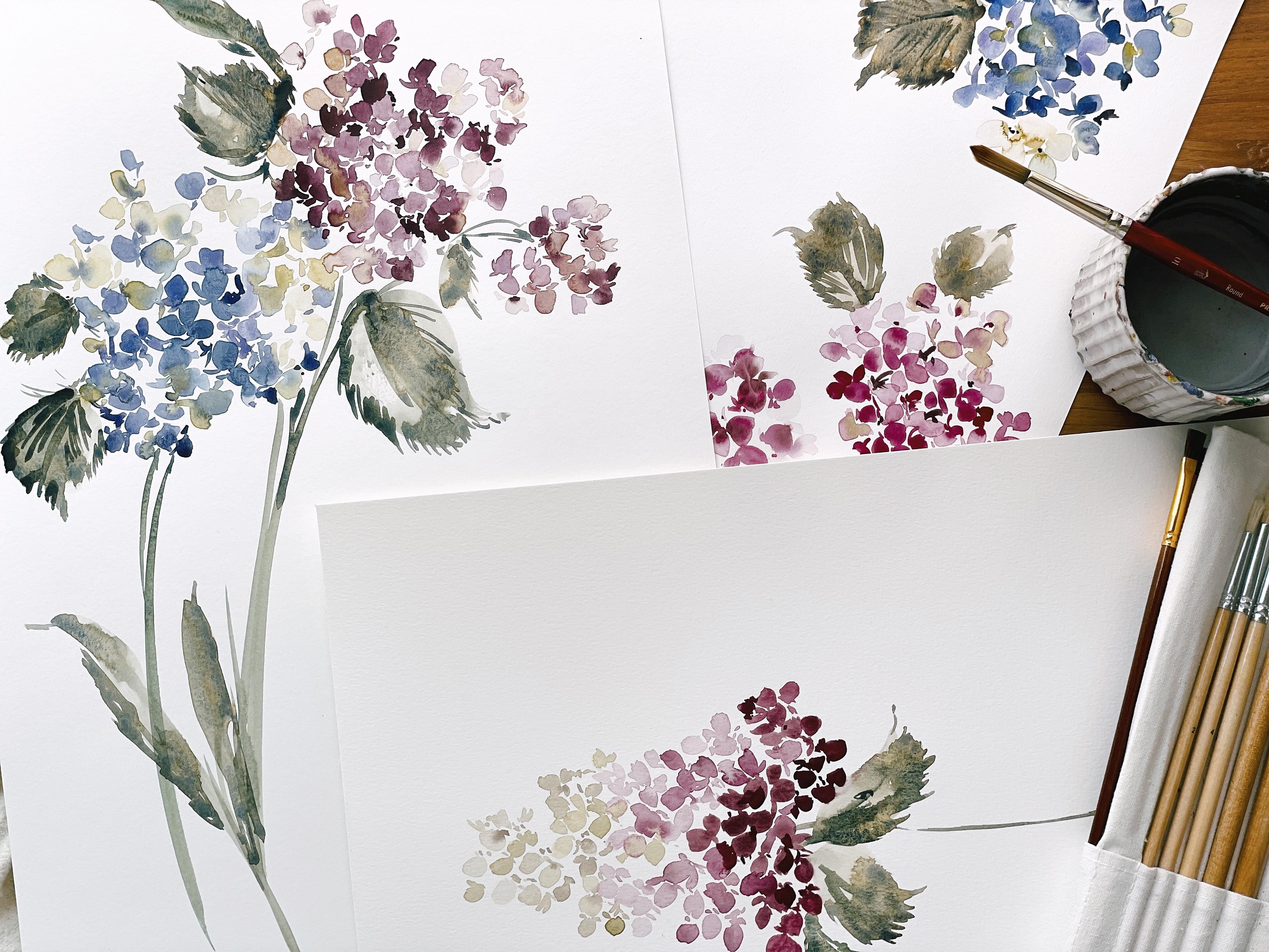
painting hydrangea, as you can see here. We're going to be painting the classic hydrangea
that you've probably seen oftentimes in
gardens and in bouquets, working with these beautiful
blues and purples. And just noting the structure, the shape, how it
all works together. So we'll take some time and we'll study some
reference images. And also while researching, I came across another shape of hydrangea with which
I was not familiar. I call it the Gum
Drop hydrangea. And as you can see here, it
has a really unique shape, something similar to what you
would find in a hyacinth. We'll talk more
about that as well. Jumping into the supplies. We'll be working with
our Canson paper or a £140 cold press. As I've mentioned before, paper has two
different sides to it. So you can see here lots of
really pretty green though, if you were to flip it over, it's a much smoother surface, so we'll talk about
that as well. And just choosing
the right paper side for what it is that we
are wanting to create something with a little
bit more texture or something just a
little bit more smooth and more along the lines of what you would find
on a hot press paper. We will also be working
with our Princeton brushes. As always, I would love for you to have a variety of sizes, specifically size
six through ten. I'll be using two sixes. So it's important that you have at least two brushes
in the same size and then also a bigger 110
or 12 would be great. Round brushes preferred. If you have a brand
that you love, obviously you can
stick with those. We're also going to be using a variety of watercolors here. I am happy if you use any of the brands that
are listed in the outline. My married blue, Winsor
and Newton Daniel Smith. The Cotman series, like I said, in Winton, Windsor and
Newton is just fine. So as long as you have just like an artist grade paint,
you should be great. You can refer to the outline for the full supply
list of the paints. But even if you don't
have the exact color, not to worry as long
as you have something similar in the same family,
it's gonna be great. Also, a palette maybe too, because we're gonna
be using a lot of a lot of different colors and
mixtures of these colors. So I want you to have
room on your palate to mix things around and not just feel
crunched into a corner. Ideally, I would
love for you to have an iPad as well
or just something for you to be able to look at just because
we're going to take, we're gonna be
taking some time to look at a few reference
pictures like I mentioned, and I'd love for you to
be able to kinda zoom in and just note
the structure and just the beauty of these
petals as we learn about them and then also
translate them to paper. So that just about covers it. Obviously you'll
need a paper towel to blot off and
then a water cup. Hopefully yours isn't
green like mine. Obviously, I need to rinse
off before we start. So all that said, let's move into
the next segment.
2. Swatching the Palette: Much better, apologies
for the portrait mode. We are now in landscape and
filling up the entire screen. I have my camera
and my tripod here. And sometimes if it's not tilted forward right
before I begin filming, it just automatically
reverts back to portrait. So anyway, from here on out, we will be in landscape
and we are now going to be swatching out the
colors we will be using for this first hydrangea. So let's go ahead
and do that now. Neuron and grab a
piece of paper. And then you're also
going to want to make sure you have
your palette filled up with the ultra ultraviolet. Believe it is. Let me get that. That's a small little tube, ultramarine violet and finance blue and then a
touch of sepia here. We're also going to
be using the sap green and the rich green gold. And so we're gonna be
using these colors together basically to
create an entire pedal, but we're going to want to
have different consistencies, different water
ratios essentially. If you haven't heard me
talk about water ratios, you'll want to go back and take a beginning class
just to freshen up or to learn all of that
information before we head into this one
because we won't be covering that in great depth. So we're gonna be using both cough syrup and
broth consistency. And I'd like you to mix
up piles for each one. So here I have a mixture
of the ultramarine violet, the finance blue, and
a broth consistency. And then here I have it in
a cough syrup consistency. I'd also like you to
be able to pull out just the ultramarine violet. I have a little bit
of the finance blue on my brush already. And pull that out over here. Because we're really going
to want to have options. I don't want you to stress
about having all of these colors working together on the same palette and running together because
they're already going to do that on the page. We want there to be a
little bit of separation. And as petals dry and as
they move wet into wet, we're going to see and just study how the colors
work together. And we just don't
need to be concerned about the colors
blending together. So I'd like you to have
at least a cough syrup and a broth version of
those two colors together. And then pull out another
version could be broth or cough syrup of the
ultramarine violet. I mostly just want you to have different colors and
different mixtures. It doesn't matter
which ones they are. I'm going to show you how when we assemble the
full hydrangea head, we're going to have areas
where it's gonna be darker, areas where it's
going to be lighter. And it's really just a
matter of being able to distinguish the overall shape. And not necessarily so important is to have the correct color if
that makes sense. Okay. I also want you to
go ahead and mix up your rich green
gold and your sap, green and sap yet to
broth consistency. So go ahead and do that
with a different brush. Can see here I have
rich green gold. And then we're pulling in
the sap green to it as well. And then we're also pulling
off a little step yet from this palette to get a really
nice earthy olive green. That's about right. And then what will you
end up doing is using our brush with water
on it to create a version of it that
has less paint. But you can also mix up the broth consistency version of this color off
to the side too. So we'll make sure
this one's darker. Take the time to
really work it to the right consistency
so that you have enough paint and the right color because you want to
have a difference in these two colors. And then can set that
off to the side. Right? So all that work just to get to putting some
color on the page. It takes awhile. Alright, so let's go ahead and I'm going to use a six
brush and we're going to dip into our
ultramarine violet and our finance blue in
broth consistency. Let's just see what that
looks like on the page. Really pretty sort
of periwinkle. And really I'm just
trying to make sure with the swatching
out that there is enough difference in
these two colors so as to provide a little
bit of separation. Can already tell
that this color. I've used some of
it while we were, while I was preparing the class, is already getting
a little bit faint, so I'm gonna go ahead
and just darken that up. Here's a side note. This finance blue is very domineering and it can
quickly take over the color, which is not
necessarily a problem. If you love blue hydrangea
is more towards. You're leaning more
towards creating blue hydrangea than purple. I really, really
loved periwinkle. It's one of my favorite
colors to use. And so I take the extra time and go the extra mile to make sure that purple is really
prominent in my color. You can see here it's
changing from blue to purple, but it takes some time. And especially with this
color now there are other more stronger versions of purple that you won't
have such quite an issue. So depending on what
color you are using, you may not be having
this problem at all. But if you're using the exact
colors, you may notice, now I have a nice cough
syrup consistency of the same color. There we go. We can see that there's
enough difference between these two colors
so as to provide some separation and
distinguishability within the petals. You'll notice too, that
these colors will dry two to three times lighter
than how they're laid down. So keep that in mind to
really make sure you have a nice dark color. Sometimes I like to just kinda poke it in because that's how we're going to use
it within the pedal. And just kinda get to see where the darker
areas are gonna be reacting with the lighter areas. Can even do it over here too, just to kinda see how that's all going
to play out together. And then if we wanted to see even a lighter
version of that, sometimes we will simply
be using the paint and the paint water that
is on our brush to actually act as a color. It's one of my favorite
things to do is just whatever's
leftover on the brush. And then we have an even
lighter version of this color. Which in my book, if you have already
pre-ordered that you will see is called
lightest consistency. It's basically like I said, whatever's leftover on
the brush plus water. Okay, So those are our three
colors that we're gonna be using for in the blue
and the purple family. And now we're going to go
head into our other mixture. Mixture you're using
a different brush are really rinse off. You may even want to use to water cups since we are
going to be using blues and purples and also
greens and yellows. Okay, so let's go into the cough syrup consistency
version of the sap, green, rich green,
gold and Cynthia. Alright. We really don't need
it to be very dark. This is just gonna be
an ancillary color. It's going to be supportive. It's not going to
be the main color. If you look within the
periwinkle hydrangea, you'll see that it's just
towards the middle of the flower that we really see this color
at the center and then also spreading
out within the petals. And then same colors
at broth consistency. I say these are the
colors that we're using, but what's going to end
up happening inherently? We're going to create
way more colors. We're going to get these two
colors when mixed together, which you're gonna be sort of a, a brown, a moody gray. And that's going to create
a new color in and itself. Because as you'll see in some of the warm-up
practice, we have, these two colors are blending together and
creating something different, same here as we use them at
different consistencies, you can see same colors but completely different
look within the pedal. We're also going to
study the approach, the way with which we
approach those petals. And it's going to be such a thrilling way to
go about this flower. Okay, So those are our colors. We can go ahead and continue on this
practice piece of paper. And I'll see you in
the next segment.
3. Studying Petal Position: As mentioned in our
previous video, we are going to be studying
positioning of petals, as you can see, once
we begin to put the hydrangea together and we're creating the
whole flower head. It starts to fill out. And rather than having
just a bunch of generic shapes comprise
the hydrangea, we look to peddle positioning. So we're gonna go over
that just single, single position by position so that we can really understand how they're all going
to work together. And then we'll begin
to cluster them to create that full
head in later videos. So let's just look at the most basic positions
that we can paint. And we're also just going
to be using a single color. I really want you
to not be focusing on color mixes and blends
and bleeds right now, and rather just focus
on position itself. So I'll be drawing from
this picture a little bit. But I like with
most of my classes, there's a lot of interpretation and I take a lot of liberties. And because my style does
lean more towards gestural, it's not an exact representation
of the flower itself, but merely, just capturing
its spirit and its essence. So take that as you will. Those of you who prefer more structure in
botanical styles, it might be a little
bit more challenging. You're going to
want to just really hone in on all those details which I know after studying that art form
myself for a year, I had to detox. Alright, so let's look at just the very basic
position we're going to create all so I'm using
my size six brush here, be using the broth
consistency of the ultramarine violet
and the finance blue. We're going to create just your regular
run-of-the-mill open face pedal. We're going to create two petals that are opposite of each other, leaving a touch of
white in between. Don't worry if the pedals
aren't just perfect. Any imperfections that
you might see are really going to lend themselves
towards the flower itself. And then we're gonna
do the same thing coming from the middle. Leaving a touch of white in the middle and finishing
off the flower. So a nice shaped pedal. But as you can imagine, if you were to just replicate this over and over
and over again, you're hydrangea would
look very boring. It would look very
one-dimensional. So the way that we
create that dimension and the fullness is
by petal positioning. Go ahead and create one that's
facing up into the right. So let's start with a line
and then come to a point. And then we're going
to use a sliver of a petal over here
off to the side. Another way that we
really contribute to the overall organic
NUS of the petal is to play with the
size of the puddles. You can see here all of them
are the same size as they are over here on my reference. But all petals cannot
be created like that. Or it's just going
to, like I said, end up looking very boring. We're gonna do the
same thing over here, creating another petal. And then create one
more over here. Let's try that again.
Creating a line. And this time was created
a little bit thinner. And you can kinda see how now it looks as though it's
really on an angle. This one was a little bit to this petal was a little bit too long to create that position
that I was looking for. So this one's a little
bit more represent story of how it would look, where it on its side. Let's go ahead and
do the same thing, but let's face down. So let's start with a line here and then just come
up a little bit. And again, we're gonna be
working gestural here. So this is all actually very formatted and we're
not even going to really work too much with
this sort of approach. But it's good to
just know how the petals we're are going to
enfold and cluster together. If it's easier, you can
turn your paper around to, rather than painting
upside down. Now you can see that this
pedal, the fourth petal, which is what the hydrangea
is made out of four petals, is mostly just a gestural line, rather than acting
as a full petal. Let's go ahead and
do a few more. Let's do one that is facing up. Let's just do a line here. And a pedal. And another line. We could always put another line here if we wanted
this to act as a pedal, or we could just leave it
as a three petal, petal. Let's go ahead and
paint one on its side using just a line and
a thicker marking. And then we're going
to do a long petal facing out this way. You can kinda see as we begin to stitch all of these
different positions together and layer them and allow them to kinda
come up against each other. There's gonna be a lot
of room for versatility. Okay, so we're going
to paint this one similarly to how we
painted our first one, but we're gonna give it a
little bit more character. We're going to start here
with this side petal. And then we're going
to come directly the right and create
a thinner version. And then we're gonna
come up here and just paint a bit on its side. So it's laying flat, but it's curving here. And because we're
not going to create that depth and
detail with color, we're going to use that by
just using a gestural mark. Then let's come down here
for that fourth petal. And really this is like a
practice I like to do before beginning any flower is to just study the positioning of things and then also
playing with size. So in some of, in some of the bouquets
that we'll be creating, we're going to use really
big focal flower petals, the way that they are. In this picture, you
can see the eyes sort of gravitates to here and here, these, these open
face big petals. And then as we move
down into this area, you can see the petals
look to be a lot smaller because they
are clustered together. Let's go ahead and create
a downward facing pedal using a marking. Another marketing. Then connecting this petal here will also obviously be playing with
different colors, so it won't look so generic
and so one-dimensional. But it's good to be able to
just see what it's gonna look like using the sketch brushing method that
we used when we were painting our poppies
in our last class. Okay, So let's do another
one to this side. One petal here, one petal here. And you can see by playing with the different size differences, it's really going
to start to look amazing when we put
it all together. Let's do a few more. Let's go ahead and paint
this one that's kinda coming up like this. Nice generous puddle there. And then obviously we
would have a little bit of green touching
in here are blue, whatever it is, whatever color we're going to be
blending together. Then let's go ahead and do
a nice big one on its side. And we'll do a
smaller petal here. Just a little marking here to represent that
it's on its side here. You can see we have a lot of different varieties
to play with. And all of this is going to lend itself to when we
put it all together, as you'll see in the
next, the next video. But the one after that, how it all comes together to start putting
it all together. Can I say together
one more time? It's going to just really
look so beautiful. I'm already, I'm just
so excited to get there because it's one thing to see
it paint it out like this. But then once you
really start to put all the moving pieces
together, it's amazing. So anyway, I'm
excited over here. I hope you are too. Let's move on to the next video.
4. Studying Approach: Okay, so now things
are going to get a little bit more
challenging as we work with multiple brushes
and multiple colors, we're gonna be using the
knowledge that we gained in our previous video positioning to create the flower petals. And we're going to study
different approaches. So as I always say
in my classes, there is no one right way
to approach a flower. There's so many different,
different styles and forms. And my goal always is your
teacher is to give you the knowledge for you to utilize your voice
and your art work. And so I don't want you
to feel as though you're tied to any of these approaches, but really feel
liberated and being able to use them interchangeably and gravitate towards one or create something that's modified that's
completely your own. Obviously, these
classes are just about giving you the education. And then from there you're moving forward to
create something that feels like you and feels
like your artwork. That is so important
for new artists to define and to put time and effort into upfront to really find your
voice and to not feel pressured to just know everything right away about
what it is you want to paint, but give yourself the freedom to explore lots of
different styles. So let's go ahead. I'm
going to show you one of the easiest ways to create a wet into wet
petal using two colors. Let's go ahead and dip into our cough syrup consistency
of the blue and the purple. And we're gonna go ahead
and do an open face flower. And you'll use the bottom to do the same thing
coming in at a diagonal. And then you're going
to take a fresh brush. And you're simply going to use the paint from these petals to create the next two petals. And let's go ahead
and bring you in just a little bit closer here so you can see hopefully you're working on your laptop, but those of you who might be on an iPad want to make sure you see a little bit
too much moisture now you wanna make
sure you don't have too much moisture
on your brush. You just want it to be
wet because what will happen is if it's too wet, the water will pull
back into these petals, which we don't
necessarily want to happen to the other side. So this is simply just using the paint from
these two petals. A very easy way. Then you can sharpen up
your edges or you can change the pedal of
the shape afterwards. If you feel like it's
looking to one-dimensional, you can create some edges. And then once things
are flowing and drying, use your other brush to dip
into your green gold and your sap green to just plug in a little bit of color right
here into the middle. You can allow it to
touch multiple petals, or you can just
stick to one side. You can pull the color
into the petal so that it becomes more dominated
with that green. And you can see there's
some really pretty things happening here just with using one color and then
using water to pull, and then your third color, which is that green, to create that fourth petal. So that's a big, bold, open face flower. I'm using that approach. We're going to
cover, like I said, multiple versions of
creating the petal. This is just one of them. Let's go ahead and do another. A common approach which is
the wet into wet style. And so with a clean brush. So hopefully you have
multiple brushes here. I'm gonna be using another six. Let's go ahead and do
another open face. So just a bit of water. You don't want it pooling, you want to just wet enough. You can see I have a
little bit of blue here and purple on my brush. I come right out here. You want enough water
so that it's staying wet while you're getting
all your petals laid down. Then what you can do is just
drop in a little bit of color into the middle
and watch it spread. You can cover the
whole petal by moving the darker color into the wet media and
allow it to spread. Or you can keep some petals
separate site for this one, I haven't touched it in there. I think it's nice just
having that pedal blank. It's a very light version
of what we just did. And we'll look so
pretty when we have more of these flowers nestled
and clustered together. So we can leave it
like this, just as is. Little bit of like I said, water and what was on the brush. And then just a
little bit of this, you can continue to dip into
the cough syrup version, darkening up this middle. Because as I said, paint is going to try two
to three times lighter. So you can just keep
plugging in a little bit more and then leave
it like that. Or let's do another
version of that. So I'm just going to pick up
a tiny little bit of paint, but mostly just
water on my brush. Let's go ahead and
recreate that again. Making sure it's wet enough
so that I have time. And this has really
forgiving paper. I don't worry too much
about timing things. You want to make sure
when you dip the color into the media and it's just
not pulling everywhere. Okay? So now you can
do the same thing. You can see it sort
of blended in here. And then what you
can do is give it a minute and then
use another brush, third brush to dip into the cough syrup
consistency of our color. You can begin to
fill in the petals. And now you can do just
some of the petals. Just Crispin's up those
edges if you like. Now, remember,
these are not just gonna be single pedals that are gonna be clustered together. And we're going to use
this to create new petals. We can go around the edges and really allow that
color to sink back in. And we can even just
pull it through the flower using the
toe of our brush. And now you can see we have a really unique flower
and we wouldn't, or excuse me, pedal, we wouldn't want to do
this to all of them. But you can see how this nestled up against
this would really, you can tell that they're
in the same color family, but the way that the light shifted on the petals
is gonna be different. And as we play with
positioning too, it's just really going to have, it's going to bring
some interesting facets to the whole flower. Again, this is going
to continue to dry. And you can, like I said, take the tip of your brush
and continue to just sort of go around the edges here, you can decide to go
into a third petal, leaving a little
bit of space here. Taking your original brush with the green gold and darken
things up if you like. This is sort of creating
a third color here, this brown, gold blue. And then you can leave
that puddle on its own. There's so many different ways. Again, you can continue to
approach the hydrangea petals. So those are the first two, I think most common methods. Let's go ahead and
cover a few more. I'm going to load one
of my six brushes with the cough
syrup consistency. Let's do a different position as well since we've
covered the open face. Let's just go ahead and
do some wet into dry. We're going to do a
line coming up here. And then we're gonna
take our brush with the broth version of the purple. And we're going to
touch just the side, leaving a little bit
of whitespace in here and come up
on the other side. And then we can take our
other six brush loaded with the green gold mixture and pop it right here
into the middle. And you can again touch
one side of the petal, touch both sides
touch all three. It's completely up to you. How you want to,
to play with it. What you can do next is create a petal that is broth
consistency in the purple. Let's go ahead and create one. But on its side. And then we'll
do a little marking here, just a little sort of line to indicate that
there's a fourth petal, but we're not really
pronouncing it. And then what we can do is let that dry for
just a little bit, or we can even take a brush, pull out some of the moisture. I always like to
have a filbert brush on hand to just I'm in a hurry and I want to just
get things move and I can pull out a little
bit of the moisture. And then we go into cough syrup. The blue and the purple. We just touch the edges. Now we need things to
be a little bit drier before we attempt this, because what will happen
if the whole petal is still very wet? It's simply going to just push back into whatever area
of the paper is wet. I like to just give it a minute, get down on eye level
with the paper and see how wet in fact it is. But what will happen
is you'll have some really pretty crisp edges. Then a really pale Center, which is really pretty effect. Then you can use an
additional brush to pull the color through if you
want or you can just sort of sit and let it settle,
it's going to dry. And then what you could do
again is once it's dry, go cough syrup over those
edges one more time, it's gonna be even
darker and you'll have this really
beautiful gradient. These are all still a little
bit too wet to do that too, but this one might
be dry enough. So let's go ahead and try that. So we'll just use coughs
or consistency again here to go along the edges. It's kinda, it's
a little too dry. But we'll fix that and
we'll just darken it up a little and then use a
clean brush to blend. This is still quite
wet over there, so I wouldn't do it
on that pedal yet. You could even just
leave it as is and keep the petal with just this highlighted gestural
mark along the edge, which would be
really pretty too. Or you can take your brush
and smooth it out so that it has more of
a blended effect. Let's go ahead and
do a, another petal. Let's start with our
green, gold and sap. Green and sap, yeah. Create our petal. And then let's go into our sepia and cough
syrup consistency. Plug-in a little bit
of green gold to that, so that it's not too brown. And then come back
into the middle. And just using the
toe of the brush, We're going to agitate
the center so that the color floods
back into the pedal. Can do it again and just
one or two of the petals, or you can do it in all four. That's a really
pretty way to do it. Or what we could do is just use a really light
version of that color. And we can use a little bit
more of the sap green color. So pulling out sap green
in broth consistency, come into here a
little bit more color. Give that a minute. And then we can plug
in our center here, allowing it to touch the petals. This is definitely, we're
getting looser and looser. You can see this as a
little bit more structured. But as we play, especially with wet into wet, there's just more
unpredictability that's going to happen. It's a matter of controlling how much water is on your
brush and on the paper, but also just letting
the pigment do is it chooses a really
pretty effect here, which will do a lot more
of as we're clustering, just letting those
colors run together. If you wanted to. You could then take the blue and the purple mixture and you
could touch up the edges. But again, you're
gonna get more of a crisp effect doing that. Pedal that is a lot more
structured, which is fine. It just all depends on what it is you're trying to achieve. And then we're just going to
blend those together and let all those colors just she can see a lot of different things
happening on the page. But it's all going
to come together to create something really
beautiful and special. So hopefully with this you have, you feel as though you're prepared to head into
the next segment? If not, please continue
on your own to just play with different
color possibilities. There's so much
possibility here. I've shown you four or five, but there's way more to study
and explore so you can do another page before you move on or jump into our next segment.
5. Clustering the Petals Part 1: Okay, this is your
quick reminder too, if you have not already
refreshing your palette. So I used quite a bit of the
paint that I had already previously laid out in our positioning and
approach videos. So I just went ahead and created a couple of
more consistencies. You can see this is
darker over here, cough syrup consistency of our
blue and purple and sepia. And then I have a frothy
version right here. And then I will also use a little bit of the purple
for a third version. Again, it's okay if your
colors are running together, you just want there to be
some separation between the different
consistencies so that you know what it is that
you're working with. Same thing with your sap green and your green
gold and your step. Yeah, go ahead and
refresh in your palettes so that you're not having to create more
paint as you're working. It's just, it's just an
added stress that you don't mean you want
to be able to focus just purely on the flower itself and not have to worry
about needing more paint. Alright, so like I
said with this video, we're really going
to be honing in on the clustering effect
of the hydrangea. The hydrangeas are super
full and they can look a little bit circling
if that's a word, just sort of clumpy. And so there's going to
be a way we can layer the petals so that we have
a little bit of structure. So it doesn't just
look like this because when I see
the hydrangeas, they really are depending on which angle that you're
looking at them. They can just be very circular, which works
beautifully in nature, but not so well. In painting unless you're
doing botanical where you can clearly see how all the petals are laying and interacting
with each other. So using our gestural form
will be able to create that using pedal
position and size. And so we're going to have
small, medium and large, and then also using the
colors themselves as a, I'm a aspect of composition to bring out a
little bit of the depth. Okay, so we've covered that. Let's go ahead and just start
using the different tools that we practiced
and we'll begin building the hydrangea itself. Go ahead and make sure you
have three brushes available. You want to have one for
your blues and purples, and then you want to have
one for a broth consistency. So a cough syrup
abroad consistency. Then a third brush for just the water or the
sap green and wrinkled. I don t think you need
to have four brushes. A little bit of rinsing
off in-between is fine, and we'll get you there too. Alright, so why don't
we go ahead and start with an open face flower just to kinda get us
anchored into the page. That would be what I
would typically do when I approach a floral
composition or Jeevan, just a single flower. I like to have an anchor
flower that just sort of grounds me to the
painting and then I can build from there. Alright, so I'm going
to take a little bit of the broth consistency. I'm going to start right here and create two petals using that first method I showed you. Not really worrying too much about the petals being perfect. And then I'm going
to use a brush that mostly just
has water on it, a little bit of the
green to create the next peddle and the last petal. And then I'll go ahead and plug in our green gold to the center here. I'm going to use cough
syrup consistency to darken up a little
bit of these edges, which is also going to lead
me in to the next petal. So using this dark
to play off onto, I'm going to take the cough
syrup consistency and dry it out so that it
leads in to a new petal. I'm just going to use the water that's on
my brush to do this. I'm gonna pull up pedal. Then I'm going to
use gestural form to create a second petal. Just a tiny little
pedal off to the side. We're going to imagine that the other two petals
are hidden behind. Now we could add a third petal, but what's going to end
up happening is we will lose the shape right here. So in order to avoid that, we're just going to
leave that area open. We may go in and create some low lights and
create some depth. But for now, while
things are still wet, we want to make sure
that we're touching areas that give
the impression of a new petal but do not corrupt the petals that
were already created. Then if we would like, we can pop in a little bit of our gold mixture
and it's fine if that pushes back
into the new petal. Again, this is all very loose. Let's go ahead and
do a little of the ultramarine purple
in broth consistency. We're gonna keep these
petals on the darker side. What I noticed when studying the hydrangea is that
there's areas and pockets where the flower seems to be a little bit more
saturated with color. And then there's little
pockets where it gets lighter. And we'll see that as we explore a new color palette
in further videos. This is just going to be one of the color combinations
that we tackle. So we'll use all
of the education, but we're going
to apply it using different color palettes. Let's go ahead and take
the ultramarine purple. Let's go ahead and pull
up a petal right here. Coming up here. Let's close it off. And now we can leave that as is. I wouldn't really
plug any green back in there just because we
already have it here. I would wait until we
did our next petal. So we have a pedal that's
popping out this way, and we have a pedal that's
popping out this way. We have a large petal, a medium pedal, and
a smaller petal. By playing, like I said, with those components
of composition, you really help
overall to just give the flower lots of
intrigue and interest. Let's go ahead and just
keep moving about. I'm going to use a
little bit of again, the purple in broth to come down here to
create a new petal. Let's start with a line. Pull out pedal here, and use a gestural
mark right here, just to show that
this petal is sort of coming out from this big one. Now what we can do
is we can switch to wet into wet for a
whole different feel. So using my brush that
mostly has water on it, a little bit of the green gold. I'm going to come in over here. And then taking my brush with
cough syrup consistency. Come back in here
along the edges.
6. Clustering the Petals Part 2: And then about now I
would probably move into another open face petal. So again, I'm going
to do wet into wet. Can hardly see this
well this time. And we're just going to continue
to build the hydrangea. And now let's get into our set with a little
bit of the green gold, like we did in our last video. Mixing it up a little
bit dry over here, so plug that in. So like I said in
my earlier video, the way that I've observed
that hydrangeas is that there's darker areas and then
there's some lighter area. So I'm going to continue
with this lighter area. Pulling up a pedal here. This one's a little
bit more green. And just a little side
petal here off to the side. And then I can, if I want to plug-in that sepia, we have something really loose
and beautiful happening. If you like that,
look on its own, you could do a full
hydrangea head just with those three colors are
essentially two colors. And it would be
really beautiful. All right, let's go ahead again. Come up here this time. We're going to pull out. We have a little side petal, a nice big open face, and then a little
side petal over here. And then we can add a
little touch of the purple and blue to this one. And let's go ahead and add
some darker petals under here. To show that this is where we're sort of looking
into the hydrangea. Just filling in the space
here with a couple of petals, allowing the colors to
run together organically, not trying to control
too much of it. We want to make sure
we leave whitespace because eventually what we would do is we'd either
add a stem or if we're looking at
it from overhead, we add some leaves
off to the side. We don't want to
create just a circle. We will really want to
create something that has a little bit
of movement to it. So let's continue to build upon what we've
already established. I'm going to come up here
for what I think will be the highest point
of the hydrangea. Take a little bit of the
green gold and plug it in. I'm gonna do that again. The pedal that's kinda
coming off to the side here. And then I'm going
to take just mostly water to come up for what will be that highest point. Okay. So we can see that we
have a high point here. I'm not going to fill
in this area so as to give some movement
to the hydrangea. If we were to really
fill it in and we would give this big circle area. But in order to
avoid, like I said, just creating that
clumpy feeling, we're gonna, we're gonna add some different structure to it. So continuing to grow. Let's add some more petals. I'm going to use mostly purple
here for a third petal. Just to kinda play off, we have some blue and
gold happening here. So I'm going to really
lean into the purple right here for a darker petal. This is what I'm allowing
to be my darker side. This one will be
popping out from here. Imagining that these two petals are on its side and then the
other two petals are kind of getting hidden
behind this flower. We can rent a little bit
of paint off the brush and now just add a few
lighter versions of that. Using more of a gestural form. We can also, another strategy
is just put some lines back here to indicate that
there's something happening, but we don't really know what fills in the area without
making it look to format it. So it's kind of a strategy
that I use when I'm painting is to just kinda
tuck in some little lines. Just filling in the area. You don't really know
what that's attached to. Could be a petal, could
be part of the stemming. Let's go ahead and build
a flower out of here. And then I'm going to
use mostly water here. And then I'm going to
plug in a little bit of green because we're
missing it over here. Always looking for variety. And then we can even plug in
green after the fact here. This is still wet and add
a little bit more there. That's why I do like this paper. It's quite forgiving. Let's continue around. Just filling in those
areas now being mindful of the whitespace, but making sure that it's dense. Hydrangea is a
very dense flower. Go ahead and do some of
the purple and broth. Maybe one more over here. I like to just sort
of move around. I don't stay in one spot
because I feel like that's how the flower grows
most organically. And then we can
go ahead and plug in a little bit of green here. And we can see it's really
starting to fill out nicely. I'm going to do cough
syrup consistency for a few darker aspects. Same thing over here. I'm gonna pull out a
little bit darker to show that over here is maybe
where the light isn't hitting it quite as obviously. And again, I'm going to create, when I imagined to be
the side of this flower. I'm really trying to avoid
having a full circle here. So I'm going to create
a couple more petals here to help close in the area. And then I'll add that Sophia, letting things touch
and blend organically. So now it's really
starting to take shape. We can see that there's
areas where it's very dense and other areas where
it's quite a bit more open. So we can just observe where
we're at and then decide, okay, I like there
to be a little bit more happening in that area. So I'm going to do a
pedal that's facing down, darker, coming up
underneath there. And I'm gonna do the
same thing over here. Just because it's a little
bit too much whitespace for this hydrangea. As I look at them in nature, again, it's just quite dense. They overlap. There's a lot happening. And I'm going to add
just a little bit of stemming like I did before. Just to fill in areas. You can even use a
little bit more of the sepia and the
blue and the purple. So it's a little bit darker now, more of a gray purple. And touch those areas
where it's darkest. And fill in some more
gestural aspects using the dotting and
marking structure. And then you can darken
the area of some of your hydrangeas by using just the toe of the
brush in the middle, it kind of acts as a center. It can ground the flower. I don't do it in
all of the petals, but it's a great way and
we'll do more of that when we're doing our final project. Mostly just wanted you to focus
on the clustering aspect. But we'll definitely
go in and we can add some more details as we work through the
different lessons. Again, we can put it over here, adding a little bit
of the dark area. And again, this is
looking at what you have and deciding, okay, where can the flower benefit from a little
bit more density? Where would we like
to leave it open? This would leave us
quite a few options. We could take a stem and run
it through the middle here, or even off to the side,
something like this. In fact, why don't I go ahead
and just do that just to see what it looks like even
though we're on clustering. Just connect that there. Then what we could do
is come out here with some big generous leaves. The leaves also spill
out from the sides, which we will do in our projects when we
approached the leaves. But you can see we can
use it just as a head on, emitting the stem and using some really big generous
hydrangea leaves. Or we can use this in a
bouquet with multiple flowers. If you wanted to
do peonies roses, this would be a great little
addition to that bouquet. Let's go ahead and move
on to the next segment.
7. Clustering the Petals Pink: Okay, so you can see I have
four working piles here. I have cough syrup consistency of the two colors combined. And then I have cough syrup consistency of just the rose matter
or excuse me, broth consistency, Roth
consistency of the Bordeaux and then even lighter
consistency here of the two. Which again, it's bleeding
a little bit into it, but we'll make sure that there's enough water on the brush
to create that lightest, palest version of the petal. So I'm gonna put this
off to the side. There really isn't any green in this
particular hydrangea. However, I think it would
be a great addition if you're a purist and
you need to paint it exactly as it's pictured, then by all means you can just
stick with all the pinks, but I think the green
will end up lending itself so beautifully
to the overall flower. And I am going to end up plugging a little in
there just to give it a little bit more
versatility and injury. Okay. So let's go
ahead and start. I have three working brushes. All sites will actually,
this is a size five. Anywhere like I said, from
the five to eight families. Great. And then you want to make
sure your water is cleaned. So if you haven't changed
out your water yet, if it's still very
blue and purple, go ahead and do that, and I think we're ready. So I'm going to dip in here to the rose matter in
broth consistency. And I'm just gonna
begin to build our cluster starting with a simple open phase, but a little bit
on its side here. I'm going to do this
a couple times. As you'll notice, as you work a little bit faster, naturally, your flowers are going
to take on more of a loose gestural form when I'm talking and explaining
each little step, things just tend to look a
little bit more structured. And so you'll see here as I began to put it
together and just work, it'll start to take
on a little bit more of a natural feel. I'm not going to have
any of these touch quite yet because they're
still quite wet. Again, I'm just working with broth consistency and
rose matter right now. Just building flower
head using positioning. So this one's coming
out from beneath. This one's going
to be on its side. Alright, now at this point, but I take another
brush and I'm gonna go into the cough
syrup consistency. And I'm going to darken
up a few of the petals. Let's start here on
the edge and just dip in to the very outside. Very tip. I'm gonna do the
same thing on this side. I'm also going to do
it on this flower. And I'm going to pull it into the entire flower so
that it's a dark flower. Let me do the same thing
here so that there's a little separation
between these two. And then I'll take my brush
that mostly has water on it and I'm going to now
touch against the side here, allow these two
petals to interact. Like I said with this
paper that is forgiving and it just gives you
time to sort of catch up. You can do that. I can approach it that way. Do a couple of flowers and then add your darker aspects
and the paper will still be wet enough to
accept the media once again. Okay, so let's go ahead
and continue to do that. I'm gonna do a few
dark ones over here. Let's do them on the right side since we did dark on the
left side last time. Nice big puddle there. Again, we're just going to
take everything we learned about positioning
and run with it. And now we can take
our rose matter in broth and start to fill
in the whitespace. Mostly just using the color
that's already there. Either to separate or to
bring out a new petal. So like here I'm going to
use the side of this petal to bring out a nice
big new petal. I'm going to go to the top now. And I'm going to create
what I believe will be the highest pedal. And began to build upon that below, leaving some separation. So it doesn't become a big blob. And then also now
I'm going to use my third brush to plug
in a little bit of that green gold to
some of the middle's. Not all of them, but some. And I'm kinda doing dark
petals first before I start to add the lighter versions. I usually do a little
bit of everything, but I think it makes it a
little bit more easy to understand when you just focus in on one color
and then you can use that color to either add darker aspects are
lighter aspects. Go ahead and creating
some under petals. And now I'm going to use lightest consistency to begin
plugging in those really, really pale, pale petals. Again, using a mixture of
the rose matter and light is consistency on its own
and then also the board DO on its own and mostly
water on the brush. This time, instead of using
the darker gestural form, I'm going to use
the lighter form to show a little
pockets of light happening throughout the flower. Continuing to build, adding different positionings,
different sizes. I want this side to be mostly comprised of a lighter petals. We can plug a little bit of
the green into some of them. We can fill the whole flower. And we can add some darker
parts of the flower as well. And just sort of create a lot of variety within what we're doing. Continuing to close off the areas that have a
lot of white in them. Not getting too bogged
down by structure here. Really just trying to
fill in the space without overwhelming the
flower with details. I liked the shape that
this one is taking on. It leaves a lot of room for stem or four leaves
to come tucking out. When you have something
that's very circular, you end up getting
leaves that look most sun, sun beam like. If you leave these little
pockets of whitespace, it gives you room to come in with leaves and just
make it look as though the leaves are sort of
pressing back against the pedals or as though the
petals are hiding the leaves. Really beautiful effect. And then we can do
at the very end, is plug in one step
above cough syrup, which is basically a
thick paste of the two. And just plug in a few
areas that are much darker. On the red side. Even. This really just leads your eye to different
areas of the flower. We like, we can add a little
bit of color into here. But I also love
how pale it looks. And you can use the pink
to act as a center, which you can also do
if you like something that is a little bit
more runny together. You can use wet into wet. I'll show you just a
little quick version of how you could
approach this again, I'm just trying to give you all of the education
and the knowledge. And then you can kind of run and take it however
you want to go. So we could start off with a lot of petals that are just kinda wet
and waiting for media. Again, this paper is
gonna give you time. So I'm just laying down a lot
of different positionings. This is a very, very loose way to approach this flower
that a lot of people love and just feel a lot of
freedom and creating need to move on the quicker
side. But it's fun. And it'll be a little
bit less structured than this with my
beginning classes, I always try and bridge the gap between
structured and loose. Um, because that tends to be where most people
are comfortable. As I move into
more intermediate, I get looser and looser, which you would think would
be easier and easier, but it's actually
more challenging. Alright, so we have quite
a few petals laid down, a couple of more over here. Then on the very edges, just kinda take
your brush to add some very small flower elements. Nothing to structure. Just
flicking the brush around. You see the quicker you move, the looser you get, because
you're stopping years. You're now taking
the focus off of each step and you're
looking at the whole. And so what you could do is
take now cough syrup and just began touching those wet areas in a very loose way. Can use the rose
matter in cough syrup, darkening up some
of those areas, leaving some of them very pale. And again, some of the
areas have dried on me. But there's still a lot of
room for playing with color, which you can even do, which people love this too. So third option, I know I'm
throwing a lot at you today. I hope, I hope it's not
overwhelming, but more enjoying. You can lay down this
layer of very light petals and then you can go over
them with the darker petals. So it's a little bit
of that happening here where there's blending, but you're also layering
on top of those really pretty
light, pale petals. The more time you give it, you can go in with cough
syrup consistency Again, darken things up or you can choose to just leave them light. Again. You can use the sepia to really provide
some dark aspects. So you could mix that sepia with the Bordeaux or the rose matter and get something
that's a lot darker. And start plugging that in to either the
center or the edges. Again, we're just doing
super loose here. It doesn't look like much yet, but once you start
adding the leaves, two things that really
starts to open up. You can do the same
thing up here, adding a brown center, a little bit more
structure here. Adding some areas
where things are just sort of filled in lightly. Can add a few petals. Even with this color. It's darker than what
we saw in our picture. But again, you're the artist and you
get to take the liberty so you can kind of decide what it is that you gravitate towards
what style is more, feels more like you, and you can explore
that in more depth. So that was a super fun
palette to work with. I hope you'd like all of those
beautiful shades of pink. You can even add more
pink center there. You don't have to use just two. You could add some red into
there and really just sort of pull out all of the different working
tones within the flower. Alright, let's go
ahead and move into our last clustering segment.
8. Clustering the Petals Ombre: For our final flower, I could not resist sharing this one last version of the hydrangea that I
found while researching. It looked to me at first upon first glance to be a hyacinth, but as I looked further, it is indeed in a hydrangea
and I thought it was so beautiful the way it has
this ombre gradient. And we're really going to play with this and have a lot of fun. We're going to use color
as our friend here. Building this flower up. You can see it's shaped
like a gum drop, which wouldn't be my first shape that I would be attracted to, especially because it
just looks clumpy, open-loop alike and
doesn't have a lot of room for leaves to help balance it out and give it
a little bit of structure. Most of its leaves are
happening down here below. But it's such a
pretty version and I thought it would be beautiful, mixed into a mixed floral. Maybe not necessarily
on its own, but added to a composition. I think it would look
really beautiful. So we're going to just really
lean into the ombre here. I'm using the same palette
that we've already had. Rose matter are
Bordeaux and our sepia. I'm going to pop
on the light here, put this off to the side. Go ahead and grab yourself a fresh piece of
paper if you need it. If not, just make sure that
you have mixed up plenty of paint to really
complete the project. What else? Probably don't need to
rinse out your cup, but did want to just say
it just in case plea out just a little bit here. You're going to
have three brushes. Again, you're going
to use one with the darker sepia Bordeaux
mixture in cough syrup. And then you'll use your rose madder Bordeaux in
broth for that medium shade. And then we'll be
leaning into the green, gold and sap, green and sepia as we work our way
to the top of the flower. So we'll just be mindful as
we're building to grow up. And to make sure
that we're being mindful of this kind of cute. I say at grudgingly, cute gum drop, shape flower. Okay. Alright, I'm going to begin with the
suburbia and Bordeaux, and we'll start down here. And I'm just going
to really play with the shape and position. Bring you in a little bit
closer here so you can see we go pulling out the bottom here. Now I'm going to plug into my rose madder and Bordeaux and breath and pull out some
flowers here again, this is still the darkest
area of our flower. I'm using my number
five and my number six. But even if you have
something up to an eight and a should work great. Letting those petals
touch a little bit. As we build out. You can see in that
picture there was a lot of pale pink and then just
dark pink along the edges. So we can do a little
bit of that as well. And just pop in a
few of those as we work our way towards the middle, we'd have to wait till
it dries a little bit. So I'm going to
leave those alone. Create a few more here. And then also just
continued to fill out the darker area down below, making sure that I have one side that's a
little bit longer. I'm imagining a stems running
from here and some leaves. Again, we want to
make sure we leave little pockets of
whitespace to tuck in those leaves that really helped to balance
out the flower. You'll see later when we
do our segment on leaves. Okay, so now we can
head into the edges here and plug in a
little bit of the pink. I'll do a little bit more of
that as we work our way up. And using broth consistency, using our cluster
for pedal method. Always playing with
shape and position. I'm open face some
on their side, making sure that
it's still nice and full down here below. My tendency is to make sure things are
really well balanced. So it's taking a little bit
of extra thought to be too. It makes sure that it's
nice and full down here. Continuing to just build, flicking the brush and also
laying the brush on its side. Always moving around so that the petals are not
facing the same way. Running them up against
the edges of other petals. I move quick because it helps to just embrace that loose form. Not getting too tied
up in all the details. Can go ahead and plug
a little bit of the darker back into the edges. So that's our cough
syrup consistency. And going even fainter as we work our way
to the top here. I petals are also going to
get a little bit smaller. Filling in the gaps here
with gestural marks. Care gum drop shape
is coming out nicely. And now we're gonna move into the green gold and
the sap green mixture. So go ahead and rinse
your brush and load it with the cough
syrup consistency. We'll work our way
towards breath. Allowing some of the petals
to run up against the pink. Putting one in here and adding just a touch of sepia to give it a little
bit more of a brown flavor. Let's go ahead and
add a few more. Using some dots to play
with this structure here. Adding some of that stemming
that we did earlier, just flicking the brush around, letting things stay
nice and loose. And working towards
the very tip. You can see by using color, we've achieved a really
pretty ombre effect. Again, not a shape. I'm going to pull out
a little bit here that I would run tours. But I think it's cute. I think it could be, it
could work really well in a, in a floral composition. Let's go ahead and
plug a little bit of sepia into the center
of some of these. Just to add a little
bit more detail. You can continue up and get even thinner if you want towards the top and create more
of that gum drop shape. But I think what we've
done here is pretty good. I'm still trying to
create a little bit of movement here within the petals by putting some
more gestural markings here. And then, as you'll
see later on, we're going to add some leaves. Let's go ahead and use again
a little bit of sepia. And the board DO down
here at the bottom, just to create some
really dark areas. There, I can at least provide
a little bit of area where the stem is going to
come through and where we can tuck in some leaves. Few more darker aspects
along the side. Can plug in some here
in the middle as well. Really just lean
into that ombre. Okay? Alright, so there you have it. There's our gum drop shape
using the same palette, just in a different form. We're going to come back
and we're going to add some leaves and some
stems to our hydrangea. And then we'll send you
off with a final project.
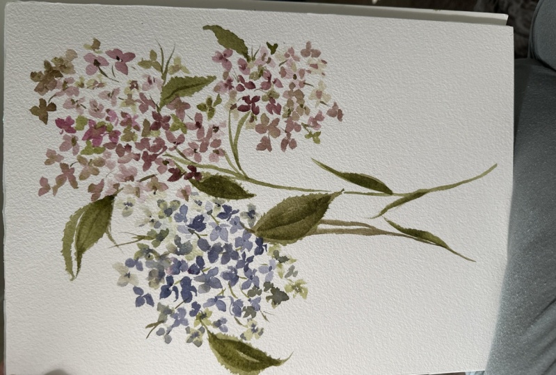
9. Adding Details to the Leaves: So I grabbed a little
scrap piece of paper and we are going to now study the hydrangea leaf in
greater detail so that we can begin to apply it to
our practice hydrangea, and then eventually put
it into our final lesson. So just speaking on
the leaf itself, It's one of my
favorites to paint. And you'll see in
a few moments here as we began to do it on its own and then
also plug it into the existing flowers we painted. It has. For one, it's so expressive, it has so much detail in it that you can really
play and draw out. And for two, it's the perfect counterpart to
that big bulbous hydrangea. It's the thing that gives it
the balance that just makes it feel really
whole and complete. And I think you're
going to enjoy adding this aspect
to the flower, the hydrangea
itself, like I said, can just feel a little
one-dimensional. And so when you begin
to add the leaves, it really pulls it all together. So we're going to mix
up our pile here, which is a mixture of
sap, green and Cepheids. And you're going to mix that
to cough syrup consistency. I'm going to use my ten brush. I can get some really big
wide strokes doing this. And so my go-to brush, you can use something
even bigger at 12 or 16 if you like. It's really up to you and depending on what size
paper you're working with, a ten is pretty versatile. So the easiest way I've found to teach these
and to paint these, both for beginner
and professional, is to begin with
these simple stroke, compound stroke method,
which is basically two strokes that you start
from base to tip, base to tip. And then from there you have your main structure
and you can begin to add the finer areas and aspects. So I'll show you what I mean. Let's go ahead and pull out
a really big generous leaf here using simple stroke. Let's go ahead and fill that in. And now we're going to pick up a little bit of a darker hue. So we're going to pick up
the steps or excuse me, undersea green and sepia at a little bit of
a darker version. We're going to start
adding the richest. And I want you to notice
where my hand is. It's really sitting
back on the brush. You can see I'm not
up-close trying to control every
little movement here. I really want you to
just embrace the play of creating leaves and to
just sit back and relax. So coming back off the leaf, we're going to begin
to create the ridges. Now the only important thing to keep in mind is you want to continue moving them towards
the direction of the leaf. If you have them poking out
where it's going to start to create sort of
like a pokey leaf. You want the ridges
to be facing in the same direction as
your overall leaf. You can do as many
ridges as you like, make it very simple, or you can make it
complex and add a bunch. You can skip areas and
then pick up, down below. And there you have a really
simple but beautiful leaf. And now all things
are still wet. You can head back in and play a little bit with
some darker aspects. I drink, at least have these beautiful veins
running through them. So you can do that
while things are wet, or you can choose to
let the media dry and then come back in
and add some shadowing. You can see over
here on the left, the paint was dry a little bit. And so you can really see these
ridges sticking out here, which is a beautiful effect. Then you can keep
it a pale leaf and then come back in with your, your darker version, your
SAP, your undersea green, and you're Sophia,
and just pull out, like I said, those
finer aspects. So let's do a sideways leaf. Lot of times in hydrangea you'll see the beautiful sideways. So let's go ahead and
start at the base, pulling the brush
all the way through, pull it down a little bit, and connect it back here. And we have our sideways leaf. And now picking up a
little bit more paint. Let's go ahead and begin to
plug it in to the side here. Do the same thing
on the other side. Again, just staying
mindful of the direction. You can fill in your leaf
or you can leave it open. You can head back in
with a little bit of sepia while things
are still wet. And add a little
bit more interest. Just creating some
bleeds within the leaf. Really just playing with it. Now. I'm just going to let
that settle for a little bit. This is one of those leaves
that you have time with this paper to just kinda
let it sit and breathe. And then you can go
back in as things are drying and add a
few more details. Let's go ahead and do a
leaf that's just what we would imagine popping
up from the hydrangea. So let's just say there was a hydrangea here and we would
pop in this leaf up here, but I'm going to
run out of space, so I'm going to bring it down. But we would imagine
that maybe there's one leaf right around this area. Let's say our stems
coming in this direction. I'll have a sideways leave, we have a hydrangea and then we have one
leaf that's kinda, just kinda popping up
over the corner here. So let's go ahead. Smaller leaf. Just kinda imagine at hiding. So we start there. Just sort of getting
the basic structure down and then we take
again sitting back on our brush or your paper
a little bit to see if a better angle and begin
to fixing those ridges. The other side. Just plugging
in special little ridges. That on its own, honestly is such a
beautiful effect and nothing else needs to happen
when I'm painting leaves. Often there's this pressure to continue adding detail after detail to really
make that leaf pop. But with this leaf itself
adding these two approaches, just the simple structure of the compound leaf with
some ridges on the side. You get so much interests. There's really nothing
to be done here. It depends on how much you
like to touch your paintings, so it's up to you how much
detail you want to add. Again, you can wait until
things are a little bit drier. Then you can head
back in and just continue to darken up the areas. Adding those details
running through. And really just
play with the leaf here is completely up to you. I love the look of just leaving it as is right, like this. And then on a differently, if I may add something
more along these lines. So again, you're the artist, you get to decide how you
want it to work together to create the whole beautiful
achievement of the flower. So, okay, so next
we are going to attach leaves to our
practice flowers.
10. Practicing Leaves: So taking our practice pieces, we're basically just gonna
do the same thing that we did in our practice
of the leaves. So go ahead and
load up your brush with that undersea green
and Sophia mixture. And now we're just
going to begin looking at the flower
itself and seeing where the flower would benefit from having
a couple of leaves. I like to just kind
of scope it out, see some potential areas. For starters, I definitely
see potential down here, bringing the leaf here, and then possibly
bringing a leaf out here. And then you can always
add some along the stems to just kinda give it a
little bit more interests. Let's go ahead and
start here at the top. Just plugging that in there. And then I'm going to use
the toe of the brush with that undersea green to
just give some ridges. Do the same thing
down here below. That's simple. Stroke. Starting at the
base. Can be back. Filling it in, then will come up and touch the sides of it. And we have a really
beautiful leaf here. Again, we can add some
shadows and some veins, although I tend to do a lot of that once
the media is dry. So we're just going to let this settle in to do a little bit
of ridging on the side here. And there you have it. We have some leaves here. Let's go ahead and
do the same thing to these two flowers. So I'm going to pull
down a leaf right here again using
that simple stroke. Just kinda pull it down. And then we'll use
the side of the brush again to create some ridges. And you can, like I said, had back in with your brush, add some details or you can leave it as is and do
that when things are dry. Go ahead and add another
leaf right up here. And using the toe of the
brush for some bridging. I'll do that one more time. Down here. Our side leaf. And you can see how
just by adding leaves, the whole flower really
starts to come alive as such. It's so amazing. Leaves are my favorite part, even sometimes more than the actual flower itself
because they just, they start to make it all feel. Right. Then let's go ahead and add
another one right here. A little bit thicker,
kind of popping out from behind these flowers. Adding some ridging. You can go back in
here when things are still wet with some color, add some veins, or you
can leave it as is. This one is drying
up pretty nicely. Can add a vein in
there if you like. Can see in the
hydrangeas There's a little bit more detail. The hydrangea leaves rather. You can take the toe of your brush and add
some structure. Same thing here. Can use the toe of your brush. Once things are a
little bit drier to add a little more structure. Or you can leave them just
like that. They're beautiful. Either way, it's really
up to you, the artists, what you feel like you're
gravitating towards. Whilst we have our
gum drop shape. So let's go ahead
and add a stem here. This is really going
to just help carry us into our final project. So let's go ahead and
let's pull a stem right from, I'd say center-left. Keep it really loose. Don't need to have it
connected all the way through. Just something to
kind of show that, okay, this is where
things are connected. Then we will start the
leaf process again. Again using my ten brush. I'm going to pull some
leaves down from the bottom. The same thing over here. Totally okay. If it runs into your flour, get a little bit of
the red in there. And now I'm going to pop
in some of that ridging can add a little bit more
structure while things are wet. That's typically about it. For this shape of hydrangea, my tendency would be to plug-in some more
leaves here off to the side and just really
give everything some, some really pretty balanced. But I'm going to just
let it be because that's the way I saw it
and I'm going to just respect the structure. I'm just going to do
one final long leaf here and just pull it down. And then I'm gonna
get my green and my Sophia loaded up on my brush and had in with some really
beautiful dark ridges. You can intensify things
along the edge here too. And you can even add some
embellishments here. Not really true
to the hydrangea, but again, this is
your composition. You get to play with it and
make it feel like your own. So sky's the limit there. You can keep playing
with it using the toe of your brush to darken
up the edges here. Or you can just let it dry for a little bit and
see how the colors feel once they are a little
bit more muted and lighter. I usually like to play with it a little bit while to it
and then head back in again for some finishing
touches once things are dry. Alright, there you have it. I'm going to quit
touching it for now. Hard to do when you're
playing with watercolor.
11. Class Project Part 1: Okay. My friend, we have reached the final portion of our time together and I'm
so excited to jump into painting this with you. We've learned so much. I hope you feel that you have. I hope you've had a lot of fun. I hope you feel as
though you were given so many
different options and so many different
ways to approach this gorgeous flower that you don't feel stuck
to do it one way, that's always my goal
with these classes is to just enrich, in, enrich you and to allow you
to just embrace your style, your voice, and be able
to carry what I've taught you into your
just existing style. Moving forward, we're going to be doing a
floral composition. Haven't decided yet
if I'm going to do two or three hydrangea, probably just two, but
we'll see we might do a little ad lib and
I might add some more. If you feel more comfortable watching me just the
first time around, a lot of students
prefer this route. And it just kinda
gives them a chance to roadmap where we're headed. And then you can watch it again with me and
paint along with me. This seems to just
be helpful and provide more piece for people
when they're painting. But again, totally up to you. And you're welcome to just
jump right in with me. Go ahead and refresh your
so you're going to want to have all of this colors
that we've been using. I have three different
working palettes here. Not all of them that you've
seen throughout the class. My blues, yellows and
greens and browns. And then I have my pinks. Just want to make sure you have different consistencies
of each one. We're gonna be
using, like I said, all of the colors and
putting it all together. And then we'll mix up
our undersea green. Once we get to the
leaves portion, will just will approach
the hydrangea heads themselves and then
we'll move on to the leaves once we've finished. As you may know, if
you've taken my classes, I tend to be very detailed while I'm teaching and the project
portion or excuse me, in the last lesson portion. So that when we do
our final project, I like to pull back
and just allow you to just watch what I'm doing
and paint along with me. And it's just more
of a peaceful time rather than highly
narrating everything. So I'll still do a
little bit of that just to kind of carry
you along with me. But just know that with this, there's gonna be
just more painting. It's nothing new
that we're doing here is all the
same positioning. And the wet into
wet, wet into dry, and just putting
it all together, a combination of all of those techniques to
create something new. Another fun thing you
may have noticed, if you are working
with cold press paper, that your paper has
two sides to it. So up until now, we've been using the tooth here, Grenier side of our paper, which is so beautiful
for watercolor, but I like to use
hot press of my work a lot also provides just a
rich Canvas for watercolor. So I'm going to be flipping my paper and using this neither site for
our final project. You can do this too
if you feel like you want some sort of new aspect as we cover things
we've already done just, again, another way to just
open up your toolbox and give you something additional to take away with this class. Or you can stick to using the
same side we've been using. Just a little bit more texture. You probably won't even
notice the difference unless I, like I said, unless I said something, but I just wanted to make
note of it before we begin. So that's that we're going to start with our six brush
using our purples and blues. I'm going to create
that hydrangea and then I'll move over and use our pinks and our
grains and our goals. And then I might
add a little bit more to the mix
as we move along. We'll just kinda take
it petal by petal. I think that's a
great way to approach painting and life, right? Petal bipedal. Eventually we'll get
to the full flower. Alright, so go ahead
and load up your brush. I have my finance blue and my ultraviolet
right here off to the side. Just kinda rewetting it. Remember that that
purple is very faint if you're using the
same one and you really do have to kinda work, work at it to get it
to draw out in that, that blue is quite domineering. So take all that to, to mind as you begin painting. Okay, let's do this. You might hear that I have some piano music on in
the background. I hope you enjoy that. It's just to kinda help us get into the spirit and
the mood of painting. Going to paint a few
little anchor flowers just to kinda start us off. And then I'm going
to use my brush, my other brush with
just the purple alone. Looking more blue at the moment. So I'm gonna make sure that
I'm getting that purple. Here we go. I'm going to use a
little bit of just the purple on my brush and
a little bit of water. A few wet into wet petals. Just going to touch
the side here on some really playing
with that color here. Again, sometimes a
mark can be a pedal. We've learned that
in previous classes when we do gestural, doesn't always have to be a fully-fledged pedal or
flower to be represented. Just filling in some of the
space here as we move along. Can I drop in a little
bit of our green gold? Let it pull back
through the flower. And then I'm going to
also do a few up here. Let me use a little
bit of the sepia so that it's more
of a brown or tone. Again, you can see I'm sitting way back on the brush here. The closer you go to the brush, the more control
you're going to have. But in something like
this that's loose. I really do like to
pull back on the brush. Plug a little bit of
purple, blue into these. Feel like I'm losing the
purple a little bit. So I'm going to head back
in with some purple. Really want to represent
all the different shades. My paper just to fit.
12. Class Project Part 2: Just continuing to
move around until I find a shape that
feels good to me. Leaving some pockets, some areas where I imagine there'll
be some leaves. You guys here, the
little scratch against the papers I'm painting. It's such a pleasant sound. I just love that. It's the little things right? To take them where
we can get them. Just filling in a little
bit of the space with some darker colors just to kinda give it a little
bit more density. Can see where the petals are nestled up against each other. Leaving some areas where they'll
be potential for leaves. Leave that alone for now, I may go in and add a
little bit more detail, but I'm feeling good about that. And I'm gonna come up
now and begin working on the pinks and the green gold. I'm just going to give my
brush a little refresh here. But pink and purple, blue are all in the same family, so it's okay if they mix
together a little bit. I'm going to load my
brush with Bordeaux and rose madder and cough
syrup consistency, add back in a touch
of the sepia to it. And then I'm going to also
make sure that I have broth consistency
available in both colors. So a little bit
of rows matter in broth and a little bit of
the board don't broth. What I'm aiming to do here
is make sure that I have, I'm a really nice
composition here, making sure that
one's a little bit lower at one's a
little bit higher. We don't want them all
at the same length or the same fullness either. Go in with rose matter. Turn my paper just a little bit. Can you use just the pink on my brush now with a
little bit of water. Just sort of nestling, nuzzling the edges of
these darker petals. A little touch of
the green gold. I'm just kinda standing
back looking at things, kinda judging size, shape, positioning, putting
it at matching an altogether imagining
putting leaves with it. And I'm just going to
play around a little bit here and create sort of
an offshoot hydrangea. So a little off
the cuff painting. Same color family. Does it a little bit
of that CPI in here.
13. Class Project Part 3: This sort of filling in the areas where
imagine this little, little branch kinda
went off on its own. Then I'm going to add
a little bit more darker areas into here. Just wondering, imagine
there's just a little bit of depth to the hydrangea. Okay. So I feel like what I have, there's a lot of
things happening, a little bit of structure, a little bit of play. There's gonna be room for
us to do some fun things with the stems and
the leaves here. So I'm just going to pause
and I'm going to let it rest. And I'm gonna begin working
or creating my greens, which is done with the
undersea green and the sepia. Try it up a little
bit on me so I'm refreshing the palate
a bit overdue. And I have an area where
it's a little bit more brown and then I'm
off to the side here. It's a little bit more green. Again, I don't get too caught up in the colors touching or blending because it's all
going to happen anyway. It's just a matter of timing. Let's go ahead and
start with some leaves. Come out here to the side. I'm going to do
another one down here. And then remember we're
going to take the edge of our brush and we're going to begin just running
apps again, the edges. And again, same thing over here, running up against those edges. To create some ridging. Now we're going to create a
little bit of a leaf here, excuse me, a stem. Just kinda imagining that some stemming is happening
back there. I'm going to do the same thing. Let the edges run up
against some of the petals. I'm going to straighten
this one out a little bit and make it
a little bit bigger. I'm just gonna kinda leave that alone while things are wet. We'll head back in
and a little bit. Go ahead and bring out a leaf. See there I'm gonna plug in a stem first just to kinda
see where we're headed. Sometimes this dam
really helps me to just ground the piece and see how
it's all working together. I'm going to do the
same thing over here. My dog is sneezing
and apologies. And just kinda add
a little bit of embellishment just to
kinda keep things loose. And now I think I'm ready. I feel like I know where
the leaf needs to go. I'm going to pull it out here. Nice, big, generous
hydrangea leaf connecting that stem all
the way through this, that there's some sense of continuation as it moves along. You imagine that
maybe that leaf is sort of connecting
right through here. Can add some, some stemming just to kinda give
it a little bit more balance. Then this little offshoot here, I noticed in some
of the hydrangea is that there's a little
bit of disconnection. I'm just kinda connect
some loose stems running through here. Smaller leaf. I also feel like
the composition may benefit from having just one
more leaf right up here. It's going to do a thinner leaf. And then I see some
areas where it's just a little bit empty and barren. So I'm going to
head back in with my brush and just fill
it up a little bit. Using my Sophia and
my board dough. Just adding some areas where I imagine that she's
a little bit darker. Things are drying up
pretty nicely over here, so I'm going to just give it a few more minutes
and then we'll head back in and do a little bit
more shading and shadows. Let's go ahead and add a
nice pretty leaf here. Again, just using
that simple stroke, can go tip to base, base to tip. Just sitting back on that brush. And then I'm gonna head in with my Sophia and undersea green. Just add a little
bit more detail. Alright, here along the edges. Just using the tip of the brush can leave some of
the leaves alone. If you like them as they are. You can continue through adding more details
as you move along. Okay, I'm going to pull
back a little bit so you can see the whole thing, how it's all working together. Straighten you out a little bit. Okay, So you can kinda see
this piece as a whole. Now. It's really beautiful the way it's working
all together. I thought that it'd be
fun to kinda deviate to the left here rather than going straight through the middle. But that's always something
you can do as well. Doesn't need to be just
one area of the page. It can be multiple areas. So as you are doing this project
and as you are doing it, because it's definitely one that there's still so much room for
play and exploration here. I would say do different things. Each time you do this project, you're going to find things
that you love about it. And by being brave and doing something that puts you
outside your comfort zone, you're going to end
up learning so much about not only how to paint, but about yourself
and what you love, and what makes you feel
just set free and alive. So anyway, I know I've
talked a lot at you today. I hope it's all been good stuff, nourishing stuff
and educational. And I'm just getting so excited. We're getting really close
over here to book launch day. If you haven't already
stumbled onto my website where my book is on pre-order
right now until July 12th, would love for you to visit. We're going to be basically taking you through 25 projects. Botanical, watercolor. It's going to be a lot of fun. And I look forward to seeing your uploaded projects and seeing what you
share on Instagram. So thank you again
for your time. I hope you had fun and we
will see you next time.
 Cara Rosalie Olsen, Floral Designer + Watercolor Instructor