Transcripts
1. Intro: Hello to you, welcoming you to class today and
looking forward to the next couple of hours during which we will
learn how to paint climbing roses using
a Filbert Brush. I'll be walking you
through each step, starting with how
I find inspiration by studying a Live
Reference flower. Next, we'll learn how
to approach painting climbing roses using
gestural technique. Capturing the shape
and essence of the flower without overwhelming
it with too many details. I'll show you a multitude
of color combinations and three different papers to
try for different results. Before we finish up
with Expressive Leaves. At that point, you will
look gain the education necessary to move into the final portion of
our time together. Our class project,
which we will pull from our earlier sessions to
create a beautiful bouquet. If you're ready, first up, we'll take a look at supplies. Let's dive in
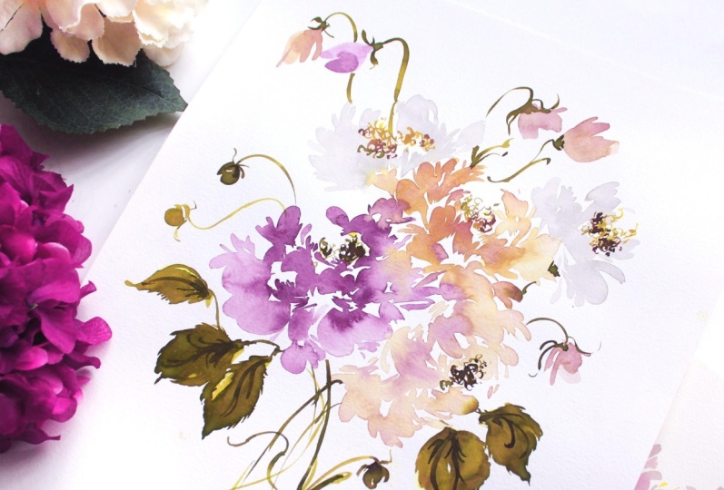
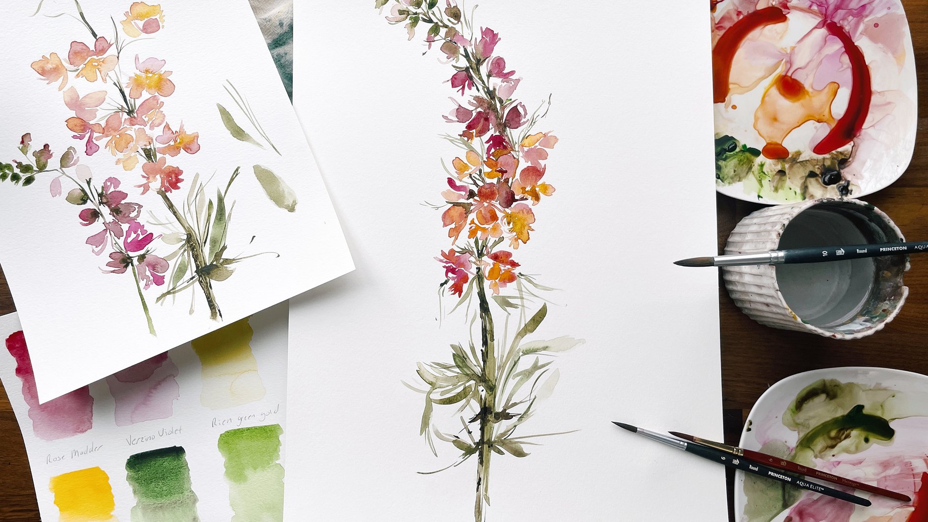
2. Studying Reference Flowers: Let's spend just a moment or two having a look at
I realized study. I feel like this is such a
benefit to have when painting. It can also be a hindrance. And you've, if you've
taken my classes, you've you've heard my
thought process on that, that sometimes we get too attached to what
things look like. In reality that we
have such a hard time loosening up because we're
trying to stroke for stroke, achieve what we
see with our eyes. And a lot of artists support that mantra of paint which you see
not what you know. And I am so contrary
to that, I really, I fully believe and support intuitive painting
and it may not always look exactly like
your subject matter, but I feel that's where
the most joy exists, that's where the most
freedom is existing, and that's where you find
I feel like your bliss. So if you're new to
me and my classes, that is my approach. My approach is gestural
and loose and free form. And that is what I teach in my classes
because as I said before, I feel like it promotes the
most joy and that's what I want for you and your
creative process. So again, I love this
part of the process. I love where we
can look and study the elegance and the
majesty of creation. But then we can also pull away and say, Okay,
I've seen it, I've been inspired by it and now I'm going to move on to create something
that feels like mine. So that's what we're gonna do. We're just looking at
these beautiful petals. We're going to be using
our filbert brush to mimic these sort of roughly
soft edge round there. They're actually called
cloud, cloud climbing roses. And so we're going to adopt
that vocabulary as we are painting our roses and really bring out the
softness that you find. And we'll play around
with angles to, I'll be moving the
Flowers around. So we can achieve this
beautiful side angle. This maybe a full
front-facing climbing rose and then maybe another one off to the side
and will also, we have a little bud
tucked back there. Can't really see it,
but it's back there. So we'll, we'll
focus on some buds. And then they have the
beautiful yellow centers in there too that we're gonna, we're gonna pull out
and play with just the, the, the playfulness
of the Center. They mimic peonies and they
have that roughly texture. But you'll notice if you have a peony garden or if you are
familiar with that flower, you'll see that there
are notable differences. So we're going to study those nuances
and really lean into them and embrace them and
pull out something special. Like I said, just a
nice reference to have as we're working along and our class,
but not necessary. So feel free to use these
Flowers as a reference. Or if you, like I
said, have your iPad, then you may want to
pull that out and have some inspiring
images next to you that you can draw
inspiration from
3. Discussing Supplies: Let's go ahead and discuss the supplies that we're gonna
be using for this class. You're gonna see that we kinda have quite the lineup here. And here's my thought
behind this class. We've painted peonies
quite a few times. And so although our
climbing roses are gonna be similar in stature
and in composition, I'm going to shake
things up with colors here and also with paper. So you're gonna see we have
a myriad of Supplies here. This is my thought
process behind it. I remember when I was a
beginning Watercolor artist, I would see these
inspiring artists working with these
different supplies. And I would wonder, is
that worth the investment? Should I wait till him a
bit more adept at my skill? Or is it, Is it something
that I need to have? And because I liked the way
that it works and I feel like it would be an
asset to my toolbox. So while I, I usually
like to use colors, especially in paper that
beginner in watercolor is have in their home toolbox. I really want to give you
a sense of variety here. You're gonna see we have a bunch of different things
we're working with today. And I feel like it's
gonna be an asset to you to be able to just
see how it all works and decide whether or
not you want to make the investment in
these supplies. If you are a newer
Watercolor artist, if not, if you're more seasoned, you may have all of this
and that's fantastic. We're going to start
with our Canson Paper, That's 140 pound cold press. We use that in most
of our beginning, a watercolor classes. We're also going to throw
in an arches hot press, hundred and 40 pound. This is a really great
paper that I use in my professional
work is pretty much the only paper I use them
in a professional work. Then we also have a loose leaf legion 140 pound cold press. And this is a great
paper as well. Great tooth and texture to it. And I do like this paper a lot. So I'm gonna give you we've used I know these two for sure. I can't remember if we've
done hot press before, but I'm just going
to show you what are subject looks like on a variety of papers
and you can decide, oh, I really liked
the look of that. Move forward. As far as our paints
are concerned, we're gonna be using
a variety here. We have Maimeri Blu, we have Daniel Smith, we are Winsor and Newton. And then we also have this great little Powder that
I got from The Sketchbox. If you have ever heard of them, It's a subscription-based
platform where they are very similar to other
crafters box or let's make Art. And so I just want to
throw everything at you and give you options as far as what you
might want to use. I'm even going to throw in
a Chinese White watercolor, which I never use, but I want to show
you how it works and just give you a
really great sense of what your supplies
are capable of. So you'll see the
full lineup here. Everything will be
listed in the syllabus, so I won't cover each color here just for the
sake of moving you along. But you'll find all the colors that are used in the syllabus. You'll also need brushes. I love for you to have a
variety of rounds and Filbert. This is a princeton heritage. This is a Princeton Aqua Elite. This is a six, this is an eight. This is the Umbria Filbert. This is a Size six and
they're all princeton. And these are my go-to brushes. I love them for versatility. And then you'll also
need a cup of water, a mostly clean
palette, excuse me, move to there and
something to blot off on either a towel
or paper towel. So that pretty much covers
what we're getting now, I'll say use an iPad just
for some reference images. However, I'm going to
pan you over so you can have a look at our
live study reference. We're gonna be using
this mostly for just composition to have a look at what the
flowers look like. And I'll put them alongside
as we're painting. But we're not gonna do the color because as I mentioned
a little later, it's a color we've used
twice now in our workshop. And again, really
wanting to give you variety here and not just be using the same colors
that we use even though they are common and
maybe comfortable. So I'm going to stretch
you a little bit with color here and I
hope you enjoy it. So let's move forward
and we'll take a look at our beautiful
climbing roses.
4. Practicing the Center: So let's go ahead and
take a closer look at the center of our
climbing rose here. And just kinda have a peek
at the playfulness that's happening here with these
beautiful yellow centers. So we're really
going to draw out these delicate little nuances
as we paint the flower. So let's go ahead and
start with the round six. Brush. If you have something
that's a little bit bigger, a little smaller,
that's okay too. But this is the size you want. It has a great point to
it and you'll be able to, I'm really achieved those
fine strokes that we are aiming for as we create
the center of the flower. I'm going to use an
abstruse color here. You may not have it like
I said, in your toolbox, but it's something I'm looking forward to
using and I hope you will to pronunciation here. A role, a role in. I'm not even sure
how to pronounce it, but it's a role in, I believe, and it's
a Cobalt yellow. And it's got a really, really luxurious patina to it
that I think is just going to be super beautiful is
we apply it to roses here. All right, let's go ahead. And if you're brand new, you may not have all of the education behind
water ratios, the mixing paint and
water together to achieve the exact consistency
that we're looking for. So if that is the case, I do invite you to move back
to some previous classes where we discuss that
in great detail. For this class, I'll just do a brief overview and reminder. But again, those
beginning classes, we'll really cover all of that education for you
and give you a full sense of how to mix the
water and the paint together to get the different consistencies
that we'll be using. I'm going to add just
a bit of water here and pull out my pile here
for about broth consistency, that's about 50%
paint, 50% water. And I'm just really going to
mix it around, make sure. And a little bit,
a little bit of black in there, but
that's alright. We're just going to keep mixing until all the paint is at. I said about a broth consistency and really rotating
those bristles back-and-forth to
make sure there's no big pink globs on the brush. Right about there. I
feel like it's ready. I'm going to pull my palette
off to the side here. And I'm practicing here on our canson 140 pound cold press. This is the side that has
a bit more texture to it. And in fact, I think
I'm going to just so that we're consistent
here with texture. Over to the smooth
ER, side here. If you are not familiar, Watercolor paper does
have two sides to it. Typically, one with a
little bit more tooth and grain to it and the other one more of a smooth hot press feel. This one's still would be
considered medium grain. Not at a hot press, but it mimics a hot press more so than other
watercolor papers I found. Let's go ahead and just begin carving out the center
of that climbing rose. You wanted to have your brush
in an upright position, not completely up and down, a bit of an angle. But you want to be able to
access this TO of the brush. You can see we have a
great little point here. That is what I would like you
to be able to really access to be able to come
up on the toe of the brush to get
those fine lines. So let's just begin
with some squiggles. Were just grazing
the paper here. Just taking the toe of
the brush and making some very fine gestural marks. There's really no rhyme
or reason to them. We're just, like I said,
grazing the paper, moving the brush around, coming up on the toe of it. This is much easier
said than done. I do want to make sure I
definitely repeat that mantra because it can be frustrating
when you see an artist's just make few strokes that looks so simple
and effortless. And then you try and do it
yourself and they look column clumsy and clumpy
and all of that. So do know that that is
part of the process, getting the field between
your hand and the paper, and really getting
this understanding of how it all comes together. Moving through from your
brain to your heart, to your hand, to the
brush, to the paper. It's a long journey. And so there's going to be
parts of it that do feel clumsy until you just
kinda get a feel for how it all moves together. So I usually like to create a center that's about
the size of a quarter, maybe a little bit bigger. I like it to have all
angle feel to it. Depending on whether or not
we're creating a flower that we want in a
specific direction. I like to have options
here because let's say I'm aiming for a flower that's facing up
in this direction. But as I'm creating, just
something goes wrong, then I'm stuck with the Center that clearly
looks like it's in a certain position and
I'm not able to modify it to work with what we know
what happened on the page. So something like
this really is so great because you can just
work with what you have. Alright, pulling, pulling you back just a bit so we can see what we're
working with here. And then we're gonna begin to mix up some color to
create the petals. But let's go ahead and just
kinda do this one more time. Again, taking your brush
and creating a center. Using these very loose, sort of fine lines. Try not to overthink it. We want something that's
very playful in nature. Nothing that feels too
stiff to stagnant. Right about there. I feel it's like our
is our happy spot. So I'm gonna pause there. And then we're gonna
go ahead and mix up color to add to the
Center of those flowers. Go ahead and I get your paint ready and we'll move
on to the next step.
5. Rose Structure: Okay, so we're going to pull out possibly a new supply for you. This is from The Sketchbox. This is Grape Watercolor Powder. I'm just going to take a
little bit on my palette here. Kinda goes everywhere. So just I'm use with caution. Just kinda blows
all over the place. But eventually, there we go. Eventually it does come out. Then I'm going to take my
filbert brush and I'm going to add just a little
touch of water. And you can see it's
very concentrated. It's so beautiful. I do love working with Powder. I don't use it as often
as maybe I would like to. Just because I am I tend to be more of a what's
familiar to me. So you can see I'm
continuing to mix it with water here and it's still
not diluting all that much. We have this highly dark color. So I'm going again,
pull out some water. And you can begin to
see a little bit of the color come
through here on the, on the plate, on palette. I'm going to rinse off my brush to get some
of that color off. And then I'm going
to pull from or yellow to create something
that's a little bit more of a muted kind
of a wine color here. Really mixing that in. Again, like I said,
we have covered beautiful bright pinks
plenty of times in classes. So I'm trying to give
you different color options so that you can just have different
style, different colors. If you followed my
Vintage color guides, then you'll know that
I love muted colors. It's one of my passions to continue to come
up with new ones. And this is one
that I love mixing this great color with this really bright,
vivid yellow here. Just to bring a little
bit of pink back into it. Let's go ahead and
pick up a Rose Lake. Blocks that are dab that
off to the side here. And then rinse your
brush a bit just to get some of that
excess color off. And then we'll pull back here. Just to get a bit
more of that pink. We want something
that's not brown, but in the middle of that pink and that
Moody Umber color. Again, pulling out a
little bit more water, we have something that's kinda cough syrup
consistency here. So I'm just continuing
to add a little water till we get something that's
more along the broth lines. Also going to take a paper towel and clear a little
bit of the paint away because as it spreads and moves, it's going to dominate
the palette here. I'm just going to
take a tiny bit. That way I have a little
bit more room to mix here. I really, I love taking the
artists through this step because this is often
where artists will say, OK, now you get your colors
ready to put on paper. And then new artists
go to do this step and they just feel like something
major has been overlooked. And it has, this is a
really long process, finding the right color
and getting it to the right consistency to then move forward
and put it on paper. So pardon me, if you are more seasoned
watercolor artist and this is not new news to you. But for those who are
still considering themselves to be new
or budding artists, I do like to, at least in the very first
couple of videos, draw out this process so that
everything is very clear. Alright, so I like it
right about there. I'm going to move the
palette off to the side and we're just going to
practice structure now, Petals structure of the roses. So I'm going to bring one over just to
kinda have a look at. So I do to hold my rose or whatever it is
that I'm studying just to kinda have a look and
play with positioning. And if I want it to be more open faced or if I want it
to be more on its side, more of an angle to
get some of this sort of under carriage of the flower. There's just so many
different ways to move Flowers around to get
those different postures. So you'll note that we have
these very soft edges here with some minor points
here along the very tip. So we're really going
to play with that. But be very free form
and loose as we do. So just type this guy
right off to the side. And I do like to just have a look at my color
before I apply it. And I do like what
it's doing there. It's got some
beautiful tone to it. It's really going to complement
our climbing roses here. Okay, so we're going
to begin is though. We already have the middle
of our flower here. I'm just going to carve
out some space here. So let's, let's move forward as though we have a middle here. And let's begin to take our
filbert brush and we're going to apply medium pressure and begin building that rose. We're gonna start with
some smaller petals here. And then we're
going to gradually get a little bit
fuller and fuller. You'll see we have a full
Filbert stroke here. And I like to begin
with this because it's sort of just grounds me. It shows me where to
begin with this flower. I can begin to use the side
of the filbert brush to add those more gestural
elements to the whole flower. I'm going to take the brush,
moving it on its side into a smaller stroke here. Same thing. Again, moving from
using the face of the brush to the side of the brush to come
up on those edges. And we're starting with those smaller
petals, like I said, and will gradually work out and get something
that's more full. Just beginning here. To fill in the fullness
of this flower. I'm loving this color is
such an elegant color here. Sort of a wine merlot. This is the point at
which I like to say, Okay, I have a little bit of breathing room
here in my flower. Not every single
aspect is filled in, but there's enough
there for me to move forward and begin
to expand that flower. So that's what we're gonna do
here, widening our stroke. So we're going to
kinda come out here. We're going to look for the
mid spot between two petals. So say we have this
here in this here. I'm going to again, I'm
going to take my brush and access that same
shape of stroke. But I'm gonna do so with a half stroke and then
another half stroke, so that we have something
that's a little bit larger than what we have here. There we have something
that's connected, but it doesn't remove the whitespace which is
acting as our light. That's something
I've talked about on repeat in our previous
watercolor classes. Whitespace is X. It's an integral to Watercolor. It needs to make sure that it's very apparent that there is White acting as the sunlight or just as space in the flower. Again. Taking the side of the
brush, roughing it up. Again, finding that midpoint, beginning to fill the space around using the
side of the brush. Remember here that strokes do not have to
look like strokes. I even just a marking, something as simple as this
can serve as a stroke. Because when it's coupled
with other strokes, it begins to really take
on a Floral appearance. So I really want you
to feel like you can embrace this brush, get really familiar with it, move it around, access all
the different parts of it. Really using full strokes
and half strokes. And also those gestural
marks that just serve as something's happening
here with the flower. Again. Come over here and I'm going to create this stroke
that sort of comes out sideways to now give
the appearance at this flower is coming up
and towards this direction, the upper left-hand
corner of the paper. Then move my way over so that
it really does appear as though these petals are
more on their side and these ones are kinda
coming right up at us. Rose really gives
way for there to be much freedom
within the flower. We're gonna do this
a couple more times together just to get a good
sense of it and we'll move it a little faster so
you can see how I actually move in
real time when I'm not necessarily explaining
the pressure of each stroke. So you can kinda see how
moving fluidly we get a just to even more
fluid process. Okay, so I'm going to grab
another piece of paper. We'll come back over here and
fill in our middles here, but I want us to get just a
little bit more or excuse me, fill in our outers
with our middles here, but I want you to just be
a little bit more familiar and comfortable with the
petals structure here. So I'm going to grab
another piece of paper. Now let's go ahead and
do the same thing, just moving a
little bit quicker. So again, I'm not going to
fill in the middle this time. I just wanted you to
have a sense of what that size was supposed to be
about the size of quarter. And now we're going to
envision that there is a middle here and begin
moving along the perimeter. We'll start with that pedal. Envisioning them Center here. Using the side of the filbert brush to create the center of
that climbing rose, or the, the outer
Center, I suppose. Playing with markings here. Now we'll begin to widen
the strokes a bit, finding that midpoint
between two puddles. And again, continuing
to build out here until we have
something that just feels very loose in nature. You can continue to poke and prod at the edges of your petals here if
they're feeling too stiff. But again, with
this climbing rose, it really does have a soft feel. There's not a whole lot
of point to the petals, but you can see here there is some ruffling
that happens here. And so you can take your
brush and just sort of ruffle up the edges a bit. Let's do the same thing, but let's now paint from
the posture of the sides. So we have our rose here. Let's paint something that
mimics this posture here. Get it to lay on its side so you get an accurate representation. Okay. So let's start
here with the bottom, and we're going to work
our way up and push out my palette a little bit to give us a little bit more room. Also bring you back
just a bit so you can see what we're doing here. So we're going to start here at the base with that
pedal with just a line. And then we're going to
wrap it up with our brush. Then we're gonna
begin to move up. And then we're going to
capture this puddle here. And again, working our way
all the way forward and up. Continuing loose
gestural approach. Really feel the freedom here. And being able to be
loose with your strokes. Capturing these mid petals here. Remember we're not
aiming petal for petal. We want something that
does feel loose and open. Nothing that feels too stiff. Actually going to come
back over here just to extend the length a bit. Alright, Now continuing
the middle here. It's okay if some of your
petals are touching, we just want to make
sure that within certain parts of the rose
there is whitespace. If things begin to touch
each other too often, you really will lose that sense of the
shape of the flower. Coming up here, working
our way right about at this point with
some looser marks. Coming out here towards the side using the
side of the brush. Again, not working to capture
each individual petal, but just the general shape. Our strokes are gonna get
a little bit smaller. We're also going to
work towards right here The petals are coming over to show that there's
something happening here. Below. This is where the center
of the flower would be. We won't see that as
we don't see it here. But just intimating that
something is happening. Coming back towards this
direction, expanding that rose. And then we also have
a petal right here. You can see that's very lovely. It's sort of covering the stem. I'm going to block
off a little bit of color because it's more
pale than the others. Then begin to carve that out. You can really play
with consistency here. If we want it to
do something that was a little bit
more pale in nature, all we would have to do is add a bit more water to it to get something that's more
broth consistency. We were really working with more of cough syrup consistency here, but let's do, I'm going to
move fast here so that you can actually see how it
looks like in progress. But we'll do something
similar to this. You can see we're working with
much lighter pigment here. And what you see here
is going to dry. It's gonna get lighter
and this is going to try to be very faint. Again using full strokes. And then also coming
up on the side here. Getting a bit more water. Curving those Petals inward, expanding those outer petals. Sometimes it's nice to
see it move quickly. I love to break down
that first rose, but as you can see, we have something that's a little
bit more structured. I still feel like
we were able to capture something that
feels loose and light here. They're very free
form and liberating. But as we slow down that process and you'll
notice that two, it'll just begin to feel a
little bit more stagnant. So when you move your brush in a more fluid position and speed, you'll be able to kinda let go of whatever it is that
you're holding onto, that fear of messing it up, that fear of perfection, and really just start
to enjoy the process, which is obviously
the sweet spot. Then if you wanted, you could always
get your brush back into that cough
syrup consistency. And then pull in a
couple of petals here on the top while
the media still wet. To get some beautiful bleeds. You can do that throughout
the entire flower. You see here we have
great bleeding happening, even without going back in and adding another
layer of color. Just because this
watercolor is so fantastic that it really
provides great depth. And when we use those
different consistencies, you can achieve
something that has a gradient that moves
from light to dark all on its own without having to pick up that cough syrup
consistency and move back in. But as you can see
in this flower, it's already moving
towards something that just feels a
little bit more unique. And each Flowers is essentially
going to feel that way. So I'm gonna put my brush down. We're going to switch paper because I think I said I
really want to give you a sense of how everything
works on a different papers. So we're gonna move into
hot press paper now. Go ahead and grab that
and meet me back here.
6. Rose Structure on Arches Paper: Okay, you can see I have my
arches hot press paper here. It's a nine by 12 pad. You can use bigger paper
or a watercolor block, whatever works best for you. But this will give
you a sense of how this approach feels on paper
that just has a bit more, I suppose a bit less of a grit and texture to it and
it's more smooth in nature, just for the heck of it
because we are continuing to switch things up as
we move forward. I'm gonna throw some Chinese
White into our color. We're going to soften
it just a tad. So go ahead and dab that
quarter of your palette. You may need to spend a
moment wiping off some color. I'm gonna do the same right
here just because we have this sort of indigo
happening, right? They're very dark. I don't mind if
my colors mix and move on the palette so long as they are not compromising
the integrity of the color. This blue is really
going to turn things purple, so minimum. Sure we alleviate that but Fine, leaving the pink and the purple. That is part of
the beauty of how it all just sort of
works on the palette. Alright, so moving here, taking a pinup white and we're gonna get
something that's more of a lavender now. It's going to have almost
a gouache consistency. Now we're gonna be painting these roses and white as well. And I'm going to use a
little bit of that white, but I'm also going
to show you how we can create white,
not using white. So it's a lot of different
things that we're going to be moving forward in exploring. But I just want
you to know as we move ahead that you're going to see a lot
of different ways. And hopefully this will give you a really comprehensive feel
of what you liked best. Alright, so I'm
going to blot off a little bit at the color here, achieving something
a bit more breath. And put my palette
off to the side. We're gonna go back to our Canson paper in a
moment and we'll fill in those petals that we
originally made in the middle. But I want us to do
the same thing here. So let's go ahead and again, pick up your round brush. Dip into that, that originally
yellow color that we used. I'm just going to call
it Cobalt yellow, even though it's pronunciation alludes me a rule in rolling. Like you have to be, have an accent in order
to get that right. Okay, so let's go
ahead and start here. And begin with those
loose gestural marks. Something about a
quarter in Size. And once we are
right about there, Let's go ahead and dip
into our new mixture, lavender color and begin. Play a little bit closer
here. A little bit closer. And we'll begin to put
it altogether creating those first strokes using full face petals and then also using the
side of the brush. You can see we're having
a whole different result here just by switching
to hot press paper. And moment here I'm going to
pull the canon Canson paper. You can see a
side-by-side comparison. Again, finding that midpoint
between the petals. And we haven't really beautiful open phase climbing rose here. Something that feels very Loose, can come a little
closer to our center here with some smaller petals. Just so it doesn't feel
as though it's to detach. But again, I do suggest
leaving whitespace You can even expand your rose if you want something
that's larger. Can kinda see you in
reference to my hand. It's about that big. If you're working
with big paper, you might want something
that's bigger. So you can really pull out that. The capability of your
filbert brush by doing those full strokes has, like I said, that
peony like structure, but it's a little softer. Let's petals have more
of a round bubble, cloud-like feel to them. Just like before we can dip
into something that's a little bit more of a
cough syrup consistency. And we can even plug into that original mixture that
has a bit more of the, the wine color in
it and begin to add just a little bit more
pigment and blending here. You can see a little bit more of this
color on my palette. Using it. A cough
syrup consistency. It doesn't need to
happen everywhere. It can just happen in certain
parts of the picture, the painting, and
create moments. I think that's what
paintings are really all about is creating
special moments within the composition
where your eye is led to. And it really marks that is a special and pivotal
moment within the painting. And then there's areas where
there's just more breadth, there's more openness and you feel restful as
you look upon it. So we're gonna do a different
posture here on this paper. We're going to move to
another side position here so that you can
kinda get a sense of how that will work. Later on, we're gonna put a composition together on a
full-page piece of paper. And take basically everything that we've learned and
put it all together. But for now, just
piece-by-piece. Again, starting on
this side will create the bottom pedal, the line here. And then let's
connect it to this. So it looks as though
there are sort of like coupling together. They're cuddling up
against one another. And then taking our
Brush for full stroke, hear me out to the side. And then begin to fill
in those upper petals. Taking the side of the brush, making some finer marks here, indicating that something
is happening in here. And we can even plug that in
because we have enough room here to then take our brush, our round, and then plug in those really lovely and
loose gestural marks here. Letting those colors
run together. And then again, dipping into that wine color on our palette. While the paper is still wet, we can plug in color. Just creating some
special moments here. Then just taking a
moment to kinda get the size and the shape
of the whole thing. I'm going to take my brush
and I'm just going to use the side of it to create a
little bit more structure. I really want this rose to appear as though it's
kinda sitting on top of this one imagining that there's a stem
connecting at all. So to do that, I need to play
with this structure here. I use the side of the
brush and creating some harder points
to act as ruffles, but also keeping
the structure soft. On there you have it.
We're going to jump back to our Canson
paper and fill in the petals there so that
we can see what that looks like on our Canson paper. And then we'll do a
side-by-side comparison
7. Adding Petals on Canson Paper: Okay, so we've
moved back over to our canson 140 pound cold press, and we'll do a side-by-side
comparison just a moment. You can continue to use that mixture in which or to which we added
the Chinese White, which is what I will be using. Or if you liked the look of
that Powder with the yellow, then you could use that as well. That's what we used
here with this flower. So it's completely
artist's choice there. So let's begin to fill in the structure to both of
these climbing roses. I'm gonna show you again my
reference image so that we can draw inspiration from here, but not be so attached to what it looks like that we're unable to really get loose here. We have something that's
going to look like this. You'll see how this one, we're going to keep it
open like this and then this one be a little
bit more on its side. All right, so let's
start here with these little cuddling
and nature petals. Again, you can come
up to the yellow and even cross over to it. Again, really drying out the
softness of these petals. By using the toe of
the filbert brush. Making sure to leave the
whitespace so that we don't lose the
sense of structure. Using just some
loose markings over here to indicate that something's happening
over here on the page. And then coming up
here to close it off. And then using the
brush to sort of curve these last few petals. You can see we have something that it's very similar to
what's happening here. And if you like,
you can even take your brush and come up
on top of the yellow. It'll blend nicely. And close that off a little. Let's go ahead and do
the same over here. This time I'm going to pick up a little bit more yellow on my palette just so that we
have a different result. All about giving you a
different color options here, so we don't want
something brown. So let's make sure that we're getting something
on the yellow side. And not going to pull
too much more of that Grape coloring because
I don't want it brown, but I'm gonna pull a
little pink into there. That's our Rose Lake. And now we're gonna have
something that's more along the apricot line. Mixing it till it's
right about here. Broth consistency. Alright, let's go ahead
and do the same thing. We're going to start
up top this time. Again, really get
loose with your hands. Try not to be too tightly
holding your brush on, but really sit back
on it and let the brush sort of whisk
around the paper Never forget that even just
marks can serve as petals. Continuing to work
our way round. I'm gonna make one large
petal here to really show the potential
of this flower. Although the petals structure typically in these
Flowers is very similar, meaning that each
petal doesn't sand so distinct from The next. Sometimes to be able to just kinda give life to the flower, I'll do an abnormally large
pedal to just kinda give again like a moment
to that composition. And then just kinda running
it up against this one here. So if we were attaching
these flowers together, we want something that's that doesn't stand separate
because rarely in a bouquet do we see flowers that are just
completely spaced apart. They're usually nestled
against each other. So doing so in our
paintings will help us when we come together for our class project and
put it all together. I'm again, I'm just
sort of standing back, seen what I have, deciding whether or not there needs
to be some strokes at it. I feel like kinda
combining this area here to create some
shadows works nicely. And then maybe some looser
marks around the sides. And in the middle. So you can see we have a
really beautiful apricot color and something similar
in shape and stature. This one's a little
bit more facing up. This one's more of an open face. So really giving
you some variety. Let's do a side-by-side
comparison of our Canson and her Arches. I'm going to pull back
here. You can see. So there are definitely some
notable differences here, especially with the texture. The texture is going to be
the biggest difference here. But because I used the smooth
ER side of this paper, it's close enough
to this hot press that it doesn't
look as though it was like painted on
Canvas, so to speak. So you'll see that there's some areas that just look a
little bit more texturize. And then here we added some of those darker lines
to bleed together. And so that really helps these flowers to
stand out a bit more. But overall, you can see
there are some similarities that really fascinating to note. But also there's some
differences too that really make each one stand
apart and feel unique. So I hope that that allows you to see the difference
between two papers. This is quite a bit more
expensive than our Canson, but it does really bear that beautiful lux texture that so many of us
enjoy with watercolor.
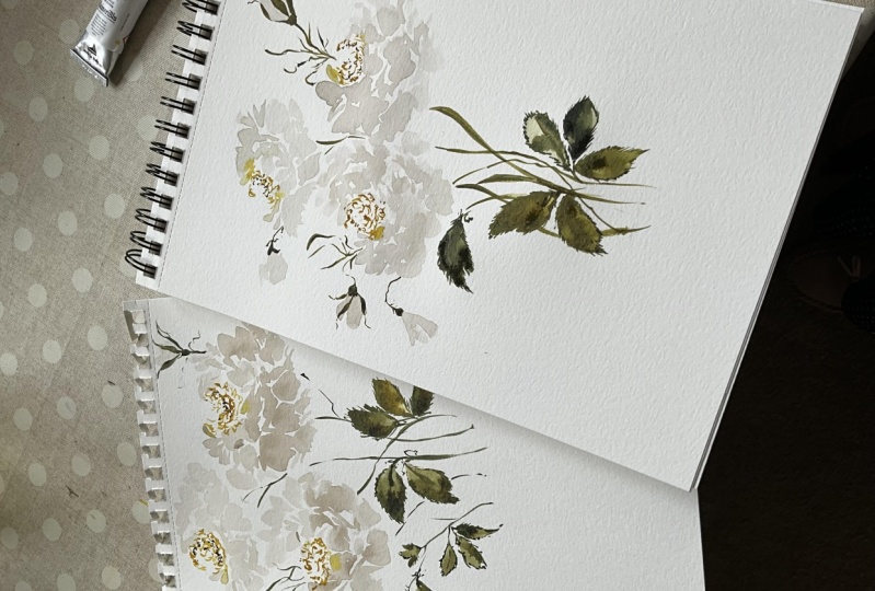
8. Painting White Roses: It is officially that time
to clear off your palate, gets yourself a fresh cup of water and rinse your
brush thoroughly. We're going to be
dipping our toes into white watercolor and these
next series of videos. So I want to make sure
you have no pinks browns, or actually we're going
to be using some browns, but none of the Grape
tones on your palette. Because we're really going to create some beautiful
white tones here. I want to give you
lots of options. So you can see what you're basically capable of using
a variety of supplies. So this is again, our Canson watercolor paper. That to the side here. This is the smooth ER
side that I'm using. You're welcome to flip
it over if you would prefer to use the
more textured side. And we'll begin. Actually, let me bring you
back here just so you can see what will be
putting on her palette. We're gonna be using
the Burnt umber. So go ahead and just do a
little DOB onto the side here. Next we're going be
using Carbon Black. This is from our Maimeri Blu. Give yourself a little
bit of room there. Then also little bit
of our Chinese White. Alright, so making sure that your brush is nice
and clean here. We will. Getting a little bit of water. We're going to start with a Carbon Black and
Sophia mixture. Bring you in a little
bit closer so you can see really rich,
beautiful brown here. Just a tiny bit. You don't need a whole lot. Again, same thing with
our Carbon Black. Nice little pile here. And then we're going to bring
it out one step further, diluted again to create a
really soft wash of color. Again, adding water
until it's very pale, going to add just a
touch more black to it. Diluting that one more time. Until we have something that
looks just about like that. The paper background like this. And we're gonna
begin by envisioning that there is a small center here and there will be
working our way out. White watercolor is one of my absolute favorite,
favorites to use. It's such a beautiful color
to enhance a composition, to give it lightness, to give it that soft,
elegant, regal feel. When we come together for our final project will
be using a variety of colors and you'll see how a white nestled up
against the apricot, that wind mulberry
color we used. And the beginning really just benefits the overall
composition. You can see if you're
looking at my nails here, that the white that
we're gonna be using is a far stretch from the white that will
appear here on paper. However, the white paper is
what we're going to see, sort of pulled the, It's going to be
prominent because the watercolor is
translucent and will be able to see that
white paper shine through, which will give it more
of a white appearance. Again, envisioning that
we have our center here. Begin to make our petals. Looking for that mid spot. Again, just working
my way around Using the side of the
brush and marks to serve. Going to create a really
nice larger pedal here. And one right here. To really give some
beautiful depth and structure to that Rose. Okay, So before we add
the center to that, I'm going to show you a different mixture of
white that you can use. And we'll use that within
the same composition. Again, pulling on our
palette here and let's use this touch of Chinese White, which again is going to
give it a gouache texture. We're going to add that
to our palette here. Again, mixing it thoroughly. Toy, have something that's
quite a bit lighter. And what we originally had. Now normally I will not use white watercolor
to create white. It dries pale enough that
I'm happy and satisfied. But lately I've been
using a bit of this in my professional work and
I'm liking the results, so I wanted to share
that with you. Okay, So we're gonna do rose right over here off to the side. Something like this. I like to play with the
posture of the roses. This is gonna be a little bit bigger than what
we're doing just because the size of the
paper I'm accommodating. But again, we're going to
fill in those leaves soon. So we're just kinda looking at all the different ways
we can play with it. Something right around there. Just put that right
after the side. And we're gonna do
the same thing. Starting with our
generous puddle here. Adding just a touch more water. Then beginning to close. Just a bit. On that rose. Using this side of the brush
to give some gestural marks. And then I'll begin to
close off the rose. Taking the brush, scrubbing
it against the side here, leaving enough whitespace
so that you can see there's definitely a separation
between these two roses, but not so much that
they feel as though they're disjointed
or disconnected. You can see we have
a tone that's just slightly lighter than
what we have here. We're gonna go one step
further and diluted again to a very
light consistency, very, very light adding water. And so we have something
extremely pale. And we're going to flower
right on top here. Really taking my time to
work the Watercolor around, making sure it's the
correct consistency. You could even do
a practice swatch just to make sure that there is a distinct color between are a distinct difference
between these colors. I think many of you are
really going to have FUN with the difference in tonal value here and make a beautiful cluster of white flowers using all three
of these different whites. Then I'm going to close it
off just a little bit here. So that when we add our center, it'll be a nice
defining difference between what is flower and what is Center. Okay? So you can see an, as
they try things are going to shift just a bit as well. But you gotta, you can
already tell we have the darkest version
here and then moving up in this direction. So let's go ahead and
put a little bit of our role in on the palette. And then using our
number six round, we're going to change
up the center of our flower color just a little bit to something
a little bit more muted. I want you to add a touch
of that Burnt umber to it. We have something that's a
little bit more of a Gold, yellow and not so
Crayola yellow. Again, giving you options is my overall goal of this class. Really want you to see that there's so much potential
with watercolor just by changing up little
details along the way. Okay, so again, let's start down here where things
are just a slightly drier. And we're going to
use the toothbrush. Remember you're not
completely up and down. You're off to the
side a little bit, sit back on that brush, loosen up your grip
and graze the paper. Beginning to do that
playful center of the rose. The entire center does
not have to be filled in. You can leave large
areas of white. It's completely up to you. Small lines and dots. Do the same. Religious grazing. The Paper vary ever so gently. To the top flower where
things are mostly dry. Picking up a bit more
paint on my palette, and then adding things
in while it's still wet, which you'll see again. It's another beautiful option. Can wait till things
are dry, on dry. Or while the flower
is still wet. You can add in that yellow for some really lovely
watercolor effect. Habit. Really beautiful
white watercolor with a touch of a
muted Gold Center
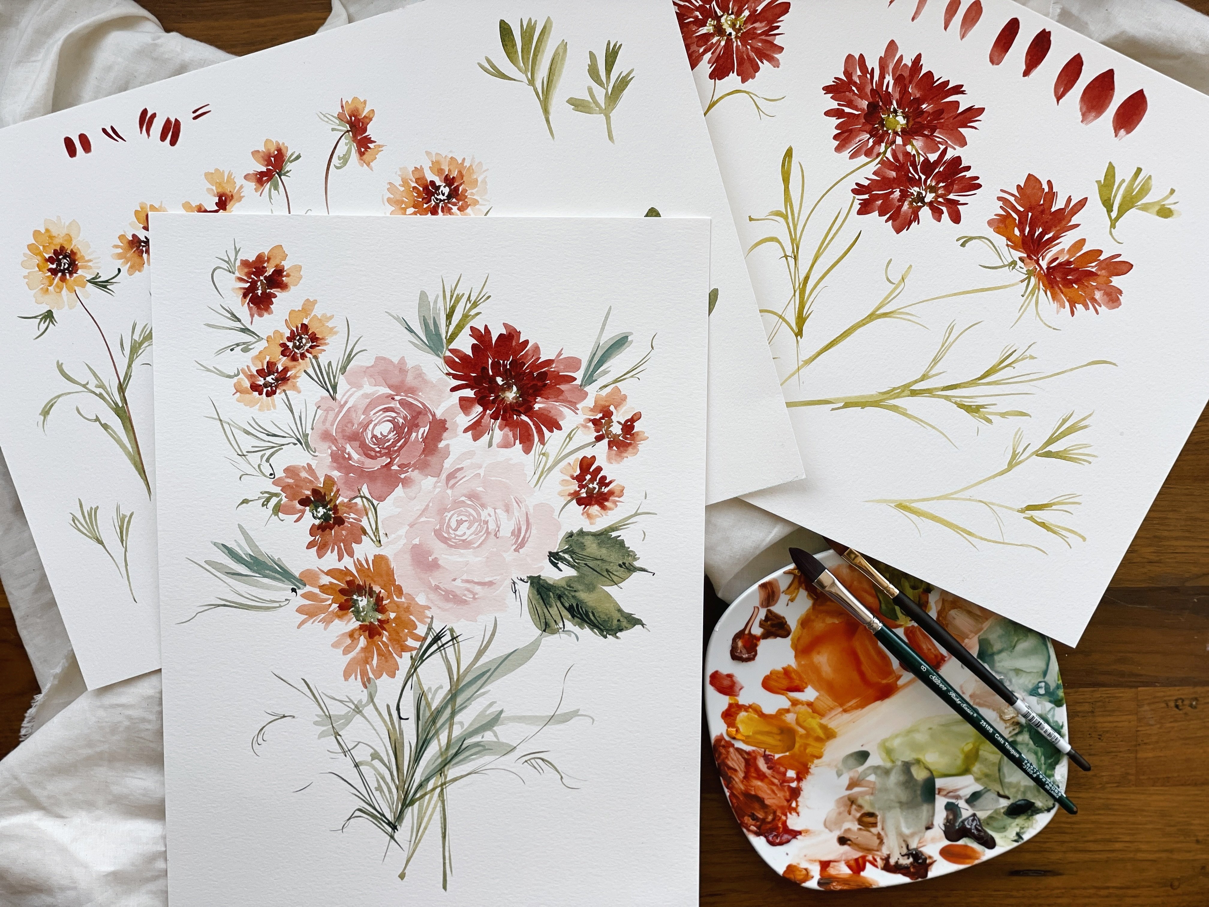
9. Expressive Leaves: So I pulled out two new colors for this next section as we work on leaf structures
is my tried and true. Daniel Smith, Undersea Green and then I also have
Rich Green Gold. These two are powerhouses and the watercolor world and
my most favorite colors. And I like to use them on their own within a
single composition and then also blend
them together with the addition
of a Burnt umber, which is also on our
palette already. You'll see we already
have all of those colors, so sure you have a nice little
dab off to the side here. We're also switching it up. I know I keep switching
things on you. Hopefully that doesn't
feel overwhelming, but just exciting as we keep playing with
different surfaces. So this is our legion 140
pound cold press paper. So we're going to practice
leaf structure here together before we pull it altogether on our white bouquet that we just did momentarily. And then again, when we come back together for our
final class project, Let's go ahead and I'm going to show you a couple
of different options. We're going to use
our filbert brush. First, I'm gonna pull
out a little bit of Rich Green Gold and the Undersea Green and create a really beautiful
Rich Green I'm giving you. I'm really ringing you into
my world here because this is such a special color for me. It's prominent and
a lot of my work and don't see a lot
of this combination. Okay? So there's a couple of
different ways we can approach these rose leaves. I'm going to bring
over rose right now. Just so you can kinda
see what we have here. There's these really
lovely ridges on the edges of the leaves here. So we're going to play
with that structure and then we'll also going
to just loosen it up to, but you have this
three-pronged leaf here that will play with. And then we also just
have these simple sort of almond shaped leaves
with the ridges. So let's go ahead and just leave this little
guy right there. Let's start with
the most simple. Let's create an
almond shaped leaf, but let's go ahead
and load this brush, put it off to the side. And any of you who've taken my class note that this
is my favorite technique. This saves me the stress
of having to be concerned about mixing up my watercolor or having it ready while
things are still wet. Being, especially
with a paper that has more texture to
it, like a legion. You want to make sure you
are moving quickly enough. If you are wanting to
achieve wet into wet, that you don't have
to pause, stop, blot rents mix because all that takes time and then what happens is things
have dried and, um, that affect you
were trying to achieve. You've missed the window for it. So I'm take your
number six brush, load that brush as well, be sure to mix because that Undersea Green really
likes to separate. Then you're going to set that
brush just off to the side. We'll come back to
that in a moment. Alright, so let's start with
our almond shaped leaf here. So we're just going
to do simple stroke. Simple stroke. Let's do that. But let's change the
direction a little bit. On stroke, picking up
a little more water. And then let's go
ahead and do one. Facing this way. A little bit bigger,
stroke and stroke. Now let's pick up our round
brush that's already loaded, but you might want to
just kinda reacquainted. And let's begin adding those lovely ridges to the side here. Just grazing the page. And let's do the same over here. A little bit of a tip as well. And again, expanding
that leaf with little. You can see these greens are just so lux together,
just absolutely stunning. And you can add more color
into the center if you like. This one's already quite dark, but you could add a little
bit more color there. Run your toe of your brush
through the center here. So again, that's
just that Ullman shape that we're working with. And then taking the edge of that round brush and
roughing up the sides. It's a very simple, very, very simple and
straightforward process, but it does take time to figure out how it
all times together. So take a moment. If you practice with a
whole page and religious, get a sense of this before you come back to our final project. So we're going to do that again just to have another look at it. And then I'm also
going to show you just these colors
on their own so we can see the
difference between them. And then we'll do some
complicated leaves as well just to kinda get memorial
gestural field Alright, so let's
go ahead and pick up a little bit of
the Rich Green Gold, little bit of the Burnt Umber. Really take a
moment to mix that. Then we'll add a touch
of Undersea Green. And we're gonna do
the same thing, but we're just gonna
do a different shape. We're going to start
with our line. Nice and long thick, plot a little bit more water
and then we're going to add what we see right here. And then just moving
that a little bit long, curving that a little more. And then taking our
brush into that mixture. While things are
still nice and wet, roughing up the edges. To create a really lovely. We actually have some
really playful edging and ruffling down here. Then I'm going to
take the brush, just sort of play with it here so that we have something
that's similar in nature. So you'll see we have the
two different colors. Both are really beautiful. They can be used in conjunction because they're complimentary. You can even take a
little bit of green, pop that in there. Alright, then I move
this off to the side. The same thing over here, store a nice wide stroke. Going to use a
little bit, slightly less paint just to get
something a little lighter. Let's do the same thing. Now we have something
that's a little lighter. Again, popping my brush
into that mixture. Now we have a little bit more
of a bleed capability here. Adding those nice
little rough edges. Then let's do this
playful little leaf that I see right up here. We have this three-pronged shape coming straight out of the stem. Let's pop back into
our Undersea Green, Rich Green Gold
broth consistency. And let's start with one stroke. Two strokes, three strokes. Let's pop into our color here. And begin. Careful not to smudge
if you have what media. And just begin to rough up
the sides of that leaf. We have some really playful
little lines happening there. Draw those out,
beautiful gestural. And then if we were
to pull that leaf in, we have something that's
sort of looks like this. Then we can imagine that there's a rose coming
right through here. So again, envisioning
what you have in mind is so important as you're
planning out a composition, It's a lot to keep in your
mind and think about. But the more you're
able to do that, the easier the process
will be when it comes time to actually
put it on paper. So always be thinking about
directions, size, and shape. We have three leaves here
that all are very similar, but they're distinct
and their own right using a variety of colors. So you can see here the
legion paper is just, it's so beautiful and using a lex less texturize Size side in case I did not
mention that before. It's smoother than
the other side, but it's still quite texturize out of all the papers
that we're using. So again, really
beautiful leaves here. Hopefully I've given you
enough to now go forward, take a whole page
and really just relish that leaf structure and playing with different sizes and shapes and colors
and consistencies
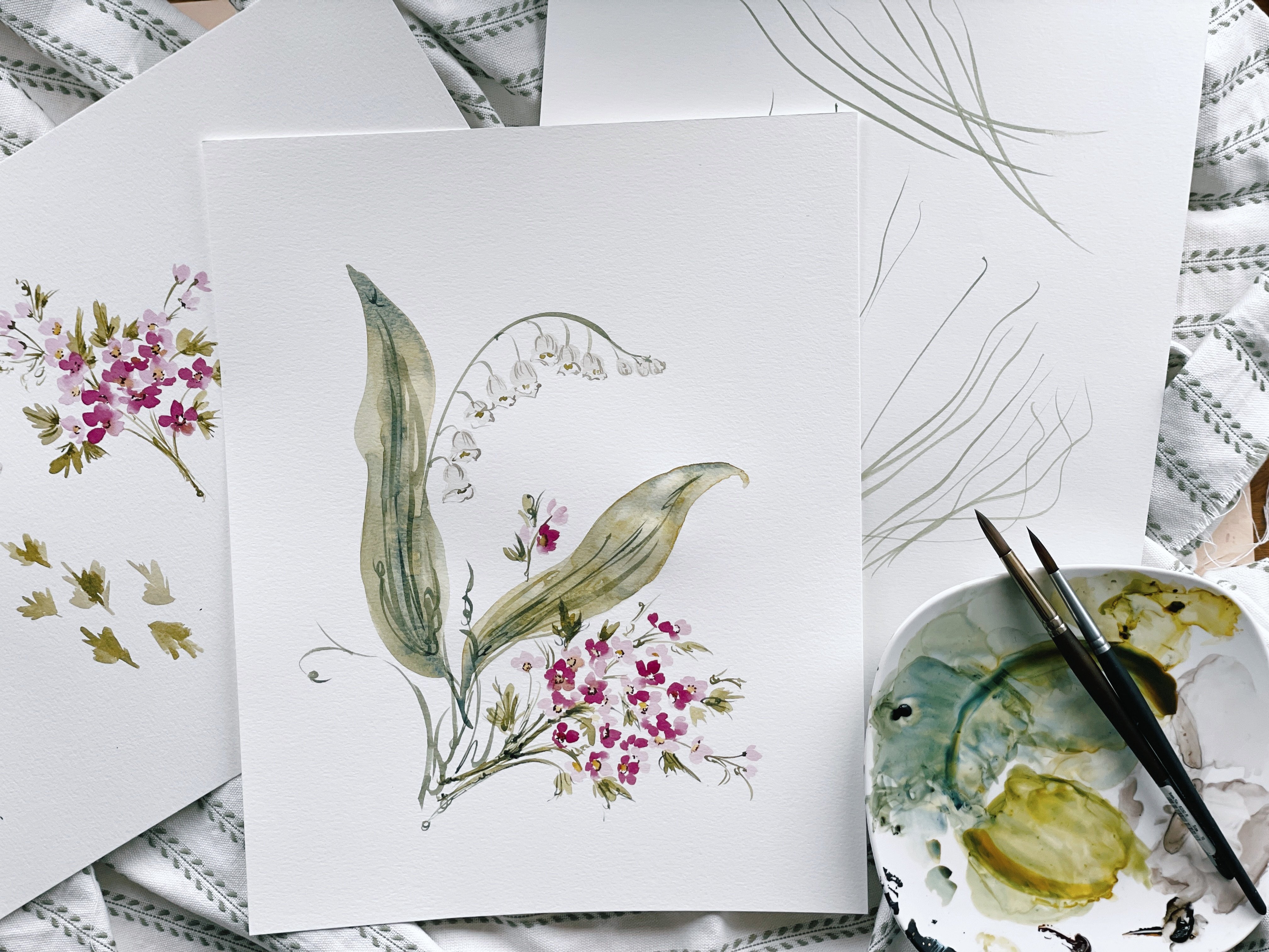
10. Creating Rose Buds: You'll see we have
a lovely little bud off to the side here. This is awesome
for my garden and such a beautiful way to add some delicacy and also some
structure to a composition. So again, while I'm working, if I am using a live study, I love to just play
with the arrangement, moving the butter round to see, okay, what are my options here? As I turn things
here to the side. And you can see we have
some really beautiful areas in which to add some buds. So we're gonna do that. We'll be adding the leaves,
like I said shortly. And we'll pull it
all together in a, a final project
where we're using apricots and the
mulberry and the white and buds and leaves altogether to create
something really beautiful. But for now we're going to
study our Buds structure. Just having a look at this, a very tightly closed bud, I'm going to show you a
couple of different options. We'll do a little wet into
wet and also dry on dry, just so you can see what the different effect would
be using each technique. So I'm gonna put this, I
don't have to the side here. We're going to continue
with our whites. So again, you may use
whatever mixture you like. If you want to use your most
pale with the Chinese White, you can do that if you liked little bit of a darker version, you can do that as well. You may also just want to
play with the color depending on what's happening
on your page. So see, you know, your pale Flowers up here. You may want to
add pale Buds over here as though these
two are connected. So again, completely up to you. I'm just going to freshen
up my paint here. I am going to use
the Chinese White with this Burnt umber
and Carbon Black. And I'm going to mix that. Show you here to a nice
broth consistency. Now for this bud,
I'm going to do a really tight closed bud here. And it's very simple. I try not to get too
complicated here. Even though I cannot take
a poll in this class, I wonder how many of
you have tried to paint any flower in particular, but especially buds. Because they are so
intricate structure, it can be really overwhelming. Trying to capture
that beauty on paper. We really have to pull back and see it as though
we're looking through a blurry window and just kinda get the overall
sense of the shapes. We have something that's
almost like a Hershey Kiss. If you've taken my classes, you know that I love
to compare what I see to everyday
objects or foods. It just makes it a lot
easier for us to understand and to say into
grasp that concept. So we have something that's almost shaped
like a Hershey Kiss. So you can kinda think about that shape as you're working. Then we have these very, almost like these
triangles have been stretched out to come up over the tip of
the petals here. And then we have this
bottom structure here, which is sort of like
an upside down bell. So we're going to utilize all
those different components, but we're gonna do so in a way that is not stiff,
that's not overworking. And really just focus on the overall structure and
less petal for petal, exactly what we see coming
up to right about. Here. I'm gonna begin one stroke and then connecting
with a second. And it's a very
simple two-stroke. However, again, I always want
to emphasize here that what looks easy from someone
doing it professionally, especially somebody who's had hours and hours of
practice of this, is preparing this class. Please don't get frustrated
if it doesn't come out exactly the way that
it looks on my end, what you bring to your process is part of
what makes you unique. And that's something to really celebrate and to not
be discouraged by. I'm just going to leave it
just like that for that. But in particular, we're going to create a little bit more
on our left side here, imagining that are buds
are opening slightly. I'm also going to point
this bud downwards. That's another thing I really
want to emphasize as well, that a positioning
your florals in multiple different directions
is really going to aid and benefit to the
overall composition. If every single flower
is facing the same way. If every Flowers the same
tonal value and the same size, you're really going to have a painting that
feels one-dimensional. But by changing up the
size and by changing up the direction of each flower, you really, you add so much
depth to your painting. Again, our Hershey Kiss. But I'm also going to create another mark right here off to the side so that it's slightly more open
than what we have here. I'm gonna do the same thing. Coming down, opening up
just a little bit there. Then I'm going to create
one stroke along the side. And then one more
right over here. Now we have a variety
of shapes and sizes. And we're gonna be adding
the stems and the Leaves to, to this painting,
bringing it altogether
11. Adding Stems and leaves: Okay, so here we
are returning to our little white
composition that we had previously painted. We're going to be adding the
stems and the leaves here before we wrap up the, the exploration part of our class and then move
into the full project. So let's go ahead and
refresh our greens. If you haven't already. A little bit of the Daniel
Smith and the Rich Green Gold. Sure you have enough to support all the leaves and mix that. Well. Let's go ahead and
start with the Stems. Know stems. I have to just again
emphasize here, they're much easier painted than they are actually achieved, which doesn't make any sense. But what I mean to say is that it looks a lot easier
watching someone do it than it is to actually
do it because it is a whole moving through the process from head
to heart to hand, to brush to paper. So this is something
that you might also want to study and play with on a separate piece of paper so that you
feel confident and comfortable getting
the right flow. So as we were talking
about before, we had this very
tight rose here. And we're going to be achieving something that's very
similar to this. By coming up here at
the top of the rose, very tippy toe of the brush. So make sure that you
are not dripping here, but you have enough
paint on your brush. And we're going to
come up right here at the top to create that
Fine little mark. Then we're going to pull
that down right about there. And then we're going to
stop right there and create a little
curve mark to serve as our upside down bell shape. Then we're gonna do the
same thing right here. Coming up over the side and bring that stroke down
does not have to be exact. There's a little mark
over on this side, but I'm going to change
the posture of that a bit. Pull that through, and then
do the same thing over here. Just grazing the side of that rose that I'm going to pull
the stem all the way through. Put that off to the side. We worked through the remainder. Same thing over here. And pulling that stem
all the way through. And just sort of playing
here with the base of that been doing the same thing here. My paper just a bit, get a better angle and pulling that stem
all the way through. One more time here. No. This is the
point where I like to really play with the forum. And so I'll take my brush
and let's just begin to add some really lovely
lines through here, just to kinda rough
things up a bit. So this is just this
structure once more. But using it over here to add
just complimentary stems. If it's feeling to
space, spaced out to me, I'll use that to fill in the space to just give
it a really nice flow. Same thing over here. Just filling in the space. To show that this is
a nice full bouquet. We don't want something
that feels so separated as to be disjointed. Once I have a couple
of those plugged in, then I like to, okay, let's start connecting things. You're going to bring
that stem all the way through medium pressure. Way down to the
bottom of the page. Same thing, touching this stem. Imagining it positioned
somewhere right around here. And bring that down. Having uneven Stems
is really lovely. Try not to line up all
your Stems exactly. And again, we're imagining something's happening
right around there. Let's plug in some leaves. Again using our
reference from before Let's take our round brush
and begin rough up the sides. You can see we're using
Canson paper here. So the results are gonna
be a little bit different. Catching a stem here, bringing it all back to base. And then using that side of the brush to rough up the edges. Let's do the same thing
on the other side. Let's do a nice big leaf
and let's curve that leaf. Let's connect the stem here. Remember those really
beautiful gestural markings that have happened
along the stem. Let's plug in a couple of those. Really loose, just
allowing your wrist is sort of move across the paper. And we can begin to roughen
up the sides of that leaf. Really playing
with posture here. And feeling as though this could benefit from another leaf. I'm gonna do the same thing. Adding a touch more of the Undersea Green to get a different feel,
different color combination. Using the side of the brush. Connecting, not here. Not everything has
to be connected. Also. Don't want you to feel as though everything needs
to line up, tear. We do have a floating stem that is not connected
all the way down. So look within your composition, see if things are just
feeling like they could benefit from a few
more additives. For example, there's a
lot of Buds over here, but there's only three stems. So what you could do
is take your brush and just sort of in
the same direction. Indicate that there's
more happening here. Same here. Taking that
following all the way through, There's a nice thick
bud happening there. I know necessarily, I wouldn't say that
this piece is done, but it's done enough so that I feel as though it encompasses everything that I'm
striving for within a piece of trying to get
the full view for you here. So I would probably at this
point just take a step back and figure out
where I want things. You may be a little bit fuller where I want things lined up, but I love where
it is in the page. I'm not running up
against the edges here. There's enough of a perimeter along the top and the bottom, which is something that I
always aim for when painting. And it feels, it
feels good and right. You could always add some
more of these elements. These the closing off
of the bud over here, just to play with it. I totally invite you to do that. By the way, just really
take your time to to enjoy that process and not
feel like it has to look exactly like what
I have in front of you. On the other thing that
you could possibly do is this is just
an extra add-on. You could take your round brush, dip into your Burnt Umber. You could add few more details to the center of
your roses here. So you're just taking the
brush and just adding a few little seeds and
dotting this and flex. Just bring the eye. You can kinda see before
things are sort of, they're blending in their
soft as the leaves are really the focal point of this
point, the painting. To change that you can bring
in some darker elements to break up or the eyes are leading and I
wouldn't overdo it here. I would just do it
slightly and loose. You don't even have to
do it to every flower. You could just do it
in certain areas. Really artists liberty here. I tried to give you the tools
and techniques and then let you really run with
the approach here. So again, feel free to play
with this Structure and this technique and approach and figure out what
feels most like you. So this will be the wrapping up of our study and
exploration segments, and then we'll move onto a beautiful class
project together. So please, after you've had some time practicing stems and leaves and just
adding details, join me for a beautiful project.
12. Class Project Part 1: We are ready to move forward
with our class project. We're gonna be working with our arches hot press
paper or at least in, if you prefer, one of
the other papers we use, the Canson or the legion or even a different brands are more than welcome to use that. But didn't want to let
you know that this is what I will be using. I also am going to
have two pallets setup and I do recommend this as well, one for your whites and your greens and have a
little separation there. Then one for your pinks
and apricot color. Because we're gonna be using
all of the colors that we, we explored while we were in a study portion of
our time together. So I want to be able to
bring all of that together. And you're going to
need room to mix. So make sure you have
ample room to do so. Make sure your water
glass is refilled with freshwater and you have
rinse your brushes as well. And that's your space
is cleared off. You have enough arm room. You're not hungry.
All of a thing. Let's make sure you're as
comfortable as possible as we just move forward and create something
beautiful together. So I'm very excited, I've prepared all my palettes, have a little bit of
that Grape Powder. I have the Rose Lake, and then I also have
the role in yellow, the Rich Green, Gold, Undersea Green, Burnt Umber, Carbon Black, and Chinese White. So I have a little bit of
everything on my palette. We'll be using most of it, if not all of it, as we create and
just want you to have everything ready
and at your disposal. Let's go ahead and
begin by mixing. I'm going to do that port that part off camera just
because it takes a little while and I want
to just launch right into this and we've covered
it multiple times. So I'll show you
the final result after I have things mixed. But I'm gonna let
you do that since we've already talked in depth about ratios and
consistency of color. Okay, so I have this beautiful
mulberry color here, the combination of the Rose
Lake and that Grape Powder. And then you can add a touch of the Burnt
umber to it if you want. I'm going to opt
not to just to have a different result than
what we had before. So I'm like I said, which with each video I'm trying to
do something different so that you'll see step-by-step how things changed
as we progressed. So this is the color and
then we can draw it out one step further to create
a lighter mixture of it. So if you want to create petals
that are lighter towards the center and then darker
or even to all one color, and then head back in to the
pedal while things are wet. With the cough
syrup consistency, which is what I plan to do, you'll see that that will create a beautiful
bleed effect as well. So just make sure that you have a nice cough syrup consistency. Then we're just going
to gradually work our way around the palate
to create different colors. The next step will be creating that lovely apricot
that we created before. And then moving into the whites. And then we'll fill
in the centers. And then we'll do Stems and
Leaves to wrap things up. I'm going to move rapidly, but a little bit
quicker than I did when we were practicing
and studying formation. Just so that you can kinda
get a sense of flow. A lot of people love to watch the class project
even before they are painting with me just to get a sense
of the whole piece, has it as it goes together
and flows as a composition. Alright, so really
rotating my brush here and I'm going to dip into my broth consistency
with composition. Because we're working
here with a nine by 12. I don't have a
whole lot of room. I tend to work 10-by-12 and up. So I'm really going to have
to be mindful of how I position things and
the size of things. So I'm going to begin with
a large climbing rose here. And then I'm gonna be
doing to smaller roses. And then we'll do our buds and the upper left-hand corner. We want to stay
mindful that we're not coming up too
close to these edges. Here are the top or the bottom, or things are going to
start to look crowded. So let's deviate off
to the side here. We're going to deviate
slightly to the left and begin by imagining we have about a quarter size
Center here in the middle, starting with those
smaller petals. Looking for that
space in-between. Blotting off just a little bit. Continuing to work my
way around the flower And then I'm going to curve the brush back towards
the center here. And again, a large puddle
in this direction. I'm liking the shape
of things so far, making sure I have enough room to continue working around. At this point, I would stop. I'm going to pick
up my round brush. I'm going to head into my cough syrup consistency and add a little bit
of color right here. As things began to touch. For some beautiful bleeds. Closing things off
just a little bit. Roughing things
up, just a smudge, kinda upping our game here. This is a next level
climbing rose, putting it all together
for the whole feel. Okay, so I like the size
that I liked, the shape. I do think that it can benefit
from one more petal just to make it distinct from The next two flowers
that I have in mind. So I am going to do that. Going to add a petal right here, a nice big one. I'm going to take my brush. Not alongside here. Going to add one
more right here. Pulling that altogether. And I feel very satisfied
with the shape and the size with one
small modification. Going to round that off a
little bit. Here we go. Okay, I'm ready to
make my apricot color, so I'm going to use
that same pink. But this time I'm going to
add a little bit of that, a role in yellow to it. Until I have something that
feels nice and Peachy. Continuing to mix and rotate
those bristles thoroughly. This rose is going to be
significantly smaller. In order to give a bit more
interests to the composition. I'm gonna do it
right on top here. Starting with those base petals, just to sort of go
around things in. And then coming up
towards the center. Adding a bit more
water to my mixture. Connecting so that things aren't feeling too disconnected. And feeling pretty
good about this. Close it off just a little bit. Remember those markets
serve as Petals? All right, so I like
where this is at as well. I'm going to do one more
small rose right over here. I'm going to turn the
paper just slightly. This one's gonna be
on its side like we practiced in our
very early videos, where you will not
see any Center. It's just moving things up. Making connections
between the petals. Lightening my
consistency just a bit. To create some
software petals here. Again, playing with
size and positioning. Here I have flower
that's coming. I have a flower that's
coming down just slightly lower than this one, roughing up that edge. And then I have a large
one and then a smaller. So again, being able
to play with size and shape and positioning
really as a benefit. And are you want to
nestle that flower up against the other? Alright, so next we will
move into our white. So go ahead and rinse
your brush thoroughly. You may even need to
change your water. I have an extra right here, so I'm not going to need to
actually stop and do that.
13. Class Project Part 2: To prepare my whites, make sure they're ready. And add a little bit
of that Chinese White. And there we go, drawing it out just a little bit further. And we're going to place a smaller rose right
here at an angle. Again, we're working
with the shape of the paper or being mindful of the size of each element and the direction
of each element, we want things moving in
all sorts of directions to give that feel
of life and breath. Let's go ahead and we're
gonna do a nice big petal here to show that this
is a closed rose. And begin to close
that off up top. Gonna do the same
thing. On this side. Turning our paper just a
bit to get a better angle. This one will be open, so we're going to leave
a nice open space here. Closing it off on the bottom. Being mindful not to run up
to close to your edge here. Back to my rose over
here and just going to add some finer elements, excuse me, some finer components
facets to this petal. Just to give it a
bit more interest. Sometimes it feels like over
complicating the flower. And so I'd rather do too little at first and then be able to
come back and say, okay, it needs a
little bit more drama, a little more intrigue
than overwork it initially and not be able
to undo because watercolor, as we all know, is a
very unforgiving medium. Once you've laid
down your stroke, you are done. Okay? So again, I'm
liking the size and the positioning of each element
and feeling really good. We are going to do some buds. So let's go ahead
and move towards the upper left-hand corner. I'm going to start with my pink. And we want this bud sort
of coming up and down. So we're going to angle or paper just a little bit to be able to accommodate that structure. Remember, we're doing
like our Hershey Kiss, one stroke, two-stroke. Then I'm going to blot
off just a little bit, dip into that apricot mixture. I'm gonna do the same thing,
but slightly further. I'm second-guessing myself. Sometimes I need to stand back, look at what room I have
available and decide, okay. Where do I want? Because I'm I'm
already thinking ahead to I need room for
leaves over here, so I think I'm going
to change that. And I'm going to start coming
up towards the middle here, 112.1 to keep it open
just a little bit. Mixing my pink and my
apricot together to get a marriage between
those two colors. And deciding one
more right here, allowing them to touch. And one more to the side here. Making sure to leave some breaths and flow
within the composition, making sure the levels
of each portion, you feel symmetrical and
balanced, but not identical. I'm going to pick up
my round brush. Just Sharpen that up just a tiny bit. Now I'm gonna begin to
mix migraines again, you may need to rinse
your brush thoroughly, even change your water. As you begin to prepare
your green mixture, which consists of the
Daniel Smith Undersea Green and the Rich Green Gold. I'm loading up my
round brush as well. And I'm gonna begin to plug in those leaves using that
all men structured. Starting down here. And another, turning my paper just so slightly. And then using my brush, my round brush to
rough up those edges. Working wet into wet here to
get those beautiful bleeds. And turning my paper
upside down now to get a really nice angle and a
dip into my Undersea Green. A little bit more. Bread. Nice big leaf here. Turning it back and round. And plugging in those
lovely Loose ruffles. Running my brush through
the middle of that leaf. Can do that while
things are still wet, or you can wait until
they're dry to add a vein. Now let's begin to plug in our Stems and making
our connections here, just like we did before. Working with things while
there's still just a tad wet. You can wait until things
are fully dry if you like, and come back or even do
a little bit of both. Be careful where you're
placing your side of your hand and pulling those
stems all the way through. Repeating that step over here. And making your connection
all the way through. Taking opportunity to fill in that space there with
some gestural marks. And we're really starting to see how it's all
moving together. And now we'll start to make our connections with the stems. So we're looking at things, wanting to bring them and guide them down
towards the middle. Making our connections through
our roses and our buds. You can connect up
here or you can leave things sort of open and
free flow if you like. You can connect your leaves as well or leave them sort
of floating. Few like Next step is we're gonna be creating the centers
of our Flowers, bringing together
that Burnt umber and the yellow for
that muted Gold, which is really going to pair so beautifully with our roses here. So let's go ahead and stop. Start in the upper left-hand
corner, watching your poem. Begin with those beautiful
loose gestural swirls and lines moving
around as we create. You wanted to keep it loose. Try not to overthink
that Center. If you want, you can go back and kinda get a feel for how those they explode in a very playful every
direction sort of manners, you can just kinda
get a sense of that. But remember, sometimes
less is absolutely more. I'm going to leave this
one nice and open. At this point, what you could
do is wait for things to dry and then you can head back in with that Burnt
Umber if you like, or while wet, you can add a little bit
of that Burnt numbers. We haven't done that, so
let's go ahead and do that now so you can see
what that looks like. So I'm kinda coming up around the edge of
where things are wet but not really
flooding the paint. Again, just using the
tippy toe of the brush. And you can see it's
bringing a lot of interest into the painting, giving the eye even
more to look at. So at this point, this is what
I would put my brush down. I might allow things
to dry and then come back with fresh eyes and
decide, You know what? It's still needs a
little bit more work. It's not exactly where
he would have it as a professional put
it in my shop painting. But I feel good about
where it's at right now and I'm ready to step away. So I hope you enjoyed
working with this paper. This is my, like I said,
my professional paper. I use it with within all
of my commissions and just my own work that I create
for friends and family. I hope you enjoyed as well. We hadn't worked with
this in depth yet. So something new I hope
you feel is there'll be explored so many
different facets of, of, of watercolor and Supplies. And just feel like you're
ready to play now, I want to thank you
again for joining me for this class and for taking time to just be an
OT and inspired by nature. So happy creating to
you and please be sure to tag me on Instagram
when you post your work, I would love to see
and connect with you. So you have a great week and I will see you back
in class next time.
 Cara Rosalie Olsen, Floral Designer + Watercolor Instructor