Transcripts
1. Introduction -Watercolors Skyscapes: Hello and welcome to
my Skillshare class on painting skies scapes
using watercolors. I'm challenged to
pan am an artist and an art educator based
in Bangalore, India. You can check out my
work on Instagram. I go by the handle watercolor. In this class, we
will learn to paint six unique and beautiful sky scape paintings
using watercolors. I'll walk you through all
the art supplies required. And we have a small
practice session before we start the
class projects. The class projects
are painted with step-by-step instructions
in real time. So you can feel it easier
to paint along with me. So without any further delay, let's get started
with the class.
2. Art supplies: Before we begin, let
me walk you through the art supplies that I'll
be using in this class. Firstly, the paper that I'm
using is Saunders 300 GSM, a 100% cotton paper. It is cold press texture. However, you could go with any watercolor paper
that you already have. The cost. The class projects in this class does not involve
heavy or layering work. So it's okay to go with
lower GSM paper as well. Next, let me show you the
colors that I'm using. I have this palette where
I store all the colors. These are artists
grade watercolors. I'll be using all
the basics heat. And there is this palette which I use for mixing the colors. You would also need white
gouache paint mixed up. We have brushes. I have these many
brushes for the washes. I'll be using this mop brush. For the larger brushstrokes, I will be using size two, round brush by cell
wall by Albert. Then next is size eight. Brush again and Princeton
size six round brush. Then I would also be using a flat brush in one
of the paintings. I have a fine liner brush. This is a very
important brush for the tiny details and for cleaning the brushes
and for the washes, you would need two
jars of water. You would need or clipboard or any hard surface to
tape down the paper. Again, we need masking tape
to tape the paper right Here. I highly recommend you not to tape the paper directly onto the table because we would be performing some
tilting techniques. I'll be using a hairdryer to speed up the drying
time of the painting. That's all about
the art supplies.
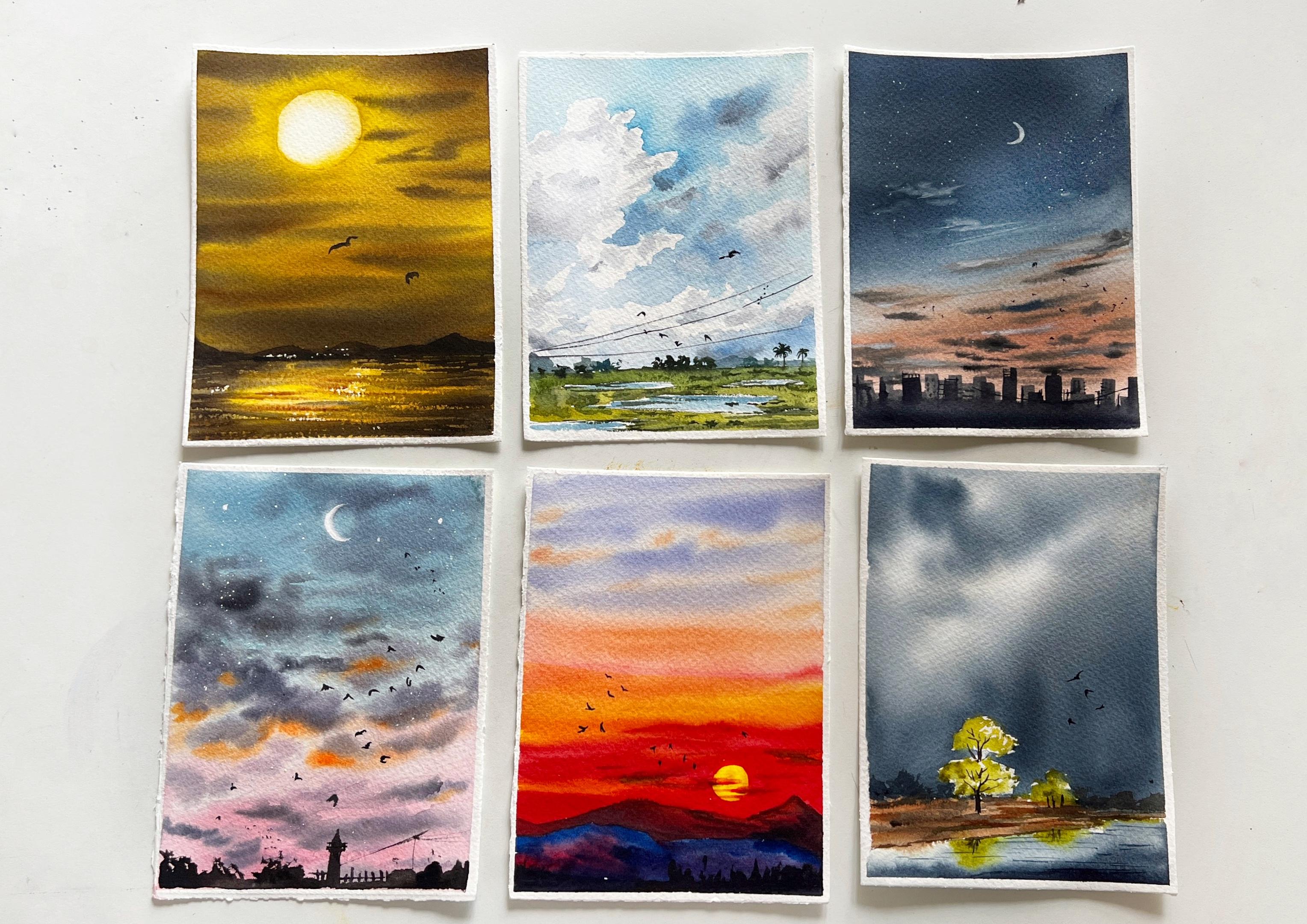
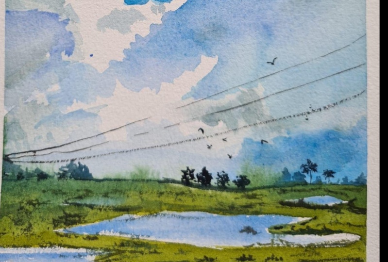
3. Project 1 - Dense Clouds Sky: In this chapter, we are going to learn to paint this
cloudy sky painting. So let us have a look at
the colors that would be required for the blue
part of the sky. You can use settled in blue, cobalt blue, or
ultramarine blue. The white clouds is
the color of the sky. And the shadows in the white clouds is
diluted. Payne's gray. For the ground area, I'll be using a yellowish
green and sap green along with some darker
colors, Payne's gray. And I'll also be using burnt umber to make
so with the trees. So let me explain the
composition of the painting. On the right side we
have this clear sky, and on the left we
have this cloudy sky. In the ground area. We have this grassy land and some distant trees that
are water puddles. And there are some boards
and electric wires. So that's all about
the compensation. So before we dive into
the painting project, let us practice the sky. So here I'm taking the settle in blue and leaving the whitespace
for the dense cloud. Your own. We will be painting outside of the focal element. We have to leave the space
for the white areas. In acrylics and gosh, we tend to apply white paint. In watercolor. We will have to preserve the white
area of the paper. So you can use clear water. If we do not want sharp edges. For the shadows in this cloud, we will be using
diluted payne's gray. Okay, So that was one way of
painting the dense clouds. Now, if you want to go with an easier way than you
can use or dry tissue, paper, towel and dab
it onto the wet paint. This will lift the pains
creating or cloud-like shapes. Remember to perform this step while the paper is still wet. If it has dried, then it won't be able to live. The pains of the paper for the shadows will perform the same technique that
is applying gray color. Alright, let us get started. I'm going to tape my paper using an
half-inch masking tape. And as you can see, I have applied a
very thin border down all the sides neatly. Once you're done with
taping down the paper, just run your finger over the edges to make sure the
paper is tightly sealed. This will prevent the water from seeping inside while
we're painting. Alright, Now let us mark the basic composition
of the painting. So this is the horizon
line in the lower half. And I'm drawing these shapes depicting the water
paddles on the ground. That is pretty much it. Now let us move on to
the painting part. Let us start by painting
the clouds first. I'm using my size
12 round brush. And I've taken said Julian blue in medium consistency. Here. We'll go with negative
painting technique, which is painting outside
the focal element. So here, my aim is to create
this dense white cloud. I'm leaving that white space and painting outside that area. So you can see a nice dense
cloud has been formed. The shape of this dense cloud doesn't have to be
exactly same as mine. You can come up with
your own shape and size. As I move towards
the horizon area, I'm applying some
darker blue color, mixing cobalt blue and blue. So here I'm adding in
some thinner strokes in between defining the
overall shape of the cloud. The lower end of this dense cloud doesn't
have to be sharp and crisp. So I'm going to blend it with the background
using clear water. Adding in a mix of
cobalt blue and say Boolean blue on the
blue parts of the sky. This will create a sense
of variation in the sky. Next, I'm taking Payne's gray in a very diluted form and I'll be applying this
inside the white area. This will suggest a
sense of dimension. In this dense cloud. Do not completely
paint this white area. We want both white and
gray is inside this cloud. Next, let me create some more
clouds on the right side. So I have taken or tissue paper and I'm dabbing it
with some pressure. So this step is, is altered in a
cloud-like shape. Now, let us add some shadows and dimension using
diluted payne's gray. So we're applying
some diluted payne's gray and defining the
shape of this Cloud. Next, I'll be adding some darker shadows using
mid-tone know Payne's gray. This darker color, we'll add a deep sense of
dimension in the clouds. I'm adding this on the
blue areas as well. Okay, So we are
done with the sky. Now, let us move on to paint
the land or the grasses. So I ever using warm green tone, which is a yellowish green color and it is wet on dry technique, I'm painting outside the water
puddles that I have drawn. You have to leave white spaces. As I move towards
the horizon area, I'll apply slightly darker
and cooler green color. If you consider the
rule of perspective, the elements that are closer to the viewpoint appears
warmer in color. And the ones that are further
away from the viewpoint, that is towards the horizon, they appear slightly cooler. So here I have used a cooler green for the district
area towards the horizon. In the foreground, I
have used Walmart green. That is a reason for using two
different shades of green. Now, let us paint some tiny
trees in the distant area. To paint these tiny trees, I'm using my size
two round brush. You couldn't go with any
similar sized brush. It will help you
create nice details. I'm going to mix blue
with a tiny bit of brown to achieve what
are the blue color? Now with this blue shade, I'm going to paint some
hazy distant trees. Next, I'll take some
darker green color and add some dimension
on this grassy land. You can apply some
dots or lines. Next, let us paint
the water paddles. So here, the blue color in the water paddles is
because of the sky. That is the reflection
of the sky in the water. I'm slightly applying
this blue color and also leaving some
white spaces in-between. Now, using clear water, I'm going to smudge
the hard lines. Alright, now I'm going to try this area using a blow dryer. Okay, so the paper is dry. Now let us add some details on the water paddles and
on the ground area. I'm using this darker green
color mixed by using sap, green, brown, and Payne's gray. You just have to apply
some tiny lines and dots, creating some dimension
in the ground area. So these darker lines, they'll break the symmetry
and avoid appearing flat. I lose some shades of blue to add some more
elements in the background. This will suggest
a hazy appearance, like I said earlier here. So we are almost done. But before winding it up, let us add some boards. So this step is optional. You can add boards
or lay a few on to. There is no compulsion at all. I've added some tiny birds. I feel that boards
add a sense of life to the painting
you would find. But in almost all
of my paintings. Now, let us add some electric wires using the tip of the fine liner brush. Make sure your brush doesn't
have too much of paint. You will end up
with thicker lines. Now, I'm taking this
concentrated paint and applying some boundaries
for the water puddles. We are done with the painting. Let us remove the masking tape. There you go. This is the
final look of the painting. I hope you enjoyed painting this simple sky scape with me. Do share your projects
under the projects gallery. I would love to see
your recreations.
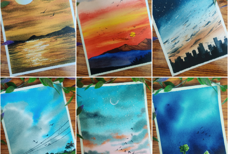
4. Project 2 - The pink Sky: Alright, let's talk about the colors required for
the second project. I'll be using acetylene
blue, cobalt blue, and a bit of burnt umber
for the blue color, that is the blue color. And for the lower
areas like this, pink, I'll be using rose madder. And for the darker clouds. I have Payne's gray here. I'll also be mixing violet and bolt-on book for some
of the darker clouds. And the orange highlights
is of course, orange color. For the silhouettes. I'll be using black. The moon will be painted
using white gouache paint. You could even use
a Jelly Roll pen or white watercolor
in it's thicker foam. Now, talking about the
composition of the painting, this is a very simple painting
with the crescent moon and some thicker
clouds in the sky. When an underlying
highlight, orange highlight. We have some silhouettes of
the trees and buildings. That's all about
the composition. Before we begin, let us practice the sky
in this painting. So for the blue area, I'll be mixing blue, cobalt blue plus a bit of burnt umber to achieve
this or the blue tone. I be applying this
on the upper area, then apply clear
water to dilute it. So the media area
should be very lighter, almost like transparent
white color. And then for the lower area, I will be applying diluted
tone of rows my door. You could even go with crimson
or any pink color blended. Well. You could lift some
paints using damp brush. Now, I'm going to add the
underlying orange highlight. Be doing this while the
paper is still wet. And once this is done, we will be adding
the darker clouds. So for this you can make, so why lid Payne's gray
and a bit of burnt umber. Or you could even use
only Payne's gray. That's also fine. Though clouds on the upper
area will be darker. And towards the horizon, that is the lower part, the clouds will be very thinner. The shape of the clouds need
not be exactly same as mine. You could come up with
your own brushstrokes. Okay, so let's get started
with the class project. Firstly, I'm going to
tape down the paper using my half inch masking tape. Once you have applied
the masking tape, just run your finger over the edges to make sure
it is tightly sealed. So this step prevent the paper from buckling
up while painting. Alright, so let us get
started with the painting. If you'll notice, I haven't done any sketching for this
particular painting. And I'm applying
water to the paper. This is the base for the
wet on wet technique. Make sure you have applied even coat of water
throughout the paper. So first, I'll take blue and mix a bit of
cobalt blue and it Also, I'm adding a
bit of burnt umber to make it a little d or
like a muted tone. Start applying this
color from the top part. And as I raised
towards the center, I'll dilute it down
with clear water. For the hues in the lower area. I'm going to make so Rose
my door and a yellow ocher. I'll be taking this
color in diluted tone. Even this color is a bit, or the rose color because we have added a
yellow ocher to this. And in the center, I'll be applying
diluted color again. Now, Let's take orange and apply some strokes
in the center area. So these are slightly
angular strokes. Next, I'll take boil it and
mix it with Payne's gray. I'm going to apply this
over the orange highlight. So I feel I need to mute
it down a little more. I'll add burnt umber
to the same color. I want a bit darker,
violet color. You can even go with
Payne's gray alone. That is also ok. So here I'm applying this
shade above the orange color. This will suggest some darker cloudy effect
with underlying highlight, which is the orange color. In the lower part, I'm applying some tiny
brush strokes because usually the clouds near the
horizon, they appear smaller. And in the upper
part of the sky, we will paint some
bigger sized Cloud. So here I'm rubbing the belly of the brush to create
these bigger strokes. These combinations of
bigger and smaller clouds adds a sense of perspective. The painting, which makes
it look very organic. In gender, if you absorb
the size of the clouds, they keep decreasing as it
moves towards the horizon. Your Cloud doesn't have to
be exactly same as mine. Just go with the flow and
paint whatever you like. But keep in mind the
size of the clouds. I'm adding some more orange
shade under the clouds. Okay, no, I'm going to
let this dry completely. Alright, the paper is now dry. So now let me add
another layer of clouds. So I'm going to first apply
water on some selected areas, like wherever I want, the clouds, I'll
apply water there. Now on this wet area, I'll apply some Payne's gray. This is another layer
of cloud in the sky. I'll repeat the same step again. That is applying water on this area and then adding
in the dark clouds. Now I'm going to do the same step in the
lower area as well. So on this wet surface, I'm applying some
tiny wispy clouds. So you can lift the
paint using damp brush. If you're not achieving
any desired shape. Right now, I'm going
to let the colors dry. Okay, so the veins
have tried moving on. Let us paint or a
moon in the sky. So I have white gouache paint. You can even go with
white watercolor as well. I'm going to paint
or crescent moon, and it is going to
be barely visible. Also splattering
some white paint suggesting the stars in the sky. Now let us paint some boards
freely flying in the sky. So I want to add some dimension to it
though, crescent moon. So I'll be adding
Payne's gray on the right side to
suggest the shadow part. All right. Let us remove the masking tape and
we're not done yet. I'm going to add
some silhouettes in the bottom part of
this sky scape. We'll be painting some trees
and some random element. You can paint whatever you want. I'm adding in some trees
and some building shapes. I'll also add some fans
using my fine liner brush. Adding in some electric wires. These tiny dots suggesting
the tree foliage. I'm adding some tiny dots
towards the horizon, suggesting some words
at the distant area. Alright, so we are done
with this painting. I hope you enjoyed
painting this with me. Do share your projects and
the projects gallery light. I'll see you in the
next chapter. Bye bye.
5. Project 3 - The Stormy Sky: Before we begin with
that third project, let us have a look at the
colors required for the sky. I'll be using indigo in
its different tonal value. And for the tree, I'll be using yellowish green. You could also use lemon
yellow and sap green. For the ground. I'm going to use burnt sienna
and burnt umber. And we would also
need Payne's gray to make a darker brown version. For the tree trunk, I'll be using black. Alternatively, you can use a mix of Payne's gray
and burnt umber as well. Now let us discuss the
composition of the painting. We have a stormy sky with this white area glowing
in the middle of the sky. And that is the reflection of
the sky in the lake water. And there is this piece of
land with some trees in it. Right? And that's about it. Now let us practice on this
guy and the Tree Yard. I'll first month the
shape of the tree. We are going to preserve
this while we paint the sky. So apply water outside
those sketched area. We are going to perform wet
on wet technique selectively. Now the paper is wet
outside the tree area. I'm going to take thicker indigo color and
apply it outside this area. Since the area inside
the tree is dry, so the colors are not
bleeding inside that part. So you can see because
of the flowing effect, we have created a nice
stormy effect in the sky. So once you're
done with the sky, then you can go ahead and paint the tree with actual painting. I'll be actually are waiting
for the sky too dry. But for now, I'll show it
on the wet surface itself. You can use a yellowish green
color to paint the trees. Alright, so let's
start the project by taping down the paper. So I'm applying very thin
border for the paper. So you can do it as
per your choice. Once you have them
DO paper down, just run your finger over the edges to make sure
it is tightly sealed. Now, with the help of a pencil, I'm going to quickly sketch
the basic composition. Draw a line in the lower
half of the paper, which will be depicted
as the horizon line. And then a mocking
the tree shapes. I'm adding another line, which will be the
boundary for the land. Above the horizon is the sky, and below this land
area is the water. Okay, So the sketching is done. Now let us move on to
the painting part. Here. I want to preserve the
white area for the tree. So I'll be painting
the sky around that. So to perform wet on wet, I'm going to apply water
around the tree area here. You can see I'm not applying any water inside the tree area. So I'm holding my paper
in a tilted position. This will enable the water to flow in the
opposite direction. Make sure you're applying
even coat of water. Next, I'll be using indigo in
with a thicker consistency. So I've loaded my brush with this indigo and as you can see, I have applied the paint
on the wet surface. Since I'm holding the paper
in a tilted position, though gravity is doing its job. You're, so you can
see the colors flowing in the
opposite direction. So here, I intend to leave
some white spaces in-between. Again, on the top, I'll apply some darker paint. I'm rotating the paper board
in different angle so that the colors flow in different directions
and we don't end up getting hairy texture. So it looks like I have achieved a nice stormy
appearance in the sky. It doesn't matter what
your sky looks like. I hope you have achieved a nice balance of
light and dark clouds. Alright, so next I'm
going to paint the land. So I'm mixing burnt
sienna, yellow ocher. This will give
yellowish brown color. Next time applying another
coat of darker brown color. On some areas. This will add a sense of depth and dimension
in the ground. Filling in the empty
spaces with blue color. Next, we will be
painting the water. So here I'll go with
wet on wet technique. So first I'll apply clear water. Then onto this wet surface, I'll be applying indigo. That is the color of the sky. The sky color is being
reflected onto the lake water. While this layer is still wet, I'm going to add
the reflection of the trees using the green color. The actual trees are
yet to be painted. But we will paint the reflection beforehand
because the paper is wet here and we want a nice soft and blurry
reflection of the trees. Next, I'll be
painting the trees. So I want to paint these trays in a yellowish green color because the
background is darker. And I want this to highlight. Now on the left side, I'm adding some darker shades to suggest the
shadows in the tree. Also adding the shadows
on the boundaries and also on the trees
in the reflection. The ground appears
slightly after drying. So I'm going to apply another
coat of burnt sienna. Not fully applying this color. I'm leaving some
background color as well. So next, I'm supposed to paint the tree trunks
and the branches, but I won't be able to do so
because of the wet paper. So what I'll do is
I'll just dry it using a blow dryer so
that when I paint. The tree trunks and the
branches on a dry surface. It appears very defined. The paper is dry now, I'm going to add in some drunk and some
branches on the trees. So as usual, I'm using a fine liner brush
for these tiny lines. And you can go with
any darker color. It could be darker
brown or black, payne's gray, any darker color? Next, when darker color, I'm going to define the
boundaries of the line. Using Payne's gray. I'm adding some
background elements. So if you notice, by adding these darker
background elements, we have naturally enhanced though EPI orange
of green trees. So it has created
a nice contrast between these three colors, brown, green, and
the darker blue. I'm also adding in some horizontal lines
on the ground area. Moving on. I'm adding some horizontal lines
in the lake water, suggesting a sense of
movement in the water. Okay, So we're almost done for you already know
what is coming next. It is the boards
in the painting. I love love to add boards. Okay, So it is done. Let us remove the masking
tape. There you go. This is the final
look of the painting. I hope you really enjoyed
painting this with me. If you have painted along, do share your class projects
under the projects gallery. I would really love to
see your recreations.
6. Project 4 - Evening Sky: Hey there. So this is
the fourth project. Let us discuss the
colors that we will use. For the skyline. Silhouette. I'll be using
black and Payne's gray. For the upper part of the sky. It is indigo. And for the lower
area it is red, orange, and white gouache paint. For the darker clouds. You could go with
Payne's gray or you can even make so
unique, darker color. So I'll be using a mix
of burnt umber, violet, and black with a bit of
white gouache paint as well. For the moon, I'll be
using white gouache paint. You could use any white
color you can help. Acrylic is also fine. Alright, so let us discuss the composition of the painting. This is an evening sky. Sun has already said. So we can see the orange
types in the sky. The upper part is
darker and we can see the stars and the crescent
moon shining bright. In the bottom area
towards the horizon, we have these
buildings silhouette. So yeah, that's about it. Okay, So let us go ahead
and practice the sky. Before we dive into
the class project. On the top area, I'm going to apply
concentrated indigo. You can go with any similar
color that you have. Then I'll be pulling the
colors using the clean water. So when we mix blue and orange, it will form a muddy shade. So I'm leaving this
white space in between. For the lower orange shade. I'm going to mix orange
or a bit of pink and gosh paint,
white gouache paint. Mix this color and apply
this mix on the bottom area. Once you have
applied this color, you can go ahead and
add some darker clouds. I'm mixing well-lit, burnt
umber and Payne's gray. In the lower area, we will apply tiny
strokes of clouds. I'll also apply some white
gouache paint for the clouds. Alright, let's get started. I'm taping down the masking
tape with a tiny border. Once you have came
down to tape this, run your finger over the edges
to make sure it is tightly sealed and it helps the paper to stay
intact while painting. Okay, so we're going to
start with sketching. I'll draw the horizon line in the lower part of the paper. And then we will have some
building silhouettes, which we will paint
later on at the end. So that is it with the
sketching, very simple. Now let us get to
the painting part. For this, I'll be using indigo
in a very thicker version, and I'll apply it
starting from the top. So here I am going with
wet on dry technique. Here, I keep my paper and tilted position and allow the
paint to flow down. It is wet on dry technique, so the colors are flowing
in a controlled manner. No, I live like clear water
to soften this hard edge. Next, I'm going to mix the
color for the lower part. So I'll take orange and
some white gouache paint, some wine, Gosh, and
mix it with orange. I'll apply this onto the
lower area near the horizon. Here, I'm trying to blend these two colors using a
damp brush and clear water. So when these two colors
get mixed together, it might give us
a brownish shade. We will try to avoid that. Now with single brushstroke, I'm applying some orange shade. Next. I'm trying to make
a brownish blue color. So I'll make so blue born Dumbo Payne's gray
and gouache paint. I'll keep doing it until
I find the light shade. If you are confused, then you can just go
with the Payne's gray. That is completely fine. But for me, I personally
love to mix my own colors. It makes me happy to explore all these different shades
from the existing palette. With this darker shade, applying tiny strokes of clouds, like some wispy clouds
or towards the horizon. Next, I will also use some white gouache paint
for the white clouds. Feel free to paint the
clouds of your own shape. That's how you will discover
your creative side. Not restrict yourself to
certain brushstrokes. Now I'm applying
this white cloud on the blue area as well, adding some more darker clouds
with concentrated color. So here you can see different
layers being formed. One is lighter clouds
and one is darker cloud. So this suggests a sense of distance in the
clouds as well. All right, I'm going to allow
this to dry completely. Using a blow dryer. You can allow it to
dry naturally as well. If you leave it for about
five to ten minutes, it will dry on its own. Okay, so the paper is dry. Now let us add the
moon in the sky. So like I said earlier, this is an evening sky. The sun has set already and we can see the
moon in the sky. I've painted a crescent moon. So I'll sprinkle some
white gouache paint to digest those
stars in the sky. Next, I'm going to mix Payne's
gray and a bit of black. With this color mix, I'm going to pay in the skyline. That is the silhouettes
of the buildings. Here. I'm using my flat brush so that it is easy for me to
paint these buildings. So as you can see, I'm painting these buildings
of different sizes. Next, I'm painting
another layer of buildings were
concentrated color. Lastly, I learned in
some minute, details are ending in these tiny dots suggesting the windows
in the building. So I'm darkening
the bottom part, which lightens the
distant buildings, forming a sense of perspective. Lastly, I'm adding
some birds in the sky. Well, right, so we're
done with this painting. Let us remove the masking tape and reveal the final
look of the painting. There you go. This is how
I'm painting. Looks like. I hope you enjoyed painting
this class project with me. Do share your class project
under the projects gallery. I would really love to
see your recreation. I'll see you in the next chapter will until then, bye bye.
7. Project 5 - The Red Fiery Sky: This is the fifth
project of the class. Now let's discuss the colors
used for this artwork. For the fiery red color, I'll be using scarlet red. And then we would need a law. And for the upper row, bluish color, I'll be mixing
ultramarine and violet. And then for the orange shade, it is orange color. For the lower area. I'm using ultramarine,
cobalt blue, and also a bit of crimson. For the lower areas are allied silhouette
using black color. Now let us discuss the
composition of the painting. Upper part of the sky appears
very calm and peaceful. And the lower part of the sky and on the
horizon is very fewer. C appears reddish in color. Then we have mountains from the foreground all the way
till the horizon area. We have this, a
lowish bright sun. Alright, so let us
practice this guy. First. I'll be painting the
sun in domain painting, I dry the area when
typing the sun. What you're, I leave it as it is because this is a
practice session, right? We'll apply the paint
around the sun. If you observe this
practice piece, the colors are bleeding inside the sun area, the circular area. So to avoid this scenario
in the actual painting, we will dry though circular area first and then go ahead
with another layer. I add water and blend
it with the background. I'm lifting some pains to
make it look very diluted. Once we have painted
the lower areas, then we will apply some clear
water on the upper part, and then the bluish hues. We're going to add
some tiny lines suggesting the darker
clouds towards the horizon. Alright, let's get started. I'm going to tape down the
paper using masking tape. Once you're done, just
seal the paper tightly. So once you are done, just run your finger over the edges just to make
sure it is tightly sealed. Right? Now, let us mark the
composition. May need our fleet. In the lower part of the paper, I have drawn these
mountain ranges. O rest of the details we
will add with the paint. Now, big size eight
or any round brush. And with LO color, we are going to draw
a circular shape. This will be suggested as
the sun in the painting. Along with this, I'll also be adding few strokes
around this area. Okay, So let us and
dry this layer. Alright, though paper has dried. Now, I'm going to
take red color. So this is scarlet red. I'll apply this around the circular area
that we have painted. It is okay if you overlap
the paint on the area. On main intention is to
preserve the area of the Sun, rest of the area. It is fine if you
apply paint over it. When we apply read over a low, it will appear like
an orange-ish color, which is totally fine. So here we have
these sharp edges. Now, in order to blend them, I'm using my cloud brush. I'll also apply some red
colored strokes around the sun. Next, I'm aiming to achieve a diluted color in the
upper part of the sky. So I'll just apply clear water and some red and orange color. Also applying some diluted
orange stroke. Hello area. Apply clear water
on the upper area. Next, I'm going to make so
violet and ultramarine blue. This will form a
bluish violet color, like apparently color
to this mixture. I'm adding some gosh paint. So we have this beautiful shade. Apply this on the white
area we have on the top. Okay, So I just dropped, oh, tiny drop of water. I'm going to fix this
using the same brush. You can even add
some more color. Here in the empty whitespaces. I'm dropping some
shades of orange. Moving on, I'm taking Payne's gray and applying in
the bottom part of the All paper which is the foot of the mountain area
of Payne's gray. I'm adding scarlet red. So this will form
a midtone shade, which I will use for
the farthest mountain. And the area closer to the sun, I will be using slightly orange shade to
create this sunlit effect. So here you can see the
area closer to the sun. Sunlight and brighter, and the
other side appears darker. I'll also add some
more darker colors to add a sense of dimension. Adding in some darker
clouds as well. Next, for domain
ground mountain, I'm going to use a mix of cobalt blue and
ultramarine blue. Then I'll drop in some more crimson on some
concentrated blue and violet. This will create an abstract
look in the mountains. Play around with colors
and come up with your own abstract
version of the mountain. Right? Now, I allow
this to dry completely. Okay, So the painting
is almost done. Now, let me add some boards, freely flying in the sky. These tiny words, they suggest that they
are distinct area. At the bottom part of the paper, I'm adding some more
trees a little bit. Okay, So we are done. Let's remove the masking tape. So this is the final
look of the painting. I hope you enjoyed painting
this artwork with me. Do share your class projects
under the projects gallery. I would really love to see
what you have created.
8. Project 6 - Golden Sky: Okay, So this is
the last painting. Let us have a look at the
colors that we would need. For the base layer of the sky. I'm going with a low, which is permanent yellow deep. You could use any warm yellow. Then I would use a mix
of L0 and burnt umber. For the darker areas, I'll be using burnt
umber and Payne's gray. And further detailing. I lose black. Now for the ripple
effect in the water, I lose some bonds here now. So yeah, that's all
about the colors. Now, let us discuss the
composition of the painting. So healer, in the
painting we have this bright sun and there are some clouds
around that area. In the distant area, we have this mountain
range and that is a lake and the reflection
of the sky and the sun. All right, now let's
practice the sky. Be doing or circular shape. I'm painting this yellow
color around that. Once we have the colors laid, we will apply brown on the side. Now in order to soften this
sharp edge around the sun, I'm using Clio brush. And then with a darker shadows, I'll be mixing burnt
umber and Payne's gray. Alright, so let's get started. I'm applying this
half-inch masking tape with this tiny border. Once you have taped
down the paper, just run your finger over the edges to make sure
it is tightly sealed. Alright, so let's start
with the sketching part. In the lower half, we
have the horizon line. On the upper area of the paper. I'll mark this circular
shape very gently. It depicts the sun
in the painting. Alright, so let's start
with the painting. I'm taking the colors
required to paint the sky. I'm going to mix the colors. I've taken and low, and I'm going to mix
it with burnt umber. This will form and
yellowish brown color. Next, I'll also take hello
color in a separate, well, I'm going to apply the
yellow shade around the sun. So here I'm applying wet
paint on dry surface, which is wet on dry technique. This will help us HU
vibrant background. Okay, So let us apply this low pain pill,
the horizon area. Next I'm going to take
this LO plus bond Dumbo and apply it around
the edges of the paper. I'm also applying it
towards the horizon area is where you can leave
some spaces in-between. Next, I'm mixing burnt
umber plus Payne's gray to achieve a
darker brown color. With this darker mix, I'll be applying some
darker clouds in the sky. So here we have three shades, which is a low brown
and a darker brown. Next, I'm going to paint
the water or the lake. So it will have the reflection
of the sky in the water. First, I'll paint
on the sides and leave though empty white area for the reflection of the sun. Adding in some
tiny brush strokes depicting the wispy clouds. Next, I'm adding some darker
brush strokes in the water, suggesting a sense of movement. This will appear like a
ripple effect in the water. Adding some darker color
along the horizon line. It could be any
darker brown color. Adding another layer of brown. Okay, so let us go back to the sun and add
some details there. I've taken clean brush and I'm softening the hard edges
around the circular area. Since the paper is still wet. So it will pick some
of the yellow color, which is completely
okay because it will create a glowing
appearance in the sun. Now, I'll add in
some yellow shades on the white reflection part. Alright, so let us allow the
paint to dry completely. Okay, so the paper is dry. Now, I'm going to take
Payne's gray and burnt umber. With this darker mix. I'll be painting
some mountains in the distant area that is
along the horizon line. Also, if you notice, I'm leaving these
tiny whitespaces to suggest some highlight
or some glowing light. Next with the same color, I'll be adding the reflection of the mountain in the water. I add some boards as well. Now with the same darker color, I'll add some more
horizontal lines suggesting some defined
ripples in the water. Now they call burnt sienna
and apply it in the mid area. So the reflection part. Alright, so we are done
with this project. I hope you enjoyed
painting this with me. And thanks for
joining this class. I hope you'll share all your class projects
under the projects gallery. Also, I would be really
grateful to you if you could leave a review or
feedback for my glass. That would mean a lot to me. Thank you once again, happy painting. Bye bye.
 Shanan Subhan, Watercolor/Gouache | Art Educator