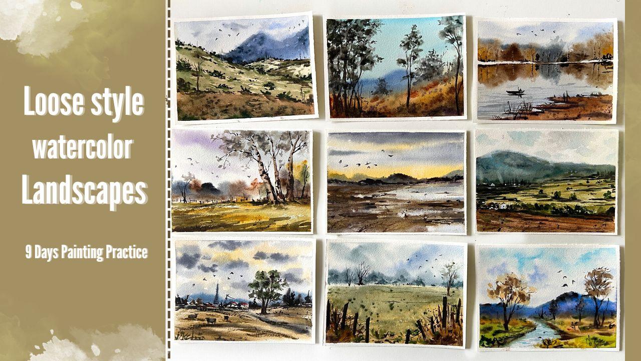
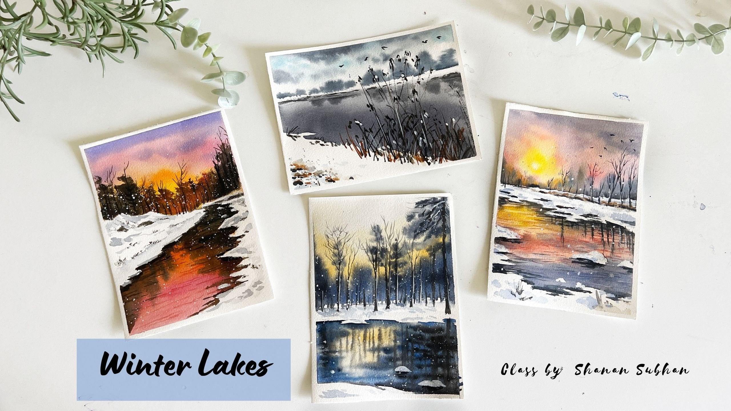
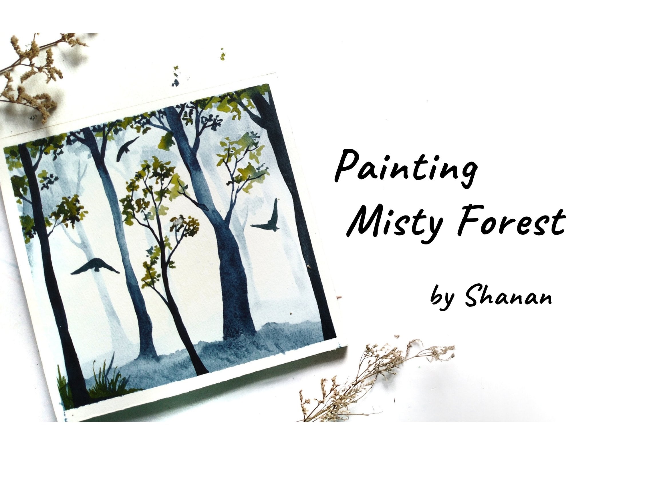
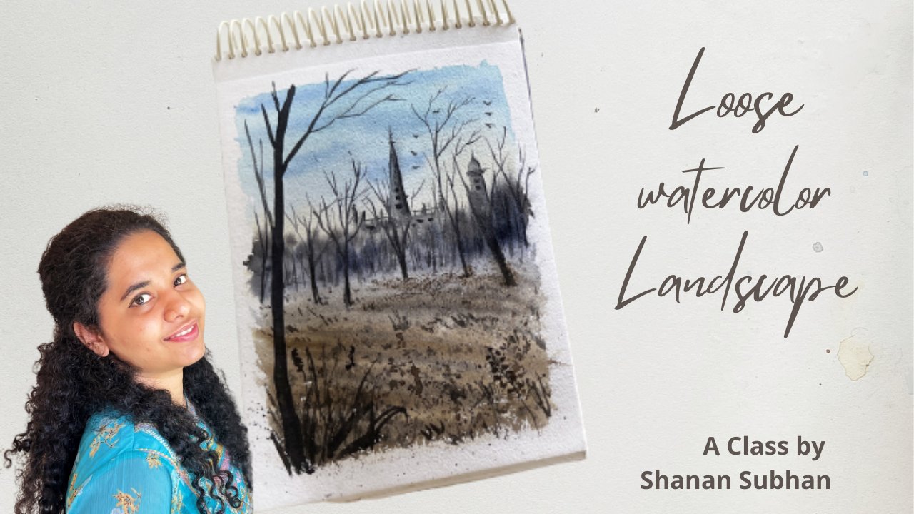
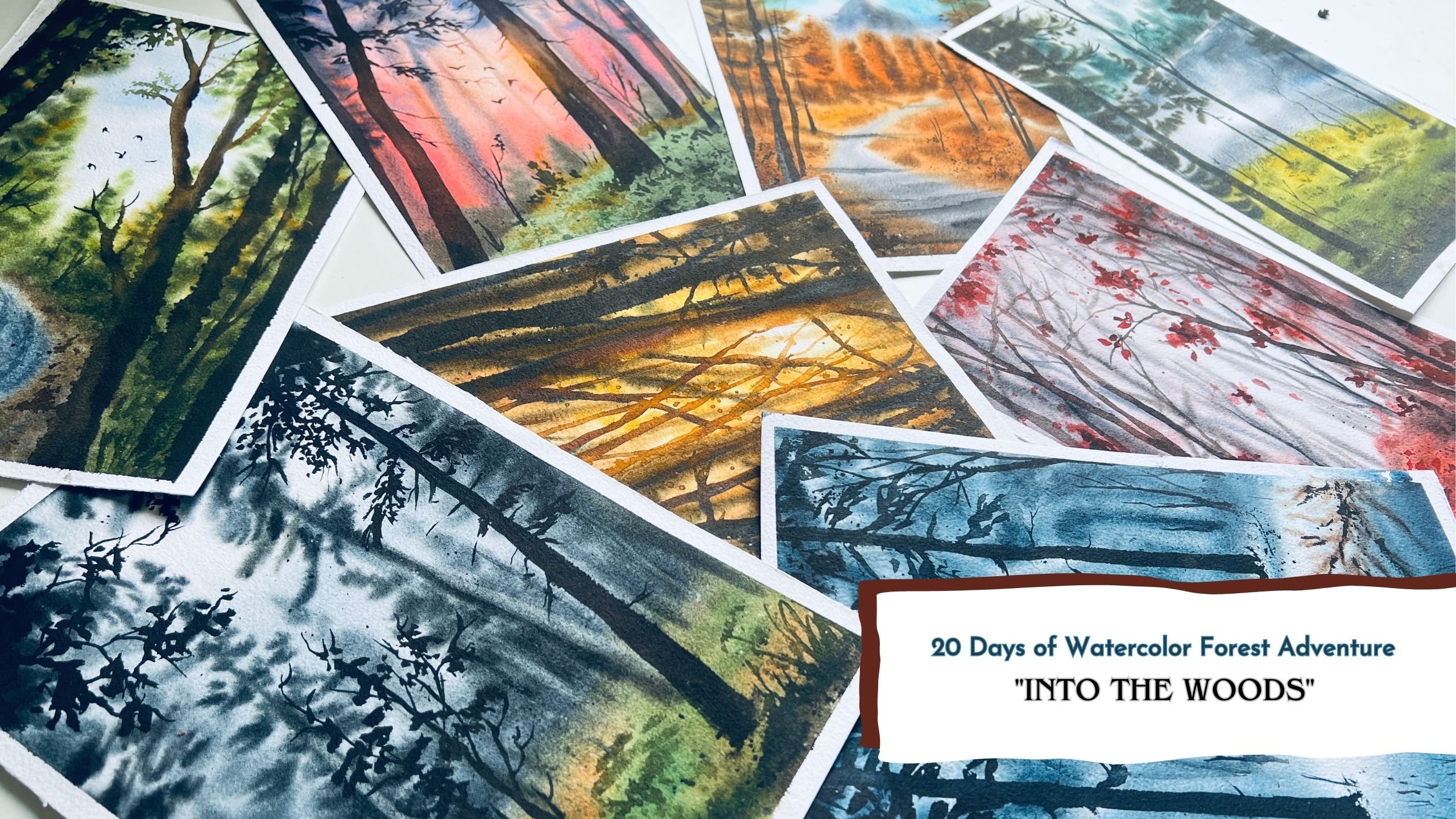
Transcripts
1. Introduction to the Class: The beautiful thing about
art and painting is that there is always room for
growth and exploration. And the best way to do
this and build upon existing talent and technique
is to work on it every day. The reward of the
consistent practise will be reflected in each and every
brush stroke you take. So tell me, do you like
to paint on daily basis? Hello, I'm Shannon
to pan and engineer and an artist based out
of Bangalore, India. Welcome to my
Skillshare class on painting loose style
watercolor landscapes. This class is designed in such a way that it
enables you to capture the beauty of the nature with simple and loose
painting approach. I will demonstrate
various ways to handle the brush and share some insights on
different brushstrokes, which would help you
to loosen up and build a muscle memory to paint easily with loose
painting style. I'll be referring to various
examples to help you understand the application of techniques that we
learned in the class. Loose painting
style, we learn to let go of control
and expectations. It teaches us to worry less about achieving picture
perfect paintings. So there are a total of
nine class projects. All of them are based on painting the landscapes
in loose manner. So painting nine projects altogether could be a
bit overwhelming, right? So in order to make
that easier for you, I'll be uploading the
classes one at a time. Like each project
will be uploaded on a daily basis so that you can come back each day and
paint along with me. If this is something
that interests, you, don't miss out on
what's coming next. Without any further
ado, let's get started. I'm excited to see you inside.
2. What is Loose-Style Painting?: What is loose style painting? In Louis style painting, we tried to paint with
suggestions or impressions, rather than painting
everything in detail. So we don't have to paint whatever we see with
our naked eyes. We just have to make some
suggestions so that it captures the essence of the
scene that we want to paint. In realistic type of paintings. We try to capture each
and every detail, which makes the
process very daunting. I personally love to paint with blue style of painting
because it gives me the liberty to paint loosely with very
less expectation. I have learned to
let go of control and enjoy the flow as I paint. As kids, we were
all taught to paint within boundaries and HU,
picture perfect drawings. So I understand that it
can feel really difficult. So step out of that
and paint freely. Getting rid of all the
controlled brushstrokes. With this nine days of
painting challenge, you will allow
yourself to experience loose painting approach and see how wonderfully
it works for you. Your class projects need
not be same as mine. I would never encourage you to create exact same
replica. Right? How fun with the exercises and the projects that's
coming ahead. If you have any questions, please feel free to ask me
in the discussion section. I would always be
happy to help you.
3. Art supplies used: Let us talk about the art supplies that we're
going to need for the class. So first off, we have paper. I'm using 300 GSM,
100% cotton paper. It is compressed
texture and I'm using the software side of
the cold press paper. You couldn't go with
any semi-log paper that you already have. And the size of this
paper is rectangular, size 7.5 by 5.5 ". Next, let us talk
about the colors I have used are displayed
colors in this palette. So let me walk you
through the color names. Crimson, scarlet, red, orange, yellow ocher, cadmium yellow, lemon yellow and
greenish yellow. Sap Green, burnt umber, cobalt blue, ultramarine blue. This is very didn't hue. Indigo. And the civilian blue, black, violet and purple. Then an empty space. Umbo and bond, Dumbo. Then the last one
is Payne's gray. And in the bottom row
I have white as well. So that's about the colors. Next, we would need two
jars of water for painting. One is for cleaning the brushes, and other one is to take Clearwater for
wet-on-wet techniques. For sketching, we would
need pencil and an eraser. We would need a water
spray bottle for wetting the surface of
the paper while painting. Now the brushes that
I will be using, a size eight or a size
six round brushes. One flat brush off
size for the washes, you can go with any larger
brush. For details. I'll be using science
to velvet brush. You can go with any detailer
brush that you have. I have got this
new hockey brush, which I might use for
writing the base layer. I'm just excited to use this. We would need some issues
and some napkins for wiping the pains and the
extra water off the brushes that we'll be
using watercolor palettes. I may or may not use
these exact ones, But yeah, you would need
something to mix your colors. And you would need
masking tape and a clipboard to tape the paper
on while we're painting. A blow dryer to speed
up the drying process. So this is an optional thing. Alright, so these were the supplies that I'm going
to use for the class. However, you can go ahead with any similar supplies that's
already available with you.
4. Techniques + Brushstrokes practice: In this chapter, we will practice some simple
brush strokes to help loosen up our muscles and get acquainted with the
loose style of painting. So grab your brush and
a rough piece of paper and let us together practice
some simple brushstrokes. I'm starting off with size two round brush and
holding the brush in a very loose manner and
paint some angular lines. As you're doing this, you might feel a sense
of discomfort in the motion because that's
not your usual style. And this is something new
that you're trying, right? Continue doing this for
as long as you want. These little exercises
will help you boost your muscle memory when you paint loose
style of painting. So you can see in
this painting we have the branches and the
fence, the background. It is done with the
loose approach. Let me show you how we
would usually draw lines. Otherwise, this is
very controlled lines. This does not convey
a loose style, so you have to get rid of that. Let go of the control and just allow the brushstrokes
to flow while painting. Alright, Next, let us go ahead with another exercise
where we will be painting lines emerging out
from a single center point. I'm so sorry that my hand
is covering the view. We are trying to make
like an asterisk or star ship, one single point. And from there, we will draw lines in
clockwise direction. Do this as many times you want. This will make you feel
very confident with the strokes and
also the direction. Next, I would want you to
practice some brushstrokes with a larger brush and practice
some bold brushstrokes. These bold brushstrokes
help us to let go of the control and embrace the
uncertainty of watercolors. It is a really good
exercise to try some horizontal and
vertical brushstrokes. Just like that. You
can press the belly of the brush in order to get a larger coverage
while painting. Just play around with colors. It's not any
punishment for you all to practice these many times. The more you practice
with the loser approach, the more you get to see
the beauty of watercolors. So just to explore. Moving on, let us practice
some tree foliage. So we're going to paint
it with loose approach. You can use any
old brush as well. You just have to
dab your brush and create some random
impressions of leaves. E.g. you can see this painting, I have dab the brush to create the impression
of the foliage. Similarly in this
painting as well. Other paintings too. Then for the darker shadows, you can use the darker color. Alright, moving on, I
want you all to practice some brushstrokes
wherein we will apply a varied
amount of pressure. So here you can see
I've started off with a thin line and then gradually
increase the thickness. Then again, I'll go back
to the thinner line. So this is the
weighted amount of pressure in the brush
that you have to control. Keep practicing this
in various directions. Now we will use
the same technique to paint the tree trunks. We will start the tree
from the bottom part with more pressure to
create thicker line. And as we move upwards, we will be reading
the pressure that is very less pressure to
draw the thinner lines. You would need to remember this technique when you're
painting the trees. Next is a technique that will be widely used as filler elements. And it is flattering
technique by getting a sense of busy wipe the
painting without much effort. This can be done on a
wet or dry surface. Sought to add some shadows
and a sense of depth, we will be adding
darker lines on the ground areas are
the grassy surface. Now, let's say we want
to paint some trees or some other background
elements that appear blurry, then we would go for wet
on wet technique, e.g. in this painting, you can see the background trees are blurry. Even in this painting as well. So here we are trying to
suggest the appearance of trees rather than painting
the whole detail tree. Okay, So let's paint
the background. I've applied Clearwater. I known that I be applying
some different shades. Now, to add any further detail, we will need to dry
this area first. So I'm using the blow dryer to speed up the drying process. Alright, now let's add
the trunk of the trees. Oops, looks like the
water media is still wet. Never mind. I hope you have understood what
I'm trying to say. If you add details
on a wet surface, the paint's going to smudge. If you want to have some
hard and detail lines, wait for the paint
to dry completely. Alright. Next let us practice
some tree branches. I'm painting them very loosely
with very loose strokes. For these trees, I'm
going to add some leaves. That is the foliage part. So I've used very
diluted colors. This is ambles and soft
transparent leaves in the tree. And for the darker
part in the tree, you can add some darker colors. E.g. in this painting, I have used this
similar technique to paint the tree foliage. Also in this painting. However, there are more
darker areas in this, but I haven't used a
similar technique. I would want you to practice some tree branches
and loose style. You can find some nature
or three references on Internet and tried to replicate
them in a loose style. That way you will
understand the subject and the style by TO mixed, I'm demonstrating some
simple and loose way of painting the grassy
or the ground area. You just have applied some
bold and thicker brushstrokes. You don't have to worry if you go wrong in your
initial attempts. That's how everyone
learns, right.
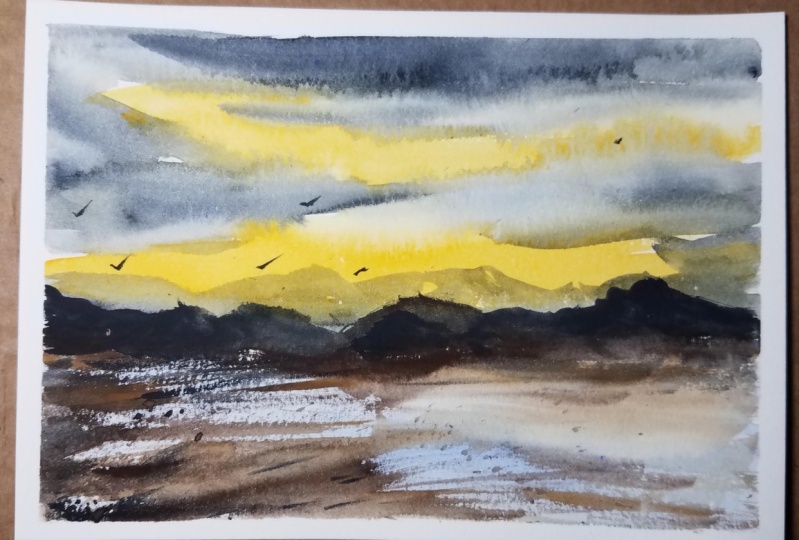
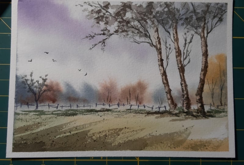
5. Day 1 - Autumn Afternoon: Hello, this is day one of the
daily practice challenge, and we are going to create
this artwork today. So come, let's get started. Before we start
our class project. Let me walk you through
the thumbnail part of the painting so that it is easier for you all to
form the composition. In the lower part of the paper, we have the horizon line and there are some
background trees. Here. We're not drawing the trees in very
detailed manner. This is just a suggestion
because we are painting or sort of
loose painting right? Around this area.
There are some trees. The foliage part of the
tree is very light, which means it will be
very diluted in color. I just shade this area. And in the foreground part, there will be some shadows of the other trees on
the ground part. And we have some flying
birds in the sky. Alright, that is it
with the thumbnail. Now let's see the colors that we would need for the project. So the shades, black, burnt sienna and sap
green, Bond, Dumbo. While I let all purple
or indigo, Payne's gray. If you do not have Payne's gray, then you can mix blue and brown. Okay, so let's get started. I'm going to keep down the
paper using masking tape. And I'm using half-inch
masking tape. A bird down on all the sites. Alright, the paper
is still tightly. Alright, so let's get
started with the painting. I'm applying clear water
throughout the paper. I'm using my size
two round brush. Apply even amount of water
throughout the paper. Okay, So the entire
paper is wet. Now, let us move on
to paint the sky. I'm going to use Payne's gray
with a bit of indigo color. Apply some random strokes. The picking the
clouds in the sky. Now, build the paper and let
the watercolor do its trick. You can see the colors are flowing in a downward direction. Now, on the left side, I'm going to apply
diluted violet color. Whichever direction you take, the colors are going to
flow in that direction. So you can see we have achieved this mild cloudy
appearance in the sky. Now, I'm going to take a napkin and wipe off all the
extra water that is there. So the paper should be
almost 60, 70% dry. Moving on, let us paint the
distant treeline. You are. The trees will be
bloody and APRNs because it is far from
the viewpoint, right? I'll be painting trees
with different colors. You could use any darker colors that you have in your palate. There's no rule that
you have to go with the same colors that I use. Now to soften those sharp edges. In the bottom part, I'm going to use a
clean, damp brush. Towards the right side. I'll be using shades of green and yellow ocher
with some oil it yeah. Like I said, you can use
any color that you like. Around the bottom
area of these trees. I'll be using raw umber. This is like a warm brown color. Do not apply a lot
of brush strokes. Let the colors blend naturally. Next, we would need or
tissue, paper, dry tissue. We will be lifting the paint
from the painted area. So you can see I have
lifted the paints here. This will be the area
reserved for the trees. So this is an easier way to
create lighter colored trees. You could even use
masking fluid. Leave the negative
space for the trees. Nothing wrong with that as well. There are various ways to achieve certain dissolves
in water colors. Now, let's paint the
foreground area. Sorry, I'm mixing a
mutated green color. It is a mix of sap, green, yellow ocher, and
white watercolor. Diluted tone of this color mix and apply it in the
foreground area. Now, apply a low or go
over this painted area. In case your paper is
still damp or wet. You can use a damp brush to lift the paint and create
the tree trunks. Next, I'll be taking hello green color with
a bit of violet. This will create a
darker green color. Like a brownish green. Apply this on the
left bottom area. And below the tree trunks. This is going to depict the
shadows in the ground area. Alright, so let us
allow the paper to dry. I'm using a blow dryer to
speed up the drying process. Alright, the paints have dried. So now let us paint the base
layer for the tree trunks. I'm using diluted brown color. Brown color could
be burnt sienna, burnt umber, raw umber. Any brown color that you have. Use a watered down
version and apply it as the base layer
for the tree trunks. Use different tonal values so that it suggests are
essential for mediation. Okay, so we will leave it on
for now and come back later. Now let us move on to paint the trees on the left
side of the painting. So these are going
to be tiny trees. I use a mix of purple and Payne's gray
to paint these trees. You could use any darker color or even black is also fine. Now with the same darker color, I'll be painting these tiny
fence in the background area. So just draw some
lines and connect them together using a
horizontal line. Next, I'm going to create a sense of texture in
the background area. So let's mix a darker green
color in thicker consistency. With this color. We will be just sliding the brush
on the offense area. So you can see it has
created this sure DO effect, creating a sense of dimension. And that in the background. In the foreground area, I'm going to paint
the cast shadows of the trees and the elements
around this area. So I'll be using slightly darker green and apply some
random brushstrokes. So the lighter areas that
you see here is reflected. Area in the foreground. The darker areas are
the shadow areas. Moving on, let us paint
the tree foliage. So here I'm using a diluted version of this
greenish brown color. I'll dab the brush. And with the belly
of this brush, I'll create the
impression of the leaves. This creates an impression of the leaves being very
transparent and light in color. Now, let us move on to
the trunk of the trees. So here I'll use concentrated
or a thicker consistency of darker brown and apply it
on the sides of the trees. This makes the tree trunk
look very dimensional. Now I'll extend
the tree branches. So I'm using my size two round brush for
these finer lines. I'll add some twigs and branches on the
upper area as well. This defines the overall
look of the tree. Are adding in some horizontal
lines on the tree trunk. Use a darker color to add those shadows around the
root area of the trees. Also adding some trees
in the background. Thanks. I'm adding in
some darker shadows in the foliage area using medium consistency
of Payne's gray. So if you use very darker color, it will spoil the harmony in the foliage part
of the painting. So make sure you're keeping
it in same tonal value. I'll extend these tiny twigs and branches on the outside
of the tree area. Now, let's add some tiny loose on the branches that
we have been dead. So he are in the background. We have a bear tree. Let's add some foliage there. I'm going to splatter some darker paint in
the foreground area. This is going to make the foreground area
look slightly busier. Lastly, let us add some free
flying birds in the sky. And I'll add some tiny
details on the tree. It is optional step.
You can skip it. Alright, so we are done
with this painting. Let us remove the masking tape. There you go. This is how
our painting looks like. Very loose and organic,
yet beautiful, right? I hope you enjoyed
painting this with me.
6. Day 2 - Dry grassland: Welcome back to day
two of the class. Today we will learn to
create this artwork. So let's start by drawing the
thumbnail of the painting. So here I will draw
lines creating various section for the dried
or lying in the painting. These lines are
just for reference. You could skip them as well. In the mid ground, we have a tree in the background that
there's the faraway line. We have some houses. So we'll just mark the
suggestion of the houses. No need of drawing
the perfect shapes. It'll also have some
other elements like tau, electric pole and some trees. I long to be drawing
some animals. So I'll make them look like they're grazing
the dried glasses. Okay. So please
don't judge me here. I'm not so good at
drawing animals, but I'm still going
to give it a try. If you want to go ahead with drawing animals
in your painting, then I would recommend you to practice them on a
piece of graph paper so that you feel confident when you go ahead with the painting. So here I'm drawing some different postures
of the animals. Just giving it a try. Next, let me show you the
colors that I'm going to use. So does bond, Dumbo,
Payne's gray. If you don't have Romberg
and makes a yellow ocher and burnt umber or any
brown than Sap green, black, violet or purple
and yellow ocher, indigo. So let me show you how
we are going to paint dried grasses will
first apply raw umber. Then towards the
foreground area, we're going to darken the
hue by applying bond Dumbo. Then to partition though grassy area will
apply Payne's gray. To get these dry brush strokes that you see in the painting, your brush should not
have lots of paint in it. In the background will be
roughly painting the trees. Now let's practice
the tree shape. Just roughly the paint. It's always good to use
an old brush for dabbing process because you might
spoil your good brushes. I always forget to switch
brushes while painting. Alright, so let's move on
to the painting process. I'm going to tape down the
paper using masking tape. So neatly apply the masking
tape on all the sides. Once you're done,
just on your finger, on the edges to make sure
it is tightly sealed. Alright, so the paper
is really tightly. Now let us start with
the sketching part. First-class mark
the horizon line. This is somewhere in the
lower half of the vapor. Towards the horizon area. I'll be marking
some tiny elements like houses or some
tower like shapes. You can add any elements
of your choice. There is no restriction as such to follow the
exact same step. I'm adding some electric
poles and wires. Now let's add a tree. So I'm forking the main trunk of the tree into multiple parts, making it look more
natural in chip. Then in the background, I'll be adding some
bushy, tree-like shapes. We'll define them as we paint. But for time being, we will just among the basic
composition and the shapes. Next I'll roughly draw some diagonal lines
dividing the background, mid ground, and the
foreground area. So these are sloping
diagonal lines. Next, I want to draw some
animals in the fields here. So let me tell you I'm not
so great at drawing animals, but I'm still giving it a try. If you want, you can go ahead and make some animals
in your painting. If you're not so confident, then you could skip it. It's totally up to you. I'm not sure if this looks
like a sheep or a cow. I think we will figure
it out as we paint. I have always hesitated
to draw animals in my paintings because I feel like I might ruin my painting itself. I think another
animal over here. So this one will be
sitting on the ground, on the grassy area. Next, I'll draw another one. So this will be the
front view of the cow. So you'll only be able to see the body of
the cow partially. Alright, so I'm done
drawing the animals. If you're not comfortable, you can totally
skip it. It's fine. Okay, Let's go back to the trees and the
background elements. Adding some branches
and some wires. You can add more houses as well. Alright, now let's start
the painting process. So reinforced with
the upper area, that is the sky part
of the painting. So I want my sky to have a
slight golden touch in it. I'm going to mix a golden color. Let's take a yellow ocher and a very tiny with
all four purple. Mix them together and we
will get a golden color. I apply this color on the sky, leaving some tiny whitespaces. Whitespaces for
the white clouds. Now take some yellow ocher
alone and apply it in between. We have a mix of golden brown
and this yellowish color. So very subtle golden color sky. Alright, so we have painted the golden highlights
in the sky. We will add the darker
clouds in the next layer. Moving on, I'm going to apply clear water in the mid ground
and the foreground area. We will be painting though, dry grassy area here. Next I'll take raw umber. You could even mix, want, Dumbo and yellow ocher. Start applying the paint from the bottom area and apply the paint till
the midground area. Next we will take
Payne's gray and apply the paint on the lines that
we have drawn earlier. This darker areas are going to create a sense of separation. And it will automatically highlight the lighter
parts in the painting. Okay, so we will
leave it here for now and get back
to the sky part. My paper is almost 60, 70% dry, so I'm still able
to add the colors I want. In case your paper has dried, you can reweight it again. So here I'm adding some darker
clouds using Payne's gray. Make sure to leave the
low clouds as it is, because that is the
golden touch in the sky. And as we reach
towards the horizon, leave the empty spaces for the houses and the
elements that we have. Big concentrated
Payne's gray and apply it as darker
clouds in the sky. So here I'm adding some
tiny wispy clouds. There is no fixed door placement
for these clouds here. You can add them
wherever you want. It's up to you. Next, I'm taking indigo and mixing it with
the Payne's gray. I have a darker blue color. With this, I'll add the distant mountain,
which appeals hazy. Leave white spaces for the
houses that we have drawn. Painting another mountain
on the right side. So these mountains are very
far from the viewpoint. They appear blurry because of the Hayes and the mist
in that atmospheric air. Next, take a mix of burnt umber and a
bit of Payne's gray. This will form a
darker brown mix. Apply this color mix in the horizon area
depicting the trees. You don't have to paint
the perfect tree shapes. I'm just wiggling my brush
to form the tree shapes. Also, don't forget to
leave these whitespaces. Now I'm switching to
my fine liner brush. This is a size two round brush. With this, I'll add
the tiny details. When we add these tiny
lines and random bags, it kind of creates a suggestion that there are some
elements in the background. Making a mix of paint gray plus bond Dumbo
in a diluted form. So here I want to create some textures in
the grassy area. So I'm loading my brush, creating this textured effect. Moving on, I'll be painting the roof of the houses
in the background area. So here I'm adding some
red depicting the roof. It is okay if the houses
don't look perfect, we can leave it up to the
viewer's interpretation. I'll add some tiny
dots depicting the window and the
doors of the houses. All right, Next, let us
paint the tree foliage. I'm going to make so
brownish green color. Let's mix burnt umber
plus Sap green. That both the extra
paint so that you get nice short
affecting the foliage. First we will paint the lighter
highlights of the tree, and then we'll go on
adding the darker shadows. Paint some smaller lines and dots around the outer
area of the tree so that it resembles the tiny leaves and makes
it look more organic. Next, I'm going to switch
to my size six round brush. And I'll take thicker
consistency of green and brown. So this will be a darker,
brownish green color. With thick paint,
we will just dab the paint and create
the leafy effect. So earlier I had painted the
base layer for the tower. Now I'm adding some
details there. And I'm also adding some
electric poles and wires using darker brown. I'm being being though tree
trunk and the branches. We'll paint the shadow of
the tree on the grassy part. Now with the help of darker color and my
fine liner brush, I'm adding some strokes
in the background area, creating more visual interest
and a sense of contrast. Be mindful of the
pressure you apply by painting these strokes. If you're in applying
more pressure, We're gonna get thicker lines. Darker green color, and the
darker foliage in the tree. Use any brown color to add
the branches in the tree. So these branches, I really find out tree trunk. I'll be adding
some grass blades. So these are very
loosely painted. You could even slide your brush creating the textured effect. Dislike how I'm doing. You're using a mix of burnt umber and Payne's gray. I'm adding some elements
in the background. So when I have
added these trees, you can clearly
notice or distinguish the difference between
the background and the mid ground trees. The ones that are in the
background are blurrier. And the ones that I'm
painting now have defined edges like this
pin, the animals. I'm using darker brown color. With the fine liner brush, you can get nice precision
and control brushstrokes. First we will add one
layer of base color. Then after some time, we will add the darker shadows. So let's apply a base color
for all the animals here. I'm sorry, these
don't turn out well, what I'm challenging
myself to paint them. And I would want you
to do that as well. Again, I'll be gliding my brush to create a textured effect. This time. It is with
the yellow ocher. As you might already know, this is called dry
brush technique, where we use a damp
brush and almost more water in the paint to
create this texture effect. Adding in some grass blades
in the foreground area. Let's go back to
being, being animals. I'm adding of Payne's
gray as darker shadows. I'm adding the shadows
and on the stomach and the bottom part where
there is lack of light. So let's add some final
tweaks here and there, making it rich in
contrast and highlights. The more you paint, the more you get idea about adding contrast and
highlights in the painting. That's why practice is very
important in any medium. You could look at your
painting and see if there's anything missing or you feel
want to add any element. You do not have to
compare your painting with mine. It's okay. We are painting loose style, so each painting is going to
turn out unique and amazing. Just the way it is explained. Some free flying
birds in the sky. I'm going to add some white
wash paint on the animals. I'm still not sure if I should
call them cows or shapes. Whatever it is, I'm
happy with the bending. Let me know how you're
painting has turned out. All right, let's build the masking tape and reveal the final look
of the painting. There you go. This is how
the bing, bing looks like. I hope you enjoyed painting
this class project with me. Please do share
your class project and the project's gallery. I'm really excited to see how
we are painting looks like, especially those little animals. I'll see you in the
next class project.
7. Day 3 - Beach : Hello and welcome to
day three of the class. Today we are going to
paint this artwork. So before we start, let me walk you through the
thumbnail of the painting. In the distant area, we have these mountain ranges. Since it isn't a distant area and blurry and not in-focus. Main focus here is the
sea touching the shore. And there are some water
puddles on the sign here. Now let's talk about the colors. For the sky. I'll be using
permanent L0 and Payne's gray. For the foreground
part. I'm going to use burnt umber, raw umber, ultramarine blue for the water, then black for the
distant mountain. Before we proceed, let us
practice the short area. I'm going to use
it all on board. With that, we will create assigned part ways it all
on board as the base. We will add Payne's gray as
the shadow to add some depth to really be using various, don't know the values
of raw umber and bond, Dumbo splattering some pains
to create a sense of noise. Now let's say this
is the water part. So I'll be using
diluted ultramarine for the Watteau and
around this area, we're going to paint
some brown color. This will suggest the
paddles in short area. I'm adding darker colors around that to create a sense of depth. Next, for the mountains, we will be creating multiple
layers with similar colors. So we'll go from light to dark, as you can see in the painting. Alright, so let us start
with the painting. I'm going to tape down the
paper using masking tape, at least in the paper so that it doesn't buckle
up while painting. Once you're done taping it down, just run your fingers through
out the edges of the paper. Alright, so let us start
directly with no sketching. Okay, So take a low, it should be a warm yellow and apply it and
I want the mid area. Then with a clean brush, we are going to blend
it with the background. Next, apply another diluted
stroke in the upper area. Then we'll take Payne's gray and apply it and
I'll do a low areas. The low streak in
the sky depicts the sunlight present
behind these clouds. Feel free to create your
own version of this guy. There's no restriction
that you have to follow the same
steps as mine. So I'm applying water below
the horizon or the main area. Apply ultramarine blue in diluted form in the bottom area. So this will be the base color for the water that
we're going to paint. Since we are painting a
beach or the shoulder area. So I'm going to use raw umber to suggest the sand
at the beach side. This will be the base
color of the sand. If you do not have raw umber, then you can make it yellow
ocher and burnt umber. Notice how I'm leaving some
empty spaces in between. This will be suggested as the
reflected area under signed know the distance area. I'm going to paint
some mountains using Payne's gray for
another layer of mountain. Use thicker consistency
of Payne's gray on the top of the mountain to
create that Misty illusion. The bluish and lighter
color mountain. Just that they are very
far from the view point. Using burnt umber for
the distant signed area. Alright, so I'm using my
blow dryer to dry this area. And then we'll come back
and paint the other layers. Okay, So the paper has dried. Know, I'll take the same color. Slightly darker consistency,
and apply or signed area. So we have the base
and color over that. We will run the brush and
create this extra defect. I lose some Payne's gray
for the darker color. There is no fixed pattern
that I'm trying to achieve. Your just loosely apply some brushstrokes depicting
the seashore like wipe. Now let's perform
splattering technique. So I've loaded my brush with the brown color and
Albee's flattening, covering the upper area. Applying different
tonal values of this brown color so that we
have a nice tonal balance. The brush strokes might
look a bit complicated, but it's nothing but some
simple horizontal lines. Moving on, I'll be painting another layer of
darker mountain. So this is somewhere
in the mid ground. Notice how roughly I'm
applying the paint, leaving a suggestion of texture, mountain or rocky surface. So that is the beauty of
loose style painting. Since we are not painting, eating everything in detail. So we're leaving the
assumption up to the viewer. So most flattering, you're
in the bottom area. Now, let's add some tiny
details here and there. As our final touch-up. In loose painting, the initial steps are very
loose and painted vaguely. The final details are something that gives a chip and
captures the essence. So let's add some
grasses as well. So I'm dabbing it with my fingertip to give it
0 smashed up your ends. Now, I'm adding some boards
freely flying in the sky. These are optional. If you want. You can add words or you
can totally skip it. So these are very simple shape. Nothing complicated at all. For some reason, I feel
that the bottom part or the foreground area of the painting looks very crowded. So I'm going to
spray some water, disperse the darker paint. So it is totally fine to add or remove some elements
from your painting. Since watercolors are
unpredictable and you won't really be sure of what outcome
you are going to achieve. So it's okay to add and
remove the elements. So here I'm using the blow
dryer to dry everything. Then let's see if we can add
or just leave it as it is. Alright, the paper is dry. Now let's see what we can do. I'm going to take this brown, darker brown color and splatter some paints
here in the bottom area. Earlier it was very crowded, but now I'm just adding some
splatters and some lines. Don't want to make it very busy. Alright, let's call it done. Otherwise, I'll keep on
adding more and more details. So yeah, let's remove
the masking tape. There you go. This is how our painting looks
like once it is done. I hope you enjoyed
painting this with me. Do post your class projects
under the projects category, I would really love
to see your outcomes.
8. Day 4 - Mountain and Terrain: Hello and welcome back to
day three of the class. Today we are going to
paint this artwork. So before we start, let us have a look at the
thumbnail of the painting. That is a slopey area. In the background we have
this distant bloody mountain. The full tale of this mountain. There are some houses and
trees in the foreground. We have this separation between
the dead in the ground. Then add some houses. You
can bend them at the end. And then there are
some random trees. Now let us talk
about the colors. So first, we will need
cobalt blue, burnt umber, or permanent L0 or
cadmium yellow, sap green, Payne's gray, black. Warranty or not. You'd
also need white, watercolor or wide gosh. Now, let's practice. In part. I've taken a yellowish green
color by mixing sap green and permanent. It can have a warm,
lighter green color. The colors don't really matter. Then with darker and
concentrated green, we will add some lines creating a sense of
depth and shadows. Now with very dark green color, we will add some trees. You can add these trees
wherever you want. There is no fixed
placement as such. For the foreground
area, it is simple. Just apply some bunch here. Now, once it dries, we will later add
the details there. Around the boundary
of the terrain. We will be adding some shadow of the trees and add some elements they're painting the
mountain is really easy. Here we're painting
it in blue to suggest though haze
in the atmosphere. In the actual painting, we will be creating the
mountain first and then go ahead with the rain and
the foreground part. Alright, so let's get
started with the painting. I have already taped down
the paper on all the sides. Make sure there'll
be a seal tightly so that the paper doesn't
buckle up while painting. Okay, so let's start here. In this painting, I'm
not catching anything. A cobalt blue in
medium consistency. Apply thicker stroke of this color and then mix
cobalt blue and burnt umber. You can see we have created this variation in
the bluish color. In the bottom part, I'm applying clean water
to soften this sharp line. Where do the same on
the upper part as well? Since this mountain is far
from us or the viewer, it appears very blurry and hazy. Next, we want to have a
slow PAPR ends, right? So I'm adding this extra
paint so that we have this slopey look
to their terrain. Next, let us make a warm
yellow and sap green. So it should look like a
very lighter green color. Let's paint that in. Now. Remember to create
those loopy shape. Otherwise, it will just
look like a flat land. So this is the base
color of the terrain. So here I have left
this whitespace intentionally to create
that sloppiness. I fill in that area later. Next I'm going to
mix a bit of bond, Dumbo and burnt sienna. With this mix, we will paint the base of the foreground area. I'm leaving a tiny white space. So that these two colors
don't get mixed up. Now with a tissue paper, I'm lifting some paint, just trying to preserve some
whiteness for the houses. Let's see if I can
preserve it till the end. If I can't, then it's okay. I can go ahead with
white gouache paint. Moving on, let's make
a darker green paint. You can mix sap green with the darker brown or black color to get a darker green color. I'm mixing some green
with burnt umber. And I might also add
some more Payne's gray. This will make it very darker. So here I'll add this
color at the tail of the mountain around this area. So it creates a nice contrast between the mountain
and the terrain. So you have this
blue and lighter green and black or darker green. Very nice contrasting value. The North apply
thicker brushstrokes. Go with smaller
brushstrokes one at a time. The window they call it loose, may still need to be
mindful of how we been. No, blend this upper
bar into the mountain. We're doing this to have a smoother transition from
the terrain to the mountain. It shouldn't look like there is a harsh or change from
these two elements. Now take one Dumbo, and we will apply this along the boundary
of the painting, applying some bold brushstrokes across the foreground area. Now, let's work on
the terrain part. So I'll be gradually building the depth and dimension
in the bearing. Alloys green color. By mixing yellow, green, and a bit of brown. Apply this mix in a slant or sloppy lines and then smudge
it with your fingertip. I'm gliding my brush
creating textured effect. So you will get this
textured effect or leaving your brush is damp, dab off extra water that's
there on the brush. Then you'll easily
achieved that effect. Towards the foreground area. I apply this textured
effect in larger amount. No, on the left side, I want to add some houses. The boundaries of that
in the foreground area. For the roof of the house, you can use brown or red color. And for the wall, we can use black or any
darker brown color. I'm leaving a tiny
whitespace on the window. These houses, I'll be adding some bushes, some
tree-like shapes. You just have to
wiggle your brush, creating some random shapes. It doesn't have to be
perfectly like trees. We will paint some bushes
all along this boundary. Next we will paint some
trees on those sloppy area. The placement of these
trees are very random. Trees in the distant area
will appear smaller. You can simply add some dark
shapes that will do the job. So you can either trees
as much as you want. There's no restriction or some fixed number that
I have followed here. Now for the same trees, I'm adding some darker shadows. Now. Diluted brown, and paint some horizontal lines suggesting the shadow of
the trees on the ground. So this is the cast shadow. Now, a darker brown color. And we will create some depth
in the foreground area. So you just have to
wobble the brush creating these random lines. I lied or green color
as well on the road. Adding some more grasses along the boundary of the ethane. I've taken a flat brush now, which is size eight,
with black color. I'll be adding some horizontal
lines under the trees. Now, moving on to the left side, I'll be adding set of trees. So these are
clustered pine trees. So just being some
vertical lines depicting the pine tree shapes. And I'll be adding this black color on the
left side, ground area. So this will suggest
the darker shadows. I've been repeating
the same step on the right side as well. And I'm adding some sloppy lines on the slopey terrain area. This will create a nice contrast between the darker and
the lighter color. So these darker lines here, these are just some unevenness
in the slopey area. Next, take some
white gouache paint and we will add this paint
on some of the houses, creating the white walls. We build up this color
on the boundary, suggesting the reflected light. Then we'll go back to
the background area, just dab the paint. Tiny swatch. This will suggest like some white colored houses
in the background. If you have notice, we did not paint the sky yet. So if you like the
whiteness of the sky, you can keep it as it is. Or you can go ahead
and paint the sky. I'll be painting it
with diluted colors of gray and maybe lighter blue. Let's see how the sky turns out. Now, I'm adding some
diluted tone of blue, also leaving some white spaces depicting lighter
clouds in the sky. Now, let us add some extra
defect on the foreground area. So I'm going to splatter some pains and smudge
it with my finger tip. Lacked adding some more paint, smudging it a little bit, and I think I'll leave it
as it is in the background. We have these houses. So I'm trying to create
Osmo coming out of the chimney effect
with a clean brush. I'll run my brush
to and fro motion. Wetting the paper. Then with tissue, I
lift off the paints. This will create a smoky
effect in the background. Now on this boundary, I'm going to apply
some water dopings. This will create some
highlighted appearance in the bushes. Right? We are done
with the painting. Let us remove the masking tape. There you go. This is the
final look of the painting. I hope you enjoyed
painting this with me. Please do share your projects
and the projects gallery.
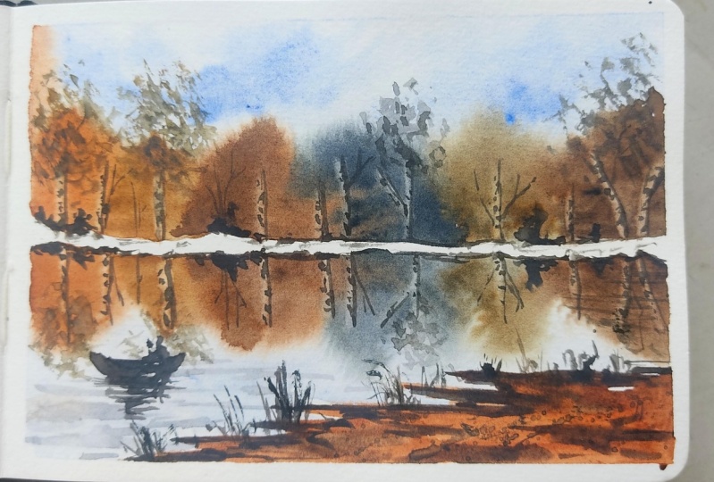
9. Day - 5 : Hello and welcome to first
project of the class. I hope you had fun painting
rest of the projects. Today we are going to
learn this artwork. So before we start, let me just show you the
thumbnail part of the painting. So we have water stream well from ground to
the foreground area. The either side of the water stream is
covered with the grasses. In the distant area, we have mountain range. Then in the mid
ground area we have some trees that are awesome
background trees as well. Now let's talk about the colors. We would need self-rule in
blue, ultramarine blue. Or you could also go with
cobalt blue, violet, burnt sienna, raw,
umber, sap, green. Well, my Payne's
gray. I'm born Dumbo. I'll also be using CPO, but then you can mix burnt
umber and Payne's gray. Now, let us practice the
elements of the painting. So for the distant mountain, I'll be first painting
with the ultramarine blue. And then we'll drop in
some oil it creating that nice mitigation
in blue and violet. So let us practice the grasses. First we will paint
with the lighter color. It could be either
yellow or green. Then we will add some darker color depicting
the depth in the grasses. This darker color could be
darker brown or darker green. Anything of your choice. Now, let us paint
the tree foliage. For the base color. We will be using a diluted
version of brownish, yellow. Then for the tree foliage is the cast shadow
of the leaves. We will be adding some
darker color so that we will have nice balance of
lighter and darker shadows. You can either add the trunk
first or paint the foliage, whichever comfortable for you. Using a damp brush, you can just rub the brush, creating this textured effect. This will work well
for the foliage and tiny leaves like
effect in the painting. Okay, so I have already
taped down my paper. Now. Let us sketch the
basic composition. It is just going to
be enough sketch. So somewhere in the lower half, I'm going to mark these
two points. From there. I'll draw this water stream
towards the foreground. Then we'll mark the lines depicting the area on either
side of this water stream. I add some lines. There's ambling the
partition in the area. In the background. We have mountain and we'll
mark the tree shapes. I think that that's
pretty much it. The rest of the details
we will add as we paint. Let's start by
wetting the paper. So take a clean brush, apply water
throughout the paper. Here all we are going for
wet on wet technique. This will help us achieve
soft and blurry background. Let us begin with the sky. I'm going to use blue
in medium consistency. Randomly apply this color. Make sure you're not
applying very thicker paint. Just creating some
simple sky here. No, towards the middle part, I'll be using ultramarine blue again in
diluted consistency. So take very little amount of paint and just dab
it in the main area. Take a tissue paper
towel and dab off paint from the
right side of the sky. So this is an optional step. If you want the sky to have
that bright blue effect, you can leave it as it is. I'm lifting the paint, creating white
clouds in the sky. Makes more elite and
ultramarine blue. And apply this color mix on
the mountain in the light. Now take ultramarine
blue and cobalt blue applied on the left side. I'll also apply this at the
peak of the mountain as well. Next we'll take Payne's gray and apply along
the horizon line. The consistency of the
paint should be medium. If the pain is too watery, it will spread a lot. Now take burnt umber and
apply it next to paint gray, which is along the horizon line. Moving on, let us begin
the stream water. I'm using diluted
violet color and blue, both in diluted consistency. It is the reflection of
the sky in the water. You'll have to create a similar reflection of
your sky in the water. Now take NO occur in medium consistency and apply
around the midground area. Since the paper is wet. So the brown color from the horizon area will flow
down into this color. Next I'm taking burnt sienna and I'll apply some
tiny brush strokes. Next, we will take a
yellowish green color by mixing sap green and
yellow or orange. We'll apply this color
on the remaining area. Next, I'm going to add some more depth around
the water stream. I'm adding this brown color, suggesting a sense of depth. This creates a sense of elevation on the
lines on either side. Next, I'll take green in thicker consistency and
create some grass shapes. You just have to dab your
brush that will create the impression of the bushes
and the grass blades. Next, I'll use a mix of sap
green plus one Dumbo in diluted consistency and apply some brushstrokes around
when ground area. Moving on in the foreground. I'm going to add some grass
blades using a yellow ocher. I'm going to leave
it here for now and go back to the mountains. Mixed Payne's gray
and one downward. Applied this darker mix on
the peak of the mountain. Next, let us add some depth in the foreground grasses so
they can draw on board. And I'll simply add some lines creating this grass
blade effect. We will also apply some brushstrokes in
the midground area, not completely
covered this L0 part. We need to have both
brown and yellow as well. Next, let us paint
the tree foliage. I'm going to use
yellow ocher and a bit of burnt sienna in
diluted consistency. Though brush and create
the foliage like effect. Leave some empty
spaces in between. We're going to paint
it very irregularly. Do not try to paint
uniforms. I used. Brushstrokes. Now for
the right side tree, I'm going to use burnt
umber in diluted form. Again, I'm just randomly
dabbing my brush, creating the foliage. Which same color. I'll add some darker
restaurants on the left three. Alright, Now let us dry this layer completely
using a blow dryer. The paper has dried completely. Now let us paint the four steps. Darker brown color. And we will paint the
branches of the tree. So here I'm using my fine
liner brush and we will take thicker consistency
paint so that we get nice precision while
adding these branches. Outer end of the foliage. We are going to add
these tiny tweaks. Add as many branches as
you want. It's up to you. In the distant area. I'll be adding some more trees. These trees, they appear smaller because they are further
away from the viewpoint. I'll add some darker
colored foliage just to keep them out of focus. Or adding some more
tiny or three shapes. Learn some grass blades
you're in there. Next, let us add some
depth in the water. I have used to make
software Julian blue and about 10% of burnt umber. To make the color muted. You're taking this color in diluted form and applying
around the boundaries of the water stream leaves some whitespaces depicting a
bright sense of reflection. And it will also appear like there's a
movement in the water. Next, we'll mix both Dumbo and Payne's gray to form
a darker color. And I'll add some tiny rock
light shapes in the water. Now with the same darker color, I'll be applying some
horizontal lines, creating some depth
in the ground area. Seem darker brown mix. I'm going to splatter the
paint on the tree foliage. So cover the sky part
with my fingertip. I'm going to smudge the paint. You can take the paint directly
from the pilot as well. This will create those shadow
effect in the tree foliage. If you don't want to do
it with your finger tip, then use the brush. That's also fine. Now, with my fine liner brush, I'm going to add
some more branches. No, let us paint some
grass blades around door, tree trunk, and the
foreground area. So I'm very lovely applying
these grass blades, apply darker paint along the boundary of
the water stream. Earnings are more paints and on the tree trunk adding some
more trees in the background. Okay, now let's add some boards. Use any darker color. Okay, So we are done
with this artwork. Let us remove the masking tape. There you go. This is the
final look of the painting. I hope you enjoyed
painting this with me. I'm really looking
forward to seeing your art work in the
projects gallery. Please do share it with me.
10. Day - 6: Hello and welcome back
to day six of the class. Today we are going to
create this artwork. So let us learn about
the compensation. So we'll draw a thumbnail. This is a rectangular painting. In the upper half we
have this horizon line, will draw this parallel
line depicting the snowy area in the landscape. Then we have nice
colorful trees. The reflection on the water in the foreground area
with some grasses. And we have a board. Next, let us talk
about the colors. So we would need black,
burnt sienna, orange, burnt umber, and Payne's
gray, ultramarine blue. So you could also go with any alternative color
that you already have. So let us practice the elements. I'm going to draw this parallel
line for the snowy area. Now, above and below
that we are going to paint the trees which
will appear blurry. This blurry effect
can be achieved by using wet on wet technique. Use any color of your choice. The colors don't really matter. Next, I'm going to lift some paints from
the painted surface to suggest though highlighted
trunk of the trees. You have to use a damp brush and no tissue paper to lift the
paint of the red surveys. Next for the water, we will be using
diluted blue color. Then for the ground
area in the foreground, we will be using
burnt sienna and burnt umber and some
darker brown color. For the board. You can just
paint some simple shape. And I had some human finger. Alright, that is it
with the practice. Let us move on to
the main project. So we'll start by masking
the paper neatly, taping it down on all the sides. Once you have tamed down though, people just run your finger
on the edges to make sure that it is tightly
sealed on right? Now we'll begin with sketching. Drawing the horizon line somewhere in the
mid area. They ran. The lower half is greater
than the upper house. I'll draw another line
parallel to this, the rainbow, this is the sky and below this
is the lake water. And towards the foreground, we have this section
for the ground. Now we will paint the sky. So I'm first writing
the upper part of the paper to go with
wet on wet technique, make sure you have a blade, even coat of water. Here, I'll take ultramarine
blue and paint the sky. The brushstrokes are
horizontal and angular. Also, I'm leaving
some tiny spaces in-between a picking the white
color clouds in the sky. Now makes any blue
and brown color, making a darker grayish color. So here I have mixed want Dumbo, ultramarine blue
and a bit of black. So as you can see, I have
achieved a darker color. So I'll take this
color in a medium too, diluted consistency so that we get diluted appearance in
their distinct mountain. Do not apply paint inside
this parallel line. We're going to
leave it as it is. Now. Let us paint
the lake water. I'll take ultramarine blue and start applying from
the bottom part. Apply clear water all the
way till the horizon. So we have blue
colored sky, right? So we'll paint the reflection
of that in the water. Next, let us paint the trees. So we will be building their
trees in multiple colors. I start off by using a mix
of Montana and draw ombre. Next to this. I'm going to, I don't want Dumbo. You will have to paint the reflection as
well in same color. Next, I'm going to
use Payne's gray. You could use any
color of your choice. What I'm trying to suggest an autumn kind of
Hawaii in the painting. So let's see how it turns out. Using rhomboid again. Next, orange color. Robert, over though
painted trees. This will create a nice sort
of vibrancy in the trees. So you will have to do it
while the trees are still wet. If, even if it is
dry, it about 50%, you're gonna get
some patchy blooms. So be mindful of that. Next. I'll take burnt sienna and
paint the foreground area. So this is the ground area in the foreground which is
closer to the viewer. I'll paint this in
zigzaggy motion. Next I'm going to mix
darker brown color. So I'll take burnt umber, Payne's gray and
a bit of oil it. With this, I'll add a sense
of depth in this ground area. Alright, so we will
leave it here for now and then come back to
this to add some details. Next, let us move on
to the arteries part. I'm going to add the tree trunk
using lifting techniques. So I've taken a ****
brush and a tissue paper. So with this damp brush, I'm gonna live paint creating
the shape of tree trunks. Once you lifted, wipe
it off on tissue paper. Clean the brush frequently so that you can lift
the paint easily. Faint as mini tree
trunks you want. There is no fixed
number as such. I think this is good enough. I have added a lot
of tree trunks. Let us move on to item depth and movement
in the lake water. Go any diluted grayish color. So here I have used Payne's gray and ultramarine blue
in diluted form. Apply this in the
form of ripples. Like you can add some horizontal lines
are some zigzaggy lines. It has to depict a sense
of movement in the water. So as we move further
away from foreground, we will add some tiny lines. Next, big black color and paint some grasses
in the foreground. I'm adding some line, creating a sense of damped. To make this area a
little more busier. I'll base fluttering some paint. Let's go back to
the horizon area. Then we will add some
darker brown paint, adding a sense of dimension and depth to the snowy area
that we have painted. In the center. This white
area has been washed off. So I'm adding some lines there. You need to learn to
embrace your mistakes. So whenever you make any
mistake while painting, think about how you can fix it, rather than feeling guilty
about spoiling the painting. This approach will
always help you feel positive and it will come
up with something creative. Next, I'm going to add some
character to the tree trunk. You gradually add
these tiny lines, leaving some spaces in between. It will be suggested as the
place that has black spots. So let us paint these darts
on all of the traits. In case you don't want to paint these parts in the tree trunk, you can leave it as it is. And that will also work fine. Now, using the pointed
tip of your brush, add some branches and also the outlines as the
shadow for these trees. I think this looks pretty good. Let us move on to add some
details on the foliage. I'm going to use
corresponding colors for the background, e.g. for this grayish color, I'm gonna use similar gray tone, slightly darker than
the background, so that it stands out. Dab the paint with my fingertips so that
it can get smashed. Well, for the trees
in the right, I'm going to use the umbo
in medium consistency. Maximum damage, then merge
it with the fingertip. You could also use some
orange shades as well. So with the same color, you can vary the tonal value. Some places you can apply
darker tone and some areas apply some lighter tone so that you have a
nice tonal balance. Now moving on to the left side. Here, I'm adding some raw umber and some bond down, but as well. Sorry, I had some
darker brown color. I don't want this area
in the center here, and I want to do this
to break the symmetry. I know failed that all the
trees APR very identical. So just to break that
symmetry, I've added this. Also adding some darker trees you're using concentrated
Payne's gray. You could paint any
three of your choice. There's no compulsion
that you have to create those same shape. It's up to you,
whichever you want. You can paint. Here in the left. I'll add a darker tree trunk. Moving on, Goodall
foreground part, I'm adding some grass
blades very loosely. Gently meglio brush with
varied pressure that will help you create
this grass blades. Next, let us paint
a simple book. First, we'll draw
a decent shape. I'm using a black color. You can use any darker
color as an alternative. Then for the reflection, we will draw a zigzaggy shape. Another quote of darker color to suggest a sense of shadow. Let us add some boards. It's really flying in the sky. The horizon. I'll be adding some bushes using black color. Adding some final details. Some bushes and then some
grasses in the foreground. Alright, we are done
with this painting. Let us peel off
the masking tape. There you go. This is how the
final painting looks like. I hope you enjoyed
painting this with me. Class projects and
the projects gallery.
11. Day - 7: Welcome back to the class. Today is day seven, and we are going to
create this artwork. So let me walk you through the thumbnail of this painting. In the upper half we have
this horizon line where we have their distinct trees
and the background blurry. Trees. In the ground. We have another tree. From this distant horizon
till the foreground. We have this playing field. In the foreground area. We have some dried grasses. So this area is
being bound by 0. Lose friends. So yeah, that's about it. Alright, now let's talk
about the colors required. So I'll be using indigo,
ultramarine, blue, green, black, burnt umber, raw, permanent
yellow and orange. You can go with any similar
color that you already have. Okay, so let us practice some of the elements of the painting. For the field here, I'll be using yellow
ocher as the base. And then towards the
foreground area, there are some dried
grasses, right? I'll be using some shades
of brown over there. I've applied it a
little darker here. But in actual painting it will
be much lighter than this. Okay? We will be drawing
this area and once it dries, we will shade of green, which will be mixed using
yellow ocher and indigo. So we'll apply this
on the upper area and towards the dry grassy area. We'll apply some grass blades in something like this
in diagonal strokes. Actually the green
color is much lighter when compared to this
practice or peace. We will be using very
light green color. Anyway, you don't have to
mimic the exact same shade. Now for the dried grassy area in the foreground
around the fence. I'll be using yellow, ocher, orange, and
some shades of brown. Now to add a sense of contrast, I'll also be adding
violet color. Now if we have to talk
about the background, it will be same as the
previous paintings where I'll be applying wet on wet technique to achieve
blurry background. Let us get started
with the painting. So here I'm taping down the
people using masking tape. Once you have written down
or just run your finger over the edges to make sure
it is tightly sealed down. Alright, so my paper is ready. Now for the sketch, I'll be marking or simple
horizon line. That is it. Okay, So let us move on
to the painting part. So I'll start by wetting the paper above
the horizon line. Now, I'll take indigo and
apply some random strokes, creating the cloud-like
effect in the sky. Next I'll apply some strokes
of ultramarine blue. Now on the same wet surface, I'll apply some
medium consistency of indigo as the
distant treeline. So you have to make
sure it is darker than this guy will take
me them consistency. So you can even make
some black with this. Now, I'm going to paint the
base color for the field. I'll use a low alcohol in
medium consistency. Gliders. Starting from the bottom area
and towards the horizon, I just apply water so that it appears
very lighter in color. Now towards the foreground
for their dried grasses, I think I'm going to apply
some brown as the base color. So I'll sprinkle some
water on this dam surface. The water droplets will create nice knows when stayed, right? Alright. Now I'm going to allow this area to
dry completely. So I'm using the blow dryer. Next with the help
of black color, I'll be painting
some tiny elements. Neanderthal horizon. This could be some random lines. We don't have to define
the element here. We will be leaving this up to the viewer's interpretation. Just add some tiny lines. Also, you could paint
as many trees you want. There's no fixed
number. As such. Next, I'll be
dabbing some paint, smudging it with my fingertip. This will create the foliage
effect in the distant area. Alright, next letter,
Spain, the playing field. So I'm going to use indigo and some yellow ocher to mix
all brownish green color. So we have a dark
green color here. Okay, so instead of painting
directly on a dry surface, I'm going to wet the area
first with clear water. Leave the foreground
area as it is. That is the brown part as it is. Now on this wet area. I'm going to apply this
brownish green color that we mixed earlier. When we approach
this brown area, I'm going to create the
shape of the glass plates. Apply some diagonal
brush strokes from top to bottom direction. With the help of your
dam and clean brush, try to lift off paint
near the horizon area. This will prevent you from creating hard edges
in the background. Paint the rest of the video
with this green color. Here we have an
undertone which will create a nice effect in the
field that we are being done. Now, I'm going to pick
a darker green color and splatter the paint
in the main area, that is the field area. All right, Now let us make the colors required
for the next step. You take burnt umber, and then I'll be using, Well, hello and orange. Mix these two colors separately. And we'll apply this on
the foreground area. Apply a mix of orange and brown. Create an illusion
of dried and brown. Grasses. Will paint
some bold brushstrokes creating the grass blades. Next, I'll take some
sap green and apply it. I don't want this
area to suggest some darker green are gases. Now we will repeat the same step in the
left side as well. From being things on grass
blades using burnt umber. And then I'll add some orange
brush strokes as well. And the center area, I'll be applying
some green strokes. Now to add a sense of contrast, I'll be applying some oil it adding some oil it on
the right side as well. Now, let us go back to the field area and I add
some depth in there. So I am using slightly
darker green color. So add some horizontal lines. This will create a sense
of depth in the field. Now let us paint or three
in the midground area. This will be much closer
to the foreground. I've taken darker brown and I've painted the
trunk and the branches. Now for the foliage, I'll be using a very
like a grayish tone. You could you use diluted
payne's gray or bond Dumbo. Take this diluted mix and
apply it as a tree foliage. This will be very
lighter in color. Creating an illusion of transparent leaves
on the tree is done. Now, let us try this
area using a blow dryer. Or you could wait for
up to ten, 15 min. Alright, the paper looks dry. Now take black. You could also make brown
and Payne's gray or indigo. And we will paint the fence
around the foreground area. So here I'm not
painting it straight. So these are slightly
slant in shape. I'll smudge the end
with my fingertip so that it does not
have any hard edges. So first I'll paint, although wouldn't log, and
then we will add the wires. Right. Now, I'm switching to my fine liner brush to
paint the barbed wires. You just have to
paint some lines. And then I add some dots to create an illusion
of the barb wire. Adding some more grasses
in the foreground. Now let us add some
birds in the sky. Alright, so we are done
with this painting. Letters peel off
the masking tape. There you go. This is how
the painting looks like. I hope you have enjoyed
painting this with me. Know, share your class projects
and the projects gallery.
12. Day - 8: Welcome back. This is
the aid of the class. We are going to create
this artwork today. Before we start, let me walk you through the thumbnail
of the painting. This slopey, yellow
colored grassy area. But some trees in the
mid ground and in the background is a
blue colored mountain. The foreground area
is covered with trees and some dark grasses. The light is falling
on the midground area. That's why we see the
grasses in yellow color. Brown is dense and
there is lack of light, so the trees appear darker. Okay, so the color
that we're going to need, civilian blue, black, cobalt blue, and violet
for the distant mountain. Yellow ocher, permanent yellow, burnt sienna for the
yellow colored glasses. Sap green. For some shades
of green in the trees. For black, you can
either go with the Payne's gray and burnt umber or you could use direct black. Okay, so that was
about the colors. Next, let us get started. I'll begin by taping
down the paper down all the sides neatly. And one to help finish
taping it down. Now your finger over the edges to make sure it is idly sitting. Right. Next, we'll mark the basic composition
of the painting. So really divide this page
into two separate sections. Then I'll draw some trees. On the left side. I will have a tree will add all the
details while we paint. For now, I'm just marking
the basic shapes. Let us read the paper
using a larger brush. Apply even coat of water
throughout the paper. Make sure there are no
extra cooler puddle of water on the
surface of the paper. I'm running my brush
all over the surface to make sure the water is
evenly distributed. So first, let us paint
the sky. I'm using. So Julian blue for the sky. If you don't have this color, you can go with any
blue that you have. Started applying this
color mix from the top. And take the clipboard so
that the color flows down. Due to the gravity. The Palo on the wet surface flows very easily in
downward direction, which helps us create
a nice background. Next letter, Spain,
the distant mountain. So here I'm taking
cobalt blue and I'll mix it with violet plus a
bit of black color. Apply this color mix in
the shape of mountains, suggesting the distant mountain x. We will take all
mics off once Yana and violet and apply it. In the foreground area. Also adding a tiny
bit of a look. Alright, so let me try this
area using a blow dryer. Okay, So the paper
has completely dried. Now, I'll be taking this salt water spray bottle and sprinkle water
throughout the paper. You can use a larger brush to wet the paper
as an alternative. So the paper is wet. So next, I'll be
mixing burnt sienna. So we will apply this mix
in the foreground area. Towards the bottom of the paper, I'll be adding
some darker brown. It could be any brown color. Black and dark blue color here. To create a sense of
depth in the foreground. Adding some darker paint
towards the mid county area. Make sure that you don't completely cover up
this yellow part. Now, I'll keep my cardboard
in a tilted position. This is to ensure that the colors flow in the
opposite direction. If I keep it straight, then the yellow color might
flow into the sky area. So to avoid that, I've kept this in this angle. Now, I'm going to splatter some darker brown paint
in the foreground area. You can cover the upper part
while flattering this else you will end up with some
tiny dots in the sky. Alright, so let's
dry this area again. Okay, So the paper
has completely dried. Next door. Let us move on to
add some further details. So let's take any
darker brown color. You can mix brown and blues or any color that
you already have. I'll be taking or diluted
mix up this color and I'll paint the trees that
are in the midground area. Dab of extra paint
from the brush. So here our intention is to create a foliage which
looks transparent. Now I'm dropping in the
darker consistency of the same color to add those
shadows in the foliage. Soften the edges at the bottom so that it
doesn't look very harsh. Okay, So let's
paint another tree. On the left side. We'll paint the base
layer with diluted color, then drop in the darker tones to create weighted tonal values. And it will create
a dramatic effect in the trees that we paint. Let's add some more trees. Next. Let us make a
darker brown color. So I'm taking burnt
umber plus Payne's gray. You could also use direct black. Now with this darker color, I'm going to paint
the tree trunks, create multiple branches
in the tree trunk. Next, on the left side, I'm going to roughly
add some lines. I'm not focusing on the shape because it will be covered
with the foliage later on. Going back to these
three foliage in the background and adding some darker color
because I feel that it is very light for
the midground area. So just add some darker color. It could be black
or darker blue, any color of your choice. Now, I'm taking
off of size eight and applying the paint ready roughly to
create the foliage. I'm using a diluted
version of black color. Now, take a bit of sap green
and mix it with black. So I'll take the
diluted version of this color and dab it on the foliage
that we have been to. Next, we will take
a very dark color. This dark color could be black or you could also
make sap green with black and other darker so that you have a
green undertone. When you paint them black color. Apply this color mix. We'll apply most of them
around the corners so that it appears it is darker and
Aldo foreground area. Now I leaped like some tiny brush strokes on
the other trees as well. This will act as though
shadow in the foliage. Bending another tree
on the right side. You could add as many to use
you want in the painting. There's no restriction as such. Now, with my fine liner brush, I'm adding some trunk and
branches in the background. Again with the same
fine liner brush, I'm adding some branches
and some tiny twigs inside this foliage area so
that it looks very natural. I'm adding some leaves, the exterior part of the tree so that it
appears like tiny leaves. No, for the tree
on the right side, I'm going to splatter some paints and then
smudge it using my fingertip so that we
get a nice coverage. Again, splatter some darker
and thicker paint so that it doesn't smudge very
fast on a wet surface. I didn't sell extra
branches if needed. Next, I'm going to add some gas-like shapes around
the roots of the trees. Now with my size
eight round brush, I'm going to splatter some darker paint on their
trees on the left side. Okay. So I'll use my blow dryer to speed up the drying process. You can add some
balls if you want. Okay, so we will stop it here and we lost
the masking tape. Alright, this is how
the painting looks once it is completely done. I hope you enjoyed
painting this with me. Do share your class projects
under the projects gallery. I would really love
to see your box.
13. Day - 9 : Welcome back for the class. This is D9, and today
we are going to create this artwork.
So let's start. Before we begin, let
me walk you through the thumbnail of the painting and also the color required. So we will first be
drawing the horizon line. I don't that area, we have some bushy grasses. And then you can see
partway in brown color. This area, this a water stream flowing towards
the foreground part. Then either sides of the
stream there is a gap, grassy area where
we have some trees. On the left side, there are three partially
visible in the frame. So that was about the thumbnail. Now, let me walk you
through the colors. The colors required, or saloon
blue, ultramarine blue. So these two are for the sky. Then we have burnt
sienna for the road. For the grassy area
will be using sap green, permanent green, black. And some YA lit For the tree. And the darker area will be using Payne's
Gray and bond Dumbo. You could also go with any alternative shades
that you already have. I'm for the grasses here. You can see I have neatly
painted these classes. I've used a specific
brush for this, which is a fan brush. This brush is really helpful to create a grassy
texture very easily. However, if you do
not have that brush, then you can take a normal
round brush, hold it, something like this,
then dab it onto the paper to create
that grassy texture. So this is an alternative that
I'm sharing with you all. You can see it is creating a similar effect as
that of the fine brush. I hope you'll find this helpful for your upcoming paintings. If at all you don't
want to do that step, then you can take
a fine liner and add though grassy
texture one by one. That is also completely okay. Okay, so let's get started
with the painting. I'm going to tape down the
paper using a masking tape. Gently tapered down
on all the sides. And once you're done, just run your finger over the edges to make sure
it is tightly sealed. Okay? Okay, So let's start
the painting process. So first let's start
by painting the sky. I've take considerably in
blue, in diluted consistency. And I'm applying the paint something like this where I
want to create white clouds. So here I'm applying the paint outside of
that white cloud. I hope you are getting my point. So this is like a negative
painting technique where we paint outside though
focused element. Let's say we want to
paint the white clouds. I'm painting outside
that are intended area. If you're not so sure
about the shapes, you could first draw it with a very lighter pencil mark
and then apply the paint. It's up to you. Now. I'm going to apply water and blend it with the, with the background. That is towards
the horizon area. I don't want a very sharp
paint around this part. Next, I have taken
ultramarine blue and I'm applying in-between
the blue clouds area. So this creates a variation in the sky with lighter
and darker blue color. The paper around
the horizon area is already wet because they
are applied water there. So on the same wet area. Next, I'll be applying
burnt sienna. This volunteer now
will be painted for the pathway and it is
going to be wet on wet. So since the paper is wet, we are getting a softer
appearance for the pathway. Okay. I'm applying another
stroke of this color. Next, I'm mixing
green with brown. That is sap green
with the bond Dumbo. So I have achieved or
darker green color. So I'll apply this mixture
along the pathway line. So next my intention is to
paint the mid pathway area. Mixed. I'm going to apply a
lighter green color on either sides of the
intended pathway area. So as you can see, just
by applying the color on either side and leaving a
negative space in between. I'm naturally creating the
shape for the water stream. Next, I'm taking a
darker green color. I, this, we'll paint the distant treeline
around the horizon area. Note that my paper is
slightly damp here, so I'm able to create a softer
kind of decision trees. So here I'm assuming that this distinct area is not
very far from the viewpoint. So we can still see it as
green and warm, shallow. If you're wanting to create the illusion of
aerial perspective, you could use blue color
for this treeline. Now with green,
darker green color, I'm adding a sense of depth to the grassy segment
in the foreground. Here, what I'm doing is just loosely applying
some darker strokes, leaving some lighter
colors as well. Now on this light green area, I'm just dabbing my brush, creating some grassy
brushstrokes. Makes them going
back to the pathway. Here, I'll be adding some darker, concentrated,
burnt sienna. This will help me build a
sense of tonal contrast, like light and dark coat color. Whenever we add darker
and lighter color, it automatically brings a sense of depth in whatever we paint. Now, I'm painting
the water stream. So here I'm using diluted
or Cerulean blue. Here, the sky in
the painting has white and blue colors, right? So same thing will be reflected
in the water as well. Adding some darker
shadows around the boundaries of this stream. Now, I want to paint a lot of grasses you are
in the foreground. I've taken my fan brush
and I'm just dabbing it, creating this impression
of the grasses. So initially in the starting
part of this video, I have shown you all the
alternative for this. You can use that as well. Just dab your brush and the
impression will be created. Here. I'm also dabbing the paint with the
violet color as well, because that will create a nice contrast
between the lighter green and the darker
purple or violet. Now, with my fine liner brush, I'm adding some darker
elements around the boundaries of the
reward and the grassy area. So this creates a sense of contrast between the lighter
and the darker color. Otherwise, it's all going
to be in the mid tone, right? So in order to Oh, bring in that contrast. We are adding some darker
colors in-between. Now, let me add or tree here. I'm using Payne's gray
when thicker consistency. Paint the trunk a
multi-color shape. And then I though, branches, as many
branches you want. Now for the tree foliage, I'm going to take or yellow ocher and green plus violet. So this will create
a brownish color. I'm taking this color
in a diluted form, wipe off all the
paint from the brush. We are going to perform
dry brush technique and gently glide the brush. This will create a
textured effect. Now, on the outer end, I'm going to use
a diluted version so that it appears
stands for End. On the outer and inner side, it is going to appear darker
due to the density right? On the outer side. We're going to keep
it very transparent, like adding some branches
to make it look organic. Now adding some more
darker brush strokes and on the foreground area. This will help us highlight the lighter green colors
around this area. Now let me add another tree that is outside the painting frame. We can only see
the foliage part. First painting
though, the branches. And then adding the foliage
with the dry brush effect. I'm using the similar color. You could go in any muted color. Also an adding some
lighter green hues, applying some
darker color and on the corners so that
it appears dens. Go with your instincts and paint any kind of tree
you want to paint. Now, I'm dabbing some
tiny drops around the outer ends to
suggest tiny leaves. In the distant area. I'm going to add
fence like shape. Also adding some
darker lines and the pathway suggesting
some shadows. Now I'm going back to the tree. I'm adding some textured effect
by splattering technique. So splatter some darker color. And maybe you could do was
Majid using your fingertip. So this acts as the
shadow area in the tree. Okay, So let's add
some birds as well. You might already know
this is an optional thing. If you want, you can add words
or else you can skip it. Okay? Okay. So let's remove the masking tape and reveal the final
look of the painting. There you go. This is how
our painting looks like. I hope you enjoyed
painting this with me. Don't share your class project and other projects gallery. I would really be happy
to see your outcome. I would be really grateful
to you if you could also leave a review
for the class. That would mean a lot
to me. Thank you. I'll see you in my next
class until then. Bye-bye.
 Shanan Subhan, Watercolor/Gouache | Art Educator