Transcripts
1. Intro - Loose Watercolor Landscape: And remind yourselves
and explore your painting skills with
loose watercolor style. Load not to get overwhelmed with the string brushstrokes
and constricting sketches. With this class, I love
yourself to flow free, but when guided advisors, everyone I'm sending
into been an artist and an art educator based
in Bangalore, India. I love painting landscapes with various mediums like gouache,
acrylics or watercolors. With watercolors are my
favorite to paint with because of it's so
unpredictable outcome. You can check out
my Instagram page, watercolors, where I regularly share about my art journey. Welcome to my class on painting, landscapes
with watercolors. So as the name suggest,
lose landscapes, we will be painting with loose brush strokes
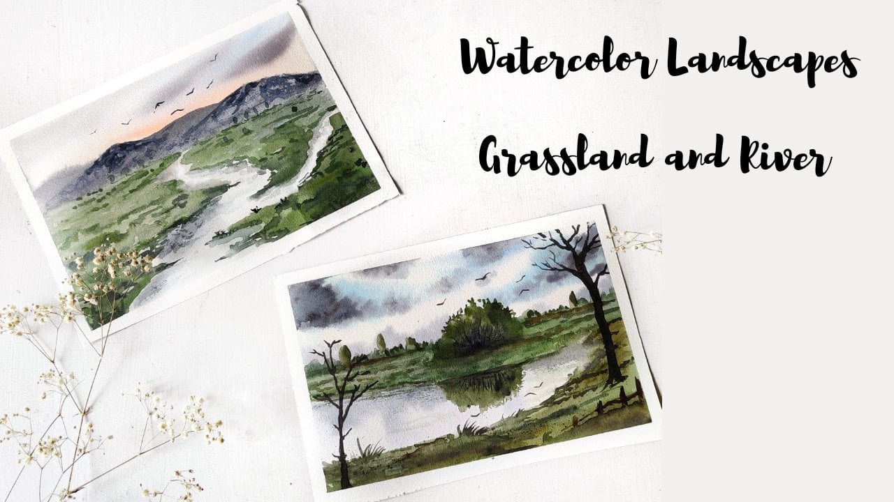
without any sketching. So this is what we will
be painting today. To paint loose, it's
liberating and so much fun. You can work without
any boundaries. Someone who doesn't really
like sketching or drawing. I really enjoy
playing with colors. I find it very helpful and relaxing to paint
without sketching. If you have followed my previous
classes, you would know, I draw very minimal sketches just to make you understand
about the composition. I'll walk you through
all the materials and the color is
required for this class. You can go with any alternative
supplies that you have. So without any further delay, let's get started
with the class. I'm excited to see
you inside the class.
2. Materials: Welcome back. I'm so glad you decided
to join my class. So before we begin, I'll walk you through
all the art supplies. This is the sketchbook
that I'm going to use. No, paper is for 40
GSM, 100% cotton paper. You can go with anything that is so readily available with you. I would recommend you to use at least 300 GSM
watercolor paper. So during the painting, I'll not be using
any masking tape to keep the paper intact. I'm using these are paperclips. If you do not have these clips, you can just tape though, masking tape on the site. Next, we will talk
about the colors. So I'll be using these
watercolor pans. I have personally curated
all these color in this box. You need not have
all these seeds. I will be mentioning about the colors in the next chapter. Talking about brushes, I'll
be using these four brushes. The first one is my brush
size for Princeton brush. I'll be using this
for the washes. Then it is size 12, round brush for
larger brushstrokes, and size eight for
medium brush strokes and size for fine detailing. The end of the painting. Then I'll be using a blow dryer to speed
up the drying process. And jars of water, one for cleaning the
dirty brushes and another one to take clean
water for the washes. Just in case you're curious
about the sketchbook. Then here you go. I got it done from a
local bookbinding shop. No papers were provided by me. So these are handmade paper of 440 GSM or thickness
and it is 100% cotton. So yeah, that is pretty much it. Let us move on to the
painting process.
3. Colors & Thumbnail: Okay, Let's talk
about the colors. You need not use the
exact same shades. Any similar shade
will also work. But this guy, I'll use two
different blue colors. That is cellulitis blue
and ultramarine blue. So I'll be using
a combination of these two colors in lighter
or mid-tone consistency. For the distinct elements, I'll be using Payne's gray. If you are taking TikTok alone, we will get this darker tone. And when we add a
lot of water to it, it appears very
grayish blue color. If you do not have Payne's gray, then you can mix
the burnt umber and ultramarine blue or blue that will give you
a similar shade. Then I would need one number
for the foreground areas. Now for the darker
colors in the painting, I'll be using sepia and black. You can use any darker color
that's available with you. Also, I'll be using raw umber
for the foreground area. So this is an optional
color though. You can use it only if you
have else you can make. So L0 with one Dumbo. Also for the warmer shade in
the lower area of the sky. I'm going to use
this Naples yellow. If you do not have this, then you can use diluted tone
of cadmium or yellow ocher. There is no rule that
you have to use. Only these colors go
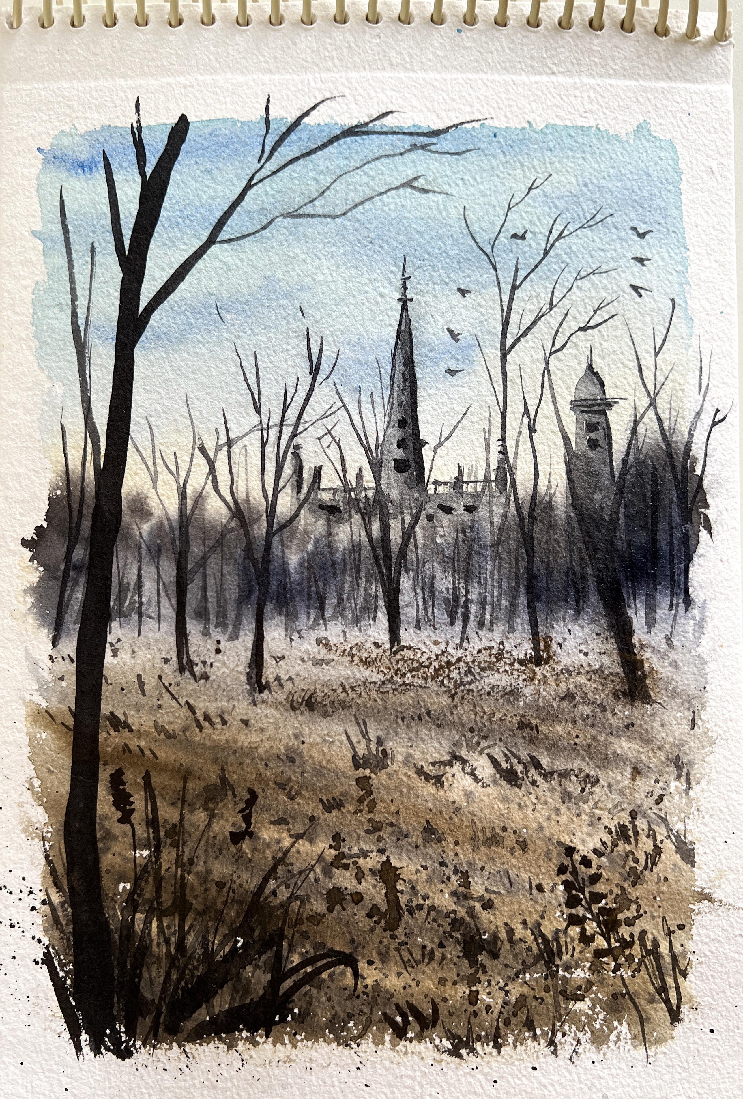
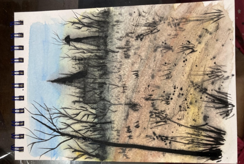
with whatever you have. Okay, so moving on, let us draw the thumbnail to understand though,
painting better. Around the midground area, there will be this
decision tree line slightly covered with Miss. Further away from that point, there will be a
temple-like structure which will be covered
with these trees. And it also appears bluish in color because of the
atmospheric mist and vapour. Then there are some bare
trees in domain ground area. What Stowe foreground. There will be grasses. So these grasses
are brown in color because they depict
door dried grasses. Closer to the viewpoint, there will be a giant tree. So we will keep the dream
where with some branches. So yeah, that is pretty much it. Let us move on to the
painting process.
4. Project - Part 1 : Alright, so let us get
started with the painting. I'm using this sketch book and to keep the sides
intact while painting. I'll be using these paperclips. You can even use masking
tape if you want. Also, there will be no
sketching involved in this process and we will be
painting it loose and free. So grab your art supplies. I'm using a size
two round brush. So let us mix the colors
for the base layers. I'll be using blue
plus ultramarine blue. Mixing these two colors to
form neutral blue color. I'll be applying this color
starting from the top. So here, this is a very
watered down version of blue allies brush so that it is easier
to cover the area. Use clean water to
soften these hard edges. Next, I'm going to use
the Naples yellow. This is a very lighter
tone of yellow. You can even use cadmium
yellow or yellow ocher. In diluted version. I left like this all the way till the bottom of the people. Slightly darker version
of blue and apply some brush strokes and depicting the clouds are the darker
variation in the sky. Switching to my size
eight round brush. And I'm mixing Payne's gray
in thicker consistency. Somewhere around the mid area. We already have
this darker tone. So this is the distant
treeline in the background. Next, we will use
clean brush to soften the lower ends of the
string tree line. This will also suggest a sense of Misty vibe in the painting. Glide the brush horizontally. And we will gradually
move towards the foreground with the
angular brush strokes. Next, we will take burnt umber and apply diagonal strokes
Towards the foreground. At this point, you need to make sure that your paper is wet. If it has dried, then it
will create hard edges. So be aware of that. So in the mid area, we want to achieve sense
of misty atmosphere. So we will lift the
colors using clean brush. Deep tissue paper
handy so that you can wipe off all the
paint off the brush. Apply some darker brown color
in diagonal brush strokes. So I use sepia and
Payne's gray to add some more darker
strokes in the tree line. Now, the upper area, and we will splatter some
paints on the foreground area. Load your brush with paint and splatter the paint onto
the foreground part. This will act as though noise and the texture in
the foreground area. So somewhere in the mid area, we have this sharp edges. I'm using the damp
brush to soften these hard edges formed
by the darker colors. Now apply some diagonal
lines using Payne's gray. This will create a sense
of depth in the ground. So we will allow
the paint to dry. So here I'm using a blow dryer.
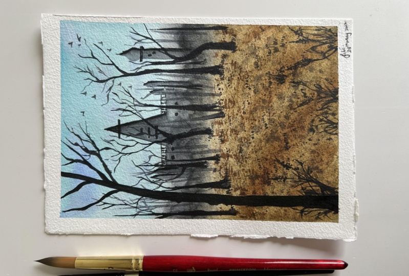
5. Project - Part 2: Okay, So the paper has dried. Now. Let us create some
far away buildings which appears hazy due
to the atmospheric mist. Now I'm taking this
diluted mix of gray. You can take any darker color, but it should be diluted form. So let us begin this
so far away building. This is mostly like a temple. So don't worry about
the complex shapes. We will love introducing
simple forms. Draw a triangular shape. And then at the lower part
of this rectangular shape. And I'll add some more hours on either sides of the building. You can switch to finer
brush for better precision. Since it is a distinct area. So you don't have to worry
about the minute details. On the right side
of this building, I'm adding another tower. Next we will be adding
shadows on the building. So use a slightly darker tone. This makes it look
more dimensional. You can use clean water to
soften the heart edges. Next, I'm adding this
concentrated tone. I add some tiny
lines on the top, and those are just
some intrinsic work. Now with the help of a tissue, I left some colors
from the, the side. Alright, we will
leave it and move on to paint the midground trees. I'm using this same here. I'll be painting the bare trees. So draw a mix of street
and crooked lines. And I don't do bottom area. Just blend it using
your fingertip. You can paint as many
trees as you want. There's no fixed number as such. So he ordered the temple
building is further away from the mid
ground three-line area. I'm also adding some
vertical lines. Just to create that
sense of distance. I like to round my people to paint the
branches comfortably. So, yeah, feel
free to experiment and do anything that
gives you better results. Adding some smaller
vertical lines in the mid area to create
a sense of distance. So now if you see you can feel that distance from
the viewpoint rate.
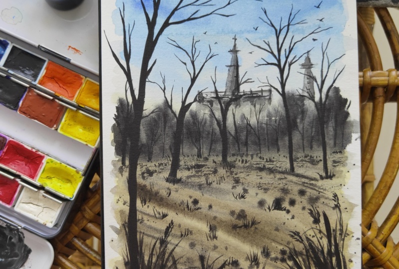
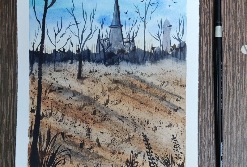
6. Project - Part 3 and Conclusion: Okay, Let us move on
to paint the line. Right now we have the base wash. So to avoid looking flat, we will add some texture. By some grasses. I'm going to add
some grass blade. I don't read ground area. The grass blades
will appear smaller. As we approach towards stuff
all grown, it gets bigger. This is due to the perspective. So to paint these grasses, you can use any darker color. I'm mixing Payne's gray and CPR. You can also use black. Just dab your brush to create the impression of these grasses. Closer to the viewpoint, I'm going to add this taller grassy bush with its blades pointed in
different directions. So here I'm adding some white
flowers in the grasses. Now we will go back to these distant or ample structure and add some details to it. You can use any darker tone or outlines on right side because that's where we mark
the shadows earlier. I had some smaller
window shapes. I'm adding another layer of vertical lines to add a sense of definition in
the distant treeline. Now, with the help of
a fine liner brush, I'm adding these tiny
branches and twigs. Moving on, we will paint
the foreground tree. I'm baking mix of
Payne's gray and CPR. Beamed article drunk. And then I add the branches. Next we will splatter
though paints again, so cover the upper area. So we will splatter
some brown color. Now I'm adding some free
flying birds in the sky. I'm extending some branches
and adding these tiny twigs. So you can paint as
many branches you want. Next with my damp brush, I'm adding this extra
using dry brush technique. Alright, so that is it. We are done with the painting. I hope you had fun
learning session today and do share your class projects under the project gallery. I would love to see your works. Thank you for joining my class. I'll see you in my next class. Until then. Bye bye.
7. Bonus-I: This is a bonus
painting session and we will be painting with
loose painting style. Firstly, made the paper throughout the
surface of the paper. We will be performing wet
on wet on this white layer. So apply even coat of water. I'm using my mop brush to apply clean water and it makes it easier to
cover the larger area. Okay, Let us mix the colors. I'm taking indigo
to paint the sky. So it makes the color
in midtone consistency. Apply the color
mix starting from top and leave some
spaces in-between, depicting the clear sky, somewhere in the middle
of the cloudy sky. Apply the same mix almost
till the lower half. So as you can see, I have left this white tiny spaces in-between for the
whiter color in the sky. Next, I'm going to mix
Payne's gray with indigo and a bit of sepia to
create a darker hue. If you do not have
Payne's gray and CPR, you can mix black or
burnt umber with indigo. I'm applying this darker mix at random areas of the sky to
depict the darker clouds. If you do not have
any whitespaces left, then you can lift the
color with a damp brush. Your end result need
not be same as mine. You can have your own
no flow of colors. Next, I'm taking a green
color and mixing it with the width of the blue
shades that I already have. I have this green. You can take any any green color and apply towards the horizon area just where the
clouds have ended. So this part, I'm applying some green color for
the district trees. Moving on, I'm using raw umber. You can either go with the
yellow ocher, raw umber. I apply this alloy brown shade
in the lower half region. This is for the dry it feels. Towards the viewpoint
or the foreground area. We will apply a bit of
a darker brown shade. No, or damp brush and create a pathway in the
middle though fields. So you just have to lift the existing paint
and create a pathway. Next I'm mixing a
darker brown color. Any darker brown color will do. Just take this color and
apply on those sites of those fields because this
will have some shadowy area. I'll also apply this
along the pathway. Also adding a bit of
concentrated tone. So you need not go with
the exact same colors. Any similar colors
will also work fine. Nowadays, go darker green color. So you can mix some
green and CPR or black and apply
the darker shadows in the background area. Also applying the
darker grass blades in the foreground area in honored to give some detailing work. All right. Let us now
splatter some paint. I'm covering the upper
half with a piece of paper and
flattering the pains. It was darker brown or black
color for the splatters. Now, really take
darker green color and add some trees
at the distant area. So you just have to dab some colors so that it
suggests the three shapes. I'm Bob, the same colors
in the foreground area. And also along the pathway. So adding darker color along the pathway will
define its shape. Let us allow this layer to dry. Okay, In the paper
has dried completely. Moving on, I'll be using
my size two round brush. This is a fine tip. Brush. It any darker brown color and add smaller details
along this pathway. Here, I'm adding these tiny
dots and lines to suggest those shadows in the middle of the fields since it is
away from the viewpoint. So we are only able to see
these tiny little details. So do not spend much
time on the retailing. Next, I'll take darker
green color and apply along this horizon line and then try to define the shape
for the decision trees. We have hard edges here. So in order to soften these, I'm applying clean water
below this darker shade. Next with the same
darker green color. I'll add some smaller plants
in the middle of the fields, adding some more
tiny vertical lines. Those are just some grassy
texture in the field. Towards the foreground,
we will add some larger grass blades. Next we will take
or diluted payne's gray and apply it along
the sides of new pathway. So this acts as the shadows of the grasses along the pathway. Now, let us flatter some
darker paint onto the field. Any darker color, and all being some three shapes
and though distant area. Now, let us spend some free
flying birds in the sky. So I'm using concentrated
Payne's gray for the birds. All died. So we are done
with this painting. So there you go. This is how it looks. If you have painted
along with me, then please do share this bonus project with
me and projects Calvin, I would love to see it.
8. Bonus-II: Welcome to second bonus
session of this class. Let us start the painting. I'll be starting
the painting wet, wet on dry technique. So take any round
brush and we'll take civilian blue color in lighter or diluted consistency
and apply water around it. So this will be the
sky in the painting. Apply water to blend the
color with the background. Next, we'll take go indigo, blue for the darker
clouds in the sky. Next, we'll mix raw umber plus indigo to achieve a
darker brown color. With this darker brown, we will start applying
it right below the sky. Add some highlights. We will leave some
empty white areas. This is going to be the
background distinct area. Now, a larger brush. Keep no paper in a
tilted position. We're going to apply
clean water and allow the paint to
flow downwards. Keep holding the paper
in a tilted position. Applied water all the
way till the bottom. On this wet layer, I'm going to apply.
So Julian low. So this is basically going to depict a lake in the background. There is distinct tree
line in the foreground. We will have some
trees later on. The blue we just added here is the reflection of the
sky in the lake water. Welling on lettuce
mix the colors for the partly submerged land. I'm mixing raw
umber and crimson. Then we will use foil,
it, burnt umber. So it's a mix of all
different colors. You can use any similar
shades that you already have. Adding some colors,
neon, distinct area. Use clean and damp brush
to blend the colors. So this part that I'm painting
right now is no party, so most aligned in the water. Now we need to
create some texture and some variation in this part. So let us splatter the paint. You can cover the upper part. If you're not so confident with Black Sea, this can happen. So please our diaper area. Now I'm adding some
darker brown color. There are distinct area. So make sure that the paper is wet while you're
performing this. Above the horizon, I'm dabbing the paint will depict the trees. Apply some horizontal
strokes in the foreground. With the help of a fine liner. I'm adding these
three trunks for the three years that we
had already painted. Alright, so we will
allow this layer to dry completely and then we'll come
back and add the details. Okay, So there'll
paper has dried. Now with the same
fine liner brush. We will add some tiny lines
depicting the branches and they're drunks in
those distant area. So keep adding these
vertical lines. You don't have to worry about
creating perfect shapes. Just add lines that
will be enough. Since we're painting the lake, we need to create some ripple effect and a sense
of movement in the water. We will add some horizontal
lines in this blank area. Next we will move on to
paint the foreground, partly submerged
land in the water. So this part is partly wet. And we will create these
tiny lines depicting the tiny plants and some
branches fallen in the water. Next, we will mix darker color by mixing Payne's gray and CPR. Or you can even take black. We will be painting
trees in this area. So I'm going with my
size two round brush. You can use any brush that
you're comfortable with. Gently. Start with the trunk
of the tree and then extend the branches from
different direction. Paint as many trees you want. The bottom part should be thicker when compared
to the upper part. Since this area is partly
submerged in the water. So we will also have
the reflection, right? So let's paint the reflection, leaving some tiny
spaces in between. Now, the upper part and flattered O pins
in the lower area. I'm adding some
ripples in the water. This is nothing but some horizontal lines are
at some zigzaggy lines. Those are just the
movement in the water. You can even use blue
color for the ripples. We will also add
some grassy texture. I'll create a sense of
busy-ness in the foreground. Since it is closer
to the viewpoint. So it demands some
attention, right? Going back to the trees, I'm adding some tiny
branches and twigs. I'm applying some black color on the tree trunk so that it appears very strong
and prominent. Now, let us add some free
flying birds in the sky. Okay, so we're done
with this painting. I hope you enjoyed
these sessions with me. If you have painted alone, then please do share it
under class project. I would love to see your works.
 Shanan Subhan, Watercolor/Gouache | Art Educator