Transcripts
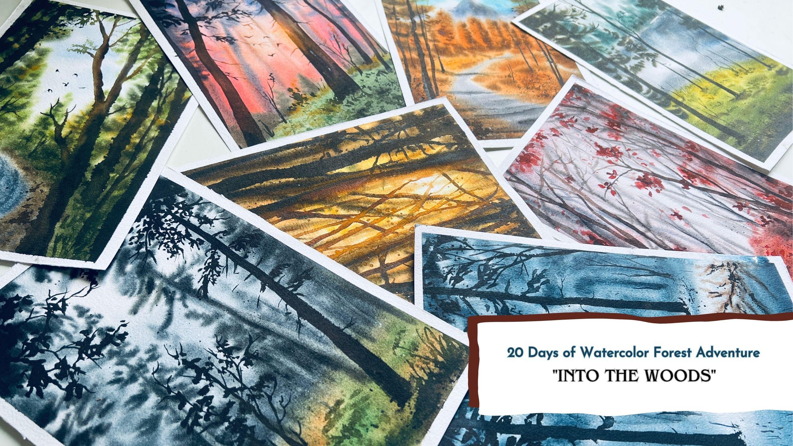
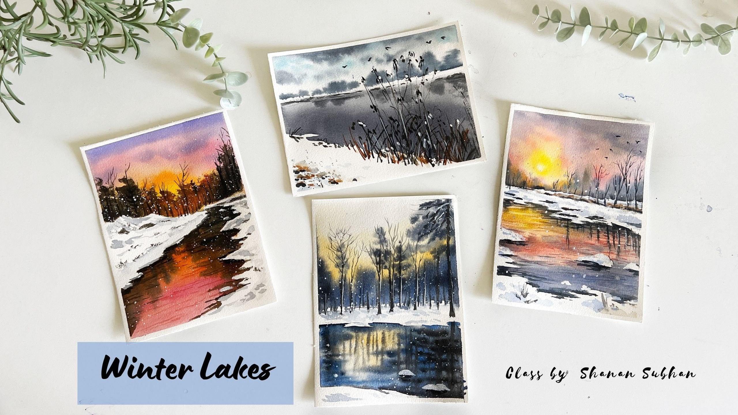
1. Into the Woods -A Watercolor Forest Adventure: In the heart of every forest
lies a secret world of wonders waiting to be unveiled through those
strokes of our brushes. As artists, we have
the privilege to capture the true essence
of nature's beauty, breathing life
into our canvases, and sharing though, enchantment of the
forest with the world. Hello, hello, hello. Welcome to the forest
painting challenge, 20 days of watercolor,
forest adventure. I'm chairman to one artist
from Bangalore, India. I mostly paint landscapes with watercolors, gouache,
and academics. Watercolors is my
favorite medium, or does all the mediums
has been good so far? Now coming to the watercolor
for rest adventure, I'm absolutely thrilled to be your host on this
artistic journey. Get ready to lose yourself. The world of enchanting forest, where we will express
the beauty of forest using the magical medium,
which is watercolors. Before we dive in, let me assure you that each and every essential technique
is covered well in advance. So you can approach each painting with
confidence and joy. And don't worry about
the art supplies. I'll walk you through
each and every art supply that I'm using
for this class. Once you are familiar with the essential
watercolor techniques, we will have some demos and practice exercises
for you to get familiar with the subject and the techniques that we're
going to use in the class. In the beginning of each day, I'll explain all the colors that I'm going to
use in the class. And also I'll talk about
the composition part, where I show you how to
arrange the elements. That it is broken down into
simple and doable steps. And there is no need
to rush at all. You can take your own time to
finish these 20 paintings. The main intention
here is to enjoy the process and find
your own creative voice. Let's embrace the serenity of the forest and
captivating nature of watercolors together. Come join me as we embark on this 20, the
watercolor challenge
2. Art supplies needed.: Before we dive into our
artistic adventure, let me walk you through on the art supplies that I'm
going to use for the class. First is this paper. This is post R&D GSM paper. It is 100% cotton.
Handmade paper. Absorbs a lot of water, which is ideal for layering
work in watercolor. So I would recommend
you to use 100% cotton. Go with 300 GSM
watercolor paper. So 25% cotton paper
might dry very fast, so you might not get
the exact same result. I would recommend you to use hundred percent
cotton paper on right and left around a quarter inch of Bordeaux
for every painting here. Next, let us talk about the colors that I
am going to use. This is the palette that I'll be using for
the entire class. So I'm going to read out
the name of the colors. That is then this color palette. This one is indigo. Next is Payne's
gray, Burnt umber, burnt sienna, cobalt blue, ultramarine blue, sap green. This is azure blue. I also have a steady
load in blue here. Then a yellow ocher,
lemon, yellow, red. This is a neutral, kind of warmer red. And here I have well-lit crimson lake or those
murder somewhat pink color. Here I have a black Walmart
LO right now it is empty. I'm going to fill it soon. Orange. Here I have raw umber. And this is very thin. So these are the colors that I'm going to be using in the class. The palette has all these wells, which is very helpful
to mix the colors. Next, let us talk
about the brushes. These are the brushes that I
will be using in the class. So I'm going to show you the
brushstrokes one by one. So this is Princeton. Neptune, size six brush. This brush has the capacity to hold lots of water so it can, it is ideal for washes. Look at the amount of
water that it has. If you use it like this, it creates thicker brushstrokes. It even creates thinner brush strokes
if applied carefully. Usually I apply in a slant
around 45 degree angle. It covers a larger area. It can be used to paint
the initial washes and the background washes. Next door in the queue we
have silver black velvet, size 12, round brush. This brush also holds a
good amount of water. It had this very soft bristles. I generally use it for
larger brush work. I can use it for painting tree branches and
thicker foliage, the diet, exercise
and everything. Then I have a size
eight round brush. This is what the regular
brush stroke and no onshore for the smaller
elements in the painting. And with the tip of this brush, you can use it for
detailing purpose as well. But you need to be
very careful and apply a little pressure in
order to get this effect. When I have rigger
brush by Rosemary, size for this can be used
for detailing purpose. It can create very tiny lines. In order to get fine
detailing lines, you need to have the right
amount of paint in your brush. If your brushes over
loaded with paint, then it will create
thicker lines. So be careful with that with
your fine liner brushes. Next we have said, well velvet size two round brush This can be used for painting smaller brushstrokes
when you need to have more control over
the fine line restaurants. This is almost same
as the rigger brush, but with little more control. Then I have this old brush
window, OneNote, Brazil's. I use this for
dabbing and creating some random effect
in the painting. This is an optional brush. If you have an old
brush you can use it or the legs,
It's totally okay. It helps us in creating a discrete texture for
the tree, for niche. Then we would need food, jars of clean water. I had kept the
clean water jar ER, but I had to use it for
the brush demonstration. So two jars of
water, one for Rome. They can clear water
while painting. Another one to rinse
off your dirty brushes. So I have placed everything
inside this tube so that the dirty water
falls inside this and my table doesn't get
spoiled very easily. I used to have color
water stains on my table, which I was tired of
cleaning every now and then. So now I have everything
inside this area, which is pretty good. Next we have tissues
and napkins. Tissues can be used to wipe off the extra cleaned during
the lifting process. And the lab Kim is for wiping the paints and brushes
during the painting process. Then open cylinder. It is for sketching and
marking the composition. You can also use a hairdryer
for faster drying process. Next, to tape down the paper. During the painting process, we would need a cardboard and a masking tape to
seal the paper type. Alright, that was all
about the art supplies. You can use any
alternative supplies that you already have at home. Don't worry if you do not have
supplies as that of mine. Also do take some
watercolor papers to practice the techniques. Warming up is very important to feel comfortable during the painting process. Smaller papers are also enough. If you have older papers or
the backside of the paper, take same paper that
you'll be using for the painting process
because you will know how your paper will react to the dampness and how soon it is going to try to understand these factors before
approaching the beam
3. Tonal values + How to achieve depth and dimension.: In this chapter,
we will talk about tonal values in watercolors. Tonal values refers
to the degree of lightness or
darkness in any color. Let me demonstrate different
tonal values to you. So fast, I'll take this
violet color in a takeoff on this is the darkest tone. Next, we will add water to it
and reduce the tonal value. After adding water, it becomes slightly
less concentrated. And we will repeat the same, achieve different tonal values. We keep adding
water to the paint until we get a very watery tone. I could still add water to this, but I think I'm going to stop it here till the end of the paper. So healed in this entire range. First we have the concentrated
or the darkest tone, then we have the lightest
or diluted tone. So this entire color values
are called tonal range. So somewhere on
this middle area, we have mid-tones, which is used for transition from
darker to lighter color. Some colors have
a wide range and some have a very lighter
or a shorter range. Let us move on to
our next color, which is lemon yellow. Since this color is slightly lighter and
brighter in nature. So it is going to yield
us shorter tonal range. After a couple of washes, you will see that
transparent effect becomes lighter very soon. Let's try out another
color. I'm going to take. This is your blue. I hope I'm pronouncing it right. Tonal values are heroes can vary between different
brands of watercolors. Artist grade paints are known for their rich pigmentation, resulting in vibrant
colors that are highly saturated and
visually striking. Know, in contrast with that, student grade paints may
exhibit less intensity and vibrancy due to their lower quality
and affordability. Student grade paints often have a chalky texture due to the use of low quality
pigments and fellows. So back to the demonstration, you can see how rich
the pigments are. So this was the tonal
range for this color. I'll repeat the same exercise
with a different color. This time, I'll use indigo. So this is a very rich
in concentrated color. I'm Shelby. I'm gonna get wider range for
this tonal value. As I add water to paint, the colors remain still vibrant, resulting in a broad
spectrum of tones. The painting you'll see here. This is a monochrome painting
painted using indigo. The color offers a wide
range of tonal values. Thus helps us achieve great depth and dimension
in the painting. The first one in the spectrum, we have concentrated
our darkest tone. Then we have the mid tones. Then here, let me as in
numerical values to the tones, making it easier to identify
and differentiate them. So the number one would be
concentrated or darkest tone. The second number would be mid
tone or the medium values. The third one is light
or diluted tones. So I less in these numbers
to the respective sheets In on what dose?
This one is Duff, darkest tone, guest on. So these are the number
three diluted tones. So you'll see this is the
darkest tone in the mid area we have from your to around
DR. we have midtone. And these are the diluted tones. The tonal values helps
us create depth, highlight, and contrast
in, at Artworks. Know, for example, if I
want to create a sphere. So this is a circle, right? Now if I want to add
dimension to it, I'm going to need to I'd darker
and lighter value to it. So I add on one side I learned darker value than then blended with water,
creating the mid-tone. Then add watered,
making it very diluted. So this diluted tone will act as the highlight
in this field. So this is their darkest tone and this one is the lightest. This light depends
on the sunlight, the direction of sunlight. So this is the shadow. Here. We can add some shadows
with different color. So this is not a perfect
way of paintings. Fields are achieving
light and shadows. I'm just showing
you very rough way to understand tonal
values in a better way. So I didn't. Darker shadows and
lighter highlights along with some midtone values, makes the element or a drawing three-dimension,
Three-dimensional. Depth highlight,
contrast the artwork. Let's take another
example of three. Let me draw it first. I'm going to roughly
draw a tree shape and the Foliage part of the tree and divide
it in three parts. Now, let's add the light
and shadows on the tree. Let's, let say the light
is from this side. We have to create lighter
highlights on this side. The darker side on the, on the opposite side
of the sunlight. I'm going to paint
the darker side. I like this darker areas
on the three sections. And then using clear water, I'm going to spread the paint and create
the lighter tone. This will create a sense of
light and shadow on the tree. No peaking darker color to
intensify those shadows. So I have used darker to
lighter Painting approach. You could also use
light to dark. Actually, in watercolors, we shouldn't be
using light to dark. But for demonstration purpose, I went ahead with dark to light. Next, let us draw some
bushy tree shapes. Go from light to dark. Painting this entire thing
with lighter color first, leaves some married lady with a lighter color on one side. Next, let us add some darker colors on
anyone off the side, depending on the light source. Here, I'll add it
on the right side, creating the shadows and the left dog wouldn't be
having the highlights. I hope you getting
my point here. Now, if you observe this bush, we really only see
dark and light. That is no midtone. I'm going to lift some colors
creating mid-tone values. They could damp brush
and lift though paint. So this may be unable to lift the paint and create
the mid-tone values. You can always add or remove
the colors as per your need. So this again depicts the
light and dark or shadow. Using tonal values, you can
achieve depth and dimension. Mood and atmospheric
effect in your painting. Tonal values contribute to the overall mood and
atmosphere of a painting. By carefully selecting
and manipulating values, artists can evoke
different emotions or convey specific
lighting conditions. I hope you're clear with the
concept of tonal values. It will be used to create, highlight, and depth in
the forest paintings
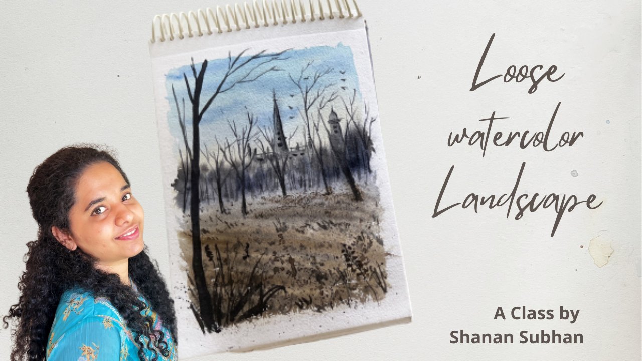
4. Wet on Wet Technique: If you have already watched
my earlier classes, you may already be familiar with the basic
watercolor techniques. However, I believe it's always helpful to refresh those skills. Let's take a look at some of the essential
techniques together. The first one is wet
on wet technique. It is a technique that
involves applying wet paint onto the wet paper. Let us wet the paper first. This is the wet layer
on which we will perform wet on wet technique. Next, I'm going to
take wet paint. You can take any color. Now, let me apply this
wet paint on wet layer. This technique helps us
create a diffuse look. It allows the color to blend and spread naturally
on the wet surface. So you can see how
easily the colors treads on this wet surface. When you tilt the paper, the colors flow in
the lower direction. Because of the gravity. Generally it is used to achieve smooth and atmospheric effect in the background
elements of the painting. Next, let us simply paint
a sky on a wet surface. Just very simple and easy to paint skies using watercolors. Let me first wet this area. I'm going to take the shades
of blue to paint the sky. You could take any
color of your choice. So I'll take this blue mix and apply it in the
shape of clouds, leaving some white
spaces in between. With wet on wet, it is
really easy to paint watercolors guys have
ever in this class, we don't have that
many guys to paint. Maybe the forest works. You could just play around and add multiple colors if you want. If you are a beginner,
then I would recommend you to practice these
little Examples. So you see how
easy and simple it was to create this
beautiful sky. It also demonstrate
painting mountains. I'm going to apply water
and extend the sky. Then I'll take cobalt blue and ultramarine blue mix
for the mounted. Directly apply it
on this wet area. So here we have
achieved this blurry and diffuse look for
the mountain as well. Similarly, you can
practice are the elements of nature to get familiar
with this technique. I hope you clear with
wet on wet technique. Next, let us move on to
Wet on Dry Technique
5. Wet on Dry Technique: Let us talk about wet
on dry technique. It is a technique that involves applying wet paint
onto dry paper. So here, we do not have to wet, those are facing at once. We can directly apply
paint on the dry surface. I'm going to load my
brush with paint. So this is the Wet thing. And we are going to
apply on Dry surface. So here we don't have to
prevent the paper or anything. You can directly apply
the paint on the paper. So this technique allows more
controlled brushstrokes. No pain, stairs where
it was intended to. Unlike this Technique where
it spreads everywhere. So if we apply like this, it is going to remain like that. It will not spread on the areas where you
do not intend to. That's why it is
very important to choose what techniques you
need for your painting. Right on Dry Technique
is a great way to create detailed paintings. So Wet on Dry allows more
control and precision. Know why he painting. Like I said, the color stays where it is
intended to stay. Unlike wet on wet technique, where it spreads everywhere. So you can use this
to your advantage and use for detailing
work in your artwork. In my painting, I
usually use wet on dry for the foreground element because it gives
me defined edges, which helps me to go though focal element
in the painting. And I use wet on wet technique for the
background elements that helps me to create in the blood we're
looking for painting. So that's how I usually choose the techniques
in my painting. Let me show you some
other examples. So you can paint grass blades
with us on some trees and bushes or wherever you want to see those
shapes in exact form, then you can go
with this Technique
6. Dry on Wet Technique: Next one is dry on Wet. This means that we are applying dry or thicker pins
on overt surface. So we first need to have
a wet surface, right? I'm going to wet
the surface first. And I'm also adding some diluted colors
on the initial layer. Let's consider this
as the initial layer, that is the right layer. Next, we should be
Painting window, take car or dry color. So I'm going to take
very thicker paint. So to perform dry on wet, your brush should be damp or no, should have less water. Now, let's take
some ticker color. No consistent of the pain
should be very thick. You could directly
take ticker color. This is ticker and let me
wipe off all the extra paint. So here, let's apply this thicker color and
see how it spreads. So you can see the paints. It spreads in that spread. But not to this extent. Here we have thicker paint so we can still get
some detailing. But for smoother detailing work. This dry on Wet
Technique is helpful to create detailing with a
sense of diffuse to look. It's like a combination of
wet on wet and wet on dry. I'll be using this technique to create out-of-focus
elements in the Painting, which are the midground
and background elements. Me show you an example. Like let's say we
have a wet surface. I'm going to take
Payne's gray tick God, in concentrated form. Directly take paint
with just 10% of water. Maybe. How ready take paint. And I'm going to paint
some pine trees here. So at this point, when you're painting
this, it appears darker. But once it dries up, it gives a very
nice diffused look in the background
of the painting. So I'll show you some examples. In this painting here. I have used a similar technique for the background to use. It creates a diffused
and blurrier appearance in the midground and
background elements. Drawing our attention
to the foreground, detailing parts does helping us to create out-of-focus
elements in the painting. So next, if I consider
this painting, the background trees or
blurrier and diffused, yet they're able to
identify the shape, which in turn helps us to draw our attention on the
foreground trees. So for this Technique
to the best result, you need to apply
thicker paint on or damp surface or as a phrase that has absorbed the water
to certain extent. This will help the paints
to retain its shape, yet create a diffuse look. Suppose you apply
thicker paint on a totally wet surface
than it is going to spread widely and as
wet on wet technique. So be careful with that. I loved the initial layer
to absorb some water. Then this technique
will work the best
7. Dry on Dry Technique: Next Technique is dry
on dry technique. This means that we need to apply dry paint on dry surface. So when I say dry paint, does it mean thicker paint? It need not be essentially
thicker paint. You could also take diluted
or lighter color paints. But what do you need to remember is your brush should have
very less amount of paint, which will in turn create
this kind of texture when you rub the brush
against the paper. The idea is to have
ready least amount of water and paint in your brush. So it is important to wipe
off the extra paints and water of the brush before
going for this technique. This technique is
very helpful to create dramatic textures
in European thing. Next, I'm adding some water to the color to get a
lighter tonal value. So here you have to wipe
off all the water and then glider brush against the surface of the paper
to create the texture. It's good to have a tissue
paper handy so that it absorbs all the paints. The more damp or
dry the brushes, the more textured effect
you will achieve. Next, I utilize the
same extra area to create or night
scape painting. So I'm going to paint a
moon and night sky here. I'm leaving this negative
whitespace for the moon. And I'll paint with darker blue color
around this moon area. So that is our sky. And we have the moon. Below the horizon. We have ocean water, which has the
deflection of the moon. To depict the reflection
in the ocean water. I'm going to use this
blank white area that was created using
dry on Dry Technique. Know. To enhance
this reflection. I'm going to add darker
colors on board this height. This is how dry on dry
technique helps us to create various
effects in our Painting. So this was one simple
example of dry on Dry. Combining with wet on
dry. There you go. We have our simple
landscape painting. You can further enhance
it using darker colors. This is the glowing
water that can be painted using this
dry on dry technique. However, this class is based
on painting the forest. I was just giving
you general idea of how you can use this
technique to your benefit. Let me further add some colors, suggesting some more
elements in this painting. Here, I've added this
darker blue color, suggesting the mountain
in the distant area. So these are the four
essential techniques that you would need for
any watercolor painting. In the next chapter,
I'll show you some additional techniques that would be helpful for the class
8. Lifting Technique: Now that we have learned all the essential
watercolor techniques required for this class, that does also have a look at
some additional techniques that would help us enhance
our experience here. The lifting technique in watercolor refers
to the process of removing or the lightening the paint that has already
been applied on the paper. This technique involves
using or wet or damp brush. Or you could even
use a tissue or a napkin to live watercolors
from the surface. Let's say we have
already painted surface and we want
to lift the colors. So what we can do is
you can take wet brush, wipe off all the water
on a tissue or a napkin. Your brush should be damped and should be
able to live the colors. Here. I'm lifting the wet paint, revealing the white underlying
color. There you go. You can see this light effect. You could also use our tissue
paper to live the colors. Let me show you another example. Let's say we have
a painted area. You want to remove some Colors
and take a tissue paper. This is how you live the Colors and reveal the
whiteness of the paper. This is basically used
to create highlights and fix your mistakes on. You could also use it
to create clouds in the these two examples where
for wet surface, right? Now, what if you wanted to live the paints from a dry surface? So what you can do is you can obeyed or reactivate the
paint by applying water. Once it gets activated, then you can follow
the same steps. That is either using a damp
brush or tissue paper. It is not simple. Let me try it again on
already dried sulfates. So here the paper is dry. I'm going to pinch
my plain water. You can see slate,
whitish color. And let's see if I can
remove colors from here. Apply water wherever it is needed to paint the paints here. So yeah, that was our
lifting Technique.
9. Splaterring Technique: Next we have
splaterring Technique. We will divide this
Technique into two types. One is splaterring on Wet surveys and splaterring
on the surface. Let's talk about
splaterring on wet surface. Let's say we have
wet surface here. So I'm going to paint that for, you know, on this wet surface. I am going to splatter
some thicker paint. These this will create a
diffused look on wet surface. Next for Dry splaterring, you can directly splatter the
paint on the dry surface. You could also splatter it on an already painted dry surface. So this remains where it
was supposed to. Right? It doesn't create any wild
blues or diffuse look. You can either on the brush, our flick the paints like this. The splaterring
Technique can be used to create different texture in
the landscape paintings. It also helps us to add a sense of business
in the plane areas. You can easily fill up the areas with some
random splatters. So that's about it. You can try this
on a rough paper and get familiar
with the Technique
10. Tree Foliage - Examples: In this tab dot, we will explore various types of tree Foliage that you can
incorporate into your artwork. This will be helpful in creating your own beautiful
forest paintings. Alright, so let's start. First. We will create a
bushy Foliage effect. So to create the
impression of the leaves, I'm going to dab my brush and leave some
spaces in between. This can be used as
a filler element or even a focal element
in the painting. You can vary the size
of the brush strokes to create a mix of leaves sizes, resulting in a more natural
and diverse depiction of Foliage mixed us. Adding pine trees. There are various
ways in which you can incorporate pine trees. This is my preferred
method where I add the, the Foliage in zigzaggy. My dog, has also become a go-to element in
most of my Landscape works. And also you can paint
these partly visible, Fine branches to fill in though painting the empty
space in your painting, you don't always have to
depict a fully grown tree. You can also add in these
partly visible branches. So this way, the competition becomes more engaging
and captivating. One pro tip here
is you can paint one or two pine trees
of proper shape. And I still have the space. You can fill it up
with simple lines. This way you don't
have to spend time on the intricate detailing
work really loudly. Another example would be to add partly visible branches
into multiple parts. Can either add the Foliage or just keep though
branches bare minimum. Next, let us paint
a pine tree again. I'm going to paint the
tree when my regular way, but I'll smash the bottom part of this using my fingertip. This will ensure a smooth blend with the underlying layer. And it is also simple
and effective technique for creating organic
elements in the painting. I'm again using my fingertip to create partially visible
branches on the sides. Also adding in darker colors in-between to create a
variation in tonal values, hence, adding a sense of depth. Now once you have created
these Foliage effect, then are the branches. To complete the
look of the tree. Next, I'll take my rigger
brush of size four. You could take any
fine liner brush and add some tiny details like twigs and the branches on the outer end
of these Foliage. My painting, these
tiny brushstrokes, you can add a touch of realism
and texture to the trees, creating a more life-like
representation in the painting. Next we will be painting some conical, triangular
shaped trees. We will first painted
with a diluted color. That will be the lighter on the highlighted
part in the tree. Next, I'll add
some darker color. On the right side. The big thing
though, shadow part. For the left part of the tree
to be brighter or sunlit. It has to have the satellite or the source of light should
be on the left side. So you feel understand
this basic idea. Then you can paint any kind of light and shadows
in a painting. If you're wanting to add further
highlight in the object, then you can use a damp
brush to lift the paint This will further reveal the underlying
whiteness of the paper, resulting in the highlight. Next I'll be painting
but similar tree, but we're though
different color. So I lose shades of green here. So I'll start with a
lighter green color. This will act as a lighter or the highlighted
areas in a tree. Next, I'll add shadow part of the trees using
darker green color. So you see, I have only added the darker color on one side. The other side, I've left it, as it is, suggesting
though, sunlit effect. Next we will paint Foliage
using babbling of the brush. So first I dab the paint
in a very lighter tone. Next I'll add darker green. Some areas. This will have a nice balance of
lighter and darker tones. Next, using a fine liner brush, I'll be adding the branches and twigs on the outer
end of these Foliage. You don't have to paint each and every leaves and branches. It's loose representation
of the tree. In the next example, I'll be starting a branch
from the left side, which is again partly visible. So in this method, we are first adding the tree branch and then
adding the Foliage. Unlike the previous method where I have Forest added though tree Foliage and then
added though branches. So you can choose
any method you want. No, I don't. The lower area, let me add some bushes. This is also an easier way
to fill up the empty spaces. So you can also have mix of different
colors for the bushes. Like er, I'm using
orange and green to bring about
sense of where it, adding darker shadow
areas for these bushes to bring about a sense of contrast and also enhance
the lighter colors. So we need to create the balance between
lighter and darker colors. Now once these
colors at about 50, 60% dry, I'm adding
door or the branches. For these trees. You could even lead for
the initial layer to completely dry and
then add the details. Going back to the
pine tree section. Here, I'll add few more
trees with darker color. This is known as
layering technique, wherein we paint over the already painted surface to create a sense of
depth or add texture. If you carefully observe, you can see that depth already. You can use this property
for other elements as well. Where do you will add
multiple layers and create sort of depth and texture
in your artworks. Lastly, we will loosely paint
the cherry blossom tree. So I may need obviously
and loosely paint the tree using pink
color in diluted form. First, apply the colors
in very diluted form, and then drop in some darker colors for
the shadow effect. And also bring about
tonal variation. Once this is done, you can add the trunk
and the branches. And whatever details
you need to add. You can use any
other color as well, using the same Technique
and paint a beautiful tree. So these were some
of the examples. Do practice these
basic tree shapes. It will help you create your own forest paintings or any other landscapes
for that matter. As you gradually build muscle
memory at, on this subject, you will feel much
more confident when attempting to work. So keep practicing
11. Water & Brush Control: Water Control stands as a
crucial factor in watercolors, as it directly influences the final output
of your artwork. In the balance between the water on your
brush and the water on the paper significantly impact the result you will achieve. Let's see what happens when you apply too much
water on the paper. You can see we have a pool of
water resting on the paper, which is more than required. Let's see what happens. Let me apply the paint. See this is what happens. The color just
spreads everywhere. So it is very important that
you take right amount of water in the paper and
also in the brush. So always keep or tissue
paper or a napkin handy so that you can control the amount of
paints in your brush. Generally, beginners tend to fully load the
brush and directly apply everything on the paper without removing
the extra paint. This is good for
the base washes. But when you're
painting some elements, you need to have controlled
amount of paint. Also, if your brush
has very little paint, it will act as dry on Dry
course Moodle, and even washes. You need to have right amount
of paints in your brush. How do we determine if the paper has right amount of water in it? What you could do is you
can generously apply water first and then with a damp brush you can
run over the area, lifting off extra
water that's there. This will ensure that you have water spread
evenly on the surface. You can see that the
water spread very softly and creates a diffuse cloak rather than spreading
everywhere on the paper. Now, if we apply more water, then how can we use
it to our benefit? You can hold your brush in a tilted position and
then apply paint. So usually this can be used for the
background techniques. One, the colors to flow, then you can go with
this technique. Otherwise, it's
always recommended to have even coat of water, straight blown. They'll paper. And if you have extra water, you can lift it off
using a damp brush. Something like this. **** brush will soak in all the extra water without
leaving any hard edges. Also, a pro tip on how to
control water in your brush. Whenever you take
water from the jar, always to slide the brush on the corners so that the
extra water is removed. Just a gentle slide to remove
the water. This is one way. Or you could even squeeze out the water with your fingers. Or you can even know, wipe off the water on a napkin. You can go with any method
that you're comfortable with. If you are painting
a larger wash, then you can load your
brush with paint. If you are planning to paint some trees or
something some shapes, then it is recommended
to take paint in smaller quantities or
remote wipe off the brush. If you have hard edges
in your painting. On damp, brush and soften it. Alright, next, let us practice making some
blurry or trees. For the background elements. For this, we're going to
use dry on Wet Technique, which means we will be using
guide vanes on its surface. If you see there's
a guy's images, there are some blurry or
trees in the background So I'll demonstrate the
technique with which I painted such blurrier atmospheric
background trees. Let's say we have Wet,
painted some phase. So we have to wait for
some time. For that. The paper reaches about 50, 60% of dampness level. Next, I'll be mixing the color
in a thicker consistency, making it what I did for
dry on wet technique. So at this stage, though, paper is only about
20 to 30% damp. Let's see what happens
when we apply. On this stage of dampness. Colors do remain in the
place where we applied it, but it doesn't retain the
exact shape that we want. This is not the ideal
state of dampness. Let's wait for
some more time and see what happens when it is **** for about 56 staple of the time required
to dry the paper. Depends on the temperature of the area that
you are living in. That's why practicing on
a rough piece of paper to understand your paper
is very important. So this way you will
know the drying time and absorption capacity
of your paper. Let's try a small tree. Yeah. No initial pine tree we painted hi spread
more than intended. So I don't think it is going to eating the result
that lyric wire. That's why I do not paint it. When the paper is
about like 20, 30%, wait for it to dry unless you
are using 25% cotton paper. This rule applies for
100% cotton papers. So this has spread a lot
compared to the newer version. No, the people is perfectly done creating the desired shape. Though paint remains
where it was intended to. And it also gives
us a diffused look. Will see the exact quiz. After it dries. We will apply the paint. At this stage when
paper is perfectly that makes randomly filling
the elements to show you how it will appear at day. And you can compare this, end, this tree, this, and
see the different. This was painted on
about 20 to 30%. And this was painted the paper was 50 to 60%. Though first example, though, paint smudge more than required. Second example gave
us the right result. Desired shape. Next, let us paint another
wait surface and perform the same technique I have
used, red and diluted. Blue is the base color. Go with any color you have. In order to perform
the right technique, we will have to
wait for some time. Meanwhile, let us
see what happens when we apply the veins
on a wet surface. Let's take dry paint and
apply it on the wet surface. Create any shape of your choice. So initially when
you apply the paint, it looks as though it is
going to retain the shape, but gradually it
will start reading. So next, let us see how it
looks on a damp surface. I'll have to wait. Just using this rough paper to dry
the paper to some extent. When you will be able to paper
from an angle of about 50, 60 degrees from across angle. You will see or kind
of sheen on the paper. That's when you will know
that the paper is perfect. To perform this Technique. Remember to check the amount
of beans and you Brush. That's also important factor. Make style paint
the same tree shape on the perfect damp paper? No. Okay. So these two
shapes no paper is same. The color is same,
brushes, same. Everything is same. What changed here was the level
of dampness on the paper. In the first example, the paper was wet and
Colors spread widely. The second example
the paper was damp. So we could issue though, is that we wanted. In the next example, I'll show you what happens
when the paper is almost dry. Let's say about 80,
90% of dryness. See, it gives us hard
edges in between. It will be partially
wet and partially dry. It might also create
backgrounds in your painting. So you have to be very careful with the dry on wet technique. You have clapped
light beams within the window range of 40 to 70%. Otherwise you will
get hard edges. I hope you'll have a
clear idea of how to achieve blurrier effects
in the forest paintings. Do give it a try. For a Rocks paper for maybe when dry or Mini
Forests painting. All right, I'll see you
in the next chapter.
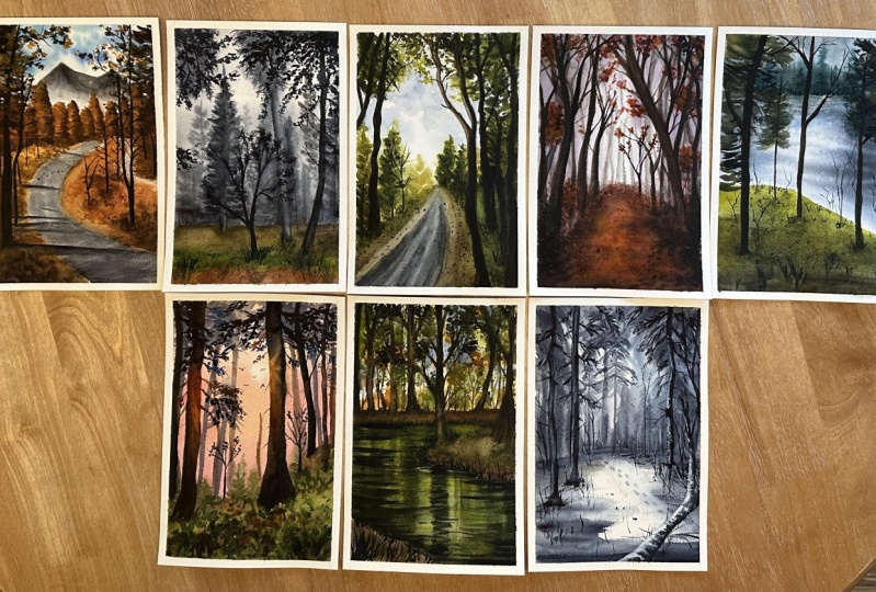
12. Demo - 3 Mini Forests: In this chapter, we
will engage in a series of simple exercises to enhance our understanding of forest and learn the Art of
painting them layer by layer by practicing these techniques that
we learnt earlier, you will download a solid
grasp of this object. So let's dive into the painting, practice A4 size paper and
make three boxes in it, dividing it into three parts. We will be Painting three Mini Forests paintings
inside these boxes. Let's begin with
our first exercise. Take them all Brush and
diarrhea completely. We will first start with
wet on wet technique. Hence, I'm wetting the surface. First. I'm going to
take Mildred down blue color by mixing
Payne's gray and blue. Sorry, take a diluted
version of this color. No randomly apply this as
the initial base layer. Also leave some whitespace is in the center with slight
intense tonal value. I paint the background trees. So here we are trying to build the painting
layer by layer. And on the top,
just that the brush creating suggestion
of the Foliage. Next again, I'm increasing
the intensity of this color. We will paint the
ground elements. So you can see how we
have the elements in the painting layer by layer by increasing
the tonal value. The idea of being thin
layer by layer helps us build a sense of aerial
perspective in the painting. It adds so atmospheric wipe and attach off life to the
painting that we create. If you do not consider
adding these layers, your painting tends to IPR flat. Here, I'm using single tone, that is a mix of ultramarine
and Payne's gray. But if we are using
multiple colors, rule remains the same, that the tonal values
should be balanced. You should have right amount of darker and lighter values in order to achieve their
depth in the painting. Next, I'm applying another layer which is very darker than
the previous layers. So whenever you add
these darker colors, don't forget to leave the
background areas as it to use. Let them be visible. So I have almost covered it up, so I'm adding lighter color
trees in the background. This Art or sense of
haze and atmospheric. Why window painting? If you tend to cover it
up with a darker color, you'll only be left
with blank spaces. And the technique that we
are using now is dry on wet, meaning I'm using dry and
thicker paint on its surface. So this is dry on Wet. Remember? Isn't it truly mesmerizing to witness
how our forest comes to life with its and depth and
the interplay of light. It's like the beauty of nature
unfolding before our eyes. We will leave this exercise for now and come back
after it dries. Now for the reference, this is dry on wet
technique where we applied the car paint
on or damp surface. So we need to allow it to dry. Meanwhile, let us paint
our second exercise. Again. We will be using wet on wet technique for the
diffuse to background effect On guide, the paper is wet. And I'll begin by
taking sap green. I'm painting or diluted tree. This is our initial layer. Just roughly paint
some pine trees. Next, I'll take a
slightly different color. That is a Walmart
or green color. I'm gonna take sap green, mix it with the burnt sienna. So here you can see they have brownish on a
Walmart or green color. Am I playing second
layer with this color? You can also add
orange to green. If you want a warmer green. It's up to you. Paint few more pine trees
over the existing ones. And then on the top area, I'll be adding the Foliage. Just to give us
edition of the forest. We can already see an emerging
shape of the forest here. Next, I'll be painting with
an intense green color by mixing indigo with the
green and burnt sienna. So it will create a very
darker green color. Anyone have an readily
available darker green. So I'm mixing my
one shared paint, another layer of pine trees. Your there is no fixed count. We can paint as many
trees you want. Okay, So let us leave it
here and allow it to dry. Meanwhile, let us begin
the third exercise. So for the third example, we will be again using
wet on wet technique for the base layer where the surface thoroughly
inside this box. Now I'm going to use a
warmer yellow color. So I'll start by adding some vertical lines for
the background area. Then mixing some
orange and Romberg. I'll slowly build the area
for the photos to your. Now, I'll slowly add some
darker colors. Here. I'm mixing burnt umber when the orange and creating
orange-ish brown color. Also, make sure to leave
the ALU spaces in between. Don't fully cover it up. So this is a rough
demonstration of the forest. I'm not going to add
each and every detail your next and we're adding
some darker brown color. In the center area. I'm gonna try to create
a kind of sunlit effect. Adding in some Foliage
effector and on the trees. The white gaps will also
enhance this and let effect. On the corners. I'm adding Payne's gray
and burnt umber mixed. So this is apple.com
brown color. Then add orange color. And all those same area have
to depict the sunlit trees. The initial base, Laos. And then we'd grown
nails are done for all the three Mini paintings. Next, let us move on
the detailing part Where we will paint the
foreground element. Next, I'll take a mix
of indigo and black, making it a very darker color. With that, I'll be
painting some trees here. This will act as though
foreground trees. Know, if you notice
the whole Painting, you'll see that foreground
elements are more attractive than that of background elements because
they are sharp and detailed. The background tends to appear blurry when compared to the
foreground elements here. That's how we are building
the aerial perspective. We have created a sense of
haze and atmospheric wipe in the background and only drawing the attention to
the foreground trees. So I want these initial
layers to be completely dried before I add
the details here. Next, I'll be taking black
and adding some trees here. Same thing goes
with this as well. You can see how the background elements at PR, slightly blurry. Giving more attention to
the foreground elements. You can absorb a clear
distinguishing between the background and
foreground elements, right? I want you all to practice
these examples with Me too, that you a good control
over the water. I'm also your brush. Brush Control and water control are the important
aspects of painting. Yeah, please do it to me before moving on to
doctoral projects. So you can use the
elements that we have practiced in the
Foliage chapter. And I've done as well your wish. There's no fixed shape
and size as such. Okay, let us move on
to the third example. Here that I'll be using a mix
of burnt umber and black. And we'll add the trees on the sides so that we can preserve the sunlit
area in the center. Then at the center area, I'll be adding some sunlit
effect using lighter colors, like orange or brown. So these brown trees, they preserve the sunlit
effect that we wanted it out. Mini painting on the
top again and guarding the brown color to
suggest that there is literally lesser light when compared to
the middle area. These were some rough depiction
of the forest paintings. If you want, you can
practice more examples using some reference
images from the Internet. I hope this chapter and gave you a little more perspective
about Forest Painting
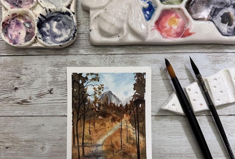
13. Day 1 - Colors and composition: Before starting our first
project or Forest Adventure, I will talk about the Colors and composition required
for the class. For the orangey hue, we will need orange
or any similar color. If you don't have orange, you can mix yellow and red. Next, we would need
all burnt sienna. You couldn't use any
similar rusty brown color. Then you can take a warm
or a neutral red color. So for the orange colored
trees in the painting, I'm going to be using. I'll mix of orange, burnt sienna and read in different proportions that
I'll explain in the Painting. Get this bright
orangey red color. So you can use any orangey
warm red color that you already have
the dude next for the sky I'm using
as your blue color. You can go with any
similar shade that you already have legs or sky blue. Then we would need Payne's
gray and also burnt umber. Next three would mean black. For the detailing purpose. These other colors
required for the painting. You can go ahead with whatever similar colors
you already have. Next, let us talk about the
composition of the painting. If you are able to understand
the composition well, then you can easily break down the complex objects into
simple and doable steps. We will start by drawing
a curvy pathway from the foreground area that is gently guiding us towards
the midground area. Just a new thing. The road ends. We have another downhill
Cove leading us to a deeper. This tan area. In the actual painting will just be creating a mild suggestion. And we'll mark the
area for the land around the node on either sides. Now, we will draw
the trees here. These are bushy trees
in conical shape. So you don't have to draw the
shape when you're painting. I'm doing it now
for your reference. But on the foreground
area we have these Niger trees with the
branches and everything. So here the trees
in the foreground, they are bigger in size because they are closer
to the viewpoint, hence they appear bigger. That is one way of building aerial perspective
in your painting. This will help us create
a sense of depth. If you observe the
mid ground trees, I've drawn them
comparatively smaller. We will mark the shadow
of the trees on the road, which indicates that
the light is from the left side and the shadows
are on the right side. Same is with domain
ground trees. Sorry, I'll do some
shading here to help you understand the shadow
part in the conversation? No, I'll fast-forward the
process to show you though. Shading areas. This will be
our shadows in the painting. This is just a rough depiction of where our shadows
are gonna be. I'll be explaining it in detail during the
painting process. So here, if you observe
these mid ground trees, the shadow part is
on the right side. And the highlighted part in the trees falls
on the left side. Heel for the background
and midground element, I have used a combination of wet on wet and dry on Wet Technique, which gives us a blurrier
and diffused look. For the foreground trees
I have used wet on dry, which gives us sharp and detailed appearance
in the painting. Now let me explain how you can add the foreground elements. I've painted this
partially visible tree, the top of the two
years, not visible here. Only the trunk and
some branches. Even on the right side, I have done the same thing. Once you have the
basic skeleton, then you can dab the
paint very randomly, creating the Foliage
on the branches. Next, for the mid ground trees, I'll be creating
these conical shapes. And on one side I leave
the lighter area. And on the right side
your help adding the darker shadows and then blend it with
the ground level. For the source of light
is from the left side. Suppose the directional light
was from the right side, then you would create the
shadows on the left side. So it's just the vice versa. I hope you're clear with this. Let us move on to
the Painting chapter
14. Day 1 - Tangerine Canopy ( Part I ): Welcome to the first project of this Forest
Painting challenge. I hope you filled
with excitement as we embark on this enchanting
journey into the odds. So I have named this project as Tangerine Canopy because
of the orange colored. Alright, let us begin by
taping down the paper. Here I'm giving about
a quarter inch border to doping onto the paper. They've done the paper on
the sides really neatly. Were doing this to make sure it doesn't buckle
up while painting. So he on, I realized that
there is inside the paper. So I'm just lift the masking tape and push
all the air outside. Once you have tape
down the paper, run your finger
all over the edges to make sure it is
tightly sealed. On right? Now the wrapping of the
paper is done below. Monk, the composition of the painting that
we're going to do. Just want to dodge
your from Your Honor, I'm going to draw C-shape. Here. The C shape should get broader as it
comes towards the Woods. A foreground, because
the road appears wider, closer to the viewpoint. So this is the reward. And on this little
hairpin called. So here we are creating an illusion that there's a
road which is going downhill. Martha horizon line. And some trees here. You don't have to
draw exact shapes, just gentle marking
those skeleton. Then in the background, we will have some mountains in some trees from
the foreground area. Alright, that's about the basic composition
of the painting. Right? Let's begin applying
water on the paper. So use clean water. We really read the entire
paper using a larger brush. You could also go
with a spray bottle. So I'll start with the sky. Using my size two brush. I am using as your blue color. Apply this color as
blue hue in the sky. And I leave some negative
space for the white clouds. There is no defined
shape as such, you can randomly
apply the blue color, leaving some white
patches in-between. And also, I'm using
some ultramarine blue to bring about sense
of color variation. It is optional. You don't have to follow each and every step. Okay, so next let us take Payne's gray. I'm going to paint the mountain in
the distant area. Just applying some
Payne's gray here. The mountains are away
from the viewpoint. That's why I'm painting them in bluish gray color to suggest us and sense of
haze in the atmosphere. This will add up to the aerial perspective
in the Painting. Also to add depth
in the mountain, I'm adding darker color, which is black here. We could also add
concentrated Payne's gray. So we have these sharper edges in the bottom part
of the mountain. So I am using my damp brush
to pull the paint down. You can also use water
to blend it well. Moving on, let us paint
the pathway or the road. So here I'm using a mix of
Payne's gray and black. The paper is wet already. So I'm applying the paint
as wet on wet technique. Try to use single
brushstroke like this. I'm the Lord continues
here. On the backside. We might not be able to retain this backside rolled all the way till the end
of the painting. As we paint the other elements, the colors might interfere window with this tiny
road on the back. Adding some darker colors
towards the foreground area. And also the road gets wider. Next, let us move on
to paint the trees. So here we want to paint
orange color trees. So I'm gonna use
orange of course. And also once you are not red. So I have mixed these
three colors to assume a vibrant
looking orangey shade. When the painting dries. In my earlier painting, I had used orange color alone and it ended up
looking very nicely. This time, I decided to make vibrant orange color audio brush with paint and apply them
in vertical brushstrokes, which would look like trees. The colors are gonna spread
as the paper is wet. So don't worry about
this whitespaces. Sorry, I can see that there's a symmetry and
similar uniformity. So I'm just gonna run
through some of the trees. And in the mid area as well, we will add some paint. This will act as the base
for the upcoming elements. I'm uncovering this part
with the same paint in order to add a touch off
mystery in this area. You don't have to spoon-feed each and every thing
to your viewer. Let them interpret what's
going on in the Painting. Next, we're going to paint the shadow or the darker
areas in the painting. So take burnt umber,
thicker consistency. I had about a little
water to it. That's it. And this paint in the foreground area and
leave some space here, I don't know midground. Around this area. I'm going
to add us and let effect. So I'll be using
just orange color to blend the color
transition here. And I played around with
growth area like so. Also around the three areas. So distinct the Foliage. Make sure you leave this
at all for the reward. I'm using a damp brush
and lifting the color What sinter discovered with the trees will have
a lot of shadows. Fix on black. The
foreground areas. Picking born Tiana. Add some trees here. Just add an impression
of Foliage. Can lead to add the details. There tree here as well. These are partially
visible trees. So here we have
these trees, right? Big black and burnt umber
could also add a bit of red. Now, I'm adding some
depth to these trees. We will only apply paint
on half part of the tree. The last half will depict
the highlighted part. Loosely trying to nipping the fuller appearance
in the trees. In the midground area, I have added these
darker colors, creating a sense of a new
one or slopey surface. I'm adding these lines to suggest a sense of
sloppiness Around the road. Next, I'll take one-channel and apply around them in
ground areas like this. This will create a
sort of color balance, having orange width value
and the darker value. Also, we need to keep checking
the road on the backside. So I'm lifting the paint
using a damp brush. No thick or make some
Payne's gray and black really be adding shadows
of the trees on the road. Like this. These are cast
shadows of the trees that are on the left
side of the Painting. Here. We just make
one shadow. One more. I don't just say you're adding this shadow and the slopey go create an illusion that the area on the
left is slightly slopey. Next week, Wednesday, a mix
of burnt umber and black. It will basically create
a darker brown color, which we will use to create a sense of
depth in the Foliage. I'm using this on both sides. So this is the tree that is partially visible
in the frame. Consider the trunk of the tree to be
outside of the frame. So we will leave this to dry. Take your time, and come
back once it is dry. I'm using this hair dryer
in a very low setting. If we apply more
heat to the paper, absorbs all the vibrancy of the color and leaves
us with painting. So be very careful with that. You could either use a very low setting or
leave it to dry naturally
15. Day 1 - Tangerine Canopy ( Part II ): Okay, So the paper has dried. Now let us move on to
bring the next layers. So far we used wet on wet
and dry on Wet Technique. Next, we're going to use wet on dry and dry on dry for
detailing purpose. We'll start defining
though mountain first. So I'm going to take
Payne's gray and brown and add some lines and then dilute it
with clear water. The main intention yard is to have nipped in the mountain, creating a sense of shadow
on one side of the mountain. This makes it appear
three-dimensional. Then on the other side, I'll be applying some
tiny brushstrokes adjusting I need when
APRN in the mountain. Moving on, let us add some
details on the ground, trees. I'll take this darker, burnt sienna and apply the brushstrokes only on
one side of the trees, suggesting those shadow part. The other half will
appear kind of sunlit. You'll do the lack
of darker colors. So we have brighter
orange color light that will suggest
this unlit part. Now, using a lighter
orangeish color, I'm going to add a sense of definition to the lighter areas. You can go orange and one-channel and use
it in diluted form. Randomly dabbing my
brush your posts or just the leaves on a sense of character
to their tree line. If you don't want to
spend so much time on detailing these fees, you can leave it as it is with
lighter and darker color. Just suggestion would be enough. So he are on the left
and ground area. I'm adding some
random brushstrokes, creating the impression of some leaves fallen
on the ground. Next, let us paint the
trunk of the trees. So I'm going to mix a darker brown color by
taking bond amber and black. You couldn't make
any darker colors and create your own
darker black color. Here near the midground area. I'm drawing these painting, these tiny lines depicting
the tree trunks. Notice their origin point. They are all starting from different points around
the ground area. So this to you that I'm
painting now is closer to the foreground or the viewpoint. That's why it is slightly because I helped for the
trunk into two parts. This part here, just blend
it with your fingertip. And he are on. So we have another tree, the objects closer
to the viewpoint at your bigger in size. So this tree we are
Painting bigger in size. And it will be closer
to the foreground. Actually, it is in
the foreground video. Right next to this, I'll add another line which
will be slightly thinner, suggesting that it is little
away from the foreground. Somewhere around the mid
ground area will have Stories. So notice all their
origin point. So this creates a
sense of distance and aerial perspective
in the painting. Next, I'll take my rosemary
rigger, brush size four. We're going to add some
teeny tiny branches here. So I'm adding these
tiny brush strokes in different shapes and sizes. This will create a sense of organic appearance in
the tree branches. Otherwise, if you are adding
branches of same length, it is going to appear inorganic. Very symmetric uniform. We don't want that in our trees. Now, let's add some branches
on the left side trees. So I'm adding branches on the trees that are further
away from the viewpoint. And for the tree that is closer, I'll be adding slightly
bigger branches. Doing this as per the
rule of perspective. Objects that are closer to
the viewpoint of yours, bigger in size and shape. Since this tree is the
good, the tank is bigger. So is there branches. Next and no background video. I'm going to add
some vertical lines. For distinct though,
bear tree trunks. You can add as many by
tree trunks you want. Now I remember I was supposed
to create a road here, but after drying, the
road just disappeared. So let's try to bring it back. Lapply water, user tissue paper. This is called
lifting Technique, where you live to paint
off from a wet surface. The paper had already dried. So what I did was I applied
water and made it wet. Then I tried to live the beans. Sometimes the paintings want, especially watercolor paintings, doesn't know no expert
on expectation. So it was okay to do our own trial and error
without paintings. I'm just leaving a hint
that there is a next. I'm going to paint
the cast shadows of the trees on the reward. So I'm gonna take diluted mix
of Payne's gray and black. I'll paint with horizontal lines suggesting the cast
shadows on the road. Here the idea is to make
the foreground area darker. So I'm painting more of these shadow parts around
the foreground area. In the midground area, we are trying to keep
it sunlit and only add a few shadows. Next, I don't this section, I'm adding some grass
blades with brown color. Also splaterring. Something's suggesting
some gases. This at all, being closer
to the foreground, need some detailing work So let's do it. I'm the splaterring
the paint and then dabbing it
with my fingertip. This will create an impression of leaves fallen on
the ground area. Moving on, let us paint
the foliage on the trees. I'm using this mixture of four. Once you are nine
orange and dabbing it on the branches,
suggests default, which I'll be repeating those same step on the
right side as well. So for the corners and the
sides of the painting, I'm adding some darker
Foliage by mixing black. Just dab this black
color and you will have narco Foliage. So the reason for adding
this darker Foliage is to get that low on the inner, lighter parts of the beam. When you have darker
gardeners and the sides, the inner areas will
flow on edge, on. The lighter parts
will get highlighted. That is it ease in. Next, I add this darker brown
color on the tree trunk. So this will make
the tree if you're stronger having
ticker bottom part. So I think this tiny
little tree here, you can add as many you
want. I'm just adding one. Hi and then around
this foreground area in slag or some black color, this will create a darker
shadowy appearance. I don't the foreground. You can observe your painting
and see if you want to add anything
or connect anything. If you're good with this, then we can peel off
the masking tape. There you go. This is how the
final painting looks like. I hope you had a FUN
learning session today. And I encourage you to share your paintings in the
projects gallery below so that I and other
students can also see your creative and
unique Creek creations. Please feel free to
reach out if you have any questions or concerns
about the painting process. I would be happy to provide guidance and support
in each and every step. Thank you, and I'll see you
all in the next chapter.
16. Day 2 - Colors and Composition: Before we begin our
second project, let us take a moment to go
through the colors we will be using and also discuss the
composition of the artwork. The colors are
Payne's gray, indigo, black, burnt sienna, sap, green, bond. You could use any similar
colors that you already have. Next, let us talk about the
composition of the painting. So I'll draw this small box representing vertical
representation. Somewhere in the lower
half of this box, we have the horizon area, a little mark as
the horizon line. And in the background we have some pine trees,
which appears blurry. So we will be painting the background and
the midground trees. So to achieve these
are blurry trees. We will be using wet on wet
and dry on wet technique. Wet on wet for the background. Dry on Wet for the
wind, ground, trees. This will give us
the blurry effect. And then for the
foreground elements, we will be painting the trees and grasses using dry
on Wet Technique. These trees will have sharp bend hard edges because they
are in the foreground. And hence they need somebody
dealing work right? Again, show you the shape
of the trees separately. So you have one trunk and then it regularly spread branches. The branches first
and then I, though, leaves depicting the set of Foliage can draw some smaller trees as well. Just start the trunk and then for them into multiple parts. Next, I'll paint the
tree using the paint. Start with Audrey trunk
and then I, the branches. I think them in different
direction and shapes. Definitely make it
look more organic. Know, the easier way to
complete this tree is filled the upper for the corner
areas with thicker paint, and then only
suggest a few areas. You don't have to
paint the entire tree. So what I'm doing is
filling the corner areas and then only I don't
the lower areas, the areas visible to the light, those areas and adding these
details by simply tapping. I'm not painting each and
every leaf separately. This is like a shortcut method that you can use
in your paintings. And once you have
painted the Foliage, you can add in some
tiny twigs and branches on the outside
of these Foliage, giving more realistic and
captivating appearance to the or all painting. I hope that makes sense.
17. Day 2 - Twilight Pines: Today we're going to paint pine forest
during the Twilight. Hence the name Twilight. Fine for this painting. Alright, let us begin by taping down the paper tape, the masking tape
on all the sides. Once you tape it down, run your finger over the edges to make sure
it is tightly sealed. Alright, the paper
is sealed tightly. Now let us begin the painting. I'll start by marking the
composition of the painting. We will have on horizon line somewhere in the lower
half of the paper. Just roughly mocking the
lines for the trees. I wouldn't be drawing each and every element of the
painting at this point. I'm just adding the basic
skeleton of the trees. The detailing part will be done during the
painting process. But I stopped the elements. We will add as many paint. It's okay if you do not want to mark the Composition lines, you can directly go
ahead and beam elements. Light. Moving on
to our next step, we will wet the paper entirely. So you can use a larger brush. Or you could also use
what does prayer. It is easier to wet
the paper this way and then spread it across
using a larger brush. I'm using a mop brush with water to evenly distribute
the water on the paper. Generously applying water and make sure you're
applying even code. There shouldn't be any
puddles on the paper. Also, liftoff all the
water drops on the sides. That is on the masking tape. This might create
backends later on. Let us start the
painting process. First, let me mix the colors required to
paint the background. So I'm going to create a
banker deep blue color. So I'll be mixing indigo
and Payne's gray. Mix this color and thicker
consistency Forest. Next I'll add burnt umber to this color to make
it a little more. Are they in turn? Just a teeny bit of W
would be sufficient. Before applying the color, we will place the paper
in a tilted position. So I'm keeping the masking
tape underneath the board. So we will start applying the color and on
this horizon area. When we place the paper
and are tilted by, the gravity will do its job
and create kind of slowly affect the horizon area. I keep the paint slightly intense when compared
to the upper Skype Art. I don't want this idea
in the upper part. I'll keep it lighter or leave, leaving circular space
in the top part. Depicting a sense of
moonlight. On the sides. Just add some random
brushstrokes will act as the background for
the upcoming pine trees. So far, this was
the initial layer. Let us add another
layer of the same color Slowly increasing the
intensity of the color, building a sense of depth. Mixing the same color. Again. It's better if you could mix more color so that you don't have
to mix again and again. Now with this darker color and my pointed tip brush
and painting pine tree, since I'm painting
this on wet surface, it is going to appear
blurrier once it dries. So this is the dry
on wet technique. When applying thicker
paints on a wet surface. Don't worry about achieving
perfect pine tree shapes. It is. Okay, and these are
the background elements. Anyway, they're going to
dry and appeal blurrier. And to fill the
space in-between, I'll be adding some
simple vertical lines depicting the distinct
trees in the background. So the thing you need to
remember about painting pine trees is you need to make them look triangular in shape. That will make it look organic. These trees, me,
slightly taller, which means that somewhere
in the midground. Next, on the side, I'll be painting some
partially visible trees. These are the trees that are closer to the foreground area. Hence they appear
bigger insights. And other passion tree here. So the thing with these partial
traces that you have to consider their trunk or the Holy Body outside
of the paintings. In the same TO, I'll be
painting another tree. Here on for this tree, I'm aiming to create a sense of backlit appearance because of the moon light in
the background. So this tree originate
somewhere in the midground or closer
to the foreground area. Next we will paint
though foreground area. So I'm gonna take burnt sienna and directly applied
on this wet surface. And then I'll add some
sap green right next to it and some more diluted
burnt sienna light next to the green part. Here. My intention is
to create a muddy area, though patch of green grass. So I will blend it with
the existing color here. So next style, day, burnt umber and
thicker consistency and apply some random
strokes around this area. I don't have any
particular expectation for this foreground area. I have randomly applied
some brushstrokes, allowing the colors
to flow freely. This way, we get to
practice letting go and embracing the unpredictable
nature of watercolors. Next, let us paint
another layer of trees. Again, dry on Wet. This time we need to create
slightly intense color. That's why I'm adding some
black and burnt umber. Okay, so we have this
darker, shade ready? I'm going to add it over
the trees area. Again. Make sure your paper
is damp at this point. I'll paint another
layer of trees, creating more depth in the background and
make broad area. There's a darker color and
the previous lighter color Will you create a separation between background bandwidth, ground, painting, some partial Foliage on
either side of the frame. So after drying, all this is
going to appear blurrier. So I have to keep that in mind. This is not our focal element. We are just painting the
background and we'd grown. So here I'm bringing back door tree trunk to
the foreground. Though, area where it originates defines the distance of the
tree from the viewpoint. And other Foliage
on the top part. So if you feel you have
already added Lord of Foliage, then you can reduce it. Makes sure you're leaving
some white spaces. We're working. The Painting can actually
spoil it sometimes. So I am trying to
build a kind of depth by overlapping
some tree Foliage. And the brush has a pointed tip. So it really helps me to
create these pointy lines. So I hope you are able to see the perspective that
we're painting here. Though. Unleash your
background elements are now a building ready,
blurred and hazy. That is because we have added darker elements
in the metro. Similarly, when you add
the foreground element, this midground is going
to appear blurry. I'm defining these tree
trunks using darker color. And on the right side, I'll add another tree trunk and some smaller lines for
the background trees. Next, I use a damp, clean, damp brush and lift
the paint from the sides of the trees here to create a sense of separation
from the background. There's will also act
as the highlight, making the tree stand out
from the background elements. I'll repeat the same steps for the background trees as well. For this step to happen, your paper needs to be done. If it has dried, you can leave it as it is. Next, I'm going to mix a darker, darker green color by
mixing Payne's gray, want sienna and sap green. And I'm going to splatter
it on the foreground part. This will create a
textured effect. Okay, so once you're
done with this, leave it to dry completely, and then we'll come back and
add all the details required
18. Day 2 - Twilight Pines ( part 2 ): On the paper has dried completely and this
is how it looks. Next, I'm going to mix a
darker color closer to black. I'm mixing all the
colors that I have. Your light, Payne's gray, indigo want Dumbo in black. So I could have used only black, but that will appear
slightly dull after drying. That's why I'm mixing
all these colors. So now load your
brush with this color and let us paint some
foreground elements. So here are painting
though Foliage. Basically I'm adding these
leaf-like shapes one by one. Since we are painting
though foreground element, so we need to do a little
bit of detailing here. So let's paint some
partial trees yard. We don't have to
paint the entire tree off by adding these
branches here. You just have to
dab the brush and create the impression
of leaves and foliage. So I'm going to
repeat the same step and create multiple branches. I'm simply filling up the corner area with
lots of brushstrokes. Next, I'll add a tree trunk. This will originate somewhere
from the foreground area. So this tree is closer
to the viewpoint. I'm going to make
though bottom part of this tree slightly thicker and blend the sharp
edges with fingertip. Look what just happened. This unintentionally has created a bad mark on the painting. Let's see if I can lift it off. If not, I'll try to
cover it up somehow. Okay. So next, I'm going
to few more branches you, in this foreground tree, paint this branches irregularly. Please avoid painting it
and symmetrical manner that will only make your tree MPR
inorganic or artificial. I'll be adding some trees here. I don't do a dark patch that
I unintentionally created. So I've painted a tree trunk. Add, wanted to Foliage, know, and you go back to this
larger tree and add some tiny literally
leaves and branches. Now back to our little tree. I'm adding more branches
and then covering it up with random dabs. The big thing though, Foliage, days you go, I somehow
managed to cover this MAC So if you don't want
this tree here, it's okay, you can skip it. I did it because
I had to cover up the the, the brush mark. Adding another tree
branch on the left side. I'm painting these lines
with irregular brushstrokes. When you paint these branches with the wobbly brushstroke, you will suggest a sense of organic API audience in
the, in their shape. Once you have painting
though branches, then you kind of, I didn't know Foliage
using a darker color. Just dab your brush and create
the impression of leaves. Next, I'll add some trees
at home. We'd go new video. Make sure to paint
the trunks and slightly thinner sites as compared to the
foreground trees. So I take a napkin
and lift up paint in certain areas because I don't want those trees
to be the focus. Mixed. Let us come back to the foreground element
and add details. You're so I lose darker green color to
paint the grass blades. So I add these teeny tiny
grass blades around the trees. And I be applying this dry brush technique to
create a textured effect. So I have taken a
very loose approach to paint the ground here. Take some green paint and splatter it on the
foreground area. So here I've taken my fine liner brush and with
the darker green color, I'm painting these grass
blades in the ground area. Next with the same brush. I we are adding
some detailing to the trees because her take this darker
blue or black color. So at this darker mix, I'll be adding some
tiny tweaks and branches to achieve more organic
appearance and the trees. This will enhance
the natural feel of the painting and bring a sense
of realism to the artwork. Next, I'll be adding some tiny lines to
this larger tree here. This will allow a sense of realism and make it
more captivating. So you can add as
many branches and twigs wherever you
want on these trees. That is no fixed number as such, you can form your
own tree shape. That is no rules here. Alright, we're done
with this project. Remove the masking tape. Dentally be loved the deep. There you go. This is the
final APRNs of our painting. I hope you had a wonderful time during today's Forest
Painting session. Please feel to share
Your Artworks with me. I know the projects gallery. I would love to see an
appreciate your creativity and don't hesitate to
ask any questions or share your thoughts
about the process. Let us continue to explore
the joy of together. I'll see you in
the next chapter. Until then, bye-bye.
19. Day 3 - Colors and Composition: Before we begin
our third project, that is, go through the colors that are
needed for the class. We would need burnt umber. You could also use bonds here. Now, if you don't
house burnt umber, these two are slightly different brown colors,
but that's okay. Next, we would need
Payne's gray or black. And you could use any Walmart
and low color, sap green. You could use any Walmart
or neutral green for this. Next, we wouldn't need
ultramarine blue for the sky. Next we would need
orange for us, light warmer tone in the trees. And raw, umber for
the muddy part three. If you don't have a raw umber, you could mix ocher and
burnt umber together. Lastly, we would
need in the book. Now let us talk about the
composition of the painting. I'll sketch the elements inside this small rectangular box. Painting is what we
call orientation. So we will start by marking
though the pathway. The battery leads us on a captivating journey
through the lush forest. Then we'll start drawing
the tree shapes. So you can see how I'm
increasing the size of the trees as I come towards
the foreground area. This will help us build
an aerial perspective and the painting creating
a sense of distance. In the yard. It was the background and the
mid ground elements, which will be painted as
blurrier effect in the painting. Next we have the
foreground elements, which really be painted
into sharp details. So we have this
foreground, trees. Select me, show you
how we can paint the trees and folk
their branches. You can start with the
trunk and then split the branch into multiple
parts, creating the branches. So when brush, it
is really easy. Let us practice painting the
trees using a paintbrush. So you can see how I'm applying the paint you're using
wobbly brushstrokes. I'm intentionally
shaking my hand movement so that it creates a nice
effect in the trees. Then once you have the trunk, you can then split it into multiple parts,
creating the branches. Similarly, you can paint
those smaller trees as well, absorbed some tree shapes
in the nature or using a reference images and try to practice them
on a rough paper. This will build a sense of muscle memory around
painting trees. I also have another class
on painting trees alone. You can check that out. And for painting the foliage, you can simply dab
your brush and create these foliage like shapes or
even splatter some paints. Painting the leaves
individually one at a time, can take a lot of times. It's good to paint it loosely. You could also use an old brush for dabbing and
creating the foliage shape. Or maybe even a
fine brush if you have that will help us
cover a larger area. Fast. If not, you can even go
with your regular brush. That's totally okay. Then let's see how to
create sunlit branch. I'm using this bond on
board for the sunlit area. And then on the sides, we will apply darker color. You could also use lifting
technique to live. The colors are from the paper. So this lighter brown color will resemble the sunlit
appearance on the tree
20. Day 3 - Through the Lush Forest : Welcome to the three of the
forest painting adventure. Today we will be painting a lush green forest with
a beautiful pathway. So grab your brushes and let us capture the acidity of
the forest along the way. Alright, let us begin
our third project. I'm going to tape down the paper nicely on all the sides and make sure
you have tightly sealed it. Once you have taped down the paper over the edges to make sure it is
tightly sealed. Okay, so now let us mark the
composition of the painting. I'm simply marking the rough
skeleton of the painting. So *** laude from
the mid anionic, we have this pathway coming
towards the foreground. Drove to Coke and warmly
line, suggesting the pathway. And on either side
of this pathway, we will resolve some space
for the rest of the element. We will add using the paint. I'm not drawing
anything as of now. Alright. So let us begin
by wetting the paper. We will go with wet on wet
technique for the base layers. I'm using a water
spray bottle here. You could also use
a larger brush. Now to spread the water evenly, I'm using a mop brush. Use any brush of your choice. So I'm running my brush
vertically and horizontally, making sure the water is
spread equally on the paper. This will help us
ensure there are no water particles on the paper. Now let's mix the color. I'm using Payne's gray and
indigo in equal proportion. So they'll paint and water
consistency is one is to one like 50% of water
and 50% of paint. And being the pathway. Now for the muddy
area on the sides, mixing wrong but
Baltimore together, you could go with any brown
color that you already have with you doesn't have to
be the exact same shade. Apply this on either
side of this pathway. So the initial layer of the
pathway is w. We will leave it and move on to
paint the forest. I'm going to mix the
colors required. So here I am mixing sap green and yellow to form
a lighter green color. Also add a bit of orange
to make it more Walmart. Okay, wait, before we
paid down for this part, we need to have sky
in our painting. So I'm going to do that using Go diluted ultramarine
blue color. Take small amount of
ultramarine blue and add loads of water to
it to make it diluted. Paint this in a minimal form. So I'm applying some paint, leaving some white
spaces in-between. If you want, you can
paint it darker as well, but I would prefer
keeping it light. Now let's go back to
the green color that we mixed earlier with this. So I will start by painting
some mid-sized trees. I don't dominate ground area. I'm bending a kind
of a pine tree shapes your with
zigzaggy brushstrokes. Leave some blank space
between the trees. Roughly paint the trees. Don't worry about
achieving perfection. This is the initial layer. It is going to spread and
create bloody effect. So next, I'm mixing orange
to this green color, and it will form an
orange green color. We will have these
orange trees in-between. So I want a sense of
variation here in the trees. So for some traits it is
green and for some it is orangeish or brownish green So you have to paint these trees on either side of the pathway. So this will suggest the pathway going
through the forest. I add the colors to cover up the blank area in
the foreground. So far, this was
the initial wash, which really depict the lighter
colors in the painting. Now on the same weird selfies, I'm going to add darker colors to add depth and
dimension in the painting. Next, let us intensify
the pathway. So I'm mixing Payne's
gray and indigo again in darker tone. Will be adding that are no
boundaries of the pathway. On the other side, I'll
add this round Ghana. So this has an, hence the depth. And when the partway
more captivated. Next we are going to paint the darker layers
for the forest. So I want you to make the
darker colors in advance. So I lose this existing
darker gray mix and I burnt sienna and sap
green to the same color. This will wake or
darker green color. Mix least bound form a
lady darker green color. I'm not applying it now, but keeping the colors and maybe will help
us paint quickly. That was one color.
Next we'll take some green and mix it together. We will use this as lighter green color
for the foliage part. So with this color, because
I'll be painting though, partially visible for the h or the top part on the upper
frame of the painting. So simply paid some
leaf-like shape. Collectively, they look
as though foliage. Simply add this
zigzaggy brushstrokes are some curved lines. Don't fully cover it up, leaving some spaces in between. All right, let's do it on
the other side as well. I'm roughly mocking these brushstrokes
depicting the foliage. Now for the main
ground trees here, I'm going to add the
mid-tone colors. So this is slightly
darker green color when compared to
the previous layer. So in their landscape, for anything to create
a sense of harmony, you should have
different tonal values, like lighter tones, mid
tones, and darker tones. Then it will make our
painting complete. I'm also adding a mix of
orange and green brushstrokes. This will suggest some
orange trees in the jaw. Also notice that the height
of the tree decreases as we move towards the
Cloud at the background. The foreground trees are taller. That will create a sense of aerial perspective and a sense of distance in the painting. Suppose I had painted the
trees in same height, then it would have appeared flat and you wouldn't feel the
difference in the landscape. Okay, So far we have been did the lighter tones,
the mid tones. Now we will add the
darker tones in doping. I'm roughly marking
these brushstrokes here, depicting the tree shape. Just remember the
pine tree shape. And think that you're only painting some parts of
it, not entire tree. Also, I'm making sure the background color
is visible here. The Lord completely blocked
the background colors. Let them show through
these blank spaces. Taking some time to make some
more darker green color. That's why it is really helpful
to mix more colors in it. But also remember this
is dry on wet technique. At this point. Initial layer was a wet on wet. Now, on the top part B, I think the darker foliage, born fully covered it up, leaves some lighter
green areas as well. For the main countries, partly apply the brush strokes, making the other parts
of the trees visible. That way we will make the tree
look fuller and complete, depicting the shadow
and the highlight. But one side of the tree will
suggest the lighter part, other side will suggest
the darker side. So when I reach the bottom
part of this forest area, I'm being deemed darker colors. Usually the bottom areas relax the sunlight so
I'm painting it darker. See this sharp
area here and take a damp brush and put on
my brush along this line. This will soften this hard
as Douglas being formed. On the side, I'm applying some random lines
suggesting the foliage. So the outer ends
of the foliage, simple tiny lines that are chances that you might apply
these darker brush strokes. So be careful. My intention was to leave some lighter green areas
in-between these trees, yet have these darker foliage. Next, I add more downward along the boundaries of
this forest area. Next I'm going to make
mid-tone green color. I'm taking a yellow, green, and burnt sienna. Use mid-tone colors to create a smoother transition from lighter to darker color. We don't want the
sharp change in colors. With this color. I'm applying some midtone values on the foliage and the leaves. Adding some more random foliage in between empty areas here. Next, I'll take a damp brush, clean damp brush, and a napkin. Lift the colors
from the main area. If your paper has already dried, then leave it as it is. It will create a
highlight on the pathway. Also create a sense of direction
towards the forest area. Now towards the foreground, I'm going to add darker colors. You could use Payne's
gray and black for this new add darker color
to a particular area. Lighter colors. And I want that area will
automatically get highlighted. Mixed. I'm taking a mix
of Payne's gray and burnt down and flattering the
beads around the pathway. Here on the left side, I feel I need to add
some darker leaves. So you can always
step back and see if your bid is
lacking something. Now is the time to
make some corrections. If you want to
absorb your painting from a distinct area and see
if it needs any connection. So next, before allowing
it to completely dry, I'm going to sprinkle
some water using my water spray bottle and
leave it to dry fully. So what happens here
is it will create some tiny water droplets
like effect once it dries. So this is an optional step. You can do it or skip
it. It's up to you. You will still get a
beautiful background even if you don't
drink the water audit. Alright, so let's
allow the paint to dry
21. Day 3 - Through the Lush Forest ( part 2 ): Alright, the paper has dried and this is how
it looks once it dries. So in watercolors, the
colors tend to appear slightly faded after
drying wet. That's okay. Okay. So let's continue. I'm going to paint
the tree trunk. So I have mixed burnt
umber and black. You couldn't make
any darker color. Notice my hand movement here. I'm trying to create all wobbly appearance
and a tree trunk. Just blending the bottom
part using my fingertip. Let us paint another tree
trunk in the foreground area. Again, doing it with
wobbly brushstrokes, creating unnatural factor
in the trunk of the tree. So he are a handful tree
into multiple parts. So I'm mixing the
same color again. Next painting, another
tree on the left side. Blend it using the fingertip
or a tissue paper. Just remember, when you're painting the trees in
the foreground area, the trunk should
be ticker entice. The trees in the
midground area will be comparatively
thinner and smaller. Next, I'm going to draw a tree that is much
closer to the viewpoint. So I'm gonna make this tree partially exposed to sunlight. Part of this tree will
have sunlit appearance. So I'm gonna paint that
with the brown color. I'm using burnt
umber for the same. Lifting some extra paint
using a damp brush so that it has a transparent
effect, the brown areas. So do you see this
transparent effect already, which gives us some little
APRNs in the painting. I'm going to add
some more branches. You can fool them as
many times you want. Adding these little touches brings a sense of
life to our Painting. Trying to define the
shape of the trees. These trees we are
painting using wet on dry technique because
we need hard edges. These hard edges will define
the shape of the trees. Are adding some branches. That is no fixed point for
adding these branches. You can fold them. Anybody want? The only thing we
need to remember is to make them look organic. Now to depict a sense of distance and create an
aerial perspective, I'm adding some smaller or three counts domain ground area. So you may not have achieved completely same result as
mine for the background area. So you can see where
you're trees on. And then add these
trunk and the branches So in the foreground, I may filling in the
area by painting some tiny trees fully apply
some random lines in between. We need to make
this area look for Florida, extending
the above branches to make the trees look. Follow. Next, I'll dig slightly darker green color. And with that, I'll be adding some grass blades in
the foreground area. This area is closer to
the viewpoint so we can see the tiny
details. You're right. That's why I'm adding these
lines and some grass shapes. And I don't the midground area, I'll be adding smaller details. The same rule applies for
the Foliage part as well. Since it is closer
to the viewpoint, we would be able to see though
leaves and the Foliage. I'm going to take darker green color and that my brush to create
the shape of the Foliage. You could also use an old brush or decode fan brush or
something like that, and cover it up
with the Foliage. Audio code individually, paint the leaves.
It's up to you. Next, I'll be using
my fine brush. To make the process easier. We add on trying to
fully cover the area. Just random brush strokes
to suggest the leaves. On the corner, I'm going to
add a darker green color, which is sap green
mixed with black. So I'll be adding some
leaves using green color. So this is spatially
sunlit area, right? So we need to paint it
with lighter green color. Finally, by adding
some more branches, you can fold them into
as many parts you want. Next, I'm going to
cover the upper area of doping being within of paper and splatter some darker
beams on the Monday pathway. This will add a sense of
texture on the ground. Okay, So we had almost done. Now, I'm going to do
some corrections. Can take black and make
the tree trunks darker. I felt that some tree trunks
where appearing lighter. So I'm kind of adding
this darker color. Also. I'll be adding some
extra tree trunks in the background area. So take your time and
analyze your artwork. It is missing anything. Okay, now let us add some board
using a fine liner brush. Alright, we are done
with this Artwork. Let us remove the masking
tape and revealed or final. If you weren't gently
below the masking tape, please don't end up
tearing the paper. There you go. This is how
our painting looks like. I hope you enjoyed and had
often learning session. Today. Please do share your class project and
other projects can be. I would really love to
see your rate negation. And please feel free to
ask your doubts questions regarding this class all day. So I will see you in
the next chapter.
22. Day 4 - Colors and Composition: Before starting the
day four project, let us walk through
the Colors required and also talking about the
composition of the painting. The colors needed are red. You can take any warm
or neutral colored red. And then we would need Crimson. Rose. My no, this is
an optional color. However, it's good
if you have it. Next, we would need burnt umber. You could use any
brown that you have. Next is cobalt blue. Whoops, this color looks nerdy. Let me clean the brush
and apply it here. Then we would need black. Or you could mix
your own black by mixing the primary and secondary colors in
your color palette. Next, we would
need Payne's gray. You could also use indigo if you don't
have a Payne's gray. And last is orange. Next, let us talk about the
composition of the painting. We'll draw a small
rectangular blocks, will draw small rectangular box. Here the painting is
in portrait form. So we draw a similar box. So somebody starting from
your redraw, the pathway. This is not the typical pathway. Let us consider this as less frequently visited or
pathway or a trail, or maybe an abundant road. And next we have the trees
starting from the background, coming all the way towards
the foreground area. The background trees
in this painting will appear hazy and blurry. And the foreground will
appear clear and focused. The trees will have
the red Foliage. You don't have to cover the
entire trees with Foliage. Let us also try to show
some bare branches. Next, let us draw the
trees separately. You can add simple
lines and then form the branches
into multiple parts. Draw wobbly branches. Organic. In the painting, we have a mix of
straight and crew could branches does not just
straight vertical lines. I'll start by drawing the
tree trunk using burnt umber. And then to add a sense of
variation in their trunk, I add in some
darker brown color. So that way you can
have a variation. Similarly, you can draw multiple trees and
formed the branches. This will make the
painting look organic. And in-between. You can add some vertical lines
to fill up the space. Now for the Foliage part, you can either dab the paint and create the IPR ends
of the Foliage. You could individually paint
the leaves one-by-one. This will add a touch of
intricacy in the painting. I've done the same thing for some areas that have
just dab the paint. And for a few areas have I didn't leaves with
individual brushstrokes. And then to IDO, the shadow, appearance
in the Foliage. I'll be adding darker
red, the color. The thing with the
Foliage here is, we can paint it with
different tonal values. Let's say red is
the brightest tone. Then we need to have a
mid-tone and a darker tone. To achieve darker tone, I'll mix black with red. For the mid tone. I'll
add a very tiny bit of black and pink to
assume medium tone. For the darkest tone, you can use direct black color. That way you'll have a nice,
well-balanced Foliage APRNs. Then for the background
trees here you can use a mix of Payne's gray
and burnt down bowl or Payne's gray alone. Why we use a bluish hue is to suggest an atmospheric
wipe in the background. I hope you're clear
with this more, but the painting chapter
23. Day 4 - Crimson Woods: Welcome to day four or
Forest Painting adventure. Today we are going to
paint Crimson Woods. Painting is covered with red fallen leaves and
also read Foliage. Does the name Crimson Woods. Okay, let's start by
taping down the paper. They've done the paper
from on the face. So once you tape it down on your finger over the edges to make sure it is fully sealed. Okay, now let's draw the
competition of the painting. I'm going to take a pencil
and it is all around here. In the lower half, we will
mark the horizon line. From there to the foreground, we will create a
sort of pathway. This would be like
a less frequently visited cradle
through the wounds. So we will have some
fallen leaves on the ground next month. The basic skeleton of the trees, just roughly marking
these lines. And as we come towards
the foreground, I'll increase the height of
these three compositions. Foreground area will
have larger trees when compared to
the midground area. Something like this. So
this is the pathway. We will have some fallen leaves on the ground
covering the Partly. Striking though some
leaves on the trees. You can define the shape
during the painting process. For now, we will just draw the
basic skeleton. That's it. I'll guide you through each
and every step as we've been. Okay, so now I take my Princeton Neptune size six brush and I'm going to
wet the entire paper. Apply generous
amount of water in horizontal and vertical
brushstrokes so that it is evenly spread
throughout the paper. So we have to wet the entire paper for
wet on wet technique. This is going to be
our initial layer. Then we will paint our
foundation element. So make sure you spread the
water throughout the paper. Next, I take my size 12
silver black velvet brush. You could take any
similar size two brush. I'm gonna take cobalt blue
and mix it with the tiny bit of burnt umber so
that we get the hue. This shade is closer
to Payne's gray. To this color mix, you can add some
Crimson or rose madder, some more cobalt blue
and burnt umber. So I want a kind of
purplish gray color. Look something
something like this. I'm going to apply this on the sides of the Painting frame, leaving the middle area blank. As of now. No big diluted mix
of this color. And I'll use this diluted mix to blend the color into
the white background. Create a circular shape. You want the light In ripples had just
a sense of light. Now using the tip of the brush, I'll mark some vertical lines
suggesting though trees in the background seen some
straight and some slant lines. Next you can take Walmart
or a slightly neutral red. This is vital red. I'm going to apply it
on the foreground part. Sorry, I know a bit of orange
to this side, more warm. I'm painting inside the pathway
that I had drawn earlier. Next, you can mix this color
with the cobalt blue or black to make muted
down tone of red color. I'll have muddy red color, which I'll apply on the sides. You're depicting the Foliage
of the background trees. I'm doing this to
show the effect of light in other areas
of the Painting. Next, I'll take slightly
darker red color. Add some black. I add this on the
sides of the pathway. This will add a sense of
depth in the pathway, creating light in the mid area. And then the same color on the sides for the
Foliage effect. Next, we'll apply some
existing darker Brush tool on the painted area. May style take black
color and apply it on the site to add further
depth here in the pathway. So I don't do Syria. So I'm going to take
my size eight brush. Next, we really
take Payne's gray and add a bit of
burnt umber to this. With this color mix, we will be adding though
background trees. So for distant areas, paint tiny lines depicting
the tree trunks. In this area. Let's add some
middle ground trees. Okay. So these lighter colors
trees grow on trees. Next I'll add some branches. It will be in the angular form And adding some more
trees in the background. These are going to be
some smaller size trees. Foreground pathway, I'm going to add some darker red color. Just dabbing some
darker red paint to create an uneven
lake surface. So here I'm going to add
some branches for the trees. We need to add
something, brushstrokes. So I'm going to switch
to my fine liner brush. Take Payne's gray or black in diluted form in paint
these branches. Once we're done painting with these diluted branches on the sides of the Painting frame, we will be adding some
darker color and branches. This will create
a sense of depth and help us illuminate the
mid area of the Painting. Next, I'll be mixing
some darker brown. So I have taken Burnt
umber and black. With this darker brown color. I'll be painting
there tree trunks around the foreground area. For the background branches, we have lighter gray color
in for the foreground. Once we will be painting
with darker brown, this will create an
aerial perspective and add a sense of
depth to the Painting. It's okay if you paint the
branches on the existing area. Overlapping strokes off branches create depth in the Painting. So far, the painting was painted using wet on wet and dry on wet. So for the initial layer we
painted using wet on wet. And these branches that
we have painting now, our dry on wet. Now, to make the forest
a bit more dense, I'm going to add
some more branches. The branches are done. Next, let us add some more
foliage using bright color. Map. Somebody paint
around the branches. This will suggest
though the Foliage. Okay, So we're done with the initial base wash
off the Painting, which includes the background
and the midground area. We will allow this to dry
completely and then come back. And I, the other details, which is the foreground
elements of the painting. Okay, so let us allow the
painting to dry completely. You could use a hairdryer
as well in a cool setting. The heart setting my TO
make the colors locked down
24. Day 4 - Crimson Woods ( part 2 ): Alright, though paper
has almost dried. Make sure to check the paper before painting anything light. So next I'm going to take brown, notice burnt umber, and paint some trees
around this area here. Paint the trees in a
very irregular manner. Make the tree branches
look organic. And blender. Trunk using your fingertip. The aim of painting these trees using wet on dry
technique is to HU, hard edge and detailed trees. We want the focus of the painting to be
on these elements. Now on the left side, I'm going to paint another
tree using brown color. Sorry, you burnt umber. Painting some more
detailed trees. You're using wet
on dry technique. The background layer has dried. Does we are painting
on dry surface. Next, I'm going to add some variation in
these tree trunks. So I'll be mixing black with this brown color to make
our darker brown color. And I just dab it in random
places of these trees. Since the tree layer is wet, the colors will spread nicely. Repeat this step on
multiple parts of the tree. Also makes sure to leave some lighter brown
areas as well. This will suggest that there is some light falling on
the tree branches. I simply paint some
more tree branches and trees and let you
absorb the process. You can paint along with me or wait for me to complete this and rewind the video if
you need your SAP to you to start some trees
from here on this area. So next time take bread. Now concentrated form and
brittle, black to it. To make this darker red. Okay, so I'm going to cover the upper area so that it
doesn't fall on the upper part. Okay. So I have bad cards, red. Now I'm going to splatter it on this part and spread
it using my fingertip. Create an illusion of fallen
leaves on the ground. Also makes sure to leave the
lighter red areas as well. We do not want to
completely cover this area. The darker leaves. Let's have a nice balance of All the colors, darker
and lighter as well. On the side yard, I'm going to use black
in a concentrated form. Splatter this black
paint mostly on the sides and very
less on domain areas. If you have not achieve
the desired result, you can take your brush and
fill up the empty areas. Debit with your finger, right? And that will be good enough. Next time, take some red corner. Non diluted form. And with this diluted mix, I'll be painting some Foliage. So wherever I have these
deep of the branches, I'll be adding some leaves, forming the set of Foliage. You can spread the color
using your fingertip, that is an easier way. And then on this lighter areas, I dab some concentrated
paint so that we have a nice mix of
lighter, darker tonal value. Next, we build up some
paint on the upper area because the upper area is quite empty it to fill
that up as well. You could also paint
some individual leaves suggesting intricate detailing
work in the painting. Using my fine liner you
to add these tiny leaves. So next I'll switch to
my pointed tip brush and paint some Foliage
and leaf-like shapes. On the upper part. I just randomly use urine. They're also dropping some leaf-like shapes in the ground area as well. Next, let us take black
and we shall paint some black colored leaves
around the Foliage here. This will suggest the
shadow part of the leaves. It doesn't really
important to have a balance of light
and darker colors. Next we will add some
bushes along this pathway. Let's take red and
mix it with black. So we'll have a maroon is shade. I'm going to add this
along the pathway. So distinct, some dark good leaves and the shadow
part of the trees. This way they'll meet area will get highlighted. Next. I'll add this midtone shade. I don't want the red
and the Black Lives Hi is the mid-tone color. Next, I'll splatter
some red paint on the upper part
of the Painting. Distinct, some leaf-like shapes. Next, you can step back
and absorb the Painting. See if you have
left out anything. I feel I have missed some branches on the upper
part in the foreground area. So I'm taking this black and
adding some branches and some darker colors on the sides
of the existing branches. This video make the trees appear cylindrical because of the
light and shadow effect. So I take some time to add some new branches in
the background area. And also enhancing
the existing branches of the foreground trees. Also making sure that the leaves and branches are connected. It shouldn't look like the leaves are just
floating in the air. One or two leaves, this might
look like falling leaves, but you can keep everything
like that, right? Alright. So let's remove
the masking tape. So this is how those
painting looks like. I hope you've enjoyed
painting this with me. Go share your class projects
under the projects gallery, and feel free to
ask your doubts and questions and other
discussion section. I would be glad to assist. I'll see you in the
next chapter. Take care
25. Day 5 - Composition & Colors: Before we begin
our class project, let us discuss the composition
and the colors needed. The colors required, our
Payne's gray, forest green. You could also use
very dim green. We would basically need
or cooler green color. Next we would need a
bluish green color. So this is like a lighter
green for the foreground. But if you don't
have this color, you could make so L0
and green together. Next we would need burnt umber. Then black. Next we would need indigo, Payne's gray and indigo, I'll pretty much similar colors. Then we would need burnt sienna. Next for the foliage color. We'll make our own shade
by using burnt umber, black, and yellowish
green color. So we'll mix these three
colors together to form a darker color with
a greenish undertone. Okay, so that was
about the colors. Next, let us move on to
the composition part. Okay, So we will
draw a horizon line. Below this line, we have the lake water about this
is the distinct trees. Then in the foreground
will draw a slant line. This really resemble
the bind area. The mid section is for the leg. Then in the distance
area we have the trees will paint misty
appearance for the trees. Then here we have the league. In the foreground. We
have this grassy area. The area closer to the
foreground appears darker than we have some lighter
green area towards the bank. Doesn't grassy area.
We have some trees. And we will also draw some tiny trees around
the midground area. Then on the corners of
the painting frame, we will add some partially
visible tree foliage. In the foreground part. We will add some grass blimps by adding more character to it. So here I'm going to show you
how to paint the foliage. Roughly take random color. We are going to paint these crisscross restaurant
depicting the foliage. Since we are being fingered
on a wet or damp surface, it is going to spread and
create a blurrier effect. Does nothing complicated here. You just have to do these
kinds of brushstrokes. When it comes to tree trunks. You can use your entire brush, apply some pressure
and all in one go, you can paint the tree trunks. If you want something on lines and you apply
less pressure. So with single brush
you can achieve multiple kinds of brushstrokes. Now for the grass blades, we will be painting these tiny lines
depicting the grasses
26. Day 5 - Hidden Forest Lake: Welcome to day five of the class, Forest
Painting adventure. In today's class, we're going
to paint a calm and setting Lake in the middle of
the enchanted forest. Let us begin. I'll start
by dipping down the paper. They've done all
the sides neatly. Once you tape it down, run your finger over
the edges of the paper. Make sure it is tightly sealed. Okay, So let us draw the
composition of the painting. I'm going to take up until this is the line
part in the here, we will have the horizon line. So the area between the
horizon line is for the Lake and some trees
in the background. I'll be painting these trees
later using my paintbrush. In the foreground land area, I'm going to mark
some tree lines. Just enough skeleton will do. Okay, that's it for
the Composition panel. Now, let's take our brushes. Start the painting, process. It clean water, and load
your brush with water. Well wet the paper entirely to perform
wet on wet technique. So this will be
the initial wash. Apply water thoroughly,
keep applying. Let the papers so given all
the water so that it is able to perform
multiple layering work. I'm simply running my brush in vertical and
horizontal motion so that in order paper remains
wet for longer duration. So liftoff all the
excess water from the sides so that we don't have any buttons happening during
the painting process. Take indigo, bit
of Payne's gray, mix, these two colors together. With this color mix, let us apply the colors
for the lake water. I'm going to apply the paint around the boundaries
of the lake, leaving the middle area
very lighter in color. Next, I'll apply another coat of color on the
boundaries, again. Adding some black, this time. For intense look. This white color that
we have left behind in the center area resembles
a sheen in the water body. Applying some vertical
brushstrokes, funny, aging, smoother blend
in the water part. Next, I'll just around
my brush around. **** brush, creating a sort
of misty effect in the water. Although this would
be an optional step, you can leave the
water body as it is. Next, let us paint the
background area for the forest. I'm going to use forest
green and Payne's gray. So here we have achieved
cooler green color, which is ideal for the
background or trees. I'm painting these
random bushy trees for the background area. Next you have to mix
very darker green color. So let's take Payne's gray, black, forest green,
and a bit of brown And I add some darker Foliage or the bushes for the
background trees. So I'm painting this
in a very loose style. So now clean your
brush thoroughly. Wipe, perform the water, and use this **** brush to create a misty effect
in the background trees. Now, we need diluted
color for the background. I'm using the same color in diluted mix and applying
on the top part. This could be though
background misty forest. You could add some Payne's
gray as well in diluted form. It makes them going to define this background area
using some darker paint. I am going to paint
the pine trees you or you could paint
any trees of your choice. There's no fixed rule as such. So let us take a
darker green color to give a cooler hint and
adding a bit of indigo to this. So I'm adding some
random pine tree shapes. With the tip of your brush. Apply some zigzaggy
brushstrokes. Fine trees are one
of the easiest or trees to paint it
though, watercolor. Now to fill in the empty
spaces in-between, just add some vertical lines. Apply it in afford motion. So these are random
zigzaggy brushstrokes and vertical lines will collectively a PR as a pine forest in the
background area. You can also lift some paints
suggesting the misty APRNs. No. Take this illusion green Conda. If you don't have
a similar shade, then you can use L0, a bit of orange and green.
Any dream you have. We want our Walmart
greenish yellow color. Okay. Before moving
on to that part, I'm going to lift
some paints from the Lake area and also splatter some water droplets to create a unique
effect in the water. So take this color, apply it around the foreground and own the land area here. This is basically a
yellowish green color. I want this area to pass
the viewer's attention. So I'm bending it very vibrant. Next I'm going to
mix forest green. And once you are no, this will form our darker,
warmer green color. We'll apply this in
the bottom part of the paper and blended
with this yellow color. So we need to make sure that we are creating a
smoother transition you and apply fewer brushstrokes on the yellow area so that it creates a smooth transition. When we look at it. Next, I'm going to take, once you are no black along
with this yellow, green. So we have a very darker color. I'll apply this in the bottom. Empty space. Makes
more black now. And make though
foreground area darker. This way, the lighter
green color will get highlighted when you have
darker colors over there. Do not completely covering it
up with this darker color. Let there be some
lighter yellow color. So this is the base
layer of the painting. We need to further add some more elements using
dry on wet technique itself So in case your paper
has dried at this point, let it dry completely, and then you can
revert the paper. If your paper is
still damp like mine, then you can follow along. If not, you can pause the video and follow the steps
that I mentioned earlier. Next, I'm going to take a darker color with a
mild greenish undertone, makes this yellowish green
with black and burnt umber. My paper is damp and I'm going to paint some curved
brushstrokes, suggesting the tree Foliage leave some tiny
spaces in-between. This is partially visible tree in the frame of the painting. Adding another tree
in the same door. And then on the right
side of the frame, apply some crisscross
brushstrokes. So when you apply these darker brushstrokes
on damp paper, which is dry on wet technique, it will blurry and diffused
kind of effect once it dries. So at this point, I'm only adding the foliage
and the leaves, not adding the trunk
part of the trees. We will do that in
the next layer, will be painting
using wet on dry. For now, let's focus
on drying this. I'm going to use my hairdryer to speed up the drying process. Use your hairdryer
in a cooler setting. The color remains vibrant. If you're using hot setting, then the color tends to
fade away and it appears. Keep moving your hairdryer
in different direction so as to avoid though
backgrounds in one direction. This will evenly
Dry the Painting
27. Day 5- Hidden Forest Lake (part 2): Okay, So the paper
looks dry now. You can touch the paper and see if it has
completely dried. Okay, Next, let us move on to paint the foreground element. So I'm going to mix
the darker color using black and brown. So this will give me
a darker brown color. With my size eight round brush, I'm loading this paint
thicker consistency. And I'll paint the
trees one-by-one. Painting another
tree and the center. The point where the
root of the tree originate defines the
distance from the viewpoint. Next, we will paint another
tree in the midground area. So how do we determine
it is in the mid ground? It does recall have the
point where it originates. I didn't some branches. So in the tree here
in the right side. So I'm adding the branches
in different direction. Next, I'll do the same
thing for the left side. And I'll add some paint
to make the area around the roots to go and blend
with the background. Makes dense which to
my fine liner brush. Load your brush with paint, dab off the extra paint. This video, we will get nice
precision in the brush. Let's paint a tiny tree with
some wobbly brushstrokes and adding some grass blades
around the foreground area. I'm, we will paint some shorter gases around
the midground area. I'll be adding some more
tiny trees around bind area. So this doesn't have to be
exactly in the same place. You can add trees anywhere
around the midground area. I didn't more branches. So paying them in
irregular manner. Next, with the same color. I'm going to add
some branches in the center tree before
them into multiple parts. Coming back to the
foreground area, I'll be adding more grass
blades and loading my brush, creating this textured effect. This is dry on dry technique
where we take **** paint and light the brush to
achieve some extra defect. Next we'll take
this greenish color and paint some
grass blades around the lighter green area on the roots area of the tree I'll add some more grasses. Next toucan splatter
some paint creating or textured effect on the grassy area will be at
almost done with the painting. But in the background area, I noticed a slightly
fuzzy appearance. That wasn't exactly what I had intended to achieve
for the background. So to address that, I am planning to add
another layer of color, probably depicting
some trees clearly. So let's apply some clean water and paint some gray shapes. Depicting no more
depth in the painting. For the paint, we will take forest green
and Payne's gray. It should be a cooler,
darker green color. This paint and apply
on the wet area. This will create a slightly
blurrier appearance. If we are getting any hard edge, then you can use
your damp brush to soften the sharp edges. Okay, so I use my hairdryer
to dry this layer. Otherwise, it will
interfere with the other layers that we're
going to paint mixed. Okay, So this is almost dry. Now, I'm going to add some tree trunks for
the background area. Simply add some vertical lines. These vertical lines
will depict though tree travel in though
distinct area. I don't this horizon area. Light sell more horizontal lines depicting sense of movement
and ripples in the water. Now with green color
adding some more grasses. This is again optional. So we are done with
this painting. Let us remove the
masking tape gently. Alright, so we're done
with this painting. I hope you enjoyed being,
being this with me. You share your class projects
under the projects gallery. I would really love to
see your recreations.
28. Day 6 - Composition & Colors : Before we begin
our class project, let me walk you through
the composition and the color is required
for the class. The first color is crimson. Next, we have orange. This is cobalt blue
by Magellan mission. Black. Payne's gray or indigo
is also sap green. And any new tools
or more moderate. When we mix burnt
umber and black, we will get a
darker brown color, which I'll be using
for the trees. And then if we mix burnt
umber and cobalt blue, we will get to the blue color, which I'll be using for
the background trees. Next, let us discuss the
composition of the painting. Okay, we'll begin by drawing
a sloppy area for the line. This is the grassy
area in the painting. In the background,
we have some trees. We will be creating a sunset
appearance with Miles and raised in the area and the
pink color around the sun. For this larger tree here in the mid ground will
have sunlit appearance. You can see sort of a
yellow tint on the tree. In the foreground
we have grasses. Upper portion of the painting will be covered
with the foliage. The midground area will
be bright and let, the upper part, we will paint a darker around the
midground area. Maybe paint these tiny trees. Now let me show you how we will paint the foliage for the trees. So you can start by
adding the branches, one simple line, and then
fork it into multiple parts. Once you have painted
the desired shape, then you can add foliage, my dabbing the brush, creating the shape
of the leaves. This will collectively appear as a beautiful tree foliage. We don't have to spend
too much time on painting single
leaves one at a time. You can also paint some
crisscross brush strokes, suggesting the pine tree shapes. All these foliage shapes will collectively appear
as forest at the end. Next, for those
sunlit appearance, you can first paint with orange color for the
underlying tone. And then you can add
the darker colors, leaving the orange spot
for those and let color. Once you have that
sunlit appearance, you can add darker colors
like black or Payne's gray. For much in doubt gotta be RNA. That is how we'd been the
sunlit appearance on tree trunk
29. Day 6 - Blushing Woods: Welcome to day six of the
Glass Forest adventure. Today we are going to paint a radiant pink, glowing forest. Thus, we will name it
as blushing would. Alright, so let us begin
with our painting process. I'm going to tape down the paper neatly using masking tape. They've done all
the sites neatly. This is to ensure that the paper doesn't buckle
up while painting. Okay, so once you
have taped down, run your finger over the
edges to make sure it is neatly sitting down and make
sure that paper is flat. Before we jump into
the painting process, let's mount the composition. So I'm going to mark
slopey land here. So we will have some trees. This will be our tree. So where we will create
a sunlit appearance. So I'm not drawing
anything here. And some more trees. That's about the
sketching for now. The rest of the details we'll be adding later while painting. Okay. So let's begin. We're going to wet
the entire paper. Apply water in vertical
and horizontal motion so that it is evenly
spread to all the papers. Alright, so the paper
is thoroughly wet. Now, I'm going to mix
kind of peach color. So I'll take pink. This is Clemson. And then I'll add
some orange to this. We have pink and orange. So diluted mix of these two colors will
look like bg color. And it makes it in
larger quantity so that I don't run out of
colors while painting. Load your brush
with the paint and apply it about
this sloping line. I'm trying to create what kind of colors spot in the center. This will suggest
the source of light. Next, we'll take a tissue
paper and clean our brush. So you have to blend the
color with no background. Now I'm adding some orange and applying it around
the circular area, creating or Walmart weren't
around the source of light. So he only will create
this tiny circular shape. This will be our son
in the background. The upper area will just
smoothly blend this. Next with a damp, clean brush. I'm going to lift the paint, creating the light rays. Next, I'll add a touch of orange color around
the light rays To add a sense of
Walmart most feared, we just tried to simply add some brush strokes around
the circular area. Feel free to create your own interpretation
of these sundries. You don't need to
replicate mine. And you can add your own unique artistic touch
them in a simple manner. And by chance, you apply any color within
this circular area. Then you can lift it off using a clean and damp brush
or a tissue paper. Next, I'll apply this peachy
pink color on the top area. Moving on, let's take
a warmer green color. This is sap green. Add a bit of orange to
add a Walmart Dutch. Now, I'll apply this
color on the sloping. Next, add black to
the same mixture and apply it in the
bottom part of the paper. This will be our
foreground area. Blend the two colors together. Here, I'm intending to achieve brighter green color for the mid ground and the
foreground will be darker. I'll blend this black
and green mixture. So with the same color, I'll be adding some
background bushes. I'm sorry, I could not record painting these tiny
bushes in the background. You can pause the video and
take your time to paint these background bushes with same color. It is very simple. Just dab your brush and you will create the impression
of the keys. Next, I'll be adding
another layer of paint for the same trees. Clean brush. I'm going to take burnt umber. I'm painting some trees. Or the CDR. These are
dumb it down trees. Can paint these trees anywhere, doesn't have to be 0
Leon. These places. They'll take cobalt blue and
mix it with the burnt umber. This will create a
darker brown color. I'll apply this for the
upper part of the trees. This darker brown color will suggest darker appearance
on the tree branches. Next, I'll add some burnt
umber to the existing mixture. This should look more like
an or the blue color. Now on these trees, we will add some foliage
depicting the pine trees. I'll add some crisscross brush strokes suggesting
the pine branches. It's okay if your
blue looks different. Doesn't matter much. You remember we had
drawn the tree trunk, so I'll paint inside that area, leaving some space for
those eyelid appearance. Also randomly
applying some drops depicting the foliage
in the midground area. Next, we will mix black and green to form a
darker green color. And I'm going to dab this
being in the foreground area, creating the impression of four uneven surface
on the grasses. Next, with the
same darker color. I'll be enhancing the pine
trees in the midground area. Just paint some simple
pine tree shapes. Style take thicker orange
color and apply around this area in the center to create a sunlight
effect on the grasses. Take some orange and
applied on the tree trunk, the thicker tree trunk. Next, let us add
another layer of trees by mixing Payne's
gray and cobalt blue. This time it should
be slightly darker. You could only use Payne's
gray. That's also fine. Apply some crisscross stroke, suggesting the pine tree shapes. Also make sure to leave
some tiny blank spaces in between so that the
background color is visible. With the same color. I'll add the trunk of the tree as well. So by adding this darker color, we can already see a sense
of depth in the painting. Add some partially
visible branches. At this point. If you don't see much of blue colored leaves, then you can go back
and add those oh, foliage in whatever
areas you want. So once I'm satisfied, I leave it to dry and then
come back and add the details.
30. Day 6 - Blushing Woods (part 2): Okay, So the paper
has dried completely. Now, let us paint the next Laos. Next, let us take this orange color and we will
paint the trunk of the VLE. This will be the sunlit
part of the tree. And next time day burnt umber. And we'll apply it
on the right side. Trying to create a sunlit effect on the left part of the HDRI. Next, I'll apply Payne's gray on top and right side of the tree. Also playing on the lower part of the trunk around
the root area. Now, blenders Brown
with the black color. We don't want a
sudden transition in the tree trunk right? Next to me, take some
tissue paper, the paint, creating a sense
of light rays on the paint, another tree. And we using the same
Technique for this as well. In the center, I'm going to
apply orange or brownish color for sense of
sunlight, APRNs. And then on the top
and the bottom, I'll be adding darker color. Here. I'm extending
the tree trunk part so that it appears closer
to the real point. Now notice the origin
point of the tree. It creates a separation
from the background. For the darker part, you can either go with
Payne's gray or black color. Anything of your choice. Make sense. Paint another tree in the background or her
own midground area. Notice that origin point, it is far from this ticker tree. So I'll end this here. Notice a difference from
the point it originate. This is what creates a sense of distance and aerial
perspective in the Painting. Let's add some more trees. In some tiny trees as well. To add more character and
drama in though Painting. For these tiny branches, you can use a fine liner brush. It will really help us get
those tiny intricate lines. Now for this taller trees, I'll be adding the branches. First. I use random branches. Then you can add in the Foliage You can paint a straight
line for them into multiple parts and then dab your brush,
creating know Foliage. So here we do not have any
particular shape in mind. This is already loose approach to paint the foliage
and branches. Paint the branches in
different size and shape that will make
it look more organic. So next I'm taking my fine liner brush and
adding some fine lines. Tank. These tiny tweaks will make the tree appear
more organic and appealing. Mixed two adults and so sunlit appearance
in the tree branches. I'm going to use one
umber and orange and mix. It will make though branches
appeared warm and vibrant. Now, I'm going to add some tiny details to
these smaller trees. And on the midground area, you can add more smaller
trees if you want. No, coming back to those
and let part of the tree, I am not really happy
with the outcome. If you're fine
with how it looks, then you can stick to that. Otherwise, you can
add some red color on the tree trunk to make it
more warm, more appealing. Again, I left some
means creating the light rays on right next to let us perform the splaterring Technique
on the foreground area. I'm going to mix some green
and black and splaterring. This darker green paint
on the foreground area. Lord, you brush with paint and tab door handle
of the brush. Splattered paint will create a sort of texture on
the foreground area. Some of these plateaus I lost played it
using my fingertip. For the midground area, I'm splatter some orangey paint. Okay, So this is how it looks once we're
done splaterring. Now, let us use darker
green paints to paint some gases in
the midground area. Paint as many tiny gases
you want that on this area, on the road part of these trees. I'm adding some grass blades. Next, let us go back
to the branches, but I'll take Payne's
gray and cobalt blue. So with this color, I'll be painting some
bluish branches and Foliage on. So I'm gonna fill up the space using splaterring
Technique again. And I'm adding some bonds. I don't doping area. Okay, we're almost done. Lastly, we will add few
elements to enhance the overall shape
of the Painting. Be adding some branches
into existing trees. Lastly, we will add some details in the
foreground grass part. I'm going to take
black and a bit of green and add some brushstrokes
in the foreground area. You could create any kind of texture for the grasses here. You could either
individually paint the grass blades are simply
dab the brush strokes, just like I did here. Let us remove the masking tape neatly and reveal the final
look of the painting. It one more correction
I need to make. You're using fine
liner brush. By law. Apply some vertical
brushstrokes to simply avoid the sharp light rays
that was being formed on the tree and also adding some, I need branches here and then day you go. This is how the painting looks
like. Once it is done. I hope you enjoyed creating
this Artwork with Me. Please do leave your review
or feedback for this class and don't forget to share your class projects under
the projects gallery. I would love to see
your recreations
31. Day 7 - Composition & Colors: Before we begin our day seven, let me walk you through
the composition and the color is needed
for this session. Let's talk about the
colors. We would need. An orange, sap, green, Payne's gray, and black. So these are the colors that we're going to
need for the class. You could use any
alternative color that you already have. Next, let us talk about the
composition of the painting. So somewhere in the mid level for the horizon
and the riverbank. But what this area is deforest
and below is the reward. We have some trees here. The rebel band, good. This is like the main tree here. This tree is slightly
closer to the viewpoint. And we have the reflection
of the trees in the water. Similarly, we have
another set of trees. Those trees are
in the background further away from the viewpoint. So wherever you have the trees, right under that, we will paint the reflection of the
trees in the same shape. You have to paint the
inverted shape of the trees. In front desk code, you're going to paint an inverted curve. We don't have to add the
branches in the reflection part. Now, for the foliage pipe, we will be dabbing the brush, creating the
impression of foliage. So we have to dab it one-by-one. And you can smudge the
paint using your fingertip. That will be an
easier way to spread, are covered the larger area. You can even use a fine brush or an old brush for wider coverage. I'll be using the
round brush itself. And then we will be
painting the tree branches, poking them in multiple parts. The detail step I'll explain
during the painting process. For water ripples,
you need to just apply these horizontal lines to get a sort of ripple effect. Alright, so let us move on to the step-by-step
painting process
32. Day 7 - Glowy Emerald Forest: Welcome to day seven of the
class, forest adventure. Today we are going to paint this lush green forest
with glowing reward. Does I have named this painting
as GloVe emerald forest? Let us begin our project. My taping down the paper. Apply masking tape on
all the sides neatly. Make sure it is tightly sealed. Once you're done, make sure to run your
finger over the edges. This will ensure
that the paper is neatly sitting down. Right? Now let us mark the
composition of the paper. We mark the horizon
somewhere in the middle. We have the forest and
below is the river water. So your paper orientation
should be no portrait manner. I'll mark another line
right next to this and then draw a sort of Kobe
area for the riverbank. And another part of line
for the riverbank itself. In the background, we will draw some bushes and some trees. These are rough depiction
of the element. I'll mark the skeleton
for the trees. This will define
their placement. You can draw straight lines or some curved lines to
depict the trees. So whenever we have painted
the tree, I'm sorry, whenever we have drawn
the trees right below it, we will have glide
reflection as well. We can draw an inverted
image of whatever you have drawn for
the forest area. This area we will resolve
for the land part. So that's about the
sketching part. Rest of the details we
will add as we paint. Now, let us read the paper titled leap for wet
on wet technique. I'm using my mop brush
to wet the area. Apply vertical and
horizontal brushstrokes to make sure the water is applied thoroughly
on the paper. So this step is very important
as our paper needs to absorb more water to perform
multiple layer of washes. If you just apply, why not two coats of water, then it might dry faster. As a result, we
may not be able to perform wet on wet or
dry on wet later on. So where did thoroughly. Now, let us move on
to the painting part. I'm going to take mice. I use 12 round
brush and we'll mix some darker bluish paint like indigo and
Payne's gray mix. I use this to paint the
background elements. Dab your brush, creating
these kinds of brushstrokes, leaving some white
spaces in-between. The reason behind painting
these brush strokes, leaving some white
spaces is to have a soft and blurry
background that will appear as a hazy atmosphere
in the painting. Instead of directly
painting the forest, I'm building a sort of
background for the painting. The viewer could
interpret this either as the sky or the hazy
elements in the background. The same color I'll apply
in the water as well. Those are just a mild
impression of the reflection. To avoid those sharp lines here, I apply my clean
brush around it. Moving on, I'll take
a yellow color. You can take a neutral or
a slightly warmer yellow. Or you could even go
with lemon yellow, which is cooler yellow. Then I'll take sap green and mix it with
this yellow color. So basically we want
a lighter green color If you have a ready-made, lighter green, you
could go with that. Now take this paint and
dab some brushstrokes, creating the background
leaf-like shapes. I'm leaving some
spaces in between. Not completely
applying the screen. Since we're painting
on a wet surface, it is going to spread and create very fuzzy and blurrier
appearance in the background. And for its reflection
in the water. I'll be applying some
horizontal brushstrokes because it is what? And we don't have to replicate
the exact same reflection. And we will be applying
multiple washes. So this is not the final one, just loosely applying
some lighter green color. Currently, my paints
are spreading in nowhere direction, creating
hair-like texture. So to avoid that, I'll turn my clipboard in different direction so
that it spreads evenly. The reason why I rarely tape my paper on
the table itself. Doing that, we'll restrict my brushstrokes and
also the flow of paint. Next, I'll take orange and mix it with the
lighter green color. I'm going to apply this
on the horizon area for some orange colored
bushes in the background. I'll also apply it around
the green leafy parts. So as to have sort of
variation in the background. I'm painting the background in a very loose manner.
At this point. I'm not trying to define any
elements for the background. Just loosely apply the Paine's. Later at the end, we can connect all the dots. Next, I'll take brown mix. So let me mix burnt
umber, burnt sienna. I'll apply this mix on
the riverbank area. Next, I'm switching to my
size eight round brush. I'm going to mix a
darker green color. So for that, I'll
take some green. I want here now. And then I add Payne's gray. You could also add black to it. Really gave us a
darker green color. I'm going to paint some trees
for the midground area. Simply dab the paint, creating the shape of the trees. You can apply these
dots one-by-one. Next we will repeat
the same thing for the foliage on
the upper parts. So when you're applying this, leave some areas for the
lighter green colors as well? No, not completely cover it up. On the upper area as well. I'll paint some foliage shapes. So wherever we have drawn the tree trunk and added
the lighter green patches, I don't want those areas. We will add these darker colored
patches for the foliage. I hope that makes sense. Do not cover the lighter
green and blue areas fully. Leave some space
for them as well. Leave on them in our
painting to suggest, highlight, and background areas. Now to add a sense of variation
in the darker foliage, I'll be adding some orange. And once you have this really create some brown
you use in the background. My paper is slightly damp, so it is easier to
apply these veins Achieve a blurry effect. I'll splatter the same paint. Now coming to the
reflection part, I'll add some horizontal
brushstrokes for the reward. Want to apply some
zigzaggy brush strokes and leaving some
lighter green spaces. This will suggest
the reflection of lighter colored
leaves in the water. I don't do sides. I'll be adding darker colors to suggest the
shadows in the water. I tried to preserve
the lighter color in the area will lead the side, sorry, we are adding
darker colors. Using some green paint
on the forest area. Apply some green paint
on the riverbank area. So I did some grasses. They're also intensify the brown color using
concentrated colors. I'll take Payne's
gray and burnt umber, dark brown, rice and beans, some background tree trunks. These are not the trees
that we sketched earlier. Those trees are for the
foreground elements. Here, I'm adding the
background elements which will appear hazy once they're dry. Now I'll apply some brown color for the foreground
riverbank area. So these empty areas are
further tree trunks, Okay. Since we want a softer look, further reflection of
trees in the water. So I'll be painting the reflection first
and then the trees. Because by the time we
paint the actual trees, the water part is going to dry. Then we will get
hard edges there. So first, I'll paint the trees and wherever we
have the reflection there, we will add the trees. Okay? So the sketching of the
tree is my reference here. Wherever I have drawn the
trees earlier, there itself, I add these reflections of the trees and some
horizontal lines to suggest a movement
in the water. Here I have a curved line, so I'll draw an
inverted curvy line. The lighter green color
appears slightly faded. So I'm going to apply
some yellow color again to make it
vibrant and intends. Only apply or dismantle
brushstrokes because this has to resemble the water. If we are applying
vertical brushstrokes, it will spoil the painting. I'll simply add some tiny lines for the background
destined trees. Next, I'm going
to make black and green for a darker,
intense green color. I'll add that around the riverbank area
for shadow effect. Remember, only apply
horizontal brushstrokes. And the foreground,
I'll make it darker again so that the mid yellow
color There's glorified. We will leave it here and
let it dry completely. And then we'll come back and
paint the foreground element
33. Day 7 - Glowy Emerald Forest (part 2): Okay, So the paper looks dry gently does the paper
and see if it has dry it. Next, I'm going to take
this size four round brush. This is an ordinal Brush. You can use any
similar sized brush. I'll take burnt umber and
Payne's gray, mix it together. This color mix in
a diluted tone. And we will be applying some midground trees
here using this color. Keep our napkin handy so that you can wipe off
the extra paint. This way you will get
a nice precision. While painting. I'm painting the
tiny tree trunks. For the midground area. You can fork the
branches and with the help of this napkin and
lift off some extra paint. This way it will not be very prominent element
in the Painting. Similarly, paint multiple trees. Next, letters mix
lighter green color. So I have taken a low and sap green and form the
lighter green. Now take this color
and dab it on the lighter green areas
to define that area. I'm doing this or
leon, few areas, not on the entire painting, although this would
be an optional step. Next, let us paint the trees. So I have taken size
eight round brush and I'm going to mix
the paint for this. So basically you have to
mix a darker brown color. So let's take one Dumbo been Shanan Payne's
gray, mix it together. And let us paint
this mean Tree Yard, which is on the riverbank area. So this is the tickets
tree because it is slightly closer to
the foreground area. So once you paint
the road area here, blended with your
fingertip so that MPLS mood and blends well
with the background. So the reflection
of the tree aligns with the actual tree, right? Moving on to our next
tree inflection, we will paint right about that area so that it aligns
with the reflection. Then we have a nice reflection. Right, about this, we
will add another tree. So anybody doing the same thing with your painting as well? Whenever you how Spain
did the reflection, right about that Yogananda. Actually, Next on the right side, we have inverted tree. So we're going to paint
the mirror image of that. It is okay if your reflections
or not that clear, you can still paint the trees. So I'm going to form this
tree into multiple bonds. And don't forget to
blend the root area. Then I add the trees wherever
we have the reflection Also, I add another tree
trunk on the left corner. Next, I'll take slightly
darker brown color. By mixing black to one number. On with this darker mix, I'm going to add
some tiny lines, adding texture to
the tree trunks. These tiny lines defining
the structure of the tree. When repeat this for
all the trees here. Now, I'm gonna, I
don't branches. Whenever you paint the branches, paint them in
different direction. I know in a very
irregular manner. Don't paint them
Lego symmetrical, uniform shape that will only make the trees
look inorganic. We should aim to paint the trees no natural and organic mono. Next item, switch
to my rigger brush, which I use as my
fine liner brush. With the help of this Brush, I'll be painting
the tiny branches and twigs in the trees. Notice how I'm adding
the branches in different direction and
forking them very naturally. I don't have any
particular shape in mind. What I'm making sure that I do not move my Blushing
same direction. Day two, we're almost
done with the branches. Now, let us add though
Foliage part for these trees. Again, switching to my size eight round brush and
mixing darker green color. Take sap green and burnt sienna. And a bit of black will get
a very darker green color. Now, either paint
in the shape of Foliage by dabbing
the brush repeatedly. You can even smarts Dupain's
using your fingertip If you'll find it lazy to no pain each and
every Foliage set, then you can use your fine brush to cover the larger area. That will be much
faster and easier. Or you could also use
your old worn-out Brush. And randomly that
Dupain's little create an organic Foliage APRNs. I have a fine brush, but I wanted to restrict myself to the round
brush for this Painting. So I'm taking my own time to
create these brushstrokes. And also, not everyone will
have Fan Brush available. So I thought why not paint
with their own Brush itself? So if you have a fine
brush or an old brush, feel free to go ahead and
complete the Foliage. Foster. Also, I'm splaterring
some green beans on the top and smudging
it with my fingertip. Another easier way to
paint the foliage. And I'll apply some darker
brown brushstrokes. I don't know me well, by giddy, you will repeat the same on this midground, the World Bank area as well. Next we really big black
and white balls, though, extra paint from the
brush, my brushes, damp. Brush creating or
textured effect, though we won't buying carrier. And then with same darker color, I'm gonna add some more grass
blades in the foreground. The horizon area. I'll add some trees
as filler elements. These are simple tiny trees. Next I'm going to take darker green color again
by mixing green and brown. And with this
darker green color, I'm going to paint
replacing the water. This will add a
sense of movement, like appearance in the water. So all you have to do is
add some horizontal lines, leaving some spaces in between and around the
boundaries of the river bank. We will apply darker colors just to add some
depth in the water. No middle, lighter green area. I'm applying very few so that we retain the
loneliness in the water. Next, I'm mixing even more
intense green by adding black. Relied along the boundaries
of the reward bank. Applied this darker color around the foreground
area as well. This will make the
lighter green color more attractive and Glowy. So if you want any lighter
color to get highlighted, apply darker colors around it. Next, big thick got a low color. And with this, we will apply
some ripples in the water. And the same paint
we will splatter on the upper area to suggest
lighter colored leaves. Next with black color. I'm going to apply
some tiny lines on the tree trunk to add
more depth to the trees. Some simple vertical lines. When do you don't have to add all intricate detailing work? And I'm going to enhance the
reflection part as well. So I'll simply apply some horizontal lines leaving
some spaces in between, like a zigzaggy brush stroke. This tree is slightly closer to the viewpoint when compared
to the other trees. That's why it needs a
bit more attention. We are done with this painting. Let us remove the masking tape. Now. There you go. This is how the painting
looks like once it is done. I hope you enjoyed
painting this with me. Please, please do share your class projects under
the projects gallery. I would really love to see
your unique recreations. Thank you for watching my class. I'll see you in
the next chapter. Until then, bye-bye.
34. Day 8 - Colors & Composition: Before we begin the
painting session, let me walk you through the Composition and Colors
needed for the class. So let's talk about
the colors first. We're going to need indigo. This is the primary
color for this painting. Then we would need black. We want on Wet and Payne's gray. Now we would also need
darker brown color. For that. We will mix
burnt umber and black. This will give us a
darker brown color. Right? Now, let us talk about the composition
of the painting. Somewhere in the middle,
we will mark the horizon. And from there we
will mark to slant or angular lines to define their tree line in
the background. The white empty
area is the snow. In the background. We will roughly paint
the tree Foliage. Then we have foreground elements which are slightly detailed. In the foreground. We have this darker pine trees and a fallen tree branch
on the snowy part. And some lose grass
blade on the snow. These darker elements or the foreground elements
in the painting. Next, let me show you how
to paint the tree branches. So we will add the
main branch first and then we can folk though branch into
multiple parts if needed. Otherwise, you can
directly add the leaves like shape by adding
angular brushstrokes. Suppose this is a tree, we relied domain branches first. Then you can add
these Foliage or the leaf shapes. That easy. All you need to do is just apply some angular brush
strokes like this. These brushstrokes
will collectively appear as a pine tree Foliage. I hope you're clear with
the Composition part. Now, let us move on to
do painting project
35. Day 8 - Winter Forest: Welcome back to the aid
of Forest Adventure. Today we're going to paint
window forest scene. Okay, so let us begin. I'm going to tape
down the paper using masking tape a put down on all the sides
so that it remains intact during the
painting process. I have given about quite a range of border
to this painting. Once you're done, just run
your finger over the edges. Make sure it does tightly sealed data via going to paint, enchanting Winter
Forest Painting. So let us mark the composition. So first I'm going to
mock the horizon line. The area of the paper from there to slant lines
on either side. This will be our
midground tree line. Though. Background, you will have some Forest which we will been widely getting the
painting process flow. Now, I know Lima these
lines as the reference. Right here we really have
the pine tree leaves. I'm just roughly
marking these shapes. The upper area will
be covered with the three branches
and pine tree leaves. And then we will mark
the main gown trees. So we need to create a
separation, rightly painting. And you're the foreground area. We have fallen tree branch. You can refer to the
final outcome and adjust your sketching as
per your convenience. Let's start the
painting process. I'm going to apply clean water
thoroughly on the paper. Keep applying water. We need to make the paper
wet so that we can perform multiple washes and do
a lot of layering work. Next, let us take indigo and mix some paint
in our palette. We need to keep
the paints ready. So this one is thicker
or concentrated tone. Will take this color in another and add lots of
water to it to make diluted. Don't. So keep two different
tonal values ready. Now, I'll apply this
around the horizon. Leave some white gap
in the mid ground and then come to the foreground area will apply the same paint. Blend is diluted color
with the white background. We shouldn't have
any sharp edges. So this area, I will preserve it for the
white snowy effect. Next, I'll move on to
paint though Forest part. I'll apply this diluted
color on the upper part. Here, I'm randomly
applying the paint, but on some areas I leave some white gap suggesting the
snow effect on the trees. Notice on the left side of the painting leaving
some white spaces. And also using lifting Technique to lift the paint showing the
white background surface. Next-gen, think this darker
color, concentrated indigo. This is the darkest value. We're going to add this. So this is slightly bluish. So I'm going to mix a
bit of black with this. So I left lightest paint around the boundaries that
we had defined earlier. And also the foreground area Moving on, let us paint some background trees
with the same color. So I'm going to just apply some vertical lines
depicting though the string trees randomly apply vertical brushstrokes
on the sides of the painting. Here we will have
some tree leaves. So these are the
background elements. So it doesn't need that
must detailing work. Let us take concentrated
indigo and black. Here I want to
paint pine trees in white color to resemble
the snow on the leaves. So I'll be using negative
painting approach where I live the actual wider area and paint outside of
the focal element. So you can imagine a
shape of Foliage or leaf on the paper and
then paint outside of it. So basically we are painting
outside the focal element, creating the desired shapes. It doesn't have to be perfect. You could leave some spaces, then add the leaf shapes
that will also work. Since these are background
and the midground elements. So it doesn't have
to be perfect. Do not worry about achieving perfect
shapes. At this point. We have achieved a dense forest. It look in the background. Next we will take concentrated
in the code and apply some brushstrokes
in the shape of leaves and some tree trunks. This will add or a sense
of depth in the Painting. So applying this darker color
around the boundary area, I think the same darker color, and apply some strokes
on the foreground area. Suppose you were
not able to achieve though leaf-like shapes
in the earlier attempt, then you can take
a damp brush and use lifting Technique to
define the leaf shapes here. And then to add more depth. In some areas, I'll be mixing indigo and black in
concentrated form. And I'll add some darker leaves. So I'm trying to bring a sense
of balance in the Colors. So we have lighter colors, mid-tone colors, and
also darker colors. It will create a sense of
harmony in the Painting. Then with this darker color, I'll be adding the tree trunks. Because we have tree Foliage, we need to connect
them together, right? So just add though
vertical lines. It will be depicted
as a tree trunks. Adding some darker
brushstrokes for the foreground and
the treeline areas. This will enhance
the mid white area. Next thing, diluted color and create the impression
of some footprint. Now you can absorb your painting and see if it needs
any connection. So I'm going to
take a damp brush and lift some paint
from some areas, giving some definition
to the Foliage. Next, we will take GO bond
Dumbo or burnt sienna, any brown color, and we'll
paint the foreground, tree fallen on the ground. The recording has
stopped midway. So here you will be applying
the tree branch like shape. This is a fallen
tree on the ground. We're painting the
initial layer. You can use to tonal
values, lighter and darker. And the shape doesn't have
to look exactly like this. You can paint a simple
tree branch as well. Right? So we will allow
this to dry completely
36. Day 8 - Winter Forest - part 2: Right, the background layer
has dried completely. So next I'll take
indigo and black, mix it in thicker form
in one of the wells. Then I'll take this color mix, add lots of water to make
diluted tone of this color. With this diluted color, I'm going to paint
the background trees. No, I add the pine tree leaves. I add some continuous angular brushstrokes, which really low. I feel as Fine tree Foliage. I'm painting the
entire tree here. Because maybe how darker
trees coming up next. So just some simple suggestion in the background is enough. Yeah, and I'm painting the trees and then smudging it off using my fingertip so that it doesn't appear very sharp and are
prominent in the background. The detailing work needs to be only there for the
foreground elements. I'll add some more binary
tree Foliage chips. You can loosely apply some
angular brushstrokes. Now take some extra
diluted colors by applying more water to the existing
diluted paint. In. Don't create these
kind of brushstrokes will repeat the same thing
on the upper part as well. So I'm adding these angular
Foliage Lake shapes randomly. This way, we will see you forest like APRNs
in the Painting. We will repeat this step on the entire upper part
of the Painting. Okay, So we're almost done with the background and
the mid ground part. Next, let us move on to
though foreground elements, which will be slightly all
kinds of D dealing book. So I'm going to mix indigo and black, innovative,
thicker foam. Use this color to paint
the foreground element. Let us first, I add
straight tree trunk. Little ahead of that, I'll paint another tree trunk. And then on the right side, one more tree trunk. You can add as many
trees you want. There's no description as such. Then I need to find the
shape around the root area. Next, letters or tree branches. I don't do trunks that
we have already painted. Paint them in many
shapes and sizes. And once you have this Foliage, by adding some
angular brushstrokes, we had loosely painting
these Foliage. Your, don't have to worry about painting these Foliage
with great perfection. Apply branches of
different sizes. This will create more realistic organic appearance
in though painting. Absorbed when I
have held my brush, I'm holding it on the dog bark so that they
did lose brushstrokes. So you feel notice as we add these darker elements
in the painting, which is the foreground element. Though. Background and
the midground elements adds a sense of depth
to the Painting. It appears deep and creates
the illusion of dense forest. Splaterring some paint
on the top area. Next, I'll switch to
my fine liner brush. This is phase four Rigo Brush. I'll be adding tiny branches and twigs and own the outer
ends of the Foliage. And I'm just going to
glide my brush around the root area to make
it look very natural. So you can add as many
three branches you want. There's no restriction
or fixed number as such. Our intention is to
create a sense of harmony and fuller
appearance in the painting. And I don't know midground area. I'll be adding some tiny trees. Use your fine liner brush
itself to add these trees. These are simply some
complimentary elements in the. Next, let us take a tissue paper and some painting the brush
wipe off the extra paint. And then we will create this tiny and shadow
lines as the glass plate. These glass plates are partially submerged
in the windows. No. Next we will perform the daily invoke on the tree trunk or the tree
branch fallen on the snow. So I've taken this
darker brown color and I we slightly adding these
details on some of the areas Adding some more grass blades and splaterring some paint
at all under 32 hooks. Here on the right side. I feel that the
real looks empty. So I'm just adding
some tree trunk. You can get into multiple parts and adding some random trees. Going back to the
background area, that is something missing
in the background. I'll be adding some trees here just to add more
depth in the Painting. Do it with diluted color. We don't want this element to interfere with the
foreground element. So you can step back and
observe your Painting. See if it needs any
connection or if you need to add any new element. That is how we make up Painting. Look at dealing. Making these final tweaks
in the painting is a wonderful way to enhance
its overall quality. Hiding go sense of balance
and harmony in the painting. And never hesitate to
add your own touch to the painting that will make you connect to the
Painting instantly. Almost done with this. Some random grasses
in the foreground. And we're done. Let us gently remove the masking tape and reveal the final look
of the painting. They ago, this is how the
painting looks like at the end. I hope you enjoyed
this session with me. Do share your projects and
other projects can be. I would really love to see
your unique three creations.
37. Day 9 - Composition & Colors: Before we begin with the
ninth project of the series, let me walk you through the Composition
and Colors needed. The colors are
orange, yellow, blue. Payne's gray ones here. Now, one or more. You could use any similar
brown that you already have. Then we would need
red, black, and green. These other colors that we
would need for this project. You can go by any similar colors that you already
have in your palate. Next, let us talk about
the composition of the painting. In the background. Those are dense forest and we also have a reflection of
that forest in the water. In the mid section
that is a Foggy layer. Below the horizon is
the Lake or the liver, and above the horizon
is the treeline. In the mid section, we have the Foggy part. These background elements
are away from the viewpoint. In the foreground we
have this piece of land. This suggests the reward
or the Lake bank area. We will mark the sun in the sky. And then in the foreground
we'll paint our trees. These are giant trees
closer to the viewpoint. Them into multiple parts
covering the upper area. Now, let me show you an example of how we
can paint the trees. You can first add domain drunk, whatever direction
or shape you want. Once you have this, then you can add the branches one by one. I'm showing it very lastly, what this is, how
this can be done. And we will cover
bit darker paint. You can also add in
some smaller trees to bring about a sense of
variation in the tree sizes. So that's it about
the composition. Now let us move on to
do painting project
38. Day 9 - Foggy Lakeview Forest: Welcome to day nine of the
class, Forest Adventure. Today we are going to paint this beautiful forest
with Foggy Lakeview. Let us get started. All right. Let us begin by taping
down the paper. Apply masking tape on
all the sides neatly. And once you're done, run
your finger over the edges. Make sure it this tightly scene. Okay, so let us mark the
composition of the painting. Somewhere in the upper half, I'm going to mark
the horizon line. About this is the
line and below is the water around the horizon. I'm going to draw the tree line. And then that reflection of
these trees in the water. And somewhere here and we will
have the shape of the sun, both in the sky and the
reflection as well. And in the foreground, we will mark the
area for the land. This is the riverbank cavea. We will be painting our
main foreground trees on this piece of land. Okay, So let us begin
the painting process. I'm going to wet the
paper using my mop brush. With the help of my mop brush, I'm applying clean water throughout the
surveys of the paper. Applying repeated brushstrokes. Because I want the paper
to absorb the water well enough to perform multiple
layers in the painting. The not skip this step. Keep applying water to make sure though paper has absorbed water and it will remain
wet for longer duration. Okay, So the paper
is completely wet. Next, let us start
painting the sky. I'll be using some Walmart US. So I'll take orange, add some water, make it
midtone consistency. Now, apply this color mix in
the form of angular strokes. This will suggest some
orange streaks in the sky. Make sure to leave some
blank areas in-between. Now, replicate the same in
the water reflection as well. Next, let us add some
blue colors in the sky. I'll take as your blue. Add a bit of
ultramarine blue to it. I'll apply this paint on
the blank areas in the sky. Be careful when you're
applying pains. I don't want this orange area. What happens is when you mix
blue with a lowish shades, you will tend to get
a greenish color. I'm only applying this blue
color on the blank areas. And I want you didn't get
to paint on the orange bar. Next, we will take slightly
concentrated orange and apply the brushstrokes on the lighter
colored orange area. This will add a sense
of depth in the Cloud. Next, I'll be adding those
son in the painting. I've taken this
makes off red and orange and I add
a circular shape. You depicting the sun in the sky will do the same thing for
the reflection as well. Since we're painting
on Wet area. So there are chances that the colors might bleed
into the circular area. So not worry about that. If that happens, you could use tissue paper
to live the Colors Like I said, we're
painting on a wet surface. I'm trying hard to
preserve this whitespace, but seems like it is not
possible at this point. So what I'll do is I use tissue paper instead
to live the colors. This will give me the
whitespace to depict the sand in the sky and also
in the reflection part. Next, let us paint the background elements
on the horizon area. So I'll take Payne's gray
to paint the tree line. Notice how I'm
intentionally leaving the whitespace for the misty
effect in the background. Also paint these bushes in different sizes so that
it appears organic. Next, I'll use burnt
sienna for the mid area. In order to add a touch of sunlight appearance
on the trees. We have to blend these together. We can now have a sharp
transition, right? I a darker brown color. Now to give some depth, I'll be mixing Payne's
gray and brown, adding some more brushstrokes. Depth in the
background tree line. Next, I use my clean brush to soften the Foggy
appearance in the beaker. I'm using the tissue
paper again to ensure that the sun this
still visible in the sky. It's okay if you couldn't
retain the shape of the sun, you can let it go and move
on to the next steps. So here I'm blending this Foggy Part value
into the background. And at this point, if your paper is still damp, and if you could
add more layers, then you could go ahead and add some darker
clouds in the sky. If your paper has dried, then you can leave it as it is. You don't have to do this step. So whenever you add the Cloud at the reflection in
the water as well, you could use Payne's gray or a mix of ultramarine
and burnt umber. Next, I'm going to define
the shape of the sun. You use a darker orange
color lever so Colors space. Apply the paint around it. You can blend these sharp
lines using clear water. Painting some additional
concentrated brushstrokes in the water to suggest the intense sun rays in the reflection I wasn't able to create those
are colored shape. Does. I've added these
intense brushstrokes and own those same area. Next, lettuce mix
some green colors. For the foreground area. I'll take some green and mix
some burnt sienna to it. This will create, or
brownish green color, which I will add in
the foreground part. Next, let us make some
darker gray color. I'll take Payne's gray and black will use this color to create some depth in the
background forest area. So we have painted
one layer of forest. Now we will add the
mid ground trees. I have taken my rigger
brush to paint these trees. All you need to do is add some vertical lines and then paint the shape
of the Foliage. So for Foliage, you can
just dab your brush, creating the shape
of the leaves. We create the similar
inverted shape for the reflection as well. These are the midground
trees in the painting. It is okay if it is a little bit here and
it doesn't have to be exactly same as that
of the actual trees. Note that it is okay. If your paper has dried, you can go with wet on dry technique by using a
slightly diluted Colors. So with this in gray color, I'll be painting the
trees on either sides. And when it comes
to the center area, use a different color because that area is partially sunlit. So now we are around
this middle area. I'll be using burnt sienna for painting the trees
around this area. So you can simply
dab your brush, create bingo shape
of the Foliage. The ad is your look. The outer end of the trees. I'll be adding some dark shapes to suggest the tiny leaves and twigs create sort of natural and organic
APRNs in the trees. You could even add some
bare trees as well. I'll add some taller trees as
well to break the symmetry. So you can add as
many trees you want. In European, it is
totally up to you. Next, take any darker color in, we will apply this
on the green area to add a sense of depth
in the grassy part. Once this is done, we will allow this
to dry completely. And then we will come back and
add the foreground element
39. Day 9 - Foggy Lakeview Forest (part 2): On write, the paper
has dried completely. No lettuce mix the colors to paint the
foreground elements. So I'm going to take
a darker color. Have taken black
and indigo here. You could do mix any darker. I know that you have
on your palette. Doesn't necessarily have
to be black colleague. Okay, so I'll take this
color and takeoff on, and I'll start painting
the tree trunks. The trees will be covered on the entire painting frame because it is closer
to the middle point. You can paint as many
tree trunks you want. Repainting for two
files them here. So once we have these
tree trunks ready, we will be adding the branches. In Lome. I know I had some branches and form
them into multiple parts. This will make the tree
appear organic and paint the branches in the
front door angles so that it appears much organic. For these tiny branches, you can use or rigor or
a fine liner brush to paint these tiny
twigs and branches. I will repeat the same step
on the other trees as well. I don't want this area. The two trees are located
closer to each other. So we need to paint some
overlapping branches indicating greater
depth in the painting. You could also glide your brush creating some dry
texture defect. You're on the left side. I'll be adding some
branches, suggesting though, branches from the outside
of the painting frame And I don't own the sun Yard. I'll be adding some brand
just with brown color so that it shows this unlit
defect in the branches. And on the lower part, I'll be adding some
tiny branches. Apply some crisscross
brush strokes so that it appears like
overlapped branches. So here I'm adding
some tiny lines. Big thing that makes the
output end of those branches. There is no such fixed
shape for these trees. You can paint as many
branches you want. It's up to you. Next, I load my brush with black paint and splatter some paints
on the upper area. Next, steak or
darker green color. We will apply some grass
blades on the foreground area. Okay, so now to add a sense of depth and fuller appearance
for these trees, I'll be adding some black
color on the top area. Just glide my brush creating
or dry brush effect. And also I'll be extending the tree branches and forking
them into multiple parts. You can paint these tree
branches in any shape and size, and you can bend it in
any angular as well. He owed. My main aim is to make these trees
appear Lake Forest, which is to make them dense
and fuller interference. You can also add a couple
of smaller trees as well. This will bring about
a sense of diversity. And lastly, I'm going to
splatter some black paint. This will create a sensor's
busy-ness in the atmosphere. Then we are done
with this painting. Now let us remove
the masking tape. Willing though finally,
look of the painting. There you go. This is how
the painting looks like. I hope you enjoyed
painting this with me. Do share your class project
and other projects category. I would really love to see
your uniquely creations. Please do post them. I'll see you in
the next session. Until then. Bye bye.
40. Day 10 - Composition and Colors: Let us talk about the colors that we are going to
need for this class. Indigo or any similar
darker blue color. Next, we would need black. These are the two main colors. Next is paints gray. So this would be an optional
color for this painting. This is almost like a
monochrome painting. You can go with
other color as well. For example, purple, brown, or some darker colors
of your choice. It's up to you whatever
color you want. You can go ahead with that. Next, let us talk about the composition part
of the painting. In this painting, we will be painting all the trees
towards the center area. Here we are creating
a bottom up view. The trunks are on the
sides of the paper, and the top of the trees is around the center
area of the paper. We'll be drawing
the trunk area of the tree thicker in shape. As we move upwards, the top part of the
tree gets narrower. Again, it should meet around the center of the paper here. If you get this basic idea, then it is easier for you to
paint the entire painting. Once you have drawn
the basic lines, then you can add the branches and whatever
shapes you want. That was about the
composition part. Make sure you're drawing
the basic skeleton, author of Sketch on
the painting paper that it will act as the guideline throughout
the painting process. Without these reference lines, it will be difficult
to paint the trees.
41. Day 10 - Beneath the Trees : Welcome back to the class into the woods forest
painting adventure. In today's session,
we are going to paint this artwork without
any delay. Let's begin. I'll start off by
securing my paper. We're going to take the paper
down using masking tape. I'll be giving about a que inch of border on all the sides. Once you're done,
run your finger over the edges to make sure the
paper is tightly secured. Let us mark the composition
of the painting. We will mark the
pencil lines for the tree shape and it
is very important. Do not skip this step. Otherwise, it will be tough in the later stages
of the painting. This artwork is going to depict
a bottom up perspective. We are viewing the trees
from a lower position. The center area of the painting depicts the
top part of the trees. Let us mark the tree shapes. The upper part of the
trees should meet somewhere around the center
area of the painting. This will help us create
a bottom up perspective. Note that this is just a
rough sketch of the artwork. Now let us move on to
the painting process. First, I'm going to wet the
entire paper using my brush. Apply clean water
and ran your brush horizontally and vertically
to make sure that the water is applied equally
throughout the paper. Again, I'll go over this, apply another layer of water. What this will do
is it will make our paper absorb all the
water and remain wet for a longer duration
from the sides. You can lift off all
the excess water using napkin and a damp brush. We'll wet the paper again. All right. That was
about wetting the paper. Now let us get to
the painting part. We'll take Indico
first and add water, making it a diluted consistency. We have about 20:30 percent of paint and lots of water in it. Now lodo brush with this color mix and apply it
very randomly on the paper. The white blank areas
will depict the light in the painting cover. The paints on the sides in the center leave
some white ******. As our initial layer, we will build multiple layers
on the same wet surface. Now I'll move my bolt in different direction so that
the color spreads nicely, giving a soft effect in the sky. The next let us makes indigo
in a midtone consistency, which means 50% of
water and paints. I apply this color mix on
the sides of the paper. The sides are actually the
bottom part of the trees. It creates a darker effect, leave some blank
****** in between. Now using the same color, we will be painting
the distant trees in the same perspective. We will use the sketching
for a reference and paint some trees around
that in the same direction. Next I'll define the shape
of the distant trees, adding some branches
and foliage. This is going to
dry, much lighter. Now to create the foliage, dab your brush, leaving
some dotted shapes. Collectively, it will
appear as the foliage leave some blank ****** as well. Do not overcrowd it
with lots of foliage. We want some white areas
as well in the painting. Next I'm going to mix
indigo and black color. We'll take this in thicker
consistency, not very thick. About 60% of paint
and 40% of water. And the color mix. With this color mix, we will apply slightly
darker colored trees, creating multiple layers
and depth in the painting. I'm referring the
background pencil line for the direction of the trees. This will help me create the same angles
throughout the painting. Start with the trunk first and then add the leaves
or the foliage. Paint the trees in
all directions, creating a circular
bottom up view. The trees that we are painting
are the midground trees. Once this layer, whole layer, we will paint the next
four ground trees. Okay, Make sure
the bottom part is thicker and the top part
of the trees are thinner. So I'll let you observe
while I paint these trees. All right, that's pretty much it with the midground layer. Next we will mix the
same color again. Go and black and splatter the paints on the
sides of the painting. Okay, so we will leave this
here for drying and then we will come back and add
the foreground elements, the trees that are
closer to the viewpoint. Okay, so I'm going
to let this dry.
42. Day 10 - Beneath the Trees (part 2): All right, Now the paper
looks completely dry. Next, we would need black color. I'm going to X and a bit of indigo for a cooler black color. The black shade that I have
is more on a warmer side. To make it a bit cooler, I'm adding indigo to it. Since I want the
painting to have a cooler atmospheric vibe, I'm choosing this cooler black. Next, I'm going to paint the trees around
these pencil lines. These are my reference lines. Now let us paint the trees. Apply slight pressure on
the belly of the brush to create a thicker trunk
at the bottom part. And as you move upwards, reduce the pressure to
create thinner lines, mix the color in more quantity so that you don't run
out of the paints while painting carefully paint all the trees following the initial sketch. So if you want, you can fork one or two tree
branches in between. This is wet on dry technique. Here, there is no need to
rush through the process. You can take your own sweet
time to paint these trees. You can rotate
your paper to feel comfortable drawing the
other side of the trees. So you need to paint
the trunk part of the tree thicker when
compared to the top part. That is how we will build the perspective of
bottom up view. Also add some
smaller sized trees to have a sense of variation. Next, I'll be adding some thinner branches to
make the tree look organic. You could add as
many trees you want. There is no restriction
on the number of trees. Also paint the trees using wobbly hand movement so that each tree gets
a unique shape. I'll go back again
and make some of the trees thicker
in the bottom part. Next I'll take indigo and
black color in a diluted tone, and I'll be adding a
similar tree shapes to suggest distant trees here. By doing this painting will
have a sense of depth, looking like a forest. Make sure that this color mix is much lighter than
the foreground color. It should be very diluted so that it appears as
midground trees. If you paint it in
a darker color, then it will appear same
as the foreground trees. I'm enjoying this process. I've added a lot of trees, but you can skip some
of them if you want. You don't have to paint
the exact number of trees. Next, you can take
a fan brush or round brush, an old round brush. Hold the brush like this
and dab it on the paper, creating the impression
of foliage or leaves. I'm using an old brush of
mine to paint these damps. If you're using a new
or an expensive brush, there are chances of
spoiling the bristles of the brush with an
old brush itself. Or you could go
with the fan brush. This is a brush which
is really helpful to paint the foliage faster
and in a easier way. I'm adding foliage on
top of every tree here. Well, if you do not
want to add foliage, then you can only paint the bare trees.
That is also fine. I've taken this round brush
and I'm dabbing the paint, make sure you don't
have more water in it. It should be like a
dry brush technique. You can also use your
fingertips to smudge the pains. I'll add some smaller trees and foliage on the
corners of the painting. Take your time and do it slowly. You don't have to rush
through the process. Wherever I find
these empty areas, I'll add some random foliage and make it look
like smaller trees. Oh, next I'll switch to my fine line
and I'll be adding tiny lines depicting the
branches and twigs in the tree. This will add more character to the trees in the painting. It will also make, it appears add as many tree
branches you want. There is no restriction on that. You could also paint
overlapping brush strokes. Next, let splatter paints on the bottom and all the
sides of the painting. All right, so we are
done with this painting. Now let us remove
the masking tape. This is how the painting looks. I hope you enjoyed
painting this with me and had a fun
learning session. Do share your class projects
under the Project gallery. I would really love
to see your artworks. Okay, I'll see you
in the next chapter. Until then, bye bye.
43. Day 11 - Colors and Composition: Before we begin
our 11th project, let me walk you through
the composition of the painting and also
the colors required. The colors needed are yellow. This is a warm yellow color. Next is orange. Then we would need two colors. One is crimson or any pink. And then we would
need a peach color. This would be an optional color. If you have something
similar, go ahead with it. Otherwise, you can skip it. Then we would need
burn Sia Voilet. Next is black and
then burned Tumber. These are the colors needed
for the 11th project. Next, let us talk about the
composition of the painting. The orientation of the paper
would be in portrait manner. Foot still start with marking the bank area near
the horizon above. This is the forest below.
This is the water. In the water we have the
reflection of the trees. These trees are mostly straight and some are forked
into multiple branches. The mint area is lighter
because of the sunlight. The corners of the painting
are slightly darker. In this painting, we have a reflection of the deer will be slightly in distorted manner to suggest a sense of
movement in the water. Then we have some random
foliage on the tree branches. Now let me explain
how to draw the deer. So we'll first draw
a rectangle and then add the neck part. Then we'll add the limbs, hind limbs, and the forelimbs. Then we have the face
or the head part. For this, I'll first
draw the circle and add triangles around it to suggest the
mouth and the ears. Once you have the
basic skeleton, then you can adjust the
drawing accordingly.
44. Day 11 - Deer in the Forest: Welcome to day 11 of the class
Forest Painting Adventure. Today we are going to paint this beautiful
painting. Let us begin. I'm going to start by
taping down the paper. As usual, I'll be applying
the masking tape, giving about a quarter inch
border to the painting, tape down all the sites. This will secure the paper
during the painting process. Once you're done taping down, run your finger over
the edges to make sure the paper is tightly
sealed. All right. Now let us move on to
the sketching part. I'll be sketching
the composition roughly somewhere in the
lower half of the paper. I'll be marking the
area for the land. This is a bank area
below this is the lake. Water above the
horizon is the forest. In the forest we will
paint this beautiful deer. Don't worry if you don't
know to draw the deer. I'll show you an easier
and simplified way to draw the same. First, we will start with this rectangular shape for
the main body of the deer. Then we will add the limbs. For the limbs, we will
add two like shapes, simple lines for the
hind legs and two for the forelegs, adding the tail. Next, let us draw the
neck and the head part. Extend a curved
line upwards from the body to create the
neck part for the head. Draw a circle and then add
a triangle shape around it. Connect the circle
and triangle to form the des face. Add the ears. Okay, So we have the
basic skeleton now. Let us erase the
unnecessary lines and define the overall
shape of the deer. I have to admit that I'm not that great in painting animals. It doesn't come that
naturally to me. I keep struggling as a lot
of times to get it right. If you know any easier way, then please go ahead and do it. All right. Now it
looks somewhat okash. I'll also change the
shape of the leg here so as to indicate
that it is moving forward. Okay, so let us not spend
more time on this and move on to draw the other elements. All right, next let
us mark the trees. Okay, so let us begin with
the painting process. I'm going to wet the paper
down using clean water. Apply water generously. Make sure you're applying
multiple layers of water so that the paper remains
wet for longer duration. This will help the retain
moisture for longer duration. All right? Okay. Now let us
make the colors required. We'll take orange and yellow. I've taken about 20% of
orange and 80% of low mix. Next to this color mix, I'll be adding crimson.
That was one color. Next, I'll take another color from a different color palette. This is like a rosy pink color. If you have any similar color, you can go ahead with that. Otherwise, you can use crimson or rose
madder. That's fine. Here my aim is to achieve
a peachy pink color. Next, let us take a
warm yellow color. Separately. We have
these two colors. Next, I'll take yellow in diluted form and start applying in the
center of the paper. Then I'll be applying
this peachy pink color. Or you could take
just pink color and apply it on the sides. Next, I'll take crimson color, applying on the corners
of the painting. Now mix orange with this crimson and apply next to
the plain area. We want to have a variation
in the background color, that's why we're applying this. Apply another coat of yellow in the center to increase the
intensity of this color. Then we'll repeat
the same colors for the water
reflection as well. Next, let us apply
another coat of the same colors with the
slightly more intensity. We will be applying this
in vertical stroke. If you observe, I'm
applying this on the sides first and then going to the mid areas
with a yellow color. Let the colors blend
with each other and create a nice background. I'll tilt the paper and I
allow the paints to spread. Well, we don't want our paints to be collected
in one particular area, hence I'm tilting this board
in different direction. Next, let us paint
the midground trees. I'm mixing burnchiana
and crimson to achieve a reddish
brown color. Also, I have switched
to a fine liner size two round brush to paint thinner
lines in the background. Since our paper is wet, it is going to create some
blurry background trees. Note that I'm painting these red trees on the
red part of the painting. All you need to do is paint some simple vertical lines
that will depict our trees. We shall repeat the same for
the reflection part as well. So here I'll apply some
colors around the bank area. Next, for the yellow
area in the center, Let's paint the midground trees with yellow or orange color. This will match with
the background. Do it for the reflection
part as well. Next, we will mix
slightly darker brown and apply it as
trees in the mid ground. This will act as
the darker trees. We will have a combination of yellow and red and
brown colored trees. Moving on, let us
paint the deer. We will first loosely apply the base coat using a brownish
or brownish red color. Then we will paint
the reflection. The reflection doesn't
have to be exactly the same as the actual deer. You can simply apply the colors. Then we will paint the bank
area using burn sianna. This is the lake or
the river bank below. This is the water
and the reflection. Next we will mix
burn timber and burn siana to paint the
darker colored trees. I'll also mix a bit of
violet on the sides. I'm adding darker trees applying the same color
for the deer as well. Use a reddish orange color to paint the trees
in the yellow area. Now using the same color, paint some foliage by
simply dabbing the brush. These dabs will appear
as the tree leaves. You can add foliage with
either pink or orangish color. It is good to have a sense
of variation in the foliage. I would suggest you to apply varied pressure for each dab so that you have leaves
of different sizes. Next for the trees on the
sides of the painting frame, we will use a slightly
darker color so that it corresponds with
the background color. Next, I'll be defining
the shape of the deer. I'll use a clean,
damp brush and lift off the excess paints
outside the sketched area. Next, I'll take a
mix of brown and black and apply it
along this bank line. All right, Now you
can let it dry or use a head dryer to
completely dry this area. If you're using a head dryer, use it in a cooler
setting so that it don't lose its
vibrancy after drying.
45. Day 11 - Deer in the Forest ( part 2 ): All right, the paper
is completely dry Now, next letter is mix
the colors to paint the darker trees using
wet on dry technique. I have mixed burn
timber crimson and burn siana to make this
darker brownish color. With this, I'll be
painting the trees. I'll start painting
the vertical lines depicting the tree trunk. You can drop in some
concentrated colors in between to add a
sense of variation. You can forge the tree trunk
as many times you want. Right next to this, I'll
paint another tree. There is no fixed
number as such, for the number of trees
that you want to paint, let me mix more of
the same color. Now let's paint it
on the left side. Next, let us paint the reflection of the
trees in the water. Initially, I thought of
painting exact replica of the trees and suggest
a sense of calm water, but then I changed my
mind and decided to go with a distorted
reflection so that we don't have to paint
exact replica of the deer. I just wanted to make
the process easier. Now to paint this
distorted reflection, I'll be applying a few
strokes of water and few strokes of the lighter
brownish red color. It doesn't have to be exactly
one particular color. You could go with the
shades of red, yellow, brown because we have the trees and the sky
in different color. Right? All right. Now let's add few
more trees with the slightly reddish color here. I'm trying to add a sense of variation
in the tree colors. This will make the forest look
more organic and colorful. Next, I'll take some
diluted colors. Very diluted as you can see
with this lvened few trees. Now to blend these tree
trunks with the ground area, I'm going to add some grasses. These are simple grass blades. Just to blend the trees into
the horizon ground area. In the mid area,
I'll be painting some shorter grasses so that it doesn't
cover up the deer. Next I'm going to take
Black Primson and burn Anna to make a darker
reddish brown color. I'll use this color mix to add the shadow part for
the tree trunks. With the same color mix, I'll be adding the branches
for some of the trees here, don't add for the lighter trees, search for the trees that has the same color and
then add the branches. Next, I'll be adding the reflection of the
trees in the water. To make the reflection
appear distorted, I'm going to apply
some horizontal lines. I'll mix slightly darker
color by taking Bunchiana and crimson and apply it on the sides to achieve a depth
in the reflection as well. In order to highlight
the lighter areas, we need to add some
darker areas as well that brings a sense of contrast
and balance in the painting. Okay, next let us
paint the deer. So I'm going to mix some
crimson to the existing color. I'll take this small amount of color and add
some water to it, making it diluted tone. I'll paint the deer here. I'm using my fine liner
size two round brush. With this I'll be able
to paint the details and around the feet of the deer, I'll cover it up
with grass blades. Next to add a sense of shadow
and dimension to the deer, I'll be adding darker
brownish color around the abdomen
and the neck area. Adding shadows on one
side of the limbs. This adds a sense of depth
and dimension to the animal. Now let us go back to
the water reflection. I'll first apply water and
then apply some yellow color. This will create a glowish
effect in the water. Next, we need to create the
reflection of the deer. I'll be creating the reflection
in distorted manner. We don't have to do
it perfectly okay. I'll add the colors here just to create some
resemblance of the deer. Also add the reflection
of grass plates. Okay, moving on, let us add some foliage on
the tree branches. I'll simply paints, creating the appearance
of the foliage. All these small dots will collectively appear as
a bunch of foliages. Try using different
colors for some foliage, I'll use black for some of them. I'll add in some
darker brownish, red color, or black here. I'm going to add a darker
tree trunk next. This is. Very dark color, closer to black and the reflection
of this tree. Next, I'll be adding some foliage on the left
part of the painting. So for that I'll just turn my bold so that it is
easier to paint the leaves. I'm simply dabbing my brush and smudging it
with my finger tip. So I'll let you observe
while I paint these foliage. And here I'll add some tiny
birds accompanying the deer. Lastly, I'll add some
horizontal lines suggesting a sense of
movement in the water. These are the ripples you could paint them
using or red color. All right, we are done
with this painting. Now let us peel off the masking tape and reveal the final look
of the painting. There you go. This is the
final look of the painting. I hope you enjoyed
painting this with me. Also, do share your projects
under the project's gallery. I would really love
to see your artworks. All right, I'll see you in the next chapter.
Until then, bye bye.
46. Day 12 - Colors & Composition: Hello. Before we begin
our 12th project, let me walk you through the composition and
the colors required. The colors needed are
sap, green, burnt sienna. This is by Jello Mission. Next is burnt umber. Then we need black. If you don't want to use black, you could also use
paints gray or indigo. As an alternate, then we
would need paint scrap. These are the colors that you
would need for the class. You could use any
alternative color that you already have with you. Now let us talk about the
composition of the painting. The orientation of the painting, paper is in portrait mode. In the foreground we
have these grasses. It's a slopey land. On this we have a giant tree. This is the tree which
has the tree house. We'll draw a simple house here with some fence,
doors, and windows. Once we have drawn
the tree house, we will extend the tree and
fork it into multiple parts. Around this area, we have
some other trees as well. The foliage of the trees
appear like the pine needles. Now let me show you how to
paint these pine needles. We'll paint some angular
or straight lines forming the clustered foliage. You could even
splatter some paints and smudge it using
your fingertips. The branches goes like this. We'll fork it into multiple parts by drawing
some wobbly lines. Don't try to paint
very straight lines. That was about the
composition of the painting. Let us move on to the
painting session.
47. Day 12 - Dreamy Treehouse: Welcome to date 12 of the
forest painting adventure. Today we are going to paint this beautiful tree
house, mist the forest. Let us begin. We'll start by taping down the paper
using masking tape. Gently tap down all the sites and make sure the paper
is nicely stretched. Once you're done,
run your finger over all the edges to make sure
it is tightly sealed. Okay. Next let us sketch the basic composition
of the painting. I'll begin by drawing
two parallel lines, suggesting the tree trunk. Now, adding these
supporting pillars for the tree house and
the base part, this is a barrier or the
fence for the tree house. Just mark some vertical
lines and then connect them with simple
horizontal lines. This is the fence for the house. Next I'll create a very
simple tree house. Notice the angle
between the roof. I'm adding these lines to
make the roof appear conical, otherwise it's
going to look flat. And then add the door
and the windows. Now we will extend the tree trunk and
continue its upper part, then fork it again around this area. We will add some more trees as are supporting elements
in the painting. In the foreground, we have a
slopy land with some trees. All right, that's
about the sketching. Now let us move on to
the painting part. I'm going to start
applying water throughout the paper using a mop brush. Apply generous amount of water. Apply horizontal and
vertical brush strokes, so that the water is equally distributed
throughout the paper. We will repeat this a couple
of times so that our papers good amount of moisture and remains wet for
longer duration. Okay, next let us mix the colors required
for the painting. I'm going to take a sap
green and Burnciana, little bit of Burnciana, to make a slightly
brownish green color. I've mixed this color in
a thicker consistency. Next I'll paints
gray in a separate, well, we'll take paints gray and apply it
on the upper area, suggesting a misty vibe
in the atmosphere. And then applying at
the lower area as well. Next, let us take this brownish green mixture and apply over the slopey area. Observe the final painting, we have some tiny
plants on this area. For that, we are going to
paint the base area. As of now using the same color mixture. I'll be adding some
midground trees also with the paints gray
to have a slight variation. Once this dries, it
is going to appear faded or blurrier
in the background. But it will definitely
add a sense of, or a sense of depth
to the painting. Let's not skip it Adding some more trees around this
area on the right side, I'll just dab this, creating an impression
of foliage. Next I'll go over
this gray trees, so that it has shades
of green as well. Next on top right part, I'll dab my brush, creating the
impression of foliage. Leave some spaces in between adding tree foliage
behind the tree house, eg paints gray and add the
shadow part in the foliage. Next I'm going to a
darker green color. For that, I'll take sap
green and burn siana. This is going to
form a green color, almost like a black shade. Next we'll take our older color, which is sap green, and burn sianamidreen color. On the left side. I'll paint
the tree foliage again. This on the upper part as well. Your brush should not have
a lot of water in it, otherwise it is going
to spread a lot and you won't be able
to get proper shapes. Then I'll take this darker
green mix with some black, and dab it on the foliage areas. This will create a sense of variation in the foliage having darker and
lighter color mixes. Okay, next let us allow
it to dry completely. You can either dry naturally or use a hair dryer to speed
up the drying process. It is totally up to you, but if you're using a dryer, then move it around
in different areas of the painting and use it in a cooler setting so that the color doesn't
lose its vibrancy.
48. Day 12 - Dreamy Treehouse ( part 2 ): All right, the painting
looks completely dry. Next, let us mix the colors
needed for the next step. I'll take burn timber
and burn Sana, mix it together to form
a darker brown color. With this, we will
paint the tree trunk. Carefully apply the color within the boundary I'm using
size John Brush. Now I'll add some water, make the color slightly diluted, and paint the roof of the house. And with more water, I'll pull the paints down for
the walls and windows area. We can define the shadow and highlight of the house later on. But for now, let's paint the
base coat of the tree house. Next, we will mix slightly
grayish blue color. For that, I'll take paints, gray burn timber, and
ultramarine blue. I'll use this color for
painting the midground trees. These trees will appear slightly because of the
mist in the atmosphere. This tree is slightly
closer to the foreground. I'll add a few strokes
of brown as well. On the left side, we'll
have another tree. I'll paint it using
brown color itself. Folk the branch into
multiple parts. For the main tree, I'm going to add a sense of shadow
using darker color. Adding shadow will make the
tree appear cylindrical. Rather than giving
it a flat look, we are trying to
make it dimensional. Next, I'm going to mix a slightly darker green color by mixing some green
and burn Sana. You could also add a bit
of black if you need. Now, with this darker green mix, let us paint the plants
in the foreground area. You can paint this
like palm tree leaves. Paint these in different sizes, or you could even choose
different type of leaves here in this area. Having a base coat
of green color really helps to bring
out the essence of these plants and makes the overall
composition looks fuller. Do leaves some empty
spaces as well? So once you have painted
some plant shapes, then you can randomly fill in the empty spaces
in the backside. Now I'll add some
darker brush strokes and also splatter some paints. Now let us add black to
the darker green mixture. This will make a
darker green color. I'll add this on the
foreground, grassy part, only on some areas, this will represent
the shadow areas. Next, let's take
darker brown color by mixing burnt umber and black. I'll be adding the shadow
part for the trees here. This adds depth to the tree
and also defines its shape. At the same time, we will
also define the tree house, adding darker color
underneath the tree house, adding the same darker
brown color for the door and the windows
and also the fence. Next, let us take Berniana and I add some
details on the roof part, adding some details on
the other trees as well. Adding more branches
to the existing trees, You can add them in any
direction you want. Also, you could
overlap the branches if you're using a
size aid brush, then use the tip of the brush to paint the branches
and tiny wigs. If you're not comfortable
using a thicker brush, then go ahead and use a fine liner brush
for thinner lines. Next, I'll switch to
my fine liner brush, which is size two round brush. I'll use this brush to paint the tiny detailed foliage
using darker green color here. Just add some tiny lines. We are painting
some simple lines suggesting pine needles. Together, they will
appear as pine clusters. You can even paint it like a
star or an asterisk shape. You can paint these clusters around all the branches
that we have here. Take your time and do
it as per your pace. You could paint as many clusters
or foliage as you want. There's no restriction as such. But once you're
done, let it dry. This is going to be the
midtone color of the foliage. Once we're done with this,
we will allow this to dry so that it doesn't
interfere with the next layer. Okay, so the colors
are completely dry. Now let us mix the darker color. I add black to the
existing green and we have darker green color. With this color mix,
I'm going to add some more strokes of pine needles around
the existing branches. This will make the foliage or the pine clusters
appear more. Then you could add these pine needles on
a new area as well. Doesn't have to be on
existing branches alone. It's up to you
whenever you want. You can add them next. I'm going to mix black
with burned timber, making it a darker brown color. With this, I'll add some
twigs, the branches. Since I'm using a
fine line of brush, I can paint these tiny twigs on the outer ends
of the foliage. This will make the tree appear
organic and much fuller. You could also add some
details like I'm adding some lines on the roof here
and defining the windows. Adding some more
branches on the trees. Now going back to the
foreground grassy part, we'll add some more definition to the plants in the foreground. Now take darker green color and splatter some paints
on the upper area, smudge it or blended
using your fingertip. All right. Next let
us paint the birds. I have used black color
to paint the birds. Now I'm going to add some
depth to the tree house. So I'll add darker colors only
on one side of the house. Blend it using clear
water so that we have nice transition from
shadow to highlight. Adding the shadows will
create a sense of depth in the tree house.
You're almost done. Let me add some finishing
touches to the painting. It's totally optional. I'm defining some of
the tree branches here. All right, we are
done with this. Now let us remove
the masking tape, revealing the final
look of the painting. There you go. This is how the
final painting looks like. I hope you enjoyed this session. Please do share
your final projects under the Project gallery. I would really love
to see your artworks. All right, I'll see you
in the next session. Until then, bye bye.
49. Day 13 - Colors and composition: Before we begin a 13, let me walk you through the colors and the
composition of the painting. The colors needed
are varied in hue. Or you could also go with a cooler green
color that you have. Then we would need lemon yellow, this is a cooler yellow color. Then we have sap green, which is warm green color. Next is orange. Then we would need burned
timber and burnt sienna. Then the darker colors, which is black and paints gray, we would need indigo as well. You could use any similar colors that you already have with you. Now let us talk about the
composition of the painting. Somewhere in the lower half, we will imagine
the horizon line. From there, we have a pathway coming
towards the foreground. We'll draw the
trees starting from the background towards
the foreground. That is one aspect. Somewhere closer to
the foreground area, we have this giant tree
falling on the ground. We will try to make this as our focal element
in the painting. Thus we have the name
to the painting, which is fallen majesty. And in the foreground we
have another huge tree, then some trees in
the background area. We'll draw the branches
for these trees because that covers the upper
corners of the painting. In the foreground area, we have some grass plates. Now let us see how to
paint this fallen tree. We will try to create a balance of highlights
and shadows. We'll paint the
lighter colors first, then add the midtone colors. Towards the end, we will
add the darker colors. This is how we create depth
and dimension in the tree. Okay, let's move on to
the painting session.
50. Day 13 - Fallen Majesty: Hello and welcome back to day 13 of the series
Forest Adventure. Today let us paint this beautiful painting
called Fallen Majesty. So we will start by
prepping the paper. I'm going to apply masking tape throughout the
sides of the paper. Tape down all the sides
so that the paper remains intact during
the painting process. So once you're done
taping down the paper, run your finger over the edges to make sure it is
tightly sealed. Okay, so we're taping
down the paper now. Let us draw the sketching
or the composition part. Somewhere around the
mid area of the paper. I'll be drawing this line
marking as the horizon area. Then I'll mark the tree line. These are the background trees. Next, I'll start drawing the trees towards
the foreground. We'll draw the trees in
such a way that it appears like it is moving away
from the foreground area. And then we have some other
trees around this area. Don't worry if you're
not able to sketch it. I'll guide you through
each and every step during the painting process. Next, let us draw the giant
tree fallen on the ground. The trunk is
horizontally inclined, We will erase the pencil
marks inside this trunk area. Then I'm going to add
a pathway leading to the background area in the foreground. We have some more
trees. All right. That is it for the
sketching part. Now let us move on to
the painting process. I'm going to apply clean water throughout the paper
using a mob rush. Apply multiple brush
strokes of water so that the paper absorbs more water and remains wet for
longer duration. Okay, next let us
mix the colors. First, I'll take Viridian hue. This is a cooler green color. You could take any similar
color of your choice. I'll take this color
in diluted mix. I'll be applying this on
the upper part of the tree. This is going to be the
foliage part in the painting. Just loosely apply this. Next, I'll mix the same
color with the indigo and paints gray slightly darker
version of this color. I'm going to apply the
shadows for the foliage part. I'm not intending to
define any tree as of now. Just loosely apply it, we can define it later on. Next, I'm going to mix lemon yellow with a bit
of a sap green. This will give us a
lighter green color. And we'll be using this same color mix for
the foreground area. Again, loose brush on the pathway and on
the sides as well, completely in the pathway area. Just some random
loose brush strokes. I apply this color around the sides and in the
foreground as well. Here I add this green color,
suggesting the foliage. Now let us a darker
grayish color. I'll take burn number paints, gray and Bridian hue
around the horizon area. Let us add some darker colors
to add a sense of depth. This depth is going to enhance the forest
in the background. Once I have the base
colors in place, I'll go over the tree areas to add another layer
of the foliage. At this point, I'll try to
define the shape of the trees. So here I don't want the colors to bleed inside
this fallen tree, so let me lift the
colors from this area. Now, we'll mix brown and a bit of violet to
paint the tree trunk. This is just the initial
layer I'm adding to the tree. We will add further
layers later on. Then let me add the color
on the foreground tree. Now using the same color, I'll be adding vertical lines in the background to
suggest the tree trunks. Note that the color is
not very pigmented. I'm using slightly
diluted color, that it just creates slight impression
of the tree trunks. Now I'll extend the tree trunks joining it into the ground area. So here I have some empty space, so I'll just blend it
with this diluted color. Now for these bigger trees, I'll be adding the branches and I'll drop in some greenish color in
the background area. Next, I'm going to
mix sap green and lemon yellow To get a
medium greenish tone, I'll use this color around the bottom part
of the tree trunks. Next, mixing slightly
darker tone of that color. Or you could simply
take some green and apply on the sides
of the painting. This will define the pathway
towards the background area. Try to retain the lighter green
color in the mid section. Now I'll take a, a
lighter green color or directly lemon yellow, and apply in the mid areas
and the foreground part. This will enhance
the greenish color. I'll apply some
strokes of sap green here. I'll just apply some random brush strokes
depicting grasses. Then I'll take burnt
sienna and randomly apply some brush strokes
so that when it gets blended with
the green color, it appears greenish brown. Next, let us mix a
darker brown color. I've taken black
and burn timber. I'll apply this color
mix on the tree trunk. This will make the tree
appear dimensional. Then I'll repeat the same
for the other trees as well. Make sure to leave this tiny gap for the
fallen tree trunk, adding this darker
color on the branches. So I'll apply the darker color on all the background trees. The darker color has spread
entirely on the tree. So I'll lift the color slightly to create a
sort of highlight. I'll be lifting the color from the foreground
tree as well, adding the crowd to the background trees
to define their shape. Let us go back to
the foliage part. I'll use a idian hue and
paint some tree foliage. You can paint the
foliage one, y one, or simply add some
zigzaggitrokes to suggest the pine foliage. You can use a damp brush
to lift the paints from certain areas
defining the foliage. Now I'll take a green color and splatter some paints
in the foreground area. I'll mix brown
with green and use this darker color to splatter
in the foreground again. Now we will allow this to dry. Once it is dry, we'll come
back and paint the details.
51. Day 13 - Fallen Majesty ( part 2 ): Okay, so the paper
has completely dried. Now, let us move on to
paint the further details. Okay, so moving on,
I'm going to mix burned timber and paints
gray to make a darker color. Now with this color mix, I'll be adding some detailing
to the background trees. Use the pointed
tip of the brush. This will define the
shape of the trees. The steps that we
did earlier was to add a base color
to the elements. This is to define them. All right, leave the empty space for the fallen tree and then
continue painting the tree. Next, we will apply some
colors on the fallen tree. I'll take orange
and burn timber, apply it as the highlight color. We'll add the darker
color later on. We'll repeat this for the tree
on the left side as well. The trees that are closer to the viewpoint appears
in the true colors. We are giving them
these warm colors. Next, let us mix a
darker brown color. So here I've taken a
burn and burn timber. I'll apply this as the
shadow color of the tree. This step adds a sense of depth in the tree and
makes it look cylindrical. We have highlights and
darker shadows as well. Next, with same darker color, we will paint some more new
trees in the midground area. Next, take a very
darker brown color by mixing black
and burned timber, and add some more darker colors around the edges of the tree. Here I'll add some smaller
branches in the tree. This will make the
tree appear organic, adding some branches on
the upper part as well, to show there are some branches outside of
the painting frame as well. Next, I'll switch to
my fine liner brush to add some fine detailing work. You can add some twigs
and tiny branches in the palette. I have
this brownish green color. I'll use this to paint
the grass blades. Paint some simple vertical
and angular lines that will collectively appear as grasses towards the foreground. Will add some larger
brush strokes because it is closer
to the viewpoint. As we go towards the background, we will add smaller lines. Now I'll go back to the
tree branches and add some fine twigs
and tiny branches. We'll fork them into
multiple parts. Next, we will apply darker colors on the
corners of the painting. I'll add the more darker
colored branches. Because of this darker
color on the corners, the lighter area
will be glorified. This is the trick that
I use in my paintings to make the paintings
look vibrant. And it also balances the
light and shadow part, which makes it look attractive. I'll add another layer of darker color to this fallen tree because this is the main focal
element in the painting, darkening this tree over here. This adds more character
to the painting, again, forking it
into multiple parts. Here I'm adding some vertical
lines on the tree trunk, suggesting a sense of
textured effect on the trees on the sides. I've
added more trees to make the painting appear fuller. Now let us add some grass blades using very darker green color to bring in a sense of balance and harmony in the
grasses as well. Whenever I paint something, I make sure there are
different tonal values. We need lighter color tone color and darker colors as well, without which the painting
will appear incomplete. Next, I'll take ardian
hue and splatter it on the foliage or
the branches area. Once it is flattered, I'll spread it using
my finger tip. This will resemble the foliage or the leaves on the trees. All right, so we
are done with this. Now let us peel off
the masking tape and reveal the final look
of the painting. Slowly peel it off at an angle
of about 50, 60 degrees. There you go. This is how the
final painting looks like. I hope you liked it and also hope that you enjoyed
this painting session. Do share your class projects
with me under the projects. I'll see you in
the next chapter. Until then, bye bye.
52. Day 14 - Colors and Composition: Before we start our
14th class project, let me walk you through
the composition and the colors required
for this painting. All right. So the colors
needed are lemon yellow, this is a cool yellow color. Then we would need sap
green, indigo, cobalt blue. Or you could also use indigo. Then we would need crimson, burned iana, and burnt arbor. These are the shades
of brown I have here. Next is paints gray
and then black. You could use any
alternative color that you already have with you. Okay, so that's
about the colors. Now let us discuss the
composition of the painting. The orientation of the paper
would be in portrait manner. In the lower half of the paper, we'll mark the horizon line. Around this horizon line, we have some pine
trees in pink color. We'll paint them in
multiple layers. Then we have the
background foliage, this is present around
midground area. Then we have the trees in the foreground and
the midground area. The thicker or the
trees that are wider are closer
to the view point, and these thinner trees are around the
middle ground area, and the foreground area
is covered with grasses. I'll mark the foliage area
using pencil sketching. This is to show the area where we have the
foliage and the leaves. So that's about the composition. Let us move on to the
painting chapter.
53. Day 14 - Blooming Woods : Welcome back to day 14 of
the class forest adventure. In this session, we
are going to paint this blooming forest painting. Let us begin. Firstly, let us prepare the paper
for the painting. I'm going to tape
down the paper using masking tape on all the sides. Here, I'm giving
about a quarter inch of border to the painting. I'm using 1 " masking tape. Tape it down on all the
sides and once you're done, just run your finger over the edges and let
it seal tightly. Now let us start the sketching. Somewhere in the lower
part of the paper, I'll mark these
vertical lines for the skeleton of the trees and
below that is the horizon. In the foreground we have some giant trees marking the trunk part of the trees. Then we'll have some
midground trees as well. At this point, you
don't have to worry about the exact sketching. This is just a rough skeleton. Yeah, that is about
the sketching. Now, let us move on
to the painting part. To begin our painting, I'll first wet the paper
using my mob brush. Apply even coat of water
throughout the paper. Run your brush a
couple of times over the paper to make sure the paper has absorbed a lot of water and it will remain wet
for longer duration. Okay, so we are done wetting the paper now lets makes
the colors required. I'll take ultramarine blue
in midtone consistency. Which means about 50, 50% of water and paint. Then I'll also a
light green color which is lemon yellow
and sap green mix. Have these two colors ready. Now take this
lighter green color and start dabbing it
on the upper part. This is going to suggest the lighter green
leaves in the painting. I'll randomly apply this color because it is not so important. At the end, we just want a slight hint of
lighter green color. Leave the empty spaces
for the tree trunk. Next, I'll apply the
same lighter green color for the foreground area as well. This will suggest the
lighter green leaves or grasses on the
foreground area. Okay, now I'll mix slightly darker green color
using more of sap green. I'll use this color to apply some brush strokes on
the foreground area. This area is going to be the grassy land around
the tree trunks. You can refer to the final
output here in the screen. Next, let us mix
a pinkish color. I've taken crimson
color and I'm going to mix it in mid tone consistency. Take this color mix and
paint some pine tree shapes. Simply apply some
zigzagi brush strokes. The tip part of the tree
should appear narrow. As you paint the bottom part, make it wider in shape. The overall shape
of the tree should appear conical in shape. This was the base layer for the pink colored
trees in the painting. Next, let us take
ultramarine blue, or you could also
take coal blue. I'll use this diluted mix and apply randomly on
the mid empty areas. This will suggest
the background sky and the background trees. We will leave it up to the
viewer's interpretation. Next, I'll use slightly
darker shade of this color for the
sides of the painting. Here we have already
painted the green color. Next, I'm going to mix a bit, Go to this blue and apply on the sides around
this green area. This will suggest
the darker leaves and the background area in the painting using the same color. I'll be painting the
upper areas leaving some mild green areas for the lighter highlights
rest of the area. I'll cover it up with
this darker color. This will act as the darker
leaves in the painting. Use slightly thicker color
to paint the darker paint. Using diluted color
might spread very widely and may not create
the shapes we want. Next, I'm going to mix
green and burn Iana. This will create a
brownish green color. I'm going to apply this
around the foreground area, apply some random
brakes in the mid area. Next we'll take
darker crimson and apply another layer of
brush strokes on the trees. This will create a depth
in the background trees. Next, I'll mix crimson and Bonsiana to paint the lower
areas of these trees. And blend it with the
green color background here. At this point, I feel the green color
is much lighter. I'm applying another layer of the lighter green color
for the reserved areas. Here I want to make
the horizon area. I'm mixing burnt timber
and ultramarine blue, applying it around the
bottom area of these trees. I want the upper area
of the trees to be lighter and make the
lower areas darker. Going forward, we are going
to paint another set of trees with the wet
on dry technique. Currently, we are painting
the background trees. It's okay if it doesn't turn
out that well in this layer, we can fix it later on. In the final step, I'm applying lighter green color over the green areas here, so that it appears vibrant. If your painting is vibrant, then you can leave it as it is. Mine appears a bit dull. Next, I'm mixing indigo
with burned timber. This will make a darker
gray color, black color. With this color,
I'll be painting the background tree trunks. These are the trees that
are in the midground area. It is going to appear much
lighter once it dries, but I still feel the need to
add them here at this point. Okay, Once you have
painted these tree trunks, you can let it dry
naturally or use a head dryer to speed
up the drying process. I'll be using a head
dryer for this. Use it in a cooler
setting so that the colors don't
lose the vibrant. Okay. I'll see you
in the next chapter once the painting
dries completely.
54. Day 14 - Blooming Woods (part 2): All right. The paper
looks completely right. Now, Let us go ahead and
paint the detailing work. Let us make a green color. I've added a bit of blue to
make it more cooler in color. Now on the lighter green parts, I'm going to dab some
random foliage like shapes. Using this cooler green
color, leave some space, dab the brush and it
will be resembled as the foliage can
Take your own time to paint the bunch of foliage, I will be painting on
the entire upper area, leaving some tiny
spaces here and there. The idea of doing
this is to have a fuller looking background
in the painting. Moving on, let us mix midtone consistency
of crimson color. With this color mix, we will be adding some depth
to the background. Trees, Apply some
crisscross zigzagi for the existing trees here. This will add dimension
to the trees. If you feel it is more sharp, you can use clear water to
blend it with the background. Next, I'll take burned timber. You could use any
brown you have. And we will paint the tree
trunk here in the foreground. We'll start with
the lighter color. I'll apply brown on the
left side tree as well. This is a base
layer of the tree. Okay, now adding
some darker colors on the sides of the trunk. Then we'll add a couple more
trees in the midground area. Notice the position of the
trees where it begins. I'm starting somewhere
in the midground area. This decides the
position of the trees. Next, let us take
black and burn temper. This will be a
darker brown color. I'll add this to the brown
color on the tree trunk. The trees will appear darker, leave some spaces for
the brown color as well. Next, take darker
green color and apply some grass plates
around the tree trunk. Next, I'll cover the
foreground part with darker color so that the
mid lighter green area gets highlighted
Using burns as well, to add some patches
of muddy appearance. Suppose you have any hard edges. Use clear water to blend
it with the background. Using some darker
green paints to splatter it on the mid area. I'm painting it very loosely and I'm not intending to
define any shape here. Next, we'll mix a
darker pinkish color. Take crimson and black and
form a darker pink color. With this color, we'll paint another layer of pine trees
around the horizon area. Draw a line, vertical line, and apply some zigzaggi
brush strokes. This will suggest
a pine tree shape. We'll cover this
horizon area here, mixing slightly
darker pink color. We will paint the pine trees
along the horizon line. Next we'll take black and
mix it with sap green, so this will form a very
darker green color. With this we will be painting the branches
on the sides of the painting do not cover the occur green foliage that
we have already painted. This is only on the sides. We'll roughly paint
the foliage shape and also add some branches, adding some foliage and
branches on the left side. Then we'll do it on the
right side as well. Paint it very irregularly and apply different type of
pressure onto the brush. This will result in very
organic brush strokes sell a darker brown color. And we'll paint some trees
in the middleground area, hiding some branches
to the trees around the root of the trees. Here the paints have
spread because of the wetness I'm
going to lift off the pains to get a nice
detailed trunk part. Here I'll add some branches. You can simply add some
diagonal lines making the area appear
fuller and organic. So you can add as many
tree branches you want. Adding some grass plates
on the foreground area. Lodiobrush with some
darker green paints and splatter the paints
on the upper part. This will create some
organic splatters which will resemble
the tiny leaves. I'm painting some tiny
leaf like shapes here. These tiny details at the end of the
painting will make it appear as though we have thoughtfully painted
the artwork. Now, time for some tiny
branches and twigs. You can paint them in
any direction you want. It is up to you. Okay,
So we're almost done, but before finishing it off, we'll dry the foreground
area so that we can come back and add
some detailing work. Okay. So it is not done. I'm using my head dryer to speed up the
drying process here. Use it in a cooler setting so that we don't lose the
vibrancy of the colors. Okay, so the paints appear dry. Now I'm going to add some darker grass blades
on the foreground area. Since it is closer
to the viewpoint, we need to add some
detailing work. All right, we are done
with this painting. Now let us remove the
masking tape and the veil. The final look of the painting, gently peel off the tape. There you go. This is how the final painting looks
like. Beautiful, right? I hope you enjoyed
painting this with me. Do share your final art works under the
project's gallery. I would love to see your works.
55. Day 15 - Morning Glow: Hello and welcome to day 15
of the forest adventure. Today we are going to paint
this glowy morning painting. So let us begin. I'm going to tape down the paper
using masking tape. Take down all the sides neatly, and once you are done, run your finger over the edges to make sure
it is tightly sealed. Okay, now let us mark the
composition of the painting. This is going to be a
dense forest painting. We cannot mark each and every tree that we
are going to paint. But just for the reference
and the placement purpose, I'll draw a few trees just to get a basic idea of what we are going
to do in the painting. Once you have marked
the size of the trees and the placements
will begin painting. First I'm going to wet the paper thoroughly To
perform wet on wet technique. I'm going to apply multiple brush strokes so that the paper becomes moist and remains
wet for a longer duration. Here I am using
100% cotton paper, which has the ability to
retain water for a long time. If you're using less than
100% cotton or ceulose paper, then you can break down the
process into multiple steps, which means there will
be a lot of drying and wet in order to
achieve similar results. Anyway, I'm hoping
that you're using 100% cotton paper so that you can easily
follow along with me. Once the paper is
thoroughly wet, you can lift off the excess
water from the sides of the paper so that it doesn't interfere with
the painting process. Next I'll switch to my
size 12 round brush. Okay, so let us mix
the colors needed. I'll take the low and mix
it in medium consistency. Apply the paints
on the upper part, leaving a tiny circular area. This is to suggest the sun
in the background area. Now let us apply this yellow
on the sides as well. Okay, next I'm going
to take a bit of orange in midtone consistency, and dab the paints around the sun area that
we just painted. This will depict the
foliage in the background. Next, apply orange
around the lower part. Next, I'll paint the tree trunks using a diluted orange color. Simply add some vertical lines
depicting the tree trunks. Next, around the lower area, I'll apply some
orange over that. I'll be applying some sap green. This will create a brownish green color
in the background. You can do it very roughly. Doesn't have to depict
anything at this point. Next, I want to illuminate
the center part. For that, I'm going to add darker colors on the
sides of the painting. Let's mix brown and some orange. I've taken burn Sana, burnt umber and orange. Now I'll use this color
mix to paint the corners of the painting randomly, dab the paints leave some
tiny spaces in between. This will depict the foliage
in the background area. And because of the sunlit part, the center area
appears much brighter. Now going back to the
center sunlit part, I'm going to apply
some lighter color to suggest some leaves. Then I'll add some
yellow as well. Moving on, let us take any brown and a bit of paints gray to
make a darker brown color, I'll apply this color mix around the sides of the artwork. If you notice, we are building a sort of layers
in the painting, the brush strokes
in different sizes. This will collectively
appear as the foliage. Now around the foreground area, I'll apply some green
and brownish paints. This is for the grasses
in the foreground area. You can loosely paint
any tree of your choice, or you could even paint some
random leaf like shapes. Remember, you don't have to
follow the exact same step, but I would rather
suggest you to understand the motive behind the painting,
these multiple layers. Next, let us take any darker brown color and
paint the tree trunks. I'm painting the tree trunks only on the sides
of the painting. I'll not touch the center
sunlit area as of now. Notice how I'm avoiding to paint the center area that we will work later with
a lighter color. Apart from that, you can create as many tree trunks you
want in your painting. Now let us paint the sunlit
part on the tree trunk. I'll take slightly
orangish brown color and paint the tree trunks here. This is to suggest the light
effect on the trunk part. Then I'll paint some
additional branches around those areas. Let's add some smaller trees next. Let us add darker brown color on
the tree trunk to add a sort of shadow and
depth to the tree trunks. Now with this
orangish brown color, I'm going to paint a tree trunk very tiny ones in
the midground area. The thicker ones are
in the foreground, Y. Next, I'll take darker
brown color by mixing black on the sides
of these branches. I'll add this darker
color so that it looks and creates a sort
of dimension to the trees. You can use a fine liner or pointed tip brush to paint
these tiny branches. My intention is to create a
dense look in the forest. Now in the foreground area, I'm going to define
the shrubs or the plants by adding some
darker green leaves. You can see I'm adding the
shapes of leaves here. These are the tiny
plants under the trees. Since these tiny plants are
closer to the view point, we want to create a sort of
definition in this area. That's why I'll
add these branches and some leaves in
the foreground part. All right. We'll allow
the pants to dry. You could use a head dryer
or let it dry naturally. Once it is dry, we can come back and add all
the details needed.
56. Day 15 - Morning Glow (part 2): All right, the paper
is completely dry. Now let us move on to paint the details using wet
on dry technique. Next, take a darker brown color by mixing brown and black, or paints gray with this color. We will be painting the tree
using wet on dry technique. With wet on dry, we get sharp edges and the
color remains vibrant. I'll paint these trees with wobbly brush strokes so
that it appears organic. We will first add
the main trunk, then fork it into
multiple parts. And around the upper area, we'll be adding the
foliage and smudging it. Using finger tips
for the foliage, you can simply dab your brush, creating these leaf like shapes. Make sure you're applying
varied pressure on the brush so that it creates
different size of leaves. Next, I'll take orange
and a bit of brown, and I'll paint the tree trunk
with this orangish color. These orange colored trees will suggest a sense of light
on the tree trunk. Once you have
applied the colors, use a damp and clean brush to lift off the
paints from one side. This will create
a glowish effect. Then I'll take brownish color to apply it on the other side. This will create a very
dramatic effect in the trees. You can use this technique to paint the other trees as well. All right, now let us
add the branches for this tree using orange color itself around the sunlight area. For the other parts, you
can use darker color, adding more foliage on the
left side a orange color. And we'll paint the trees
around the mid area, the area where we have
this white sunlit part, we will paint the trees using orange and brown color for
the sides of the painting. We will use darker color for the lower area
of the sunlit part. We need to use a brownish color carefully create the
transition between orange and brown color on
the sides of the painting. I'll add some darker
brown branches. Next, I'll add branches on
the sides of the frame. This means that the
actual tree is outside the painting frame and only the branches
are visible here. Here, I'm adding these
branches very wild and loosely that it depicts a
sense of dense forest vibe. Moving on, we will
add some plants or shrubs in the foreground area
using darker green color. I'm adding these tiny leaf like shapes to suggest these plants. Next, I'll add some more
trees in the sunlit part. This is going to make
the painting appear. A bit more sophisticated
using orange color. I'm painting these branches. You could go with
loose brush strokes. As we approach the lower
part of the trees, we need to use brown
color or darker brown. Darker brown suggests
the shadow part in the tree and the brown color suggests partially sunlit Ada. Now let's mix darker brown color and give some border
to these trees. This will make the trees
appear dimensional. Next time, Going to
splatter paints, you could use brown color and also black color for
different kind of platters. It creates an organic appearance of leaves in the painting in the foreground area, you could splatter some
green color or black color. Now we're almost done
with the painting. You could step back and
look at the painting. You could analyze if there
is any missing element. I'm going to add border
to the trees here. This will add more
depth to the painting. I'll also fill in some
empty spaces suggesting the branches for the mid area. I'll splatter some orange color. If you have splattered
around the white segment, you can lift it off using a
napkin or a tissue paper. All right, we are done
with this painting. Let us remove the masking
tape. There you go. This is how the painting
looks like once it is done. I hope you've enjoyed
painting this with me. Do share your projects
under the project gallery. I'll see you in the next
chapter. Until then, bye bye.
57. Day 16 - Colors and Composition : Let us discuss the colors
needed for day 16, the first one being indigo. Next, we would need paints. Gray, ultramarine blue, sap, green burned timber, burn siana black low as your blue. Or you could also go
with cellular blue. Note that you don't have to
use exactly these colors. You could go with any similar
color of your choice. Now let us discuss the
composition part of the painting. In the lower half of the paper, we have a water stream flowing
through the pine forest. And we'll draw two
angular lines suggesting the water stream
around that we'll be adding or drawing
these pine trees on the sides of the
painting frame. We have these huge pine
trees whose actual body is out of the painting frame and we can only see
the foliage part. Then behind these we have mid ground and
background trees, those are farther away
from the viewpoint. We'll paint them in a
much lighter color. I'll show you how to
paint the pine trees here use diluted green
color for the base. We'll be painting the
trees in multiple layers. We'll paint the first
layer using wet on wet, and the second and the third
layer using wet on dry. For the third layer, we will
use a concentrated tone. This makes the tree
looks complete with all the lighter
and darker colors and makes it appear
very beautiful. All right, let us move on
to the painting chapter.
58. Day 16 - Pine Stream: Welcome to Sisteene of the
class forest adventure. Today we are going to paint this beautiful string passing
through the pine forest. Okay, so let us begin by
taping down the paper. We will tape down all the sides of the paper using masking tape. Once you're done
taping down the paper, run your finger
over the edges to make sure it is tightly sealed. Let us do the
sketching part now. We'll mark the compositions roughly at the bottom
part of the paper. There is a stream
of water flowing at a diagonal angle on the
boundaries of the water stream. We have some random
elements like grasses, rocks in the foreground. We'll mark some grasses
around the midground area. We have the pine trees
surrounding the water stream. You can draw a straight
line and then mark the zigzaggi shapes to
suggest the pine tree. We are roughly
drawing the shapes of the trees on the sides
of the painting frame. We'll mark the foliage
of, of the pine tree. We'll do it on either side. The main body of the tree is outside of
the painting frame. Then we will draw some partially submerged
rocks in the water. Okay, next, let us start
with the painting. I'm going to apply clean
water throughout the paper. Use a large brush
to apply water, it will be easier to
cover the larger area. Apply generous amount of water. Let the paper absorb
good amount of moisture so that it remains
wet for longer duration. Keep applying water and run your brush in
to and from motion. At the end, we will wipe off all the extra water that's
there on the paper. We don't want water puddles
remaining on the paper. Now, I'll take a masking tape or you can take any
object and keep it under your paper that we have a slight tilt during
the painting process. I'll take go in a
thicker consistency. Now, take a small
amount of color, add water to make a
diluted consistency. Now to this diluted mix, I'll be adding a bit of ultramarine blue
to paint the sky. You could use any
color for your sky. Now leaving some small gaps. I'll be painting the sky. My sky will be blue
in this painting. To spread the color, I'll turn around my board so that I get a nice
flowy effect in my sky. I'll take this
concentrated indigo color. With this color, we'll be painting the
background tree line. Take a napkin and keep it handy. We will need it to wipe off the paint during the
painting process. Now I'll hold my brush in a
very slanted position and dab off the paint to create these pine tree shapes
in the distant area. Now with the clean rush, I'll pull the paint down. This will help us to blend this element into
the atmosphere. Now you can go over
the same segment and add some pine trees to add some more
depth in that area. Next to add some further depth, I'll add another
layer of pine trees. Now you can a
slightly lighter tone to add some more layers of
pine tree in the background. Next, I'll add some darker
colored pine trees. Here we are trying to add a
sense of tonal variation. We will have different
tonal values of the same color, indigo, which will bring a sense of harmony in the
background area. If at all you have achieved
any patchy appearance, you can use clear water to
blend it with the background. If you want to achieve
some lighter effect, you can use lifting technique. Next, let us paint the trees. So I'm going to mix green color. Take Sam green and
a bit of yellow. I'll take this color in a slightly midtone consistency and apply the paints
in zigzaggi manner. This is the base
wash for the trees. I'll apply this paint
on all the trees, applying it on the
foreground area as well. And leave some space for the stream water next. Right above this tree area, we have some empty space, right? We will add some midground
trees using a bluish color. I'll be using indigo
and a bit of green. With this color
mix, I'll be adding some bigger trees
around this area. I don't want the
empty space here fill in this white space
with the blue color. Once you have filled
in this empty space, we will ache a darker tone of indigo and paint another
layer of trees here. This will create a sense
of depth in the trees. I'm painting some zigzagi
random brush strokes. We need to do it for all the u, darker blue trees
we have painted. And we will add
some darker lines in between the
green areas as well towards the foreground area. To define the green tree, I'll be adding
some shadow parts. We'll apply some
darker indigo color in the foreground area. Then we will apply
this darker paint along the boundaries
of the stream water. Next, let us paint the water. I'm taking azure blue
and ultramarine blue makes and applying a
diluted mix of this color. This will give a slight
blue hint in the water. Rest of the area will
blend it with clear water. If you feel any sharp edges, you can blend it using
a clean, damp brush. Now, we will allow our
paper to dry completely. Once it is dry,
we will come back and add all the details
to our painting.
59. Day 16 - Pine Stream (part 2): All right. So the paper
is completely dry. Now, let us add some
details on the trees. I'll take green
color, sap green. Add some burn Iana to it
to get early green color. Okay. If you want to make
it a little more darker, you could add black
or paints gray. This darker green mix, I'll be defining
the tree foliage. You can add some
random zigzaggi lines. I'll be painting the foliage
one by one to all the trees. You can add one main
line and then add the foliage by adding
multiple angular lines. Notice my hand movements
and the brush strokes, how I'm adding these lines here, There is no pattern as such. One thing you need to make sure your brush doesn't have
lots of paints in it. You need to wipe off all
the extra paints from the brush in order to
get the crisp lines. We will repeat it on the
other trees as well. This is the second layer. Once this is done, we will add even more darker layer to build that sense of depth
in the tree line towards the bottom area. We will add some
more brush strokes to make the area look fuller. You can apply these brush
strokes in various tones. Like for some areas, you can apply lighter color. And you can go with darker tone. The area where we have
these blue and green trees, I'll add some darker
color trees so that there is a nice balance
between the transition. Here we will paint a tree
using a darker color. You can use indigo or black. Let us add another
layer of foliage with darker color for any
element or painting to. Appear complete and beautiful. We need to have a sense
of tonal balance. That's why we are
using lighter tones, mid tones, and darker tones. The foreground area,
I'm trying to define a separate pine tree,
smaller in size. Now let us go to the left side trees and add
another layer of details. Here I paint two different trees overlapping with each other. I'll apply some darker colors on the bottom area
of these trees. Next, I'll take azure
blue and ultramarine. And you find the, I've applied the color
on the boundaries. Next, using my clean brush, I'll spread the water. Next, take any darker color. You could take black or indigo
for darker green as well, and apply it along the
boundaries of the water stream. This will bring out the essence of the blue
color in the water. Now using a darker color, I'll be painting some pine
trees along this boundary. Now we will take a darker
brown or black color and paint the partially
submerged rocks in the water. Now I'll use my head
dryer to dry these rocks. I'll be building
multiple layers on them. Once these rocks are dry, you can use a darker color
to add some shadows on them. Now let us add some birds. These are optional. Add them only if you want. Now, I'll add some final
touches to the trees. Here you can add some tiny
twigs or defining leaves. All right, so we are done. Now, let us remove
the masking tape and reveal the final
look of the painting. There you go. This is how
our painting looks like. I hope you have enjoyed
painting this with me. Do share your class projects
under the Projects Gallery. I would love to see your works. Okay, so I'll see you in the next session.
Until then, bye bye.
60. Day 17 Colors and Composition: Before we begin
our 17th project, let me walk you
through the colors needed and also the composition
part of the painting. All right, the colors
needed are lemon yellow. I'll be using a
cool yellow here. Then we would need sap green. You could also use Hookers
green or any mid range green. Then cobalt blue, ultramarine
blue, ultramarine blue. I've used for the sky, but at the end the sky is not that visible,
you can skip it. Next is burn Sana
and burn timber. I've used this color to achieve
a brownish green color. Then we have black
and paints gray. I've used black for the sides of the painting frame to paint these darker foliage. Next is azure blue. I'll use this to get
blue hue in the water. Next we would need a white
crayon or oil pestle. If you don't have
this, you could use a candle or a wax stick. Now let me show you
how this works. Apply the wax over
the desired area. When we apply paints
over this section, this technique will
help us preserve the white area of the painting. You can see when
applying paints, it will leave that
white section as it is. This is very helpful to
get plain white areas, especially when you want to
paint something very loosely. Next, let us talk about the composition part of
the waterfall painting. First, I'll mark the
area for the waterfall. Then around the waterfalls, I'll be marking the area
for the forest part. Then at the basin
of the waterfalls, we have these rocks. From there, there
is a water stream. The waterfall is flowing
towards the foreground. Around the sides of
this flowing water, we have some rocks
and grassy shapes, and on the sides of
the painting frame, we have these darker silhouettes covering the entire scene. I'm shading the part
to resemble the silo, the tree foliage that has
covered the painting frame. Okay, now for this
waterfall part. I'll apply the oil
pastel around that area. Will be applying the paint
around the waterfall. We have these forest area on the sides of the
painting frame. We have darker foliage. These darker trees are closer to the foreground area and
there is lack of light. We are painting it dark. The light is being reflected
on the midground area, which is the waterfall
and the trees around it. Next, I'll demonstrate how to paint the midground forest area. I'll go from light to dark. I'll apply lighter green
paint as the base coat. This will be the
reflected lighter leaves. Next, I'll use a
mid green color. We'll apply a few brush strokes and some tiny strokes
on the lighter part. Next, we will mix a
darker green color. I'll use green burn,
cana, and black. I'll use this for
the darker stone. So when you apply lighter
tones, mid tones, and darker tones, we get a
nice balanced composition. This is how we paint the
forest in the midground area. You could paint any shapes
by using this technique. That's about it. Now
let us move on to the painting chapter and
learn everything in detail.
61. Day 17 - Jungle Waterfall: Welcome to day 17 of the class
forest painting adventure. Today we are going to paint this beautiful waterfall
in the jungle. Okay, so let us begin. I'll start by taping
down the masking tape. Taping down helps to keep the paper intact during
the painting process. Once you're done
taping down the paper, run your finger over the edges to make sure it is
tightly sealed. Now let us start with
the composition part. I'm going to do some
basic sketching here. This is going to be a
waterfall painting. I'll roughly mark the
area for the waterfall. Draw it very gently, we do not want
darker pencil lines. And then around the waterfalls, I'm going to mark some
areas for the forest, and then I'll draw some rocks. The waterfall is around
the mid ground area. The foreground area is covered
with trees and some rocks. We will have the water flowing through the
foreground area. Next, I'm going to
take this white tons and I'll apply this around
the waterfall area. If you do not have white ions, you can also use candle wax. Apply this wax on the
foreground water area as well. The reason behind
applying wax is to resist the colors from
being applied on the paper. This technique helps us to
preserve the whiteness of the paper without
absorbing any color. Next, I'll take my brush and water spray bottle
to wet the paper. Here, the purpose is to make
the paper entirely wet. Now using my mom brush, I'm spreading the water
throughout the paper. Apply multiple brush
strokes and make sure the paper has absorbed
good amount of water, that it remains wet
for longer duration. I'm applying vertical and
horizontal brush strokes to make sure that there are no
uneven puddles on the paper. Now let's take any blue color. I'm taking ultramarine blue and I'm painting the
background sky here. A few diluted brush
strokes are good enough. Next time, switching to my
size eight round brush, we'll take paints gray
and mix it with water. The paint and water
ratio is one is to one. Now we'll apply this mix. On the rocks as the base layer, you can leave some wide
spaces to suggest water. And we'll apply this mix for the rocks around the
foreground area. For the waterfall part, I'll apply some vertical
brush strokes in between, suggesting the underlying
rocks around the waterfall. Next, I'll take the
same paints gray mix. Apply on the upper part to suggest a distant forest
in the background. Next, with a clean damp brush, I'll lift some of the
paints from this area, giving a variation in the
background forest part. Next, we will mix
two shades of green. One is mid green color, another one is lighter green. First, I'll mix mid green by taking more of sap green and very little
amount of lemon yellow. Next is more amount
of lemon yellow and a bit of sub green to get a green color lodo brush
with lighter green. And as the base coat
for the forest area, I'm applying this lighter
green very randomly. This will act as the
highlight in the forest area. Next, a cooler green color, I'll take Cobol
blue green to this, this will form a cooler green. I'll use this color for the
farther part of the forest. Apply this color and blend it with the
lighter green part. We are only applying this around the origin of
the waterfall area. Next, let us take sap green. I'll use this color in a slightly thicker consistency and apply it around
the midground area. Leave the lighter
green areas for the highlights and
randomly dab the colors. This is the base coat for the
shadow parts of the forest. The lighter green was
for the high light part. The sides of this painting
will be covered by trees. We don't have to add all the lighter colors
on the corners. I'll be using diluted paints, gray and paint the sides of the painting tile. Take azure blue and apply some horizontal brakes to suggest water flowing
through the foreground. You can apply some
horizontal brush strokes and then apply water and blend
it into the background. I'll also apply a
few brush strokes of blue around the
waterfall area. If at all you feel you
have applied darker tones, then you can use
a damp brush and a napkin to remove
the extra colors. I'm lifting some darker paints
around the waterfall area. Next let us makes a very
darker green color. I'll use Sam, Green, Black, and burned Siena. This will give us very
dark green color, which are ideal for
the shadow parts. Now take this color and apply some random brush strokes on the top part of the painting. This will suggest the
darker trees surrounding the whole waterfall
and the forest area. O, for the left and right side, I'll apply some random lines, suggesting the tree branches. Use the tip of the brush
to get thinner lines. If not, you could go with
the fine liner brush. Then I'll randomly
dab the brush to suggest the darker foliage
around the foreground area. The area around the
viewpoint is darker, thus the trees are also darker, the sunlight falls on
the midground area, that's why we see those
lighter highlights. Next, I'll mix a darker
brown color by taking a burnt umber and paints gray. I'll apply this for the rocks
around the foreground area. Then I'll use the
same darker color to paint the rocks around the water fall area and some darker color around
the basin of the waterfall. I'll also cover the foreground
area with darker color. Okay, so we will allow
this to dry completely and then add all the required
details once it dries.
62. Day 17 - Jungle Waterfall ( part 2 ): All right, now the paints
have completely dried. You can touch your paper and
see if it has dried or not. Okay, so let us move on to
painting the further layers. We'll start with
the distant forest. Now let us mix the colors. I'll take lemon ello and a bit of sap green to make a
lighter green color. With this lighter green mix, I'll start painting the
layers on the distant forest. Will damp the colors on
lighter green areas and then smudge it so that it
blends with the background. You don't have to
cover the entire area. Just some random daps
would be enough. Next, I'm going to paint
some darker colors above the waterfall area because I want the white
color to be enhanced. That's why I'm adding
background area. I don't want it to appear
as a blob of paint. I'll blend it with the background by
applying clean water. Then to make it more natural, I'll dab some darker
paints as well. Next, I'll take sap green and mix it with the
existing darker color. It's slightly darker but
not very dark color. We'll apply this color
mix onto the green areas. This will suggest the midtone
areas of the foliage. Make sure to leave those
lighter green areas and apply the
paints around them. I'll use my fingertips to smush the paints for
easier coverage. I'll repeat the steps on
all the mid green colors. Once this is ready, then we can add the darker hues. You can keep wearing the midtone greens by
adding or removing some green paints here. I'm leaving the lighter
green color to some extent, and then applying
this darker color towards the foreground area. I'll paint some random lines suggesting grass plate effect. Going back to the foliage part, I use the tip of
my brush to create these various effects which will help us make the
foliage look organic. We are trying to create some
random leaf like shapes. Next, let makes
darker green color. So I'll take green
burn, siano and black. You could also use paints gray if you don't
want to use black. Now we are adding
the darker shadows on some areas very randomly. We don't want to cover up the
lighter or mid tone greens. Once we add this darker color, you can see how the lighter
colors are glorified. That's why it is very
important to create a balance of lighter and darker tones along with the mid
tones as well. Although I'll try to
keep the darker colors in the midground area
very minimal here. The trees in the foreground
area will be darker and the midground area will be
comparatively brighter. We'll get to the
foreground part later on, but now let us fit the
midground areas here. I'm trying to define a
shape for the foliage here. You can try to make
some set of green foliage patches by adding the boundary using this
darker green color. I'll use a darker color to paint some grass blades around
the foreground area. Now splutter the paints to
create some random effect. Next, I'll use a lighter
green color to add the highlights on some of the areas where lighter
green is missing. Like I said, a sense of balance is very
important in a painting. Next, let us take burnt umber in a midtone consistency and apply it around the rocks in
the foreground area. Then I'll also apply it
around the mid ground area. The wax we applied earlier is resisting the paints and
leaving some white highlights. I'll use banchana and burnt umber to paint the
areas of the rock. Since it is closer
to the viewpoint, it needs some detailing work. If you have applied very
sharp edges and dark patches, you can either lift the paint or blend
it with clear water. There is always a solution
to fix something that went wrong using diluted green color, very diluted, and
apply it around the waterfall part to add a
sense of depth to the water. This will make the water appear dimensional rather
than appearing flat. Next, we will add some depth on the rocks near the waterfall, darker color to add
the shadows there. Using a darker color to balance
the waterfall part here, I'm simply following my
intuition to fix the things. There's no reference
or anything as such. Next, let us add some rocks that will be partly submerged
in the stream of water. Moving on, let us paint
the foreground trees. First I have darker brown color. To paint the trunk
and the branches, I'm using a dark
brown color paint, some overlapping brush
strokes suggesting the tree trunks and branches
overlap with each other. I'll darken the area around the foreground part and paint the thicker trunk starting from the
foreground. Bottom part. I'll cover the sides
of the upper part. Next, take this brown mix
and mix it with sap green. We will get a very
darker green color. Now with this darker mix, I'm going to paint
the leaf shapes on the upper part
of the painting. This will suggest that the area is covered
with the foliage. You could do it one
by one or apply some random brush strokes
suggesting the foliage. I'll repeat this on the branches in the
sides of the painting. You could paint some
smaller leaves as well. This will bring a
sense of variation and I'll add some leaves
around the mid area. Tell switch to my size two rod. With this I'll be painting
the tiny branches and twigs. Paint some wobbly and criss cross lines suggesting
the branches. Next, I'll add some leaves
and foliage with this brush. Since it is a smaller brush, we will get some
smaller leaf shapes by dabbing the brush. I'll be adding some brushes
in the foreground area, suggesting the grass blades. Wherever you have some green
area and some empty spaces, you could add these
brush strokes suggesting the grass blades. I'll be adding some details
around the midground area. You can observe
your painting and see if it needs any detailing. Work next to the net to make the water fall
more intense and vibrant. I'll be using this white crayons and apply some strokes
of this color. If you do not have a crayon, then you can go with the
white gauge or acrylic. Next, I'll use darker
brown color and apply some detail around
the midground area, adding some darker color on the brown areas to give some depth to the
rocks that we have painted. All right, so we're done
with this painting now. Let us remove the masking tape. There you go. This is how the
final painting looks like. Isn't this beautiful? I hope you enjoyed
painting this with me. Do share your class projects
under the project's gallery. I would really love
to see your artworks. I'll see you in
the next chapter. Until then, bye bye.
 Shanan Subhan, Watercolor/Gouache | Art Educator