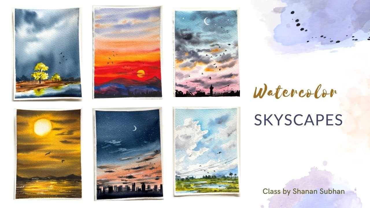
Transcripts
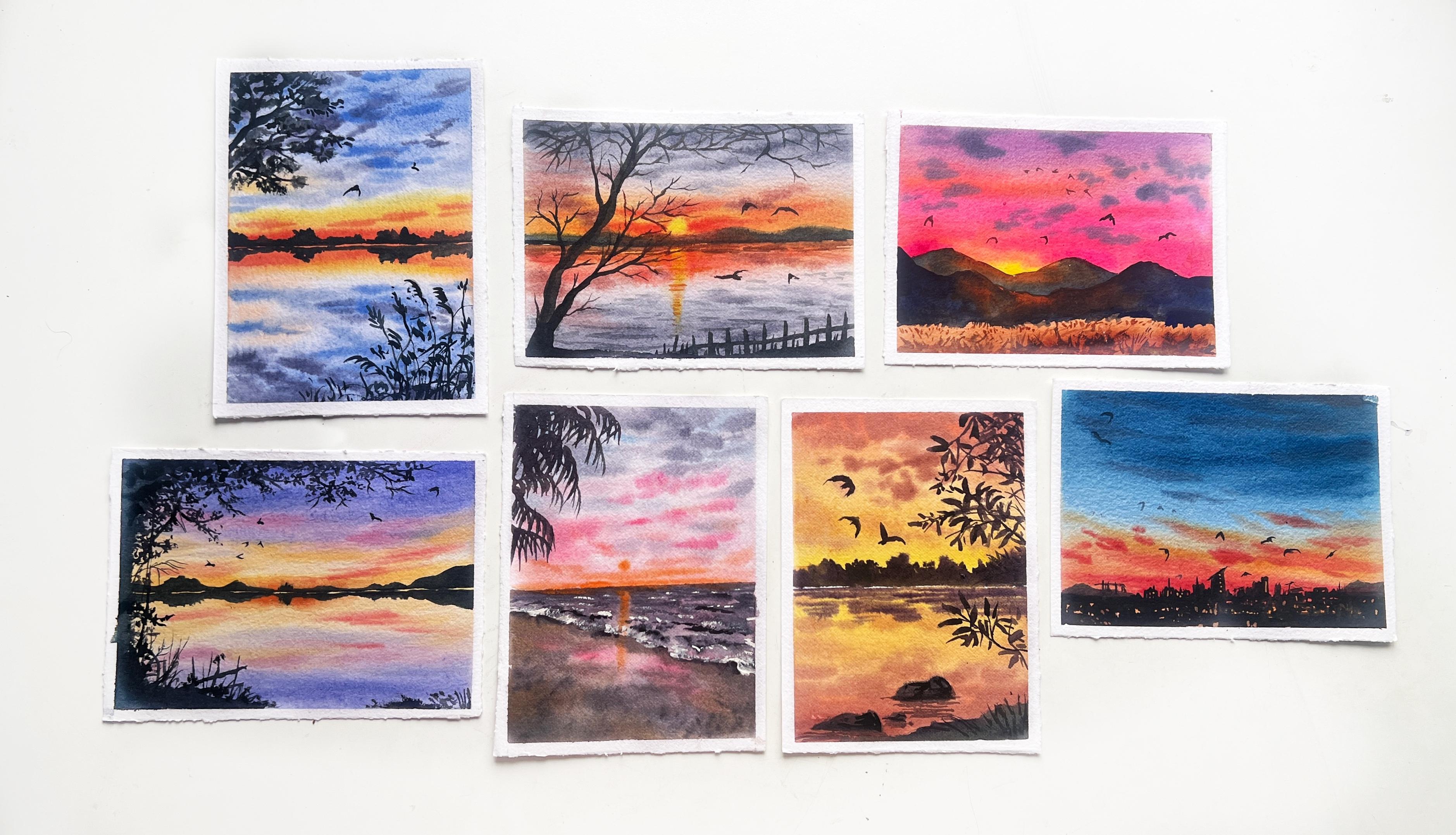
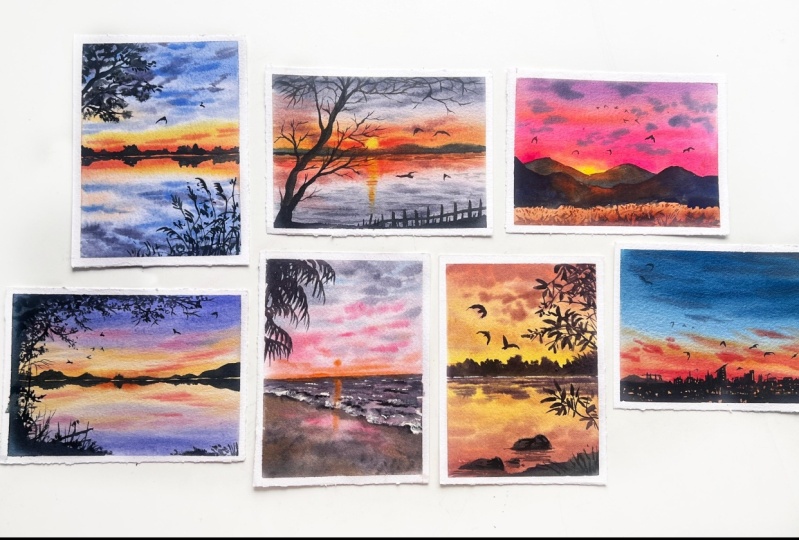
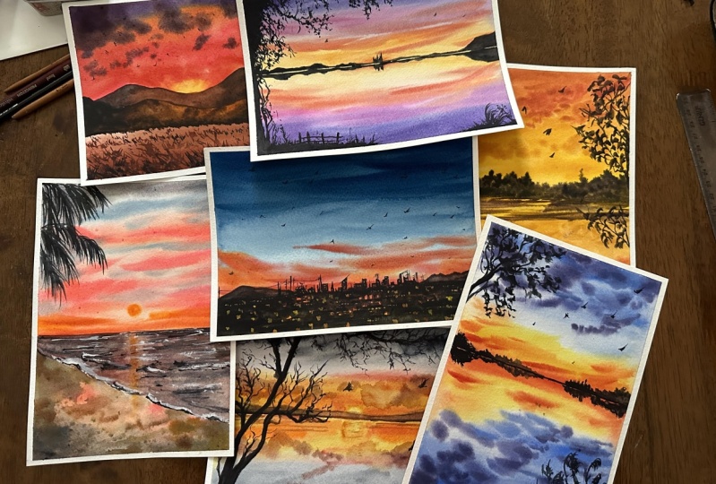
1. Introduction - Sunset & Silhouette Watercolor Paintings: Hi, I'm Shannon, and this
is Phoebe. Say hi, Phobe. Hi, I'm a watercolor
artist from Bangor, India. I love painting landscapes. You can check out my artworks
on my Instagram page, Ws. Welcome to my class on painting sunset and silhouette paintings. In this class, there are a
total of seven paintings. We'll be painting
them one at a time. Each day, I'll be posting
the painting sessions. Painting sunsets is
mesmerizing because there are endless opportunities to explore their beauty as we witnessed
them every day in our lives. In today's class, we
will unfold the magic of painting sunsets and
Silowz using watercolors. We will dive into
different techniques for painting clouds
and sunset skies, creating vibrant and
dynamic painting scenes. We will discuss how to achieve
various types of clouds from airy light weighted clouds to thick and
dense formations. You will learn how to blend
the colors seamlessly and how to consider perspective when painting clouds in the sky. We'll also talk about
complementary colors and color mixing
using a color wheel. Then we will discuss
various types of brat strokes to
paint the filet, and we'll also have
practice sessions to paint simple sunset skies. Ultimately, we will
bring together all this knowledge through the completion of
seven projects. I will guide you step by
step through the process of creating stunning
sunset landscapes. Join the class and enjoy
2. Art supplies used in the Class: Now, let us talk about
the art supplies needed to paint the sunset
and silhouette paintings. I'll tell the name of the
color and also the brand. First is permanent yellow. This is by M jello Mission. The next color is Naples yellow. This is by the brand senili Next is yellow per
by Art Philosophy. Next orange by white knight, permanent red by Art Philosophy C. Bright opera by
Mijello Mission. Burn Sana, again by Mjomsion crimson by art philosophy C raw umber, number two by Mago mission, Sepia dioxide purple by Ceneli On the opposite side, I'll be only using
the shades of blue, so I'll only mention about them. Next is ultramarine
blue by white knight, Indigo by Mago mission. Pain cray by Daniel Smith, ivory black by art philosophy. And we also have cellin
blue by Cenelio. These are the colors I'll
be using in this class, and we would need white gauge
paint or watercolor paint. I'm using Brustro
white gauche paint. Anytime you see me
picking paints from here, that is gauche paint. Now, let's talk
about the papers. I'm using Citrat
four 40 SM paper, and I'm using the
backside of this paper, which is slightly mat finish. Let's check the
size of this paper. You can take any
rectangular paper. Okay, the size is
19 14 centimeters. Next, let's talk about brushes. I'll be using three
different brushes. First one is this
Princeton Neptune mob brush of size four. I'll be using this for
washes and wetting the area. Next, we have silver velvet, size eight for the regular brush strokes
and silver velvet, size two for fine lining
and detailing purpose. A pencil for rough sketching. If you have a water
spray available, then you can use that
to wet the paper. This is an optional tool. You can also do without it. Next, I will tape the
paper onto a glass sheet. You could use any hard surface
clipboard or similar item. We are using this hard surface, so we can tilt the paper and move it around in
different direction, making the painting
process easier. If you're taping the paper
directly onto the table, you won't be able to achieve the tilt and flow effect that's important
for watercolors. Okay. And to tape
down the paper, we would need masking tape. So I'm using a three
quarter inch masking tape. Okay. Next, we have
two jars of water. One jar is to clean the
dirty paints of the brushes, and other one is to take
clean water for the washes. We also need a
napkin to wipe off the extra water or the extra
paints while painting. I have two napkins, one for wiping off clean water, and the other one for wiping off paints that has already
become dirty in the palette. For example, here, my
palette has this red color. I'll just take this
napkin and clean it off. Lastly, we need a head dryer to speed up the
painting process. If you don't have a head
dryer, that's also fine. You can let the
paints dry naturally. These are the supplies I
will be using in this class. You can go ahead and use whatever similar supplies
you already have.
3. Watercolor Washes: In this chapter, we will discuss different types of washes
used in this class. We'll start with flat wash. Here we apply the paints, either wet on dry or wet on wet. But ensuring the end result is uniformly flat without
any unevenness. A flat wash creates a smooth and consistent
layer of color, making it ideal
for backgrounds or larger areas where a uniform
appearance is desired. Next is variegated wash. In a variegated wash, we apply two colors
and blend them together evenly
using clean water. This technique can be done using any watercolor technique, such as wet on wet
or wet on dry. Variegated wash creates
a smoother transition from one color to the other, adding depth and dimension
to the painting. This is one example
of variated wash, where we blend two colors
and this one as well. Next, let us talk
about gradated wash. Here, we begin with the
thicker application of color and then gradually dilute it by adding water
with each brush stroke. We are slowly moving
towards lighter shade. This method allows for a seamless transition
between colors, creating a soft gradient effect. Next is the layering technique. In this technique, we apply two or more layers of
colors to the painting. The first layer serves
as the base layer, which can be any initial
color application. Then we build upon this base
by adding subsequent layers. For example, let's say we
have painted a base sky using the sunset shades like
a yellow pink around the horizon and
blue on top area. Next, to add the clouds, we would need the
layering method. After completion of
this base layer, we will proceed to add
darker clouds in the sky. That is our next layer. This process of applying
multiple layers, one on top of other is known as layering technique
in watercolor painting. These were a few washes and techniques that we will
be using in our class. I hope we have grasped the fundamentals
behind them. Okay.
4. Perspective guide - Painting Clouds: In this chapter, we will discuss the guidelines for painting the clouds in different sizes. Consider this line as horizon line and the point
on it as vanishing point. Let's draw a rough grid to illustrate how everything
converges towards this point. Whenever you paint
or draw clouds, keep an imaginary
sketch in your mind as a guideline to help you shape
the clouds realistically. We need to direct all the lines towards the vanishing point. We have drawn all the lines. Now we will start
drawing the clouds. The area inside the line is
narrow near the horizon. We will draw the
clouds smaller there. In the upper part
where the area is, we will draw bigger clouds. In the mid section, we will
draw medium sized clouds. As the lines grow farther
from the horizon, the clouds will
increase its size. The lines converse towards
the vanishing point, which determines the
size of the clouds. Closer to the horizon
and vanishing point, the clouds will be smaller. As we move away, the clouds will get larger. Similarly, if we have to
paint the reflection, we'll apply the same rule. Smaller clouds near the horizon and bigger away
from the horizon.
5. Complementary colors - ft Color wheel: Let us look at the color heel. By referring to the color hel, we know that we can mix
any number of colors. Today, using the same, let's understand about
complementary colors. Complementary colors are
those placed next to each other on the color heel and they contrast
with each other. For example, yellow and violet, orange and blue, red and green, are all complementary pairs. These colors sharply
contrast with each other. Be careful when you want
a vibrant painting as mixing these
complementary colors can result in a mud mix. However, this can
also be used to our advantage to create
various shades of brown. In this painting, I have used shades of
yellow and violet. These are complimentary colors and they compliment each other. Now, let's talk about mixing different browns using
complimentary colors. Let's take this example. Here, I've taken two portions of yellow and one portion of
the opposite color violet, which gives me a
muted yellow color. Next, I'll be using two portions of orange
and one portion of blue, which gives me a
orangish brown color like burniana color. In the opposite side,
I've used two portions of blue and one
portion of orange, which gives me a paints
gray type of color. Similarly, if you mix all these colors in
different ratio, you'll get different
type of brown colors. So I hope you'll
find this helpful in your color mixing journey. Okay.
6. Transparent and opaque Watercolors: In this chapter, let us talk about transparent
and opaque colors. Before that, let us
understand how to identify transparent
or opaque watercolors. On a paint tube, you will find an attribute
indicating its transparency. If that box is empty, that means the paint
is transparent. If the box is half filled, then it is semi transparent
or semi opaque. Let me demonstrate you
with some examples. For the demonstration, I will use different types of ellos. One is permanent yellow, and other one is yellow
c. Within this box, I'll sketch a pencil line to check the transparency
of the paints, followed by applying the
paint over the line. If the pencil lines remain clearly visible
post application, then it indicates the
transparency of the color. Conversely, if the lines exhibit a faded or
smudged appearance, it signifies slightly
opaque color. Here, we observe that permanent yellow reveals
the underlying line through the paint while yellow occur does not display
the line as distinctly. Next, I'll use
another yellow color, which is Naples yellow. That color also is
slightly opaque. Next, for the
transparent section, I'll check ultramarine
blue for its transparency. This color is transparent. You can check your paint tubes. If it has empty box
or half filled box, that will determine its
transparency level. Here, if you don't want
to spend time figuring out if it is transparent
or opaque colors, there is another method
for making opaque color, which is adding
white gauche paint to the color that you want. Here I have taken white
gauche paint and mixed it with the yellow color,
which is transparent. After mixing, the color
will become opaque. You can see the
difference clearly. I will repeat the same for
ultramarine blue as well. For this class, we will require both transparent
and opaque colors. Transparent colors are ideal for painting the base layers
or transparent layers. While opaque colors are
better suited for painting dense clouds or any element that does not allow the
light to pass through them, which gives them the
denser appearance. The above example is
watercolor plus water, and the bottom one is watercolor
plus white gauche paint. Next, we will paint
a sunset scene using two mini paintings for
demonstration purpose. In one painting, we will depict the clouds using
transparent colors. While in the other, we
will use opaque ones. By the end of this
demonstration, you will notice the contrast
or changes in the clouds. Remember, there is no
right or wrong way. It's simply our
preference in this class to create denser clouds
using opaque paints. Let's begin the painting process by wetting the area completely. I will begin by applying orange paint around
the horizon area, followed by crimson and then
ultramarine blue on the top. These are all
transparent paints. Since we are painting
the base layers, for both the boxes, we will
use transparent paint itself. Now, let's take crimson
and a little bit of violet and some paints gray. Basically, we want a
darker volet color. We will use same shade for
painting both the clouds. For the first part, we will apply direct paint, which is watercolor paints. For the second one, we will
go with white gauche paint. I'm sorry, the color mixing part has not been captured entirely. We've taken small amount of this paint and mixed it
with the gauche paint. Let's see how it looks. We have got a thick
and dense color. Towards the horizon,
we will apply smaller clouds and
on the upper part, we'll apply bigger clouds. Next, we will apply only watercolor paints
on the first painting. Here you can say this
is not that thick and dense and you can see the
underlying paints slightly. There is nothing wrong
with this as well. But in this class, I prefer having a
denser looking clouds. It also depends on
personal preference. If you intend to paint
A or wispy clouds, transparent colors
may be preferred. Conversely, if you aim to
depict defined clouds, opaque colors would
be more suitable. Ultimately, it's about achieving the desired effect
in your painting. Now, let's dry this area and see how it looks once it dries. It is dry. Now you can
see the difference. First one is very airy
and light weighted. The second one is
dense and defined.
7. Brushmarks and Silhouette: Let us discuss the colors
used for silhouettes. Even though these
colors look like black, they aren't pure black. They have different undertones. In this chapter, let us
explore how we can mix various colors to achieve different shades
for silhouettes. Firstly, I have this color, which is a mix of
sepia and paints gray. Next I'm going to mix
violet and paints gray. When you look at these colors, they both look black. But when you apply
water and dilute it, you will see different
undertone in this. Similarly, I'll
take in the go and mix it with a little
bit of brown. Here, when you apply water, you'll see a blue undertone. Next, I'll take darker shade of sepia and mix it with the
little bit of paints gray. Now when we see the diluted
version of this color, it has a brown undertone. Next I'm going to mix crimson with the paints
gray and sepia mix. Okay. This will also look darker when you
apply thicker color. But as you apply water, you will see a
maroonish underton. These are all the paintings
and each painting has a different color undertone
in its silhouette. This one here has a
brownish underton this painting has slightly
bluish underton in it. Let us practice painting
tra silhouette. I'll use the paints that's
already on the palette. We'll start with
thick main branch. As we paint, we'll fork it into smaller little curvy branches
to make it look natural. Keep your lines continuous
and progressively th add small twigs on the
outer end for extra detail. You can also add some
overlapping brush strokes so that it looks dense. Next, I will paint
the tree foliage by dabbing the brush to create
the impression of leaves. By wearing the pressure and
direction of your dabs, you can simulate the look
of the leaves together. Note that I'm just dabbing the tip of the
brush and not entire brush. You don't have to worry about
making exact leaf shapes. Just da and the brush
will do the work, creating a natural
leafy texture. For a different
style of foliage, I'll dab the brush
using the belly of the brush to create long
elongated leaf shapes. For this type, you have to use a thinner fine line of brush. Thick brush won't do the job. P dabbing and create
cluster of leaves. Yes. Next, let us
paint the same tree. But this time, we'll
paint the leaves first and then connect
them with the branches. I'll dab the brush
using the belly of the brush to create
elongated leaves. Once we have all the leaves, we can connect them
using straight lines, forking them to
form the branches. Next, let us paint
the palm leaves. I'll be painting them sideways. You'll need to apply repeated jagged brush strokes to achieve the desired effect. We will try to capture the characteristic
shape and structure, mimicking the natural
essence of palm leaves. In this painting, I'll be using these kind of brush strokes
and some grass blades, which goes like simple straight lines in
different direction. Again, in this painting,
for the tree foliage, we are using the daping method. And the foreground grasses, we'll use some wild grass
shapes, something like this. In the next painting, we have painted a bare tree. In this painting, it is
these elongated leaf shapes. In this beach painting, it is the palm leaves. And in this pink painting, we have these simple
grass plates. And in this sky line painting, they will be painting the
building silhouettes. To paint the skyline silhouette, there are two different methods. One involves painting with an orange undertone while the other one uses
directly black color. I'll demonstrate both and you can choose
whichever you prefer. First, let me draw the outline. Now, I'll fill the
color inside this area. I'll write completely
using a head dryer. For the second one,
we'll mark the outline. Here we have orange
undertone and we will leave the spaces to suggest
the building lights. Let's carefully apply
this dark color. Leave some spaces, smaller
boxes here and there. This will collectively
appear as city lights. Next, I'll go back to
the first one and add some white gas paint
suggesting the city lights. I'll apply white dots. Then I'll mix yellow with
white and apply the same. I'll apply this on the
second one as well. This is a rough depiction
and may not look perfect. But I just wanted to show
how this can be painted. Once this is painted, you can add some fine
details at the end, like adding some
wires and towers. Moving on, let us practice
painting the birds. Here, we are painting
the birds in either or inverted V shapes
or you could just draw some dots and
then add the wings. You could even use the belly of the brush to create
bigger size to birds. Just dab the belly of the brush, creating thicker brush strokes. All right. These were some of the silhouettes that we can
include in our painting.
8. Practice Simple Sunset Skies: In this chapter, we will practice blending and
painting simple skies. Before moving on to painting
multiple layers in the sky, I want to make sure you're comfortable with
single layer washes. Let's start by painting these
mini sunset skies together. I have drawn four
rectangular boxes to practice these
mini exercises. I recommend you practice along with me so
that you feel more comfortable and confident when you attempt the class projects. For the first exercise, we will go with wet
on wet technique. Let's supply water
inside this box. I will paint the sky
using three colors. I'll start with opera
pink at the top. I'm using midtone consistency
of opera pink color. For the mid section, I'm
using permanent yellow. Using a clean dam bruh. I'll try to blend
the two colors. And I'll finish it with
permanent red at the bottom. Try to blend the colors well. So there are no sharp patches. For the next exercise, I will mix a darker blue color using paints gray and
ultramarine blue. I'll apply this color directly onto the paper
without wetting it. This will be wet
on dry technique. I'll hold the paper in a slightly tilted position so
that the colors flow down. Next to the blue color,
I'll apply crimson. As blue and pink gets mixed, they'll create a let color. Below this color, I'll
apply opera pink. Since the paper is tilted, you will see the
colors flowing down, creating a nice blend. At the bottom, I'll apply
yellow and blend it with pink. When pink mixes with yellow, it creates an orange color, which is ideal for
sunset paintings. This way, we can use both wet on wet and wet on dry
technique for the washes. In the third exercise, we will be painting
a simple sunset sky with wispy airy clouds. Before everything, we
will wet the paper thoroughly and then start
applying yellow color, leaving some white gaps. After applying the
yellow Brostrokes, we will then take paints gray and apply on
the empty areas. This will depict the
clouds in the sky. Finally, we will add thick orange color in
the bottom area to represent the sun and use the same orange color
to apply some bras strokes. Next, let us move on to
our exercise number four. Here, we will be painting like a varicated wash. Let's
go with wet on wet. I'm wetting the section
using clean water. The water is not so
clean, but it's okay. I'll start off with the
violet color on the top. And then I'll apply yellow
occur in the bottom area. Now the task is to blend
these two colors together. I'll use orange color in the lower area and opera
pink on the upper area. With the help of
pink and orange, I'm blending these
two colors together. You could also use plain water. Okay. Going back to
the first exercise, if your paper is still damp, then you can paint a sun
using a orange color dot. If your paper has already
dried, then don't touch it. Next is the fifth exercise. In this one, we will be
painting a bright glowing sun. First, let's wet the area to go with wet on wet technique. We will use negative
space to paint the sun by applying yellow paints
around a circular area. This is an imaginary
circular area. If we are using pencil
to draw the circle, then it will leave
the pencil mark. Then towards the end, we will apply orange
color around the edges. Blend these two colors together. Voila we have a bright
glowing sun in the sky. Now, if you want to create
sunbeams or sun rays effect, then you can use a damp brush and lift off the pains in
the desired direction. Let us move on to
our sixth exercise. I'll wet the paper first. Now on this wet area, I will apply yellow paints
in the shape of semicircle. Right next to it, I'll apply orange pins followed
by pink color. I'll use opera pink. You could use any
other pink as well. Blend these colors together. This can be used to paint sun rise or sunset
behind the mountains. I'll cover the rest of
the area with opera pink, and then add some purple
strokes on the upper part. Okay. Defining the shape of the sun by adding orange color around the
semicircular shape. There you go. This is done. Now let us move on to
our seventh exercise. In this exercise, we will
paint a fiery red sunset. We will be using yellow and
red as the main colors. We'll start applying yellow on the lower part of
this painting frame. Then I'll take orange
and red color, creating a darker red color. Now apply some overlapping
brustrokes on yellow area. Okay. Then I'll apply
some yellow again, and then some more red. Can you imagine a sunset with such bold colors,
isn't that amazing? Next, I'll take paints
gray and apply it over the top red color to create
darker clouds in the sky. Now with the help
of a dam brush, blend these darker colors
into the red color. Okay. Next, we will move
on to our eighth exercise. Here, we will be painting a
blue sky with orange sun. First, we will apply a flat
wash using blue color. You could use any
darker blue color. Next, using a clean damp brush, lift the paints from
the bottom section. Now apply some
orange paints there. Next, we will be painting the sun using lifting technique. Take tissue paper and lift off the paints from the blue
area in a circular shape. Let it dry. Once it is dry, then you can add
the orange color, which will suggest the sun. Here, I made a mistake of not waiting for
the paints to dry. I started adding the paints when the blue area
was still wet. You can wait for
it to completely dry and then apply the paints. For painting the sun, you can start with
a darker color, probably orange or red. Once you have applied
the full colors, then you can lift off the
colors from the mid section of the sun and apply yellow. This will create a pre
dimensional look in the sun. Now on the upper part, I'll add some darker clouds. I hope you enjoyed
these simple exercises. Now let us move on to
the painting process.
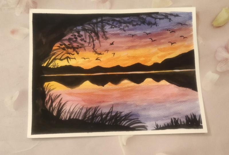
9. Class Project #1 - Purple Haze at Sunset: In this session, we are going to learn to paint this
beautiful sunset painting. Grab your supplies and
let's get started. We'll start off by
taping down the paper. I'm using a three four
inch masking tape. Taping down helps the paper to preventing an
unnecessary curling up during the painting process. Okay. Once you are done, applying the masking tape, run your finger
over the sides of the paper just to ensure that
they are tightly sealed. Also, I'll be directly painting on the paper
without any sketching. Firstly, we'll wet the paper thoroughly to perform
wet on wet technique. I'm using a mob brush
to wet the entire area, and I'll use this masking tape under my paper to achieve
a slight elevation. This helps to create
a flowy effect and all the extra water will
flow down due to gravity. I'll keep applying water
for a long time so that the paper remains moist
for longer duration. Okay. And towards the end
of water application, take a napkin, wipe
off all the water. Now with the damp brush, you will lift off all the extra water that's
there on the masking tape. This will prevent us from creating backruns
in the painting. Okay. All right. Now let us mix the colors. I'm going to take a yellow and a bit of orange to create
that warm yellow color. We will mix this in
one is two one ratio. I'm using size
eight round brush. Now load your brush
with the paints and apply it on the
center of the paper. This is the horizon
area in the painting, and we are painting the base
color for the sunset shades. Okay. Now, let us paint
the upper part of the sky. The upper part of the sky has
this bluish purple color. I'm going to use ultramarine
blue and violet. It will look similar
to perivncal shade. Now to this color mix, we'll add water and make
it a runny consistency. If you do not get the exact
same shade, it's okay. You could use a purple
violet or any blue color. Okay. Now load your brush with this color mix and start
applying from the top part. Apply the paints in
the lower part as well as we are painting a
mirror image of the sky. Next, we will slowly try to
achieve a gradated effect, making the color lighter
as we paint downward. To create a smooth transition
from let to purple, we need to pick a color that
won't create a muddy mix, and it should go well
with both yellow and let. Let us pick crimson apply crimson both on the sky
and the water part as well. Okay. So we can see we have a nice transition from purple to yellow color. I'll apply some more
rush strokes of violet on the upper part to increase the intensity
of this color. We'll do the same on
the lower part as well. In the center area which
suggests the horizon, we will apply some
orange brush strokes to create a sense of red
shift around the horizon. I'm mixing yellow
and orange together. Around the horizon, we'll create intense orange hues blend the colors well by moving the
brush in horizontal motion. Apply some more strokes
on the pink area as well. Try not to cover
the entire area, leave some lighter hues as well. Next, I'll take Naples yellow
and mix it with the orange. This will create
opaque color which will make the clouds appear
dense in the painting. The yellow and orange we used earlier is slightly transparent, we may not get the effect
that we want in the sky. Similarly, the bluish violet
color is also transparent. Now to make it a little opaque, I'm adding white color to it. You could use white watercolor or white gage. It's up to you. Now when I mix this white color, the color becomes
slightly opaque. I'll use this opaque color
to make the clouds denser. You don't have to completely
apply this color, some random strokes on
there in the upper part. I'll repeat this for
the pink color as well. While you're painting this, make sure you're creating a symmetrical reflection
in the water. We need to have a mirror image
of the sky in the water. Yes. Next, let us take orange yellow
and a bit of red for a darker orange color and
apply some brush rows, creating some orange
stripes in the sky. Use the pointed
tip of your brush. Okay, so the background
layer is done. We will let this dry completely. Once the paper is dry, we will add the midground and the foreground elements
in the painting. All right, the paper
looks completely dry. Now, let us paint
the midground area around the horizon line. So I'm taking a darker color mixing indigo and paints gray. Okay. Take this color in a thicker consistency. With the tip of the brush, I'm painting a horizontal line. This is the area where
the sky meets the water. Now to create the separation, I'm drawing another line here, leaving a tiny gap. Next, I'll tap the brush, creating the
impression of trees. Whatever we paint above the
horizon line needs to be recreated below the line as well to suggest the
reflection part. I'll be adding some trees and distant mountains along
this horizon line. You can paint anything you want. It is your choice. Here, I'll break
this straight line by adding some
colors in between. Next, let us paint the tree silhouette on the
left side of the painting. First, I'll block the
area with darker color. And then on the outer ends, I'll be adding the trees
and leaves and everything. Next, I am switching to my size two round brush to add
the tiny foliage shapes. Okay. You can turn around the paper, whichever angle is
comfortable to you. You can switch to
that. We'll slowly and gradually build
the silhouette part. It will comprise
of the branches, foliage leaves and tiny twigs. We'll use the combination
of all these elements, creating a beautiful
silhouette at the end. We have painted a
decent tree branch. Now let us create some foliage. I'm dabbing the bh, creating the
impression of leaves. You could use a fan brush or an old brush to create the
impression of the foliage. Such brushes make
the process easier. For smaller brush strokes, you can use a smaller brush, and if you want bigger leaves, you could switch to a
bigger brush comparatively. You can take your own
time to paint this. There is no rush because
we are painting wet on dry and there is no hurry as such to finish
the painting soon. I'm adding some branches and smaller plants in the
lower ground area. And in the foreground, I'll add a sort of fence and cover the lower part
of it with grasses. Okay. Going back to the upper tree part, I'll add in more leaves
by wearing the pressure. I'm wearing the
pressure in the brush and painting bigger
sized leaves. So there is no restriction in the shape that you
have to achieve here. You could paint silhouettes
of any tree shape. Okay. Also, try to paint the tree branches
in an irregular manner, bringing a sense of organic look to both the branches and
the leaves you paint. Also, do not leave a lot of empty spaces between the
inner foliage and branches. It's okay to have
some loose gaps at the outer extreme
end of the tree. But on the inner side, try to fill it with darker
colors as much as possible. Leave only a few gaps so
that the tree looks dense. Okay. Note that if you're using diluted paints
to paint the silhouette, there's a chance you might see the background colors
due to transparency. Make sure you're using thick or opaque colors to block out the background
colors effectively. I'll add some tiny trees
around the main tree. I'll slowly paint the foliage
and the other elements. You can watch me paint and
then follow along with me. I'll paint with the
varied brush strokes, creating some
leaves smaller and. This will give the tree a
more organic appearance. Adding some grass on the right
side of the ground area. This is to bring a sense of
balance to the composition. Now it's time to add some birds. I love adding birds
in my painting. If you don't want them
in your painting, you can skip that part. And we are almost done
with the painting. But before we finish, I want to add some
orange touches around the horizon to
suggest a setting sun. So I'll use a midtone
orange color and apply it in the center area to enhance the sunset
vibe of the painting. This is totally optional. If you don't want to do this, you can skip this part. If you have these sharp
edges around the horizon, then you can use cleaned
ambrah to soften them. All right, we have completed
this painting project. Now let us carefully remove the masking tape and reveal the final look
of the painting. Okay. Gently peel off the tape. Voila, this is the
finished artwork. I am thrilled with how
beautiful it has turned out. I hope you enjoyed
painting along with me. Don't forget to share your projects in the
project gallery. I am really looking forward
to seeing your artworks.
10. Class Project #2 - Pink Vibrant Sunset: In this session, we are going to paint this gorgeous pink sunset. Grab your supplies and
let's get started. All right. Let us begin by taping down the paper
using masking tape. Tape down all the sites to
secure the paper tightly. This will prevent the
paper from buckling up. Run your finger over the edges to make sure it is
tightly sealed. Now let us mark the
composition of the painting. In the lower half of the paper, I will draw some
set of mountains, and then write below it, I'll draw another set of mountain overlapping
the previous one. Next, right below that,
I'll draw a line. This will be our horizon line, which separates
the sky and land. That is it for sketching. Now, let us move on
to the painting part. I'll turn around the paper
to create a slide tilt. Now, with the help
of a mob brash, I'll bed the area outside
the mountain ranges. Apply generous amount of water, let the extra water flow down. The paper is wet. Next, let us apply the paint. I'm using permanent yellow, which is slightly
neutral yellow. Applying this color on one of the mountain valley to suggest
the sun in the painting. Next, I will apply opera pink in medium consistency right
above the yellow region. Now to blend the yellow
and pink colors, I'm using darker orange color in between to create a smoother
and seamless transition. I will continue applying the pink and orange colors
on the rest of the sky, creating a base
color for the sky. Next, for the upper part, I'll be applying volet to
add slight depth in the sky. Blend all the colors well for a seamless
transition in the sky. Now, around the horizon area, I'm defining the shape
of the sun by making it semicircular around this area, I'll add some extra pink
color to intensify the hues. Next, we will move on
to painting the ground, which is the grassy area. For this, I will use Burn Siana. You could use any other
brown color as well. This serves as the base
color for the grasses. We will revisit this area once it dries to add the
further details. Next, while the paper is
still damp in the sky area, we will add the clouds
to paint the clouds. We will use paints gray
along with gas white paint, which creates an
opaque consistency. Lodo brush with the
paints and start dabbing. We'll paint the clouds using
continuous dabbing motion, aiming to achieve a
wispy cloud effect. On upper area, I'll
paint some larger clouds and smaller clouds around the horizon for more
dynamic composition. Now let us dry this area. I'm using my head dryer to
speed up the drying process. Turn the sheet around
to its normal position. Next, let us paint
the mountains. On the palette, I have this blue color that had
mixed for the clouds. To this same color. I will add ultramarine blue. Apply this paint to
the distant mountain, leaving some gaps
around the center to paint the sunlit effect. To create the sunlit
effect around the sun, I will use burnt sienna
on the mountains. Apply the color to
the middle gap that we left and blend it
with the blue color. When you mix brown and blue, it will become a black color. We will dry this area
using a head dryer. So if we directly apply the
paints on the next mountain, it will bleed into each other. So let's dry this mountain first and then move
on to the next one. To create the sunlit effect
in the next mountain, we would need orange
and burn Ciena. I'll apply orange first around the mid area where we'll
have sunlit effect. Then right next to it, we'll
apply this burn Ciena. Then we'll take pines cray and
apply it around this area. When I mixed Berciana
with pines cray, it looked like a darker color. You could also use indigo here. Next, we'll create a transition
from warm to cool color. I'll apply ultramarine
blue mixed with brown. Next, using burnt Siana, I'll blend the colors together so that there
is seamless transition. Next, using a darker color, we will create a jagged
and toothed effect to suggest grasses
near the horizon. You just have to move
your brash up and down. So I'll go back to
this mountain area and change the shape
of the mountain. So I'll simply add some bluish darker bluish color on the left side mountain. Take Bersana we'll
paint the grasses. Apply some tiny dotted lines to create the effect of grass
blades in the distance. I just switched to my size to round brush for
painting fine lines. As you come closer
to the foreground, increase the size of the grass blades that will create a sense of
depth in the grasses. Around the foreground area, I'll apply some random, bigger brush strokes, creating
definition in the grasses. Since it is closer
to the foreground, it will appear bigger and
it demands more attention. Okay. Now it's time to add some birds freely
flying in the sky. So more smaller birds on
the upper part of the sky. All right. We are done
with this painting. Now let us peel off
the masking tape, revealing the final
look of the painting. Gently peel off the
tape. There you go. This is how it looks so
beautiful and vibrant. I love how it has turned out. Do share your projects as well. I'll see you in
the next session.
11. Class Project #3 - Skyline Sunset: In this session, we are going to paint a beautiful
skyline at sunset. So grab your supplies
and let's get started. I'm going to tape down the
masking tape on all the sides, preventing it from buckling up during the painting process. Once you are done taping down, run your finger
over the edges to make sure it is tightly sealed. Before we start the
painting process, I want you all to mark the
composition of the painting. So we will mark the sky line. It's nothing but drawing
the shape of the buildings, smaller and bigger
buildings against the sky. On either side, we'll mark
some mountain shapes. That is it for now. Rest of the details we can add as we proceed
with the painting. I'll place this
masking tape under my paper so as to get a
slight tilt in the paper. The color of our sky is going to be blue
and orangish red. Here I'm taking Persian blue. I'll mix this in slightly
to medium consistency. Now, apply the pines
starting from the top part. The slight tilt in the paper will allow
the pins to flow down. Keep applying the pines
until the mid section. Once we reach the mid section, we will add water to
the pines and create a gradated wash darker on the top and lighter
in the lower area. Then I'll apply water all
the way till the skyline. Next, we will mix the pains in thicker consistency and apply darker brush strokes
on the top part. This will allow us to have a
sense of depth in the sky. Next letter is mix
the orange hues. I'm using orange and
a warm red color. Basically, I need a
darker orange color. I'll start applying it
around the skyline area. These are the sunset hues. Here, there are chances
that we might get some green color because of the intersection of
blue and orange. If that happens, you can use a damp rush and try to
lift off the pains. Around this intersection area, I'm trying to keep the colors light and towards the bottom, I'll add more darker color. And then we'll apply some
angular brush strokes in the mid area. Next, we will mix
red and pink color. Apply few brush strokes
of this darker red color. Leave some suggestions
of orange sky as well. Don't completely cover it
up with the red strokes. Then I'll take paints gray and apply some brush strokes on
the upper part of the sky, suggesting the darker clouds. This layering work in the sky adds a sense
of depth in it. Here in the bottom part, I'll cover it up
with orange color. This will be helpful to us when we are painting the city lights. Now, let us allow it
to dry or you could use a head dryer to speed
up the drying process. Okay. All right, the paper
is completely dry now. Now let us paint the skyline. For that, we need
a darker color. I'm going to take black and mix it with the
existing Persian blue. I don't want to waste
the colors here. You could take any darker color. So let us start
painting the sky line. Here, we have to just create the building shapes
on the outline area. Then for the inner area, we can simply fill it up. I'm very carefully painting the outline part so that
it appears as skyline. You could also use a flat brush for painting the
squares and rectangle. So here, what I'm doing is, I'm using the underlying paint, which is the orange color to be depicted as the city lights. You can see I'm leaving some
tiny spaces in between. Just leave some
tiny dots here and there that will do the
job of the city lights. And then fill up rest of the area using
this darker color. It is okay if you do not want to follow this step of
painting the city lights. You could also paint or the darker color and then add
the lights using gas color. That's also another way. And with slightly
transparent color, I'll be painting the
mountains in the background. Now, I'm going to define
the shape of the buildings. If they're out of shape, you can add some defining shapes to them so that
it looks organic. I'm going back to
the city light area and adding some
lines in between. The lights looked
quite bigger to me, so I'm making them small. Now, again, allow it to dry so that we can
add more details. I'm using a head dryer to
speed up the drying process. All right. The skyline
area has dried. Now I'm using a fine
line of brush to add some tiny details
like wi towers or so. If you're not sure
about the shapes, then you can look up to the Internet for some
city scape images. Next, let us take white gauge paint or even
white watercolor works, and you can mix it with
orange and yellow. I'll use this for
the city lights. We already know
that adding wash to the paints makes it opaque. Simply add some dots
on the buildings. Lastly, I'll add some birds
flying freely in the sky. And some more birds with the slightly bluish color to suggest a sense of
distance in the sky. Okay, so we are done
with this painting. Now let us remove
the masking tape. Oh, no, I just tore the paper. Never mind, we'll
fix that later. That's why it is very important to peel the paper in
opposite direction. Now let's fix this. I'm going to take the same color and paint it in the
original shape. All right. This is how
it has turned out. I'm really happy
with the outcome. This looks gorgeous with
all the city lights. I would love to see
your artworks as well. So please share them with me
under the projects gallery. Okay, then I will see
you in the next session.
12. Class Project #4 - Lakeside Sunset: In this session,
we're going to paint gorgeous red sunset
by the lake side. Grab your supplies and
let's get started. Let us begin by taping
down the paper. I'm going to apply the masking tape on all
the sides of the paper, giving about a quarter
inch border on all sides. Once you are done, taping down, just run your finger over the edges to make sure
it is tightly sealed. All right. Now, let us mark the composition
of the painting. Take a pencil and let
us start sketching. Firstly, I'll mark
the horizon line in the center of the paper. Dividing the paper
into two halves. I'll draw another parallel line for a sense of separation. Then in the lower
part of the paper, I'll mark the
foreground element. Here, I'll be drawing a fence. First, mark the vertical lines, then connect them through a horizontal line,
making a fence. Then we'll mark the outlines
for the ground area. Now, on the left
side of the frame, I'm going to draw a giant tree. The sketching is just
for the reference. You can change some shapes
later on while painting. I'm going to paint a bare tree in the foreground area. Okay. So that is it with
the sketching. Rest of the elements and the details will
add while painting. Now, let us get to
the painting part. Okay. Keeping the masking tape under the paper to
get a slight tilt. Now, let's start applying water
for wet on wet technique. Using a bigger brush to
cover the area faster. You could use any
brush of your choice. Keep applying water and let
the paper so the moisture. And with a dam brush, lift off the excess water on the sides of the masking cap. This will prevent the
water from seeping inside. Now, take paints gray and add a little bit of wide gauche
paint to make it opaque. Now let's supply the paint
in top and the bottom part, creating a replica or a mirror image of the
sky in the water. As you can see, this
wash was very diluted. Next, apply slightly darker paint gray over the same area. Next, I'm taking sunset hues. I'll mix yellow in a
mid tone consistency. I'll apply this for the glowy
effect around the horizon. Here we have this sharp
transition from yellow to white. To blend that out, I'm
using a damp brush. Make sure your brush
has very little amount of water so that you
can blend it well. Next time taking orange
color in mid to consistency. Notice that the consistency
of the paint is flowy. It is not thick or very diluted. Mine consistency. Now, I'll apply this
color in circular manner, leaving the yellow space to suggest the sun
in the picture. And then I'll apply the
paints around this area. So we have this glowy
sunset appearance. Having the yellow base helps to create a sense of depth
and glow in the sky. Next, I'll take a red color and apply some brush strokes
over the orange area. This will suggest the
red shift in the sky. For the reflection of the sun, I'm using yellow color
on the mid area. Also, blend the colors around
the mid section in the sky. We do not want any
sharp transition similarly in the
reflection part as well. You can intensify the colors in the sky or the reflection part. Next, let us take a
darker paint gray color. Da brush on the upper
part of the painting, creating the clouds in the sky. Well replicate the same
in the water as well. Going back to the sky, I'll apply some bras strokes
defining the shape of the clouds and also some
thin brush strokes, suggesting tiny clouds. Next, let us mix
a darker color in sunset hues to paint the clouds
around the horizon area. I'm mixing paints
gray with orange, creating a brownish color. With that color mix, I'm painting the clouds
around the horizon area. When you're painting the clouds, also at the same time, paint the reflection
part as well. Otherwise, later on,
it will be difficult for you to replicate the shape. You can fix the
shapes of the clouds, but do not over work as
it might in the painting. I love the watercolors
to do its job. All we can do is control the brush stroke or
the amount of water or pressure. All right. Now we will allow
this layer to dry. I'm using a head dryer to
speed up the drying process. You could also choose to
let it dry naturally. Okay, so the paper has dried. Now, let us paint the
area around the horizon. I'm mixing black and indigo
to form a darker color. You could mix any
color of your choice. The next color we would mix is ultramarine blue and indigo. This will give us a
darker blue color. Now I'm taking this color in a very diluted mix and applying
around the horizon area. Leave some space in the
middle and continue painting. The middle space left is to create the site
effect on the mountains. Here, if you notice
the mountain that we painted has sharp edges. So to soften that, I'm using a damp brash. Next, let us makes
a brown color. I'm taking Bercana and red
and also a bit of sepia. You could take any brown color. We just need that sunlit
effect in the mountains. Blend this well into the
darker part of the mountain. Okay. Now, we will take the darker color, the black color that we mixed earlier and apply in the
bottom part of these mountain. This will create a depth and a sort of light shadow effect. Now, take burn siana and orange. This will create a darker
brownish or orangeish mix. I'll use that to paint the ripples around
the horizon area. Next, we'll make slightly
darker brown color. Paint some horizontal lines, creating a rippled effect
in the reflection. Now, let us create some ripples or movement in the water
around the foreground area. The color here is gray. Let's use a darker gray color and apply some z zaggitrokes
creating the rippled effect. Towards the horizon, the size of the ripples are bigger because it is close
to the viewpoint. Okay. Now take any darker color. I'm mixing black brown indigo. All these color mixes will make the color even more darker. I'm painting the silhouette
part in the foreground area. With the help of
some simple lines, I'll be painting the
fence in the foreground. Also, adding in some
smaller extra lines as filler elements to
make the area look busy. Moving on, let us paint the
giant tree in the foreground. I'm using the same color
mix for the tree as well. Okay, so the paints around the horizon area
has not dried yet. So because of the wetness, it will spoil the shape of the
tree that we are painting. So we'll allow it to dry and then continue
with painting the tree. All right. Let's continue. I'm adding the branches
for this tree. We are painting a
giant bear tree, so we need to add more branches and twigs in various direction. Next, to paint thinner branches. I'm switching to my size
to file liner brush. This will be easier to
create thinner lines. Paint the branches regularly
so that they organic. Now, let's paint some tiny ks. To achieve thin brush strokes, you can apply light
pressure on the brush so that it creates very thin lines. S. Now to create the sunlit effect in
the tree branches, we will use brown color. This transition from
black to brown color will create a glowing sunlit
effect in the tree branches. There is no fixed number on the number of branches
we are creating. You can paint as
many as you want. It's up to you. T. On the upper tree branches, we'll paint some
overlapping brush strokes so that the tree looks dense. Now, we'll go back to add some tiny twigs on the outer extreme
ends of the branches. Finally, it's time
to add some birds. If you don't like birds
in your painting, you can skip this step. Okay, so we are done with this artwork. Now, let us peel
off the tape and reveal the final outcome. There you go. This is how
it looks once it is done. I'm really happy
with the result. Very bright and vibrant
sky by the lake side. I hope you enjoyed
this session with me. Do share your artworks
under the projects gallery.
13. Class Project #5 - Beach Sunset: In this session, we
are going to paint a beautiful sunset at the beach. Grab your supplies and
let's get started. Let us begin taping
the masking tape. Here, I'm using the paper in a portrait mode and
not landscape mode. Let's tape down the paper. I'm applying the masking
tape on all the sides, sing it down tightly. Once you're done,
taping down the paper, run your finger over
the edges to make sure it is tightly sealed and also place a masking
tape or something under your paper to create
a slight tilt. Let us begin with the sketching, draw a line in the
center of the paper, marking as a horizon, on either side of the paper, we'll mark the points to
connect the shore area. Then we will add some
waves defining the shape of the shore. Okay. So let us begin our
painting process. I'm going to wet the
paper using a mob rush. Apply generous amount of water. I'm wetting the entire paper. I'll keep applying the water
so that the paper absorbs good amount of moisture and remains wet for a
longer duration. Now let's mix the colors. I'm going to mix two colors, opera pink and orange
in equal quantity. This will create a very
orangish pink color. You could use any bright
pink color of your choice. Now, I'm taking
this color mix in a diluted form like
very water remix. I'll apply this color mix, starting from the horizon area. Also leave some white spaces in between depicting the
white color of the sky. I'll applies on the lower part
as well on the shore area. Next, let us take panes gray I'll dab the panes
on the upper part, leaving some white
spaces in between. Okay. Also applying it on the ground area as well. Apply some brush strokes over the pink area,
suggesting the clouds. This is just the initial
wash to add clouds. We are going to paint
another layer of colors. Now let us add some
touch of blue color. I'm taking Cerulin blue
and the Coval blue mix and damming it in the blank spaces
that we had left earlier. I. Apply some paint gray
or gray brash strokes on the ocean part. Next, let us paint the sun. I'm going to use orange in a thicker consistency and
directly apply it on the paper. Applying the orange
brash strokes on the sea water and
also on the shore. This is a reflection of the sun. Apply some orange brush strokes
around the horizon area. Apply orange brush stroke
again along the horizon line. This will intensify
the sunset colors. My paper is still damp. If you spend some time
wetting the paper, it will remain wet for
a longer duration. Next, I'll take this opera pink and apply some
clouds in the sky. Also pin the reflection in
the water and the sand part. Here, the sand is
slightly damp or wet. That's why we can
see the reflection. Now, going to the
upper part of the sky, we will add some darker
clouds using paints gray. Also replicate the same
in the reflection. The reflection on the
seashore sand part will not be that visible at the end, we'll be covering that up, but we need to have some hints of the reflection of the sky. All right. Let us dry this area. I'm using a head dryer to
speed up the drying process. All right, the paper
looks completely dry. Now let us mix the colors
needed to paint the s. I'm using paints gray and
a little bit of opera pink. This will give us a
muted gray color. Now, take this color in a runny consistency and apply it inside
the sketched area. I'm leaving the space
for the orange part. We will later blend
it with the water. For now, paint the
rest of the area. Once you're done
with this, clean your brush and
with a damp brush, you can blend it with
orange and the gray part. Next, I am taking
orange color in a Maton consistency and applying it along
the horizon line. This will create a glowing
reflection in the water. Okay. Next, we will focus
on painting the sea. Here, we will define
the shape of the waves. The shape of the waves is
curvy or slightly up and down, so we will capture
that form first. Next, to add a sense of
movement in the waves, we will incorporate
some darker colors to create contrast between
lighter and darker areas. Thus, I have added these horizontal brushes
on the wet area. Next, with a slightly
darker color, I will outline the
shape of the waves. This will define the
boundaries of the sea. To enhance the depth of
the ocean or sea waves. I'm adding dark
color brass strokes. Additionally, I'll also add some orange stones to amplify the reflection
of the sunlight. These techniques contribute to creating atmospheric seascape. I'm using a head dryer
to dry the pains. If you do not have a head dryer, you could just leave
it to dry naturally. Now that the paints
have dried completely, you may notice that they
appear slightly dull. This is a characteristic
feature of watercolor where they tend to appear
lighter upon drying. You don't have to
worry about that. Moving forward, I'll be adding some intricate details using a fine liner brush to create
the shape of the waves. To capture the
movement in the water, simply apply smaller and
repeated brush strokes. This will beautifully depict the liveliness of the
water in the scene. Next, we are going to paint the ground area of
the shore while also being mindful of the reflection I want to create
in the moist sand. To achieve this, I'll first wet the area thoroughly
with the clean water. Apply gentle brush strokes of water so that you don't pick
up the existing paints. I'm taking raw umber in a midtone consistency and
applying on the sand area. Leave some areas untouched
to maintain the pink hues. These untouched areas
of pink will act as the reflection of the
sky on the wet sand. I'm applying some
pains cray as well. I'll add some more brush
strokes of raw amber creating a connection between
the sand and the water. We'll go back to the
sea water part and add some ripples around
the horizon area. This area is far
from the viewpoint. It is closer to the horizon. The waves or the ripples are going to be much
smaller in size. Simply add some dotted
lines that will do the job. Let's go back to
painting the sand. I'm going to add
some details here. Take raw umber in slightly thicker consistency and apply some brush strokes
over the brown area again. This is to intensify the shape
and form of the wet sand. Now, I'm going to
cover the upper part to go with the
splattering technique, load your brush with pains and splatter the pains
on this wet area. This will create a sense of
noise in the foreground area. Now when to stop, please do
not overwork on this area. Next, let us add some
definition to the waves. I'll use white gauche paint
directly from the tube. This will suggest the foam or the bubbles formed
by the crashing waves. So when you're painting the
foam around the horizon area, just apply some dotted lines. The elements far from the viewpoint doesn't
have to be that detailed. The waves currently appear flat. So to add a sense of depth, I'm adding darker brown color around the perimeter of the sea. I Moving on, I will be adding palm
leaf silhouettes on the left side
of the painting. This addition will enhance a harmony and also contribute
to the overall composition. I will be painting
multiple palm leaves. Painting the palm
leaves is quite easy. You have to apply repeated
jagged brush strokes and also vary the pressure
that you apply on the leaves. I'm painting the palm
leaves of different sizes. You could also paint
some overlapping leaves. If you're finding it difficult, you could watch the
video first and then rewind it and paint
along with me. Returning to the s
part of the painting, I still feel that
the boundary of the sea needs a little
more fine tuning. Therefore, I have decided to add more darker colors around the perimeter to
enhance its depth. Remember, it's
perfectly okay to go back to your painted elements
and make some adjustments, but do not over work or get
hung up on the perfection. Allow yourself to enjoy the process and embrace
the flow of creativity. I'm adding some final
details on the palm leaves. Okay, so we are almost done. You can step back, have
a look at your painting, see if it needs any changes. All right. This is done. Now let's peel off
the masking tape. There you go. This is how
the painting has turned out. I hope you enjoyed
painting this with me. Do share your class projects
under the project salary. I would really love
to see your artworks.
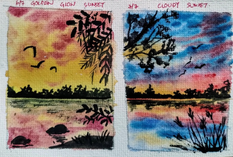
14. Class Project #6 - Golden Glow Sunset: In this session, we are going to paint a warm golden sunset. Grab your supplies and
let's get started. Let us start by
securing the paper tape all the sides to
prevent the paper from buckling during the
painting process. Once you're done taping down, run your finger over all the sides to make sure
it is tightly sealed. Now, let us outline the
composition of the painting. Draw the horizon line approximately in the
middle of the paper. Then add some bushes
along the horizon. Next, we will sketch the reflection of these
bushes in the water. Moving to the foreground area, mark the ground area and include some rocks partially
submerged in the water. In the upper part
on the right side, we'll sketch the tree
branches and some leaves. There is no fixed count on
the number of branches. You can paint as many of them. That is it for the
composition for now. We will add rest of the
details as we paint. Next, let us mix the colors. I'm going to take shades
of yellow orange. First is yellow cor, mix it in a thicker consistency. Next, take yellow cor
and mix it in crimson. This will give a nice
muted orangey brown color. I don't know what
that shade is called. Next, let us makes yellow color. I have this neutral
yellow color. So we have these three colors
ready in the ballette. Let us begin painting by taking this yellow color and applying
it around the horizon. Apply yellow for the
reflection as well. Next, apply yellow
occur right next to this and blend it well
with the existing pins. Continue applying the paints
almost till the upper area, and then add the orange mix. Blend all the three
colors together. This will create a
smooth variegated wash. Now repeat the same process for the water
reflection as well. Next, I'm going to mix a darker mix using yellow
cor, let and crimson. These three colors will create a nice muted maroonish color. Since yellow occur
is a opaque color. We don't have to add white gauge to create
that opaqueness. I'm using this color to
paint the clouds in the sky. Gently dab the brush, creating the impression
of the clouds. Whatever you do
in the sky has to be replicated in the
reflection part as well. Moving on to the
reflection part. Here I'll add the clouds. The size of the clouds
doesn't have to be 100% s. You can try to achieve 60 70% similarity in the
reflection and the actual shape. Okay. I'll also apply some yellow grass strokes
around the horizon area. Also applying some
orange grass strokes along the horizon line. Moving on, let us paint the bushes around
the horizon area. I'm using a very darker color. You could use any darker color, such as paints gray, darker volet, dark brown, black or any color
that you prefer. When you're painting
the tree shapes, try to make them irregular
and asymmetrical. That will make them
appear organic. Okay. This step can be performed either when it
is damp or completely dry. If the paper is very wet, then it will smudge and won't
create the desired results. Next, we will paint the reflection of the
bushes in the water. To accomplish this, apply horizontal brush strokes to
create the rippled effect. Next, we will mix a
darker volet color. I'm using violet because it's the opposite complementary
color of yellow. Mix violet with paints gray or black to get a darker color. Now apply this color on
the silhouette areas. Next, let us paint the rocks, depicting them as partially
submerged in the water. Okay. I will also add a few smaller rocks
around this area. Next, I will dry the paints completely using a hair dryer. This will prevent
interference with the future leaves that
we are going to paint. Next, let us take a color. This will have a
purpliish undertone. Okay. Next, let us begin painting the
leaves one by one. I gently dabbing the brush to create the impression
of individual leaves, applying each brush stroke
in various direction to miic the natural growth
patterns of foliage. We will link all these
leaves with branches, making it look like they are
growing together naturally. After adding the branches, you can add some filler
elements by delicately applying simple lines to enhance
the overall composition. Next, we will move on
to another branch. Here again, we'll
paint the leaves individually and then add
the connecting branches. Okay. Next, we will introduce additional
branches overlapping with the existing foliage. This creates a sense of
depth and complexity. Next, let us introduce
another layer of foliage on the upper part
of the painting frame. Here, I've started by adding the branches first
followed by the leaves. Both approaches nice results. On the corner, I'm adding some filler elements
by simply adding some lines and leaves
depicting the branches. Apparently, all the leaves appear uniform or
similar in size. To infuse further
organic appearance into the composition, we will introduce some
smaller sized leaves around the main foliage, enriching the visual complexity and the essence of the scene. Next, we will go back
to the rocks area and enhance the sense of depth by
applying dark bras strokes. This technique will
create a play of light and shadow adding
realism to the rocks. After this, we will depict the reflection of
the rocks in the water. Now to achieve this, we'll
use shades of orange and orange brown complementing
the natural hues of water. We'll opt for
slightly darker tones to create the contrast. Then apply horizontal
zigzag lines to evoke the ripple effect and capture
the movement in the water. Okay. Next, I'm adding some grass blades on
the lower bottom area. All right. Lastly, we will add some free flying
birds in the sky. I'm using my size
two round brush. You can also use a
fine liner brush. Before we conclude the painting, I would like to make
a quick correction. So I want the three
branches to appear denser, particularly around
the corner area. To achieve this, I'll add
more branches and leaves. Additionally, adding some
random paints to create a and denser pang. All right. Now let us carefully remove the masking tape to reveal the final look
of the painting. There you go. It turned
out so beautiful, right? I'm truly pleased with the colors and the contrast between the silhouette
and the sky. Please don't forget to share your own class projects
in the project section. I'm eager to see your creations.
15. Class Project #7 - Cloudy Sunset: In this session, we are going to paint a cloudy sunset painting. Grab your supplies and
let's get started. Let us begin by taping
down the masking tape. Gently tape down all
the sides to secure the paper from buckling up
during the painting process. Once you're done taping down, run your finger over the edges to make sure
it is tightly sealed. Okay. Let us mark the
composition of the painting. Take a pencil and mark the horizon line in the
center of the paper. This will divide the
sky and the water. Next, I'll draw the mountain and its reflection
around the horizon area. In the foreground, we'll
have some wild grasses. I will roughly outline the
grasses for the painting. And then during the
painting process, we can define their
shape more precisely. And then on the top left part, we will paint the tree branches. Now, let us get to
the painting part. Here, I'll place
masking tape under the board to create a
slight tilt or elevation. Next, let us mix the colors
needed for painting the sky. First, let's mix
ultramarine blue. I'm mixing the colors
in one to one ratio. You should have a runny
consistency in the paints. Next, let us makes
orange and red, creating a darker orange color. Then I'll add a bit of
burnt sienna to this color. We have the paints
ready in the palette. Now let's wet the paper. I'll apply generous amount
of water using my mob brush. I'll apply multiple
strokes of water so that the paper absorbs
good amount of moisture. Now, let's take the blue
color that we mixed. I'm using size a round brush and applying the paints on
the upper part of the paper. This is to suggest the blue sky. Similarly, I'll apply it for
the reflection area as well. Next, we will apply this orange red color around the horizon. Now, I'll take some
yellow color and apply it around the orange brass strokes
that we applied earlier. Next, I'm going to
mix orange and red and apply it around
the horizon area. Next, let us take
ultramarine blue in a slightly thicker
consistency and apply it on the
upper and lower part depicting the clouds
and its reflection. Here I've applied all these brush strokes
in horizontal manner. Okay. Around the mid section, I'll try to create a glowish effect by applying
some yellow bras strokes. So far we have painted
the base layer. Now let us add the clouds
using opaque colors. Let us mix opaque blue color. I'm going to use white
gauche paint and ultramarine blue mix it together
forming an opaque color. With this color, I'm going
to paint the opaque clouds. I'll repeat the similar brakes
on the water part as well, creating the
reflection of the sky. Next, I'm going to mix a
darker blue opaque color. I'll take paints gray and indigo mix it with
the white again, and a little bit of purple. I have a let blue opaque color. With this, I'm going to
paint the clouds in the sky. So I'm applying some
angular brush strokes. You can also use zigzag brush movements
to paint the clouds. Switching back to the
ultramarine shade. I'll apply it in the mid section wherever I have some
empty white areas. Do not use two water paints. Take it in a mid
tone consistency. You can paint the clouds
in any desired shape. There is no restriction in the shape and
form of the clouds. I'll apply some darker clouds
on the left top and bottom, creating a sense of depth. Then around the horizon, I'll apply some darker
orange brush strokes. All right, we are
done with this layer. Let us dry it using a dryer. All right, the paper
is completely dry. Now let's paint the
elements near the horizon. I'm going to paint a tree line. First, let's draw
the horizon line. I'll be dab the brush, trying to create
the tree shapes. We'll paint the similar replica
for the reflection part. Leave a tiny gap between the actual shape
and the reflection. This is to suggest the separation between
the sky and the water. You can paint any
tree shape here. If you want you can also paint some mountains
in the background. Next, we will paint
the tree silhouette. Here I'm using a mix of
indigo and paints gray. You could use any darker color. Start by painting the
branches in a thicker manner. Then as you proceed, you can fork it into
multiple branches. Paint tree branches
in irregular manner. So here you could leave the
tree branch dry and bare, or you could add the foliage. I'll be adding the foliage
by dabbing my brush, creating the impression
of collective leaves. Here, my brush has very
little amount of paint. That's why I'm able to
create this textured defect. Next, in the foreground area, we will be painting
the wild grasses. Apply the paints in this manner. This will create the
wild grass shape. Just have to apply
some repeated lines. Paints in different direction. Once we are done with this, we will use a fine
line of brush and connect all these with
the straight lines, creating the overall shape
of the wild grasses. Paint them in by manner, and not very straight lines. Okay. So once we have added the basic shapes, we will add in some
random lines and dots inside this area to
make this appear fuller. Next, we will go back to the tree area and
add some leaves, creating a sense of realistic
effect in the tree. I'll use my fine liner brush and dab the brush creating
the impression of the leaves. You don't have to
paint the entire area. Just some leaves here and
there would do the work. And some more grasses
around the foreground area. Lastly, I'll add some birds
in the sky. All right. We are done with this artwork. Let's feel off the masking tape. I hope you enjoyed all the sessions and had a
fun learning experience. Do share all your projects
under the projects gallery. I'm really looking forward
to see your artworks. Please do leave your reviews
or feedback for this class. That would be really
helpful to me. All right. I'll see
you in my next class. Until then, bye bye.
 Shanan Subhan, Watercolor/Gouache | Art Educator