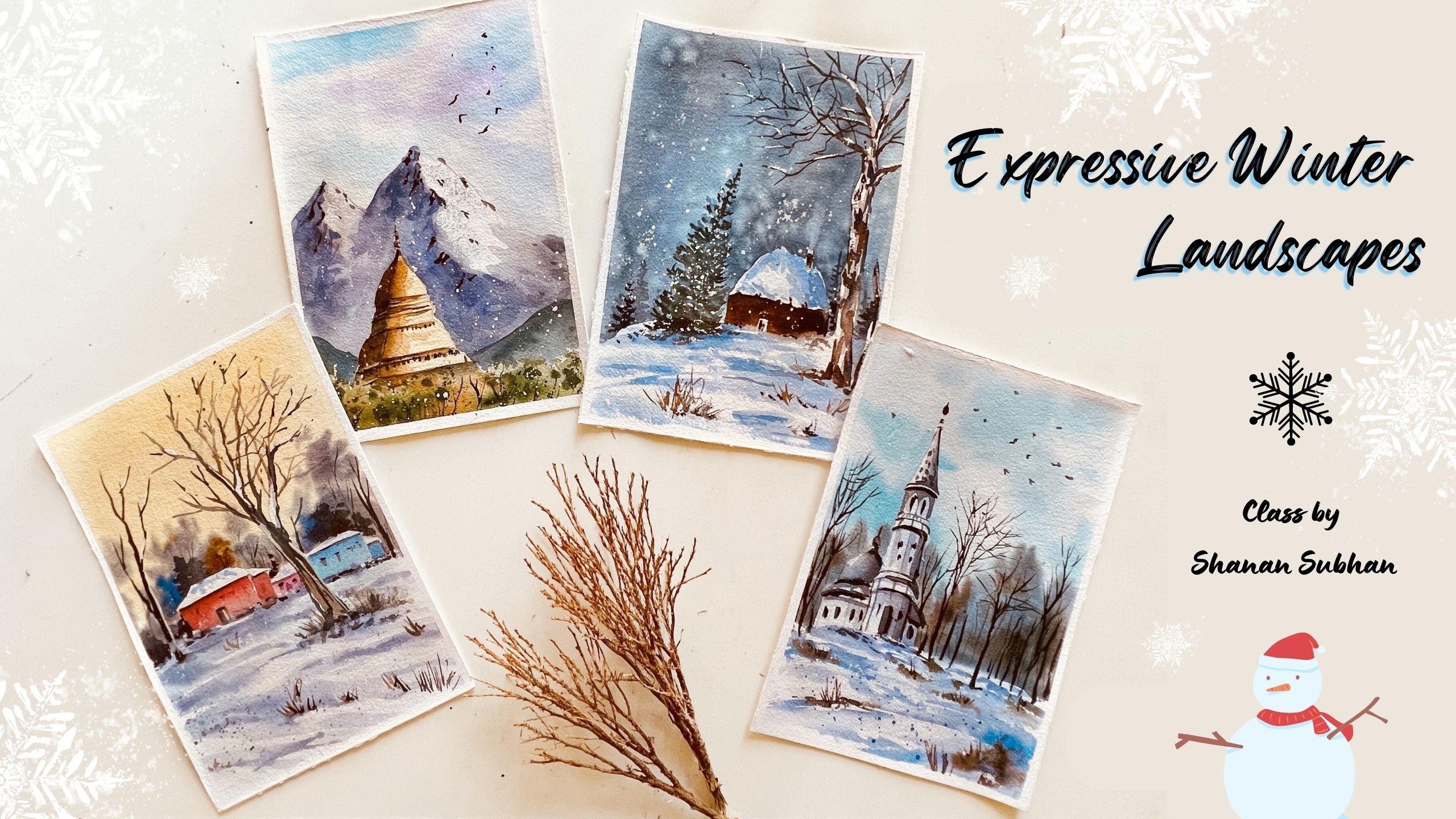
Transcripts
1. Introduction: Welcome to the class,
expressive winter landscapes. In this class, we
are going to paint for gorgeous winters
cave paintings. Hello, I'm Shannon and artist
based in Bangalore, India. You can check out
all my artworks on my Instagram
handle, watercolor. This class will help you to level up your watercolor skills. We will be discussing
about various factors affecting the highlight and
shadows while we paint. Then we will also
learn about how to achieve depth in the
objects we paint. We will talk about
the importance and application of tonal values. I'll walk you through
all the art supplies that are needed for the class. Then we'll work on
the composition part and the colors required
for the class. We will have some drawing
exercises as well. Once you're ready, we'll move
on to the painting process, where we will paint each
painting step-by-step. Every step will be explained
with great instruction. I'll also be sharing some helpful tips during
the painting session. So come join me in
this class and let us together create this
beautiful winter landscapes. So without any further
ado, let's get started.
2. Art supplies: Okay, so before we start
the painting process, let me walk you through the art supplies that I'm
going to use for this class. The papers that I'll be using
for 40 GSM handmade paper. So this is 100% cotton for
40 DSM and rough texture. So you can see the texture
is slightly rough. Okay? So all four papers are the same. Talking about the brushes, I'll be using these
four brushes. This is my mop brush. This is size eight round brush. The mop brush I'll use for the washers and to
cover the larger areas. This is for the
medium-sized brush strokes and size six as well. Then they have a size two round
brush for detailing part. And this is my old brush, which I use for painting the
foliage and the foliage, the branches and
anything very loose and anything that I want
to paint very randomly. I use this brush so
that the bristles. I don't care even if
the Brazil school bag, because this is a very old brush and the bristles are
really worn out. Now talking about the colors, I have this color palette where
I have stored the colors. This is violet, red, and blue, different
shades of red. There's a low or a yellow ocher. So toluene blue, sap green, ultramarine blue, cobalt blue. Once you are now been Dumbo,
Payne's gray, indigo. And this is pink. Rose my door and pink. I have two shades of pink here. This is black, this is white. White I use for making the
paints a little opaque. You'll see that in the class. And I have orange, raw, umber, viridian green,
but he didn't heal. Okay. So these are the colors and the palate has these wells
where I can mix my colors. This is my new palette which I started
using a month I go. I'm really enjoying it because I don't feel the need to have
an extra palate or plate. I can do all the mixing right in this palette and wipe it off once I'm done
with one painting. That's about the colors. Also, I will be using gouache paint and mixing
it in this ceramic bowl. So if there's any
paint left in this, I can go back and use
reuse this again. This is my gosh, color and the ballot. They have a spray bottle, water spray bottle to wet my
colors and also the paper. This is really helpful to
wet the paint and the paper. Then I would be using napkins, wiping off the water
to have water in this. And I can just slide my brush, remove all the water. Or I could even do it like this and remove all the
water from the brush. So having tissue paper napkin by the side really
helps me a lot. And I also use some tissue
papers, something like this, very soft tissue papers
to lift off the paint or to perform some
lifting techniques are and we have
two jars of water. So the water is already dirty, excuse me for that. But yeah, you can maintain two separate jars
while painting so that only one jar of water gets dirty and other
one remains clean. I would also be using oh, pencil eraser and an eating it. And so this is really helpful to remove all the
darker pencil lines. And then I have this hairdryer, which I use for speeding
up the drying process. I'll make the paper dry faster with the help of this hairdryer. Then I have this small booklet, this I use for the composition
and the colors watching. That was about the supplies. Let's get started
with the class.
3. Understanding Winterscapes : These are the four
main things that we're going to
learn in the class. So if you observe
these paintings, the common element
here is the snow. So we will learn more
about how to paint. Let's have a look at the
painting one by one. In this painting,
here you can see there are some highlights
and shadows in the snow. It's not just plain
white, right? Similarly in this
painting as well, you can see the brighter
and the shadow side. These two paintings as well, where the snow has
some depth in it. How do we achieve the depth in the snow and what are the
factors affecting it? It mainly depends on
the source of light. When the light falls
onto an image, it gets reflected very brightly. In this painting, the source of the light is from
the right side. The shadow is cast
on the left side. Here we can assume
that the light is reflected on this part and
the backside of yours darker. Same in this area as well. In this painting, we can observe that the shadows are
around the houses. And in this, the shadows are
towards the foreground area. Now that we have understood the factors affecting
the light and shadows. But how do we paint those
highlights and shadow areas? We're going to use multiple
tonal values of Apollo and the whiteness of the people to achieve highlights and shadows. I'm using ultramarine blue, then I lose it so different tonal value to paint the dramatic
effect in the snow. Me show you with the help of an example from taking this
color in thicker consistency. Now if I add water to this, this becomes our
midtone consistency. Then as I keep
adding water to it, it becomes more
and more diluted. This is a lightest tonal value and this one is the
thickest color. Somewhere in-between we
have the mid consistency. So using the combination
of these tonal values, we can paint the snow. It may not be only
ultramarine blue. You could also use indigo
or any bluish color. This is another color. I'm using indigo here. Now if you add water to this, it gives you light
midtone consistency, again, adding more water. So you can see we have different tonal values of
two different colors here. Say I want to paint
a Snow's cape. Then I'll paint the
background or element first. And synthesis small. I'm going to add
multiple tonal values. So I have used diluted blue
and then mid-tone blue. Next, let me show you the
example of mountains. I'll be painting
two mountains where light is reflected
from different sides. You can watch me paint your annual understand
the difference. I'm considering the right
side as the shadow side. So you can see the left side. It automatically got highlighted when we added the darker color. For the second one, the source of light
would be from the right side and the darker
side would be on the left. So I hope you have
understood how the direction of light matters
in any elements you paint. Similarly, we will do this
for the temple shape, your lighter color,
and the darker color. So if you want to
paint something, absorb the light and
shadows on them, then you will be able
to easily recreate the image or come up with your own compositions
considering the source of light.
4. Project 1 - The Temple: Before we start our project, let us have a look
at the thumbnail. So the thumbnail for
this painting goes like, Oh, we'll have a mountain. And here are the four
pillar of this mountain. We have a temple. You can practice this temple on a rough piece of
paper so that you feel confident when
you are drawing on the actual painting paper. Behind this, that
is a small hill. In the foreground. We have some trees. Here. We would be considering the sunlight over
here from this side. So this part would be brighter. And this way, the shadow
side, the light again. Fonts on the right side. The left side,
automatically it becomes darker due to the lack of light. This creates a three-dimensional
mountain shape. And even for this temple, the light would be
reflected on the front, on the right side. Backside of this template will
automatically look darker. And here we have some trees. So we'll keep it very
simple and cheap. And the sky color
is also very mild. The colors that I
would be using. So first is YA lit, then I lose a lot. For the brighter side,
your scheduling. One channel. For
the darker side. You would also need
some ultramarine blue, burnt umber, cobalt blue for this mountain, plus green. And we will need a black color. Payne's gray is also fine. You can go with any similar
color that you already have. Okay, so let's get started
with the painting. I'm going to save down
this masking tape. So once you have a
Amnon, the paper, just run your finger over the edges to make sure we have
tightly sealed the paper. Okay? No, I'm going
to draw the sketch. So I have any data
zone and a pencil. I'm drawing a shape that
is similar to a triangle. And then dividing it all around 30% for the backside and the 70% toward
the front side. I'm not so great with
drawing the building shapes, but I'm still
learning and trying. Right behind the mountain, there's this Haley, and in the background
we have the mountain. So this is our though for tail
part of the mountain area. I'm going to keep my cardboard
in or tilted position. So let's start with the sky. I'm going to apply
it clear water above the mountain area. So we'll go with wet on
wet technique for this. Make sure you're
applying even coat of water throughout this area. Now, I'm going to
take a break before I let some federal in blue. So here I have used very
mild colors for the sky. No, I lose my needing
it is to lift off all the darker marks
from this ample shape. I don't want it to have
darker lines while I paint. So I'm going to paint
the lighter area first. So here I'll take a look and apply this paint in
a very diluted form. I'm considering the source of
light from the right side. So this will be highlighted. And the backside know the adjacent side will
have the shadows. So first, here I'll be painting a board the site with the same color as
the base layer. Now, here, I'm going to
add some tree-like shapes. This is the base color
that I'm going to add. Some opening as well. On the upper part
of this tree area. I'm going to solve can do, I do with clear water? Okay, So I let this dry. Okay, So this layer looks dry. You can touch it and see if you feel it is not dry enough, then wait for it
to completely dry. Okay. Now, I'm going to paint the shadow side
of the mountain, okay? So I'm going to take
a darker color. So this is a bluish gray color. Take it in a very diluted form. Paint around this area. Here. When you are applying
the paint, be very careful. You can leave some
white gap also. Next one, so fine. Here I'm using a mop brush for easier
coverage of the area. So here we have the other side of the
bright monk and right, we're going to apply
water. Leave it as it is. Next, I'll be adding shadow
on the other mountain. So we have to write and
highlighted sites in the mountain and to darker or the shadow sides who do not want any patches here. So I'm just applying
some damp brush. So I'm dropping in
some darker color to break the uniformity
in the mountain. This will create
uneven appearance. Again, avoid the
sharp edges here. I'll just use a damp brush to
soften the heart. He bark. Now with the same **** brush. I'm going to just know, glide over this area
to create extra. Okay, so I'm going
to try this area. Alright, the paper looks dry. So next we're going to paint the darker side of the temple. So I'm gonna take burnt
sienna and yellow ocher. Will use this color
in a diluted form. Apply on the shadow
side of the ample. Will also take some
ultramarine blue. I'm trying to keep a balance of cooler and warmer color
in the shadow side. So here we don't want to
create any sharp edge. So I'm just blending
with clear water. Okay. So once this is done, I'm going to dry it. No, with the same brown color. I'm going to paint the shadows
on the highlighted side. So this creates a sense of depth in the
front part as well. So I'm keeping it
as simple as I can. Don't want to complicate
it with lots of shapes. I'm taking very diluted color. So here I'm going
to add a center for midtone value and blend
it with clear water. For any element to
have a sense of depth, it should have 0 or darker tone, mid-tone, and a lighter tone. So here we are
trying to create the same laying some color
on the shrine part. I'm drawing this area
using a hairdryer. If the paper is wet, we won't be able to add
the details, right? So I want this area
to be completely dry. Now take our darker brown color. With this darker mix, I'm going to add
the details now. On the shadow side, the lines are slightly inclined. Also add the details
on the sunlit part so that I can easily
figure out the directions. Follow the pencil marks
that we have drawn earlier. I'm adding some lines depicting the intricate
work on the temple. It is enough if you
can try to capture the essence of the image. You don't have to walk on
each and every detail. Next, I'm taking
slightly darker color. On the other side,
I'm painting it with the slant, slightly
inclined line. So here what I don't
want this line. So if we just blot
it with clear water, I think I'll leave it as it is. For now. Let's see
what we can do later. Now. I'll take and ultramarine blue, mix it together and add some texture on
the mountain area. So I'm simply adding some lines creating
a sense of depth. This area. We can also know
glide your brush, creating some darker texture. Try to keep it as
minimal as you can. On the highlighted side, you can add some mild, actually like effect
using darker color. So I'm using black. So for this mountain, I'm going to add a
greenish blue color. Mixed cobalt blue and sap green. Again, on the bottom area, I'm going to spread
it with clear water. Don't have to paint exact
shape of the mountain. Just create an impression
of the background mountain. Now, you can take your fine liner brush
with darker brown color. You may add some tree trunks. Paint as many trees you
want. That's up to you. So we can use a green color. The upper area, just to prevent the paints from
falling on the temple. And I'm going to splatter
some paint here. Okay, Now to spread that effect, you can dab your finger. So you can see a nice darker and lighter
highlights in the tree area. Now I'm taking black and
applying some details. So adding darker color to any object in the painting
is really important. We should have darker and
lighter tonal values. When we add darker color, the lighter color, it
automatically gets highlighted. So that's really helpful to
bring out the accents of two. The object that we are being can add some boards. If you don't want any
words in your painting, then just skip this step. It's up to, you know, if you want to give
some snow effect, you can use squash. In a thicker consistency. I'm adding very little amount of water so that my brush can hold the paint and mix it in
thicker consistency. Okay. I can splatter the paint. The aid the snowy effect. So yeah, we are done
with the spending. No. Next, remove
the masking tape. So this is how our
painting look like. I hope you enjoyed
painting this with me. Do share your class projects
and the project gallery.
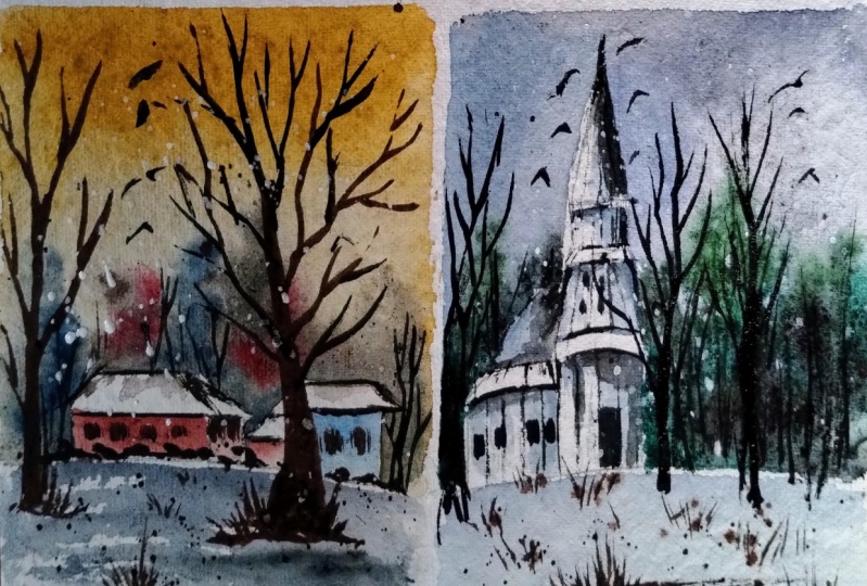
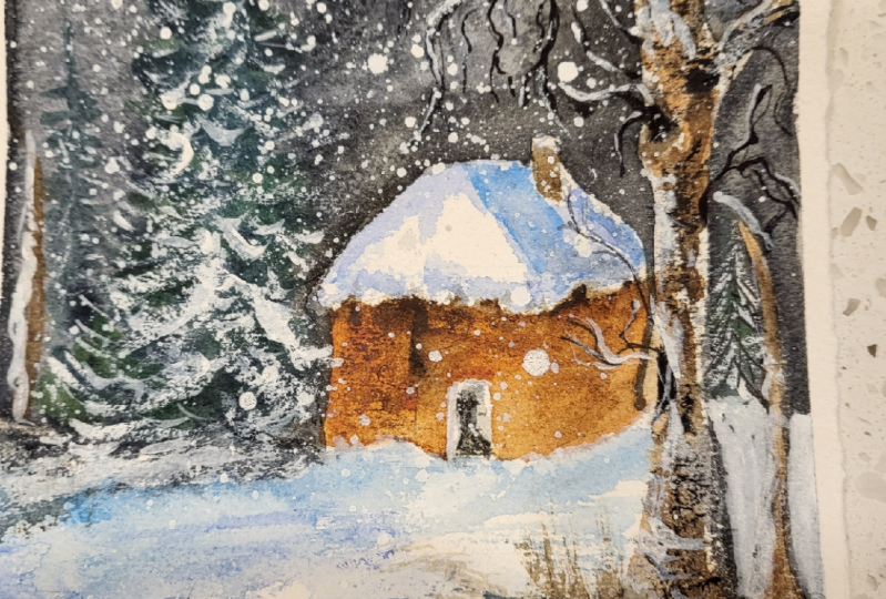
5. Project 2 - The Cottage: Welcome to the second
project of this class. Let us talk about the thumbnail
of this class project. We have a house and a tree, or next to this house, a little closer
to the viewpoint, that is this tree. A small tree here. This foreground is
covered with snow. The darker color here indicates a sense of
shadow in the snowy part. Drops in the sky. It indicates the snowfall. Okay. Yeah, that's about it. Now, let us draw the thumbnail. We'll first draw the
heart or the cottage. And a pine tree by the house. Around this foreground area, that is giant tree. The tree is there. There's no foliage,
your dried tree. Somewhere. Here we
have the horizon. So the background, we have
some trees. In the foreground. There are awesome,
no grass blades. The entire foreground area
is covered with snow. Again, the snow has
some depth in it, so we will be painting it with various tonal values
of ultramarine blue. Okay, so now let us have
a look at the colors. I'm going to use, indigo
and ultramarine blue. We'll use different tonal values of this color to
create the snow. Then I'll be using
sap, green, cobalt, burnt sienna, one, Dumbo, umber, and Payne's gray. We would also need
white gouache paint for the snow in the sky, in the tree and every bad. Okay. Let's get started
with the painting. Okay. So I've done the masking tape and run
your finger over the edges, make sure it is
tightly sealed down. Okay. Now I'm going to draw the composition
of the painting. So somewhere here
we have the heart. So I'll start by
painting the roof, starting with the front side and then adding the backside. I think the walls. It's pretty much understood. Right? You can draw your
own shape of house. Now. I'm drawing the
chimney on the side. Now I'm going to draw a giant tree somewhere
closer to the foreground. Add some wobbly or
branches in the tree. Do not keep it very straight. On Adele pine tree over here. For now. I'm just going to mark
the lines. Later on. She can add all the
details as we paint, mocking the areas for
the grass blades. So this is pretty much
about the composition. Let's start the
painting process. So first I'm going
to paint the sky. So I will mix in
the wall of a bond. Tambo. Also paints gray. So I'm going to
keep the paper in an inverted manner so that
the color flows backward. We'll start applying
the paint for the sky. Look carefully, apply it
around the heart area. Here. I'm going to leave
some white area for those. No. I'm going to leave this white space
for the tree trunk. So here I'm going to
paint another branch. Painting around that area. Paint the sky before the paint dry out. There. Don't want this area
to have a sharp line. So I'm applying some white area, white doll, oh, sorry. Water here so that it gives
out white-collar crime. Leaving negative spaces
wherever I need. And then painting the rest
of the area for this guy. Next, I'm going to dry
the paper for some time. And when the paper
reaches about 60, 70% state of dryness, then I'm going to stop and
apply some water droplets. So that will create
nice blooms in the sky, suggesting
the snowfall. In order to let the
paint is completely dry, let it reach to about 60, 70% of damp state. Now we're going to
apply to the water. Now I'm going to try
it again completely. So you can see we have this
white droplets in the sky. Okay, so I'll stop drying here. Now, I'll turn around
this board and you can see these tiny droplets. They appear like a snow
in the distant area. Now I'm going to paint a
tree shape with water. So here I'm drawing
pine tree with clear water and my
size six round brush. So this will act as
the base for the tree. So I'll use or
bluish green color. So I have mixed
blue and sap green. In some areas, not everywhere. Though, shape of the
pine tree foliage. This is the initial
layer of the tree. We're going to add
darker layer later on. Once you're done creating
this initial layer, we can stop it and then we want to paint the other element. Moving on, let us
paint the tree. So I'm going to mix
the colors for that. So here I'll take burnt umber, burnt sienna in a
very diluted form. Makes it a bit while it. And I'm going to use diluted tone of this
color for the base, wash off the tree. I'll also be leaving some
white space for the snow. Now, use brown, burnt umber, burnt sienna, and
paint the house. That is the cottage
that we have drawn. I'm painting the walls
here with brown color. We will leave the roof
part as it is for now. And nato, or the snowy effect. I'm going to add some
background trees. These trees are at a
distance from the viewpoint. We're painting them
in a pale color. Anything that is not in the focus will be
lighter in color. Okay, So here as well. Now think darker green
color and mix it with a bit of Payne's and burnt umber. We get our darker Green Knight. With this darker color, I'm going to add some
foliage in the tree. So here you can see we have
different tonal values, lighter and darker color. This makes the trailer organic. You can paint the pine tree in your own favorite
style. You want. Now to separate it
from the background and this midground area. I'm going to extend this tree snow part so
you can distinguish between the snow and the
background area right? Now, pick any bluish color and apply it under the tree
to suggest a sense of shadow in the snow blended
with the ground area here. Now, we'll take ultramarine in diluted form and we
will paint the snow. So Yomi, at adding blue lines, this will act as though
shadows in the snow part. So this indicates a sense
of shadow in the snow area. So these white areas,
the reflected part, and the narco, and
diluted ultramarine blue. These are the shadow
part of the snow. Now let's also add some shadow areas on
the roof of the house. The white color of the paper. It indicates the
reflected light on the roof and diluted blue, which is the shadow part, indicates the
shadows in the roof. So it's a combination of
lighter and darker color, which adds a sense of depth. I'm using brown for the chimney. Also. I'm adding
some extra color and on the roof to give
the shape of the snow. Those know, when it is
accumulated over the roof, it cannot have a
straight shape, right? So I'm trying to
give some shape, your grid darker color. Also adding some darker
color on the adjacent wall, which is the shadow part. Now with this paint has dried. So I'm adding another
layer of re-entry. Well, here are as well. Right behind the house. Next, I'm going to
paint the giant tree. So for this, I'm going to use one Tombow plus
bit of Payne's gray. I'm adding some lines, also saving some
lighter brown color. You want to make sure that
you have all three colors. Darker brown, mid-tone
brown, and white. To add some blue as
well from some manias. Now I'm adding the branches, also saving some white
part and on though branches to suggest
the snowy effect. Now with the help of
my fine liner brush, I'm going to add the
branches and it wakes. Gently add as many
branches you want. There's no restriction to add only these
number of branches. I'm painting the branches in
a loose and irregular way. You can also overlap
the branches. Burning, I don't
own the paper can actually help you to
get the shapes right. No bake slightly bluish color and add those shadow,
darker shadow part. So whenever I feel
there's something wrong, I lift up the paint
that I've applied. You can do that as well. Big brown and add some grasses. Here I'm taking a row on bar, adding some grass blades at
random areas of this node. Now adding some darker
color to add some depth. And on this area. Also adding some grasses and
on the pine tree. And the heart. Next noticed gosh paint. So this is white gosh. I'm taking the paint
directly from the tube to have a thicker consistency
with this paint, I'll apply it over the
branches to have snowy effect. That is the snow collected
over the branches. On this tree. We can add some white patches
depicting the snow. So now let's take white paint, splatter it as the snowfall. I'm taking away a
thicker consistency so that it appears white
even after drying. Also flattering it over the sky. You can add some darker
ultramarine blue to create for the shadows in the snow part. You can lift off some
paints if you feel it as well, more than required. Alright, so we are done
with this painting. Let's peel off the masking tape. All right, So we have
removed the masking tape. This is how our
painting looks like. Once it is ready. I hope you enjoyed
painting this with me. Boucher your class projects
under the projects gallery. I would really be happy
to see your works.
6. Project 3 - The Village: In this project, we are going
to create this artwork. So let us get started. So before we start
with the painting, let me walk you through
the thumbnail of the beam. Okay. Who's embedded? In the lower half, like 40% of the people will
resolve for the ground area. And here we will be drawing some random
shapes for the houses. In the background.
We have some trees. These trees are distant trees and they're appearing
blurry and shape. Somebody closer to
the foreground. We have a tree or a giant tree. And there are some grasses
in the foreground area. The foreground, from the mid
ground to the foreground. We have this area
covered with snow. So you can see there is variation in the snow
palette as well. Some bed with darker
color, right? Yeah. So we haven't
another tree here. Some trees in the background. This is the thumbnail
of the painting. Now let us have a
look at the colors. For this guy, I'm
going to use an ocher. Payne's gray or sorry, YA lit. Also use some
bonds, Yan'an bond. Glue. I'm somebody. Umbo could also use some black or mix your
own black by using blue, brown and all those colors. Then we would also need
some white gouache paint for all these white highlights. That's about the
thumbnail and the colors. Now let us get started
with the painting. Okay, let's get started. Apply the masking tape. Run your finger
over the edges to make sure it is tightly sealed. Okay, so the paper is
taped down neatly. Now, let me draw the
composition of the painting. I'm going to divide
the paper into like, I think about 64%. The sky area is the sixth
and the ground area is 40%. Okay? So here I'm going
to draw some houses. These are very simple
shape of houses. Nothing complicated. The lower area will not
keep a straight line. Maybe you want to have it a
little uneven appearance. Behind this, we'll
paint some trees. From the foreground. Midground area will
draw a straight line. That will be our tree. Making sure we don't have any sketches inside
the tree area. So it is it off? Okay. So I'm gonna use
my needing it is up to remove the darker
pencil lines. I'm going to take an orca, apply lots of water in
this and paint the sky. So renewed approaching around the tree trunk and the
roof part of the house. Be very careful and not apply
paints inside that area. Or you could just roughly
apply the paints and later on you can use white
gouache paint. Be very mindful when
you're applying the paint. I don't want the roof. He wouldn't have to paint
flow inside the roof area. You could use a tissue paper
to lift off the paint. I'm taking the board so
that the paint flow in the opposite direction and
we will get a clean wash. So now I'm switching to
my size six round brush. And I'll take YA lit
and Payne's gray one. So a bit of indigo.
Her into this. I'm going to add some white, so some brown to mute it down. So we'll use this color
for the background trees. Gliding my brush and creating
this foliage effect. You could use multiple colors as well for the distant treeline. Dabbing my brush to create the
impression of tiny leaves. Maybe we can add some
blue color as well. Just break the symmetry. Also some brown. Okay, so we have painted though
distant background trees. Now. I'm going to add
know like red and yellow. On maybe orange. Paint this house. Use any color of your
choice. That's up to you. For the next house, I
lose signal in blue. Mixed, I'm thinking
which color to use. I think I'll go with
the pink color. This part over here is the
extension of the same house. Now you slightly darker
blue. For the shadow. For the background
extension loop. This house. Adding shadows to any object makes it
look three-dimensional. That's what we want in
our paintings, right? Since the sky is
elevation color, our snow would be
somewhat neutral in color instead of
ultramarine blue. So I'm going to use a
bit of burnt umber. And ultramarine blue mix. Also add slight bit
of white color. Now to achieve or softer snowy
effect in the foreground. I'm going to spray some water. And I'm applying this
diluted color mix. You can already feel
a sense of snow and the shadow in
the snow, right? So leave some white
paper whitespaces for the reflected
light in the snow. We do not want the color of the houses to bleed
inside the snow part. So let's just keep it
flat on the table. Makes darker blue color and
apply on this wet snowy area. So this acts as the darkest
tonal value in the snow. From using it and other tree. Some places around the houses
for those shadows can see I'm trying to give us
land inclined direction to the snow lines. They give us the visual cues for those land or sloppy
appearance in the snow. I'm going to use brown
in the same mixture and paint some of the
areas in this tree part. I want to save some
white color in the tree. So I'll paint only
some of the areas. Now for the tree trunk
into multiple branches. You can add as many
branches you want. So the initial layer, I have painted it with
a lighter brown color. Later on we can add the details. Part is wet here, so the color is
bleeding into the sky. I'm going to lift off the
paint using my tissue. So we'll leave it
here for Brian. The paper looks dry. Next, I'll use a diluted
version of blue. Let us this Payne's gray and
paint some random branches. I'm painting the branches
very irregularly. You can also overlap
the branches. Notice how I'm wearing the
brush strokes as I paint. Now I'm adding some
darker colors in-between. This will add a
nice variation in the branches where we have lighter and darker color based on the light
reflected on it? No. Let's add some darker
color on the trunk part. Writing some darker
color for the branches. And I want to also add some overlapping branches
so that the looks natural. Now for the distant tree
foliage that we have painted, need to add some branches
from those trees as well. So I'm adding these
distinct branches as well. The user doesn't have
to be very detailed. You can just create
the impression of the tree trunk and the branches. No, I don't. The midground area, I'm going to add another tree. So look at where the
tree trunk originates. So this is an own does
snowy area right? Next I'm going to add some details like doors
and windows on the houses. Do not have to paint exact
shapes of windows and doors. Just create some
tiny impression of the shapes that you
want to create. A new tree. Bluish
color for the roof. This is adding depth to
this, knowing the roof. So here I'm adding some
darker color around the houses so that it
creates a tonal contrast. Currently, I'm feeling
that everything looks very mid-tone him color. So I want to add
some darker colors. Glasses and on the
bottom of the tree. It was all fine liner
brush if you want, or you could also use the
pointed tip of the brush. Anything that works for you. So I'm going to
splatter some paints, you're in the foreground area. Next, I'm using darker
Payne's gray on some of the branches to create
tonal contrast. So I want to add
some darker foliage behind the house so that
the roof gets highlighted. This tree foliage right
behind the houses. When we have these
darker foliage on the trees behind the houses, the roof, that is the
white color of the roof. It automatically
gets highlighted. So that's the purpose of adding this darker color
in the background. You can use whitewash. Although this is
an optional step. If you want, you can add white color or
leave it as it is. But adding white will bring out a nice contrast when
darker and lighter color. Well around this area
here near the houses, I feel we need to add some darker color so that
the houses get highlighted. So I'm using a mix
of burnt umber and Payne's gray and just
dropping some color. It doesn't have to
mean anything that you can live up to your
viewer's interpretation. Now, I'm adding some white
around the tree trunk. This will separate it
from the background. For some reason. I don't really feel satisfied
with the horses. So I think I'm going to add
some darker color here. I'm going to use
a mid-tone color of red and yellow ocher. So yeah, this looks better. Now. Let's add some grass
blades in the foreground. Alright, so I'm done
with this painting. Let us peel off
the masking tape. Okay, so there you go. This is how my
painting looks like. I hope you enjoyed
painting this with me. Know, share your class project and other projects calorie. I would be really happy
to see your equations.
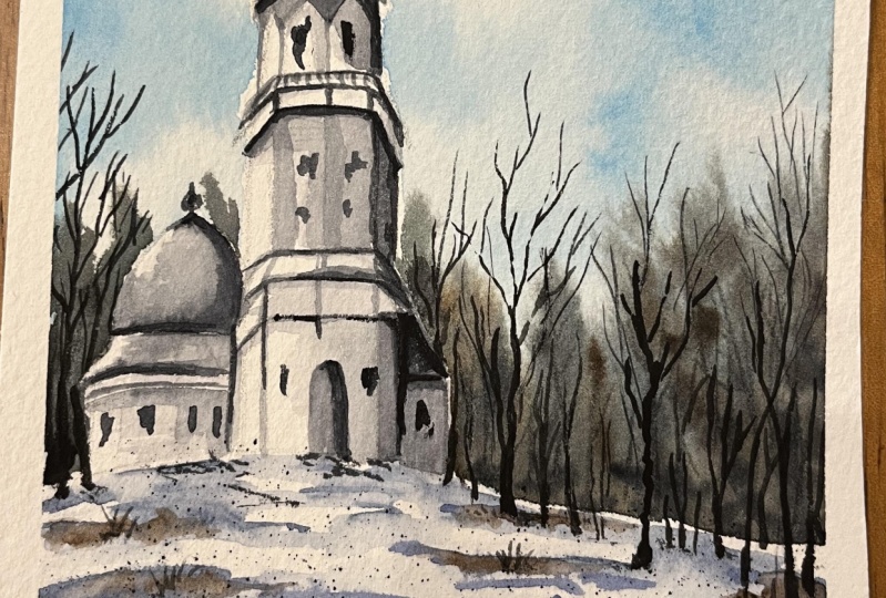
7. Project 4 - The Church: In this chapter, we will
be painting this artwork. So let's get started. Before we start the painting, let me walk you
through the thumbnail so that you get familiar
with the compensation. So somewhere here we
have the horizon. And here we have a building. This is like a
George or a chapel. Roughly going to draw, there's no measurements as such. And in the background we have
some distinct blurry trees. Here we have some tree
trunk. In the foreground. We have this snowy area
covered with some grasses. The colors that
we're going to use, Payne's gray in
different tonal values. Okay? And we have burnt umber, cobalt blue, raw umber, and ultramarine blue. Again, in different
tonal values for the lighter and darker
color in the snow. You could also use some
black for the outlines here. In blue for the sky. So these are the colors, but you can go with
any alternative color that you already have. Okay. So that was about
the thumbnail and colors. Now let's start the painting. Alright. So let's start by
taping down the masking tape. Run your finger over the edges to make sure
it is tightly sealed. Now, I'm going to
draw a building. So this is like
George or a chapel. Somewhere here. We will have this line, parallel,
straight lines. And I bought that. Draw a straight line from
here, these two lines. So this should look
like this shape. From there. We already
draw another shape. I'm gradually building
this towel one-by-one. We'll repeat the same thing
for the upper part as well. Two parallel lines and then a horizontal line
connect them together. The purpose of doing this is to achieve a cylindrical
shape in the tower. There could be numerous ways of drawing this in easier way. But this is how I draw
and this is my approach. If you know any easier way, you can draw it in
your own style. No, I'm drawing this
arch like shapes from the center of this
Mach point and then draw our triangle shape. So now next to this, we'll draw a line again. I want this building
to IPO cylindrical. That's why I'm
drawing these lines and trying my best to give
it a cylindrical shape. These buildings, it doesn't
have to be perfect. Or creating the impression
of it is just enough. Now, let me draw a tomb
for this building. Well, I think this
looks like mosque, right? I'm not sure. Let me draw it again. Yeah, this looks better. Yeah, so we are done
with the sketching part. Now, I'm going to use
my needing it is 0 and wipe off all the
darker pencil marks. So I'll use Payne's gray color, a bit of ultramarine
blue as well. So this should be a
cooler gray color. Okay. I'm going to
paint the shadow side. Considering this side
as the light source. I'm going to apply paint
on the right side. Plus under though shapes
that we have created. I'll be using though color
of the paper that is white or paper color for the
highlights in this building. I'm applying water and on this area to achieve or
mid-tone consistency. The white parts
in this building, it is going to act
as the highlight. The darker bar being
the shadow side. Now, I'm going to wet this area and paint the sky. I use Sedona and
blue for the sky. Carefully apply the paint
around the building. We could have painted
the sky first, but then we wanted these
white highlights, right? So I chose to paint
the sky later once we have the building initial
voice of the building ready. Same time using a mop brush. It really helps me to
cover larger areas. So this initial wash is done. Now I'm going to add some more thicker consistency
of the rule in blue, depicting the clouds in the sky. Okay, so we're
done with the sky. Next, let us find the
distant treeline. Lettuce mix the colors required to paint
the distantly line. I'm going to use
mutate blue color. So I'll take cobalt
blue and burnt umber, and I'll mix a tiny bit of white color paint
the distant treeline can also use some brown. When we are painting
around the building. May very careful though, paint might bleed inside
the building area. Since we're painting wet on wet, we are achieving or softer, blurry background for
the distant treeline. Do not let any paint blade
inside the building area. If it does use a tissue paper
to lift off the paints. I'm using some shades of
brown, like burnt umber, raw umber in middle
of this tree line. This creates a variation
in though student trees. You can use the knee back of
your brush and Beanstalk. Tree trunks. I'm going to dry this. No, use Payne's gray. Paint the outline. Hello, wet brush handy so that you can spread
the colors nicely. Apply paint around this arch. I'm adding some darker
color for the tomb. The white part would be
the highlighted area. Adding some windows and a door. You could use a fine liner
brush to add these tiny lines. I'm using mild pressure to create lines with my
existing brush here. This is size eight. No, I'm adding a slightly
midtone value so that we have a nice contrasting balance from light to mid tone
and then go darker color. If you feel your tomb
has some darker color, you can lift off the
paint using a damp brush. Now, I'm going to
paint the trees. Notice the origin
point of these trees. This is what creates a sense of depth when we're painting
the background elements. Next, let us paint the branches. So I'm ******* drunk
into multiple parts. Now, let us outline
the building area. So I'm using black color here. Adding some final details
on this building. So now we're going
to take ultramarine blue, many diluted form. Okay. That's a bit of burnt umber to move
down the vibrancy. Now let's apply this color
mix in a zigzaggy pattern. Now, wash your brush
and take clean water. Smudge door hard lines. We are trying to
create a sense of reflected light and also
shadows at the same time. Applying some loose brush
strokes in the foreground area. This will act as a sense of
depth in the foreground. Snowy part. I think some mid-tone color
of ultramarine blue. So here. You could
also use bunch here, not all burnt umber. I'll add some grasses. This will be wet on wet because the paper on some
areas of it, right. So only on those areas
I'll apply this paint. Okay, so let's dry
this layer completely. No, use any darker brown color. And add some grass page. Make sure you have right
amount of paint in your brush. Not too much, not too less. Just right amount. No splatter, some
ultramarine blue. For the branches here. I'm going to wipe off
all the water from the, from the brush and paint
the tiny branches, just paint some irregular
shaped branches. So here I'm adding some darker strokes in
front of the building. You can add any
details you want. Now, I'm going to add some
free flying birds in the sky. Okay, so we're done
with this painting. So we are done with this. I hope you enjoyed
painting this with me. Do share your class projects
under the projects gallery. I would really love
to see your box.
8. Thank you!!: Hello again. I hope you had fun
learning session with me in this class. If you enjoyed
watching this class, please do leave a review
or feedback for me. Under the review section. That would really
mean a lot to me. Also, don't forget to post your projects and
other projects gallery. I'm really looking forward to
seeing your class projects. I'll see you in my next class. Until then. Bye-bye.
 Shanan Subhan, Watercolor/Gouache | Art Educator