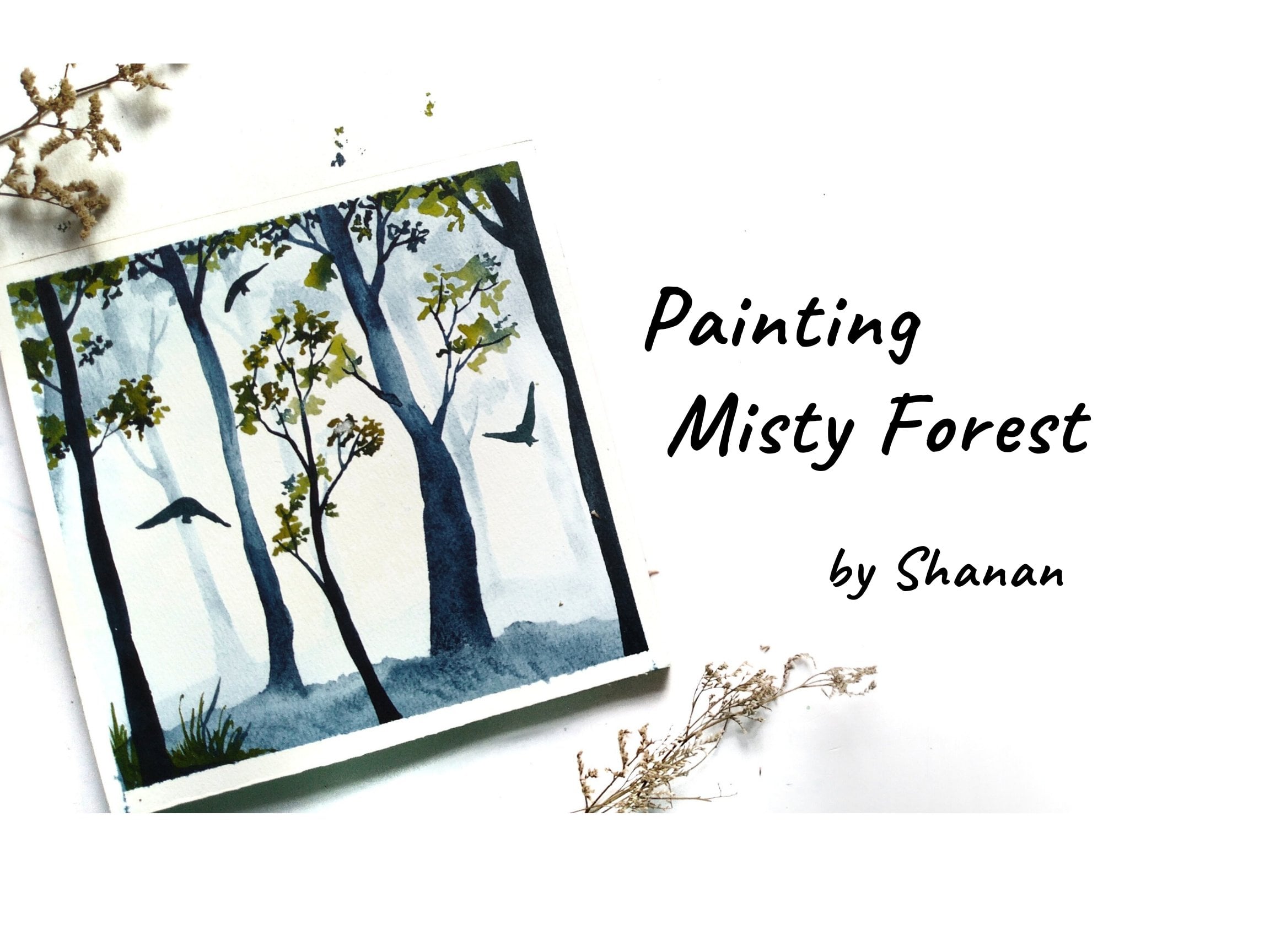
Transcripts
1. Winter Sunset Landscape - Introduction: Window is the time for comfort, for good food and won't, and for the dog beside the fire. Lucky are those who get
to witness the snowfall. Hello, I'm challenged urban am an artist and art
educator based in India. Welcome to my Skillshare
class on painting Windows. I'm sent landscape. Today we will learn to paint this sunset scene in Windows. This class is not just about
painting this artwork, but also about learning light
and direction of shadows. We will talk about some
interesting topics like color values and its range. Learning to control
the amount of water in the painting and adding
dimension to the elements. So without any further
delay, let's get started. Much excited to see
you in the class.
2. Art Materials Needed: Hello again. I'm glad
you decided to join me. This is the painting that
we're going to learn today. Now, let's talk about the art supplies that I
will use for this class. Starting with paper. I'm using SON those. So 300 GSM watercolor paper. It is a 100 percent cotton
and cold press or texture. It is important that we use a 100 percent cotton paper in order to achieve
the same results. Next, let's talk about
the colors I'm using. Colors from various
art is great brand. I have stored them in this pilot for easier
access of beans. And I have displayed as my
palette for mixing colors. Next is brushes. I'll be using these three
brushes by Silverberg brushes. First one is size 12 to
pin the larger areas, then size eight for regular
application of paint. And then I have phase 2, which is 4 finer
lines and details. Then I have a pencil
and it is here. I'm using kneading eraser to remove the darker
graphite lines. You can use a regular
eraser as well. Then we will use
two jars of water, one for cleaning the brushes and the other one to
take the clean water. Then I have some issues
and a napkin to wipe off the extra water and pains from the painting
and the gracious. Lastly, I'll use
masking tape and a hard mold or a clipboard to tape down
the paper while painting. So yeah, these are
all dark supplies that I'm going to
use for this class. You can go with any
alternative supplies that you already have.
3. Color Values and Range: In watercolors,
the water to paint ratio creates a
unique value range. This color range is an
important factor to achieve different modes and drama in the
watercolor paintings. The amount of water added to
paint determines the value, or also known as the
tone of the color. The different value ranges are dark or concentrated value, midtone or a mate value,
or lighter value. When we mix less
water to the pigment, it results in a darker
or concentrated moon. Equal amount of water and
paint eels or mid-tone range. The more water
added to the paint, the lighter the value. So when we apply a lighter tone, the color of the
paper is seen through this layer and hence it
appears more whitish. That's the transparency
property of what the colors. Here consider this color range. The initial stage is
the darker color, and as we add more
water to it in gradually transitioned
into a mid-tone range. And lastly, we have a lighter
tone which appears very whitish or base telling you this is due to the
transparency property. Different colors have
different tonal range depending on the
pigment and the brands. Here. This violet color has a wide tonal range because
of its high saturation. Some colors are less
saturated and some are more. So it is recommended to slash
the colors and understand the properties of the colors before you use them
in your paintings. When we compare
these two pigments, they have different
tonal values. And the violet color has
a wide tonal value range. A good painting
always has a balance of lighter and
darker tonal values. For example, if your painting
only has like no values, then it is going to
look unappealing. Now, you might wonder, where do we use this
various tonal values? Let me show it with an example. Here. In this painting, we have snow on the ground, which is white in color, but we also have
reflection of sun and sky colors on the snow. So how do we achieve that? Here, we will be using the lighter tonal
values of a law and some lighter tonal values of bluish gray to bring out the reflection of the
sky colors on this note. However, if it was
acrylic or gouache pins, we would have to add
white pigments explicitly to make colors lighter in Pune. But in what the colors, we just need to add water to make it lighter. Tonal value. Here's another example
of the sky where we have used lighter values by
adding water to the pigment. If you notice, this painting has a good balance of lighter
and darker tonal values. With the help of
different tonal values, we can achieve a
sense of distance and atmospheric mood in the
landscape painting. With just single color. We can bring out the light and darker mood in the painting. For instance, the distant
object in the landscaping, we use lighter tone and value. This can also be
depicted as though the trees are covered
with mist and fog, which makes it look
lighter in color. When we use darker pigment, it appears as though it
is closer to the viewer. And it can also be depicted as the clear view with no
fog or mist in the wheel.
4. Water Control - How much water to use?: Most watercolor
beginners commonly struggle with water control. It is easier to get
overwhelmed with how much water and pigment
go into the painting. It does sound complex, but you will get hang of it with regular practice
in what the colors. So here are some methods of control that I personally
use in my painting. So I'll be demonstrating different situations by
changing the amount of water. First one is to demonstrate what happens when we apply
too much water on paper. So you can see there's a
lot of water on the paper. And on application of spins, it starts flowing in
an uncontrolled way. The paint your gets the freedom to move around and
form their own shape. So you may not be able to achieve any particular
desired shape. So this is not an ideal way
of performing where conduit, let's say we want to paint a pine tree shape on
this wet surface. So you can see it
is quite difficult to define the shape
on a wet surface. The DRI, or kind of goes everywhere and losing
the original shape that we are trying to create. However, if you are
planning to paint galaxy painting and have a unique background
formed on its own, then probably you can go
ahead with this technique of applying the paint on
a very watery surface. The colors get blended
on the watery surface, leaving behind a
beautiful background. So I hope you have
understood the difference. The second scenario is when
we apply just enough water, I play clean water
and spread it well, wipe off all the extra water. It's more like a thin layer
of water on the paper. The amount of water is just
enough to apply the paint. So when you apply paint
on this wet surface, it spreads very slowly as
compared to the previous one, and we can retain
the original shape. I just stops the
moment after awhile. Again, the outcome
also depends on the quantity of pinch
you take in your brush. If you have more watery paint, then it does spread
like the earlier case. So we need to make
sure that we have right amount of paint
in the brush as well. Here the brush has thick
and just enough paint. So you can see it is easier
to define the shape. It does spread, but to
a certain extent only, which helps us achieve
softer and blurrier effects. Okay, Let's say we want to paint the same galaxy effect on this surface where we have right amount of
water applied on paper. So I'm applying the paint. And as you can see, the movement is limited. And it doesn't allow the
paint to flow very freely. As compared to the previous one. We can use this wash
for painting skies or distinct elements where we have some control over the flow. Yet we achieve some software
and blurrier effect. While the paper is still wet, we'll add some darker
and thick colors to see how it stretched
on a wet surface. Wet on wet doesn't necessarily need to be on a plane surface. You can also add the paints on previously painted surface. So this can be used to paint. Darker clouds in gender,
landscaping things. It is very beneficial for creating a dramatic
effect in the painting. Next, we will
demonstrate a scenario where we allow the water
to soak in for some time. So this technique helps
us in achieving sort of undefined elements
in the painting. So I'll apply water and
I loved the paper to absorb the water for
up to one minute. Here, if you tilt the paper, you will see a sheen
kind of effect. Now let's apply some paint. Here. You can see the
colors are spreading very mildly and we can
retain the shape. Also, you have to make
sure that you're taking very less amount of
paint in your brush. Now, if we compare all
the three binary shapes, that is the first 1, second 1, and the third one. Here we get very clear
and defined tree shape. So this method is ideal for achieving defined and soft
elements in the painting. You can apply the pins up until the paper is 60,
70 percent damp. The additional layers like
shadows and contrast in the painting could be
added up. At this stage. The colors get
blended easily and doesn't spread on the paper. All right, The next scenario is what happens
when we add pains. When the paper is almost dry. Let's say we have a wet surface. So you'll note that
it could be a layer of clean water or
already painted surface. I am applying a layer of
paint as the base layer. So usually in watercolors, if we do not work fast, then the paper dries up and
creates unwanted textures. So let's see how do
we deal with that. I leave it for some time and
then I'll come back to this. Okay. So the paper is almost 80 to 90 percent dry after a few seconds or a minute. So now if we add
water or paints, then we will get loans
or cauliflower effect. You will see that
in few seconds. So it is very important that you work quickly with watercolors. Now I'm applying this
clear water on this. So you can see this
blooming effect. This usually happens
with this guys on some flat washes in the
landscape painting. Some of you might have already experienced this
unexpected outcome. I have also seen this in the class projects from
my previous classes. Although this is
considered as an issue, but we can still use
this to our advantage for achieving texture and
noise in the plane areas. For example, if you want to create some texture
in the grasses, then you can just
sprinkle some water. And I loved the pinch
to move away from it. That's all about
the water control. Along with the controlling
the amount of water on paper. You should also have the right amount of
water in your brush. So yeah, that is it. Let us move on with
the next chapter.
5. Direction of Light and Shadows: In this chapter, we will
discuss the direction of light and how it affects
the cast shadow. Consider the sundries
or the direction of the light falling from the left side of the paper that
has the object. In this case we have
threes, your, your, the trees will be sunlit
on the same side. And thus we will apply
this orange sheet to depict the sunlight or the
sunlit effect on the trees. Now, on the other side, it resembles the darker side. So we will go ahead and paint the darker shade on the trees. Since we have painted the trees and there is light
in the painting, there should also be
some shadows, right? So here, the shadows
of these trees are casted on the opposite side, which is against the
direction of sunlight. So this rule applies
to all the cases. Wherever the sunlight is, the shadows will be tested
on the opposite direction. So here I am using some cool
colors to paint the shadows. Now, let's change the
direction of the sunlight. Let's say the direction of the highlight is
on the right side. So here the sunlit
part on the trees will be on the same side as
that of the sunlight, which means on the right side. So we'll be adding orange
on the right side and depicting those Hamlet
affect the darker side. I'd so contrasting
values to the trees. So we will be adding some brown. It is okay if the two colors
get blended organically. Here are the shadows are clustered in the
opposite direction. So we're really paying them against the direction
of the sun. The strips are going
to be very helpful if you are printing something
out of your imagination.
6. Structure of Trees - Practice: Now that we have learned
the direction of sunlight and sunlight effect, now let us practice the trees. Here. I'm using size 8 brush. For trees with sunlit effect, you can use orange color
and then go ahead with the brown is shared as discussed earlier in
the previous chapter. Now for the shape of the trees, you can start off by
painting the trunk first. Paint the tree in a lovely little slightly V-shape to render and organic
look in the drink. The way you hold your
branches while painting doesn't make a difference
in the shapes you create. If you hold the
brush at the bottom and it results in a
controlled strokes. And if Doug brush is
held at the top end, it results in loose strokes. Now, based on what you require, you can choose the
way of holding it. Usually in realistic painting, it is held in a
controlled way to HU, precision in the painting. Whereas in the loose
watercolor works, it is the other way. I prefer using mix of both, depending on the outcome
I want in my painting. Like a mix of both realistic
and loose watercolor style. Now, let's see how we can create dimensions in the
branches of the fees. Initially, we will
paint a simple shape 3 and allow it to
dry for some time. Then we will add more branches right on the middle
of the tree trunk to make it appear like it is
emerging towards the observer. Let's add some more
branches one by one. There you go. I hope
you're following me. Now. The branches you
see at the sides of the tree trunk are the branches that emerge from
the backside of the tree. You need to imagine
it while painting. Alright, let's do it again with a lighter color as
the base layer. So it is easier for us to figure out the darker
branches in the next layers. Okay, So I'm going
to add the branches. So these are
front-facing branches. Among snack emerge
from the backside will be on the
sides of the trunk. Sorry, add some more
branches and let you guys take their own shape. We can also create dimension by adding darker colors on one of the sides of the trunk so that it looks
cylindrical in shape. Once we have the basic
shape of the tree, we can add in more branches
to make the tree look fuller. For the tiny branches, you can use any fine liner
or smaller sized brushes. I'm using a size 24
fine liner brushes. It is easier to draw these pointed tips
and fine branches.
7. Setting up the Paper: Okay, so here I have up the board and the Saunders
watercolor paper. This is 300 GSM, 100 percent cotton paper. And now I'm going to master
paper using masking tape. This is a half-inch
masking tape. I'm going to apply it on all the sides,
sealing it tightly. So masking the paper helps. So in securing the paper
tight so that it doesn't though or move or buckle up when we are applying
water on the paper. And it also gives a nice
border to the painting. You can even use a
wider masking tape. For me, this works
perfectly fine. So yeah, our paper is most. Once it is sealed, just run your fingers over the edges to make sure
it is tightly scene.
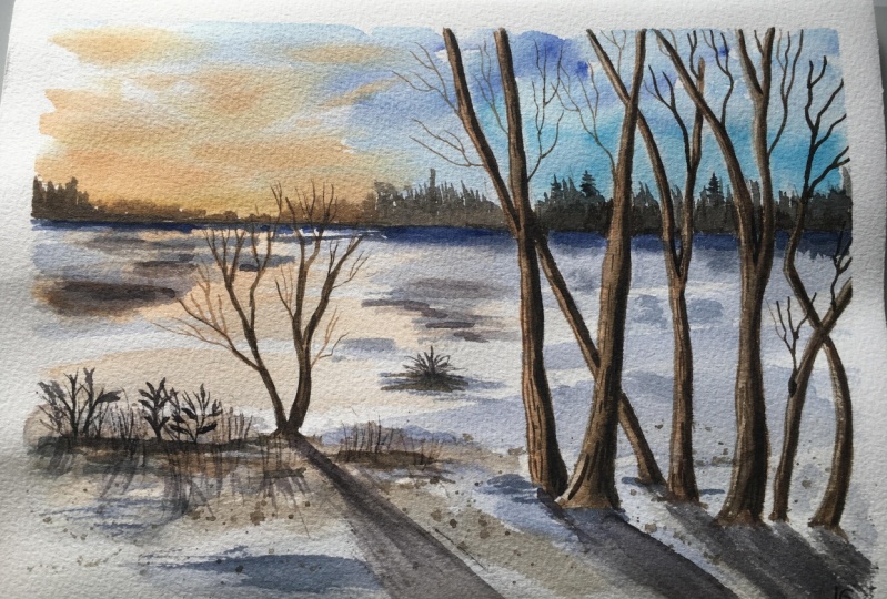
8. Thumbnail and Colors required: Before we begin our painting, let us briefly
discuss the thumbnail to simplify the elements
of the painting. So here we have some trees at the distant area
near the horizon. About this is this guy
below this is the ground. Since it is sunset time. So we have salaries
somewhere near the horizon. The ground is covered with snow. And in the foreground, ADR, we have some trees. The trees up your bigger in size when compared to
the distant trees, because these trees are closer to the observer
or the viewpoint. Now, let's name these elements. We have sky and then sun. And the ground is no. And some grasses, the trees foreground one and
the distant trees. So these are the elements
of the painting. Now let's talk about the tellers and that we
would need for the painting. Starting with the sky. I'll be using Sarah Lynn
blue in diluted are lighter. And then ultramarine blue. For the upper parts of the sky. For the sundries, I will use
orange and yellow sheet. Now for the snow on the ground, I lose ultramarine blue
in it stallion barn. Since we are using
a lighter tone. Let's say transparent
on no background, white color of the paper will
be seen through this layer, and it will be depicted as snow because snow is
not simply by trade. It has some reflection
of this guy. Here we will use a low
orange diluted colors. So you need to add more
water to the pigments. Keep adding water until you
see the color of the paper. Moving on to the
background trees. Here, I will use sepia. You can also use burnt umber
as an alternative color. Then I'll use Payne's gray here, or you can use indigo and
black as an alternative. Now for the sunlit effect in the background trees
near this handset area, we will use orange
and alone shades. Along with CPR. Now, coming to the
foreground trees, I'll use orange again for the
sunlit effect on the trees. Then for the darker sides, I'll be using sepia. Again, burnt umber we'll do for the shadow
part of the trees. I'll be using Payne's
Gray and why. These two are cool colors and it works good
for the shadow part. I'll also be using CPR, though, dipping the warmer
shades in the shadows. So that's all about the colors.
9. Sketching the Composition: It is time for sketching. Now, use any pencil
and very gently, we are going to mark the
composition of the painting. So keep the paper
in landscape mode. Draw the horizon line
somewhere in the upper half. So about this, we will
draw the district trees. It need not be perfect figures just
roughly mark the shapes. Near does handset area, we will not mark any
lines as of now. We will leave it blank. Okay. For this, no, we will be painting
it with the colors. So you don't have
to draw anything. Now, let's paint the
foreground trees. I'm marking the tree trunks
because I want to leave blank spaces while painting
to render the sunlit effect. So here, if you were
painting fully darker trees, then you didn't have to
draw the lines beforehand. Simply draw some parallel lines to depict the tree shapes. If you notice, I have ended the tree trunk of this tree little ahead
of the previous one. This creates a sense of
distance between the two trees. Similarly, we will do that
for other reasons as well. Try to create distance
between one another. So here we will also
folk the tree branches. You can also prefer to keep the tree trunks
straight in shape. Next, I will overlap
some tree branches to create a sense of
dimension among studies. Let us add another tree
trunk next to this tree. So we will add the trunk and leave this
space here to make it IPR, like it is behind the
broader tree trunk. I hope you are following me. Now let's paint another tree that is in the
center of the crown. Here we will form the trunk of the tree right
from the bottom part, and then further focused
into several branches. For now, we will leave
the tree trunks as it is. And then we can add the tiny branches
with the paintbrush. Next we will mark the
shadows of the trees. So these are going to be against the
direction of sunlight. I have explained everything
about lights and shadows in the earlier chapters of this
class. Please go through it. If you have skip that part. For these trees, you
are the source of light is on the left side. So the shadows should be
falling on the light side. And then some simple
grasses on the ground. Here, the direction
of the shadow changes because the direction of satellite changes as well. It's on the right
side of the element. So the shadow falls
on the left side. I hope you are getting my point. So initially, I did
mention about drawing the lines gently so that we
don't leave the Pencil Dense. I can see some
darker lines yard. So I'm using this
kneading eraser to lift off the darker
pencil marks. Since watercolors
are transparent. So you can see these
pencil marks if they are darker in Palo Alto. That's all about sketching. Let us move on to
the painting part.
10. First layer - Paint the Sky: Let's dive right into
the painting process. So take two jars of clean water, a color palette, colors,
and paint brushes. I will start with
size 12, round brush. Now let's apply. What about this horizon
line to paint the sky? We will attempt one
element at a time. So here we will go with
the wet on wet technique. And thus, we need to wet
the surface of the paper. Be mindful of the amount
of water you apply. Just a thin layer of
what URL will be enough. If you're good at liable water, then you can use a
paper towel or a napkin to wipe off the extra
water off of the paper. So I'll use this plate as my
palette for mixing colors. A civilian blue or any similar
color, doesn't matter. Apply this on the bottom part of the sky near the horizon, but not apply paint
inside the tree trunks. Leave some blank space there. Next, for the upper
part of the sky, we will use ultramarine blue
in midtone consistency. Apply the pins in
diagonal brush strokes. Also leave some white space on the left side to render
the sunset colors. So this layer looks lighter when applied on a wet surface. Next, we will take a
slightly darker shade of ultramarine blue and ableism
diagonal brushstrokes again. So if you notice I just
applied the paint freely over the tree trunks to create the
continuous diagonal line. Now I'm going to
wipe off the paints from the drunks using our
tissue because I want that area to be lighter in color gently and up that
issue on the targeted area. Now let's paint the sunset. He was in the sky. Take a yellow and
orange in the pilot. Now apply a low near the
horizon and on the blank areas. And then a bit of
overlapping orange sheet. So this will create the
sunset use in the sky. Adding some more horizontal
strokes of orange color.
11. Distant trees - Background: Moving on. While the
paper is still wet, we will be in the distant
trees in the background. So we'll take CPR, or you can take any dark brown color
and mix it with orange. So it will give
orangeish brown color, which is ideal for sunlit
effort of the trees. Applying the paint
along the horizon line. These trees are far
from the viewpoint. So the APR, blurry
and smaller in size. So as released the
blue areas of the sky, we will apply Payne's gray. Again. Leave the blank
area for the tree trunks. Having those sketch
of the arteries helps us analyze where not
to apply. The beams. Apply beans grow along
the horizon line. Now apply some
darker colors along the horizon line,
neon, sunset area. So this will add a sense of depth in the district DRI area. So here we have a tear but
a lovely sunlit effect. Now let's apply paints gray
on the remaining area. Here, I am creating some
spikes using the tip of the brush to create
the pine tree shapes. Before we, alright, so we
will allow the paint to dry before we move on
to the next element.
12. Painting the Base layer of Snow : Alright, now paints have dried. Now let's spin the
snow on the ground. So as we all know, the
color of the snow is white. But we need not apply
white color separately. Unlike actor lakes or wash bins, where we have to apply
the colors separately. Here, we can use the color of the white paper as this note. Again, we're going to use
wet on wet technique. So apply clean water
below the horizon line. So you see we have two
colors in the sky. Sky colors will be reflected
on the snow as well. So first, let's spin the
sunset views on this note. Apply a very watery
yellow and orange mix on the wet surface. Do leave some blank
spaces in between because we don't want the
snow to be entirely alone. Just simple horizontal
strokes will be enough. On the other side, we will apply what remix of
ultramarine blue, along with a bit
of Payne's gray. To render the blue
colors of the sky. Make sure to leave blank spaces. Now, add some shadows of the
distant trees on this no, using slightly
darker Payne's gray. They're not apply paint
inside the trees. Now we've been
adding some shadows, offers no, to create
a sense of dimension. The paints get inside
the three areas, then you can use tissue
paper to wipe off the paint. Use midtone Payne's gray loosely around the bottom part
of foreground trees. This will appear like
any masses of snow. Add some brush strokes and
randomly on the snow area. Adding this darker
bumps urine there. We'll create the sense of dimension and depth
in this note. However, you don't
have to achieve the exact same result as mine. Just go with the flow and embrace the outcome you achieve.
13. Sunlit Foreground Trees : Okay, So this is how the snow looks after the
beans have dried. Now, let's paint the
foreground trees along with the sunlit effect. So take orange and TPR and
mix it in medium consistency. So yeah, I'll use size
eight round brush. So we shall apply the paint. So inside the sketched areas, start by applying orange on
the left side of each trunk. This part of the tree is
exposed to the sunlight, so it creates sunlit effect. Next, I'll switch to my
size two round brush and apply CPR on the
other side of thirdly. Now, if you feel like
orange is a little vibrant than you can note it down by mixing a bit of sepia, applied the two colors and let them get blended
with each other. It shouldn't appear like to
separate the colors there. When light and shadows are
added to the painting, it contributes to
achieve a sense of dimension as it makes it a PR, like cylindrical in shape. So I apply the same technique
for rest of the trees. And I let you absorb
while I paint them. So here there are some overlapping tree
trunks and branches. So here we need to decide what comes of friends and
what goes behind. How you can judge that is based upon the distance
from the viewpoint. So if the object is closer to the viewpoint,
it comes friend. And if it is, then that goes behind. I'll switch between my
size eight and size two. Depending on the size
of the brush strokes. I want. For final, I like this darker areas. I use size two. And for the wider areas
like the orange sheets, I'll be using a size eight. So you can go ahead with any
similar sizes that you have. This tray here is closest
to the wheel point, so it comes Frank and the
other branches goes behind. So you can judge
the distance from the viewpoint from where
the roots originate. It is okay if you are placed slightly different colors urine. So this is a local vibrant
than the other orange sheet. But that's okay. It need not be perfect. Hello. Hi. Okay. Carefully observe
how I created this, distinguishing
between the two trees and make them appear
organic and shape. I want to add in more
depth in the drunks. So adding darker
colors to enhance it. Central tree, splitting the
drunk right from the bottom. So here I have applied a bit muted orange
by mixing sepia. First we will add the
mutate orange sheet. And then we'll go ahead
and add the darker colors. Here. I'm adding sepia on the
right side of the tree. Great drunks cleared the
impression of rocks, are adding in some
darker colors.
14. Branches: All right, so we have painted the tree trunk and
limbs of the tree. Now let's spin the
branches and I need to x. So here I'll make it
orange and sepia. And Lord, this color
mix in the brush. Now let us introduce some
thinner branches one by one. So I'm using a size two round
brush for finer details. Then I'll add in
some tiny tweaks using the pointed
tip of this brush. Folk the branches as
many times as you want. The more the branches, the more denser it
is going to look. Also note the emerging
point of the branches. The branches are
on the front side. Then it emerges towards us, that is the viewpoint or the absorber are the branches in all direction to make
it look dimensional. Next, I will switch
to the Palo Scipio, play the darker branches
on the opposite side. It is good to have
variation plus i just a nice balance
of light and shadows. Next, I'm moving on to paint the branches in the other trees. These trees are
dollar in height, so their branches are going to appear outside of
the painting frame. Does we need not create the
upper ends of the tree. So here we will add in some
branches at random areas. We will aim to achieve
a sense of dimension by adding the branches
So in all direction, that is the friend on
the sides and the back. Folk, the mentors as
many times as you want. One thing you need to remember
is that we should add these darker colors only on the opposite side
of the sundries. The other side is going
to look darker, right? So at that thing, if
you keep in mind, then you will have a nice
organic looking tree. If you want to keep your
tree straight and simple. That is also fine. You need not a lot of
branches, anything. It is totally up to you. And I didn't some details. There is no fixed
method as such. Just keep adding the branches and if you feel you have
done anything wrong, then simply dab or tissue and liftoff the
talus and that's it. Now take darker color. It could be either
Payne's gray or CPR. With darker color, we will add some character to the
bark of the trees. Some simple random lines to enhance the
appearance of the bark. We don't want the tree
trunk to look flat rate, so we will add these
knee lines and shadows. Also, be mindful of the pressure
you apply on the brush. Let me add some more
branches here and there. All right. So I let you absorb
and follow along with me while I paint these
tiny branches and tweaks in the trees. There is no compulsion as such to achieve
the same outcome. You can have your
own checkoff crease and you can have your
own style of trees.
15. Adding Depth in the Snow: Moving on, let us introduce some noise and texture
on the snowy part. So apply clean water on the targeted area and then
use so any darker colored. This creates a
softer brush stroke. Also, we will add in some
loose lines near the horizon. I'm dabbing it off with my fingertip to avoid
having sharp lines. Legs, they will add another
layer of diluted colors on the foreground snowy area to render some tiny masses of
snow and their shadows. So basically this is
going to look like a bumpy surface in the north
since the paper is dry. So we might end up with
sharp edges and lines. Therefore, we will blend in the colors when the
clear water in-between. So your I'll go with the sepia, ultramarine blue, a very
watery tone of these colors. So when you apply these
colors and water in between, so that the colors get blended well and doesn't leave
any sharp edges. Create some simple grass shapes with these diluted colors. You or I have applied a mix
of all colors like CPR, ultramarine blue,
and Payne's gray. And some areas are left
as it is dry and blank. Now let splatter some
pins on the wet surface. Make sure to cover
the upper surface of doping because we do not want the paints on the sky or the main areas of the snow. Here. We are trying
to achieve a sense of noise and texture in
the foreground area. Now allow the paint to dry.
16. Painting Darker Side of the Trees: Okay, So the foreground snowy
texture has already dried. Now, if I gauge the tree structure and its
dimension in the painting, the darker side of
the trees don't really appear that dark
once they're dried. So I'm going back to these trees and I'll be adding
some darker colors. Now, if your trees
already looked darker, then you can skip this step and move on
to the next chapter 0. Otherwise you can
follow along with me. Here. I'll be using
Payne's gray with a bit of sepia to make it
local blackish color. Or you can simply
use black color. I'm adding in some
darker shades on that. I am using my size
eight round brush. Apply a kind of dotted lines. Don't just apply the
lines in a straight line.
17. Cast Shadows and Conclusion - Thank you!: Moving on, let us introduce the cast shadows of
the trees on the snow. So here I will be using violet and Payne's gray
for the pool side. And on the left side
I'll add some sepia. Okay. So mixed voice, lead and Payne's gray and apply the shadows towards
the right side, paying them one by one. We have already learned the
basics of three shadows and direction of light earlier in this class.
Go check it out. If you have missed it, we will be painting the shadows
for all the trees here. The direction of sunlight on these trees is from
the left side. So it's shadows will be
tested on the right side. And I'm applying the
paint on a dry surface. So you need not the surface. Next we will paint the
shadows of the grasses. I'm yet to add the
actual grasses here before painting the
grasses and paint It's shadows so that I can define the shape and note the direction of shadow and
also the source of light. In this case it
is opposite Your, let's add some colors on
the mid area of the snow. This is optional. Now we will go back to the cast shadows and add some warm
colors of sunset. Let's add sepia. Here. I'll take clean water and soften the edges of the shadows. Along with diarrheal also add some darker concentrated colors. That is Payne's
gray and white LED. So don't worry if it
looks darker now, after drying, it is going
to look much lighter. On the left side, I'll add some CPI
and I were tough orange to suggest
the sunset use. So once we have this, then I'll paint the
actual grasses. These are loose shaped grasses. Again, applying some
random texture on the snow using diluted sepia. Okay, so at this stage, I usually end to
fix the elements. That doesn't look
good to my eggs. Correcting this
shadow by lifting the existing colors
using a tissue paper. So this step might
help you learn how to cope with those
mistakes. Let's agree. We all have been
at the stage where we feel the painting did
not turn out really well, as per our expectation. And we end up
getting frustrated. So don't give up so easily. Try to save the painting
with whatever you can. Apply all the knowledge
that you have. All right, so let's
add the shadows to the grasses in the center
area and notice so the shadows of this
element your real somewhat straight because
there's hundreds are right behind this element. Okay, So we are done
with the painting. Let us remove the
masking tape gently. Alright, so this is the
final look of the painting. I hope you found
this class helpful. I have shared all my knowledge on the subject in this class. Finally, share your review about this class and help me
reach more students. I'd be really grateful
for your support. Thank you so much for joining me and please do share
your class project. Also, feel free to reach out
to me in case of any doubt. I'll see you in my next class. Happy painting, Bye bye.
 Shanan Subhan, Watercolor/Gouache | Art Educator