Transcripts
1. Welcome to Class: If you've ever thought
about painting landscapes with what I
colored pencils and thought, This is going to
be way too hard. This class is for
you. We're gonna use these pencils to paint a full landscape and
make it look soft, smooth, and honestly a lot
easier than it might see. I'll show you a technique
that's not well known, but once you try
it, it will open up a world of possibilities
with water pencils. Hi, I'm Fassa. I'm a French artist, and I mainly work with watercolor and Water pencils
that I teach online. You might know me from
YouTube or Patron, where I teach lessons every week under the name
painting and chocolate. In this class, we'll paint
a lighthouse landscape, and the project will give you a solid foundation
of the techniques. We'll start with the basics. I'll show you the supplies, and then we'll do a short
background exercise to learn how to turn streaky
backgrounds into smooth ones. From there we'll sketch, add color to paper, learn how to activate
it for best results, and build up the details
to finish everything off. Each step is broken down freely, and everything you learn
here is meant to be reused. This process works for
all kinds of landscapes. And this class is
beginner friendly. Even if you've never
painted a landscape before, we'll go at a relaxed pace and I'll guide you
through each step. And if you already have
a bit of experience, you'll pick up some fun
new tricks along the way. So grab your pencils and
let's start painting.
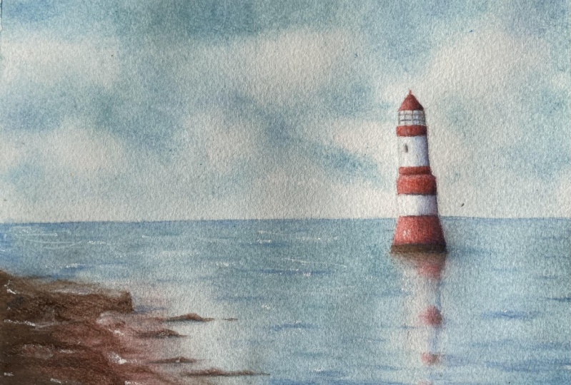
2. Class Project: In this class,
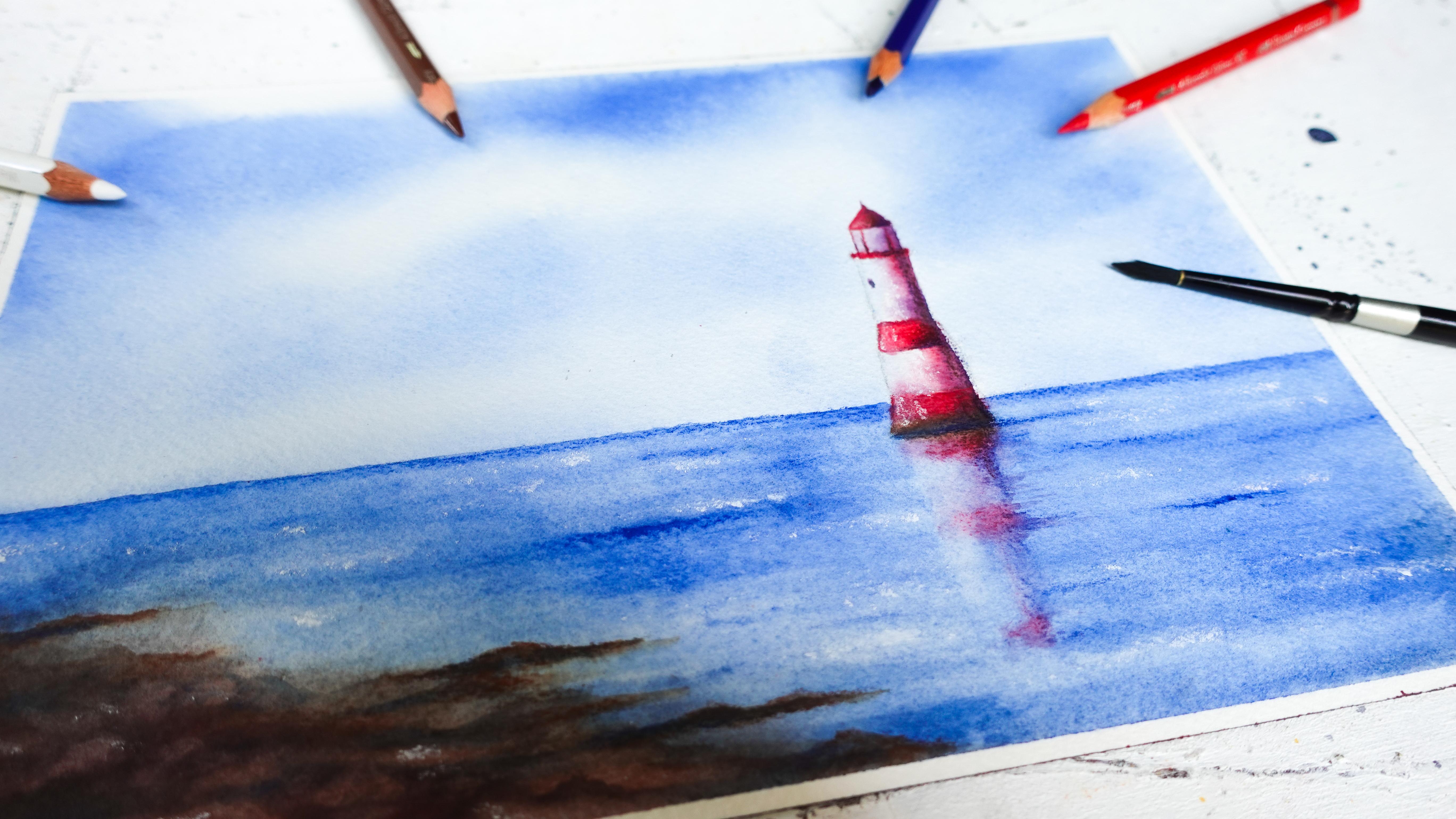
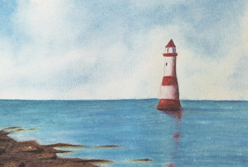
you'll get to paint a peaceful watercour
pencil landscape featuring a lighthouse, some calm summer skies, and soft blue seas. I chose this scene because it has all the elements that are perfect to practice painting landscapes
with watercour pencils, a smooth sky and water, a bit of contrast with the rocks and a focal
point with a lighthouse. It's relaxing to paint, but still gives you a full range of skills and techniques that you'll be able to use in so many other
landscapes afterward. One of the highlights
of this project is a little known method, a technique that completely
changes the world of Waco pencils and makes them faster and
smoother to work with. It's especially useful for covering large areas
like skies or seas, and once you try it, you'll
want to use it all the time. To help you follow along, you can download the line art, a list of the supplies, the reference photo,
a photo of my art, all from the resources
section of the class. When you're ready, snap
a photo of your art and download it to the project
section of the class, you can also ask me questions
or ask for feedback. So now let's jump into
the next lesson while I'll walk you
through the supplies we'll be using. See you there.
3. Supplies: No, no, no. In this lesson, I'd like
to talk to you about the supplies we're
going to use for today's project, and
they're pretty simple. If you're familiar with
watercolor painting, these are going to be the
same type of supplies. So we'll start with
water cota paper, and the paper I'll be using
today is the Asha cold press, 100% cotton, 300 grams/square
meter, watercour paper. Now for watercolor pencils, you don't have to use
this type of paper. You could very well go
for a silose paper, which is a lot more affordable. So that's going to be
great for this project. I would also lean
towards something with a little bit of
texture, slight texture. We don't need
anything too rough. It will make our
coloring stage easier. So that's why I went
with cold press. You could pick a
hot press paper, which is going to be a
little bit smoother. Just be aware, I'll dry a
little bit faster as well. So we'll need just a
sheet that's going to be about 18 by 26 centimeters
or seven by 10 ". But if you prefer, you can make it a little
bit smaller or bigger. We'll also need a scrap piece of watercour paper for the
exercise. We'll do together. And if you have one, you can grab a palette. I will use it, but it's by no
means necessary to have it. You can make do with
watercour paper. We'll use it to make
a swatch of paint. So I'll show you how I use
this in the next lesson. Watercolor pencils I'll
be using today are the fable Costle Aberur
watercolor pencils. There are some of the
best ones out there. I also like the andash
Museum aqua had kind, but there are some others
that I haven't tried. Anything that's
going to feel creamy enough when we color with
it, it's going to be great. These pencils are sturdy. There are a lot of colors. You can also get
them in open stock. That's why I like them so much, and they're very vibrant. So those are quantities to look for in a watercolor pencil. And the colors we'll
be using today. Are going to be pretty simple. So we'll just use
we'll start with blue. Then we'll also need a
red for the lighthouse. And I've picked
brown for the rocks, as well as white for
some of the highlights. So I highly recommend to get a white water colored
pencil if you can. You can replace it with something like just
a colored pencil, but this is going to be
a lot more effective. Or you could use a
white gel pen if you really don't have one
right now or even white guash. Why not? Anything
that's going to get you some crisp highlights towards
the end of our project. Just a reminder that all the references for everything I'm going
to be using in this class is going to
be listed in the list of the supplies that
you can download from the resources
section of the class. Now, for paintbrushes,
we're also going to keep it very simple with
just two paint brushes. So these are water
cut paint brushes. They are round and pointed, which makes detailing
a little bit easier for something
like a lighthouse, especially on a
small size of paper. So I highly recommend at least one paint
brush with a fine tip. If, otherwise, all you have
is a round paintbrush, you can make do as well, even with just one, but two paintbrushes will be
a lot more convenient. For the main technique we'll
be using in the class, we will need some sanding paper. So this is grade 220. You can go for
something slightly lower or bigger than that. It doesn't really matter. And we will also need a spray bottle. It will be very useful here. Other things that you will
need and are very useful in general with water coated
pencils are a jar of water. One is enough. Then
we'll need also some tissues or a
towel, if you prefer. And we'll need a roll
of masking tape. So that is if you are working on a loose sheet and you
need to tape it all around so it doesn't
move while you paint. For sketching, we
will need a ruler, a pencil, and an eraser, and it will be very
useful to have a pencil sharpener just
in case we need it, especially for something like the lighthouse where we
might need a sharp tip. And then, finally, something that is
absolutely not a must, but you might find very
useful is a heat gun or a hair dryer to allow your sheet to dry a lot faster than if you were to
let it dry on its own. So that's it for the
supplies and I'll meet you next for a
background exercise.
4. Background Exercise: No, no, no. In this lesson, we're going to work on some
background techniques, and this is going to be
very useful to paint landscapes with watercolor
pencils for two things. The first one is that
we're going to be able to get some smooth
backgrounds out of this, and we're going to be able
to paint them very quickly. So this is a true game changer, I think, in the world
of watercolor pencils. So let's start by
taping our sheets and just make four squares
or rectangles. There we go. And to
demonstrate that, I will go grab a random
water coat of pencil. We'll also need a water
jar, paper towels. We need our spray bottle, our sandpaper, and we'll need
at least one paintbrush. You also see me use this one, which we're not going
to use in the class. This is just to show you one way to activate a background. I'll use color purple
to get started. So we're going to start with
the coloring technique, which is the base when it comes to using
watercolor pencils and you are not going to be able to get those streaks
out all the time. It depends on the
paper you're using. So try to go for
something that's a little bit smooth
with some tooth. And it's also going to depend on the pencil that you're
going to be using. These are pretty good. At blending without streaks, those fabe cost ones, but some are not like that, so just be aware of that. And I'm going to show you how I color to get
the best results. Now, this is not
the only technique. That is why we're working
on other ones here, where you're never going to get any streaks no
matter what you use. And that's what's beautiful
about this class here. So let's get started. First, we don't want to work with something
that's going to be too sharp when we color to
avoid indenting the paper. So this is kind of
sharp but not very, very sharp and it's
going to be enough. Then you want to apply light
pressure as you color, and you want to use
circular motions. Mine are pretty elongated,
almost like ovals. So it looks like a back and forth that I'm doing,
but it's actually not. And these pencils
are very creamy, so they're very
easy to color with. Pigment comes off very easy. It's not always the case. So looking at my coloring, you can see how
smooth it is already, how even pressure is important. Motion's important. Here we go. Then once we have a little
bit of pencil down, we can start layering on
top and pressing a little harder with the same
motion and so on. And you can do this with
different colors as well. There we go. Now to activate this, we're going to
need a paintbrush. We're also going to use
a little bit of water, and the key here with watercolor pencils is
not use a lot of water. That's why when you
wet your paintbrush, you want to make sure to
suck up the excess here. And then once you have that, you can start adding water to your lightest area or the
white area in this case, and then slightly move
towards the cold area. You can see I'm also using
circular motions here to really help the pigment blend
and we move the streaks. I I don't have enough water, I can start again
what my paintbrush, remove the excess, and then
keep blending everything. So this dries pretty fast. I'm also using hot press
paper for the exercise. That's also why it dries faster, so I can smooth it out
by going over once more. And we can get something
that's quite smooth, as you can see, no streaks. This is, however, not the best
technique for large areas, and that's where the
other ones come in. This is going to be better for smaller areas like the
lighthouse or the rocks. For something like
the sky and the sea, we're going to use other ways. So the first one is going
to be to either use a scrap piece of
watercolor paper or a palette like this one. So what's special
about this palette is that it has a rough side to it, and that's going to
help the pigment to grab onto it better. So I just colour on my palette. You could do this on scrap
piece of water coated paper. And then I'm going
to create a swatch. So again, I grab my paintbrush. I wet it. And then I melt the pigment
right on the palette, and I can paint with it. And you see how
effective this is. And keep in mind this is just
on dry. It dries very fast. You could use this
technique by just wetting your paper and then painting on it as you would
with watercolors. And this is going
to help you create beautiful skies and a lot
of beautiful backgrounds. So there are many ways
you can utilize this. And as you can see,
it's a lot better than this technique here
for large areas. And now we're going to do
something a little different. We're going to use sandpaper. So I'm just going
to grab it with my pencil and start
sending pigment on top. I'm going to do the same here. This is a very nice technique. The next step with it is to smudge the pigment
with a paper towel. I like to again use
circular motions here and look at
how smooth this is. It's incredibly fast
and incredibly smooth. And for landscapes, really, that's going to change
everything for you because you'll be able to
paint them a lot faster, and you won't have to
deal with streaks, even with pencils that might be a little bit harder,
a little bit drier. I'm doing the same here. And I want to show you
two ways to do this. So you can either activate this kind of
background with a paintbrush. And if the area is larger, I would recommend
a flat paintbrush. This is why I was
taking this one. And what you want to
do is just wet it, but not too much. Again, we don't want to flood
our background with water, but we want it to be wet enough that it's easy
to blend everything. And now you're going
to do a little bit back and forth quickly
enough to avoid any lines. And just like that, your
background is activated. Look at how smooth it is. Now, another way to do it is
just to use a spray bottle. And your results are
going to depend on how you're holding
the spray bottles. For example, if it's far away, the activations going to be
very even if you get closer. See here, we get a highlight. So you can create cool effects for a very creative
background if you wanted to. You don't even have to activate everything as you see here, or you can activate everything as we'll do for today's project. But this technique is excellent for a boost of
creativity in your art. And you can even tilt your
sheet on hot press paper. It's going to be very
effective with a lot of marks, stains and for today's project because it is a landscape and
I want it to be realistic. I went with cool
press on purpose, so I get less of those marks. I'm sure you exactly
how to do it. So I hope this was
insightful and it will open up a bunch of new
possibilities for you, and I will meet you next to get started on our project
with a sketch. No, no.
5. Sketching the Landscape: No, no, no, We are ready to get started
with our sketch here, so I'm gonna tape the sheet all around with my
masking tape first. Once that's done, we're
going to be ready to sketch. So the first thing you want
to look for in a landscape in particular is the horizon
line if there's any, and I see one on my
reference photo. It is in the lower
third already, and that's what you
would want to do here. You'd want to rely on
the rule of thirds here. So if you divide your sheet into three parts horizontally
and vertically, that's going to help
you place everything. So for the horizon
line, it's going to be either the lower third of the sheet or the
upper third of the sheet. Here we want to make sure
the lighthouse shows. So we need to place
the C in lower third, just like on the reference. And then you don't
have to do this in a way that's very precise. It's okay to be
approximate here. So let's say, it'll be
somewhere around here. I don't press too too hard. And now we have this. We need to draw our lighthouse. So again, the rule of
thirds is going to help us. Let's look at the
vertical lines this time. They would fall somewhere
around here and around there. And this is where, if we're going to put the
lighthouse on the right side, this is where you'd
want to have it. So I'm just going to
trace the line partially. Going to be something like this. And now we're able to
draw the lighthouse. So the base is going
to be around here. I'm paying attention
to the size of the sheets for the
final proportions. You can play with
that a little bit. I'm looking also at the heights. I don't want it to
be too high up. Something like this looks good. And when we have the main lines, we can refine this a bit. I tend to erase quite a bit
when I sketch. That's okay. It's better to make
adjustments now than later. You can also customize your lighthouse a
bit to your liking. Now make sure to add the sketch
in the resources section. If you prefer to
just transfer it. So it's going to be
something like this. I always like to look
at the final sketch, see there are things
that I want to improve. One thing worth
mentioning also is try not zoom in too
much on your reference. It will be very tempting
to draw all the details, and we want to stay
away from that. So it's better to just
stick to the main shapes. And then for things
like the rocks, we're not even going to
need to sketch them. We'll just draw them
directly with our pencil. So now I'm just going to
erase the lines Okay. And that is it. So I will see you
in the next lesson. We'll start working
on our background.
6. Sandpaper Technique: In this lesson, we're going to take care of our background with one of the methods I
showed you in the exercise, and it's going to be
with a sandpaper here. So we'll be using just
two of our colors so far because we'll
be working on the sky, the sea, and the
rocks. That is it. So just blue and brown here. And what we want to do first
is block in our main colors, which is why I'm
going to start adding blue pigment wherever
I see it in the sky. And, of course, you can
customize this as you wish. You can leave room for
the clouds if you like, not add pigment in places. Leave them white.
It's up to you. I want to keep the
sky quite light, so I'm not adding
too much pigment. I'm going to add a
lot more in the sea. So let's start with that. We need a paper towel
to smudge everything. So again, circular motions. Remember to leave some
whites in the sky for the clouds if you'd like. We can get a little bit
of blue in this area of the lighthouse or sus glass. So notice we're
already able to shape our painting just
through that stage here. And now let's take
care of the seed. That Dot worry. If you have a hard time keeping your horizon line looking neat, we can work on that again
later with a pencil. Also, don't worry if you get some blues on the
lighthouse, that's fine. And here now, I'm going
to start adding brown. So I'm okay with blue
and brown mixing together because
we're going to get darker shades of brown that way, and this is going to
be great for contrast. That's also why I
left some whites for browns are going to
be a little more pure. So this is enough already. I'm thinking we could actually add a little bit
of red, why not? It's gonna be great for
color harmony between the sea and the lighthouse,
just a little bit. There we go. So now
what we can look at is trying to darken
everything a little bit more so when we
activate everything, we don't need to
layer once more. So I'm just going to add more blue That is great. We're gonna be ready
to activate this, so I won't meet you
next to just that.
7. Spray Bottle Activation: We're ready to activate this. So make sure to have a
few paper towels ready. Also a paintbrush, as
well as your spray bottle and your
water jar just in case we need to rinse the
paintbrush at any point, because what we'll
do is just activate everything with the spray
bottle and then come back to the painting here
with a paintbrush to add maybe details or
correct some things. So both of them are
going to be useful. I'm going to start by spraying the painting from far away. I'm not worrying about the
lighthouse, as you can see. I didn't put much pigment on it. Okay. So when you
have enough water, now you can start moving
everything around. I'm starting in
the whitish areas. And I'm already
rinsing my paintbrush, making sure to remove the excessive pigment to soften the edges
here in the clouds. Don't have to do it. That's something you
can do though if you like smooth art like meat. So I rinse my paintbrush often because it's
very easy to get a lot of pigment on the
paintbrush very quickly, and then we'll keep transferring it elsewhere if we
don't rinse the brush. I'm going to get the blues
here behind the lighthouse. By adding more or less
water to your paintbrush, you can also control how
light or dark the color is. So it's not just where
you add the pigment, but also how much water
you add to your brush. O. Can lift pigments, too, so that's a great thing
about this technique. Even here, I would like
to get some of the whites back. Very easy to do. With the lifting technique, just rinse your brush, make sure to remove all of the water from
it, and then press. The sky looks great. Now let's take care of the sea. A pick up paintbrusher might have been a
little bit easier. I'm able to get something smooth also because my
paper is called press. It's 100% cotton, so it
doesn't dry that fast. Helps me work on my
painting for longer. So if you're struggling with
yours, look at the paper. Could be a reason
why things dry fast, and you get marks, too. Now let's blend the rocky area. Okay. And then I pull paint while
things are still wet. I don't know if
I'll have the rocks look exactly like
in the reference. I like to change
things up a little. At this stage, what you can do, again, is lift paint in the sea. So make sure to clean
your paint brush, and wherever there
are lighter areas, we can start lifting. Natural highlights are
always going to be better than the ones we're going to add later
with the pencil. So whenever I can, I lift. I would also like to lift
a little bit over here. It's great for the reflection. I'm starting to dry, so it's gonna be
better to stop soon. There we go. If your sheet
is still a little wet, you might consider picking
up a little bit of your reds here and adding some over there. I'm just going to remove
a little bit of pigment. That seems like a lot. We want it to be very subtle. And I'm using my paintbrush to blur the edges a little bit, make it look more
like a reflection. My paintbrush is
always slightly damp, not quite dry, but almost. I'm going to try and lift a bit more with a
dry brush this time. And add a little bit
of brown down here. So this is the actual
base of the lighthouse, and this is a
reflection over here. Okay. Let's stop here. So we're going to dry this
completely and meet in the next lesson where we
will color the lighthouse. So let's dry this. Et's meet next to color. And if you'd like
to share your art in progress in the project
section of the class, you can already do so or reach out if you
have any questions.
8. Coloring Technique: No, no, no, We're ready to work on the lighthouse and small
details in the sea, as well as the rocks. So let's work with
our red pencil first. I'm also going to use
the brown pencil, and I'm going to need to
sharpen it, actually, so it's able to get into the nooks and crannies
of the lighthouse. So now let's start. So everything that's
black in my reference, I'm actually going to
replace it with red. It's important at this
stage that drawing, the painting is dry. Otherwise, you'll
get some marks. You'll notice pigment
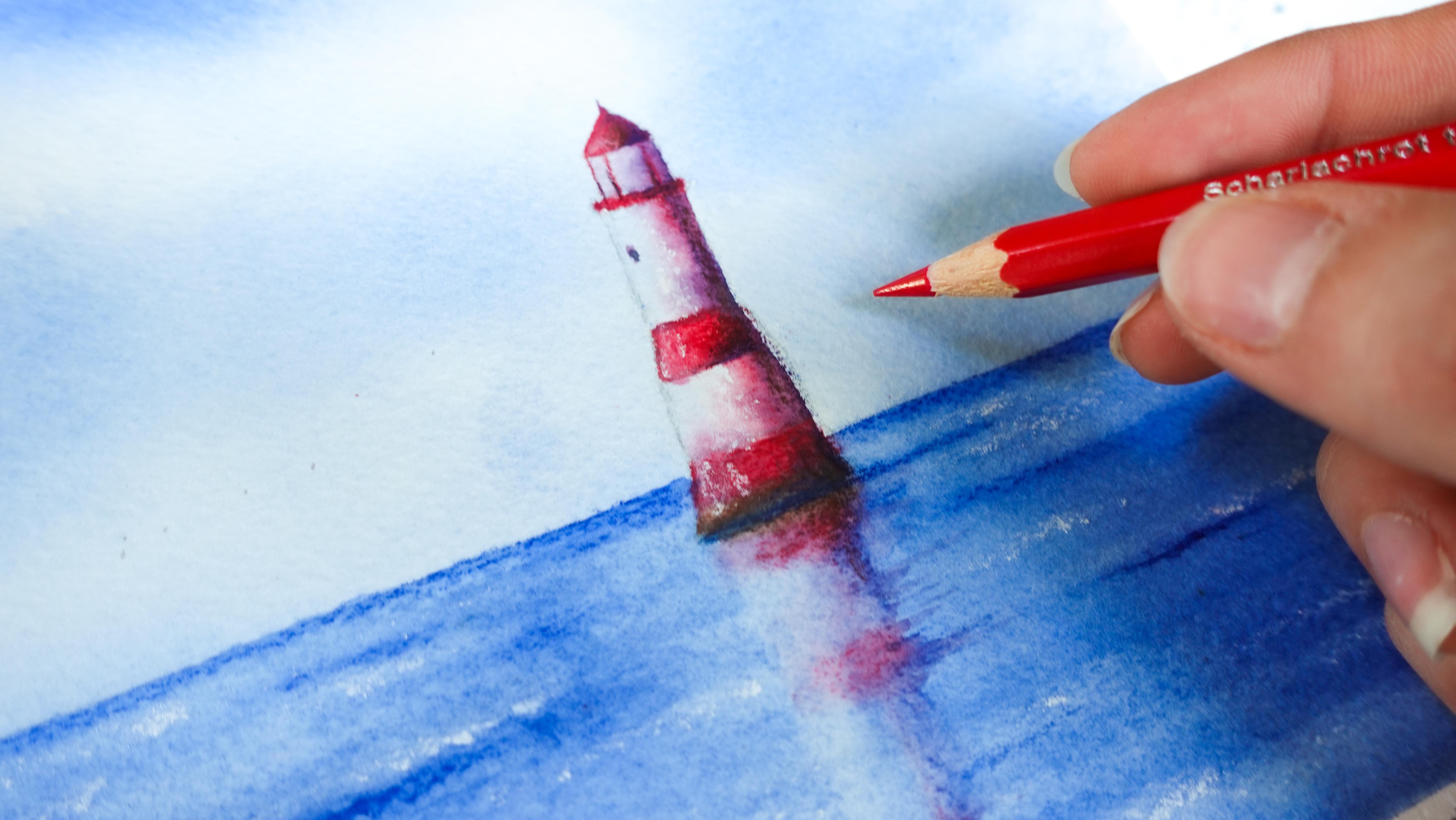
tends to melt directly on paper if it's wet. I'm not pressing too hard, and I'm using the same
technique I showed you in the exercise, elongated motion. Here, I don't know if I want to paint the top of the
roof red. Why not? There we go. Now, a
little bit of brown. And I'm going to start taking care of the reflection a
little bit better than before by adding a
little more color. And now I would like to grab my blue and start
shading that lighthouse. So I'm going to layer a
little bit of blue on top of the reds here. And actually, I'm thinking instead of shading
this part here, just blue, why not
make it purple? So I'll add more
red onto the side. It will be a little bit nicer. I'm adding a little
bit of red. Not much. So this is an important step for your lighthouse
to look realistic. We want contrasts, shadows. And here towards the base here, I'm going to press
a little harder. I'm even going to draw a ripple. You can see it on the reference, something that indicates the
surface a little bit better. We're just suggesting and I'll
add shadows onto the side. You can start
pressing a little bit more once you can see
where this is going. And even add more red on top, and that will help
our blues look more purple where those two
colors overlap more purple than blue by overlapping
more red onto it. There we go. Now I do want to
add a little bit more blue here on the horizon line to
define it a bit better. Can add a few ripples
here and there as well. Wherever you want your see
to be a little bit darker. I try not to place them
all in the same area. It's better to vary them. So, for example, these
two are very close. This one is a lot further
away and also less long. Also starting to add
little ripples over here. That's looking good. Now let's take care of the rocks with a little bit of coloring over what we've done before
to help reshape each rock. So, for example, if
I add a little bit of blue on top of brown, I know I'll get a darker area
that's going to help me. So you can look at the reference if you
need help with that. That's what I'm doing
right now, actually. So I'm seeing I have some
shadows in those areas, and that's where I add blue. I'm going to keep adding
a little bit of brown. You can overlap it
onto the blue areas. I'd like to add some over here. I will look nice. Okay. So same here, you
wouldn't want to shape the rocks in the same
exact way every time, which is easier said than done. So for example, here I
can add another one so it doesn't look the
same as this one here. I'm going to add more browns. In this area. I start
pressing a lot harder now. I already have a lot on paper. And I'm going to add a
little bit of red in places. Again for color
harmony, that's great. And you can see now your
coloring is gonna look more like either the reference or
whatever you have in mind. And that's where you
know that you're going to be ready to
activate everything. So to do this, we will
meet in the next lesson.
9. Paintbrush Activation: No, no, no, no. In this lesson, we're going
to activate our coloring. And to do that, we're going to need a
paper towel in hand, just so we're able to soak up the excess water off of our
paintbrush because that is very important to retain all the detail we've
added here with pencils. We don't want to flood
the painting with water. So I'm going to start
with a lighthouse. And as you can see, I
just rinse my paintbrush. And then I make sure
to suck up the excess. I'm going to start with
the top. It's easier. And also the lighter area, which is a plain red. And I finish with the darker
one where I've added blue. I'm going to pull a little
bit of the paint to draw the top of the lighthouse. I rinse my paintbrush
because remember, we're going to keep transferring pigments otherwise
onto other parts. So we do want to make sure to clean our
paintbrush every time. And now, again, I start wetting the light area where
there's not much. And then I move towards
the area of colored. That way, it melts beautifully into the rest of the lighthouse. This is actually the glass. We'll add details later. Then again, I move down. So if a little bit of the paint here melts into this
part that's still wet, actually, it's great
to leave it like that. It looks all the more charming. I find very watercolor
like when we let things not look perfect and
very, very clearly defined. Now, again, you see I've
wet this part first, and then I move towards
the coloured area. I do want to soften
my harsh edge here, so I'm rinsing my paintbrush, blotting it, and then
I soften that part. I'm going to take advantage. I have paint on
my paintbrush and it's still wet here to draw a little window that's going to look very loose because
still a little wet, so it melts into the sheet. Okay. And now I'm finishing with the bottom here. Just going to add a little
bit of that blue up here. So it's a little bit stronger. I'm even pulling the
paint in some areas. I want to emphasize And now it's going to be
time to work on the sea. So I'm actually going to
start with this area here. So again, with my
slightly wet paintbrush, I start where I
didn't add anything, and then I move up towards
the horizon line so that the horizon line can melt
into the rest of the sea. Here I don't want to
cover up my highlights. That's why I rinse my
paintbrush quite a bit. So a tip for you when
something like this is wet because you've been activating pigment and
you want to add detail, you can pick up your pencil
and directly add ripples. Let the pigment melt on paper. That's going to help you
create stronger marks. You can choose to blend
them or not. I keep going. Then I'm going to wet this part. So I'm just going over
what I've done before. Now, I'm moving towards
the lighthouse. And remember to rinse a brush
quite often here because we want to keep those whites
in the reflection. And we're going to
take advantage now to pull a little bit of
paint into the seat. Like this. I'm always wetting that white
area first and then moving towards the
colored areas. There we go. Pressing a little harder here to
make a stronger ripple. And now I'm going to start activating the paint
over here in the rocks. You can even start shaping
your rocks at this point. I'm going to grab my
other paint brush. It's going to be helpful here. I'm going to get it ready to
soften those harsh edges. So again, clean paint brush. Make sure to remove the excess. So with one, I'm activating. With the other one,
I'm softening. So I do like to soften those edges so that the rocks really look like they're
part of the sea. They're not just sitting on top. Again, you can pull
blue paint from elsewhere and add it at the
base of those rocks here. Whenever you need a shadow, Let's try this now. And in the next part, I'll show you my favorite techniques to add details and final touch to this painting.
So see you there.
10. Final Details: No, no, no, no. We're ready to add beautiful
detail to this lighthouse. So the first thing
we could do is work on it directly
with a pencil. So you can see this one
is actually sharp now. We can add a little
bit of detail directly as if it were
using a colored pencil. We don't even need
to activate it. I'm going to add some over here. Maybe over there and even add, why not a little bit of
shadow with our blue pencil. We can emphasize areas that might need a
little more attention. You can activate or not activate those touches
here. It's up to you. I'm trying to see where else
I want to improve this. Maybe add a little
bit of brown again for color harmony over the top. It does look very nice. It's very subtle, but it helps. I'm not going to work
on the reflection too much because I want to
keep it loose there. So that looks good. Let's see if there are any other details we
might want to add. Maybe a little bit of
texture over here. Otherwise, it looks pretty good. Now, I want to work
on the rocks a little bit more with
a little more shadow. And I might actually
activate that. So again, I'm going to grab my paintbrush and just
quickly activate this. It's always easier the
second time around. Okay. We want to try this quickly. And now a great technique that I would like to
share with you is how to lift color in other ways than what
I showed you before. So you'd want to just
wet an area on dry. You wet it, whatever
you want to lighten up, lift a little bit of color, and then with a paper towel, you're going to help the
lifting of the pigment, and you can see it's
very efficient. That's going to help
you build, like, a three dimensional effect in a mass of color
like this one. So it looks a little bit nicer. M. So I'm just going to do this in places to bring a little more
light to this piece. And I'm shaping little rocks. I'm not really looking at
the reference at this point. Oh Here I don't really like the way
my shadow looks like, so I'm just going to lift a bit. Same here. You can also use
eraser to lift color. It works pretty well on
whatterclor pencils. The best is to use
something small. I have one here, actually. Let's try it. Here, for example, I'm able to get a
highlight back, which is pretty nice. So it's great for sto
highlights of that kind. We could even emphasize
the highlights in this area. It works pretty well. And then another thing you can do is use your white pencil, as a colored pencil if you like, like we did before. So you can add little
touch ups here and there. I wouldn't overdo it,
though with this. And then what you can do
and what I love is just dip your pencil in water
just to tip, just to lead. And when you have this, you'll be able to add strong whites that'll deposit
themselves very easily. And you also get nice
texture as a bonus. Even here, why not? And it shows a lot better than
when the pencils dry. You can also use
this on the rocks. Although I wouldn't like
to overdo it there. What I like this for is the
little highlights in the sea. It looks gorgeous. You can deposit dots or just make little
lines. It's up to you. You see, there are a lot of things to do
with those techniques. So many things for landscapes. You can paint anything. So now I'm gonna reveal and look at this
beautiful painting. It's so smooth, and
we're able to get so many different effects with
just water color pencils. So if you'd like, please
share your art in the project and resources
section of the class. And if you need feedback or help with anything,
please ask away. And for now, I'll just see you next for some final thoughts.
11. Before You Go: I hope this class gave you a fresh perspective of what
watercolor pencils can do, especially when it
comes to painting landscapes with ease
and confidence. Don't forget you can share your finished
lighthouse painting in the project section and grab
your resources there too. And if you enjoy the class, leaving a review is
a great way to help potential students know what to expect and if the class is
the right fit for them. If you'd like to see
more of my watercolor, oh, what I could have pen work, can follow me here on
Skillshare and get updates every time I
publish a new class. You can also find me
over on YouTube and my website under the name
Painting and Chocolate, where I share
everything from tips, techniques, classes and
tutorials more regularly. Thank you so much for
joining me in this class, and I will see you
in the next one.
 Francoise Blayac, Professional Artist