Transcripts
1. Introduction: [MUSIC] Watercolor is one
of those mediums that allows all painting styles to
shine and yet, if like me, you have a knack for detail, you enjoy spending time polishing and
perfecting a painting, you might have noticed
how easy it is to overwork it with too
much of everything. That's why in this class
we're going to explore ways to use this superpower of ours in combination
to watercolor loose techniques so we can
keep the process satisfying, and our paintings looking
gorgeous and stylish. Hi, I'm [inaudible] I'm a multi-passionate
realism artist, and watercolor is the medium that I use the most
because you can easily mix styles and achieve
truly unique paintings. I've been working towards
loosening up my style a bit, and I had the aha
moment as I was preparing for my first
beginner watercolor workshop. I had to ask myself, how can I make my painting style slightly
more approachable? [MUSIC] Since then, I've made some progress
so in this class, I'm going to teach you
my little strategies, so you can loosen
up while staying true to your own
painting preferences. First, we will look into keeping your supplies and paints so simple that you don't overwhelm yourself
with too much choice. Loose painting starts
with a sketch, so we'll learn to tweak a
complex reference photo to draw a simple yet stylish window and balcony with flowers. We will start
painting so you can experiment with the
tricks I used to balance a lot of detail with
loose watercolor techniques. An extra boost of motivation for last with a bonus lesson
in which I'll let you in my tight watercolor painting gone loose process with a practice sketchbook
flip through. This class is for
you if you've been playing with watercolors
for a while, you see the potential
in using them to loosen up your style
and finally let go, but you find it difficult to do [MUSIC] By the end of
our time together, you will have all the
strategies you need to do just that while staying
true to your own style. I can't wait to see
what you all create, so let's get started [MUSIC]
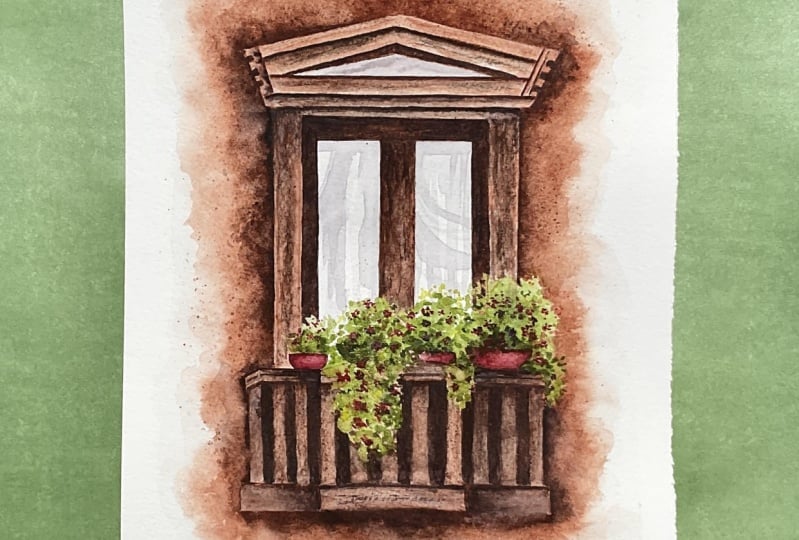
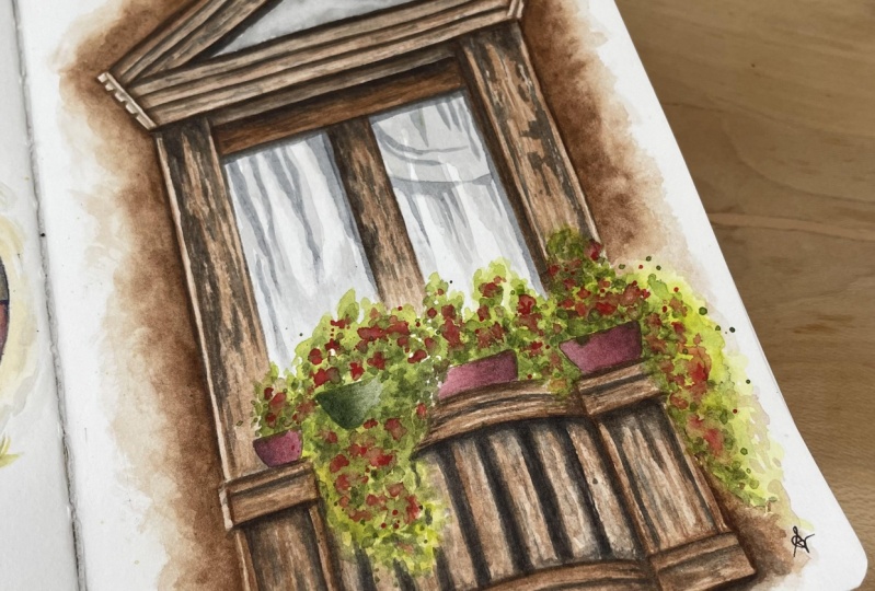
2. Class Project: [MUSIC] Your project for today is to paint a window with balcony flowers using the
techniques taught in the class. I didn't pick this
project at random. Capturing the worn-out look of an antique building
with the addition of a bush of florals
like this one, will be challenging for anyone who enjoys details and realism. Can they just paint
all the leaves? The reference photo itself
is quite intricate and because it's an old style
window from Southern Europe, there are a lot of beautiful and highly tempting
details, aren't there? A spoiler for you, we won't be painting them all. In fact, our motto throughout the entire class will
be, keep it simple. This project will
be great to learn to let go and lose control, but just a bit, while keeping the
painting looking stylish and refined with
just some detail. All you need to get started are basic watercolors supplies. You'll notice I labeled
the paints with the simple color
like brown or red, instead of having you get specific shades like raw umber, permanent red, etc. That's because these things are just details and I
don't want that to stop you from practicing. As a perfectionist, that would have been
my case in the past. For our specific references, you're welcome to download
a supplier's list from the resources section, and there you'll also find
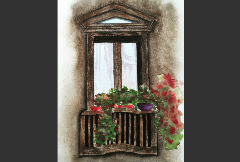
a reference photo I use for the project as well as
a photo of my painting. To make the sketching part
of it easier here for you, if you'd like to get to
the painting right away, I added the line art. Although I recommend to go
through the sketching lesson because this is going to be our starting point
for looser paintings. Also, don't skip my bonus
lesson, the sketch book tour, because this one will
provide a lot of insight on my watercolor
painting process, and you'll see how I went from a tight style to being a looser, and that might spark
new ideas and hopefully even give you some inspiration to go create more
paintings of your own. Please post your project to
the project and resources section of the class when
you're done, like so. You can ask me for
feedback if you need it, or to share your painting with the community,
if you'd like. Now it's time for
us to get started, so I'll see you in
the next lesson for a look at the supplies
we're going to need. [MUSIC]
3. Supplies: [MUSIC] Loosening up a
tight watercolor style starts with simple supplies. With practice, I found
there is little need for fancy tools and I almost always use the same supplies,
painting after painting. First, you want to find
some watercolor paper. The type I personally like is a cold-pressed 100 percent
cotton paper because it holds water very well and
colors are able to flow better. My favorite brand is Arches. Remember you can
download the list of supplies that is
attached to the class. There you'll find
alternatives I also enjoy. Don't worry if you own another
type of watercolor paper. This is an example of loose
watercolors I painted on a different and
much cheaper type of watercolor paper, and
it works very well too. The next item I find
convenient is masking tape. With it, you can paint on a single sheet without worrying
about it moving around. Sometimes I even use it to
create crisp edges too, but not in today's painting
and actually not relying on clean edges is a good way
to encourage a looser look, and I will show you that
in our base layer lesson. For this sketching lesson, you will need a
pencil, an eraser, and a ruler and that
will come in handy even if you decide to
use the template I attached to the class. I like to limit my
paintbrushes to two or three for one painting. It makes the process easier
when supplies are simple. I picked a small
round paintbrush. Mine has natural fibers
because like the paper, it holds water better than synthetic paintbrushes
so that's my go-to. For details and precision, I also enjoy using this type. It's a round and
pointed paintbrush. I find it easier to get into the nooks and crannies
and trace thin lines. [NOISE] Our color palette can be achieved with
only four colors. You can use the watercolor
brand you're used to and pick any light shade of green or bright
red, brown, and black. We will elaborate on that
in the color mixing lesson. I like to pour the
paints from tubes into pens and use those
wells to make my mixes. If you prefer, you can plan
on a pallet to mix colors, especially if you don't have
a metal box like this one. Finally, we will need
two jars of water, one to wet a paintbrush, and one to rinse it. A few paper towels to soak extra water off
the paint brushes, and a heat gun or
hairdryer, if like me, you don't have the
patience to wait for the paint to dry
between each step. These are my favorite
supplies for pretty much every type
of subject I paint. That's it, so meet me
next to sketch a window. [MUSIC]
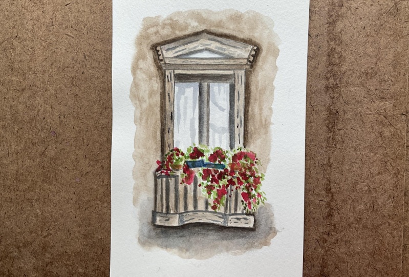
4. Simple Window Sketch: [MUSIC] In this lesson, we're going to sketch a window and balcony from reference, and we'll be simplifying what we see to support a
looser painting style. You can take the sheet
with the masking tape now. I suggest you watch this
lesson all the way through, even if you plan to download the line art from the resources, just to learn from
the approach and thought process behind
a simple sketch. I use this reference photo. As someone who loves details, I was drawn by the
beautiful carvings on the stone and the old-fashioned
Southern European looks for this window. A few years back, I would have probably tried to
draw everything, but now I know I can keep my favorite details
in while turning this photo into a
realistic painting that looks light and expressive. Remember our motto
to keep it simple. The first modification is
to change the perspective. Let's decide the window
will be facing us. [NOISE] Make sure there's enough room around
the window so we can suggest the wall without
the crisp edges. The most efficient way to start sketching anything while
keeping the subject centered and proportions correct is to decide where the
top and bottom will be. From there, it's easier
to fill in the gaps. I draw the main contours of the window to make it
as wide as I like. Keep in mind you can alter
the proportions here too. My goal is to keep this
painting looking realistic, but really there aren't any
limits to what you can do, which is true, the most
important lines for our project. Feel free to make
adjustments now before we start adding
the smaller lines. [NOISE] You can see how I'm placing the top of
the balcony after this. It helps me check the
window looks tall enough. Now ask yourself, what contributes to the atmosphere
you would like to convey. For me, the balusters seem central to the old-world vibe, so I want to keep
that kind of detail, and I think earthy colors and
flowers will support that. In other words, these
elements will be enough. So I think we can skip intricate moldings
around the window. Overall, I try to keep lines parallel or perpendicular
with each other, so it looks cohesive and recognizable as a window with
a balcony and it's enough. Don't worry about getting
everything perfect. With landscape painting,
unlike portrait, I find it's easier to get away with approximate
proportions. [MUSIC] When you're happy
with your sketch, you can start
pressing a bit more for those lines to stay visible. With this project,
we'll be using brown paint and covering
up most of the window. This is why in this
specific painting where the paint will
be mostly dark, you want your lines
to show still after our base layer because
they will be easily covered up later when
we add their shadows. If I plan on the subject to look like it's very
light in color, I would have pressed a lot less. To decide whether to make the sketch visible
or very subtle, it helps when you know what tone of color the shadows
are going to be. If you're not sure when
you're on your own, you might want to
revisit the sketch after the colors were mixed
or start with the colors, or at least make swatches. [MUSIC] Notice that for the balcony, I'm not sketching the balusters. We could do it, but because
I want to show you in this class how you can be more loose when you have
a tight style, we'll be challenging ourselves and paint them on the spot. Let's add a few pots, and please make those
the shape you like. There are so many ways to customize this type of
painting if you want to, so have fun with it. [MUSIC] Remember, start sketching
the main shape: top, bottom, and sides
of your subject. Don't worry about
perfect proportions as long as a drawing
looks cohesive. Keep the lines light at first. To encourage a looser style only sketch the main elements. To take it a step
further and encourage creativity, alter
the proportions. We are done with the sketch, and in the next lesson, we'll mix our colors to
prepare for painting. See you there. [MUSIC]
5. Mixing the Colors: [MUSIC] We are ready to
prepare our color mixes. We'll be using a
light green, red, brown, and black to keep
our color palettes simple. Not only will that help achieve
a better color harmony, but it will avoid overworking the painting with many
colors and details. This is raw umber
from [inaudible] and it's the only one I don't
have here in the pan. I'm going to use it
straight out of the tube. Don't worry if yours is a bit lighter or darker than this, if it's a different
shade of brown. If you have burnt umber, sepia or Van **** brown,
that would work too. Let's add a lot of water enough to make
this a creamy mix. I would like the color to show, but we need water so
the paint can move into water we will
add to the paper. Later in the process, we will mix black to this mix. It's a technique I use to make colors darker for shadows, rather than using
a different color. I find a dark one I can mix to all the others to make
them look deeper, but for now, we
do not need it so let's concentrate
on the main colors. [MUSIC] The next one is green. We'll use it to
paint the plants. I like that it's a bright green. It will add color and
light to the painting in contrast to our earthy
tones of brown. When you don't have
a light green, simply add yellow to
the shade you want. I'm making a creamy mixed here just like we
did with brown. I'm not giving you a
precise color name for this as each brand has their own variations
and I find it's much easier to just look at
what the color looks like, rather than worrying
about the specific shade. In the supplies list that
I attached to the class, I listed the exact
color I have used here, but please don't let it stop you from creating with
your own supplies. I know it can be
frustrating in a class when you don't have the colors
you need for a project, but really, that doesn't
matter too much. In this mix here, let's add black since we will
be needing it soon. [MUSIC] Look at how much darker it is getting now. [MUSIC] Let's do
the same with red, a creamy mix of it. Another one to which
we'll be adding black once more to achieve a
darker shade of red. [MUSIC] Now let's mix a tad of
black and this time we want to add a lot of water to make a runny and very light. This will be useful to paint a window panes and build a
reflection effect on them. [MUSIC] Remember, try and figure out color mixes while picking the colors to keep
the pallet simple. For this type of subject, keep those mixes creamy. Add black or brown to any color in order to
make it look darker. Window panes require
a very light gray, so add lots of water to
your black watercolor. I hope this lesson helped
you assess how to make great color choices while
keeping your palette simple. I'll see you next to
paint the base layer. [MUSIC]
6. Base Layer: In this lesson, we're going
to work with brown to paint our base layer and
we're focusing on the stone in the
wall and the window, we're leaving out
everything else for now. Let's erase some of those lines around where
the florals will go. I find this as a good
reminder for when to stop painting the
window base layer, although you could also draw
a line to locate the florals if you prefer because even when you want
to go more loose, I found through trial and error, that is still important
to plan ahead, so the paint and the plants and wall don't get in the way of
one another for instance. We'll be needing
both paint brushes. I'm going to use the round
one to wet the paper all around the window and the
pointy one to add the paint, so grab two paint
brushes, and let's start. I picked a brown
color for the stone because for me it
conveys that feeling of the type of structure
you would see in countries like
France, Spain, Italy. We're working on sections, so we have time to paint
without the paper drying. The idea is to create loose edges to our painting
thanks to the water. It can seem like it's not much, but it easily brings out more spontaneity
to a piece of art, even when everything else is realistic and I find sketchbooks are a nice way to experiment with creating those
loose contours. You'll see more
examples of that in the sketchbook
flip-through lesson. I'll normally use
masking tape to create crisp edges and while it's possible to paint
loosely this way, for someone who's
looking at loosening up, it's a great way to get started. Here actually, I'm not
worried about how the edges are going to look that is the
beauty of that technique. Let it be what it wants to be. For now, I'm
focusing on avoiding the window panes mostly
and the areas where we'll paint the flowers [MUSIC]. [MUSIC] To make the flowers of full part of our painting later, I suggest a fade hard
edges right around the area so those edges
don't show through later. To do it, clean your paintbrush, dab it on the paper
towel so it's just damp, and clean up those edges
before the paint has dried. This is more of a style choice, some artists with a
loose style will just be blank space between different
elements of the paintings. Don't worry if it
looks a bit messy, not only will that be a good thing to keep a
painting looking looser, but the parts you don't like, it can be improved later
where we add shadows and a little bit of detail [MUSIC]. Let's try this layer. Remember, you can make the edges of a painting
add to a looser look. To plan for florals
in a painting, either draw a line
or erase sketching lines there to remember and
avoid painting this area. Use a clean and damp
paintbrush to fade the paint around the
pots and flowers. Let's meet in the next lesson to paint the window
panes and the pots. [MUSIC]
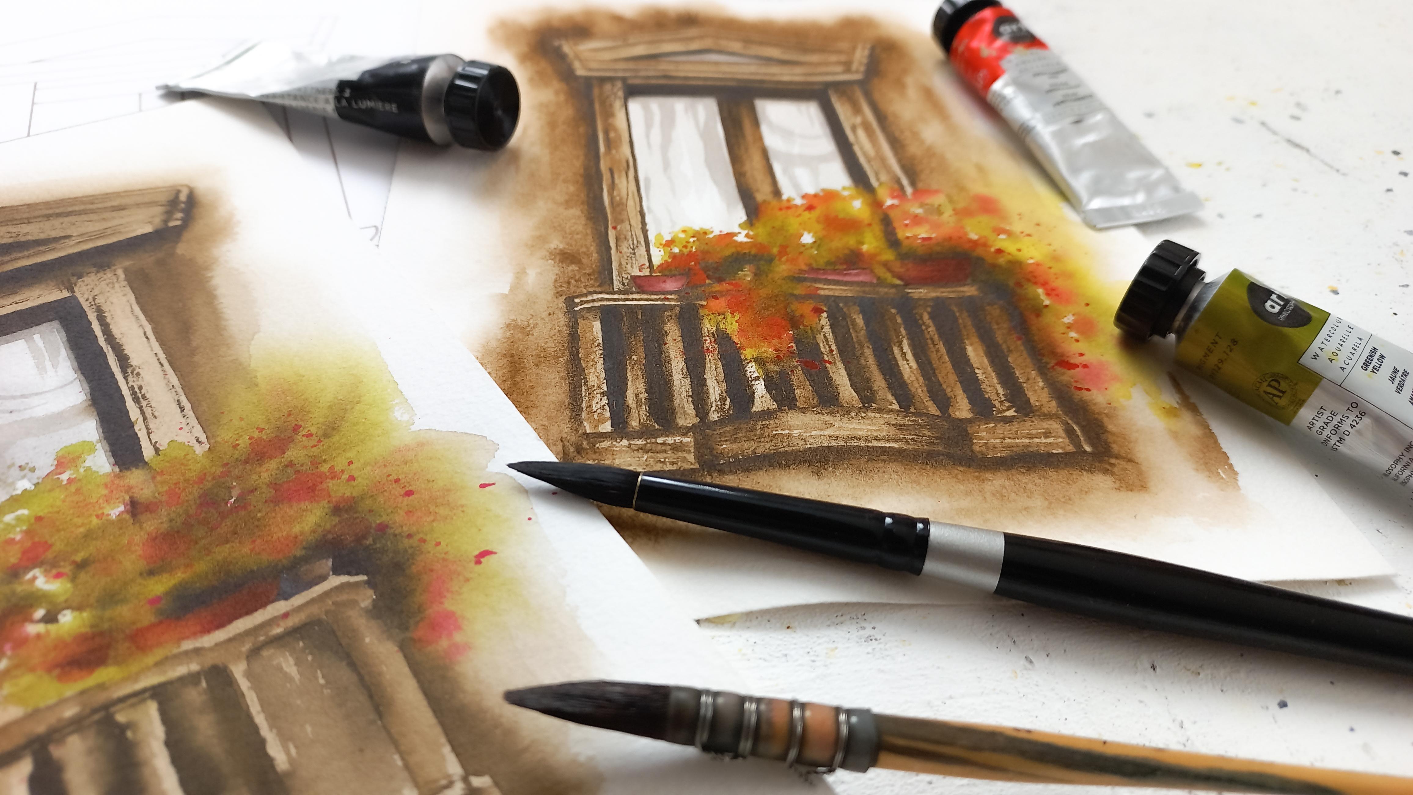
7. Window Panes and Pots: [MUSIC] We're going to finish adding paint
to our sketch with the window
panes and the pots. This way, we'll have
a solid base on paper and we can move on to
refining the painting later. We're going to use
a very light mix of black for the window panes. It's very important
that it stays pale to create that impression of
a reflection in the glass. [MUSIC] I rarely leave paper white highlights on my
realistic paintings. I prefer to use white
gouache or a gel pen. That's my personal take
on this, of course, because I find paper white
areas make paintings less realistic but lately I've been trying to include
them to my art more. What has worked
well for me was to keep those paper white
highlight subtle, to keep the painting
looking realistic still. I think the key is to
find the right balance, the one that works for you. You can use the
techniques in this class as something to work from. [MUSIC] Now, let's paint the pot. This is just the base layer, it will improve later. I find this mix of red and black resembles a Venetian red shade. You would see a lot of plain parts of this color
in Southern Europe. [MUSIC] For a little variety
in the pots, I'm going to use a
dark green shade we created initially for the
shadows and the front bushes we'll paint the next. [MUSIC] Notice I
fade the paint in some areas with my clean
and damp paintbrush, like we did in the
previous lesson because I'd like to
include florals there. Don't worry if you get
some overlapping colors when you paint the plants, it's okay at this stage, and that's why many artists
will advise you to start light with watercolors
and gradually go darker. Add a tad of black to
your light gray mix. It's going to allow us to finish painting
the window panes. There isn't much left to
do to finish the paint, so let's make sure this is dry first so we can
keep on painting. When you look at the
reference photo, especially if you zoom in, there is a whole lot of
detail in the window. Here. We're going
to simplify it by keeping the main elements. [MUSIC] Reflections will
look better when the final details are
painted on dry paper, so make sure the first
layer we added in the beginning of this
lesson is completely dry. [MUSIC] I'm not trying to copy
exactly everything, just getting the main
features to come out. With a few strokes we're able to suggest a curtain with
beautiful creases. [MUSIC] When we love to pay detail
to perfect a painting, it's always so tempting to
add more and more to it. You'll find that with
practice and some mistakes, you will get better at
learning to stop in time. [MUSIC] That is going to be more
than enough for me, so let's try this. Remember, keep your paints very light to paint
window panes. Keep using the clean and damp brush technique to fade the
paints around the florals. Take a short break when
you paint the details, it will help in
deciding when to stop. Great job on finishing the base, next we'll paint the florals. [MUSIC]
8. Plants and Flowers: [MUSIC] In this lesson, we're going to paint
the plants and flowers. If you're like me,
this might have been one of the hardest things
to paint in watercolor, because we have little choice
but staying quite loose. Plants are always going
to look a bit messy, just like they are in real life, so even with some control, my plants won't look like
your plants for instance, and that's absolutely fine. We will be using two
paint brushes again, a round one is convenient, I find to create the contours and another one to
loosen up some parts. With our mix of green, we're going to tap the brush wherever we want
those plants to be. [NOISE] Tapping the paintbrush rather than painting
foliage makes the outcome look a lot more natural in the
way I look at it, because it's easier to
keep a bit of white space in-between the leaves
and avoid ending up with a solid mass of paint. I use this technique
in skies too, it works really well to depict those elements of nature
like clouds or foliage. With a clean and
damp paintbrush, fade the edges and parts, for me, it's on the right
side and towards the bottom. Plants are probably
the best way to add a loose touch
to any painting, and I know in the beginning
it can feel scary to let go to just accept
and lose control. [NOISE] With loose
flower bushes, I find it works best
to keep some parts well-defined so we can tell
it's a bush from it's shape. That doesn't mean you can't
add water to other parts to blur the edges and make the
whole thing look looser. [MUSIC] Before the paint dries, I'm going to add the mix
of dark green we created, it will get those plants
even more definition. In general with art, whether it's a very tight or a semi realistic or loose style, you'll notice it's
always a good idea to include different
shades in one spot, unless you're going for
something more cartoony. [MUSIC] Let's add red while
there's still time and splatter it in there to create
an impression of flowers. When you do that, you want
to make sure the paint is concentrated enough
so the color shows. [MUSIC] Something that might
happen when you're not used to painting
flower bushes is your flowers don't show enough because the
color is too light. Keep in mind, our bush is
probably drying already, so if you can use a pigmented mix of paint for the flowers,
it's even better. To add a stronger touches, you can even use a
paint brush like this and tap it
directly on the bush. That would also help you create the impression that there
are more flowers there, since paints platters can
be tiny in comparison. [MUSIC] Let's try this, and again, don't worry about
the current looks of it. The painting is going to come
to life little by little, which is why we
love a loose touch, but we also love the
layers and detail. Remember to tap a
round paintbrush on paper to paint a bush. Use water in places
to loosen it up. Add darker shades and flowers
while it's still wet. In the next lesson, we will
define the wall some more. See you there. [MUSIC]
9. Deepening the Wall: [MUSIC] We're going to deepen the brown tone
in the wall to make the window pop more and give
the painting more intensity. You need your brown mix only with a little bit
more paint in it, so it's thicker and
dries darker on paper. Just like we did
in the beginning, let's have two paint
brushes ready. One to wear the edges the other paint and we're
working on sections. [MUSIC] Don't be afraid to paint the
areas around the flowers. It will be much easier to do at this stage because we already
have a base layer of brown. If you find you get paint
on the flower bush, just use a clean and damp
paintbrush to clean it up. We won't be able to tell where the wall ends and flowers start. That's the beauty
of this technique. My paint is not very dark. If yours is, you might like to sprinkle clean
water drops like this to add it to the loose five-minute painting with beautiful
watercolor blooms. This technique works better with one single layer of
paint or two layers, as long as the first one is very light and the
second very dark. On mine, it doesn't show much, but you might be lucky here. [MUSIC] Let's finish the wall and sprinkle more water
if you want to. Another fun way to spice this up a little bit is to
splatter brown paint. I use that type of technique in the illustrations
from my sketchbook. You can either make splatters on wet paper or dry paper or both. It's just really a
matter of taste and experimenting if you
haven't tried it before. [MUSIC] I'm going to try this. Remember to add pigment to your color mixes as you paint to improve the vibrancy and build up more contrast between colors. Use to clean and damp brush techniques to make
the transition between loose florals and the wall and later when the structure
looks seamless. That's it. Let's meet next
and repeat with a window.
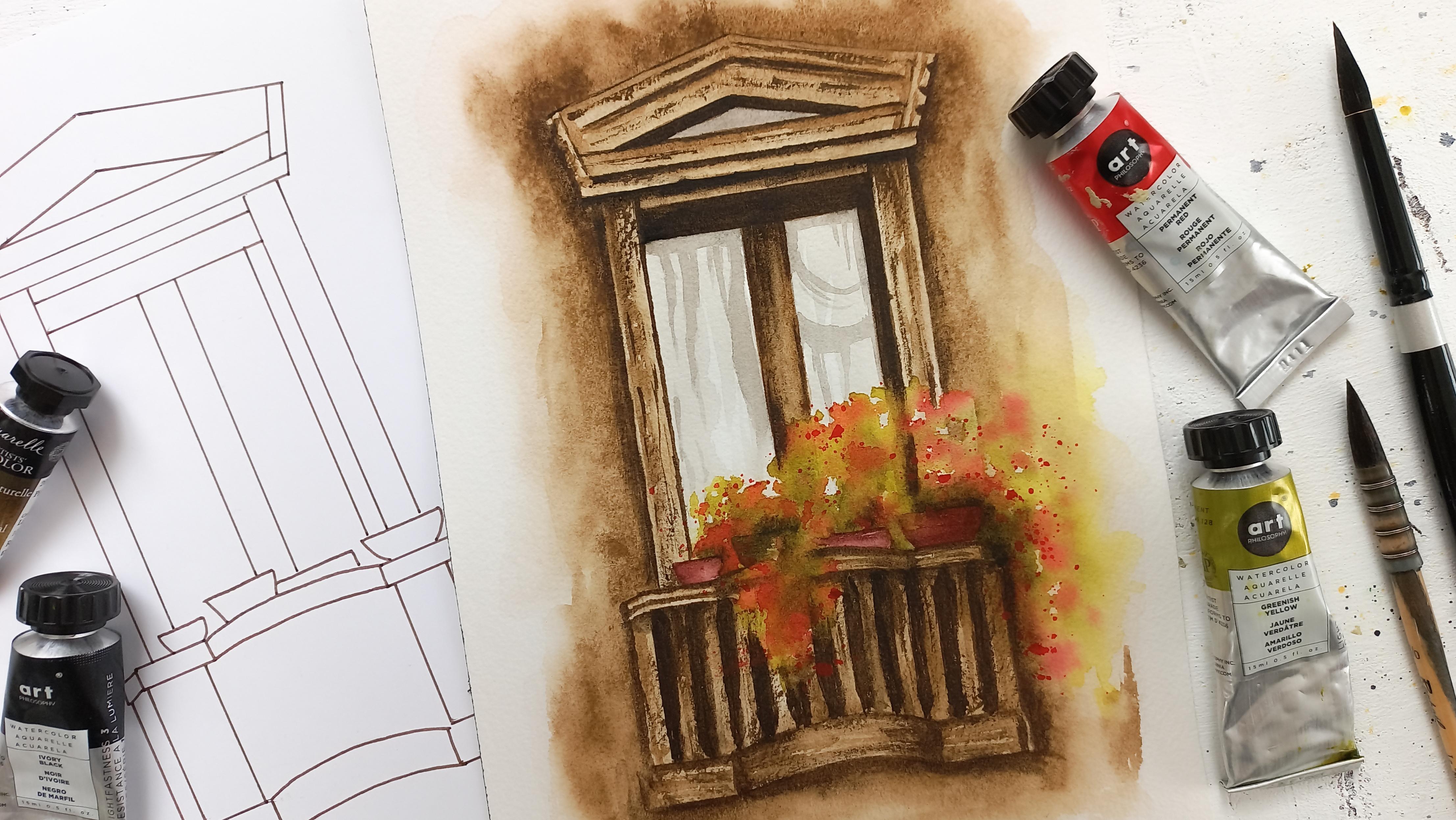
10. Deepening the Window Frame and Balcony: [MUSIC] We just define the wall. Now let's do the same with the window and there
will be a bit more work as there are parts
of it that will need more enhancements
than others. You need exactly the
same things as before, your second brown mix, as well as both paint brushes. It might help to trace
the sketching lines again if you just got
lost with the base layer. We're still moving
section after section. Now I'm enhancing the
head of the window because in old-fashioned
structures of this type, you would find in a
place like province, there's a lot of detail. Remember on the photo, there was even more detail. Here we're keeping
only some of it just to convey the
old world atmosphere. [MUSIC] As you can see, I keep fading the
bottom of the marks I'm making to avoid
a harsh line there, but I'd like the
top to stay crisp so we can make each part
of the structure pop. [MUSIC] There are darker areas
and places that are going to suggest something
hollow or a shadow. We'll make them even more
obvious later in the class. [MUSIC] On the frame, I'm creating loose marks to give an impression of texture. There too, I enjoy fading
some of those edges, so it looks more natural. [MUSIC] Let's keep going
with the balcony. First, we can define
the main lines. [MUSIC] For the balusters, a great way to stay loose
is to paint them now, without the guidance
of the sketch. What we're already doing
is just guessing them. A mindset shift you
can do when you're a perfectionist is to remember a painting can
look realistic and beautiful without
looking perfect. Realism doesn't have
to be perfection. I even find with practice that the final outcome actually looks better when not
everything is perfect. That not every line is
straight, for instance. I use a combination of
the dry brush technique and fading some parts with a
clean and damp paintbrush. To execute the dry
brush technique, dip your paintbrush
into your paint mix. If it's dry enough
like mine, that's it. You can create the type of
strokes I'm painting now. Otherwise, if the brush
feels too damps though, just dab it onto
your paper towel to get rid of the excess water. [MUSIC] Don't forget to let this dry before moving on
to the next step. Remember to play with color
values for more realism. Realism is not perfection. Combine various
techniques to loosen up. See you in the next lesson for
some detail on the window. [MUSIC].
11. Window Detail and Texture: [MUSIC] In this lesson, I'm going to show you how
we can add details to our project without
overworking the piece. Let's mix more pigment
into our mix of brown. We want something
quite thick and dark now for those details
to be effective. You should be able to paint
with it easily though. Add some water if
this is not the case. We'll be using a
round and pointed paintbrush throughout
the lesson. [MUSIC] I'm going to go
over the main lines and moldings of the
window to build up their shapes some more. [MUSIC] Add some texture
to the stone as well. [MUSIC] It's also time to make certain
parts noticeably darker. Here, for instance, this is a hollow part
of the window right above the glass [MUSIC] You can already see how
working with a darker, stronger version
of our brown color is enhancing the whole painting. This is why no matter the style when you're
looking at some realism, it's so important to use
light, dark, and mid-tones. [MUSIC] We need some texture on those large parts to make them look a bit
more interesting. [MUSIC] Let's add shadows around
the main window pane. [MUSIC] A shadow beneath the
balcony will also help the whole window
pop off the page. [MUSIC] They should be drying
quickly if you don't have a heat gun or a hairdryer. Keep adding pigment
to your mix to make the addition of details and
texture more effective. Hollow areas should
appear darker. Use your reference
photo for guidance. It's now time to
finish the balcony, so see you next. [MUSIC]
12. Balcony Detail and Texture: [MUSIC] In this lesson, we're going to
define the balcony. We're using the same
thick brown mix from the previous lesson. I ran out of it so
I'm mixing more. [MUSIC] First, we're going to
increase the impression of a shadow between each
baluster to bring them out. Remember that it's okay if
it doesn't look perfect. This is why we're painting
them on the spot. [MUSIC] I'm progressing section
after section here too. You'll notice at this point, the balusters are looking
very obvious because they're very light and the shadows on either
side very dark. We're going to balance this. Before the paint
dries completely, you can wash your
round paint brush, dab it on the paper towel to get rid of the excess water and then brush it slightly over the paint and edges to wet it. If your paint is still very wet, this will blur the edges between balusters and shadows,
which is great. [MUSIC] Mine is almost dry, so the blur is not very obvious. My plan is to add more
paint on the balusters this time to have them blend into
the shadows just a bit. They should be easy to do
when the paper is wet, it will look more natural. [MUSIC] Be careful not to cover
up all of the balusters, we're just adding a touch of texture there with
the dark paint. Keep it up with the
rest of the balcony. There is no need to paint all
balusters exactly the same. Variety is key. A painting doesn't look too
rigid and perfect. [MUSIC] It's time to take
a step back and decide where you might want to add more shadows and texture. [MUSIC] Make sure this is dry
before the next step. Remember that when something
requires great detail, or precision like the balusters, use water in places
to alter your work and make it look more
loose and instantaneous. We are almost done. Let's meet next to add
the final touches. [MUSIC]
13. Final Touches: [MUSIC] In this lesson, we're going to finish
the painting by enhancing the parts and
flower bush some more. You will need your round
and pointed paint brushes. Let's reactivate
this reddish mix that we made before
for the parts. The parts are
looking a bit pale, boring right now because there's just one
solid light color. We're going to paint shadows
with the second layer. Let's add some paints, and before it dries, we're going to fade that paint
into the rest of the part. [MUSIC] We're going to repeat this
with the next two parts. [MUSIC] I find when painting flower bushes that
it's easier to do when there's already a
base of paint all around and that's
exactly how we did it. We painted the wall, window, and the
window panes first. It's easy to add the foliage
on top of a light base. Once you have all of that, then go ahead and
add some details and shadows to those areas
around the foliage. I always use a wet and
damp brush to remove any harsh lines and there is no more
start and stop lines. [MUSIC] I'm going to repeat with my dark green
mix in that last part. [MUSIC] Let's add some black
to our dark green mix, and now we're able to also add some shadow to
the flower bush. Be aware here to add little. We want to keep a sense of
spontaneity with the foliage, so we really don't need much. I'm adding this to the
base of each plant and one of the sides
and that'll be enough. Don't forget to use your
clean and damp paintbrush to have this dark mix melt into
the rest of the foliage. [MUSIC] A trick to finish the foliage and also bring some color to the painting is to splatter a bright color paint all around. Here I'll go with red since it's the one we used for the flowers. We'll just be adding
additional flowers and the more concentrated
with pigment, the better at this stage. I also like to splatter
all around the foliage as the last step because the
rest has been fully painted. Now we can easily overlap more flowers on top
and finish the bush. The key here will be to
make sure the color is concentrated enough that
it will actually show. [MUSIC] Remember, finishing touches
are meant to stay subtle. Splatter additional flowers at the very end with a
pigmented mix of paint. Congratulations on finishing
your balcony flowers. Please share it with
me and the community in the project
section of the class. [MUSIC]
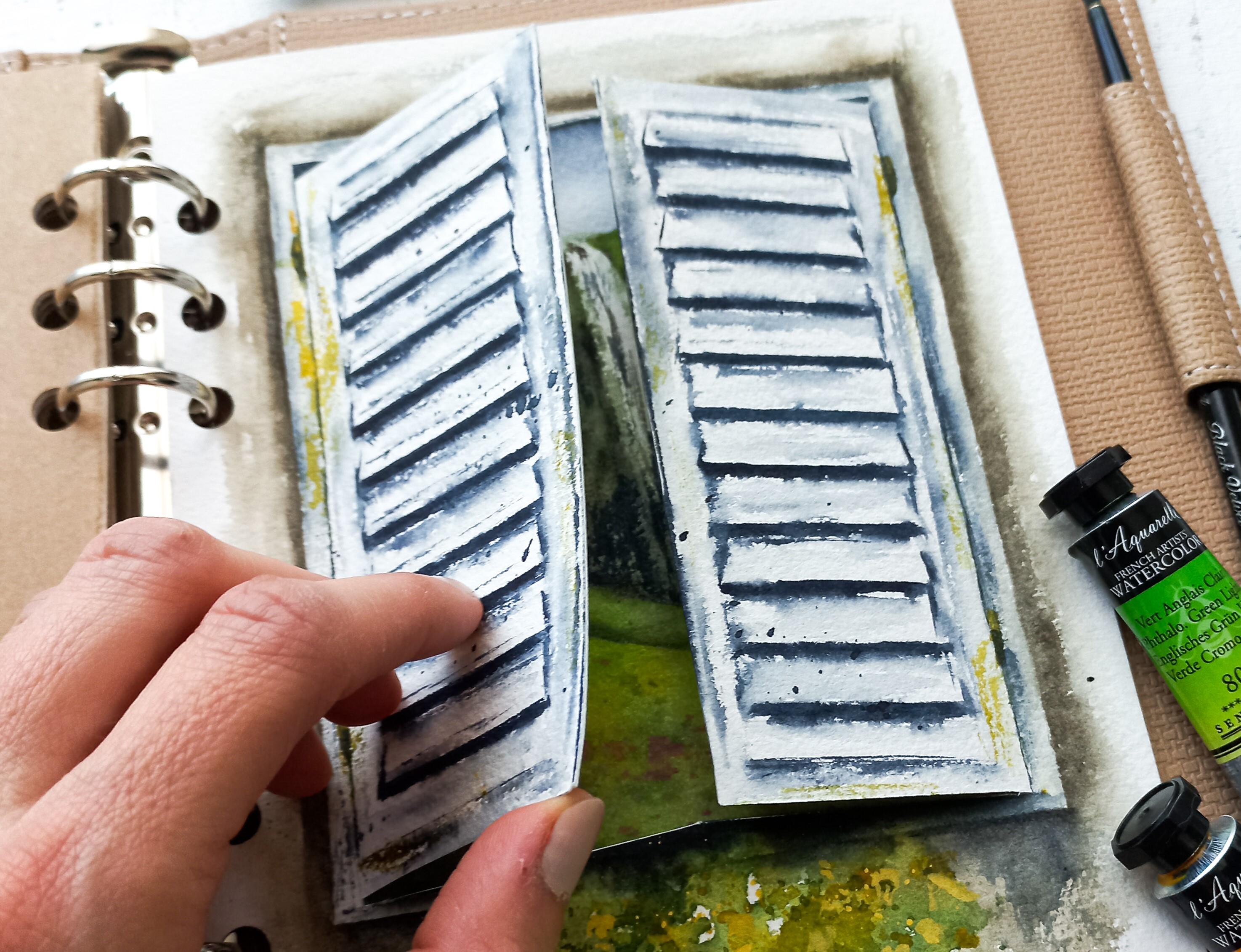
14. Sketchbook tour ! Pots & Balcony Flowers Inspo: [MUSIC] I thought it would be interesting to show you my sketchbook in this lesson. This is a special one for me. Note only did I turn this notebook cover
into a sketchbook, something you can do when 30
pages long sketchbooks seems scary since you'll
be able to add single sheets one-by-one
to your liking, and you'll be able to
use your favorite paper. The main purpose of the
sketchbook has been to loosen up my style with brick walls
and fury bushes mainly, because I find these
very hard to do for me, with a tight style and
perfectionism going on. I also use this book to
explore a new concept with flaps and practice with a
[inaudible] watercolors. Notice here how I
made the edges of the painting looking
loose and spontaneous. I did not use masking
tape for perfect edges. The bricks were a challenge, so I taught myself through
trial and error not to draw them all and even
suggest some of them. I didn't try and paint the
plants very precisely. If you look closely,
you can tell I used water in places
to make them looser. Now, let's look at the
next illustration. It's a realistic door with a magical forest
on the other side. Notice the door is more
polished than the rest. I made this choice to
make it the star of the painting by keeping
a realistic style there and including
a lot of painting all around but it's
just less detailed, more loose in other words. Let's take a close look. Look at how loose
the plants are. On the wall, I
added a few bricks. It's even more subtle than
the previous painting. The ground is pretty basic. Some paint with paper white
spots showing and splatters. Now this one was
meant to focus on painting loose plants with
a more realistic touch. I added letters in
the mailbox for fun. To create a loose
base of the wall, I just tilted the page
when the paint was wet to have drops escape
the mass of paint. I also left some white spaces, but I still added quite a bit
of detail for more realism. In the plant, I experimented
with adding flowers, not just splatters, so it's
not just a loose bunch. On the mailbox I wrote La Poste which is the name
for the French mail service. But I didn't try to
make it very neat and clean as a way to loosen up. This painting is a combination
of a loose door and bushes and inside there's
more realistic painting. As you can see, they pair up well together. I really liked adding flowers to the pot in
the previous painting, so I had to add a
few leaves here too, to try and it's looking great. I added detail to the
wood panels, the ground, the step and the door, but they're subtle, almost a bit messy. The painting is not overworked. Now you can see this seascape is quite detailed in comparison. I added a few splatters
towards the bottom, waters splatters first
to create highlights. Later, paint splatters for fun. We have another painting
here with loose edges. The background here
is very simple. Once more, I chose to have a painting inside more detailed. The shadows are pretty loose. In the past, I might
have tried to get each line to be straight
and looking very polished. But here I used
water to make them looser by helping the
paint spread all around, like what we did in the
balusters with our project. I hope you enjoyed
this sketch book tour. I'm very happy I got to show you this and I'm counting on adding a few more paintings
to this collection and exploring the flaps and loose
techniques, a lot more. Overall, I'm very happy with how the paintings I showed
you have turned out and I really like to
encourage you to put together a sketch
book like this one to experiment as this
has really helped me paint better fury
bushes and stone walls. It's better when you get
to focus on one subject. After just a few pieces, I felt more comfortable and now I can paint all
of that easily. Let's meet one more time
for some final thoughts. [MUSIC]
15. Final Thoughts: [MUSIC] Congratulations
for making it to the end. I'm curious to learn
how this class helps you shift your
perspective about what realistic
painting could mean to you and how painting
the details or perfecting a painting
doesn't have to be an all-or-nothing process. The next time you itched
to paint the details, remember, you're not
alone, nor duped. I've been painting
for about three years and I'm still learning, for you and I, I think the
journey is just beginning, and still have a lot
of room to play and grow and that's pretty encouraging when you
think about it that way. If there was one key takeaway, I would love for you
to remember after the class is that
you don't need to drastically change your style to enjoy watercolors techniques. On the opposite, you can use
them to support your style. Remember that with
basic supplies, a limited color palette, a simple sketch combining
loose and present techniques, you can tackle even the
most complex of subjects. To get notified by all
my future classes, you can follow me
here Skillshare, you can also find me on
YouTube and Instagram, for added inspiration
and behind the scenes. Before you go, I'd
like to ask you to leave a review so that
potential students know what to expect and can decide if a class
is a right fit for them and also please share your project to
the project gallery. Happy creating and
see you next time. [MUSIC]
 Francoise Blayac, Professional Artist